
For a function like plot(), a method of the function is the version of the function that applies to a specific class of objects – such as the class of numeric vectors or the class of time series objects. In this chapter, we cover those methods of plot() in the graphics and stats packages – other than plot.default(). (The function plot.default() is the subject of Chapter 3.) There are eight methods for plot() in the graphics package, and, in the stats package, there are twenty.
5.1 Methods
When plot() is run, plot() finds the class of the first argument and, based on the class, chooses which method of plot() to use. The first argument is the first argument listed in the call – unless there is an object assigned to x (or formula if the method is formula) elsewhere in the call, which then becomes the first argument. If plot() has a method for the object, a plot, or plots, is (are) created. The graphic created is based on the method and varies with the class of the object.
To see a list of the methods of plot() in an R package when using RStudio, open the Packages tab in the lower-right windowpane and scroll to the package. Open the package (click the name) and scroll down to where plot falls in the alphabetical order of the contents. The methods of plot() start with plot. and have an extension describing the method – for example, plot.ts.
Not all functions named plot. followed by an extension are methods of plot(). If the function is a method, in the help page for the function, under Usage, there will be the expression plot( … ) (where the contents between the parentheses vary by the method). Some help pages cover more than one function, so there may be more functions under Usage than just plot().
In R, go to the Packages & Data tab in the menu and choose Package Manager. Scroll down to the package, open the package, and then scroll down to plot. Not all packages have methods for plot().
Given that plot() has a method for a class of objects, the call to plot() does not necessarily include the extension. For some methods, the extension can be included. For other methods, including the extension causes an error. In this chapter, the functions are referred to either as plot() or as plot.ext(), where ext is the name of the method. But, with regard to the coding, running plot.ext( … ) sometimes gives an error.
The arguments to plot() differ as the methods change. On the R help page for a method, arguments specific to the method are located within the parentheses after plot. Some are different from the arguments of plot.default(), and some just have different defaults. In Sections 5.2 and 5.3, the arguments specified on the help page are described, and the kinds of values the arguments take are given. One or more graphic examples are given for each method.
5.2 The Methods for plot( ) in the graphics Package
Methods for plot() in the graphics package
Function | Description |
|---|---|
“plot.data.frame | Plot Method for Data Frames” |
“plot.default | The Default Scatterplot Function” |
“plot.factor | Plotting Factor Variables” |
“plot.formula | Formula Notation for Scatterplots” |
“plot.function | Draw Function Plots” |
“plot.histogram | Plot Histograms” |
“plot.raster | Plotting Raster Images” |
“plot.table | Plot Methods for ‘table’ Objects” |
—Help page for the graphics package in R
5.2.1 The data.frame Method
The first method covered is the data.frame method , for objects of the data frame class. A data frame is like a matrix, except that columns can be of different atomic modes. The data frames plotted by plot.data.frame() should be data frames with numeric columns - but columns that are not numeric are converted to numeric. (The mode of a data frame is list, since matrices cannot mix modes across columns.)
According to the help page for plot.data.frame(), the data frame is first converted to a numeric matrix by using data.matrix(). For columns in the data frame that are not numeric, the columns are converted to numeric. Raw data are converted to numeric values, logical values are converted to 0 for FALSE and 1 for TRUE, complex numbers are given the value of the real component, and character values are converted to factors – which have numeric values.
Numeric columns in a data frame can be selected using indices. For example, xx[ , c( 1, 5, 3 ) ] creates a data frame containing the first, fifth, and third columns of the data frame xx. Selecting a single column does not result in a data frame, but data frames can have just one column by using the function data.frame() with just one vector value. For example, data.frame( xx[ , 2 ] ) would create a one-column data frame out of the second column of xx.
After the data frame is converted to a numeric matrix, the function pairs() is used to plot the data frame, except when the data frame contains only one column. When the data frame contains only one column, plot() uses the function stripchart() to plot the data frame.
The only specified argument is x, for the object of the data.frame class. There is no default value for x.
The arguments that can be used by plot.data.frame() are the arguments used by plot.default() and pairs() – also those of stripchart() if the data frame contains a single column.
Code for the example of using the data.frame method of plot given in Figure 5-1
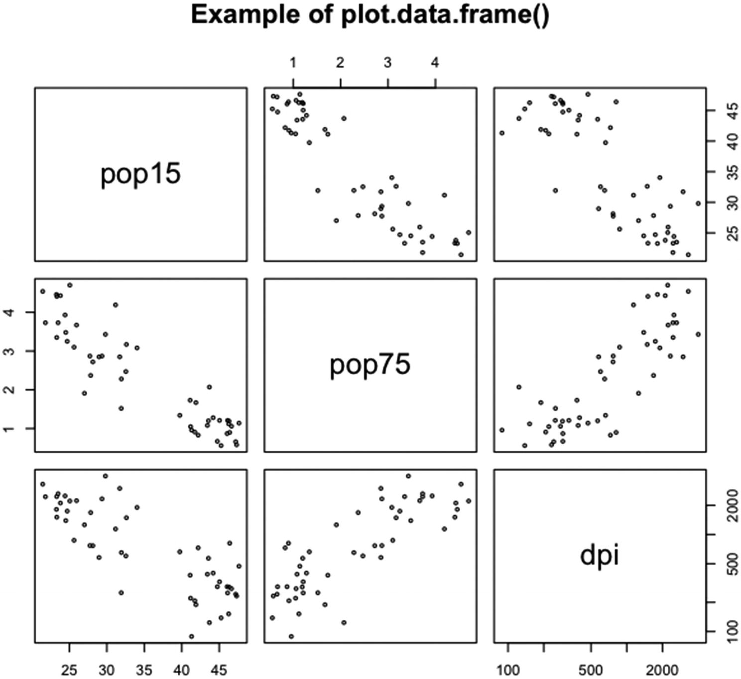
An example of running plot() on the middle three columns of the data frame LifeCycleSavings
Three columns were selected out of the full LifeCycleSavings dataset. Note that the third variable, dpi, uses a log scale. See the help page for pairs() for information on how to set a log scale.
The plots in the first row are pop15 (y axis) against pop75 (x axis) and pop15 against dpi. In the second row, pop75 is plotted against pop15 and dpi. In the third row, dpi is plotted against pop15 and pop75. The size of the plotting circles was reduced by setting cex equal to 0.5.
5.2.2 The factor Method
R data that is of the factor class is data for which the values are in groups – often the values are names for different factor levels in a designed experiment. The values are usually character strings, but not necessarily. The factor method plots data for which the argument x is a vector of the factor class or a two-column matrix or a data frame whose first column is of the factor class. The value of the argument y is an, optional, vector that can be of the factor or numeric class.
If y is not supplied and x is a vector, the vector is plotted as a bar plot – where the lengths of the bars are the counts (the number of observations) for each factor.
If x is a matrix, the second column of x is a vector of the numeric class, and y is NULL, then the second column of x is plotted against the first column of x. If x is a matrix and y is a vector of the numeric class, then y is plotted against the first column of x. If x is a vector and y is a vector of the numeric class, then y is plotted against x. In all three cases, boxplots are produced for each factor of x, if x is a vector, or for the first column of x, if x is a matrix. The numeric values used for the boxplots are those values associated with the vector in the second column of x or in y – if y is given and numeric.
If y is a vector of the factor class or if y is NULL and x is a matrix for which both columns are of the factor class, then the two factor vectors (x and y, the first column of x and y, or the first and second columns of x) plot against each other in a spline plot. A spline plot puts the first factor vector on the x axis and the second on the y axis.
In a spline plot, for each factor on the x axis, the length along the axis given to the factor depends on the proportion of observations assigned to the factor. On the y axis, for each y axis factor level, a color is assigned to the factor. Then the color is plotted vertically above each x axis factor – with the height of the color based on the proportion of the y axis factor in the x axis factor class.
The specified arguments of plot.factor() are x, for the factor object (if a matrix, the second column can be a numeric vector); y, for an optional numeric or factor vector; and legend.text, to label the factors on the y axis if two factor vectors are supplied to the function – otherwise, the argument is ignored.
The argument x can be a vector of the factor class or a matrix or data frame with two columns, the first of which must be of the factor class and the second of which must be of the numeric or factor class. There is no default value for x.
The argument y can be NULL, a vector of the factor class, or a vector of the numeric class. If a vector, the vector must be the same length as x (or the number of rows of x if x is a matrix). If y is supplied and x is a matrix, only the first column of x is used for the plot. The default value of y is NULL.
The argument legend.text takes a character vector (or a vector that can be coerced to character) of arbitrary length. The character strings in the vector cycle out to the number of factors in y, if y is a factor. If y is NULL, x is a matrix, and the second variable of x is a factor, then legend.text cycles out to the number of factors in the second variable of x. The default value of legend.text is the vector of factor names for y or the second column of x.
The function also takes the arguments used by plot.default(), as well as the arguments of boxplot(), barplot(), and splineplot().
The code to demonstrate the use of plot.factor() to create a bar plot, a boxplot, and a spline plot

An example of using plot.factor() to create a bar plot, a boxplot, and a spline plot
In Figure 5-2, the code in Listing 5-2 is run.
Note that the function cut() was used to put the variables for the percentage of the population younger than 15 and the percentage older than 75 into classes. The labels for the percentage over 75 were assigned in the cut function. The labels for the percentage under 15 were assigned by using the argument legend.text.
5.2.3 The formula Method
The formula method for plot() creates plots for objects of the formula class. Objects of the formula class are created by the functions formula() and as.formula() or by explicitly writing out the formula. The dependent variable in the formula is plotted against each independent variable in the formula, each on a separate plot. The type of plot depends on both the class of the dependent variable and the class of the independent variable.
The function takes five specified arguments as well as the arguments used by any other methods called by the function – like plot.default(). The five specified arguments are formula, for the object of the formula class or the explicit formula; data, for the data frame, if one is used; subset, for the set of observations (within the rows) to plot; ylab, for the label on the vertical axis(es); and ask, for whether to pause before going to the next plot if there is more than one independent variable.
In the order of the arguments, the argument … comes third. In general, arguments after … in the order of arguments cannot be referred to in shortened form.
The formula argument takes a formula or an object of the formula class. In the simplest form of the argument, the formula starts with the dependent variable name, followed by a tilde, which is followed by the independent variable names separated by plus signs. For more complex formulas, see the help page for formula(). There is no default value for formula.
The data argument takes a matrix, data frame, or environment. If the argument is a matrix, the matrix is converted to a data frame. The variables in the data frame can then be referred to in the formula by the variable name in the data frame. The default value of data is parent.frame(), which on my device is the session environment.
The subset argument takes a numeric vector of index values – for the indices of the observations to be plotted. Only the observations in subset are used in the plot(s). There is no default value for subset.
The ylab argument takes a one-element character vector (or a vector that can be coerced to character). The default value of ylab is varnames[response] – which, on my device, uses the variable name of the dependent variable.
The ask argument takes a logical vector (or a vector that can be coerced to logical) of arbitrary length. Only the first value is used. The default value of ask is dev.interactive() – which on my device gives a value of TRUE since I can interact with my device.
Code to demonstrate plot.formula() using formula, data, subset, ylab, ask, las, and xlab
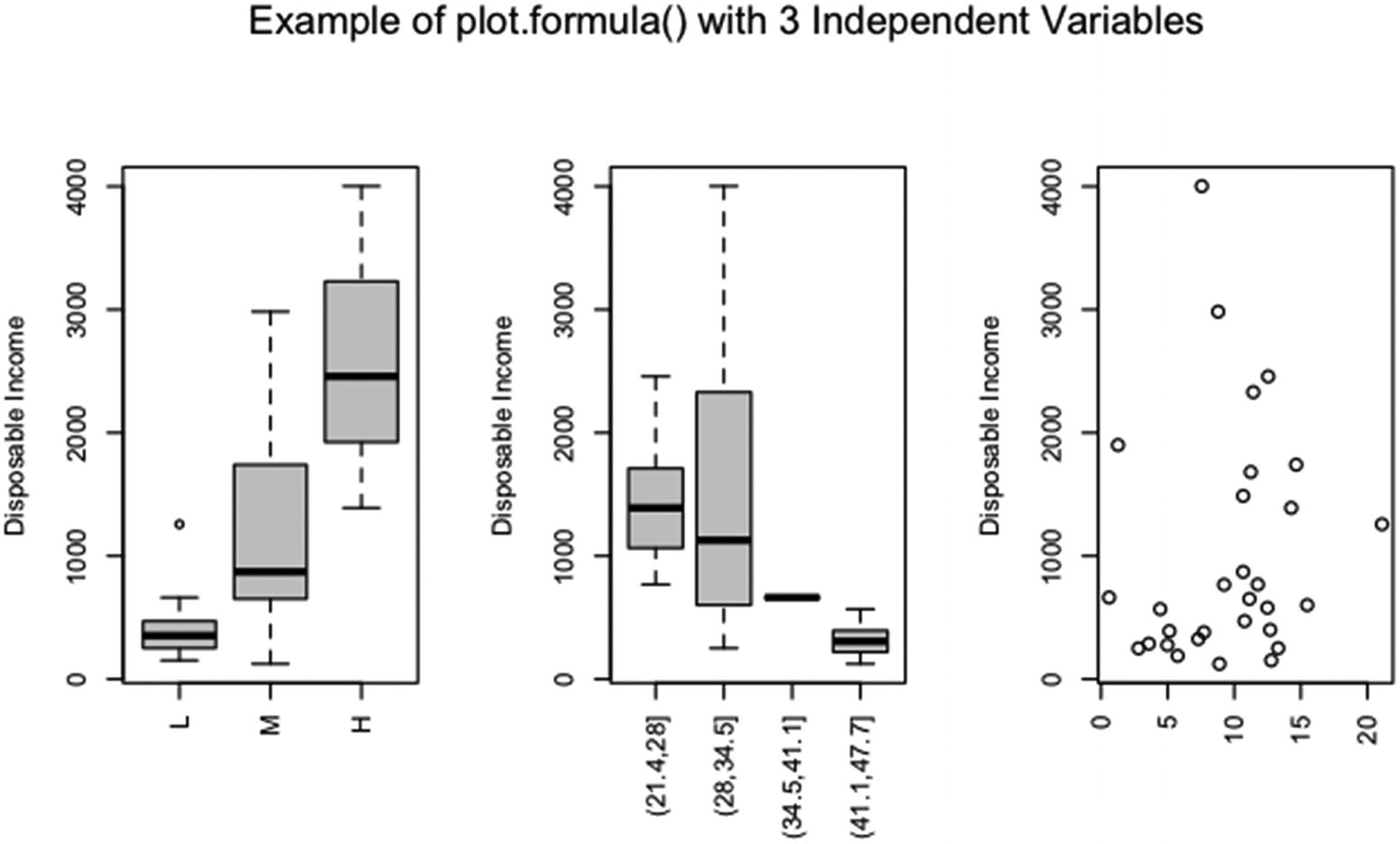
An example of using formula, data, subset, ylab, ask, las, and xlab in plot()
The argument formula takes the form dpi ~ .. Since the argument data is set to LCS, the period after the tilde tells R that all of the variables in LCS are to be used as independent variables except the assigned dependent variable.
Only the middle 30 observations are plotted, since subset equals 11:40. The y axis label has been changed to “Disposable Income”. The argument ask is set to FALSE, since the plots are plotted together in one graphic (which is done by setting mfrow in par() and will be covered in Section 6.2.1). Note that the x labels have been suppressed and the x axis tick labels are plotted vertically.
The three plots are against the percentage of the population over age 75, the percentage of the population under age 15, and the ratio of aggregate personal savings to disposable income. Since the first two variables are factor variables in the data frame LCS, the first two plots contain boxplots.
5.2.4 The function Method
The function method for plot() plots an object of the function class. Objects of the function class are either canned R functions or created with the function() function . The function plot.function() is similar to the function curve(), and the two functions share the same help page. The arguments of plot.function() are a bit simpler than those of the function curve(), but the method gives essentially the same result.
The plot.function() function takes six specified arguments as well as the arguments of curve() – with the exception of the argument expr in curve() (see Section 4.3.2 for a discussion of the arguments of curve()). The six specified arguments of plot.function() are x, for the function definition or function name; y, for the starting value of the variable input into the function; to, for the ending value of the variable input into the function; from, an alias of y; xlim, for the limits on the x axis of the plot; and ylab, for the label on the y axis.
The x argument can be a written function definition (e.g., function( z ) z +1) or the name of a function – including user-defined functions. The function must take only one argument and must return only one value for each value of the input variable. There is no default value for x.
The y, to, and from arguments take logical, numeric, complex, or character vectors of arbitrary length. The vectors are coerced to mode numeric, and only the first value is used. If from is specified, then from takes precedence over y. The default value of y is 0, of to is 1, and of from is y. (If from is specified as equal to y in the call to plot(), then plot() looks in the workspace for a value for y; and if y is not found, an error is given.)
The xlim argument takes a two-element vector of the raw, logical, numeric, or character mode. If not numeric, the vector is converted to the numeric mode. If y and to are not specified and xlim is, the values in xlim are used for y and to. The default value of xlim is NULL – that is, use the (possibly default) values of y and to for the x limits.
The ylab argument takes a character vector (or a vector that can be coerced to character) of arbitrary length. The elements of ylab are plotted on consecutive lines in the plot margin, starting at the default line used for axis labels. The default value of ylab is NULL – which plots the value of the argument x as the y label.
Code to demonstrate the use of x, y, to, xlim, and xlab in plot() when x is a function definition

An example of using x, y, to, xlim, and xlab in plot(), where x is a function definition
Note that the y axis label is the function definition and, since the variable z was used for the function definition, the x axis label has been changed to “z”. By default, the x axis label is “x”. The range of xlim is wider than the range of y and to, so the parabola does not plot as far as the x axis limits.
5.2.5 The histogram Method
Histograms are plots of the number of observations that fall into numeric classes, usually of equal width, within the range of a numeric vector. The numeric variable can be on the horizontal or vertical axis. The histogram method of plot() plots a histogram when x is set equal to an object of the histogram class or is set equal to a list with the correct structure for a histogram. Objects of the histogram class are created by a call to hist().
The plot.histogram() function takes 17 specified arguments plus many unspecified graphical parameters. Of the specified arguments, the values of only three are specific to plot.histogram().
The first seven arguments are x, for a list containing the specifications of the histogram; freq, for whether to plot frequencies or a probability density function; density, for lines per inch in the histogram rectangles if the rectangles are filled with lines; angle, for the angles of the lines in the histogram rectangles; col, for the colors of the histogram rectangles; border, for the colors of the borders of the rectangles; and lty, for the line type of the borders of the rectangles.
The argument x takes a list with six elements. The first element is named breaks and contains an increasing numeric vector of break points for the histogram rectangles. There is one more break point than there are rectangles.
The second element is named counts and is a numeric vector containing the number of observations that fall between each two break points. There should be one value for each rectangle.
The third element is named density and is a numeric vector with a value for each rectangle giving the height of the rectangle. The value that R calculates for the density is the count for a rectangle divided by this quantity: the total number of observations multiplied by the width of the rectangle. The values have the property that the areas of the rectangles sum to one – a fundamental property of a probability density.
The fourth element is mids, a numeric vector of the midpoints along the x axis of the rectangles. The fifth element is xname and is a one-element character vector containing the name of the object for which the histogram is drawn.
The sixth element is equidist and is a one-element logical vector. The value should be TRUE if the rectangles are all of the same width. Otherwise, the value should be FALSE.
An appropriate list for x can be generated by a call to the function hist(), for example, by setting x equal to hist( pop75.ordered, plot=FALSE ).
The second argument, freq, takes a single-element logical vector. If set equal to TRUE, the counts values are used for the histogram heights. If FALSE, the density values are used.
The third through seventh arguments density, angle, col, border, and lty are as in the ancillary function rect(). See Section 4.3.4.1 for more information.
The last ten arguments, except labels, are standard arguments from plot.default(), but some have default values specific to plot.histogram(). The arguments are main, sub, xlab, and ylab, for the title, subtitle, x axis label, and y axis label; xlim and ylim, for the limits of the x and y axes; axes, for whether to plot axes; labels, for whether to plot and what to put for labels above the histogram rectangles; add, for whether to add to an existing plot; and ann, for whether to plot the titles and axis labels. See Sections 3.2.1, 3.2.2, and 4.1 or the help pages for plot.default(), title(), and axis() for more information.
The default value of main is paste( "Histogram of", paste( x$xname, collapse=" " ) ). The default value of xlab is x$xname. The default value of xlim is range( x$breaks ). The default values of axes, add, and ann are TRUE, FALSE, and TRUE, respectively.
The labels argument can be either logical or a character vector of arbitrary length. If set to TRUE and freq is also set to TRUE, then the number of observations falling in the class of a rectangle (the count) is plotted above the rectangle.
If set to TRUE and freq is set to FALSE, then plotted above the rectangle is the count in a rectangle divided by the quantity: the total number of observations multiplied by the width of the rectangle. The result is taken out to three decimal places at most – depending on the width of the rectangles. If labels is FALSE, no labels are plotted.
If labels is a character vector and if the length of labels is less than the number of rectangles, then the elements of labels cycle out to the last rectangle. If the length of labels is the same as or larger than the number of rectangles, the elements will continue cycling through the rectangles until reaching the end of labels – overplotting the labels that were already above the rectangles as the cycling continues. The default value of labels is FALSE.
Code and output for an example of using x, freq, labels, and ylim in plot.histogram()
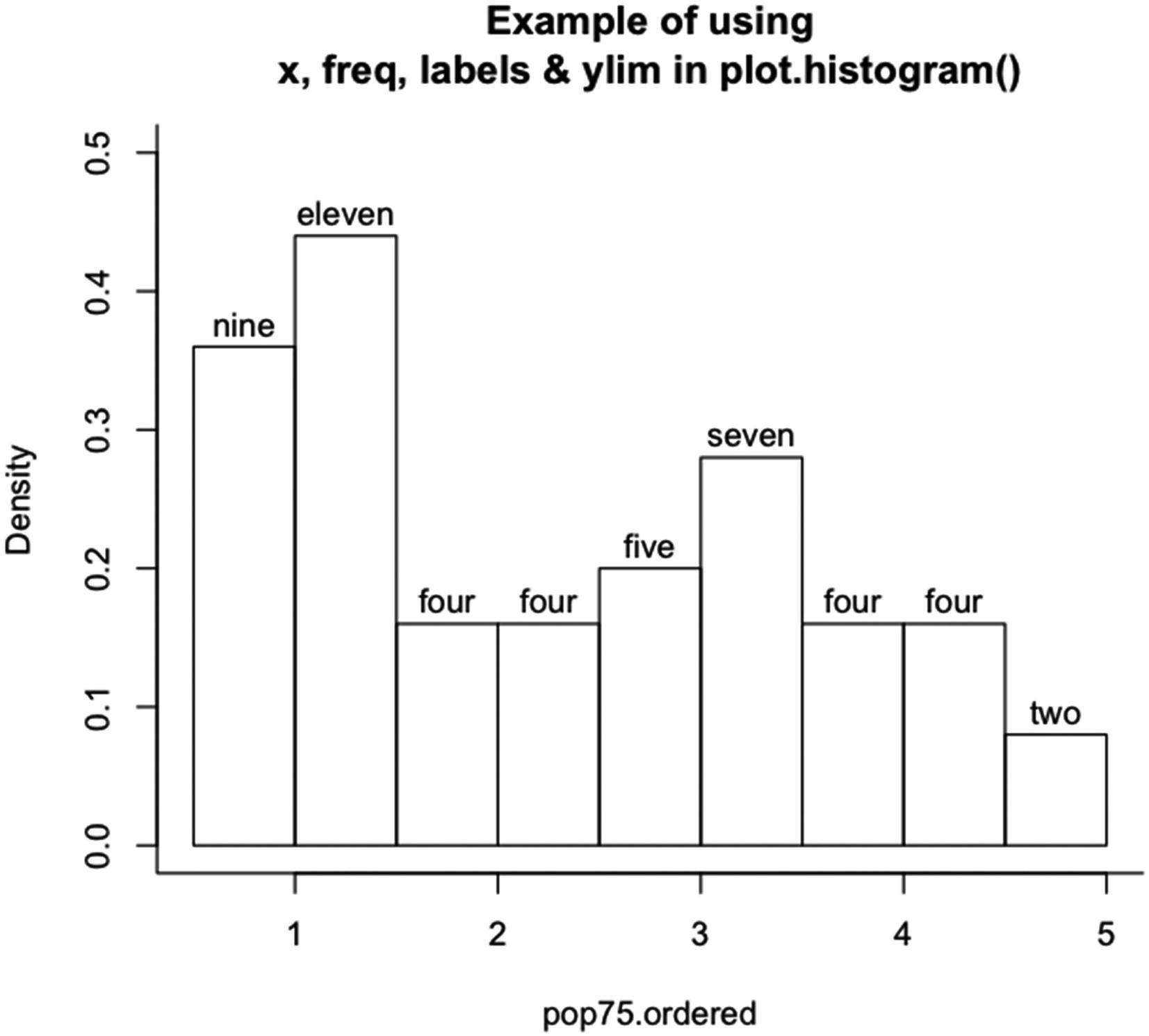
Example of using x, freq, labels, and ylim in plot.histogram()
Note that the y axis has been extended, because the top of the el in eleven was cut off with the default value of ylim. Also, the labels plot out the numbers in letter form. The size of the labels is determined internally. On the y axis, the values are for a probability density. An L-shaped box was added to the plot.
5.2.6 The raster Method
Raster objects are used in plotting images and are created out of rectangular grids – in the form of a vector or matrix of color values in R. The function plot() plots objects of the raster class. Objects of the raster class are created by the function as.raster(). The function as.raster() takes a vector or matrix and assigns color values based on the values in the object. By default, as.raster() gives a raster object with a gray scale. (See the help page for as.raster() for more information.)
When using plot.raster(), the matrix or vector to be plotted must be of the raster class. Otherwise, nothing plots. No annotation can be done in the call to plot(), but it can be added by using ancillary functions.
The plot.raster() function takes eight specified arguments, plus unspecified arguments used by plot.default() and rasterImage() (see Chapter 3 and Section 4.2.4.2). The arguments are x, for the raster object; y, which is ignored; xlim and ylim, for the limits of the x and y axes; xaxs and yaxs, for the style of edge spacing on the x and y axes; asp, for the aspect ratio; and add, for whether to add to an existing plot.
The x argument takes an object of the raster class. There is no default value for x.
The xlim and ylim arguments give the limits of the plotting region on which the raster object is plotted. Usually, only one is used by plot(); the other limits are calculated internally by plot(). The axis limits can be used to select a portion of an image, to resize an image, and/or to place an image at a specific place on a graphic. The default values of xlim and ylim are c( 0, ncol( x ) ) and c( 0, nrow( x ) ).
The xaxs and yaxs arguments are as in Section 3.4.5. By default, xaxs and yaxs are equal to “i”, that is, there is no margin between the edge of the plot and the limits of the plot.
The asp argument gives the ratio of a unit on the y axis to a unit on the x axis. By default, asp equals 1. That is, the actual length of a unit on the y axis equals the length of a unit on the x axis.
The add argument tells plot() whether to add to an existing plot or to create a new plot. The default value is FALSE, that is, create a new plot.
If the raster object is a vector, the object is always plotted vertically. If the object is a matrix with one row or column, the object is plotted vertically. If the object is a matrix with one row or one column and is transposed, the object is plotted horizontally.
The values used for locating the cells of a raster matrix (the x and y coordinates) are the values of the row and column indices minus one-half. That is, for a nr by nc raster matrix, the image plots from zero through nc on the x axis and zero through nr on the y axis. The arguments xlim and ylim can be set to affect the placement of the image in the plotting region.
The size of the plotting region is set by the pin argument of par(). The pin argument is a two-element numeric vector containing the lengths of the sides of the plotting region in inches – the length of the horizontal sides is given first and the length of the vertical sides second. The argument pin can only be set by a call to par() (see Chapter 6, Section 6.2.1.3).
How the raster image plots depends on the row and column dimensions of the matrix (or vector) and the ratio of the width and height of the plotting region. The function plot() figures which of xlim or ylim to extend to the horizontal or vertical limits of the plotting region based on whether the limits given for the other axis fit within the plotting region.
Say xlim is used for the limits of the x axis. To find the limits of the y axis, the range of the x axis is divided by two and then multiplied by the ratio of the height of the plotting region to the width of the plotting region. The result is then subtracted from and added to the mean of ylim. The two results give the limits of the y axis. That is, the limits on the y axis equal mean( ylim ) minus and plus ( max( xlim ) - min( xlim ) ) / 2 * par( "pin" )[ 2 ] / par( "pin" )[ 1 ]. The process gives an image that is centered on the mean of ylim.
If the ylim is extended, the y axis limits are set by ylim. The x axis limits are then mean( xlim ) minus and plus ( max( ylim ) - min( ylim ) ) / 2 * par( "pin" )[ 1 ] / par( "pin" )[ 2 ]. The placement of the image also depends on the argument asp.
For example, the volcano dataset is a matrix with 87 rows and 61 columns. Each row is one unit, and each column is one unit. Assume that the plotting region is such that the top and bottom of the image are at the edge of the plot. That is, the vertical axis goes from 0 to 87. Assume that, for the plotting region, the vertical to horizontal ratio is 0.86. Then 87 divided by 0.86 gives the range of the horizontal axis limits. The range would be 101 units. For the default value of xlim (c( 0, 61)), the mean of xlim is 30.5, so the image is centered at 30.5 on the x axis, which gives a lower limit of -20 and an upper limit of 81 on the x axis. The image does not fill out to the left and right edges of the plot if asp equals 1.
To plot the volcano dataset so that the image completely fills the plotting region, the following code works: plot( as.raster( 250-volcano, max=195 ), asp=( par( "pin" )[ 2 ]/87 )/( par( "pin" )[ 1 ]/61 ) ). The argument asp is then the inches per unit on the y axis divided by the inches per unit on the x axis. Given that the ratio of height to width for the plotting region is 0.86, for the preceding value of asp, a unit on the y axis would be about 0.6 the size of a unit on the x axis.
Code to plot the volcano dataset with and without setting asp in plot.raster()

Example of plotting a raster image of the volcano matrix using plot() without and with setting asp
Note that the axes and boxes were added to the plots to clarify how plotting works in plot.raster(). The function plot.raster() plots raster images without axes or annotation. Because the width and height of the individual plotting regions are not the same, the second plot is not to the scale of the matrix.
Code for the demonstration of plotting a raster matrix in Figure 5-7

Example of using plot.raster() on the matrix volcano, where as.raster() is run a function of volano
In Figure 5-7, the code in Listing 5-7 is run.
In Figure 5-7, the matrix in the volcano dataset has been put in reverse order for both the rows and the columns and then plotted. So the top of the plotted matrix is the bottom of the original matrix, and the left of the plotted matrix is the right of the original matrix. The reversal was done to put north on the top and west on the left.
5.2.7 The table Method
Tables tabulate or cross-tabulate data that is in columns. A table contains the number of observations in each group within the columns of the dataset. If there is more than one column, the columns are crossed with each other to find the unique groups. Cells of the table can contain zero. Tables are often used with data that contains measurements of the presence, absence, or class of a property of the observations.
The table method for plot() plots objects of the table class. An object of the table class can be created by using the table() function on classified data or by using the function as.table() on a numeric vector, matrix, or array. The function table() creates a contingency table, and as.table() gives an object of the numeric mode (with nonnegative values) the table class.
The function plot.table() draws bars for the count in each class if the table is based on one variable. If the table is based on more than one variable, the function plots a mosaic plot of the variables.
The function has seven specified variables and also takes many of the arguments used by plot.default(). The arguments are x, for the object of the table class; type, for the type of plot; ylim, for the limits of the y axis; lwd, for the width of the plotted lines; xlab and ylab, for the labels on the x and y axes; and frame.plot, for whether to put a box around the plot. The arguments type, ylim, lwd, and plot.frame only affect plots of a single variable, not the mosaic plots.
The argument x can be any object of the table class. The argument has no default value.
The argument type is the standard argument from plot.default() and can take the values “p”, “l”, “b”, “c”, “o”, “h”, “s”, “S”, and “n”. (See Section 3.3.1 for more information.) The default value of type in plot.table() is “h”.
The arguments ylim, lwd, xlab, and ylab are the standard arguments from plot.default(). (See Sections 3.2.1 for ylim, xlab, and ylab and 3.4.4 for lwd.) The default value of ylim equals c( 0, max( x ) ). The default value of lwd equals 2. The default values of xlab and ylab equal NULL.
The argument frame.plot takes a logical vector (or a vector that can be coerced to logical) of arbitrary length. Only the first value is used. If set to TRUE and the plot is of bars, the argument bty can be used to set the box type (see Section 3.2.2). The default value of frame.plot is is.num – which takes the value of TRUE when the names of the variables can be coerced to numeric. Otherwise, the value is FALSE.
Code for the example, in Figure 5-8, of plotting single-variable and two-variable contingency tables with plot(), using x, ylim, lwd, lend, main, xlab, ylab, frame.plot, and bty
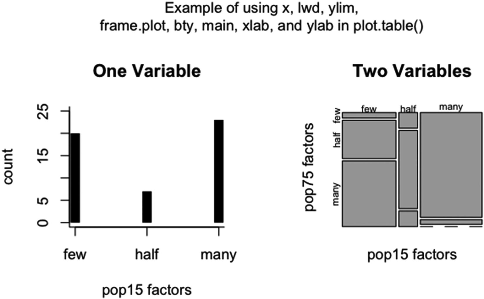
An example of using x, ylim, lwd, lend, main, xlab, ylab, frame.plot, and bty in two calls to plot.table()
Note that in the first plot there is a space between the bars and the axis. Setting xaxs to “i” would move the axis up to 0 and eliminate the gap. Also, for the bars, lwd was set to 10, and lend was set to a square line end. The default gives rounded line ends. Since frame.plot was set to TRUE in the first plot, the box type was set to “l” for an L-shaped box.
5.3 The Methods for plot() in the stats Package
The methods for the plot() function in the stats package are used to plot output from a variety of functions used for statistical analysis. For example, there are methods for linear regression, dendrograms, and principal component analysis. In all, there are 20 methods for plot() in the stats package.
The methods for plot() in the R stats package
Function | Description |
|---|---|
“plot.acf | Plot Autocovariance and Autocorrelation Functions” |
“plot.decomposed.ts | Classical Seasonal Decomposition by Moving Averages” |
“plot.dendrogram | General Tree Structures” |
“plot.density | Plot Method for Kernel Density Estimation” |
“plot.ecdf | Empirical Cumulative Distribution Function” |
“plot.hclust | Hierarchical Clustering” |
“plot.HoltWinters | Plot function for HoltWinters objects” |
“plot.isoreg | Plot Method for isoreg Objects” |
“plot.lm | Plot Diagnostics for an lm Object” |
“plot.ppr | Plot Ridge Functions for Projection Pursuit Regression Fit” |
“plot.prcomp | Principal Components Analysis” |
“plot.princomp | Principal Components Analysis” |
“plot.profile.nls | Plot a profile.nls Object” |
“plot.spec | Plotting Spectral Densities” |
“plot.spec.coherency | Plotting Spectral Densities” |
“plot.stepfun | Plot Step Functions” |
“plot.stl | Methods for STL Objects” |
“plot.ts | Plotting Time-Series Objects” |
“plot.tskernel | Smoothing Kernel Objects” |
—Help page in R for the stats package
Each of the methods in the table is covered in this chapter. Examples are given for the methods.
5.3.1 The acf Method
Autocorrelation and autocovariance plots and partial autocorrelation and partial autocovariance plots (or cross-correlation and cross-covariance plots) are used in time series analysis to visually assess the amount of autocorrelation within a vector of numbers (or cross-correlation for two vectors). Usually the vector(s) contains observations that are equally spaced in time or space.
The acf method of plot() plots objects of the acf class. Objects of the acf class are created by the functions acf(), pacf(), and ccf(). The functions acf(), pacf(), and ccf() calculate and plot autocorrelations and autocovariances (acf()), partial autocorrelations and partial autocovariances (pacf()), and cross-correlations and cross-covariances (ccf()) for numeric (usually time series) vectors or matrices – that is, objects of the numeric class or mode (usually of the ts class).
The plot.acf() function takes 17 specified arguments, plus many of the arguments that plot.default() takes. The first nine arguments are x, for the object of the acf class; ci, for the level(s) of the confidence of the confidence interval(s) that is (are) plotted; type, for the plot type; xlab and ylab, for the labels on the x and y axes; ylim, for the limits on the y axis; main, for the title of the plot; ci.col, for the confidence interval color(s); and ci.type, for the type of confidence interval.
The x argument takes an object of the acf class. There is no default value for x.
The ci argument takes a numeric vector with elements that are greater than or equal to zero and less than one. A confidence interval is plotted for each value. A value of 0 suppresses the confidence interval. The default value of ci is 0.95.
The type argument is the standard argument from plot.default() (see Section 3.3.1). The default value of type is “h”.
The xlab, ylab, ylim, and main arguments are the standard arguments from Section 3.2.1. The default value of xlab is “Lag”. The default values of ylab, ylim, and main are NULL.
The ci.col argument takes a vector of color values (see Section 3.4.1) of arbitrary length. The colors cycle in the following way: The first color is assigned to the first confidence level line above the line at zero. The second to the second confidence level line. And so on until all of the lines above zero are assigned a color. Then, the lines below zero are assigned colors starting with the line closest to zero. The default value of ci.col is “blue”.
The ci.type argument takes NULL or a one-element character vector that can take on the value “white” or “ma”. The values NULL and “white” tell plot to use the assumption that the errors are white noise to generate the confidence intervals and multiple intervals do not cause a problem.
The value “ma” tells plot() to assume a moving average time series with the order of the time series being one less than the lag being calculated (see the help page for plot.acf()). Only one interval can be calculated if ci.type equals “ma”. The default value for ci.type is c("white", "ma"), that is, use “white”.
The tenth through sixteenth arguments are used to make the plotting of acf objects with multiple time series easier. The arguments cannot be changed – at least on my device.
The seven arguments are max.mfrow, to tell plot() how many series to plot on a page if there are multiple series; ask, to tell plot() whether to ask the user for a response before going on to a new plotting page; mar, for setting the margins of the plot(s); oma, for setting the outer margins of the page; mgp, for setting the lines on which the axis labels and subtitles plot; xpd, for whether to expand the plotting region; and cex.main, for the character size of the plot titles. The arguments are included because the arguments have special default values in plot.acf().
For max.mfrow, the value is 6, for a maximum of 36 plots per page – six rows and six columns. (The mfrow argument is covered in Section 6.2.1.5.)
For ask, the default value is Npgs > 1 && dev.interactive(), that is, if there is more than one page and the device allows interaction with the user, then ask is set to TRUE. Otherwise, ask is FALSE.
For mar, oma, and mgp, the arguments take the respective values in par() if the number of time series is less than three. Otherwise, the respective values are c(3, 2, 2, 0.8), c(1, 1.2, 1, 1), and c(1.5, 0.6, 0). Both mar and oma are covered in Sections 6.2.1.1 and 6.2.1.2, and mgp is covered in Sections 4.1 and 4.2.1.
The argument xpd takes the value of xpd in par(). The argument cex.main takes a value of 1 if the number of time series is greater than two. Otherwise, cex.main has the value of cex.main in par().
The 17th argument is verbose, for the level of information to return. The default value is the value of verbose in options() – which on my device is FALSE (found by running getOption( "verbose" )).
Most of the arguments to plot.default() in Chapter 3 can be set. However, font.main, col.main, and cex.main cannot be set.

Examples of using plot() to plot output from acf(), pacf(), and ccf(). The first plot is of output from acf(), the second from pacf(), and the third from ccf(). The arguments x, ci, type, ci.col, ci.type, and main were set
Code for the examples of plotting output from acf(), pacf(), and ccf() using plot(). The arguments x, ci, type, ci.col, ci.type, and main are set
In Figure 5-9, the code in Listing 5-9 is run.
Sunspots have a known cycle of slightly less than 11 years. In the third plot, the cross-correlations between the sunspot series lagged by 11 years and the current sunspot series are given – just for an example. Note that, for the first and third plots, the lags are over 150 years and, for the second plot, the lags are over 10 years.
For the first plot, type is set to “l” – for a line plot. In the second and third plots, type is set to “h” – for histogram bars (the default value). For the first plot, ci.type is set to “ma” – for moving average – so only one confidence interval can be calculated. In the second and third plots, ci.type takes the value “white” – for white noise – so two confidence intervals can be and are calculated.
5.3.2 The decomposed.ts Method
For seasonal time series data with a trend, the time series can be decomposed into three time series. The three time series give the trend within the data, the seasonal component of the data based on the given frequency of the time series, and the residuals found by subtracting the combined trend and seasonal components from the original series.
The decomposed.ts method for plot() plots objects of the decomposed.ts class. Objects of the decomposed.ts class are created by the decompose() function. The decompose() function decomposes a time series, based on the frequency of the time series, using an autoregressive method.
The decomposition returns a list containing the original data, the trend in the data, the seasonal component of the data, the random component of the data, and the type of decomposition. The function plot() plots the first four elements of the list in four separate plots and gives the type of decomposition in the title.
The help page for plot.decomposed.ts() and the help page for decompose are the same page. However, there is no function plot() under Usage on the help page, so no specific plotting parameters are set.
The function decompose() takes three arguments, x, for the time series; type, for the type of decomposition; and filter, to manually enter numeric values to filter the seasonal component.
The x argument is the time series and takes an object of the ts class. The frequency of the time series must be greater than or equal to two. The value of x can contain more than one time series, but plot() does not perform well in the case of more than one time series. There is no default value for x.
The type argument takes a one-element character vector that has the value “additive” or “multiplicative”. If type equals “additive”, then an additive model is used. If type equals “multiplicative”, a multiplicative model is used. (The strings “additive” and “multiplicative” can be shortened and still be recognized by decompose().) The default value of type is c("additive", "multiplicative"), that is, the additive method is used.
The filter argument takes a numeric vector of a length less than the following quantity: two plus the length of the time series minus the frequency of the time series. The filter should be in reverse of the time order. If filter is given the value of NULL, then a symmetric moving average model is used to find the seasonal component. The default value of filter is NULL.
For an object created by decompose(), no changes can be made to main, sub, and ylab in the call to plot(), but xlab can be set. Most of the other arguments in Chapter 3 can be set. However, the font weight for a plotting character cannot be set. The family argument and the other font arguments can be set. The ancillary function mtext() can be used to put information about the plot onto the figure.
Code for the example of running plot() and decompose() together – lwd=2, lty=3, col=grey( 0.25 ), and xlab=”Eleven Year Cycles”

Example of using plot() and decompose() together. The arguments to plot(), lwd, lty, col, and xlab, are set
In Figure 5-10, the code in Listing 5-10 is run.
Note that only the x axis label could be changed and that mtext() is used to include the information about the dataset. A line width of 2 and a line type of “dotted” are used. The color in the plots is grey( 0.25 ). The method of decomposition is the multiplicative method.
5.3.3 The dendrogram Method
The dendrogram is directly represented as a nested list where each component corresponds to a branch of the tree.
—The help page for dendrogram in R
The structure of a list that has the dendrogram class is given at the help page for dendrogram. An object of the appropriate structure – for example, the output from hclust() – can be converted to the dendrogram class by running as.dendrogram().
Dendrograms are made of lines that branch to new lines. The places where the lines branch are nodes. The final branches are leaves. Both the nodes and the leaves can be labeled.
The plot.dendrogram() function takes 16 specified arguments and many of the arguments used by plot.default(). The first eight arguments take values specific to the method. The eight arguments are x, for the object of the dendrogram class; type, for the type of dendrogram to plot; center, for the location of a node along the line from which the branch originates; edge.root, for whether to put a branch above the first line; nodePar, for the properties of the nodes; edgePar, for the properties of the lines making up the tree and any text used to label the nodes; leaflab, for whether to plot and how to orient the labels of the leaves; and dLeaf, for the distance between the tree and the leaf labels.
The x argument takes an object of the dendrogram class. There is no default value for x.
The type argument is a character vector and can take one of two values – “rectangle” or “triangle”. The choice of “rectangle” plots a rectangular tree. The choice of “triangle” plots a triangular tree. The default value is c( "rectangle", "triangle" ), which gives a rectangular tree.
The center argument takes a single-element logical vector (or a vector that can be coerced to logical). The value TRUE tells plot() to use the position of the leaves to locate a node on a line. The value FALSE tells plot() to position the nodes at the center of the line containing the node. The choice of TRUE gives a narrower plot. The default value is FALSE.
The edge.root argument takes a one-element logical vector (or a vector that can be coerced to logical). A value of TRUE tells plot() to plot a branch into the first line. The value FALSE tells plot() to not plot the branch. The default value is is.leaf(x) || !is.null( attr(x, "edge.text" ) ).
The nodePar argument takes a list, if used, and the value of NULL otherwise. The argument tells plot() what to plot at the nodes and leaves. There can be up to five elements in the list which are each named one of the following: pch, col, cex, xpd, or bg – for the plotting character, the outline color for the plotting character, the character size, the expansion choice, and the fill color for the plotting characters 21–25 (see Sections 3.2, 3.3, and 3.4).
The elements of the list can have one or two values. If one value long, the property is applied to both the nodes and the leaves. If there is a second value, the first value affects the nodes, and the second value affects the leaves. The default value of nodePar is NULL, that is, do not annotate the nodes.
The edgePar argument takes a list, if edgePar is used, and otherwise takes the value NULL. The list is up to seven elements long, and each element is named one of the following – col, lty, lwd, p.col, p.lty, p.lwd, and t.col.
Each element can take one or two values. If only one value is supplied, and depending on the name of the value, the setting is applied to all of the lines, node label polygons, or node labels. If two values are supplied, the first value applies to all of the nodes down to the lines to the leaves, while the second value applies to the leaves and the lines into the leaves.
The values named col, lty, and lwd apply to the lines making up the tree and are the standard col, lty, and lwd of plot.default(). The values named p.col, p.lty, and p.lwd affect the polygons that are drawn around labels for the nodes – if the nodes are labeled – and act like the standard col, lty, and lwd.
The value named t.col gives the color of the text if the nodes are labeled and takes color values. The default value of edgePar is list() – that is, segments and polygons are black, with solid lines of width 1, and the text is black.
The leaflab argument takes a character vector with one of three possible values – “perpendicular”, “textlike”, or “none”. If the value is “perpendicular”, the leaf labels are plotted perpendicularly to the tree. If leaflab is set to “textlike”, the leaf labels are plotted parallel to the tree and in polygons. If set equal to “none”, no labels are plotted. The default value of leaflab is c( “perpendicular”, “textlike”, “none” ), that is, the labels are plotted perpendicularly.
The dLeaf argument takes a numeric vector of arbitrary length. If dLeaf is longer than one, each label is plotted n times – where n is the length of dLeaf – each time at the distance given by the respective value in dLeaf. Usually, just one value is used in dLeaf. A large value – like 100 – is necessary to see the effect of dLeaf. The default value of dLeaf is NULL – which gives a space of about three-quarters of a character size in the direction perpendicular to reading (height for text parallel to the tree and width for text perpendicular to the tree).
The ninth through sixteenth arguments of plot.dendrogram() are xlab and ylab, for the x and y axis labels; xaxt and yaxt, for the x and y axis types; horiz, for the orientation of the tree; frame.plot, for whether to frame the plot; and xlim and ylim, for the x and y axis limits. Most of the arguments are the standard arguments to plot.default() but have different default values than in plot.default().
The xlab and ylab arguments take character vectors of arbitrary length. The default value for the arguments is “ “.
The xaxt and yaxt arguments take character vectors of arbitrary length. Only the first element is used which must take on a value of “s”, “l”, “t”, or “n”. The first three values give the same result – a standard axis. The value of “n” suppresses the axis. The default value of xaxt is “n” and of yaxt is “s”.
The horiz argument takes a logical vector (or a vector that can be coerced to logical) of arbitrary length. If the length is greater than one, a warning is given and only the first value is used. If set to TRUE, a horizontally oriented tree is plotted. If FALSE, a vertically oriented tree is plotted. The default value is FALSE.
The frame.plot argument is a logical vector (or a vector that can be coerced to logical) of arbitrary length. If the value of frame.plot is longer than one element, only the first element is used and a warning is given. If set to TRUE, a box is plotted around the tree. If set to FALSE, no box is plotted. The default value is FALSE.
For the example, there are 50 leaves, and the x values of the leaves go from 1 to 50. Also, the height is given as 3912.968, so the maximum value of y is 3912.968. The minimum value of y is 0. There are no default values for xlim and ylim – R chooses good values.
Code for the example of using plot() to plot an object of the dendrogram class. The argument axes is set to FALSE

Example of creating and plotting a dendrogram using the defaults of dist(), hclust(), and as.dendrogram(). The plot() argument axes is set to FALSE
In Figure 5-11, the code in Listing 5-11 is run.
The bottom margin of the plot is increased by two lines to accommodate the labels on the leaves. The left and right margins are reduced to 0.1 line width for the plot. The margins are reset to the default values after the plot is plotted. The left axis is suppressed.
5.3.4 The density Method
Probability distribution functions, also called probability densities, are the basis of inferential statistics. There are many probability densities that are based on mathematical functions. The densities are estimated by estimating parameters of the mathematical functions. Density functions can also be estimated directly from the data. The density method of plot() plots probability densities estimated directly from the data. Probability densities have the property that the area under the curve is equal to one.
The density method for plot() plots objects of the density class. Objects of the density class are created by the density() function. The density() function estimates probability densities using the kernel method of density estimation.
The plot.density() function takes six specified arguments plus many arguments used by plot.default(). The six arguments are x, for the output from density(); main, xlab, and ylab, for the title and x and y axis labels; type, for the plot type; and zero.line, for whether to plot a line at y equal to zero.
The x argument takes objects of the density class. There is no default value for x.
The main, xlab, and ylab arguments take character vectors of arbitrary length. The default value for main is NULL, for which plot() plots the value of x as the title. For xlab the default value is NULL, for which the number of observations and the kernel bandwidth are plotted as the label of the x axis. For ylab, the default value is “Density”.
The type argument is the standard argument from plot.default(). In plot.density() the default value is “l”, that is, a line is plotted.
The zero.line argument takes a logical vector (or a vector that can be coerced to logical) of arbitrary length. If longer than one element, only the first element is used and a warning is given. If set to TRUE, plot() should put a line at y equal to 0. On my device, no line is plotted. The default value is TRUE.
Code for the example given in Figure 5-12 of using the defaults in plot.density() and density() to plot an estimated probability density of the variable pop75.ordered
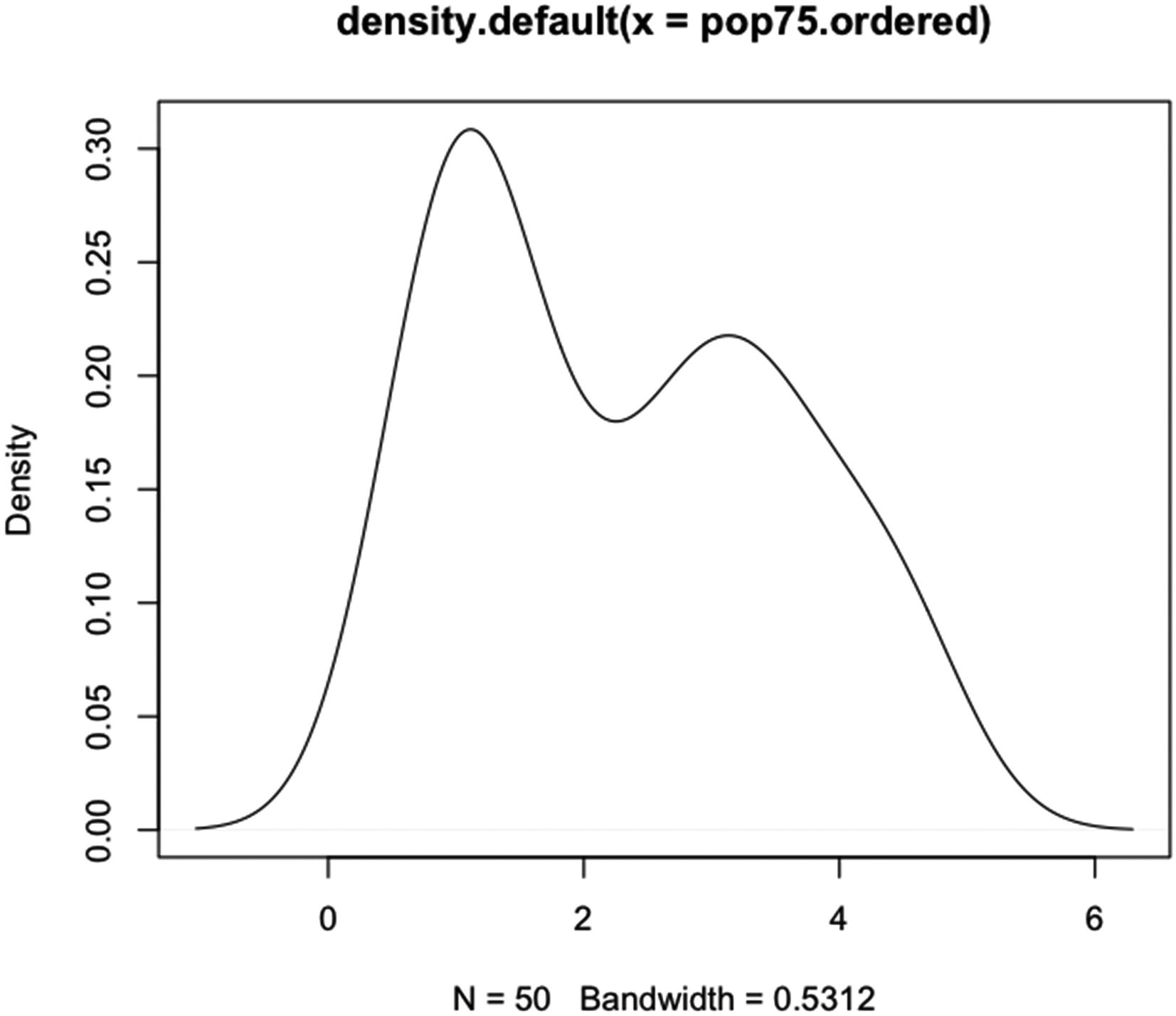
Example of using the defaults for plot.density() and density() to plot an estimated probability density of the variable pop75.ordered
Note than no line is drawn at y equal to 0, even though the default value for zero.line is TRUE.
5.3.5 The ecdf Method
The cumulative distribution function, plotted against x, is the integral from minus infinity to x of the probability density function. The values of the cumulative distribution function go from zero to one, and the function is nondecreasing. (The integral is done over some combination of the real line and the counting measure, depending on the underlying measure of the probability density.)
The ecdf method for plot() plots objects of the ecdf class. Objects of the ecdf class are created by the ecdf() function. The ecdf() function creates an empirical cumulative density function out of a numeric vector. An empirical cumulative density function is a nondecreasing function that steps from zero to one over the range of the data. The function steps up where there is a data point.
In ecdf(), the data is a numeric vector (or an object that can be coerced to a numeric vector) and is sorted internally before the step function is created. See the help page for ecdf() for more information.
The plot.ecdf() function takes five specified arguments plus arguments used by the plot.stepfun() function. The five specified arguments are x, for the object of the ecdf class; ylab, for the y axis label; verticals, for whether to plot the vertical parts of the steps; col.01line, for the colors of lines at y equal to 0 and 1; and pch, for the plotting character at the top of each step. In the order of the arguments, … is the second argument.
The x argument takes an object of the ecdf() class. There is no default value for x.
The ylab argument is the standard argument from plot.default(). The default value of ylab in plot.ecdf() is “Fn(x)”.
The verticals argument takes a logical vector (or a vector that can be coerced to logical) of arbitrary length. If longer than one element, only the first element is used and a warning is given. If set to TRUE, the vertical parts of the steps are drawn. If FALSE, the vertical parts are not drawn. The default value of verticals is FALSE.
The col.01line argument takes a vector of color values of arbitrary length (see Section 3.4.1 for kinds of color values). Only the first and second values are used if the length of col.01line is greater than 2. If there is only one color, both the zero line and the one line are the given color. Otherwise, the zero line takes the first color, and the one line takes the second color. The default value in ecdf() is “gray70”.
The pch argument takes a vector of plotting character values (see Section 3.3.2) of arbitrary length and is the standard argument used in plot.default(). The values of pch cycle through the plotted points. In plot.ecdf(), the default value of pch is 19.
Code to demonstrate plot.ecdf() with verticals, col.01line, pch, and cex set

Example of running plot.ecdf() and ecdf(), with verticals=TRUE, col.01line=grey( c( 2, 4 )/10 ), pch=“.”, and cex=4 in plot.ecdf()
In Figure 5-13, the code in Listing 5-13 is run.
Note that the line at 1 is lighter than the line at 0. Also, solid lines extend from the distribution to the left at y equal to 0 and to the distribution from the right at y equal to 1. Setting pch to “.” and increasing cex is a useful way to plot small points – as has been done in the figure.
5.3.6 The hclust Method
Hierarchical clustering is a method of putting observations into clusters based on a dataset of variables associated with the observations. The hclust method for plot() plots objects of the hclust class. Objects of the hclust class are created by the hclust() function or by running as.hclust() on an object with an appropriate structure. (The help pages for hclust() and as.hclust() give the structure and other information.) The function hclust() does hierarchical clustering.
The plot.hclust() function takes 11 specified arguments plus many of the arguments used by plot.default(). The specified arguments are x, for the object of the hclust class; labels, for the labels of the leaves on the tree; hang, for the length of the branch that branches to a leaf label; check, to check if x has a valid format; and the standard axes, frame.plot, ann, main, sub, xlab, and ylab from plot.default() – with defaults specific to plot.hclust().
The x argument takes an object of the hclust class. There is no default value for x.
The labels argument takes a character vector (or a vector that can be coerced to character) that must be NULL, FALSE, or of a length equal to the number of observations being clustered. If labels equals NULL, plot.hclust() uses the row names of the observations as labels, if the row names exist, or else the index numbers of the observations. If labels equals FALSE, no labels are plotted. Otherwise, the given labels are plotted. The default value of labels is NULL.
The hang argument takes a numeric vector of arbitrary length. Only the first value is used. Negative values for hang cause all of the leaves to end at the zero line and all of the labels to line up in a row at a constant distance below the zero line.
A value of 0 tells plot() to use leaves of zero length. The resulting leaf locations can be at different heights. As hang increases, the length of the leaves increases proportionately to the size of hang. When hang equals 1, the length of the leaves plus the distance from the end of the leaves to the labels equals the length of the y axis. The default value of hang is 0.1.
The check argument takes a logical vector (or a vector that can be coerced to logical) of arbitrary length. Only the first value is used. If set to TRUE, plot.hclust() checks to see if the structure of x is a valid hclust class structure. If set to FALSE, the function does not check. The default value is TRUE (see the help page for hclust() for more information).
The default value of axes is TRUE – that is, axes are plotted. The default value of frame.plot is FALSE – that is, no box is drawn around the plotting region. The default value of ann is TRUE – that is, titles and axis labels are drawn. The default value of main is “Cluster Dendrogram”. The default values of sub and xlab are NULL. The default value of ylab is “Height”.
Code for the example in Figure 5-14 of using plot() with an hclust class x value. The arguments labels and hang are set

Example of using plot.hclust(), hclust(), and dist(), with labels and hang set in plot.hclust() and default values used in hclust() and dist(). The source of the data is the LifeCycleSavings dataset in the R datasets package
Note that the clustering differs from the clustering in the dendrogram in Section 5.3.3. Only one column of the LifeCycleSavings dataset was used in Figure 5-14, whereas three were used in Figure 5-11. In the preceding plot, hang was set to 0, so the leaves are of zero length.
5.3.7 The HoltWinters Method
Holt-Winters filtering is a technique used to model time series data. The HoltWinters method for plot() plots objects of the HoltWinters class. Objects of the HoltWinters class are created by running the function HoltWinters(). The function HoltWinters() performs Holt-Winters filtering on time series objects for which the frequency is greater than or equal to two. The observations and the fitted values from the Holt-Winters model are plotted by plot(). Values predicted into the future can also be plotted, with or without confidence intervals.
The function plot.HoltWinters() takes 15 specified arguments, as well as taking many of the arguments of plot.default(). The first four arguments are x, for the object of the HoltWinters class to be plotted; predicted.values, for plotting predicted values into the future; intervals, for whether to include confidence intervals if predicted values are calculated; and separator, for whether to plot a vertical line between the observation and fitted value portion of the plot and the predicted value and confidence interval portion of the plot.
The x argument takes an object of the HoltWinters class. There is no default value for x.
The predicted.values argument can take two kinds of values, NA or output from the function predict() – where the object of the HoltWinters class is the model in predict(). The number of time periods into the future to be found must be included in the call to predict(). Whether to include confidence intervals must be set in predict() if confidence intervals are to be plotted. (See the help page for predict.HoltWinters() for more information.) The default value of predicted.values is NA, that is, do not plot predicted values or the separator line.
The intervals argument takes a logical vector (or a vector that can be coerced to logical) of arbitrary length. Only the first value is used. If intervals is set to TRUE and predicted values have been calculated and calculated with confidence intervals, then confidence intervals are plotted. Otherwise, no confidence intervals are plotted. The default value of intervals is TRUE.
The separator argument takes a logical vector (or a vector that can be coerced to logical) of arbitrary length. Only the first value is used. If set to TRUE and predicted values have been calculated, then the separator line is plotted. Otherwise, no line is plotted. The default value of separator is TRUE.
The fifth through twelfth arguments are col, col.predicted, col.intervals, col.separator, lty, lty.predicted, lty.intervals, and lty.separator. The first four specify the color of the observation line, the line of fitted values, the line of predicted values, and the separator line, respectively. The four arguments take vectors of color values of arbitrary length. Only the first value is used. The respective default values are 1, 2, 4, and 1. (See Section 3.4.1 for color value formats.)
The second four arguments specify the line type of the observation line, the fitted value and predicted value line, the confidence interval lines, and the separator line. The arguments take vectors of line type arguments of arbitrary length. Only the first value is used. The respective default values are 1 (or “solid”), 1, 1, and 3 (or “dotted”). (See Section 3.3.2 for information about line type formats.)
The 13th through 15th arguments are the standard ylab, main, and ylim (see Section 3.2.1 for more information). The default value of ylab is “Observed/Fitted” and of main is “Holt-Winters filtering”. According to the help page for plot.HoltWinters(), if ylim is set to NULL, the function chooses limits that contain the observations, fitted values, and predicted values. The default limits may not be large enough for the confidence intervals. The default value of ylim is NULL.
Code for the example in Figure 5-15 is given. The functions plot(), HoltWinters(), predict(), and ts() are used. The frequency is set in ts(); the number of time periods to predict and to calculate prediction intervals is set in predict(); and col, col.predicted, col.intervals, and ylim are set in plot()
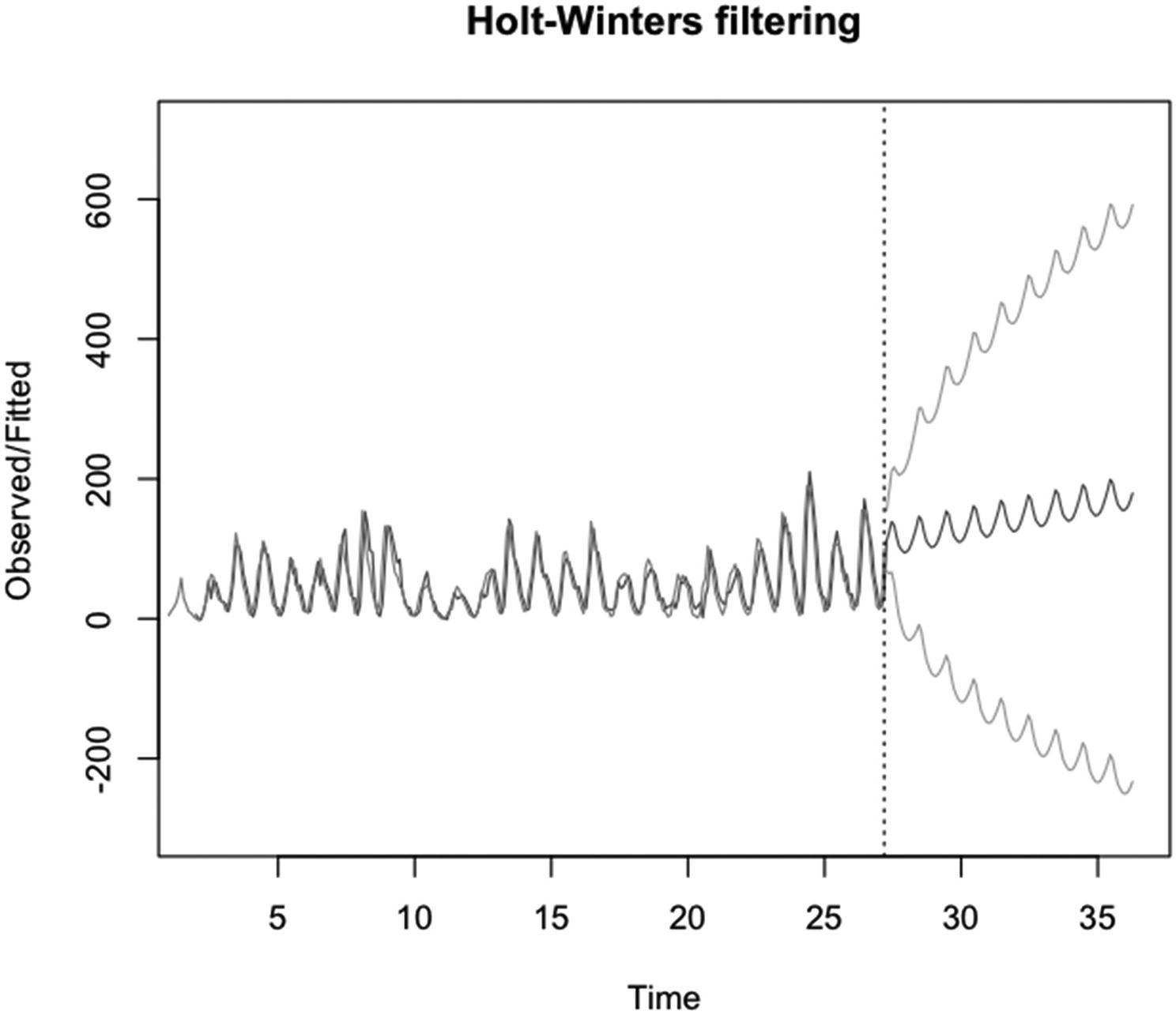
An example of using plot() on an object of the HoltWinters class. The functions ts(), predict(), HoltWinters(), and plot() are run
In Figure 5-15, the code in Listing 5-15 is run.
Note that the frequency of the time series is set to eleven in ts() – the function that creates time series objects. The number of predicted values is set to 100 in predict(). The observations are plotted in a mid-gray, the fitted and predicted values in a dark gray, and the confidence interval in a light gray.
The y axis limits are set to -300 and 700 so that both confidence intervals are included in the plot. Since 0 is the minimum possible value of y for this dataset, the lower confidence limit is not sensible.
5.3.8 The isoreg Method
Isotonic regression is a form of nonparametric regression for two variables that are positively correlated. The isoreg method of plot() plots objects of the isoreg class. Objects of the isoreg class are created by the function isoreg(). From the help page for isoreg(), the function does isotonic regression – which is a nonparametric technique that fits a monotonically increasing series of horizontal lines (with the endpoints connected by vertical lines).
The isoreg() function fits a regression model by finding the model that minimizes the sum of residual squares. The data can be a numeric vector, which is fit against an index value, or two numeric vectors with the second vector fit against the first. If the data tends to decrease instead of increase, just one horizontal line is fit – at the y value equal to the mean of the y values.
The plot.isoreg() function takes ten specified arguments plus many of the arguments that plot.default() takes. The first two arguments are x, for the object of the isoreg class; and plot.type, for the kind of page to plot.
The x argument takes an object of the isoreg class. There is no default value for x.
The plot.type argument takes a one-element character vector that can take three possible values. The values are “single”, “row.wise”, or “col.wise”. The value of “single” tells plot() to plot a single plot containing the data and the regression fit.
For both “row.wise” and “col.wise”, a second plot is plotted – of the cumulative data and fit. For “row.wise”, the two plots are in two rows. For “col.wise”, the two plots are in two columns. (The values of the arguments can be shortened to a unique identifier – e.g., “col” instead of “col.wise”.) The default value of plot.type is c( “single”, “row.wise”, “col.wise” ), which tells plot() to plot a single plot.
The third through sixth arguments are main, for the title of the regression plot; main2 for the title of the cumulative data plot, if the plot is included; xlab for the x axis labels on the plot(s); and ylab for the y axis labels on the first plot and part of the y axis label on the second plot – if the second plot is included.
The types of values that the four arguments take are the standard types for main, xlab, and ylab in plot.default() (see Section 3.2.1.). The default value of main is paste( “Isotonic regression”, deparse( x$call ) ), of main2 is “Cumulative Data and Convex Minorant”, of xlab is “x0”, and of ylab is “x$y”.
The seventh through tenth arguments are par.fit, for formatting the regression lines and points; mar, for the size of the margins of the plot(s); mgp, for the placement of the axis labels, axis tick mark labels, and axis line within the margins; and grid, for whether to plot a grid in the first plot and some vertical lines in the second plot.
The par.fit argument takes a list of arbitrary length. The function plot.isoreg() will ignore any element that is not named col, cex, pch, or lwd. The elements are the standard col, cex, pch, and lwd of plot.default(), but are applied to the regression line and the points on the regression line, not the data points. All can have multiple values, and all cycle through the lines and points. The default value of par.fit is list(col = "red", cex = 1, pch = 13, lwd = 1.5).
The mar argument (which is covered in Section 6.2.1.2) gives the size of the four margins in units of margin lines. The argument takes a numeric vector of length four. The default value in par() is c( 5.1, 4.1, 4.1, 3.1 ). In plot.isoreg(), the default value is if (both) c(3.5, 2.1, 1, 1) else par("mar").
The mgp argument takes a three-element numeric vector. In par(), the default value is c(3, 1, 0). In plot.isoreg(), the default value is if (both) c(1.6, 0.7, 0) else par("mgp").
If two plots are run, then the values for mar, mgp, and mfrow in par() are changed. To return the default values to par(), enter par( mar=c( 5, 4, 4 , 2 ) + 0.1, mgp=c( 3, 1, 0 ), mfrow=c( 1, 1 ) ) at the R prompt.
The grid argument takes a logical vector (or a vector that can be coerced to logical) of arbitrary length. If longer than one, only the first value is used and a warning is given. If set to TRUE, a light gray grid is plotted on the first plot, and light gray vertical lines are plotted on the second plot at the regression steps (see the help page for plot.isoreg() for more information). If set to FALSE, the grid or line(s) is not plotted. The default value of grid is length( x$x) < 12.
Code for the example of using an object of the isoreg class in plot(). The arguments par.fit, col, plot.type, cex, and grid are set
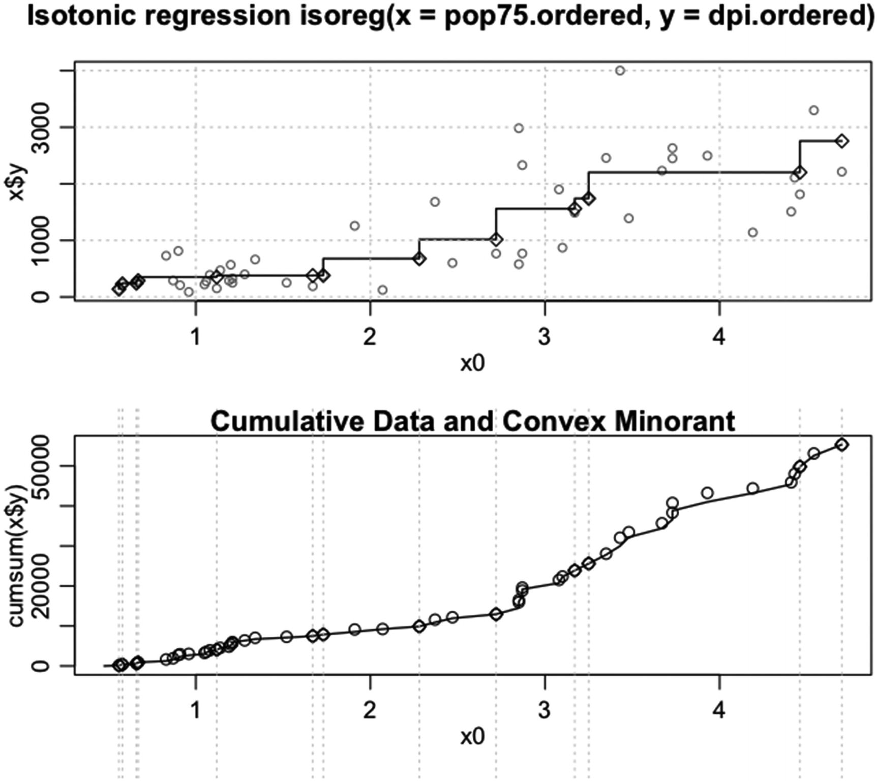
Example of running plot on an object of the isoreg class
In Figure 5-16, the code in Listing 5-16 is run.
Note that in the second plot, light gray vertical lines are drawn where the steps in the first plot occur. For the styling of the regression line, col is set to 1, cex is set to 1, pch is set to 23, and lwd is set to 1.2. For the styling of the observations, col is set to grey( 0.5 ), and cex is set to 0.75. The plot type is set to “row” and grid is set to TRUE.
5.3.9 The lm Method
Linear models are models for which a dependent variable is set equal to a sum of independent variables multiplied by constants, for example, y=b0 + b1 x1 + b2 x2. In linear regression models, an error term is added to make the linear model exact for the data.
The lm method for plot() plots objects of the class lm. The functions in the stats package that create objects of the lm class are lm(), glm(), and aov(). The functions lm(), glm(), and aov() fit linear models – that is, a variable y is fit to a number of x variables, which can be just one x variable, based on a linear model. Usually, an intercept is fit.
The lm() function fits ordinary least squares models. The glm() function fits binomial, gaussian, gamma, inverse gaussian, poisson, quasi, quasibinomial, and quasipoisson models by various methods (see the help page for family for more information). The aov() function fits analysis of variance models.
The plot() function returns up to six plots when the value of x is of the lm class. The six plots are the plot of the residuals against the fitted values, the plot of the observed quantiles vs. the theoretical quantiles based on the normal distribution, the plot of the square root of the studentized Pearson residuals against the fitted values, the Cook’s distance plotted against the observation number, the plot of the studentized Pearson residuals against the leverage, and the plot of the Cook’s distance vs. the leverage divided by one minus the leverage.
The plot() function takes 17 specified arguments plus many of the arguments of plot.default(). The argument … is the eighth argument in the order of the arguments. The total number of listed arguments is 18, if ... is included.
The first seven arguments are x, for the object of the lm class; which, for which plots to plot; caption, for the captions on the plots; panel, for whether to include a smoothed line in some of the plots; sub.caption, for the subtitle on the plots (the same for all plots if the plots are plotted separately – otherwise, a title in the outer margin on the third side if multiple plots are plotted on a page and the outer margin on the third side is greater than zero, but only on the last page if there are multiple pages); main, for a title to be plotted on all of the plots; and ask, for whether to ask to continue between pages when more than one page is plotted.
The x argument takes an object of the lm class. There is no default value for x.
The which argument takes a numeric vector of arbitrary length. The elements can take on values between 1 and 6, inclusive. If a value of an element is not an integer, the value is rounded down to an integer. If more than one element rounds down to the same integer, the plot associated with the integer is only plotted once. The plots are always plotted in the same order, irrespective of the order of the values assigned to which. The default value of which is c(1, 2, 3, 5).
The caption argument takes a list of single-element character vectors (or single-element vectors that can be coerced to character) or a single vector that can be coerced to character. Both the list and the single vector can be of arbitrary length. (The elements of the list can be of length greater than one too, but each new element of the character vector plots over the previous element if the length is greater than one.) Only the first six elements are used.
Depending on the plots selected in which, the corresponding captions are used, where each title is placed above the correct plot. The default value of caption is list( "Residuals vs Fitted", "Normal Q-Q", "Scale-Location", "Cook's distance", "Residuals vs Leverage", expression("Cook's dist vs Leverage. " * h[ii] / (1 – h[ii]))).
The panel argument takes an object of the function class. Two possible functions can be used, panel.smooth() and points(). If the argument is set to panel.smooth, a smoothed line is plotted in plots 1, 3, 5, and 6 – by default in the color red (the color can be changed by changing the palette). If set to points, the smoothed line is not plotted. The default value of panel is if(add.smooth) function(x, y, ...) panel.smooth(x, y, iter=iter.smooth, ...) else points, that is, if add.smooth is TRUE, add smoothed lines and otherwise do not. For both options, the points are plotted.
The sub.caption argument takes a vector that can be coerced to character and is of arbitrary length. The sub-caption is plotted either at the top of the last page if there are multiple plots on a page or below the label on the x axis if there is just one plot on a page. (The arguments mfrow and mfcol in par() control the number of plots on a page and are covered in Section 6.2.1.5.)
If there is more than one element in the value of sub.caption, the elements overplot on the same line. With text that has more than one line, the lowest line in the string plots on the line below the label of the x axis. (The text “ ” in a string causes a line feed and can be used to move text in an element up or down.) The default value of sub.caption is NULL, that is, a (possibly) abbreviated version of deparse(x$call) is plotted.
The main argument takes a vector that can be coerced to character and that can be of arbitrary length. The value of main plots above the caption on all of the plots. For vectors with multiple elements, each element of the vector plots on a different line. The default value of main is “ “, that is, no title is plotted.
The ask argument takes a logical vector (or a vector that can be coerced to logical) of arbitrary length. If longer that one value, only the first value is used and a warning is given. A value of TRUE tells plot() to ask before going to a new page if more than one page is plotted. A value of FALSE plots all of the plots without pausing. The default value of ask is prod(mfcol) < length(which) && dev.interactive(), that is, ask whether to go to the next page if the number of plots on a page is less than the number of plots to be plotted. Note that if which contains duplicates, the default logic can fail.
The ninth through eighteenth arguments of plot.lm() are id.n, for the number of extreme points to label; labels.id, for the labels to assign to the observations; cex.id, for the character size used in the labels; qqline, for whether to plot the 45-degree line on the quantile-quantile plot; cook.levels, for the values of the Cook’s distance at which to draw contour lines; add.smooth, for whether to plot a smoothed line on plots 1, 3, 5, and 6; iter.smooth, for the value of iter to be supplied to the function panel.smooth() if panel equals panel.smooth; label.pos, for the position of the labels in the first three plots; cex.caption, for the character size used in the caption; and cex.oma.main, for the character size used in the sub-caption if there are multiple plots on a page.
The id.n argument takes a numeric vector of arbitrary length. If longer than one element, only the first element is used and warnings are given. The argument must be greater than -1 and less than or equal to the number of observations. If between -1 and 1 and not equal to either, no labels are plotted. If greater than 1 and not an integer, the number is rounded down to the next lowest integer. The default value of id.n is 3.
The labels.id argument takes the value NULL or any vector that can be coerced to the character mode and which can be of arbitrary length. If labels.id equals NULL, the index values of the observations are assigned as the labels. If the value of labels.id is longer than the number of observations, then only the labels with indices up to the number of observations are used. If shorter than the number of observations, only those observations with indices up to the length of labels.id are given labels if the observations are extreme. The default value of labels.id is names(residuals(x)).
The cex.id argument takes a numeric vector. The vector must be of length one if the fifth plot is plotted. Otherwise, the vector can be of arbitrary length; and the labels on the extreme values can be of different sizes, where the order of assignment is based on the order of extremity. The default value of cex.id is 0.75.
The qqline argument takes a logical vector (or a vector that can be coerced to logical) of arbitrary length. If longer than one element, only the first element is used and a warning is given. If set to TRUE, the line is drawn in the quantile-quantile plot (the second plot). If FALSE, no line is drawn. The default value is TRUE.
The cook.levels argument takes a nonnegative numeric vector of arbitrary length. Contours are drawn for each value in cook.levels if the contours are within the limits of the plot. The default value for cook.levels is c(0.5, 1.0).
The add.smooth argument takes a logical vector (or a vector that can be coerced to logical) of arbitrary length. If longer than one element, only the first element is used and a warning is given. If set to TRUE, the argument tells plot() to add (in plots 1, 3, 5, and 6) a line based on the smoothed y values. If FALSE, the lines are not plotted. The default value is getOption("add.smooth"), which on my device has a value of TRUE. (The first option in options() is add.smooth.)
The iter.smooth argument takes a numeric vector of arbitrary length. Only the first value is used. The default value of iter.smooth is if(isGlm) 0 else 3, that is, if x is a result from the glm() function, then set iter.smooth to 0. Otherwise, set iter.smooth to 3.
The label.pos argument takes a numeric vector (or a character vector that can be coerced to numeric) of length greater than one. Only the first two values are used; and those values can only take the numbers 1, 2, 3, or 4. The first value gives the position with respect to the point of the odd-numbered labels and the second value of the even-numbered labels. A value of 1 puts the label below the point, of 2 to the left, of 3 above, and of 4 to the right. The default value of label.pos is c(4, 2), that is, labels are plotted to the right of points whose index values are odd and to the left for the points whose index values are even.
The cex.caption argument takes a numeric or logical vector of arbitrary length. Logical vectors are coerced to numeric. The value gives the character size used in the caption. If more than one value is set for cex.caption, the caption is plotted in the same place for each of the values. So using just one value makes the most sense. The default value of cex.caption is 1.
The cex.oma.main argument takes a numeric or logical vector of arbitrary length. Logical values are coerced to numeric. The argument has an effect only if multiple plots are plotted and the outer margin is set larger than 0 on side 3 (with the amount larger depending on the character size used for sub.caption). Then cex.oma.main operates on sub.caption like cex.caption operates on caption. The default value of cex.caption is 1.25.
Code for the example of using plot() on an object of the lm class. The arguments x, caption, which, labels.id, sub.caption, main, cex.id, cook.levels, iter.smooth, label.pos, cex.caption, and cex.oma.main are set

An example of running plot() with an object of the lm class. The arguments that were set were x, caption, which, labels.id, sub.caption, main, id.n, cex.id, cook.levels, iter.smooth, label.pos, cex.caption, and cex.oma.main
In Figure 5-17, the code in Listing 5-17 is run.
Only four of the six possible plots are plotted in the example. The captions on the six plots are assigned the values “plot 1”, “plot 2”, … “plot 6”. The labels argument is set to NULL, so the index values are used for the labels. In Figure 5-17, since there are multiple plots on the page and only one page, the sub-caption appears above the plots. The value of the argument main, “main”, is plotted above the caption on each plot.
Two labels are plotted, for the two most extreme y values in each plot, since id.n was set to 2. The character size for the labels is set to 0.9. There are three contour levels for the Cook’s distance, and six contour lines are plotted. The smoothing is strong since iter.smooth is set to 5. Since both lab.pos values are set equal to 4, both labels plot to the right of the points. The character size for the captions is 1.15 and for the sub.caption is 1.4.
In order to plot four plots on a page, the argument mfrow was set to c( 2, 2 ) in par(). After the plots were plotted, mfrow was set back to c( 1, 1 ) to reset R to plotting one plot on a page. The outer margins were set to two lines deep by setting oma to c( 2, 2, 2, 2 ) in par() and then set back to zero width by setting oma equal to c( 0, 0, 0, 0 ) after the plotting was done. To change those lines and text that plot red by default to the color gray, the palette was changed to a gray scale. After plot() was run, the palette was changed back to the default palette. (See Section 6.2 for information about par() and multiple plots on a page.)
5.3.10 The ppr Method
Projection pursuit regression is a form of regression. The regression estimates a model for one or more dependent variables using one or more independent variables. The ppr method of plot.ppr() plots objects of the ppr class. Objects of the ppr class are created by the function ppr(). The function ppr() does projection pursuit regression of a y on an x, where either can be a matrix or vector and both have the same length and/or number of rows. The plots are done for each of the terms found in ppr() and are of the ridge functions for the terms. See the help page for ppr() for more information.
The plot.ppr() function takes seven specified arguments, plus many of the arguments used by plot.default(). All of the arguments are standard arguments for plot.default() but have different default values in plot.ppr(). The arguments are x, for the object of the ppr class; ask, for whether to ask before plotting a new plot; type, for the kind of plot; cex, for the character size of the plotting characters; main, for the title of the plot; and xlab and ylab, for the x and y axis labels. See Section 6.2.1.5 for information about ask; Section 3.3.1 for type; Section 3.4.3 for cex; and Section 3.2.1 for main, xlab, and ylab.
The x argument takes an object of the ppr class. There is no default value for x.
The ask argument takes the value of ask in par() by default, which on my device is FALSE.
The type argument takes the value of “o” by default, that is, plot the lines over the points.
The cex argument takes a value of ½ by default. The ½ is relative to the value of cex in par().
The main argument takes the value quote(bquote(“term”[.i]*”i” -– hat(beta[.i]) == .(bet.i))) by default.
The xlab argument takes the default value quote(bquote(bold(alpha)[.(i)]^T * bold(x))).
The y argument takes the default value of "".
Code for an example of using an object of the ppr class in plot(). Four terms are used in ppr()
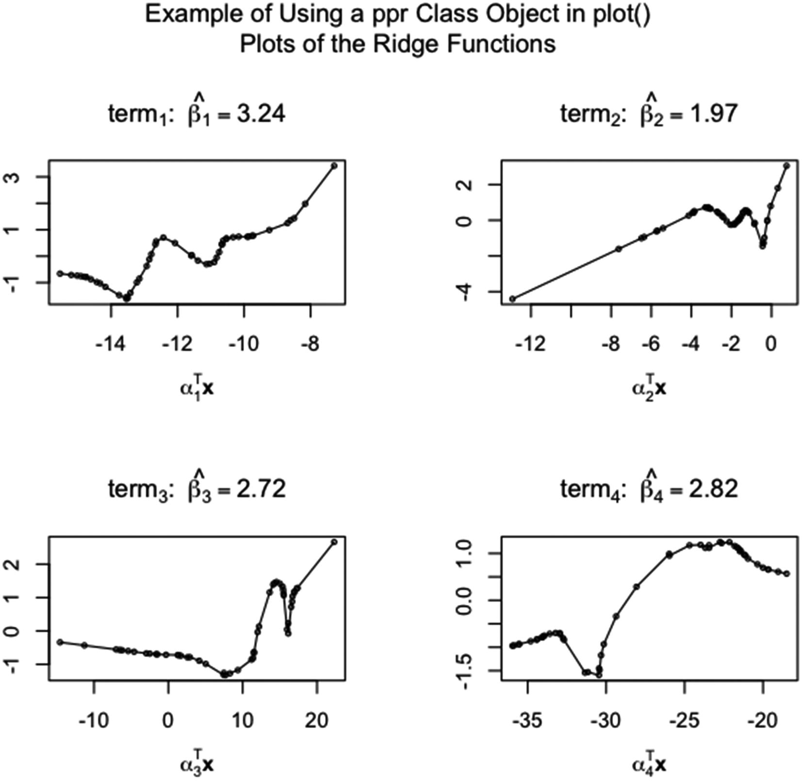
Example of using an object of the ppr class in plot()
In Figure 5-18, the code in Listing 5-18 is run.
Note that the number of terms is four (nterms=4), so four ridge function plots are drawn. In main and xlab, the functions quote() and bquote() allow the index to be changed for each plot. Inside bquote(), the expression .(i) returns the current value of i in the function.
5.3.11 The prcomp and princomp Methods
Principal components are properties of matrices. Given a matrix, the matrix containing the principal components of the original matrix in the columns, when multiplied by the original matrix on the left, creates a new matrix with the same information as the original matrix but for which the columns of the matrix are linearly independent. Principal component analysis is sometimes used in data modeling to reduce the dimensionality of correlated variables. The other main use of principal component analysis is to cluster the observations in a dataset.
The prcomp and princomp methods of plot() plot objects of the prcomp and princomp classes. Objects of the prcomp and princomp classes are created by the functions prcomp() and princomp(). Both functions do a principal component analysis of a numeric matrix or data frame. The functions differ in the R functions used in the calculations and in the divisor of the covariance matrix of the matrix or data frame containing the data.
For prcomp(), the eigenvalues and eigenvectors are found using singular value decomposition, that is, using the svd() function. Also, in the estimation of the covariance – if done – the divisor of the covariance matrix is the number of observations minus one.
For princomp(), the eigenvalues and eigenvectors are found by inputting the output from the function cor() into the function eigen(). If the covariance matrix is used in the calculations, the divisor for the covariance matrix is the number of observations rather than the number of observations minus one. According to the help pages for prcomp() and princomp(), the method used by prcomp() is the preferred calculation method.
The function plot() creates a scree plot from the output of both functions. A scree plot plots the amount of the total variance each principal component contains. If the analysis is done with standardized variables, then the variance of each column of the standardized original matrix is one, so the total variance is just the number of columns.
There are no specified arguments, other than x, for plot() if x is an object of the prcomp or princomp class. (The functions plot.prcomp() and plot.princomp() both take the arguments that screeplot() takes.)
Code for the example, in Figure 5-19, of using plot() on objects of the prcomp and princomp classes
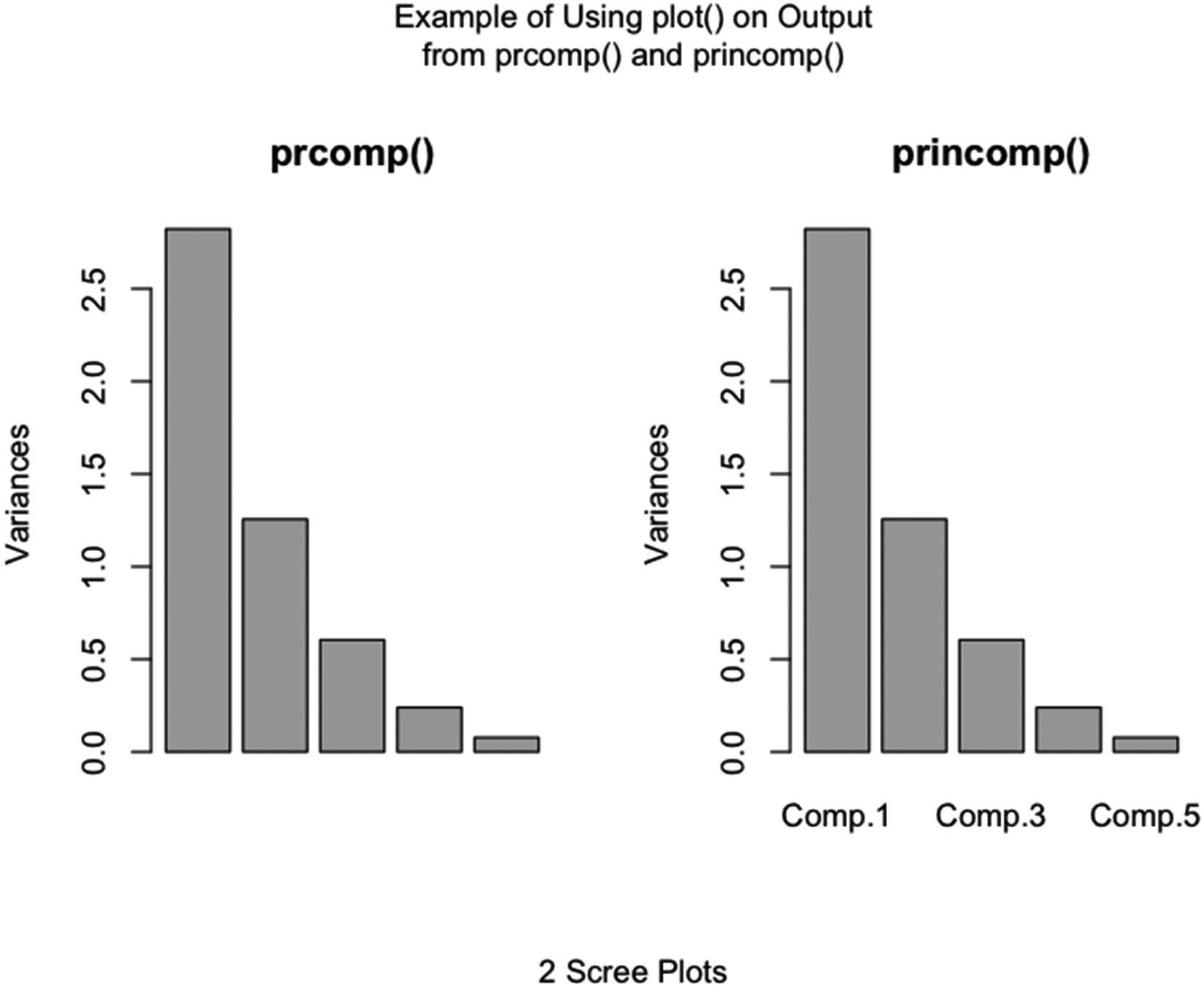
Scree plots, which are produced by plot() when x is set equal to objects of the prcomp and princomp classes
Note that the plots are very similar. The only major difference is that no bar labels are plotted by default for the output from prcomp(), while the output from princomp() plots bar labels by default.
5.3.12 The profile.nls Method
Nonlinear least squares modeling is an approach used to model a data vector with a model in which the relationship between the independent variables is nonlinear. The least squares criterion is used to evaluate how well the model fits the data.
The profile.nls method for plot() plots objects of the profile.nls class. Objects of the profile.nls class are created by running profile() on objects created by nls(). The nls() function does least squares fitting for nonlinear models.
The plot.profile.nls() function creates diagnostic plots. According to the help page for the function, on the vertical axis of the plots is the statistic tau – which is the square root of the change in the sum of the squares of the residuals divided by the standard error of the residuals. (The value of the residual sum of squares changes as the value of the coefficient being estimated is changed in the fitting process.) On the horizontal axis are the values that the coefficient takes as the size of the coefficient is changed. A plot can be generated for every coefficient that is estimated or for a subset of the coefficients.
The plot.profile.nls() function takes six specified arguments, plus many of the arguments of plot.default(). However, according to the help page for the function, the arguments xlab, xlim, ylim, and type cannot be set. The arguments that are specified are x, for the object of the profile.nls class; levels, for the levels of the confidence contours measured in the units of tau; conf, for the levels of the confidence contours measured in levels of confidence; absVal, for whether to use the absolute value of tau in the plot; lty, for the line type of the confidence contours and the vertical line at the estimated coefficient; and ylab, for the label on the y axis.
The x argument takes an object of the profile.nls class. There is no default value for x.
The levels argument takes a numeric vector of arbitrary length. The values should be reasonable values for tau. There is no default value for levels.
The conf argument takes a numeric vector of arbitrary length. The values must be between 0 and 1, but not equal to either. (If both levels and conf are set, levels is used.) The default value of conf is c(99, 95, 90, 80, 50)/100.
The absVal argument takes a logical vector (or a vector that can be coerced to logical) of arbitrary length. If longer than one, only the first element is used and a warning is given. If set to TRUE, the absolute values of the tau’s are plotted. If FALSE, negative values of tau are plotted as negative. The default value of absVal is TRUE.
The lty argument takes a line type vector of arbitrary length (see Section 3.3.2). Only the first value is used. The default value of lty is 2, that is, a dashed line.
Colors in the plot are based on the color values in the color palette (see Section 3.4.1.3). According to the help page for plot.profile.nls(), the color of the axes is based on the first element of the color palette. On my device, the axis color is not affected by setting the first element of the palette – the axes are plotted in black.
The color of the vertical line at the estimate of the parameter is based on the third element in the color palette. The color of the line representing tau is based on the fourth element. The color of the confidence contours is based on the sixth element.
There is no element in plot.profile.nls() to tell the function which parameters to select for plotting. All profiles that are generated in profile() are plotted. The which argument in profile() controls which profiles are generated.
Code for the example of running plot() on an object of the profile.nls class
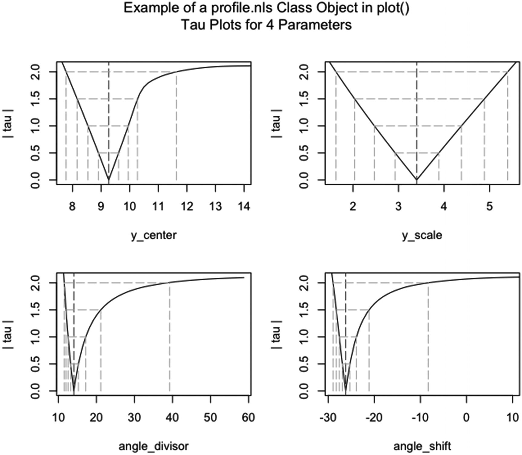
Example of using plot() on an object of the profile.nls class. The functions par(), mtext(), plot(), nls(), profile(), and palette() are run. In plot() the arguments levels, lty, and ylab are set
In Figure 5-20, the code in Listing 5-20 is run.
Note that the x labels are the names of the parameters. Also, plots are plotted for all of the parameters. The which argument in profile() is not set, so the default value (generating profiles for all of the parameters) is used.
The arguments levels, lty, and ylab in plot() are set to c( 0.5, 1, 1.5, 2 ), 5, and “| tau |”, respectively. The colors in the color palette are changed to colors on the gray scale by running palette() with gray scale colors set. The confidence contours are spaced evenly on the tau scale. With type set equal to 5, the line type is a long dash.
5.3.13 The spec, spec.coherency, and spec.phase Methods
In time series analysis, two common approaches are the time domain approach and the frequency domain approach. The time domain approach looks for patterns that repeat in time by looking at plots of a time series over time (such as looking at the 11-year cycles in the sunspot data over time). The approaches in Sections 5.3.1, 5.3.2, 5.3.7, 5.3.15, and 5.3.16 are in the time domain.
The frequency domain involves plotting the data against frequencies, rather than against time, in order to look for frequencies at which cycles occur. The function spectrum() creates plots of the data against frequency. The methods used to create the plots given by spectrum() are based on calculating periodograms, either on the raw data or on a fit by an autoregressive model.
In the sunspot data, there is approximately one cycle every 11 years. Using spectrum(), in a plot of the data against the frequency, there is a peak at 0.091. (The value of 0.091 is 1/11. Since the frequency in the sunspot.year object is 1, not 11, the value 1 divided by 0.091 gives the period of the cycle in years.)
The spec, spec.coherency, and spec.phase methods of plot() plot objects of the spec class. Objects of the spec class are outputted from the function spectrum(). The function spectrum() fits either a periodogram on the data or a periodogram on an autoressive fit to the data – where the data is a times series object. (The autoregressive modeling is not up and running yet for multiple time series.)
In spectrum(), the method argument tells spectrum() to either create a periodogram from the raw data or to fit an autoregressive model first. If the first method is chosen, the raw periodogram can be plotted, or the periodogram can be smoothed. If smoothing is done, according to the help page for spectrum(), the argument spans sets the smoothing width(s) and a modified Daniell smoother is used to do the smoothing. Smoothing is not done on the periodogram for the second method.
Three types of plots are generated by the three versions of plot.spec(). The first type is the marginal plot, which plots the marginal periodogram(s) for the time series. The second type plots the coherence between multiple time series, two at a time. The third type plots the phase shift between multiple series, two at a time.
The plot.spec() function takes 11 specified arguments, plus many of the arguments of plot.default(). The arguments are x, for the object of the spec class; add, for whether to plot a new plot or add to an existing plot; ci, for the level of the confidence interval; log, for the type of scale on the y axis; xlab and ylab, for the labels on the x and y axes; type, for the type of plot; ci.col, for the color of the confidence contour; ci.lty, for the line type of the confidence contour; main and sub, for the title and subtitle of the plot; and plot.type, for which of the three types of plots to plot.
The x argument takes an object of the spec class. There is no default value for x.
The add argument takes a logical vector (or a vector that can be coerced to logical) of arbitrary length. The argument appears not to affect the plot(s) on my device. The default value of add is FALSE, that is, start a new plot.
The ci argument takes a numeric vector of length one. The value of ci must be between 0 and 1, exclusive, and gives the level of the confidence interval. Confidence intervals are only plotted for smoothed coherency or phase plots.
The log argument takes a character vector of length one and, according to the help page for plot.spec(), only affects plots if the plots are marginal plots. Logical vectors are not accepted (unlike what is written on the help page for plot.spec()). The four possible values of log are “no”, for a linear scale on the y axis; “dB”, for a log scale, with the powers in base ten as the labels on the y axis; “yes”, for a log scale, with 1, 2, and 5 times the powers of ten as the labels on the y axis; and NULL, for the same result as “yes”. The default value of log is c("yes", "dB", "no"), that is, the value used is “yes”.
The xlab, ylab, and type arguments are the standard arguments from plot.default() (see Sections 3.2.1 and 3.3.1). The default values in plot.spec() for marginal plots are “frequency” for xlab, NULL for ylab, and “l” for type. For coherency plots, the values are “frequency”, “squared coherency”, and “l”. For phase plots, the values are “frequency”, “phase”, and “l”.
The ci.col and ci.lty arguments take color and line type vectors of arbitrary length (see Sections 3.4.1 and 3.3.2 for the kinds of values). For both arguments, only the first value is used. The default values are “blue” for ci.col and 3 (for a dotted line) for ci.lty.
The main and sub arguments are the standard arguments from plot.default() (see Section 3.2.1). The default values in plot.spec() are NULL for both arguments.
The plot.type argument takes a character vector of length one. The possible values of plot.type are “marginal”, “coherency”, and “phase”, for the three types of plots. (The values can be shortened to “m”, “c”, and “p”.) The values of “coherency” and “phase” give an error if x contains a single time series. The default value of plot.type is c("marginal", "coherency", "phase"), that is, a marginal plot is plotted.
Both coherency and phase plots take a different default ylim from plot.default(). Coherency plots take ylim equal to c(0, 1) by default. Phase plots take ylim equal to c(-pi, pi) by default. (See Section 3.2.1 for information about ylim.)
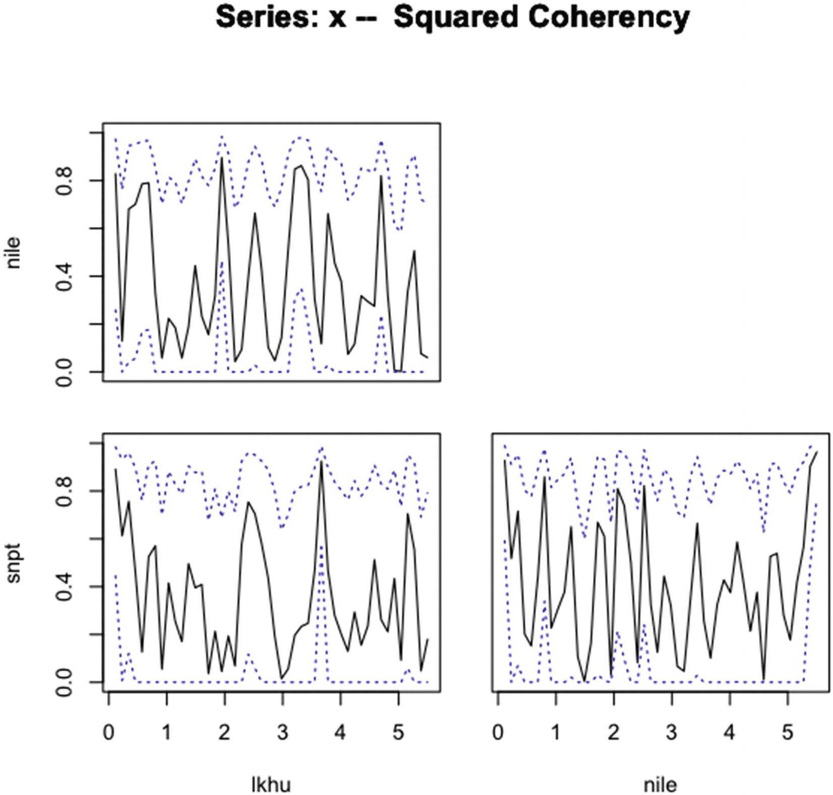
Example of running plot() with an object of the spec class. In spectrum(), method and spans are set. In plot(), plot.type and ci are set. The frequency is one cycle per 11 years
The times series used in the example are lkhu, from the LakeHuron dataset; nile, from the Nile dataset; and snpt, from the sunspot.year dataset. The LakeHuron, Nile, and sunspot.year datasets are in the datasets package and are accessible for most users, since the datasets package is loaded by default in R. The years 1875–1970 were selected from the three datasets by using the function window().
Code for an example of using an object of the spec.coherency class in plot(). The method and spans arguments are set in spectrum(), and the ci and plot.type arguments are set in plot.spec()
In Figure 5-21, the code in Listing 5-21 is run.
Note that smoothed periodograms are used in the figures, since method is set to “pgram” in spectrum() and spans is set to 3. The coherency between each pair of periodograms is plotted, along with a 96.6% confidence interval, since plot.type is set to “coherence” in plot() and ci is set to 0.966. The frequency that is set in ts() is eleven.
(Note that the labels on the x axis ticks give the frequency of the time series object divided by a sequence from 0 to 0.5. That is, if the frequency of the time series object equals 11, then the frequencies on the x axis go from 0 to 5.5. Also, the x and y axis labels are the names of the time series.)
5.3.14 The stepfun Method
A step function plot is a kind of plot that creates steps from point to point. The stepfun method of plot() plots objects of the stepfun class. Objects of the stepfun class are created by the functions stepfun() and as.stepfun(). An object of the stepfun class is a list with the information needed to plot a step function (see the help page of stepfun() for the components of the list). The function – run as plot.stepfun() – also plots numeric vectors as step functions. (The plot.ecdf() function plots a special kind of step function out of a numeric vector.)
The function plot() applied to objects of the stepfun class takes 18 specified arguments, plus many of the arguments of plot.default(). The arguments are x, for the object of the stepfun class; xval, for the values of x at which to find and plot y; xlim and ylim, for the limits of the x and y axes; xlab, ylab, and main for the labels on the x and y axes and the title of the plot; add, for whether to add to an existing plot; verticals, for whether to draw the vertical parts of the steps; do.points, for whether to plot a plotting character at a point; pch and col, for the plotting character and color of the plotting character and lines; col.points and cex.points, for the color and size of the plotting characters if do.points is TRUE; col.hor and col.ver, for the color of the horizontal and vertical parts of the steps; and lty and lwd, for the line type and line width of the lines.
The x argument takes an object of the stepfun class. There is no default value for stepfun.
The xval argument takes a numeric vector of arbitrary length. A point in y is plotted for every x in xval. If the length of xval is greater than the length of x, some of the points in y are used more than once. If less than the length of x, the y associated with the middle value between the x and the next larger x is used. There is no default value for xval.
The arguments xlim and ylim are the standard arguments from plot.default() (see Section 3.2.1). There is no default value of xlim. The default value of ylim is range(c(y, Fn.kn)).
The xlab, ylab, and main arguments are the standard arguments from plot.default() (see Section 3.2.1). The default value of xlab is “x”, of ylab is “f(x)”, and of main is NULL.
The add argument takes a logical vector (or a vector that can be coerced to logical) of arbitrary length. If longer than one, only the first value is used and a warning is given. If set to TRUE, the plot is added to the previous plot. If FALSE, a new plot is opened. The default value of add is FALSE.
The verticals argument takes a logical vector (or a vector that can be coerced to logical) of arbitrary length. If longer than one, only the first value is used and a warning is given. If set to TRUE, vertical lines are drawn at the steps. If FALSE, no vertical lines are drawn. The default value of verticals is TRUE.
The do.points argument takes a logical vector (or a vector that can be coerced to logical) of arbitrary length. If longer than one, only the first value is used and a warning is given. If set to TRUE, points are plotted. If FALSE, points are not plotted. The default value of do.points is (n < 1000), that is, TRUE if the number of points is less than 1000 and otherwise FALSE.
The col.hor and col.ver arguments take a color vector of arbitrary length (see Section 3.4.1 for possible color values). The color vectors cycle as the function goes through the points. The default values of col.hor and col.ver are the color set by col.
The lty and lwd arguments are the standard arguments from plot.default() (see Sections 3.3.2 and 3.4.4). The default values of lty and lwd are the values in par() of lty and lwd – “black” and 1 on my device.
Code for the example in Figure 5-22 for using plot() on an object of the stepfun class. The xval, verticals, pch, col.points, cex.points, and lwd arguments are set

An example of using an object of the stepfun class in plot(). The xval, verticals, pch, col.points, cex.points, and lwd arguments are set
In stepfun(), the value plotted on the x axis must be an increasing vector (which 1:50 in Figure 5-22 is). Note that for y, the first element of pop15.ordered is repeated. To plot the points at the correct place, a point must be added to the beginning of y. Since the step function starts at the beginning of the x axis, setting the first and second values of y to the first value of the vector to be plotted makes good graphical sense.
The xval argument has been set to even steps of width 1/2 between 1 and 50. Each of the points is plotted twice at the height of the respective element of pop15.ordered. The steps are drawn toward the right of the points. (The direction can be changed in stepfun().)
The plotting character is 23 – an open diamond – and plotted in a mid-gray color at a size of 0.9 the size of a character width. The line width of the steps is 2.5. The vertical parts of the steps are not plotted.
5.3.15 The stl Method
Seasonal time series decomposition can be done using a loess method rather than by an autoregressive method. The plotting in this section is much the same as the plotting in Section 3.3.2, but the method of finding the values used in the plots is different in this section – using a loess method.
The stl method of plot() plots objects of the stl class. Objects of the stl class are created by the stl() function. The stl() function does seasonal time series decomposition using the loess method – as opposed to the function decompose(), which does seasonal time series decomposition using an autoregressive method (see Section 3.3.2 for plots from the autoregressive method).
The plot.stl() function takes six specified arguments, one of which takes four sub-arguments, plus many of the arguments of plot.default(). The … argument is in the sixth place in the order of arguments, so the last argument cannot be shortened. The specified arguments are x, for the object of the stl class; labels, for the y axis labels for the four plots of the components; set.pars, for setting parameters for the plots (contains mar, oma, tck, and mfrow, which are arguments of par()); main, for the title over the four plots; range.bars, for whether to put a bar that represents a standard size measurement for the y scales of the plots; and col.range, for the color of the range bar.
The x argument takes an object of the stl class. There is no default value for x.
The labels argument takes a character vector (or a vector that can be coerced to character) of arbitrary length. If there are more than four elements, only the first four are used. If less than four, the elements do not cycle. Those plots without labels are not given a label. The default value for labels is colnames(X), that is, “data” for the top plot, “seasonal” for the next plot, “trend” for the third plot, and “remainder” for the bottom plot.
The set.pars argument sets the parameters for mar, oma, tck, and mfrow (all except tck are covered in Section 6.2; tck is covered in Section 3.4.5). The default values for the parameters are c(0, 6, 0, 6) for mar, c(6, 0, 4, 0) for oma, -0.01 for tck, and c(nplot, 1) for mfrow.
The main argument is the standard argument from plot.default() (see Section 3.2.1). The default value of main is NULL in plot.stl(), that is, no title is plotted.
The range.bars argument takes a logical vector (or a vector that can be coerced to logical) of arbitrary length. If longer than one, only the first element is used and a warning is given. If set to TRUE, range bars are plotted. If FALSE, range bars are not plotted. The default value of range.bars is TRUE.
The col.range argument takes a vector of color values of arbitrary length (see Section 3.4.1 for kinds of color values). If longer than one, only the first value is used. The default value of col.range is “light gray”.
Code for the example of using an object of the stl class in plot. The arguments labels, main, and col.range are set
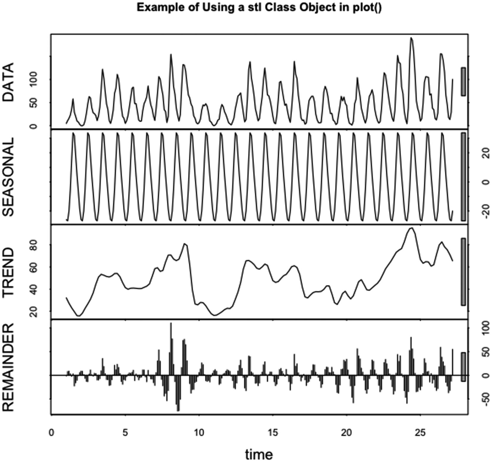
An example of using an object of the stl class in plot(). The arguments labels, main, and col.range are set. The dataset is the sunspot.year dataset from the datasets package in R
In Figure 5-23, the code in Listing 5-23 is run.
Note that the labels on the four plots are changed to uppercase letters from lowercase letters. A title is added to the plot, using the default plot settings for titles. The color of the range bars is changed from “light gray” to “grey70”.
The ranges of the scales on the y axes for the data and the remainder are much larger than for the trend and the seasonal components, as can be seen from the range bars. The dataset used for the plot is the same dataset used in the example for the decomposed.ts method (see Section 3.3.2), so the plots can be directly compared.
5.3.16 The ts Method
Time series are a specific form of data. For time series, the observations are made at evenly spaced times or locations. In R, time series can be created with starting (and optionally ending) times and with a given frequency.
The ts method of plot() plots objects of the ts class. Objects of the ts class are created by the ts() and as.ts() functions. The ts function creates a time series out of a vector or matrix. An object of the ts class has a starting place in a period and an ending place in a period and a periodic frequency associated with the series, as well as the data in the series. (The tsp() function returns the start, end, and frequency for an object of the time series class.) Running the full name plot.ts() with a vector or matrix that is not a time series plots a time series plot where the starting value is 1 and the frequency is 1.
The plot.ts() function takes ten specified arguments plus many of the arguments of plot.default(). The specified arguments are x, for the first object of the ts class; y, for a second object of the ts class, if one is included; xy.labels and xy.lines, for whether and which labels and/or lines to plot for plots of x against y, if y is given; panel, for the function to use to plot the data in the plots if multiple plots are plotted (does not appear to affect the plots on my device); nc, for the number of columns to use for multiple plots; yax.flip, for whether to put the y axis labels, axis tick labels, and tick marks on the right instead of the left on alternate plots when multiple plots are plotted; mar.multi and oma.multi, for the size of margins on the plots and the size of the outer margin, again if multiple plots are plotted; and axes, for whether to plot axes.
The x argument takes a numeric vector or matrix of arbitrary length and of the ts class. For matrices, the series are in the columns and the observations are in the rows. There is no default value for x.
The y argument takes either the value of NULL or a numeric vector. If a vector, according to the help page for plot.ts(), x must also be a vector, and x and y must be the same length. The function then plots a scatterplot of y against x. The default value of y is NULL, that is, x is plotted against time.
The plot.type argument takes a character vector of length one. The argument affects the plot when x is a matrix. The argument can take the value “multiple” or “single” – for creating separate plots for each time series or for plotting the multiple time series on one plot.
The xy.labels argument takes either a logical vector or a character vector of arbitrary length. If logical and longer than one, only the first element is used and warnings are given. If character and the length is less than the length of x and y, the values cycle out to the ends of x and y. If longer than x and y, the excess values are ignored. There is no default value for xy.labels, that is, the time values for x and y are plotted at the points.
The xy.lines argument takes a logical vector of arbitrary length. If longer than one, only the first element is used and a warning is given. If set to TRUE, lines are plotted of the type “c” (see Section 3.3.1). If set to FALSE, no lines are plotted. There is no default value for xy.lines, that is, according to the help page for plot.ts(), if xy.labels is logical, xy.lines takes the same value. If xy.labels is character, xy.lines is set to TRUE.
The panel argument takes a function name as a value. The argument has no effect on my device. The default value of panel is lines.
The nc argument takes a positive numeric vector of length one. If not an integer, the value is rounded down to an integer, except for values between 1.5 and 2, which can do unusual things. There is no default value for nc, that is, according to the help page for plot.ts(), if the number of time series is less than or equal to four, one column is used and otherwise two columns are used.
The yax.flip argument takes a logical vector (or a vector that can be coerced to logical) of arbitrary length. If longer than one, only the first element is used and a warning is given. If set to TRUE, the y axis label, axis tick labels, and tick marks flip to the right side on alternate plots. If FALSE, the y axis annotation does not flip. The default value of yax.flip is FALSE.
The mar.multi and oma.multi arguments take nonnegative numeric vectors of length four, giving the number of line widths in the bottom, left, top, and right margins. The default value of mar.multi is c(0, 5.1, 0, if (yax.flip) 5.1 else 2.1). The default value of oma.multi is c(6, 0, 5, 0).
The axes argument takes a logical vector (or a vector that can be coerced to logical) of arbitrary length. If longer than one, only the first element is used and a warning is given. If set to TRUE, axes are plotted. If FALSE, axes are not plotted. The default value of axes is TRUE.
Code to demonstrate using x and y time series vectors in plot()

An example of running plot() with x and y set equal to vectors of the ts class
Note that only a selection of the years are plotted. The selection is done externally to the plot() call. Also, xy.lines is set to FALSE, so no lines are plotted.
Code for the example of using plot() on a time series matrix with plot.type set to “single”

Example of using plot() on a matrix of the ts class with plot.type set to “single”
Note that, for the scale on the y axis, there is little variation in the Lake Huron elevations, so the data looks like a straight line. The labels on the x and y axes are the labels plotted by default – Time and the value of the x argument.
Code for the example, in Figure 5-26, of setting plot.type to “multiple” in plot.ts(). The argument mar.multi is also set
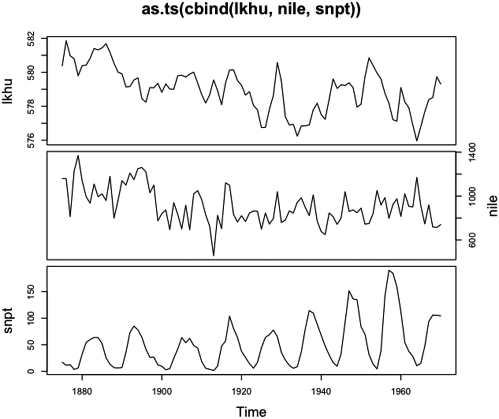
An example of running plot() on a matrix of the ts class with plot.type set equal to “multiple” and mar.multi set
Note that plot type is “multiple” (the default). The argument yax.flip has been set to TRUE, so the y axis annotation is on the right side of the second plot. A small margin has been added between the plots by setting the first and third values of mar.multi to 0.3.
There is no way to change the y axis labels – the labels are set equal to the names of the time series in x. The title is the default title and is the value of the argument x.
5.3.17 The tskernel Method
Kernels are used to smooth numeric vectors, usually vectors with data that is evenly spaced in space or time. Kernels consist of a vector of numbers used to weight consecutive data points in the smoothing process. The numbers are generated by specific kinds of processes.
The tskernel method of plot() plots an object of the tskernel class. Objects of the tskernel class are created by the kernel() function. The kernel() function creates kernels that can be used to smooth time series.
The plot.tskernel() function takes five specified arguments plus many of the arguments used by plot.default(). The specified arguments are x, for the object of the tskernel class, and the standard type, xlab, ylab, and main from plot.default() (see Sections 3.2.1 and 3.3.1).
The default value of type is “h”, for a histogram; of xlab is “k”; of ylab is “W[k]”; and of main is attr(x,”name”).
Code for the example of plotting a time series kernel
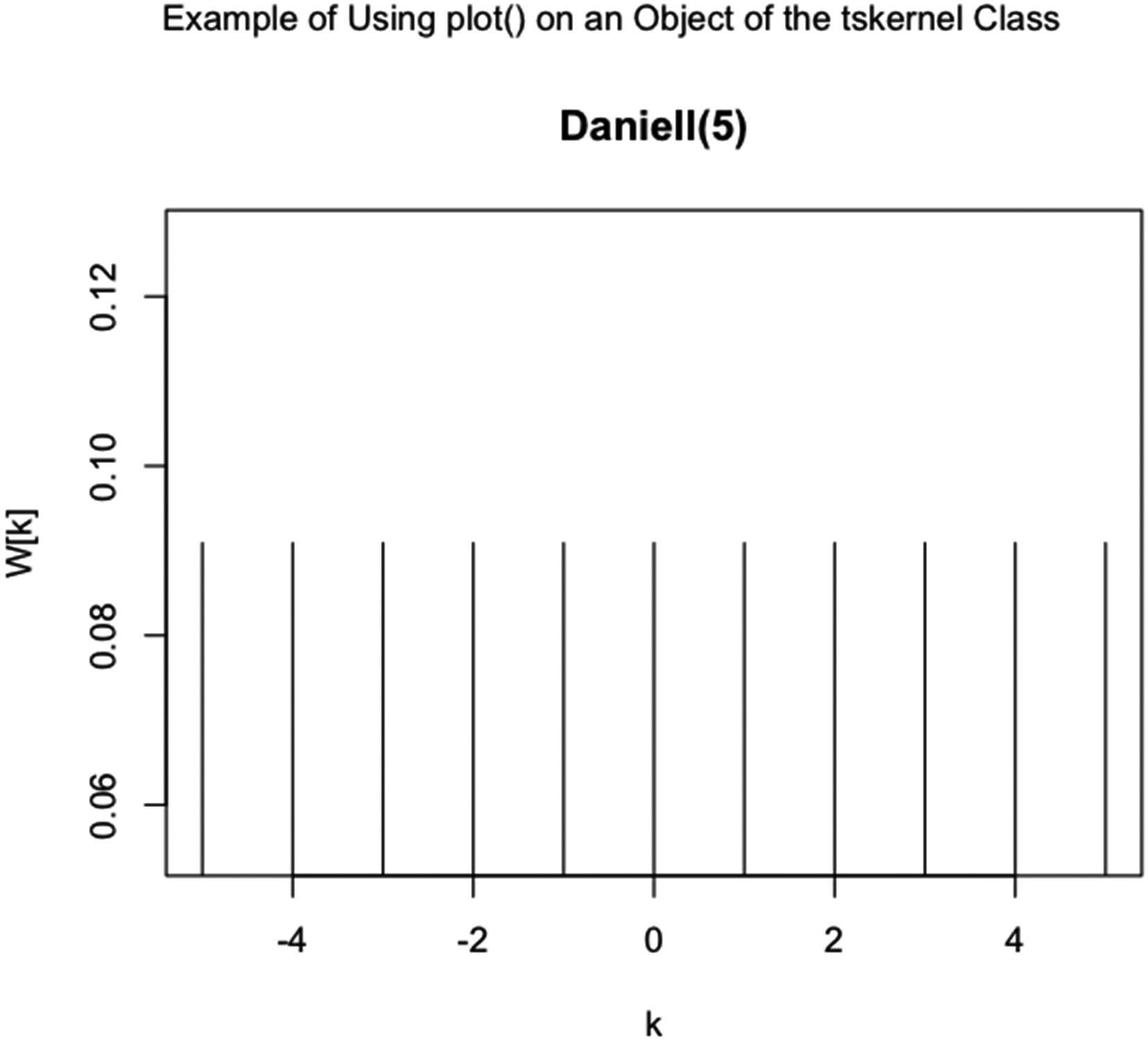
Example of running plot() on an object of the tskernel class. A Daniell kernel with m equal to 5 is plotted
In Figure 5-27, the code in Listing 5-27 is run.
Note that the Daniell kernel gives a kernel with a width that is two times m plus one and that every weight in the kernel has the same value. The kernel weights sum to one. (The preceding kernel is appropriate for yearly sunspot data since the kernel has a width of eleven.)