
Chapter 4: Five Vue UI Libraries for Your Next Project
by Michiel Mulders
According to the official Vue.js website, Vue is a progressive framework for building user interfaces. It’s designed from the ground up to be incrementally adoptable, and the core library is focused on the view layer only. This makes it easy for devs to pick it up and quickly become productive.
When starting a new project, designing a whole set of UI elements can be a time-consuming business. In this guide, I’m going to introduce you to five UI libraries that you can integrate with Vue in a few lines of code.
What Is a UI Library?
Before we get into things, let’s pause for a quick definition.
A UI library usually consists of easy-to-use components which you can include in your Vue application using custom elements. You benefit from using a library like this, as you can create elements such as forms much faster, with most libraries offering a great range of input components with added functionality and events.
Besides that, most libraries come with a proper and simple design which you can easily modify to your needs. In short, a UI library saves you time and helps you develop your application much faster.
1. Ant Design for Vue
Pros:
- Its components support a lot of functionality and modifications via API options.
- It has a very minimal but beautiful design.
- It offers a wide range of data entry and display components.
- It has great ES6 support.
Cons:
- While it can be used in mobile applications via its Col and Row components, it’s more suitable for desktop web applications.
With over 5,000 stars on GitHub, Ant Design for Vue is part of the bigger Ant Design library covering other frameworks like Angular and React. In my opinion, Ant Design has a very minimal but beautiful design which you can customize if needed. Ant Design is best known for its wide variety of data entry and data display components. Just their data table page shows more than 15 different data table examples you can implement in your web application.
Ant Design for Vue is great if you like to work with the JavaScript ES6 standard. Besides that, it comes with a webpack-based debug build solution supporting ES6.
In addition, Ant Design for Vue is known for its great documentation. It provides tons of API options that influence the behavior or design of your component. For example, a simple checkbox has 5 properties: autoFocus, checked, disabled, defaultChecked, and intermediate (which can help you to achieve a “check all” effect).
Also, the documentation always provides an event section for each component, which displays the type of events you can catch and what values are emitted. Every property in the documentation mentions its data type, if there are any default values, and if the value is required.
As you can see, it’s a pleasure to work with Ant Design for Vue as the documentation is so accurate and helps you to be very productive while developing your front end.
The first snippet I selected is to demonstrate the nice design of Ant Design. It’s a timeline which has a loading state at the end. It’s a very useful component for showing the history of certain objects.
Live Code

See the Pen Ant Design 1 Timeline.
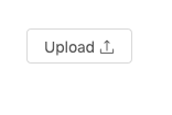
The second element shows you an upload button that registers files, and you can even push the files to an API endpoint that stores them. It’s a very useful component which is mostly hard to configure correctly, but Ant Design just gets it right.
Live Code
See the Pen Ant Design 2.
2. Element UI
Pros:
- It has a very large range of components.
- It offers extensive documentation with version management.
Cons:
- The default language of Element is Chinese. If you want to use another language, you’ll need to do some i18n configuration.
With over 35,000 stars on GitHub, Element is one of the leading UI frameworks for Vue.js 2.0. Element is focused on web applications. Built upon a strong community of over 400 contributors, the library provides a rich selection of customizable components along with a full style guide and more resources.
Element is quite similar to Ant Design, as it provides the same minimal style with a beautiful touch. But Element provides better capabilities for designers to change the style and layout of all components using an easy style guide where you can change things such as the primary color of the theme.
Element offers 16 components for building nice, easy-to-understand forms. Besides that, it offers several components for things such as data display, navigation, and message.
Code Snippets
The first element I want to bring to your attention is the tree select. It allows you to display and select data in a hierarchical structure. Here’s an example implementation of this tree component in Vue which shows how to load node data asynchronously.
Live Code

See the Pen Element - Tree select.
This is a simple tree element that allows you to select data entries in this hierarchical data set. There are even more crazy implementations that let you filter this tree, move elements from one branch to another, or append and delete data in the tree. In my opinion, it’s quite a unique component for a UI library that can be a good alternative way for displaying and interacting with data.
The next component is also quite special for a UI library. This transfer component lets you move data from one list to another. It also allows you to select or deselect all data in one list so you can quickly move it.
Live Code

See the Pen Element - Transfer.
Again, many advanced options are available, like disabling the transfer of certain elements, filtering list, or even executing operations on your selected data. It’s a great alternative for selecting data in a user-friendly way.
3. Vue Material
Pros:
- Allows you to mimic Google elements in your application.
- It’s mobile focused.
- Its documentation.
- It includes Code Sandbox integration, so you can immediately experiment with the code.
Cons:
- Currently 109 open issues, of which most have not yet been addressed by the developers.
Vue Material is a simple and lightweight design library built exactly according to the Google Material Design specs. They offer a wide range of form elements to build your mobile application. For example, the Input & Textarea section offers many input options, such as password fields, fields with a maximum length, built-in error validation, or prefixes and suffixes. All of this is well documented with all properties the element accepts and the events it fires.
Vue Material even provides different classes to change the layout of your component. The toolbar section is a good example of this. You can add an offset to your title, remove the hamburger icon, or add some custom section ending.
Code Snippets
The first snippet shows a simple speed dial—a common component for mobile applications—which not many UI libraries offer. You can add multiple icons to the speed dial that each have their own action attached to it.
Live Code

See the Pen Vue Material - speed dial.
The second item I selected is the calendar input. It’s a great example of Google Material Design. I experimented a bit with the options and was able to disable all Saturdays and Sundays by declaring a disabledDates data property:
new Vue({
  el: '#app',
  name: 'DisabledDatesDatepicker',
  data: () => ({
    selectedDate: null,
    disabledDates: date => {
      const day = date.getDay()
      return day === 6 || day === 0
    }
  })
})
It’s a good example of controlling the input of your users with a smart UI.
Live Code

See the Pen Vue Material - date picker disabled days.
4. iView
Pros:
- It offers clean animations.
- It offers a wide range of components with amazing data table components.
- It has an easily customizable theme.
Cons:
- Some components don’t have many variants.
- The default language is Chinese. If you want to use English, you’ll need to do some i18n configuration.
With over 20,000 stars on GitHub, iView is one of the leading UI libraries for Vue. The style of the theme can be easily changed in the Less file, which holds a set of variables that can be customized. It’s recommended that you override these variables by importing a custom theme file. The style of the theme is very minimalistic but beautiful, and includes many simple animations that help the library to stand out.
For some elements, the library doesn’t offer so many variants. For example, the Card component just offers a few basic card designs, while other libraries have card designs that include action bars, images, etc. However, some elements are very elaborate, like the data table components. Let’s take a look at them in the code snippets section.
Code Snippets
The first data table snippet includes a view and delete button to display or delete rows in the table. It’s quite a basic example.
Live Code

See the Pen iVew Data Table Component.
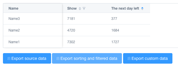
Next, we have a more elaborate data table example that includes filters and sorting for each column. The data table comes with the ability to export the data to CSV. What’s special here is that you can even export the filtered data and also select the columns you want to include.
Live Code
See the Pen Vue.js iView Table Sort Filter CSV.
5. Mint-UI
Pros:
- It includes uncommon components like lazy load, action sheet, swipe or infinite scroll.
- It’s mobile focused.
Cons:
- The design is a bit too simple.
- There’s no documentation on how to change or improve the design.
- There are no events listed in API specs.
With over 13,000 stars on GitHub, Mint-UI is a popular Chinese UI library for Vue. The library includes some more uncommon components like an action sheet, cell swipe, index list or infinite scroll, all of which are mobile focused. However, the design is too simplistic and doesn’t have any styling.
Besides that, the library doesn’t list events for the components. For example, the checklist component returns an array of checked options, but it’s not clear how to access this value or where it’s coming from. For a Vue beginner, this can be very confusing!
Code Snippets
The first code snippet is an example of an index list. It’s an uncommon example but still a useful element for including in your mobile application.
Live Code

See the Pen Mint-UI 1 Proper index list.
The second code snippet shows a year-month picker to indicate a range. It includes a comparison function that makes sure the second value is always greater than the first item in the range comparison. Again, a simple but useful element.
Live Code

See the Pen Mint-UI 2 Picker.
The Bottom Line
There are many great UI libraries out there for Vue and this was only a small selection of my favorites.
Of the libraries presented, iView offers the greatest design of all libraries but not all elements are as elaborate as the data tables section. Ant Design is an ideal choice if you want a nice and minimal design with most of the data input and data display components covered in the library. It also has a number of other useful components, such as a progress bar with steps. In my opinion, despite its mobile-friendly approach, Mint-UI is probably the least useful library from this selection as the design is very basic and the events aren’t well documented in the API.
However, saying this, whichever library you pick will depend on your project requirements. They all have their strengths and weaknesses, and there isn’t one that covers all the bases alone.