with Barbara Fudurich
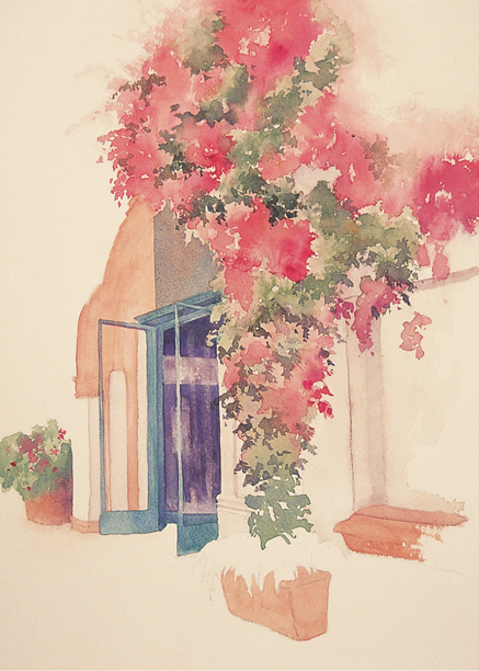
OFTEN THE SUBJECT ITSELF will determine the format—the shape, size, and orientation—of my paintings. For example, a horizontal format is logical for a broad landscape, whereas a vertical format is better suited for tall subjects, such as a vase of flowers. But just because your format is rectangular, that doesn’t mean your painting need be. I often like to create a free-form composition— a vignette—that doesn’t cover the entire paper. In a vignette, parts of the scene are omitted and most of the subject fades away along the edges. Although you can blur the edges of your subject evenly, creating a perfect oval, I prefer more asymmetrical designs that provide interest and a sense of movement in a composition. Here I let the subject “bleed” off the paper, balancing the painted elements with the blank areas and anchoring the subject on the page.
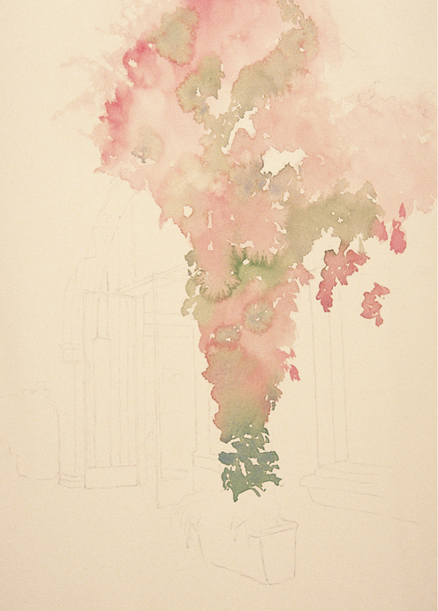
1 I sketch out my composition on the paper, including only the parts of the scene that I want to focus on. Then I paint with the side of a very wet, large round brush to create the bougainvillea, using permanent rose mixed with a touch of quinacridone gold for the blossoms and touches of sap green mixed with ultra-marine blue for the greenery. I let all the colors blend together, and then charge in the green mix here and there to break up the mass of pink. I paint all the way to the top and right edges of the paper–my first two anchor points.
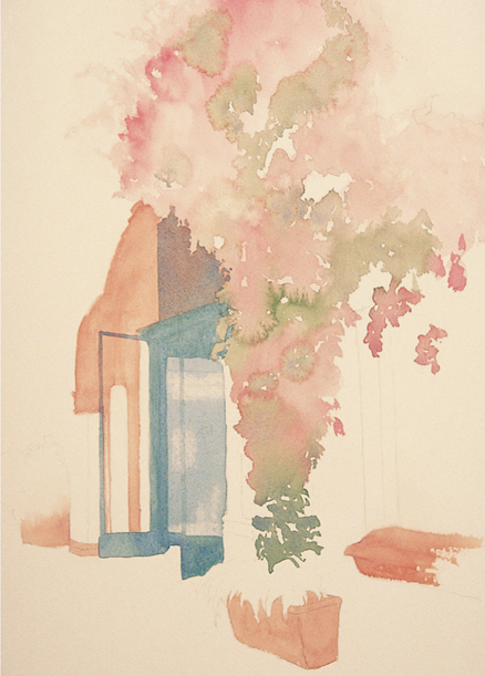
2 Next I paint the arch over the door, the flowerpots, and the window ledge with a mix of quinacridone burnt orange, vermilion, and a touch of dioxazine purple. Using a damp brush, I gently soften the edge where the bougainvillea and the arch meet. I switch to a large round brush to paint the doorframe with a mixture of viridian green and a touch of cobalt blue, lightly washing the mix over the glass door on the right. Then I use a damp brush to lift out a few reflections in the glass.
3 I wash a light gray mix of vermilion, quinacridone gold, and cerulean blue over the wall, painting around the bougainvillea. I also wash over the building on the left side of the doorway, leaving the front edge white. I use the tip of the brush to apply a heavier application of gray around the doorway and window. I paint the “inside” of the building using ultramarine blue mixed with a bit of vermilion. Next I lift out a few spots with a damp brush, indicating objects inside, and then lift out some lighter reflections in the glass. With the tip of a round brush, I carry the color along the doorframe.
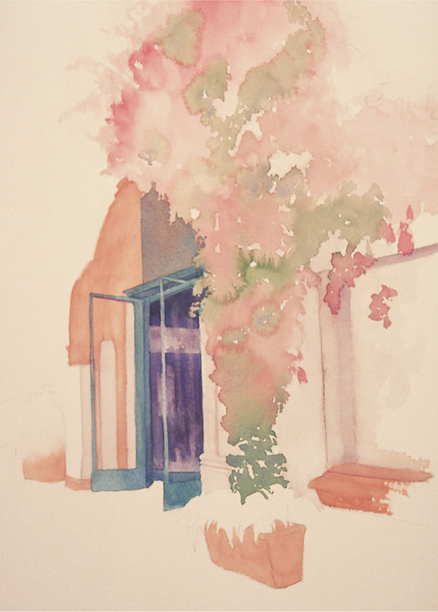
4 With a green mix of sap green and ultramarine blue, I add foliage to the flowerpot, extending the greenery to touch the paper’s edge so it becomes the third anchor of my vignette, balancing the two points of bougainvillea that touch at the top and at right. I drop in a mix of permanent rose and quinacridone gold for flowers. Then I glaze ultramarine blue mixed with a touch of vermilion along the flowerpot to give it form and to define the edge of the building. I return to the bougainvillea, adding another layer of the red and green mixes and charging in alizarin crimson for deeper values.

5 Next I use a medium brush with a mix of quinacridone burnt orange and a bit of dioxazine purple to give definition to the archway, window ledge, and planter. Then I use a liner brush to create fine lines in the same area. I brush in foliage in the planter at right using viridian green mixed with a touch of dioxazine purple. Then, to give form to the foliage, I add more pigment to the tip of the brush and add fine lines. I also brush a mix of quinacridone orange and dioxazine purple along the side edge of the window to connect the ledge to the mass of bougainvillea so that the window isn’t “floating.”
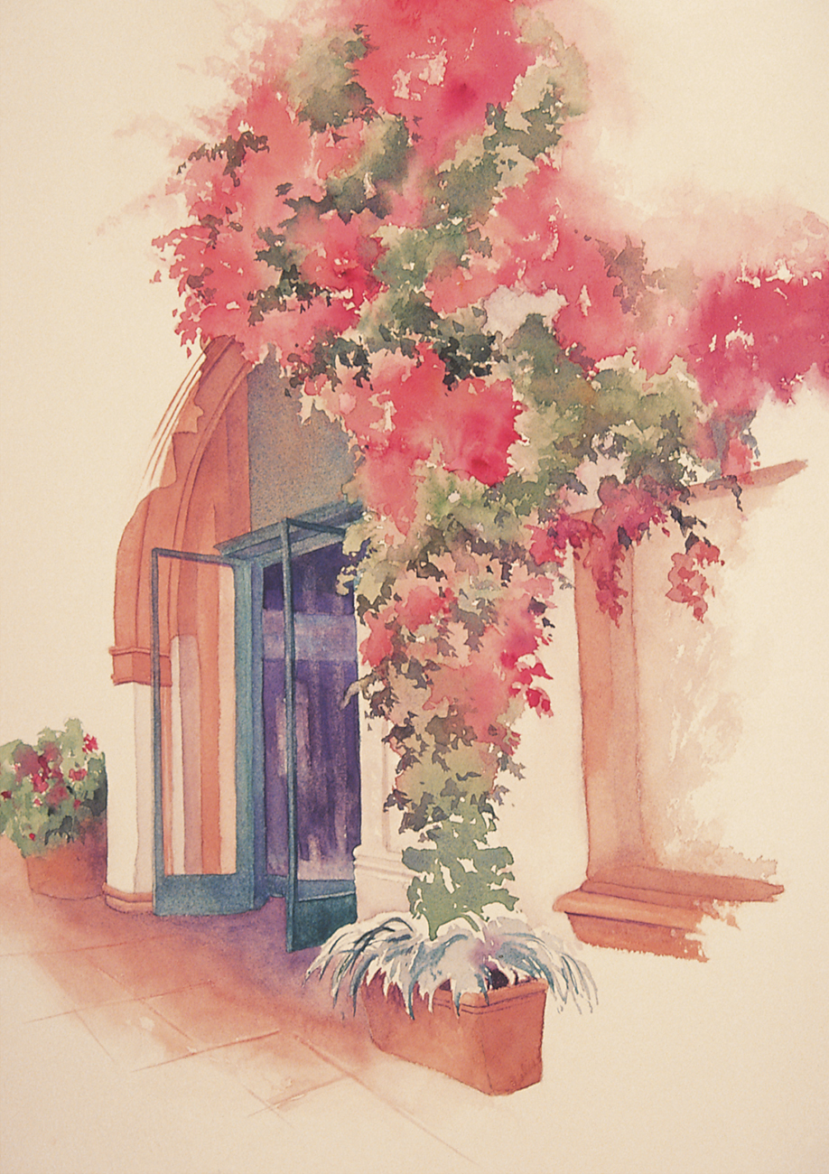
6 I begin the flooring with a mix of ultramarine blue and vermilion. Then I switch to a mix of quinacridone gold, permanent rose, and dioxazine purple for the tile, keeping the outer edges soft and indistinct. While the surface is damp, I use the chisel end of my brush to scrape out grouting lines (a palette knife also will work). Because the paint is still on the wet side, the pigment will run into the grooves and create dark lines. To finish, I lift out color along the outer edge of the doors, darken the flowerpot foliage next to the building, and add a few more touches of alizarin crimson to the bougainvillea.
BOUGAINVILLEA FOLIAGE

Sap green and ultramarine blue
ARCHWAY, FLOWERPOTS, AND LEDGE LIGHTS

Quinacridone burnt orange, vermilion, and dioxazine purple
ARCHWAY, FLOWERPOTS, AND LEDGE DARKS
Quinacridone burnt orange and dioxazine purple
OUTSIDE OF BUILDING
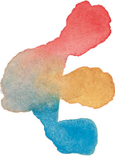
Vermilion, quinacridone gold, and cerulean blue
INSIDE OF BUILDING

Ultramarine blue and vermilion