with Joan Hansen
INCORPORATING ELEMENTS of the environment can add interest to a floral composition and highlight the vibrant colors of flowers. Sometimes I like to capture a quiet corner in a garden or a sparkling seaside dotted with spring blossoms. I enjoy the challenge of creating the illusion of space and depth by overlapping objects and varying color, values, and size. But the floral elements in the scene allow me to maintain a sense of intimacy in a wider landscape setting.
Focusing on the Foreground
You can showcase a particularly striking plant by zooming in on one or two blooms, as I have done with these colorful birds of paradise. Focus attention on the flowers by placing them in the extreme forefront of your composition, and use warm, vivid colors to make them “pop” forward. In this painting, I also contrast the intense colors of the foreground blossoms with the cool, muted shades of the cast shadows and less detailed background flowers. The marked differentiation in both detail and color makes the birds of paradise truly the center of attention.

1 After I sketch my scene, I begin painting my focal point, the large foreground flowers. I paint the orange petals of the first flower with a small round brush and a mix of cadmium orange and touches of cadmium yellow medium and cadmium scarlet. When dry, I add a touch of burnt sienna to the mix for the shadows. Next I glaze cadmium yellow medium and then cadmium scarlet over the petals. I switch to a mix of mineral violet and cobalt blue to build up glazes for the dark values of the purple petals. Then I wet the base, where the petals originate. Working from left to right, I wash in cadmium yellow medium, cadmium scarlet, and cadmium red medium; then permanent magenta and ultramarine blue; and finally a mix of cadmium yellow medium and ultramarine blue, with more blue for the darks. When dry, I glaze dark values of the red, purple, and green near the lower edge and soften all the edges with a damp brush.

2 I finish the second flower with the same colors and techniques I used for the foreground flower. When dry, I switch my focus to the large curled leaf. I wet the surface of the leaf and then wash in a light gray-green mix of cobalt turquoise, cadmium yellow pale, and a touch of burnt umber. Using a darker value of the same color, I add shadowed lines to create the illusion of soft folds in the leaf. Then I use a damp brush to blend the edges.

3 For the split-leaf plants, I start with aureolin yellow along the edges and move on to the sunlit portions with aureolin yellow mixed with a touch of cobalt turquoise. At the outer edge, I blend the washes with a damp brush and then add a thin line of burnt sienna. Next I add darks with a mix of cobalt turquoise and a touch of aureolin yellow. I glaze the underside of the leaves with cerulean blue, painting from center vein to mid-leaf. I soften the edges of the glaze with a damp brush.

4 Alternating between purples and blue-greens from previous steps, I paint abstract shapes for the flower bed. When dry, I add darker values to break up the larger shapes. Then I start the bamboo with a mix of burnt sienna and a little ultramarine blue. When dry, I apply a darker value to the left shadow side. I begin my background by randomly painting foliage shapes with cobalt blue, cobalt turquoise, and cerulean blue. I let the colors blend and lift out a few lighter spots with a tissue.

5 Using the same techniques as in step four, I complete the bamboo and the cool blue background wash. Alternating between some of the green mixtures I’ve used previously, I paint in some foliage shapes in the area behind the birds of paradise. Then I use a flat brush to wet the sunlit path. Working wet-into-wet, I wash a light coat of yellow ochre over the area. In the tighter spaces, I let the paper dry first to better control the spread of color.

6 When dry, I lightly sketch in the shapes of the shadows on the path with a pencil. I paint the path shadows in one continuous motion, starting at the bottom edge of the paper with a graded wash of mineral violet mixed with ultramarine blue and burnt sienna. Next I paint dark values in the foliage for cast shadows. I also glaze cadmium orange over the split leaves to make them more vibrant. Then I add a touch of orange to some of the white spaces in the flower bank. Finally, I glaze cadmium orange over the bamboo to create a sense of color harmony.
CURLED LEAVES
Cobalt turquoise, a little cadmium yellow pale, and a touch of burnt sienna

LEAF HIGHLIGHTS
Aureolin yellow and a touch of cobalt turquoise

LEAF SHADOWS
Cobalt turquoise and a touch of aureolin yellow

PATH SHADOWS
mineral violet, ultramarine blue, and burnt sienna
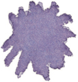
PURPLE PETALS
mineral violet and a touch of cobalt blue
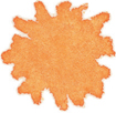
ORANGE PETALS
Cadmium orange and touches of cadmium yellow medium and cadmium scarlet

ORANGE PETAL SHADOWS
Cadmium orange, cadmium scarlet, and touches of cadmium yellow medium and burnt sienna