Color Theory & Color Palettes
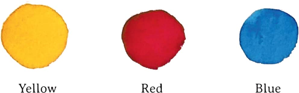
Color is one of the most exciting aspects of watercolor painting; who can resist the appeal of all those gorgeous hues of pigment? Knowing just a bit about the different hues and their relationships to each other can help broaden your palette, even if you only start with three colors. The three primary colors are yellow, red, and blue.
Mixing these three in different combinations will broaden your palette to twelve colors. Here is how you do it:
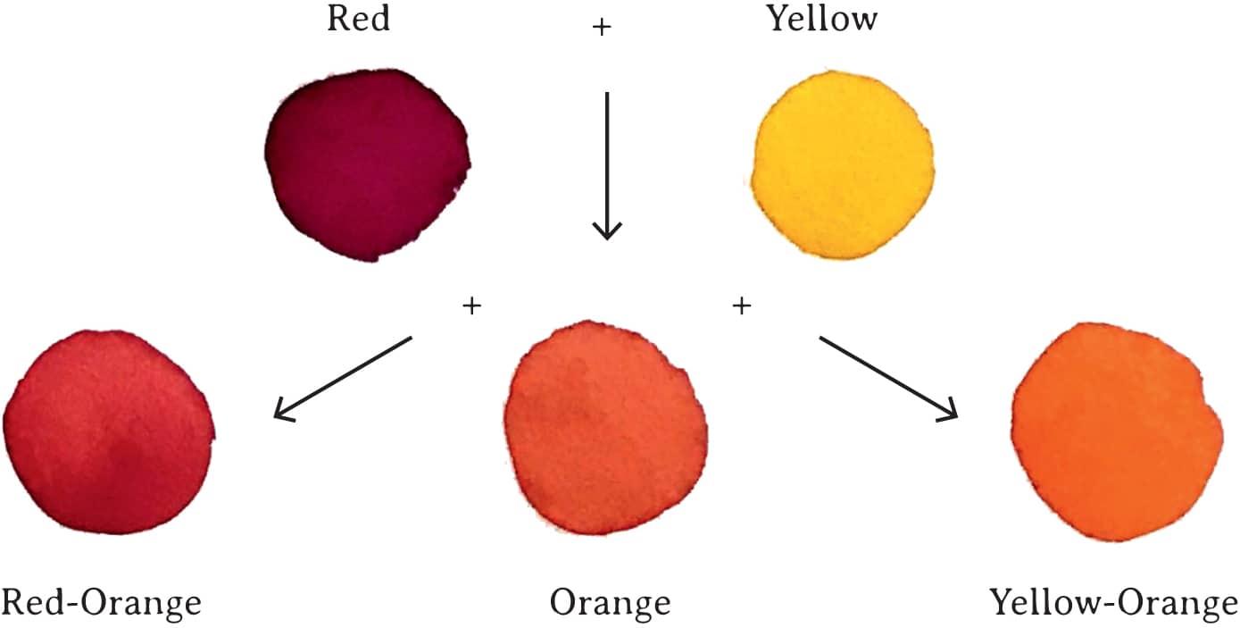
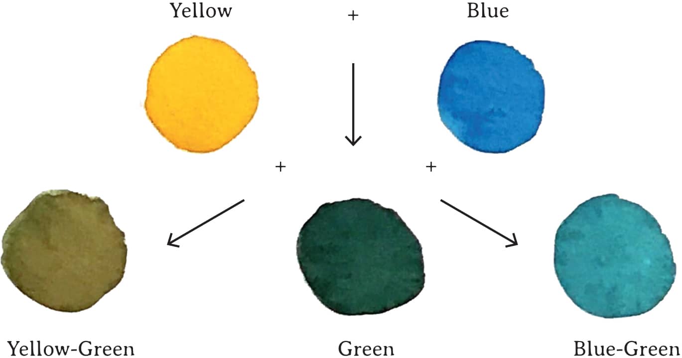
First, mix yellow and red to make orange. Then mix red and blue to make purple. Finally, mix blue and yellow to make green. These are called secondary colors; observe how they are placed around the color wheel below.
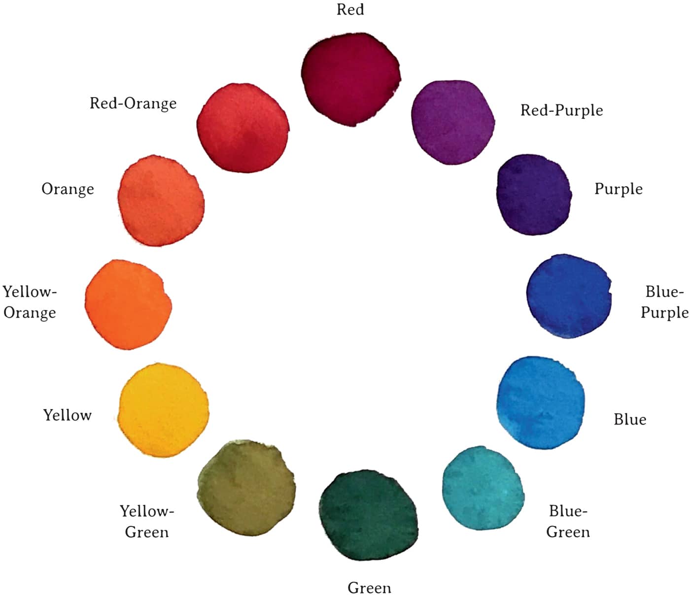
You can now mix another set of colors, called tertiary colors, to fit between the primary and secondary colors.
Mix orange with red to make red-orange. Mix yellow with orange to make yellow-orange.
Mix green with yellow to make yellow-green. Mix blue with green to make blue-green.
Mix purple with red to make red-purple. Mix blue with purple to make blue-purple.


COLOR COMBINATIONS
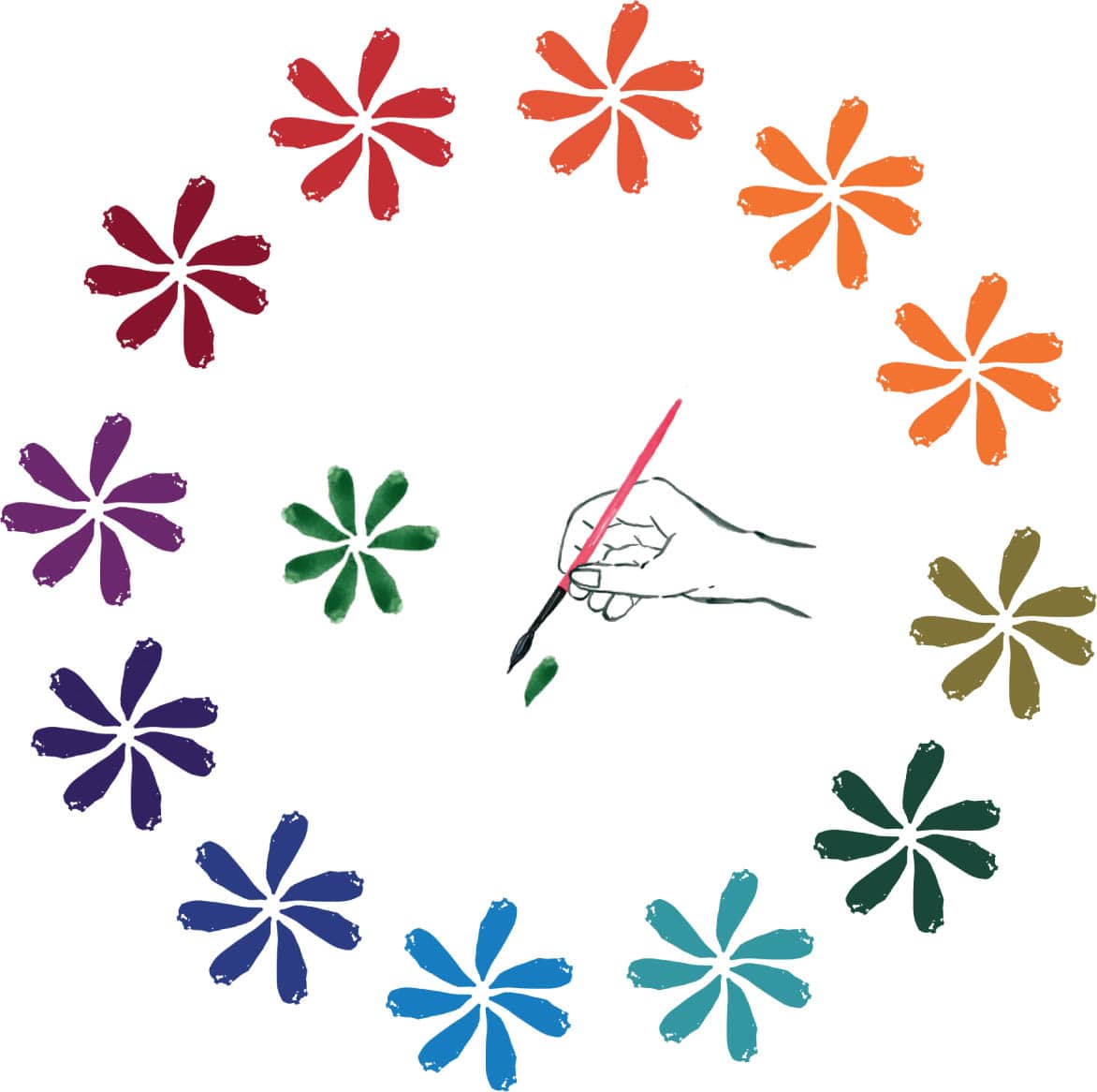
A simple way to make a flower is by “stamping,” using the natural shape of the brush. Several of these petals placed together will create a flower.
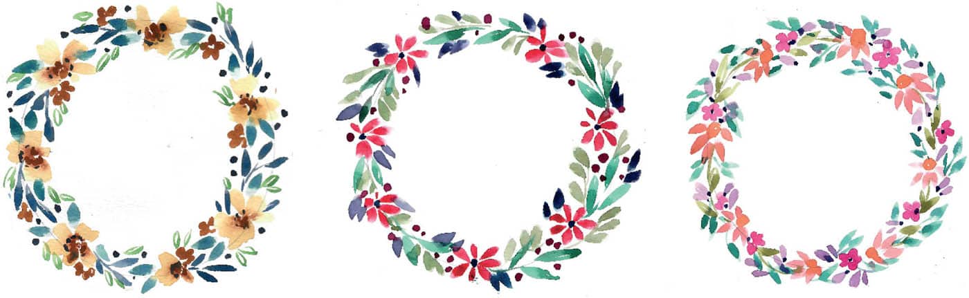
Once you’ve painted your flowers, practice mixing neutral colors for some leaves between the flowers. The easiest way to mix a neutral color is to use two shades directly across from each other on the color wheel.
Here are a few suggestions: red and green, blue and orange, or yellow and purple.
As you can see, each of these wreaths turns out unique, and they all look fabulous when put together! You can continue to practice these color exercises by substituting different reds for the primary red, or you could also use pink. Try a warm yellow-brown pigment like yellow ochre for the yellow. Blue can easily be substituted with a more purple pigment to mix many lovely grays. These three wreaths were painted using different combinations of primary colors.