
CHAPTER 3
Building a .NET App with WinRT
Chapter 2 focused on building components and accessing them across languages. For many scenarios, this will come in handy. However, the vast majority of development situations will use the controls and components included in Windows 8.
This chapter focuses on a few of the simpler controls and consumes them into a .NET app written in Visual C#. Developers with knowledge of WPF or Silverlight will find this chapter quite familiar.
In this chapter you will
- Build a Visual C# Metro style app
- Consume Windows 8 WinRT controls and components
- Use data binding to populate WinRT controls
- Use templating to control the display of data
 Note Visual C# was chosen for this chapter in order to utilize XAML controls and demonstrate .NET development against WinRT. At the very least, it extends the range of exposure from the previous chapter, which focused on HTML and JavaScript
A Simple Design
The app in this chapter is for demonstration purposes only, so the design is simple. The app will show a couple of different ways to access the photos on your machine. It will demonstrate data binding and control manipulation. The basic features and approaches shown in this chapter will work for nearly all WinRT controls.
There are many resources, online and in print, that focus on building Metro style apps. This chapter is not about the design aspects and other points of interest when building an app for the Windows Marketplace. The focus of this chapter is WinRT and showing you how to use it.
Note You can find a list of resources for building Windows 8 Metro style apps in the appendix of this book.
Create the Solution
In this section, you will start with the Blank Application template and build an app that demonstrates some fundamental concepts of working with WinRT controls. You will add data binding and control manipulation.
1. Start Visual Studio 11 Beta on your Windows 8 development machine.
2. Create a new project and select the Blank Application template in the Visual C# Windows Metro style section.
3. Enter the name of your solution and the location for your code files. When your screen is similar to Figure 3-1, click OK.

Figure 3-1. Creating a new Visual C# Metro style project
Visual Studio creates the solution and necessary project files for your app. You will begin by building the UI, so look for the BlankPage.xaml file.
Build the UI
Every good app starts with the user experience.
1. Open the BlankPage.xaml file. The page consists of an empty Grid control. Replace the Grid control with the following code:
<Grid Background="Silver">
<Grid.RowDefinitions>
<RowDefinition />
<RowDefinition />
</Grid.RowDefinitions>
<Grid.ColumnDefinitions>
<ColumnDefinition />
<ColumnDefinition />
</Grid.ColumnDefinitions>
</Grid>
This XAML simply sets up the structure of the page. It breaks up the screen into four even areas. Now you will add the controls for each area.
2. Add the following code just above the closing Grid tag to build the controls for the top left section of the screen:
<StackPanel Grid.Column="0" Grid.Row="0" VerticalAlignment="Center">
<TextBlock FontSize="40" HorizontalAlignment="Center"
VerticalAlignment="Top">
Test App
</TextBlock>
<ComboBox x:Name="cboOptions" Width="400" Margin="20"
SelectionChanged="cboOptions_SelectionChanged_1">
</ComboBox>
<Button x:Name="btnPickImage" Width="200" Content="Change Image"
HorizontalAlignment="Center" Click="btnPickImage_Click_1" />
</StackPanel>
The design view in Visual Studio should appear similar to Figure 3-2.
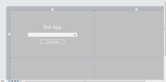
Figure 3-2. Design view of the first set of controls
This section arranges the controls on the top left using a StackPanel control. The values of Grid.Column and Grid.Row specify where the controls display in the Grid control. The StackPanel control is in column “0” and row “0.”
Within the StackPanel control, there is a TextBlock control to display the title for the app, a ComboBox control to display a few options for interaction by the user, and a Button control for the user to click.
3. Add an Image control to the top right section. Add the following code just below the StackPanel control:
<Image x:Name="imgPhoto" Grid.Column="1" Grid.Row="0"
Source="images/image1.jpg" Height="300" Width="300">
</Image>
The Image control references a file in the Source attribute. This file needs to be added to the project to display on the screen.
4. Right click on the solution and click Add  New Folder. Name the new folder “images”.
5. Add an image file from your machine by clicking the images folder and selecting Add Existing Item, as shown in Figure 3-3.
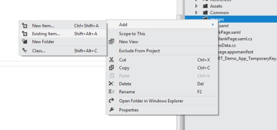
Figure 3-3. Adding an existing item to the images folder
6. Either rename the added file to image1.jpg or change the value of the Source attribute to match your file name.
The design view should now appear similar to Figure 3-4, only with your image displaying on the top right.

Figure 3-4. Design view after controls defined for both top sections
Make the App Work
The UI for the top half of the app is complete. Now you will focus on making this section actually work before you turn to concentrating on the rest of the app. You will start with the Combo Box control of options.
You will use data binding to populate the Combo Box control. For data binding, you need a data source.
1. Right-click the solution and click Add Class. Name the class DemoData.cs. Add the code from Listing 3-1 to this new file.
Listing 3-1. DemoData.cs
public static class DemoData
{
public static List<string> GetSizeOptions()
{
List<string> options = new List<string>();
options.Add("Small");
options.Add("Medium");
options.Add("Large");
return options;
}
}
This class has one simple method, GetSizeOptions(). This method returns a List<> of string objects. This will be used as the options for the Combo Box control.
2. Open BlankPage.xaml.cs. Add the following using statements to the beginning of the class file:
using Windows.Storage.Pickers;
using Windows.UI.Xaml.Media.Imaging;
using Windows.Storage;
3. Add the following method to the class:
void BlankPage_Loaded(object sender, RoutedEventArgs e)
{
//bind data to control
cboOptions.ItemsSource = DemoData.GetSizeOptions();
}
This method simply binds cboOptions to the List<> of strings that is returned by the SetSizeOptions() method. Since the method returns a collection of strings, the combo box will use the value as the display and the value of each item.
Note You can bind a collection of other types to a control like Combo Box. However, you would need to set
the DisplayMember and ValueMember properties to configure how to display and work with items bound to the control.
The method needs to be called. In fact, the method BlankPage_Loaded() is actually an event handler, written to be called once the page is loaded.
4. Add the following line of code to the BlankPage() constructor, just after the this.InitializeComponent() line:
this.Loaded += BlankPage_Loaded;
5. Add the following code to handle the event when the selection in the Combo Box control is changed:
private void cboOptions_SelectionChanged_1(object sender,
SelectionChangedEventArgs e)
{
switch (e.AddedItems[0].ToString())
{
case "Small":
imgPhoto.Height = 100;
imgPhoto.Width = 100;
break;
case "Medium":
imgPhoto.Height = 300;
imgPhoto.Width = 300;
break;
case "Large":
imgPhoto.Height = 600;
imgPhoto.Width = 600;
break;
}
}
This code changes the size of the Image control based on the selection made by the user.
6. Add the following code to handle the button click event for btnPickImage:
async private void btnPickImage_Click_1(object sender, RoutedEventArgs e)
{
var filePicker = new FileOpenPicker();
filePicker.FileTypeFilter.Add(".jpg");
filePicker.ViewMode = PickerViewMode.Thumbnail;
filePicker.SuggestedStartLocation = PickerLocationId.PicturesLibrary;
filePicker.SettingsIdentifier = "imagePicker";
filePicker.CommitButtonText = "Choose an image to load";
var file = await filePicker.PickSingleFileAsync();
BitmapImage bitmap = new BitmapImage();
bitmap.SetSource(
await file.OpenAsync(Windows.Storage.FileAccessMode.Read)
);
imgPhoto.Source = bitmap;
}
This is the most complex section of code so far. This method uses the WinRT FilePicker control. When the button is clicked, a new instance of the FilePicker is instantiated. Settings are configured.
Note The FileTypeFilter property needs at least one value added, even if that value is "".
The CommitButtonText property allows you to override the FilePicker button text.
Chapter 1 explained that WinRT was designed to run asynchronously most of the time. The FilePicker runs this way. The await keyword is used to allow the code to open the FilePicker and wait for the response without stopping the UI thread from working, as in the following line from this method:
var file = await filePicker.PickSingleFileAsync();
Adding an await statement into a method does require that method to run asynchronously as well. You can see that the async keyword has been added to the method definition to satisfy this requirement.
Once the file is chosen by the user, it is then read into a BitmapImage object for display on the screen.
These are the last of the code changes for the top sections of this app. You can refer to Listing 3-3 toward the end of this chapter if you have questions regarding code placement in the files.
Run the First Test
Now you are ready to run the app.
1. Press F5 to run the solution. Your screen should appear similar to Figure 3-5.

Figure 3-5. WinRT_Demo_App running in first test
2. The Combo Box control should be populated with the options shown in Figure 3-6.

Figure 3-6. WinRT_Demo_App Combo Box options
3. Selecting an option in the Combo Box control should change the size of the image, as shown in Figure 3-7.

Figure 3-7. WinRT_Demo_App with image resized
4. Clicking the Change Image button should bring up the File Picker. Your screen should look similar to Figure 3-8.
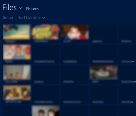
Figure 3-8. WinRT File Picker (images blurred intentionally)
5. Choose a file and click the Choose and image to load button, as shown in Figure 3-9.
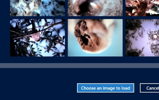
Figure 3-9. File Picker button
The image you chose should appear on the right side of the screen. You can continue to resize this image with the Combo Box control, or you can choose other files to load in its place.
Note This app uses the FilePicker to gain access to files on the machine. This interaction involves the user, so permission is granted. If the app were to load a file directly, without interaction from the user, the app would need to be configured to do so. This is done by managing the Capabilities list in the Package.appxmanifest file. Figure 3-10 shows this file and the options available.
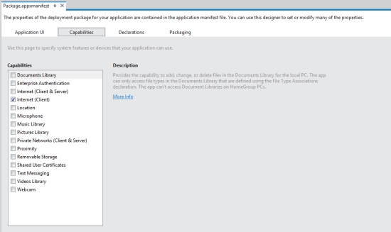
Figure 3-10. Managing the capabilities of an app
Complete the UI
Now you will add the UI markup for the bottom sections of the screen.
1. Open BlankPage.xaml and add the following code just below the StackPanel control added earlier:
<Button Grid.Column="0" Grid.Row="1" x:Name="btnPickFolder" Width="200"
Content="Load images from folder" HorizontalAlignment="Center" Click="btnPickFolder_Click_1" />
<GridView x:Name="gvPhotos" Grid.Column="1" Grid.Row="1"
HorizontalAlignment="Stretch" Margin="0" VerticalAlignment="Stretch" ItemTemplate="{StaticResource Standard250x250ItemTemplate}">
</GridView>
This XAML markup adds a Button control to the bottom left section and a GridView control to the bottom right section. The button is configured to look just like the button in the top section. The GridView control is configured to fill the bottom right section. It also is set up to use the Standard250x250ItemTemplate template.
Note The Standard250x250ItemTemplate template is provided by the default Metro style files. It can be found in the solution under the Common folder, in the StandardStyles.xaml file.
The UI is now complete. The design view in Visual Studio should appear similar to Figure 3-11. While the GridView control is present, there is no visible element until the data is added. Therefore, it does not appear in the design view.
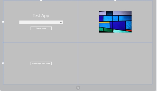
Figure 3-11. Complete UI design
Complete the App
The data template for the items in the GridView control requires an object with particular properties.
1. Add a new class file to the solution called ImageGroupItem.cs. The code for this class file is shown in Listing 3-2.
Listing 3-2.ImageGroupItem.cs
using System;
using System.Collections.Generic;
using System.Linq;
using System.Text;
using System.Threading.Tasks;
using Windows.UI.Xaml.Media.Imaging;
namespace WinRT_Demo_App
{
class ImageGroupItem
{
public BitmapImage Image { get; set; }
public string Title { get; set; }
public string Subtitle { get; set; }
}
}
2. Add the following code to handle the button click event for btnPickFolder:
async private void btnPickFolder_Click_1(object sender, RoutedEventArgs e)
{
var folderPicker = new FolderPicker();
folderPicker.FileTypeFilter.Add("*");
folderPicker.SettingsIdentifier = "imageFolderPicker";
folderPicker.SuggestedStartLocation = PickerLocationId.PicturesLibrary;
var folder = await folderPicker.PickSingleFolderAsync();
var files = await folder.GetFilesAsync();
List<ImageGroupItem> items = new List<ImageGroupItem>();
foreach (StorageFile file in files.Take(6))
{
BitmapImage photoBitmap = new BitmapImage();
photoBitmap.SetSource(await file.OpenAsync(FileAccessMode.Read));
ImageGroupItem item = new ImageGroupItem()
{
Image = photoBitmap,
Title = file.Name,
Subtitle = file.DateCreated.ToString()
};
items.Add(item);
}
gvPhotos.ItemsSource = items;
}
This method uses the FolderPicker WinRT control. It works very similarly to the FilePicker used earlier. Once a folder is chosen, the code loops through the files and creates a list of ImageGroupItem objects and binds that list to the GridView control.
The asynchronous methods GetSingleFolderAsync() and GetFilesAsync() are used in this section.
Prior to C# 4.5, a separate method would need to be implemented to handle the response from the asynchronous call. In C# 4.5, the await keyword is available. Asynchronous development has become straightforward and simple.
In this example, the files and folders will be retrieved without causing the UI layer to stop responding to the user. The async keyword is required on the method signature because the await keyword is used.
Note The Take(6) method on the files collection is used to control the number of images bound to the GridView control. Depending on the size of the images in the folder chosen, performance can become a problem with a large number of images.
The app is ready for complete functionality tests.
1. Press F5 to run the app. You should see something similar to Figure 3-12.
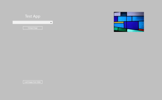
Figure 3-12. WinRT_Demo_App running for final tests
2. Click the Load images from folder button on the bottom of the screen to bring up the FolderPicker, as shown in Figure 3-13.

Figure 3-13. WinRT FolderPicker
3. Choose a folder and click the Choose this folder button at the bottom, shown in Figure 3-14.
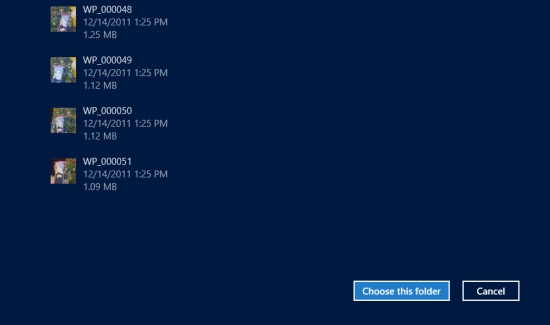
Figure 3-14. FolderPicker commit button
Six images from the chosen folder should load into the GridView control with their information, as shown in Figure 3-15.

Figure 3-15. Images loaded into GridView (blurring intentional)
The full code for BlankPage.xaml is included in Listing 3-3. If you are not familiar with XAML, it is helpful to see how the markup works. The Grid control includes column and row definitions to break up the screen into areas. StackPanel controls help to organize controls within an area. It is in the XAML that the UI layer is described.
Listing 3-3. BlankPage.xaml
<Page
x:Class="WinRT_Demo_App.BlankPage"
xmlns="http://schemas.microsoft.com/winfx/2006/xaml/presentation"
xmlns:x="http://schemas.microsoft.com/winfx/2006/xaml"
xmlns:local="using:WinRT_Demo_App"
xmlns:d="http://schemas.microsoft.com/expression/blend/2008"
xmlns:mc="http://schemas.openxmlformats.org/markup-compatibility/2006"
mc:Ignorable="d">
<Grid Background="Silver">
<Grid.RowDefinitions>
<RowDefinition />
<RowDefinition />
</Grid.RowDefinitions>
<Grid.ColumnDefinitions>
<ColumnDefinition />
<ColumnDefinition />
</Grid.ColumnDefinitions>
<StackPanel Grid.Column="0" Grid.Row="0" VerticalAlignment="Center">
<TextBlock FontSize="40" HorizontalAlignment="Center"
VerticalAlignment="Top">Test App</TextBlock>
<ComboBox x:Name="cboOptions" Width="400" Margin="20"
SelectionChanged="cboOptions_SelectionChanged_1"></ComboBox>
<Button x:Name="btnPickImage" Width="200" Content="Change image"
HorizontalAlignment="Center" Click="btnPickImage_Click_1" />
</StackPanel>
<Image x:Name="imgPhoto" Grid.Column="1" Grid.Row="0"
Source="images/image1.jpg" Height="300" Width="300"></Image>
<Button Grid.Column="0" Grid.Row="1" x:Name="btnPickFolder"
Width="200" Content="Load images from folder"
HorizontalAlignment="Center" Click="btnPickFolder_Click_1" />
<GridView x:Name="gvPhotos" Grid.Column="1" Grid.Row="1"
HorizontalAlignment="Stretch" Margin="0"
VerticalAlignment="Stretch"
ItemTemplate="{StaticResource Standard250x250ItemTemplate}">
</GridView>
</Grid>
</Page>
The full code for BlankPage.xaml.cs is included in Listing 3-4. If you run into any issues building the project, check here to ensure that your code is correct and is in the correct place. This code is straightforward. It is essentially a collection of event handlers. There are no real tricks here, but that is by design. Developing with WinRT is straightforward.
Listing 3-4. BlankPage.xaml.cs
using System;
using System.Collections.Generic;
using System.IO;
using System.Linq;
using Windows.Foundation;
using Windows.Foundation.Collections;
using Windows.UI.Xaml;
using Windows.UI.Xaml.Controls;
using Windows.UI.Xaml.Controls.Primitives;
using Windows.UI.Xaml.Data;
using Windows.UI.Xaml.Input;
using Windows.UI.Xaml.Media;
using Windows.UI.Xaml.Navigation;
using Windows.Storage.Pickers;
using Windows.UI.Xaml.Media.Imaging;
using Windows.Storage;
// The Blank Page item template is documented at http://go.microsoft.com/fwlink/?LinkId=234238
namespace WinRT_Demo_App
{
/// <summary>
/// An empty page that can be used on its own or navigated to within a Frame.
/// </summary>
public sealed partial class BlankPage : Page
{
public BlankPage()
{
this.InitializeComponent();
this.Loaded += BlankPage_Loaded;
}
void BlankPage_Loaded(object sender, RoutedEventArgs e)
{
//bind data to control
cboOptions.ItemsSource = DemoData.GetSizeOptions();
}
/// <summary>
/// Invoked when this page is about to be displayed in a Frame.
/// </summary>
/// <param name="e">Event data that describes how this page was reached. The Parameter
/// property is typically used to configure the page.</param>
protected override void OnNavigatedTo(NavigationEventArgs e)
{
}
private void cboOptions_SelectionChanged_1(object sender, SelectionChangedEventArgs e)
{
switch (e.AddedItems[0].ToString())
{
case "Small":
imgPhoto.Height = 100;
imgPhoto.Width = 100;
break;
case "Medium":
imgPhoto.Height = 300;
imgPhoto.Width = 300;
break;
case "Large":
imgPhoto.Height = 600;
imgPhoto.Width = 600;
break;
}
}
async private void btnPickImage_Click_1(object sender, RoutedEventArgs e)
{
var filePicker = new FileOpenPicker();
filePicker.FileTypeFilter.Add(".jpg");
filePicker.ViewMode = PickerViewMode.Thumbnail;
filePicker.SuggestedStartLocation = PickerLocationId.PicturesLibrary;
filePicker.SettingsIdentifier = "imagePicker";
filePicker.CommitButtonText = "Choose an image to load";
var file = await filePicker.PickSingleFileAsync();
BitmapImage bitmap = new BitmapImage();
bitmap.SetSource(await file.OpenAsync(Windows.Storage.FileAccessMode.Read));
imgPhoto.Source = bitmap;
}
async private void btnPickFolder_Click_1(object sender, RoutedEventArgs e)
{
var folderPicker = new FolderPicker();
folderPicker.FileTypeFilter.Add("*");
folderPicker.SettingsIdentifier = "imageFolderPicker";
folderPicker.SuggestedStartLocation = PickerLocationId.PicturesLibrary;
var folder = await folderPicker.PickSingleFolderAsync();
var files = await folder.GetFilesAsync();
List<ImageGroupItem> items = new List<ImageGroupItem>();
foreach (StorageFile file in files.Take(6))
{
BitmapImage photoBitmap = new BitmapImage();
photoBitmap.SetSource(await file.OpenAsync(FileAccessMode.Read));
ImageGroupItem item = new ImageGroupItem()
{
Image = photoBitmap,
Title = file.Name,
Subtitle = file.DateCreated.ToString()
};
items.Add(item);
}
gvPhotos.ItemsSource = items;
}
}
}
Summary
This chapter has introduced WinRT development in .NET. In building the app in this chapter, you have seen several XAML WinRT controls:
- TextBlock
- Button
- Image
- FilePicker
- GridView
- FolderPicker
You have also used data binding and data templating to control the user interface and display of data. These basic approaches to app development apply to nearly all WinRT UI elements.
Hopefully, you are getting excited about WinRT development. If you are already familiar with .NET development, you can see that building apps for Windows 8 is very natural.
In the next chapter, you will learn how to expand your app. You will provide interaction with other apps and see how to access system resources.