
CHAPTER 12
ensuring a strong CENTER OF INTEREST

EILEAN DONAN, MONARCH OF SCOTLAND ![]() Watercolor
Watercolor ![]() 22″ × 30″ (56cm × 76cm)
22″ × 30″ (56cm × 76cm)

When I was a youngster, my cousins and I used to go out into the hills to play with our bows and arrows. I had a cousin who would never say beforehand what it was he was shooting at. He would wait to see what his arrow hit and then claim that was what he meant to hit. In painting, like target practice, we need to know what we are aiming at.
Ask yourself at the very beginning what you want to say in your painting. Be very specific and phrase it in visual terms. For example, the red shape; the white area surrounded by dark; the dark shape of trees where the river shape meets the base of the hill. This is a crucial step. You cannot design the painting to support the center of interest if there is no center of interest.
Four methods for establishing a center of interest
Some substitute the term “focal point” for “center of interest.” The only objection I have to the former term is that it seems to suggest a small point when the center of interest is usually a larger area. Once you have chosen a center of interest, you must decide two things:
l. Where you will place it in the format.
2. The methods you will use to direct attention to it.
Just wanting an area to be the center of interest will not make it happen. There are several tried-and-true methods that artists use to add emphasis to a center of interest. Among these are:
![]() Value contrast
Value contrast
![]() Color contrast
Color contrast
![]() Major lines of motion
Major lines of motion
![]() Contrast of complexity
Contrast of complexity
More often than not, an artist will use at least three of the four to ensure that the viewer does not miss the point. Study some of your favorite paintings to see if this is not so. In the center of interest you will usually find the darkest and the lightest values placed next to each other, the area of richest color, and the greatest concentration of small shapes.
In addition, you will find that lines of motion in the foreground lead to the center of interest. The outlying areas will be large and simple, painted in grayed or neutral colors with no strong contrast of values and little detail. What you do not include in the supporting areas is just as important as what you do include in the center of interest.
In the next few pages we will examine these methods more closely.

MORNING CHORES Watercolor 14″ × 21″ (36cm × 53cm)
Modify Subjects to Create a Center of Interest
The dark doorway in this scene caught my eye. I decided that if I pumped its interest level up a few notches, it would make a good center of interest. So, I put a light window shape within the doorway, moved the light-valued shed closer to it, and included a figure as a light shape cutting into the dark. Now you can't miss it!
Lead the viewer's eye with value contrast
Of the four methods for establishing a center of interest, value contrast is the most compelling to the viewer's eye. Design your center of interest as either a light shape surrounded by dark or a dark shape surrounded by light. Plan the remaining areas as middle or midtone values. Placing the strongest value contrast in your center of interest elevates it to a position of eye-catching importance.

EL MOLINO VIEJO ![]() Watercolor and collage
Watercolor and collage ![]() 14″ × 21″ (36cm × 53cm)
14″ × 21″ (36cm × 53cm)
A Light Against Dark Distinguishes the Center of Interest
The center of interest here is a light area surrounded by darker values. Limit the whites to the façade of the building and you will give greater importance to that area of the painting. The strong contrast of white against dark pulls the viewer's eye to this area. The contrasting orange only adds to it, like an extra nail in the board.
Think Value First, Then Color

Beginning artists often think the solution to a dull painting is to simply add more vivid colors. But if your values are poorly planned, no amount of beautiful color will fix your painting. Good color is key to the success of any painting, but a well-executed value plan is what will captivate your viewers.
Engage the viewer with color contrast
Color contrasts are abundant in nature. This is where our ideas about color harmonies originate. Nature provides us with large areas of subdued color (e.g. skies, fields and forests) juxtaposed with small areas of intense, rich color (e.g. flowers, birds and insects). Create color contrasts using all the color properties: warm against cool, intense against muted, and light against dark. Look at a color wheel and notice how complementary colors — those opposite each other — are also opposite in color temperature.
As a rule of thumb, I keep the areas farthest from the center of interest a muted color and reserve the most intense colors for the center of interest. Decide what color is going to dominate the painting, then use the opposite (or complement) in the center of interest.
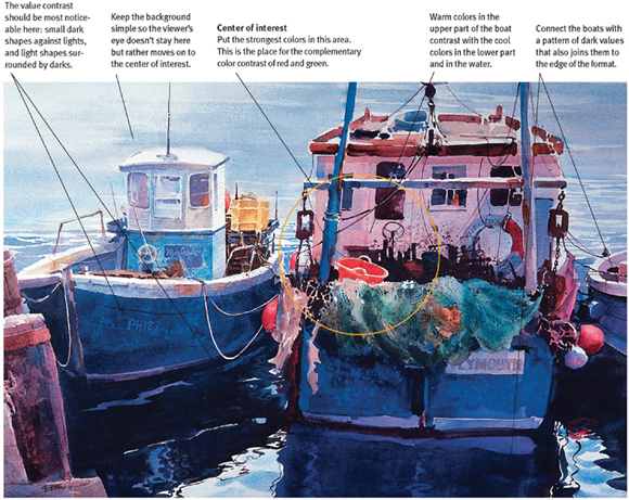
AT REST IN PLYMOUTH ![]() Watercolor
Watercolor ![]() 22″ × 28″ (56cm × 71cm)
22″ × 28″ (56cm × 71cm)
Enhance a Painting With Color Contrast
The contrast of the red-orange bucket next to the green fishing nets drew me into this scene. The contrast of warm colors against cool colors is very appealing. This is primarily a cool painting, with blue dominating the scene. Most of the warm colors are found around the center of interest. Note the yellow storage box, the warm backlit cabin and the buoys. These provide company for the red-orange bucket, since they are all analogous in color. Color may not be able to build a solid foundation for a painting like value can, but it certainly entertains the viewer's eye.
Follow lines of motion leading to the center of interest
Streams, paths and roads are great tools for providing lines of motion leading the viewer's eye to the center of interest. However, use caution with these lines; don't lead the viewer's eye too directly. The shortest possible route may be fine for traveling, but it is not best in a painting.
Construct a more indirect route back to the subject by creating some bends, curves and breaks in the line. The purpose of creating lines of motion is to direct the viewer's eye around the picture plane in a way that allows for exploration, yet keeps leading back to the center of interest. An undeviating movement traps you, and no one likes the feeling of being trapped.
Shapes of shadows, cloud patterns, skylines of distant hills and a myriad of other things with a dominant directional thrust can create lines of motion. Just make sure they are pointing in the direction you want the viewer's eye to go. Choose things to include in your painting based on how they can serve the center of interest. Don't include objects just because they are there. Think of them as actors auditioning for parts in your play. Your job is to create a great production, not provide work for every starving actor. Only use those things necessary for the composition. Send the rest packing.
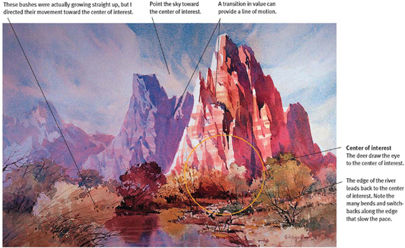
COURT OF THE PATRIARCHS, ZION CANYON, UTAH ![]() Watercolor
Watercolor ![]() 14″ × 22″ (36cm × 56cm)
14″ × 22″ (36cm × 56cm)
Use Natural Lines to Create a Center of Interest
I decided to create a center of interest at the base of the nearest of these three stone “patriarchs,” mainly because the vertical line of the mountain met the horizontal plane there. I had to move the river so it flowed to that area, creating more color intensity and value contrast.
Save visual complexity for the center of interest
The fourth method for developing a center of interest is to have a concentration of color and small shapes of light and dark in the focal area while keeping the surrounding areas as simple as possible. The viewer's eye automatically travels to an area of concentrated energy. We naturally gravitate toward complexity of shape and detail.
The challenge is to consciously simplify areas of the painting that do not contain the center of interest. Decide where you want the center of interest, develop it in your drawing and add shapes to the outlying areas carefully, all the time judging their impact on the center of interest. If they start to compete, get rid of them.
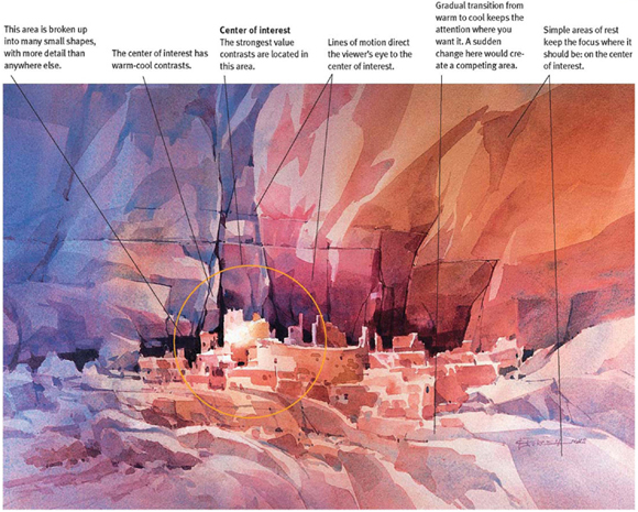
ANASAZI INDIAN RUINS ![]() Watercolor
Watercolor ![]() 14″ × 21″ (36cm × 53cm)
14″ × 21″ (36cm × 53cm)
Use All Four Methods to Create a Center of Interest
This painting utilizes all four methods discussed in this chapter. Lines of motion lead from above, below and from the sides to point toward the ancient dwellings. The principal building is the lightest shape and is placed next to some of the darkest darks. The warm colors terminate in the main building, which is set against the cool purples.
Note that the entire group of ruins constitutes a horizontal band of small, complex shapes sandwiched between two wider bands of relative simplicity. This is the visual concept that guides the painting.