

Deconstructing the iOS User Experience
It is important to recognize that it’s not a single design element or interaction that makes the iOS user experience so successful and popular. All user experience can be expressed as a gestalt effect. In other words, that which we experience is greater than the qualities of the individual components we perceive. You can’t truly understand what it is about iOS (and subsequent applications) that makes it so attractive without pulling it apart piece by piece. So let’s take a deeper look into iOS and break down some of the fundamental elements of user experience that define the nature of the operating system and the fundamental framework of iOS applications.
The first part of this deconstruction will focus on higher-level issues including the presentation metaphor, the concept of direct manipulation, and the centrality of the Home button. Later on I will break down some of the interaction mechanics inherent to all iOS applications in terms of their presentation and the mental model that presentation suggests for users. Beyond that, I’ll look at some of the core philosophy behind iOS and how that philosophy is applied, and even how that philosophy is often contradicted or ignored. And finally, I’ll cover the aesthetic components of the experience and explain how visual design can provide the continuity that pulls all of these disparate elements together.
Metaphor vs. Utility
One of the more interesting aspects of the iOS experience is how the OS layer of the device fundamentally lacks a visual metaphor. The fact that this was never an obstacle to the perceived usability of the iPhone when it was initially released tells us a lot about the changing nature of users over the past decade or so. As stated earlier, there was some consternation regarding the physical design of the device, and the inclusion of a single hard control for operating the user interface (UI). This is a clear indicator of a fairly conservative view of the media, and likely the populace at large too. So why didn’t the on-screen user interface result in a negative reaction? It was a departure from preceding devices, and it certainly did not have a clear relationship to desktop UIs.
The key to understanding the success of the iPhone UI lies in recognizing the emphasis the design places on utility, rather than metaphor. Why was this decision made? Apple had already revolutionized personal computing with the metaphor-rich graphical user interface, a design solution that played a fundamental role in the rapid adoption of the PC. Highly accessible ideas like “desktop,” “files,” and “folders,” and their representation within a graphical framework that you could see and interact with directly, are now ingrained in our communal consciousness. A departure from a highly metaphorical interaction model was not necessarily a deliberate move when you look at the iPhone in comparison to its contemporaries at the time of its release. Smartphones and feature phones already had a well-established design ethos that evolved from the increasing complexity of their functionality—an increasing number of features and an increasingly sophisticated means by which to navigate those features. In many cases this evolution resulted in a matrix of icons navigated by some kind of four-way control. This is a very utilitarian approach to the design of a UI. One quickly scans a screen for the appropriate function for the task at hand, selects that function, and executes the task. Speed and efficiency are the determining factors here, and there is very little tolerance to complex metaphorical environments that must first be deciphered by the user.
iOS devices are no different. There is a lack of overt or overarching visual metaphor at the OS layer, yet at the same time it is still very graphical in nature. What we need to recognize is that at the root level of the OS, the user is presented with an inherently abstract space populated with button-like controls that represent the applications available on the device. Some of these controls contain artwork that is minimal and iconic, while others are very rich and illustrative. Sometimes the artwork is representative of the underlying functionality and sometimes it is not. Beyond the basic geometry that bounds them, the icons’ only shared characteristics are a few minor rendering attributes that give the user an indication that these controls may be touchable. In most cases, a user will first identify an app icon by its visual appearance. Reading the app icon’s label is entirely a secondary action. This behavior becomes very evident when swiping through multiple screens of applications; a user must quickly scan the screen before making the decision to swipe again. The simplistic presentation model at the OS level becomes usable when it is enabled by the visual nature of the app icons.
There is no notion of a file system on iOS devices, which reinforces the non-metaphorical approach. If there is no desktop and no folders, then the concept of files certainly becomes a very difficult concept to manage. Content types are dealt with in a very unambiguous manner—they run seamlessly as part of the application workflow that led to their creation or discovery. The user isn’t burdened with having to organize files within a file system hierarchy, and subsequently having to find or search for those files when they are needed again. Each application manages its relevant “content objects” in its own way. The nature of the content object often defines the method of organization and browsing interaction for the user. Here are a few examples of apps, their content types, and their method of organization:
- Camera: Camera Roll: image array or one-up swipe-able browsing
- iPod: List-based media object browsing or carousel browsing
- iBooks: Library: book/document array or list-based browsing
There are numerous other examples that I could point to as well. And while there are many shared interaction patterns and popular techniques, you’ll find that each application manages its particular content object in the most relevant way for whatever it is the user is doing.
From these examples we begin to see that the highly abstracted nature of the OS layer does not extend into the application experience. Apps can be, and in many cases are, highly metaphorical experiences. Generally, smaller-scale devices are less suitable for visually complex metaphorical UIs. Small screens present many challenges to engaging users at that level, and as I explained earlier, mobile devices tend to bias towards utility. However, that is not to say a successful, highly metaphorical interface is impossible. There are many great design solutions in apps available now for the iPhone that take this approach, but we really begin to see this kind of design solution taken to its fullest effect on the iPad.
The iPad, representing a new product category, does not have the historical legacy of hyper-utility. Its focus is centered on the leisure use-case. Speed and efficiency have taken a back seat to engagement and entertainment. And while the iPad and the iPhone share the same fundamental OS, the presentation aspects of their applications diverge significantly. Obviously, display scale is the main platform characteristic driving divergence, but one of the distinct qualities that have emerged with many iPad apps is a very rich, metaphorical approach that in many cases borders on simulation. Not only is there a literal representation of an object with a high degree of visual fidelity, but the objects also react to input with a high degree of physical fidelity. While this has been possible in other computing environments before the iPad, the tangible aspect of these devices have imparted a new dimension of realism that makes this kind of approach desirable.
Metaphor and utility are only two considerations when conceptualizing your application, but be aware that they are not exclusive of one another. Take a look at the applications that you value today. How are they structured and what concepts do they employ? Do they appear to be biased more toward utility than metaphor, or is it the other way around? These questions will help you understand the value of the two approaches so you can begin to formulate your own ideas about what you believe is right for your users.
Direct Manipulation
Direct manipulation is an absolutely fundamental concept for any touch-driven UI. The basic concept is this: You directly touch the objects that you wish to interact with. Whereas with indirect manipulation you are dependent on an input device to indirectly navigate a cursor, or by other means to direct focus to an object with which you want to interact. But this is about more than fingers or mice. The key to direct manipulation is the notion that the result of your interaction with an object is so closely associated with your input that you perceive no barrier between the virtual and the real. This understanding is very important to the iOS experience. Many interactions that you may find exciting or novel on iOS devices are entirely dependent on this idea.
Users inherently understand the concept of direct manipulation because it is a reflection of how they interact with the physical world. You drag things to move them around and buttons appear to be depressed when touched. There is no hardware control set to learn, or complex set of commands to learn. Objects tend to behave in a predictable manner consistent with what you know about your world.
There are some challenges with direct manipulation. With devices like the iPhone and iPad, screen real estate is always at a premium. There is a tendency to optimize that space by creating touch controls that are small, and in some cases too small to be easily usable. Size can be a significant challenge to usability on touch screens when direct manipulation is a fundamental principle. The smaller the touch target, the more difficult it is access and operate. Small touch targets in close proximity dramatically increase the possibility of user error by providing the opportunity for mistaken input. Small targets can be difficult to identify when obscured by fingers. This can also have the effect of negating any visual feedback that may be important to a particular interaction.
We can see all of these challenges arise on the iPhone, which is a relatively extreme environment in which to attempt a robust touch-based OS. Many iPhone touch-based controls push or even exceed the boundaries of the effective ergonomics. The best example of this is the iPhone keyboard in all its variations. Apple was challenged to create a fully operational keyboard in a very limited amount of space, especially in the vertical orientation when horizontal screen width is at its minimum. The keys are too small, they are too close together, and you can’t see what key that you have touched. So why does this keyboard work so well? Apple integrated a number of different techniques to mitigate the inherent ergonomic and usability issues and make this design successful. Here’s what they did:
- Target too small: Provide visual feedback of the touched key that extends beyond the contact point of the finger.
- Targets in close proximity: Provide a predictive text algorithm that suggests an intended word, even if it wasn’t what was typed.
- Targets in close proximity: Provide an inline spellcheck algorithm for additional user control and refinement of input.
This represents a very robust interaction design solution and complex technical solution for one of the most problematic aspects of direct manipulation and touch screens in general: tiny buttons, squeezed together in a very small space. It’s a very dangerous proposition, and unless you have the resources to create the workaround solutions to augment the core interactions and make it successful, then avoid this situation.
The reason I raise this issue within the context of direct manipulation is because scale and proximity are only really problematic when direct manipulation is the driving principle. Remember, you have to interact directly with an object in order to affect the state or condition of that object. The object is the target. But there are possible design solutions where you don’t have to interact directly with an object in order to affect its condition. There may be a scenario in which a very tiny button is desirable (for whatever reason), maybe so tiny that by its appearance it is somewhat problematic. You could create a control whereby the graphic that represents it is far exceeded in scale by a “target region” that encompasses it. A user could affect that control by interacting with the target region without necessarily making contact with the actual graphical representation at the center of that target region. You can even take that concept a step further by creating situations where a target region is disassociated from its representational graphic. This is a good point from which to segue into the next topic!
Gestures
The term “gesture” is in wide use today, and depending on the context it can have very different interpretations. Sometimes the definition can be literal, as when thinking about devices that use complex machine vision to interpret the physical motion of your body as input into the computing system. When Apple refers to gestures they are specifically referencing touch interactions that allow Apple to expand their palette of input events beyond the basic input that direct manipulation might allow. In some cases this involves the simultaneous compounding of touch events (multi-touch) to invoke a particular response. But there are also examples of gestures that reside strictly in the realm of direct manipulation. At an abstract level, many gestures are the same, or at least only differentiated by subtleties of input or context of use.
The most common gestures in iOS are as follows:
- Tap: This is the most basic selection behavior in the OS.
- Drag: During a persistent touch event, an object tracks with your finger until you remove your finger from the screen.
- Flick: Very similar to the drag gesture, but done with greater speed. The key to this gesture is really the behavior inherent to the object itself. On release, “flickable” objects tend to display and model inertial characteristics that make the flick action relevant.
- Swipe: A linear brush with a finger, no direct manipulation implied, often used to reveal a hidden control.
- Double Tap: Two taps in short succession to designate the point of origin for image or content scaling—often a predetermined scale factor.
- Open Pinch: User defined up-scaling determined by how much you “open” your pinch.
- Close Pinch: User defined down-scaling determined by how much you “close” your pinch.
- Long Touch: Usually associated with invoking some form of secondary control, as with editable text to invoke the magnified view, but many other uses are possible.
There are also some newer gestures on the horizon for iOS. It will be interesting to see how quickly these are adopted and how other app developers begin to employ them. Most of these newer gestures are natural extensions of what I have listed above, and pertain more to OS level navigation and control. By that I mean they are concerned with movement through the OS, and not necessarily relevant to individual component control within a running application. The OS-level focus seems to be achieved by true multi-finger interaction (more than two fingers) to separate them from the classic set of gestures used to control applications.
Application designers and developers can do a lot with standard gesture input to add value and excitement to their products. But many gestures can be used in nonstandard ways that can still be usable, but with more compelling results. This will be covered in depth when I discuss the development of novel concepts later in this book.
The Invisible Button
The Home button, once a controversial control, is now so widely adopted and so frequently used that it is almost invisible. In previous releases of iOS, the Home button could be customized to some extent. A double click of the Home button could be configured to access the home screen, the search UI, “phone favorites,” the camera, and the iPod app. Subsequent releases eliminated this functionality and have focused the Home button on the more utilitarian aspects of navigating the OS.
To understand the rethinking of the Home button for being more focused on navigation we need to look at the changing nature of iPhone usage. One of the primary drivers for the evolution of iOS has been the need to support the ever-increasing quantity of apps that users are loading onto their devices. We are seeing devices come to market with greater storage capacities designed to meet this same user demand, and this demand is in turn driven by the success of the App Store and the highly specialized nature of the apps themselves. Apple may have expected people to download a lot of apps, but they were not prepared for the very high average quantity of applications most users have. A high quantity of anything often suggests the need for an efficient means to organize as well as an efficient means to navigate that organization.
Finding an app and putting it to work was once a fairly simple proposition. All you had to do was quickly scan an array of virtual buttons on the screen. You may have had a second screen of apps that you could quickly flick over to, but with a few simple gestures you could usually find what you sought. Fast-forward a few years and instead of having one or two screens of apps, you now have five! The relatively simple behavior of flicking back and forth between a couple of screens has now become problematic. As you move between anything more than three screens, orientation starts to become very challenging. The quick flick behavior that once made everything so easy now becomes a source of confusion as screen after screen of app icons moves past you in a rapid blur. Are you at the home screen, or are you four pages in? It can get very frustrating very quickly.
As iOS progressed, Apple designers created a number of great solutions to assist users with the challenge presented by a large number of installed apps. We can now group apps into a second-level hierarchy of user-definable app collections. We have access to an “App Switcher” that prioritizes apps by most recent use, and we can navigate directly to application via search results. We can also quickly reorient ourselves back to the home screen.
That brings us back to understanding the evolving nature of the Home button. With the increased level of functionality associated with navigation and orientation, the significance of the Home button really begins to grow. The simplistic nature of the OS-layer UI, home screen and beyond, does not allow for the addition of a navigation control set. This is very different from application-layer UI which (via the HIG) demands explicit consideration for these types of controls and a consistent model for designers and developers to follow. Without GUI components to prompt the user, ancillary navigation and orientation controls must be managed by the Home button. Within the context of the unlocked device the Home button manages the following functions:
- Return to Home Screen: This is the fundamental function of the Home button, and the aspect of the Home button that receives the most use.
- Go to Spotlight: Once the user is at the home screen, a single click takes the user to the Spotlight UI.
- Reveal App Switcher: The App Switcher can be revealed at any point in the OS layer or application layer.
The first two actions can be accomplished with the use of the flick gesture, but the use of the Home button makes those interactions much more efficient. The App Switcher is different in that it is dependent on the Home button for its operation.
I think this clearly shows a pattern for how the Home button is evolving as a control dedicated to support navigation behavior. There are a few exceptions to this model, but those exceptions follow a clear pattern as well. Waking a device from its dormant mode or invoking iPod controls from the locked screen occur outside of the context of the core UI. Navigation is not a relevant function at that point in your interaction with the device, so the Home button might as well be put to good use. With that said, Apple has provided some pretty decent solutions to some of the most common use cases associated with the iPhone. Access to the iPod controls from the locked state via a double-click on the Home button is one example, another would be the ability to access Voice Control with a single long press (3 seconds). So it appears that locked-state interactions for critical use-cases is a valid use for this control too. One last exception to navigation support is the ability to configure accessibility options for the Home button that can be invoked with a triple-click.
Future releases of iOS may provide additional uses for the Home button, but that remains to be seen. We may even see the Home button eventually disappear. There are some interesting scenarios that might enable this. We may see the introduction of off-screen capacitive controls that may act as a replacement for the Home button, or we may even see new gestures emerge to control the functionality currently associated with the Home button. Rest assured, Apple will continue to evolve this aspect of their devices.
The Strange Topology of iOS
Later in this book I will delve into methods and techniques used to create interesting and unique interaction models that can be applied to iOS device apps. Before we reach that point it’s worth taking some time to deconstruct some aspects of iOS that really haven’t been clearly codified, or at least documented in way that helps us understand why iOS is so easily adopted by users. At the root of the iOS interaction model is a notion of a “space” through which users move fluidly to accomplish tasks. We can think about this space as a tiny little universe that the OS functionality and applications all inhabit. Like any universe, it has certain rules, limitations, and attributes that inherently affect the things that populate it. When we understand those basic mechanics we can design solutions that either use those mechanics more efficiently, or sidestep them entirely and begin to define our own rules.
iOS is essentially a planar environment, with a few exceptions. When I say “planar environment,” what I mean is that the presentation of user experience at the core is a two-dimensional proposition. You may think that this is an obvious statement, since we view a screen on the device, and by their very nature the things presented on the screen are two-dimensional. That is true, but what I refer to is how interface elements are presented and how a user moves conceptually through the space inhabited by those elements. This two-dimensionality is important to recognize because we are no longer technically constrained to create user experiences that are limited to two dimensions. iPhones and iPads can render very sophisticated graphics and a volumetric UI is entirely possible, so Apple has made a conscious decision not to go in this direction (literally).
While the UI is planar, it’s not strictly two-dimensional in its operation. iOS really operates between three dependent or coexistent planes. You can think of iOS as three layers of user interface, where each layer is reserved for a specific type of interaction. The movement between those layers is defined by specific set of interaction mechanics particular to the layer.
The three layers or planes of user interface break down like this, by order of importance of operation (see Figure 2-1):
- Default Plane: This layer is inhabited by app icons and the icon dock, and is the plane of interaction that receives the most activity from users.
- Underlying Plane: This is reserved for the App Switcher and for displaying contents. This space is purely a supplemental construct that supports organization, orientation, and navigation.
- Superimposed Plane: This layer used for dialog boxes, alerts, modal controls, and pop-overs.
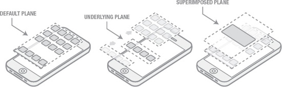
Figure 2-1. The three planes of user interface.
These planes all coexist in a very shallow visual space. From an appearance perspective these planes all lie within a few millimeters of each other. While this is simply a matter of how the graphics are rendered, the visual presentation of these planes connotes a close relationship between these spaces. It’s as if the appearance of proximity supplements the cognitive association these features initially required to gain acceptance by the users. The idea of an underlying plane asserts the illusion that there was always more to this UI, literally below the surface!
The default plane of the core UI elements naturally receives the most frequent use, and by definition supports the greatest degree of interaction activity. In contrast to that, the other two planes are very limited in their interactions because they only support a limited amount of functionality. The underlying plane exists solely as a support mechanism for organization and navigation. This plane gives Apple the degree of UI scalability needed to resolve the emerging app management issues that I reviewed earlier. The underlying plane is revealed as a state change of the default plane, so those two aspects of the interaction model more accurately constitute what I would refer to as the core UI in iOS.
The superimposed plane contains objects that are very different from the app icons that populate the other two planes. There are a few ways to think about these objects; they are deliberately disruptive, they are temporary, and they do not have a “home” within the core UI. I am referring to objects such as alerts, dialog boxes, and modal controls of various types. Again, I think we take the iOS interaction model for granted, because interaction on the superimposed plane feels so natural to us. However, each of those objects could have been accounted for in the core UI in a lot of different ways. They could have reserved a portion of screen real estate to manage, but Apple determined that presenting these objects in a higher-level plane was a superior solution. Why was that? Obviously, alerts and dialogs are critical points of interaction in any kind of user interface, and bubbling those objects up and superimposing them above all other elements is a standard approach. Dialog boxes are inherently modal in nature, so they would need to disrupt activities in the core UI. Apple leverages the design pattern of the dialog for the alert, and that fact helps reinforce the understanding of how these objects operate and what users need to do when they appear. UI objects in superposition receive the least amount of interaction, but due to their nature they do receive the greatest amount of attention when they are on screen.
There is one major exception to the established spatial model. When using the iPod functions, a user has access to the classic carousel browse mode when viewing certain types of lists. The carousel view is invoked when a user rotates the device horizontally while viewing a list of songs, albums, or other media objects. The carousel view reverts to a traditional list when the device is rotated back to a vertical orientation.
The carousel view’s spatial model is very different from anything I have reviewed so far. It presents objects in what appears to be a three-dimensional space. The interaction within that space is limited to the movement of objects on only one axis within a fixed frame of the horizontal view (see Figure 2-2). The notion of a fixed frame of reference is very different from the model that is in use at the top levels of the OS. The perception at that level is that a user is going from point A to point B while browsing the screens of apps. It is the perceived movement that establishes (and even defines) the concept of space. When interacting with the carousel, the user’s view does not move! The user moves objects through a fixed point of view, and that fixed point of view remains unchanged no matter how many objects populate that particular frame. This is essentially an inversion of the kind of visual interaction that the user experiences with the OS as a whole.
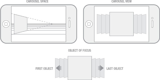
Figure 2-2. The carousel view spatial model.
Now that we have reviewed the basic visual construct of the three planes of OS interaction, we can now get into a more detailed review of how a user moves through that space. The first thing we need to establish is that those three main planes of interaction are ordered on the z axis, but the user is not required to make an explicit choice to navigate between those planes. Those three layers are really just an aspect of state pertaining to the view of the UI with which they are currently engaged, and are revealed only as needed. The dynamics of iOS spatial model are really defined by the navigation and browsing behaviors essential to device operation.
There are two basic types of movement that we can analyze: movement on the x axis and movement on the y axis. Within iOS, these two types of movements reflect very different types of interaction behavior. Movement on the x axis is most closely associated with navigation and movement on the y axis is associated with content consumption. X axis refers to right/left directionality, and when you think about it, almost all navigation happens with motion to the left or right. Browsing apps from the home screen requires a swipe to the left to bring the next screen of apps into view. A swipe to the right brings you to the search screen. The OS, at the top level, can be described as being composed of a limited set of discrete screens that extends one screen to the left, and 11 screens to the right. A user moves to the left or right through what are perceived of as discrete adjacent spaces—each adjacent space being defined by the fixed array of icons that populate it.
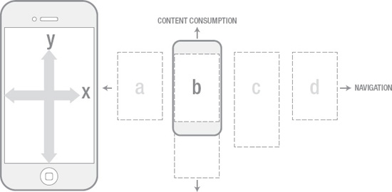
Figure 2-3. Movement & interaction behavior.
The x axis is also associated with hierarchical movement through the OS. Let’s use Settings as an example to demonstrate how this works: Starting from the home screen, one swipes left till the Settings app is located. Settings is opened and you see a list of high-level options on the screen. To the right of each setting is an arrow that points to the right. Selecting a settings category, like General, initiates a transition that slides your current view to the left and off screen, while bringing the adjacent screen to right into view. You can continue to move in this fashion till you reach the bottom of the hierarchy. When going back up the hierarchy (as prompted in the upper left of the screen) the visual interaction is reversed.
The consistent use of left-right movement simplifies what would otherwise be a complex mental model for the user. Traditional approaches to hierarchical navigation often present the user with a few nonlinear methods, or shortcuts, to accelerate movement through that space. However, many of those shortcuts depend on a more comprehensive display of the hierarchical tiers, or they introduce additional points of interaction, both of which add complexity to the design solution. A device like the iPhone is limited by what it can display due to its size, so a simplified solution to hierarchical navigation is perfectly appropriate. However, I should point out that the iOS approach of one path down and the reverse path out does not hold up to deep hierarchical structures, but Apple makes it clear in the HIG that hierarchies need to be restrained for this very reason.
Movement along the y axis is not weighed down with quite as many implications as the x axis. For the most part, this type of movement is reserved for vertical scrolling behavior wherever it is required. The one observation I would call out is that there is no limitation to the length of a scrollable list. This means that virtually all y axis movement is contained within a single contiguous space. The y axis is a significant aspect of the overall spatial model and is in stark contrast to the behavior of the x axis. As I stated before, x axis movement is all about the presentation of discrete screens or deliberate chunks of space that you must move through in increments, while “y” is all about a much more fluid experience.
A significant part of what defines the spatial model is based on how we perceive the physicality of the objects, screens, controls, and other elements that populate the established space. The behavior of those items can either reinforce or undermine that model. In iOS, Apple is extremely consistent with the behavior they have imparted to all the various elements of the design. One of the most important and universal behaviors that is critical for the definition of the spatial model is their use of what I’m calling the “slide” transition. Transitions, within the context of user experience, are the visual mechanisms that denote state change to the user. Much of what we have reviewed so far in terms any perception of space has been either entirely dependent on key visual transitions or at least significantly enhanced by visual transitions. The use of transitions becomes especially useful when direct manipulation is not being employed.
Browsing applications from the home screen or sliding over to the Spotlight UI is driven directly by your touch of the screen. As your finger or thumb moves from left to right, the screen underneath tracks directly with your touch. As you explore the space and move between screens you develop an intuitive level of understanding about how that space is defined. There will always be points where direct manipulation cannot be applied, but in those situations transitions can automate visual interaction to simulate or replicate core behaviors that may be beneficial to establishing a sense of consistency for the user. iOS uses this technique in the hierarchical step navigation that I reviewed for settings. When a user has more than one choice available, it’s not applicable to slide the screen to the left or right to get to another level. Instead, Apple lets you select an option, then automates a transition that is identical to the same sliding visual interaction when directly manipulating the screen.
Everything that I have reviewed so far pertains almost exclusively to the core UI of iOS. The spatial model for applications is another story altogether. Generally speaking, applications that run on top of the OS are unrestricted in terms of interaction model and design execution. The HIG certainly suggests some best practices, but that doesn’t mean that you are required to follow those best practices. This means that applications may or may not replicate or mirror the spatial model inherent to the core UI of the OS, and to be sure, many applications have set out explicitly to do their own thing. Knowing that there is huge variety of apps out there, there are still some generalized behaviors that we can observe. The easiest place to identify this is on what I call the entry and exit points of the application experience, since this is common to all applications. Opening an app can happen from a few different points in the OS, and for each point there are different spatial implications:
- From the home screen and its subsequent pages: By far the most likely point from which a user may launch an application, the visual transition associated with this event portrays an app emerging from behind the icon array and pushing those objects away. The illusion is that the app is moving into the same plane that the icons had previously populated.
- From the Spotlight interface: I expect that this is likely the least used entry point of the three for the typical iOS user. In this case the Spotlight interface recedes to a point in space first, quickly followed by the selected app moving forward in space from the same vanishing point.
- From the App Switcher: App switching has its own unique behavior. Once an app is selected in the switcher, the entire active view (including the switcher) rotates out of view on the z axis, quickly followed by the desired app. All rotation appears to share the same anchor point when apps exit and enter the screen. There are few connotations of this unique visual behavior: first, it supports the idea of switching (as in toggling between two states), and second, the idea of multitasking, since the exiting app seems to be rotating just out of view—and not vanishing into oblivion.
The app exit action, as initiated by the Home button, is always the same. An app recedes back to the vanishing point from which it emerged. There isn’t a direct path to Spotlight from an open app, so that scenario does not apply. Exit via app switching happens as I described it above.
What’s the common theme through each of these different interactions? They all tend to stand apart from the planar presentation of the core UI and linear arrangement of space that is suggested when navigating that space. From a user’s perspective, this helps establish the expectation that what they are about to embark on, from a functional perspective, is an entirely separate experience from the core UI…and in a sense that all bets are off!
I know that all of this seems obvious, but it’s important to analyze and understand all of the subtle factors comprising the iOS user experience and why it is fundamentally intuitive to use. Mapping out and understanding the spatial model, at least how I have described it, gives you insight into a significant aspect of the user experience.
The Easy and the Obvious
A proper deconstruction of the iOS user experience requires me to examine and attempt to translate the philosophical underpinnings that have driven many of the important design decisions throughout the experience. Apple has done a great job of defining many of these ideas within the HIG, but it’s worth taking a look at where and how they’ve been applied, and where and how they may have been ignored. As with any kind of guidance, there are always going to be notable exceptions that need to be reviewed.
When reading through the HIG, some patterns and themes come through loud and clear. One of the major themes is simplicity. Again, this may seem obvious, but understanding how various topics are unified and work together toward single goal tells you a lot about iOS.
Simplicity, as concept, appears to be straightforward and easily achievable—by definition. But the reality of designing complex interactive systems with simplicity in mind is another thing altogether. To compound this, the perception of simplicity does not equate to simplicity itself. What I mean is that what sometimes appears to be simple is really the result of many complex or sophisticated techniques that aren’t readily apparent to the person interacting with the system. I’ll try to deconstruct that gestalt quality of simplicity in iOS in terms of a few key directives identified within the HIG.
I’ve identified many constituent topics of this theme, but I’m certain that more could be found as well. To be clear, many of these aren’t explicitly outlined in the HIG. What I’ve done is abstracted some key statements made in the HIG to their core so that you can understand the application of these concepts in terms of the application you are designing and/or building.
- Finite Navigation: Providing users with redundant means of navigation, or enhanced nonlinear navigation, is unnecessary at best, and at worst can be confusing or distracting. The ease of interaction with the device allows you to focus on creating a single clear path through your content or functionality.
- Constrained Control Mapping: It’s more effective to identify and isolate the limited regions of your application to contain user interface elements. The controls themselves (buttons, etc.) should be perceived as secondary elements, especially in situations when application content needs to have the most prominence.
- Constrained Control Quantity: Limit or reduce the number of controls that you present to the user at any given point in time. To manage complex applications, distribute functions across screens and seek to group like tasks together.
- Control Clarity: Limit the number of unique control types when possible to avoid confusing the user. This applies not only to control type, but also to control rendering. Control functions should be identifiable by short labels and/or easily understood icons.
- OS Offloading: In certain situations, functionality can be removed from an application and managed at the OS level. Application settings can migrate to the iOS settings screen, helping reduce potential UI complexity.
- User Interface Suppression: Control elements do not necessarily need to be omnipresent. A simple gesture or touch event can invoke a control set as it is needed in the interface. The key is to provide the user with a mechanism that suggests the temporal nature of these controls and how to re-invoke them once they leave the screen.
- Progressive Disclosure: Strive to provide functionality only where and when it is needed within the flow of an application. It’s very likely that not every feature needs to be universally available, so use that to your advantage to reduce the complexity of your screens.
- Brand and Identity De-emphasis: It’s not necessary to hit users over the head over and over again with your brand. Identify the key points in your application where a significant brand and identity statement makes the most sense, and tone it down to an acceptable volume everywhere else.
- State Persistence and Restoration: Expect users to frequently engage with your application, but know that that engagement will be fractured. Mobile users are chronically multitasking, and may open and close your application many times while moving through your workflow to complete a task. Thus, you need to ensure that the state of your app is maintained as users leave it, and that the task can easily be resumed when the app is restarted.
- Implicit Saving: As with the issue of state persistence, any content creation tasks must be preserved and the notion of “saved” should be implicit to any workflow.
- Gestural Restraint: Limit the number of unique gestures required to interact with your application. Understanding gesture usage or having to learn new gestures can be a significant barrier to the adoption of your application.
- Hierarchical Restraint: Restraint of hierarchical depth is really an aspect of the successful implementation of finite navigation. A high degree of hierarchical structure makes it difficult to design a simple and easily understood path through an application. That doesn’t mean that it is impossible, it just means that you will be challenged with managing user orientation or challenged with trying to eliminate the tedium of moving through that hierarchy.
- App Modality: A user can really only view and interact with one application at time. The App Switcher suggests that there may be multiple apps running concurrently, but even in that case a user is required to toggle between apps to do anything. At this point there is no such thing as simultaneous app viewing, but that may be a possibility in the future with larger format devices like the iPod.
All of these topics point toward the theme or directive of simplicity, and in doing so cross over or complement one another considerably. However, there are also various topics that seem to contradict this direction too. These ideas are sprinkled throughout the HIG and have interesting implications for how you may think about your application.
The first few issues I want to raise pertain to the topics reviewed in this section. I first want to call out that while the concept of UI suppression can be used to manage screen complexity, it potentially shifts a greater cognitive load over to the user. When the UI elements are not on screen, the user is required understand where they went, how they got there, and what they need to do to bring them back. This isn’t necessarily a problem when managed in a simple and direct way, but if this requires any kind of complex interaction it can lead to significant problems for the user.
I’d also like to point out that universal labeling of controls can become problematic in cases where you are unable to limit control quantity on screen. Labels require room, and sometimes there is just not enough room for a legible label. And there are cases that even when there may be room to account for a label, the presence of labels can increase the perceived complexity of the elements on screen.
Another interesting point within the HIG is an emphasis on high information density and high functional density for applications. This seems to fly in face almost every topic that I reviewed before. The HIG states that app authors should
…strive to provide as much information or functionality as possible for each piece of information people give you. That way, people feel they are making progress and are not being delayed as they move through your application.
At face value this seems contradictory, but I think Apple is trying to make the point that you should provide the user with a high degree of interaction efficiency to avoid frustration.
Summary
In this chapter I covered a number of topics intended to deconstruct many of the subtleties of the iOS user experience. From the overview you can see how many discrete ideas and techniques are utilized in concert to really engage the user in a way that actively manages their perceptions.
The iOS bias toward a more utilitarian approach appears to be a rational evolution from the smartphone legacy of days gone by, but this may increasingly be limited to the domain of smaller-scale devices like the iPhone. As the iPad and other medium-format devices come into their own, legacy concerns around utility and efficiency will become less relevant.
The idea of direct manipulation is the foundation for all touch interactions. Users are presented with a model where the result of interaction with an object is so closely associated with their input or action that no barrier is perceived between the virtual and the real.
Gestures evolve the capabilities of touch interfaces beyond the baseline interactions accounted for with direct manipulation.
The Home button is the only hardware input to directly control the core UI of iOS. It’s important to recognize the limits of its operation and how that folds into the interaction model of iOS as a whole. The role it plays in supporting navigation and orientation as its primary function has remained its focus as the OS evolves.
iOS presents the user with an easily understood spatial model, and this is a significant factor contributing to the perception of ease of use. The spatial model is established by the consistent use of visual interactions and passive transitions that allow users to navigate in a predictable manner.
A philosophical imperative to keep things simple drives many of the design decisions that have made iOS easy to use and understand. This philosophy can be identified at various points in the HIG that at first glance may seem to be unrelated. However, all of these points work in concert to help manage functional complexity and interaction complexity.