Chapter 5
Attention to Detail
Among all of the skills required to be a good data analyst, attention to detail ranks near the top. When you work with data, you cannot afford to overlook details that point to outliers or anomalies or interesting trends and patterns. Paying attention to all characteristics of the data you are working with and how it is presented is critical for success. This chapter looks at the various parts that come together in a great visualization, demonstrating attention to the finest detail.
We encourage people to treat Makeover Monday as a fun project and a testing ground for their ideas and creativity. Every visualization they publish becomes part of their portfolio and reflects their abilities as analysts. This does not mean that every visualization has to be an outstanding, in-depth, comprehensive analysis. What it does mean is that when you pay attention to detail, it shows.
It can be obvious to an audience when care has been taken during analysis and design to ensure that it is supported with facts, laid out in a logical order, and allows the audience to gain insights or to be informed. Taking care means that various aspects of the overall design have been considered, a thorough spell check has been done, formatting is consistent, and attributions have been given for images and data sources.
Consider Figure 5.1, a visualization by Michael Mixon of historical results from Le Tour de France.

Figure 5.1 Visual history of Le Tour de France.
At first glance Michael’s visualization may look simple: a couple of line charts, a unit chart, and some text boxes. Upon exploring the tool tips and interactivity, however, the various layers of information Michael has worked into the visualization and the focus on the details reveal the care he has put into his work.
- Applying gray shading to indicate there was no race due to World Wars I and II
- Using line charts that resemble elevation profiles to go with the theme of the data
- Small instructional text boxes indicate how to interact with the visualization
- Data source is stated where the data is displayed
- Designer credit is positioned in the bottom right corner
The overall design with the yellow circle at the left, the rectangular chart in the middle, and text boxes on the right resemble the chain and chainrings on a bicycle. The circular pattern flows into the unit chart where yellow circles indicate the number of times a rider has won the race. All of these elements blended together make everything work as one visualization.
Mastering attention to detail only happens when you get the basics right first. The following sections focus on those foundations.
Typos
It is very easy to make minor errors when creating data visualizations, especially when you use text elements that rely on manually added words. Typographical errors can reduce the impact of your work, making it appear unpolished, unprofessional, or even sloppy.
There are a number of reasons why you may make such mistakes. You might:
- Be in a rush
- Not know how to spell a certain word
- Be suffering from dyslexia
- Be creating a visualization in a second language
The audience, however, generally does not care about the reasons for your mistakes; all they see are the errors on the page, likely leading them to assume that you did not take enough care to produce work that is free from typos and spelling mistakes. Aside from these fairly harmless considerations, typos may completely change the meaning of words, resulting in confusing titles and an audience that might tune out because what they are looking at does not make sense.
Before publishing your work, conduct a thorough check for typographical errors. The result is a more polished, credible visualization. A useful technique for checking your work is to read the text backward, starting from the last word to the first. This makes every word stand alone, prevents the brain from naturally filling in the gaps, and helps identify mistakes much more easily. While proofreading an entire book backward may not sound appealing, applying this technique to a sentence or two is certainly doable and a good way to identify any remaining typos.
Punctuation
Whether there is a missing comma or an unnecessary exclamation mark drawing attention to something that is not actually that important, punctuation plays a role in how people read and understand text. Punctuation can change the meaning of a sentence dramatically, so you need to pay careful attention to it to avoid misunderstandings.
In data visualization, text is typically written in relatively short paragraphs or single-line sentences. To check how well a passage of text flows, read it aloud and read it slowly, making use of pauses as indicated by the punctuation. Reading aloud helps identify any missing or superfluous marks, such as periods (full stops), commas, or parentheses.
Formatting
After ensuring your text is clear of typos, grammatical errors, and punctuation mistakes, spend time focusing on formatting. Formatting helps your audience easily consume the information you present and has the ability to provide a great first impression.
This section covers formatting from two different angles:
- Chart formatting
- Overall formatting
Chart formatting is more about the effective design of a chart through formatting choices, while dashboard or visualization formatting relates to elements that bring several charts, text boxes, and titles together effectively.
Formatting Charts Effectively
Generally, removing clutter and nondata ink (“Above all else show the data”)1 is a good idea to help your message stand out and for the information to be consumed more easily. At a summary level, this can include any of the following:
- Removing gridlines, borders, and divider lines
- Removing shading of titles and labels
- Replacing legends by adjusting the color and size of text in titles
- Choosing colors that are easy to differentiate, carry meaning, and are used sparingly
- Ensuring charts are sized correctly and have the right width-to-height ratio so as to not distort the data
Line Charts
A line chart without any labels can still convey information about the trends in the data and the general behavior of the metric, such as whether there are increases, decreases, or plateaus and when fluctuations occur. It is easier for an audience to quickly understand the details of a chart, however, when clear labels are included to specify the units of a measure.
When analyzing gold and oil price correlations, as in Figure 5.2, Pablo Gomez used three different line charts to show the timeline of how prices changed over time.

Figure 5.2 Example of minimalist line charts.
Pablo paid particular attention to the formatting:
- The price in dollars is represented on the y-axis of the two smaller charts at the bottom.
- The unit of measure is clearly stated in the subtitle; for gold the price relates to ounces, for oil the price relates to barrels.
As an alternative to labeling the axis with the actual unit of measurement, Pablo could have included the unit in the subtitle for each chart and only provided the numbers on the axis. This would still give his audience the important details, but it may look repetitive.
Bar Charts
When it comes to labeling the units on a bar chart, you need to find the balance between keeping a clean and simple design and providing sufficient information for the audience. In Figure 5.3, Steve Wood used stacked bar charts to visualize air quality data in the US. Each horizontal bar represents a state, divided into three panes: 1995, 2005, and 2015. The columns show the time of day and the labels guide the audience to understand how data changes from left to right. The inclusion of AM and PM in his unit labels on the x-axis make it very easy for the audience to interpret the visualization and to understand how air quality changes throughout the day.
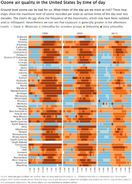
Figure 5.3 Removing labels from the bars created an uncluttered look.
In Figure 5.4, Charlie Hutcheson visualized medal tallies from the Southeast Asia Games as a horizontal bar chart, using color for highlighting and labels to show the value.
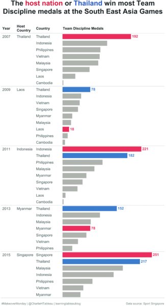
Figure 5.4 Using color and labels sparingly on a bar chart to indicate the important data.
Designing bar charts this way removed the need to display an axis. Showing the label on the maximum medal tally for each year provides a reference point for the nonlabeled bars. By labeling the ends of a bar, Charlie created a clean, easy-to-understand visualization.
Dual Axis Charts
Dual axis charts are typically created to show:
- Two metrics on two separate axes in the same chart (e.g., snowfall levels vs. temperature)
- Two metrics with different measurement units
- Two metrics with the same measurement unit, but on different scales
- The correlation between two metrics
If you use the same metric twice to create a dual axis, it is essential that you synchronize the axes to ensure the data points are on the same scale. In other cases, you may want to keep unsynchronized axes if you use different scales or metrics in combination. While axis synchronization may happen by default in your data visualization tool, some tools will make the two axis scales different from each other even when they represent the same metric. It is a good habit always to double-check that the axes are synchronized to ensure your visualization does not look misleading or confusing and does not impact your credibility with the audience.
Figures 5.5 and 5.6 show the consumption of poultry and livestock. Figure 5.5 has two axes with two different metrics that have not been synchronized. Both metrics show consumption in pounds, meaning they are the same unit, and therefore should be scaled the same. Figure 5.6 shows synchronized axes, completely changing the story.

Figure 5.5 Example of unsynchronized axes using the same unit (lbs).

Figure 5.6 When using the same unit on two axes, the axes should be synchronized.
Look at Figures 5.5 and 5.6 in comparison. What kind of story would you tell for the first versus the second?
Tile Maps
Tile maps require extra considerations for formatting, particularly because they are a different way to present data compared to more familiar choropleth and bubble maps. The benefit of using a tile map is that it allocates equal size to each geographical element regardless of its actual physical size. This makes geographically smaller and larger states easier to compare. You can read in more detail about this chart type in Chapters 7 (“Trying New Things”) and 10 (“Choosing the Right Chart Type”).
Figure 5.7 is a dashboard Eva created using tile maps to visualize US household income distribution from 2009 to 2016. The most visually appealing tile maps combine the following characteristics:
- Use a single shape (like the hexagons in Figure 5.7).
- Keep shapes close together, leaving a small white gap that helps differentiate the geographical areas.
- Tessellate shapes to ensure a snug fit. Notice how the hexagons in Figure 5.7 are rotated to ensure a tighter fit.
- On larger tile maps, place geographical information (e.g., state abbreviations) or data values inside each tile.
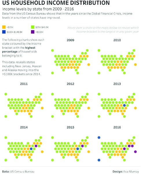
Figure 5.7 Small multiple-tile map.
Pay special attention to the orientation of tile maps. Is each tile in its logical place? Is the map sized correctly? For example, when you create a state-level tile map of the US, the ratio of height to width needs to be appropriate to keep the overall shape of the US recognizable.
An easy way to check the impression your tile map can have on your audience is to get out of your chair, take a step back from your screen, and look at the overall design. This helps you identify obvious mistakes and gives you an appreciation for what your audience sees when they first look at your work.
Universal Formatting
Formatting plays an important role in creating data visualizations that effectively communicate information and provide actionable insights. It helps to have an overall theme or format for your work. This section covers the following aspects related to the overall formatting of your visualization:
- Background colors
- Fonts
- Alignment
- Labels
- Lines
- Visibility
Background Colors
Ensure that the background is consistently formatted across the entire visualization. Strive to achieve a consistent overall look and feel by choosing colors for shading and the background that work well together.
Figure 5.8 represents a dashboard where the charts, titles, and text boxes have different shading and background colors, resulting in a visualization that looks too busy.

Figure 5.8 Example of too many different background colors.
By contrast, using a consistent approach to background colors results in a dashboard that flows more easily without the breaks created by the formatting of different sections, as in Figure 5.9.
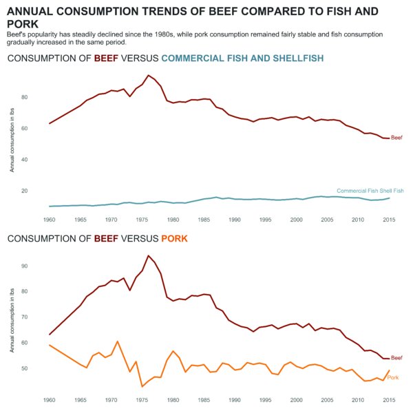
Figure 5.9 Example of simple background colors.
Fonts
Generally speaking, when it comes to formatting, simplicity, consistency, and less variety work best. For fonts, limiting yourself to a single font for the entire visualization, or one font for the title plus a font for the rest of the visualization, will typically result in a consistent and professional-looking product. Formatting the color, capitalization, font size, and font weight can be a very effective approach to structuring your visualization. As with anything you want to highlight, this only works if very few elements are formatted to stand out, otherwise everything is competing for attention.
While visualizing survey data, Naledi Hollbrügge created the dashboard in Figure 5.10 to visualize policy makers’ responses for a survey about issues facing women and girls. The following uses of text formatting makes this dashboard design work well:
- Using a large font size for the title
- Applying color to the text in the subtitle to define the colors that are used in the visualization
- Limiting the design to two different colors to convey the meaning
- Using gray text for information that is less important
- Using bold fonts for country names to make them easy to read
- Using italics to indicate instructions
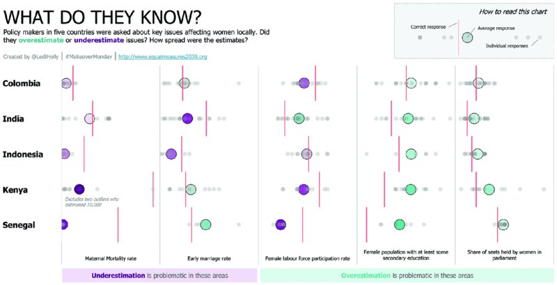
Figure 5.10 Example of effective use of color, fonts, and formatting.
Make text elements more effective during the design process by asking a few questions:
- Does the text need to be colored, bolded, or italicized?
- What if some of the formatting is removed? Will the necessary words still stand out?
- Does a single font or multiple fonts work better?
- Is the text displayed in a single block or have you used paragraphs and spacing to make it easy to read?
- What is the balance of text versus charts? Is it appropriate for the topic?
- Does the visualization meet the style intended?
- Do the fonts and formatting display well on different screen sizes?
This is simply a starting point, a collection of questions that can guide the design process. As always with learning, it is important to experiment, to try things out, and to iterate to improve your visualization. This applies not only to your chart choices, but also to your font selections.
Alignment
When all the elements of a visualization are properly aligned, the result is much more appealing to the audience. Alignment includes the overall layout of your data visualization, as well as the positioning of charts, text boxes, labels, titles, annotations, icons, and so on. Considering the location of each element on the page and ensuring they are neatly aligned shows that the author has paid attention to those details and is aware of their impact.
For long-form dashboards, it helps if the charts are neatly aligned and not offset left or right from one another. Figure 5.11 from Pooja Gandhi shows a well-structured, long-form dashboard that flows from a high-level summary to a detailed breakdown. The alignment of every line and text box is deliberate and adjusted with pixel-perfect precision to ensure the lines guide the audience through the visualization most effectively. The positioning of text, titles, and large numbers brings attention to each part of the analysis. The end result looks polished and professional and gives credibility to her skills as a data analyst.
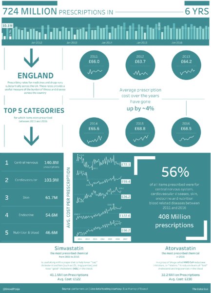
Figure 5.11 Perfect alignment helps guide the audience.
Labels
When placed correctly, labels can be a very effective way to add information to charts. In Figure 5.12, Rodrigo Calloni created a dashboard with six line charts: one summary index and five detailed indices. He used labels to give his audience the values of each line’s start and end points.
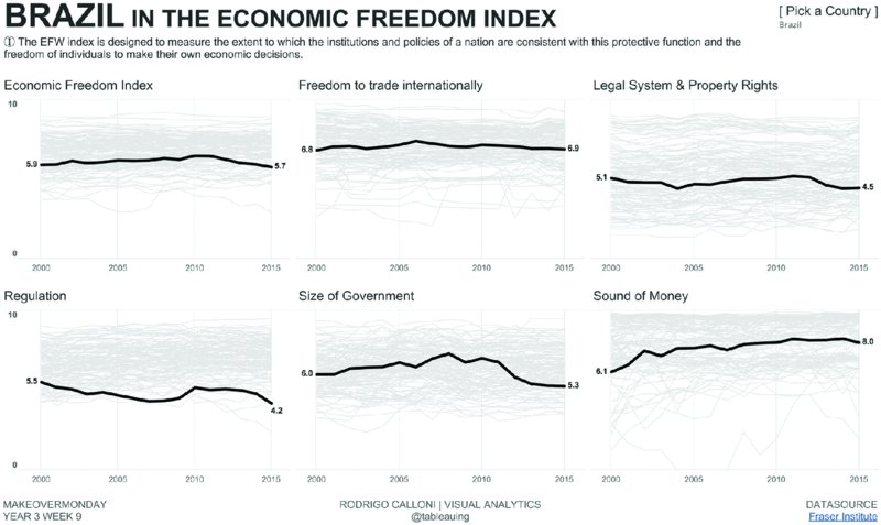
Figure 5.12 Labeling the ends of a line adds context.
Adding labels to the first and last value of each line help the audience understand the changes for each index over time. He included an option to highlight a specific country, so that viewers could choose a country they were interested in and have labels change accordingly.
Figure 5.13, created by Amar Donthala, demonstrates how effectively placed labels provide focus on the important insights in the visualization. The labels are only displayed for the selected nationality and show up inside the circles. This provides an additional reference point for the circles, as well as their distance from the average (dotted line) and gives the audience a sense of the distribution. The labels allow the audience to easily understand the approximate value of the gray circles without needing to refer back to the y-axis.

Figure 5.13 Labeling specific data points provides focus.
Lines
Dashboards vary in size, layout, and complexity, with some consisting of a single chart and a few text elements, while others combine multiple charts across different sections. More complex visualizations require a well-structured layout to ensure the visualization flows easily. Section dividers, arrows, connecting lines, and borders act as effective visual elements to structure the visualization and help the viewer understand the information provided.
In Figure 5.14, Michael Mixon used different types of lines to connect the parts of his visualization in order to guide the audience through his findings. To enhance his visualization, Michael used the following line formatting techniques:
- A horizontal line under the title separates it from the rest of the view.
- Dashed square brackets encapsulate the key insights.
- Short, dashed lines connect the labels for the minimum and maximum values.
- A shaded reference band represents the Great Recession.
- A thick line connects the labels of the measurements (gold and oil price) while also serving as a color legend.

Figure 5.14 Example of using lines to connect sections.
Overall, the use of lines is expertly executed. Each line deliberately guides the audience through the analysis.
Visibility
All of the elements in a visualization should be easy to see, read, and compare. They should not be made less visible by poor color choices, difficult-to-read fonts, misalignment, and overlapping text. When your audience looks at a visualization, they should not have to expend any unnecessary effort to see what is being presenting to them.
Consider Figure 5.15 by David Hoskins, which shows the prevalence of different dietary requirements around the world. All of the elements of his visualization (the title and subtitle, the filter, the instructions, the chart, and the footer) are easy to see and nothing is obstructed, freeing up the audience to take in the relevant information. David deliberately displayed lines along the x-axis that guide the eye rather than competing for attention, resulting in a clean overall look.

Figure 5.15 Example of color choices that work well together, making them easy to read.
The goal should be to ensure that your audience can see the necessary information and insights as clearly as possible. Otherwise, your viewers may quickly switch off and navigate away. Remove any barriers that could hinder your audience’s understanding.
Crediting Images and Data Sources
The credit to data and image sources, and those that inspired your work, is typically confined to a footer at the bottom of your dashboard. The credit section is highly important and needs to be included in every visualization, irrespective of whether the analysis was done for an internal or external stakeholder.
For Makeover Monday, we publish each week’s data set with a link to the source. Most visualizations reference the sources and some people have developed a specific footer design to blend with the rest of the visualization. Keep in mind that content like icons, images, and photos available on the internet are not necessarily available for reuse. Some Makeover Monday topics lend themselves to the use of a few small icons or the inclusion of an image that reflects the design and emotion communicated in the visualization. Only when these are explicitly labeled for reuse, should they be included; attribution to the creator must be given.
When images and icons are used, the following needs to be considered:
- Did you create the icon or image yourself? In this case you are free to use it as you choose, provided it does not breach copyright or trademark laws.
- Did you pay for the icon or image? In this case the license you paid for will dictate the type of usage available to you and the attribution you need to give.
- Did you find the image online? It will be very difficult to discern whether a random picture can be used in a visualization. If possible, contact the creator of the image directly and if that is not possible, find a different picture that is permitted for reuse.
For her visualization of the UK pet population in Figure 5.16, Sarah Burnett used a number of animal icons that she created herself. This is the best way to ensure that you are able to use an image or icon in your work. Sarah properly stated in the footer that the images were her own and also listed the data source as well as her name.
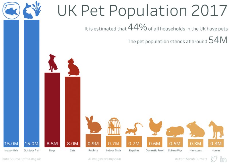
Figure 5.16 When using icons, either create them yourself or give credit as dictated by the creator.
Summary
Taking into account the formatting of charts, as well as the format of the overall visualization, is just as much a part of creating great work as using effective language that is free from grammatical or typographical errors. Stating your sources clearly and correctly and using only images that you have the license to use ensures your work is credible and professional.
The suggestions in this chapter will help you develop well-rounded skills that take your designs to the next level and make you stand out as an analyst who delivers valuable insights and communicates them effectively through language, visual analysis, and thoughtful design.