CHAPTER 6
Designing for the Audience
As a data visualization designer, you must know your audience if you want your work to be viewed, understood, appreciated, and potentially used as a basis for decision making. Along with the design skills you develop over time and the technical skills that are required to conduct the initial analysis, it is important to put yourself in the shoes of the audience and ask, “What do they need?”
As previously mentioned, stating the dashboard title in the form of a question, ideally a question the audience wants answered, is a great way to start as it will help focus the analysis and subsequent design. The audience comes in two forms:
- Those you already know, like your boss, your department, or your organization as a whole
- A completely unknown audience, for example, the people who come across the work you publish online
It is this latter audience that we design for in Makeover Monday. Not knowing who will see, consume, and interact with your visualizations presents its own set of challenges.
After reading this chapter, you will have strategies for:
- Creating an effective design
- Designing for mobile
- Using visual cues for additional information
- Using icons and shapes
- Storytelling
- Reviewing your work to improve its quality
Creating an Effective Design
The more you know about your audience and their preferences, the easier it will be to create an engaging design. If they prefer simple charts, create simple charts. If they prefer flashy and fancy visual designs, even if it comes at the expense of telling a clear story, then you may need to create those advanced visuals.
Today’s audience typically prefers a single-page, at-a-glance type of dashboard that allows for quick decision making. Ultimately if your work is engaging, your audience will love it. If they are not engaged, that falls back on you as the designer. Before you start creating your design, it helps to think through and plan the design.
What Is the Purpose?
Any project starts with a goal. If you do not know the goal or the aim of your project, then you are not ready to start. Go back and ask more questions, do additional research on the topic—whatever it takes to be able to communicate the goal easily. Once you know the goal, you will be in a better position to determine the purpose of the piece. Some of the considerations you should make include:
- Is your visualization supporting decision making?
- What are the most important metrics?
- How will you provide context to those metrics?
- What defines good or bad?
- Where will your work be seen? Online? In a static presentation slide deck?
- Who will deliver the message and how? Will the analysis be presented in person and does the presenter know all the aspects of your design (e.g., interactivity, drill-down and filters)?
- How much time does your audience have? Do they get to ask questions?
- Are there any limitations or special considerations of your audience like colorblindness, language, or data literacy level?
Washington D.C. Metro Scorecard
For Makeover Monday, Lindsey Poulter created the scorecard in Figure 6.1 about the Washington D.C. Metro system.

Figure 6.1 Performance dashboard for the Washington D.C. Metro.
Can we clearly identify the purpose? Let’s go back to some of the considerations above.
Does the Visualization Support Decision Making?
- The design is organized, clean, and easy to read. Using “cards” allows each metric to be considered individually.
- Including the values on the bars aids in comprehension yet does not distract.
- The timelines are consistent across all of the metrics.
What are the Most Important Metrics?
- Sectioning the dashboard by “Quality Service” and “Safety & Security” allows the users to focus on the metrics that are important to them.
- Then within each section, the metrics are listed in a “z” pattern from most important to least important.
Do the Metrics Have Proper Context?
- Including a reference line and labeling it for the goal helps the audience understand performance.
- Each metric has a clear, simple title. Subtitles are included as needed to aid comprehension.
- Including a dot on the end of each line and color-coding it allows the reader to determine good or bad performance in the most recent period.
- Including a goal line on each of the line charts allows the reader to find patterns of consistent over- or underperformance.
Identifying What Defines Good or Bad
- Color-coding the bars by above/below the goal makes problems easy to spot.
- Really good labeling on the color legend helps to clarify information.
Where Will Your Work Be Seen?
- Lindsey knew her audience was the Makeover Monday community on Twitter, so she designed it so that it could be seen and understood as a static image, meaning that its effectiveness does not depend on interactivity.
- She provided click-through so the audience could interact if they desired.
- Her work could have just as easily been done by and for the D.C. Metro itself. This is a great example of an actionable dashboard that would help them provide better services and identify where to deploy more resources.
Who Is the Audience?
For Makeover Monday, the audience is nearly always online. When considering this audience, an effective visualization will need to be understood as a static image. If it cannot be understood without interaction, then the designer did not take the time to understand who the audience is and where they will consume the visualization. Many people engage while on the move using their smartphones, so a static image is easy to access and does not come with the risk of display issues in browsers or other apps.
When you start a data visualization project, it is quite rare that you are the audience; you are typically designing for someone else and they will likely have a different comprehension level than you do about the topic.
Do They Have Knowledge about the Topic Already?
If so, then it is usually okay to use acronyms and metrics that are not understood outside of this audience. If they have little or no knowledge about the topic, then you need to educate them with your design, for example, through well-placed annotations, footnotes, and descriptions.
How Numerically Literate Are They?
The less literate the audience, the more basic your design and metrics need to be. Typically, the higher up in an organization the people are, the simpler you need to make the metrics, because your audience is less familiar with detail and more interested in the impact of key high-level metrics across the organization. If a metric is not easily understood within an organization, use it with caution.
What Are Their Needs?
Is your audience full of senior-level executives with little time? Are you creating something for a product manager with deep insight into the product? What if the audience is made up mostly of data analysts? Each of these audiences has different needs that must be taken into consideration.
What Do They Want to Find Out?
Depending on the audience, they may only care about a single number and/or how it compares to a prior period or a goal. Perhaps they want to see trends over time to identify patterns. The list of what they want to find out goes on and on. Interview the audience, ask them questions. By asking questions, you will begin setting their expectations and confirming in the audience’s mind that you care about delivering a high-quality end product.
Sketching
Too often we receive a data set, jump into our data visualization tool of choice, and create something without a whole lot of thought or planning. If this is you, then you should include sketching as part of your design process. Why is sketching an important part of the process?
Sketches help to convey ideas, demonstrate functionality, visualize user flow, and illustrate anything that requires human interaction. Sketching helps discover potential issues and solutions early, prior to starting the design and development stages.1
Assuming you know the purpose and audience for your visualization and have done the associated research to understand the problem you are trying to solve, you are ready to start sketching. Sketching is noncommittal; that is, you are not obligated to produce anything you draw. This frees up your creativity, allows you to get lots of ideas out of your brain, and helps you determine which parts may or may not work in the final output.
Tips for Fast Sketching
- If you have A2 (17″ × 22″) or flipchart paper, use that. Start by creating a 3 × 4 grid of any size (Figure 6.2).
- Create a sketch in every square. Each sketch should be related to the data you have and what you are trying to communicate. For example, if you want to show a ranking of the top five products, sketch a basic bar chart. Or if you want to show sales over time, draw a simple line chart. Maybe it is a key performance indicator (KPI) and you just need a big number.
- Time-box this activity; the idea is to do something quick, not exhaustive.
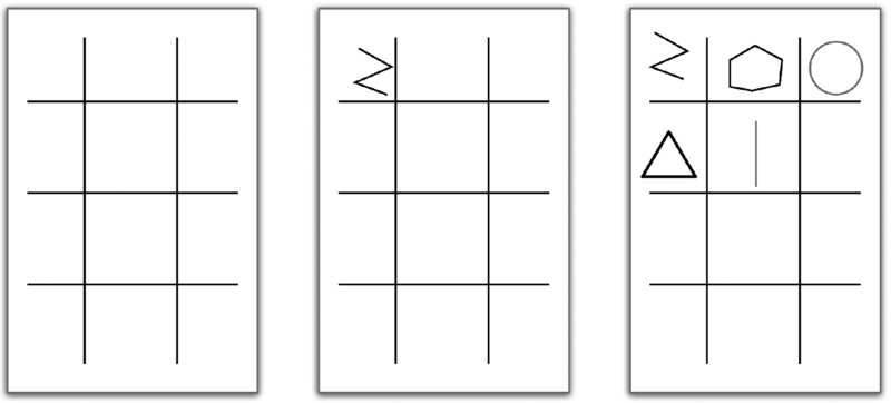
Figure 6.2 Sketching grid by Caroline Beavon.
Planning the Layout
Once you have gone through a few iterations of sketching, from abstract to rough to refined, you should now be ready to completely flush out your design before moving to the computer. Creating a data visualization is similar to considering the components of a book in that a visualization tends to have a pretty structured set of elements.
- Header or title
- Subtitle or introduction
- One or more sections
- Charts and graphs within each section
- Explanatory text or annotations
- Footer
Do you need all of these elements in every design? Of course not. However, the more structured and repetitive the process, the easier and faster it will be to create the end product.
Now that you have refined your sketches, transfer them onto sticky notes and grab another sheet of big paper. Each sticky note should have one chart or one data point or one block of text. It is time to start laying out the design.
- Write a nice big title on the paper; consider writing it in the form of a question.
- Consider adding a smaller-sized subtitle that explains what the visualization is about.
- Group the sticky notes together. You can organize the groups by the data they refer to or by the type of metric like KPIs or perhaps by the chart type. The idea is to group things that belong together. Repeat until you and your team are satisfied.
- Once you have the groups, it may be worthwhile to assign each group a sticky note color. This means redrawing some of the notes, but it will save time in the long run.
- Organize the sticky note groups from most important to least important and, keeping them in their groups, arrange them in the Z-Pattern.
- Depending on the number of groups, draw a grid on the paper so that there are sections for each set of sticky notes.
- Transfer the sticky notes onto the paper and arrange each section separately. Within each section, again consider what is the most and least important. Place the most important chart or piece of information on the upper left.
- Iterate on the layout a few times if needed. Consider removing notes that do not help answer the question in the title. Removing some notes will reduce clutter and result in a cleaner design.
- Draw annotations or additional text directly on the paper. These do not have to be accurate or detailed; they are serving as placeholders. The intent is to see if they add to the visualization. If they do not, scribble them out or erase them.
- Finally, add a footer with credits, sources, and so on.
Now that you are done with the planning, tape the big paper up on a wall and take a few big steps back. Can you still understand the design even though you are farther away? If so, great; you have likely created an effective design. If not, identify what does not work and make changes until it becomes more effective.
Your analog dashboard is now ready to be reproduced digitally. At this point, as you are building the final charts, text, and so on, you may decide to change your mind on the chart choices, colors, and even the layout. The whole idea of sketching is to make the digital process faster. Even if you must change a few things, the overall concept will likely stay the same.
Consider the visualization by Athan Mavrantonis in Figure 6.3.

Figure 6.3 Dashboard of stolen bikes in London.
What effective design choices did he make?
- The title tells us exactly what the visualization is about.
- There are clear section breaks. Athan uses gray shading to distinguish one section from another.
- Each section has a clear title.
- None of the charts are complicated. He used a heatmap, a scatter plot, a stacked bar chart and a map. His typical audience members understand how to read these.
- There are big numbers as KPIs below the map with smaller text below each number for context.
- The colors consistently represent the same values; the darker the red, the more bikes were stolen.
- The footer cites the sources and credits the designer.
You cannot create a design like this without planning it first. By following this basic process, deliberately and diligently, you will become a better designer. It takes practice. It takes discipline. It takes patience. Being great at anything does not come easy; the work you put in will be worth it, though. As you improve your skills and your designs, your reputation as an analyst will improve along with it.
Designing for Mobile
Designing data visualizations for mobile devices is not easy. How do you design for a small screen size yet still provide enough information and make the different parts large enough? Should you design long or wide? How do you account for touch screens? What different display choices do you need to make compared to a full-size screen? How many colors are okay to use?
The list of questions and considerations does not stop there, so in this section, we will provide some basic tips and strategies we have learned through Makeover Monday to help you overcome these design challenges.
Know Your Audience
Mobile users expect a different experience than desktop users. Before setting out to create a mobile data visualization, ask yourself (or better yet ask your audience) a few basic questions:
- How will they be using it and how is information shared?
- Do they expect interactivity?
- Will this be used merely for reporting or will they need to be able to answer their own questions through interactivity?
- What are the most important metrics?
Once you have gathered this information, you are ready to embark on your design. Follow the principles outlined in the section above. Draw with pen and paper. Rearrange the design with sticky notes. This will help you “see” the design before you sit in front of the computer.
Information Displays
You are now ready to take the sticky notes and turn them into visualizations. Thinking about the audience and what they really need will help you design the most effective information displays.
Charts versus Text
For example, typically we will display sales over time with a line chart.
However, when a user is accessing the data on a mobile device, all they might care about is the most recent sales and how that compares to the previous period. Therefore, a simple number may be preferred over a chart.
Filters and User Controls
When designing a dashboard for a desktop screen, we are tempted to allow users to see all of the options they can select at once. When designing for mobile, though, we need to optimize the available space and limit the number of objects on the screen. This might mean swapping charts for metrics, as in Figures 6.4 and 6.5. Other forms of simplicity include removing unnecessary charts, simplifying or removing text and titles, removing legends, and/or incorporating them into chart titles.

Figure 6.4 Line chart of sales over time.

Figure 6.5 Big numbers are great for KPIs. Include context if possible.
Radio buttons are a typical filter display. This type of filter allows the user to pick one option at a time while allowing them to see all the available options. The disadvantage of this display is that radio button filters take up a lot of space—space we do not have on mobile devices. A more effective display would be a selection filter. These save space, are easy to use on touch devices, and are familiar to users. (See Figure 6.6.)

Figure 6.6 Selection filters take up less space than radio button filters, making them more accessible on mobile devices.
Example of an Effective Mobile Design
In the mobile-first design about German auto production in Figure 6.7, Robert Crocker used big text, included context and simple charts, excluded color legends in favor of coloring the text, and used selections that are touch-friendly to make the most of the limited space available.

Figure 6.7 German auto production mobile dashboard.
Color Choices
Desktop displays allow us to include color legends, display many colors for a single chart, and have different color legends for different charts. Mobile designs require simplicity and minimal colors, where colors emphasize what is important.
Contrast
The colors used in mobile designs need to contrast enough to work in high- and low-visibility environments. In Figure 6.8, the colors are of a similar hue, making them hard to distinguish from one another.
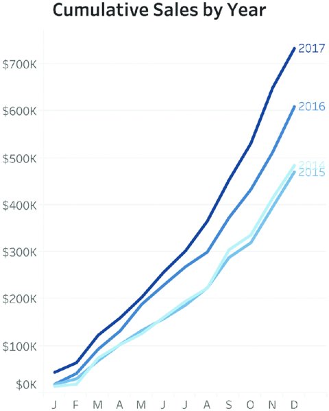
Figure 6.8 Colors that are too similar to one another to work on mobile devices.
Instead, consider high-contrast colors as in Figure 6.9. Orange and blue contrast more effectively, making it easier for the user to distinguish the two years.
If you need inspiration, look at the official colors for any professional sports team. They intentionally use high-contrast colors to make the uniforms stand out. In the line chart in Figure 6.9, the number of lines was also reduced to focus on the most relevant data since it is likely that the focus would be on comparing the most recent two years.

Figure 6.9 High-contrast colors work well on mobile devices.
Highlighting
Highlighting is an effective alternative to high-contrast colors. The purpose of data visualization is to make it easier for the audience to understand the data. Highlighting can be used to draw attention to something important, emphasize a significant data point, or put focus on what you want the audience to notice first.
Let us assume that our sales team is responsible for the East region. We need to understand where the East ranks compared to the other regions and we want the team to know that quickly. We can use highlighting to ensure the audience sees what is important to them, as in Figure 6.10.
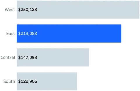
Figure 6.10 Use highlighting to make the most important data obvious.
Combining contrast and highlighting, we can begin to build out our mobile design. Figure 6.11 shows the East sales team exactly where they rank as well as their monthly performance.
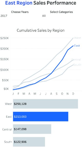
Figure 6.11 Mobile design using highlighting and contrast.
Use of White Space
Mobile devices provide lots of opportunities to include user interaction for charts, graphs, and filters. At the same time, due to the limited screen size, it is easy for a user to inadvertently tap on the wrong option if they are placed too close together.
Give all of the elements that require user interaction enough room on the screen. Instead of placing two filters one above the other, place them side by side. This reduces the likelihood that the user will tap on the wrong filter.
Figure 6.11 uses a bit of white space between the sections to divide the mobile dashboard into separate areas.
Keep It Simple
We use charts and graphs to communicate large quantities of data. Why? Because the human brain can process visual displays more quickly than it can process tables of numbers. Ultimately, the chart or graph needs to be straightforward enough so that the audience can quickly and easily determine what is being communicated.
- If you need to display the data values as text, place them near or with the chart. Do not force your audience to move their eyes away from the visualization. This will distract them and break the flow.
- Use basic charts. Bar charts, line charts, and large text, while often considered boring or ordinary, are easily understood. On mobile devices, you do not have much space to communicate a lot of information, so the simpler the chart, the better.
Bringing It All Together
In this section, we have learned the following about designing for mobile devices: effective information displays, choosing appropriate colors, using white space, and keeping it simple. To bring all of these design recommendations together, consider Figure 6.12, a mobile design Andy created for Makeover Monday about average tuition in the United States.
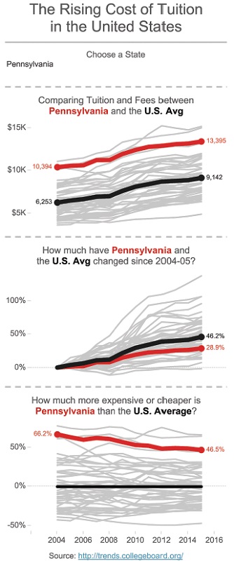
Figure 6.12 Mobile dashboard of tuition in the US.
Andy used a single filter, dashed lines as section breaks, contrasting colors, and straightforward labels, and moved the color legend to the chart titles. None of this is complicated, but it takes thought and consideration for the audience to design a good user experience.
Using Visual Cues for Additional Information
Visual cues are simple images or text that provide additional information to the user that is not essential to the main visualization. Visual cues serve as supplementary context for a topic.
Consider Figure 6.13 created by David Krupp. David placed a question mark icon in the upper right corner to provide:
- Data explanations
- Instructions on how to navigate and use the dashboard
- Information about what the comparisons mean and how to interpret them
- Guidance on how to understand the candlestick chart
Figure 6.13 Information icons are useful for providing extra information to the audience.
Including all of this information on the dashboard would be distracting and consume a fair amount of space, so David moved it out of the way and made it available as a user hovers over or clicks on the question mark. He did not exclude the information; he merely chose to make it available on demand.
Using Icons and Shapes
Adding pictographs to your visualizations can make them more appealing and help the audience more easily understand the message you are trying to convey. In Figure 6.14, Pablo Gomez used footprint icons to represent each of the water types from the data set and to connect the image of a footprint to the topic: water footprint of different foods.
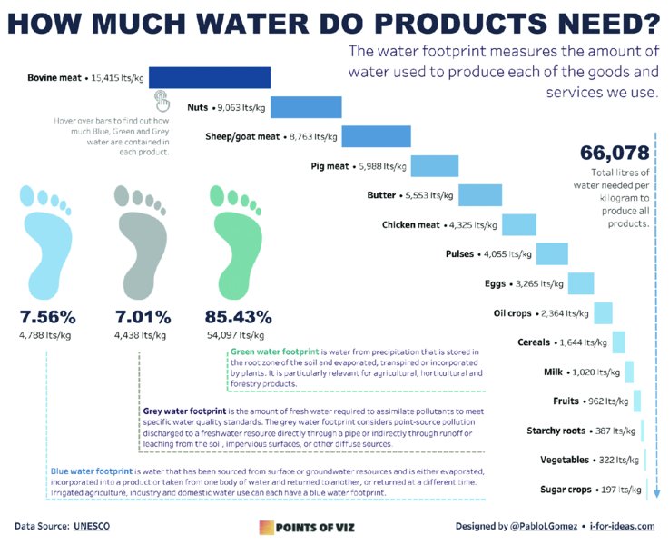
Figure 6.14 Icons can help relate the data to the topic.
There were three water types in the data (blue, gray, and green), so Pablo associated those colors with each footprint, used text in the available space that was not taken up by the chart to describe each water footprint and use dashed lines to separate them neatly.
Proper Attributions
Pablo created the footprint icons himself, so there is no need for him to credit anyone. However, if you are using icons created by someone else or a service like FlatIcon, then it is critical that you follow their protocol for crediting the creators; otherwise, you are effectively stealing someone else’s creative work. Credit any and all of the sources in the footer like Louise Shorten did in Figure 6.15.
Figure 6.15 Example of proper image attribution.
Go Easy on the Shapes
While we need to give credit for the shapes we use and ensure they are connected to the analysis, we must take care and use them sparingly. In the same way that using too many colors can be distracting for your audience, too many icons or shapes can have the same effect.
The visualization in Figure 6.16 looks at the ranking of Major League Baseball teams across various statistics for the 2017 season.
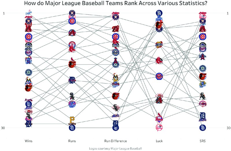
Figure 6.16 Too many icons create a cluttered mess.
There are 30 teams in the Major Leagues, hence there are 30 logos. And while this might look intuitive to the person who created it, the audience will not be able to glean any insights because the visualization is simply too busy with so many icons and lines. You could get around this by allowing the user to highlight their favorite team and then have the graph show only the logo for that team.
If you are going to use icons, limit the number you use, consider the audience, and evaluate the effort you are asking the audience to make in order to understand your visualization.
Storytelling
We have given you tips and suggestions on structuring your design, from layout considerations to mobile formats, and the inclusion of visual cues, icons, and shapes. Bringing it all together in a coherent story is an essential step to achieving a design that informs your audience and gives them something of value that they enjoy.
Finding a Story and Sticking to It
Sometimes we fall into the trap of using all the available data, turn it into visualizations, and do not end up with a structured, coherent story that is easy for our audience to comprehend. To achieve an effective design, it is a good idea to choose a specific angle or use a subset of the data and build a story from there. We do not have to use the entire data set and it is actually helpful to really pin down something we find particularly interesting and go deeper into it, rather than creating something general and nondescript.
Charlie Hutcheson created the mobile-friendly visualization in Figure 6.17, focusing on the employment challenges of young people in Guatemala. The data set covered most South American nations and Charlie could have simply created an overview dashboard with high-level information. He chose to focus on a single country and go into deeper detail. This helped him develop a strong story with interesting insights, which flows from the beginning at the top to the end down the page.

Figure 6.17 Choosing a subset of the data can make a story more focused.
Long-Form Storytelling
Long-form storytelling, an approach taken in many infographics, is an excellent way to present data and take the audience on a journey. Consider Figure 6.18, a long-form dashboard about Tourism for Berlin and Brandenburg from Sarah Bartlett.
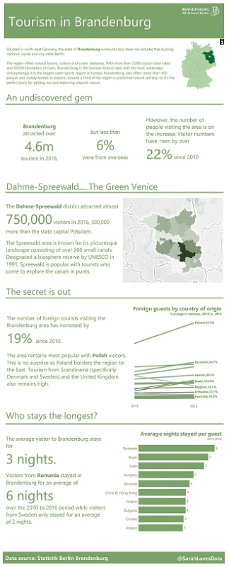
Figure 6.18 Long-form visualization can be useful for guiding the audience through the analysis.
Sarah starts with an introduction to the topic, sets the scene by describing the state of Brandenburg, and shares high-level statistics. She goes on to focus on a specific district, incorporating a map before going into more detailed analysis of the tourism data. Sarah takes the reader on a journey down the page as if you are reading a story. Like any good writer, she starts with an introduction, then adds more and more detail to the story as you scroll down, before concluding with information about who stays the longest.
When you have a data set that contains rich levels of detail for you to work with, it may be suited for a long-form dashboard. While this type of design will require a bit of additional research to add information and context, the results can be very impactful.
Think Like a Data Journalist
Storytelling can often be thought of as data journalism. How can you take a data set, investigate, analyze, research, and communicate the insights? This requires continuous and regular practice, a bit of inspiration, and a willingness to learn.
Figure 6.19 by Mike Cisneros is a visual news story about life expectancy at birth. He lets the user pick the story they want to see and the visualization updates according to what they choose.

Figure 6.19 Life expectancy at birth by Mike Cisneros.
On the left side of his visualization, Mike describes the pattern in the data for the events that were selected. On the right side, his audience can see and understand what the data is showing based on these explanations and descriptions. This is a very effective way to communicate insights and educate the audience.
Reviewing Your Work to Improve Its Quality
Before you publish your work, spend some time reviewing it. Stepping back and reviewing your work with a critical eye allows you to:
- Find errors or omissions
- Ensure simplicity
- Test for bugs
- Put yourself in the shoes of the audience
This section will provide tips and strategies for reviewing your work.
Take a Step Back
The easiest and quickest way to “test” your visualization is to step away from the screen. You can do this in many ways, for example:
- Literally get out of your chair and take a few steps back so that you cannot touch the screen or the computer.
- Look away for a few seconds, then look back at your screen and pay attention to where your eyes are drawn.
Both of these techniques allow your brain to “reset” itself and consider the visualization anew. When you step back, ask yourself a few questions:
- Does this visualization tell the story in the most effective way?
- Is there anything (lines, words, labels, logos, images, etc.) I can remove or simplify, while still keeping the overall message the same?
- Is the layout intuitive and does it support or possibly enhance the story?
This does not take much time and it provides a lot of value. Give it a try.
Ask a Friend
Ask a friend what they think, preferably someone who does not work in the field of data visualization and does not know much about the topic. The benefits of this include feedback about:
- Insights. Did they say back to you what you intended them to understand?
- Usability. Did they click where you wanted them to? Did they use an unexpected combination of interactions?
- Honesty. We can typically count on friends and family to be very honest with us.
Do not take their feedback personally. They are not critiquing you; they are critiquing the visualization. Listen to them. Do not interrupt. Hear what they have to say. Then incorporate their feedback and ask them again.
Viz Review
Each week, we review visualizations on a webinar specifically designed for feedback. This is an opt-in session, so we only review work that people want feedback on. We are often seeing these visualizations for the first time, so you will get our initial impressions. Each review covers:
- Overall design
- Use of text in titles, subtitles, and annotations
- Font choices
- Effective use of color
- Depth and accuracy of the analysis
These sessions are designed to help anyone interested in improving their skills. However, if you want feedback, it is expected that you will listen to the feedback, take it on board, and iterate. This does not mean you have to agree with all of the feedback, but you should take it into consideration. After all, you asked for the feedback in the first place.
For more information about techniques for applying feedback, flip to Chapter 8, “Iterate to Improve.”
Summary
Your visualizations will be most effective when they are designed with the audience in mind. Ask yourself who will consume the information, what message you want to share, and what assumptions you can make about your audience’s knowledge of a topic. Do you want them to interact with your visualization and delve deeper into the data, or are you providing them with an overview of your findings?
Tailor your visualization to your audience and give them the information and context they need to understand your key message.