CHAPTER 9
Effective Use of Color
Most of the chart examples used in this book include color to help bring a topic to life, draw your attention, highlight specific insights, or evoke emotion. Using color in data visualization is an effective way to better communicate your message and to make your work more impactful.
In this chapter, you will learn best practices for using color in data visualization. More specifically, this chapter will help you understand how you can use color to:
- Evoke emotions
- Create associations
- Highlight key findings and data points
The Significance of Color in Data Visualization
Color has long been used to communicate information and convey emotions. Color theory1 became a topic through the work of Leone Battista Alberti and Leonardo Da Vinci in the fifteenth century before being formalized through Isaac Newton’s theory of color in 1704. We can acknowledge that the concepts introduced by these influencers informed many of the ways we think about color today.
Color is used to influence people in advertisements and product packaging, and to capture their attention through various channels. In data visualization, you can utilize the research on the effectiveness of color to help influence the processing and understanding of information.
How Color Is Used to Tell Stories
Children’s books use color in storytelling. There are lush green meadows where cows graze, while a dog runs after a butterfly. It is a colorful display to draw children into the story and help them discover all the objects on a page. It enables children to learn how colors help the parts of a story fit together. You can use the ideas behind children’s stories and apply them to data visualization in a business context.
Stories are a natural way for humans to communicate information. Thousands of years ago, before we had books and paper to capture data and display information, stories were the only way to transfer knowledge from one generation to the next.
Your audience will likely respond very positively to a captivating story, one they understand easily and can follow along, a story that informs them and shares critical insights that help them make decisions and take actions.
Whether you create data visualizations as a hobby, for social impact, in your day job, or for all these reasons, practicing your storytelling skills and enhancing them through the effective use of color will help you communicate your message more clearly to your audience.
In the following sections we will introduce the parallels between data visualization and storytelling and how you can use color to tell a better story.
NOTE: The next few sections assume that the default background color for data visualizations is white. Any other colors in the text are specified as required.
Using Color to Evoke Emotions
They may forget what you said, but they will never forget how you made them feel.
—Carl W. Buehner
Creating data visualizations that evoke emotions in your audience will make your work more memorable, give you a greater chance to influence people, and ensure that they take action or make changes based on your findings and recommendations.
In business, concepts like responsibility, ownership, urgency, and pride evoke emotion. For example, if your analysis shows that there is a large untapped opportunity to close a major deal with an existing customer by the end of this quarter, you can use color to give your audience a sense of urgency and communicate the need to act quickly.
In the following sections we have assumed a typical Western view, which associates certain colors with certain meanings and emotions. Emotional colors are very culturally defined and what is seen as an alarming color in the Western world (i.e., red) is perceived as a celebratory color in many parts of Asia.
Diving into the cultural context of emotional color would go far beyond the limitations of this chapter, so please read the following pages with the assumption of a North American and European perspective.
Positive Results and Emotions
For good things, you will typically want to use bright, positive colors, such as blue and green. In business, green is often representative of positive results and gives people confidence that things are going well. Pinks and purples, as opposed to reds, are also often used to show positive outcomes. On dark backgrounds, white can be featured as a positive color. These colors work well by themselves or in combination with lighter hues or neutral grays.
In Figure 9.1, Shawn Levin visualized iPhone sales over time, showing the performance of the product in a simple line chart, specifically highlighting the difference between sales of various iPhone models. Shawn uses green boxes and white upward arrows showing positive performance and white in the line chart to show the total sales figures across years and quarters. The white line works well on the black background and the gray shading below the line ensures the chart stands out.
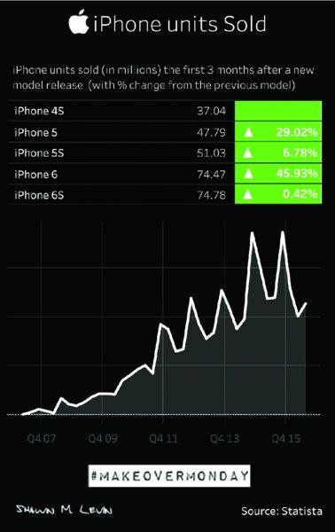
Figure 9.1 Using a basic line chart to show iPhone units sold over time.
In her visualization of tourism trends in New Zealand (Figure 9.2), Aline Leonard used two shades of green to specify domestic versus international visitors. Aline’s visualization evokes positive connotations and the colors she uses help reveal the pattern in the data.
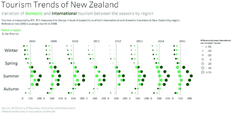
Figure 9.2 A simple color palette shows domestic versus international tourism trends of New Zealand.
Negative Results and Emotions
Color can be a key factor in communicating negative results and emotions. The best colors to use for conveying negative results are red, orange, black, and gray. These contrast well with neutral and positive colors.
In a financial context, red usually depicts losses, expenses above a certain threshold, or below-target results. In a social, environmental, or health context, dark colors typically evoke a somber, sad tone. Haiping Kuang created the visualization in Figure 9.3 of German car exports between 2008 and 2017. She used red to highlight the months when car exports dropped below prior year values. Red is used in the line charts to indicate the decline of exports during 2009 and to show that truck exports took a longer time to recover to prerecession levels than passenger cars.
Figure 9.4, from Rosario Gauna, analyzes the likelihood of UK workers being replaced by robots, using color effectively to highlight negative findings. Her use of red to call out the key findings focuses the audience on those insights. While the title sets the scene, the red elements on a black background stand out strongly and direct the audience’s attention.
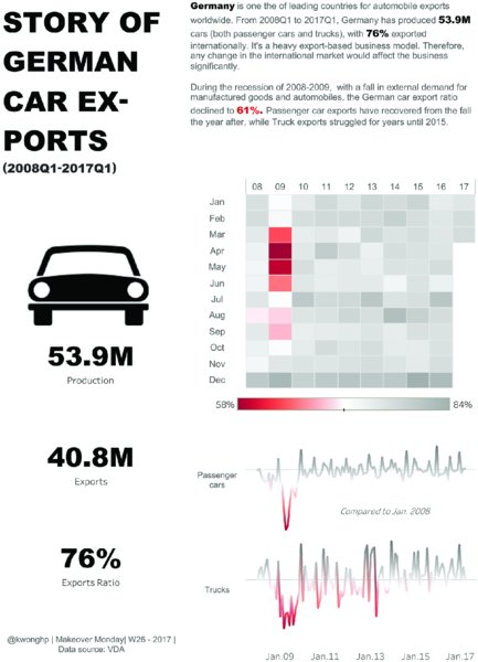
Figure 9.3 Red color highlights the impact of recession on German car exports between 2008 and 2017.

Figure 9.4 Key insights about the use of robots to replace workers are accentuated with red color on dark background.
Using Color to Create Associations
We previously discussed how colors can evoke emotions in an audience. Companies around the world use this knowledge to their advantage, which makes you naturally associate colors with brands like Coca-Cola, for example.
Aside from brands, we also associate colors with countries, topics, and themes. The following section shows you how to use color for creating associations in three areas:
- Brands
- Topics and themes
- Linking fields across charts
Color Associations with Brands
The example of Coca-Cola probably made you think of the color red, because that is the main color of their logo. For Makeover Monday we have used several data sets that were associated with brands and the resulting visualizations predictably featured the colors associated with those brands.
Apple as a brand is associated with the colors white, black, and silver, and the concept of clean, minimalist design. In Figure 9.5, Michael Mixon’s choice of black with a gray font and a white to blue color palette for units sold creates a strong visual connection with the Apple brand. Like Apple’s products, the visualization has a minimalist and uncluttered design.
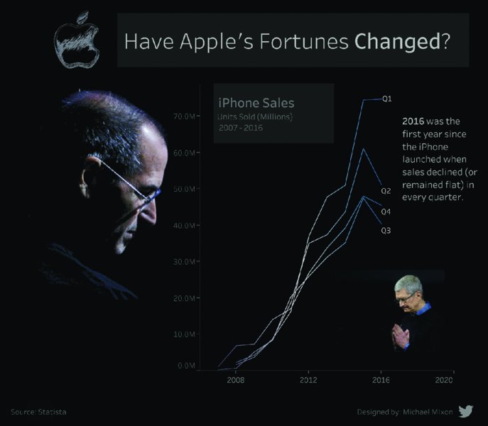
Figure 9.5 Minimalist design and deliberate color choices create associations with Apple as a brand.
The Makeover Monday topic of “Top 500 YouTube Gaming Channels” featured a number of visualizations with the red and black colors found in the YouTube logo. The creative, lighthearted design from Mike Cisneros in Figure 9.6 combined a long-form layout with interactive dashboard elements, balancing the colors so the YouTube red would not be overwhelming.

Figure 9.6 The design elements of this visualization lead to fast brand recognition with YouTube.
Mike used the YouTube red sparingly. In the title, red reflects the YouTube logo. Red is then repeated in the instructions. The other colors used are more muted shades of red, where Mike reduced the saturation of the red color. If the circles in the scatterplot had been bright red as well, then the audience would likely struggle to understand what they should focus on and the different elements would compete for attention. Using pastel colors helps avoid this problem.
Color Associations with Topics
When communicating information, data, and insights, using colors associated with the topic will help your audience understand the message more easily. It came as no surprise when we provided a data set about bee colony loss, that many dashboards contained yellow, gold, and black.
The visualization in Figure 9.7 by Sean Ramsdale stood out for its clean design and very visual representation of the data. The total annual bee colony loss was represented by different shades of yellow, from a golden hue to a very pale, almost white color.
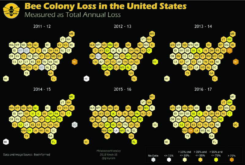
Figure 9.7 Using colors and shapes associated with bees creates a visualization that forms strong associations with the topic.
The colors chosen were deliberate and work well with the topic. The hexagon map suits the association with honeycombs and allows for an easy representation of the United States. The prominent title, and the subtle color legends, provide a nice frame for the visualization.
It often makes sense to use colors associated with the topic because the colors put the subject matter and the visual representation of the data in harmony with each other. Your audience will be more likely to focus on your key messages because they do not have to overcome a disconnect between the topic and the way you have visualized it.
Any nature topic, such as the analysis of National Park visitors in the US, will probably make people think of nature colors like browns and greens, oranges and blues, or anything to do with the earth, the sky, rivers, mountains, plants, and animals. As an example, as seen in Figure 9.8, Chantilly Jaggernauth created a beautiful visualization, providing an overview of the parks across the United States and a more detailed breakdown for the top 10 national parks.
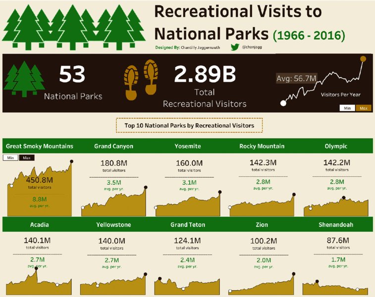
Figure 9.8 Using a palette that reflects nature’s colors makes the topic visually more accessible.
The colors were chosen deliberately to feel like a nature theme. The placement of lines to split total visitors and yearly average for each of the top 10 parks, and the addition of horizontal bars in brown and green to divide the page into sections, mean the information is more easily consumed as the audience can work their way down the page section by section.
American baseball is often associated with the colors on the logo of Major League Baseball (MLB). When visualizing baseball demographics in MLB since the middle of the twentieth century, many visualizations used blue, red, and white as the main colors. Chantilly Jaggernauth produced an insightful infographic (Figure 9.9) showing a timeline of the involvement of African American players in baseball and highlighting Jackie Robinson’s career.
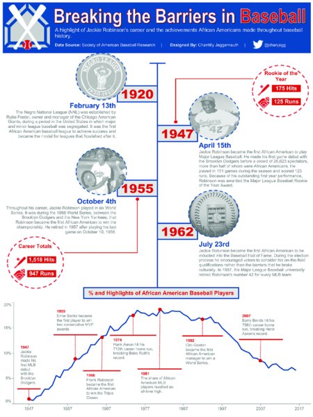
Figure 9.9 Selecting colors, shapes, and images that are generally recognized as baseball-related supports fast recognition by the audience.
Years are consistently labeled in red, the vertical timeline and the line in the chart at the bottom are in blue, and specific achievements or notable events are represented with images that have dotted circular lines drawing attention to them. The design is easy to read, makes the story relatable, and adds richness to the insights. The colors Chantilly used in her design are an obvious choice for the MLB topic and work well together, while also being easy to differentiate. The balance of blue and red compared to white ensures there is no overload of color and color remains meaningful.
Color Associations Across Multiple Charts
You can use colors to create a strong connection between the different elements of your visualizations. It is good practice to apply color deliberately and sparingly to specific fields that you want to focus on in your dashboard and to let those colors highlight the important aspects of your data throughout the visualization. If your dashboard contains a number of charts that visualize related data, you can connect these visuals by applying color to specific fields or metrics. In Figure 9.10, David Eldersveld created a dashboard about the European Union potato sector and compared the five primary EU producers to other countries.

Figure 9.10 Consistent colors linked to specific groups of countries guide the audience through the analysis across multiple charts.
The choice of colors in this visualization very easily highlights the two groups of countries being compared and shows David’s audience how these two groups differ across a number of key indicators of potato production.
Other examples of using two colors—one color for a specific field and second color for all other data points—include dashboards that focus on the performance of one product versus all other products, one team versus all other teams in the league, or one region in a business compared to the remaining regions. There are numerous use cases and we encourage you to try this approach to create effective linkages between the different elements of your visualization. Keeping a consistent meaning attached to the colors you use helps your audience follow your story more easily from start to finish.
Using Color to Highlight
Using colors to highlight specific data points or insights helps show your audience how specific data points differ from the rest. Kate Brown analyzed the cost of meals at different pubs for a popular chain of pubs in the UK and the Republic of Ireland, shown in Figure 9.11. Kate showed those pubs that charged above-average prices for a meal and used red circles to highlight the locations.
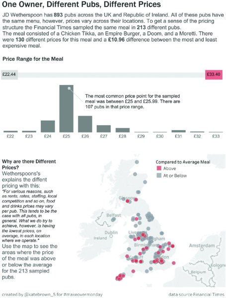
Figure 9.11 Specific data points are highlighted in red against all other data points.
The audience can easily see the clusters of more expensive pubs as well as their proximity to the cheaper locations. The horizontal bar serves as a color legend and shows the range of prices.
Best Practices for Using Color
So far, this chapter has shown how color can be used for storytelling and for bringing the key insights into focus. Before applying the ideas from previous sections to your own work, there are some best practices to keep in mind.
Less Is More
Too often, dashboards are designed with too many different colors. Including lots of colors together creates a lot of noise in the visualization, keeping any single color from standing out and insights can easily get lost.
Consider Figure 9.12 of cumulative sales across different cities in New Zealand. Because the colors create confusion, a few simple questions cannot be answered:
- Is the highest-performing city Auckland or Rotorua? (Both are blue.)
- Which city is represented by the horizontal brown line at $5000?
- Which two cities are represented by the two brown lines among the top performers? Are they Wellington and Hamilton? Or is Paraparaumu a possible option?
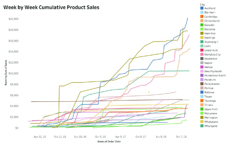
Figure 9.12 The meaning of colors is unclear and confusing because a number of colors are applied to different cities.
The colors in this visualization create confusion and get in the way of effectively conveying insights. This multitude of colors means your audience has to work hard to look back and forth between the graph and the color legend to make sense of the information provided. If you want to make data visualization available to a broader audience, you need to make information accessible and easy to understand.
Monochrome colors are used effectively in Figure 9.13 to highlight the poor-performing stores in Paraparaumu. Paraparaumu is now the focus of the analysis and stands out against the remaining cities, which are shown in gray to provide context. The color of the line is noted by the bold font in the title and the small label next to the line.

Figure 9.13 Reducing colors allows a single city to be highlighted effectively.
If you want to compare two cities against all other cities, they can be highlighted with two distinct and well-contrasting colors while all other cities are represented by gray lines, as in Figure 9.14.
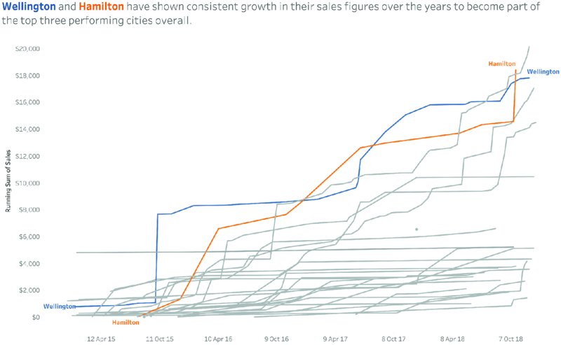
Figure 9.14 The use of two contrasting colors for specific cities allows an easy comparison, while gray lines indicate all other cities for context.
Again, the title is used as a color legend and the two colors chosen have a strong contrast with each other, while also being easy to differentiate from the gray lines representing all other cities.
Considerations for Color Blindness
Color blindness is a vision deficiency that effects on average 8% of men and 0.5% of women worldwide,2 making it a significant enough challenge to consider when it comes to communicating information. This is especially true for data visualization since color plays such an important role when visualizing information for an audience.
There are different forms of color blindness, which, at a general level, can be categorized as follows:
- Deuteranomaly, where people are less sensitive to green light, because the medium-wavelength cones are defective, resulting in a “green weakness,” which makes it difficult for people to differentiate hues of red, orange, yellow, and green.
- Protanomaly, where people are less sensitive to red light, because the long-wavelength cones in their retina are defective. Protans have trouble with red-green distinctions as well as green-orange.
- Tritanomaly, where people are less sensitive to blue light, because their short-wavelength cones are defective. These people struggle to differentiate between blues and greens and yellows and reds.
Deuteranomaly is the most common form of color blindness.3 People affected by protanomaly or deuteranomaly suffer from what is commonly described as red-green color blindness and struggle to differentiate between hues of red and green, brown and orange.
In the context of data visualization, using red and green together in a chart to represent bad and good results could easily be misinterpreted by people with these two types of color blindness. How many financial dashboards have you seen with numbers, bars, lines, or circles in red and green, aiming to alert the audience about negative and positive results? If those colors are perceived as very similar shades of gray or brownish gray by people with color blindness, how does this affect their understanding of the results?
There are helpful tools available online, such as the Chromatic Vision Simulator,4 which allow you to upload an image of your work to see what it looks like for people with different types of color blindness. It is also important to have color palettes available that are color-blind friendly. Jeffrey Shaffer from Data + Science has written a very helpful article on his blog on how to design color palettes yourself.5
Using Background Colors
Most of the dashboards and data visualizations you see use a white background. However, we have seen a trend in Makeover Monday toward other background colors, the most common being black. The typical use case for applying a different background color is for linking the topic to the design. Serious topics, such as wars, illnesses, death rates, and inequality, lend themselves to darker visualizations with black or dark gray backgrounds.
It is important to keep in mind that colors are perceived differently on different backgrounds. You need to ensure that regardless of the background color you use, your visualization is easy to read, and the information is communicated clearly.
In her visualization of solar eclipse data (Figure 9.15), Angie Chen used a black background and plotted individual data points in a warm golden hue.
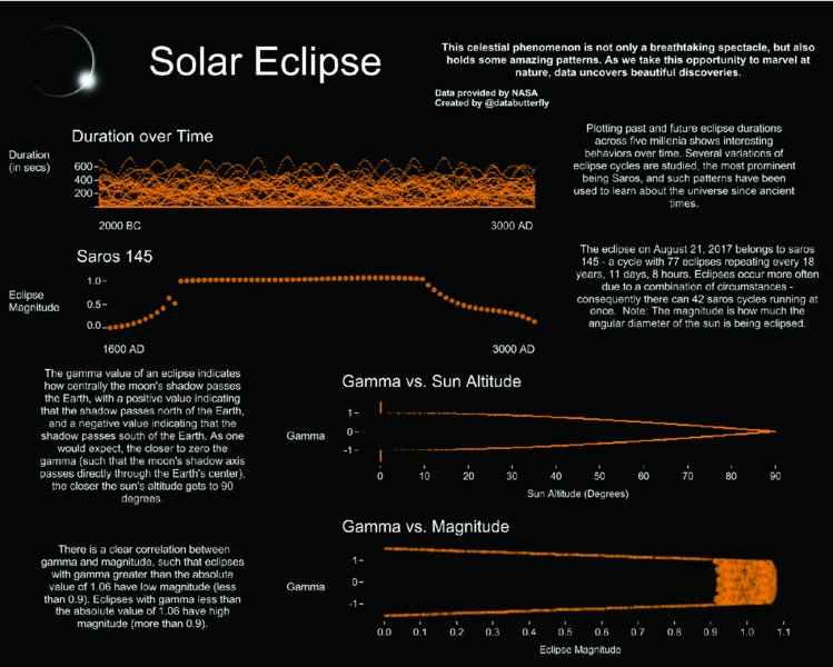
Figure 9.15 A black background was used for the topic of solar eclipses.
If you change the visualization to a white background, making the necessary adjustments for the text from white to black, you get Figure 9.16.

Figure 9.16 The same solar eclipse visualization is presented on a white background.
The visualization still works well, but the overall perception of the two dashboards is very different. The version with the white background does not convey the astronomical nature of the topic as well as the dark background does.
When analyzing economic freedom data (Figure 9.17), Steve Fenn emulated the Financial Times chart design style, using their color palette with a beige background and a unique color for each of the different columns in his dashboard.
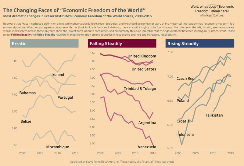
Figure 9.17 The beige background was inspired by the Financial Times Style Guide.
With the topic being about economics and financial matters, this design approach worked very well, resulting in a recognizable visualization. The gray, burgundy, and dark blue can be easily distinguished from the background, and the black text font is easy to read.
In Figure 9.18, the visualization definitely still works well on the white background, but it does not trigger associations with the Financial Times. The colors do not appear as warm as they did on the beige background, changing the overall feel of the dashboard.
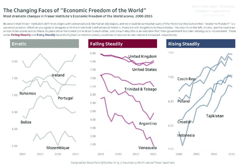
Figure 9.18 Notice how the visualization changes when the background color is removed. Removing the beige background leaves no association with the original design inspiration.
As you have seen in Figures 9.15–18, background colors change the appearance and the perception of a visualization. Sometimes this is very subtle, while other times it is much more noticeable. Stay clear of bright background colors that make your visualization difficult to read, are hard on the eyes, and look unprofessional.
Using Text as a Color Legend
Applying color to the relevant words in a title or subtitle removes the need for a separate color legend. In Figure 9.19, Mark Bradbourne visualized meat consumption data for the US and colored the words “Poultry” and “Red Meat” in the same colors as their respective lines in the chart.

Figure 9.19 Colors applied to the words “poultry” and “red meat” in the subtitle work as a color legend.
In Figure 9.20, Adam Crahen took a similar approach when highlighting the rapid growth of prescriptions for the drug Apixaban. At a glance, Adam’s audience can tell that orange and Apixaban are related, given the coloring of the text in the title and the color of the line. Using the color in the title also eliminates the need for a color legend, thus removing elements from the visualization.
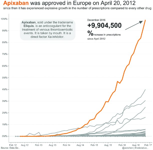
Figure 9.20 The orange line represents a specific drug, which is made clear by applying the same color to the drug’s name in the title.
As you apply color to text, keep in mind that the audience can get confused if you color too many words. If you have more than about three colors, then a color legend will be easier to read and understand.
Summary
Color is a great tool for conveying information quickly and effectively and to draw your audience into your visualization. Using color sparingly makes it more meaningful and can highlight your key insights effortlessly. Look at each visualization you create with a critical eye, and take a step back (literally and figuratively) to see the complete picture. Let the overall impression of your visualization sink in for a few minutes and decide whether your use of color is as effective as it can be.
Make deliberate color choices to evoke emotions in your audience. Do you want your visualization to have a specific emotional tone and is this conveyed through your color choices? When it comes to storytelling, have you chosen specific colors for particular fields to tell your story in a way that flows from start to finish with clarity and consistency? Using color to create linkages between different parts and concepts in your visualization as well as between individual charts helps to bring your overall design together.