Chapter 2. Introduction to VFX: Advanced Photoshop for 3D, VFX, and Digital Compositing
In its simplest, most distilled definition, creating visual effects or VFX is simply either adding or removing something from the original image. To do that, you must first be able to select certain objects in a scene. These may be objects that need to be removed or objects in the original image that need to be replaced back on top of the item or element you are adding to the image. You want it to appear as if whatever you have added is at a proper depth and is behind any appropriate foreground elements already in the scene. This is what will make your object appear to be actually in the image. As you will see, creating the most accurate and appropriate selections possible is probably the single most important fundamental skill required to become a VFX artist.
Designed by visual effects artists in the early 1990s, Adobe’s image paint and 2D compositing application Photoshop® remains an amazingly versatile tool for VFX work. Compositing with Photoshop is a great way to learn, in a professional environment and application, all the concepts, techniques, and applications you need to make selections for your VFX work. All of Photoshop’s selection methods are universal among image editing, visual effects, and compositing applications, so once you learn selections in Photoshop, you can pretty much apply them to any other application.
Photoshop Selection Methods
Photoshop has many prebuilt selection tools. Some are simple and straightforward, others are complex, and still others are relegated to the categories of legacy or not well documented. Because many artists tend to shy away from technical stuff, Adobe has hidden much of the inner workings of some of these powerful selection tools under the hood in lieu of creating simple, artist-friendly interfaces and naming conventions.
In order for you, as a VFX artist, to be able to fully understand, utilize, and troubleshoot VFX work, you need to understand all the selection methods and how they work. You need to get under the hood and find out what Photoshop is doing behind the scenes so that you can harness the true power of all of these selection methods. Don’t worry, though. This chapter teaches you all this technical information in a very simple, straightforward way. By the end, you’ll easily have mastered the power of selections.
Simple Selections
To make simple selections using the basic selection tools, after selecting the tool you would like to use, simply place your mouse pointer at the starting location of whatever you’d like to select, click and hold the mouse, and then drag to the end location and release the mouse.
Marquee Selection
On the Photoshop toolbar, located by default on the left-hand side of the Photoshop interface, the tool second from the top is the Marquee Selection tool. By default, it’s the Rectangular Marquee Selection tool. The tiny triangle in the bottom right corner of this tool indicates that a pop-out menu of options is available. Click and hold the mouse button with the pointer over the tool to reveal these options, as shown in Figure 2.1.
Figure 2.1. Marquee Selection tool pop-out menu
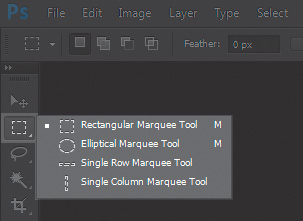
As you can see, the pop-out menu reveals three additional Marquee tools you can use to make selections: the Elliptical Marquee tool, the Single Row Marquee tool, and the Single Column Marquee tool.
Each of these Marquee tools has additional, helpful modifier keys that can assist with selections:
• Pressing and holding the Shift key after clicking and dragging the mouse constrains the selection to a perfect square or circle, depending on whether the Rectangular Marquee or Elliptical Marquee is selected.
• Pressing and holding the Alt key after clicking and dragging the mouse creates a selection centered from the point clicked outward (instead of from corner to corner).
• Pressing and holding the Shift key after a selection has been made and then making another selection adds to the selection, meaning both objects will be selected.
• Pressing and holding the Alt key after a selection has been made and then making another selection subtracts from the selection, meaning the second selection will be subtracted from the first selection.
• Holding down both the Shift and Alt keys together constrains a selection and makes that selection from the click point center outward.
Lasso Selection
The next tool button down, as you can see in Figure 2.2, is the Lasso Selection tool.
Figure 2.2. Lasso Selection tool pop-out menu

Lasso Selection allows for freeform drawing of selection shapes. The additional variations within the pop-out menu for this tool are the Polygonal Lasso tool and the Magnetic Lasso tool. The Polygonal Lasso tool makes selections using straight line segments anchored by corners that are placed wherever you click. This feature makes the Polygonal Lasso tool handy for selecting any object with straight edges, such as buildings or street signs. By contrast, the Magnetic Lasso tool “pours” its selection lines, like toothpaste being squeezed out of the tube, automatically finding edges with contrast.
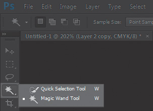
Magic Wand Selection
Next is the Magic Wand tool, shown in Figure 2.3, with its Quick Selection tool pop-out option.
Figure 2.3. Magic Wand Selection tool pop-out menu
Magic Wand tools make their selections based on color values and allow more or less of an image to be selected depending on Tolerance or Brush Size values. These values are based on the pixel that is clicked, or selected; more of similar color values can be selected with higher values or larger brush sizes, and less can be selected with lower tolerance or brush sizes, as seen in Figure 2.4.
Figure 2.4. Example of selections made using the Magic Wand Selection tool

Note
All the modifier keys described in the “Marquee Selection” section work equally and the same way with all of these other tools.
Selections in VFX
These basic selection tools (shown in Figure 2.5) are handy for simple selections. But rarely in VFX are the subjects, or elements, you need to select in a scene so simple. In addition, elements in a filmed scene never have a perfectly sharp edge, as you can see in the magnification of Figure 2.6.
Figure 2.5. Examples of selections made with selection tools
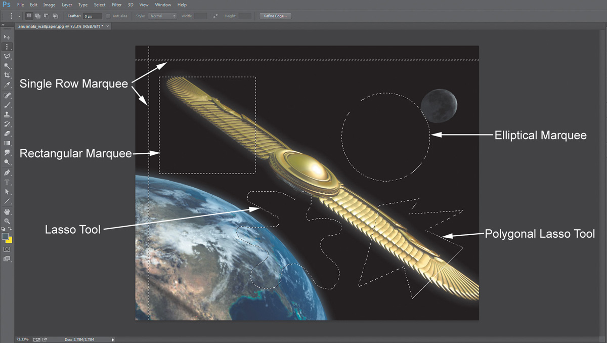
Figure 2.6. Edges in any kind of photography are never razor sharp

The edges of all these selection methods are unnaturally razor sharp, as you can see in Figure 2.7 and 2.8.
Figure 2.7. Selections made with selection tools...
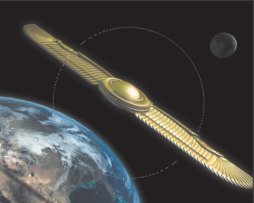
Figure 2.8. ...create unnaturally sharp edges when extracted.
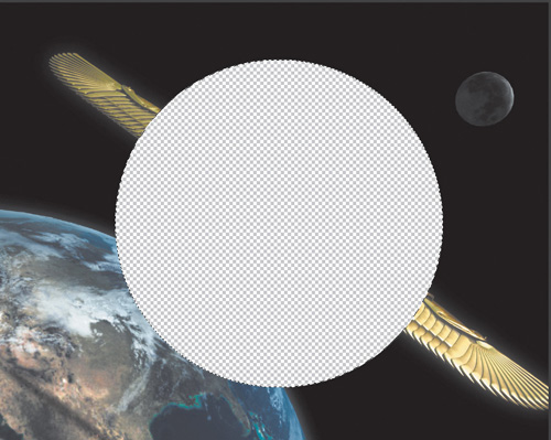
Figure 2.8 quite blatantly gives away that an element has been cut and pasted. But your goal as a VFX artist is to create seamless, photorealistic images.
At the top of the interface, as shown in Figure 2.9, click Select menu > Modify > Feather. Feather helps produce softer, more natural-looking edges by creating a blurry-edge effect that you can control by setting its Feather Radius. However, setting the Feather Radius is a bit hit or miss. Here’s where you need to get under the hood to see what Photoshop is actually doing so you can have more control over the edges.
Figure 2.9. The Feather tool can be used to soften selection edges.

Alpha Channels
Alpha channels are one of the most important, versatile, and useful tools you will use in VFX.
In this section, if you have Photoshop installed, you can work directly with the same files shown in the figures as you read along. Download the images from www.peachpit.com/register and follow the directions to register the book. The downloadable files will be listed under the Registered Products tab of your Account page.
Go back to the Selection menu (shown in Figure 2.10) and click Save Selection.
Figure 2.10. Save Selection tool found under the Select menu

Select the New Channel option under Operations in the same Document image you’re working on. If you click the Channels tabs in the lower right (shown in Figure 2.11), you’ll see that in addition to the three RGB (Red, Green, and Blue) channels and the combined RGB Channel layer at the top, you now have an additional black and white image in another channel named Feathered Selection. This is called an alpha channel.
Figure 2.11. A new alpha channel created with the Save Selection tool

Although the phrase alpha channel might tempt the technophobic to immediately run, it’s actually quite simple. Where the alpha channel image is white, the image the alpha channel is a part of will be solid or opaque. Where it is black, the image will be transparent or see-through. Where the alpha is a shade of gray, the image will be semi-transparent, or partially see-through, depending on the value of gray. Transparency is determined on a scale of 0–255, with 0 being black (or 100% transparent) and 255 being white (100% solid or opaque).
If you select an alpha channel and then click the Load Channel As Selection button at the bottom of the Channels tab (as seen in Figure 2.12), you will see that any alpha you have selected now loads as a selection!
Figure 2.12. The Load Channel As Selection tool

Let’s create a new, perfectly sharp shape selection and perform another Save Selection. After you’ve done so, select the saved alpha for the sharp shape in the Channels tab.
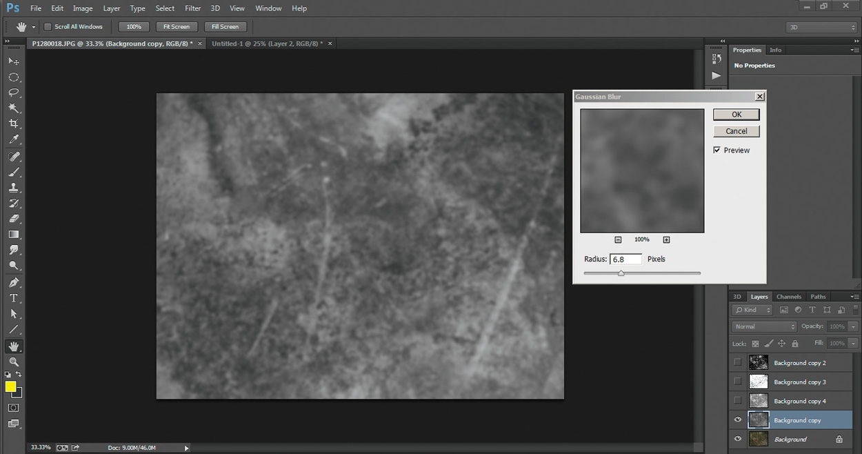
Click Filters > Blur > Gaussian Blur (shown in Figure 2.13) and adjust the Radius value of the blur slightly. You’ll see that you’re actually getting the same result as you would using the Feather Selection tool!
Figure 2.13. The Gaussian Blur tool applied to an alpha channel
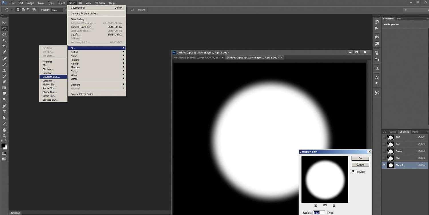
This, in fact, is what Photoshop is doing behind the scenes—creating this soft edge. The difference is that by performing the process manually, you have complete control over the quality of the edge and you get instant interactive feedback (you can see it being done right before your eyes as you adjust the Radius Pixel value slider).
Advanced Selections
Unfortunately, most selections you’ll need to perform are not simple shapes with simply shaped edges. Most will require more advanced methods, or even multiple methods, to arrive at the best possible selection. Photoshop provides a few stock tools to get somewhat better precision over selections, including the Color Range Selection tool (click Select > Color Range), as shown in Figure 2.14.
Figure 2.14. The Color Range Selection tool creates its selections based on a similar range of color values, selected with the eyedropper.

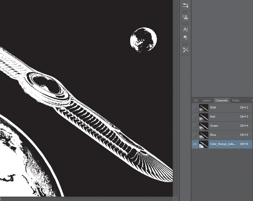
Notice that the selection of a color value produces a very similar type of result to the one you get with the Magic Wand tool. Notice also that the Fuzziness slider gives you a very similar result to what you get when you raise or lower the Tolerance value of the Magic Wand tool. In fact, it’s doing pretty much exactly the same thing! But look at the little selection preview thumbnail image in the tool—does it remind you of anything? Yup. If you save this selection (see Figure 2.15), you’ll see that this is just another alpha selection!
Figure 2.15. Alpha channel created using a Color Range selection.
Levels Adjustment
Among the many tools you’ll use in your bag of tricks, one of the most versatile—and one of my favorites—is the Levels adjustment tool (shown in Figure 2.16).
Figure 2.16. The Levels adjustment tool
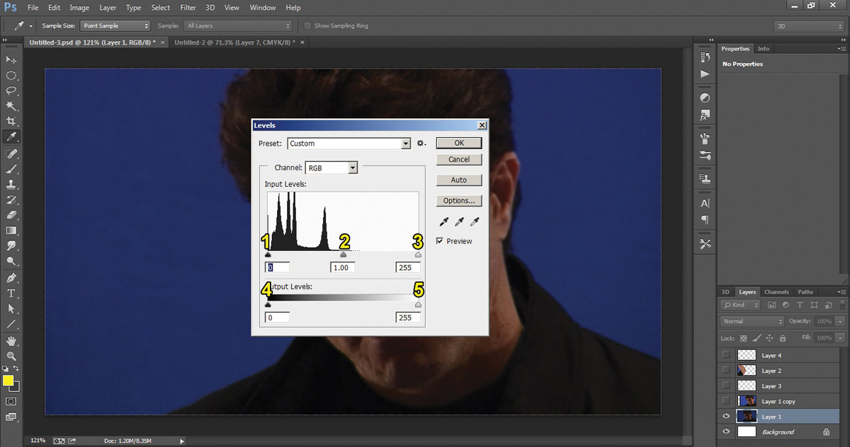
The Levels adjustment tool is found under Image menu > Adjustments> Levels. It has a simple interface with a graphical representation of the values of the image from black to white (called a histogram) and five controls divided into two sections (as numbered in Figure 2.16):
Input
1. Black level (shadows): This controls where on the histogram the image should be black.
2. Gamma level (midtones): This controls where on the histogram the image should be mid gray.
3. White level (highlights): This controls where on the histogram the image should be white.
Output
4. Black level: Where this control is placed on the gradient above will be the darkest black the image can be.
5. White level: Where this control is on the gradient above will be the lightest white the image can be.
By raising the Black Input level and lowering the White Input level, you can effectively increase the contrast and add punch to the image. By raising or lowering the Gamma level, you can increase or decrease the brightness of the image without affecting (crushing or clipping) the black or white points in the image. By raising the Black Output level and lowering the White Output level, you can decrease the contrast in the image.
Later in this chapter, you’ll see how versatile the Levels adjustment tool can be and the many ways in which we can use it to effectively control many different effects.
Channel Ops
Since we now know that the red, green, blue, and alpha channels are all just grayscale images with values ranging from 0–255 in an 8-bit image, what’s the difference between them? Absolutely nothing! What does this mean to you, and how can this help you as a VFX artist? Well, it means you can
• Load any channel or image as a selection.
• Modify or filter any channel or selection as you would any other image.
• Use complex math or interactions between individual or multiple channels within, or even outside of, the image itself to create complex selections.
These are called channel operations or channel ops for short.
To give you an idea of how powerful channel ops are—and how you can use the simple Levels adjustment you just learned about—let’s use channel ops to build your own bluescreen (sometimes abbreviated BS) keyer. We’ll use this to remove the BS seen in Figure 2-17 from behind the actor and place him into a sci-fi setting.
Figure 2.17. Actor on bluescreen (BS) background
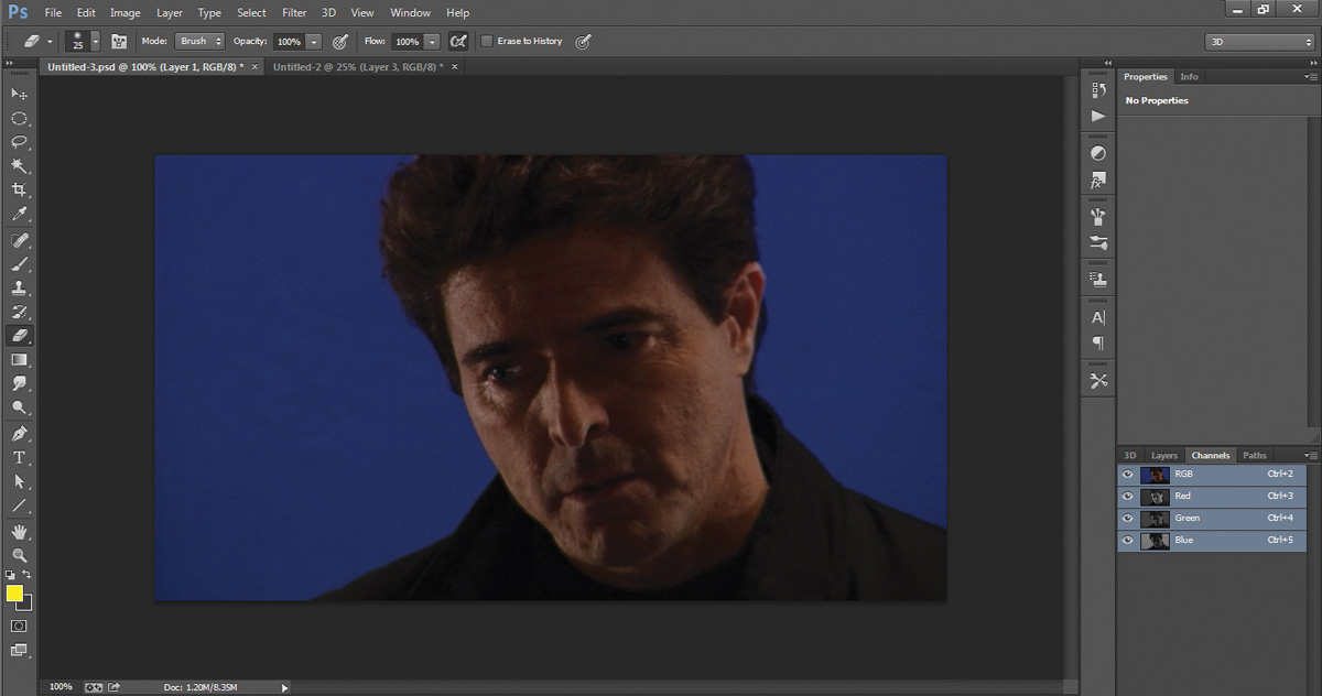
A keyer or chroma key (or color separation overlay) is a technique for combining or compositing two or more images, or frames, together in which a color (or color range) from a foreground (FG) image is removed, or made transparent, revealing the background (BG) image behind it. To begin, look at each of the individual RGB channels in Figures 2.18–2.20.
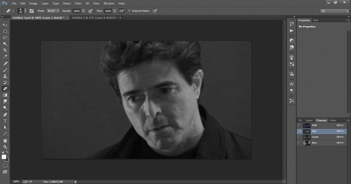


You’re looking for the channels that provide you with the most contrast to work with to help you separate the parts of the image that you want to extract. As you can see, the Red channel has a lot of nice contrast in the skin tones. Let’s use that as the first channel in our calculations. The Green channel has the least contrast, so let’s skip that one for now. The Blue channel has, not surprisingly, a lot of contrast in the BG (it is a bluescreen after all).
Create a copy of the BS footage layer by dragging the layer onto the little sticky note icon at the bottom right of the Layers tab. Select the copy (you always want to work on a copy, never the original... just in case!). Select the copy layer and then choose Image menu > Calculations from the top of the interface to bring up the Calculations dialog box, as shown in Figure 2.21. For Source 1, select Red in the Channel box. For Source 2, choose Blue and select the Invert checkbox. For Blending Mode, select Overlay (make sure you have the Preview checkbox under the Cancel button checked) and set the Result to New Channel (you should see a result that looks something like Figure 2.21), then click OK.
Figure 2.21. Result of Calculations procedure
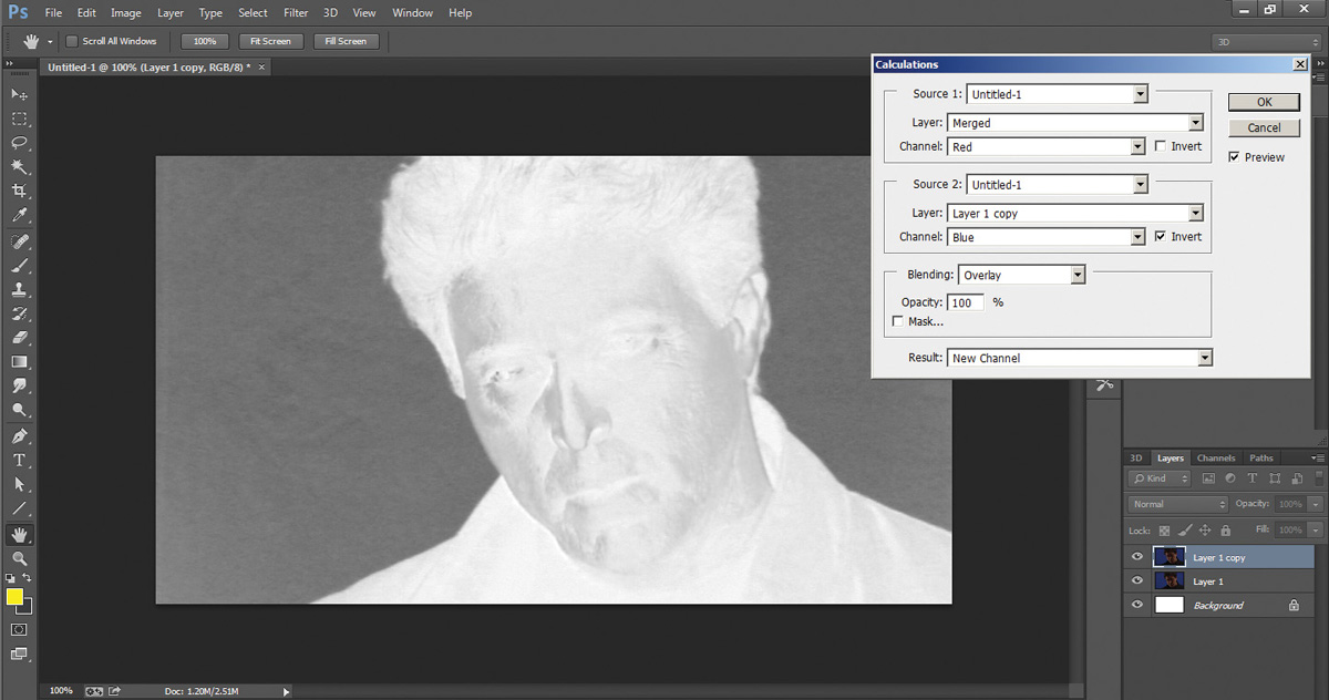
You can see from the result that there’s great contrast between the actor and the BG, but it’s not quite strong enough (remember, grays will give you semi-transparencies—you’re shooting for black transparencies and white opacities). Not to worry, Levels adjustment to the rescue!
By sliding the little triangular controls, bring the Black Input levels up to where the BG is crushed to black, and then bring the White Input levels down to where the actor is crushed to white. Figure 2.22 shows the Levels Histogram settings before any adjustment and Figure 2.23 shows the Levels Histogram adjustment settings and the resulting alpha (or matte).
Figure 2.22. Before Levels adjustment
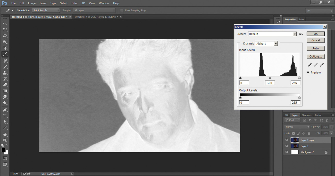
Figure 2.23. Result of the Levels adjustment procedure

Note
Your eye should always be on the edge and you should take great care not to lose detail in the fine edges, such as hair, wherever possible. You can always fix the black BG or fill the white FG with garbage or core mattes (discussed later in this chapter), but you can never regain detail lost in the edges! For right now, don’t worry too much about losing the edges—you’re just getting to know the tools.
Once you have a solid alpha/matte, simply select the new alpha/matte in the Channels tab and load it as a selection using the Load Channel as Selection button.
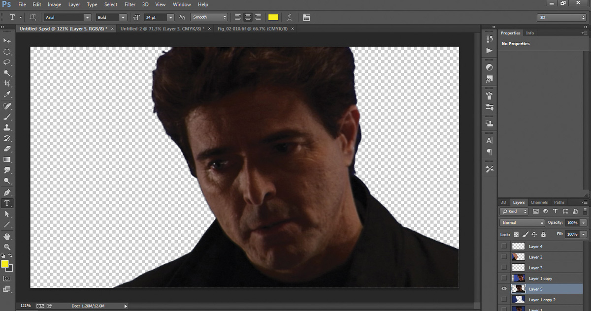
Select Ctrl+Shift+J to cut the actor out, as shown in Figure 2.24, and place him on his own layer.
Figure 2.24. Actor extracted from BS into his own layer
Then load the BG image into a layer below the actor (Figure 2.25).
Figure 2.25. The extracted actor composited over the background (BG) image

Congratulations! You just built your own keyer! You may notice a little blue halo around the actor. That’s called spill. I address cleaning up spill in Chapter 6.
Feel free to experiment with this process and different transfer/blending modes as well as using different, or even all the same, channels to get different results.
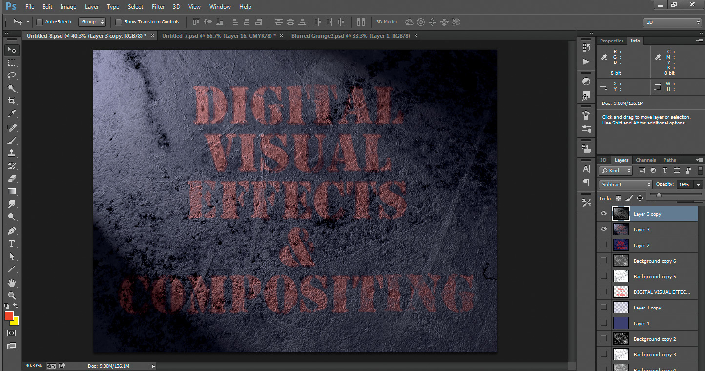
Application of Selection Methods: Grunge and Grime Maps
You can use many of these same steps and techniques for all kinds of cool VFX including the creation and use of grunge and grime maps. I have a saying that I teach my students to keep this concept in their heads: “Nothing in nature is perfect, and that’s why it’s perfect!” To make things in VFX look real, you need to mimic the way they are in reality—not in the computer. In nature, there is no such thing as a perfectly straight line, a perfectly saturated or pure color, a perfectly flat surface, or perfectly symmetrical body parts or leaves. Everything—everything—has a certain bit of imperfection. That’s what makes it perfectly natural and real.
A sure sign of a beginning 3D or VFX artist is a scene with perfectly white lights, perfectly straight edges, perfectly smooth motion, perfectly symmetrical dinner plates placed around a perfectly round table with a perfectly 255,0,0 red, wrinkle-free, spotless tablecloth. In reality, everything has a bit of imperfection and grunge to it. Although many artists choose to hand paint these kinds of detail, I am of the firm belief that no one can create the complexity of nature like nature herself. I also firmly believe in not wasting time. Why spend countless hours trying to re-create nature’s complexity when you can just steal it? Visual effects is one of the few professions where cheating is not only okay, it’s encouraged. (I’m not referring to copyright infringement or plagiarism here—I’m talking about saving time and money by taking an easier, better, cheaper, faster way out if it’s available and makes for a better product.)
My favorite demonstration of this technique is to create something photorealistic out of something completely not photorealistic using grunge/grime maps extracted out of only one image. After doing this exercise, you will never look at dirt, grime, rust, or other such textures the same way. You can thank me or curse me when someone laughs at you for taking a photo of some really amazing rust or grunge while everyone else is taking snapshots of the tourist attraction.
Procedural Extraction of Grunge and Grime Maps
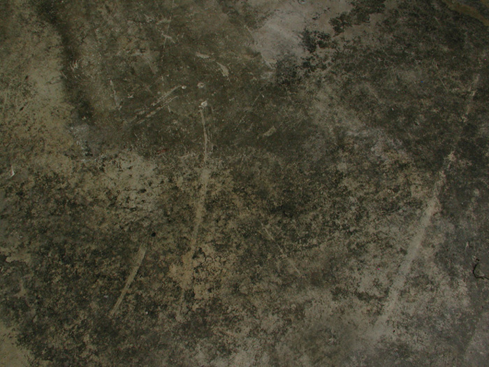
The first thing you need to do is extract some of nature’s complexity to use for your grunge/grime maps. When I’m referring to nature, I’m including dirt, residue, and other grunge that accumulates naturally or from man-made processes, such as industrial dirt, residue, debris, and so on. For this example, we’ll use one of my favorite images of a grungy warehouse floor, shown in Figure 2.26. (Download the image from www.peachpit.com/register and follow the directions to register the book. The downloadable files will be listed under the Registered Products tab of your Account page.) I took this photo right after the company moved a piece of machinery. You should’ve seen the look on their faces when I said, “Wait! I’ll be right back! I gotta get a photo of that!”
Figure 2.26. Grungy warehouse floor image
When I refer to a procedural extraction, I mean a method of extracting what you need by way of a series of procedures, as opposed to hand creating.
To get a good idea of how versatile this technique is, you’re going to pull a few different, but matching and relational, grunge and grime maps, all from this one image. As always, make a copy of the original to keep as a backup just in case you need it.
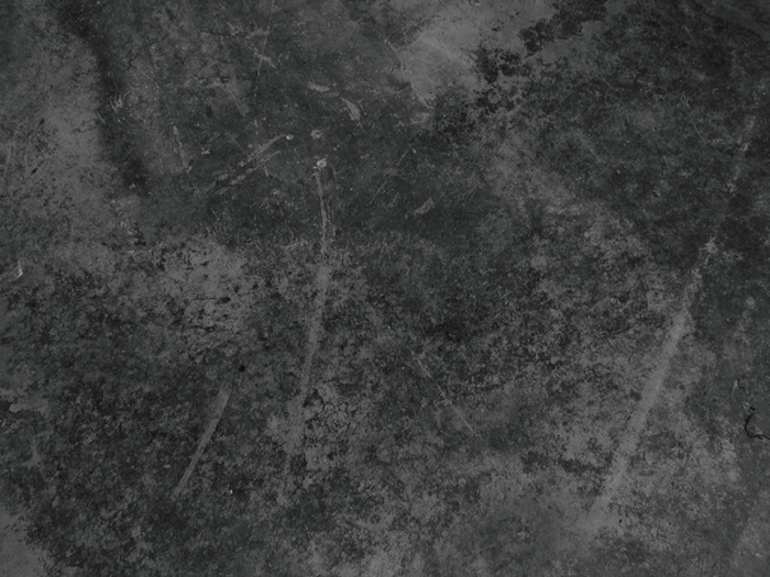
First get rid of the color information because, in this case, what you’re really interested in is the texture and not the color information. (There are a few ways you could also use the color to extract some different variations, but for now, let’s keep it simple.) The first procedure, then, is to desaturate the image. Select Image menu > Adjustments > Hue/Saturation and desaturate (reduce the saturation) all the way down to nothing. Make three more copies of this desaturated version (shown in Figure 2.27).
Figure 2.27. Desaturated grungy warehouse floor image
With the first one selected, you’re going to try to extract the large, thick dirt patches and scratches. Add our best friend, the Levels adjustment. Bring the Black levels up, the White levels down, and the Gamma up a little until the large thick dirt patches are the most apparent things you see; then click OK. There’s no right or wrong to this, it’s all to taste. You should have something like Figure 2.28.
Figure 2.28. Levels adjustment to bring out thick dirt and scratches

Temporarily turn off the visibility of the first copy by clicking the eyeball icon to the left of the layer to toggle visibility on/off and select the second copy. For this one, you’re going to try to extract the finer, grittier dirt. Again, add a Levels adjustment. Bring the White levels almost all the way down to the bottom of the histogram, the Black levels up to the base or foot of the curve, and the Gamma levels toward the Black levels to get a fine gritty result like in Figure 2.29; then click OK.
Figure 2.29. Levels adjustment to bring out finer, grittier dirt

Hide this Layer and move to the third. For this one, you’ll just bring the White levels down to the front end of the curve and leave the rest alone, which should look something like Figure 2.30; then, again, click OK.
Figure 2.30. Levels adjustment to bring the White levels down to the front end of the curve

For the fourth copy, add a Levels adjustment, bring the White levels down about half as much as in the previous copy, and then apply Filter menu > Blur > Gaussian Blur of about 7 pixels or so, which should give you something that looks similar to Figure 2.31.
Figure 2.31. Slight Gaussian Blur added
That’s it! Now let’s put them to use.
The Five Magical Uses of Grunge and Grime Maps
The most amazing demonstration of how procedurally extracting grunge and grime maps can add realism to your VFX is to take the most unrealistic samples you can find and then make them look photo real. You usually (but not always) want to use grunge maps that are appropriate for what you’re trying to create. That is, for wood, you’d use a wood-based extraction; for peeling plaster, use peeling plaster; and so on. Since we’re using dirty concrete floor grunge and grime maps, we’ll take a completely unrealistic logo and make it look like it could actually be a real one on a concrete floor. Use whatever unrealistic and perfect colors you’d like for this example (colorful vector logos work well for this, too—a simple web search for “vector logos” will give you hundreds of great examples).
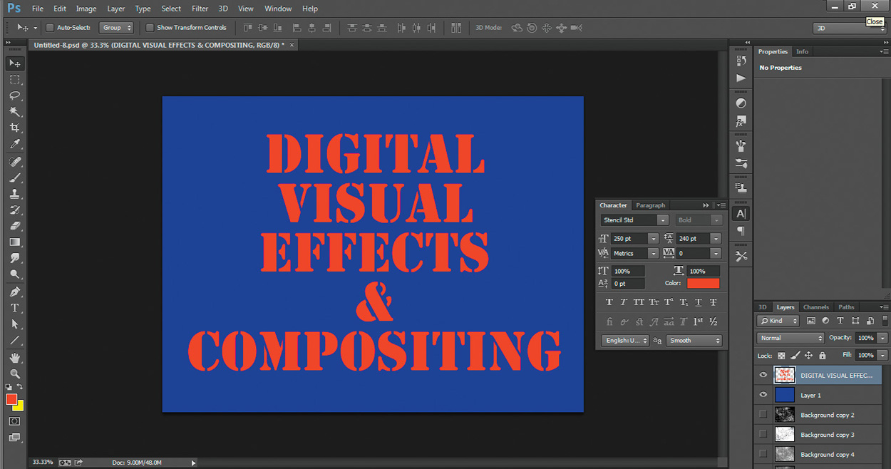
Create a new file and follow along. For this example, I’ll fill the entire screen with a perfect 0,0,255 Blue. Next I’ll type some big thick letters using a perfect 255,0,0 Red, which gives me what’s shown in Figure 2.32.
Figure 2.32. A very unnatural perfect 0,0,255 (Blue) and 255,0,0 (Red) image
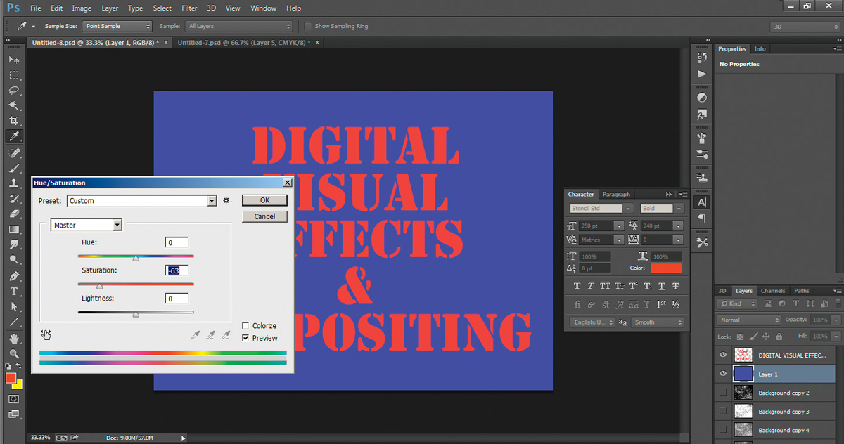
Yuck, right? Remember, nothing in nature is perfect, that’s why it’s perfect. There’s no such thing as perfect colors, so let’s desaturate each of the blue and red graphic layers a bit using the Hue/Saturation tool, as seen in Figure 2.33.
Figure 2.33. Desaturated layers using the Hue/Saturation tool
Now let’s use grunge and grime maps to demonstrate these five magical uses.
1. Stripping Paint and Surfaces
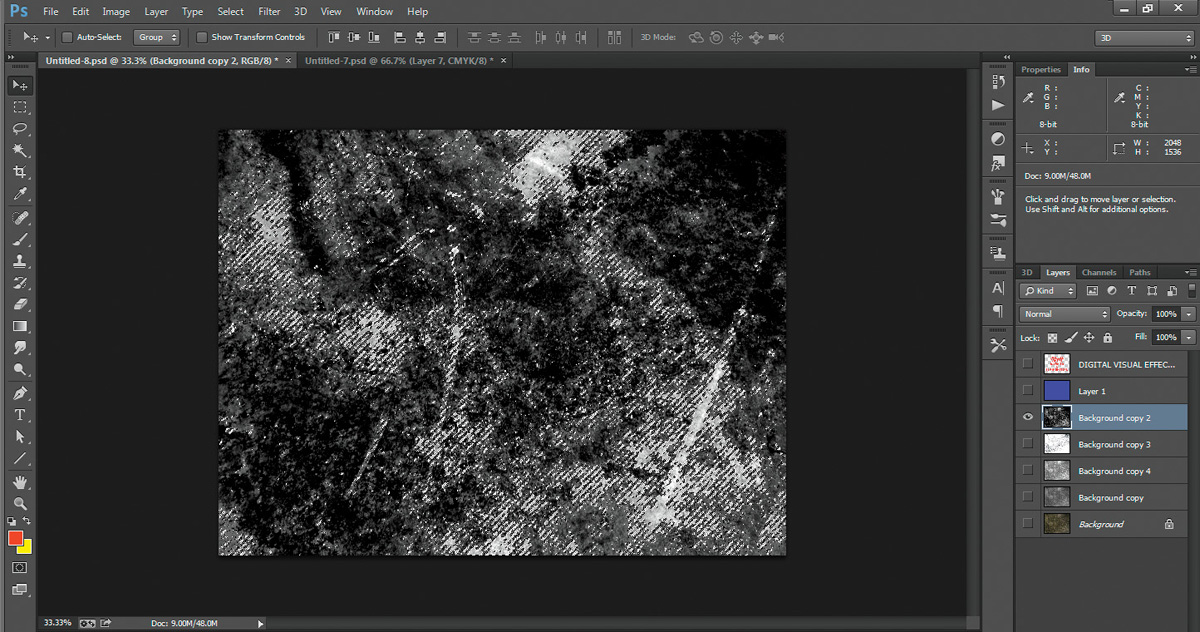
The first magical use is to strip paint and surfaces. For this, I want you to be light-handed at first. Remember from the “Alpha Channels” section of this chapter that the darker or lighter the alpha, the more strongly it is either opaque or transparent—or more accurately in this case, the more or less it is selected. First select your text layer and then turn the visibility of everything off. Turn on the visibility of the darkest grunge map (this will select the least amount).
Switch to the Channels tab, choose any channel, and then click the Load Channel as Selection button. The grunge map loads as a selection, as shown in Figure 2.34.
Figure 2.34. Grunge map loaded as a selection
Turn your logo images back on and make sure the top layer or lettering is selected (press Ctrl+H to temporarily hide the “marching ants” selection indicator). Then press Delete. You should notice some of your logo or lettering disappears as if worn away. Press Ctrl+H to unhide the selection and then Ctrl+D to deselect everything.
Make a duplicate of your BG color layer and add a Hue/Saturation, desaturating a little more and darkening the bottom of the colored layers. Repeat the previous process and strip away some of the upper solid layer. You should have something that looks like Figure 2.35.
Figure 2.35. Paint/surface stripped and second color layer added

You can repeat this process as much as you’d like or even perform it again with other grunge or grime maps.
2. Dirtying Down
Next, you’ll use grunge maps for dirtying down your textures. Select a grunge map you’d like to use (in this case, I’ll try the really light one) and make a copy of it by dragging it down to the Create New Layer icon. Drag this copy to the top of the stack and set its Blend mode to Multiply, which should give you something that looks like Figure 2.36.
Figure 2.36. First dirt layer added
You can also adjust the Opacity slider to taste. Experiment and add another grunge or grime map, trying different Blend modes to see how they affect the results.
3. Randomizing Maps
You can also use grunge and grime maps to break up and randomize other textures that may repeat or not have enough variation. In this case, you have plenty of variation, so we can skip this one.
4. Using Grunge and Grime Maps as 2D Texture Displacements
Notice how, even with all of that paint/texture stripped away and dirt added, the text is still relatively perfect, with perfect edges everywhere. That’s gotta go. Turn off the visibility of everything except the blurred version of the grunge map you created, and then save this file as a “copy” .psd (make sure to uncheck layers). Next, select your text or logo layer and select Filter menu > Distort > Displace as you see in Figure 2.37. When prompted, select the blurred grunge map you saved. You can also add another Levels adjustment to the blurred grunge map file you’re using to increase the effect. If you’d like more of a harsh tearing and displacement, save out an unblurred copy. Try the default values of 10, 10, and then experiment until you get the effect you want. The result should slightly displace the lettering, similar to what you see in Figure 2.38.
Figure 2.37. Before layer displacement
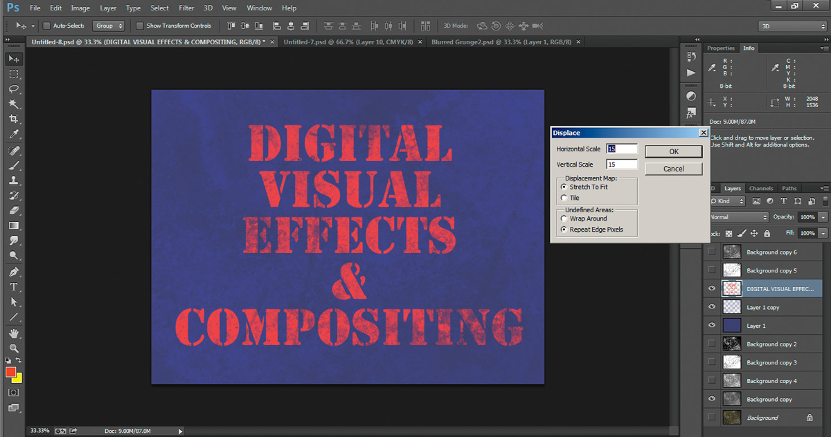
Figure 2.38. After layer displacement

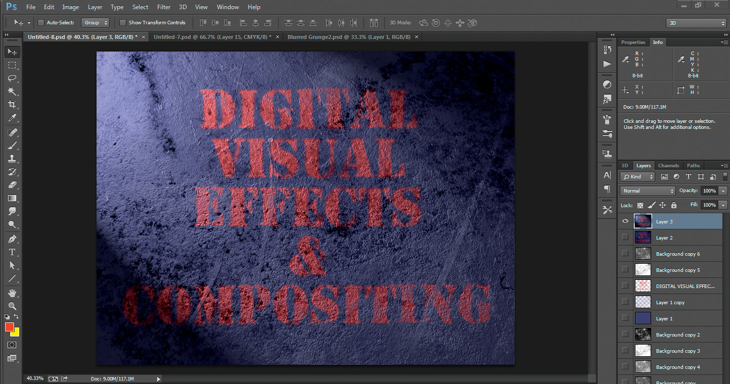
When you’re done experimenting, turn the visibility of all the dirt layers back on. Your result should now look similar to Figure 2.39.
Figure 2.39. Dirt layer visibility turned back on

Select Ctrl+A to Select All,then choose Edit menu > Copy Merged, and then paste once or twice (if you want a backup) by selecting Edit menu > Paste. This will paste a copy of the entire texture so far. Feel free to add another desaturation (Figure 2.40) if you feel it’s still looking a little too bright and colorful.
Figure 2.40. Another desaturation added

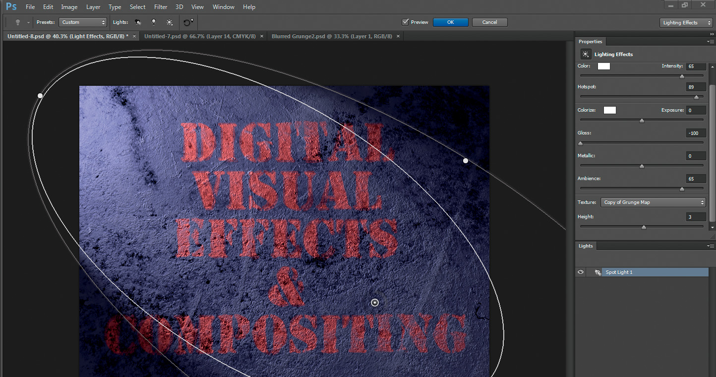
5. Using 3D Lighting Bump Maps and Displacements
Finally, the last magical step. Choose one of the medium gray grunge maps and turn off the visibility of everything else for a moment. In the Channels tab, drag a copy of one of the channels of the grunge map into the Create New Channel icon (the same as the Create New Layer icon, but on the Channel tab). This creates a copy of the grunge map and places it as the alpha in the scene. (Feel free to click the name of the channel to rename it for easier identification if you’d like.)
Reselect RGB and go back to the Layers tab. Turn on one of the merged copies and select it. From the top menu select Filter menu > Render > Lighting Effects. Change the Light type to Spotlight and the color to White. Rotate and widen the light using the little circle handles on the light to get a glancing angle across your texture. Make sure Gloss is turned off and increase the Ambient to around 50–65.
Now the magic! Under the Texture tab, select the copy of the grunge map alpha you copied in the Channels tab and raise the height (I’ve found that around 2 or 3 is a pretty good starting point, but feel free to experiment). You should see something like Figure 2.41 appear—a really nice textured surface!
Figure 2.41. Lighting applied using alpha as Texture
After you’re satisfied, click OK to accept and feel free to add additional desaturation (Figures 2.42 and 2.43), Levels adjustments, or even copies you’ve added together with blend modes to get the effect that you’re looking for.
Figure 2.42. One last desaturation—before...
The finished texture is shown in Figure 2.44.
Figure 2.44. The finished texture
Other Matched Texture/Layer/Element Sets
The preceding tutorial shows that you can do amazing things with just these different types of basic grayscale images. But the fun doesn’t end with alphas and grunge maps. You can utilize these same types of grayscale images to affect and represent many other types of image data that you can use for 3D texturing and VFX work.
In a typical 3D modeling/rendering application, there are many different types of maps you should know about in order to fully understand how light is reacting with your model in the virtual 3D world and why your image looks the way it does. These maps include the following:
Color
• Color map: A color or image map that determines what color will be seen (and where); one of the few maps that actually uses color information.
Luminance
• Luminosity map: A grayscale map that determines what parts of a surface should appear to be self-illuminating.
• Glow map: A grayscale map that determines where a surface should appear to glow or radiate light (as opposed to being just self-illuminated).
Reflectivity
• Diffuse map: A grayscale map that determines where a surface’s raw color reflectance will be shown or not. If a color map is associated with the texture, this channel will dictate how much of that color/map/image will be seen.
• Specularity map: A grayscale map that dictates where a surface’s reflective hotspot will be seen (to give the impression that the surface is reflective). This channel should be balanced with the Diffuse map, as both are actually two sides of the same reflective-quality coin (meaning as one increases, the other should theoretically decrease and vice versa; the idea being that the more a surface is shiny, the more reflective it becomes, hence, the less diffuse).
• Specularity Breakup map: A grayscale map that mimics the way dirt, smudges, fingerprints, and so on dampen the apparent reflectivity of a reflective surface, causing it to be less reflective wherever dirt is present. This creates a more realistic-looking surface. Perfectly clean, shiny, smudgeless materials are rare in the real world.
• Glossiness map: A grayscale map that determines how small or tight the specularity hotspot will be. A surface such as brushed aluminum will have a very low value (close to black), whereas a surface such as porcelain or lacquer or a liquid such as water will have a very high glossiness value (closer to white).
Transparency
• Transparency map: A grayscale map that dictates where a surface is transparent or see-through (such as glass). One hundred percent transparent, clear, or see-through would be white; non-transparent or not see-though would be black.
• Opacity map: Some applications use an Opacity map instead of a Transparency map. They’re the same thing, just opposite. An Opacity map determines where a surface is opaque, or not see-through. White would be completely 100% opaque, and black, 0% opaque, or completely transparent.
• Refraction map: A grayscale map that shows where a surface is refractive or not. Refraction is the bending of light and is used to show the light-bending properties of surfaces such as liquids, crystal, or other transparent, but light-bending, materials.
• Translucency map: A grayscale map controlling where a surface is translucent (allowing some light to show through, but not necessarily transparent). The light glowing through a lit candle and the light showing shadows glowing through a closed curtain are good examples of translucency.
Bump
• Bump map: A grayscale image that controls the fake 3D shadowing/modeling properties of a surface (fake because no real surface distortion is happening—it is, in fact, just a lighting trick). A bump map does a good job of adding the subtle appearance of 3D to a surface without adding actual complexity to a 3D model, making it an efficient cheat in many circumstances.
• Normal map: An RGB image that creates a bump map–like effect but calculates the effect using more data (the red, green, and blue channels) and the surface normal direction creating a more detailed “bump” look.
Displacement
• Displacement map: Unlike its bump map counterpart, a displacement map actually does modify the surface to create complexity, bump, and distortion. Displacement modeling is a powerful technique. I cover it in great detail in Chapters 14 and 15.
Tip
Think of all of these types of images as matched sets, where each grayscale image represents a different component of the image, texture, or composite.
No matter how complicated the texture or composite is as a whole, at its core it is still a simple grayscale image representing 0% to 100% of something. Whether that something is a color channel, alpha (or level of transparency), specularity (or the hotspot associated with shininess), or z-depth (distance from camera), at its core, it is still just a 0% to 100% (or 0 to 255 in 8-bit) of something. And this something will be perfectly aligned with every other layer of something above and underneath it to create a representation you can fine-tune and adjust each parameter for.
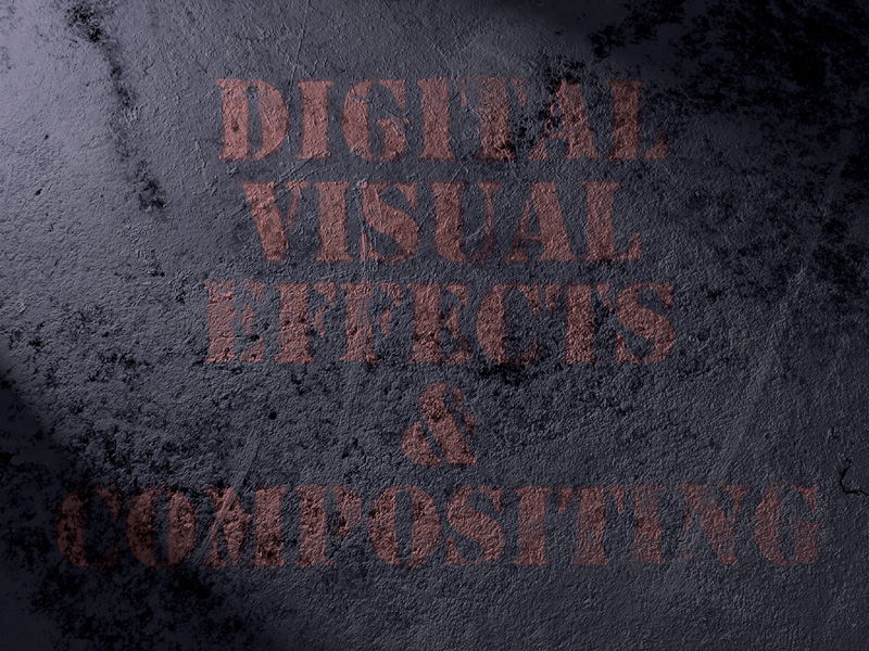
Let’s take a look at a few of the other grayscale images/channels in the matched set that makes up the image shown in Figure 2.45. You can see that we can use grayscale images/maps to determine where the color of our diffuse lighting (Figure 2.46), specular highlights on all the metal and glass reflective surfaces (Figure 2.47), specular breakup where dirt and smudges break up those highlights (Figure 2.48), transparency of the glass materials (Figure 2.49), and others will be seen, all using the same principles of 100% where the grayscale image/map is white, 0% where it’s black, and proportionately wherever it is a degree of gray.
Figure 2.45. Render of a steampunk blimp
Figure 2.46. The Diffuse channel

Figure 2.47. The Specular channel

Figure 2.48. A Specular Breakup channel

Figure 2.49. A Transparency channel dictates where a surface should be transparent or opaque. In this image, you can see that the glass electrode tubes and windows are mostly white (or mostly transparent).

Cloning
No, don’t worry, we’re not going to get into any kind of philosophical debate here.... I’m referring to image cloning. In the world of VFX, sometimes nothing can get you out of a bind quicker than a little image cloning. Cloning is the process of copying pixels from one position on an image, or from another image entirely, and pasting them into a different area of the same or other image, as shown in Figure 2.50.
Figure 2.50. Cloning an actor with a positional offset from within the same frame

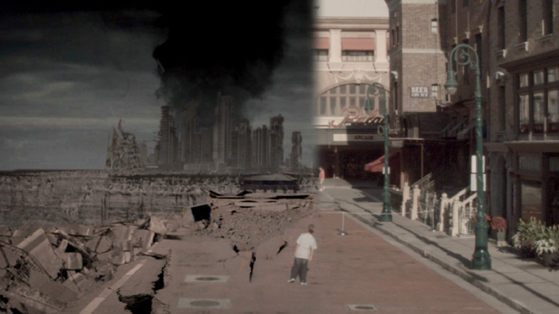
Cloning techniques can be used to remove or replicate elements and help create digital matte paintings (Figure 2.51).
Figure 2.51. Cloning concrete cracks, damage, and debris onto a clean street to create a post-apocalyptical setting
You can use cloning to remove blemishes and flaws while doing beauty work, or repair dust and scratches in old film footage (dustbusting is shown in Figures 2.52 and 2.53).
Figure 2.52. Frame with large dust particle near actor
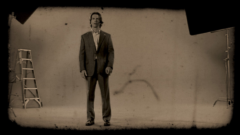
Figure 2.53. Dust particle removed by cloning from nearby clear area
You can even use cloning to do crowd and object replications (Figures 2.54 through 2.57).
Figure 2.54. Aerial shot of parking lot with cars; more cars needed to be added digitally

Figure 2.55. Grid created with Vanishing Point Clone tool to allow cloning in perspective

Figure 2.56. Cars being cloned/added to empty part of parking area
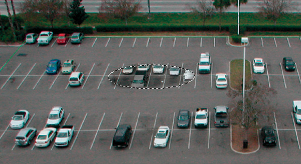
Figure 2.57. Finished parking area with cloned additions

Basic Cloning Techniques, Tips, Tricks, and Strategies
There are two main strategiesto help you when cloning. They are your best friends when you have to either remove or replicate elements in a scene. For simplicity’s sake, and as a good memory hook, I’ll call them randomness and order. Which one you should use depends on the content of the image itself. After determining what element in the image needs to be removed or added, examine the surrounding image features and decide whether they are more random or orderly. Random features include things like grass, bushes with many small random leaves, large bodies of water, and so forth. Orderly features would include things like walls with straight edges, buildings or elements with linear or repeating features or patterns, and so on.
To use the Cloning tool, we select the Rubber Stamp icon from the toolbar on the left, Alt+Click the point on the image or area where you want to clone from (called the source), and then move the cursor to where you want to copy the source pixels to (called the target) and simply start painting with the offset pixels.
Randomness
If you determine that the surrounding features to the element you need to remove are random, you will want to use this randomness to fool the eye or camouflage the element. You use pieces of surrounding randomness the way a sniper adds twigs and branches to his ghillie suit to blend into the surrounding foliage. In this case, I’ve pieced together two images to create a seamless panoramic background plate for an effects shot. The problem is, the two sky plates don’t match very well—they leave a nasty, very obvious seam. This is what we need to blend (Figure 2.58). You’ll use bits and pieces of the randomness of the surrounding clouds to paste over and obscure the seam (Figure 2.59).
Figure 2.58. Offending seam creating by combining two different sky plates
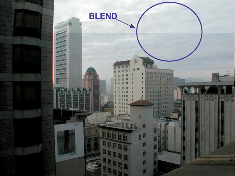
Figure 2.59. Bits and pieces of random nearby clouds are cloned over the seam using a soft-edged clone brush to allow for the better blending of the edges.

Make sure you take large enough samples of the surrounding sky that you don’t create repeating patterns (which the human eye is expert at recognizing). Make certain that the areas being cloned lie in the same general z-depth as the area being covered to assure there are no inconsistencies in size and perspective.
After finishing the cloning of the seam other nearby elements, and general color correction to theshot, the finished, seamless sky is complete (Figure 2.60).
Figure 2.60. The finished seamless panoramic BG plate

Tip
Good cloning work takes practice. Try challenging yourself by cloning out difficult, random elements from photographs to hone your cloning skills.
Order
When there is no randomness to help you mask your cloning work, you look to your other friend, order. In this example, again I’ve combined two images into a panoramic BG plate for the effects shot. This time, however, there are no random features to hide the seam. Everything from the straight edges of the buildings to the repeating windows and concrete texture is orderly (Figure 2.61).
Figure 2.61. Offending seam creating by combining two different building plates
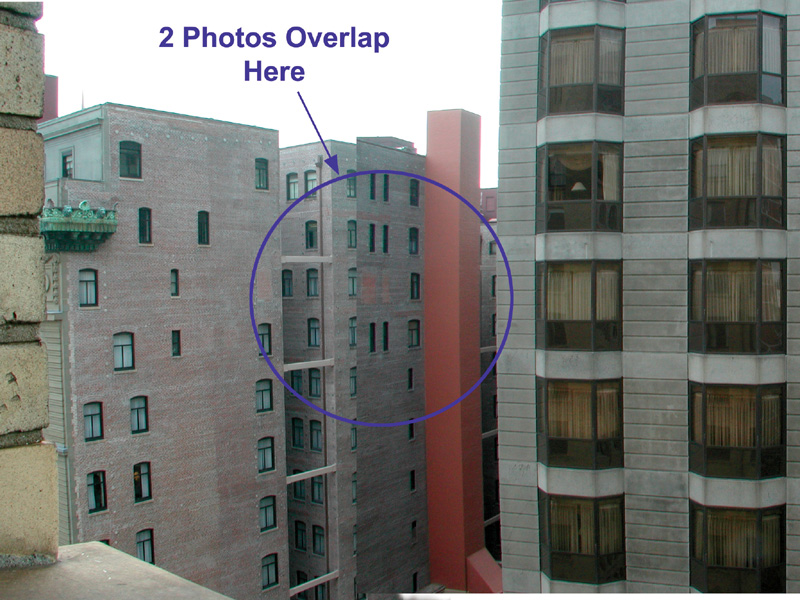
Figures 2.62 and 2.63 show that a better seam location might be the edge of the elevator shaft portion of the building jutting off the side.
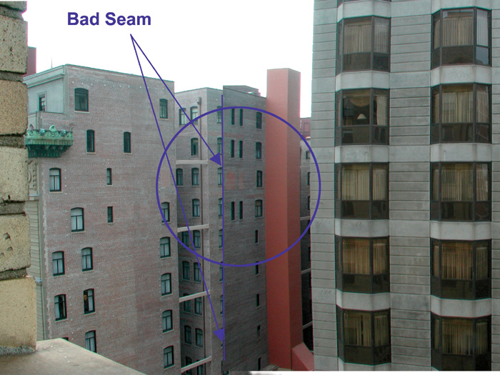
Figure 2.63. Better potential seam location

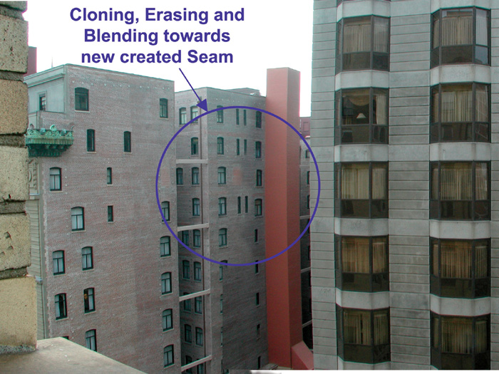
When using order as your guide, you can use a technique I call follow and continue. This means you find features that are linear, or that repeat in a pattern, and then you simply follow them and continue them, taking care to use the same position, spacing, and so on, while still blending from nearby areas on either side (Figure 2.64) using a soft brush as in the random example.
Figure 2.64. Following the edge lines while blending from each side across the seam
Eliminating the seam
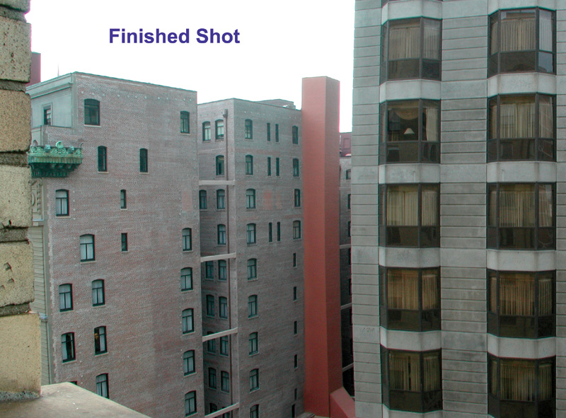
The finished shot (Figure 2.65) is a seamless panoramic blend.
Figure 2.65. The finished, blended shot
2D Visual Effects
When you’re not dealing with 3D VFX, and you’re in the realm of 2D VFX, you’re mainly dealing with paint (which includes cloning), matte and roto work, and compositing. Let’s take a look at each of these.
Wire and Rig Removal
In the old days of VFX there was a lot more 2D paint VFX animation. These animations were hand-painted, rotoscoped (frame-by-frame) animations used for effects, such as electricity arcing, light sabers, and even cartoon animations traced over live action movies and then painted on animation cels. Today, most hand paint work consists of removing unwanted elements from a scene or performing hand extractions of difficult elements that need to be replaced back on top of a filmed or computer-generated (CG) element.
In VFX, one of the most frequent uses of 2D paint work is to remove wires, rigs, and harnesses used to protect actors and stunt men and women during dangerous VFX stunts. Let’s take a look at the ubiquitous flying super hero shot, one of 2D paint work’s simplest forms. Figure 2.66 shows one frame of the original footage shot on a bluescreen with wires suspending our superhero. But even after extracting the bluescreen (BS), you can see there’s still a problem—the wires remain (Figure 2.67).
Figure 2.66. Super hero on bluescreen

Figure 2.67. Wires still remain after the key extraction.
In this scenario, the only choice is to do a wire/rig removal using frame-by-frame roto cloning techniques (whether by hand painting or using spline-based roto tools). Once the wires are removed (see Chapter 9 for information on wire removal), the super hero can fly free (Figure 2.68).
Figure 2.68. Our super hero, flying free thanks to roto clone wire/rig removal

Matte and Roto
You may have already deduced that, since an alpha channel used to extract an actor or element is simply a grayscale image, it’s entirely possible to create and/or modify an alpha channel or matte completely by hand, painting each frame one at a time. This may sound like a daunting task—and it definitely can be (it’s the way it was done for many decades and through the optical FX printing days)—however, it is still is a viable option, and sometimes it’s your only one.
Tip
The best strategy in VFX should always be to approach any VFX shot using the most efficient means possible. That means using the most efficient means cost-wise, time-wise, and resource-wise, including manpower. I teach my students to have “multiple, preplanned lines of defense.” Here is what this means: form a strategy known and proven to be very effective and efficient and take that course of action first; if it fails or becomes too time/cost/resource consuming, jump to the next line of defense; and so on.
When it comes to extracting actors or elements, your first line of defense should always be to use some relatively self-matting method. I say relatively because the extraction process, on a professional level, is rarely if ever a one-click automated process. Nevertheless, there are some tried-and-true techniques you can use to get the best results with the least expenditure. The following sections discuss some of these.
Self-Matting
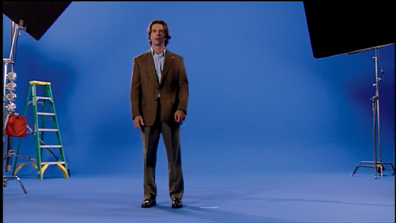
By self-matting techniques, I’m usually referring to some form of chroma key extraction method. The subject is filmed against a (hopefully) evenly lit, highly chrominant (color saturated) and consistently colored background (BG), like the bluescreen (BS) shown in Figure 2.69.
Figure 2.69. Actor Chad Ayers filmed on a bluescreen stage
Keying software is used to “pull” the best possible extraction, retaining as much detail as possible in the subject or element, particularly at the edges. Although a one button-click solution may sound attractive, unfortunately, it is rarely ever the case. You can, however, help this process go as smoothly and efficiently as possible if you follow the method the top-end pros use: Your eye should always be on the edge.
Garbage Mattes
There’s no reason to make the keyer work to remove areas of the image that are nowhere near your subject, even if your footage has a well-lit bluescreen or greenscreen. So your first step is always to create a garbage matte. A garbage matte is a matte loosely created around the subject that literally cuts out the “garbage” in the scene or frame, as shown in Figure 2.70.
Figure 2.70. A garbage matte cutting away stage flags, C-stands, the ladder, and everything not in the immediate vicinity of our subject
The result leaves just a small amount of actual bluescreen around the subject for the keyer to have to contend with, shown in Figure 2.71.
Figure 2.71. The garbage matte leaves only a little bluescreen around the actor for the keyer to have to extract.

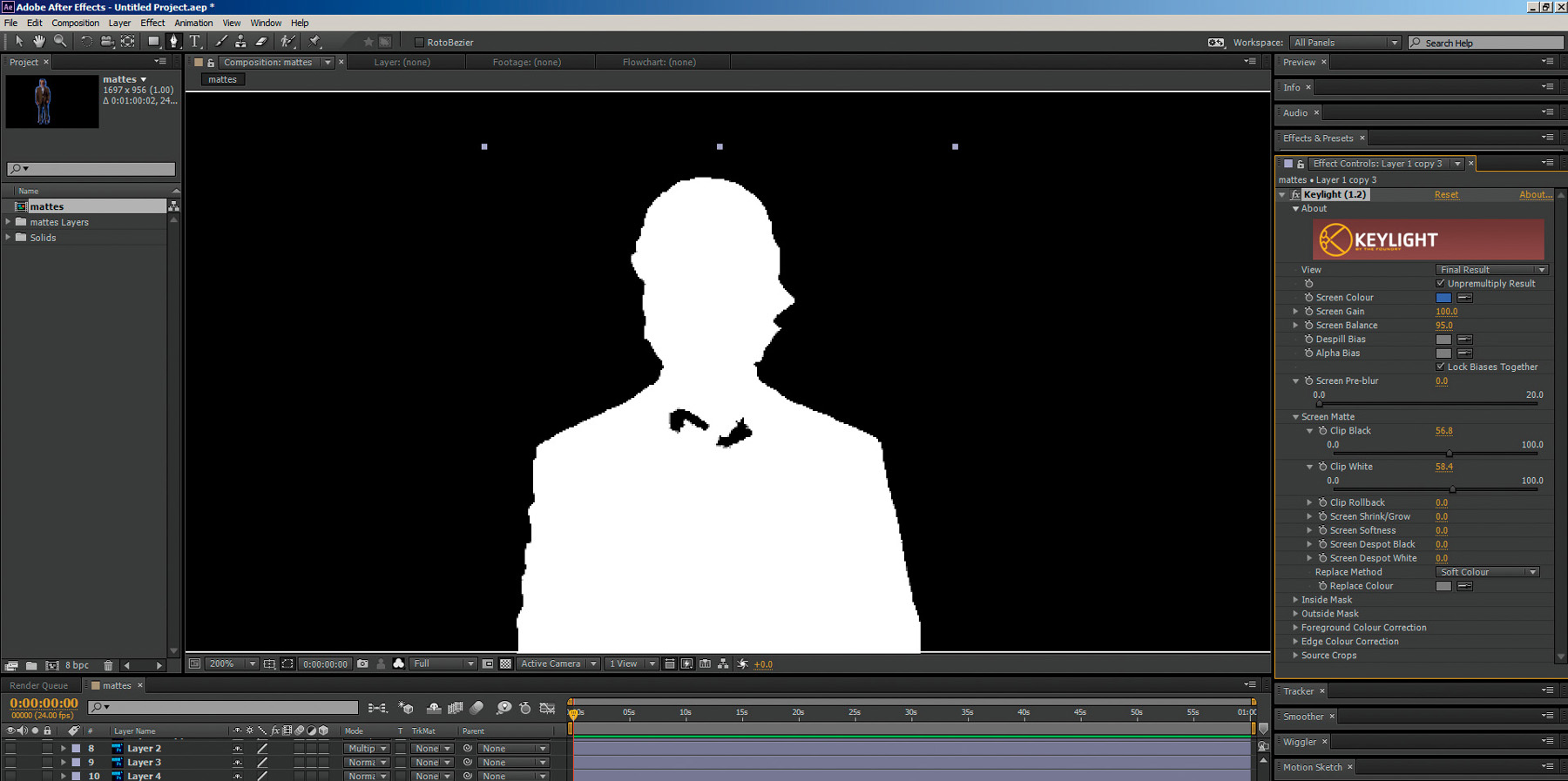
However, as you can see in Figure 2.72, when you apply the keyer, select your key color to extract, and then look at the alpha channel in the viewer, you can see that, although you’ve retained a good amount of detail around the edge—remember the most important factor is to always keep your eye on the edge to make sure you don’t lose that precious edge detail—there is quite a bit of non-white area inside the actor that will result in him being transparent. Remember, gray in our alpha channel equals partial transparency. We definitely don’t want that.
Figure 2.72. Initial key extraction leaves too many gray (transparent) areas in the actor (he was wearing a light blue shirt as well due to scene scheduling issues, so we knew we’d have to contend with this).

If you try to get rid of that stuff by crushing the matte using the keyer controls, you will crush and lose all your edge detail, as Figure 2.73 shows.
Figure 2.73. Trying to crush the matte to get rid of the transparency (gray) in the alpha/Matte results in losing tons of edge detail.
Core Mattes
In this case, you’ll undo those keyer controls and get rid of that unwanted transparency using the opposite of the garbage matte, called a core matte. Normally, you’d create a core matte out of multiple shapes (as you’ll see in Chapter 3), but for clear illustration purposes, I’ve created a single-shape core matte (shown in Figure 2.74) so that you can easily see and understand the concept here.
Figure 2.74. A core matte fills in any unwanted “holes” or transparency in the alpha/matte.

The combined matte is perfectly solid on the inside and perfectly transparent on the outside (see Figure 2.75); only the edges having any semi-transparency where the fine details like hair require it.
Figure 2.75. The finished combined (garbage matte, key matte, core matte) alpha/matte

Edge Mattes
In addition to mattes that address the outside and inside of the subject, you can also create mattes to fine tune the edges of your mattes. These are, not surprisingly, called edge mattes. Edge mattes can help you fine tune everything from edge softness (like we did with the alpha blur at the beginning of the chapter) to light wraps (specialized mattes that give the illusion of wrapping the FG element in the light of the BG plate). You’ll dive into edge softness and light wrap in detail in Chapter 6.
Fine Tuning Mattes
You can use many of the steps and techniques from the beginning of this chapter to fine tune selections on your alpha/mattes as well. You can add blur to soften them, clamp the blurred version using a Levels adjustment to erode or dilate them, add filters and effects, and a whole lot more. Chapters 5 and 6 explore some of these cool concepts.
Compositing
Once your key is pulled and you have an acceptable alpha/matte, you’re left with the actor alone on a transparent BG, as seen in Figure 2.76. To place him into another image or environment, you need to composite, or comp, him into another image, as shown in Figure 2.77.
Figure 2.76. The actor extracted and all alone on a transparent BG
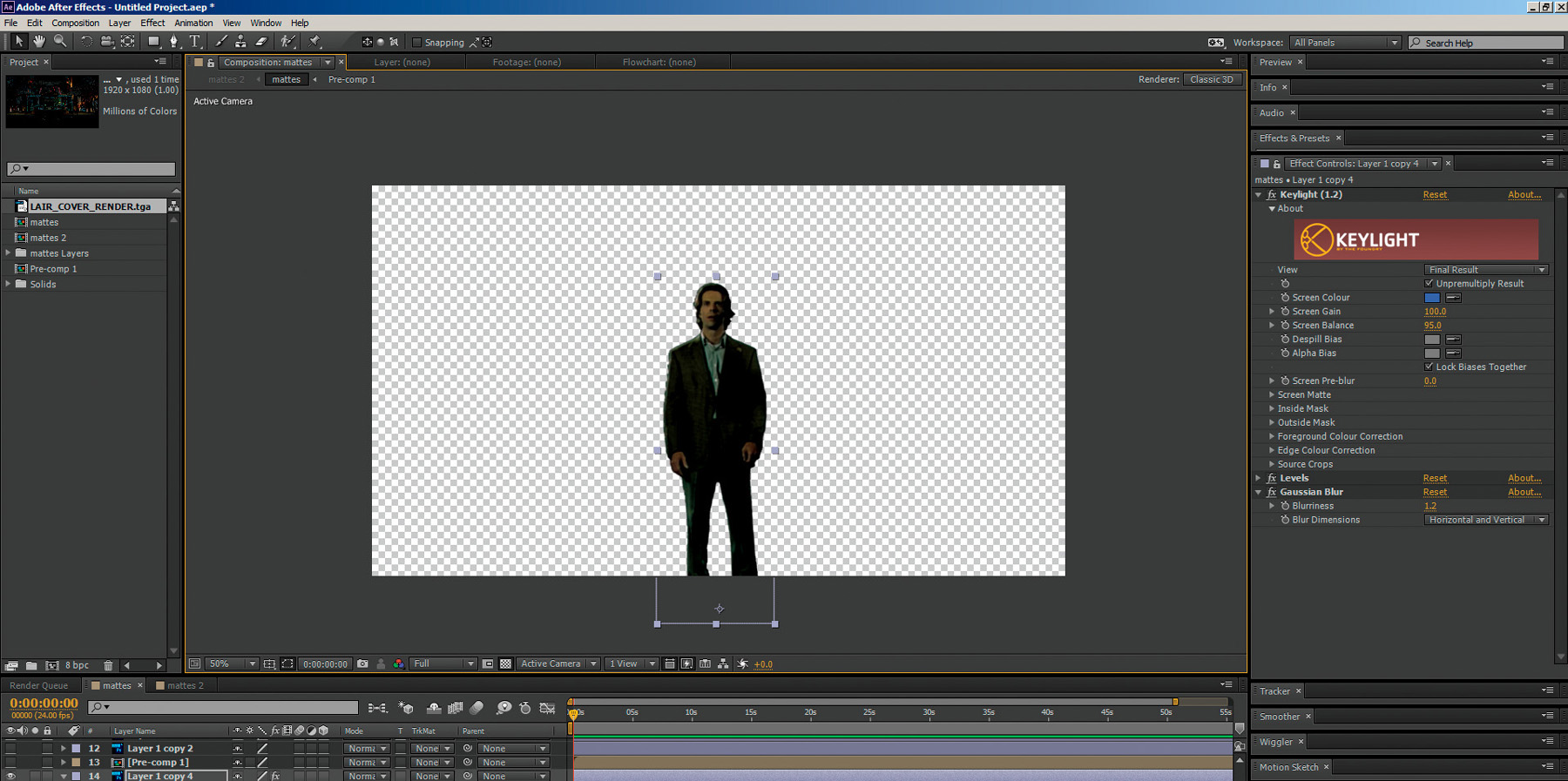
Figure 2.77. The actor comped into his new BG

Not surprisingly, to do the compositing, you will need to use a compositing application, or compositor.
Compositing Applications
A compositing application is a piece of software that allows you to combine, process, manipulate, animate, and apply effects to images or motion footage. Many compositing applications are available on the market today. They all have different strengths, weaknesses, features, bells, and whistles, but the core functionality of all of them is pretty much the same. They generally fall into one of two categories: layer-based compositing or nodal-based compositing. These two categories approach compositing using slightly different methodologies, but again, with core functionality that is pretty much the same (see Figure 2.78).
Figure 2.78. Layer-based compositor vs. nodal-based compositor—different methodologies but the same core functionality.
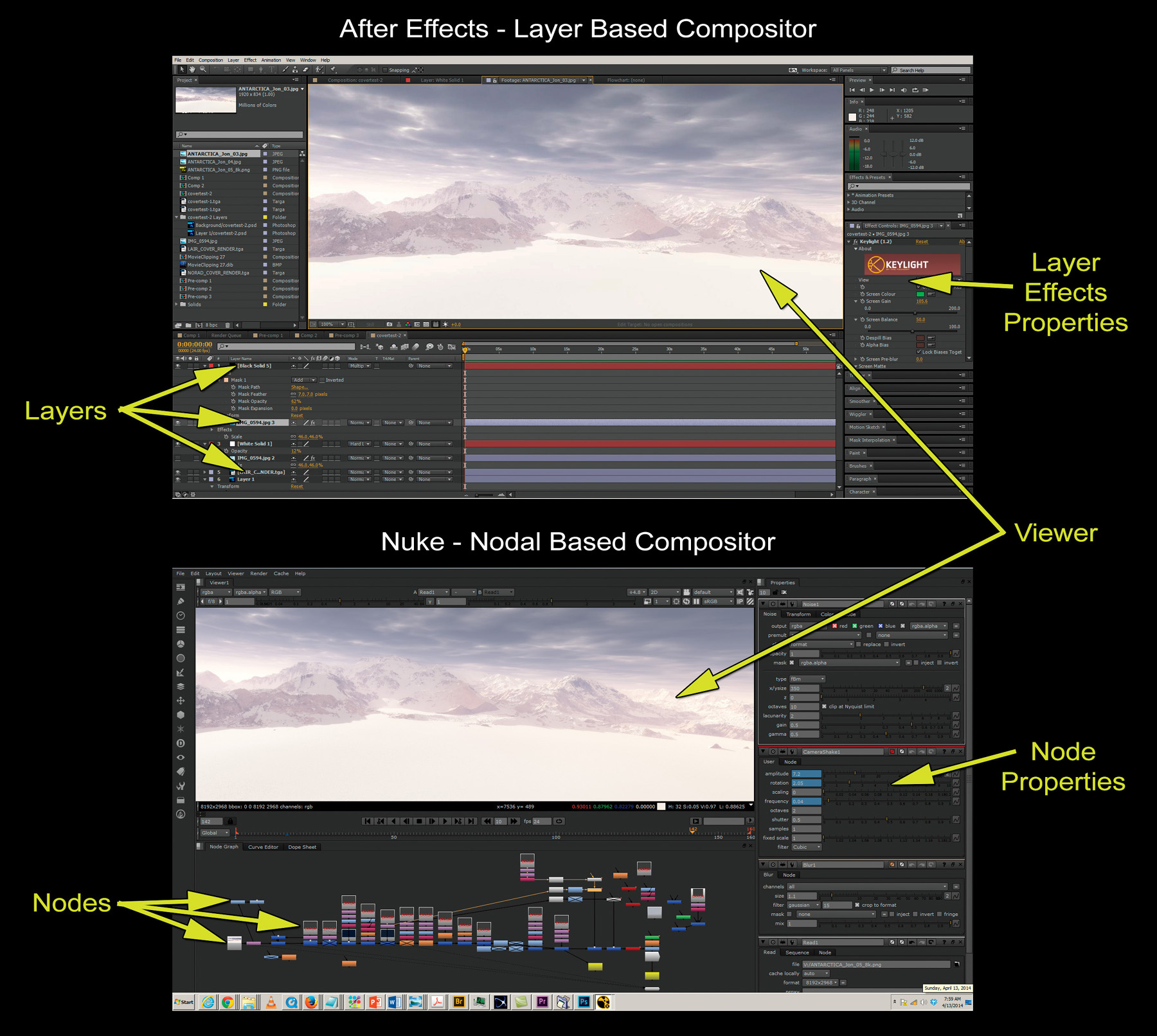
Layer-based Compositors
Layer-based compositors combine their elements by stacking them up, layer on top of layer, on a timeline. Adobe’s After Effects is among the most popular in this category. The strength of a layer-based compositor is in working with long duration composites that have many components that need to be synchronized very precisely in time. The ability to lay all the components out on a timeline and cut and paste them—like in a word processor—while compositing, allows for a speedy workflow for long projects where there are not many people working on each shot. Layer-based compositors also tend to be very intuitive to work with, especially for those accustomed to working with photo or video editing software. The layer-based compositors’ weaknesses are in dealing with huge composites, especially in a professional feature film environment where enormous file sizes and very complex composites can easily bring a layer-based compositing application to a crashing halt.
Nodal-based Compositors
Nodal-based compositors combine elements and add effects by piping together (or connecting using string-like pipes or noodles) a series of modules, or nodes. You can think of nodes as little containers that hold a tool. Each node (tool) is represented by a small graphical icon that is placed in one of the application’s work areas or grids and then connected to other nodes to create the finished composite. A project consisting of nodes is called a node-flow or script. The Foundry’s Nuke is among the most popular and widely used in this category. At first glance, a huge node-flow can look extremely intimidating for the uninitiated, but a nodal-based compositor really works in much the same way as a layer-based one. They both have viewports, timelines, and parameter/property controls for each effect or function added. They both combine and animate images, and both use alpha channels and mattes, and so on. They’re just packaged differently and take a little getting used to. I highly recommend learning both.
The advantage of a nodal-based compositor is its efficient use of elements, assets, and data, which allows it to work very efficiently on much larger, more complex composites. Nodes allow you to reuseof an assetby simply piping another pipe off of a node and into any other node or node tree you want, as opposed to having to reload a copy of the asset to put into another layer. This allows for fast, flexible work with massively complex node-flows and excellent collaborative environment pipelines such as in large VFX studios, where hundreds of artists might all be working on different aspects of the same complex VFX shot. Node-based compositors’ weakness is that they are difficult to very quickly sync and align complex, long-form, timing-intensive composites.
Keyer Types and Concepts
Many of the keyers used in compositing are available on many applications and platforms. Keyers such as Keylight, Primatte, and Ultimatte are available on both layer-based and nodal-based compositing applications and can be divided into three general categories.
2D Color Space Keyers
2D color space keyers, such as Keylight, work primarily by allowing you to select a key color (usually by means of an eyedropper tool selection) and to expand and modify the selection based on tolerance levels that are centered on a 2D color space selection method (see Figures 2.79 and 2.80).
Figure 2.79. The key color is selected in 2D color space

Figure 2.80. Tolerance ranges expand or contract in 2D color space around this key color.

3D Color Space Keyers
3D color space keyers, such as Primatte, work by allowing you to select a range, or volume, of key colors (usually by scrubbing an area with a tool selection). You can then expand and modify your selection based on tolerance levels centered on this 3D color volume selection in 3D color space (see Figures 2.81 and 2.82). This allows you to make very precise selections that group and expand into neighboring color values.
Figure 2.81. The key color is selected in 3D color space.
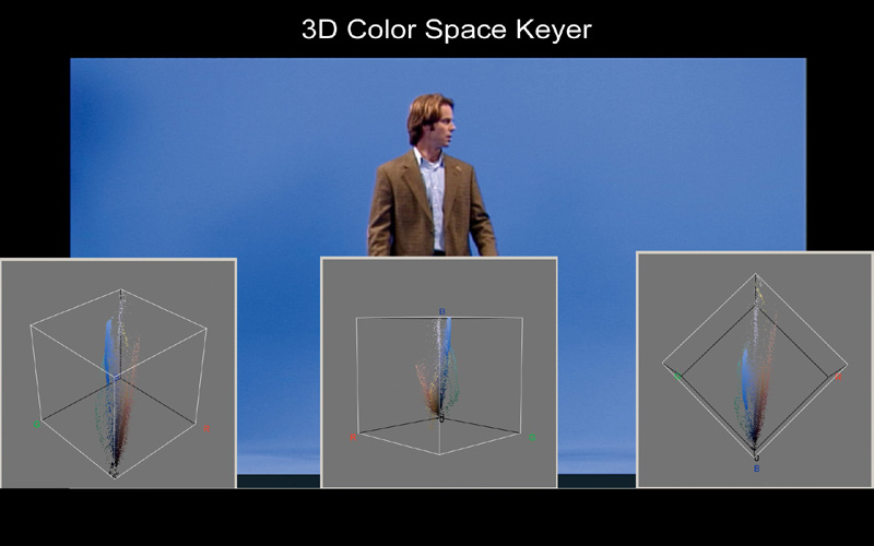
Figure 2.82. Tolerance ranges expand or contract in 3D color space around this key color.

Advanced Keyers
Whereas 2D and 3D color space keyers work by allowing you to choose key colors and then expand and modify your selection based on tolerance levels centered on these selections in either 2D or 3D color space, advanced keyers, such as Ultimatte and Nuke’s Image Based Keyer (IBK) also add the ability to load and analyze real (or create fake) clean plates (see Figure 2.83)., allowing for the additional comparison of difference value data between the original and clean versions of the image to be added into the calculation and extraction process, for even greater precision of extractions, and the amazing retention of edges, shadows, reflections, and transparency.
Figure 2.83. The creation of a fake clean plate allows for the image difference comparison data to be added into the extraction calculation process.

Creating selections, cloning, and keying are some of the most common procedures you will perform in creating VFX. In the next chapter you will learn three more powerful tools for your VFX arsenal: rotoscoping, motion tracking, and 2D matchmoving.