Chapter 6. VFX Techniques II: Advanced Integration and Card Trick VFX
It’s sometimes helpful to think of the VFX creation process as being done in stages, levels, or waves of refinement, with each pass refining the quality, look, and integration of the shot further and further.
After your tracking is solid and your integration is matching well, you’ll want to dig down to the next level of refinement, matching the grain or noise characteristics of the acquisition medium and further integrating the foreground into the background plate by applying a VFX trick called a light wrap. A light wrap gives the look and appearance of light from the scene actually wrapping around your composited foreground element the way it would if it had actually been in the original scene.
Fine-Tuning Integration: Film Grain/Video Noise Matching and Light Wraps
Many compositing applications have built in or semi-automated grain-matching tools. However, to be truly masterful at integration, and to quickly be able to deal with anomalies and problems when they arise, a professional VFX artist must know how to match and create these fine-tune details from scratch.
Matching Film Grain and Video Noise
As you remember from Chapter 1, film grain is the result of the interaction of light with the film emulsion’s layers of silver halide crystals and the chemical processes used to develop those granules in the film. Similarly, video acquisition has noise artifacts created from the exposure of the photosensitive CCDs or CMOS chips to light. When you composite a CG element that has no inherent grain or noise (or other element with different grain/noise characteristics) into a film or video background plate that does have grain or noise, in order for these elements to integrate seamlessly, you need to match and add grain or noise to this added element. You probably won’t have a grain/noise plate which perfectly matches every scenario, but you can easily create a simulated matching grain or noise. Though the characteristics of film grain and video noise are slightly different, they are similar enough that you can create a reasonable facsimile from scratch, using very basic tools and techniques, which will be indistinguishable from the real thing to the average viewer.
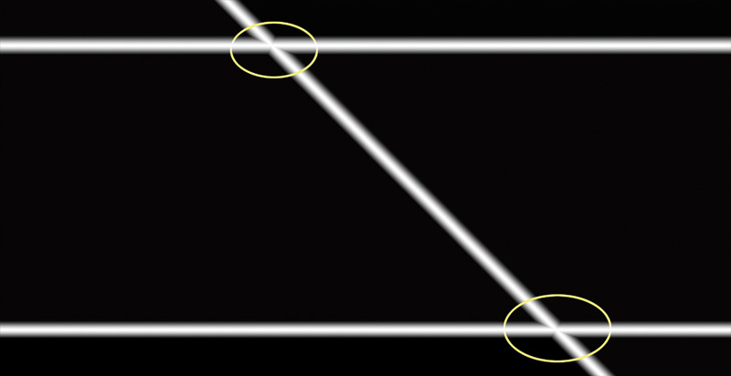
Upon closely examining an area of a piece of footage with film grain or video noise, you will notice that grain and noise are not static—they move and evolve. One of the biggest flaws in a VFX shot that can instantly give away that it is a composited 3D CGI element or bluescreen/greenscreen footage addition is the lack or mismatch of moving grain or noise.
When adding an element to a piece of footage that has film grain or video noise, you have to choose how you will apply this grain or noise. You basically have three options:
• Add grain or noise to only the new composited element.
• De-grain the entire footage and then add back grain or noise to the entire composited composition.
• Add grain or noise over the entire composition without de-graining the original plate.
Each of these methods has its advantages and disadvantages.
Applying grain to only the added element is usually the easiest and quickest way to go. The disadvantage to this method is that you have to very closely match the grain in the original plate or risk the added grain looking as noticeably bad as an element without grain at all.
Although de-graining the entire plate and adding back grain to the entire composite may sound like the purest way to go, the process of de-graining a plate inevitably leads to some softening of the footage and therefore may yield some unacceptable results with some footage.
Adding grain to the entire plate, although also a seemingly easier option, leads to effectively doubling the amount of grain on the areas of the plate that originally had grain to begin with, so again, it might lead to unacceptable results.
Video noise is usually a little more blocky and granular. Film grain tends to be softer with grain appearing as random blotchy patterns of the developed photosensitive granules. You will also notice that grain and noise have color to them (because they are the RGB-filtered photochemical granules or individual RGB pixels). They are not black and white like video snow. In fact, the color is usually perceptually biased toward the blues and greens, meaning it usually appears slightly more blue and green than red.
To create your own grain or noise layer, again as with all VFX, start by analyzing the footage and what exactly it is that you are matching.
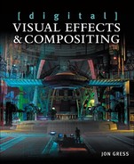
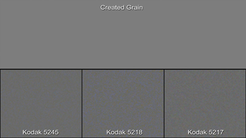
Look at dark and mid-gray, or neutral-colored areas of the footage and zoom in to more clearly be able to see the shape, structure, definition, clarity, and color of the grain or noise pattern. Figures 6.1 through 6.3 show zoomed-in examples of film grain from three different Kodak film stocks. You can also scrub the timeline to get an idea of its motion.
Figure 6.1. Kodak 5245 EXR 50D Color Negative Film
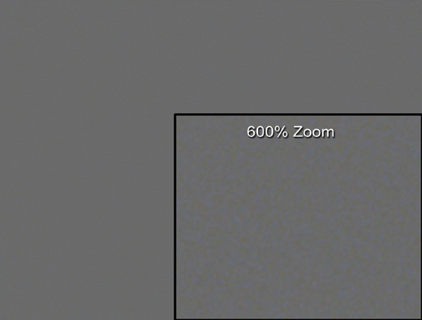
Figure 6.2. Kodak 5218 VISION2 500T Color Negative Film
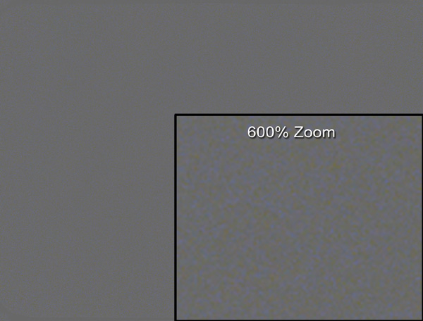
Figure 6.3. Kodak 5217 VISION2 200T Color Negative Film
In Photoshop, or the image-editing application of your choice, create a mid-grey (or approximately RGB 128, 128, 128) solid or constant, as shown in Figure 6.4.
Figure 6.4. Mid-gray RGB 128, 128, 128 solid
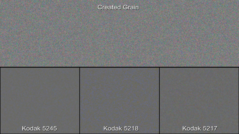
Create a duplicate of this grey layer and apply motion Gaussian noise to it. Make sure to use color noise, and not monochromatic noise, and set the size or intensity high enough to best match the size and strength of the grain or noise in the footage. Figure 6.5 applies a color Gaussian noise of about 4%, zoomed in, and includes small comparisons of the actual film grain close-ups.
Figure 6.5. Color Gaussian noise at approximately 4% applied to the duplicate 50% gray solid and compared to the actual film grain samples
If the size of the grain is too small, you can always scale the layer up in size afterward.
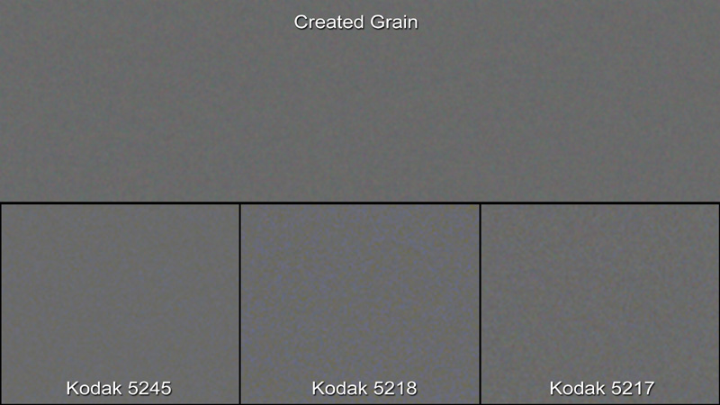
Add a blur to the grain/noise layer and adjust the value to match the softness of the grain or noise in the footage. Usually, only a fraction of a pixel or so is sufficient. Figure 6.6 shows the results of a 0.5-pixel blur, again compared to the actual film grain close-ups.
Figure 6.6. Gaussian blur of 0.5 pixel added and compared to the actual film grain samples
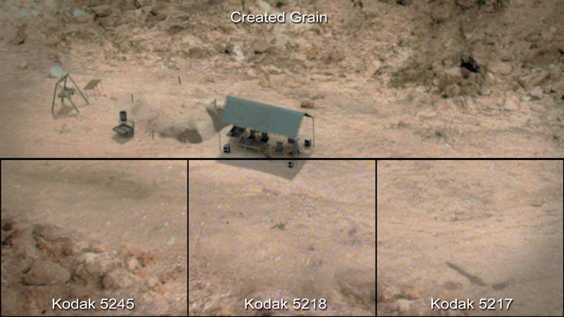
As you can see, you have a very close match to the grain in real film. To use this grain (or real film grain samples), simply switch the grain/noise layer’s blending mode to overlay or soft light. Which one you choose will depend of how it looks and which looks better when applied to the footage. Then dial back the opacity to get the closest match to real film possible, as shown in the before and after example in Figure 6.7.
Figure 6.7. Before and after example of fake film grain added to a plate
As a final tweak, you can apply a levels adjustment to your element to add more of a film-like contrast. You can add another curves adjustment to your grain layer by pulling the middle of the curve slightly negative in the red and green channels and boosting this same area of the curve slightly in the blues to better match the color characteristics of the grain or noise in your original plate if necessary. Your grain should now match very closely to the grain in the original plate and should help to integrate your foreground element nicely.
So how does adding this fake grain/noise help you? By adding matching grain or noise, you create a number of subtle consistencies to the shot that otherwise might not exist:
• The added blanket of grain/noise helps cover and normalize slight color and edge inconsistencies between the foreground elements you add and the original background plate.
• The moving grain/noise also helps add a level of motion refinement and consistency, better integrating elements that may not have originally been filmed at all but rendered instead and thus containing no inherent grain or noise.
Next, let’s take a look at how to procedurally create light wraps to further refine and integrate your VFX shot.
Creating Procedural Light Wraps
When you shoot a photo, film, or video of a subject in a real-world lit environment, light from that environment hits that subject from all angles of that environment. This light then reflects off of the material properties of the subject—depending on whether that material is shiny, reflective, light absorbing, and so on. This light appears as a slightly lit rim around the edges of the subject. With a human subject, in a sunny exterior environment, the blue from the sky may be cast on the edges of the hair and shoulders; green from the grass might reflect up onto the shoes and pants; or a reflection of the sun off of a bright glass or metal object behind the subject might bloom and flare around the subject’s edges. All these interactions of light are visual cues to the observer that the subject or object being viewed is actually in the scene.
You can simulate and fake this effect of light by using a technique called a light wrap. As with film grain, some plugins can create light wraps—but again, to be able to troubleshoot and harness the true power of this technique, you should learn to create this little bit of VFX wizardry yourself from scratch.
The key to creating a light wrap is creating a special alpha channel or matte called a light wrap matte.
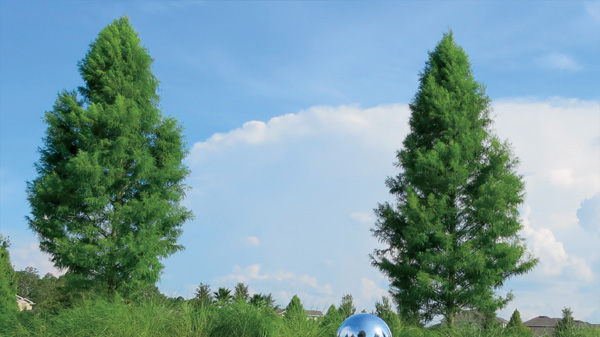
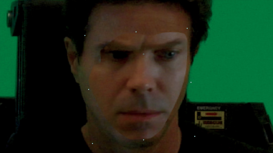
To create a light wrap matte, begin by following the same steps you would use when doing a standard key composite (covered in Chapter 2). Your procedural light wrap matte will use the alpha from your keyed subject to, conveniently and semi-automatically, create the moving matte. In this example, you will key a bluescreen shot of actor Chad Ayers (Figure 6.8) over the sunny park background example (Figure 6.9) used in Chapter 4 Though the shot of Chad wasn’t originally lit to be composited onto this background, as it would have been in a production, the disparity between the two will help illustrate and emphasize the power of this technique.
Figure 6.8. Bluescreen shot of actor Chad Ayers
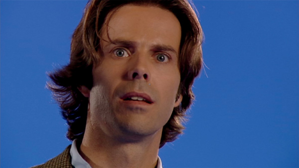
Figure 6.9. Sunny park background used to show mirror ball comparison in Chapter 4
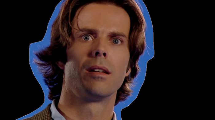
Following your usual key-extraction procedure, garbage matte (as shown in Chapter 2) the area to be keyed (Figures 6.10 and 6.11).
Figure 6.10. Garbage matte spline

Figure 6.11. Resulting much smaller bluescreen area left to be keyed only near subject
Then extract the subject by selecting a blue background color near the actor, as shown in Figure 6.12.
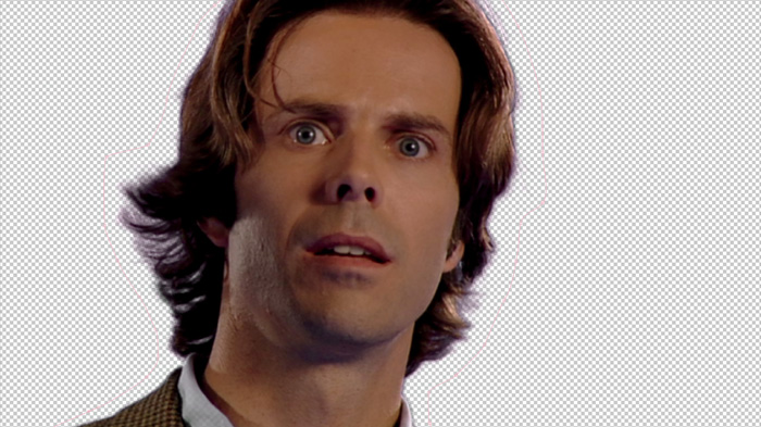
As you can tell from the VFX camera cues discussed in Chapter 1, this is a long lens shot, so you need to slightly blur the crisp in-focus background to simulate a narrower depth of field (DOF) (Figure 6.13).
Figure 6.13. Slightly blurred background to simulate narrower DOF

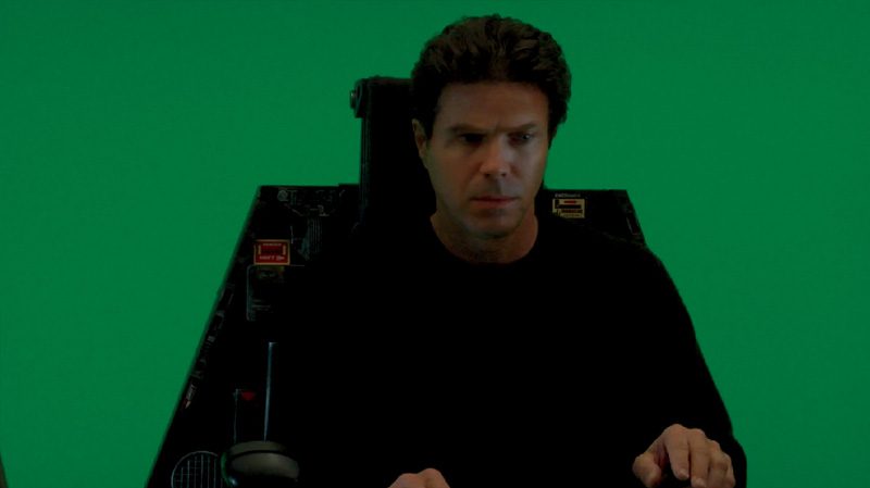
After a simple composite/merge and quick color correction of the subject onto the background (Figure 6.14), you can see that the actor’s edges don’t have the kind of brightness or halo/glow you’d expect to see in such a bright sunny environment. This is where the light wrap comes in—to help ease this type of disparity.
Figure 6.14. Simple composite/merge of actor over background
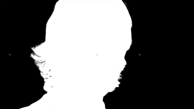
Next you will take the alpha from the keyed foreground, by using a set channels effect or shuffle node, and set each of the red, green, and blue channels to use the alpha. Doing so gives you the black and white alpha also in the RGB channels, as shown in Figure 6.15.
Figure 6.15. The RGB channels set to the alpha channel using a set channels effect or shuffle node
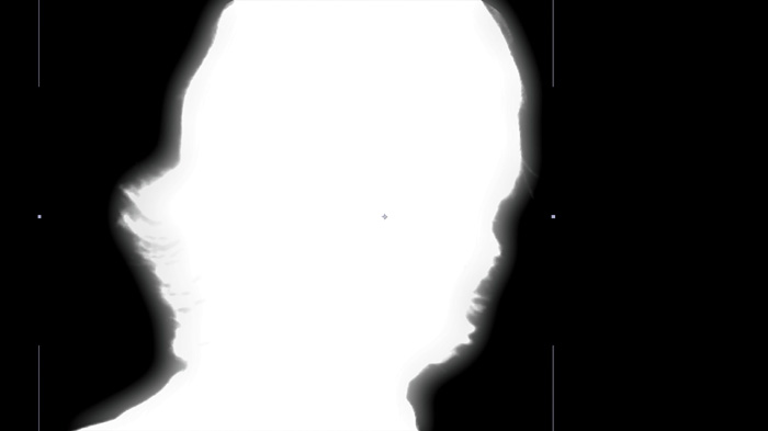
Next make a copy of this black-and-white RGB matte image and apply a blur to it. How much you blur is up to you and is adjustable to taste once you apply the effect, so add a healthy amount to start, as shown in Figure 6.16.
Figure 6.16. Blur added to copy of black and white RGB

Note
For advanced artists, this process can all be done in the alpha channel alone without copying the alpha information to the RGB channels. But many applications make manipulations of just the alpha channel difficult to see, keep track of, and use. Unless you are very familiar with complex alpha manipulations, this method is easier and more straightforward and “visible” for all artists.
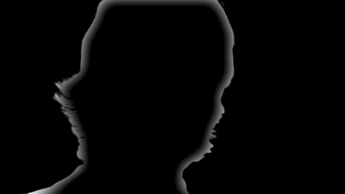
Simply laying the blurred image over the original will yield what looks like a glowing alpha channel, as shown in Figure 6.17.
Figure 6.17. Blurred version overlaid onto original unblurred matte
That’s partially what we want, because we want it to look like the light from the scene is glowing onto the subject, but not outside of the subject, as this method gives you so far. Luckily, you have the original, non-blurred alpha image that already defines the limits of where you want this effect to appear. All you need to do now is apply the alpha again using a silhouette luma blend mode, track matte, or another merge to achieve the finished alpha limited version of this matte, as shown in Figure 6.18.
Figure 6.18. Finished light wrap matte
Note
In some cases, you may have to matte out some additional small pieces of the light wrap matte where the edge of the screen or other unwanted barriers may create unwanted light wrap. In these cases, simply create small feathered mattes to match the blur used for the light wrap matte and “cut away” those unwanted areas.
It’s time to use your light wrap matte.
Tip
Many artists misuse the light wrap matte by directly applying it over the subject using a screen or add blend mode. Although doing that may help the scene somewhat, it merely applies an unnatural whitish glow to the subject and does not truly harness the power of this technique.
To properly use the light wrap matte, create another copy of the background image (in this case the sunny park image), merge it on top of the entire composite, and blur it until small features are basically unrecognizable, as shown in Figure 6.19. Because you’ve already blurred this image to create the narrow depth of field effect, it should be okay as is, but feel free to add more blur to taste.
Figure 6.19. Blurred copy of background plate merged/placed over top of composite

Next, you mask this blurred image using the light wrap matte as a luma matte, which will give you a result similar to Figure 6.20.
Figure 6.20. Blurred image masked by light wrap matte
Notice how, unlike the light wrap matte alone, the image in Figure 6.20 takes on all the brightness and color information of the background image and applies it only to the edges of the foreground subject’s edges. You can completely control how much or how little this light wrap wraps around your image by adjusting the blur amount in the original light wrap matte blur.
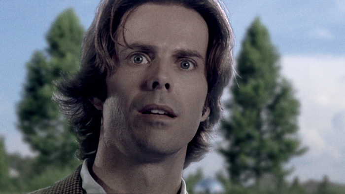
To apply this light wrap to the foreground image, simply set its blend mode, usually to either screen or add, but other blend modes will also work well in particular cases. I’ve used this technique with dark images and blend modes set to multiply as well for a darkening, shadow-type effect. Figure 6.21 shows the before, and Figures 6.22 and 6.23 show applied and exaggerated applications of the light wrap to better illustrate its effects.
Figure 6.21. Base composite before light wrap

Figure 6.22. Small amount of light wrap added to actor’s edges

Figure 6.23. Exaggerated amounts of light wrap added to actor’s edges for better illustration
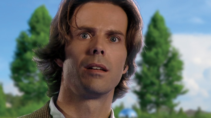
Figure 6.24 shows added film grain, some desaturation, and a final couple of color corrections to get a better integrated, cooler, more filmic look.
Figure 6.24. Film grain, desaturation, and final color corrections added for a more filmic look
Tip
Although you could use dedicated plugins and tools to do spill suppression (the removal of background color spilling onto the subject—usually, but not always, on the edges),you can use your light wrap matte to apply a desaturation, levels, curves, color, or hue correction to just the isolated edges of your keyed subject or element. This ability makes your light wrap matte an excellent tool to help isolate, neutralize, and remove blue or green spill created on a soundstage shooting environment.
2D and 2.5D Crowd Replication
One of the coolest VFX tricks is to take small groups of small quantities and use them to create large quantities, or crowds—of people, animals, vehicles, arrows, ... anything. When used for people, this kind of VFX shot is referred to as a crowd replication shot.
In its simplest form, this kind of effect is a simple 2D composite in which you matte and stitch together small groups, or pods, of people into one seamless image. Perhaps the most important factor when creating a podding-style crowd replication is the way in which it was shot to begin with. It is extremely important that the series of pod shots be carefully photographed with each pod of people in each shot placed in a distinct area, isolated from overlapping each other pod shot as much as possible to help prevent manual roto masking work. Preferably all pods should be lit under the same one lighting condition. That can be easier said than done, especially in extremely large crowd pod scenes, such as an arena or stadium, where exterior lighting conditions may change between pod shot takes.
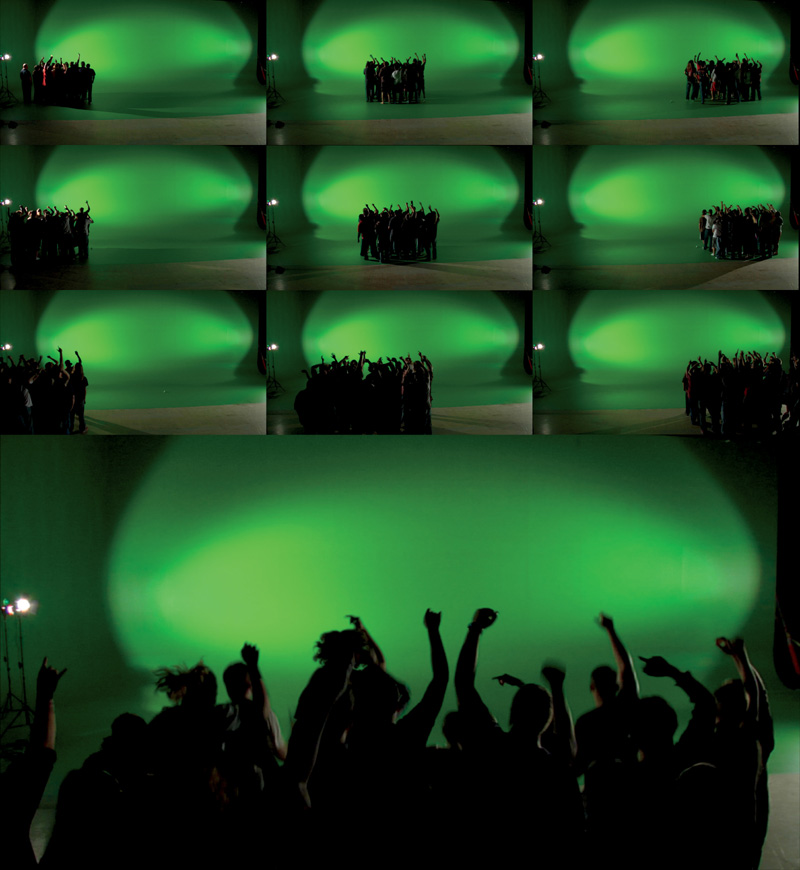
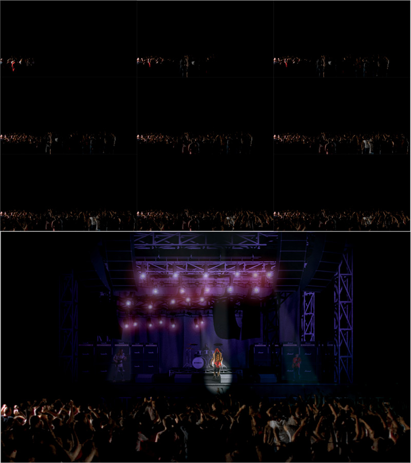
For this example, I’ve illustrated a concert crowd scene shot with about 20 extras who will be podded and used to represent a crowd of a few hundred. To control the lighting as much as possible, I shot this on a small greenscreen stage and side lit as much as possible to try and get mainly silhouetted figures in the foreground audience crowd. In Figure 6.25 you can see the compilation of the 10 or so positions in which the pod of 20 people was placed. Starting at the front left, a couple-minute take was filmed of the crowd cheering, then moving everyone to the right and repeating the process, being as careful each time to prevent each pod from overlapping the next. Once the width of the stage had been covered, the process was repeated, starting in a position back behind where the first had been filmed. Again, this was repeated across the stage and then back one more position. Finally, one last take was done with the small crowd directly camera center in front of the camera.
Figure 6.25. Compilation of ten pod positions of small group of extras filmed on greenscreen
In the compositing application, a render of a 3D stage (with composited performers) was placed at the bottom, or back, of the composite. Each small pod of crowd members was imported and (starting from the frontmost pod and working toward the back of the crowd, towards the camera) garbage matted, keyed, and positioned until the full crowd was achieved, as shown in Figure 6.26.
Figure 6.26. Pods imported, garbage matted, keyed, positioned, and composited into the full crowd scene
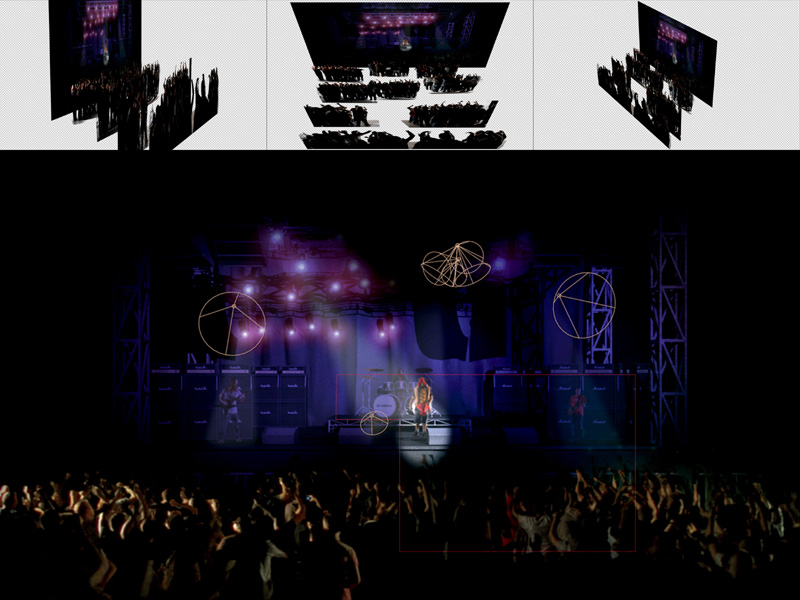
To take this technique a step further, each of the pod layers (as well as the background stage) can be mapped to a 3D plane, or card, and pushed back into Z-space. You can then offset each card to create a hybrid 2D/3D or 2.5D composite, as seen in the top images in Figure 6.27. This method allows you to make camera moves in 3D with real motion parallax, add interactive animated relighting (concert spotlights in this case), and atmospheric and depth-of-field blur effects.
Figure 6.27. Pods layers pushed into Z-space and offset to create motion parallax, depth-of-field, and interactive relighting effects
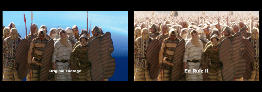
The sequences shown in Figures 6.28 and 6.30, created by two of my students, show how amazing, convincing, and versatile this effect can be. Figure 6.28, created by Michael Keith, shows the application of this method for the creation of a 2.5D angry mob. Figure 6.29, created by Emmy-nominated Ed Ruiz II, shows this method taken to the extreme—to create a Persian army of more than 100,000 for the Battle of Thermopylae shot created for the TV show Deadliest Warrior.
Figure 6.28. 2.5D crowd replication used to create an angry mob, created by Michael Keith
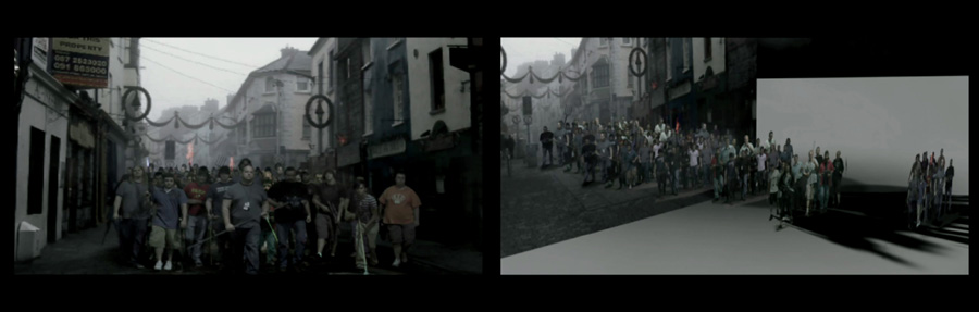
Figure 6.29. Crowd replication taken to the extreme, created by Ed Ruiz II using the same technique
2D Face Replacement
Many times, VFX artists are called upon to do some visual surgery to help, or even sometimes save, a production. Face replacement is quite common—replacing the face of a stunt double with the actor’s face. Sadly, a few times in recent history we have lost an actor before the wrap of a production. In those cases a double was filmed and that double’s face was replaced throughout the remainder of the production using this technique.
As with all VFX, the key to a great face replacement is the similarity of actors’ facial structures, accurate matching of the lighting and camera and, optimally, positioning and movement. Unfortunately, these things are not always achievable, and you have to work with positioning that is off, actors with very different facial structures, and lighting that often doesn’t quite match. There is a lot you can do, though, to remedy these VFX maladies.
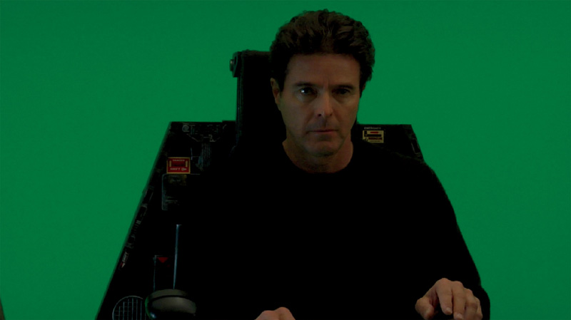
To illustrate face replacement, we’ll start with a greenscreen shot of actor Steve Roth in an aircraft prop seat, as shown in Figure 6.30.
Figure 6.30. Actor Steve Roth filmed on greenscreen sitting in an aircraft prop seat
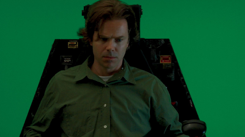
His face will be replaced with actor Chad Ayers, also filmed in the seat but in a different position and with different lighting, just to make it a little trickier (Figure 6.31).
Figure 6.31. Actor Chad Ayers, also filmed on greenscreen sitting in an aircraft prop seat, but in a different position and with slightly different lighting
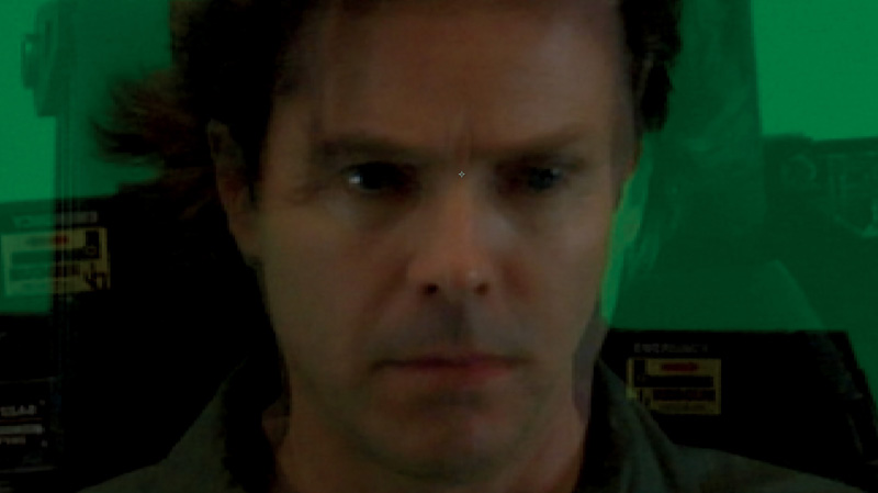
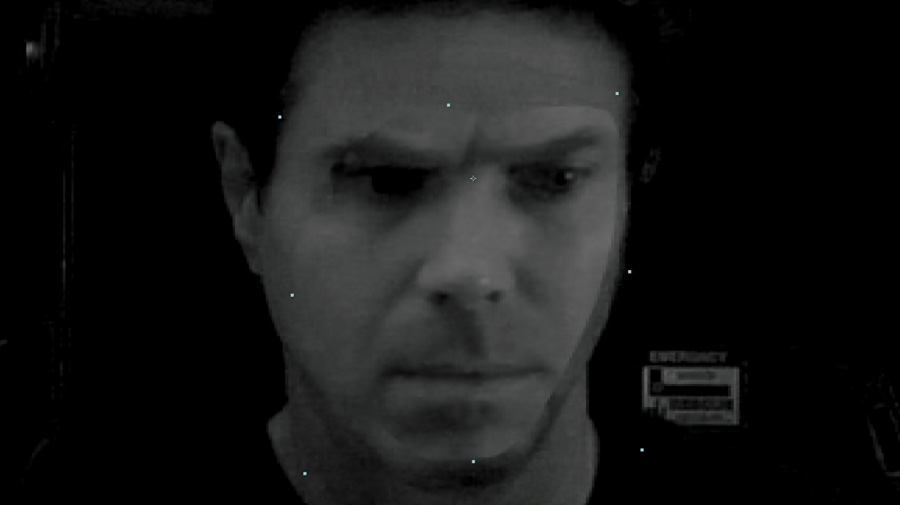
Because it is impossible for a human to hold completely still, you must stabilize both actors’ faces to create a solid replacement. The corners of the eyes is a good location to 2 point track for this type of facial stabilization and is done exactly the same way as described in the 2D tracking lesson in Chapter 3. The only difference is that instead of applying the tracking data as a matchmove, you will apply it inversely to stabilize. I highly recommend using only position and rotation and not scale in this case, because tracking errors amplified by the close positioning of the tracking markers tend to make a face replacement go haywire.
Once both plates are stabilized, move the pivot point of the actor’s face—the one you will be using as the replacement—to the center between the actor’s eyes. This will allow you to precisely align, rotate, and scale the face to make the best match possible. Reduce the opacity of the plate to about 50% and position the two plates until the inside corners of the eyes are aligned, as shown in Figure 6.32.
Figure 6.32. Pivot point moved to center between actor’s eyes, and plates aligned to match the position of the inside corners of the eyes
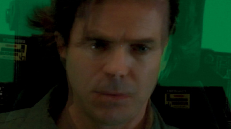
Next, rotate and scale the plate until the eyes, nose, and mouth line up. The best way to know when is to look for what I call the creepy factor. The creepy factor is the moment when the two faces seem to blend into some creepy combination (as shown in Figure 6.33).
Figure 6.33. Plates rotated and scaled until they align and exhibit the creepy factor
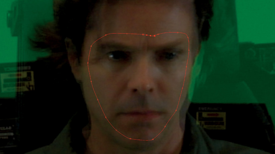
The appearance of “the creepy factor” indicates that it is time to begin blending the two faces. Create a mask in the shape of ... well ... a mask (the full-face ones like the famous drama mask decorations you might have seen before—see Figure 6.34).
Figure 6.34. Spline mask creating facial mask shape
Note
If the integration is particularly difficult or the actor has distinctive facial features, scars, or other distinguishing characteristics, you may reduce the full face mask shape around the eyes, nose, and mouth to be as small as you need to resemble more of a “monkey face mask.” Doing so will show a lot more of the original actor’s face and less of the one replacing it, but it is usually sufficient enough to allow the replacing actor to be able to do his/her performance with the required facial expressions.
Now make the replacing actor’s plate 100% solid (opaque) to see where you are (Figure 6.35). You want this mask to be razor sharp on the edges for now so that you can best identify the areas of mismatch in the plates.
Figure 6.35. Replacing plate made 100% solid/opaque

You can also create a dip in the mask around the actor’s right eye (like I have in the example) to cut out the hair that was dangling over it.
Next, go channel by channel, using a levels adjustment and the procedural color-matching technique covered in Chapter 5. In the red channel (Figure 6.36), you can see the noticeable difference between the lighting on the two sides of the face.
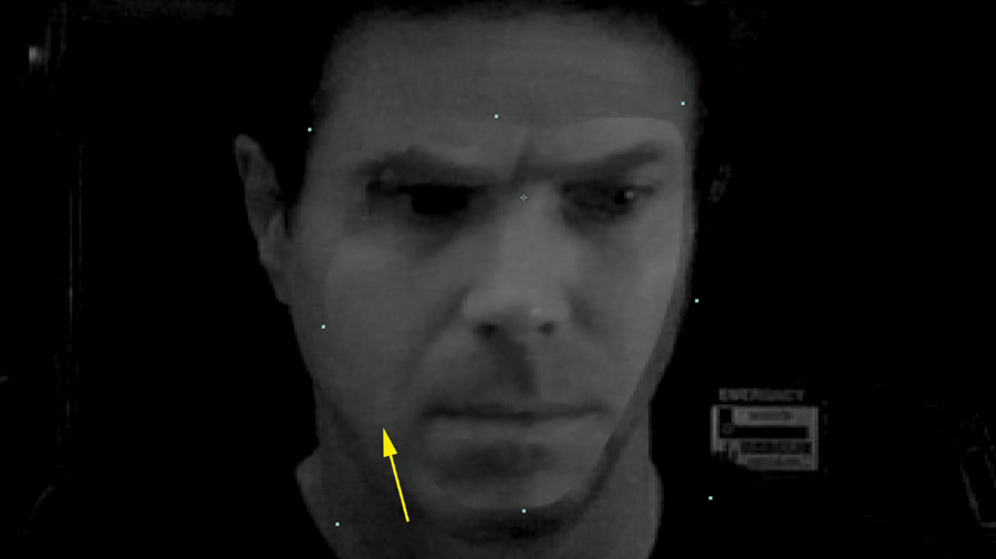
Ideally, you want the seam between the two plates to completely disappear, as you can see indicated by the yellow arrow in Figure 6.37. Unfortunately, in this example, making the seam on one side disappear as you’d like it to causes the other side of the face’s seam to get worse.
Figure 6.37. Seam between two plates disappearing
In this case, your best bet is to “split the difference” between the two sides, as shown in Figure 6.38.
Figure 6.38. Splitting the difference in the red channel levels adjustment match
Next, repeat the process with the green and blue channels, as shown in Figures 6.39 through 6.42.
Figure 6.40. Splitting the difference in the green channel levels adjustment match
Figure 6.42. Splitting the difference in the blue channel levels adjustment match
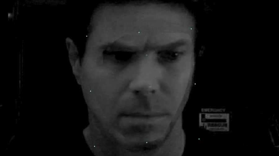
Once the color match is done, return to the full RGB view, as shown in Figure 6.43.
Figure 6.43. RGB view of color corrected/matched face replacement plate
As you can see, it looks okay, but not that great. Well, here’s where the magic happens! Go into the mask properties for the spline that’s creating the mask and turn up the edge feather or blur. Like magic, you should suddenly see a great integration happen (like the one seen in Figure 6.44) right before your very eyes!
Figure 6.44. Turning up the edge feather/blur on your mask spline suddenly creates a great integration, almost like magic.

Zooming back out to full view (Figure 6.45) reveals quite a convincing and natural-looking face replacement using quite mismatched source plates.
Figure 6.45. Zooming back out to full view reveals a nice result from less-than-perfect source footage.
Card Tricks: Outside-the-Box Strategies
Although it may now be obvious to you, from seeing how we were able to map pods of people onto simple 3D planes/cards (or billboards) to create stunning crowd VFX, there is a lot more you can do to expand this technique and create some pretty incredible VFX with very little in the way of actual 3D geometry, all with just these simple 2D cards.
It’s time for me to teach you how to use some outside-the-box thinking strategies to create some amazing VFX, which I affectionately call card tricks!
The Grid
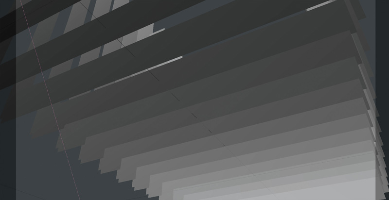
Chapter 1 discussed how VFX are meant to save money, time, and resources. It should always be at the forefront of your mind to approach a VFX shot with this mindset. Far too often, I see VFX artists believing they are in some way “purists” to some imaginary art form that they have deemed the holy grail of VFX technique. I’ve seen it happen with 3D modelers, 3D animators, 3D sculptors, and particle and simulation artists, each believing because it is their favorite or specialty, that it’s the best way to approach a VFX shot. All too often, I watch them sucked into the black hole vortex of time, emerging after the shot could have been completed a dozen times with a simpler, more straightforward approach. Remember, you only need to create what is going to be seen and nothing more. Nowhere is this more applicable than in a shot such as our previous concert example, which may require extensive and intricate trussing, scaffolding, or other supportive gridwork.
Let’s say you have been told you need to create a theater stage. You will need to create a complex grid of lighting support trusswork that will be tucked away in the rafters above the stage. Many 3D artists would jump right in and get started modeling in their favorite 3D package—wasting millions of needless polygons, many rendering hours, and too much production time. We will use a little outside-he-box thinking to save you tons of work and time. First, we will consider that this trusswork is tucked away in the rafters, so we will never really be getting that close to it. We’ll only get close enough to see the form and the parallax that occurs between sections of the trussing.
If you think of a truss in its simplest form, it is a series of metal rods or tubing welded together to form flat planes, which are then connected with welded crossbeams to form solid geometric shapes such as cubes, n-gons (a polygon with n or “any value” number of sides), or grids.
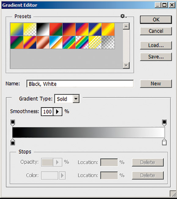
Knowing this, open Photoshop® (yes, Photoshop) and create a solid black square large enough for a decent texture (1024×1024 or 2048×2048 should be fine). Select the Gradient tool, click the small gradient thumbnail to open the Gradient Editor, and choose a black to white gradient, as shown in Figure 6.46.
Figure 6.46. Gradient Editor with black to white gradient selected
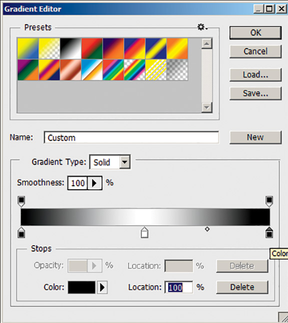
If you remember from Chapter 4 a bump map and displacement map are, like most other maps, just grayscale alpha maps. If you were to create a rod or tube using such a map, all you would really need to do to represent it is to have the tube start at black, gradate to white at the closest point to us (the viewer), and then round back to black again as the other edge of the tube falls away from us. To simulate this, open the Gradient Editor again and slide the bottom white color marker to the middle of the gradient. Click at the far right (where the white color flag originally was) to create a new white color flag. Double-click this flag and then the tool’s Color swatch at the bottom of the Gradient Editor tool and then select black. You should now see a reflective gradient (one that seems to mirror itself on each side) that looks like the one in Figure 6.47.
Figure 6.47. Gradient Editor with black to white to black reflective gradient created
Next, after you make sure you’ve selected the Gradient tool from the toolbar, start about a quarter of the way from the top of the image and while holding down the Shift key (to constrain your tube or pipe to a perfect angle), click and drag vertically a small distance (about the thickness you want your piping to be). You should see a nice resemblance of the top support tube, similar to Figure 6.48.
Figure 6.48. First tube, or pipe, created with the Gradient tool

Next create another solid black layer, and this time, starting about a quarter of the way from the bottom, repeat the above steps to get the bottom support tube. Now, using a little of the blending mode magic you learned in Chapters 1 and 2, set the blending mode to Lighten. You should now see both the top and bottom support struts, similar to Figure 6.49.
Figure 6.49. Lighten mode allows both layers’ struts to appear

Repeat this process again, adding another layer, but this time carefully draw your gradient line at an angle, creating a crossbeam. When you change the blending mode of this layer to Lighten, in addition to now being able to see all your tubing, you will see that the Lighten mode, together with the gradient you created, nicely (and automatically) creates the look of a complex metal join or weld, as seen in the yellow circled areas in Figure 6.50.
Figure 6.50. Joins, or welds, automatically created when Lighten mode is selected
Experiment with placing and creating tubes and joins and then create an open-ended, tileable truss pattern like you see in Figure 6.51 and save this out as your color map.
Figure 6.51. Open-ended, tileable truss pattern

Next, you want to be able to see through the open areas of the trusses (now black), so you will create a simple matching alpha channel/map to do this. Click Select menu > All, Edit menu > Copy Merged, and then Edit menu > Paste to quickly create a copy to the entire set in one layer. This will be your color and/or diffuse map. Duplicate this layer and then, with this layer selected and the Shift key held down, select each of the black areas using the Magic Wand tool (you may have to adjust the Tolerance level—somewhere around 10 or 20 should work well) until the only thing not selected are the trusses. Click Select menu > Inverse (this will select all of the truss areas that you want to be solid or opaque). Click Edit menu > Fill and fill these areas with 100% white, which will give you your matching alpha map (similar to Figure 6.52). Then save this out as your alpha map.
Figure 6.52. Matching truss alpha map

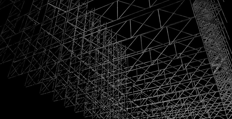
Now it’s time to create your geometry. No fancy 3D models are needed here. In your 3D application (or even in your compositing application—this will work as well, just without as many texture controls), create a simple, long, flat rectangle, as shown in Figure 6.53.
Figure 6.53. Simple, flat, rectangular plane
Next, duplicate this plane and push it back into Z-space so that it sits where you would expect the next truss to be in a series. Repeat this process as many times as you’d like (as shown in Figure 6.54).
Figure 6.54. Duplicated and offset truss rectangles
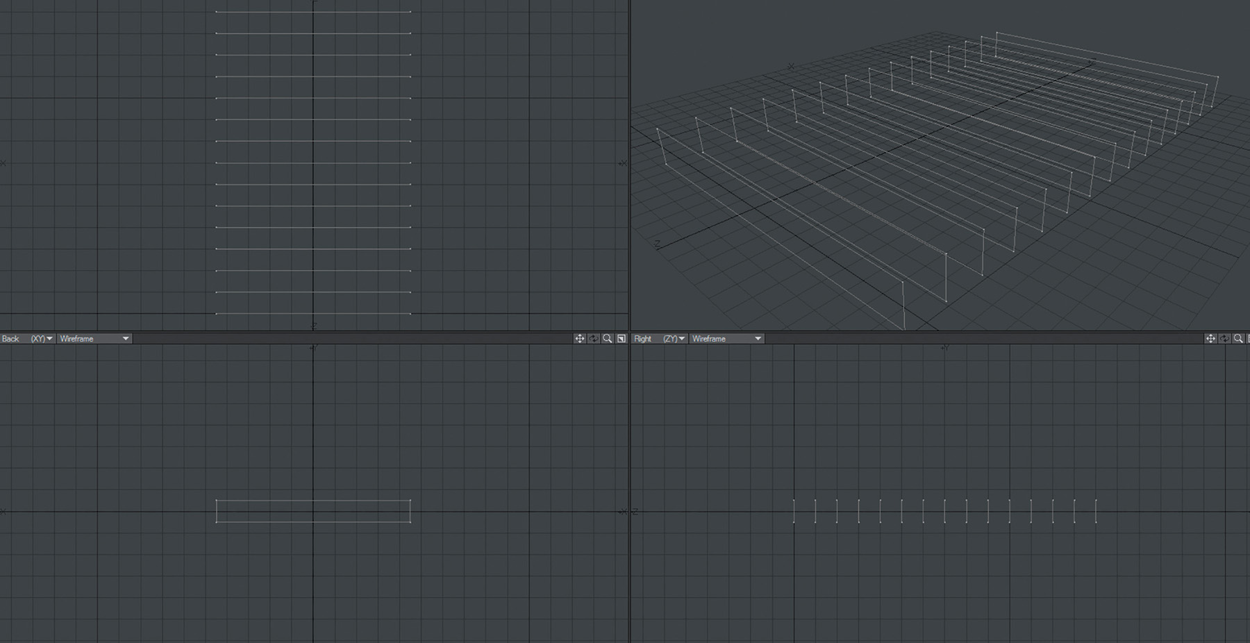
Place a light in the scene and a camera below the rectangles looking up, as you would if you were looking up at a ceiling (Figure 6.55).
Figure 6.55. Light and camera placed in scene
Feel free to replicate these truss rectangles some more and rotate them vertically, as in Figure 6.56, or however you’d like to add more complexity.
Figure 6.56. Two more sets of rectangles duplicated then rotated vertically
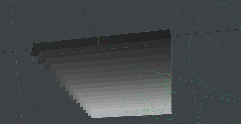
Now apply the color map into the color channel, diffuse channel, and bump channel (you can use this same map as a displacement as well), as shown in Figure 6.57, and load the alpha you created into the alpha, or transparency/opacity, channel.
Figure 6.57. Color map loaded into color, diffuse, and bump channels
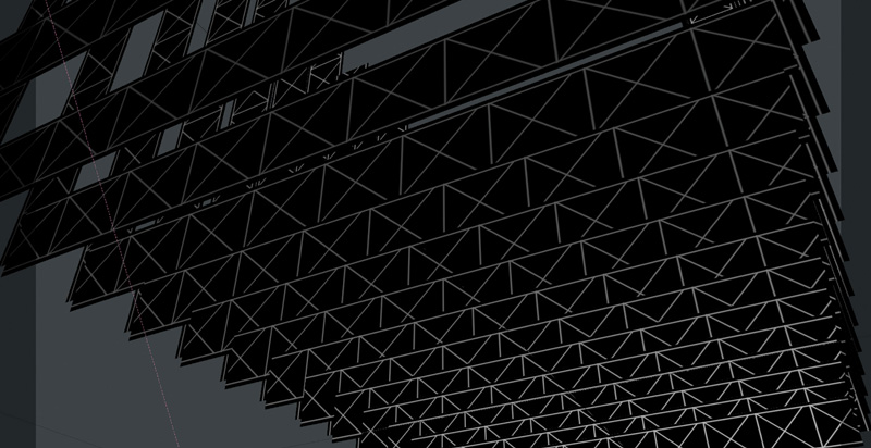
All that’s left to do is to click Render! You should now have a complex grid of trusswork similar to Figure 6.58 (all with about 45 polygons in this case).
Figure 6.58. Rendered trusswork using only 45 polygons or planes/layers
House of Cards
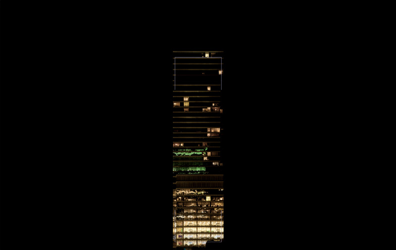
Let’s take this card concept in another direction and one step further, using it to quickly put together simple structures. This entire example will use only two images: a background night sky (Figure 6.59) and a cropped face of a high-rise building (Figure 6.60).
Figure 6.59. Background night sky image
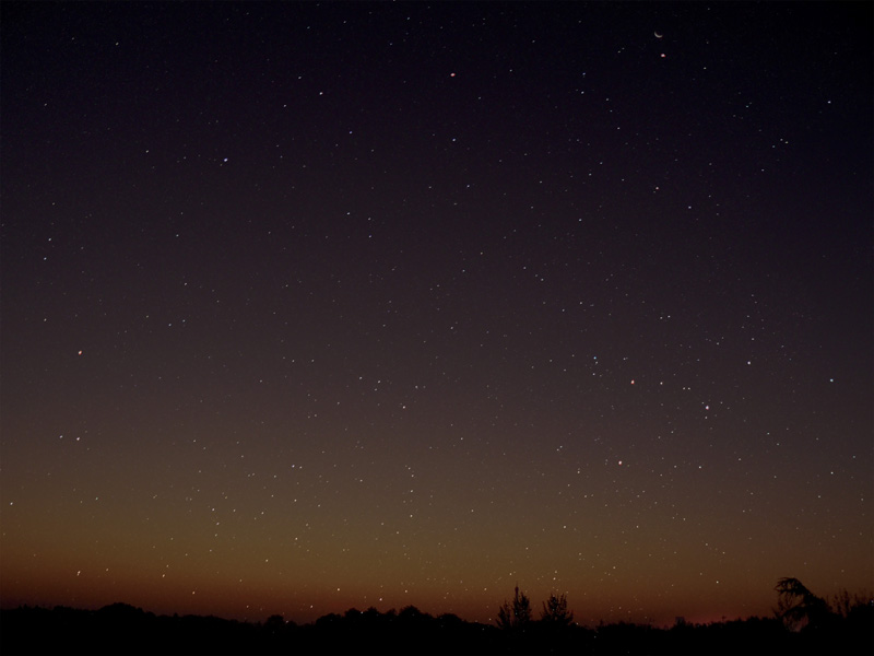
Figure 6.60. Cropped face of high-rise building image
Load the sky image onto a card and place it way in the background. You will likely have to scale it up so that it fills the frame after you move it so far into the distance.
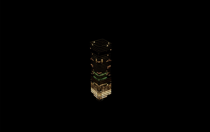
Next, map the high-rise image onto a simple rectangular card. Duplicate this card and move the pivot point to one side edge. Doing this allows you to easily rotate the duplicate 90 degrees while keeping its edge aligned with the original. Repeat this process until you’ve made a cube with the four identical cards, as shown in Figure 6.61.
Figure 6.61. Four identical image planes rotated and arranged into cube
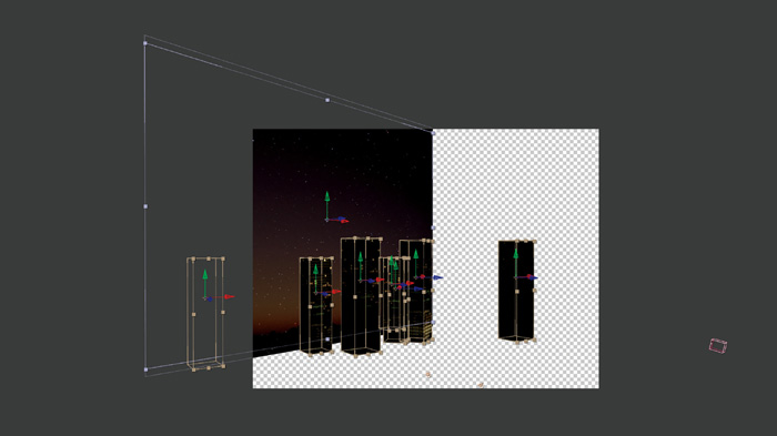
Next, group these planes into one group or object, duplicate it a few times, and distribute the duplicate copies around the scene however you’d like, rotating them and moving them in Z-space, as shown in Figure 6.62.
Figure 6.62. Grouped image cards distributed around the scene, rotated, and offset in Z-space
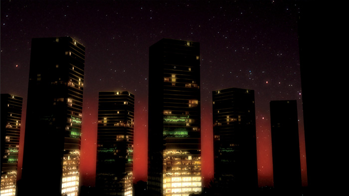
Finally, place a camera, a few lights, and some color correction and/or post effects (in this case I’ve only added a bloom effect, nothing else) to create another amazing shot, as shown in Figure 6.63, with only 29 polygons in this case!
Figure 6.63. Finished shot with only 29 polygons and one bloom effect
Note
A bloom effect creates a glowing effect to (usually) bright areas of an image. A tolerance control determines what point on the histogram will be considered “bright” and therefore bloomed. It is also possible to bloom dark areas instead of bright areas of an image.
For the Birds
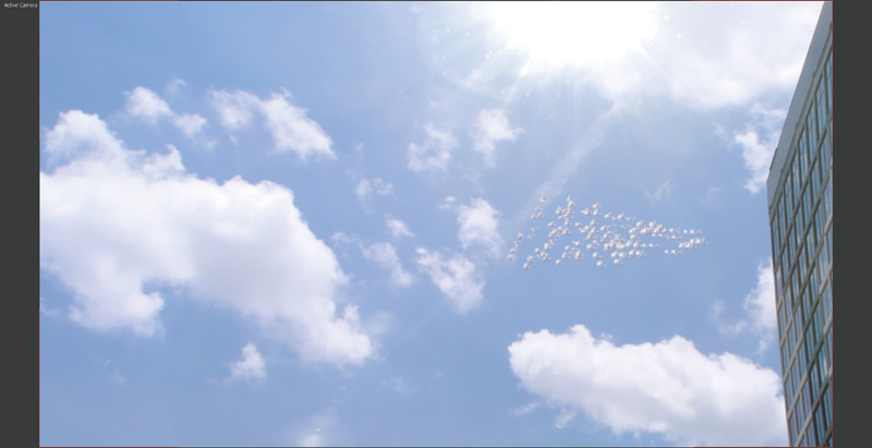
Now that you probably have some great ideas for how you can use these card tricks with alphas to create trusses, railings, distant trees, signs, scaffolding, vents and grills, simple buildings, and a myriad of other handy elements, I’m going to blow your mind and show you how you can put these card tricks into motion to create flying birds! Now, you might be asking yourself why you would want to create birds at all, right? Well, because everyone inherently knows what a bird looks like and can gauge an average bird’s size. Birds are one of those clever little VFX secrets that can be used to add scale to a 3D environment or miniature set piece, lead the audience’s attention, and focus and direct them anywhere on the screen you would like them to be looking. This trick instantly brings a matte painting or 3D environment to life that might otherwise appear completely lifeless. Simply add some flying birds in the distance, and voila!—the scene instantly springs to life.
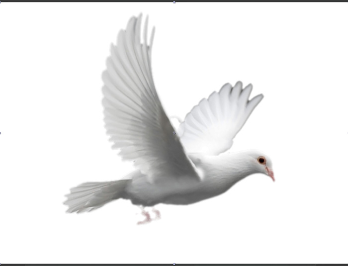
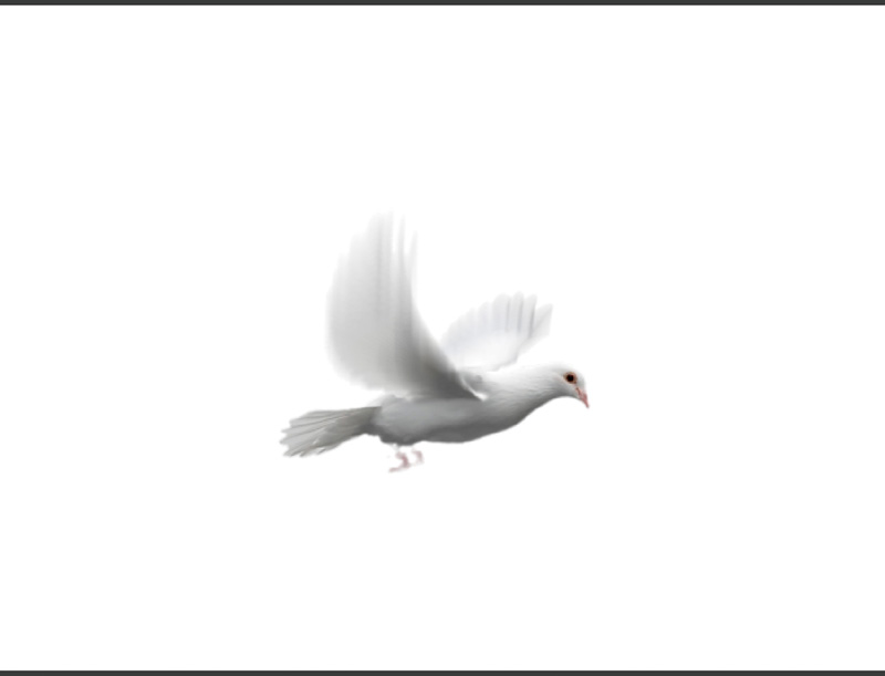
Although it is entirely possible to just sketch or roto basic bird shapes for birds that will appear in the distance, I always prefer to work with photorealistic sources wherever possible. In this example, you will create a flock of doves using an image of a dove (Figure 6.64) in flight as the basis for this 2.5D card trick.
Figure 6.64. Image of dove in flight used as basis for card trick
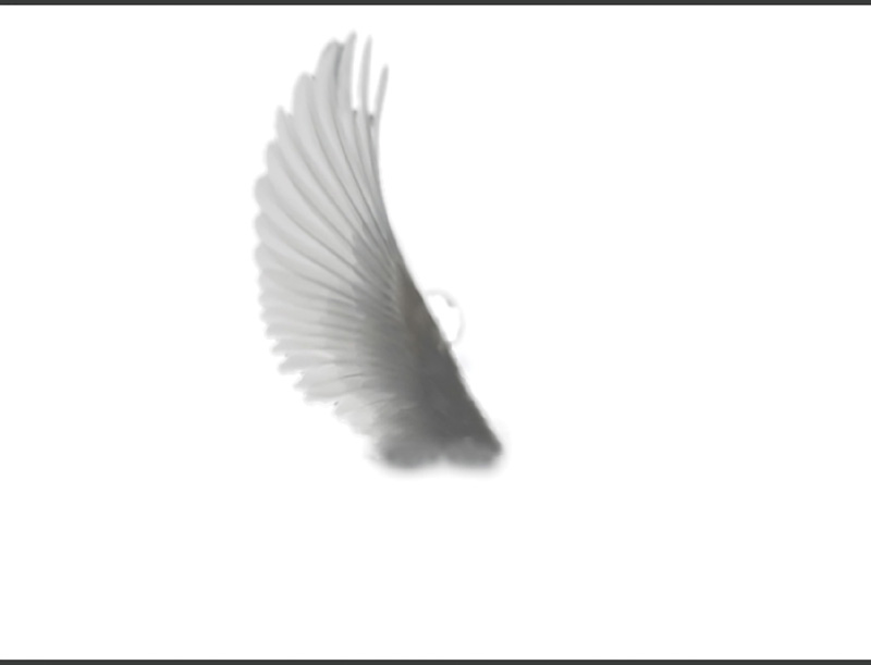
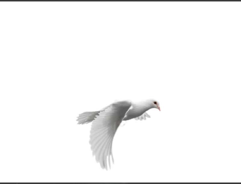
First, cut the dove into pieces (yeah, I know how that sounds). You want to create separate back wing (Figure 6.65), body (Figure 6.66), and front wing (Figure 6.67) elements. These will require a little cloning work to patch and extend areas so that they are seamless and overlap properly.
Figure 6.65. Back wing element
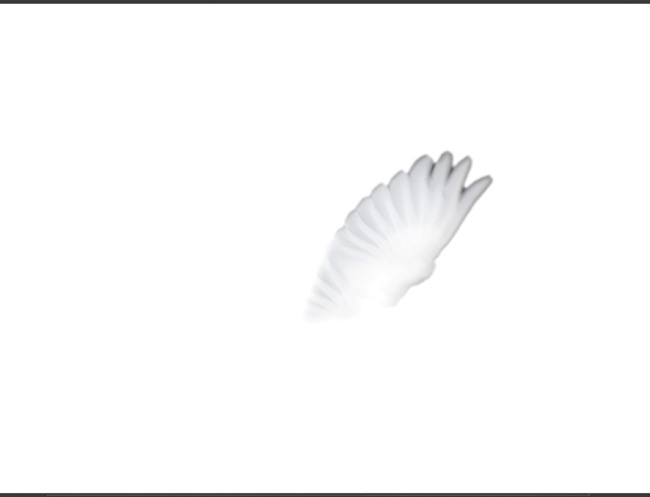
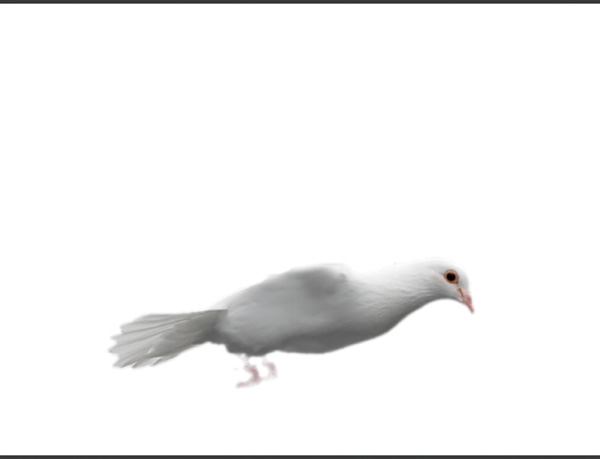
Figure 6.67. Front wing element
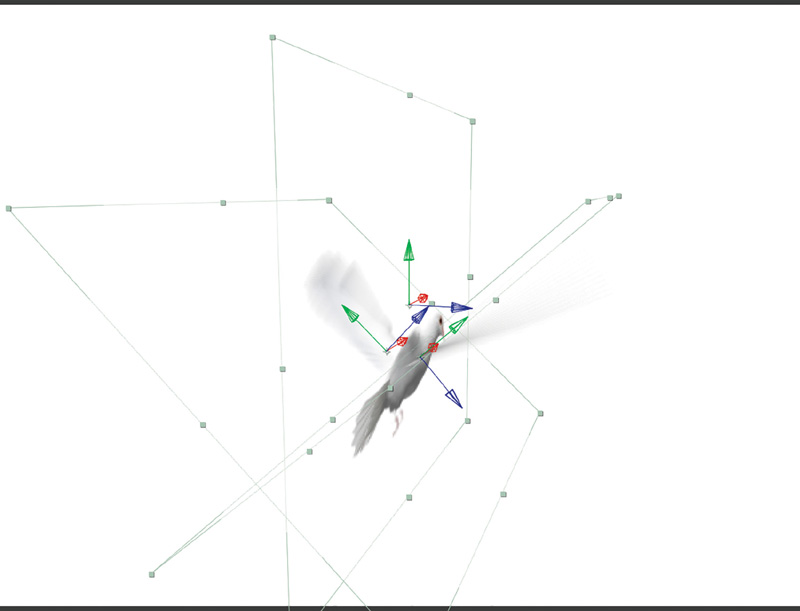
Next, as with the buildings we did earlier, you will map each image to a flat 3D card and move the pivot points of the wing cards to the point on the card/image where they would attach and rotate from in real life. This may not be the exact same place on each card, and that is perfectly fine—remember: “in VFX, if it looks right, it’s right.” Rotate and translate them to intersect the body card as you would a paper bird (see Figures 6.68 and 6.69).
Figure 6.68. Cards arranged into position
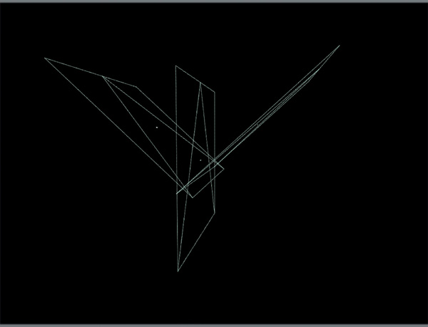
Figure 6.69. Cards arranged into position with color maps applied
Keyframe and loop the animation of each wing to rotate from the upmost position (Figure 6.70) to the downmost position (Figure 6.71) over about five frames. Keyframe the wings back to the starting position over about four frames. The total rotation should be around 135 degrees, depending on the type and wingspan of the bird, of course.
Figure 6.70. Wing in upmost rotation position
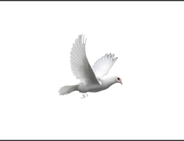
Figure 6.71. Wing in downmost rotation position
Enabling motion blur at these flapping speeds should give you a nice, natural-looking, flapping motion blur (see Figure 6.72).
Figure 6.72. Natural-looking wing motion blur created by keyframed rotation
Next, as you did with the buildings, group these layers together and replicate them into a small group of ten or so. Offset their motions in time so that their wings flap at different times (Figure 6.73).
Figure 6.73. Small group of birds with wing motions and positions offset and randomized
You can also add a slight noise or randomization expression (a mathematical equation, procedure, or variable) to the position of each bird so that they drift around slightly while still basically maintaining formation.
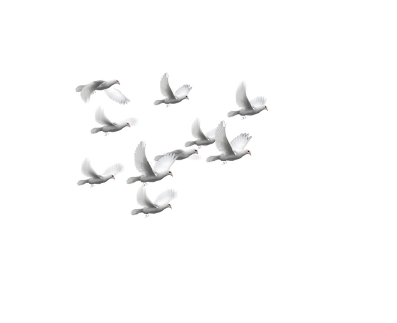
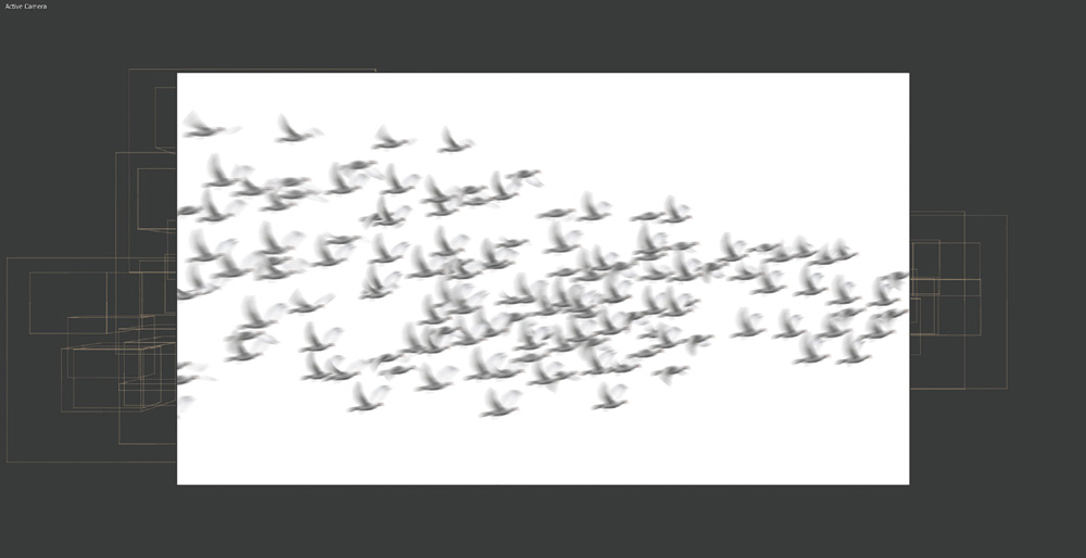
You can now replicate this group into larger flocks, as shown in Figures 6.74 and 6.75, and keyframe an overall motion path.
Figure 6.74. Small group duplicated into large flock—wireframe box preview
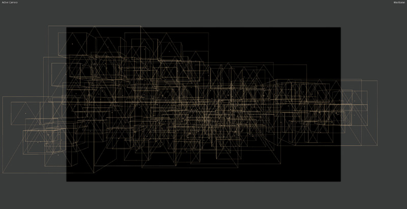
Figure 6.75. Small group duplicated into large flock—textured preview
For finishing touches, you could add a lens flare to simulate the sun over the birds (Figure 6.76) and then drop in a background, as shown in Figure 6.77. You could also scale the flock layer down and put them in the distance, as shown in Figure 6.78, to add life and a sense of depth and scale to a static image or matte painting.
Figure 6.76. Lens flare sun added
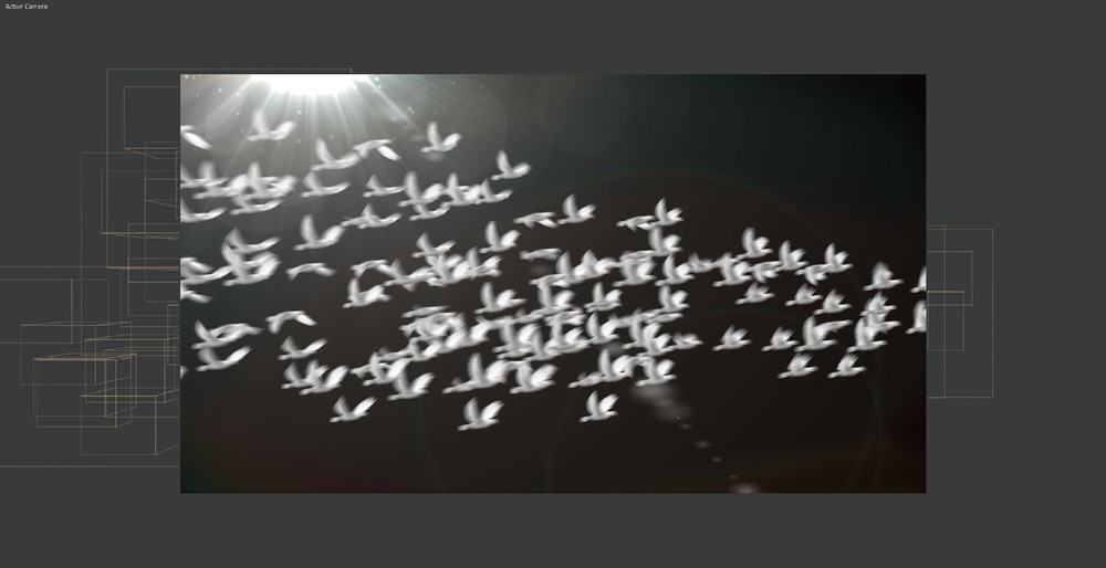
Figure 6.77. Flock of animated 2.5D doves with background added
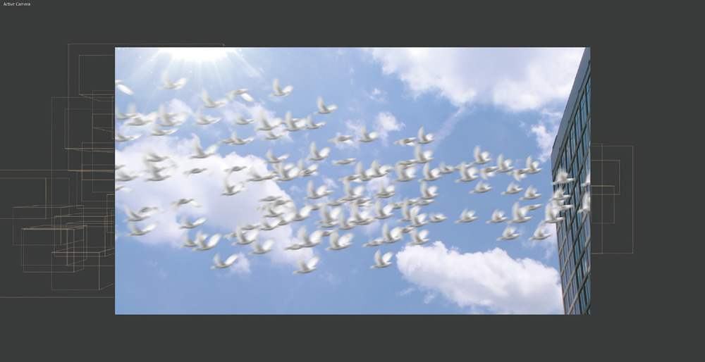
Figure 6.78. Flock of animated 2.5D doves scaled down to provide scale and depth to scene or matte painting
Now that you’ve had a chance to explore some great 2D and 2.5D tracking and integration VFX, you will see that there are times when you just can’t quite get a 2D or 2.5D tracking solution to work. In those cases, you will have to turn to a full 3D tracking and integration solution. And that’s exactly where you will start in Chapter 7.