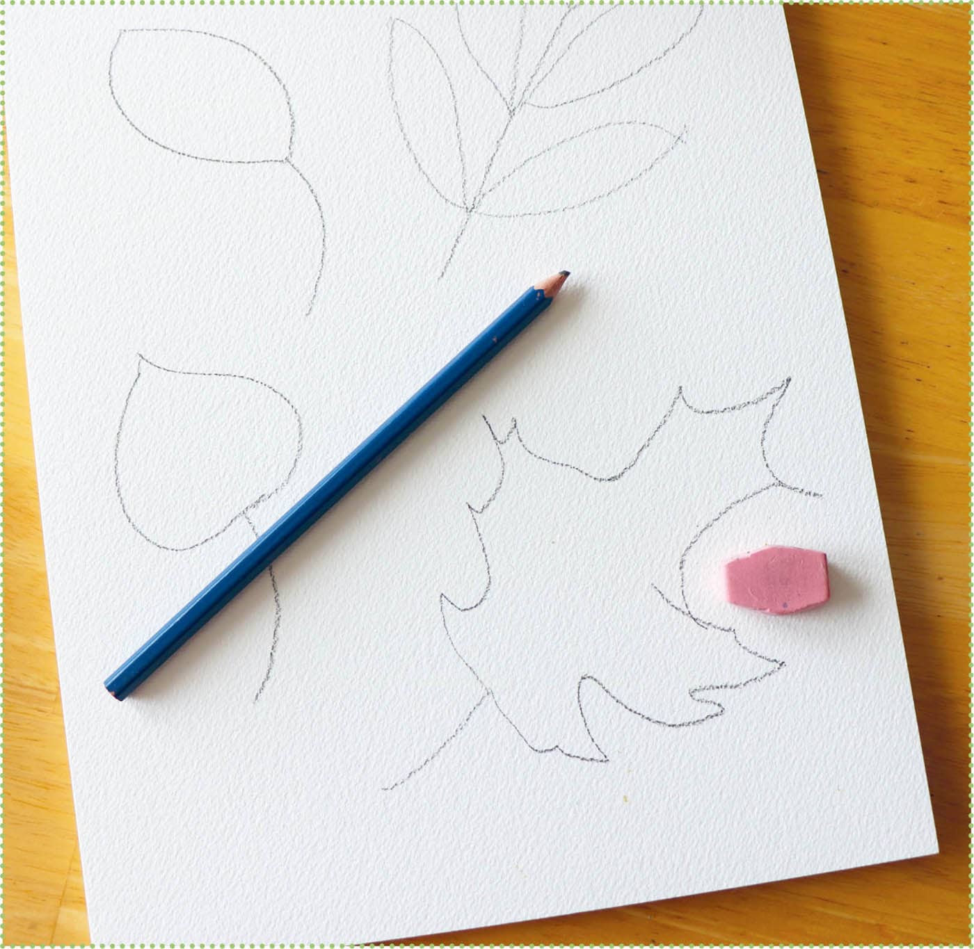
Mixing Colors
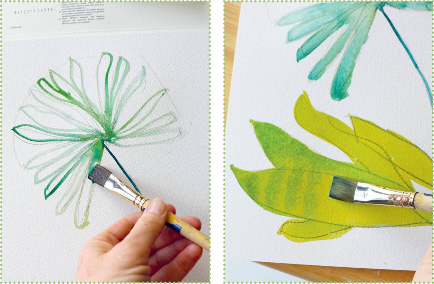
Mixing watercolors is quite fun and easy. It takes just a bit of practice to get used to your paints and the amount of water needed to get the desired results. One thing to remember is that watercolors are transparent, and they will show the paper underneath. Take advantage of this when painting. Also, instead of painting light colors on top of dark colors, remember to add darker colors over lighter areas. To create light areas, less is more—the lightest whites should be the paper itself. To lighten watercolors, instead of adding white (which is an option), try watering down the paint to a weaker mixture.

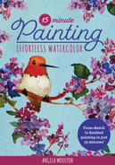
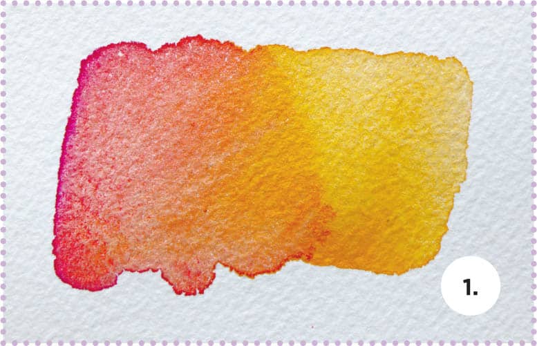
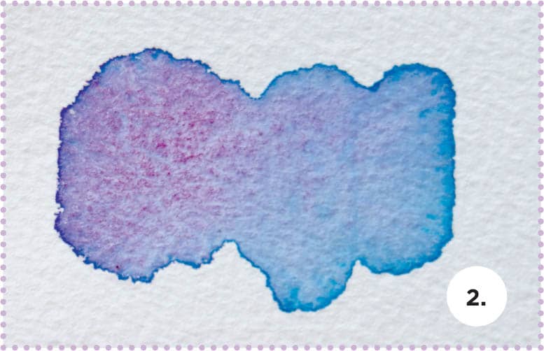
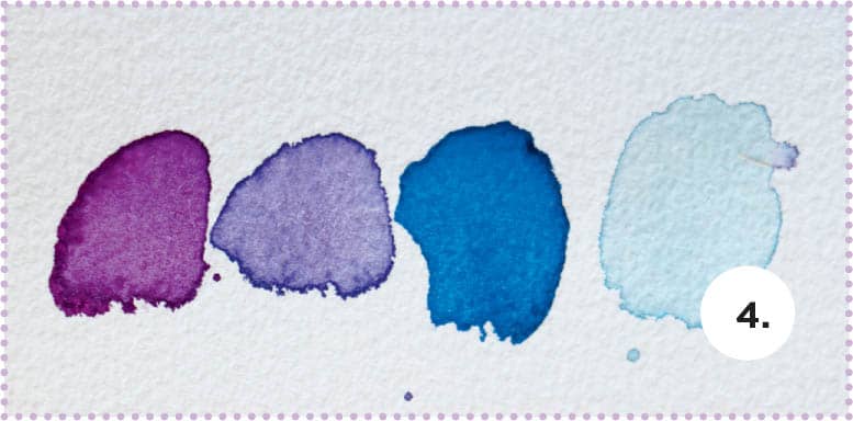
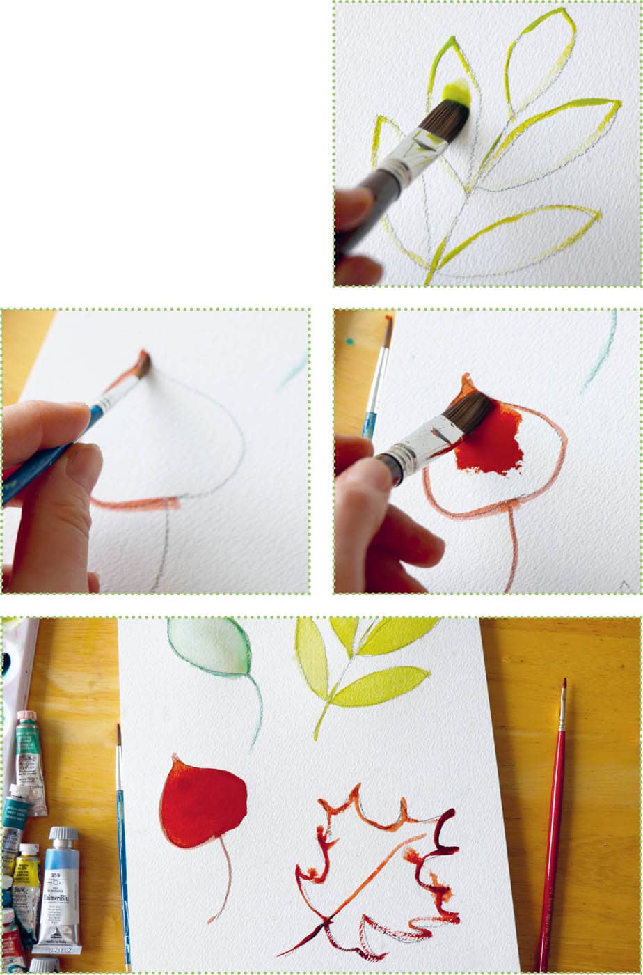
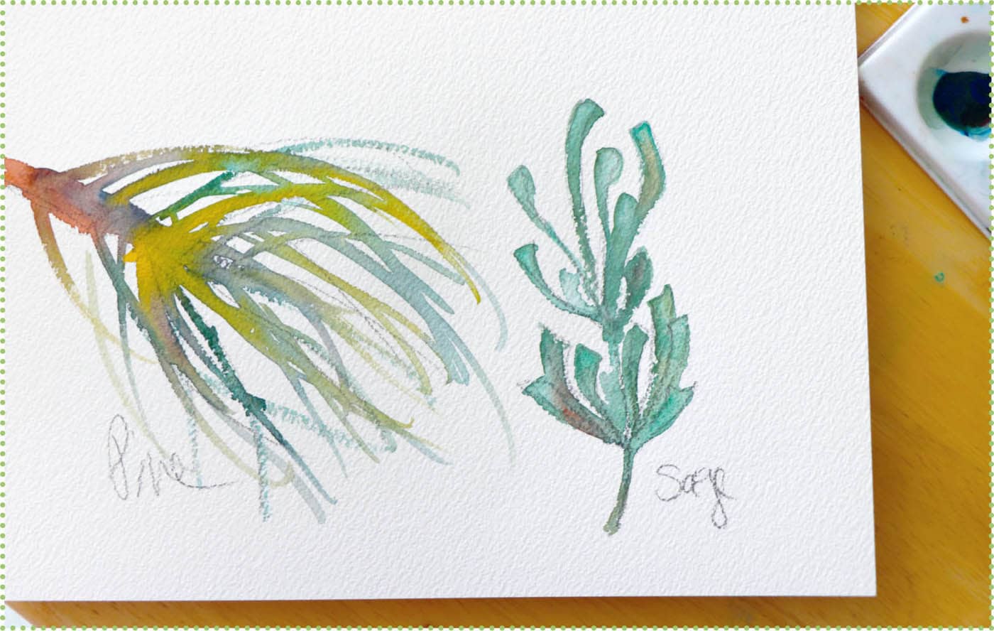
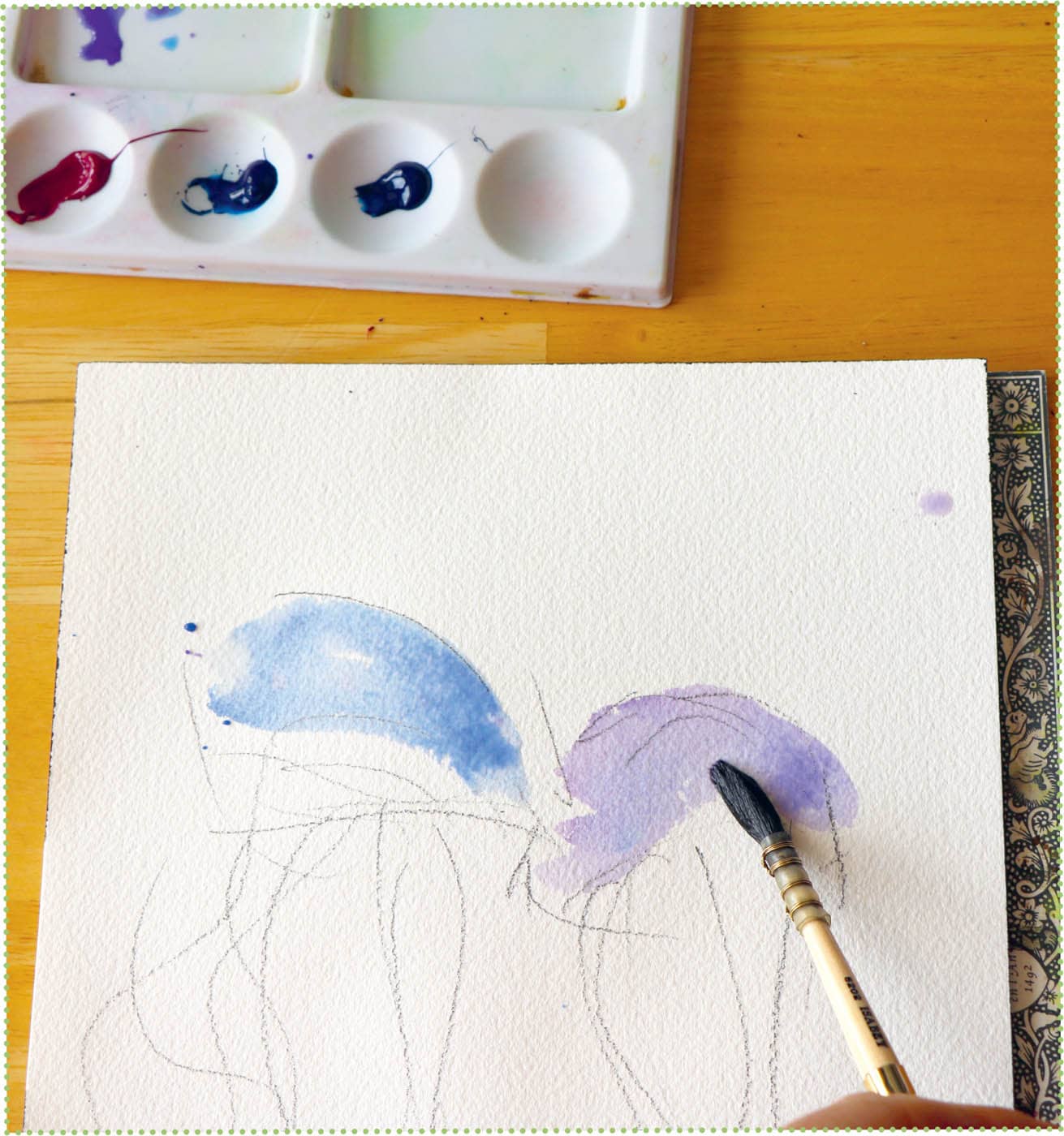
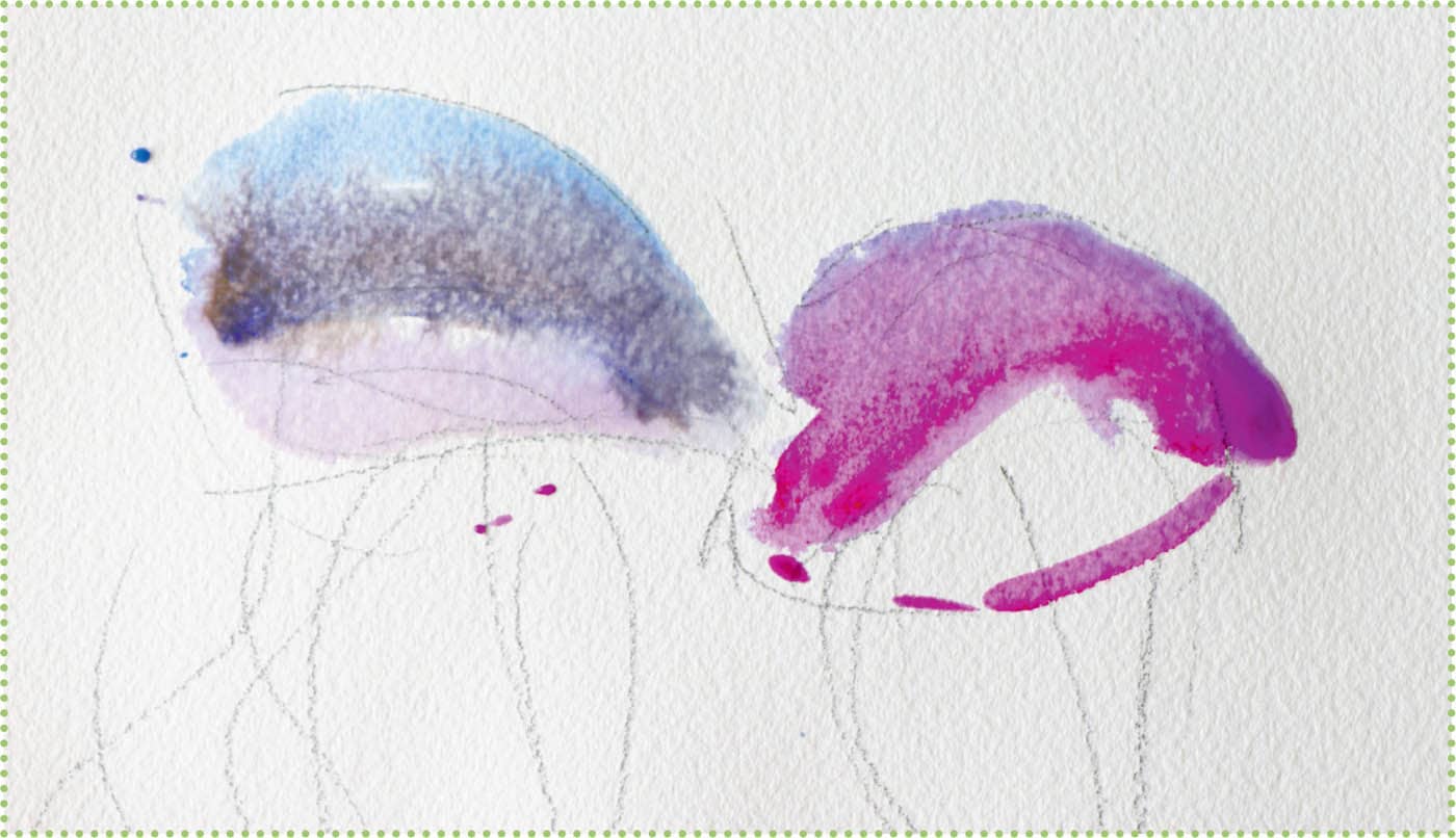
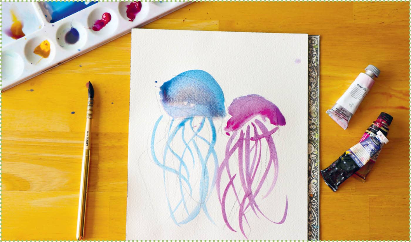
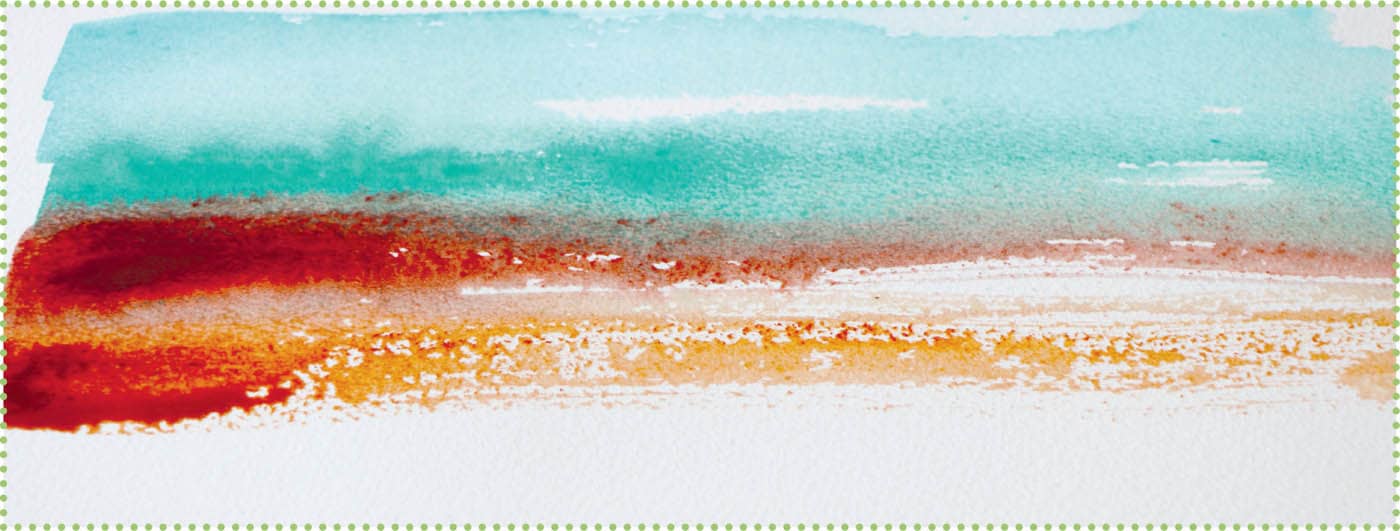
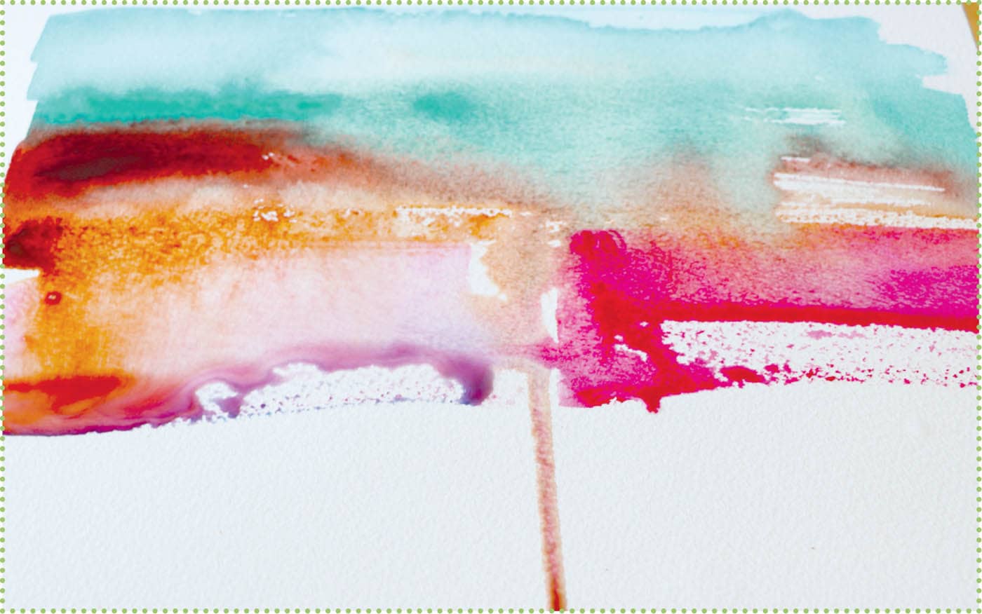
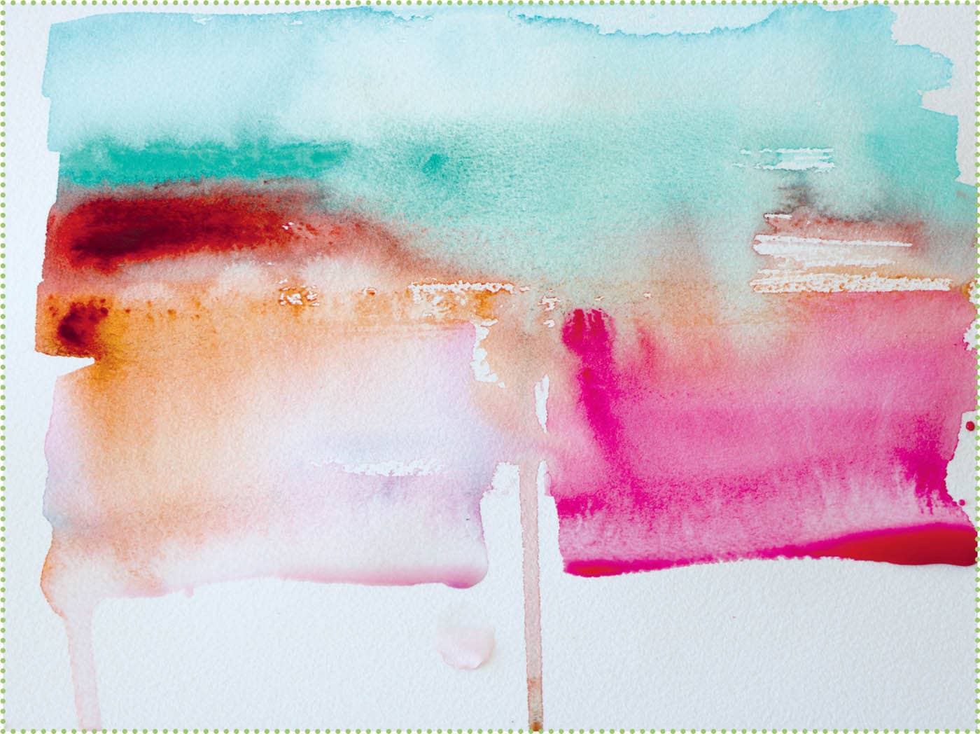
You can mix watercolors on the palette or on the paper by painting one color right next to (or on top of) another color. This technique is best practiced on scrap paper or in a sketchbook before trying on your artwork. Go ahead and experiment with mixing your colors. Here I paint one color next to another while both are still wet. The colors meet and blend to create a secondary color. As I mentioned, you can mix these same secondary colors on the palette, but it is also fun to see how they naturally blend together directly on the page. 1. Red and yellow blend to create orange. 2. Red and blue blend to create violet. 3. Blue and yellow blend to create green. 4. Pure violet, and then with one dip into water; phthalo blue, and then with one dip into water. 5. Four transitions from dark to light using violet and water. The more water, the lighter the applied color. I simply dipped the brush into a container of water between each brushstroke. Use your flat brush dipped in water to “pull” the paint from the outline into the middle of the leaves. This creates a transparent layer of color. If the leaf is large or the outline has dried, go ahead and add more paint to the center of the leaf and blend to fill in the shape. Use a liner brush to make pine needles. Start with darker colors and end with lighter greens for the needles. Try more complicated leaves or leaves from another part of the world. Try overlapping leaves or adding folded leaves. Try adding stripes and variations wet-into-wet or dry-on-dry for more defined lines. Add some saturated color to the middle and bottom edges. This will help delineate the top of the jellyfish from the underbelly where the tentacles hang down. Combine a watered-down mix of the violet with a touch of added yellow. Use this to paint the underbelly of the blue jellyfish. Outline the underbelly of the violet jellyfish. Add some black to the blue paint, and spread along the base of the blue jellyfish. Paint matching tentacles with tip of the round brush dipped in paint. Again, add black to the blue paint and use to paint darker tentacles on the blue jellyfish. Add more blue to violet, and paint some darker tentacles on the violet jellyfish. Fill in the underbelly of the violet jellyfish with a mixture of gray paint mixed from all three primary colors or by adding brown to the violet or blue paint. After the tentacles have dried, paint the underbelly of the violet jellyfish. First, pick four or five colors for your project. I use two different blues, a pink, and a burnt sienna. Use a flat brush to make two horizontal brushstrokes from left to right using the color of your choice. Now add a second similar color underneath. Notice how the stroke becomes drier toward the right side of the painting. Now switch to burnt sienna. This color will break up the painting with a more dramatic shift in color and value. Add water to your flat brush and apply to your painting. Watch as the colors blend into each other. Don’t use your brush to blend the paints; rather, gently press the brush to the surface and slowly stroke where you want to soften the lines and mix the colors. Where the drip divides the paper, I added some pink horizontal brushstrokes to the right. Make sure not to touch the drips or the paint will blend and mix. Then mix blue with some pink to create a light violet color and apply a couple more brushstrokes to the left of the drip. Add more water to further blend the colors. Finally, decide when to stop painting. I decide to leave some white paper showing. As the painting dries, the colors start to absorb into the paper, creating blooming and pooling of pigments. For this project, use a round brush and a medium flat brush. Start by applying one of the colors in random circles around the paper. I chose ultramarine violet. Using a similar color, such as magenta, paint more circles that attach to the first circles. Use a third color (I used violet-brown) to continue with the drippy dots. Notice when the colors connect wet-into-wet, they blend together at the connection point. I use a dark Payne’s gray for the next set of connecting dots. Fill in areas to create a balanced effect on your paper. While the dots are random, choose what looks most pleasing. On your palette, blend a touch of magenta and Payne’s gray into yellow paint to tone it down. You don’t want the bright yellow to overpower the other colors on the paper. Allow the painting to dry. See how dramatic the flow of colors can be, especially when the colors contrast in value or hue.WET-INTO-WET


STEP 1:

STEP 2:
STEP 3:
STEP 4:

STEP 1:
STEP 2:

STEP 3:

