19
Artistic Visualization
Lev Manovich
Before the end of the 1990s, the use of data visualization was limited to particular scientific disciplines or financial pages of newspapers. It was not part of the vernacular visual culture. By the end of the 2000s, the situation had changed dramatically. For example, the Museum of Modern Art in New York (MoMA) presented a dynamic visualization of its collection on five screens in its lobby. MoMA also included a number of artistic visualizations in its large survey exhibition Design and the Elastic Mind (2008). The New York Times was regularly featuring custom visualizations both in its print and web editions created by the in-house New York Times interactive team. The Web was full of numerous sophisticated visualization projects created by artists, designers, scientists, and students. If one searches for certain types of public data, the first result returned by a Google search links to automatically created interactive graphs of the respective data. Dozens of free web-based visualization tools have become available. In short, three hundred years after William Playfair started the field by inventing the now classic visualization techniques (bar chart, pie chart, line chart), data visualization has finally entered the realms of both high and popular cultures.
This shift was acknowledged by the leading data visualization designers themselves:
Information visualization is becoming more than a set of tools, technologies and techniques for large data sets. It is emerging as a medium in its own right, with a wide range of expressive potential.
(Rodenbeck 2008)
Visualization is ready to be a mass medium.
(Viégas and Wattenberg 2010)
Artists played a key role in the popularization of the data visualization field in the 2000s, and created some of the most memorable visualizations of the decade. They also created a new visual programming environment—Processing (2001) by Ben Fry and Casey Reas—and built a large community around it. Through Processing many more art and design students learned programming and started to explore computer graphics, interactives, and visualization. Artists also set up and taught in hundreds of digital art programs around the world, thus preparing a new generation of people who could create images, animations, spaces, sounds, and all other media types (including visualizations) via programming.
The development of the data visualization field in the 2000s happened in parallel to another technological and social movement—the rise of Big Data, that is, massive data sets, which could not be easily understood by using the existing approaches that modern society had developed to analyze information. Among the key sources of such data was “social media,” user-generated content and user activities on social networks such as Facebook, Instagram, Twitter, Google+, Weibo, etc. Because all leading social media networks made it easy for anybody with knowledge of programming to download their user data and content (using their APIs, which stands for Application Programming Interfaces), they also indirectly contributed to the popularization of data visualization. Getting, cleaning, and organizing a large data set can typically take a significant amount of time, but downloading social media data from the networks is relatively simple and fast. As a result, many memorable visualizations of large data sets in the 2000s featured data from Twitter, Flickr, and other then popular social media networks.
In this chapter I will not try to address every kind of aesthetic strategy developed by visualization artists, or to review all important projects created in that field. Instead I will focus on what I see as one of the most important and interesting developments in this area of digital art. I will discuss work by artists who challenged the most fundamental principles of the data visualization field as it has existed since the 18th century. Instead of continuing to represent data using points, lines, and other geometric primitives, they pioneered a different method which I call “media visualization”: new visual representations derived from visual media objects (images, video, text). I will analyze well-known examples of artistic visualizations that use this approach: Listening Post (Ben Rubin and Mark Hansen, 2001), Cinema Redux (Brendan Dawes, 2004), and The Preservation of Favoured Traces (Ben Fry, 2009).
Along with examples from the classics of artistic data visualization, I will also use relevant ones from the projects created in my own research lab. Following the pioneering work of other artists discussed in this chapter, we developed software tools to visualize massive cultural data sets and applied them to a variety of data sets, ranging from 4535 covers of Time magazine to 2.3 million Instagram photos from thirteen global cities.
In order for us to understand how visualization artists went against the norms of the field, we first need to understand these conventions, which will be discussed in the following section.
Defining Data Visualization
What is data visualization? Despite the growing popularity of datavis (a common abbreviation for “data visualization”), it is not so easy to come up with a definition that would work for all the types of projects being created today and, at the same time, would clearly separate datavis from other related fields, such as scientific visualization and information design. So let us start with a provisional definition that we can modify later. Let us define data visualization as a mapping between discrete data and a visual representation. We can also use different concepts besides “representation,” each bringing an additional meaning to the subject. For example, if we believe that a brain uses a number of distinct representational and cognitive modalities, we can define data visualization as a mapping from other cognitive modalities (such as mathematical and propositional) to an image modality.
My definition does not cover all aspects of data visualization—such as the distinctions between static, dynamic (i.e., animated), and interactive visualization (the latter, of course, being most important today). In fact, most definitions of datavis (or its synonym, information visualization) by computer science researchers equate it with the use of interactive computer-driven visual representations and interfaces. Here are examples of such definitions: “Information visualization (InfoVis) is the communication of abstract data through the use of interactive visual interfaces” (Keim et al. 2006); “Information visualization utilizes computer graphics and interaction to assist humans in solving problems” (Purchase et al. 2008).
Interactive graphic interfaces in general, and interactive visualization applications in particular, offer many new techniques for manipulating data elements—from the ability to change how files are shown on the desktop in modern operating systems to the multiple coordinated views available in some visualization software such as Mondrian by Martin Theus (2013). However, regardless of whether you are looking at a visualization printed on paper or a dynamic arrangement of graphic elements on your computer or smartphone screen—generated by using interactive software and changeable at any moment—the image you are working with in both cases is a result of mapping. So what is special about images produced by such mapping?
For some researchers, data visualization is distinct from scientific visualization in that the latter uses numerical data while the former uses non-numeric data such as text and networks of relations. For example, “In contrast to scientific visualization, information visualization typically deals with nonnumeric, nonspatial, and high-dimensional data” (Chen 2005). I am not sure that this distinction holds up in practice. Plenty of datavis projects use numbers as their primary data, but even when they focus on other data types, they still often use some numerical data along with them. For instance, a typical network visualization may use both the data about the structure of the network (which nodes are connected to each other) and the quantitative data about the strength of these connections (for example, how many messages are exchanged between members of a social network). As a concrete example of datavis that combines non-numerical and numerical data, consider the well-known project History Flow (2003) by Fernanda B. Viégas and Martin Wattenberg, which shows how a given Wikipedia page grows over time as different authors contribute to it. The contribution of each author is represented by a colored line. The width of the line changes over time reflecting the amount of text contributed by an author to the Wikipedia page. Another datavis classic, Aaron Koblin’s Flight Patterns (2005), uses numerical data about the flight schedules and trajectories of all planes that fly over the United States to create an animated map that displays the pattern formed by their movement over a 24-hour period.
Rather than trying to separate data visualization and scientific visualization by using some a priori concept, one could instead enter each term in Google image search and compare the results. The majority of images returned by a search for “data visualization” are two-dimensional and use vector graphics—points, lines, curves, and other simple geometric shapes. The majority of images returned when searching for “scientific visualization” are three-dimensional; they use solid 3D shapes or volumes made from 3D points. The results returned by these searches suggest that the two fields indeed differ—not because they necessary use different types of data but because they privilege different visual techniques and technologies.
Scientific visualization and data visualization come from different cultures (science and design); their development corresponds to different areas of computer graphics technology. Data visualization developed in the 1980s along with the field of 3D computer graphics, which at that time required specialized graphics workstations. Information visualization developed in the 1990s along with the rise of desktop 2D graphics software and the adoption of PCs by designers. Its popularity accelerated in the 2000s, the two key factors being the easy availability of big data sets via APIs provided by major social network services since 2005 (as I already mentioned above), and the new high-level programming languages specifically designed for graphics (i.e., Processing 1 ) and software libraries for visualization (i.e., Prefuse 2 ).
Can we differentiate data visualization from information design? This is a trickier issue, but here is my way of distinguishing the two. Information design starts with data that already has a clear structure, and its goal is to visually express this structure. For example, the famous London tube map designed in 1931 by Harry Beck uses structured data: tube lines, tube stations, and their locations within London geography (Beck 1931). In contrast, the goal of data visualization is to discover the structure of a (typically large) data set. This structure is not known a priori; visualization is successful if it reveals it. A different way of expressing this is to say that information design works with information, while data visualization works with data. As always is the case with regard to actual cultural practices, it is easy to find examples that do not fit this distinction—but a majority do. Therefore I think that this distinction can be useful in allowing us to understand the practices of data visualization and information design as partially overlapping but ultimately different in terms of their functions.
Finally, what about the earlier practices of visually displaying quantitative information in the 19th and 20th century that are known to many people via the examples collected in the pioneering books by Edward Tufte (1983, 1990, 1997, and 2006)? Do they constitute datavis as we understand it today? As I already noted, most definitions provided by researchers working within computer science equate data visualization with the use of interactive computer graphics (a number of definitions of information visualization from the recent literature is available at InfoVis:Wiki 2013). Using software, we can visualize much larger data sets than previously was possible; create animated visualization; show how processes unfold in time; and, most importantly, manipulate visualizations interactively. These differences are very important, but for the purposes of this chapter, which is concerned with the visual language of visualization, they do not matter. The switch from pencils to computers did not affect the core idea of visualization—mapping some properties of data into a visual representation. Similarly, while the availability of computers led to the development of new visualization techniques (scatter plot matrix, treemaps, etc.), the basic visual language of datavis remained the same as it was in the 19th century—points, lines, rectangles, and other graphic primitives. Given this continuity, I will use the term “data visualization” (or “datavis”) to refer to both earlier visual representations of data created manually and contemporary software-driven visualization.
Finally, how can we distinguish between regular data visualization and artistic visualization? There are certainly many ways to do this. I am going to suggest three complementary distinguishing features. Not every artistic visualization has to have all three—but in my opinion, the best ones do. First, in contrast to usual data visualization work done for clients, artistic visualizations are typically self-initiated. This allows the best visualization designers to experiment freely and to come up with solutions that don’t use commonly accepted visualization techniques and therefore may also be more challenging for viewers to process. Second, the most outstanding work introduces fundamentally new visualization techniques, thus pushing the visualization field forward. (To draw a historical analogy, we can compare commercial visualization work to realist art of the 19th century, and artistic visualization to modernist art.) But the most important distinction is the third one. The best artistic visualizations do not simply reveal patterns and relationships in the data. Instead, through the choice of the data set and the use of particular (often novel) visualization techniques, they make statements about the world, history, societies, and human beings—just as artists do in other mediums.
Given the growing importance of “data” in modern societies in the 2000s and 2010s, it is appropriate to represent and comment on society through visualizations of data sets. Thus, artistic data visualizations are equivalents of portraits, landscapes, genre scenes, and cityscapes in traditional art. But instead of representing the world through its visible forms, they depict it through presentation of data sets.
Reduction and Space
In my opinion, the practice of data visualization, from its beginnings in the second part of the 18th century until today, relied on two key principles. The first principle is reduction. Datavis uses graphical primitives such as points, straight lines, curves, and simple geometric shapes to stand in for data objects and relations between them—regardless of whether these “objects” are people, their social relations, stock prices, incomes of nations, unemployment statistics, or anything else. By employing graphical primitives (or, to use the language of contemporary digital media, vector graphics), datavis is able to reveal patterns and structures in the data objects that these primitives represent. However, the price being paid for this power to reveal is extreme schematization. We throw away 99% of what is specific about each object to represent only 1%—in the hope of revealing patterns across this 1% of objects’ characteristics.
Data visualization is not unique in relying on such extreme reduction of the world in order to gain new power over what is extracted from it. Datavis came into its own in the first part of the 19th century when, in the course of just a few decades, almost all graph types commonly found today in statistical and charting programs were invented (Friendly and Denis 2001). This development of the new techniques for visual reduction parallels the reductionist trajectory of modern science in the 19th century. Physics, chemistry, biology, linguistics, psychology, and sociology propose that both the natural and social world should be understood in terms of simple elements (molecules, atoms, phonemes, just noticeable sensory differences, etc.) and the rules of their interaction. This reductionism becomes the default “meta-paradigm” of modern science and continues to rule scientific research today. For instance, currently popular paradigms of complexity and artificial life focus our attention on how complex structures and behavior emerge out of interaction of simple elements.
Even more direct is the link between 19th-century datavis and the rise of social statistics. Philip Ball summarizes the beginnings of statistics in this way:
In 1749 the German scholar Gottfried Achenwall suggested that since this “science” [the study of society by counting] dealt with the natural “states” of society, it should be called Statistik. John Sinclair, a Scottish Presbyterian minister, liked the term well enough to introduce it into the English language in his epic Statistical Account of Scotland, the first of the 21 volumes of which appeared in 1791.
(Ball 2004, 64–65)
In the first part of the 19th century many scholars including Adolphe Quetelet, Florence Nightingale, Thomas Buckle, and Francis Galton used statistics to look for “laws of society.” This inevitably involved summarization and reduction: calculating the totals and averages of the collected numbers about citizens’ demographic characteristics, comparing the averages for different geographical regions, asking if they followed a bell-shaped normal distribution, and so on. It is therefore not surprising that many—if not most—graphical methods that are standard today were invented during this time for the purposes of representations of such summarized data. According to Friendly and Denis (2001), between 1800 and 1850, “In statistical graphics, all of the modern forms of data display were invented: bar and pie charts, histograms, line graphs and time-series plots, contour plots, and so forth.”
Do all these different visualization techniques have something in common besides reduction? They all use spatial variables—position, size, shape, and, more recently, curvature of lines and movement—to represent key differences in the data and reveal the most important patterns and relations. After reduction this is the second core principle of datavis as it was practiced for three hundred years—from the very first line graphs (1711), bar charts (1786), and pie charts (1801) to their ubiquity today in all graphing software such as Excel, Numbers, Google Docs, and OpenOffice (historical data from Friendly and Denis 2001).
This principle can be rephrased as follows: datavis privileges spatial dimensions over other visual dimensions. In other words, we map the data properties in which we are most interested into topology and geometry. Other less important properties of the objects are represented through different visual dimensions—tones, shading patterns, colors, or transparency of the graphical elements.
As examples, consider two common graph types: a bar chart and a line graph. Both first appeared in William Playfair’s Commercial and Political Atlas (published in 1786) and became commonplace in the early 19th century (Friendly and Denis 2001). A bar chart represents the differences between data objects via rectangles that have the same width but different heights. A line graph represents changes in the data values over time via changing height of the line.
Another common graph type—the scatter plot—similarly uses spatial variables (positions and distances between points) to make sense of the data. If some points form a cluster, this implies that the corresponding data objects have something in common; if you observe two distinct clusters this implies that the objects fall into two different classes.
Consider another example: network visualizations that today function as distinct symbols of “network society” (see Manuel Lima’s authoritative gallery, visualcomplexity.com, which houses over seven hundred network visualization projects). Like bar charts and line graphs, network visualizations also privilege spatial dimensions: position, size, and shape. Their key addition is the use of straight or curved lines to show connections between data objects. For example, in distellamap (2005) Ben Fry connects pieces of code and data by lines to show the dynamics of the software execution in Atari 2600 games. In Marcos Weskamp’s FlickrGraph (2005) the lines visualize the social relationships between users of Flickr. Of course, in addition to lines many other visual techniques can be used to show relations—see for instance a number of maps of science created by Katy Borner and her colleagues at the Information Visualization Lab at Indiana University (see Lima 2014 and InfoVisLab 2014).
I believe that the majority of data visualization practices from the second part of the 18th century to the present follow the same principle—reserving spatial arrangement (we can call it “layout”) for the most important dimensions of the data, and using other visual variables for the remaining dimensions. This principle can be found in visualizations ranging from the famous dense graphic showing Napoleon’s March on Moscow by Charles Joseph Minard (1869, discussed in Tufte and Finley 2002) (Figure 19.1) to the recent The Evolution of The Origin of Species by Stefanie Posavec and Greg McInerny (2009). Distances between elements and their positions, shape, size, line curvature, and other spatial variables code quantitative differences between objects and/or their relations (for instance, who is connected to whom in a social network).

Figure 19.1 Charles Joseph Minard, Map of the Tonnage of the Major Ports and Principal Rivers of Europe, 1859. Map reproduced from Cartographia, https://cartographia.wordpress.com/2008/06/16/minards-map-of-port-and-river-tonnage/. Public domain.
Visualizations typically use colors, fill-in patterns, or different saturation levels to partition graphic elements into groups. In other words, these non-spatial variables function as group labels. For example, Google Trends 3 uses line graphs to compare search volumes for different words or phrases; each line is rendered in a different color. However, the same visualization could have simply used labels attached to the lines—without different colors. In this case, color ads readability but it does not add new information to the visualization per se.
The privileging of spatial over other visual dimensions was also true for the plastic arts in Europe between the 16th and 19th centuries. A painter commonly first worked out the composition for a new work in many sketches; then the composition was transferred to a canvas and shading was fully developed in monochrome. Only after that color was added. This practice seems to assume that the meaning and emotional impact of an image depends most of all on the spatial arrangements of its parts, as opposed to colors, textures and other visual parameters. In classical Asian “ink and wash painting,” which first appeared in the 7th century in China and was later introduced to Korea and then Japan (14th century), color did not even appear. The painters used exclusively black ink exploring the contrasts between objects’ contours, their spatial arrangements, and different types of brushstrokes.
It is possible to find data visualizations where color is the main dimension—for instance, a common traffic light, which “visualizes” the three possible behaviors of a car driver: stop, get ready, go. This example shows that, if we fix the spatial parameters of visualization, color can become the salient dimension. In other words, it is crucial that the three lights have exactly the same shape and size. Apparently, if all elements of the visualization have the same values with regard to spatial dimensions, our visual system can focus on the differences represented by colors, or other non-spatial variables.
The two key principles that I suggested—data reduction and privileging of spatial variables—do not account for all possible visualizations produced during the last three hundred years. However, they are sufficient to separate datavis (at least as it was commonly practiced until now) from other techniques and technologies for visual representation: maps, engraving, drawing, oil painting, photography, film, video, radar, MRI, infrared spectroscopy, etc. They give data its unique identity—the identity that remained remarkably consistent for almost three hundred years, that is, until the 1990s.
Visualization without Reduction
The meanings of the word “visualize” include “make visible” and “make a mental image.” This implies that until we “visualize” something, this “something” does not have a visual form. It becomes an image through a process of visualization.
If we survey the practice of datavis from the 18th until the end of the 20th century, the idea that visualization takes non-visual data and maps it into a visual domain works quite well. However, it seems to no longer adequately describe certain new visualization techniques and artistic visualization projects developed since the middle of the 1990s. Although these techniques and projects are commonly discussed as “data visualization,” it is possible that they actually represent something else—a fundamentally new development in the history of representational and epistemological technologies, or at least a new broad visualization method for which we don’t yet have an adequate name.
Consider a technique called tag cloud (Wikipedia 2014). The technique was popularized by Flickr in 2005 and today can be found on numerous web sites and blogs. A tag cloud shows the most common words in a text in the font size corresponding to their frequency in the text. We can use a bar chart with text labels to represent the same information, which in fact may work better if the word frequencies are very similar. But if the frequencies fall within a larger range, we don’t have to map the data into a new visual representation such as the bars. Instead, we can vary the size of the words themselves to represent their frequencies in the text.
The tag cloud exemplifies a broad method that I will call media visualization: creating new visual representations from actual visual media objects or their parts. Rather than representing text, images, video, or other media though new visual signs such as points or rectangles, media visualizations build new representations out of the original media. Images remain images; text remains text.
In view of our discussion of the data reduction principle, we can also call this method “direct visualization,” or “visualization without reduction.” In direct visualization, the data is reorganized into a new visual representation that preserves its original form. Usually, this does involve some data transformation such as changing data size. For instance, the text cloud reduces the size of text to a small number of most frequently used words. However, this is a reduction that is quantitative rather than qualitative. We don’t substitute media objects by new objects (i.e., graphical primitives typically used in infovis), which only communicate selected properties of these objects (for instance, bars of different lengths representing word frequencies). My phrase “visualization without reduction” refers to the preservation of a much richer set of data objects’ properties when visualizations are created directly from them.
Not all media visualization techniques, such as a tag cloud, originated in the 21st century. If we retroactively project this concept into history, we can find earlier techniques that use the same idea. For instance, the familiar book index can be understood as a form of media visualization technique. Looking at a book’s index one can quickly see if particular concepts or names are given more importance in the book—they will have more entries; less important concepts will take up only a single line.
While both the book index and tag cloud exemplify a media visualization method, it is important to consider the differences between them. The older book index technique relied on the typesetting technology used for printing books. Since each typeface was only available in a limited number of sizes, the idea that you can precisely map the frequency of a particular word into its font size was counterintuitive—so it was not invented. In contrast, the tag cloud technique is a typical expression of what we can call “software thinking”—that is, the ideas that explore the fundamental capacities of modern software. The tag cloud explores the capacities of software to vary every parameter of a representation and to control it by using external data. The data can come from a scientific experiment, from a mathematical simulation, from the body of the person in an interactive installation, from calculating certain properties of the data, and so on. If we take these two capacities for granted, the idea to arbitrarily change the size of words based on certain information—such as their frequency in a text—is something we may expect to be “actualized” in the process of cultural evolution. (In fact, all contemporary interactive visualization techniques rely on the same two fundamental capacities.)
The rapid growth in the number and variety of visualization projects, software applications, and web services since the late 1990s was enabled by the advances in the computer graphics capacities of PCs including both hardware (processors, RAM, displays) and software (C and Java graphics libraries, Flash, Processing, Flex, Prefuse, etc.) These developments both popularized data visualization and also fundamentally changed its identity by foregrounding animation, interactivity, and more complex visualizations that represent connections between many more objects than were previously processed (to give an example, it took the open source data visualization software Mondrian 1.0, running on my 2009 Apple PowerBook laptop with a 2.8 GHz processor and 4 GB of RAM, approximately 7 seconds to render a scatter plot containing 1 million points). But along with these three highly visible trends, the same advances also made the “media visualization” approach possible—although it has not been given its own name so far.
Media Visualization: Examples
In this section I will discuss three well-known art projects that exemplify a “media visualization” approach: Listening Post, Cinema Redux, and The Preservation of Favoured Traces. Cinema Redux was created by interactive designer Brendan Dawes in 2004. Dawes wrote a program in Processing that sampled a film at the rate of one frame per second and scaled each frame to 8 x 6 pixels. The program then arranged these miniature frames in a rectangular grid with every row representing a single minute of the film. Although Dawes could have easily continued this process of sampling and remapping—for instance, representing each frame though its dominant color—he chose instead to use the actual scaled-down frames from the film. The resulting visualization represents a trade-off between the two possible extremes: preserving all the details of the original artifact and abstracting its structure completely. A higher degree of abstraction may make the patterns in cinematography and narrative more visible, but it also further removes the viewer from the experience of the film. Staying closer to the original artifact preserves the original detail and aesthetic experience, but may not reveal some of the patterns.
What is important in the context of our discussion is not Dawes’s choice of particular parameters for Cinema Redux but this reinterpretation of the previous constant of visualization practice as a variable. Infovis designers would typically map data into new diagrammatic representations consisting of graphical primitives. This was the default practice. With computers, a designer can select any value on the “original data”/abstract representation dimension. In other words, a designer can now choose to use graphical primitives, or the images in their original state, or any format in between. While the title of Dawes’s project refers to the idea of reduction, it can be actually understood as expansion in the historical content of earlier datavis practice—that is, an expansion of typical graphical primitives (points, rectangles, etc.) into the actual data objects (film frames).
Before software, visualization usually involved the two-stage process of first counting or quantifying data, and then graphically representing the results. Software allows for direct manipulation of the media artifacts without quantifying them. As demonstrated by Cinema Redux, this manipulation can successfully make visible the relations between a large number of these artifacts. Of course such visualization without quantification is made possible by the a priori quantification required for turning any analog data into a digital representation. In other words, it is the “reduction” first performed by the digitization process that paradoxically now allows us to visualize the patterns across sets of analog artifacts without reducing them to graphical signs.
For another example of media visualization, let us turn to Ben Fry’s The Preservation of Favoured Traces (2009). This web project is an interactive animation of the complete text of Darwin’s On the Origin of Species (1859–1872). Fry uses different colors to show the changes made by Darwin in each of six editions of his famous book. As the animation plays, we see the evolution of the book text from edition to edition, with sentences and passages deleted, inserted and rewritten. In contrast to typical animated information visualizations that show some spatial structure constantly changing its shape and size in time to reflect changes in the data (for example, the changing structure of a social network over time), the rectangular shape containing the complete text of Darwin’s book always stays the same in Fry’s project—what changes is its content. This allows us to see how the pattern of additions and revisions to the book become more and more intricate over time, as the changes from all the editions accumulate.
At any moment in the animation we have access to the compete text of Darwin’s book—as opposed to only a diagrammatic representation of the changes. At the same time, it can be argued that The Preservation of Favoured Traces does in fact involve some data reduction. Given the typical resolution of computer monitors and web bandwidth today, Fry was not able to actually show all the actual book text at the same time. 4 Instead sentences are rendered as tiny rectangles in different colors. However, when you mouse over any part of the image, a pop-up window shows the actual text. Because all the text of Darwin’s book is easily accessible to the user in this way, I think that this project can be considered an example of media visualization.
Let’s add one more example—Listening Post by Ben Rubin and Mark Hansen (2001). Usually this work is considered to be a computer-driven installation rather than an example of datavis. Listening Post pulls text fragments from online chat rooms based on various parameters set by the artists in real time and streams them across a display wall made from a few hundred small LED screens in a six-act looping sequence (Figure 19.2). Each act uses its own distinct spatial layout to arrange the dynamically changing text fragments. For instance, in one act the phrases move across the wall in a wave-like pattern; in another act words appear and disappear in a checkerboard pattern. Each act also has its distinct sound environment driven by the parameters extracted from the text that is being animated on the display wall.
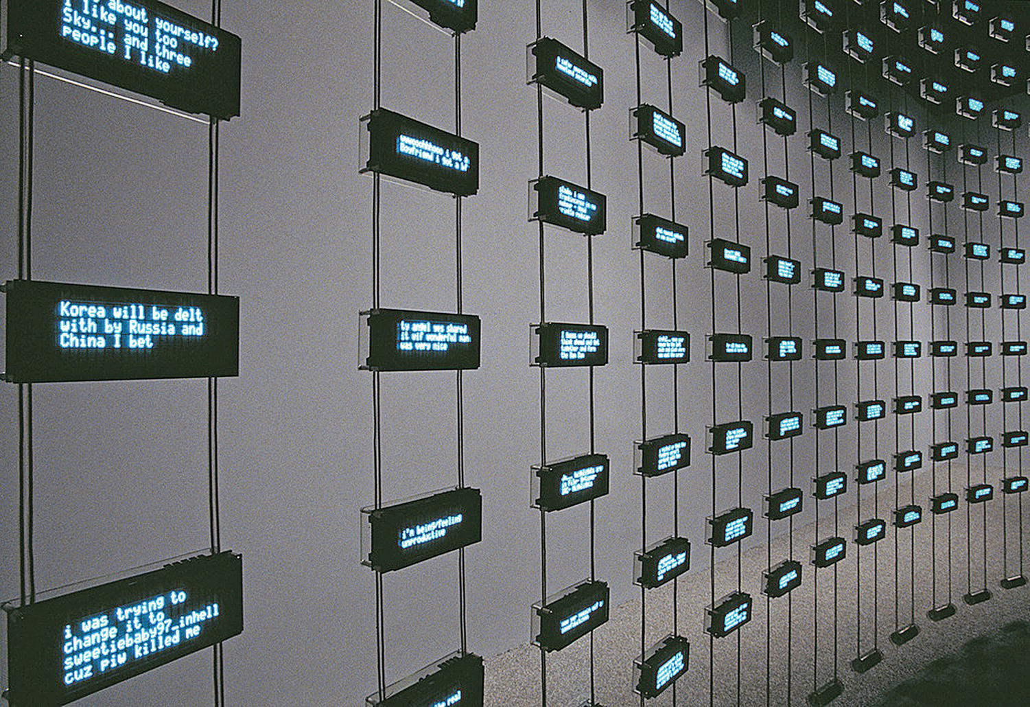
Figure 19.2 Ben Rubin and Mark Hansen, Listening Post, 2001. Installation shot, detail.
One could argue that Listening Post is not a visualization because the spatial patterns are pre-arranged by the artists and not driven by the data. This argument makes sense but I think it is important to keep in mind that, while layouts are pre-arranged, the data in these layouts is not; it is a result of the real-time data mining of the Web. While the text fragments are displayed in pre-defined layouts (wave, checkerboard, etc.), the overall result is also always unique because the content of these fragments is always different.
If the authors were to represent the text via abstract graphical elements, we would simply end up with the same abstract pattern in every repetition of an act, but because they show the actual text changing all the time, the patterns that emerge inside the same layout are always different. This is why I consider Listening Post to be a perfect representative of the media visualization category; the patterns it presents depend as much on the content of all text fragments appearing on the screen wall as on their pre-defined composition. We can find other examples of info projects that similarly stream data into pre-defined layouts. Manuel Lima identified what he calls a “syntax” of network visualizations, including commonly used layouts such as radial convergence, arc diagrams, radial centralized networks, and others (to see his taxonomy of network display methods, select “filter by method”; Lima 2014). The key difference between most of these network visualizations and Listening Post lies in the fact that the former often rely on existing visualization layout algorithms. Thus they implicitly accept the ideologies behind these layouts—in particular the tendency to represent a network as a highly symmetrical and/or circular structure. The authors of Listening Post wrote their own layout algorithms that allowed them to control the layouts’ intended meanings. It is also important to note that they use six very different layouts that cycle over time. The meaning and aesthetic experience of this work—showing both the infinite diversity of the Web and, at the same time, the existence of many repeating patterns—to a significant extent derive from the temporal contrasts between these layouts. Eight years before Bruno Latour’s argument that our ability to create “a provisional visualization which can be modified and reversed” allows us to think differently since any “whole” we can construct is just one of numerous others (Latour 2010), Listening Post beautifully staged this new epistemological paradigm enabled by interactive visualization.
The three influential projects I considered here demonstrate that, in order to highlight patterns in the data, we don’t have to reduce it by representing data objects via abstract graphical elements. We also don’t have to summarize the data as is commonly done in statistics and statistical graphics; think, for instance, of a histogram that divides data into a number of bins. This does not mean that, in order to qualify as a “media visualization,” an image has to show 100% of the original data—every word in a text, every frame in a movie, and so on. Out of the three examples I just discussed, only The Preservation of Favoured Traces does this. Neither Cinema Redux nor Listening Post use all the available data; instead they sample it. The former project samples a feature film at the fixed rate of one frame per second; the latter project filters the online conversations using set criteria that change from act to act. What is crucial is that the elements of these visualizations are not the result of a remapping of the data into some new representation format; they are the original data objects selected from the complete data set. This strategy is related to the traditional rhetorical figure of synecdoche—in which a part is made to represent the whole or vice versa—specifically its particular case in which a specific class of object refers to a larger, more general class. (For example, in Cinema Redux one frame stands for a second of a film.)
While sampling is a powerful technique for revealing patterns in data, The Preservation of Favoured Traces demonstrates that it is also possible to reveal patterns while keeping 100% of the data. If you ever used a magic marker to highlight important passages of a printed text, you have already been employing this strategy. Although text highlighting normally is not thought of as visualization, we can see that in fact it is an example of a media visualization that does not rely on sampling.
Cinema Redux and The Preservation of Favoured Traces also break away from the second key principle of traditional visualization: the communication of meaning via new spatial arrangements of the elements. In both projects, the layout of elements is dictated by the original order of the data—shots in a film, sentences in a book. This is possible and also appropriate because the data that these projects visualize is not the typical data used in datavis. A film or a book are not just a collection of data objects, they are narratives made from these objects (i.e., the data has an assigned sequential order). Although it is certainly possible to create effective visualizations that remap a narrative sequence into a completely new spatial structure as Listening Post does—see also Writing Without Words (2008) by Stefanie Posavec and The Shape of Song (2001) by Martin Wattenberg—Cinema Redux and The Preservation of Favoured Traces demonstrate that preserving the original sequences also can be effective.
Preserving the original order of data is particularly appropriate for the visualization of cultural data sets that have a time dimension. We can call such data sets “cultural time series.” Whether it is a feature film (Cinema Redux), a book (The Preservation of Favoured Traces), or a long Wikipedia article (History Flow), the relationships between the individual elements (film shots, the book’s sentences) and also between larger parts of a work separated in time (film scenes, the book’s paragraphs and chapters) are of primary importance to the work’s evolution, meaning, and its experience by users and viewers. While we consciously or unconsciously notice many of these patterns during the watching and reading of or interaction with the work, the strategy of projecting time into space—meaning, laying out movie frames, book sentences, magazine pages in a single image—gives us new possibilities to study the work. Thus, space starts to play a crucial role in media visualization after all: it allows us to see patterns between media elements that are normally separated by time.
Let me finish this discussion with a few more examples of media visualizations created at my own lab, the Software Studies Initiative. 5 Inspired by the artistic projects that pioneered the media visualization approach, as well as by the resolution and real-time capabilities of interactive super-visualization systems such as HIPerSpace (35,840 x 8000 pixels = 286,720,000 pixels total; see Graphics, Visualization and Virtual Reality Laboratory 2010) developed at the California Institute for Telecommunication and Information Calit2 (www.calit2.net) where our lab is located, my group has been working on techniques and software to allow for interactive explorations of large sets of visual cultural data (see Software Studies Initiative 2014). Some of the visualizations we created use the same strategy as Cinema Redux—arranging a large set of images in a rectangular grid. However, the fact that we have access to a very high resolution display sometimes allows us to include 100% of data—as opposed to having to sample it. For example, in Mapping Time we created an image showing 4553 covers of every issue of Time magazine published between 1923 and 2009 (Manovich and Douglass 2009a). We also compared the use of images in the Science and Popular Science magazines by visualizing approximately 10,000 pages from each magazine during the first decades of their publication in the project The Shape of Science (Huber, Manovich, and Zepel 2010). Our most data-intensive media visualization Manga Style Space is 44,000 x 44,000 pixels; it shows 1,074,790 Manga pages organized by their stylistic properties (Manovich and Douglass 2010) (Figure 19.3).

Figure 19.3 Jeremy Douglass and Lev Manovich, Manga Style Space, 2010. Visualization of 1 million manga pages. All manga pages are analyzed by software to measure selected visual properties. In the visualization, the pages are sorted by two of these properties: X-axis shows standard deviation of grayscale values; Y-axis corresponds to entropy, depicting the range from low detail/no texture/flat images to high detail/texture/3D. We don’t see any distinct clusters, but only continuous variation. This example suggests that our standard concept of “style” may not be appropriate for looking at particular characteristics of big cultural samples since “style” assumes presence of distinct characteristics, not continuous variation across a whole dimension.
Like Cinema Redux, Mapping Time and The Shape of Science make equal the values of spatial variables to reveal patterns in the content, colors, and compositions of the images. All images are displayed at the same size and arranged into a rectangular grid according to their original sequence. Essentially, these direct visualizations use only one dimension, with the sequence of images wrapped around into a number of rows to make it easier to see the patterns without having to visually scan a very long image. However, we can also turn such one-dimensional image timelines into 2D, with the second dimension communicating additional information. Consider the 2D timeline of Time covers we created in Timeline (Manovich and Douglass 2009b). The horizontal axis is used to position images in the original sequence: time runs from left to right, and every cover is arranged according to its publication date. The positions on the vertical axis represent new information—in this case, average saturation (the perceived intensity of colors) of every cover which we measured using image analysis software.
Such mapping is particularly useful for showing variations in the data over time. We can see how color saturation gradually increases until Time’s publication reaches its peak in 1968. The range of all values (i.e., variance) per year of publication also gradually increases, but it reaches its maximum value a few years earlier. It is perhaps not surprising to see that the intensity (or “aggressiveness”) of mass media as exemplified by changes in the saturation and contrast of Time covers gradually rises up to the end of the 1960s. What is unexpected, however, is that since the beginning of the 21st century, this trend is reversed: the covers now have less contrast and less saturation.
The strategy used in this visualization is based on a familiar technique, the scatter graph. However, if a normal scatter graph reduces the data displaying each object as a point, we display the data in its original form. The result is a new graph type, which is literally made from images and can be appropriately called an “image graph.”
Conclusion
In conclusion, I want to return to the key topic of this chapter—a move from traditional visualization that relies on extreme compression of the information to “visualization without reduction,” which I defined as visualization that shows a much richer set of data objects’ properties and/or all media objects directly. I see this move as a very positive one, because it allows one to think about data patterns and details without the dramatic reduction that was at the core of traditional visualization techniques. These 19th-century data reduction techniques (thematic map, bar plot, line graph, timeline, etc.) were the tools of a modern Panopticon society obsessed with classifying and controlling its subjects and resources. This does not mean that we can’t use them today for comparisons between qualities, for understanding temporal or spatial trends, or in many other situations. (We still use arithmetic and logic developed two thousand years ago, and calculus developed in the 17th and 18th centuries.) What is crucial today is to understand that traditional data visualization techniques are no longer the only option for visually exploring data of networked cultures.
If we can visualize data with much less or no reduction, we can focus on individual variations rather than summaries. This would also allow us to think about the full range of diversity in the social and cultural phenomena. In contrast, the use of classical visualization techniques often hides this diversity; variations and outliers can get lost when everything is reduced to a few summary bars (for example, dividing a society into a few ethnic groups or two genders or a few income classes), or described by a simple statistical model.
As data sets are quickly increasing in size today, we have now entered the real race. Media visualization techniques such as sampling a larger set of frames from a feature file in Cinema Redux works well for one film or a handful of films. But imagine trying to visualize millions of YouTube videos! Even the largest among currently used displays, such as HIPerSpace, would not be able to show sampled frames from more than a few hundred videos at best. And if we try to show millions of videos, we would have to reduce each one to a single point—which would be no better than using traditional bar charts or line graphs to show main tendencies in the data.
As this example demonstrates, the dramatic growth in the size of the data sets since the second part of 2000s (that is, the rise of Big Data) challenged everything we learned about visualizing data. We need artists to invent new techniques to deal with the mega-scale of contemporary data at the level of individual variations, and engineers and computer scientists to create appropriate hardware and software to support these techniques.
How to deal with the new scale of information and at the same time represent its variability and diversity is a major new challenge for visualization artists, as well as the design community. To make a comparison with modernism again, modernist artists showed the visible reality we saw with our unmediated vision (landscape, a person, groups of objects, and so on)—while filtering it through various styles (impressionism, post-impressionism, cubism, expressionism, etc.). But now our key challenge is no longer how to “see differently” or “make it new”—instead we need to learn how to see at all, given the scale of the data our world generates.
References
- Ball, Philip. 2004. Critical Mass. London: Arrow Books.
- Beck, Harry. 1931. “London Underground Map.” http://britton.disted.camosun.bc.ca/beck_map.jpg (accessed October 21, 2014).
- Chen, Chaomei. 2005. “Top 10 Unsolved Information Visualization Problems.” IEEE Computer Graphics and Applications 25(4): 12–16. doi: 10.1109/MCG.2005.91.
- Dawes, Brendan. 2004. “Cinema Redux.” http://brendandawes.com/projects/cinemaredux/ (accessed October 21, 2014).
- Friendly, Michael, and Daniel J. Denis. 2001. “Milestones in the History of Thematic Cartography, Statistical Graphics, and Data Visualization.” http://www.datavis.ca/milestones (accessed October 21, 2014).
- Fry, Ben. 2005. “Distellamap.” http://benfry.com/distellamap/ (accessed October 21, 2014).
- Fry, Ben. 2009. “Preservation of Favoured Traces.” http://benfry.com/traces/ (accessed October 21, 2014).
- Graphics, Visualization and Virtual Reality Laboratory. 2010. “Research Projects: HIPerSpace.” http://vis.ucsd.edu/mediawiki/index.php/Research_Projects:_HIPerSpace (accessed October 21, 2014).
- Huber, William, Lev Manovich, and Tara Zepel. 2010. “The Shape of Science.” http://www.flickr.com/photos/culturevis/sets/72157623862293839/ (accessed October 21, 2014).
- InfoVisLab. 2014. “Research.” http://ivl.cns.iu.edu/research/ (accessed October 21, 2014).
- InfoVis:Wiki. 2013. “Information Visualization.” http://www.infovis-wiki.net/index.php?title=Information_Visualization (accessed October 21, 2014).
- Keim, Daniel A., Florian Mansmann, Jörn Schneidewind, and Hartmut Ziegler. 2006. “Challenges in Visual Data Analysis.” In Tenth International Conference on Information Visualization, 9–16. London: IEE. doi: 10.1109/IV.2006.31.
- Koblin, Aaron. 2005. “Flight Patterns.” http://www.aaronkoblin.com/work/flightpatterns/ (accessed October 21, 2104).
- Latour, Bruno. 2010. “Tarde’s Idea of Quantification.” In The Social after Gabriel Tarde: Debates and Assessments, edited by Mattei Candea, 145–162. London: Routledge.
- Lima, Manuel. 2014. “Visual Complexity.” http://www.visualcomplexity.com/vc/ (accessed October 21, 2014).
- Manovich, Lev. 2002. “Data Visualization as New Abstraction and Anti-Sublime.” http://manovich.net/index.php/projects/data-visualisation-as-new-abstraction-and-anti-sublime (accessed October 21, 2014).
- Manovich, Lev, and Jeremy Douglass. 2009a. “Mapping Time.” http://www.flickr.com/photos/culturevis/4038907270/in/set-72157624959121129/ (accessed October 21, 2014).
- Manovich, Lev, and Jeremy Douglass. 2009b. “Timeline.” http://www.flickr.com/photos/culturevis/3951496507/in/set-72157622525012841/ (accessed October 21, 2014).
- Manovich, Lev, and Jeremy Douglass. 2010. “Manga Style Space.” http://www.flickr.com/photos/culturevis/4497385883/in/set-72157624959121129/ (accessed October 21, 2014).
- Marchand-Maillet, Stéphane, Eric Bruno, and Carol Peters. 2007. “MultiMatch Project - D1.1.2 - State of the Art Image Collection Overviews and Browsing.” http://puma.isti.cnr.it/linkdoc.php?icode=2007-EC-030&authority=cnr.isti&collection=cnr.isti&langver=en (accessed October 21, 2014).
- Posavec, Stefanie. 2008. “Writing without Words.” http://www.stefanieposavec.co.uk/-everything-in-between/#/writing-without-words/ (accessed October 21, 2014).
- Posavec, Stefanie, and Greg McInerny. 2009. “The Evolution of The Origin of Species.” www.visualcomplexity.com/vc/project.cfm?id=696 (accessed October 21, 2014).
- Purchase, Helen C., Natalia Andrienko, T.J. Jankun-Kelly, and Matthew Ward. 2008. “Theoretical Foundations of Information Visualization.” In Information Visualization: Human-Centered Issues and Perspectives. Lecture Notes in Computer Science No. 4950, edited by Andreas Kerren, John T. Stasko, Jean-Daniel Fekete, and Chris North, 46–64. Berlin and Heidelberg: Springer. doi: 10.1007/978-3-540-70956-5_3.
- Rodenbeck, Eric. 2008. “Information Visualization is a Medium.” Keynote lecture delivered at Emerging Technology Conference, San Diego, California, March 3–6.
- Rubin, Ben, and Mark Hansen. 2001. “Listening Post.” http://ear-test.earstudio.com/?cat=5 (accessed October 21, 2014).
- Software Studies Initiative. 2009a. “Anna Karenina. ”https://www.flickr.com/photos/culturevis/sets/72157615900916808/ (accessed October 21, 2014).
- Software Studies Initiative. 2009b. “Hamlet.” https://www.flickr.com/photos/culturevis/sets/72157622994317650/ (accessed October 21, 2014).
- Software Studies Initiative. 2014. “Cultural Analytics.” http://lab.softwarestudies.com/p/cultural-analytics.html (accessed October 21, 2014).
- Theus, Martin. 2013. “Mondrian.” www.theusrus.de/Mondrian/ (accessed October 21, 2014).
- Tufte, Edward. 1983. The Visual Display of Quantitative Information. Cheshire, CT: Graphics Press.
- Tufte, Edward. 1990. Envisioning Information. Cheshire, CT: Graphics Press.
- Tufte, Edward. 1997. Visual Explanations: Images and Quantities, Evidence and Narrative. Cheshire, CT: Graphics Press.
- Tufte, Edward. 2006. Beautiful Evidence. Cheshire, CT: Graphics Press.
- Tufte, Virginia, and Dawn Finley. 2002. “Minard’s Data Sources for Napoleon’s March.” http://www.edwardtufte.com/tufte/minard (accessed October 21, 2014).
- van Ham, Frank, Martin Wattenberg, and Fernanda B. Viégas. 2009. “Mapping Text with Phrase Nets.” IEEE Transactions on Visualization and Computer Graphics 15(6): 1169–1176. doi: 10.1109/TVCG.2009.165.
- Viégas Fernanda B., and Martin Wattenberg. 2003. “History Flow. ”http://www.bewitched.com/historyflow.html (accessed October 21, 2014).
- Viégas Fernanda B., and Martin Wattenberg. 2010. “Interview: Fernanda Viégas and Martin Wattenberg from Flowing Media.” http://infosthetics.com/archives/2010/05/interview_fernanda_viegas_and_martin_wattenberg_from_flowing_media.html (accessed October 21, 2014).
- Wattenberg, Martin. 2001. “The Shape of Song.” http://www.turbulence.org/Works/song/ (accessed October 21, 2014).
- Weskamp, Marcos. 2005. “Flickrgraph.” http://www.visualcomplexity.com/vc/project_details.cfm?id=91&index=91&domain= (accessed October 21, 2014).
- Wikipedia. 2014. “Tag Cloud.” http://en.wikipedia.org/wiki/Tag_cloud (accessed October 21, 2014).