Chapter 6: Descriptive Statistics – Univariate Analysis
Generating Descriptive Statistics for Continuous Variables
Investigating the Distribution of Horsepower
Adding a Classification Variable in the Summary Statistics Tab
Computing Frequencies for Categorical Variables
Creating a Filter Within a Task
Before you begin any statistical test, you should spend some time “getting to know your data.” This chapter describes ways to examine both continuous and categorical data using a variety of techniques, including descriptive statistical measures such as means and standard deviations as well as graphical techniques such as histograms and box plots. The term univariate describes single variables and not the relationship between variables, which is a topic discussed in several of the later chapters in this book (such as correlation and regression).
This step is so important because understanding your data is necessary when you are choosing appropriate statistical tests to perform. Also, describing your data, especially using graphical techniques, is one way to spot possible errors in your data.
Generating Descriptive Statistics for Continuous Variables
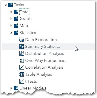
Let’s use the CARS data set, which is located in the SASHELP library, to demonstrate how to produce descriptive statistics for continuous and categorical variables. Start by selecting Summary Statistics from the Statistics tab on the Tasks and Utilities Tasks menu, as shown in Figures 6.1 and 6.2 below.
Figure 6.1: Selecting Summary Statistics from the Statistics Task Menu
Double-click this selection to bring up the following screen.
Figure 6.2: DATA Tab for Summary Statistics

As with almost every statistical task, the first tab you see is the DATA tab. It is here where you select the SAS data set that contains your data and select which variables you need for various roles. Because you want to analyze data from the Cars data set in the SASHELP library, you click the Select a Table icon, choose the SASHELP library and the Cars data set. This data set contains variables such as the price of the car (MSRP), the weight, type of car, and so on.
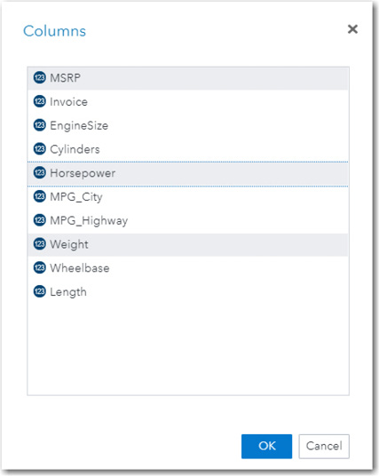
The next step is to select variables to analyze. Click the plus sign in the Roles section of the pane to bring up a list of variables in the Cars data set. You can select variables in two ways. One is to hold down the Ctrl key and left-click each of the variables that you want to select. The other method is to click one variable, hold down the Shift key, and then click a variable farther down in the list. All the variables from the first to the last will be selected. You can even combine these two methods to select variables. In the following example, the variables of interest are not next to each other in the list. Therefore, you can hold down the Ctrl key and click on each of the variables MSRP, Horsepower, and Weight. It looks like this:
Figure 6.3: Selecting Variables for Analysis
Once you click OK, you can click the OPTIONS tab to select or deselect statistics and plots that you want to generate. (See Figure 6.4.)
Figure 6.4: OPTIONS Tab
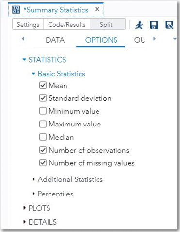
Notice that many of the statistics boxes are already checked. You can select additional statistics or click on a box to deselect a statistic that has already been selected. In this example, the Number of missing values and a request for the median have been added to the default list and the two options Minimum and Maximum value have been deselected. It is very useful to see both the number of nonmissing observations along with the number of observations with missing values.
One other useful statistic is the 95% confidence interval (95% CI) for the mean. The 95% confidence interval for the mean is useful in determining how accurately your sample mean estimates the mean of the population from which you drew your sample.
To request this statistic, click the triangle to the left of the heading Additional Statistics. This reveals a further set of choices as shown in Figure 6.5.
Figure 6.5: Additional Statistics

When you check the box for Confidence limits for the mean, the option below, labeled Confidence level, displays the default value of 95% for the confidence level. You can select other intervals, but 95% is the one most commonly used.
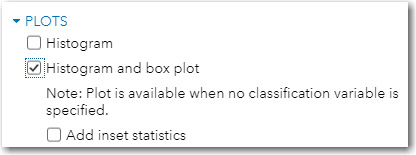
Finally, you can also select plots using the OPTIONS tab. Here you are requesting a histogram and box plot for the selected variables (Figure 6.6 below).
Figure 6.6: Requesting a Histogram and Box Plot
You are ready to click the Run Icon.
The first section of output shows basic statistics for the selected variables.
Figure 6.7: Descriptive Statistics for Selected Variables
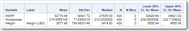
You see the mean, standard deviation, median, the number of nonmissing values, and the number of missing values for each of the analysis variables. The last two columns in the table represent the lower and upper 95% confidence limits for the mean.
The next section of output consists of a histogram and, directly below it, the box-plot for each variable. To save space, only two histograms, one for MSRP and one for Horsepower, are shown in the two figures that follow.
Figure 6.8: Histogram and Box Plot for MSRP
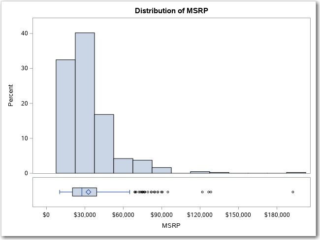
You can see that the histogram for MSRP has some very large values on the right side of the distribution (probably because of some very expensive luxury cars). This distribution is described by statisticians as being skewed to the right. If there are extreme values on the left of the distribution, it is said to be skewed to the left—the terms right and left indicate which side of the distribution contains extreme values.
Figure 6.9: Histogram and Box Plot for Systolic

A detailed discussion of box plots is presented later in this chapter. For now, we will concentrate on the histogram. The histogram for Horsepower is also positively skewed, easily seen by the long tail on the right side of the histogram.
Investigating the Distribution of Horsepower
Let’s use the variable Horsepower to demonstrate how to further investigate the distribution of a continuous variable. One way to do this is to select Distribution Analysis from the list of
Statistics tasks. Make sure that the Cars data set is selected on the DATA tab and Horsepower is selected as the analysis variable. Click the OPTIONS tab to bring up the following menu:
Figure 6.10: Options for the Distribution Analysis Tab
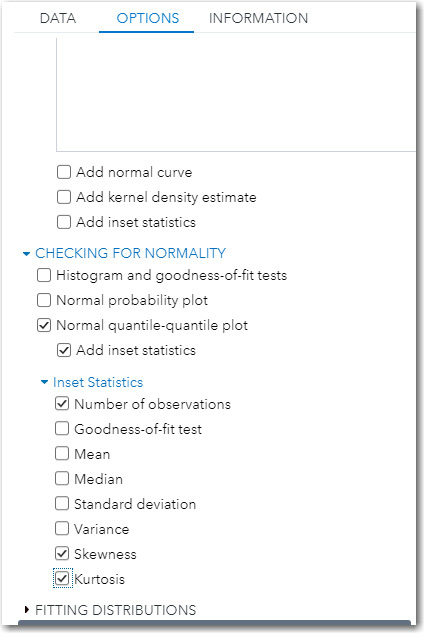
Because you have already produced a histogram from the Summary Statistics tab, you first want to deselect the box next to Histogram. Next, you have a choice of options for checking for normality. In this example, you are requesting a Normal Quantile-Quantile (Q-Q) plot with added inset statistics (values placed in a box on the plot). A Q-Q plot displays the quantiles of one distribution on the X axis and the quantiles of another distribution on the Y axis. A quantile is the proportion or percent of a distribution that falls below a given value. For example, 25% of the data values will fall below the 25th percentile. The Q-Q plot produced by SAS displays the quantiles of a theoretical distribution (in this case, a normal distribution) on the X axis and the actual quantile for your sample distribution on the Y axis. If you have normally distributed data, the Q-Q-plot will fall along a straight line.
Two popular statistics that quantify deviations from normality, Skewness and Kurtosis, are selected to be displayed in an inset box on the Q-Q-plot. We will discuss these two terms shortly. Clicking the Run icon produces the following plot:
Figure 6.11: Q-Q-Plot for Horsepower

The straight line on the plot represents a normal distribution with the same mean and standard deviation as the variable Horsepower. The circles on the plot represent values of horsepower from your sample data. At the bottom of the Q-Q plot, you see that the theoretical normal distribution has a mean (Mu) equal to 215.89 and a standard deviation (Sigma) equal to 71.836.
To help you understand this Q-Q plot, look at the right side of the plot. The circles above the straight line on this part of the plot indicate that your sample data includes values of horsepower that are higher (more extreme) than you would expect if horsepower values were normally distributed. This confirms the strong positive skewness that you saw in the histogram.
Values for Skewness and Kurtosis close to zero result from distributions that are close to normal. Positive values for skewness, as in this plot, indicate a positively skewed distribution (extreme values in the right tail). Positive values for kurtosis (as in this example) indicate both that the distribution is too peaked (leptokurtic) and that the tails (left and right side of the distribution) contain more data values than a normal distribution. Negative values for kurtosis indicate that the distribution is too flat (platykurtic) and that there are too few data values in the tails of the distribution.
When it is time to run statistical tests on horsepower and various categorical variables of interest, you might be concerned that the distribution for horsepower deviates quite noticeably from a normal distribution. Because the sample size of the Cars data set is relatively large (428 observations), you might feel comfortable in running parametric tests such as t tests and ANOVA. Parametric tests rely on the data values being distributed in a specific way, such as a normal distribution. Nonparametric methods are often described as distribution-free methods. Those types of decisions will be explored in later chapters that discuss inferential statistics.
Adding a Classification Variable in the Summary Statistics Tab
Suppose you want to see if horsepower is related to the number of cylinders? It would be reasonable to assume that vehicles with more cylinders would have more power. Before you begin this investigation, it would be a good idea to investigate the Cylinders variable. The next section describes how to do this.
Computing Frequencies for Categorical Variables
The first step is to select One-Way Frequencies from the Statistics menu, as shown in Figure 6.12.
Figure 6.12: Select One-Way Frequencies from the Statistics Task

Next, be sure the Cars data set in the SASHELP library is selected. Under the Roles tab, click on the plus (+) sign and select the variable Cylinders.
Figure 6.13: Select Your Analysis Variable(s)

Click the Run icon to obtain the output displayed in Figure 6.14.
Figure 6.14: Frequency Distribution for the Variable Cylinders

Who knew there were three- and five-cylinder cars? Because some of these categories contain so few observations, let’s restrict our comparison of horsepower to four- and six-cylinder cars. To accomplish this, you need to create a filter, which is the subject of the next section.
Creating a Filter Within a Task
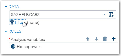
You can select which rows in a table to include in an analysis. It’s easy to do. Go back to the Distribution Analysis task and on the DATA tab, click the Filter icon. (See figure below.)
Figure 6.15: Creating a Filter
This brings up the filter box as shown next.
Figure 6.16: Selecting Cars with Four or Six Cylinders

If you are familiar with how to use a WHERE clause in SQL, you already know how to create a filter—simply write the contents of the WHERE clause, leaving out the word WHERE. If you are unfamiliar with WHERE clauses, it’s quite simple. In the example shown here, you are asking if the variable Cylinders is equal to 4 or 6. It is very important not to write this expression as:
Cylinders = 4 or 6
This expression makes sense if you are speaking to another person, but not as a computer statement. You have to explicitly repeat the name of the variable for each part of this expression as shown in Figure 6.16.
Because SAS treats any numeric value other than zero or missing as “true,” the expression above would evaluate each part of the OR operator. One part is Cylinders = 4. The other part is 6. Because 6 is not zero or missing it is evaluated as “true.” If one part of an OR expression is true, the entire expression is true. Strange as it sounds, the expression above will not cause an error message to be printed, and all values of the variable Cylinders will be included in the analysis.
Other examples of filter expressions are shown below:
|
Filter Expression |
Filter Syntax |
|
Horsepower greater than 150 |
Horsepower > 150 |
|
Horsepower between 100 and 200 |
Horsepower between 100 and 200 |
|
Horsepower is not missing |
Horsepower is not missing alternative: Horsepower is not null |
|
Gender is M or F |
Gender = 'M' or Gender = 'F' |
|
Cylinders is not equal to 3 or 5 |
Cylinders ne 3 and Cylinders ne 5 |
Notice the quotation marks around the M and F in the Gender example. You need quotation marks (either single or double) for all character values. Whenever SAS Studio shows you a list of variables to be selected, notice the symbols ![]() or
or ![]() before the variable names. The symbol 123 indicates a numeric variable, and the A in a triangle represents a character (Alpha) variable. For logical expressions, you can use symbols or mnemonics as show in the table below.
before the variable names. The symbol 123 indicates a numeric variable, and the A in a triangle represents a character (Alpha) variable. For logical expressions, you can use symbols or mnemonics as show in the table below.
|
Logical Comparison |
Mnemonic |
Symbol |
|
Equal to |
EQ |
= |
|
Not equal to |
NE |
^= |
|
Less than |
LT |
< |
|
Greater than |
GT |
> |
|
Less than or equal to |
LE |
<= |
|
Greater than or equal to |
GE |
>= |
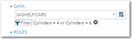
Once you click APPLY, the filter expression shows up next to the Filter icon. (See Figure 6.17.)
Figure 6.17: The Filter Condition Is Displayed
Now that you know how to set up a filter, let’s continue with the Data Distribution task under the Statistics tab. To see a distribution of Horsepower for four- versus six-cylinder cars, select the variable Cylinders in the Group analysis box under the Additional Roles drop-down list in the DATA tab, as shown next.
Figure 6.18: Choosing Your Grouping Variable

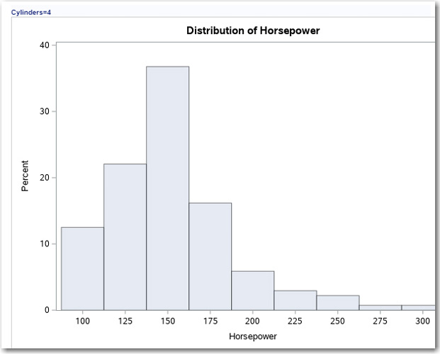
Make sure that you have checked the box next to Histogram on the OPTIONS tab and run the program. This produces a histogram of Horsepower for four- and six-cylinder cars. The histogram for four-cylinder cars is shown in Figure 6.19.
Figure 6.19: Distribution of Horsepower for Cars with Four Cylinders
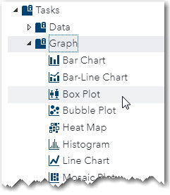
An interesting way to display a single distribution or to see several distributions side-by-side is to use the Box Plot option on the Graph Task menu, as shown in Figure 6.20.
Figure 6.20: Selecting a Box Plot on the Graph Task
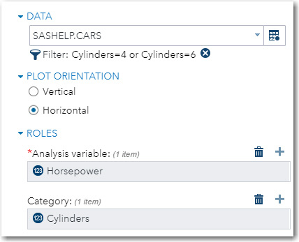
A box plot is a part of a collection of plots and techniques called exploratory data analysis (EDA). Let’s run the Box Plot task first and then describe what you are seeing. Make sure you re-enter your filter criteria, select a horizontal orientation (this makes the display more compact), choose Horsepower as the Analysis variable and Cylinders as the Category variable as shown in Figure 6.21.
Figure 6.21: Requesting a Horizontal Box Plot for Horsepower Broken Down by Cylinders
It’s time to run the task. The result is shown in Figure 6.22.
Figure 6.22: Box Plots Showing Horsepower for Four- and Six-Cylinder Cars

For each value of Cylinder, you see a box, lines coming out of each side of the box, and some small circles on the right side of the display. The vertical line within each box represents the median. Remember that half the values of your data fall below the median, and half the values in your data fall above the median. The median is also referred to as the 50th percentile. The small diamond in the box represents the mean. True believers of EDA would not include the mean; however, it is useful to see where the mean lies with respect to the median. Because both of these distributions are positively skewed (the tail is to the right), you expect the mean to be higher than the median, and that is confirmed by the box plots shown here. The left and right side of the box represents the 25th percentile and the 75th percentile, respectively. The 25th and 75th percentile are also referred to as the first quartile (Q1) and the third quartile (Q3). Notice that the box contains 50% of all the data values and the distance between Q1 and Q3 is called the interquartile range. Wow, that’s a lot of terminology! The horizontal lines on the left and right side of the box represents any data values within 1.5 interquartile ranges below Q1 or above Q3. Finally, the small circles that you see on the display represent outliers—values that are more than 1.5 interquartile ranges above Q3 or below Q1. They represent the data that you see in the right tail of the histograms shown earlier.
Before you conduct statistical tests on your data, it is a good idea to explore your data with the descriptive techniques (both tables and graphical output) described in this chapter. Knowing the shapes of distributions for continuous variables may affect your choice of statistical tests to perform. Frequency analysis will enable you to determine how many items (observations) belong to each category of a categorical variable. Both of these tasks also have the ability to uncover data errors.
1. Using the data set IRIS in the SASHELP library, generate summary statistics for variables PetalLength and PetalWidth. Include the mean, standard deviation, median, the number of nonmissing observations, and the number of missing observations. Using the tab ADDITIONAL ROLES, request the 95% confidence limits. Finally, request a histogram for the variable PetalLength.
2. Using the same data set in exercise 1, check for normality for the variable PetalLength. Add a Normal Quantile-Quantile (Q-Q) plot and compute skewness and kurtosis for this variable.
3. Using the same data set in exercise 1, compute one-way frequencies for the variable Species.
4. Using the same data set in exercise 1, generate a horizontal box plot for the variable PetalLength using Species as the category variable. Use a filter to remove the species “Virginica.”
5. Using the data set Heart in the SASHELP library, investigate the distribution of the variable Weight, broken down by the variable Sex. Using the Anderson-Darling test for normality, would you reject the null hypothesis (at the .05 level) that Weight is normally distributed?
6. Using the data set Heart in the SASHELP library, produce a histogram and box plot for Weight and Height separately for males and females (variable Sex with values of F and M).
7. Using the data set Cars in the SASHELP library, create a horizontal box plot for Invoice (invoice price) for each value of the variable Cylinders. Do this again with a filter to restrict the rows in the table to 4 or 6 cylinders. Hint: Your filter expression should be: Cylinders = 4 or Cylinders=6.