
Chapter 12. Dmaic Model: ‘A’ is for Analyze
What is the Objective of This Chapter?
The objective of this chapter is to take you through the various steps of the Analyze phase of the Six Sigma DMAIC model so that you can apply them on projects at your organization. We will use a case study to demonstrate how the steps of each phase are executed in real world projects.
Purpose of the Analyze Phase
Let’s go back to our equation CTQ is a function of one or more Xs or CTQ = f(X1, X2, Xi,....Xn) where:
• CTQ is a measure of your problematic key indicator.
• Xi represents the ith factor that causes your CTQ to be problematic.
We completed the Define phase and identified our CTQ(s).. Next, we completed the Measure phase by operationally defining, conducting measurement systems analysis, and collecting baseline data for our CTQ(s)..
This chapter focuses on the third phase, the Analyze phase, whose purpose is for team members to identify the factors or Xs that cause your CTQ to be problematic.
The six main deliverables for the Analyze phase are:
• Detailed flowchart of the process
• Identification of potential X’s for the CTQs
• Failure Modes and Effects Analysis (FMEA) to reduce the number of Xs
• Operational definitions of Xs
• Data Collection plan for Xs
• Validate the measurement system for Xs
• Test of theories to determine critical Xs
• Develop hypotheses/takeaways about the relationships between the critical Xs and CTQ(s)
At the end of the Analyze phase, the team conducts a tollgate review with the Project Champion, Black Belt, and Process Owner. This is where the team reviews what they have learned in the Analyze phase and make a ‘go-no go’ decision on the project. If yes and if everyone is satisfied with the teams work the team proceeds to the Improve phase.
The Steps of the Analyze Phase
Detailed flowchart of current state process
The first step in the Analyze phase is for the team to complete a detailed flowchart of the process under study. Remember from Chapter 3: Defining and Documenting a Process, which a flowchart is a pictorial summary of the steps, flows, and decisions that comprise a process. There are two types of flowcharts you can use to create a detailed flowchart of your process:
Process flowchart: A flowchart that lays out process steps and decision points in a downward direction from the start to the stop of the process.
An example of a process flowchart for an adult health assessment is seen below in Figure 12.1 with starbursts representing opportunities for improvement in the process.
Figure 12.1. Process Flowchart Example
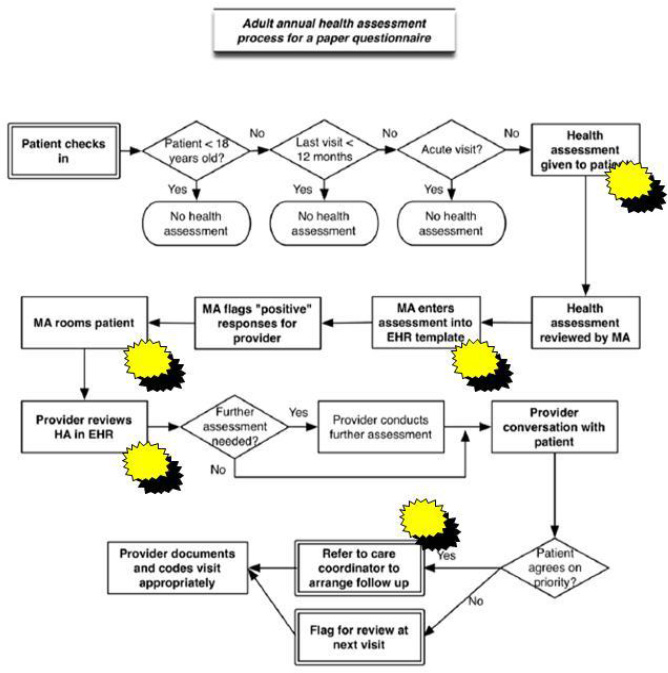
Source: modified from ahrq.gov
Deployment flowchart: A flowchart which is organized into ‘lanes’ which show processes that involve various department, people, stages or other categories.
An example of a deployment flowchart for a medication reconciliation process is seen below in Figure 12.2 with starbursts representing opportunities for improvement in the process.
Figure 12.2. Deployment Flowchart Example
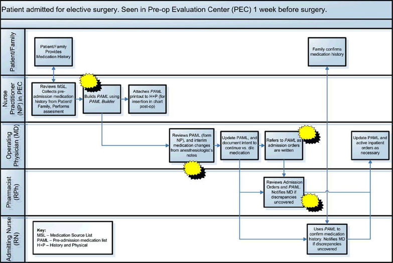
Source: modified from ahrq.org
We recommend using a deployment flowchart if you have a process with multiple departments or employees responsible for different parts of the process, as well as tracking the number and location of handoffs within the process; otherwise a process flowchart will do the trick!
Identification of potential Xs for CTQ(s)
The next step in the Analyze phase is to identify potential Xs for your CTQ(s). There are various ways to identify potential Xs including: from a flowchart, from experts, from the internet, talking to experts, from benchmarking, from cause and effects diagrams, from data analysis, from the list of 70 change concepts, and from other sources.
From the Flowchart
A common method used by team members to identify the Xs in a process is from a detailed process flowchart created in the first step of the Analyze phase (Gitlow and Levine, 2004; Gitlow and et. al, 2005). The purpose of a flowchart in the Analyze Phase is to provide a “detailed” picture of the process under study. The definition of “detailed picture” is that the flowchart should provide the necessary specificity required to identify all potential Xs that might affect each CTQ.. It is important to understand the current process to be able to effectively standardize and improve it. Understanding the current process requires a flowchart with enough detail so that team members can identify the points in the process impacted by the Xs. Team members manipulate the Xs to create the improved process.
Team members should go through the detailed flowchart step by step asking the following questions to identify potential Xs:
• Why are steps done? How else could they be done?
• Is each step necessary?
• Are they value added and necessary? Are they repetitive?
• Would a customer pay for this step specifically? Would they notice if it’s gone?
• Is it necessary for regulatory compliance?
• Does the step cause waste or delay?
• Does the step create rework?
• Could the step be done in a more efficient and less costly way?
• Is the step happening at the right time? (in sequence or parallel)
• Are the right people doing the right thing?
• Could steps be automated?
• Does the process contain proper feedback loops?
• Are roles and responsibilities for the process clear and well documented?
• Are there obvious bottlenecks, delays, waste or capacity issues that can be identified and removed?
• What is the impact of the process on all stakeholders; this includes other processes?
From Experts
Another way to identify potential Xs is to ask people who are experts in the process under study. Many times you will be able to go back to your Voice of the Customer interviews from the Define phase and go through them to see if there are any potential Xs there. Now that you have a better understanding of the process and have analyzed some data you may want to go back and re-interview certain stakeholders that are experts in the process.
From the Internet
If you are trying to solve a problem odds are you aren’t the first person in the world trying to solve that specific problem! So many times there is no need to reinvent the wheel, just go to your favorite search engine on the internet and see what you can find.
From Brainstorming
Brainstorming is a way to elicit a large number of ideas from a group of people in a short period of time (Gitlow and Levine, 2004; Gitlow and et. al, 2005). Members of the group use their collective thinking power to generate ideas and unrestrained thoughts.
Brainstorming is discussed in detail in Chapter 6.
From Cause and Effect Diagram
A cause and effect diagram is used if there is only one CTQ in a Six Sigma project, while a cause and effect matrix is used if there are 2 or more CTQs in a Six Sigma project. A Cause and Effect (C&E) diagram also known as an Ishikawa or fishbone diagram is a tool used to organize the possible sources of variation (Xs) in a CTQ and assist team members in the identification of the most probable causes (Xs) of the variation. Cause and effect diagrams are discussed in detail in Chapter 6. Recall, the data for a cause and effect diagram can come from a flowchart. Frequently, the data for a cause and effect diagram comes from a brainstorming session, but for our purposes, we will think of a flowchart as a tool useful in identifying the Xs related to a CTQ (Gitlow and Levine, 2004; Gitlow and et. al, 2005). .
Failure Modes and Effects Analysis (FMEA) to reduce the number of Xs
Many times you will identify an enormous amount of Xs in the first part of the Analyze phase (Gitlow and Levine, 2004; Gitlow and et. al, 2005). However, operationally defining and collecting data on all of those Xs is not feasible due to the amount of time it takes. One way to reduce the number of Xs is to create a Failure Modes and Effects analysis, which you learned about in Chapter 6: Understanding Non-Quantitative Techniques: Tools and Methods, for all of the Xs identified.
An internal committee of experts in the process under study is typically assembled to assign values for Severity (how severe is the X), Occurrence (how often does it happen), and Detection (how easy is it to detect) for each of the Xs you have identified. You can use the scales for Severity, Occurrence, and Detection shown in Chapter 6 or you may want to create your own that make more sense to the context of your business. Also, often times using severity, occurrence, and detection may not make sense for your particular Xs, so you may want to create different variables to help reduce the number of Xs.
Multiplying these values together gives you an RPN which will help you prioritize and select Xs that you want to explore further to see if they are critical. One way you can compare the RPNs is to take the RPNs from the FMEA analysis and put them into a Pareto diagram to help prioritize them.
Operational Definitions for the Xs
Once you have reduced your list of Xs to a manageable number the next step is to operationally define each X (Gitlow and Levine, 2004; Gitlow and et. al, 2005).
Recall, an operational definition contains three parts: a criterion to be applied to an object or group, a test of the object or group, and a decision as to whether the object or group met the criterion.
(1) Criteria - Operational definitions establish “Voice of the Process” language for each X and “Voice of the Customer” specifications for each X.
(2) Test - A test involves comparing “Voice of the Process” data with “Voice of the Customer” specifications for each X, for a given unit of output.
(3) Decision - A decision involves making a determination whether a given unit of output meets “Voice of the Customer” specifications.
Problems, such as endless bickering and ill-will, can arise from the lack of an operational definition. A definition is operational if all relevant users of the definition agree on the definition.
Operational definitions are discussed in detail in Chapter 6: Understanding Non-Quantitative Techniques: Tools and Methods.
Data Collection plan for Xs
Once you have operationally defined the Xs, the next step is to create a data collection plan to lay out how you will collect the data on the Xs in terms of defining what you are going to measure, defining how you are going to measure it, defining who will collect it and the sampling plan. See the example below in Table 12.1 on creating a data collection plan for the number of courier pickups per day of pathology slides from various labs in a hospital.
Table 12.1. Data Collection Plan for Xs
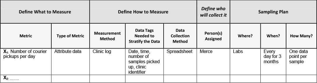
Defining what to measure
Measure – what is the name of the X you are collecting data on?
Type of metric – is the data for this X attribute or measurement data?
Define how to measure
Measurement method – will the data be collected visually or via automated collection (i.e. extracted from a database)
Data tags needed to stratify the data - Data tags are defined for the measure. Such as time, date, location, tester, line, customer, buyer, operator etc.
Data collection method – will the data be collected manually, on a spreadsheet, via a computer?
Define who will collect it
Person(s) assigned – who will be assigned and held accountable for the data collection?
Sampling plan
Where? – what is the location where the data will be collected?
When? – when and how often will the data be collected? How long will data be collected for?
How many? – how many data points will be collected for each sample?
Validate Measurement System for X(s)
The next step in the Measure phase is to validate the measurement system we are using to measure the baseline data for our Xs. Measurement systems analysis was discussed in detail in Chapter 6: Understanding Non-Quantitative Techniques: Tools and Methods and in the Measure phase in Chapter 11: DMAIC Model: ‘M’ is for Measure (Gitlow and Levine, 2004).
Test of theories to determine critical X’s
Once you have collected data for each X, the next step is to then determine hypotheses that determine if the selected Xs truly impacts the stability, shape, variation, and mean of the CTQ(s) so that you can come up with solutions in the Improve phase.
The way we do this is by testing of the theories that we have for each critical X identified earlier in the Analyze phase. When you initially identified Xs you had a theory on how each X affected the CTQ. Now that you have collected data on each X, it is time to put that theory to the test to see which Xs affect the CTQ(s).
Test of theories consists of 3 elements: Theory, Analysis, Conclusion
1. Theory – this is where you state the theory for each X in terms of how you believe it impacts the CTQ
2. Analysis – this is where you determine whether each X is critical to the CTQ via statistical methods, process knowledge, or a review of the literature.
Statistical methods
Team members can use statistical methods to test a theory between an X and a CTQ. For example, after the team has collected baseline data in the Analyze phase they analyze that data to determine if that X affects the center, spread, shape, and stability of the CTQ. The following statistical methods can be used to help determine if an X is critical or not:
• Does the data for the X exhibit any patterns over time?
Tools: A line graph or a run chart is used to study raw baseline data over time.
• Is the data for the X stable? Does it exhibit any special causes of variation?
Tools: Control charts are used to determine the stability of a process.
• If the X is not stable (exhibits specials causes of variation), then where are the special causes of variation so appropriate corrective actions can be taken by team members to stabilize the process?
Tools: Again, a control chart is used to identify where and when special causes of variation occur. However, they are not used to identify the causes of special variations. Tools such as log sheets, brainstorming, and Cause and Effect diagrams are used to identify the causes of special variations.
• What is the distribution of the data?
Tools: A histogram or a dot plot helps us understand the distribution of the data
• If the baseline data for the CTQ is stable, then what are the characteristics of its distribution? In other words, what is its spread (variation), shape (distribution), and center (mean, median and mode)? Is the baseline data what we expected when undertaking the project?
Tools: Basic descriptive statistics such as mean, median, standard deviation
Mean – is the process average, is the process average what we expected it to be?
Median – is the middle number and
Standard deviation – tells us about the spread or variation of our data about the mean
Process knowledge
Often times, teams do not have access to good data and due to their familiarity with the process are able to use process knowledge to determine if an X is critical or not. Process knowledge is the result of studying the theory of a process, or the result of experience with a process that reinforces the theory of the process. For example, “lean manufacturing” theory explains the direct relationship between batch size and cycle time; if batch size is decreased, then cycle time is decreased. Sometimes the solution is obvious or seems obvious, so you just make your best guess, try it and see what happens.
Review of the literature
A review of the literature can be used to develop a hypothesis. For example, in the trade journal of the Linen Supply Association of America (LSAA), The Linen Supply News, an article reported a study that suggests a statistically significant negative relationship between “dryness of sheets after processing” and “thread count of sheets.”
3. Conclusion – based on your analysis this is where you state whether the X is critical or not to the stability, shape, variation, and mean of the CTQ.
Develop hypotheses/takeaways about the relationships between the critical X’s and CTQ(s)
Team members develop hypotheses that explain the relationships between specific critical Xs and each CTQ. A hypothesis states a premise about a CTQ, for example, the mean value of CTQ > 25 units, or about a relationship between variables, for example, CTQ = a – b1X1 + b2X2. CTQ = a – b1X1 + b2X2 is a hypothetical statement of: “If I increase X1, then CTQ will decrease by b2, and if I increase X2, then CTQ will increase by b2,” assuming there is no interaction between X1 and X2.
Say for example, you have 10 Xs, X1 through X10, and you believe only that X3, X5, and X8 are critical Xs with X5 being a main driver, your hypothesis would be CTQ = f (X3, X5, X8) with X5 being the primary driver
Go / No Go Decision Point
Once all of the tasks and sub-tasks of the Analyze phase have been completed the project leader (Black belt) reviews the project with the Master Black Belt who critiques the Six Sigma theory and method aspects of the project. Then, a member of the Finance Department critiques the financial impact of the project on the bottom-line, a member of the Information Technology department critiques the computer/information related aspects of the project, a member of the Legal department comments on legal issues, if any, the Process Owner critiques the process knowledge aspect of the project, and the Champion critiques the political/resource aspects of the project.
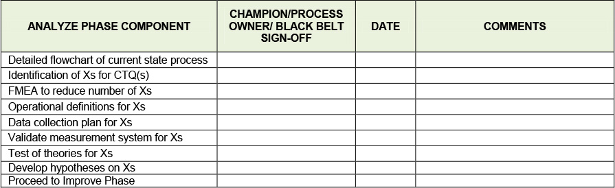
Finally, if all of the elements are acceptable a tollgate review is scheduled where the Six Sigma team presents its project to their Champion and the Process Owner for approval, see Table 12.2 below. After each phase the team presents their project in a similar way.
Table 12.2. Analyze Phase Tollgate Review Checklist
At this point a go-no go decision on the project must be made. Are the benefits what we thought they were? Do they justify the time and resources we are spending on the project to the level that we want to continue? Do we want to change the focus of the project? The Project Champion and Process Owner will typically make this decision keeping in mind the mission of the organization while making this decision.
Keys to Success and Pitfalls to Avoid
• Flowchart the process in as much detail as possible to really understand where the pain points and opportunities for improvement lie. Also make sure to verify and validate with the process experts to make sure it is 100% correct.
• Use your stakeholders to your advantage! Much of what they say during the Voice of the Customer analysis in the Define phase can be used to identify Xs during the Analyze phase
• To help give structure to the identification of your Xs take advantage of tools and methods such as brainstorming, affinity diagrams, cause and effect diagrams
• If you are having a problem, odds are someone else has had the same problem, so use the internet or other resources to help identify Xs
• Sometimes gathering data on an X is not possible or too time consuming or an X and its solution is just plain obvious.
• As in the Measure phase, Data collection can take time, so as soon as you know what you need ask for it or start collecting it!
• Don’t rush to collect data. Spending time up front on creating a sound data collection plan will save you time later! Only collect data you need, using an FMEA to reduce the number of Xs you identified to only ones with potential of being critical Xs will save you a lot of time collecting data.
• Make sure all key stakeholders agree on the operational definition of the Xs to avoid any misunderstandings later
• Many times data collection is viewed by employees as a burden. So when creating your communication plan it may be wise to have an initiative to educate and create awareness amongst stakeholders to facilitate their cooperation and buy-in.
• Not all tools are used when testing theories, a good Black Belt will know which ones to use in different situations
• You should only end up with a few critical Xs that really impact the CTQ
Case Study: Reducing Patient No Shows in an Outpatient Psychiatric Clinic
Analyze Phase
Detailed flowchart of current state process
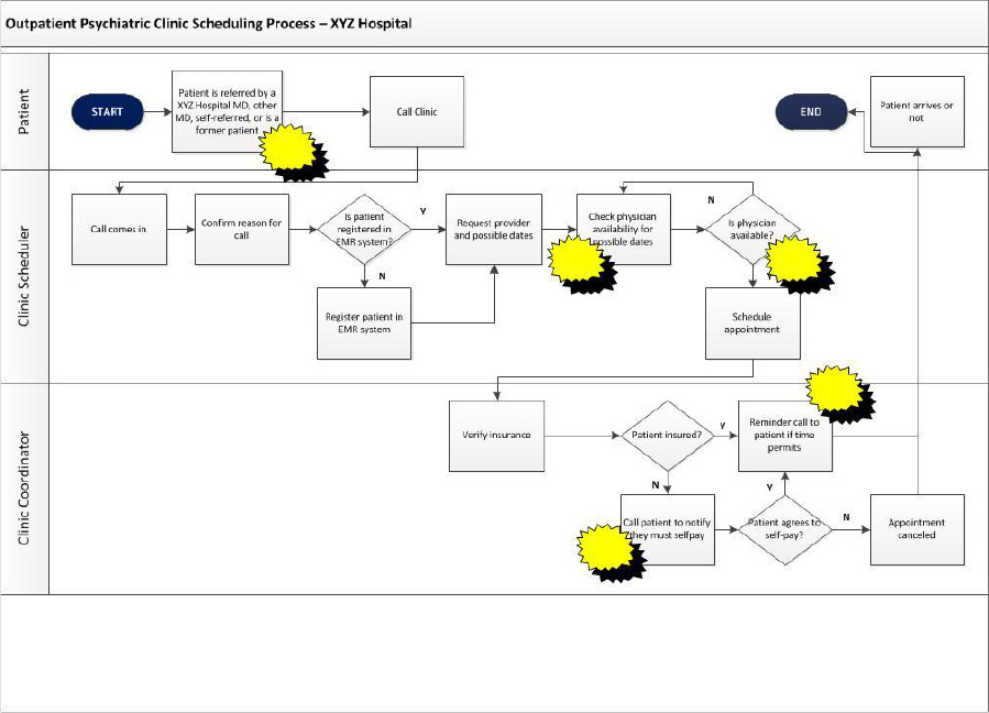
The first step of the Analyze phase had the team complete a detailed process map of the scheduling process for the Outpatient Scheduling Clinic at XYZ Hospital. The team created a deployment flowchart to illustrate the process in detail, see Figure 12.3 below. You will notice the lanes which depict who in the process are responsible for different part of the process, as well as the starbursts which represent opportunities for improvement.
Figure 12.3. Detailed Flowchart
Identification of Xs for CTQ(s)
After creating a detailed flowchart, the team used the following methods to identify Xs:
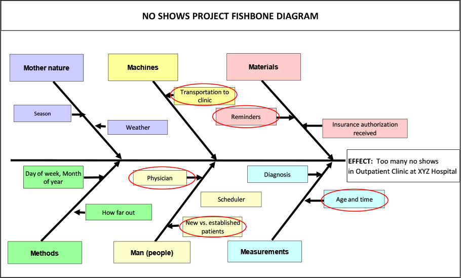
Cause and Effect Diagram
The team sat down with team members and created the Cause and Effect Diagram below in Figure 12.4 to identify Xs. After some discussion the team agreed that they would investigate a few of the Xs that came out of the Cause and Effect Diagram that made the most sense, namely:
X1: Reminder calls made to patients?
X2: How far out appointment scheduled
X3: Physician to be seen
X4: New vs. established patients
X5: Age of patient and time of appointment
Figure 12.4. Cause and Effect (Fishbone) Diagram for no Shows
Brainstorming
After doing some further brainstorming the team added another X
X6: Insurance company (payer)
They thought perhaps insurance company (X6) could be a potential X as different providers may have different copays which may de-incentivize patients from showing up.
Failure Modes and Effects Analysis (FMEA) to reduce the number of Xs
Due to the small number of Xs identified, there was no need for the team to reduce the number of Xs using FMEA.
Operational Definitions of the Xs
The team then created operational definitions of the Xs
X1: Reminder calls made to patients
Criteria: Has a reminder phone call been made to each patient prior to their visit, yes or no?
Test: Is the ‘reminder call made’ field in database populated with a Y for each patient?
Decision: If ‘reminder call made’ field is populated with a Y, patient received a reminder call, if ‘reminder call made’ field is not populated with a Y, patient did not receive a reminder call.
X2: How far out is appointment scheduled
Criteria: The number of days between when the date appointment is scheduled and the appointment date itself.
Test: Select a patient and subtract the ‘appointment date’ field in the database from the ‘date the appointment is scheduled’ field in the database.
Decision: The result of the subtraction in the Test above is how far out the appointment is scheduled.
X3: Physician to be seen
Criteria: The name of the physician the patient is scheduled to see.
Test: Open the patient record and locate the ‘physician name’ field in the database.
Decision: If the name in the field is the physician the patient is scheduled to see, then the physician is correct. If not, then the physician is incorrect.
X4: New vs. Established patients
Criteria: Has patient made a previous visit to this clinic, yes or no?
Test: Select a patient and determine if the patient had a ‘previous visit to clinic’ noted in the database
Decision: If ‘previous visit to clinic’ field is populated with a Y, then the patient is an established patient, if ‘previous visit to clinic’ field is not populated with a Y, then the patient is a new patient.
X5: Age of patient and time of appointment
Criteria: The age of the patient at the time of the visit and the time of the appointment
Test: Open the patient record and locate the ‘patient age’ field and the ‘time of appointment’ field in the database.
Decision: The value in the ‘patient age’ field is the age of the patient and the time in the ‘time of appointment’ field is the time of appointment.
X6: Insurance company (payer)
Criteria: The name of the insurance company the patient has.
Test: Open the patient record and locate the ‘insurance company’ field in the database.
Decision: The name in that field is the insurance company the patient has.
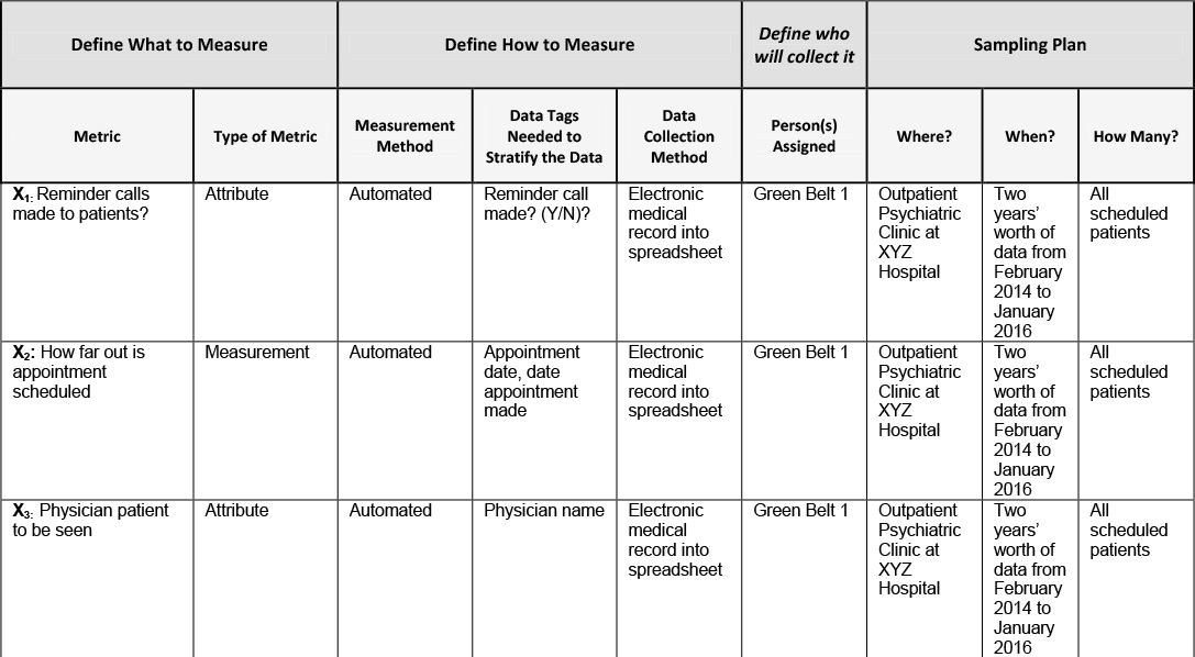
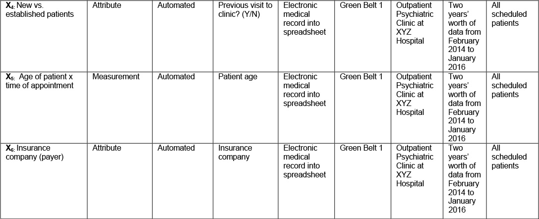
Data Collection plan for Xs
The team was confident that at least some of these Xs were responsible for the increasing the no show rate in the Outpatient Psychiatric Clinic at XYZ Hospital. The next step was to create the data collection plan below in Table 12.3 for each X so that the team could test their theories to determine which of these Xs were in fact critical!
Table 12.3. Data Collection Plan for Xs
Validate Measurement System for Xs
Since the baseline data for the Xs are coming right out of the database from the hospital’s electronic medical record system the team felt that it was unnecessary to complete a measurement systems analysis. Measurement systems analysis was discussed in detail in Chapter 6: Understanding Non-Quantitative Techniques: Tools and Methods and in the Measure phase in Chapter 11: DMAIC Model: ‘M’ is for Measure. .
Test of theories to determine critical Xs
After collecting data for each X, the next step for the team was to then determine which Xs affected the stability, shape, variability, and mean of the CTQ in the Improve phase.
They did this is by testing of the theories that they had for each critical X identified in the Analyze phase.
X1: Reminder calls made to patients
Theory:
The office makes reminder calls to patients regarding their appointments when the staff has time and the team thinks there may be a correlation between reminders and no shows. They believe that many patients may forget that they have an appointment and if given a reminder call will show up.
Analysis:
The team analyzed data in Table 12.4 to see if reminder calls decreased the amount of no shows in the clinic.
Table 12.4. Data on Reminder Calls
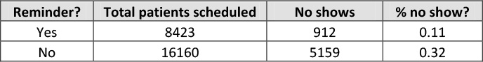
Of those 8423 patients who were given a reminder call by the staff, 912 or 11% ended up no showing. Of the 16,160 who were not given a reminder call by the staff, 5159 or 32% ended up no showing. No shows are almost three times lower when a reminder call is made absent any interaction effects.
Conclusion:
Based on the analysis above it appears that X2: Reminders is likely a critical X that affects no show rate.
X2: How far out appointment scheduled
Theory:
Team members hypothesized that the further out an appointment was made, the greater the chance that a patient would no show. The reason was that if an appointment was made too far out the patient would shop around at other hospitals to see if they could get an earlier appointment and if they could they would take it and not bother to cancel or show up.
Analysis:
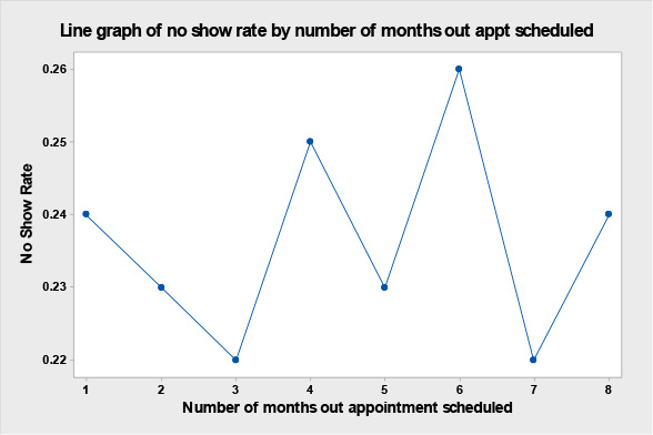
The team collected data on no show rate by how far out the appointment was scheduled. Rarely are appointments scheduled more than 8 months in advance, so they collected data on no show rates on how far out appointments were scheduled from 1 to 8 months out, the results are in Table 12.5 below and graphically displayed in the line graph seen in Figure 12.5. It seems that contrary to what the team thought that the no show rate is not affected by how far out the appointment is scheduled.
Table 12.5. Data on How Far Out Appointment Scheduled
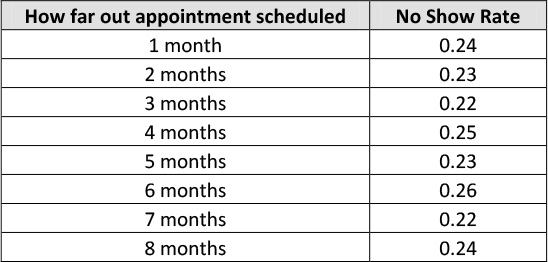
Figure 12.5. Line Graph of no Show Rate by Number of Months Out Appointment Scheduled
Conclusion:
Based on the analysis above it appears that X2: How far out appointment schedule is not a critical X as the further out the appointment is made does not affect the no show rate.
X3: Physician to be seen by patient
Theory:
The team believes that different physicians may have different no show rates due to the fact that some see more new patients who they believe may have a higher no show rate.
Analysis:
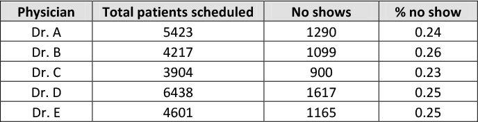
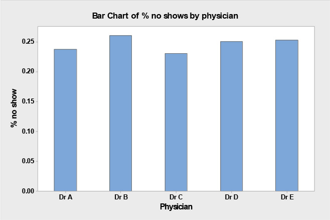
The team analyzed no show % by physician to be seen in Table 12.6 below to see if there was a difference in no show rates amongst the five physicians in the clinic
Table 12.6. No Shows by Physician to be Seen
Conclusion:
As you can see from the data in Table 12.6 and bar chart in Figure 12.6above, it seems likely that X5: Physician seen by patient is not a critical X for no shows as there is no real difference in no show rates amongst different physicians.
Figure 12.6. Bar Chart of % no Shows By Physician
X4: New vs. established patients
Theory:
The team had a theory that the new patient population seemed to have a much higher no show rate than the established patient population. Part of their reasoning was due to established patient loyalty and being comfortable with their physician. Team members further theorized that if new patients couldn’t get an appointment soon enough they would ‘shop around for a physician,’ and if they found something sooner at another hospital they would go there and not cancel their appointment at XYZ Hospital.
Analysis:
The team analyzed data on no shows rates by new vs. established patients as seen in Table 12.7 below:
Table 12.7. No Shows by New Vs. Established Patients
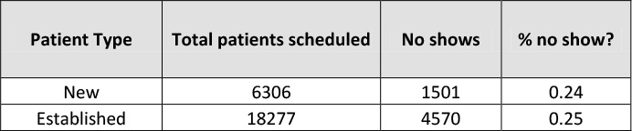
They found that new patients no showed at almost the same rate as established patients, 24% for new patients versus 25% for established patients.
Conclusion:
Based on the analysis above it appears that X4: New vs. established patients is not a critical X.
X5: Age of patient and time of appointment
Theory:
The team thinks that perhaps there is a correlation between age of patient and time of appointment and no show rate. The older the patient the less likely they are to no show in the morning because they are more responsible and less likely to sleep in, conversely the younger the patient the more likely they are to no show in the morning because they have more to do with their time and they may have had a late night the previous night.
Analysis:
The team analyzed the data in Table 12.8 regarding no show rates by age of the patient and time of the appointment to see if both variables together were a critical X that affected no shows.
Table 12.8. No Shows by Age and Time of Appointment
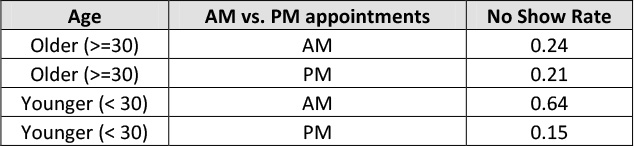
Upon analysis of the data in Table 12.8 it is obvious that an interaction exists between age of patient and time of appointment.; that is, younger patients have a much higher no show rate in the AM at .64 than older patients at .24, while in the PM the no show rates are quite similar at .21 for older patients versus .15 versus younger patients.
Conclusion:
Based on the analysis above it appears that X5: Age of patient combined with time of appointment is indeed a critical X that affects no show rate.
X6: Insurance company of the patient (payer)
Theory:
The team wondered if the volume of no shows varied by the insurance company the patient had perhaps due to the fact that some had higher co-pays than others.
Analysis:
The team collected data on the actual number of no shows by insurance company, see Table 12.9 to see if some had a higher volume than others. Next, team members used a Pareto diagram to graphically display the results.
Table 12.9. Data on no Shows by Insurance Company
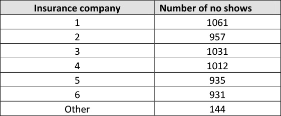
As is evidenced by the data in Table 12.9 and the Pareto diagram in Figure 12.7, the insurance company that the patient has does not seem to affect no show volume or rate.
Figure 12.7. Pareto Diagram of no Shows by Insurance Company
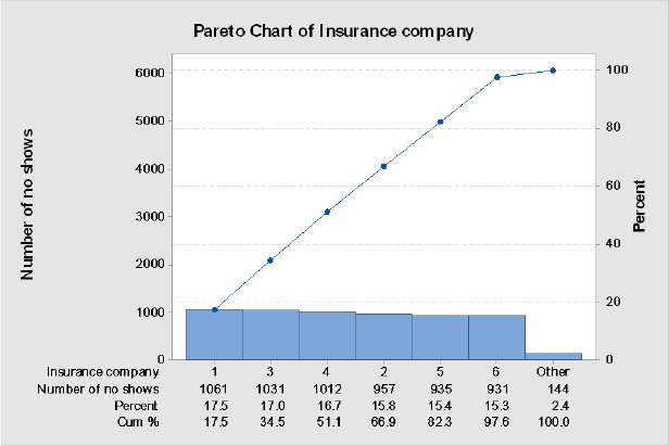
Conclusion:
Based on the analysis above, insurance company (payer) of the patient does not seem to be a critical X
Develop hypotheses/takeaways about the relationships between the critical X’s and CTQ(s)
Based on the testing of theories above, hypothesized that:
No show rate is a function of X1 (reminder calls made to patients) and X5 (age of patient combined with the time of their appointment).
The team’s hypothesis is that no show rate is CTQ = f (X1, X5).
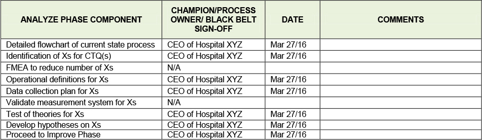
Tollgate Review - Go / No Go Decision Point
The team conducts the Analyze phase tollgate review using the Analyze phase checklist seen in Table 12.10 below with the Project Champion (the hospital CEO), the Black Belt, the Process Owner, and the rest of the team on hand. The Process Owner, the Assistant Vice President of Behavioral Health commented that the previous hospital he had worked at had used reminder calls successfully to decrease no shows and was looking forward to the team implementing them in the Improve phase.
Table 12.10. Analyze Phase Tollgate Review Checklist
Takeaways
• The Analyze phase is the third of the 5 phases in the DMAIC model
• The steps of the Analyze phase are:
• To create a detailed flowchart of the process in nauseating detail to really understand current state
• To identify Xs or factors that cause your CTQ to be problematic, Xs can be identified by many various methods
• If you have a large number of Xs, one way you can quickly eliminate them is by using FMEA
• Once you have a list of Xs, you must operationally define them, create a data collection plan for them, validate their measurement system and then collect data on them
• Next you want to test the theories you have on each of them to determine which Xs are critical Xs
• Finally you develop hypotheses about the relationships between the critical Xs and the CTQ.
References
Gitlow,H., Oppenheim,A., Oppenheim,R., and Levine,D. (2005), Quality Management: Tools and Methods for Improvement, 3rd ed., (New York: McGraw-Hill-Irwin)
Gitlow, H. and Levine, D. (2004), Six Sigma for Green Belts and Champions: Foundations, DMAIC, Tools and Methods, Cases and Certification, Prentice-Hall Publishers (Saddle River, NJ).
Additional Readings
Rasis, D., Gitlow, H. and Popovich, E., ““Paper Organizers International: A Fictitious Six Sigma Green Belt Case Study – Part 1,” Quality Engineering, volume 15, number 1, 2002, pp. 127-145. 2,” Quality Engineering, vol. 15, no. 2, pp. 259-274.
Rasis, D., Gitlow, H. and Popovich, E., ““Paper Organizers International: A Fictitious Six Sigma Green Belt Case Study – Part 2,” Quality Engineering, vol. 15, no. 2, pp. 259-274.