
10. Design Principles: Bring Focus to Your Design Decisions
The stage is set and it’s time to move into the meaty part of the design process. Maybe you’re starting with a blank screen. Or maybe, with a screen that’s so full to bursting that you don’t know where to begin to cut down on all the elements screaming for attention.
The good news is that there are many accepted principles in the field of design that can serve as a starting point for you. The challenging (but fun) news is that every design problem has something unique about it and should have a unique solution. Understanding common design principles, and creating your own, will help you create and maintain a design vision that can be used to keep your designs simple, targeted, and engaging as you move from conceptual design to implementation.
Carolyn Chandler
Whether you’re working within a current design or creating one from scratch, it’s extremely helpful to have a framework to work within. You can define a framework using design principles—commonly understood rules, assumptions, or guiding statements that define the relationships between the elements of your design. In this chapter you’ll learn how to create your own design principles, in the form of guiding statements that help you make design decisions for the unique demands of your products. But first, you’ll get an introduction to commonly understood principles that apply to most digital designs within these areas:
• Visual design principles regarding the relationship between elements in a view (such as a web page). This includes concepts such as unity, hierarchy, and balance. They provide focus on how users may see your product.
• Interaction principles regarding the way users move through the site’s spaces. This includes flows within a page (such as through an online form), and navigation. They provide focus on how users may act within your product.
• Psychology principles affecting the way users may perceive and engage with your design. This includes common perceptions that may influence if they trust your information, their engagement with other users, and their motivation to learn. They provide focus on how users may feel when using your product.
There are many great resources covering these topics in more detail; here you’ll find some of the most commonly discussed, and tips on where to find more.
Let’s start with the first thing a user is likely to notice about a site; its visual design.
Visual Design
The visual design of your product affects a user’s understanding of its brand and often affects the trust placed in the product. (After all, if someone put money into a great visual design, there’s a good chance something good is going on behind the scenes as well, right?) An effective visual design also affects viewers at a subconscious level, enabling them to glean value, relevance, and importance without making conscious judgments about the product.
Your visual design doesn’t have to be beautiful to be effective—Craigslist.com exploded despite its unadorned look, and “no-frills” can be a draw in itself. However, there are basic visual design principles that are good to focus on when designing to ensure a pleasing and usable product regardless of how sophisticated it appears. Here are some of the most common.
Unity and Variety
Unity is the degree to which elements in your design have an obvious association with each other. You can demonstrate unity in many ways—for example, with color, with shape, with style, or with the way elements are positioned in relationship to each other (also called proximity).
Of course, if everything was the same, that wouldn’t make for a very visually interesting design! By introducing some variety in the elements of a design, you can make it clear when there are differences between elements, and can add to a sense of freshness or exploration (Figure 10.1 on the next page). Part of the challenge of design is figuring out how to achieve unity in visual experience (which will help users understand) while still representing some of the different users or needs a particular product is targeting.
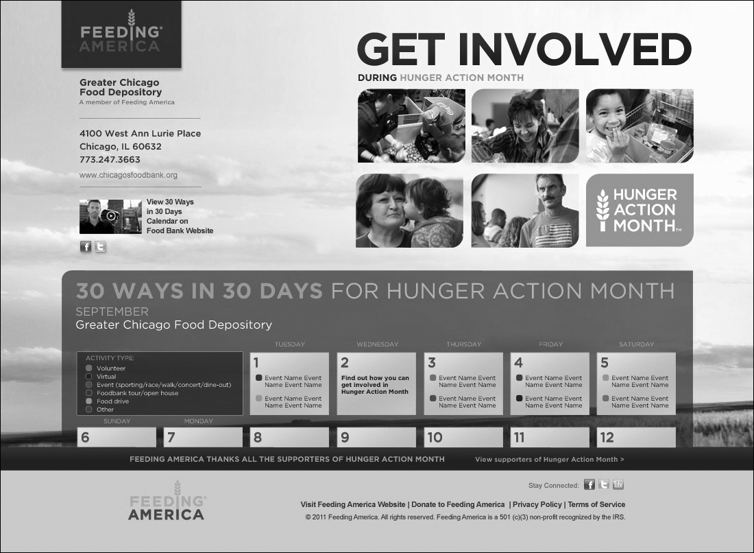
Figure 10.1 Feeding America launched a site for Hunger Action Month (which is September). The Manifest Digital designers had the challenge of balancing unity and variety—clarifying that Hunger Action Month is associated with Feeding America, while still giving the initiative its own unique identity. The Hunger Action Month logo in the middle right of the page demonstrates unity with the photos around it through shape (the semi-rounded rectangle) and proximity. The logo also demonstrates unity with the Feeding America logo in the upper left through color (the word Feeding is the same orange as the base of the Hunger Action Month logo), symbol (the wheat stalk), and font style and size. Variety is demonstrated through the distance between the two logos, the difference in shape, and additional colors used in the Feeding America logo.
Another challenge may be in representing elements in your design that vary from each other in character, but that work together for a particular purpose. For example, you may want to associate text-based information with button-based actions that you’d like users to take once they’ve read that information. In this case, you may take visually different elements and associate them with proximity, grouping or chunking information together so they appear related. If elements are disassociated by too much space, those relationships won’t be as easily understood.
See the section later in this chapter on proportion for more on situations that could affect your ability to control the proximity of elements in your design.
Hierarchy and Dominance
Hierarchy is the established order of the elements being viewed. Things higher in the hierarchy are more prominent and more likely to stand out to the viewer, while things lower in the hierarchy tend to be supportive and may seem less important. Hierarchy influences the path that a user’s eye will take when scanning a page. This is useful to keep in mind if you’re trying to encourage a particular action, like choosing to buy a product.
Some of the factors that determine a user’s understanding of hierarchy are location, color, and size of the action object (like a button) and the tone and length of any text. Generally, objects that are larger, brighter, and have higher contrast against other objects on the page have more dominance, and text that is short and commanding will attract attention as well. “Click here to add this item to your shopping cart” is less dominant than “Buy Now!” both because of visual reasons (Buy Now can be scanned by the user’s eye more quickly) and because of more active tone and urgent punctuation.
Note
Limit the number of dominant items on the page in order to have a clearer hierarchy of elements, and to make your primary actions stand out.
Images also tend to attract attention. Faces can be visually arresting, and dramatic photos will dominate the page (Figure 10.2 on the next page). Marketers are well aware of this, and many banner ads will include photos like this regardless of how relevant they are to the products being sold. Subtle—or not so subtle—animation can draw the eye.

Figure 10.2 healthychildren.org creates a visual hierarchy on the page by using size of text and prominence of image, as well as animation. The most dominant element is the photo of the baby, with an association drawn to the heading of Car Safety Seats and a clear and simple button for the action of navigating to that topic (the GO button). This area rotates through topics and associated photos, using animation to draw the eye. The Ages & Stages section and the Hot Topics section are next in prominence due to their locations and the relatively large size of their headings.
The location of elements also influences the user’s understanding of hierarchy. This is one of the areas where cultural differences come into play; for most Western languages, the order of reading is from top to bottom and from left to right, so eyes will naturally tend towards that direction when scanning a page. An element in the lower right hand side of the screen will likely be prominent when the eye rests there at the end of a scan. Arab and Semitic writing, and Chinese calligraphy, are examples of writings that are read from right to left and the natural path for eye scanning will vary for users with that familiarity. Yet another reason why it’s good to know your target audience!
Before starting to design a specific page or view, it’s helpful to list and designate the weight of all of the elements on the page, giving each a status of primary, secondary, or tertiary. This practice will help you make choices about location, size, and color to reinforce the hierarchy on the page. As your view takes shape, take a moment to step back and consider its overall hierarchy. Are the right elements dominant? If you’re not sure, give it a squint test—squint your eyes so you can’t look at all the elements individually, and pay attention to the things that really jump out at you. Or, run your designs through a usability test to see the elements users are drawn to (or missing). See Chapter 14 for more on usability testing.
As you consider your design more holistically, take a moment to understand the types of graphic elements that will span multiple pages or views. For example, you may anticipate two types of actions for the forms you design—those that help the user fill out the form (like a lookup of airport codes in a flight booking application) and those that submit the form, moving the user to the next step in the process. The latter should have more prominence because the action of submitting the form has more weight—it’s the main purpose of the form, it saves information, and it navigates the user to the next step. In defining these relationships, you’ll be creating a visual language for the site or application—a consistent treatment of elements and their place in the hierarchy, which will subtly help users understand their meaning and behavior. You can communicate visual language even in simple wireframes when the visual design is not yet set, by varying your treatment of elements (for example, using buttons for prominent elements and links for others).
Economy of Elements
Picture yourself walking into a cocktail party with a small gathering of 10 people. You strike up a conversation with one and cover some interesting topics. All of a sudden, another friend in a completely different conversation calls you over to answer a question. Immediately you hear him, your attention is drawn, and you walk over to him.
Now picture you’re at a party in the same room, with 100 people all involved in conversation. There’s a general buzz that makes it harder to hear everyone as individual voices. Your friend is going to have to shout even louder, or perhaps even come over and touch your shoulder in order to get your attention.
The same applies to design elements. A very busy design with many elements may seem like a lot of voices shouting to the user—she may not know which one to listen to, and when! In fact, a common comment heard in usability testing is that a page is too busy, or that it’s unclear where to go next. When a design has a good economy of elements—when elements on the page are purposeful, relevant, and information-rich, and when those that aren’t are removed—you are able to ensure the information can be easily digested and acted upon.
Edward Tufte is a proponent of economy in design. He introduced the concept of chartjunk as a way to describe all of the design elements that are added to chart but that have no valuable use in communicating the data (Figure 10.3). It’s often amazing just how many elements can be removed from a chart, cleaning it up and focusing on the real information that needs to be shown. 3D effects are a frequent culprit here!

Figure 10.3 3D effects on pie charts are a great example of chartjunk. The tilt in perspective, and the way it skews the lines of the chart, make comparisons inaccurate. On the left, slice #4 (the one that appears closest to you) looks much bigger than slice #3, which is just counter-clockwise to it. Seeing the same pie without the special effects shows a smaller discrepancy between the two.
A simple element can also be information-rich if you use more than one method to communicate its purpose. For example, these status icons use color, shape, and symbol to communicate their purpose, all in a relatively small and clean design). This is particularly good in the case of status, where relying simply on color would affect usability for color-blind users (Figure 10.4).
Figure 10.4 These status icons each contain three levels of information, which help reinforce their meaning. One level is shape (a circle vs. a triangle), another is symbol (a checkmark vs. an exclamation point) and the third is color. Typically the checkmark symbol would be green for a status of “good” and the exclamation would be red to serve as a warning. However, those color indicators will be lost for a color blind user, or in cases where information is printed in grayscale, so having all three levels makes a strong combination to cover those situations. Test your designs in grayscale to make sure your message is still clearly conveyed.

Proportion and Balance
A design’s proportion refers to the size relationships of its elements to each other, and to the outer dimensions of the overall design. When dealing with a fixed design, like a poster, the proportions never change, even if you change its orientation (Figure 10.5).

Figure 10.5 This print by Matt M. Cipov is completely fixed in proportion (as is everything in print form). Whether you hold it in a portrait orientation or rotate it to landscape, the image has exactly the same relationship to the text and to the sides of the page—the size and relative position of elements do not change (“Joining the Team,” www.mattcipov.com, 2011).
When dealing with a more fluid design, like an application for an iPad that must be able to shift between portrait and landscape mode, discussions around proportion become more involved!
In most digital design, where you may not have control over the dimensions of the user’s screen, you’ll need to be explicit about how fluid your design will need to be. If you want elements to change proportion between different devices or dimensions, set rules about the way elements change to adjust. Figure 10.6 shows an example and Chapter 12 explains how this affects design for mobile interface design.

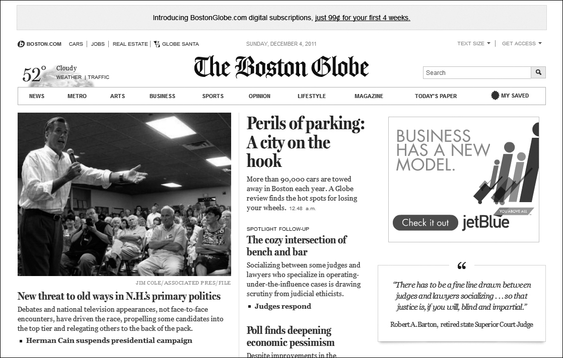
Figure 10.6 The Boston Globe has done an excellent job of creating a fluid design. The proportion and layout of elements change dynamically to adjust to the dimensions of the user’s browser window. In the first example, the window has a relatively low width, so the photo is smaller and paragraphs of text adjust to fit. In the second example, the browser window has been significantly widened, and the proportions are adjusted dynamically. The photo becomes larger, associated paragraphs widen, and a new column of content appears on the right. The proportions have changed in that the photo is now relatively larger than fixed-size elements, like the logo for The Boston Globe. Even the main navigation has changed, with Sections grouped in the more narrow view, and expanded in the wider view.
Generally, larger areas of text will be fluid, and primary navigational elements will remain grouped together but may “stick” to the top or side of the screen to ensure the user doesn’t have to keep searching for the relative location of a menu item.
Proportion is often controlled by using a grid. Grids are very apparent in most content-heavy websites, for example, where you may have grid sections for left navigation, content in a larger middle section, and related content called out on the right. Another pattern is to have all navigation at the top and dedicate more columns to content (Figure 10.7).
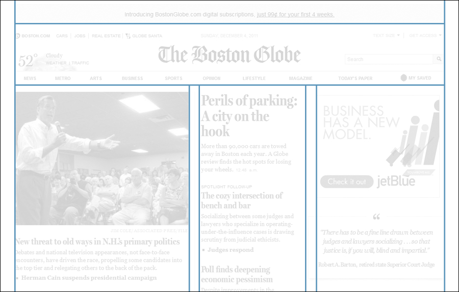
Figure 10.7 A basic grid as demonstrated using The Boston Globe screen. Note that the Globe uses two different grids—this one has three columns, while the narrow version uses a grid with only two columns.
Grids help users understand the structure of the page. Strict adherence to a grid may be very functional, but could lead to a design that appears dull or overly utilitarian. Visual designers will often intentionally break the grid in order to make some elements stand out, or to make the design more visually appealing. A balance between the two techniques can help create a design that’s both appealing and usable.
Be sure to test your grid with a variety of content, especially if you’re designing a product that has dynamic content (like news stories and articles that get posted on a regular basis). In this case it’s very important to make sure the design and content guidelines work together to create a good visual balance. Large and unintentional areas with no content can make your screen look awkward, and can also affect the usability of the page through excessive scrolling or separation of elements that should have proximity to each other.
Prevent this by talking with your content team to understand the types of content that need to appear on different views of your product, and setting guidelines such as amount of text for articles or news items so that everyone knows how to handle long and short content.
Now you’ve seen some of the most common principles to keep in mind when working with visual design elements. It’s time to move on to how the user interacts with them by looking at common interaction principles.
Interaction
An interaction doesn’t start with a click or touch. It starts with a desire to act, and the understanding that something can be acted on. This is where visual design and interaction design overlap—before a user knows which button to click, he or she has to realize that it actually is something that can be clicked. It sounds simple, but it’s a rule that’s often broken.
There are many rich sources of information on interaction design that go into depth. This section will break down the simplest steps of a user’s interaction—understanding the ability to act, acting, and then getting a response—and cover some commonly accepted principles that help guide designing for interaction.
First, more on ways you can communicate something can be acted on.
Associations and Affordance
Go to your favorite eCommerce website. Take your hands off the keyboard and mouse, and really look at the page. Can you clearly tell what you can click on and what you can’t?
If you’re on a typical site, you probably see some of the most commonly used metaphors for interaction—tabs and buttons. You can’t rifle through the tabs like a real set of folders, and you can’t press your screen and get the tactile movement and click of a button, but your associations with these objects in the physical world gives you a clear understanding of how they should work in the digital space.
Using associations like this can be very strong, but be careful—it’s also very easy to start breaking the rules and stretching your visual metaphor to the point of breaking. Around 2000, Amazon.com ran into this problem when trying to add categories to the site, making them all visible and breaking the tab metaphor (Figure 10.8 and Figure 10.9).
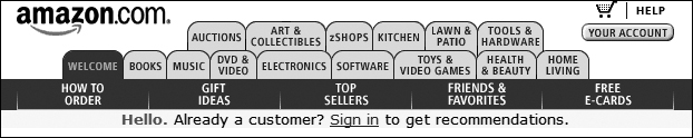
Figure 10.8 Amazon.com broke the rules of the tab association several years ago when trying to show all categories and still maintain tabs (they weren’t the only ones). Look at this closely all you’ll see the issue. If the user clicks “zShops” in the top row, does the tab stay in the back but still change the main page to go to zShops? (This breaks the way tabs work in the real world). Or does the zShops tab move to the front, rearranging all the other tabs to fit? (This breaks the user’s ability to remember tab placement when browsing, or on return visits). Thankfully this was a short-lived design and was replaced the next year with the design in Figure 10.9.

Figure 10.9 In 2001, Amazon.com replaced their confusing, metaphor-breaking tab design with this one, which is more consistent with the associations that users have with tabs. This still wasn’t an ideal representation of all of the content on the site. Amazon has since moved away from tabs as their primary navigational metaphor as you can see in Figure 10.11, opting for a longer list of categories along the left hand side, and prominent search at the top. (Historical designs can be seen using the Internet Archive Wayback Machine at http://www.archive.org/web/web.php.)
When designing objects that need to be acted on, most of the time you should make sure it follows one of these rules:
• Use an association with something of common use in the physical world that provides clues on how it is used digitally (such as tabs or buttons)
• Follow the common standards of interactive elements online, such as showing links in an obviously different color from regular text
• Consider the likely perceived affordance of the design element
An object’s affordance is the degree to which the properties of the object make it clear how it can be used. In the classic example, a baseball is round and fits well in one hand, whereas a bat is long and takes two hands to hold at the base. Someone would be more likely to throw the baseball than throw the bat. Their shapes provide affordance to how they should be used. Digital objects don’t have the physical properties, but their look, feel, and behavior can build perceived affordances that help communicate their ability to be acted on.
Elements that can be interacted with ideally are distinguished visually with color, or with effects like beveling on buttons (seen for the featured stores in Figure 10.9), which help users understand they’re clickable.
A subtle animation, like the increasing or decreasing of a glow on an object, or the movement of a page curl, can also enourage users to click.
Note
Limit the number of dominant items on the page in order to have a clearer hierarchy of elements, and to make your primary actions stand out. If your users are missing a clickable element on your screen, consider the dominance of that element (see the previous section on hierarchy) and the kind of affordance it provides, to make sure it’s clearly perceived as something that can be acted on.
A common design error is to assume that a hover-effect on a design element is enough to indicate that it’s clickable. For example, if a link isn’t clearly distinguished as a link, but the user moves the mouse over the text and an underline appears, it’s clearly a link, right?
The hover-effect approach (as the only indication of interactivity) assumes that the user is randomly moving the mouse over elements in the design in the hopes that something is clickable (Figure 10.10). Although this might be appropriate for exploratory products where you want to build some mystery—like a game where users are looking for clues—it should be used very intentionally as a design for exploration and not as a common navigational technique.
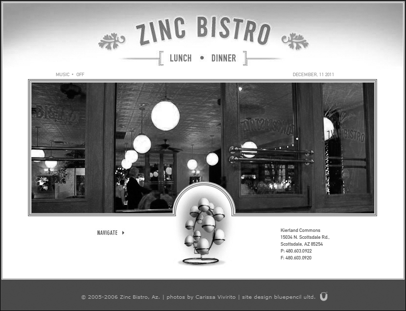
Figure 10.10 This site gives the wrong visual clues about what is clickable. You might think you could click Lunch or click Dinner at the top to see a menu, but those aren’t links. You might think you could click NAVIGATE in the lower-left, but that’s not clickable either—it’s a sign pointing to the eggs in the middle. Those eggs only become obviously clickable when the user hovers a cursor over the eggs—then some of them enlarge. As you can imagine, it’s unlikely a user is going to consider eggs an affordance for links.
Users rarely want to spend a lot of time moving around your site to find clickable elements. For products where users are trying to do work or find information quickly, it’s best to pay attention to the next topic—designing for economy of motion.
Economy of Motion
The user has gone from understanding that an action can be taken, to taking it. How quickly and effectively she can do that depends on the distance she has to travel to get to the object, and the ease with which she can act on it. On a web page, for example, a small button far from her cursor is going to take longer to use than a large one right next to it. This is the basis of Fitts’ Law.
Note
Fitts’ Law predicts that the time required to rapidly move to a target area is a function of the distance to the target and the size of the target. It’s based on a mathematical model created by psychologist Paul M. Fitts in 1954.
So why is it that most navigation is far away from where the user is likely to be—at the top and bottom edges of the screen? Partly this is to make sure it’s out of the way of changing content in the middle—but also, because the navigation is “pinned” to the edge, users are less likely to overshoot when moving to it with a cursor or pointing with a finger—so the position actually makes it a larger target.
Thinking of distance and target size may seem obvious, but it demonstrates an understanding of an economy of motion that you should be considering when designing navigational elements, and that can be easy to forget when you’re in the middle of design. When placing elements consider this:
• How far is it from the where the user probably is? Good form design, for example, takes this into account—if a user is moving through a series of fields on the far left side of the screen, buttons on the far right will take longer to click than buttons directly below the last field. If this is a highly used form, this could be annoying and inefficient.
• Are you requiring users to switch methods of input—for example, from keyboard to mouse? Switches like this are inefficient, so consider the way users may interact with a page or a task using both input methods. Keyboard-centric users will appreciate the ability to hit the Enter key, for example, rather than having to go from entering form info with they keyboard and then moving to the mouse to find and click the Submit button.
• How easy is it to act on the object? A larger target is easier to hover over and to click on—a simple large button is an example of that. Nested menus, where users have to hover to open other options and keep the menu open while they select one, can be difficult to use for some users, especially if the menu is unforgiving and disappears if the user accidentally moves the cursor off when trying to select an option (Figure 10.11).
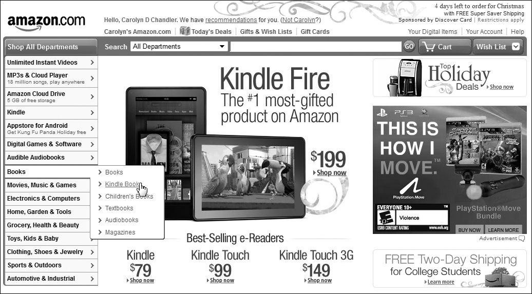
Figure 10.11 Amazon uses nested menus, which expand when the user hovers over them with a cursor (as shown here). This design only uses two levels; it’s only two because none of the options in the Books menu have additional hover states. Sites with three levels become increasingly hard to act on because the path is lost if the user moves outside of the active hover area and the menu disappears. Nested menus like these are effective when dealing with a large number of categories, but they are more difficult to act on than a simple button or link—especially for users that have difficulties with vision or fine motor control.
In addition to the economy of motion within a page, consider the number of clicks required for a user to complete a particular task. Here as well, for something used every day for critical work, a large number of clicks will become inefficient and frustrating for users.
Is it possible to take economy of motion too far? Yes, like most things, it is. Having all options closely gathered and present can be overwhelming. It’s not rare to hear a business stakeholder say, “I don’t want anything to be more than three clicks away,” as if clicks are the only economy that matters. In design you need to balance discoverability and access (which is provided if all options are up and close together) with simplicity and economy of elements, discussed in the Visual Design section above.
The user has acted, and now it’s time for the system to respond.
Response
When users act, they often have expectations for what will happen next. In products with great user experiences, their expectations are either met, or users are delightfully surprised to get something more powerful or interesting than they had expected (Figure 10.12).
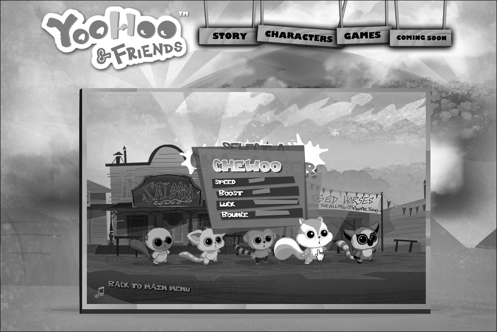
Figure 10.12 YooHoo & Friends is an online game experience for kids. Hovering over different elements causes a variety of different (and delightful) responses. For example, the YooHoo & Friends title spins, the navigation at the top sways gently back and forth, and characters themselves display different skills. (http://yoohooworldwide.com/games/fling-the-furry-5/)
In most cases, however, a difference between expectations and reality leads to frustration or annoyance instead. Some of the common culprits are:
• Poor performance, such as search results taking a long time to return. The development team you work with will often communicate potential issues with performance when in the design process. It’s a limitation that can be a design challenge, but an important one to acknowledge.
• Poor error handling. This can come in the form of a design that doesn’t do enough to prevent errors in the first place. Once an error does happen, however, the tone and clarity of the error message (and the suggestion on how to fix it, when it’s in the user’s control) are essential. Figure 10.13 shows an example of a common problem.

Figure 10.13 The image on the top demonstrates a common problem—error messages that communicate problems in language that developers understand, but users are mystified by. On the other hand, Gmail’s error message on the bottom handles a general message in a more friendly way. It uses conversational language, reassures users that they have not lost information, and gives users a clear next step to move beyond the error with a link to perform that step whenever they are ready. Of course, it would be better if the error message wasn’t necessary at all.
• Lack of feedback on results. If the user is successful in their action, ideally they know it through clear changes in the design. For example, many applications don’t give a response when the user clicks Save, but for something so important, a subtle clue that saving is happening (an animation on the Save button or a “last saved” timestamp) can be very reassuring.
Good responses reward the user with a positive result of one kind or another. It turns out that a lot of the more addictive products online—like social sites and games—are well designed to reward users with a splash of good old dopamine, a hormone that lights up the pleasure center of the brain.
Research in psychology focuses on responses like these, and on motivations for returning to products with good experiences. The next section covers some of the principles that have come out of this research.
Psychology
Up to this point the principles covered have focused mainly on aesthetics and movement—more cognitive and mechanical aspects of design (dealing with psychology at a more visceral level). However, the truly fascinating aspect of design is the pursuit of understanding the psychology behind a user’s attraction to, and engagement with, a product or experience.
The role of psychology in design is a rich area in itself, and it’s worth a deep dive into several of the resources here that cover the topic. This section will give you just a taste of some of the insights psychology research has brought to the design field, including:
• The emotional effect of an attractive design
• The personal, or intrinsic, motivation people have to take on new challenges within your product (in particular, the principles of flow and gamification)
• Social proof—or the effect that second, third, and 164th opinions and behavior can have on a user’s decisions regarding your product
First, here’s more on the importance—and unintended consequences—of an attractive design.
The Effect of Attractive Design
If you’re already working in the design field you may have heard one of the phrases that make a visual designer cringe:

For consumer products from chandeliers to mobile phones, where similar models are being compared side by side, the attractiveness of the product is clearly one way to differentiate. But is it as important for more utilitarian products like ATMs or banking websites? Aren’t features and usability more important than look-and-feel in those cases?
In his book, Emotional Design, Don Norman brought together some surprising findings in his argument for considering the emotional side of design regardless of the type of product:
• People generally perceive that an attractive product is easier to use. It turns out usability isn’t just about usability. Cross-cultural studies on ATM design showed that simple aesthetic improvements in an ATM interface, which did not affect the usability of the ATM, led to a significantly higher perception that the product was easier to use. A visually pleasing design contributes to more pleasing interaction whether or not the user’s task is completed more quickly or effectively. (This can be an issue when you’re testing a design for usability—see the sidebar below for more detail).
• An attractive design builds trust. Ever hear the story about how Van Halen trashed a concert venue after finding brown M&Ms backstage, despite the fact that their rider explicitly stated “M&Ms (WARNING: ABSOLUTELY NO BROWN ONES)?” In David Lee Roth’s biography, he claims this rider was intentionally placed there to test the venue staff’s attention to detail. The band brought large amounts of heavy, and potentially dangerous equipment into venues that hadn’t handled that type of show before, and a staff that didn’t fully read the contract could lead to major issues with the production. The presence of brown M&Ms signaled a lack of attention to detail that could be trouble. Similarly, a regard for aesthetic details (for example, alignment of elements, clear visual hierarchy, and other considerations covered in the section on visual design above) communicates an attention to detail that users often feel will carry over to other, less visible areas of the product. This has a positive impact on a user’s trust of the product.
• Pleasurable products create positive feelings and, as a result, increased creativity. When people feel stressed they tend to see problems in very narrow, black-and-white terms. This emotional response makes it more difficult for them to be creative in their approach. Customer support staffs encounter this all the time, as users frustrated with a computer issue may not consider solutions that seem obvious (hence the common support question for digital products, “is it plugged in?”). On the other hand, pleasurable products relax people and encourage a more exploratory approach to problems. Any product that requires creative thinking on the part of its users will benefit from attention to the attractiveness of the design.
Do these findings mean that aesthetic design is more important than usability? Far from it—the two work hand-in-hand to create a positive and engaging user experience. A beautiful product that doesn’t work well may get purchased, but quickly ends up in the junk drawer (physically or digitally speaking). A utilitarian product that meets a real need will get used, until a more attractive and equally useful product becomes available. Both aesthetics and usability work hand-in-hand to create something that users return to and enjoy.
Because people perceive an attractive design as easier to use, make sure you account for this when conducting usability testing. People are less likely to criticize an attractive, fully-formed design than criticize a sketch, which feels still “in draft” and easier to change. They’ll also be more likely to rate an attractive design highly even after encountering some usability issues. If you must test a complete visual design, consider testing two or more variations so users will compare the designs against each other, which helps reduce a bias towards positive feedback.
Just as attractiveness is often underrated in the design of functional things, so is the element of fun. The next section will cover some of the factors that make the interactions within a product engaging and meaningful.
Flow & Game Design
After decades of research into the positive aspects of human activity—moments of happiness and joy, for example—Mihaly Csikszentmihalyi (pronounced me-high chick-sent-me-high-ee) proposed the concept of flow in his book, Flow: The Psychology of Optimal Experience. Flow is the state of deep immersion that people feel when engaged in an activity that provides a challenge appropriate to their perceived level of skill. Along with spending time with friends, flow states brought the greatest degree of happiness among the many people who participated in Csikszentmihalyi’s research.
When people enter flow states, time passes differently. For athletes, time can slow down and seconds pass like minutes as each movement of an arm or leg has their focused attention. For artists, hours can pass as they paint the detail on a face, and to them it feels like time has been suspended.
You can never really control when the people you design for will find the level of immersion required for flow experiences, but by supporting them in your design, you’re more likely to create engaging products that help users learn the features or topics that you’re providing. Some of the conditions that contribute to flow states are:
• Presentation of an activity that has a clear set of goals. A knowledge of what needs to be accomplished, and the basic rules that apply in the activity, provides structure so the participant can focus on the activity itself.
• A particular balance between the challenges presented and the skillset that the participants perceive they have (Figure 10.14). This is where it’s extremely valuable to have an understanding of the target users of your product, and their likely skill sets; see Chapter 6 on User Research, and Chapter 7 on Personas for more on developing this understanding.
• Clear feedback regarding the participant’s performance as they perform the activity. This allows the participant to try something, see a result, and try again, learning something new at each step and building their skills.
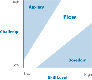
Figure 10.14 This is a version of Csikszentmihalyi’s graph demonstrating the emotional conditions that exist at different balances of challenge vs. skill. Flow states tend to happen when a user feels they are facing a great challenge that they have, or can develop, the skills to face successfully.
Game design takes flow into account, as any gamer who has lost two days to World of Warcraft or Halo can attest. Successful games provide:
• Well-structured, clearly explained, and consistent rules of interaction
• A series of well-defined and sequenced goals (for example, quests or levels within the larger scope of game play)
• Immersive game play, engaging multiple senses (for example, using visual, audible, and tactile elements)
• Feedback on performance, with the ability to try challenges multiple times to increase skill
• Social interaction, either with fellow game-players or via a community that shares tips and results
Jesse Schell, author of The Art of Game Design, defines a game as “a problem-solving activity, approached with a playful attitude.” And increasingly, the concepts of game design are being applied to new situations to build on a participant’s intrinsic motivation to complete an activity (intrinsic motivations are those that individuals feel based on internal drive rather than external rewards or penalties). For example, Quest schools use a game-like curriculum to create a fun and immersive learning environment, where students are highly motivated to explore and solve challenges (Figure 10.15).
Figure 10.15 Quest schools are designed by the Institute of Play, with locations in New York City and Chicago. Students learn cross-disciplinary skills within a challenge-based, game-like curriculum that integrates disciplines (such as math, biology, and ethics) into core classes, and also learn by designing and playing games. A digital media focus also allows them to express their creativity and develop skills in the digital space. (http://q2l.org)
An increasing number of digital products are tapping into play as a motivator for user engagement. Gamification is the process of using game design concepts to engage users in ways that aren’t traditionally considered game environments. For example, in Spigit’s FaceOff (Figure 10.16), members suggest product or service ideas, and other users vote on their favorite. Popular ideas show up on a leaderboard, enhancing the feeling of competition.
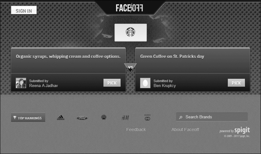
Figure 10.16 Spigit focuses on generating value for companies via products using gamification. In FaceOff, popular ideas are worth more points for the person who suggests it, and the company sponsoring that competition gets the benefit of ideas generated and validated by users (as well as the overall engagement of users with their brand, which may be even more valuable).
Gamification can also be used to encourage behavior changes that add to personal or social good. Health Month combines social gaming mechanics with information on healthy lifestyle habits, encouraging players to set and meet goals around nutrition as well as financial and mental health (Figure 10.17).
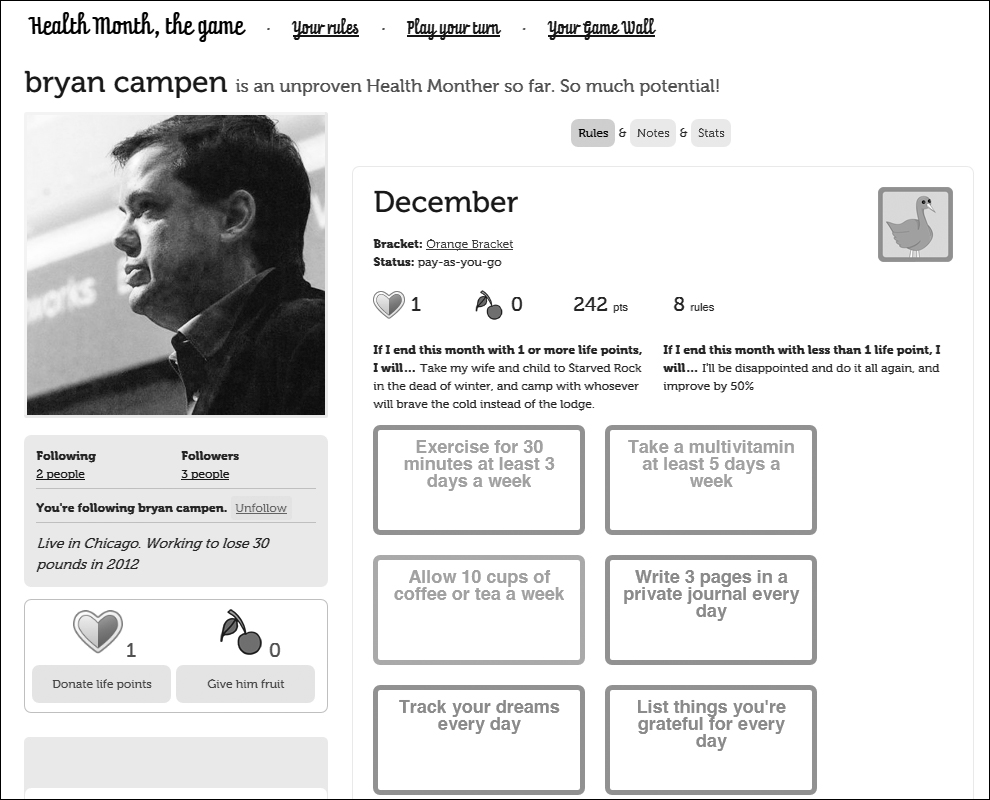
Figure 10.17 To play Health Month, users set goals and track their progress online. Points are awarded for tracking consistently and for meeting goals (more points are awarded for goals which the play anticipates will be more difficult to meet). A variety of technologies can be integrated, such as scales, pedometers, and blood pressure monitors that automatically send information to Health Month for easier tracking.
“Fun is the act of mastering a problem mentally.”
—Raph Koster, A Theory of Fun
Simply adding competitive elements, like points and badges, are not enough to make a product a truly immersive game-like experience. When trying to motivate and engage users in a playful way, be sure to focus on what their needs are, and what style of play is most appropriate. If designing a game-like experience for a non-profit, for example, competitive game play (pitting player against player) may not be as effective as collaborative game play (where players work together to achieve a goal).
When designing an experience that requires learning and problem-solving skills, consider these motivational aspects of play. Could your product provide clear goals, pleasurable activities, and constructive feedback to make the experience fun and effective?
Whether it’s to take on a dragon in World of Warcraft, or to get help finding the best web design book to buy, online social interactions are powerful things. The next section covers a principle that conveys the way users look to others to make decisions, and how digital designs can support that desire.
Social Proof
It’s been said many times; the human being is a social creature. Not only do we look to others for companionship; we rely on each other, even complete strangers, to help make decisions in the face of uncertainty.
You may have been here before: something unexpected happens in a crowd of people, like a loud argument or potential fight, and a long pause stretches out as people look to each other to figure out if someone should intervene. When situations are overwhelming or uncertain, an individual often looks to the people around him in order to understand whether an action should be taken (and if so, which one).
Online it’s no different. Faced with an overwhelming number of choices and limited time or money, the power of social proof—of popular support of a particular choice or action—may help people choose a better investment. This can help users decide anything from which product to purchase (Figure 10.18), to which document to spend time downloading and reading from a corporate intranet.
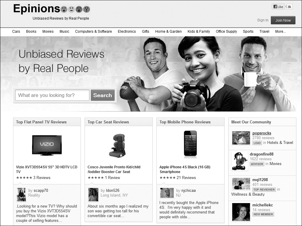
Figure 10.18 Epinions provides a platform for reviewers to share their opinions on products, which other users may use in making a decision to purchase. Highly rated products have a greater degree of social proof, which can be a compelling reason to choose them. Reviewer bios are also often convincing, and Epinions’ addition of photo, name, and location builds trust and affects ultimate choice. Notice on the right that reviewers are rewarded with status (Lead, Advisor, or Top Reviewer) for being active contributors.
Even if users can’t post content like reviews within your product, you can still bring user activity to the surface in your design to show that there are people using it, and to help support decisions in what to pay attention to (Figure 10.19).
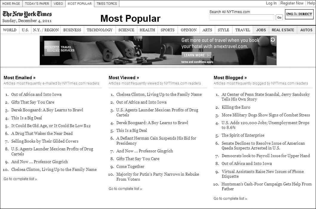
Figure 10.19 The New York Times brings up activity around stories, whether they are viewed, emailed, or blogged about. For some readers, this provides a cross-section of the articles generating the most interest—a smaller list than they would encounter if trying to visit each major section individually.
Products that don’t reflect any patterns of how they are being used are likely to appear disconnected. And in addition to appearances, they are probably missing a powerful method for both engaging users and adding valuable information that helps in decision-making.
So what happens if, early in the project, you realize that better support of decision-making is a key way to meet the needs of your users? How do you create a focus on this need and maintain it through the design process, as features are added and removed based on timelines and budget? The next section covers a method for creating your own design principles, collaboratively, to provide a consistent focus through product iterations.

Creating Your Own Guiding Principles
Up until this point, you’ve learned about design principles that are generally widely accepted by the design community, based on research that applies to most types of users. But it’s easy to get lost in a sea of recommendations and possibilities if you don’t focus your efforts on a set of guiding principles fitting your own user needs and design direction.
This section will cover the process of creating design principles in the form of research-based, memorable guiding statements that your team can use to set a vision through the unique challenges your product team encounters.
Chapter 5 introduced heuristics, which are good examples of guiding statements. The example used was:
This guiding statement applies broadly, which is why it’s one of the more widely-referenced. It’s relatively short, with a bit of qualifying description afterwards to make it more easily understandable.
Here are some tips on creating your own design principles:
• Base your design principles on research conducted with your target users. This ensures the principles are relevant, concrete, and defensible when you’re in the throes of a debate on a design decision.
• Make the main statement snappy and memorable. Ideally team members won’t need to consult a list to remember the main purpose of the principle. A small number (8–10, for example) of short, catchy statements will help the team reference them ad hoc when standing at the whiteboard.
• Only add a principle if it helps to focus the team and differentiate the product. Vague or widely-applicable principles don’t help you say “no” to features or to create a unique design—both of which are goals of good design principles. A statement like “make it easy to use” is a waste of your time, for example. A design principle should take a particular stand, like saying “choose simple relevance over precision” to help the team focus on providing a small number of relevant choices to the user rather than every possible combination. (If user-need changes over time, you can adjust your principles if you need to.) It should also help the team brainstorm ways to delight the user by exceeding expectations set with past experiences with your company or your competitors.
• Refine your principles collaboratively across the project team. Everyone on the team should be familiar with these principles and take ownership in using them as a focus during feature definition and prioritization.
Here’s an example of the creation of a design principle:
Pseudo Corporation was behind the curve in gathering useful information about its customers. In the rush to gather as much rich data as possible, the web design team has inadvertently created a site that requires users to enter an intimidating number of fields with their personal information, with no obvious statement on why that data was needed.
User research found that customers were frustrated with the amount of data entry required, especially when they were in the process of solving an issue (a situation that didn’t lend itself to a lot of patience with requests like this). To them, it felt like Pseudo was taking their time and their data without clear returns. Research uncovered the need for a principle to help the project team understand when and how to gather user information in a way that was beneficial to users as well.
To provide focus, the following principle was created:
This was a short principle that was memorable due to its play on the phrase “give and take.” In refining the statement collaboratively, the team added these test questions to help them determine when features or design decisions were being true to the principle:

The Pseudo team then used this principle whenever a requirement for another form, or another field, was added. It helped them both determine if the data should be required, and where to ask for it in the overall task flow. It also provided a prompt to discuss where additional value could be provided to the user.
Once you’ve developed a framework to help you brainstorm ideas and focus design decisions, you’re ready to open up your sketchbook or your favorite diagramming tool. The next chapters will cover some of the techniques like flows, sketches, and wireframes. It’s time to visualize!