Chapter 10. Developing with the Ajax Control Toolkit
In this chapter:
- The auto-complete extender
- Additional properties of extenders
- The Ajax Control Toolkit API
- The animation framework
The Ajax Control Toolkit is an open source project that Microsoft started in the early days of ASP.NET AJAX. It’s a collection of extenders, script controls, and client components written with the Microsoft Ajax Library. The Toolkit provides a server API for developing Ajax-enabled controls, a client API for testing client components, and a framework for creating visual effects and animations.
The project is located at the CodePlex hosting website (http://www.codeplex.com) and is owned by Microsoft’s Agility Team. Rather than agile programming (and all that implies), the name Agility refers to execution agility (meaning the team is very flexible). Agility Team launched the Toolkit project in late January 2006 to facilitate the adoption of ASP.NET AJAX extensions among web developers. The project was soon opened to contributions from the community and now includes many controls developed by non-Microsoft programmers. A new release of the project is available nearly every month and ships with the source code for controls, a sample website that demonstrates their usage, and a suite of tests written with a JavaScript framework for testing. With a bug-tracker hosted at CodePlex and a dedicated forum on the ASP.NET website, the Toolkit is one of the biggest repositories of Ajax-enabled controls and one of the best resources for learning ASP.NET AJAX.
In this chapter, we’ll explain how the Ajax Control Toolkit leverages the base framework provided by ASP.NET AJAX extensions. We’ll introduce the properties added to extenders and show you how to develop Ajax-enabled controls using the Toolkit’s API. The last part of the chapter is dedicated to the animation framework, a collection of client components for creating visual effects and animations. Let’s start by introducing the auto-complete extender, one of the numerous controls provided by the Ajax Control Toolkit.
10.1. A world of extenders
The major role in the Ajax Control Toolkit is played by extenders. As we discussed in chapter 9, extenders are server controls that wire client components to existing ASP.NET server controls. Once an extender is associated with a server control, the extended control inherits a new set of properties for configuring the client-side functionality. Interestingly, all the extenders shipped with the Toolkit are built on top of a custom API that leverages the one provided by ASP.NET AJAX to build Ajax-enabled controls. Before we go deep into the Toolkit API, let’s see how to configure and use one of the many extenders shipped with the Toolkit. To build the next example, you’ll use the auto-complete extender, which upgrades a simple ASP.NET TextBox to a text box with auto-completion capabilities. In order to run the examples presented in this chapter, you must reference the Toolkit assembly in your website. Appendix A contains instructions on how to download, install, and configure the Ajax Control Toolkit.
10.1.1. The auto-complete extender
One of the first and best examples to demonstrate Ajax capabilities was to embed an auto-complete text box in a web page. This kind of text box, usually a feature of desktop applications, can display a list of suggested words in a pop-up panel below the text field. The list of suggestions is obtained by completing the portion of text typed by the user, as soon as the user types in the text field. As shown in figure 10.1, the auto-complete text box is a good example of how to enhance a simple text box with client capabilities.
Figure 10.1. Google Suggest (http://labs.google.com/suggest) features an auto-complete text box that presents a list of suggested words with additional information about their numerical occurrences.
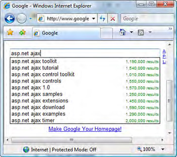
Making an Ajax request in the background lets you retrieve the list of suggestions from a database with millions of records. Without Ajax, you would have to send all the possible suggestions to the browser, embedded in the web page, and filter them using JavaScript. Millions of records can lead to a page size measured in megabytes. With Ajax, the filtering is performed on the server, and the list of suggestions is updated in real time while the user is typing.
The auto-complete functionality provided by the auto-complete extender is implemented in JavaScript. The logic is encapsulated in a client component—a behavior—called AutoCompleteBehavior. You can wire this component to an ASP.NET TextBox through the auto-complete extender without writing a single line of JavaScript code. (Behaviors and other kinds of client components were covered in detail in chapter 8.)
The following example will guide you in setting up a web page with an auto-complete text box similar to the one shown in figure 10.2. This web page should be part of an ASP.NET AJAX enabled website, which is a website configured for ASP.NET AJAX. Appendix A contains a tutorial on how to create such a website using the Visual Studio template shipped with the ASP.NET AJAX extensions installer. You must also reference the AjaxControlToolkit.dll assembly or manually add it to the website’s bin folder.
Figure 10.2. A web page with an auto-complete text box, built with an ASP.NET TextBox and the auto-complete extender
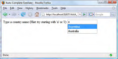
The first step is to create a new page called AutoCompleteExample.aspx. In Visual Studio 2005, switch to Design mode and drag a TextBox control from the Toolbox to the page area. Give the TextBox the ID Country. If you have the Toolkit controls listed in your Toolbox, drag the AutoCompleteExtender control and drop it near the TextBox. If you don’t have the Toolkit controls in the Toolbox, check appendix A for a walkthrough of how to add them. Dragging one of the Toolkit’s extenders in the page adds the following @Register directive at the top of the page:
<%@ Register Assembly="AjaxControlToolkit"
             Namespace="AjaxControlToolkit"
             TagPrefix="ajaxToolkit" %>
In the previous code snippet, we replaced the default tag prefix (cc1) with ajaxToolkit. If you aren’t using the Visual Studio Designer, you should manually add the @Register directive at the top of the ASP.NET page. In the Designer, click the auto-complete extender, and open the Properties panel. The panel shows all the properties exposed by the extender. Table 10.1 lists each property and the value assigned to it in the example.
Table 10.1. Values assigned to the properties of the AutoCompleteExtender in the example
|
Property |
Description |
Value |
|---|---|---|
| ID | ID of the extender control | CountryAutoComplete |
| TargetControlID | ID of the target TextBox | Country |
| ServiceURL | URL of the web service used to retrieve the list of suggestions | CountryService.asmx |
| ServiceMethod | Name of the web method that returns the list of suggestions | GetCountries |
| MinimumPrefixLength | Minimum number of characters needed to activate the auto-complete functionality | 1 |
If you switch to Source mode, you should see that the code in listing 10.1 has been generated in the page’s form tag. The TargetControlID property of the AutoCompleteExtender control is set to the ID of the TextBox. In this way, the TextBox becomes an extended control and gains the auto-complete capabilities.
Listing 10.1. Code for the ASP.NET TextBox with an associated AutoCompleteExtender control
<asp:TextBox ID="Country" runat="server"></asp:TextBox>

<asp:AutoCompleteExtender ID="CountryAutoComplete" runat="server"
                          TargetControlID="Country"
                          ServicePath="~/CountryService.asmx"
                          ServiceMethod="GetCountries"
                          MinimumPrefixLength="1" />
You can use the AutoCompleteExtender control to configure the client component that will be associated with the text box element rendered by the extended TextBox control. For example, you need to specify the URL of a local ASP.NET web service and the name of a web method that returns the list of suggestions to display. The ServicePath property contains the path to the web service, which you’ll add to the website in a moment. The ServiceMethod property specifies the name of the web method that will be called to get the list of suggestions. The last property, MinimumPrefixLength, determines the number of characters the user must type before the call to the web service is made.
Web service setup
The web service used in this example is located in the CountryService.asmx file in the root directory of the website. It exposes a web method named GetCountries, which returns a list of country names based on the text typed by the user in the text field. The code for the CountryService web service is shown in listing 10.2.
Listing 10.2. Code for the CountryService web service
<%@ WebService Language="C#" Class="CountryService" %>

using System;
using System.IO;
using System.Xml;
using System.Web;
using System.Web.Services;
using System.Web.Services.Protocols;
using System.Collections.Generic;
using System.Web.Script.Services;

[WebService(Namespace = "http://tempuri.org/")]
[WebServiceBinding(ConformsTo = WsiProfiles.BasicProfile1_1)]
[ScriptService]
public class CountryService : System.Web.Services.WebService
{
    [WebMethod]
    public string[] GetCountries(string prefixText, int count)
    {
        return GetCountriesFromXml(prefixText, count);
    }
}
The GetCountries method accepts two parameters: prefixTest and count. These two parameters must always be present in the web method signature and must be spelled exactly as in listing 10.2 (case matters); otherwise, the extender won’t work.
The GetCountries method calls a private method named GetCountriesFromXml. This method accesses the data store and returns all the countries whose name starts with the value of the prefixText parameter. The count parameter specifies the maximum number of countries to return. In the example, you store the list of countries in an XML file called Countries.xml, located in the website’s App_Data folder. Listing 10.3 shows a reduced version of the file, which contains six country names.
Listing 10.3. XML file containing the list of countries
<?xml version="1.0" encoding="utf-8" ?>
<Countries>
  <Country>Argentina</Country>
  <Country>Australia</Country>
  <Country>Germany</Country>
  <Country>India</Country>
  <Country>Italy</Country>
  <Country>United States of America</Country>
</Countries>
The XML file contains a root Countries element. The child elements are Country tags that hold the names of the countries. The GetCountriesFromXml method parses the XML file and filters the countries based on the values of the prefixText and count parameters, as shown in listing 10.4.
Listing 10.4. Code for the GetCountriesFromXml method

When a Country element is found in the XML file ![]() , its value is compared with the prefixText parameter. If prefixText contains a prefix for the current country
, its value is compared with the prefixText parameter. If prefixText contains a prefix for the current country ![]() , the name of the country is added to the suggestion list
, the name of the country is added to the suggestion list ![]() . If you reach the maximum number of suggestions allowed, you break out of the loop
. If you reach the maximum number of suggestions allowed, you break out of the loop ![]() . When the method returns, the array with the country names is serialized in JSON format and sent back to the browser. On the client side, the instance of the AutoCompleteBehavior behavior configured and instantiated through the extender is responsible for displaying the returned strings in a pop-up
panel under the extended text field.
. When the method returns, the array with the country names is serialized in JSON format and sent back to the browser. On the client side, the instance of the AutoCompleteBehavior behavior configured and instantiated through the extender is responsible for displaying the returned strings in a pop-up
panel under the extended text field.
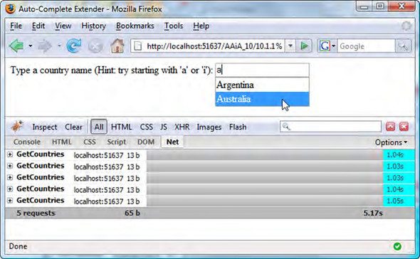
The auto-complete text box is ready to be tested: Build the website, and run the AutoCompleteExample.aspx page. When the page is loaded, type some characters in the text field (hint: start with A or I). As soon as you type a character, the CountryService web service is invoked in the background to retrieve and display the list of matching suggestions. Figure 10.3 shows the asynchronous requests sent to the web service as soon as you type in the text field. To debug the HTTP traffic, we used Firebug, an add-on for the Firefox browser. Appendix B contains an overview of Firebug as well as the instructions to download and install it.
Figure 10.3. The Firebug console in Firefox shows the asynchronous requests made to the web service to retrieve the list of suggestions for the auto-complete text box.
All of the Ajax Control Toolkit’s extenders are used similarly to the auto-complete extender. A great advantage of extenders is that, most of the time, all you have to do to enhance existing ASP.NET controls with rich client capabilities is declare an extender in the page and wire it to an ASP.NET server control. As you saw in the previous example, you do this by setting the extender’s TargetControlID property to the ID of the extended control. Due to the nature of Extenders, it’s easy to take an existing page and enhance it by adding extenders to server controls that are already there. In other words, it’s easy to start with what already works and then enhance it bit by bit by adding Toolkit controls.
The Toolkit’s extenders expose additional properties to configure the client component that provides the Ajax functionality. These properties are exposed by the custom ExtenderControlBase class, which is the class from which all Toolkit extenders derive. This class is part of the Toolkit API for building Ajax-enabled controls, which we’ll discuss in section 10.2. Now, let’s examine the additional properties available in the Ajax Control Toolkit’s extenders.
10.1.2. The ScriptPath property
Ajax-enabled controls usually reference a JavaScript file that is loaded in the page at runtime. This script file contains the code for the client component the Ajax-enabled control needs to instantiate in the web page. For example, the auto-complete extender needs to create an instance of the AutoCompleteBehavior client class, as we explained in the previous section. Usually, script files are either located in folders of the website or embedded as web resources in a separate assembly. In the case of the Ajax Control Toolkit, all the script files are embedded as web resources in the AjaxControlToolkit.dll assembly.
To load a script file from the file system rather than from the Toolkit’s assembly, you can use the ScriptPath property. This property is exposed by all the Toolkit’s controls and lets you specify the path to the script file associated with a Toolkit control. At runtime, this is the script file loaded in the page, instead of the one embedded in the Toolkit assembly.
For example, suppose you want to test or debug a modified version of the AutoCompleteBehavior component. Instead of recompiling the Toolkit project every time, you can reference the modified script file from the website as follows:
<ajaxToolkit:AutoCompleteExtender ID="AutoComplete1" runat="server"
           TargetControlID="TextBox1"
           ScriptPath="~/ScriptLibrary/AutoComplete.js" />
When the page is loaded, the AutoComplete.js file is loaded in place of the original script file associated with the auto-complete extender. In section 10.2, we’ll discuss how to leverage the Toolkit API to associate a script file with an Ajax-enabled control. Now, let’s look at another property exposed by Toolkit extenders, which is useful when you want to deal with client components at runtime.
10.1.3. The BehaviorID property
Ajax-enabled controls automatically wire client components to server controls without the need for you to write a single line of JavaScript code. This is an advantage because you don’t need to be an experienced JavaScript developer to add rich client capabilities to server controls in your web applications. Most of the time, wiring a Toolkit extender to the extended control is all you have to do to get the desired client functionality. Other times, you may need to interact with the client components that extenders or script controls instantiate in the page. Such components often expose methods and events that you can hook up on the client side as part of the client application’s logic. For example, the slider extender—one of the Ajax-enabled controls shipped with the Toolkit—can upgrade an ASP.NET TextBox to a graphical slider, as shown in figure 10.4.
Figure 10.4. Example of a slider extender running in Safari

On the client side, the slider extender creates an instance of the SliderBehavior behavior. This client component exposes a valueChanged event that is raised whenever the value of the slider changes. (We explained how to expose and handle events raised by client components in section 8.2.3.) To hook up the valueChanged event on the client side, you need to first access the SliderBehavior instance. To simplify this task, every extender in the Ajax Control Toolkit exposes a property called BehaviorID, which you can use to assign an ID to the client component instantiated by the extender. Listing 10.5 shows how to use the BehaviorID property with the slider extender to subscribe to the valueChanged event on the client side.
Listing 10.5. Using the BehaviorID property with the slider extender
<asp:TextBox ID="TextBox1" runat="server" />

<ajaxToolkit:SliderExtender ID="SliderExtender1" runat="server"
                            TargetControlID="TextBox1"
                            BehaviorID="theSlider" />

<span>You can use the slider to change the font size.</span>
<script type="text/javascript">
<!--
    function pageLoad() {
       var slider = $find('theSlider'),

       slider.add_valueChanged(onValueChanged);
    }

    function onValueChanged(sender, e) {
       var slider = sender;
       document.body.style.fontSize = slider.get_Value() + 'px';
    }
//-->
</script>
The value of the BehaviorID property becomes the value of the id property of the SliderBehavior instance. If you want to access the behavior on the client side, you have to pass the value of the BehaviorID property to the $find method, as you did in the pageLoad function.
Note
In templated controls such as the Repeater or the GridView, the BehaviorID property must be manually set to a unique ID for each item rendered by the server control. You must do this because two client behaviors can’t have the same value for the name property. Also note that BehaviorID is an optional property. If it isn’t set, the behavior still has an ID—but it’s based on the client name of the target control.
Once you get a reference to the slider on the client side, you can invoke the add_valueChanged method to subscribe to the valueChanged event. In the event handler, onValueChanged, you use the slider’s get_Value method to retrieve its value and change the font size of the page, as shown in figure 10.4.
Tip
The slider extender isn’t the only Ajax-enabled control to expose methods, properties, and events that can be accessed on the client side. For a description of all the Ajax Control Toolkit controls, browse the Toolkit sample website, located at http://ajax.asp.net/ajaxtoolkit/. The sample website is also available as part of the source code that you can download from the CodePlex website, as explained in appendix B.
In the previous sections, we’ve mentioned that the Toolkit Ajax-enabled controls are built on top of a custom API that enhances the base functionality provided by ASP.NET AJAX. In the next section, we’ll explain how to use the Ajax Control Toolkit as a platform for building extenders and script controls. Let’s see what’s under the hood of the Ajax Control Toolkit API.
10.2. The Ajax Control Toolkit API
As you learned in chapter 9, the ASP.NET AJAX framework provides base classes and interfaces for creating Ajax-enabled controls. These classes and interfaces are contained in the System.Web.UI namespace. To create an extender, you can derive from the ExtenderControl class and override the methods defined in the IExtenderControl interface. Similarly, to create a script control, you can inherit from the ScriptControl class and override the methods of the IScriptControl interface.
A big advantage of these classes is that they take care of doing most of the work related to configuring and registering the extender with the ScriptManager control. The Ajax Control Toolkit API provides new base classes for creating extenders and script controls. They extend the base functionality provided by ASP.NET AJAX and simplify the process of creating Ajax-enabled controls.
Note
If you’ve downloaded the source code for the Ajax Control Toolkit, you’ll find the API classes in the AjaxControlToolkit project, in the ExtenderBase folder. Appendix A provides instructions on how to download and install the Ajax Control Toolkit.
In the following sections, we’ll tour the main features provided by the Toolkit API. Let’s start by introducing the Toolkit’s base classes.
10.2.1. The Toolkit’s base classes
On the server side, the Ajax Control Toolkit defines two base classes: ExtenderControlBase and ScriptControlBase. The ExtenderControlBase class derives from the ExtenderControl class and is used to create extenders. The ScriptControlBase class inherits from the ScriptControl class and is used to create script controls. Figure 10.5 shows the base classes defined in the Toolkit API. All the classes defined by the API are contained in the AjaxControlToolkit namespace.
Figure 10.5. The Toolkit API provides enhanced base classes for creating extenders and script controls.

Figure 10.5 shows an additional pair of classes: The Toolkit API defines the ScriptUserControl class as the base class for creating script user controls. These controls are nothing more than web user controls—custom controls with an HTML template defined in a .ascx file—turned into script controls.
On the client side, the Microsoft Ajax Library provides the Sys.UI.Behavior and Sys.UI.Control classes for creating visual components. In turn, the Toolkit API provides base classes that encapsulate additional functionality for creating behaviors and controls. These classes are called BehaviorBase and ControlBase, and they’re shown in figure 10.6.
Figure 10.6. The Toolkit API also extends the base functionality on the client side, where new base classes for creating behaviors and controls are provided.

For the same reasons outlined in chapter 9, behaviors are usually associated with extenders. Similarly, client controls are usually associated with script controls. The same reasoning applies to the controls shipped with the Ajax Control Toolkit. Extenders usually instantiate a client class that derives from the BehaviorBase class. In the same way, script controls are usually associated with classes that inherit from the ControlBase class.
The main characteristic of the Toolkit API is that it can be considered a metadata-driven API. A whole group of metadata attributes are available to decorate classes, properties, and methods of Ajax-enabled controls.
Note
Attributes are a declarative way of defining some functionality associated with a method, a class, a field, or a property. For further reading, please browse to http://msdn2.microsoft.com/en-us/library/5x6cd29c.aspx.
As we’ll explain in the next section, the purpose of these attributes is to avoid the explicit override of the methods that return the list of script descriptors and script references to the ScriptManager control. Script descriptors and script references are generated by the base classes based on the attributes that decorate the class members. Sounds attractive, right? Let’s discuss these attributes in more detail.
10.2.2. A metadata-driven API
As we mentioned in the previous section, the Toolkit API can build script descriptors and script reference instances by inspecting attributes that decorate class members. Attributes provide extra information—about a class, a field, a method, or a property—that you can query using the reflection capabilities offered by the .NET framework.
For example, the Toolkit API defines an attribute called ExtenderControlProperty, which you can use to decorate a property of an Ajax-enabled control. When the base class filters the properties that are decorated with this attribute, it knows that those properties are mapped to properties of the client component associated with the server control. The base class can use the value of the property when, say, generating a script descriptor. In this way, you can collect all the information you need without building script descriptors manually in a child class. Table 10.2 lists the attributes defined by the Toolkit API, along with a brief explanation of what they accomplish.
Table 10.2. Attributes defined in the Ajax Control Toolkit API
|
Attribute name |
Entity decorated |
Description |
|---|---|---|
| Designer | Class | Specifies the type of the designer class associated with an Ajax-enabled control. |
| ExtenderControlProperty | Property | Maps a server property to a property of the client component. |
| ClientPropertyName | Property | Specifies the exact name of the client property mapped to a server property. |
| ExtenderControlEvent | Property | The decorated property returns the name of a JavaScript function that will handle the event specified in the attribute. |
| ExtenderControlMethod | Method | The decorated method can be invoked from the client side using ASP.NET 2.0 callbacks support. |
| ClientScriptResource | Class | Specifies the name of a script resource that contains the JavaScript code for the client component. |
| ClientCssResource | Class | Specifies the name of a web resource that contains a CSS file to load in the page. |
| RequiredScript | Class | Specifies the name of a script resource to load in the page, or a type associated with multiple script resources. The loadOrder parameter is an integer used to define the loading order of script resources in case multiple RequiredScript attributes are used. |
| RequiredProperty | Property | The decorated property must be assigned a value. |
| ElementReference | Property | The decorated property returns the client ID of a DOM element in the page. |
| ComponentReference | Property | The decorated property returns the ID of a client component in the page. |
The Toolkit’s base classes can generate a single script descriptor and multiple script references based on the attributes listed in table 10.2. Most of these attributes are used to build the script descriptor, which is responsible for generating the $create statement that instantiates and configures the associated client component in the page.
The $create method, which we introduced in chapter 8, is a powerful method that performs all the work related to component instantiation and configuration. This task is accomplished based on the arguments you pass to $create. The attributes defined by the Toolkit API can be seen as a way to build the parameters passed to the $create method. Figure 10.7 helps to clarify this concept by showing how some attributes can influence the generation of a $create statement.
Figure 10.7. Some of the attributes of the Toolkit API determine how a script descriptor generates a $create statement.

It’s time to switch from theory to practice and see some of these attributes in action. You’ll leverage the Toolkit API to build a new extender. The TextChangedExtender will let you raise an event whenever the user stops typing in a text field for a certain amount of time. In the next section, you’ll see why you would need such a control and how to wrap it in a Toolkit extender.
10.2.3. Building Toolkit extenders: the TextChanged extender
The idea behind a control like the AutoCompleteExtender, which we discussed in section 10.1.1, is to provide the user with real-time feedback. As the user enters text in a text box, data is retrieved from the server and presented to them in a pop-up displayed under the text file. Ajax makes it possible to implement this pattern by sending asynchronous requests to the web server in the background.
Many variations on the auto-complete pattern are possible. For example, you can filter the content of a GridView in real time based on the filter expression the user is typing. You can also perform a live search on the web page and highlight the matching words as soon as the user types them. We presented an example of such functionality in section 6.5, where you built the Live GridView Filter. Figure 10.8 shows this control.
Figure 10.8. The Live GridView Filter that you built in chapter 6 is an example of a control that processes user input in real time.
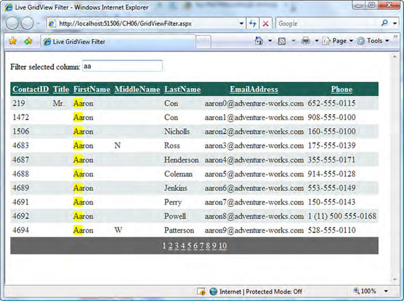
These controls need to capture the user input in real time and send an asynchronous HTTP request to the server. If you don’t pay attention to how the mechanism is implemented, you may experience a huge performance drop. Imagine an Ajax request being sent to the web server each time you type a character in a text box. Now, multiply by the number of users that might be using the real-time filtering functionality at the same time. If the website generates a high volume of traffic, the web server will be flooded with requests.
Note
The auto-complete functionality provided by the Toolkit already uses this mechanism, together with an internal cache, to limit the number of asynchronous requests sent to the server.
To mitigate this issue, you’ll write a client component that programmatically fires the change event of a text box element only after the user has stopped typing for a certain—and configurable—amount of time. Chances are, the user then wants the input to be processed, and you can safely issue the asynchronous request. Let’s start by opening Visual Studio and creating a new Toolkit extender project.
Creating the extender project
The Ajax Control Toolkit ships with a Visual Studio template for creating an extender with the Toolkit API. You can select the template, called ASP.NET AJAX Control Project, when you add a new project to a Visual Studio solution. Figure 10.9 shows the structure of a new extender control project called TextChanged. This is the project you’ll use in the example.
Figure 10.9. Structure of the TextChanged project created by the Visual Studio template shipped with the Ajax Control Toolkit

The Visual Studio template creates three files with the project name as a prefix and the suffixes Behavior, Designer, and Extender:
- TextChangedBehavior.js— A JavaScript file that contains the code for the client component. The commented skeleton code for a client behavior is already declared in the file created by the template. This JavaScript file must be compiled as a web resource; otherwise, it can’t be referenced by the extender. You must ensure that, in the Properties panel, the Compilation mode of the file is set to Embedded Resource.
- TextChangedExtender.cs— Contains the extender class, which derives from the ExtenderControlBase class.
- TextChangedDesigner.cs— Contains a class that can be used to enhance the design-time experience in the Visual Studio designer. This class derives from the base ExtenderControlBaseDesigner class. More information on this class is provided in section 10.2.5.
Because part of the code is automatically generated by the template, and we want to focus on the Toolkit API, we’ll illustrate only the relevant portions. The entire example, with commented code, is available for download at http://www.manning.com/gallo, as part of the code for chapter 10.
The TextChangedBehavior Class
The TextChangedBehavior class is the client behavior that enhances the text box element. The class inherits from the AjaxControlToolkit.BehaviorBase class and encapsulates all the JavaScript code needed to monitor the text typed in the text field. The client behavior is responsible for raising the DOM change event of the text box when a configurable timeout elapses. It also fires a textChanged component event, which can be subscribed to on the client side using the techniques introduced in section 3.7. Listing 10.6 shows the members of the class, as declared in the TextChanged.TextChangedBehavior constructor.
Listing 10.6. Constructor of the TextChangedBehavior class
TextChanged.TextChangedBehavior = function(element) {
    TextChanged.TextChangedBehavior.initializeBase(this, [element]);

    // TODO : (Step 1) Add your property variables here
    //
    this._text = '';
    this._timeout = 500;
    this._timer = null;
}
The first field, _text, holds the text typed by the user. The second field, _timeout, stores the time interval to wait before firing the change and textChanged events. The value of the _timeout field is exposed in a public property called timeout. The last field, _timer, holds the opaque ID returned by the JavaScript’s setTimeout function. You’ll use the setTimeout function to simulate a timer.
The client component handles the keypress event—raised by the text box whenever the user types a character—to start the timer. As soon as the user presses a key, the timer is reset and restarted. This prevents the events from being raised. If the timeout interval elapses before the user types another character, you raise the change and textChanged events.
The code in listing 10.7 shows how the timer is implemented using the setTimeout and clearTimeout functions provided by JavaScript. The _startTimer and _stopTimer methods are embedded in the TextChangedBehavior’s prototype.
Listing 10.7. Implementing a simple timer in JavaScript
_startTimer : function() {
    this._timer = window.setTimeout(Function.createDelegate(this,
        this._onTimerTick), this._timeout);
},

_stopTimer : function() {
    if(this._timer != null) {
        window.clearTimeout(this._timer);
    }
    this._timer = null;
}
The setTimeout function invokes the _onTimerTick method as soon as the interval specified in the _timeout variable elapses. The setTimeout function returns an opaque ID that is stored in the _timer variable. If you pass the opaque ID to the clearTimeout function, the timer is stopped.
If the timeout value elapses before the timer is reset, the user has stopped typing for the desired amount of time. At this point, you can programmatically fire the DOM change event on the text box element.
Note
A DOM event fired programmatically is called a synthetic event.
Listing 10.8 shows the code needed to fire a DOM event programmatically with JavaScript. In this case, you’re interested in raising the change event on the text box element. Because the text box is the associated element of the client behavior, you can retrieve a reference by calling the get_element method. Note that the else branch in the if statement contains code specific for the Internet Explorer browser.
Listing 10.8. Firing a DOM event programmatically
_fireTextBoxChange : function() {
    if (document.createEvent) {
        var onchangeEvent = document.createEvent('HTMLEvents'),
        onchangeEvent.initEvent('change', true, false);

        this.get_element().dispatchEvent(onchangeEvent);
    }
    else if(document.createEventObject) {
        this.get_element().fireEvent('onchange'),
    }
}
The client logic encapsulated in the behavior is simple, but it’s helpful in case you want to reduce the HTTP traffic generated by a control that processes the user input in real time. The next step is to create an extender to wire this client functionality to an ASP.NET TextBox control.
The TextChangedExtender class
The TextChangedExtender class is located in the TextChangedExtender.cs file generated by the Visual Studio template. This class inherits from the ExtenderControlBase class and is supposed to wire the client functionality provided by the TextChangedBehavior component to an ASP.NET TextBox control. If you open the TextChangedExtender.cs file, you’ll find the following statement just before the class declaration:
[assembly: System.Web.UI.WebResource("TextChanged.TextChangedBehavior.js", "text/javascript")]
The WebResource attribute is used to register a file as a web resource embedded in an assembly. A URL can be generated to reference the embedded resource in an ASP.NET page. Through this URL, you can instruct ASP.NET to load the resource in a web page through a HTTP handler.
Note
To learn more about web resources, browse to the following URL: http://support.microsoft.com/kb/910442/en-us.
The first argument passed to the WebResource attribute is the name of the web resource. The second argument is the MIME type (the Internet Media Type) of the web resource. In the example, you register the TextChangedBehavior.js file as a JavaScript resource. The corresponding MIME type is text/javascript.
Let’s pass to the attributes that decorate the class. The TextChangedExtender class is decorated with the following attributes:
[TargetControlType(typeof(Control))]
[Designer(typeof(TextChangedDesigner))]
[ClientScriptResource("TextChanged.TextChangedBehavior",
    "TextChanged.TextChangedBehavior.js")]
The first attribute, TargetControlType, restricts the use of the extender to a particular type of web control. We introduced this attribute in chapter 9, when we discussed the base framework for creating extenders. Here, you want to extend ASP.NET TextBox controls. Therefore, you change the attribute as follows:
[TargetControlType(typeof(TextBox))]
Trying to extend a control other than a TextBox will result in an exception being raised by ASP.NET. The subsequent attributes have been all introduced by the Toolkit API. A quick look at table 10.2 reveals that the Designer attribute specifies the class you use to enhance the design-time experience of the TextChanged extender. In the example, this class is called TextChangedDesigner, and it’s defined in the TextChangedDesigner.cs file generated by the Visual Studio template.
The ClientScriptResource attribute specifies which script file is loaded in the page by the extender. The first argument passed to the attribute is the fully qualified name of the client component. This information is needed by the ExtenderControlBase class to build the script descriptor for the client component used by the extender. The second argument is the name of the web resource associated with the JavaScript file. This is the same string you passed to the WebResource attribute.
Extender properties
As you know from chapter 9, an extender usually exposes properties that let you configure the client component from the server side. These properties are mapped to the corresponding properties of the client component, as shown in table 10.3.
Table 10.3. Mappings between the properties of the TextChangedExtender class and the TextChangedBehavior class
|
Client property |
Extender property |
|---|---|
| timeout | Timeout |
| textChanged (event) | OnTextChanged |
The first property, Timeout, lets you specify on the server side the value of the timeout property exposed by the client behavior. The second property, OnTextChanged, specifies a JavaScript function that handles the textChanged event. Listing 10.9 shows how these properties are declared in the TextChangedExtender class.
Listing 10.9. Complete code for the TextChangedExtender class
[Designer(typeof(TextChangedDesigner))]
[ClientScriptResource("TextChanged.TextChangedBehavior",
     "TextChanged.TextChangedBehavior.js")]
[TargetControlType(typeof(Control))]
public class TextChangedExtender : ExtenderControlBase
{
    [ExtenderControlProperty]
    [DefaultValue(500)]
    [ClientPropertyName("timeout")]
    [RequiredProperty]
    public int Timeout
    {
        get { return GetPropertyValue<int>("Timeout", 500); }
        set { SetPropertyValue<int>("Timeout", value); }
    }

    [ExtenderControlEvent(true)]
    [DefaultValue("")]
    [ClientPropertyName("textChanged")]
    public string OnTextChanged
    {
        get { return GetPropertyValue<string>("OnTextChanged",
                         String.Empty); }
        set { SetPropertyValue<string>("OnTextChanged", value); }
    }
}
The ExtenderControlProperty attribute tells the base class that the value of the decorated property maps to a corresponding client property. The exact name of the client property is specified in the ClientPropertyName attribute (note that you remove the get_ prefix from the name of the client getter). If you omit the ClientPropertyName attribute, the base class uses the name of the server property.
The GetPropertyValue<> and SetPropertyValue<> methods are generic methods for automatically storing and retrieving the value of a property from the control’s ViewState. The first argument passed is the name of the ViewState field in which the value is stored. The second argument is the value that is returned if the ViewState’s field is set to null.
Note
At the moment, the GetPropertyValue<> and SetPropertyValue<> methods are available only in the ExtenderControlBase class.
The ExtenderControlEvent attribute tells the base class that you want to specify a handler for an event raised by the client component. The name of the client event is specified in the ClientPropertyName attribute. The name of the JavaScript function that handles the event is contained in the string returned by the property.
Testing the TextChanged extender
Once the TextChanged project is compiled, you can use the TextChangedExtender like any other extender. Usually, an @Register directive is added at the top of an ASP.NET page to specify the assembly and the namespace in which the extender is contained, like so:
<%@Register Assembly="TextChanged" Namespace="TextChanged"
    TagPrefix="samples" %>
Listing 10.10 uses the TextChangedExtender control to refresh an UpdatePanel control each time the user stops typing in the text field for one second.
Listing 10.10. Example usage of the TextChangedExtender
<asp:UpdatePanel ID="UpdatePanel1" runat="server">
    <ContentTemplate>
      <div>Updated at: <%= DateTime.Now %></div>

      <asp:TextBox ID="TextBox1" runat="server"
                   AutoPostBack="true" />

      <samples:TextChangedExtender ID="TextChangedExtender1"
                                   runat="server"
           TargetControlID="TextBox1"
           Timeout="1000"
           OnTextChanged="onTextChanged"
           />
    </ContentTemplate>

</asp:UpdatePanel>

<script type="text/javascript">
<!--
    function onTextChanged(sender, e) {
        Sys.Debug.trace('textChanged event handled'),
    }
//-->
</script>
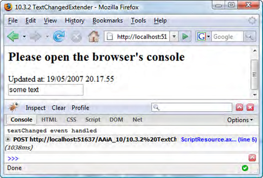
As usual, the extender is wired to the extended TextBox by specifying the ID of the extended control in the TargetControlID property. Note how you can use the Timeout and the OnTextChanged properties to configure the timeout value and the event handler for the textChanged event. The timeout property of the client behavior instance is set to one second. The event handler for the textChanged event is the onTextChanged function declared in the page. This function logs a message in the browser’s console using the Sys.Debug.trace method, as shown in figure 10.10.
Figure 10.10. The TextChangedExtender example running in Firefox. The current date is updated every time the change event of the text box is fired.
Live Gridview Filter
In the code downloadable at http://www.manning.com/gallo, you’ll find a modified version of the LiveGridViewFilter example, rewritten to take advantage of the TextChangedExtender control.
To complete our tour of the Toolkit API, we’ll do a quick overview of how the Toolkit enhances your design-time experience thanks to its support for the Visual Studio Designer.
10.2.4. Support for Visual Studio Designer
All the Toolkit controls can have an associated class to enhance the design-time experience provided by the Visual Studio Designer. The associated class must derive from the ExtenderControlBaseDesigner class contained in the AjaxControlToolkit.Design namespace. The associated designer class is specified in the Designer attribute, which decorates an extender or script control class. The argument passed to the Designer attribute is the type of the designer class, as in the following code:
[Designer(typeof(myDesignerClass))]
We need to discuss how the design-time experience can be enhanced for Ajax-enabled controls. The majority of Ajax-enabled controls rely heavily on JavaScript for rendering the control layout at runtime. An example is the CalendarExtender control, which renders the calendar entirely on the client side using dynamic DOM elements. It’s difficult to get a design-time experience similar to that of the ASP.NET Calendar control, which renders static HTML and can be displayed in the Visual Studio Designer. Using JavaScript lets you use the CalenderExtender control to render a full-featured calendar with support for animated transitions, similar to the one used in Windows Forms applications. Figure 10.11 shows a page that contains the CalendarExtender control.
Figure 10.11. The CalendarExtender control provides a calendar rendered using Dynamic HTML on the client side.

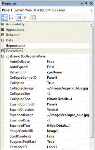
At the moment, the Toolkit offers basic design-time support that targets the configuration of the extender’s properties. Figure 10.12 shows a portion of the Properties panel in the Visual Studio Designer. In the panel, you can see the properties of an ASP.NET Panel control. Interestingly, you can also edit the properties of all the extenders associated with the Panel control. This is reasonable because an extender, as the name implies, is supposed to provide additional properties to the extended control. In figure 10.12, the Panel has been extended with a CollapsiblePanel extender, which lets you dynamically show and hide the panel with an animation effect. A new Extenders category is added in the Properties panel. Inside is the list of properties added by each extender associated with the control.
Figure 10.12. Example of design-time support offered by Toolkit extenders
To provide additional design-time capabilities, you have to work with the associated designer class. A discussion of the Visual Studio Designer API is beyond the scope of this book. You can find a good introduction to Visual Studio design-time capabilities at http://msdn2.microsoft.com/en-us/library/37899azc.aspx.
Our overview of the Ajax Control Toolkit API is complete. This API makes it easier to create Ajax-enabled controls using an attribute-based programming model. It also provides the possibility to enhance the features provided by the base ASP.NET AJAX framework. As part of an open-source project, you can modify or expand the API based on your needs.
The Ajax Control Toolkit provides much more than the biggest available collection of Ajax-enabled controls and an API for creating them. You can leverage its powerful framework to add animations and visual effects to a web page’s DOM elements.
10.3. Animations
The transition from static pages to Dynamic HTML pages opened the possibility of creating more appealing UIs. Static links, images, and panels turned into floating menus, slideshows, scrollers, and fading panels. Now, clever use of CSS and the DOM is required to obtain a modern web UI that enhances the user experience. Animations and visual effects are the key concepts you need to master. In the following sections, we’ll examine the framework for creating animations and visual effects provided by the Ajax Control Toolkit.
10.3.1. Toolkit animation framework
The Toolkit animation framework consists of a group of client classes, each of which describes a particular type of animation. These classes derive, directly or indirectly, from a base class called Animation. Table 10.4 lists all the available animations along with their descriptions. As you can see, the list of animations is exhaustive—it includes fading effects, and you can move, resize, and scale elements; animate colors; and manage multiple animations.
Table 10.4. Classes of the Toolkit’s animation framework
|
Name |
Description |
|---|---|
| FadeInAnimation | Fade-in effect |
| FadeOutAnimation | Fade-out effect |
| PulseAnimation | Sequence of fade-in and fade-out effects |
| ColorAnimation | Animated transition between two colors |
| LengthAnimation | Animates the height or width style attributes of an element |
| MoveAnimation | Animates the top and left style attributes of an element |
| ResizeAnimation | Changes the size of an element |
| ScaleAnimation | Scales an element, given a scale factor |
| SequenceAnimation | Plays a group of animations sequentially |
| ParallelAnimation | Plays a group of animations simultaneously |
| ConditionAnimation | Plays one of two child animations based on a condition |
| CaseAnimation | Plays one of the child animations based on a selection script |
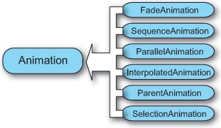
Animation classes are organized into families. Each family consists of a base class from which the animation classes derive. Figure 10.13 shows the families that make up the animation framework.
Figure 10.13. Base classes for the animations defined in the Toolkit animation framework
In the Toolkit animation framework, you can create animations three different ways:
- Using the classic imperative syntax— You create an instance of the class with the new operator and configure its properties as with any other client class.
- Using JSON— You describe a group of animations using JSON objects.
- Using XML— You define animations using XML syntax. This is the technique used by the AnimationExtender, which is an extender you can use to create animations in a web page. We’ll discuss the AnimationExtender in section 10.3.3.
Using the imperative syntax is the fastest technique in terms of performance. JSON and XML descriptions are translated into imperative code to instantiate the corresponding animation classes. On the other hand, JSON and XML lead to compact and high readable code; this becomes relevant especially when you have to deal with many complex animations. The overhead introduced by JSON and XML description becomes substantive only in the most complex scenarios.
Because you know how to use the imperative syntax (assuming you’re familiar with the JavaScript language), we’ll focus mainly on the XML and JSON syntax. Before introducing them, let’s do an overview of the common properties and methods exposed by the animation classes.
10.3.2. Animation basics
All the animations in the animation framework derive from a base client class called Animation. This class is contained in the AjaxControlToolkit.Animation namespace. It acts as an abstract class that provides the basic functionality needed by every animation. Whenever you create an instance of an animation class, you should set the following properties on it:
- target— The client ID of the DOM element that will be animated.
- duration— The overall duration of the animation, in seconds. The default value is 1 second.
- fps— The number of frames per seconds at which the animation is played. The higher is the value, the smoother the animation. The default value is 25 frames per seconds.
Every animation class exposes methods for controlling the animation status. The main methods are the following:
- play— Starts an animation, and resumes a paused animation.
- pause— Pauses an animation. If the play method is invoked after pause, the animation continues to play from the point where it was paused.
- stop— Stops an animation. If the play method is invoked after stop, the animation is played from the beginning.
You can detect when an animation is played or stopped by handling one of the events exposed by the base Animation class. These events can be handled with the techniques explained in section 3.7. At present, the Animation class exposes the following events:
- started— Raised as soon as the play method is invoked on the animation instance
- ended— Raised when the stop method is invoked on the animation instance
This is all you need to know to start working with the animation framework. The next step is to experiment with some of the animation classes provided by the framework. To do this, we’ll introduce the animation extender, which is a Toolkit extender that lets you define animations using a declarative XML syntax.
10.3.3. Using the AnimationExtender
The animation extender is a Toolkit extender that defines animations in a web page based on an XML description. Being an extender, the AnimationExtender must extend a server control declared in the page. The extended control—set, as usual, through the TargetControlID property—is a control that triggers one or multiple animations. For example, if you wire the AnimationExtender to a Button control, you can play single or multiple animations based on the events raised by the button element. Listing 10.11 shows the skeleton structure for the AnimationExtender control.
Listing 10.11. Skeleton of the animation extender
<ajaxToolkit:AnimationExtender ID="AnimationExtender1" runat="server"
                       TargetControlID="Button1">
  <Animations>
    <OnLoad></OnLoad>
    <OnClick></OnClick>
    <OnMouseOver></OnMouseOver>
    <OnMouseOut></OnMouseOut>
    <OnHoverOver></OnHoverOver>
    <OnHoverOut></OnHoverOut>
  </Animations>
</ajaxToolkit:AnimationExtender>
The child Animations element contains XML elements mapped to events raised by the DOM element rendered by the extended control. Listing 10.11 assumes the extender is wired to a Button control with the ID of Button1. The elements under the Animations node represent events raised by the DOM button element. In the elements, you specify which animations you want to play in response to the event. For example, animations declared under the OnClick element are played as soon as the element is clicked. The only exception is represented by the OnLoad element:
Animations defined under this element are played as soon as the browser has finished loading the web page.
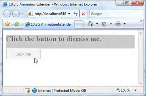
Let’s see how to define animations using XML syntax. Listing 10.12 shows how you can fade out a div element by clicking a button. Note that the fade effect starts when you click the button, which is the element rendered by the extended Button control. The fade effect is applied to a different element, a div; this means you can trigger the animations based on the button events, but the animations can target any elements in the web page.
Listing 10.12. Animating a div element with the AnimationExtender control
<div id="thePanel" style="background-color:#aaa">
    <h2>Click the button to dismiss me.</h2>
</div>

<asp:Button ID="Button1" runat="server" Text="Click Me"
            OnClientClick="return false"
            UseSubmitBehavior="false" />

<ajaxToolkit:AnimationExtender ID="AnimationExtender1"
                       runat="server"
                       TargetControlID="Button1">
  <Animations>
    <OnLoad>
        <Scale ScaleFactor="2" />
    </OnLoad>
    <OnClick>
        <Sequence>
            <EnableAction Enabled="false" />
            <FadeOut AnimationTarget="thePanel"
                     MinimumOpacity="0"
                     MaximumOpacity="1"
                     Duration="0.5"
                     />
        </Sequence>
    </OnClick>
  </Animations>
</ajaxToolkit:AnimationExtender>
In the OnLoad element is a Scale tag, which is parsed as an instance of the ScaleAnimation class. In general, you obtain the name of the tag to use in the XML description by removing the suffix Animation from the class name. As usual, attributes represent properties of the class. Because the value of the ScaleFactor attribute is set to 2, the button doubles its default dimensions. Note that because you haven’t specified a duration, the button reaches its new dimensions in one second, which is the default value.
The OnClick element includes a sequence of animations to play as soon as the button is clicked. To play multiple animations in response to an event, you must encapsulate them into a Sequence or Parallel element. Otherwise, you can play only a single animation. The Sequence element defines an animation of type SequenceAnimation. This animation encapsulates a group of child animations that are played sequentially, one after another, as shown in figure 10.14.
Figure 10.14. A sequence animation is used to play all the child animations sequentially.
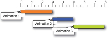
When the previous animation is completed, the next one is played. The start, pause, and stop methods affect the entire sequence of animations. The SequenceAnimation class also exposes an iterations property, which can be set to an integer value. This value specifies the number of times the sequence is looped.
As an alternative, you can play a group of animations simultaneously, without waiting for the previous animation to complete before starting the next. In this case, you must declare the child animations in a Parallel element, which represents an animation of type ParallelAnimation. Note that the duration and fps properties affect the overall duration and smoothness of all the child animations. If one of the child animations sets different values for these properties, they’re ignored if the animation is played in parallel. The concept of parallel animation is shown in figure 10.15.
Figure 10.15. A parallel animation is used to play all the child animations simultaneously.

In listing 10.12, the second animation in the Sequence element is a FadeOutAnimation, represented by the FadeOut tag. This kind of animation can fade out the element whose client ID is set in the AnimationTarget attribute. In the example, you fade out a panel represented by the div element with the ID thePanel. The MinimumOpacity and MaximumOpacity attributes control the initial and final opacity for the fade-out effect. In this case, you pass from a value of 1 to 0, so the element is faded out until it disappears. The FadeIn element has the same attributes and can be used to play a fade-in effect. Figure 10.16 shows the example in listing 10.12 running in Internet Explorer.
Figure 10.16. The AnimationExtender example running in Internet Explorer
The first animation in the Sequence element is neither a visual effect nor a real animation. You can consider it an action. Actions are atomic animations. They don’t need a duration and don’t need to be played at a certain framerate, because they perform tasks such as disabling an element or hiding it. But defining actions as animations means you can use them in sequence or parallel animations to perform atomic actions on DOM elements. Table 10.5 lists all the actions available in the animation framework, together with the description of what they accomplish.
Table 10.5. Actions available in the animation framework
|
Name |
Description |
|---|---|
| EnableAction | Enables or disables a DOM element |
| HideAction | Hides an element or makes it visible |
| StyleAction | Sets the value of a CSS attribute of an element |
| OpacityAction | Changes the transparency of an element |
| ScriptAction | Evaluates a portion of JavaScript code |
The Ajax Control Toolkit provides another extender to manage animations in a web page. The UpdatePanelAnimation extender works in a manner similar to the AnimationExtender, but it targets the UpdatePanel control and lets you play animations before and after a partial postback. Let’s see how you can use this extender to implement a visual pattern known as the yellow spotlight.
10.3.4. The UpdatePanelAnimation extender
The UpdatePanelAnimation extender plays animations before and after a partial update. This extender must target an UpdatePanel control declared in the page. Animations are declared under the Animations node, in two elements called OnUpdating and OnUpdated. The OnUpdating tag contains all the animations to play before the partial postback begins, and the OnUpdated tag contains the animations to play after the content of the UpdatePanel has been refreshed.
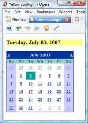
Listing 10.13 shows how to use this extender to implement a visual pattern called the yellow spotlight. This effect notifies the user that a region of the page has been updated by animating the background color of the panel from a yellow color—or your preferred color—back to its original background color, in a short time. The purpose of the short color burst is to capture the user’s attention on a refreshed portion of the page.
Listing 10.13. The yellow spotlight pattern applied to an UpdatePanel
<asp:UpdatePanel ID="UpdatePanel1" runat="server">
    <Triggers>
        <asp:AsyncPostBackTrigger ControlID="Calendar1"
            EventName="SelectionChanged" />
    </Triggers>
    <ContentTemplate>
        <h3><%= Calendar1.SelectedDate.ToLongDateString() %></h3>
    </ContentTemplate>
</asp:UpdatePanel>
<asp:UpdatePanel ID="UpdatePanel2" runat="server">
    <ContentTemplate>
       <asp:Calendar ID="Calendar1" runat="server"></asp:Calendar>
    </ContentTemplate>
</asp:UpdatePanel>
  <ajaxToolkit:UpdatePanelAnimationExtender
                 ID="UpdatPanelAnimationExtender1"
                 runat="server"
                 TargetControlID="UpdatePanel1">
    <Animations>
        <OnUpdated>
          <Color
             StartValue="#FFFF55"
             EndValue="#FFFFFF"
             Property="style"
             PropertyKey="backgroundColor"
             Duration="1" />
        </OnUpdated>
    </Animations>
</ajaxToolkit:UpdatePanelAnimationExtender>
The first UpdatePanel control is the one associated with the UpdatePanelAnimation extender. When the user selects a date in the Calendar declared in the UpdatePanel2 control, the first UpdatePanel is refreshed and the yellow spotlight animation is played. The animation is defined in the extender’s OnUpdated element, in the Animations element. The effect is implemented with a ColorAnimation instance. The StartValue and EndValue attributes specify the start and end color, expressed in hexadecimal notation. The Property and PropertyKey attributes reach the property that the animation affects. In this case, you’re interested in animating the background color of the panel. You must animate the backgroundColor property of the style object encapsulated by the div element rendered by the UpdatePanel control. Figure 10.17 shows the example running in the Opera browser.
Figure 10.17. You can use the UpdatePanelAnimation extender to implement the yellow spotlight visual pattern.
The extenders provided by the Ajax Control Toolkit, in conjunction with the elegant XML syntax used to describe animations, make it easy to create complex effects and to implement visual patterns like the yellow spotlight. In the next section, we’ll look at another technique that uses JSON to instantiate animations. You’ll use this technique to enhance the PhotoGallery control that you coded in section 8.4.5.
10.3.5. JSON and animations: adding transitions to the PhotoGallery control
When you use the AnimationExtender or the UpdatePanelAnimationExtender, the XML that defines the animations is parsed on the server side. The result is a JSON-serialized object that is sent on the client side and used to create instances of the animation classes. The following example will give you the opportunity to experiment directly with the JSON syntax for creating animations.
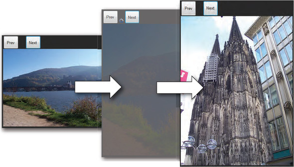
In this section, we’ll return on the PhotoGallery control built in section 8.4.5. So far, you’ve created a client control to browse a set of images stored in the website. Your next goal is to enhance the control by adding an animated transition between the images. The transition you’ll build isn’t complex, but it’s effective, as shown in figure 10.18. While the next image is being loaded, you partially fade-out the current image; then, you resize it until it reaches the width and height of the next image to display. Finally, the new image fades in and replaces the old image.
Figure 10.18. Example of an animated transition applied to the PhotoGallery control. The animations that make up the transition are defined through JSON objects.
Let’s start by opening the PhotoGallery.js file that contains the code for the PhotoGallery control. You have to modify the code so that when the next image is loaded, a new method named _playTransition is called. This method is responsible for playing the animated transition and then calling the _displayImage method as soon as the transition is completed. First, you must rewrite the _onImageElementLoaded method, declared in the PhotoGallery’s prototype, as follows:
_onImageElementLoaded : function() {
    this._playTransition();
}
Then, you must add a method called _playTransition to the constructor’s prototype. The code for the _playTransition method is shown in listing 10.14.
Listing 10.14. Code for the _playTransition method
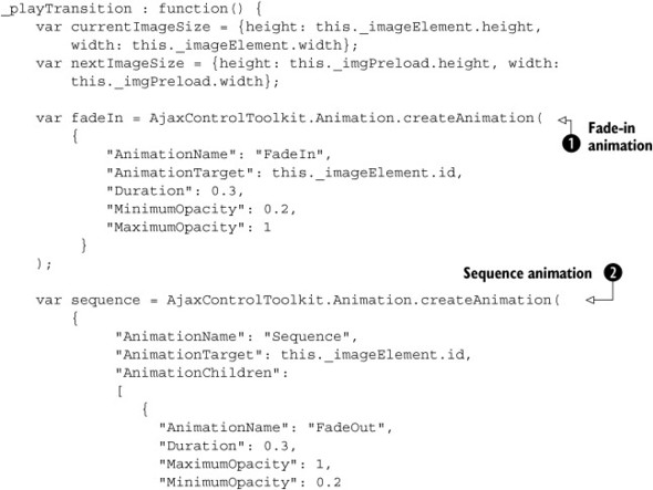

The first thing you do in the body of the method is save the height and width of the currently displayed image and the next one in the list. You need these dimensions in order to set up the animation that resizes the current image to the size of the next one.
The first animation you create is a fade-in ![]() , stored in the fadeIn variable. The animation is created with a call to the AjaxControlToolkit.Animation.createAnimation method. This method accepts an object literal (a JSON object) and instantiates the animations defined in the object. In the
JSON object, the value of the AnimationName attribute is the FadeIn string, which corresponds to a fade-in animation. You follow the same rule used in the XML description. The name of an animation
is obtained by removing the Animation suffix from the name of the class.
, stored in the fadeIn variable. The animation is created with a call to the AjaxControlToolkit.Animation.createAnimation method. This method accepts an object literal (a JSON object) and instantiates the animations defined in the object. In the
JSON object, the value of the AnimationName attribute is the FadeIn string, which corresponds to a fade-in animation. You follow the same rule used in the XML description. The name of an animation
is obtained by removing the Animation suffix from the name of the class.
The second attribute, AnimationTarget, specifies which element to animate. In this case, it’s the img element that displays the current image. The third attribute, Duration, is the duration of the animation; the last two attributes define the values of the maximum and minimum opacity. The fade-in effect is obtained by animating the opacity value from 0.2 to 1.
You use the same technique to create the sequence animation ![]() that completes the transition. In this case, the AnimationChildren attribute holds an array with the child animations. When the _playTransition method is called, the transition is played in two parts. First, the sequence animation is played. To detect its end, you
subscribe to its ended event. The event is handled by a function called onSequenceEnded, declared in the _playTransition method. When the sequence animation ends, the _displayImage method is called to replace the old photo with the new one. Finally, the fade-in animation is played to complete the transition
between the two images.
that completes the transition. In this case, the AnimationChildren attribute holds an array with the child animations. When the _playTransition method is called, the transition is played in two parts. First, the sequence animation is played. To detect its end, you
subscribe to its ended event. The event is handled by a function called onSequenceEnded, declared in the _playTransition method. When the sequence animation ends, the _displayImage method is called to replace the old photo with the new one. Finally, the fade-in animation is played to complete the transition
between the two images.
The JSON description is compact and leads to highly readable code. The only drawback of this approach is that it’s slower than the imperative syntax because an additional step is required to translate the JSON description into an instance of the FadeInAnimation class. For this reason, the imperative syntax is preferable when you need maximum performance. In most cases, though, you’ll be able to use the shortest and most readable code.
10.4. Summary
In this chapter, we’ve explored the Ajax Control Toolkit, an open-source project started by Microsoft in the early days of ASP.NET AJAX. The Toolkit, which is open to contributions from the community, aims at becoming the biggest free collection of Ajax-enabled controls available.
The Toolkit controls are built on top of a custom API that enhances the base functionality provided by the ASP.NET AJAX extensions. The Toolkit API is a metadata-driven API: Ajax-enabled controls can be authored using attribute-based programming. All controls created with the Toolkit API provide support for the ASP.NET 2.0 callbacks framework and the Visual Studio Designer.
The Ajax Control Toolkit offers also a powerful framework for creating visual effects and animations. We explored the animation classes and explained how to create them in a web page using the AnimationExtender control. You can create animations using XML or JSON syntax, as we demonstrated by adding transition effects to the PhotoGallery control developed in chapter 8.
In the next chapter, we’ll look at the XML Script declarative language, which is used to instantiate client components in a page using a declarative syntax.
