
6. Developing and Editing
Lesson overview
Artificial light sources, unusual shooting conditions, and incorrect camera exposure settings can all cause faults in an image. In the Develop module Lightroom delivers a suite of powerful developing tools to quickly rectify these problems in your photos.
This lesson introduces you to editing options from easy-to-use presets and retouching tools to an array of specialized settings. Along the way you’ll pick up a little computer graphics background knowledge as you become familiar with some basic techniques:
• Applying Develop presets
• Cropping and rotating images
• Working with video
• Using the History and Snapshots panels
• Removing blemishes
• Correcting color problems and adjusting the tonal range
• Sharpening images and removing noise
• Making discrete color adjustments
• Working with black and white and split tone effects
• Adjusting specific areas of an image
You’ll probably need between one and two hours to complete this lesson.
Fine-tune and polish your photographs—and your videos—with precise, easy-to-use tools, secure in the knowledge that the modifications you make in Lightroom won’t alter your master file. Take your developing a step beyond just correcting your images; use the Develop module controls creatively to customize your own special effects, and then save them as develop presets.
Getting started
This lesson assumes that you are already familiar with the Lightroom workspace and with moving between the different modules. If you find that you need more background information as you go, refer to Lightroom Help, or review the previous lessons in this book.
Before you start on the exercises in this section, make sure that you have correctly copied the Lessons folder from the CD in the back of this book onto your computer’s hard disk as detailed in “Copying the Classroom in a Book files” on page 2, and created the LR4CIB Library Catalog file to manage the lesson files as described in “Creating a catalog file for working with this book” on page 3.
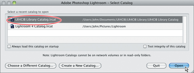
1. Start Lightroom.
2. In the Adobe Photoshop Lightroom - Select Catalog dialog box, make sure that the file LR4CIB Library Catalog.lrcat is selected under Select A Recent Catalog To Open, and then click Open.
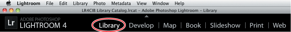
3. Lightroom will open in the screen mode and workspace module that were active when you last quit. If necessary, switch to the Library module by clicking Library in the Module Picker at the top of the workspace.
The first time you enter any of the Lightroom modules, you’ll see module tips that will help you get started by identifying the components of the Lightroom workspace and stepping you through the workflow. Dismiss the tips by clicking the Close button. To reactivate the tips for any module, choose [Module name] Tips from the Help menu.
Importing images into the library
The first step is to import the images for this lesson into the Lightroom library.
1. In the Library module, click the Import button below the left panel group.

2. If the Import dialog box appears in compact mode, click the Show More Options button at the lower left of the dialog box to see all the options in the expanded Import dialog box.

3. At the top of the Source panel at the left of the Import dialog box, navigate to and select the LR4CIB > Lessons > Lesson 6 folder. Ensure that all six files in the folder are checked for import.
4. In the import options above the thumbnail previews, select Add so that the imported media will be added to your catalog without being moved or copied. Under File Handling at the right of the expanded Import dialog box, choose Minimal from the Render Previews menu and ensure that the Don’t Import Suspected Duplicates option is activated. Under Apply During Import, choose None from both the Develop Settings menu and the Metadata menu and type Lesson 6 in the Keywords text box. Make sure that your import is set up as shown in the illustration below, and then click Import.

The six files in the Lesson 6 folder are added to the LR4CIB Library Catalog and now appear in the Grid view of the Library module and also in the Filmstrip across the bottom of the Lightroom workspace.
Quick developing in the Library module
The Library module’s Quick Develop panel offers an array of simple controls that let you apply developing presets, correct tone and color, sharpen images, and even crop them—without ever switching to the Develop module.
You can make multiple selections in the Grid view or the Filmstrip and apply a develop preset—or any of the Quick Develop adjustments—to all the selected photos at once.
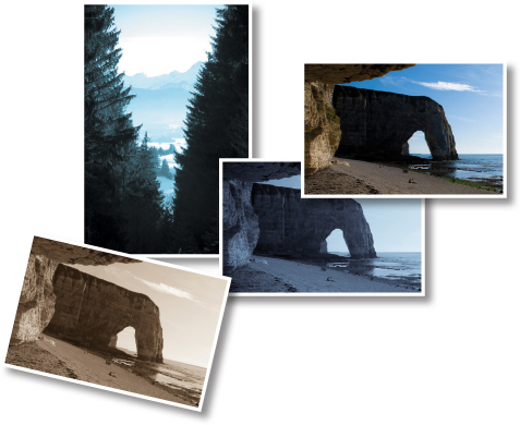
1. In the Grid view, double-click the image DSC_6056.NEF (a photo of the famous cliffs of Etretat, in Normandy) to see it in Loupe view.
2. In the right panel group, expand the Quick Develop panel, if necessary.
3. From the Saved Preset menu, at the top of the Quick Develop panel, choose the preset B&W Look 4, from the category Lightroom B&W Presets. Examine the results in the Loupe view, and then choose the Yesteryear preset from the Lightroom Color Presets category.

Although the Saved Preset menu is located at the top of the Quick Develop panel, it’s sometimes preferable to apply a developing preset as a final step—after you’ve made any adjustments that are needed to correct tone and color.
Develop presets apply a combination of different developing settings to an image at the same time, enabling you to achieve dramatic results with a single click. You can choose from over fifty Lightroom presets, ranging from fine-tuned contrast settings to creative special effects. Apply a preset from the menu as is, or use it as a starting point and tweak the settings to suit your purpose; you can even save your own develop settings as custom presets, and then organize them in folders that will be listed as new categories in the Saved Preset menu.
4. To return the image to its original state, choose Default Settings from the Saved Preset menu.
5. Expand the White Balance pane in the Quick Develop panel. Try each of the White Balance presets. When you’re done, choose the Daylight white balance preset.
6. Click twice on the second button of the four beside the Tint control (the button with a single, left-facing arrow) to reduce the pinkish color cast in the sky and around the reflected glare on the water.

Adjusting the white balance can mean making some very subjective choices. If you wish to stay fairly close to the original look of an image, start with the As Shot preset in the White Balance menu, and then fine-tune the Temperature and Tint settings. If you feel that the white balance was set incorrectly when an image was captured—perhaps as a result of artificial lighting—or if you wish to create a specific effect, use an appropriate preset from the menu as a starting point.
7. Expand the Tone Control pane and click the Auto Tone button.
As the original photo was too bright overall, Auto Tone darkens the entire image considerably—exposing much more detail in the sky and sea but effectively losing detail from the overly darkened beach and cliffs.

You can use the developing controls not only to correct image problems but also to create effects or moods. For this photo, a technically difficult image in terms of correction, the Auto Tone adjustment approaches the look of a night scene.
Next you can use the controls below the Auto Tone button to fine-tune the tonal balance of the image, recovering detail from the shadows and reducing the glare.
8. Click the fourth button beside Exposure to increase the setting by one stop. Click three times on the right-most Shadows button, and six times on the left-most Whites button. Adjust the Blacks control by clicking the first and second buttons once each. Finally, click the right-most Vibrance button twice.

If you lose track of your Quick Develop adjustments, you can reset any control to its original state by simply clicking the name of the control. Clicking the Reset All button located at the bottom of the Quick Develop panel will revert the image to its original state.
You’ve already improved this photo considerably without even leaving the Library module, but you could still do a lot more to enhance it in the Develop module.
Quick and easy video editing
Many digital cameras enable photographers to capture video as well as still images, but for those of us who haven’t learned to use video editing software, those videos end up languishing, forgotten and neglected, in dark corners on our hard disks.
Lightroom 4 lets you import your videos, dust them off, catalog and organize them alongside your photos, make simple edits and grab still frames—even share them to Facebook or Flickr—and you can do it all without ever leaving the Library module.
You can import video in many common file formats used by digital still cameras, including AVI, MOV, MPG, MP4, and AVCHD, in exactly the same way that you import photos; in fact, you did just that at the beginning of this lesson.
1. Press the G key or click the Grid view button (![]() ) in the Toolbar. If you’re working with very small thumbnails, use the Thumbnails slider in the Toolbar to make them a little larger.
) in the Toolbar. If you’re working with very small thumbnails, use the Thumbnails slider in the Toolbar to make them a little larger.
2. Locate the video file TamilTemple.MPG; then, move the pointer slowly from left to right, and then back again over the thumbnail (or better still, just below it) to scrub forwards and backwards through the video.
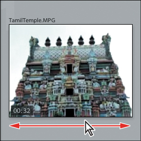
The position of the pointer relative to the width of the thumbnail preview corresponds roughly to the location of the current frame in the video clip.
3. Double-click the thumbnail to see the video in Loupe view; drag the circular current time indicator in the playback control bar to scrub through the video.

Trimming video clips
In the Loupe view, you can improve a video by snipping off a slow start or a shaky ending; the video file on your hard disk remains intact, but when you export the clip, or play it in Lightroom, it will be trimmed down to show only the real action.
1. Click the Trim Video button (![]() ). The playback control bar expands to display a series of key frames from the video, representing a time-line or film-strip view of the clip. You can lengthen the expanded control bar by dragging either end.
). The playback control bar expands to display a series of key frames from the video, representing a time-line or film-strip view of the clip. You can lengthen the expanded control bar by dragging either end.
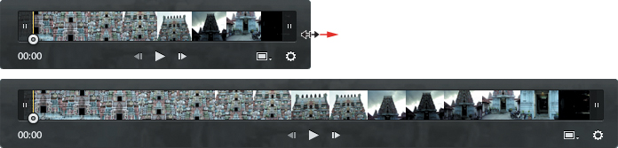
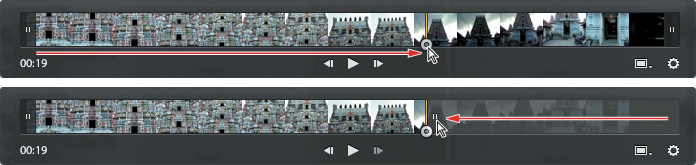
2. Watch the time count at the left end of the control bar as you drag the current time indicator to the last frame in the 19th second; then, drag the end marker in from the right end of the time-line to meet the current time indicator.
3. Click the Play button at the center of the control bar to view the trimmed clip.
Setting video thumbnails and grabbing still frames
Setting a distinctive poster frame (thumbnail image) for a video clip can make it easier to locate in the Grid view or the Filmstrip.
1. Make sure that you can see the video clip’s thumbnail in the Filmstrip. In the Loupe view, move the current time indicator to the frame you want; then, click the Frame button (![]() ) at the right end of the control bar. Watch the video thumbnail in the Filmstrip as you choose Set Poster Frame.
) at the right end of the control bar. Watch the video thumbnail in the Filmstrip as you choose Set Poster Frame.
2. Find a frame that you like somewhere in the range between 00:05 and 00:13; then, click the Frame button and choose Capture Frame to capture and save the current frame as a JPEG image that will be stacked with the clip. You’ll use the captured frame later in this lesson.
Applying develop presets to videos
When you’re working with a video in Loupe view, the Quick Develop controls for Highlights, Shadows, and Clarity are disabled. Although you can still access all the developing presets in the Saved Preset menu, only the supported settings within each preset will be applied. This means that for a particular clip, some presets not specifically intended for use with video may produce very little effect. Some other presets, including the Lightroom Effect category, will not work at all for video.
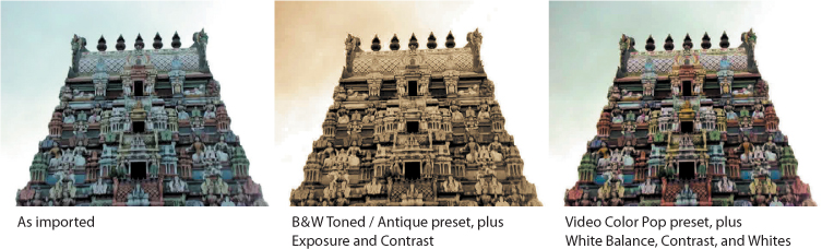
The colors in our lesson clip are cold and de-saturated, and the tone is flat and dull; the video was shot just a few seconds before the arrival of a tropical storm. In this exercise you’ll try two very different developing presets to liven up the movie, and tweak the settings for each effect using the controls in the Quick Edit panel.
1. With the video still open at the same frame in the Loupe view, choose the Antique preset from the Lightroom B&W Toned Presets category.
Unless you’ve already disabled it, an alert appears warning that some settings are not supported for video and listing those that are. Check Don’t Show Again to disable the alert if you wish, but it may be a good idea to make a note of the settings supported for video for future reference.

2. Click OK to dismiss the alert message. In the Quick Develop panel, click once on the third Exposure button to increase the exposure by one-third of a stop, and then click the right-most Contrast button once to add more definition. Drag the current time indicator to scrub through the clip, or click the Play button in the control bar, to see the effect in motion.
Resetting the Quick Develop controls will not affect the way you’ve trimmed your video clip; the start and end markers will stay in place unless you move them manually.
3. Click the Reset All button at the bottom of the Quick Develop panel, and then apply the Video Color Pop preset from the Lightroom Video Presets category. Choose Auto from the White Balance menu, and then click twice on both the right-most Contrast button and the left-most button for Whites. Scrub or play through the clip to assess the changes.
About process versions
Lightroom 4 uses updated Camera Raw technology to analyze, process, and render digital images, allowing finer control over color, tone, and detail adjustments than was possible in previous versions—so you’ll get better results, with fewer artefacts. Taken as a whole, this technology constitutes the current process version, PV2012.
Lightroom 1 and 2 used the original process version, PV2003. Lightroom 3 applied the updated PV2010 by default, offering the option to either update images edited in Lightroom 1 or 2, or switch to the old process version to avoid modifying the existing adjustments. Process Version 2012 is applied by default to photos that are edited for the first time in Lightroom 4. For images edited in an earlier version of Lightroom, you can switch to either of the old process versions if you wish.
PV2012 incorporates improved sharpening and noise-reduction routines, as well as new adaptive tone-mapping algorithms that help to protect edge detail and minimize processing artefacts, enabling you to adjust exposure without clipping the whites in your image and to recover more detail from shadows and highlights.
Updating the process version
In this exercise, you’ll update the process version for a raw image that was edited in Lightroom 3. Even if you’re new to Lightroom and don’t have photos that were edited in previous versions, this exercise will serve as an introduction to the new Develop controls in Lightroom 4.
1. In the Grid view or the Filmstrip, select the raw image DSC_7259.NEF, and then click Develop in the module picker at the top of the workspace.
In the Develop module, an exclamation point badge in, or near, the lower right corner of the image indicates it was edited with a process version earlier than PV2012.

2. Choose Settings > Process. The Process menu shows that this image was edited using the 2010 process version. For the moment, leave the setting unchanged.
3. To access update options, click the exclamation point badge, rather than using the Settings > Update To Current Process (2012) command, which updates the image using the default options, or those that were set for the last update.
4. In the Update Process Version dialog box, activate the option Review Changes Via Before/After; then, click Update.
5. If necessary, expand the Basic panel in the right panel group. Watch the Histogram and the Basic panel settings as you undo and redo the update by pressing Ctrl+Z / Command+Z, and then Shift+Ctrl+Z / Shift+Command+Z.
If you don’t see the right panels, press F8 or choose Window > Panels > Show Right Module Panels.
The histogram shows a significant improvement in the image’s tonal spread. In the Basic panel, the old develop settings are mapped to a new set of slider controls.

Updating to Process Version 2012 may result in significant changes in the appearance of your photos; it’s a good idea to update images one at a time until you’re familiar with the new processes. Use one of the Before & After views while you tweak the PV2012 settings, to help you match the look of the photo before it was updated.
In PV2012, the Exposure setting combines elements of both the Exposure and Brightness settings from earlier process versions. The new Exposure control works more like camera exposure; shifting the midtones without clipping the highlights.
The Highlights and Shadows sliders replace Recovery and Fill Light, enabling you to bring out even more detail from the darkest and brightest parts of your photos. The improved processes in PV2012 target their respective tonal ranges more effectively, without affecting the rest of the image; your Highlights and Shadows adjustments won’t overlap, so there’s less chance of color shifts and other artefacts.
The Whites and Blacks controls correct clipping at the ends of the histogram; for PV2012, blacks are calculated automatically. The new Clarity process produces a different look, with less likelihood of halo effects; the upgraded setting is reduced.


The Develop module
Although the Quick Develop panel in the Library module offers access to many basic image editing options, you’ll work in the Develop module to make more detailed adjustments and modifications to your photos. The Develop module is a comprehensive editing environment, presenting all the tools you’ll need to correct and enhance your images in a single workspace. The controls are easy enough for a beginner to use, and yet have the depth and power required by the advanced user.
The Develop module offers two viewing modes: the Loupe view, where you can focus on a single image, and the Before/After view (with several layout options), which makes it easy to compare the original and edited versions of a photo. The Toolbar across the bottom of the work area presents buttons for switching between the views and a slightly different suite of controls for each viewing mode.

The tools and controls in the Develop module’s right panel group are arranged from top to bottom in the order in which they would ordinarily be used: a layout that guides you intuitively through the editing workflow.
The left panel group contains the Navigator panel, which can be collapsed but not hidden, and any combination of the Presets, Snapshots, History, and Collections panels, which can be shown or hidden to suit the way you prefer to work.
At the top of the left panel group, the Navigator panel helps you find your way around a zoomed image, and lets you preview the effects of developing presets before you apply them. You can also use the Navigator to review past stages in an image’s developing history. At the right of the Navigator’s header is a zoom picker for setting the magnification levels in the working views.
The Navigator can be collapsed, but not hidden. While the History panel keeps track of every modification made to the image, including Quick Edit adjustments made in the Library module, you can use the Snapshots panel to record important stages in a photo’s development, so you can return to a key state quickly and easily, without searching through the history list.

At the top of the right panel group is the Histogram panel. Immediately below the Histogram is an array of tools for cropping, removing flaws and red eyes, applying graduated adjustments and painting develop settings directly onto an image selectively. Clicking any of these tools opens a drawer with controls and settings for that tool.
Below these editing tools is the Basic panel: your starting point for color correction and tonal adjustments. In many cases this may be the only panel you need to achieve the result you want. The remaining panels offer specialized tools for various image enhancement tasks.
For example, you can use the Tone Curve panel to fine-tune the distribution of the tonal range and increase mid-tone contrast. Use the controls in the Detail panel to sharpen an image and reduce noise.
It’s not intended that you use every tool on every photo. In many circumstance you may make only a few slight adjustments to an image; however, when you wish to polish a special photo—or if you need to work with shots captured at less than ideal camera settings—the Develop module provides all the tools you need.
In the next exercise you’ll crop and rotate an image, and then remove some spots.
Cropping and rotating images
The Crop Overlay tool makes it simple to improve your composition, crop away unwanted edge detail, and even straighten your image.
1. Click to select the raw image DSC_6058.NEF in the Filmstrip.
2. If you’re not already in the Develop module, press the D key or choose View > Go To Develop. Hide the Filmstrip and the left panel group to expand the work area; you’ll find keyboard shortcuts for showing and hiding any or all of the workspace panels listed beside the commands in the Window > Panels menu. If you’re not already in the Loupe view, press the D key again, or click the Loupe view button (![]() ) in the Toolbar. If you don’t see the Toolbar, press the T key.
) in the Toolbar. If you don’t see the Toolbar, press the T key.
3. Click the Crop Overlay tool (![]() )button just below the Histogram panel, or press R. A crop overlay rectangle appears on the image in the Loupe view and a control pane for the Crop Overlay tool opens above the Basic panel.
)button just below the Histogram panel, or press R. A crop overlay rectangle appears on the image in the Loupe view and a control pane for the Crop Overlay tool opens above the Basic panel.

4. From the Aspect menu, choose Original. If the lock button shows an open lock icon, click to close the lock. The closed lock will constrain the aspect ratio.
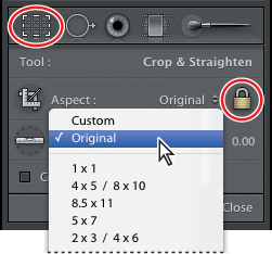
You can specify a custom crop ratio by choosing Enter Custom from the Aspect menu. Your new Aspect Ratio will be added to the Aspect menu for later use; it will also be listed as a sorting and filter criteria.
5. Drag the lower left handle of the crop overlay rectangle upwards and to the right. As you drag, the image moves so that the cropped portion is always centered in the Loupe view. Release the mouse button when the horizon is roughly aligned with the guideline one-third of the way up the image as shown below.

6. Click outside the crop overlay rectangle and drag to rotate the photo. As you drag, additional grid lines appear to help you straighten the image. Release the mouse button when the horizon is aligned with the grid.

7. Click inside the crop overlay rectangle and drag the image. You’ll notice that you can’t drag the photo downwards or to the left because the image will move only until its edge touches the border of the cropping rectangle. Position the photo so that the stone arch in the background is roughly centered in the frame.
8. To exit cropping mode, press R on your keyboard or click the Crop Overlay tool button again. The cropped image is displayed in the Loupe view.
Thanks to non-destructive editing, you can return to adjust your crop at any time by simply reactivating the Crop Overlay tool. The crop becomes “live” again—the entire image becomes visible once more and you can resize the cropping rectangle or reposition the image as you wish.

Removing spots
Unsightly spots or blurs caused by water droplets or dirt on the camera lens are not an uncommon problem, especially in photos captured outdoors or in harsh lighting conditions. The Spot Removal tool is ideal for fixing blemishes like these.
1. In Loupe view in the Develop module, click the Spot Removal tool just below the Histogram panel, or press Q on your keyboard. You’ll notice that an extra pane opens below the tool buttons with controls and settings for the Spot Removal tool.

The Spot Removal tool works in either Clone mode or Heal mode. In Clone mode, the tool covers an imperfection in the photo (the target area) with an exact copy of another portion of the image (the sample area). Clone mode is ideal for repairing an area in the image that is patterned or where there are distinct repeated details such as bricks, stairs or even foliage. For areas with smooth color transitions, such as skin, or the sky—or fine, “noisy” textures, like the beach in our example—use the Heal mode. In Heal mode, the Spot Removal Tool blends the sampled area with the target area rather than replacing it.
2. In the Spot Removal Tool settings pane, choose Heal from the two brush options.

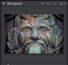
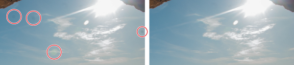
3. Choose Window > Panels > Show Left Module Panels or press F7. In the header of the Navigator panel, click 1:1 to zoom in to a pixel-for-pixel view. Drag the white rectangle in the Navigator preview to focus on the distant stretches of the beach, as shown in the illustration at the right.

OK, so they’re tourists—not unsightly blemishes—but the principle is the same.
4. Use the sliders in the Spot Removal Tool settings pane to set the brush Size to 75 pixels and the brush Opacity to 100%.

5. Position the circular Spot Removal tool cursor over the nearest of the tourists; then, click—but don’t drag. Release the mouse button and move the pointer away; Lightroom automatically finds an appropriate area to sample. On your screen you should see something similar to what you see in the illustration below: the lighter white circle with the cross-hairs is the target area centered on the tourists and the bolder white circle is the sample area.


6. If you see obvious repetition of nearby detail in the newly depopulated target area, as in the illustration above, click inside the circular sample area and drag it to a new position, watching the result in the target area.
7. If you wish, you can manually specify the area to be sampled by the Heal brush. Increase the brush size by clicking the Right Bracket (]) key until the Spot Removal tool cursor is large enough to cover the next group of tourists. Click to define the target area, but this time, don’t release the mouse button immediately; instead, drag to find a sample that blends effectively. Watch the effect on the target area as you drag; then, release the pointer when you’re satisfied with the result. A white arrow between the two circles indicates that data from the sample area has been applied to the target area.
8. Repeat the process, using either technique, to remove the rest of the unsightly tourists. Increase or decrease the brush size as necessary by pressing the Left and Right Bracket ([,]) keys. For the large group behind our targets, and the couple in the far distance, the shore-line runs through the target area; whichever technique you use, drag the sample area carefully to align the effect. If you see blurred artefacts at the edges of the target area, use the slider in the tool settings pane to increase or decrease the brush size for the active spot edit.
9. When you’re done, press Q to disable the Spot Removal tool. The circular tool overlays disappear from the image in the Loupe view.
The best way to evaluate the results of a spot removal operation—and many other image edits—is to inspect the photo at full size. Click 1:1 in the header of the Navigator panel to set a pixel-for-pixel zoom ratio for the Loupe view.
10. Click the Spot Removal tool, or press Q, to activate the tool again. The circular tool overlays for your spot corrections reappear on the image in the Loupe view. These edits are all still “live”—you can adjust them at any time.
11. Click the Spot Removal tool, or press Q, to disable the Spot Removal tool. To return to the Fit zoom level click the image in the Loupe view, or choose from the zoom picker in the header of the Navigator panel.
12. If you’re itching to get your hands on some authentic unsightly spots, show the Filmstrip and select the image DSC_6056.NEF—the other shot of the beach at Etretat, and then have some fun honing your new skills.
Adjusting a photo’s tonal range
In the Develop module, the basic tone and color corrections your photos are likely to need are generally best made in the following order:
• Apply tonal corrections to set the correct white point and maximize the tonal range in the image using the Histogram and the controls in the Basic panel.
• Tweak the contrast using the Tone Curve panel.
• Adjust color problem selectively in the HSL / Color / B & W panel.
• Apply sharpening and noise reduction in the Detail panel.
• Add special effects such as duo-tone treatments, decorative lens vignetting, and simulated film grain, using the Split Toning, and Effects panels.
The order of these operations is reflected in the layout of the panels in the Develop module’s right panel group; although you may often make only a handful of adjustments to any one image, you can work your way down the right panel group, using it as an image processing check-list.
In this exercise, you’ll explore the Basic panel.
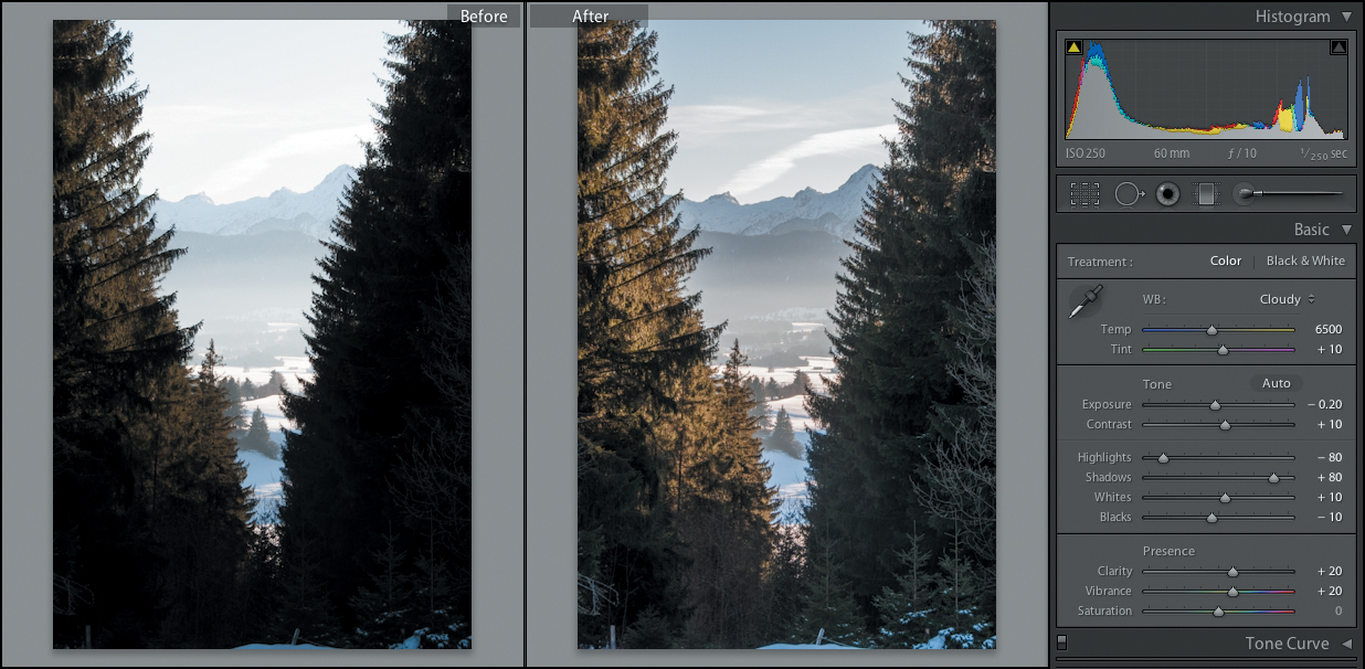
1. If necessary, press the D key to go to the Develop module. In the Filmstrip, select the image DSC_0357.NEF, a photo of an alpine vista shot in Germany.
2. Make sure that the Histogram and the Basic panel are expanded. Hide the Module picker (F5), the Toolbar (T), and the Filmstrip (F6); then, drag the left edge of the right panel group to make it as wide as possible—wider adjustment sliders give you finer control.
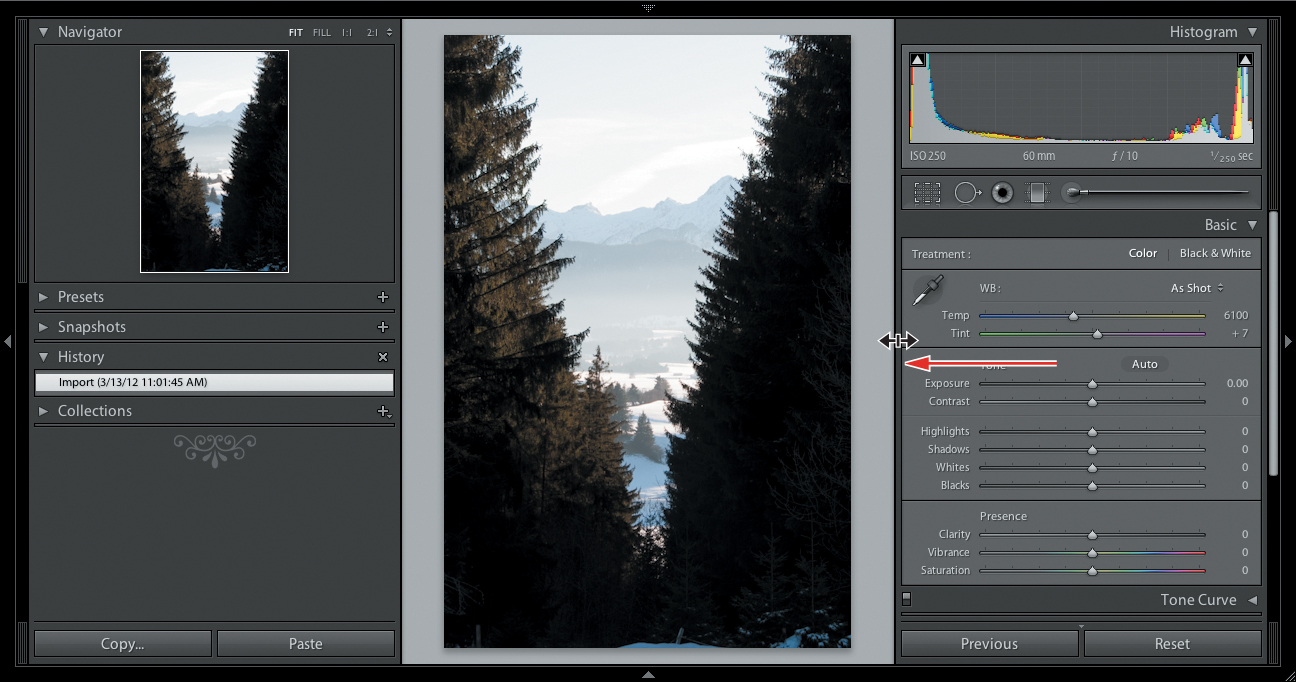
The controls in the Basic panel are also arranged from top to bottom in the order that’s likely to produce the best results; if you’re new to image correction, you can let the layout guide you through the workflow.
3. Starting at the top of the Basic panel, try a few of the White Balance (WB) presets; then set the white balance to the Cloudy preset for this exercise.

4. Moving down the Basic panel to the Tone controls, click Auto Tone. Undo and redo the Auto Tone adjustment, noting the effect it has on the Histogram and the tone settings in the Basic panel, as well the changes in the image itself.
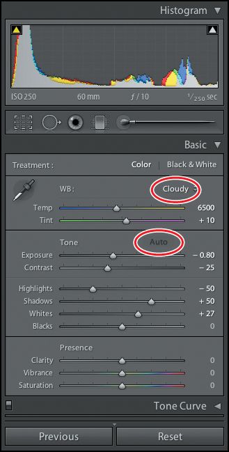
Auto Tone improved the photo’s tonal range markedly. The Histogram curve is still far from ideal, but the peaks in the Highlights and Whites have been shifted to fill out the mid-tones a little.
The adjustment to the photo’s tonal distribution has unveiled the distant landscape that was hidden in the mist and glare, increased definition in mid-toned areas such as the sunlit branches of the trees on the left, and even retrieved some of the detail that was lost in the shadows. Overall, the image has far more color and depth.
The Auto Tone adjustment may be all you need for some photos, but for others, especially problem images, it may produce unexpected results. You can use it as a starting point for manual adjustment, or read the automatic settings as a diagnosis of your photo’s deficiencies, and then undo and devise your own treatments.
Undoing, redoing, and remembering changes
Lightroom offers several options for undoing and redoing changes and recalling key stages in the develop process. The Edit > Undo command (Ctrl+Z / Command+Z) lets you undo the last command executed; pressing Ctrl+Y / Command+Shift+Z will redo the last command undone. To jump backward and forward in the editing history by more than one step at a time, you’ll use the History panel.
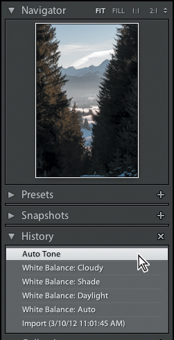
The History panel
1. Press F7 or click the triangle at the left edge of the workspace to show the left panel group. If necessary, collapse any other panels that are open to see the History panel.
2. Expand the History panel; you’ll see a list of every operation that has already been performed; with the most recent command at the top.
3. Watch the Navigator panel as you move the pointer slowly up the list of commands in the History panel. The Navigator preview shows how the image looked at each stage of its developing history.
4. Click the top entry—Auto Tone—to return the image to its most recent edited state.
If you return an image to a previous state by clicking an entry in the History panel, and then make any new adjustment, all of the entries above your current position will be replaced by the new command.
Creating snapshots
The History list can quickly become long and unwieldy, so it’s a good idea to save key steps in an image’s developing history as Snapshots for quick and easy recovery. In this case, you’ll use a snapshot as a reference to guide you as you work.
1. In the History panel, right-click / Control-click the Auto Tone entry and choose Create Snapshot from the context menu.
2. In the New Snapshot dialog box, type Auto Tone to name the snapshot; then, click Create. Your new Auto Tone snapshot appears in the Snapshots panel.
Changing the Before image
By default, the original, un-edited photo is displayed as the Before image in the Before / After view, but you can designate any other stage in the photo’s developing history—or any saved snapshot—as the Before image.
Change the Before image when you’re happy with your work so far, then work beside it so that you can see exactly what gains you’re making.
1. Press T to show the Toolbar; then click the Before & After view button, repeatedly if necessary, until you see the two states of the photo side by side.

2. Right-click / Control-click your saved snapshot in the Snapshots panel and choose Copy Snapshot Settings To Before. Both sides of the view should now be showing the photo as it appears with the Auto Tone adjustment.
3. In the Basic panel, double-click the name of each of the top five controls in the Tone pane to zero the current settings.
To quickly toggle between the last edited state of an image and the Before view state, press the Backslash key ().
Each of these actions is listed as a new entry in the History panel. The Auto Tone adjustment was never actually undone—it merely became history. Once you’ve zeroed all six controls, the After view is identical to the history state just before you applied the Auto Tone adjustment.

Now you can go back to your exploration of the Basic panel, with a visual benchmark to which you can compare your efforts.
Working with the Tone controls
As with the panels in the right panel group, you’ll start at the top.
The first step is to use the Exposure control to set the overall image brightness by correcting the midtones range; then, you can retrieve detail from the lightest and darkest areas with the Highlights and Shadows controls and correct clipping at the ends of the curve by tweaking the Whites and Blacks settings.
1. Hide the left panel group to make more room for your working view.
2. In the Basic panel, drag the Exposure slider all the way to the left, and then back up through its range. Watch the effect on the curve in the Histogram as well as in the After image. Set the Exposure value to -0.2.
The Exposure value is expressed in terms of camera f-stops: a setting of +1 is the equivalent of opening the aperture one stop.

3. Experiment with the Contrast slider, and then set the contrast to +10 (%)
To modify any of the settings, you can either drag the slider, scrub horizontally over the numerical value, or click the setting’s name to activate it, and then use the Plus (+) and Minus (-) keys.
4. Watch the Histogram, as well as the After image, as you drag the Highlights slider slowly, all the way to the left. Notice the dramatic effect on the lighter parts of the image, while very little changes elsewhere, even in the adjacent mid-tones. The peak in the Whites zone of the Histogram curve disappears, and the right end of the curve moves towards the center. Set the Highlights to -80.
5. Drag the Shadows slider slowly, all the way to the right. Watch how little effect this has on the mid-tones and highlights in the image, relative to the gain in the darkest areas. When you’re done, leave the Shadows set to +80.

These Highlights and Shadows settings are somewhat extreme; at these levels you’ll notice a glowing halo effect where light and dark areas meet, giving the scene an unreal look—and there is also the risk of introducing noticeable noise.
As a general rule, set values between -50 and +50 for image correction, and use higher settings sparingly to rescue problem photos or to achieve creative effects.
6. Set the Whites control to +10, and the Blacks to -10: settings not far short of levels that would result in clipping at the ends of the Histogram curve.
7. Set both the Clarity and Vibrance controls in the Presence pane to +20. Both of these controls are useful for enhancing image definition.
Clarity adjusts local contrast between small adjacent areas of light and dark. Vibrance boosts saturation selectively, without affecting skin tones or colors that are already saturated.
The photo now has very nearly as much detail in the brightest areas as the auto-toned Before image, and a lot more detail in the mid-tones and shadows.

8. Show the left panels. Right-click / Control-click the Import entry in the History panel and choose Copy History Step Settings To Before; then, hide the left panels.
Creating your own developing presets
When you’ve spent time setting up an effect that you’d like to use again, you can save all your current settings as a developing preset that will be listed in both the Develop module’s Presets panel and the Library module’s Quick Develop panel.
In this exercise, you’ll create a custom preset tailored to very specific purpose. Earlier in this lesson you edited a video clip in the Library module, where your options were limited to those offered in the Quick Develop panel. You can’t bring video into the Develop module, but by working on a captured frame, and then saving your settings as a custom preset, you can effectively bring the power and subtlety of Develop module editing back to your video in the Library module.
You can set up a preset to achieve a consistent look for every image in a photo book or web gallery, to add a romantic glow to wedding shots, or even to correct the color in your underwater photos. Whatever the purpose, develop presets streamline your workflow by letting you apply your favorite develop settings with a single click.
1. Staying in the Develop module, click the Loupe view button (![]() ) in the Toolbar. Show the Filmstrip, if it’s hidden, and then select the still image that you captured from the TamilTemple video earlier in the lesson.
) in the Toolbar. Show the Filmstrip, if it’s hidden, and then select the still image that you captured from the TamilTemple video earlier in the lesson.
2. Starting at the top of the Basic panel, set the Temperature and Tint to +15 and +30, respectively. Set a Contrast value of 55, reduce the Whites setting to -100, and increase the Blacks to +100.

3. Choose Develop > New Preset. Name your custom preset IceCreamCake and accept the User Presets folder as the destination to which it will be saved.

4. Inspect the Settings pane in the lower half of the New Develop Preset dialog box. You won’t need to change the defaults for this preset, but the Settings options will give you an overview of just how many developing adjustments you can include in a single preset. When you’re done, click Create.
This preset is intended for use with our lesson video, so no values are specified for Highlights, Shadows, or Clarity settings; those adjustments are amongst those not supported for video.

If you apply your custom preset to the lesson video now, you’ll lose the work you did earlier. In the next exercise, you’ll create a virtual copy of the video file, so that you can keep and compare the two edited versions.
Working with virtual copies
When you wish to explore different treatments for a photo or video, without losing the work you’ve already done, you can create virtual copies of your image or clip, and edit each one independently, just as if they were separate master files.
If a particular photo is included in more than one collection, any changes you make to that image while you’re working in one collection will be visible in all the others. If you wish to modify an image for a specific collection without affecting the way the photo appears elsewhere in your catalog, you should use a virtual copy.
You might include a full-frame, full-color version of your photo in a collection that you’ve assembled for a slideshow—and a tightly cropped, sepia-toned virtual copy in another collection intended for a print layout. You can apply a unifying special effect to an entire collection of virtual copies for a photo book without affecting the way the same images appear in any of your other projects and presentations.
Another important advantage of working with virtual copies is that you save a great deal of disk space by keeping only one master file for each photo. A virtual copy is actually just an additional catalog entry for that master file. This new entry will be updated to record every change you make to the virtual copy, while your developing settings for other virtual copies—and the master file—remain unchanged.
1. If you’re still in the Develop module, switch to the Grid view in the Library. In the Grid view or the Filmstrip, right-click / control click the video file TamilTemple.MPG and choose Create Virtual Copy from the context menu.
2. If necessary, press F6 to show the Filmstrip. You can see that there are now two copies of the video side by side in the Filmstrip.

In both the Grid view and the Filmstrip, virtual copies are identified by a page peel icon in the lower left corner of the thumbnail, though this is difficult to see on video thumbnails, as it appears behind of the duration indicator.
By default, Lightroom will automatically stack the virtual copy with the original video. In this case, the original video was already stacked with the still frame you captured, so Lightroom has added the virtual copy to the existing stack. The video at the top of the stack is marked with a stack badge.
3. Move the pointer over either of the stacked videos to see a file count indicating the position of that copy in the stack.

To unstack photos or videos, select one of the thumbnails in the stack in the Grid view; then, right-click / Control-click the stack icon on the selected thumbnail and choose Unstack from the menu.
You can use the Kind filter—one of the Attribute filters in the Filter bar—to filter your library by file kind, isolating master images, virtual copies, or video files.
4. If you don’t see the Filter bar above the Grid view, choose View > Show Filter Bar, or press Backslash () on your keyboard. Click Attribute in the filter picker; then click the third of the Kind filters—the button with a film-strip icon—at the right end of the Filter bar. The Grid view displays both videos. Click the next Kind filter to the left—the button with a turned-up corner—to isolate the virtual copy.

5. Click None in the filter picker; then, press Backslash () to hide the Filter bar.
6. Double-click the virtual copy, TamilTemple.MPG / Copy 1, in the Grid view or the Filmstrip, to open the clip in the Loupe view. Expand the Quick Develop panel, if necessary, and click the Reset All button at the bottom of the panel to clear all of the current settings and set the copy to the video’s un-edited state.
7. Click the Saved Preset menu (currently set to the Default Settings preset) and choose your custom IceCreamCake preset from the User Presets category. Scrub or play through the clip to see the effect.
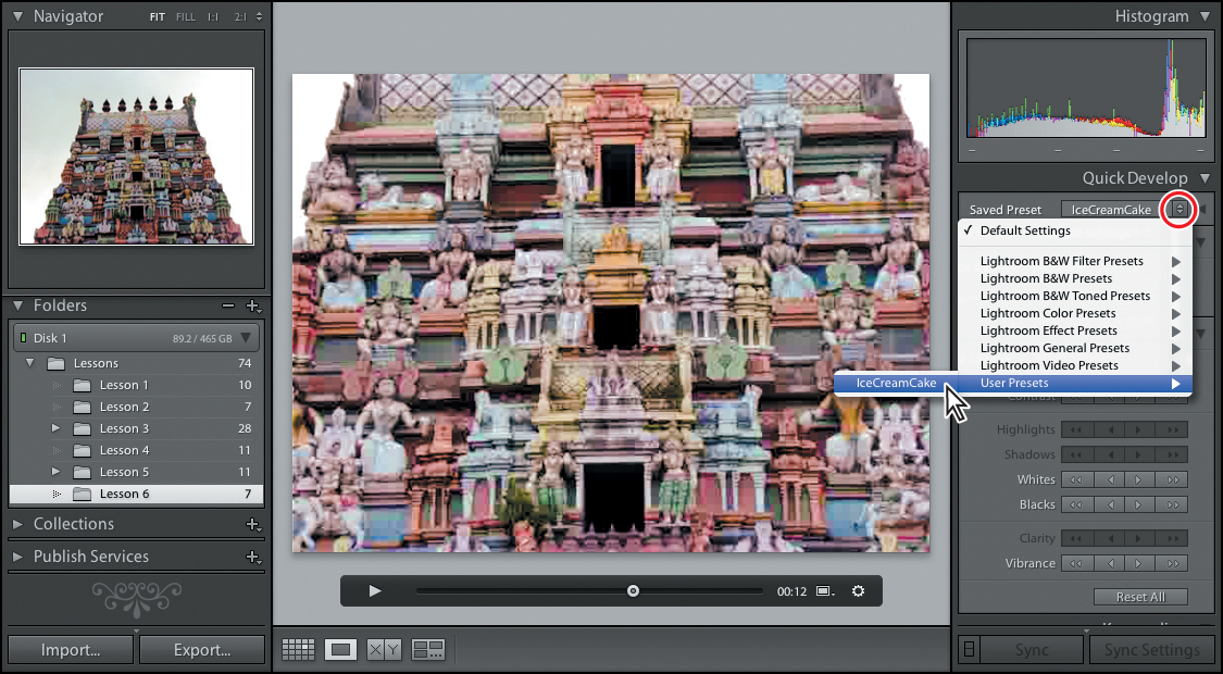
Your custom preset has improved the video significantly, correcting the cold, blue-green color cast, boosting the flat tonal range to add contrast and definition, and replacing the dull, de-saturated hues with the cheerful colors of the candy counter.
8. Choose Edit > Select None. In the Filmstrip, select the original video; then, hold down the Ctrl / Command key and click the virtual copy. Press the C key to switch to Compare view where you can see the two treatments side by side.

Beyond the Basic panel
Once you’ve adjusted the white balance and the tonal distribution in the Basic panel, you can move on to the rest of the panels in the right panel group.
1. In the Filmstrip, select the photo of the church: DSC_0299.NEF; then, press D on your keyboard to switch to the Develop module.
2. You can make more space in the Loupe view for this portrait-format photo by hiding the top panel (F5) and the Filmstrip (F6). Press T to hide the Toolbar. In the right panel group, expand the Histogram and Tone Curve panels. For a clear view, collapse any other panels that are currently open.
3. Inspect the settings in the Basic panel; you can see that the developing settings for this image have already been modified to adjust the tonal range.
Adjusting contrast using the tone curve
Working with the Tone Curve enables you to adjust contrast in different parts of the tonal range selectively. Tone curve corrections should not be applied until after the imaged has been processed as necessary with the controls in the Basic panel.
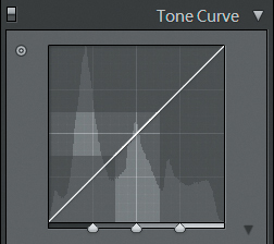
The tone curve maps the distribution of tonal values in the input image along the x-axis to a new distribution of tonal values in the output image along the y-axis. The dark end of the range is at the lower left and the light at the upper right.
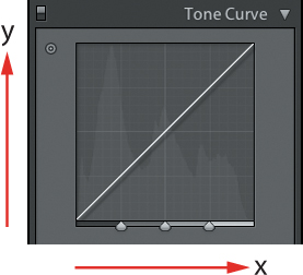
A linear tone curve at a 45° incline from the lower left corner to the upper right corner has no effect on the image; each tone value in the input image is mapped to the identical tone value in the output image. Raising the tone curve above this line maps tone values to a lighter value; lowering it darkens the tonal values.
A tone curve section that is flatter than 45° compresses a range of tone values from the input image (x axis) to a narrower range in the output image (y axis). Some tone values which were distinguishable in the input image become indistinguishable in the output image, resulting in a loss of image detail.
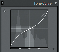
A tone curve section that is steeper than 45° expands tone values; the differences between tone values becomes more noticeable and the image contrast is increased.

In Lightroom, the tone curve is constrained so that the curve is always ascending. This means that if you increase the incline of one section of the curve you’ll end up with a decreased incline somewhere else; you’ll have to make a compromise. When using the tone curve, the trick is to increase the contrast in the range where you have the most tonal information; recognizable by a peak in the histogram. At the same time, try to place the flatter parts of the tone curve in ranges where there is less information in the image (troughs in the histogram) or where a lack of contrast is not as disturbing or noticeable.
A typical tone curve intended to increase mid-range contrast starts flat in the lower left corner (less contrast in the shadows), is steep in the center (more contrast in the mid-tones), and ends flat in the upper right corner (less contrast in the highlights).
For the image at hand we’ll customize the tone curve to selectively increase the contrast in the well-lit wall area of the church, which is the focus of attention in the photo. For this substantial enhancement it will be worthwhile sacrificing a little of the contrast in the shadowed area at the lower left and in the sky.
1. In the Navigator, set the Loupe view zoom level to Fit.
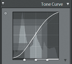
2. From the Point Curve menu at the bottom of the Tone Curve panel, choose Linear, Medium Contrast, and Strong Contrast in turn and notice the effect each setting has on the image. You can use a tone curve preset as a starting point for your adjustments; for this image, set a Medium Contrast curve.
The choice of point curve preset also constrains the amount of play in the adjustment controls.
Note the silhouette of the histogram plotted in the background in the tone curve display. This gives you an indication of the tonal ranges where an increase in contrast might be most effective.
3. Position the pointer over the tone curve. As you move from left to right you’ll notice the names of the ranges you’re moving over displayed at the bottom of the tone curve grid, while the corresponding slider is highlighted in the Region controls below.
By default, the four tonal ranges are of equal width. You can change their width by dragging the controls below the tone curve to reposition the dividing lines between adjacent tonal ranges.
Whether you use the sliders, enter numeric values, or drag directly in the tone curve grid, the tone curve controls raise or lower the curve by moving the center points of these four ranges: Shadows, Darks, Lights, and Highlights. The overall shape of the tone curve changes to accommodate your adjustments, becoming flatter in one place and steeper in another.
The extent to which you can adjust each section of the tone curve is indicated by the gray area that appears when you position the pointer over that section.
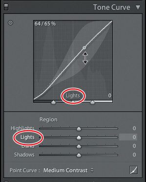
4. To see which areas in the image correspond to the different tonal ranges, click the Target button (![]() ) in the top left corner of the Tone Curve panel and move the pointer over the image in the Loupe view. As you move the pointer over the shadowed area in the lower left of the image you can see that these tones account for much of the first peak in the histogram around the 25% mark. Most of the tonal values in the blue sky are represented in the second peak in the histogram close to the 50% input level. The tones in the well-lit parts of the church wall are mostly spread between input levels of 60% to 90%.
) in the top left corner of the Tone Curve panel and move the pointer over the image in the Loupe view. As you move the pointer over the shadowed area in the lower left of the image you can see that these tones account for much of the first peak in the histogram around the 25% mark. Most of the tonal values in the blue sky are represented in the second peak in the histogram close to the 50% input level. The tones in the well-lit parts of the church wall are mostly spread between input levels of 60% to 90%.

Lowering the Lights value in the tone curve should produce the effect we’re after: increasing the contrast in the well-lit church wall by steepening the curve for the input values above 60%. The compromise is a flattening of the curve for lower input values; reducing contrast in the sky and shadow areas where a loss of detail is less noticeable.
5. Watch the tone curve as you move the target cursor over the church wall. When you see the Lights adjustment control selected on the Tone Curve, click and drag downwards in the image. Release the mouse button when the Lights value is adjusted to –45. Remember: you can only adjust the tone curve by dragging directly in the image when you are using the Tone Curve Target mode.
6. Click the Target button again to turn off target mode.
7. To compare your image with and without the tone curve adjustment, switch the tone curve controls off and on by clicking the On/Off switch at the left side of the Tone Curve panel’s header. Review the effect in the image at 100% zoom level. Note how much your adjustment enhanced the detail in the stone wall.


The image was also darkened as a whole because the tone curve was pushed below the diagonal. This works quite well for the image at hand. In another case, you could lessen the effect, if you wished, by raising the Shadows value in the Tone Curve or by readjusting the levels using the controls in the Basic panel.
8. When you’re done, set the zoom level to Fit and make sure the tone curve adjustment is turned on.
The image now looks quite acceptable. To improve it even further you can apply additional sharpening and reduce some of the noise that’s visible in the sky area.
Sharpening detail and reducing noise
The Detail panel contains controls for sharpening image detail and reducing noise. Sharpening helps make edges more pronounced and gives the image a crisper look.
Lightroom applies a slight amount of sharpening to your Raw images by default, so you should apply additional sharpening with caution.
Noise is most noticeable in images that were captured under low lighting conditions or at a high ISO setting. The image for this exercise was shot at an ISO setting of 800.
The Detail panel offers separate controls for reducing luminance noise and color noise. The image for this exercise was shot at an ISO setting of 800 and contains a slight amount of noise, mostly noticeable the sky area.
1. In the Navigator panel, set the zoom level for the Loupe view to 1:1 (100%). Image sharpening and noise reduction are always best executed at 100%; the pixel-for-pixel zoom level view gives you the clearest view of the results.
2. Scroll down in the right panel group, or collapse other panels if necessary, and then expand the Detail panel.
3. For this image, the sharpening amount is already set to 25%. To compare the image with and without this default sharpening, switch the Detail controls off and on by clicking the On/Off switch at the left of the panel header. Review the effect in several areas of the image at 100% magnification. When you’re done, make sure that the Detail settings are switched on.

Though the default sharpening has done a good job of emphasizing the edges in this image, you can still make it crisper. Before you apply extra sharpening, however, it’s best to set up a mask that will restrict your adjustment to areas with edge detail. For our lesson image, this will let you to sharpen architectural detail while you avoid accentuating the noise in the sky area where it will be easily noticeable.
4. Position the photo in the Loupe view so that you can see some of the sky and part of the church at the same time. Hold down the Alt / Option key and drag the Masking slider to the right. The mask is displayed in the Detail panel preview and in the Loupe view when the zoom level is set to 1:1 or higher. Release the pointer when most of the sky area is masked (black) but the edge detail on the church is still unmasked (white). We used a value of 50.
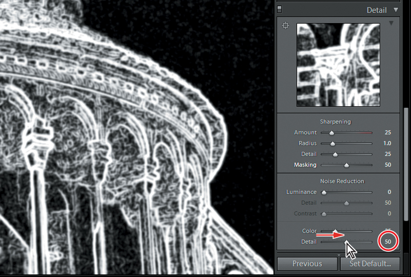
5. To sharpen the image further, drag the Amount slider to the right. With the extensive mask in place, you can afford to increase the value by a relatively large amount. We raised the setting to 100.
6. Compare the image with and without sharpening once again by clicking the On/Off switch icon at the left side of the header of the Detail panel.
7. To assess the effect of the sharpening mask, make sure the detail controls are turned on and drag the Masking slider all the way back to its default setting of 0. Undo and Redo to see the effect of applying sharpening with and without the mask. Pay particular attention to the sky area where unmasked sharpening accentuates noise. When you’re done, return the Masking setting to 50.
If you can’t see the effect clearly, click a higher zoom ratio in the header bar of the Navigator panel.
Most of the noise apparent in this image is luminance noise—variations in the brightness of pixels which should be equally bright. Luminance noise looks a little like film grain and is in general less of a problem than color noise, or chrominance noise—bright blue, red and purple spots in an area that should be a uniform hue. In the Noise Reduction pane at the bottom of the detail panel, you can see that a small amount of Color noise reduction has been applied to this image by default.
8. To assess the effect of the default reduction in color noise, focus on an area of sky in the image and drag the Color slider all the way to the left. Undo and Redo to see the image with and without the color noise reduction. When you’re done, return the zoom to 1:1 and the Color noise reduction value to 25.
9. Position the photo in the Loupe view so that you can some of the sky and part of the church wall at the same time, as shown in the illustration below. Drag the Luminance slider all the way to the right to a value of 100. The luminance noise in the sky has now disappeared—however, there is marked blurring of the detail in the church wall. You’ll need to find a compromise between reducing noise and maintaining the sharpness. Drag the Luminance slider back to 0, and then slowly to the right until you notice that the sky area is improved with only slight blurring of the details on the church wall. We used a value of 40.
You should use Noise Reduction with caution; both forms can blur image detail. You can use the Detail sliders for the Noise Reduction controls to help maintain the sharpness of the image, despite this effect.
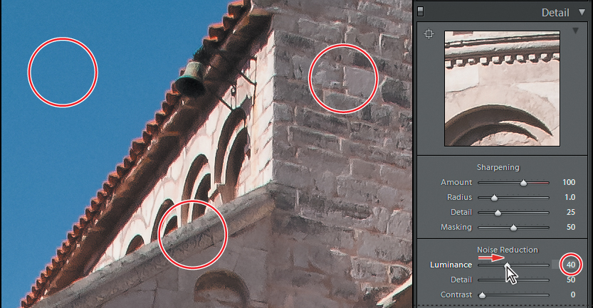
10. Use the Detail and Contrast controls below the Luminance slider to reduce the blurring effect. Try Detail and Contrast values of 70 and 25 respectively.
Correcting lens effects
As well as the Transform sliders you used in Lesson 1, the Lens Corrections panel in manual mode presents controls for correcting Lens Vignetting and Chromatic Aberration—unwanted effects that can be caused by your camera lens.
For information on using the Profile mode to make lens corrections tailored to your camera, please refer to Lightroom Help.
Lens vignetting is a phenomenon that results in reduced brightness or saturation of color towards the edges of an image—usually an accidental effect caused by a combination of the focal length, type of lens, and filters used.
Chromatic Aberration is most noticeable near the edges of an image shot with a wide-angle lens, resulting in color fringes where the lens has been unable to focus the different wavelengths of incoming light correctly on the sensor. There is only a very slight chromatic aberration in the image used for this exercise.

The slight amount of color aberration in this photo is apparent as a blue fringe around the top of the sunlit arches. The Remove Chromatic Aberration control is in the Lens Corrections panel’s Profile mode.
Adding effects
In the Lens Corrections panel, you can remove accidental lens vignetting; in the Effects panel you can deliberately put it back. A post-crop vignette can be used creatively to frame a photo, to draw the viewer’s attention to the center of an image, or even to simulate an accidental vignette for an atmospheric or “antique” effect.
The Effects panel also offers a Grain effect that simulates the distinctive look of a film photograph by adding grain.

This illustration shows a fairly extreme application of Post-Crop Vignetting that suggests the look of a film transparency. You can control the softness and shape of the vignette, and specify how you want it to interact with colors and highlights.

Making discrete color adjustments
You can use the controls in the HSL / Color / B & W panel to adjust discrete shades of color in your image, changing the hue, saturation, or luminance values for specific color ranges independently.
When converting an image to black and white, you can fine-tune the way that each color in the image will contribute to the grayscale mix. Use the Split Toning panel to apply creative duotone effects to a black and white image.
Understanding hue, saturation, and luminance
The color of each pixel in your image can be expressed either as a set of RGB values or as a combination of hue, saturation, and luminance values. Hue, saturation, and luminance values can be calculated from from RGB values, and vice versa.
Once you understand hue, saturation, and luminance, defining color in these terms seems far more natural than using RGB values, especially when it comes to describing changes made to color.
For example, darkening the blue colors in your image can be done by reducing the luminance value for the blue color component. Expressed in RGB values, a light blue might be composed of R: 42, G: 45, and B: 63, while a darker blue uses R: 35, G: 38, and B: 56—certainly not a very intuitive model for describing color adjustments.
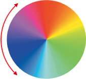
When you describe a color by name—red, yellow, green, blue—you’re referring to its hue. The full range of hues can be displayed as a color wheel. Adjusting the hue moves a given color around the wheel in one direction or the other.
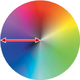
Saturation is the boldness or intensity of a hue, ranging from neutral and grayed to vivid and un-muted. Saturation can be visualized on a color wheel with fully saturated colors around the edge of the circle and less saturated colors closer to the center. As the saturation of a color is increased it moves from a neutral gray in the center of the wheel to a pure, vivid hue on the rim.
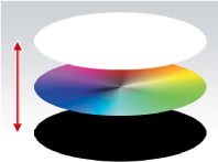
Luminance is the measure of brightness of a color, ranging from the minimum value for black to the maximum value for white. On the color wheel model, luminance can be represented by adding a third dimension, with a completely underexposed—or black—wheel below the color wheel and a completely overexposed—or white—wheel above it.
The terms tint, shade, and tone can all be expressed with reference to hue, saturation, and luminance.
A tint is a pure hue mixed with white; a hue with increased luminance and a reduced saturation. In our three-dimensional color wheel model the tints of a hue are found along the line from the pure hue on the rim of the wheel in the middle to the center point of the white wheel at the top.
A shade is a pure hue mixed with black; a hue with decreased luminance and saturation, located along a line from the pure hue on the rim of the wheel in the middle to the center point of the black wheel at the bottom.
A tone is a pure hue mixed with a neutral gray, located along a line from the pure hue on the rim of the wheel in the middle to the respective gray on the central axis.
Adjusting colors selectively
Understanding color in an image in terms of hue, saturation and luminance can help you both in identifying the changes you need to make to achieve the effect you want and in choosing the most effective way to make those changes.
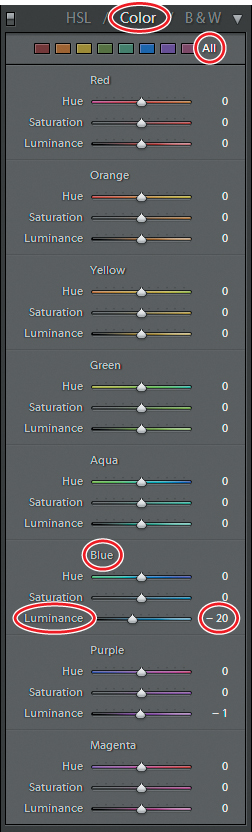
In this exercise you’ll darken the blue of the sky in the photo of the stone church. You can do this by reducing the luminance of the blue color range while leaving the hue and saturation unchanged.
1. You should still be in the Develop module, with the image of the stone church, DSC_0299.NEF, open in the Loupe view.
2. In the Navigator panel, set the zoom level to Fit.
3. In the right panel group, scroll up or collapse other panels, if necessary, and then expand the HSL / Color / B & W panel. If not already selected, click HSL (Hue, Saturation, Luminance) in the panel header, and then click the Luminance tab.
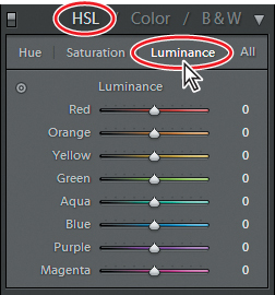
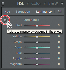
4. Click the Target tool button (![]() ) in the upper left corner of the Luminance pane.
) in the upper left corner of the Luminance pane.
5. In the Loupe view, click in the sky area and drag the pointer downwards to reduce the luminance of the color range under the pointer. Release the mouse button when the Luminance value for Blue reaches –20. Depending on where you click, you may see a small shift in the Aqua or Purple values.
6. Click the Target button again to disable target mode.
7. To compare the image with and without the luminance adjustment applied, switch the HSL / Color / B & W adjustment off and on by clicking the On/Off switch icon at the left side of the panel header. Note that the adjustment has not affected the gradient from lighter blue near the horizon to darker blue at the top. When you’re done, make sure the HSL / Color / B & W adjustment is turned on.
The luminance adjustment is not restricted to one discrete color but is applied across a range of colors to either side of the target hue.

You can adjust the hue or saturation in the same way. Select the Hue or Saturation tab, then use the Target tool to adjust the color in a specific area in the image. You could also use the respective slider controls. Click the All tab for access to all the sliders for Hue, Saturation, and Luminance at the same time. In the Color tab the sliders are grouped by color rather than by hue, saturation, and luminance. The All tab displays the sliders for all of the colors at the same time.
Converting an image to black and white
Lightroom converts a photo to black and white by mapping each color in the image to a different tone of gray according to a default routine. You can create very different grayscale looks by adjusting the relative predominance of each color in the mix.
1. Click B & W in the header of the HSL / Color / B & W panel. You can see the result of the default black and white mix in the Loupe view.
If you wish, you can even adjust the black and white mix selectively for different areas of the same image.
2. Click the Target button (![]() ) in the upper left of the Black And White Mix pane. In the Loupe view, click the sky and drag upwards to set the Blue value to +30; then, click the church wall and drag down to reduce the value for Orange to –20.
) in the upper left of the Black And White Mix pane. In the Loupe view, click the sky and drag upwards to set the Blue value to +30; then, click the church wall and drag down to reduce the value for Orange to –20.
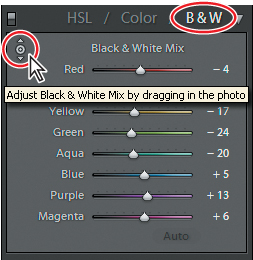

3. Click the Black And White Mix Target button (![]() ) again to turn target mode off.
) again to turn target mode off.
4. To compare the image before and after your adjustments to the grayscale mix, switch the Black And White Mix adjustments off and on by clicking the On/Off switch icon at the left side of the HSL / Color / B & W panel header. When you’re done, make sure the Black And White Mix control is turned on.
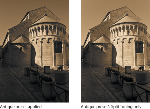
Split toning
A split toning effect replaces the dark tones (shadows) in a black and white image with shades of one color and the lighter tones (highlights) with tints of another. The effect can be quite subtle and restrained or very striking and unusual depending on your choice of colors and your intention.
1. In the right panel group, expand the Split Toning panel. If possible, keep the HSL / Color / B & W panel open so you can see the settings for the grayscale mix at the same time.
2. Right-click / Control-click the image in the Loupe view and choose Settings > Lightroom BW Toned Presets > Antique from the menu. Note the changes in the Split Toning panel. The Antique effect uses a sepia tone for the highlights and a less saturated and slightly warmer color for the shadows.

3. In the right panel group, expand the Basic, Tone Curve, Detail, and Lens Corrections panels in turn, using Undo and Redo to see how the Antique preset changes the settings. Collapse each panel when you’re done with it.
If you wish, you can copy only a subset of the settings from a preset or another image. In this case, you’ll copy just the color settings from the Split Toning panel.
4. Right-click / Control-click the antique grayscale image in the Loupe view, and then choose Settings > Copy Settings from the context menu. In the Copy Settings dialog box, first click the Check None button, and then activate only the Split Toning option. Click Copy.
5. Choose Edit > Undo Antique to return to the black and white image with all your customized settings. Right-click / Control-click the image in the Loupe view and choose Settings > Paste Settings from the context menu. By checking the panels in the right panel group, you can see that this time only the settings in the Split Toning panel have been altered.
Synchronizing settings
You can copy, or synchronize, settings from one photo to a multiple selection of images by using the Synchronize Settings command.
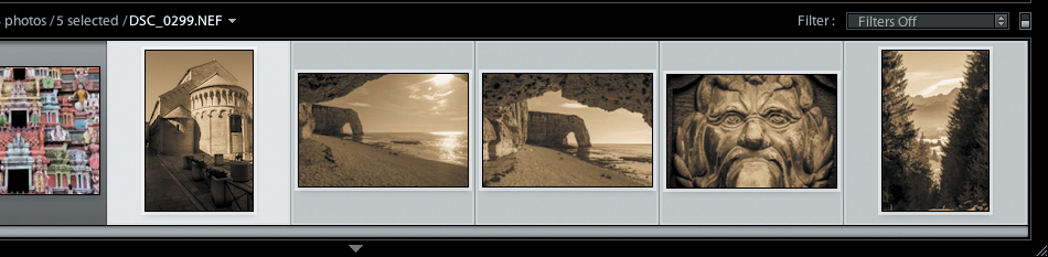
1. Select all five of the raw images in the Filmstrip, avoiding the two video files and the associated JPEG image. Click the image of the church to make sure it’s the active (the most selected) image.
2. Click the Sync button below the right panel group. In the Synchronize Settings dialog box, click the Check None button, and then activate both the Treatment (Black & White) and Split Toning options. Click Synchronize.
All five images have been converted to black and white and have had the duo-tone effect that you copied from the Antique Grayscale preset applied.
The Synchronize Settings command in the Develop module copies absolute values from one image to the others. To apply relative changes to a selection of images—such as increasing exposure by 1/3 step independent of the current exposure settings in each of the destination images—you can use the Quick Development panel in the Library module.
Local corrections
All the adjustments you’ve made in this lesson so far have been applied globally—across the entire image. For example, increasing the Shadows setting affects all the darker areas in a photo; you can’t lighten one area selectively or some areas more than others. With the local correction tools—the Graduated Filter tool and the Adjustment Brush tool—you can do both.
Using the Graduated Filter tool
With the Graduated Filter tool you can created a gradient mask through which you can apply an adjustment so that the effect is stronger in one area and fades off across the rest of the image.
1. In the Filmstrip, select just the image of the stone church. Click the Graduated Filter button below the Histogram panel, or press M. Controls for the tool appear below the tool buttons.
2. Make sure New is selected as the Mask setting; then, choose Exposure from the Effect menu above the Temperature and Tint sliders. Use the slider or type a new value in the text box at the right to set the Exposure setting to 0.36.

3. With the Graduated Filter tool, drag from a point near the lower left corner of the image upwards and to the right, and then release the pointer.
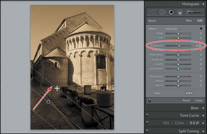
You have just created a basic gradient mask, through which your adjustment has been applied. Next you’ll fine-tune both the mask and the adjustment.
You can see the effect on the image at a glance; the exposure is gradually increased towards the lower left corner. In the Graduated Filter controls, the Mask setting has changed to Edit. You can still change the settings for the adjustment and reposition, rotate, resize, and fine-tune the gradient mask.
4. Increase the Exposure setting to 1.00. Then adjust the gradient mask as shown in the illustration below. Drag the pin to reposition the center of the gradient beside the kerb-stone. Drag the center line to rotate the mask so that its orientation is parallel to the kerb, and then drag either of the outer lines to make the band of the gradient narrower or broader.
You can use the Adjustment Brush to create more than one local adjustment in a single image, each with its own settings.

The broader the band, the “softer” the gradient—the narrower the band, the more abruptly the adjustment is faded into the image. While you’re dragging the outer lines, you can keep the center line fixed at its current position by holding down the Alt / Option key. The outer lines represent the boundaries beyond which the adjustment is applied at 100% of the specified value on one side and 0% on the other. Press the H key to hide or show the adjustment pin.
5. To evaluate the image with and without the graduated filter adjustment, click the On/Off switch icon in the lower left corner of the Graduated Filter controls pane. When you’re done, make sure the graduated filter adjustment is activated.
6. Click the Graduated Filter button again to disable the Graduated Filter tool.
Using the Adjustment Brush tool
You can use the Adjustment Brush tool to paint adjustments directly onto different areas of the image selectively.
1. Click the Adjustment Brush button below the Histogram panel (circled at right), or press K. The Adjustment Brush tool settings appear below the tool buttons. Make sure that Mask is set to New in the Adjustment Brush tool controls pane.

In addition to the Effect pane, the Adjustment Brush tool settings also present controls for setting up brushes. You can set a different size, softness, flow, and density for two brushes that will apply the adjustment or effect and one that will erase it.
2. Reset the Exposure value to 0. Click the color box to choose a color for a tint effect. We chose a strong, saturated red.
3. Click brush A and activate the Auto Mask option. With the Auto Mask option activated, the brush will detect the edges of the area you’re painting, and will mask those parts of the image outside those edges.
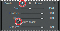
4. Paint over the entire sky area. Avoid moving the center of the brush outside the area. Hold down the Alt key / Option key and drag to erase any mistakes.
You can use more than one graduated filter in a single image, each with its own position, direction, size, and adjustment settings.
To delete a local adjustment, select its pin, and then press delete.

5. Click the Adjustment Brush tool again to disable it.
This exercise completes the lesson. You are now familiar with a wide variety of basic skills as well as some specialized techniques for more sophisticated image editing tasks. Experiment with the tools, settings, and options on your own photos to discover more of the depth and power of the Develop module. Take a moment to refresh what you’ve learned by reading through the review on the facing page.
Review questions
1. How do you undo changes or return quickly to a previous develop state?
2. How can you edit a video with the Develop module’s tools, even though video is not supported in the Develop module?
3. What is white balance?
4. What does a tone curve represent and what is it used for?
5. What are the two kinds of noise you might encounter in a digital image and what can you do about them?
6. Which tools are used to perform local corrections?
Review answers
1. You can undo one modification at a time using the Undo command. You can jump back multiple steps at once in the History panel. You can create snapshots of important develop states so that you can return to them quickly.
2. Capture a still frame from the video; then, open the captured frame in the Develop module, make your adjustments, and save the results as a custom developing preset. Your saved preset is listed in the Library module’s Quick Develop panel, where you can apply it to your video clip.
3. An image’s white balance reflects the composition of the red, green, and blue components in the light source when the picture was taken. It is used as a calibration benchmark to correctly render the color information recorded by the camera’s sensors.
4. A tone curve adjusts the distribution of the tonal ranges in an image. The curve shows the way tonal information from the original image will be mapped to the adjusted image. It can be used to increase or decrease the contrast in specific tonal ranges.
5. Digital images may contain two kinds of noise: luminance noise, which is a result of variation in the brightness of pixels which should be of the same luminance, and color (chrominance) noise: bright blue, red and purple spots in an area that should be a uniform hue. Each kind of noise can be reduced using the appropriate noise reduction slider in the Detail panel.
6. You can restrict adjustments to selected areas of your image with the Graduated Filter tool and the Adjustment Brush tool.