
12. Adding Interactivity
Lesson overview
In this lesson, you’ll add Web 2.0 functionality to your webpages by doing the following:
• Use Dreamweaver behaviors to create an image rollover effect
• Insert a Bootstrap Accordion widget
This lesson will take about 2 hours to complete. If you have not already done so, download the project files for this lesson from the Lesson & Update Files tab on your Account page at www.peachpit.com, store them on your computer in a convenient location, and define a new site based on the lesson12 folder as described in the “Getting Started” section of this book. Your Account page is also where you’ll find any updates to the lessons or to the lesson files. Look on the Lesson & Update Files tab to access the most current content.

Dreamweaver can create sophisticated interactive effects with behaviors and accordion panels using Adobe’s Bootstrap and jQuery frameworks.
Learning about Dreamweaver behaviors
The term Web 2.0 was coined to describe a major change in the user experience on the Internet—from mostly static pages, featuring text, graphics, and simple links, to a new paradigm of dynamic webpages filled with video, animation, and interactive content. Dreamweaver has always led the industry in providing a variety of tools to drive this movement, from its tried-and-true collection of JavaScript behaviors, jQuery, and Bootstrap widgets to the latest support for jQuery Mobile. This lesson explores two of these capabilities: Dreamweaver behaviors and Bootstrap widgets.
 Note
Note
If you have not already downloaded the project files for this lesson to your computer from your Account page, make sure to do so now. See “Getting Started” at the beginning of the book.
A Dreamweaver behavior is predefined JavaScript code that performs an action—such as opening a browser window or showing or hiding a page element—when it is triggered by an event, such as a mouse click. Applying a behavior is a three-step process:
1. Create or select the page element that you want to trigger the behavior.
2. Choose the behavior to apply.
3. Specify the settings or parameters of the behavior.
Note
To access Dreamweaver Behaviors, you must have a file open.
The triggering element often involves a hyperlink applied to a range of text or to an image. In some cases, the behavior is not intended to load a new page, so it employs a dummy link enabled by the hash sign (#), similar to ones that you used in Lesson 11, “Working with Navigation.” The Swap Image behavior you will use in this lesson does not require a link to function, but keep this in mind when you work with other behaviors.
Dreamweaver offers more than 16 built-in behaviors, all accessed from the Behaviors panel (Window > Behaviors). Hundreds of other useful behaviors can be downloaded from the Internet for free or a small fee. Some are available from the online Adobe Add-ons website, which can be added to the program by clicking the Add Behavior icon  in the Behaviors panel and choosing Get More Behaviors from the pop-up menu or by choosing Window > Browse Add-ons.
When the Adobe Add-ons page loads in the browser, click the link to download the plug-in, extension, or other add-on. Often you can simply double-click the add-on to install it.
The following are some examples of the functionality available to you using the built-in Dreamweaver behaviors:
• Opening a browser window
• Swapping one image for another to create what is known as a rollover effect
• Fading images or page areas in and out
• Growing or shrinking graphics
• Displaying pop-up messages
• Changing the text or other HTML content within a given area
• Showing or hiding sections of the page
• Calling a custom-defined JavaScript function
Not all behaviors are available all the time. Certain behaviors become available only in the presence and selection of certain page elements, such as images or hyperlinks. For example, the Swap Image behavior must be applied to an image.
Each behavior invokes a unique dialog that provides relevant options and specifications. For instance, the dialog for the Open Browser Window behavior enables you to open a new browser window; set its width, height, and other attributes; and set the URL of the displayed resource. After the behavior is defined, it is listed in the Behaviors panel with its chosen triggering action. As with other behaviors, these specifications can be modified at any time.
Behaviors are extremely flexible, and multiple behaviors can be applied to the same trigger. For example, you could swap one image for another and change the text of the accompanying image caption—and do it all with one click. Although some effects may appear to happen simultaneously, behaviors are actually triggered in sequence. When multiple behaviors are applied, you can choose the order in which the behaviors are processed.

Adobe add-ons offer tons of resources for many of the applications in Creative Cloud, including both free and paid add-ons.
To learn more about Adobe Add Ons, check out creative.adobe.com/addons.
Previewing the completed file
In the first part of this lesson, you’ll create a new page for GreenStart’s travel services. Let’s preview the completed page in a browser.
1. Launch Adobe Dreamweaver CC (2015.1 release) or later.
If necessary, define a site based on the lesson12 folder.
Name the site lesson12.
2. Open travel_finished.html and preview the page in the default browser.
The page includes Dreamweaver behaviors.
3. If Microsoft Internet Explorer is your default browser, a message may appear in the browser window indicating that it has prevented scripts and ActiveX controls from running. If so, click Allow Blocked Content.
This message appears only when the file is previewed from your hard drive.
It doesn’t appear when the file is actually hosted on the Internet.
4. Position the cursor over the Tour Eiffel heading.
Observe the image to the right of the text.

The existing image swaps for one of the Eiffel Tower.
5. Move the pointer to the Paris Underground heading.
Observe the image to the right of the text.
As the pointer moves off the Tour Eiffel heading, the image reverts to the Eco-Tour ad. Then, as the pointer moves over the heading Paris Underground, the ad image swaps for one of underground Paris.
6. Pass the pointer over each <h3> heading, and observe the image behavior.
The image alternates between the Eco-Tour ad and images of each of the tours. This effect is the Swap Image behavior.
7. When you’re finished, close the browser window and return to Dreamweaver.
8. Close travel-finished.html.
In the next exercise, you’ll learn how to work with Dreamweaver behaviors.
Working with Dreamweaver behaviors
Adding Dreamweaver behaviors to your layout is a simple point-and-click operation. But before you can add the behaviors, you have to create the travel page.
1. Create a new page from mygreen_temp.
2. Save the file as travel.html in the site root folder.
Switch to Design view, if necessary.
3. Open sidebars12.html in Design view from the lesson12/resources folder.
Insert the cursor into the first paragraph.
Examine the tag selectors.

The paragraph is a child of a <blockquote> within an aside element. The classes and structure in the new file are identical to Sidebar 1 in the site template.
4. Select the aside tag selector.
5. Copy the aside element from sidebars12.html.
6. Switch to travel.html.
Insert the cursor into the first quotation.
Select the aside tag selector.
7. Paste the new content.

The new content replaces the placeholder.
8. Close sidebars12.html.
9. Open travel-text.html in Design view from the lesson12/resources folder.

The travel-text.html file contains content in some paragraphs and a table for the travel page. Note that the text and table are unformatted.
10. Press Ctrl+A/Cmd+A to select all the text, and press Ctrl+C/Cmd+C to copy the contents of travel-text.html.
Close the file.
11. In travel.html, select the placeholder Add main heading here.
Type Green Travel to replace the text.
12. Select the heading placeholder Add subheading here.
Type Eco-Touring to replace it.
13. Select the p tag selector for the Add content here text.
Press Ctrl+V/Cmd+V to paste.

The content from travel-text.html appears, replacing the placeholder text. It assumes the default formatting for text and tables applied by the style sheet you created in Lesson 9, “Working with Text, Lists, and Tables.”
Next, let’s insert the Eco-Tour ad, which will be the base image for the Swap Image behavior.
14. In the table, double-click the SideAd placeholder.
Select ecotour.png from the images folder.
Click OK/Open.

The placeholder is replaced by the Eco-Tour ad. But before you can apply the Swap Image behavior, you have to identify the image you want to swap. You do this by giving the image an id.
15. Select ecotour.png in the layout.
In the Property inspector, select the existing id SideAd.
Type ecotour and press Enter/Return.
Enter Eco-Tour of Paris in the Alt field.

 Tip
Tip
Although it takes more time, giving all your images unique ids is a good practice.
16. Save the file.
Next, you’ll create a Swap Image behavior for ecotour.png.
Applying a behavior
As described earlier, many behaviors are context sensitive, based on the elements or structure present. A Swap Image behavior can be triggered by any document element, but it affects only images displayed within the page.
1. Choose Window > Behaviors to open the Behaviors panel.
Note
Feel free to dock the Behaviors panel with the other panels in the interface.
2. Insert the cursor in the Tour Eiffel text, and select the <h3> tag selector.
3. Click the Add Behavior icon .
Choose Swap Image from the behavior menu.
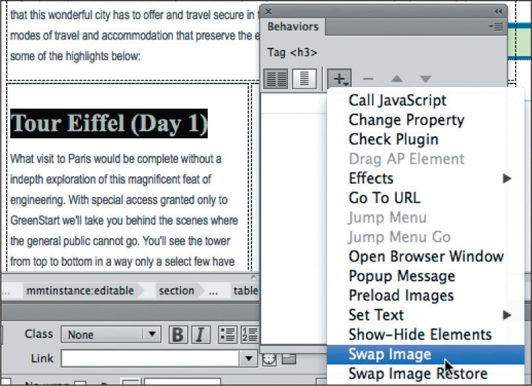
The Swap Image dialog lists any images on the page that are available for this behavior. This behavior can replace one or more of these images at a time.
Note
Items listed as unnamed <img> are images without id attributes. If you wish to swap them too, you’ll have to first give them ids.
4. Select the image "ecotour" item and click Browse.
5. In the Select Image Source dialog, select tower.jpg from the site images folder.
Click OK/Open.

6. In the Swap Image dialog, select the Preload Images option, if necessary, and click OK.

Note
The Preload Images option forces the browser to download all images necessary for the behavior when the page loads. That way, when the user clicks the trigger, the image swap occurs without any lags or glitches.
A Swap Image behavior is added to the Behaviors panel with an attribute of onMouseOver. Attributes can be changed, if desired, using the Behaviors panel.
7. Click the onMouseOver attribute to open the pop-up menu, and examine the other available options.

The menu provides a list of trigger events, most of which are self-explanatory. For now, however, leave the attribute as onMouseOver.
8. Save the file.
Switch to Live view to test the behavior.
Position the cursor over the Tour Eiffel text.
When the cursor passes over the text, the Eco-Tour ad is replaced by the image of the Eiffel Tower. But there is a small problem. When the cursor moves away from the text, the original image doesn’t return. The reason is simple: You didn’t tell it to. To bring back the original image, you have to add another command—Swap Image Restore—to the same element.
Applying a Swap Image Restore behavior
In some instances, a specific action requires more than one behavior. To bring back the Eco-Tour ad once the mouse moves off the trigger, you have to add a restore function.
1. Switch to Design view.
Insert the cursor in the Tour Eiffel heading and examine the Behaviors panel.
The inspector displays the currently assigned behavior. You don’t need to select the element completely; Dreamweaver assumes you want to modify the entire trigger.
2. Click the Add Behavior icon .
Choose Swap Image Restore from the drop-down menu.
Click OK in the Swap Image Restore dialog to complete the command.

The Swap Image Restore behavior appears in the Behaviors panel with an attribute of onMouseOut.
3. Switch to Code view and examine the markup for the Tour Eiffel text.

The trigger events—onMouseOver and onMouseOut—were added as attributes to the <h3> element. The rest of the JavaScript code was inserted in the document’s <head> section.
4. Save the file and switch to Live view to test the behavior.
Test the text trigger Tour Eiffel.
When the pointer passes over the text, the Eco-Tour image is replaced by the one of the Eiffel Tower, and then reappears when the pointer is withdrawn. The behavior functions as desired, but nothing is visibly “different” about the text. There is nothing here to prompt a user to roll their pointer over the heading. The result will be that many users will miss the swap image effect altogether.
Users sometimes need to be encouraged or directed to these types of effects. Many designers use hyperlinks for this purpose, since users are already familiar with how they function. Let’s replace the current effect with one based on a hyperlink.
Removing applied behaviors
Before you can apply a behavior to a hyperlink, you need to remove the current Swap Image and Swap Image Restore behaviors.
1. Switch to Design view.
Open the Behaviors panel, if necessary.
Insert the cursor in the Tour Eiffel text.
The Behaviors panel displays the two applied events. Which one you delete first doesn’t matter.
2. Select the Swap Image event in the Behaviors panel.
Click the Remove Event icon  .
.

3. Select the Swap Image Restore event.
In the Behaviors panel, click the Remove Event icon.
Both events are now removed. Dreamweaver also removes any unneeded JavaScript code.
4. Save the file and check the text in Live view again.
The text no longer triggers the Swap Image behavior. To reapply the behavior, you need to add a link or link placeholder to the heading.
Adding behaviors to hyperlinks
Behaviors can be added to hyperlinks even if the link doesn’t load a new document. For this exercise, you’ll add a link placeholder (#) to the heading to support the desired behavior.
1. Select only the text Tour Eiffel in the <h3> element.
Type # in the Property inspector Link field.
Press Enter/Return to create the link placeholder.
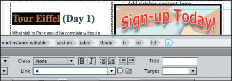
The text displays with the default hyperlink styling. The tag selector for the a tag appears.
2. Insert the cursor in the Tour Eiffel link.
Click the Add Behavior icon .
Choose Swap Image from the pop-up menu.
As long as the cursor is still inserted anywhere in the link, the behavior will be applied to the entire link markup.
3. In the Swap Image dialog, select the item image "ecotour".
Browse and select tower.jpg from the images folder.
Click OK/Open.
4. In the Swap Image dialog, select the Preload Images option and the Restore Images onMouseOut option, if necessary, and click OK.

The Swap Image event appears in the Behaviors panel along with a Swap Image Restore event. Since the behavior was applied all at once, Dreamweaver provides the restore functionality as a productivity enhancement.
5. Apply a link placeholder (#) to the text Paris Underground.
Apply the Swap Image behavior to the link.
Use underground.jpg from the images folder.
6. Repeat step 5 for the Seine Dinner Cruise text.
Select the image cruise.jpg.
7. Repeat step 5 for the Champs Élysées text.
Select the image champs.jpg.
The Swap Image behaviors are now complete, but the text and link appearances don’t match the site’s color scheme. Let’s create custom CSS rules to format them accordingly. You will create two rules: one for the heading element and another for the link itself.
8. In the CSS Designer, select green_styles.css > GLOBAL.
Create the new selector: article table h3
9. Create the following properties in the new rule:
margin-top: 0px
margin-bottom: 5px
font-size: 130%
font-family: "Arial Narrow", Verdana, "Trebuchet MS", sans-serif
10. Select green_styles.css > GLOBAL.
Create a new selector:
table h3 a:link, table h3 a:visited
11. Create the following properties in the new rule:
color: #090
font-weight: bold

The headings are now more prominent and styled to match the site theme.
12. Save all files.
Test the behaviors in Live view.
Note how the links are underlined when the mouse moves over them. The Swap Image behavior should work successfully on all links. If one or more of the links do not function, check to make sure the behavior was assigned to the link successfully.
Making it responsive
Once you’re satisfied that all the rollover effects are functioning properly, you should check to make sure that the new components adapt properly to the responsive page design too. You can check the functionality in Dreamweaver or in any modern browser installed on your computer.
1. If necessary, open travel.html.
Switch to Live view.
2. Drag the Scrubber to the left to test how the new table responds to the existing set of media queries.
The table adapts to the changing screen in a fashion similar to the tables created and styled in Lesson 9. Everything seems to display fine, although the Eco-Tour ad does not scale or resize in any way.

At a width of 426 pixels, the two columns merge and the cells begin to stack one atop the other, including the cell containing the ad. The image does not appear beside the text describing the tours. At this point, the purpose of the rollover effect will be lost completely, as does the need for the ad itself. The simplest plan would be just to hide the ad on smaller screens and allow the text to speak for itself.
At this moment, there’s a custom id applied to the ad image but nothing applied to the cell containing it. CSS can hide the image, but it will leave the blank cell behind. Instead, let’s create a custom class to hide the cell and its contents.
3. Drag the Scrubber all the way to the right to restore the table layout to
two columns.
4. Select the Eco-Tour image.
5. Select the td tag selector.

The HUD appears focused on the td element.
6. Click the Add Class/ID icon  .
.
7. Enter .hide_ad in the HUD text field. If the CSS Source HUD appears press the ESC key to close it.
8. If necessary, open the CSS Designer.
Select green_styles.css > (max-width: 426px).
Create a new selector: table .hide_ad
This rule limits the styling to elements within a table when the screen drops down to the smallest media query.
9. Create the following property:
display: none.
The table cell and ad will hide whenever the screen is 426 pixels or narrower.
10. Drag the Scrubber to the left until it is narrower than 426 pixels.
Observe the changes to the table and its content.

The Eco-Tour ad hides once the screen is narrower than 426 pixels. It reappears as soon as the screen gets wider than 426 pixels.
11. Save all files.
12. Close travel.html.
In addition to eye-catching effects such as the dynamic behaviors you’ve just been learning about, Dreamweaver also provides structural components—such as jQuery and Bootstrap widgets—that conserve space and add more interactive flair to your website.
Working with Bootstrap Accordion widgets
The Bootstrap Accordion widget allows you to organize a lot of content into a compact space. In the Accordion widget, the tabs are stacked, and when opened, they expand vertically rather than side by side. Let’s preview the completed layout.
1. In the Files panel, select tips_finished.html from the lesson12 folder and preview it in your primary browser.
The page content is divided among three panels using the Bootstrap Accordion widget.
2. Click each panel in turn to open and close each.
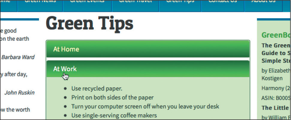
When you click a tab, the panel slides open with a smooth action. The panels are set to a specific height; if the content is taller than the default panel size, the panel adjusts its height automatically. When the panels open and close, the bulleted lists of green tips are revealed. The accordion allows you to display more content in a smaller, more efficient footprint.
3. Close your browser and return to Dreamweaver.
Close tips_finished.html.
Inserting a Bootstrap Accordion widget
In this exercise, you’ll incorporate a Bootstrap Accordion widget into one of your existing layouts.
1. Open tips.html in Live view.
The page consists of three bulleted lists separated by <h2> headings. These lists take up a lot of vertical space on the page, requiring the user to scroll down two or more screens to read them. Keeping content on one screen as much as possible will make it easier to access and read.
One technique to maximize screen real estate is using tabbed or accordion panels. Dreamweaver offers both types of components in jQuery and Bootstrap frameworks. Since we’re using a Bootstrap layout, let’s use a Bootstrap Accordion.
2. Insert the cursor in the At Home heading, and select the <h2> tag selector.
3. Open the Insert panel.
Select the Bootstrap category.
Click the Accordion item.

The position assist HUD appears.
4. Click Before.

Dreamweaver inserts the Bootstrap Accordion widget element above the heading, but inside the <article> element. The default element is a three-panel Accordion widget that appears with the top panel (Collapsible Group 1) open. The HUD appears above the new object, focused on a div element with a class of .panel-group and an id of #accordion1.
The next step is to move the existing lists into the panel. Since two of the panels are hidden by default, the easiest way to work with the content will be in Code view.
5. Switch to Code view.
Tip
As you work in Code view, you may need to click the Refresh button from time to time in the Property inspector to see the tag selectors.
6. Scroll down, and insert the cursor in the first bullet:<li>Wash clothes in cold water.</li> (approximately line 87).
7. Select the ul tag selector.
Press Ctrl+X/Cmd+X to cut the whole list.

8. Delete the code  .
.
9. Scroll up and select the heading Collapsible Group 1 (approximately line 63).
Edit the heading to say: At Home

The new heading structure is based on an <h4> element.
10. Select and delete the text placeholder Content for Accordion Panel 1 (approximately line 66).

The text appears in the <div> without any other structure. Make sure you do not delete the <div>.
11. Press Ctrl+V/Cmd+V to paste the list.

The list markup appears in <div class="panel-body">. The first Accordion panel group is complete. You have to repeat this process for the other two lists.
12. Scroll down and select the “At Work” tip list (approximately line 112).
13. Using the ul tag selector as in step 7, press Ctrl+X/Cmd+X to cut the list.
14. Click the <article> tag selector.
Press Delete.

The <article> and the heading At Work are deleted.
15. Select the heading Collapsible Group 2 and type At Work to replace it (approximately line 93).

16. Delete the placeholder text Content for Accordion Panel 2 and paste the list you cut from step 13 (approximately line 96).

17. Repeat steps 12–16 to create the content section for In the Community.
When you’re finished, all three lists are now contained within Accordion 1, and all the empty <article> elements have been deleted.
18. Switch to Live view.
You inserted a Bootstrap Accordion and added content to it.
19. Test the panels by clicking each heading.

When clicked, the panel should open, revealing the list contained within. When you click a different heading, the new panel opens, closing the old one.
20. Save all files.
In the next exercise, you’ll learn how to apply the site color scheme to the Accordion widget.
Styling a Bootstrap Accordion
As with the basic layout and the other Bootstrap components created by Dreamweaver, the accordion is formatted by the Bootstrap CSS and JavaScript files. You should avoid editing these files directly unless you know what you are doing. Instead, you’ll apply the site design theme to Accordion 1 using your own custom style sheet as before. Let’s start with the tabs.
1. Click the At Home tab.
Examine the tag selectors.
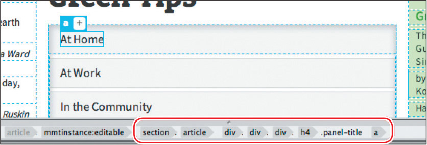
The tab is composed of three main elements: <div.panel-heading>,<h4.panel-title>, and <a>. But that’s only on the surface. Behind the scenes, the Bootstrap JavaScript and CSS functions are manipulating the HTML and CSS to produce the various behaviors controlling the accordion. As you move your mouse over the tabs and click them, class attributes are being changed on the fly to produce the hover effects and animated panels.
As you learned earlier, hyperlinks exhibit four basic behaviors: link, visited, hover, and active. The Bootstrap framework is taking advantage of these default states to apply the various effects you see when interacting with Accordion 1 for the At Home list.
Your job will be to create several new rules that will override the default styling and apply the GreenStart theme instead. The first step is to format the default state of the tabs. Since only one tab can be open at a time, the closed state is considered the default state.
2. Click the At Home tab heading to close the tab content.
The tabs are currently styled a light gray. You need to identify any rules that format the background color of the Accordion tab. Be aware that there may be more than one rule affecting these properties.
One trick that can help you identify rules that are styling a specific element is to notice how the selected element is displayed in the document window. For example, when you clicked the heading initially, only the <a> element was selected, as shown below.

You can see how the HUD outlines the heading text.
3. Click the h4 tag selector for the closed tab.
When you click the h4 tag selector, the HUD outlines the <h4> element but does not extend to the entire tab.

The outline is a literal indication of how far the styling of the heading extends. That means you can ignore rules styling the a and h4 elements if you want to set the background of the entire tab.
4. Click the next element in the tag selector interface.

The element <div.panel-heading> is selected. Note how the HUD outlines the entire tab.
5. Click the Current button in the CSS Designer.
Examine the rules and properties applied to this element.
The very first rule displayed in the Selectors window, .panel-default > .panel-heading, applies a background color. To apply the site color theme, you need to override this rule.
6. Click the All button.
Choose green_styles.css > GLOBAL.
Create a new selector:
article .panel-default > .panel-heading
Since some elements already feature the site theme, it’s a simple matter to grab this styling using the CSS Designer. Let’s format the tabs the same way the footer is styled.
7. Select the footer rule in green_styles.css in the Selectors window.
8. Right-click the footer rule.
Select Copy Styles > Copy Background Styles from the context menu.

9. Right-click the rule article .panel-default > .panel-heading and select Paste Styles from the context menu.

The background color and gradient properties are added to the new rule.
10. Add the following property:
color: #FFC

This styling will apply to the default state of the Accordion tabs. We’ll add some interactive styling later, but first let’s flesh out the styling of the accordion.
11. Choose green_styles.css > GLOBAL.
Create a new selector:
article #accordion1
12. Create the following properties:
border: solid 1px #060
border-radius: 5px
This new rule defines a border around the entire accordion.
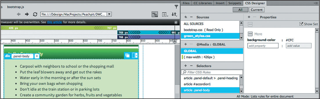
13. Create a new selector: article .panel-body
Create the following property: background-color: #CFC
This rule adds a background color to the content panels.
Finally, let’s give the accordion a little flair by adding a rollover behavior to the tabs. Although it’s mainly used for links, the :hover pseudo-class can be used anytime you want to create interactive effects.
14. Right-click the rule
article .panel-default > .panel-heading.
Select Duplicate from the context menu.
A duplicate of the rule appears in the Selectors window, complete with the same styling.
15. Edit the new selector by adding the highlighted markup:
article .panel-default > .panel-heading:hover

The new rule will format the tabs whenever you position the cursor over the tab. But at the moment, the styling is identical to the original.
16. Edit the background gradient property.
Change the angle to 180

17. Change the color property to #FFF
18. Save all files.
19. Position the cursor over each tab to test the new behavior.

The gradient background inverts as the cursor moves over and away from each tab. There is only one distraction in the overall effect. The default hyperlink styling adds an underline to the heading when the cursor passes over it.
Although this may be an acceptable behavior in a normal text-based link, it’s rather distracting in the Accordion tab. To turn this effect off, you first have to find the rule that’s responsible for creating it.
20. Select the Current button in the CSS Designer.
21. Click the heading At Home in the first tab. Examine the rules listed in the Selectors window. Try to identify any rules adding the underline effect.
The third rule, a:hover, a:focus, applies the underline effect. We don’t want to turn this styling off for all hyperlinks, just for links in the Accordion tabs.
22. Create a new selector in green_styles.css > GLOBAL.
The name .panel-heading .panel-title a appears in the window.
23. Press the up arrow key to make the selector less specific.
24. Add the highlighted markup to the name:
.panel-title a:hover,
.panel-title a:focus

This rule will style the hover state of the tab heading.
25. Create the following property:
text-decoration: none
26. Test the rollover effect.
The underline no longer appears in the Accordion tabs.
27. Save all files.
The accordion is just one of over 100 Bootstrap and jQuery widgets and components offered by Dreamweaver. They allow you to incorporate advanced functionality into your website, while requiring little or no programming skill. All of these components can be accessed via either the Insert menu or panel.
Adding interactivity to your webpages opens new possibilities of interest and excitement for your visitors, engaging them in new ways. It can easily be overdone, but a wise use of interactivity can help bring in new visitors and keep your frequent visitors coming back for more.
Review questions
1. What is a benefit of using Dreamweaver behaviors?
2. What three steps must be used to create a Dreamweaver behavior?
3. What’s the purpose of assigning an id to an image before applying a behavior?
4. What does a Bootstrap Accordion widget do?
5. What Dreamweaver tools are helpful in troubleshooting CSS styling on dynamic elements?
Review answers
1. Dreamweaver behaviors add interactive functionality to a webpage quickly and easily.
2. To create a Dreamweaver behavior, you need to create or select a trigger element, select a desired behavior, and specify the parameters.
3. The id is essential for selecting the specific image during the process of applying a behavior.
4. A Bootstrap Accordion widget includes multiple collapsible panels that hide and reveal content in a compact area of the page.
5. The Current mode of the CSS Designer helps identify any existing CSS styling and create new specifications.