
10 Adding Interactivity
Lesson overview
In this lesson, you’ll add Web 2.0 functionality to your webpages by doing the following:
Using Dreamweaver behaviors to create an image rollover effect
Inserting a jQuery accordion widget
This lesson will take about 90 minutes to complete. Please log in to your account on peachpit.com to download the project files for this lesson, as described in the “Getting Started” section at the beginning of this book. Follow the instructions under “Accessing the Lesson Files and Web Edition.” Define a site based on the lesson10 folder.
Your Account page is also where you’ll find any updates to the lessons or the lesson files. Look on the Lesson & Update Files tab to access the most current content.
Dreamweaver can create sophisticated interactive effects with behaviors and accordion panels using Adobe’s Bootstrap and jQuery frameworks.
Learning about Dreamweaver behaviors
The term Web 2.0 was coined to describe a major change in the user experience on the Internet—from mostly static pages, featuring text, graphics, and simple links, to a new paradigm of dynamic webpages filled with video, animation, and interactive content. Dreamweaver has always led the industry in providing a variety of tools to drive this movement, from its tried-and-true collection of JavaScript behaviors to jQuery, jQuery Mobile, and Bootstrap widgets. This lesson explores two of these capabilities: Dreamweaver behaviors and jQuery widgets.
 Note
Note
If you have not already downloaded the project files for this lesson to your computer from your Account page, make sure to do so now. See “Getting Started” at the beginning of the book.
A Dreamweaver behavior is predefined JavaScript code that performs an action—such as opening a browser window or showing or hiding a page element—when it is triggered by an event, such as a mouse click. Applying a behavior is a three-step process.
Note
To access Dreamweaver behaviors, you must have a file open.
Create or select the page element that you want to trigger the behavior.
Choose the behavior to apply.
Specify the settings or parameters of the behavior.
The triggering element often involves a hyperlink applied to a range of text or to an image. In some cases, the behavior is not intended to load a new page, so it employs a dummy link enabled by the hash sign (#), similar to ones you used in Lesson 5, “Creating a Page Layout.” The Swap Image behavior you will use in this lesson does not require a link to function, but keep this in mind when you work with other behaviors.
Dreamweaver offers more than 16 built-in behaviors, all accessed from the Behaviors panel (Window > Behaviors). You can download hundreds of other useful behaviors from the Internet for free or a small fee. Some are available from the Adobe Add-ons website, which you can add to the program by clicking the Add Behavior icon in the Behaviors panel and choosing Get More Behaviors from the pop-up menu. You can obtain other tools or features from third-party developers and install them in Dreamweaver as extensions. You can also access the Adobe Add-ons website by choosing Window > Find Extensions On Exchange.

When the Adobe Add-ons page loads in the browser, click the link to download the plug-in, extension, or other add-on. Often you can simply double-click the add-on to install it.
The following are some examples of the functionality available to you using the built-in Dreamweaver behaviors:
Opening a browser window
Swapping one image for another to create what is known as a rollover effect
Fading images or page areas in and out
Growing or shrinking graphics
Displaying pop-up messages
Changing the text or other HTML content within a given area
Showing or hiding sections of the page
Calling a custom-defined JavaScript function
Not all behaviors are available all the time. Certain behaviors become available only in the presence and selection of certain page elements, such as images or hyperlinks. For example, the Swap Image behavior must target an image.
Each behavior invokes a unique dialog that provides relevant options and specifications. For instance, the dialog for the Open Browser Window behavior enables you to open a new browser window; set its width, height, and other attributes; and set the URL of the displayed resource. After the behavior is defined, it is listed in the Behaviors panel with its chosen triggering action. As with other behaviors, you can modify these specifications at any time.
Behaviors are extremely flexible, and you can apply multiple behaviors to the same trigger. For example, you could swap one image for another and change the text of the accompanying image caption—and do it all with one click. Although some effects may appear to happen simultaneously, behaviors are actually triggered in sequence. When multiple behaviors are applied, you can choose the order in which the behaviors are processed.
To learn more about Adobe Add-ons, check out www.adobeexchange.com/creativecloud.html. Select Dreamweaver in the “view by product” list to see add-ons developed specifically for that app.

The Adobe Add-ons website offers tons of resources for many of the applications in Creative Cloud, including both free and paid add-ons.
Previewing the completed file
In the first part of this lesson, you’ll create a new page for GreenStart’s travel services. Let’s preview the completed page in a browser.
Launch Adobe Dreamweaver CC (2019 release) or later.
Define a site based on the lesson10 folder. Name the site lesson10.
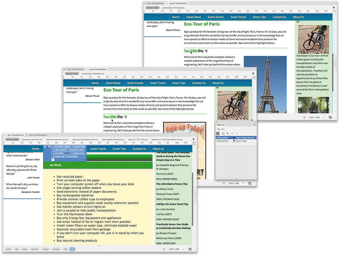
Open travel_finished.html directly in your favorite browser.

The page includes Dreamweaver behaviors. In the middle of the page is a two-column table. Some of the interactivity may not preview properly in Dreamweaver.
If Microsoft Internet Explorer is your default browser, a message may appear in the browser window indicating that it has prevented scripts and ActiveX controls from running. If so, click Allow Blocked Content.
This message appears only when the file is previewed from your hard drive. It doesn’t appear when the file is actually hosted on the Internet.
Position the cursor over the Tour Eiffel heading. Observe the image to the right of the text.
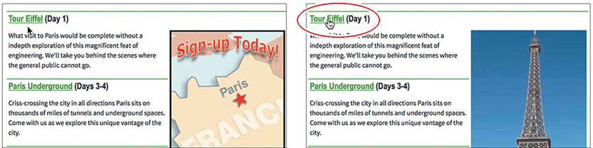
The existing image is swapped for one of the Eiffel Tower.
Move the pointer to the Paris Underground heading.
Observe the image to the right of the text.
As the pointer moves off the Tour Eiffel heading, the image reverts to the Eco-Tour ad. Then, as the pointer moves over the heading Paris Underground, the ad image is swapped for one of underground Paris.
Pass the pointer over each
<h3>heading, and observe the image behavior.The image alternates between the Eco-Tour ad and images of each of the tours. This effect is the Swap Image behavior.
When you’re finished, close the browser window and return to Dreamweaver.
Close travel-finished.html.
In the next exercise, you’ll learn how to work with Dreamweaver behaviors.
Working with Dreamweaver behaviors
Adding Dreamweaver behaviors to your layout is a simple point-and-click operation. But before you can add the behaviors, you have to create the travel page from the site template.
Create a new page from mygreen_temp.dwt.
Save the file as travel.html in the site root folder.
Switch to Design view, if necessary.
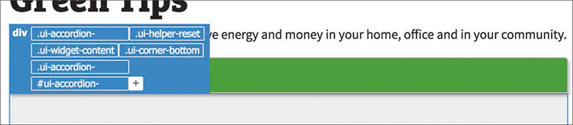
Open sidebars10.html in Design view from the lesson10/ resources folder. Insert the cursor into the first paragraph. Examine the tag selectors.
The paragraph is a child of a
<blockquote>within anasideelement. The classes and structure in the new file are identical to Sidebar 1 in the site template.In sidebars10.html, drag to select the four quotes and citations.
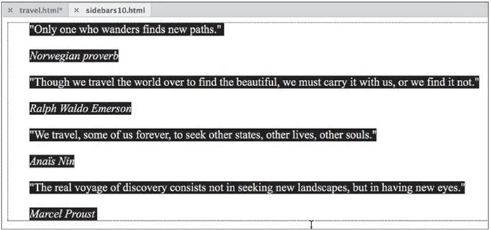
Copy the selected text in sidebars10.html.
Switch to travel.html.
Insert the cursor into the quotation placeholder.
Select the
blockquotetag selector.Paste the content from step 5.
NoteIt’s vital that you use the same document view when copying and pasting content from one document to another in Dreamweaver.

The new content replaces the placeholder.
In sidebars10.html, scroll down to the next content element.
Insert the cursor into the first paragraph. Examine the tag selectors.
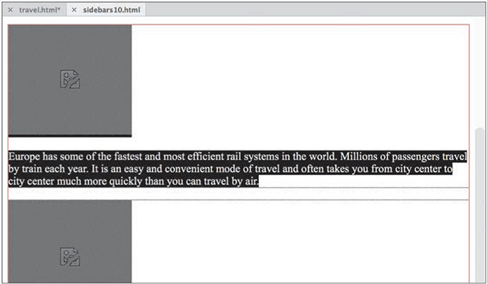
The content is composed of figure and figcaption elements.
Select the
figuretag selector.Hold the Shift key and click to select all the content ending at “…welcome friendly visitors.”
Copy the selected content.
Note that the text in Sidebar 2 in sidebars10.html contains images that are missing. If you check the source attributes, you’ll see that the image paths are designed to work from the site root. Since sidebars10.html is saved in the resources subfolder, the images will not appear until the code is moved into the travel page and saved.
Close sidebars10.html.
In travel.html, insert the cursor in the Sidebar 2 placeholder.
Select the
ptag selector. Paste the text from step 10.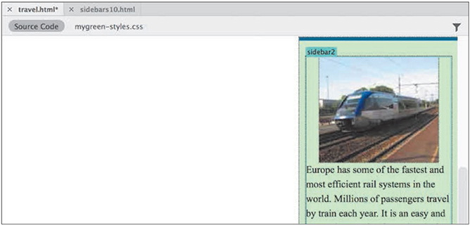
The text replaces the placeholder text in Sidebar 2. The images should now be visible.
Open travel-text.html in Design view from the lesson10/resources folder.
The travel-text.html file contains content in paragraphs and a table meant for the travel page. Note that the text and table are unformatted.
Press Ctrl+A/Cmd+A to select all the text.
Press Ctrl+C/Cmd+C to copy the contents.
Close travel-text.html.
In travel.html, select the text Add main heading here.
Type Green Travel to replace the text.
Select the placeholder Add article heading here.
Type Eco-Touring to replace it.
Select the
ptag selector for the text Add content here.Press Ctrl+V/Cmd+V to paste.

The content from travel-text.html appears, replacing the placeholder text. The new text will assume the default formatting for text and tables applied by the style sheet you created in Lesson 7, “Working with Text, Lists, and Tables.”
Next, let’s insert the Eco-Tour ad, which will be the base image for the Swap Image behavior.
In the table, double-click the SideAd placeholder.
Select ecotour.png from the images folder.
Click OK/Open.
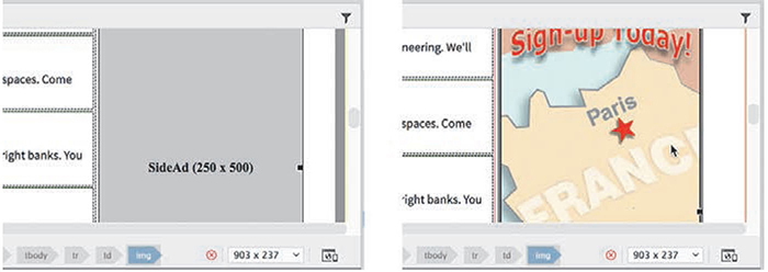
The placeholder is replaced by the Eco-Tour ad. But before you can apply the Swap Image behavior, you have to identify the image you want to swap. You do this by giving the image an id.
 Tip
TipAlthough it takes more time, giving all your images unique ids is a good practice.
Select ecotour.png in the layout.
In the Property inspector, select the existing id SideAd.
Type
ecotourand press Enter/Return.Enter
Eco-Tour of Parisin the Alt field.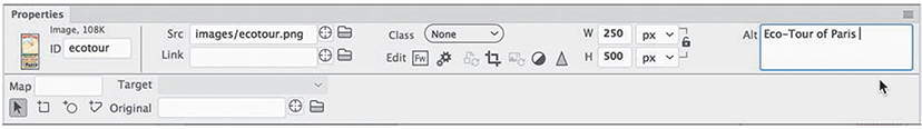
Save the file.
Next, you’ll create a Swap Image behavior for the new image.
Applying a behavior
As described earlier, many behaviors are context sensitive, based on the elements or structure present. A Swap Image behavior can be triggered by any document element, but it affects only images displayed within the page.
Note
You will be able to access the Behaviors panel only when you are in Design view or Code view.
Choose Window > Behaviors to open the Behaviors panel.
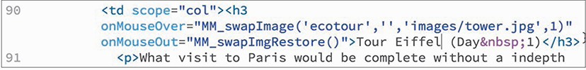
Insert the cursor in the Tour Eiffel text and select the
<h3>tag selector.Click the Add Behavior icon
 .
.Choose Swap Image from the behavior menu.
NoteFeel free to dock the Behaviors panel with the other panels in the interface.

The Swap Image dialog lists any images on the page that are available for this behavior. This behavior can replace one or more of these images at a time.
Select the
image "ecotour"item and click Browse.In the Select Image Source dialog, select tower.jpg from the site images folder. Click OK/Open.

In the Swap Image dialog, select the Preload Images option, if necessary, and click OK.
NoteThe Preload Images option forces the browser to download all images necessary for the behavior when the page loads. That way, when the user interacts with the trigger, the image swap occurs without any lags or glitches.
A Swap Image behavior is added to the Behaviors panel with an attribute of
onMouseOver.Attributes can be changed, if desired, using the Behaviors panel.Click the
onMouseOverattribute to open the pop-up menu and examine the other available options.
The menu provides a list of trigger events, most of which are self-explanatory. For now, however, leave the attribute as
onMouseOver.Save the file. Switch to Live view to test the behavior.
Position the cursor over the Tour Eiffel text.
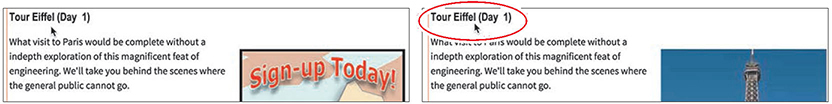
When the cursor passes over the text, the Eco-Tour ad is replaced by the image of the Eiffel Tower. But there is a small problem. When the cursor moves away from the text, the original image doesn’t return. The reason is simple: You didn’t tell it to return. To bring back the original image, you have to add another command—Swap Image Restore—to the same element.
Applying a Swap Image Restore behavior
In some instances, a specific action requires more than one behavior. To bring back the Eco-Tour ad once the mouse moves off the trigger, you have to add a restore function.
Switch to Design view.
Insert the cursor in the Tour Eiffel heading and examine the Behaviors panel.
The inspector displays the currently assigned behavior. You don’t need to select the element completely; Dreamweaver assumes you want to modify the entire trigger.
Click the Add Behavior icon
 .
.Choose Swap Image Restore from the dropdown menu.
Click OK in the Swap Image Restore dialog to complete the command.

The Swap Image Restore behavior appears in the Behaviors panel with an attribute of
onMouseOut.Switch to Code view and examine the markup for the Tour Eiffel text.
The trigger events—
onMouseOverandonMouseOut—were added as attributes to the<h3>element. The rest of the JavaScript code was inserted in the document’s<head>section.Save the file and switch to Live view to test the behavior.
Test the text trigger Tour Eiffel.
When the pointer passes over the text, the Eco-Tour image is replaced by the one of the Eiffel Tower and then reappears when the pointer is withdrawn. The behavior functions as desired, but nothing is visibly “different” about the text. In other words, there is nothing here to prompt a user to roll their pointer over the heading. The result will be that many users will miss the swap image effect altogether.
Users sometimes need to be encouraged or directed to these types of effects. Many designers use hyperlinks for this purpose, since users are already familiar with how they function. Let’s replace the current effect with one based on a hyperlink.
Removing applied behaviors
Before you can apply a behavior to a hyperlink, you need to remove the current Swap Image and Swap Image Restore behaviors.
Switch to Design view. Open the Behaviors panel, if necessary.
Insert the cursor in the Tour Eiffel text.
The Behaviors panel displays the two applied events. Which one you delete first doesn’t matter.
Select the Swap Image event in the Behaviors panel.
Click the Remove Event icon
 .
.
The Swap Image event is removed.
Select the Swap Image Restore event.
In the Behaviors panel, click the Remove Event icon
 .
.Both events are now removed. Dreamweaver also removes any unneeded JavaScript code.
Save the file and check the text in Live view again.
The text no longer triggers the Swap Image behavior. To reapply the behavior, you need to add a link or link placeholder to the heading.
Adding behaviors to hyperlinks
Behaviors can be added to hyperlinks even if the link doesn’t load a new document. For this exercise, you’ll add a link placeholder (#) to the heading to support the desired behavior.
Switch to Design view.
Select only the text Tour Eiffel in the
<h3>element.Type
#in the Property inspector Link field.Press Enter/Return to create the link placeholder.
The text displays with the default hyperlink styling. The tag selector for the a tag appears.
Click the Add Behavior icon
 .
.Choose Swap Image from the pop-up menu.
As long as the cursor is still inserted anywhere in the link, the behavior will be applied to the entire link markup.
In the Swap Image dialog, select the item
image "ecotour".Browse and select tower.jpg from the images folder. Click OK/Open.
In the Swap Image dialog, select the Preload Images option and the Restore Images onMouseOut option, if necessary, and click OK.
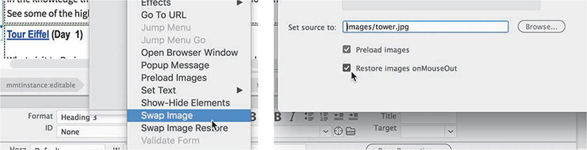
The Swap Image event appears in the Behaviors panel along with a Swap Image Restore event. Since the behavior was applied all at once, Dreamweaver provides the restore functionality as a productivity enhancement.
Add a link placeholder (#) to the text Paris Underground. Apply the Swap Image behavior to the link. Use underground.jpg from the images folder.
Repeat step 5 for the Seine Dinner Cruise text.
Select the image cruise.jpg.
Repeat step 5 for the Champs Élysées text.
Select the image champs.jpg.
The Swap Image behaviors are now complete, but the styling of the text and link don’t match the site’s color scheme. Let’s create custom CSS rules to format them accordingly. You will need to create two rules: one for the heading element and another for the link itself.
In the CSS Designer, create a new selector in mygreen-styles.css:
table h3Create the following properties in the new rule:
margin-top: 0px
margin-bottom: 5px
font-size: 130%
font-family: "Arial Narrow", Verdana, "Trebuchet MS",
sans-serif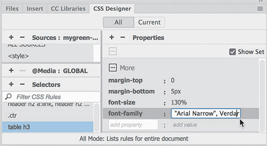
Create a new selector:
table h3 a:link, table h3 a:visitedCreate the following properties in the new rules:
color: #090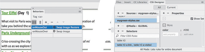
The headings are now more prominent and styled to match the site theme.
Save all files. Test the behaviors in Live view.
The Swap Image behavior should work successfully on all links, but only on the link itself. If one or more of the links do not function, check to make sure the behavior was assigned to the link successfully.
Close all files.
In addition to eye-catching effects, such as the dynamic behaviors you’ve just been learning about, Dreamweaver also provides structural components—such as jQuery and Bootstrap widgets—that conserve space and add more interactive flair to your website.
Working with jQuery accordion widgets
The jQuery accordion widget allows you to organize a lot of content into a compact space. In the accordion widget, the tabs are stacked, and when opened, they expand vertically rather than side by side. Let’s preview the completed layout.
In the Files panel, select tips-finished.html from the finished folder in lesson10 and open it directly in your favorite browser.
The page content is divided among three panels using a jQuery accordion widget.
Click each panel in turn to open and close each.

When you click a tab, the panel slides open with a smooth action. The panels are set to a specific height; if the content is taller than the default panel size, the panel adjusts its height automatically. When the panels open and close, the bulleted lists of green tips are revealed. The accordion panel allows you to display more content in a smaller, more efficient footprint.
Close your browser and return to Dreamweaver. Close tips-finished.html.
In the next exercise, you’ll learn how to create and format a jQuery accordion widget.
Inserting a jQuery accordion widget
In this exercise, you’ll incorporate a jQuery accordion widget into one of your existing layouts.
Open tips.html in Live view.
The page consists of three bulleted lists separated by
<h2>headings. These lists take up a lot of vertical space on the page, requiring the user to scroll down two or more screens to read them. Keeping content on one screen as much as possible will make it easier to access and read.One technique to maximize screen real estate is using tabbed or accordion panels. Dreamweaver (2019 Release) offers these types of components in both jQuery and Bootstrap frameworks. Since you’re not using a Bootstrap layout here, let’s use a jQuery accordion widget.
Insert the cursor in the At Home heading and select the
<h2>tag selector.Open the Insert panel.
Select jQuery UI from the drop-down menu.
Click the Accordion item.

The position assist dialog appears.
Click Before.
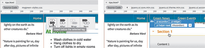
Dreamweaver inserts the jQuery accordion widget element above the heading but inside the
<section>element. The default element is a three-panel accordion widget that appears with the top panel open. The Element Display appears above the new object, focused on a div element with an id of#Accordion1.The next step is to move the existing lists into the panels. Since two of the panels are hidden by default, the easiest way to work with the content will be in Code view.
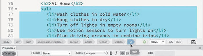
Switch to Code view.
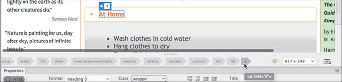
Scroll down and insert the cursor in the first bullet:
<li>Wash clothes in cold water.</li>(around line 77).Select the ul tag selector.
Press Ctrl+X/Cmd+X to cut the whole list.
Delete the code
<h2>At Home</h2>.Scroll up and select the heading Section 1 (around line 62). Edit the heading to say
At HomeThe new heading structure is based on an
<h3>element.
TipYou may not be able to see the tag selectors when you edit code elements. Remember to click the Refresh button as necessary.
Insert the cursor into the text placeholder Content 1 (approximately line 64). Select the p tag selector.
The text appears in the
<div>without any other structure. Make sure you do not delete the<div>.Press Ctrl+V/Cmd+V to paste the list.
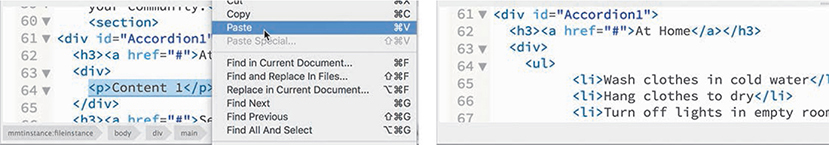
The list markup appears in the
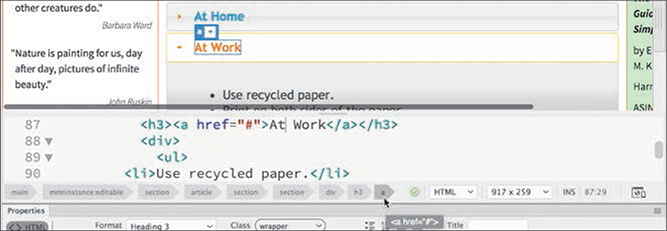
<div>. The first accordion panel group is complete. You have to repeat this process for the other two lists.Scroll down to the At Work tip list (around line 101).
Select the ul tag selector, as in step 7. Cut the list.
Click the
<section>tag selector. Press Delete.The
<section>and the heading At Work are deleted.Select the heading Section 2 and type
At Workto replace it (approximately line 88).Delete the placeholder text Content 2 and paste the list you cut in step 13 (around line 90).
Repeat steps 12-16 to move the content for In the Community into the third panel.

When you’re finished, all three lists are now contained within Accordion 1, and all the empty
<section>elements have been deleted.Switch to Live view.
You inserted a jQuery accordion widget and added content to it.
Test the panels by clicking each heading.
When clicked, the panel should open, revealing the list contained within. When you click a different heading, the new panel opens, closing the old one.
Save all files.
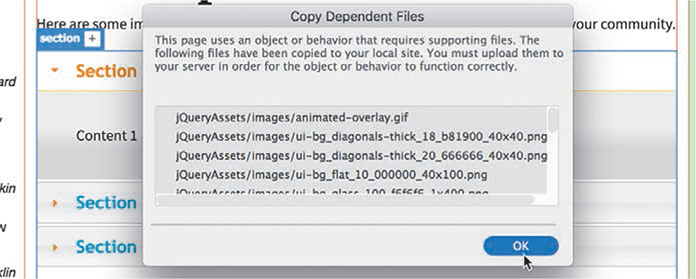
When you save tips.html, a dialog should appear informing you that several new dependent files will be copied into the site folder. These include images, CSS, and JavaScript files that enable the interactivity of the accordion panel. These files will be stored in a folder named jQueryAssets. Whenever you upload this page to your web server, remember to include this entire folder.
Click OK.
In the next exercise, you’ll learn how to apply the site color scheme to the accordion widget.
By any other name
I keep throwing the terms jQuery and JavaScript around and you may be wondering,“What’s the difference? Do I need to learn two different scripting languages?”
The good news is that jQuery is JavaScript. Created by John Resig, an American software engineer, a little over a decade ago, jQuery is a library of prebuilt JavaScript functions. Resig realized that he was constantly writing the same code over and over to perform specific tasks in JavaScript. By supplying a library of these functions, jQuery enables you to create a set of complex behaviors with a minimum amount of coding.
The Insert panel of Dreamweaver hosts 11 jQuery widgets, including tabbed panels, dialog boxes, date pickers, and other handy webpage components. Like the accordion, each item provides powerful interactive functionality to your site that can be added using a simple user interface that requires no programming knowledge orcoding experience.
Styling a jQuery accordion
As with the basic layout and the other jQuery components created by Dreamweaver, the accordion is formatted by the jQuery CSS and JavaScript files. You should avoid editing these files directly unless you know what you are doing. Instead, you’ll apply the site design theme to Accordion 1 using your own custom style sheet. Let’s start with the tabs.
Tip
As you work in Code view, you may need to click the Refresh button from time to time in the Property inspector to see the tag selectors.
Click the At Home tab. Examine the tag selectors.
The tab is composed of two elements:
<h3>and <a>. But that’s only on the surface. Behind the scenes, the jQuery and CSS functions are manipulating the HTML and CSS to produce the various behaviors controlling the accordion. As you move your mouse over the tabs and click them, class attributes are being added and changed on the fly to produce the hover effects and animated panels. In most cases, you won’t even see it happen.As you learned earlier, hyperlinks exhibit four basic behaviors:
link, visited, hover,andactive.The jQuery library takes advantage of these default states to apply the various effects you see when interacting with Accordion 1 for the At Home list.Your job will be to create several new rules that will override the default styling and apply the GreenStart theme instead. The first step is to format the default state of the tabs. Since only one tab can be open at a time, the closed state is considered the default state.
When the accordion is inserted, the first tab is typically open by default. Normally, you can troubleshoot the CSS by selecting an element in Live view. But since the tabs are designed to open when you click them, selecting a closed tab in Live view poses a problem. Luckily, you can use Code view.
Select Split view, if necessary.
In Code view, insert the cursor in the text At Work.
Select the a tag selector.
Closed tabs are currently styled a light gray with a slight gradient background. You need to identify any rules that format the background color of the accordion tab. Be aware that there may be more than one rule affecting these properties and, as you learned in Lesson 9, “Working with Navigation,” some of the styling is applied dynamically. So you have to distinguish rules that apply by default and ones that work only by user interaction.
In CSS Designer, click the Current button.
The Selectors panel displays all the rules that are currently styling the selected element.
NoteBe aware that the selector display in CSS Designer changes based on whether the tab is open or closed.
If necessary, click the first rule in the list:
.ui-state-default a,.ui-state-default a:link,.ui-state-default a:visited

Note that the Element Display focuses only on the <a> element. You can see that the properties format the text color and turn off the underscore. It’s clear that this rule does not format the entire tab, but we can use it later to style the text color.
One class, two class, three class, more!
You may have noticed that many of the rules that came in with the jQuery accordion feature multiple classes. You may be wondering, “What’s up with that?”
As you learned in Lesson 3, “CSS Basics,” classes are used to apply styling in special circumstances, such as an open or closed accordion tab. But why multiple classes in one selector?
CSS rules often apply several properties to the targeted element. But if you need to provide different styles for different states of the object (open or closed, and so on), you may want to split the styles into several classes and apply several to one element. That way, one rule will supply the basic default styling and the others will only need to provide styling for special events.
You can sometimes figure out the intention of the class by seeing how it was named. In the jQuery style sheets, you will see several words used multiple times, like default, active, hover, and so on. Some of the events are supported directly by HTML, such as a:link and a:hover. Others, like default and active, will be applied and swapped out by JavaScript.
Click the rule
.ui-state-default,.ui-widget-content .ui-state-default,.ui-widget-header .ui-state-default

Notice that all three tabs are highlighted in the document window, although the Element Display continues to focus on the <a> element. You can also see that this rule includes styling for the tab background, which means you can use it to reformat the default styling.
By looking at the Sources pane, you can see that the highlighted rule is located in the file jquery.ui.theme.min.css. The goal is to duplicate this rule in mygreen-styles.css so that you can override the default styling on the tab.
Unfortunately, Dreamweaver doesn’t have an easy, built-in feature that does everything that we need all at once. But you can still use the CSS Designer to get the same result.
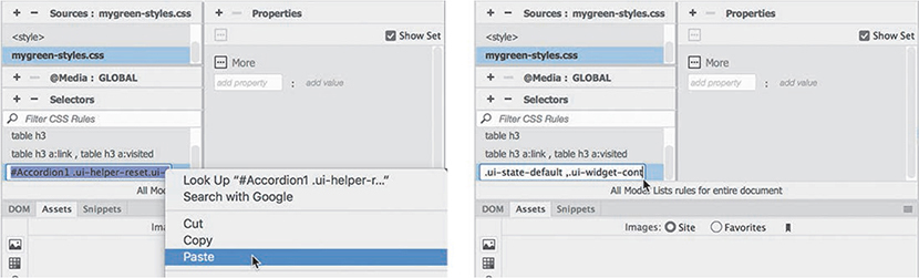
Note the exact name of the targeted rule.
Click the All button in the CSS Designer.
The Selectors window now shows all the rules in jquery.ui.theme.min.css. The rule you need to duplicate should still be visible, but it may no longer be highlighted.
Double-click the selector
.ui-state-default,.ui-widget-content .ui-state-default, .ui-widget-header .ui-state-default
The name should now be editable
NoteSelectors cannot be edited while the Current button is selected.
Copy the selector.

In the Sources pane, select mygreen-styles.css.
Click the Add Selector
 icon.
icon.A new selector name appears.
Paste the selector name copied in step 8 and press Enter/Return as necessary to create the new selector.
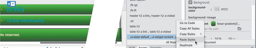
In jquery.ui.theme.min.css, select the rule
.ui-state-default,.ui-widget-content .ui-state-default, .ui-widget-header .ui-state-default
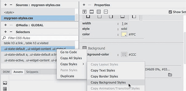
Right-click the rule, and select Copy All Styles from the context menu.
In mygreen-styles.css select the rule
.ui-state-default,.ui-widget-content .ui-state-default, .ui-widget-header .ui-state-default
Right-click the rule, and select Paste Styles from the context menu.

The selector and all the styles from the original rule are now duplicated in your site style sheet.
Save all files.
Bringing across all the properties enables you to identify the ones you need to modify. First, we’ll start with the background effect.
Applying a background effect to the accordion tab
Since some elements already feature the site theme, it’s a simple matter to grab styling from another element using the CSS Designer.
In this exercise, you’ll use the footer styling to format the accordion tab.
Right-click the footer rule in mygreen-styles.css.
Select Copy Styles > Copy Background Styles from the context menu.
Right-click the rule
.ui-state-default,.ui-widget-content .ui-state-default,.ui-widget-header .ui-state-default in mygreen-styles.css.
Select Paste Styles from the context menu.
The background color and gradient properties are added to the new rule. The tabs now have the same gradient background as were applied to the footer. The text in the tabs is now hard to read.
Edit the following property:
color: #FFCWhen you change the property, nothing happens in the layout. That’s because the text color is also being supplied by the rule styling the hyperlink. You changed the color applied to the heading, but you’ll also need a new rule to format the
<a>element.In jquery.ui.theme.min.css, select the rule
.ui-state-default a,.ui-state-default a:link,.ui-state-default a:visited
Double-click the selector and copy the name.
In mygreen-styles.css create a new selector and paste the name copied in the previous step. Press Enter/Return as necessary to complete the selector.
Create the following property:
color: #FFC
The text in the tab is now styled in pale yellow, a nice contrast to the green gradient.
Save all files.
The new rule completes the formatting of the default tab state. You still need to style the open and hover states.
Formatting a conditional state for an accordion tab
In this exercise, you will identify and style the open state of the accordion tab.
If necessary, open tips.html in Split view.
The file has a jQuery accordion in the layout with three panels. One panel is open by default. CSS Designer can identify the rules that affect this component and its various states.
If necessary, click the first tab in Live view to open it.
In Code view, insert the cursor in the text At Home.
Click the Current button.
Select the h3 tag selector.

You will sometimes find that the display in the CSS Designer is different when you use Code view over Live view.
Examine the rules affecting the
<h3>element.Of the seven rules displayed, only one affects the active state of the tab. To change the styling of the open tab, you will need to duplicate this rule in your site style sheet and create alternative styling.
Click the All button.
In jquery.ui.theme.min.css, double-click the rule
.ui-state-active,.ui-widget-content .ui-state-active, .ui-widget-header .ui-state-active
Copy the entire selector name.
In mygreen-styles.css click the Add selector icon
 , paste the name copied in step 7, and press Enter/Return to create the selector.
Copy the background styles from the default state of the tab.
Paste the styles on the rule created in step 8.
The new rule has the same background as the default state of the tab. To reset the styling, you have to turn off the background gradient.
In CSS Designer, click the Show Set option to disable it.
Select the rule
.ui-state-active, .ui-widget-content .ui-state-active, .ui-widget-header .ui-state-active
In the Background category, remove the background-image property.

There’s no change to the styling, because the default state styling is still being inherited. For the open state, let’s format it with a solid color. To do that, you have to turn off or reset the gradient being applied by the other rules.
In the
background-imageproperty URL field, enternoneand press Enter/Return.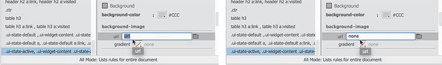
When you press Enter/Return, the gradient is turned off and the tab turns gray. The gray color comes from the
background-colorproperty in the same rule. This is an important point to remember: one rule may interfere or override another.Change the background-color to
#090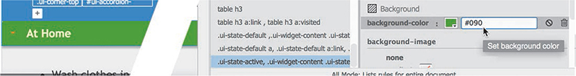
The open tab now displays a solid green color.
In Live view, test the three tabs.
As you click each tab, it opens and reformats. The open tabs display the solid green background; the closed tabs show the gradient.
Save all files.
Now that you have addressed the default and active states, the last step is to format the hover state.
Using Live Code to identify dynamic styling
When you are working on a complex component like the jQuery accordion, it may be difficult to identify exactly where specific styling is coming from, especially in dynamic elements like accordion tabs.
Luckily, Dreamweaver provides an enhanced workflow that allows you to see what’s happening behind the scenes and helps you track down just such styling questions.
If necessary, open tips.html in Split view. Scroll down to view the accordion markup.

On the surface, the accordion seems like a simple component. It is composed of four div elements and three h3 headings. It sports only a single id. The simplicity of the HTML belies the actual complexity of the final product. In most HTML editors, you would never be able to see the truth, but that’s not the case with Dreamweaver.
Using Live view you can get a partial sense of the accordion’s true nature.
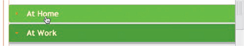
Click the first tab in Live view.
If necessary, select the
h3tag selector.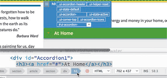
The Element Display appears focused on the h3 element and displays eight class names. But in Code view, there are no classes at all. So what gives?
Live view is based on the WebKit rendering engine, which is the same one used in the Safari browser. It doesn’t just display the HTML that you can see in Code view; it also picks up the CSS and JavaScript, and then previews the page almost exactly the way it would appear in the browser. So although no classes appear in the code, Live view shows what’s generated by jQuery in the background. Dreamweaver’s Live Code feature can actually show you what’s happening in Live view.
Missing tools?
To use Live Code fully, you may need to customize the Common toolbar. If any of the tools mentioned in the exercise are missing, you can add them to the toolbar by clicking the Customize Toolbar icon
 and then selecting them in the Customize Toolbar dialog.
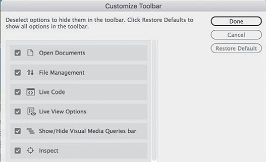
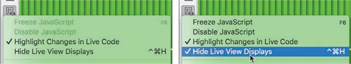
In the Common toolbar, click to open the Live View Options
 pop-out menu.
Select the option Hide Live View Displays to enable it.
Click the Live Code icon
 .
.
In the Related Files interface, the Source Code reference changes to say Live Code. The Code view window now shows how the source code is being manipulated by the jQuery functions. The window will continue to update as you interact with the page.
In Code view, scroll down as needed to show the tab At Home.

With Live Code enabled, the markup has changed dramatically. You can now see all the classes and other attributes added by JavaScript. But this shows you only half the magic that’s possible.
Click the Inspect Mode icon
 .
.Inspect mode turns your cursor into an interactive inspection tool. Position the inspection tool over components in your page, and Code view dynamically refreshes the code. At the same time, the CSS Designer displays the various rules and properties styling the targeted element.
Position the cursor over each tab and observe the changes in Code view and in the CSS Designer.
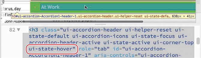
As the cursor passes over the tab, you can see the changes to the markup. When the cursor is over the tab, you can see the class ui-state-hover added to the h3 element. When the cursor moves away, the hover class is removed. You can freeze the CSS display by clicking the element.
Click the tab At Work.
The Selectors pane displays 14 rules affecting the targeted element. Some are coming from mygreen-styles.css and others are supplied by the jQuery framework. You can see that one of the selectors contains the class
.ui-state-hover.To style the hover state of the tabs, you should duplicate this rule in mygreen-styles.css.Select the rule that contains the class
.ui-state-hoverThe rule is contained in jquery.ui.theme.min.css.
Click the All button.
In jquery.ui.theme.min.css, copy the selector
.ui-state-hover,.ui-widget-content .ui-state-hover, .ui-widget-header .ui-state-hover,.ui-state-focus, .ui-widget-content .ui-state-focus,.ui-widget-header .ui-state-focus
Select mygreen-styles.css. Create a new selector.
Paste the selector copied in step 12.
Press Enter/Return as needed to create the new rule.
You can use this rule to format the hover state of the tab.
Add the following properties to the new rule:
background-color: #0C0
background-image: none
The accordion tabs are now fully styled, as a hyperlink would be. There are styles for each state:
link, visited, active,andhover. However, the active state is out of order. For all the styling to be effective, the active class must appear after the hover class. The CSS Designer allows you to reorder rules by dragging them in the selector pane.In mygreen-styles.css, drag the hover rule above the active rule.

Test the styling in Live view.
Position the cursor over each tab.
The new hover rule styles only the closed tabs. It’s a behavior that will prompt visitors to click them to see what’s inside.
The interface is still in Live Code mode. The mode is handy for troubleshooting, but you may find it unnecessary for most workflows. It also tends to slow down the other functions of the program. It’s a good idea to turn it off until the next time you need it.
Click the Live Code icon
 to turn off Live Code mode.
In the Common toolbar, click to open the Live View Options
 pop-out menu.
Select the option Hide Live View Displays to disable the option.
Save all files.
The last step in styling the accordion is to apply an appropriate fill color in the content area.
Styling the background of the accordion content
Each tab introduces a content area containing an HTML list. The default styling of the accordion applies a light-gray gradient background. In this exercise, you will apply a new background effect to the content area that better matches the site color scheme.
If necessary, open tips.html in Live view.
By default, one of the accordion tabs is always open.
In Live view, select one of the bullets in the open content area. Examine the tag selector interface.

The first parent (the one closest to the ul element) of the HTML list is a
<div>element. You need to identify the rule styling the content area.Select the tag selector for the first parent div. Examine the Element Display.
The Element Display lists the classes applied dynamically to the content area. Sometimes the class names scream out at you, “Here I am!” One of the classes assigned to the
<div>is.ui-widget-content.Click the Current button in the CSS Designer. Select the rule:
.ui-widget-contentand examine the properties.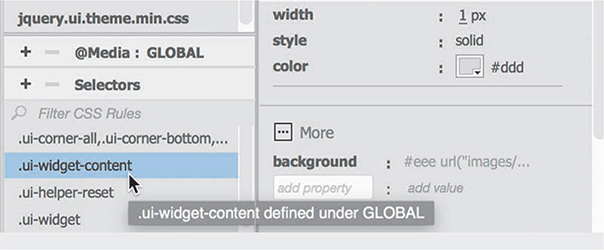
As expected, the rule applies the current background effect. You can use the same rule to reset it.
Click the All button.
In mygreen-styles.css, create the following selector:
.ui-widget-contentAdd the following properties to the new rule:
background-image: none
background-color: #FFC
The content area displays a pale yellow background. The accordion is fully styled.
Save and close all files.
The accordion is just one of more than 100 jQuery and Bootstrap widgets and components offered by Dreamweaver. They allow you to incorporate advanced functionality into your website, while requiring little or no programming skill. All of these components can be accessed via either the Insert menu or the Insert panel.
Adding interactivity to your webpages opens new possibilities of interest and excitement for your visitors, engaging them in new ways. It can easily be overdone, but a wise use of interactivity can help bring in new visitors and keep your frequent visitors coming back for more.
Review questions
1. What is a benefit of using Dreamweaver behaviors?
2. What three steps must be used to create a Dreamweaver behavior?
3. What’s the purpose of assigning an id to an image before applying a behavior?
4. What does the jQuery accordion widget do?
5. What Dreamweaver tools are helpful in troubleshooting CSS styling on dynamic elements?
Review answers
1. Dreamweaver behaviors add interactive functionality to a webpage quickly and easily.
2. To create a Dreamweaver behavior, you need to create or select a trigger element, select a desired behavior, and specify the parameters.
3. The id is helpful for identifying specific images during the process of applying a behavior.
4. A jQuery accordion widget includes multiple collapsible panels that hide and reveal content in a compact area of the page.
5. The Current mode of the CSS Designer helps identify any existing CSS styling, and Live Code and Inspect mode can be used to troubleshoot dynamic CSS and JavaScript effects.