
7. Working with Widgets
Lesson overview
• Understand Button widgets
• Insert and edit a Composition widget
• Add a form
• Insert a menu
• Add an Accordion widget
• Insert and edit a Slideshow widget
• Insert a Social widget
Muse provides an easy way to add powerful interactivity to your pages in the form of widgets. In this lesson, you’ll explore various widget types and see how easy it is to customize them.
About widgets
On the web these days, you see all sorts of cool, interactive content like slideshows that cycle through larger images, and much more. You may have even heard of jQuery, one of the behind-the-scenes technologies that power these advanced features. Adobe Muse provides much of the same interactive functionality in the form of widgets. Widgets are reusable building blocks of interactivity and behavior that are completely customizable. You can simply drag them onto your pages, giving you all the power they offer without you having to write code.
 Note
Note
If you have not already downloaded the project files for this lesson to your computer from your Account page, make sure to do so now. See “Getting Started” at the beginning of the book.
Muse groups widgets into seven categories in the Widgets Library panel (Window > Widgets Library): Buttons, Compositions, Forms, Menus, Panels, Slideshows, and Social.
Each provides an easy way of adding different types of interactivity to your web pages. Because Muse has multiple widget types in each of the widget categories, in this lesson you’ll explore at least one example widget from each category.
Note
If you are starting from scratch using the Jumpstart method described in the “Jumpstart” section in “Getting Started,” your workspace may look different than the figures you see in this lesson.
Understanding Button widgets
The newest category of widgets, called Buttons, offers two types of buttons that you can use in your design: a HiDPI button and a State button. Each type of button has prebuilt button states that you can edit and style to match your design.
The HiDPI button requires that the resolution setting in the site properties (File > Site Properties) be set at HiDPI (2x) rather than standard resolution. For sites with HiDPI assets, this button offers visitors the ability to toggle between HiDPI and normal resolution assets. If the site isn’t viewed on a HiDPI screen, the button will show the HiDPI Unavailable button state and be grayed out (the option isn’t available).
In this exercise, you’ll look at the State Button widget because the Resolution option in the site properties for your site isn’t set to HiDPI (2x).
1. With the SPC site open, and Plan mode showing, double-click the Home page thumbnail to open the page in Design mode.
2. Choose Window > Reset Panels.
3. In the Layers panel (Window > Layers), select the Page content layer.
4. Open the Widgets Library (Window > Widgets Library). In the panel, click the folder icon or arrow to the left of the Buttons category to reveal the two button widgets.
5. Drag the State Button widget onto the page next to the red button you created in a previous lesson.
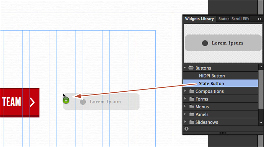
The State Button widget is a button with states, similar to the red “MEET OUR TEAM” button you created. It has different appearances for the four states, but it is composed of three objects: a button container, a rectangle (the small dark gray circle), and a text frame. You can edit each of these button parts in each of the states.
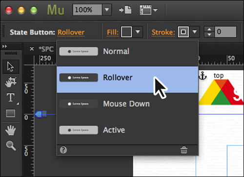
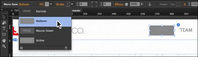
6. With the new button selected, click the Normal link to the right of the Selection Indicator in the Control panel to reveal the States menu. Click each of the states to see the button appearance change. Select the Normal state.
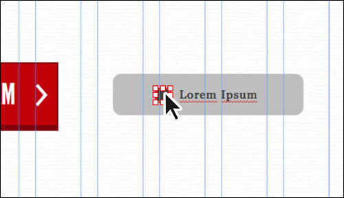
7. With the Selection tool, and the button still selected, click the text “Lorem Ipsum” to select the text frame. The words “Text Frame” should appear in the Selection Indicator in the Control panel.
With the text frame selected, you can drag it around, even positioning it away from the lighter gray button container. You can select the text and edit it as well as apply different types of text formatting. Most of the formatting for the text and the text frame, such as position and font, is locked between the states. But you can change color and other attributes to make each state unique.
Make sure the text frame is within the bounds of the gray button container.
8. Click the small, dark gray circle in the button.
The circle is actually a rectangle with rounded corners and can be used to apply a background image (like the arrow from the red button we created) or other formatting properties. You can reposition the circle and change appearance options for it. Each state can have different appearance options, like color or image fill, for instance.
9. Click the gray button body and press Delete (Backspace) to remove it.
10. Choose File > Close Page and return to Plan mode.
Using a State button can be a faster way to create a button with states and provides another option for creating buttons.
Note
If you drag either the text frame or the dark gray circle out of the button body, it will not delete when you delete the State button. You’ll need to select those objects and delete them separately.
Inserting a Composition widget
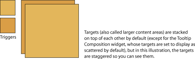
The Widgets Library offers five composition widgets: Blank, Featured News, Lightbox Display, Presentation, and Tooltip. Each has the same widget options available, but each has different options set by default. All five widgets are composed of at least one small container (called the trigger) that displays content in a larger content area (called the target) in response to visitor interaction.
Composition widgets can have trigger content that is different from the target content, and they’re not limited to displaying images. For example, you could list a recipe that contains a trigger in the text. When the visitor clicks the trigger phrase “cube the potatoes,” for example, an image with text and even a video could appear in the larger content area, providing hints on uniformly cubing potatoes.
In Composition widgets, you can move the larger content areas independently of each other. You can stack them on one another so only one at a time is visible, as in an image slideshow (the default for all but one of the Composition widgets), or you can scatter them around the page so you can see more than one at a time, as in a Tooltip Composition widget that displays target content when the visitor interacts with the trigger area on a page.
In this section, you’ll insert and edit a Featured News Composition widget, which will give you a feel for working with a Composition widget.
Inserting a Composition widget and editing the options
Similar to other Composition widgets, the Featured News widget can show and hide text, images, and more. Using a Featured News widget can be a great way to show other content without forcing the visitor to go to another page or to reload the same page.
In this exercise, you’ll insert a Featured News widget and edit its appearance and contents.
1. In Plan mode double-click the Team page thumbnail to open the page in Design mode. Choose View > Fit Page In Window.
2. In the Layers panel (Window > Layers), make sure that the Page content layer is selected.
3. With the Text tool selected, insert the cursor after the customer quote “The SPC team was a real find! They were on time with every deadline and offered nothing but the best customer service.” Press Return (Enter) and type Team Members.
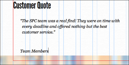
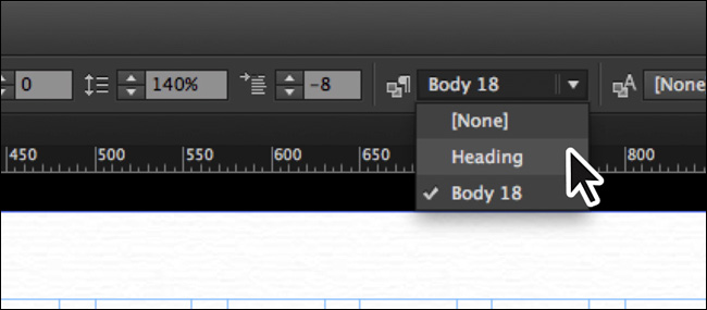
4. Select the Team Members text and apply the Heading paragraph style by choosing it from the Paragraph Styles menu in the Control panel or in the Paragraph Styles panel (Window > Paragraph Styles). You may need to make the text frame taller.
Note
Depending on your screen’s resolution and whether you have maximized the Muse workspace, you may not see the Paragraph Styles menu in the Control panel.
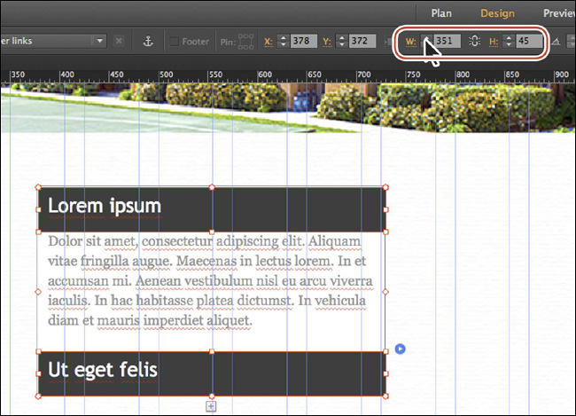
5. With the Selection tool, click to select the large image beneath the text that spans the page. Change the Y value to 980 in the Control panel to position the image farther down the page (leaving room for the widget).
Note
Depending on your screen’s resolution and whether you have maximized the Muse workspace, you may not see the Y value in the Control panel. In that case, you can open the Transform panel (Window > Transform).
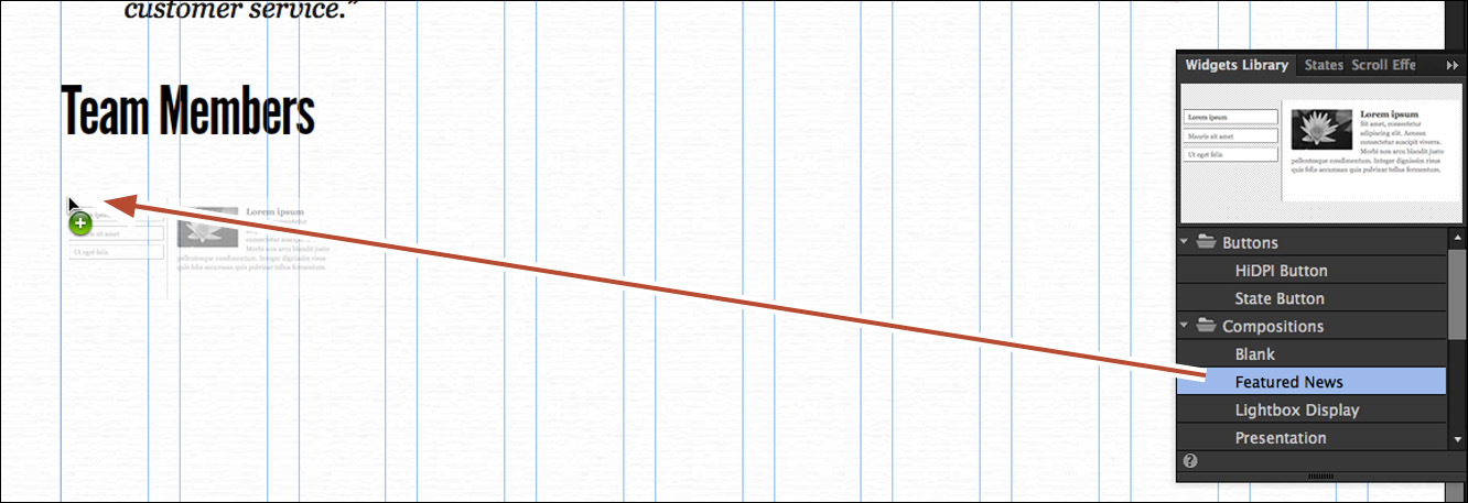
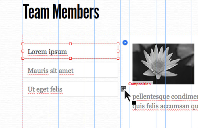
6. In the Widgets Library, click the folder icon or arrow to the left of the Compositions category to display that category’s widgets. Click Featured News to see a preview at the top of the panel. Drag the widget from the Widgets Library into the page beneath the “Team Members” text, aligning the left edge to the left edge of the first column. The Composition Options menu will appear to the right of the widget.
 Tip
Tip
You can also insert a Composition widget by choosing Object > Insert Widget > Composition > [specific widget you need].
After inserting any widget, you can edit its options, which allow you to turn on and off widget features, as well as customize the widget’s actions. All Composition widgets offer the same group of options for you to edit, but each option is set slightly differently by default, to suit the widget’s specific purpose. However, these settings are simply a starting point. You can further customize a Composition widget’s function as well as its content and appearance to suit your needs.
Note
The selected widget’s bounding box has eight points around the composition, which in Muse usually means that you can resize something, but that’s not the case for Composition or Slideshow widgets. Here, they have no function, hence the Xs in place of the bounding points.
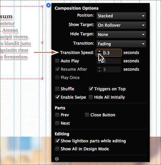
7. Choose Edit > Deselect All, and then click the widget to select it. You may need to zoom out for the next steps. Click the blue arrow button, and in the Composition Options menu that appears, change Transition Speed to 0.3. Leave all of the other options at their default settings.
8. Press the Esc key to hide the Options menu for the widget.
9. Choose File > Save Site.
10. Click the Preview mode link to test the widget. Roll over one of the triggers to see the target area change.
11. Click the Design mode link to return to the Team page.
Adding or deleting a trigger
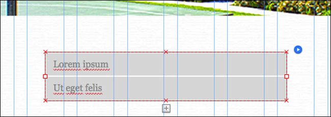
When you drag a Featured News Composition widget onto your page, it includes three triggers (the small text boxes) that when clicked in Design mode show one of three large target areas. Each trigger can contain text, images, and more. The larger target areas are stacked on top of each other by default, making it look like there’s only one.
Next, you’ll add and remove triggers. When you add or remove a trigger, its associated target area is also added or removed (along with the content in it).
1. With the Selection tool, click the small triggers one at a time to see each associated target area and its content. You may want to zoom in to see the widget on the page.
In Design mode, you can interact with widget triggers to access the different target containers and edit their contents.
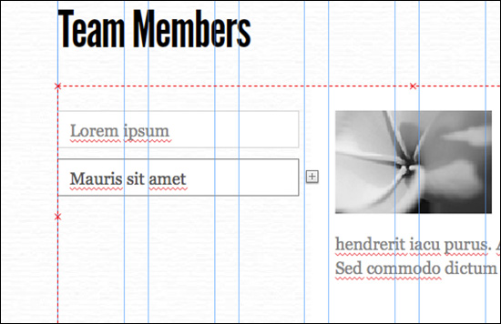
2. Click the plus (+) icon that appears to the right of the lowest trigger element to add another trigger and blank target area set.
Tip
With the entire Composition widget selected, you can also position the pointer over any of the target areas, right-click within the target bounds, and choose Insert Element to add another trigger and target set.
Note
The placeholder images you see in this lesson may be different than what you see in Muse and that’s okay.
3. Click the newly added trigger to select it, and press Delete (Backspace) to remove the trigger and the associated content area.
4. Click the third trigger from the top to select it (the one that contains the placeholder text “Ut eget felis”). The word “Trigger” will appear in the Selection Indicator in the Control panel. Position the pointer over the selected trigger, and press Delete (Backspace) to remove the trigger and the associated content area.
Two triggers remain.
5. With the Selection tool, click away from the Composition widget to deselect it.
Each trigger and target area can contain content and have formatting applied. In the following sections, you’ll edit the trigger and target areas. If you had more than one trigger and target area, you would repeat the steps for each, even creating graphic styles and text styles to make it easier to ensure consistent design formatting.
Editing the triggers
The triggers in a Composition widget can contain backgrounds, text, images, effects, and more. Each trigger is a container that can hold other content. In addition, triggers can indicate interaction by changing the appearance of the different states in the States panel.
The appearance and states for each trigger and target are independent. That means, if you want to apply the same formatting to two triggers, you either need to apply the formatting to each or create a style. In Lesson 8, “Applying Effects and Graphic Styles,” you’ll learn how to create a graphic style to save time, maintain consistency, and update content easily.
You’ll edit the triggers so they change appearance when a visitor interacts with them.
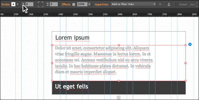
1. Click twice on the larger target area to select it. As you click you’ll see the tooltip next to the pointer change. The word “Target” appears in the Selection Indicator in the Control panel. Drag it beneath the two trigger areas and snap the left edge to the left edge of the first column.
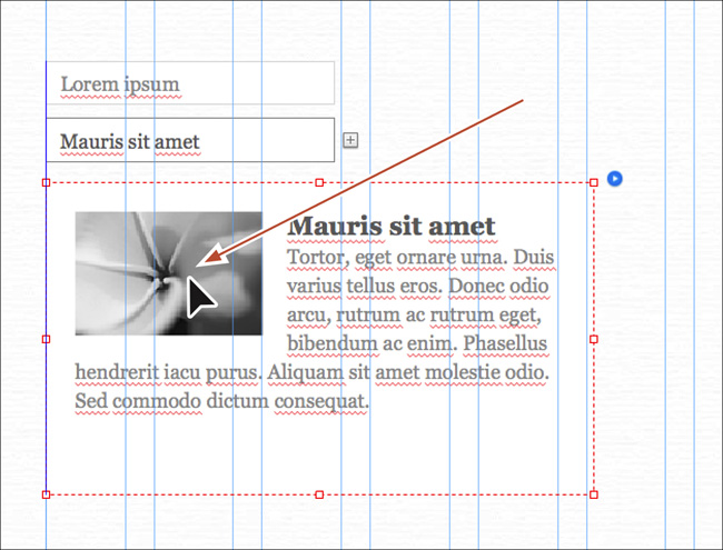
2. Click the bottom trigger to select it (both triggers are now above the target area). The word “Trigger” appears in the Selection Indicator in the Control panel. Drag the selected trigger to the right of the other trigger, using the Smart Guides that appear to ensure that the centers of the triggers are aligned with each other (a blue line appears in the center when they are aligned).
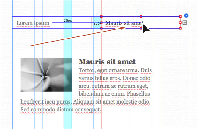
3. Select the Text tool in the Toolbar. Select the text in the leftmost trigger and type John Brown. Select the text in the rightmost trigger and type Heather Smith.
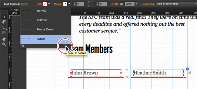
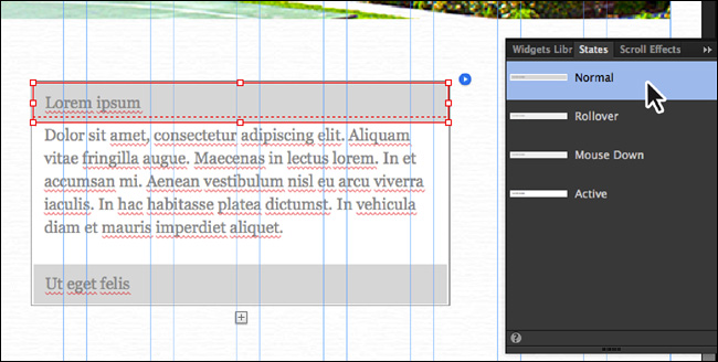
4. Select the Selection tool, click to select the trigger that contains the “John Brown” text, and open the States panel (Window > States). We dragged the States panel closer to the widget.
Each state in a trigger has a fill and a stroke. You can select each state, like you’ve done before, and edit the appearance of the trigger by changing the fill color, add a text frame, insert a background image that changes with each state, drag a button in, and more.
5. Select the Normal state in the States panel, and then click the Stroke link in the Control panel. Change the Top stroke setting to 0, which changes all of the stroke settings to 0. Deselect the Make All Stroke Weight Settings The Same button ( ). Change the bottom stroke value to 4.
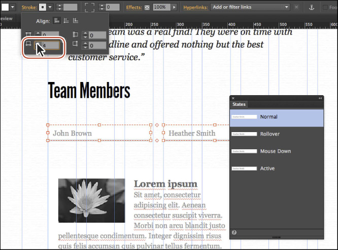
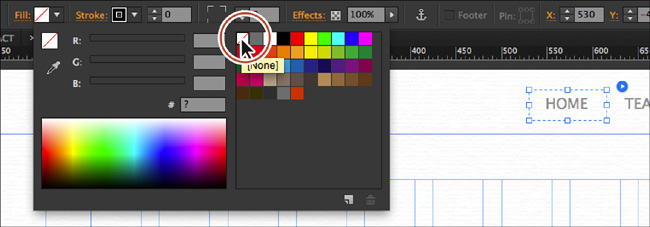
6. Change the Stroke color to the FooterStroke (gray) swatch in the Control panel. Click the Fill color and select the [None] swatch to remove the fill in the Control panel.
The Rollover and Mouse Down states should have the same stroke weight and no fill, but the stroke color is gray. You’ll leave those states with the default formatting.
7. Click the Active state, and click the Reset To Default button ( ) at the bottom of the States panel.
The Reset To Default button, in this case, makes the Active state have the same appearance attributes as the Normal state.
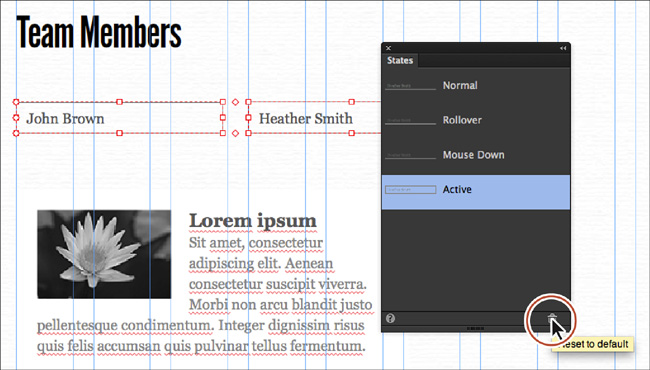
8. While the Active State is still selected, change the Stroke color to the LogoOrange swatch in the Control panel.
Now that the appearance of the triggers is set, you’ll edit the text formatting for both as well.
9. Repeat steps 5–8 after selecting the trigger that contains the “Heather Smith” text.
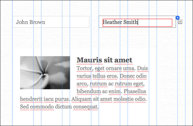
10. With the Selection tool, click the “John Brown” text twice to select the text frame. “Text Frame” will appear in the Selection Indicator on the left end of the Control panel.
The text frame that is contained within the trigger can also change appearance using states. That’s what you’ll do next.
11. Select the Normal state in the States panel.
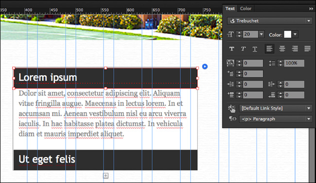
12. Change the Font Size to 18 and the color to Black in the Text panel.
13. Change the Height (H) to 27 in the Control panel.
You could also change the value in the Transform panel if you don’t see the Height option in the Control panel.
14. Click the Active state in the States panel. Click the Reset To Default button () at the bottom of the States panel to give the text the same appearance as the Normal state.
15. With the Selection tool, click twice on the “Heather Smith” text to select the text frame. Repeat steps 11–14 to apply the same formatting to the trigger text.
Adding content to the target areas
Now that the triggers are ready, you can focus on the larger content area for each trigger. The content area is where the main content appears. You can add text, images, or any other type of content using Muse’s design features by drawing frames or rectangles within the bounds of the content area, inserting embedded HTML, or dragging content into the area.
Note
When you click away from content in the page area, you deselect that content but wind up selecting the page. Be careful when making changes at that point because they will affect the page. If that happens, choose Edit > Undo.
1. Click away from the widget on the page to deselect it. Click the “John Brown” trigger text until the target content for that trigger shows (it may already be showing). Click the larger target area to select it.
The word “Target” appears in the Selection Indicator on the left end of the Control panel.
2. Click the text frame in the target to select it, and press Delete (Backspace) to delete it. This removes the default content in the target. Leave the target selected.
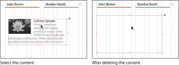
You can now create, paste, place, or drag other content into that area.
3. Choose File > Open Site. In the Lesson07 folder in the Lessons folder, select the Muse file named Composition.muse. Click Open. In Plan mode, double-click the Home page thumbnail to open the page in Design mode.
4. With the Selection tool selected, click the John Brown group of content on the left, and then choose Edit > Copy.
5. Click the Team tab at the top of the Document window to return to the page. With the target still selected for the John Brown trigger, choose Edit > Paste.
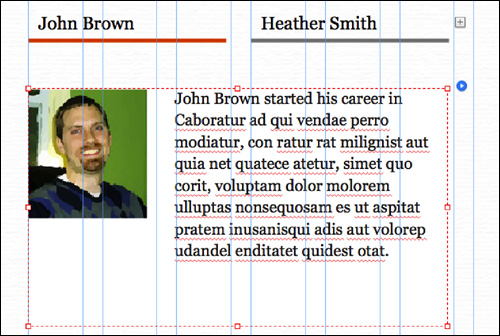
By default, the pasted content is pasted within the bounds of the selected target.
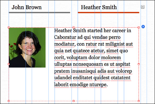
6. Click the “Heather Smith” trigger text to show the target content. Click the content in the larger target area twice to select it. Press Delete (Backspace) to delete it. Leave the target selected.
7. Click the Home tab to return to the Composition site home page. Select the Heather group of content on the right and choose Edit > Copy.
8. Close the Composition.muse site by choosing File > Close Site.
9. Back on the Team page, with the target still selected for the Heather Smith trigger, choose Edit > Paste.
Tip
At anytime you can resize the Target area, apply rounded corners, effects, and more if you like.
At this point you could click again on the group you pasted to edit content within that group if necessary. You could also create more content in the larger content area or drag other content in as well.
10. Press the Esc key until the composition is selected and “Composition” displays in the Selection Indicator in the Control panel. Drag the composition so it is closer to the “Team Members” text.
11. Click the Preview mode link to test the widget. Hover over each trigger to see the corresponding target content appear. Click the Design mode link to return to the page.
12. Close all open pages and Preview mode, and return to Plan mode.
13. Choose File > Save Site.
Adding a form
Muse includes a long and short contact form that you can drag and drop onto the page and edit as you see fit. You can add and remove fields, and style the form as you would other Adobe Muse elements. You can independently style the various states of the form and form fields to provide a compelling user experience with visual cues for Error states, Empty states, and more.
Note
Muse form CAPTCHAs are only supported when sites are published on Adobe host servers. When you host your site using a third-party host provider, Muse will attempt to limit the number of form submissions from a single site visitor (IP address) to help reduce form spam.
In Adobe Muse CC, the supplied contact forms found in the Widgets Library work with most web hosts. When you export or publish by choosing File > Upload To FTP Host, PHP files are uploaded along with your site content. Those PHP files make the forms work behind the scenes.
Note
Your web host must support PHP, and the PHP mail service must be properly configured to send email messages. If you use the FTP Upload feature within Muse, Muse will attempt to warn you if it detects that your web host does not meet these requirements. If you host your site on a non-Adobe host server and your contact forms are not working, contact your hosting provider to learn more about configuring your hosting account to process forms.
Inserting a form and editing options
The first step in the process of adding a form is to add one of the form widgets to a page.
1. Double-click the Contact page thumbnail to open the page in Design mode. Choose View > Fit Page In Window.
2. In the Layers panel (Window > Layers), make sure that the Page content layer is selected.
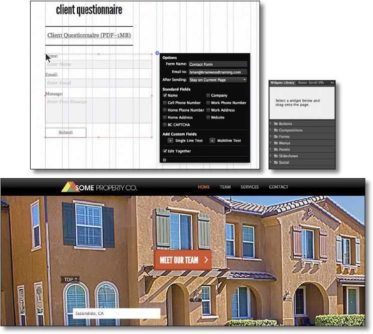
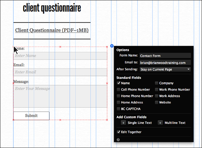
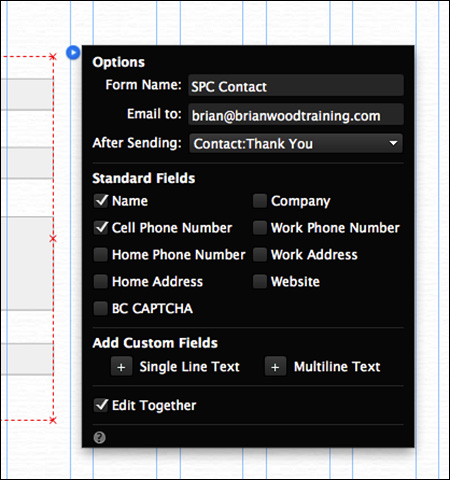
3. In the Widgets Library, click the arrow or folder to the left of the Forms category. Two forms are available to choose from: Detailed Contact and Simple Contact. Drag the Simple Contact Form widget into the page area below the Client Questionnaire (PDF–1MB) text frame.
Note
The two contact forms are identical except that the Detailed Contact form shows more fields; those fields can easily be added to the Simple Contact form as well.
After inserting the Form widget into your page, you need to edit the main form options that appear automatically, and then edit the individual form field options as well.
4. After dragging the Form widget into the page area, the Options menu will appear.
Ensure that the following options are set accordingly in the Options menu:
• Form Name: SPC Contact
• Email To: your email address (the default setting, which references the Adobe ID used to install Adobe Muse).
Note
If you don’t see the Options menu, select the widget and click the blue arrow button in the upper-right corner of the widget.
Tip
You can insert multiple email addresses by separating them with a semicolon like this: [email protected];[email protected].
• After Sending: CONTACT:Thank You
• Standard Fields: Select Cell Phone Number and ensure that Name is selected (This area contains an array of fields that you can add to your form.)
• Add Custom Fields: The Single Line Text field adds a generic single-line text field to the form. The generic Multiline Text field adds a multiple-line field. You can add or remove form fields at anytime.
• Edit Together: Selected (the default setting, which means any style attributes you apply to one field will affect all of the fields).
5. Press the Esc key to hide the Options menu, and click in a blank area of the page to deselect the form.
6. Choose File > Save Site.
Editing field options
With the form in place and the options set, you can begin to edit the individual options for each field, if you like.
1. With the Selection tool, click the form to select it. Position the pointer over the Name field. A tooltip with the words “Form Field” appears. Click once to select both the form field and the “Name” text.
Notice that “Form Field” appears in the Selection Indicator in the Control panel. A form field is typically composed of a label (the text “Name:”) and the field (called Text Input in this case).
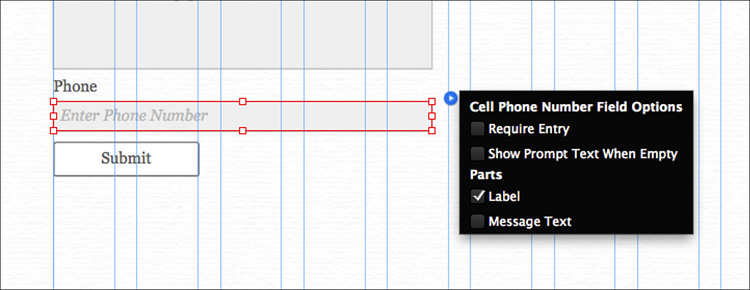
2. Click the blue arrow button to show the Name Field Options menu. Ensure that the following options are set accordingly:
• Require Entry: Selected (the default setting)
Certain fields are “optional” in a Muse form, but the Email form fields are required by default. This means that the user is required to fill out the field in order to submit the data.
• Show Prompt Text When Empty: Deselect.
The prompt text is the text “Enter Name,” which appears in the field initially. This text can be very helpful to display details like a date format, for instance. The prompt text may not initially disappear from the field in Design mode, and that’s OK. When you preview the page, it will be gone.
• Label: Selected (the default setting).
• Message Text: Selected.
The Message text is a text frame that shows the editable text “Required,” by default. You can change the position, content, and other formatting properties.
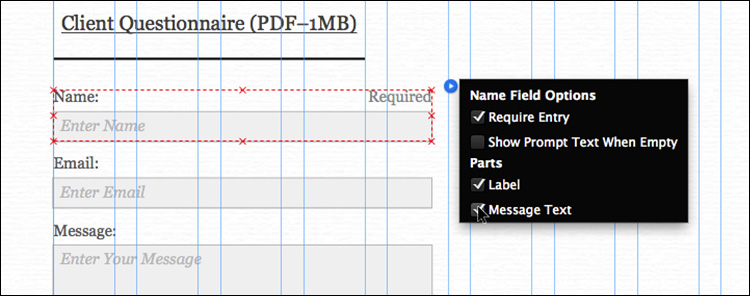
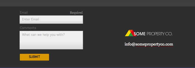
3. Select the Text tool and insert the cursor into the “Name:” text. Remove the colon (:) so it’s just Name.
4. Select the Selection tool, and then click the Email field to select it. Click the blue arrow button to show the Email Field Options menu. Deselect Show Prompt Text When Empty, select Message Text, and leave the other options at their defaults.
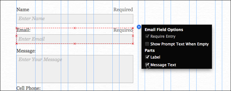
Notice that the Require Entry option cannot be changed for the Email field. The reason is that it is the only field that must be in a Muse Form widget. Visitors cannot send messages without providing their email address in the form.
5. Select the Text tool and insert the cursor into the “Email:” text. Remove the colon (:) so it’s just Email.
6. With the Text tool, select the label text “Message:” Type Comments to change the label text.
7. With the Text tool selected, select the text “Enter Your Message” in the Comment field and type What can we help you with?
By default, that text will appear in the field.
8. Insert the cursor into the “Cell Phone:” text. Change the text to Phone.
9. Select the Selection tool, and then click the Cell Phone field to select it. Click the blue arrow button to show the form field options. Deselect Require Entry, deselect Show Prompt Text When Entry, leave Label selected, and ensure that Message Text is deselected.
Note
If you select multiple fields, clicking the blue arrow button shows the options that pertain to the entire form, not the individual field options.
10. Click the Preview mode link to preview the form.
When you preview the forms in Muse or in a browser, you get an error message when you click Submit. Although you can see the form’s appearance when previewing, you’ll need to wait until you’ve published the trial site to test the form functionality.
11. Click the Design mode link to return to the Contact page in Design mode.
Moving and resizing form fields
Now that the form has the form fields we need, as well as the options set, you can edit the position of fields and their labels.
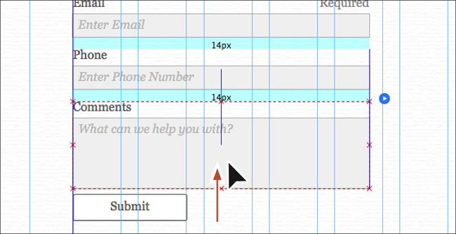
1. With the Selection tool selected, click away from the form to deselect it. Click twice, slowly, on the Comments field to select the form field and label. Drag the field down beneath the Phone field.
A blue smart guide is temporarily displayed as you drag the element (View > Smart Guides) to help keep the field aligned with the center of the others.
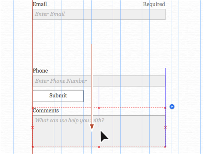
2. Click and drag the Phone form field up to just beneath the Email form field. When the aqua gap measurements show the same value (14px) above and below the Email field, release the mouse button. Leave the field selected.
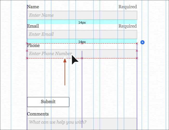
3. Click and drag the Comments form field up to just beneath the Phone form field. When the aqua gap measurements show the same value (14px) above and below the Phone field, release the mouse button.
4. Click and drag the Submit button down, a little farther away from the Comments field.
Tip
You can also move selected field(s) by pressing the arrow keys. Pressing Shift+arrow key will move the field(s) 10 pixels further with every key press.
5. With the Selection tool, click twice on the Name field label (the text “Name” above the field). Drag the label to the left side of the field.
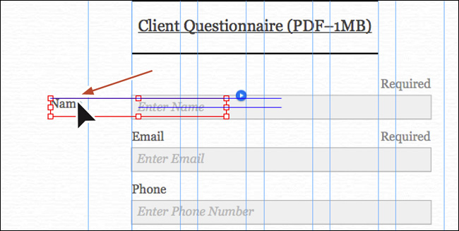
You can change the size of the label, the position of the label, text formatting (like alignment), and much more. A good, simple, rule of thumb to keep in mind is that when the data being collected is familiar (like a simple contact form), labels should be stacked vertically on top of fields or not shown at all (with the prompt text indicating what the user should enter into the field). When the data being collected is unfamiliar or complex, labels should be placed to the left of the field.
Tip
To move all the labels at once, select one label (like you did) and then choose Edit > Select Same (Label).
6. Choose Edit > Undo Move Item to return the label to its original position.
Next, you’ll resize the form fields so they are roughly the same width as the Client Questionnaire (PDF–1MB) text frame.
7. With the Selection tool, click the Phone field (not the label) twice to select just the field. The words “Text Input” will appear in the Selection Indicator in the Control panel. Right-click the field and choose Select Same (Input) from the context menu that appears to select all of the fields.
8. Click and drag the right, middle bounding point to the left until the measurement label shows a width of approximately 280px. It will most likely snap to a column edge.
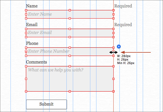
If you hadn’t selected all of the fields, changing the size of one of the form fields changes them all except for the Comments (multiline) field. The reason is that the Edit Together option is selected in the form options.
Tip
You can also set the width and height of fields using the Transform options in the Control panel or the Transform panel.
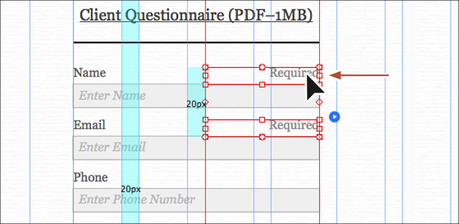
With all of the form fields the same width, you probably noticed that the message text “Required” didn’t move. You’ll fix that next.
9. With the Selection tool, click the “Required” text above either the Name or Email fields to select it. “Field Message” will appear in the Selection Indicator in the Control panel.
10. Right-click the “Required” text and choose Select Same (Field Message).
11. Press the Shift key and drag one of the selected field messages to the left until the right edge snaps to the right edge of the fields. A red line will appear when they snap.
12. Press the Esc key until the Form object is selected. Leave the form selected for the next section.
Notice that the bounding box around the form is still as wide as it was (it’s wider than the fields are now). The reason is that other parts of the form, like form messages, are still where they were. Don’t worry about that right now.
When it comes to sizing fields, keep the visual design of the entire form in mind. Some very simple forms, such as a login form (username and password), use the same size fields. It may confuse visitors to create longer, more complex forms with a series of fields of varying widths.
Editing the appearance of the form fields
Most of you will want to modify the formatting options of the form fields and labels to change colors, borders, and more. That’s what you’ll do next.
1. With the form still selected, click twice on the Name field (not the label) to select it. The words “Text Input” appear in the Selection Indicator in the Control panel.
Tip
When styling form elements, treat each form field like a rectangle you drew. You can change the stroke and fill, and add effects, as well as change the opacity and more. For instance, you could set the fill color to None and the stroke weight to 0 for a form field, and then place an image behind the entire form or each field to make the field take on a different appearance.
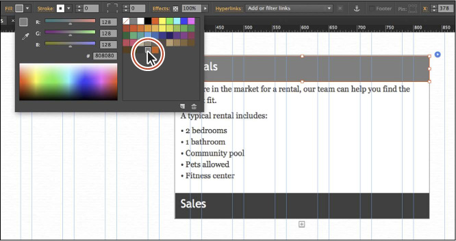
2. Click the Fill link in the Control panel to show the Fill options. Select Gradient. Change the first Fill color to White (if it’s not white already), the second Fill color to a light gray (we entered the values R=223, G=223, and B=223), the Focal Point to approximately 80%, and then select Vertical for Direction. Leave the field selected.
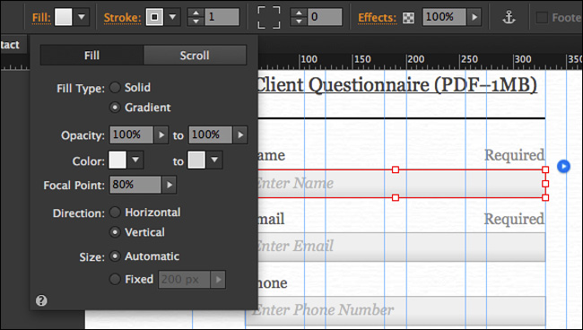
Notice that all of the form fields changed appearance because Edit Together is selected in the form Options menu.
Next, you’ll edit the text formatting of the labels and the fields. By editing one label, all the labels will change in appearance. The same goes for the form fields because the Edit Together option is selected in the form’s Options menu.
3. With the Selection tool, click the Name label to select it. The word “Label” will appear in the Selection Indicator in the Control panel. Change the font to Geneva in the Text panel.
4. Click the Name field once to select it.
5. In the Text panel, change the font to Geneva and click the Italic button to turn it off. Leave the Name field selected.
If you want to change the appearance of the field messages (that contain the text “Required”), you can select one and make text formatting changes and the other field message will change as well.
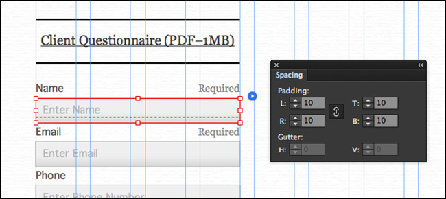
Now that the font is set for the fields, you’ll add some padding between the message text and the edge of the field using the Spacing panel.
6. Choose Window > Spacing to open the Spacing panel. Making sure that the Make All Padding Settings The Same button ( ) is on, change the Left Padding (L:) to 10.
7. Make the Height a few pixels taller in the Control panel so that the Min-Height dotted line disappears from the field. We made the Height of ours 35, but yours may be a bit different. This will change the height for the Name, Email, and Phone fields.
After adding padding to all of the fields, the fields are too close together. You’ll fix that next.
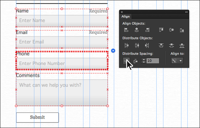
8. With the Name field still selected, press the Esc key to select the Form Field (the label and the field). “Form Field” will appear in the Selection Indicator in the Control panel. Right-click the field and choose Select Same (Form Field) to select all of the fields.
9. Click the Align link or open the Align panel (Window > Align) and choose Align To Key Object from the Align To menu. One of the fields will have a bold red highlight around it. Change the Distribute Spacing value to 10, and click the Vertical Distribute Space button ( ) to make the spacing the same between the fields.
You might need to reposition the Submit button and drag the entire form down a bit if it is too close to the text above it.
Note
We dragged the Align panel closer to the content so it would be easier to see.
10. Choose File > Save Site and then Edit > Deselect All.
Editing the states of your form fields
When visitors fill out the form, all required fields are checked by code created by Muse when you preview, publish, or export the site to ensure that they are filled out. If one or more fields are not filled out properly, errors will appear in the form after the visitor clicks the Submit button, indicating which form fields are required. This is generically referred to as form validation.
Five states of form fields can be edited (see the sidebar “Field states explained”). In this part of the lesson, you’ll focus only on the Error state.
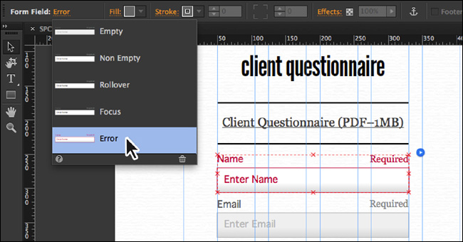
1. With the Selection tool, click the form on the page. Click once more on the Name field to select the label and field (“Form Field” will appear in the Selection Indicator).
2. Click the Empty link to the right of the text “Form Field” in the Selection Indicator in the Control panel. Select the Error state.
Note
You can also select states in the States panel (Window > States).
Tip
You can also change the appearance of the other form fields states if you like, including the Rollover and Non Empty states.
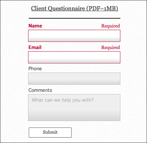
When a visitor clicks the Submit button, all text in the Name field, label, and message text of required fields will turn red if the fields are empty or not filled out properly (in the case of the Name field, for instance). With the Error state selected, you could select the field, label, or message text and change the appearance.
3. Press the Esc key to hide the States menu in the Control panel. With the Selection tool, click the Name field label to select it. Click the Bold button in the Text panel. The Error state for all required fields will now be updated.
Note
The bold formatting may not show on the label text in Design mode, and that’s OK. It will work.
4. Click the Preview mode link. Test the form by simply clicking the Submit button. The errors should appear on the Name and Email fields. Fill out all of the fields in the form and click Submit again. No errors should appear this time.
Note
Most likely, you’ll see a dialog box when submitting a nonpublished previewed form with Muse (or the browser). The dialog box will indicate that the form won’t work in Preview mode. You’ll need to publish the form in order to test it. Click OK.
5. Click the Design mode link to return to the Contact page, and then choose File > Save Site.
Editing the appearance of the Submit button
Next, you’ll change the appearance of the Submit button.
1. With the Selection tool, click twice to select the Submit button.
2. Click the Fill color in the Control panel, and change the fill to a yellow/orange color with the values R=231, G=168, B=0.
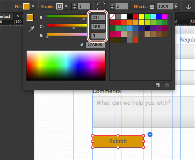
Tip
You could also add a background image to the button to create some interesting effects.
3. Change the Stroke Weight to 0 in the Control panel.
4. Open the Text panel (Window > Text), click the Font menu, click the Web Safe Fonts category, and choose Geneva. Click the Bold button in the Text panel, change the color of the text to Black, and choose Edit > Change Case > Uppercase.
Leave the Submit button selected for the next section.
Tip
You can change the text on the Submit button from Submit to anything you like by selecting the Submit text with the Text tool and changing it. If the text is too wide, you may need to resize the button using the Selection tool.
Editing the states of your Submit button
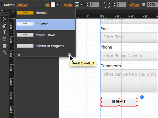
Now that the main appearance of the Submit button is set, you can edit the appearance of the Rollover states of the button if you desire.
1. With the Submit button still selected, click the Normal link on the left end of the Control panel to show the States menu, and select the Rollover state.
2. Click the Reset To Default button () at the bottom of the menu. This makes the Rollover state look like the Normal state.
Note
The bold formatting may not show on the label text in Design mode, and that’s OK. It will work.
3. Click the Fill color in the Control panel, and then change the color values to R: 255, G: 201, B: 57. Press the Esc key to hide the Color Picker panel.
4. Click the Rollover link on the left end of the Control panel, and then click the Mouse Down state to select it. Click the Reset To Default button () at the bottom of the menu to make the Mouse Down state look like the Rollover state.
5. Click the Submit In Progress state in the States menu to select it. Click the Reset To Default button () at the bottom of the menu to make the selected state look like the Normal state.
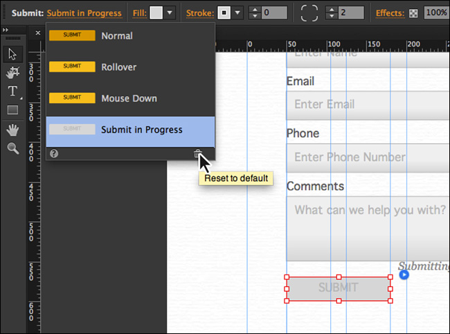
The Submit In Progress state is a button state that appears when the data is being submitted after the user clicks the Submit button. You can change the appearance to look like the user shouldn’t click the button again.
6. With the button selected, change the Opacity to 50 in the Control panel. You’ll learn more about Opacity in Lesson 8.
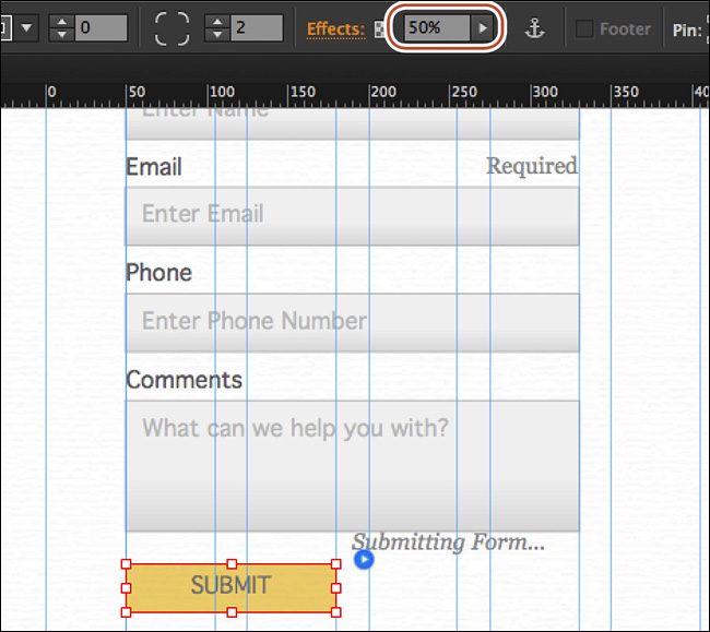
Before continuing, make sure that the Submit button is in roughly the same position as you see in the previous figure.
7. With the Selection tool, click and drag the text frame with the text “Submitting Form” to the right of the Submit button and align the top edge of the text frame with the top edge of the Submit button. This text frame is called a form message.
8. Click Preview to test the button, and then click the Design mode link to return to the Contact page in Design mode.
9. Choose File > Save Site.
Editing the Form widget states
If you select the entire form and then open the States panel (Window > States) or click the Normal link in the Selection Indicator of the Control panel, you’ll see states for the entire form. When you select a state other than Normal, a text field appears toward the bottom of the form that contains different text, depending on which state is selected. Most likely, you’ll need to click each state and position this text field where you want the text to appear. You can also change the message that appears and the formatting of that text.
Note
The state messages will only appear when the Submit button is clicked.
Next, you’ll edit the Form states.
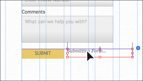
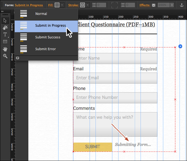
1. With the Selection tool selected, click away from the form to deselect it, and then click the form to select it again. If your form is close to the Client Questionnaire (PDF–1MB) text frame, drag it down a little.
2. Click the Normal link to the right of the Selection Indicator in the Control panel. Select the Submit In Progress state, and a text frame with the text “Submitting Form...” should appear next to the Submit button in the form.
Note
You can also select the states in the States panel, if that’s easier.
Note
When you select a state like Submit In Progress, the form message text frame may be beneath one of your form fields and be difficult to select. With the form selected, you can click any of the form fields to select it. Then choose Edit > Select All. This will show you where the text frame is. You can move fields out of the way, select and reposition the text frame, and then put the fields back where they were. You can also select a field, and then choose Object > Send To Back to arrange it behind the form message text field. Of course, you’ll need to reselect the form and then choose the Submit In Progress state again.
This is the same “Submitting Form...” text frame that you saw earlier when you were editing the states for the Submit button. It should already be to the right of the Submit button. If it isn’t, you can drag it into position to the right of the Submit button and style it any way you like. You can also change the message by selecting the text with the Text tool.
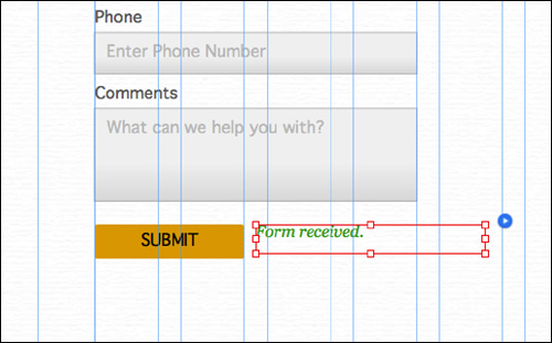
3. Select the Submit Success state in the States menu, and a text frame with the text “Form Received” should appear in the same position as the “Submitting Form...” text field. Press Esc to hide the States menu.
4. With the Selection tool, click the text frame that contains the “Form Received” text (a tooltip will appear that shows “Form Message”). Change the text color to a green (we used the color values R: 34, G: 166, B: 33) in the Text panel. You can also change the message by selecting the text with the Text tool.
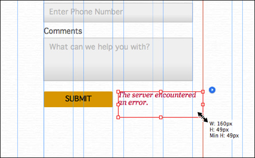
5. Click the Submit Success link on the left end of the Control panel. Select the Submit Error state in the States menu, and a text frame with the text “The server encountered an error.” should appear. Press Esc to hide the States menu.
6. With the Selection tool selected and the form message text frame still selected, drag the corner bounding point of the text frame to make it narrower and tall enough to fit another line of text, just in case. You can also change the message by selecting the text with the Text tool.
7. Choose Edit > Deselect All, and then choose File > Save Site.
Creating a copy of the form
To finish the form, you’ll copy the form into the footer and make a few changes to simplify it. Then you’ll add some text to the Thank You page that tells people you will contact them shortly.
1. With the Selection tool selected, click the form to select it on the page. Choose Edit > Copy.
2. Press Command+J (Ctrl+J) and choose Home-master from the menu. Click OK to open the master page in Design mode.
3. Scroll down so you can see the entire footer.
4. In the Layers panel, select the Master content layer.
5. Choose Edit > Paste.
6. With the form selected, right-click on the form and choose Footer Item.
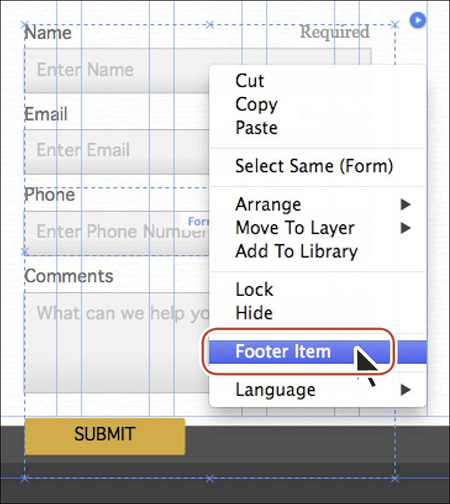
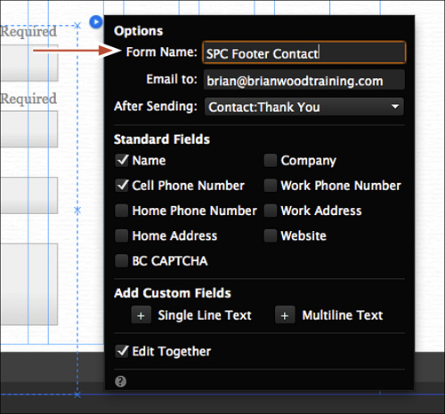
7. Click the blue arrow button off the upper-right corner of the form and change the Form Name to SPC Footer Contact. Press the Esc key to hide the menu. If someone contacts you, you can tell which form is being used now because both forms have different names.
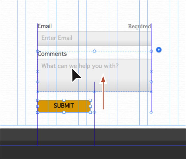
8. Click the Name field to select the form field (the label and the field). “Form Field” will display in the Selection Indicator in the Control panel. Press Delete (Backspace) to delete it. Delete the Phone form field as well using the same method. This form will be simpler to fit within the footer area.
9. Click the Comments field to select it, and then Shift-click the Submit button. Drag both up closer to the bottom of the Email field. Leave a gap.
10. Press the Esc key to select the entire form.
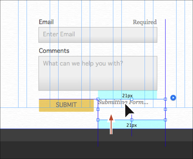
11. Click the Normal link on the left end of the Control panel. Select the Submit In Progress state from the States menu, and the text frame with the text “Submitting Form...” should appear. Select the text frame and then drag it up and align the top edge of the text frame with the top edge of the Submit button.
12. Press the Esc key to select the entire form and drag it onto the left side of the footer and deselect it.
Feel free to change the color of the labels and other appearance properties using what you’ve already learned.
13. Press Command+J (Ctrl+J) and choose Thank You from the menu. Click OK to open the page in Design mode.
14. In the Layers panel, select the Page content layer.
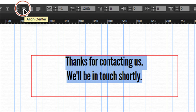
15. With the Text tool, create a text frame in the middle of the page that is roughly 500 pixels wide. Type Thanks for contacting us. Press Return (Enter) and type We’ll be in touch shortly.
16. Select all of the text, and choose Heading from the Paragraph Styles menu in the Control panel (or from the Paragraph Styles panel).
17. With the text selected, center align the text by clicking the Align Center button in the Control panel. Center the text frame on the page horizontally, as well.
18. Close the page and make sure that the Home-master page is showing in Design mode.
Adding a navigation menu
When designing for the web, the site navigation plays a key role in your design process, and the prime navigation system of any website is its menu bar.
To help you create a menu, Muse offers Menu widgets. Although you can create a series of links to connect the pages manually, the widgets are a fast and flexible way to add navigation and more. Like other widgets, you simply drag a Menu widget onto your page. From there, you can customize it with your own content and formatting. Muse also offers two types of Menu widgets: Horizontal and Vertical. Depending on your design and where the menu will be positioned on the page, you’ll choose one or the other.
Inserting a Menu widget
The next step, after deciding which Menu widget you want to use on your page, is to drag it into the page. The Horizontal Menu widget works best for the SPC site.
1. Scroll up in the page to see all of the header content on the Home-master page.
2. Choose Window > Reset Panels.
3. In the Layers panel (Window > Layers), select the Master content layer, if it’s not already selected.
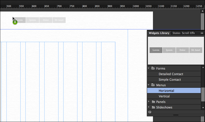
4. Open the Widgets Library and click the folder icon or arrow to the left of the Menus category to reveal the Menu widgets. Drag the Horizontal Menu widget into the header area to the right of the logo. See the figure for general placement. You’ll reposition the menu later in the lesson.
With the Menu widget on the page, notice that Muse automatically filled in the names of your pages in the menu, following the same order as the page thumbnails in Plan mode. Muse creates menu items with links to all of the top-level pages in your site map. Be careful and accurate when naming those thumbnails; any errors in the site map names will appear in your menu! Shortly, you’ll change the names of the pages in Plan mode to be uppercase so they will appear that way in the menu.
Now that the menu is on the Home-master page, it appears on all of the pages, even those with Internal-master applied (because Internal-master is based on Home-master).
5. Choose File > Save Site.
Excluding pages from the menu
Every time you create a new top-level page in Plan mode, Muse automatically adds it to the menu. Sometimes, however, you may want to test a page before making it accessible to visitors or hide a seasonally specific page during the offseason. From Plan mode you can specify pages to exclude from the navigation to ensure these pages are not listed as menu items in the Menu widget.
Next, you’ll add a new contact page to the site map that you’ll use for testing.
1. Choose View > Plan mode to return to Plan mode.
First, you’ll reorder the pages in Plan mode to see the affect on the menu.
2. Drag the Team thumbnail just to the left of the Services thumbnail. When the blue drop zone appears, release the mouse button to reorder the pages.
The ordering of the pages in the menu will reflect this change
3. Hover over the Contact thumbnail, and click the plus (+) icon to the right of the thumbnail to add another page.
4. Name the page ContactEvent.
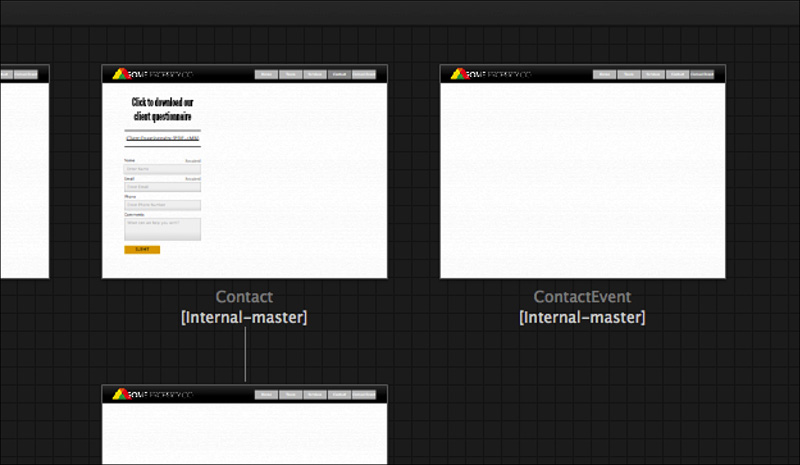
This page will be another design option for the gallery page. Later, you can choose which of the two designs you prefer to use.
5. Click the Home-master page tab above the site plan area to show the master page in the Document window. Notice that the new page, ContactEvent, was automatically added to the right end of the menu.
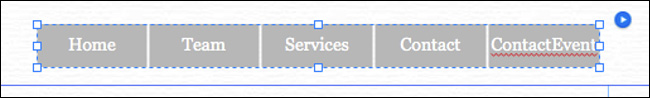
In the menu, each button with a page label and link is called a menu item. Muse automatically creates links to those pages so you won’t have to do so later. This new page is being set up ahead of time for an event that hasn’t happened yet, so it doesn’t need to appear in the Menu widget.
6. Choose View > Plan Mode.
7. Right-click the ContactEvent page thumbnail and choose Menu Options > Exclude Page From Menus so that the page no longer appears in the menu.
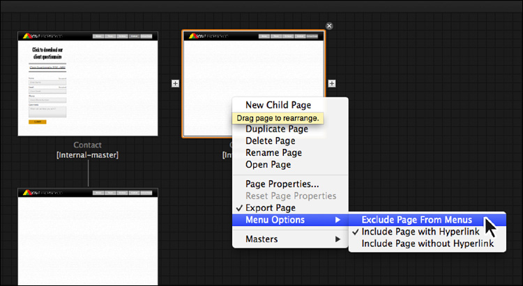
By default, any new pages are added to the menu, but by selecting Exclude Page From Menus for the ContactEvent page, only that single page is excluded from the menu.
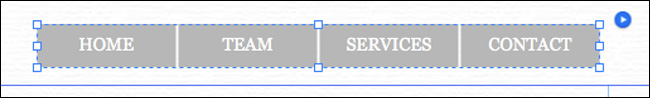
So that the menu items are uppercase, you’ll now change the names of the pages to be uppercase in Plan mode.
8. Double-click the word Home beneath the Home page thumbnail and rename it to HOME. Change the name of the Team, Services, and Contact pages by double-clicking the name and typing the same name in uppercase. The pages should now be named: HOME, TEAM, SERVICES, and CONTACT.
9. Click the Home-master page tab to return to the master page and see the menu items update to use capitalized names.
10. Choose File > Save Site.
Editing the Menu widget options
After placing a Menu widget onto a page, you can define how the menu behaves.
1. Choose Edit > Deselect All with the Home-master page showing in Design mode.
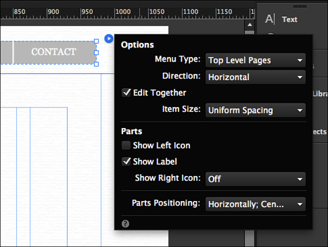
2. With the Selection tool, click to select the Menu widget on the page. Click the blue arrow button off the right end of the menu to reveal the Options menu, and set the following options:
• Menu Type: All Pages
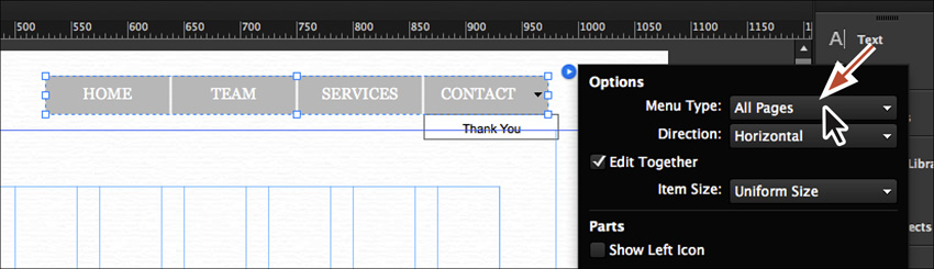
Notice that if you choose the All Pages option, the child pages from the site map appear in the menu as a submenu. In this case, we only have the Thank You page showing as a submenu of CONTACT.
• Change Menu Type back to Top Level Pages to see just the parent pages again.
• Direction: Horizontal (the default setting)
• Edit Together: Selected (the default setting)
• Item Size: Uniform Spacing (Each menu item will be as wide as the page name plus the same amount of padding left and right for each.)
• Show Left Icon: Deselected (the default setting)
• Show Label: Selected (the default setting)
• Show Right Icon: Off
• Parts Positioning: Horizontally; Center-Aligned (the default setting)
It is usually a good idea to set these basic options first before you add your own styling to the menu bar.
3. Choose File > Save Site to save the page and the site.
Next, you’ll edit the appearance of the menu text.
Tip
To learn more about the different menu options, check out the menu_bar_options.pdf file in the Lessons > Lesson07 folder.
Formatting the Menu widget text
When you insert a Menu widget into your pages, the default font of the menu text is a serif font like Georgia. To match the menu to our design, you’ll change the font of the text, as well as other appearance properties.
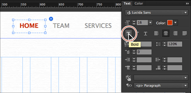
1. In Design mode, click away from the Menu widget to deselect it. Click twice, slowly, on the HOME text in the menu bar to select the menu item. The words “Menu Item” appear in the tooltip and in the Selection Indicator on the left end of the Control panel when the menu item is selected.
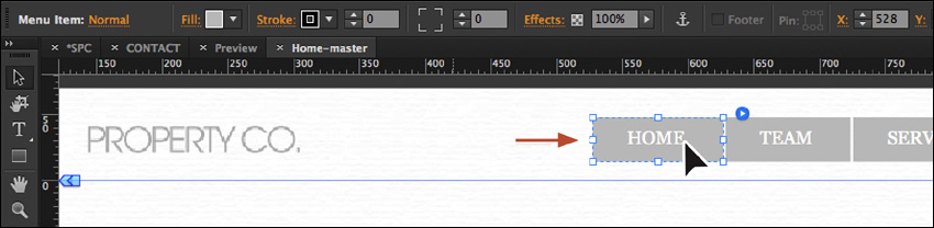
If you click once more on the HOME text, you’ll select the Label. You can change the text formatting when selecting the menu item or the label.
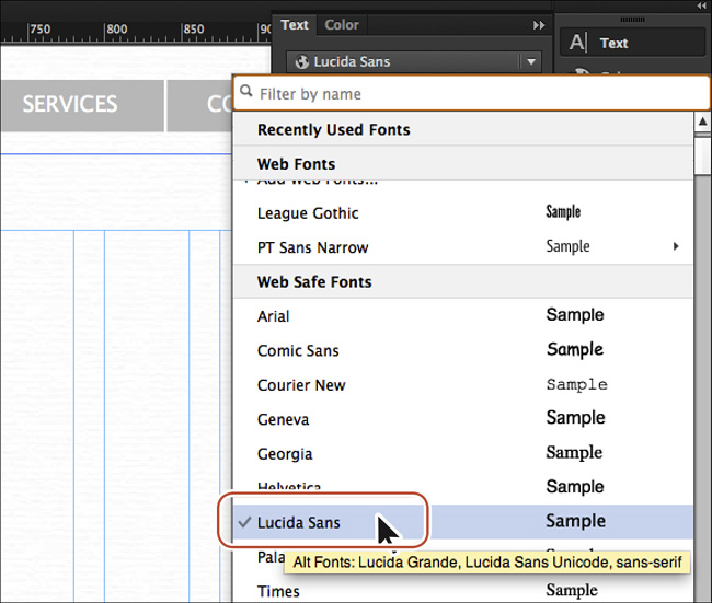
2. Open the Text panel (Window > Text) on the right side of the workspace. Click the Font menu in the Text panel, and choose Lucida Sans from the Web Safe Fonts category.
Tip
You can edit the text formatting, like font family, size, and more, without ever selecting the text in the menu. By selecting the entire Menu widget, any changes you make to text formatting will affect all of the text in the Menu widget.
All of the menu items update to use the same font. This occurs because Edit Together is enabled in the Options menu.
Note
You cannot edit the text that appears in the menu items. That is controlled by the name of the pages in the site map. However, if you create a manual menu, you must enter the text for each of the menu items and create the links for each menu item.
3. In the Text panel, change the Size to 16 by clicking the arrows to the left of the size field or by typing the value directly into the field.
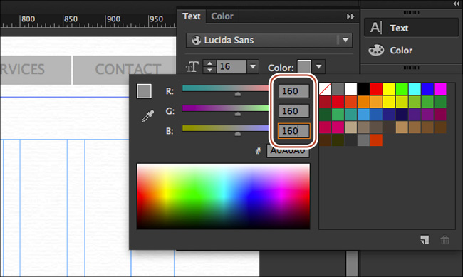
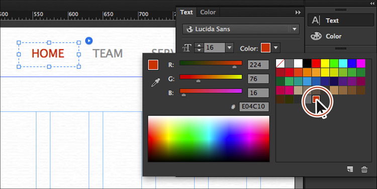
4. Click the Text Color in the Text panel, and change the color values to R: 160, G: 160, B: 160 (a gray).
Next, you’ll select the menu and position it where it needs to be.
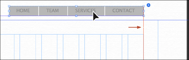
5. With the menu item still selected, press Esc to select the entire menu. You can also click away from the menu with the Selection tool and click the menu to select it again.
6. Drag the menu to the right. When the right edge of the menu snaps to the right edge of the rightmost column and a red guide appears, release the mouse button. See the figure for placement help.
Tip
If you need to nudge the menu, press an arrow key on your keyboard. Or press Shift while pressing an arrow key to make it move ten pixels at a time.
7. Click the Preview link above the Control panel and position the pointer over an item in the menu. Notice that the background color changes to a darker gray.
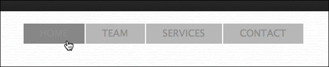
The appearance changes that you see when interacting with the menu are called the states of the menu. Editing the appearance of these states is an important part of designing your menu and is the task you’ll perform after you edit the menu appearance a bit more.
8. Click the Design mode link in the upper-right corner of the Application window to return to the Home-master page.
Editing the appearance of the Menu widget and items
You can change the look of your menu by changing appearance settings. When an entire Menu widget is selected, you can change its dimensions, appearance, and location. With the sub-elements of a widget selected, you can format the contents (such as insert other objects, like images, text, and rectangles) as well as update each element’s appearance and dimensions within the confines of the widget. First, you’ll edit the size and appearance of the entire widget.
1. Choose View > Smart Guides to turn them off.
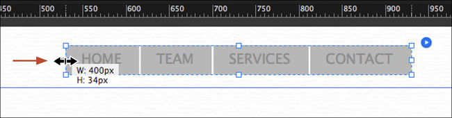
2. With the entire menu still selected and the Selection tool selected, drag the left, middle point of the menu to the right until the measurement label shows a width of approximately 400px.
Tip
You can change the width or height of the menu by dragging a bounding point or change the values in the Width and Height fields in the Control panel or in the Transform panel (Window > Transform).
3. Choose View > Smart Guides to turn them back on.
Aside from changing the width and height of the menu, you can also change the background of the menu by applying a fill (color, gradient, or image). The fill appears behind the menu items. By default, the menu has no stroke and no fill.
Now that the general menu appearance is finished, you can edit the appearance of each of the menu items as well.
4. Click the word HOME to select the individual menu item. The words “Menu Item” will appear in the Selection Indicator on the left end of the Control panel.
Tip
To make each of the menu item containers look different, deselect Edit Together in the menu bar options. Then select each menu item within the Menu widget, adding different fills, strokes, background images, rounded corners, and more.
5. Click the up arrow to the right of the Stroke option in the Control panel to change the stroke to 1px. Notice that a stroke (border) is applied to every one of the menu items, separately.
In addition to a stroke you can also apply fills, including gradients, solid colors, and background images, in each of the containers. You can also apply effects like drop shadows or rounded corners to the menu containers. You’ll learn about effects and rounded corners in Lesson 8.
6. Remove the stroke by setting the Stroke value to 0 in the Control panel.
7. Click the Fill color in the Control panel and select the None swatch in the list of swatches to remove the fill color.
8. Choose Edit > Deselect All.
With the menu containers formatted, you can also format the menu item text using different fonts, sizes, and a host of text formatting options.
Editing the menu item states
As discussed earlier, a state is the appearance of content (in this case, a menu item) on a web page based on user interaction. For example, if a visitor hovers over an item in the menu, a menu item’s background color might change from none to blue.
You can edit the various states of Menu widget items by selecting the correct menu part and using the States panel.
1. With the Selection tool selected, click twice, slowly, on the HOME link to select the HOME menu item. “Menu Item” will appear in the Selection Indicator in the Control panel.
Note
Remember that by default editing the appearance of one menu item will modify the rest in the menu.
2. Click the Normal link on the left end of the Control panel to show the States menu.
In the States menu, you’ll see that each menu item has four states.
3. Click the Rollover state, and Muse shows what the Rollover state looks like on the page in the menu.
Once you select a state in the States panel or States menu, you can then edit the appearance of the state using any number of appearance options, such as text properties, fill, stroke, and more.
4. Click the Fill Color in the Control panel and select the color [None] ( ).
).
5. In the Text panel, click the Color and select the LogoOrange swatch you created previously.
Next, you’ll change the Mouse Down state. We want the Mouse Down state to have the same appearance as the Rollover state.
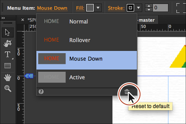
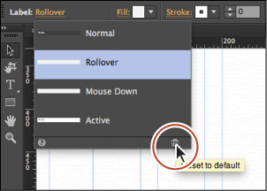
6. Use the States menu in the Control panel to select the Mouse Down state. Click the Reset To Default button () at the bottom of the States menu. This makes the attributes the same as the Rollover state for every menu item.
Tip
In Lesson 8, you’ll learn how to save formatting as a graphic style that you can apply throughout your document, making changes like these easy.
7. Select the Active state in the States menu that is still showing.
The Active state indicates the appearance of the menu item of the page currently showing in the browser window (it’s a link in the menu).
Note
Clicking the Reset To Default button in the States menu or the States panel (the trash can icon in the lower-right corner) with either the Rollover state or Active state selected will make the selected state look like the Normal state. With the Mouse Down state selected, clicking the Reset To Default button will make it look like the Rollover state.
8. Click the Reset To Default button () at the bottom of the States menu. This makes the attributes the same as the Normal state for every menu item.
9. Change the text color to the LogoOrange swatch in the Text panel. Click the Bold button to bold the text.
10. Press Command+M (Ctrl+M) to go back to Plan mode. Double-click the HOME page thumbnail to open the page in Design mode.
11. Click the Preview mode link and position the pointer over the menu items, clicking on a few to see the resulting states.
12. Click the Design mode link to return to the HOME page and choose File > Close Page. Make sure the Home-master page is showing in Design mode, and choose Edit > Deselect All.
Pinning the header content
In Lesson 6, you learned how to pin content and what it means to do so. Next, you’ll pin the header content so it always displays, even if a visitor scrolls down a longer page.
1. With the Selection tool, Shift-click the menu and the logo in the header.
2. Click the Align link in the Control panel to show the Align menu. Set the Align To menu to Align to Selection. Click the Align Vertical Centers button ( ) to align the objects with each other.
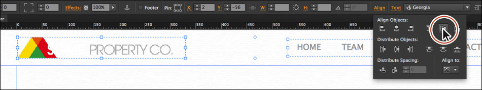
You might want to move the logo or the menu a bit to visually align them. We moved the logo up a few pixels. If you do this, make sure that the logo and the menu are selected before proceeding.
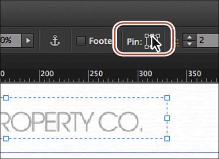
3. In the Control panel, click the top-center position of the six possible options in the Pin tool ( ) located in the Control panel.
By pinning the header content on the Home-master, the same content on the Internal-master will be affected. Now, you’ll pin the rectangle that appears beneath the logo and menu item on the Internal-master page.
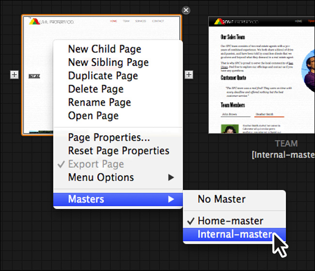
4. Press Command+J (Ctrl+J) and choose Internal-master from the menu. Click OK.
5. On the Internal-master page, select the gradient-filled rectangle behind the logo and menu in the header.
6. In the Control panel, click the top-center position of the six possible options in the Pin tool () located in the Control panel.
7. Press Command+M (Ctrl+M) to go back to Plan mode.
8. Right-click the page thumbnail for HOME and choose Masters > Internal-master to apply the Internal-master page to the HOME page.
9. Click the Preview mode link and scroll the page in the Preview window.
You’ll notice that the header content stays in the same position vertically as you scroll in the Preview window.
10. Click the Design mode link and close all open pages and Preview, returning to Plan mode.
11. Choose File > Save Site.
Adding an Accordion Panel widget
The widgets in the Panels section of the Widgets Library are helpful when you need to display more content within a compact area of a web page. Muse offers two types of panels in this category: Accordion and Tabbed panels, each useful in its own way. Accordion widgets expand and shrink vertically to expose content, whereas Tabbed panels are a fixed height no matter which tab is selected. Most often, the space you have available in your design will help you to decide which widget to use.
Inserting an Accordion widget
An Accordion widget contains several panels stacked on top of one another. When a visitor clicks an accordion tab, that tab expands to display a larger panel in the corresponding content area.
On the web, accordion displays are commonly used for FAQs with lists of questions and answers. When you click a question, the answer appears to slide from beneath it. Click another question and the previous answer hides, allowing the new answer to slide open. The first step to adding this widget is to drag it onto the page.
Next, you’ll use an Accordion widget to show the different types of services offered by the Some Property Company.
1. In Plan mode, double-click the SERVICES page thumbnail to open the page in Design mode. Choose View > Fit Page In Window.
2. Choose Window > Reset Panels.
3. In the Layers panel (Window > Layers), select the Page content layer.
4. Choose File > Place. In the Import dialog box, navigate to the Lessons > images folder and select the rental.jpg image. Click Open. Click to place the image on the page.
5. With the Selection tool, drag the image so the upper-left corner snaps into the upper-left corner of the first column guides.
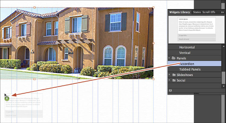
6. In the Widgets Library, click the folder or arrow to the left of the Panels category to show the widgets. Drag the Accordion widget from the widget list roughly into the center of the SERVICES page, below the image.
Tip
You can also insert a Panel widget by choosing Object > Insert Widget > [specific widget you need].
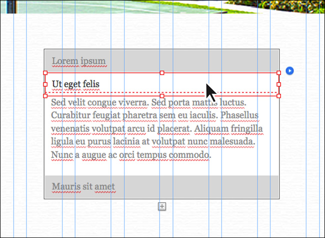
7. With the Selection tool selected, click the second gray bar from the top in the panel (also called a tab) to see the content for that panel. With one of the tabs selected, “Label” will appear in the Selection Indicator in the Control panel.
Note
The accordion just shows and hides the content for each tab in Design mode. When you preview the page in Preview mode or the browser, the panels will animate with a smooth transition between expanding and collapsing the content areas.
8. Click the top gray tab to show the content for that first panel again.
Editing the Accordion widget options
After inserting any widget, you can edit the widget’s options. The options for widgets in the Panels category of the Widgets Library are limited compared to the other widget types, as you’ll see.
1. With the Selection tool, click away from the Accordion widget on the page to deselect it. Click anywhere in the Accordion widget to select it again.
The word “Accordion” appears in the Selection Indicator on the left end of the Control panel.
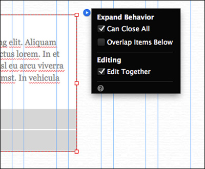
2. Click the blue arrow button off the upper-right corner of the accordion and make the following changes in the Expand Behavior menu that appears:
• Can Close All: Selected (With this option selected, the user can then close all panels at once. When this option is not selected, one panel always remains open.)
• Overlap Items Below: Deselected (the default setting)
• Edit Together: Selected (the default setting)
With Edit Together selected, changes apply to all items in the Accordion widget. For example, if you have a single panel tab selected and you are editing its padding, your edits will apply to all panel tabs in the widget. Deselect this option to make changes to each of the tabs independently. With the Overlap Items Below option deselected, if a user clicks a tab and the content area expands down, it will push any content beneath it down to make room (if necessary).
3. Choose File > Save Site and leave the widget selected.
Note
You can select any part of a widget to open the Options menu to edit the widget options.
Adding or deleting a panel in the Accordion widget
You can easily add more panels to the widget so that it can contain more content, as well as delete any panels that you don’t need.
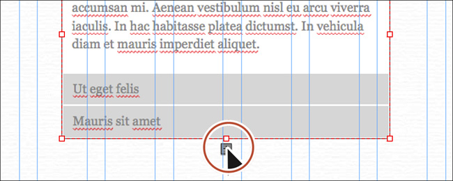
1. Click the plus (+) icon that appears at the bottom of the widget (circled in the figure). Muse adds another panel to the widget.
The accordion on the SERVICES page only needs two panels, so now you’ll delete two of them.
2. With the Selection tool selected and “Accordion” showing in the Selection Indicator on the left end of the Control panel, click the bottom gray tab to select it.
By clicking once on the widget, you select the entire Accordion widget. By clicking on a part of the widget, such as a tab, you select only that sub-element (the label).
3. Press Delete (Backspace) to remove both the tab and the associated panel (and contents).
Note
You could also select the panel, not the tab, and press Delete (Backspace) to delete both.
4. Click the bottom gray tab and press Delete (Backspace) to delete it as well, following the same step as described above. Make sure there are two panels before you continue.
Editing the appearance of the Accordion widget
You can style the Accordion widget using the appearance settings you’ve learned about thus far, including setting background fills and images, strokes, effects, transparency, and more.
1. With the Selection tool selected, click away from the accordion to deselect it.
2. Click the top label twice to select it, not the widget. Make sure that “Label” is showing in the Selection Indicator.
3. In the States panel (Window > States), select the Normal state.
When a tab is selected, and the content for that panel is showing, the tab is in the active state. The Normal state dictates the appearance of the tabs when they are not selected.
4. Change the Stroke Weight to 0 in the Control panel.
5. Click the Fill color in the Control panel, and select the FooterBG swatch in the Color Picker.
Tip
You could also apply a background image, rounded corners, or other effects.
Now that the basic appearance of the tab is finished, you’ll edit the text formatting.
6. With the label still selected, open the Text panel (Window > Text). Click the Font menu, and then click the Web Safe Font category. Select Trebuchet, or something similar. Change the text color to White and the font size to 20.
Any new changes you make to one of the panels or panel tabs will apply to all of them because Edit Together is enabled in the Accordion widget’s Options menu.
Next, you’ll change the height and width of the tabs. Editing the height and width of one panel tab will not affect the other panel tabs, so we need to select both of the panel tabs.
Note
To change the appearance of the tabs separately, click the blue arrow button and deselect Edit Together before making appearance changes.
7. With the label still selected, choose Edit > Select Same (Label) to select both labels. In the Control panel or the Transform panel (Window > Transform), change the height to 45 and change the width to 340. Notice that the width won’t change to 340 because the default text frames in each panel are wider than 340 pixels, preventing the panel from getting narrower.
Next, you’ll edit the appearance of the content areas. Because we set the accordion to be able to close all, you may need to click on the tab until the content area appears.
Note
You could also drag one of the bounding points of a label to change the size, but it would only change the tab you were dragging. If your screen resolution doesn’t allow you to see the Width or Height options in the Control panel, either click the word Transform or open the Transform panel (Window > Transform).
9. Choose Edit > Deselect All, and then click several times to select the top tab, ensuring that you can see the content area beneath it.
10. Position the pointer over the white content area below the selected tab that contains the placeholder text. The words “Content Area” show in a tooltip next to the pointer. Click to select it. “Content Area” will show in the Selection Indicator on the left end of the Control panel.
Tip
Accordion and Tabbed Panel widgets can also be rotated to allow the content to expand across the page rather than down the page, providing more creative options.
11. Change the Stroke Weight to 0 in the Control panel.
You could add fills, strokes, rounded corners, effects, and more to the content areas.
12. Choose File > Save Site. Click the Preview mode link to preview the widget.
When you position the cursor over the non-active tab, a gray background appears. You’ll fix that later in the lesson.
13. Click the Design mode link to return to the page in Design mode.
Adding content to the Panel widget
Now that the widget looks the way it should, you can add content to it. The great thing about an Accordion widget is that you can insert text, images, color fills, background image fills, and more to the panels and panel tabs. You can also insert video with embedded HTML and add other types of content to the panels. To learn about inserting video content, see Lesson 9, “Inserting HTML and Working with the Library Panel.”
Next, you’ll add placed text to the Panel widget.
1. Choose Edit > Deselect All.
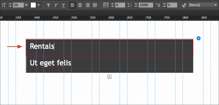
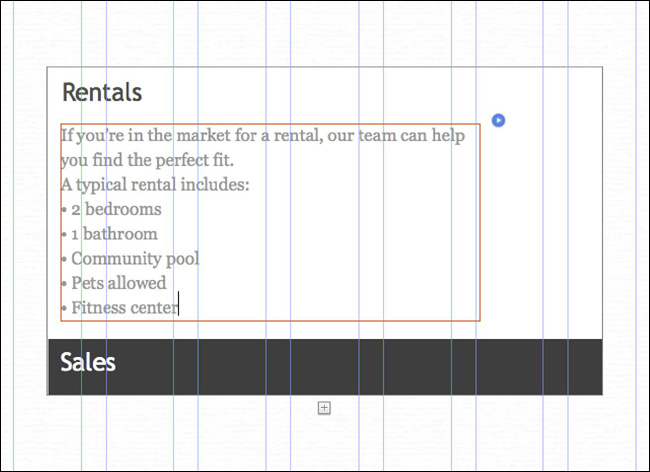
2. Select the Text tool in the Toolbar, click in the text of the top tab (“Lorem ipsum”), and select the text. Type Rentals.
Panel tabs are just text frames to which you can add fills, strokes, effects, and more.
Tip
If you wanted to change the spacing between the text and the edge of the label, you could edit the spacing options in the Spacing panel (Window > Spacing).
3. With the Text tool, click to select the second tab. Select the text in the tab and type Sales. Press the Esc key to select the Label.
Now that the labels have the right text in them, you’ll focus on adding content to each panel in the accordion.
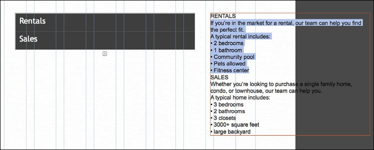
4. Choose File > Place. In the Import dialog box, navigate to the Lessons > text folder and select the text file panels.txt. Click Open. Click to place the text in a frame to the right of the widget.
5. With the Text tool, select the text frame between the RENTALS and SALES headlines in the placed text, and then choose Edit > Copy.
Next, you’ll put the new text into each of the panels. You can replace the placeholder text that is already in each panel, delete the text and paste, or drag in the new text.
6. With the Text tool, click the Rentals tab again, making sure that the content area is showing. Click to insert the cursor in the placeholder text that appears in the content area to select it. Choose Edit > Select All, and then choose Edit > Paste to replace the text.
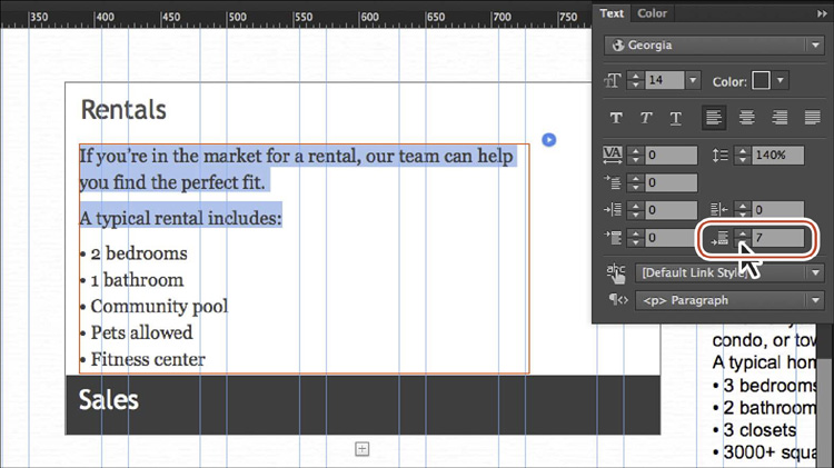
7. Select all of the pasted text, and change the color to the FooterBG swatch in the Text panel (Window > Text). Select the first two paragraphs of the pasted text (not the text in the bullet list) and change the Space After to 7 in the Text panel.
At this point, because you’ll be using the text formatting in multiple panels, it would be a best practice to create a paragraph style for the text.
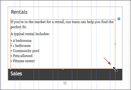
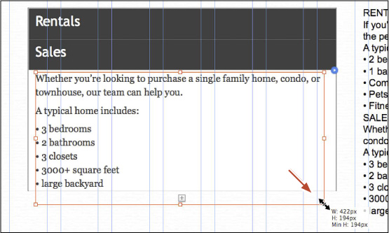
8. Select the Selection tool, and with the text frame still selected, press the down arrow key three times to move the selected text frame down, away from the tab a little to look like the figure. Drag the lower-right, bounding point down and to the right to make the text frame a bit larger. Be sure not to go past the bounds of the content area on the right.
Note
Be careful: You can easily drag content out of the panel. If that happens, choose Edit > Undo Move Item, and try again. You can also select the content area that the text is in and drag the bottom, middle point down to resize it manually first.
When adding content to panels, you can also drag content into the content area. As long as the cursor is within the bounds of the content area while dragging and a thick border appears around the content area, the content will appear within the panel.
9. Click the Sales tab to see the content area below it.
10. With the Text tool, select the text below the SALES headline in the text you placed earlier, and then choose Edit > Copy.
11. With the Selection tool, select the text in the content area below the Sales tab. Choose Edit > Paste.
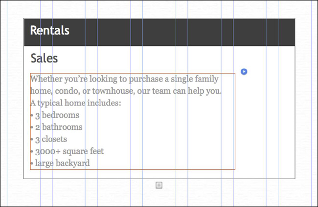
12. Select all of the pasted text, and change the color to the FooterBG swatch in the Text panel (Window > Text). Select the first two paragraphs of the pasted text (not the text in the bullet list) and change the Space After to 7 in the Text panel.
Widgets dynamically adjust their size to accommodate their content, such as a text frame that expands vertically as you type. Widgets also grow vertically to accommodate the additional content you place in them, such as an image or embedded HTML content, like a video.
13. With the Selection tool selected, press the down arrow key three times to move the selected text frame down, away from the tab a little to look like the figure. Drag the lower-right, bounding point down and to the right to make the text frame a bit larger. Be sure not to go past the bounds of the content area on the right.
Note
To align the text frames in the content areas, you can adjust the X position in the Transform panel or Control panel so the values match.
Tip
You can also copy and paste content from the same page or another page, and then drag the content into a content area.
14. Select the placed text frame to the right of the accordion and delete it by pressing Delete (Backspace).
Editing the widget states
You can edit the various states of an Accordion widget’s panel tabs. For example, you might want a panel tab to display a different color when visitors hover the pointer over the tab or when they click it.
1. With the Selection tool, click the Rentals tab twice to select the label. “Label” appears in the Selection Indicator in the Control panel.
2. Click the Active link on the left end of the Control panel. In the States menu that appears, select the Rollover state. Click the Reset To Default button at the bottom of the States panel.
3. Click the Fill color in the Control panel and select the FooterStroke swatch.
4. Click the Rollover link on the left end of the Control panel and select the Mouse Down state in the States menu that appears.
The Mouse Down state should look like the Rollover state by default, so there is no need to change it.
5. Select the Active state in the States menu.
6. Click the Reset To Default button () at the bottom of the States menu so it has the same appearance attributes as the Normal state.
7. Click the Fill color in the Control panel and change the color to the LogoOrange swatch.
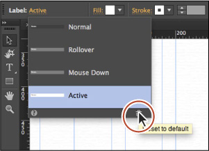
At this point, you could incorporate any changes you wanted, like text color, a different background image, and more. Changing the states for one of the tabs changes the appearance of the states of the other tab because Edit Together is enabled in the Options menu.
Next, you’ll adjust the positioning of the panel.
8. With the Selection tool selected, choose Edit > Deselect All. Click the accordion to select it. Click the Align link in the Control panel to show the Align options. Choose Align To Content Area from the Align To menu. Click the Align Horizontal Centers button ( ) to align the accordion to the horizontal center of the page.
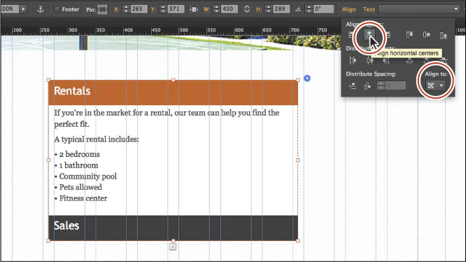
9. Choose File > Save Site.
10. Click the Preview mode link to test the widget. Roll over and click the tabs to see the different states of each tab. Click the Design mode link to return to the page; then close all open pages and return to Plan mode.
Working with slideshows
Slideshow widgets are a great way to add robust image slideshows to your pages and are what you typically see on the web these days.
Muse offers five Slideshow widgets: Basic, Blank, Fullscreen, Lightbox, and Thumbnails. Each has different preset options enabled to create a specialized configuration, but all have the same options available. You can explore each slideshow configuration to discover which slideshow works best for your project.
Slideshow widgets are different from Composition widgets in that they can contain only images, and they can include a caption, first and last buttons, and thumbnails that can be shown or hidden for each larger image. The larger content areas must be stacked, displaying one at a time (unlike Composition widgets).
In this section, you’ll insert a Blank Slideshow widget that is 100% width.
Note
The main difference between the Basic Slideshow widget and the Blank Slideshow widget is that the Basic Slideshow widget has three default images in the larger content area that you can delete or replace, and the Blank Slideshow widget has none.
Adding and configuring a Slideshow widget
A Blank Slideshow widget is one of the simplest slideshows. By default, previous and next arrows are displayed to help the visitor cycle between the images.
1. In Plan mode, double-click the HOME page thumbnail to open that page in Design mode. Choose View > Fit Page In Window.
2. In the Layers panel, select the Page content layer.
3. In the Widgets Library, click the folder or arrow to the left of the Slideshows category to show the Slideshow widgets. You may need to scroll down in the panel. Drag the Blank Slideshow widget into the middle of the page. Leave the widget selected and the Options menu showing; you’ll reposition it later in the lesson.
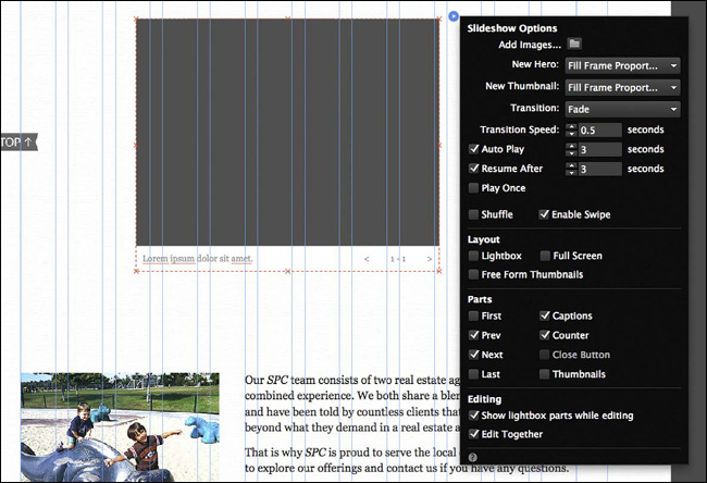
Tip
You can also insert a Slideshow widget by choosing Object > Insert Widget > Slideshow > [specific slideshow you need].
Next, you’ll add some images to the slideshow. One important detail to be aware of is that the images you add will use the Fitting option set in the New Hero and New Thumbnail options in the Options menu. If you don’t want to apply the default option Fill Frame Proportionally to the images and instead want them to Fit Frame Proportionally, you need to set these options before adding images.
4. In the Slideshow Options menu, click the Add Images folder icon. Open the Lessons > images > gallery folder. Click the image named home-slide1.jpg, Shift-click the image named home-slide3.jpg to select all three images. Click Open. The images are loaded into the slideshow, but you’ll see only one on the page.
5. If the Slideshow Options menu is not still showing, click the blue arrow button just off the upper-right corner of the widget to show the menu, and ensure the following options are set accordingly:
• New Hero: Fill Frame Proportionally (the default setting; images you add to the slideshow will fill the larger content area, ensuring that there are no gaps and that a portion of the image is cropped. If the image frame is resized later, the image will always fill the frame proportionally. The Hero is the image in the larger content area.)
• New Thumbnail: Fill Frame Proportionally (the default setting)
• Transition: Horizontal
• Transition Speed: 0.4
• Auto Play: Selected (the default setting)
• Auto Play: 3 (the default setting)
• Resume After: Selected (the default setting)
• Resume After: 3 (the default setting)
• Play Once: Deselected (the default setting)
• Shuffle: Deselected (the default setting)
• Enable Swipe: Selected (the default setting)
• Lightbox: Deselected (the default setting)
Selecting the Lightbox option would hide the larger content areas initially, as with the Composition Lightbox widget.
• Full Screen: Deselected (the default setting)
Selecting the Full Screen option would scale the content of the slideshow to fill the entire browser window for the computer or device screen.
• Free Form Thumbnails: Deselected (the default setting)
• First, Prev, Next, Last, Counter, and Close Button: Deselected
• Captions: Selected (the default setting)
You’ll hide the thumbnails later but will use them to show each image and change its caption. If necessary, click the blue arrow button to open the Options menu again to continue checking the remaining options.
• Show Lightbox Parts While Editing: Selected (the default setting)
• Edit Together: Selected (the default setting)
This configuration will hide all of the slideshow parts except for the larger content areas, thumbnails, and the captions.
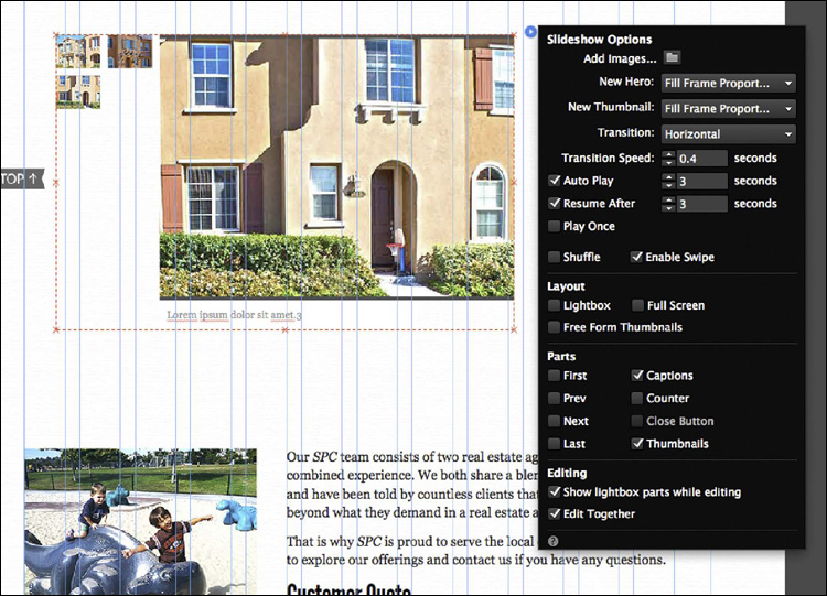
6. Press the Esc key to hide the Slideshow Options menu.
7. With the entire slideshow still selected (the word Slideshow will show in the Selection Indicator on the left end of the Control panel), choose Object > Send To Back to put it behind the other page content, including the red button.
Editing the appearance of the Blank Slideshow widget
You can apply all sorts of formatting options to the triggers and the larger content areas (targets) of Slideshow widgets, just like the other widgets. In this exercise, you’ll resize the larger images, and then edit and style the captions.
1. With the slideshow selected on the page and the Selection tool selected, click the Hero Image (the large image in the slideshow). The words “Hero Image” will show in the Selection Indicator in the Control panel.
2. Drag the Hero Image up until it snaps to the Header guide.
3. Click the 100% Width button ( ) in the Control panel or the Transform panel.
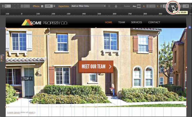
The slideshow will now be 100% width and the height you are about to set. Also, notice that the slideshow thumbnails stayed on the left side of the hero image outside of the main page area.
4. Change the Height to 520 in the Control panel or Transform panel.
Each image will fill the image frame automatically, with no distortion.
5. With the Selection tool, click to select the caption. Drag it so that it snaps into the left edge of the first column, just above the bottom of the slideshow image.
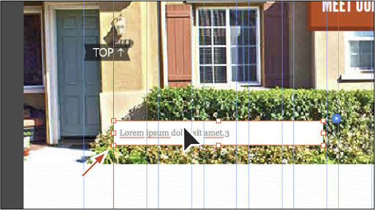
Note
You can change the formatting of the text frame, including background fill, stroke, rounded corners, effects, and more.
6. With the caption selected, in the Text panel click the Font menu, click the Web Safe Fonts category, and choose Lucida Sans. Change the font size to 16, and change the color to the FooterBG swatch.
7. Select the Text tool, and change the text to San Diego, CA.
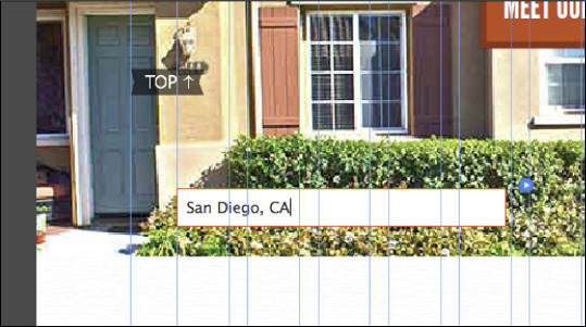
8. With the Selection tool selected, click another image thumbnail off of the left side of the larger hero image a few times to show the larger hero image and caption.
9. Select the Text tool, and change the text in the caption to Carlsbad, CA.
10. Click the last thumbnail with the Selection tool a few times to show the larger content area caption. Change the caption to Escondido, CA.
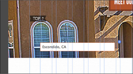
Don’t worry if your captions aren’t displayed on the same images as we have done here.
11. With the caption still selected, click the blue arrow button to show the Slideshow Options menu and deselect the Thumbnails option to hide them.
Later, if you want to edit the hero images or the caption for a specific image, you can show either the Prev and Next arrows or the thumbnails in the Slideshow Options menu, use them to cycle through the images, and then hide them again.
Note
You may have a large gap between the slideshow and the group of content farther down the page. If you want, you can drag up the group so it’s closer to the slideshow.
12. Press Command+P (Ctrl+P) to test the slideshow in Preview mode. Click the Design mode link to return to the page.
13. Choose File > Save Site, and then choose File > Close Page.
Working with Social widgets
Adobe Muse has a category of widgets in the Widgets Library called Social widgets that allow you to add social media content—such as Google Maps, Twitter widgets, YouTube videos, and much more—to your pages.
Because a whole host of Social widgets are available in Muse, we will cover only Google Maps and Twitter Follow in detail to give you an idea of how they work.
Adding the Google Maps widget
The Google Maps widget allows you to embed a Google map into a page. If you don’t have an Internet connection, the preview for the map will not be generated, but you can still add a map to the page.
1. In Plan mode, double-click the CONTACT page thumbnail to open that page in Design mode.
2. Choose View > Fit Page In Window.
3. In the Layers panel (Window > Layers), make sure the Page content layer is selected.
4. In the Widgets Library (Window > Widgets Library), click the folder or arrow to the left of the Social category to show the widgets in that category. Drag the Google Maps widget onto the right side of the page.
Note
If you don’t see the Options menu, select the widget and click the blue arrow button off the upper-right corner of the widget.
As soon as you drop the widget onto the page, the Options menu appears. Each of the Social widgets has different options that you can set. By now, the process of dragging widgets from the Widgets Library should be familiar to you.
5. In the Google Maps Options menu, change the following options:
• Address: San Diego, CA
• Map Kind: Roadmap (the default setting)
• Expand Pin Info: Selected (the default setting)
• Zoom Level: 12 (the default setting)
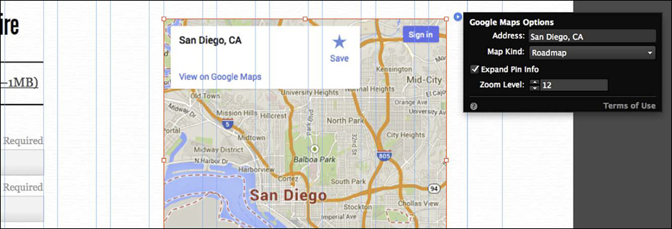
Next, you’ll set a guide so you can align the map to existing content.
6. With the Rulers showing (View > Show Rulers), click and drag from the top (horizontal) ruler out into the page. Roughly align the guide with the top stroke of the Client Questionnaire (PDF–1MB) text frame.
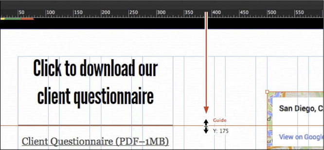
Tip
You can simply select a guide and press Delete (Backspace) to remove it.
7. With the Selection tool selected, drag the map so that the right edge snaps to the right edge of the last column and the top snaps to the guide you just created. Temporary lines will appear on the top and right edges when the map is snapped in place.
Note
Your guide may be blue when dragging, indicating that it is snapping to content.
8. Shift-drag the lower-left corner of the Google Map widget away from the center until the height and width show roughly 505px in the measurement label that appears. You can snap it to the nearest column guide. The map preview will refresh to fill the area (if you have an Internet connection).
9. Choose File > Save Site.
10. Choose File > Preview Page In Browser to test the map. Try clicking the plus and minus buttons and exploring other map features. Close the browser and return to the page in Muse.
11. Choose File > Close Page to close the CONTACT page and return to Plan mode.
Adding the Twitter Follow widget
The Twitter Follow widget allows you to embed a link so users can follow you or your business on Twitter. You’ll need to a set up a Twitter account for this, unless, for example, you are building the site for someone else.
1. In Plan mode, double-click the Home-master page thumbnail to open it in Design mode.
2. In the Layers panel, select the Master content layer.
3. Scroll down to see the entire footer area. You’ll insert the Twitter Follow widget below the email address.
4. In the Widgets Library, drag the Twitter Follow widget from the Social category into the footer, below the email address [email protected]. Click the blue arrow button to show the Twitter Follow Options menu and change the following options:
• Twitter @: Enter your Twitter handle in the Follow @ field. If you don’t have one, you can leave it at the default: AdobeMuse.
• Size: Large
• Show Username: Deselected
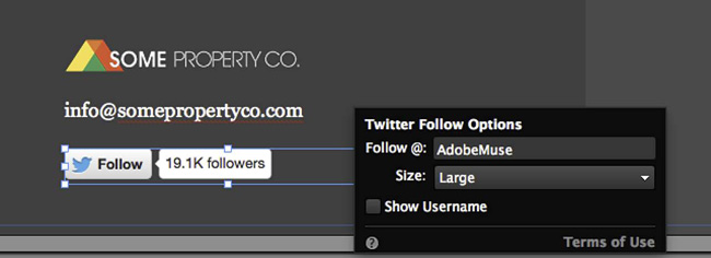
5. With the Selection tool, drag the widget so that its left edge is aligned with the left edge of the email address (if it isn’t already).
You may want to align the logo, email address, and Twitter Follow widget with each other before proceeding.
6. Press Shift and click to select the Some Property logo, the email text frame, and the Twitter Follow widget, and then choose Object > Group. Drag the group so that it is more vertically centered in the footer (see the following figure).
7. Choose File > Save Site.
8. Choose File > Close Page to return to Plan mode.
Now that you’ve added widgets on your pages, you’ll dive into the next lesson. Lesson 8 focuses on adding effects like drop shadows, rounded corners, and opacity, and saving object formatting as graphic styles for ease of updating, consistency, and more.
Review questions
1. What are Muse widgets?
2. What are the seven categories of widgets available in Muse?
3. Describe what a trigger and target are in a Muse widget.
4. Name a benefit of using an Accordion or Tabbed Panel widget in your page.
5. Name the major difference between Composition and Slideshow widgets.
Review answers
1. Widgets are reusable site features that offer configurable interactivity and behaviors. Widgets allow visitors to click or hover (or auto-run) to show and hide page content. They are completely customizable and can be styled to fit your design. Widgets provide an easy way of adding interactivity to your web page.
2. The seven categories of widgets available in Muse are Buttons, Compositions, Forms, Menus, Panels, Slideshows, and Social. Each of these categories contains multiple widgets, each customized for a specific purpose.
3. Most, but not all, widgets in Muse are composed of at least one small container (the trigger) that acts like a button to display content in a larger container (the target) in response to user interaction. Triggers can be hidden in certain widgets that are set up to auto-play.
4. Accordion and Tabbed Panel widgets are helpful for displaying more elements within a smaller screen area. Visitors can click the tabs of these types of widgets to reveal the contents of each container. Both Tabbed Panel widgets and Accordion widgets add interactivity to pages by enabling visitors to choose the content they want to show.
5. Slideshow widgets are different from Composition widgets in that they can contain only images, and they can have a caption and first and last buttons, as well as thumbnails that can be shown or hidden that correspond to each larger image. The larger content areas in Slideshow widgets must be stacked, displaying one at a time (unlike Composition widgets), because their targets can be scattered on a page.