
8. Applying Effects and Graphic Styles
Lesson overview
• Round the corners of content
• Apply shadows, bevels, and glows
• Make opacity (transparency) changes
• Work with scroll effects
• Apply Motion scroll effect to browser fill images
• Apply Motion scroll effect to page content
• Apply Opacity scroll effects
• Save and apply graphic styles
Muse has many great options to add punch to your web designs, including drop shadows and other effects, rounded corners, scroll effects, saving object formatting as graphic styles, and much more.
Working with rounded corners, effects, and opacity
In Adobe Muse, many formatting options can help you add some real design flair to the content on your pages, aid in readability, keep up with today’s design trends, and more. Those formatting options include effect settings, which consist of drop shadows, bevels, glows, rounded corners, and opacity (transparency) changes. You can apply all of these options to content from the Control panel. You’ll experiment with these formatting options in the exercises that follow, starting with rounded corners.
 Note
Note
If you have not already downloaded the project files for this lesson to your computer from your Account page, make sure to do so now. See “Getting Started” at the beginning of the book.
Rounding corners
You can round the corners on content, such as text frames, image frames, rectangles, form buttons, and more. In addition, you can round each corner separately or round all of a frame’s corners at once. Either way, you can easily adjust your initial rounding settings, as you’ll see in this exercise.
1. In Plan mode with the SPC site open, double-click the HOME page thumbnail to open the page in Design mode.
2. Choose Window > Reset Panels.
3. With the Selection tool selected, click the red MEET OUR TEAM button to select it. The Selection Indicator in the Control panel shows “Text Frame.”
4. Press Command+= (Ctrl +=) several times to zoom into the button.
5. Change the Corner Radius to 10 in the Control panel.
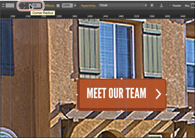
Changing the Corner Radius changes all four corners of the frame to a radius of 10 pixels. The larger the radius, the more rounded the corners will become.
6. Click the caption in the slideshow (behind the MEET OUR TEAM text frame) twice to select it.
7. Click the upper-right Enable/Disable button ( ), and click the lower-right Enable/Disable button (
 ) in the Control panel to enable the corner radius for just those corners.
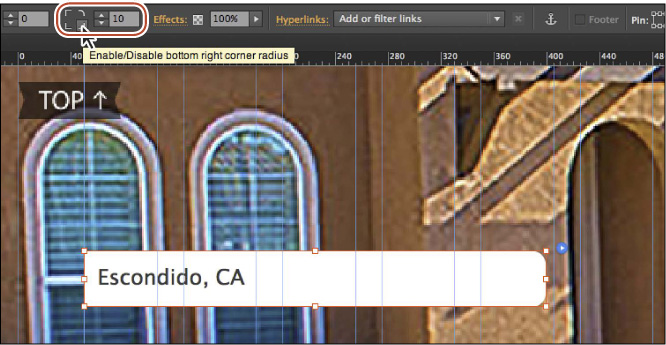
You can turn on and off the Corner Radius for each corner of a selected frame to give you more creative control.
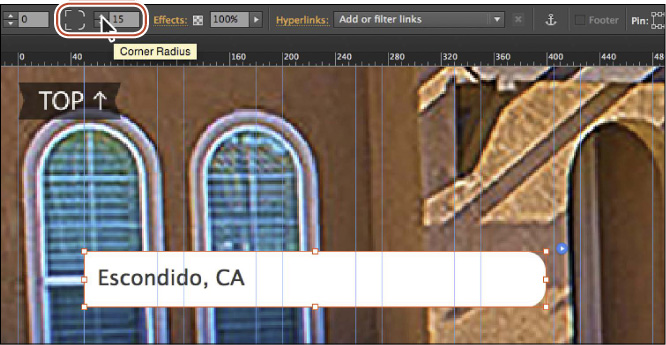
8. Change the Corner Radius value to 15 in the Control panel.
Note
To remove the rounded corners, you can change the Rounded Corners value to 0 or click the Enable/Disable buttons until they all show a square corner.
9. Choose File > Save Site.
10. Click the Preview mode link to see the rounded corners. Click the Design mode link to return to the page and leave it open for the next section.
Applying a Shadow effect
The Shadow effect, or drop shadows, on the web can add depth to your design content, so that it takes on a more 3D appearance. As you explore shadows with your own projects, you’ll quickly learn that not all objects support shadows. Next, you’ll apply a shadow to the red button on the HOME page.
1. On the HOME page choose View > Fit Page In Window.
2. With the Selection tool selected, click to select the red MEET OUR TEAM text frame.
Note
You can apply a shadow to text only if it’s rasterized or to the frame that the text is in if it’s filled with a color. You cannot apply shadows to ordinary text that isn’t rasterized.
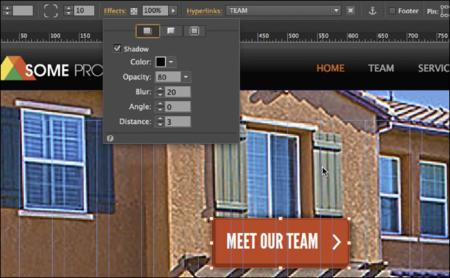
3. Click the Effects link in the Control panel to reveal the Effects menu. Making sure that the Shadow button is chosen at the top of the options, select Shadow.
Three types of effects are listed in the Effects menu: Shadow, Bevel, and Glow, as well as the specific options for each effect.
4. Change the Shadow options to the following:
• Color: Black (the default setting)
• Opacity: 80
• Blur: 20 (specifies the “thickness” of the shadow)
• Angle: 0 (moves the drop shadow around the object)
• Distance: 3 (specifies the distance between the drop shadow and object)
Note
Drop shadows follow the contour of an image, not the edges of the image frame. If you were to apply a color fill to the same image frame, the drop shadow would follow the contour of the color fill. If you were to apply a background image to the image frame, the drop shadow would follow the contours of the background image or image in the frame.
Try adjusting the settings to see the effect on the shadow. Be sure to return to the settings in the previous step when you are ready to continue. Click away from the Effects menu to hide it or press the Esc key.
5. Choose File > Save Site; then choose File > Close Page and return to Plan mode.
Applying a Bevel effect
The Bevel effect adds a beveling to the edge of an object, such as an image or frame filled with color. You can apply the Bevel effect to give objects a more realistic, 3D look.
1. In Plan mode, double-click the CONTACT page to open it in Design mode.
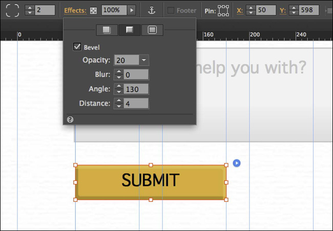
2. With the Selection tool selected, click twice on the SUBMIT button to select it. “Submit” will show in the Selection Indicator in the Control panel.
3. Press Command+= (Ctrl+=) three times to zoom in.
4. Click the Effects link in the Control panel to reveal the Effects menu. Click the Bevel button at the top of the menu. Select Bevel, and then change the Bevel options to:
• Opacity: 20
• Blur: 0
• Angle: 130
• Distance: 4 (specifies the distance between the border of the rectangle and the faded edge of the bevel)
Try adjusting the settings to see the effect on the bevel, but be sure to return to the settings in this step when you are ready to continue. Click away from the Effects menu to hide it.
5. Click the Preview mode link to preview the Bevel effect. Click the Design mode link to return to the CONTACT page, and then choose File > Close Page.
6. Choose File > Save Site.
Applying a Glow effect
The Glow effect causes a glow to emanate from under the object, but you can also apply a glow to the inside of an object. You can apply a glow to a rectangle, image frame, or rasterized text. In this exercise, you’ll apply a Glow effect to an image on the HOME page.
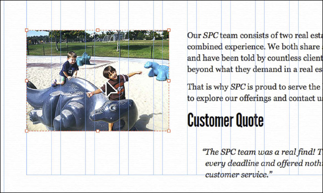
1. In Plan mode, double-click the HOME page thumbnail to open the page in Design mode. Scroll down the page to see the text and image above the footer.
2. With the Selection tool selected, click the image to the left of the “Customer Quote” text twice to select the image frame.
You are clicking the image twice because the image and text are currently grouped together.
3. Click the Effects link in the Control panel to reveal the Effects menu. Click the Glow button at the top of the menu, and then select Glow. Change the rest of the Glow options to:
• Color: Black
• Opacity: 50 (the default setting)
• Blur: 15
• Inner Glow: Selected
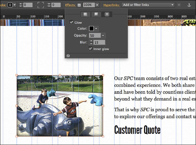
Try adjusting the settings to see the effect on the glow, but be sure to return to the settings in this step when you are ready to continue. Click away from the Effects menu to hide it.
 Tip
Tip
You can apply multiple effects to a single object. For instance, you could also add a drop shadow to the image with the Glow effect to give it a more realistic, 3D look.
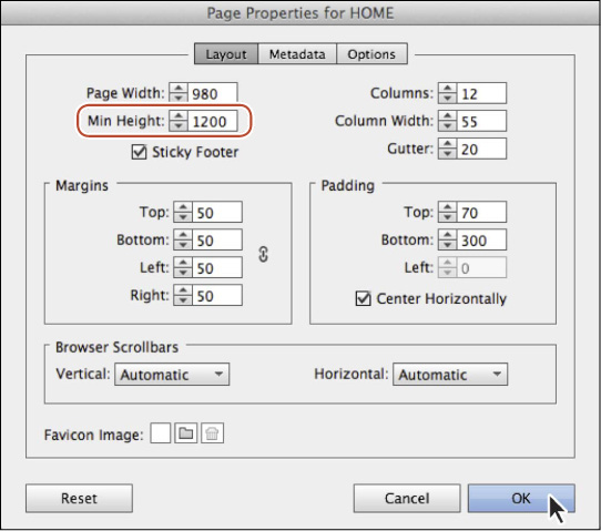
4. Choose Page > Page Properties. Change the Min Height to 1200 and click OK.
5. Click the Preview mode link to preview the Glow effect (you may need to scroll down). Press the Esc key to return to the HOME page.
6. Choose Edit > Deselect All.
7. Choose File > Save Site, and leave the HOME page open.
Adjusting opacity
Another great feature for adding design interest to your pages is the ability to change the opacity (transparency) of content. You can use opacity changes to aid in readability when placing text on an image, for instance.
In this exercise, you’ll create text and insert a rectangle frame between the image and the text for readability.
1. Scroll up on the HOME page to see the slideshow toward the top of the page.
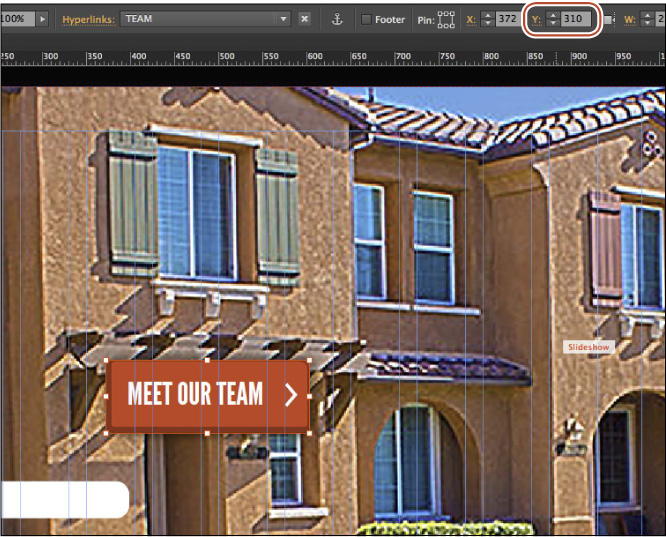
2. With the Selection tool selected, click the red MEET OUR TEAM text frame. Change the Y value to 310 in the Control panel (or Transform panel; choose Window > Transform).
3. In the Layers panel, choose the Page content layer.
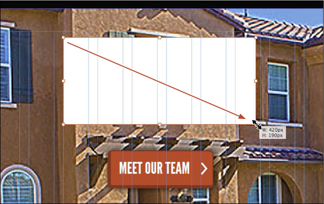
4. Select the Rectangle tool in the Toolbar, and draw a rectangle above the MEET OUR TEAM text frame that has a height of approximately 190px and a width of 420 pixels. Don’t worry about its exact position right now, because you’ll change it later.
5. Change the Fill color of the frame to black and the Stroke Weight to 0 in the Control panel.
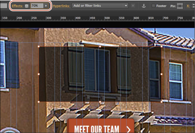
6. Change the Opacity setting to 70 in the Control panel.
Tip
To change the opacity, you can either click the arrow to the right of the Opacity field and drag the slider or type the value directly into the Opacity field.
Opacity changes the transparency of the selected object. If the rectangle you drew had a background image, stroke, and so on, the opacity adjustment would apply to the frame and all of its contents.
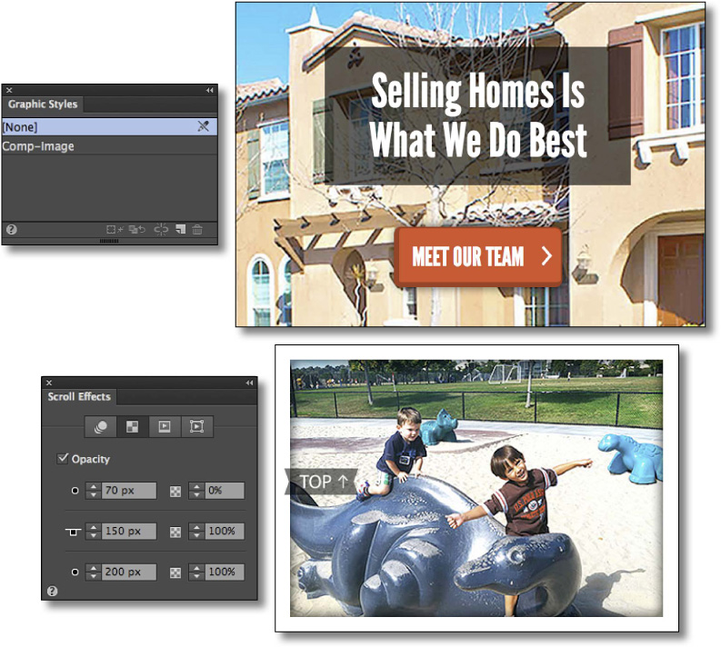
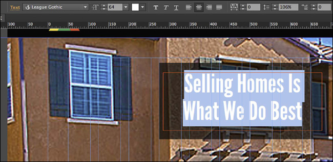
7. Select the Text tool, and draw a text frame on top of the rectangle you just created that is almost as big. Type Selling Homes Is press Return (Enter) and type What We Do Best.
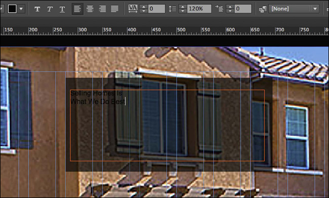
8. Select the text and change the following text formatting options in the Control panel:
• Click the Font menu and change the font to the Web Font League Gothic
• Font Size: 64
• Text color: White
• Click the Align Center button
• Leading: 106
You may need to resize the text frame, making it larger.
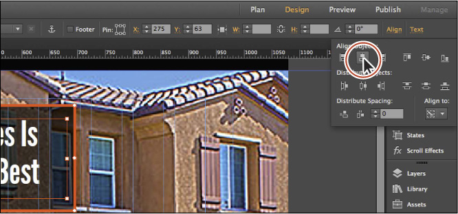
9. With the text frame still selected, select the Selection tool, Shift-click the black rectangle beneath it to select both, and then release the Shift key. Click the black rectangle again to make it the key object for alignment. Click the Align link in the Control panel (or open the Align panel), and click the Align Horizontal Centers button ( ).
).
10. Choose Edit > Deselect All, and then Shift-drag the text frame to visually align the text vertically with the black rectangle. A blue horizontal line temporarily appears when the text frame is vertically centered within the black rectangle.
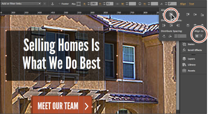
11. Shift-click the black rectangle to select both objects and choose Object > Group.
12. With the group selected, change the Y value to 65 in the Control panel (or Transform panel; choose Window > Transform).
13. With the group selected, Shift-click the red MEET OUR TEAM text frame to select it as well. Click the Align link in the Control panel and choose Align To Content Area from the Align To menu, if it’s not already chosen. Click the Align Horizontal Centers button ().
14. Click the Preview mode link to preview the changes. Click the Design mode link to return to the HOME page.
15. Choose File > Save Site; then choose File > Close Page to close the page and return to Plan mode.
Working with scroll effects
Arguably, one of the more exciting features in Adobe Muse is the addition of scroll effects. Scroll effects allow different content on one scrolling page to move at different speeds and directions, creating the illusion of depth. You can create many changes that occur based on page scroll movement, including controlling the motion, opacity, playback of a Slideshow widget, and Adobe Edge Animate content.
Check out www.scrolleffects.com to get a sense of what scroll effects are (the site was built using Muse; scroll down or click the links to see what each effect is).
Used effectively, scroll effects can add to the interest and navigation of a site. Many types of sites can benefit from using scroll effects. In addition to making a site more interactive and engaging, scroll effects can offer the following benefits:
• Improve the user experience by enticing users to want to see more—keeping users on your site longer
• Allow for storytelling
• Lead to a call to action while demonstrating a product
• Add layering and depth to your design
Currently, you can’t apply the Motion scroll effect to an object within a widget or a group, inline elements (like an image pasted into a text frame), or pinned content. Content that is 100% width can only have vertical motion defined.
Later, when you’re considering whether or not to use scroll effects in your own site, start by asking whether it adds to the user experience.
Applying a Motion scroll effect to a browser fill image
Now you’ll get your first taste of working with a Motion scroll effect when you apply it to a browser fill image on the site.
1. In Plan mode, double-click the Home-master page thumbnail to open the page in Design mode.
2. Choose View > Fit Page In Window.
3. Click the Browser Fill link in the Control panel. With the Fill tab selected, click the page-bg.png link in the Image section to open the Import dialog box and replace that image. Navigate to the Lessons > images folder, select the scroll-bg.jpg file, and click Open.
4. In the Browser Fill menu, choose Scale To Fill from the Fitting menu, ensure that the center position of the six possible options in the Pin tool ( ) is selected, and verify that scrolling is selected.
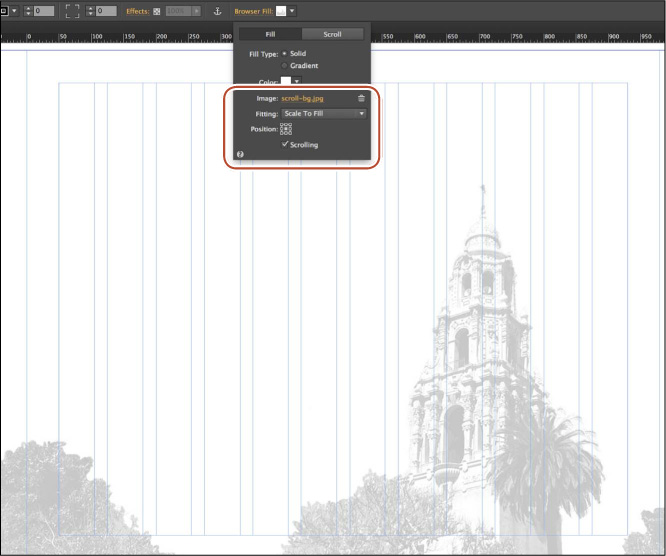
5. In the Browser Fill menu, click the Scroll tab and then select Motion.
Muse applies the Motion scroll effect to the background image. The Motion settings in the Scroll tab control the browser fill image motion in relation to the vertical scrolling in a viewer’s web browser. In the settings, you can control the horizontal and/or vertical motion and speed of the browser fill image.
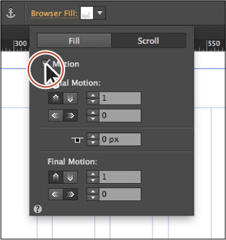
The settings in the Scroll Effects panel are divided into three sections: Initial Motion, Key Position, and Final Motion. Here is what each option is used for:
• Initial Motion: The object can move in from the right or left (at a specific speed), or move up or down (at a specific speed). When the T-shaped handle (the Key Position) reaches the top of the browser window, the motion is complete and the object is at its current location in the design.
• Key Position: The Key Position is a pixel value and is typically represented by a T-shaped handle on selected content that has a scroll effect applied (except in the case of a Motion scroll effect applied to a browser fill). The default setting of 0px means that the T-shaped handle is set to the very top edge of the browser window. When the page is scrolled and the Key Position reaches the top of the browser window, the Initial Motion is complete and the Final Motion settings begin.
• Final Motion: After the visitor scrolls the page to the location of the Key Position, which in this case is the top of the browser window, and the page is scrolled further, the object can move right or left (at a specific speed), or move up or down (at a specific speed) based on the Final Motion settings.
The element with the Scroll Motion effect applied (in this case, the background image) moves in the direction(s) that has a value greater than 0 (zero). If both the horizontal and vertical speeds are set to 0, the element is essentially pinned to the page and doesn’t move.
As you change the Motion options in the following steps, we’ll discuss what is happening.
6. In the Initial Motion options, change the Vertical Speed value to 0 (zero) and ensure that the Horizontal Speed is 0.
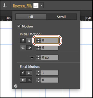
Note
When a speed is set to 0 (zero), it doesn’t matter which direction is selected (the up or down arrow buttons). For instance, if the Horizontal Speed is set to 0, it doesn’t matter whether the up or down arrow button is selected.
To change a speed value, you can either type the value or click the arrows to the left of the value.
The default value of 1 applied to the Vertical Speed setting would move the background image vertically at the same rate (speed) of scrolling. The up arrow button ( ) would move the background image up, in the same direction as the content; the down arrow button (
 ) would move the background image down, in the opposite direction of the page content.
You can set the values to be less than 1 or greater than 1. For instance, a value of 0.5 for the Vertical Speed would cause the background image to move vertically at half the rate, compared to the rate the page is scrolling.
7. Change the Key Position value to 200.
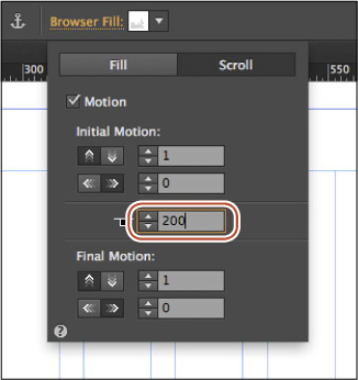
The Key Position value is the distance the page is scrolled vertically. In this case, after the user scrolls down the page a distance of 200 pixels, the Final Motion settings take effect. You will set the Final Motion settings next.
8. In the Final Motion options, make sure the up arrow button () is selected and change the Vertical Speed value to the far right to .3 (that’s point 3). Make sure the Horizontal Speed value is 0.
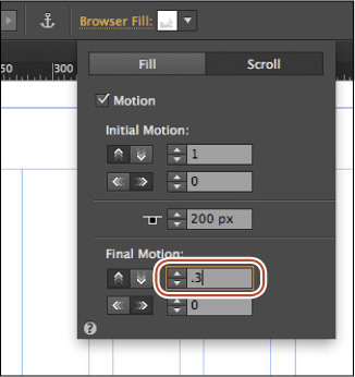
With the up arrow button selected and a value of 0.3 set, the background image will move up in the browser window (the same direction as the page content) at roughly a third of the vertical scrolling speed. Normally, without scroll effects applied, a background image will move at the same rate as the scrolling.
Note
Your screen size may not allow you to see the effect. You can change the size of the Application window to test the effect or preview the page in the browser and adjust the browser’s magnification.
9. Choose View > Preview Mode to preview the effect. Scroll vertically in the Document window and watch the background image move more slowly than the scroll speed.
10. Choose View > Design Mode to return to the Home-master page.
You could try some different settings to see the effect, but be sure to return to the settings in the preceding steps before you move on.
11. Choose File > Save Site, and then choose File > Close Page to close the Home-Master page. Click the Preview tab and close the Preview page.
Applying scroll effects to page objects
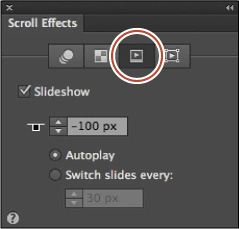
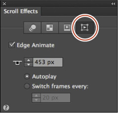
The Motion scroll effect can be applied to content like frames, rectangles, and more. In this section, you’ll explore the Scroll Effects panel. The Scroll Effects panel has four different effect categories: Motion, Opacity, Slideshow, and Edge Animate. They appear as a series of buttons along the top of the Scroll Effects panel, as you’ll soon see.
You can apply more than one type of scroll effect to content, but the Slideshow effect is meant to be applied to Slideshow widgets, and the Edge Animate effect is meant to be applied to placed content created in Adobe Edge Animate (.oam files).
Next, you’ll apply a Motion scroll effect to the composition you created on the TEAM page.
1. Press Command+J (Ctrl+J), type the first few letters of the word “team,” and choose TEAM from the menu to open the page in Design mode. Click OK.
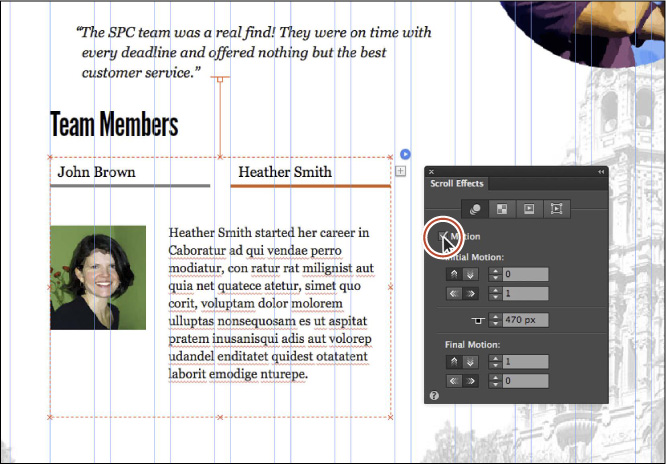
2. Scroll down the page until you see the TEAM MEMBERS content. With the Selection tool, click the Composition widget below the TEAM MEMBERS heading to select it.
3. Open the Scroll Effects panel (Window > Scroll Effects). Click the Motion button, if it’s not already selected, and select Motion to apply the effect.
Note
We dragged the Scroll Effects panel into the workspace closer to the composition. You don’t have to do that. Also, the initial settings in the dialog box may not match what you see, and that’s OK.
On the page, notice the T-shaped handle that extends from the top of the selected composition on the page. This is a visual representation of the Key Position value that you see in the Scroll Effects panel, as we mentioned earlier. The location of the T-shaped handle represents the element’s key position. When the page is scrolled vertically, the settings in the Initial Motion section are applied until the Key Position is reached, so that the element’s position matches its location as shown in Design view.
Once the visitor scrolls the page using various methods (such as moving the scroll bar in their browser window or clicking a link to an anchor farther down the page) and the “T” portion of the T-shaped handle reaches the top of the browser window, the settings in the Final Motion section of the Scroll Effects panel are applied as the page continues to scroll in the same direction.
4. Drag the T-shaped handle up until the Key Position value 300 appears in the tooltip (you may need to scroll up in the page). As you drag the T-shaped handle, notice that the Key Position value updates in the Scroll Effects panel.
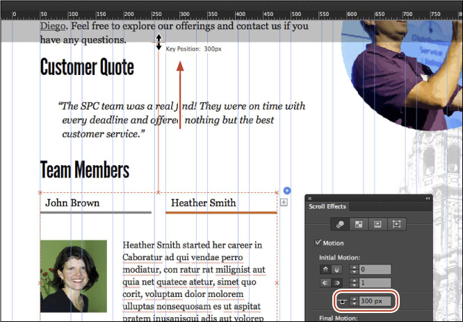
Tip
You can also change the key position by dragging the T-shaped handle with the Selection tool to visually position the key position in the design.
Next, you’ll set the Initial Motion options.
5. In the Initial Motion options, make sure the Vertical Speed is 0 (zero, the default). Ensure that the right arrow button is selected ( ), and change the Horizontal Speed value to 2.5.
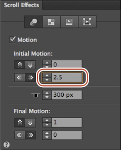
These settings mean that the image will not move vertically before the key position reaches the top of the browser window, but it will move horizontally from left to right, stopping at the position it currently is on the page when the T-shaped handle (the Key Position) reaches the top of the browser window. What’s interesting is that the slower the speed (say .5 rather than 1.5), the sooner it starts moving and the longer it takes to move into its position.
Next, you’ll make sure the default Final Motion options are set. This movement occurs after the T-shaped handle (the Key Position) reaches the top of the browser window.
6. In the Final Motion options of the Scroll Effects panel, make sure the Vertical Speed is 1 (the default). Ensure and verify that the up arrow button is selected () and that the Horizontal Speed is 0 (zero, the default). See the previous figure. Leave the composition selected.
These settings mean that the object will not move vertically before the key position reaches the top of the browser window, but it will move horizontally from left to right.
7. Press Command+P (Ctrl+P) to preview the page. In Preview mode scroll all the way down the page to see the effect.
You’ll see that the composition, when moving into position, covers the TEAM MEMBERS text above it at certain points.
8. Click the Design link to return to Design mode and show the TEAM page in Design mode.
At this point, you can try adjusting the motion settings for the composition to see the effect change. Make sure you change the settings back to what they were in the previous steps before moving on. Next you will remove a white background fill color in the composition so that the overlapping elements look less distracting as they animate into position.
9. With the composition still selected, click once on the John Brown trigger to ensure that the content is showing. Click the target area (that contains the image and text). The word “Target” will appear in the Selection Indicator on the left end of the Control panel. Change the Fill color to None in the Control panel.
10. Follow the same procedure (the previous step) for the Heather Smith trigger of the composition as well.
11. Choose File > Save Site, click the X in the Preview tab to close it, and then choose File > Close Page to close the TEAM page.
Applying an Opacity scroll effect
In this section, you’ll learn how to apply unique opacity values to an object as a user scrolls the page. This is a helpful way to show and hide content by making items appear to fade in or fade out as the visitor scrolls down the page. As an example of the Opacity scroll effect, you could fade a button in as a user scrolls to a certain section of a longer page. As the user scrolls farther away from the section, the button fades back out.
Next, you’ll make the TOP button, which links to the top of the page on the HOME page, fade in after the user scrolls down the page a bit and stay visible until the user scrolls back toward the top of the page.
1. Press Command+J (Ctrl+J) click the arrow to expand the list of pages, and choose HOME from the menu to open the Home page in Design mode. Click OK.
2. On the HOME page, with the Selection tool selected, click the slideshow beneath the header to select it. Choose Object > Hide to temporarily hide it.
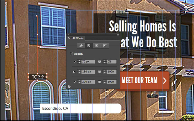
3. Click the TOP button on the left side of the page. You may want to zoom in on the button a bit.
4. In the Scroll Effects panel, click the Opacity tab. Select Opacity to apply an Opacity scroll effect to the button.
Note
We dragged the Scroll Effects panel closer to the button. You don’t have to do that.
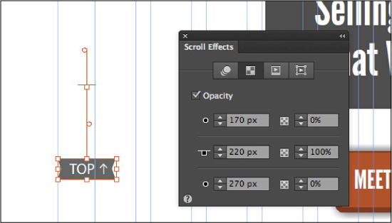
On the page, you should see a handle appear above the button, similar to the T-shaped handle you saw previously. The Opacity handle has three parts that you can drag independently to set three different options found in the Scroll Effects panel: Fade Position 1, Key Position, and Fade Position 2. You can either adjust the position settings by dragging parts of the handle or entering new values in the Scroll Effects panel.
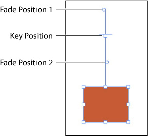
Here’s how the Opacity scroll effect works: For selected content that has the Opacity scroll effect applied, you can have three opacity settings: the initial opacity (Fade Position 1), the opacity when the key position reaches the top of the browser window, and the final opacity (Fade Position 2). To have something fade in and then fade out, you would set the Fade Position 1 to 0% opacity, the Key Position opacity to 100%, and the Fade Position 2 to 0% opacity.
The Opacity settings also have a position associated with them to indicate when the opacity should change and how quickly, as the user scrolls vertically in the browser.
5. Click and drag the Key Position handle (the square part of the T-shaped handle) up until the tooltip shows a value of roughly 150px.
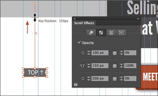
You should see that the top handle of the T-shaped handle also moved and that the Key Position value in the Scroll Effects panel is also now 150px. As we stated earlier, this is the second Opacity setting. By dragging it into position you are telling the browser at that position the opacity should be what is set in the Scroll Effects panel. You’ll set that next.
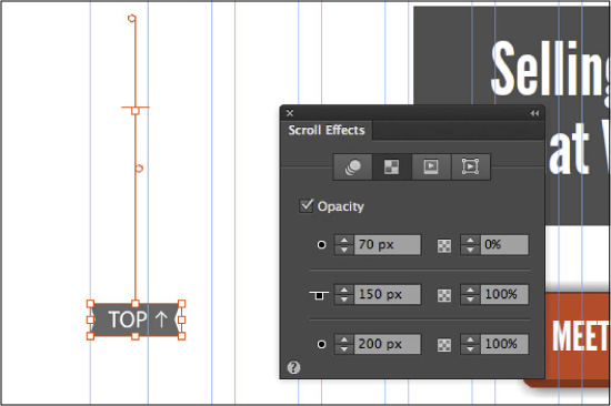
6. Apply the following settings to the Opacity options in the Scroll Effects panel:
• Fade Position 1: 70 (This option determines the starting opacity. A value of -70px in our master page would mean the top of the page area [the Header guide starts the Y value at 0]. If you were to set this option to 100px, by default, the button would have an opacity of 0% at the starting scroll position to 100 pixels down. Know that this position will change if you change the Key Position value later.)
• (Fade Position 1) Opacity: 0 (zero, the default setting) (Before the page is scrolled, the button will be transparent.)
• Key Position: 150 (You already set this by dragging a part of the T-shaped handle on the page in the previous step. This option determines the second opacity.)
• (Key Position) Opacity: 100 (the default setting. By setting the Key Position Opacity to 100, the opacity of the button will change from 0 to 100 when the key position reaches the top of the browser window. The distance between the Fade Position 1 and the Key Position determines how “fast” the transition occurs.)
• Fade Position 2: 200 (This location of this scroll position doesn’t matter because the button will stay at 100%. This value cannot be less than the Key Position value.)
• (Fade Position 2) Opacity: 100 (If this opacity for this position were set at 50%, for instance, the button would be 50% opacity when the Fade Position 2 reaches the top of the browser window. So the button would fade from 100% to 50% opacity in the distance of 50 pixels [200px minus 150px].)
7. Choose Object > Show All On Page to show the slideshow again.
9. Choose File > Preview Page In Browser. Scroll down in the browser far enough to see the button fade in.
Notice when it fades in and how long it takes to fade in, depending on your scroll speed.
10. Close the browser and return to Muse; then choose File > Close Page, and return to Plan mode.
Applying a scroll effect to Edge Animate content
Working with graphic styles
Just as you use paragraph and character styles to quickly format text, you can use graphic styles to quickly format graphics and apply attributes to frames. Object styles include settings for stroke, fill color, effects, wrap, and more, but do not contain text formatting. If you work in Adobe InDesign, you’re probably familiar with Object styles. Object styles in InDesign are very similar in basic functionality to graphic styles in Muse.
In Muse, graphic styles are often used for formatting submenus, image frames, and tooltips, and much more. Let’s start by exploring the Graphic Styles panel.
1. In Plan mode, double-click the TEAM thumbnail to open the page in Design mode.
2. Choose View > Fit Page In Window.
3. Choose Window > Reset Panels.
4. Choose Window > Graphic Styles to open the Graphic Styles panel.
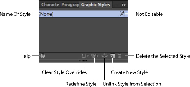
Take a minute to familiarize yourself with the options in the Graphic Styles panel. As you progress through this exercise, you’ll learn about each of these options.
Creating and applying a graphic style
Next, you’ll create a graphic style from the images in the composition on the TEAM page and apply it.
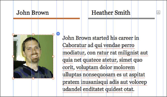
1. On the TEAM page, with the Selection tool selected, click twice on the John Brown trigger (the John Brown text) to show the target content, which includes the picture of John. Click three times on the picture of John to select the image frame.
With the image frame selected, you’ll apply some formatting and then save that formatting as a graphic style that you can then apply to the picture of Heather.
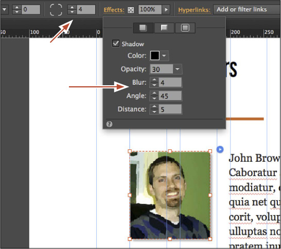
2. With the image selected, zoom in by pressing Command+= (Ctrl+=) several times.
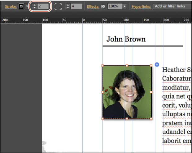
3. Change the Corner Radius to 4 in the Control panel.
4. Click the Effects link in the Control panel to reveal the Effects menu. Making sure that the Shadow button is chosen at the top of the options, select Shadow. Change the Shadow options in the Effects menu to the following:
• Color: Black (the default setting)
• Opacity: 30
• Blur: 4
• Angle: 45 (the default setting)
• Distance: 5
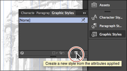
5. With the Graphic Styles panel still visible (Window > Graphic Styles) and the image still selected, click the Create A New Style button ( ) at the bottom of the panel to create a new graphic style based on the image formatting.
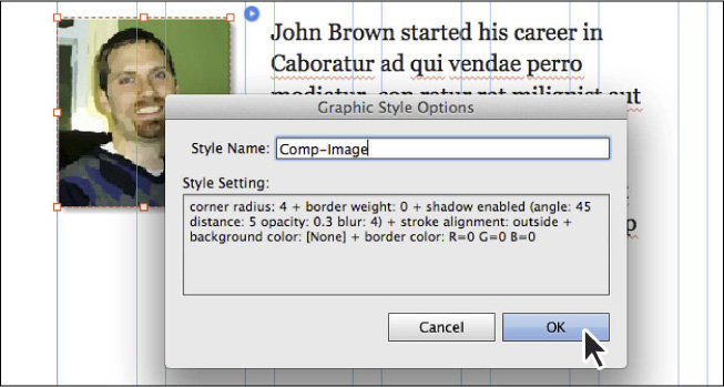
6. Double-click the new graphic style named Style. Change the Style Name to Comp-Image, and notice all of the formatting that was captured in the Style Setting area of the Graphic Style Options dialog box. Click OK.
Note
The order of the attributes listed in the Style Setting section might be different than those listed in your Graphic Styles Options dialog box, and that’s OK.
Graphic styles cannot contain formatting like sizes of objects (width and height), text formatting, and more.
Now you’ll apply the graphic style to the image of Heather in the other composition target.
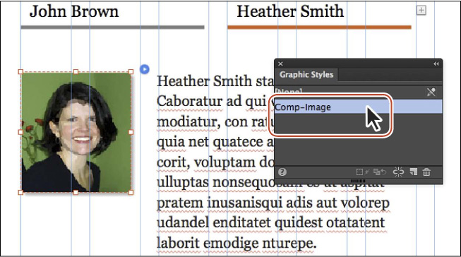
7. With the Selection tool, click the Heather Smith trigger (the Heather Smith text) to show the target content, which includes the picture of Heather. Click three times on the picture of Heather to select the image frame.
Note
We dragged the Graphic Styles panel into the workspace to bring it closer to the image. You don’t have to do that.
8. In the Graphic Styles panel, click the Comp-Image style name to apply it to the image of Heather.
Note
Be careful not to click a graphic style in the Graphic Styles panel with nothing selected. The graphic style will actually apply to the page area. If you accidentally do this, you can select the graphic style named [None] to remove the formatting.
9. Choose File > Save Site and leave the image of Heather selected.
Clearing overrides and editing a graphic style
In Muse, updating a graphic style is accomplished by redefining that style. To redefine a style, you edit the formatting for an object on the page that has that graphic style applied. Then you redefine the style based on the changes. This makes the graphic style match the new settings, and all other objects with that style applied automatically update to match.
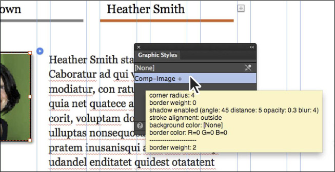
1. On the TEAM page, with the image of Heather still selected, change the stroke weight to 2 in the Control panel.
In the Graphic Styles panel, notice that the Comp-Image style now displays a plus (+) to the right of the name.
2. Position the pointer over the Comp-Image style name. In the tooltip that appears below the dotted line you’ll see the local formatting options (in this case, it is the stroke formatting that is applied to the selected content that differs from the existing attributes of graphic style).
Note
The styling options you see may be in a different order than in the figure, and that’s OK.
3. Click the Clear Style Overrides button ( ) at the bottom of the Graphic Styles panel to remove the stroke override.
Next, you’ll redefine the graphic style formatting.
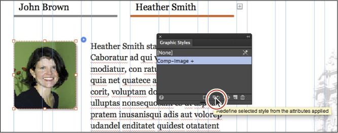
4. With the image of Heather still selected, change the Corner Radius to 10 in the Control panel.
In the Graphic Styles panel, the Comp-Images style displays a plus (+) to the right of the name again. This time you’ll redefine the style.
5. Click the Redefine Style button ( ) at the bottom of the Graphic Styles panel.
As a result of redefining the style, two things happen:
• The Plus (+) sign next to the graphic style’s name disappears in the Graphic Styles dialog box.
• All other elements that have the style applied are updated to use the new style attributes.
This workflow is especially helpful when you want to make changes that affect many different elements in a site. You can redefine the applied style to update them all at once.
7. Click the Preview mode link, scroll down the page until the composition comes onto the page. Position the pointer over the triggers (the names of John and Heather) to see the images.
Notice that the photo of John displays the same corner radius as the photo of Heather, because they both have the same style applied.
8. Choose File > Close Preview.
9. Back on the TEAM page, choose File > Close Page to close the page and return to Plan mode.
In Lesson 9, “Inserting HTML and Working with the Library Panel,” you’ll learn how to add extra functionality to your Muse site in the form of HTML and how to work with the Library panel. You’ll also be introduced to Adobe Muse Exchange.
Graphic style options
Unlinking a graphic style from selected content is useful if you want to create a style similar to another style or apply a style but don’t want the formatting of that content to change in the event that you decide to update the graphic style later. You can unlink selected content from a graphic style by clicking the Unlink Style From Selection button ( ) at the bottom of the Graphic Styles panel or by right-clicking on a style’s name and then choosing the Unlink option from the context menu that appears.
Review questions
1. Name the three main effects in the Effects menu that you can apply to content in your pages.
2. How do you apply effects to page elements?
3. Briefly describe the benefits of working with scroll effects.
4. Describe the behavior of the Initial Motion and Final Motion settings for Motion scroll effects.
5. Why would you use a graphic style?
Review answers
1. The three main effects you can apply to content in Muse are shadows, bevels, and glows.
2. You can apply effects to selected content by clicking the Effects link in the Control panel, choosing the tab with the desired effect, enabling the effect, and then setting the options in the Effects menu.
3. Scroll effects allow different layered content to move at different speeds and directions, creating the illusion of depth. With them you can improve the user experience by enticing users to want to see more—keeping users on your site longer; allow for storytelling; lead to a call to action while demonstrating a product; and add layering and depth to your design. You can also pin page elements, draw focus by making elements fly into view, or adjust Opacity settings so elements become visible as the visitor moves down a longer or wider page.
4. Initial Motion allows an object to move in from the right or left (at a specific speed), or move up or down (at a specific speed). When the T-shaped handle (the Key Position) reaches the top of the browser window, the motion is complete and the object is at its current location in the design. After the Key Position has reached the top of the browser window (the T-shaped handle), if the page is scrolled further, the object can move right or left (at a specific speed), or move up or down (at a specific speed) based on the Final Motion settings.
5. Just as you use paragraph and character styles to quickly format and update text, you can use graphic styles to quickly format graphics, image frames, and text frames. Graphic styles include settings for stroke, fill color, effects, wrap, and more.