3 Using Lightroom’s Develop Module for Global Adjustments
Lesson overview
Adobe Photoshop Lightroom CC excels at correcting the tone and color of your photos. In this context, tone refers to the Exposure, Contrast, Highlights, Shadows, Whites, and Blacks sliders in the Develop module’s Basic panel. You’ll apply these changes to the entire photo, which is referred to as making global adjustments.
In this lesson you’ll learn how to:
Find your way around the Develop module workspace.
Undo any adjustments you’ve made.
Use profiles to re-create camera tone or develop artistic effects.
Master a typical workflow for adjusting tone and color.
Reduce noise and sharpen photos.
Sync changes made to one photo with many.
Save Develop module settings as defaults and create presets.

This lesson will take 1 to 2 hours to complete. Please log in to your account on peachpit.com to download the files for this lesson, or go to the “Getting Started” section at the beginning of this book and follow the instructions under “Accessing the lesson files and Web Edition.” Store the files on your computer in a convenient location. Your Account page is also where you’ll find any updates to the lessons or to the lesson files. Look on the Lesson & Update Files tab to access the most current content.
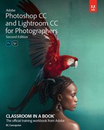
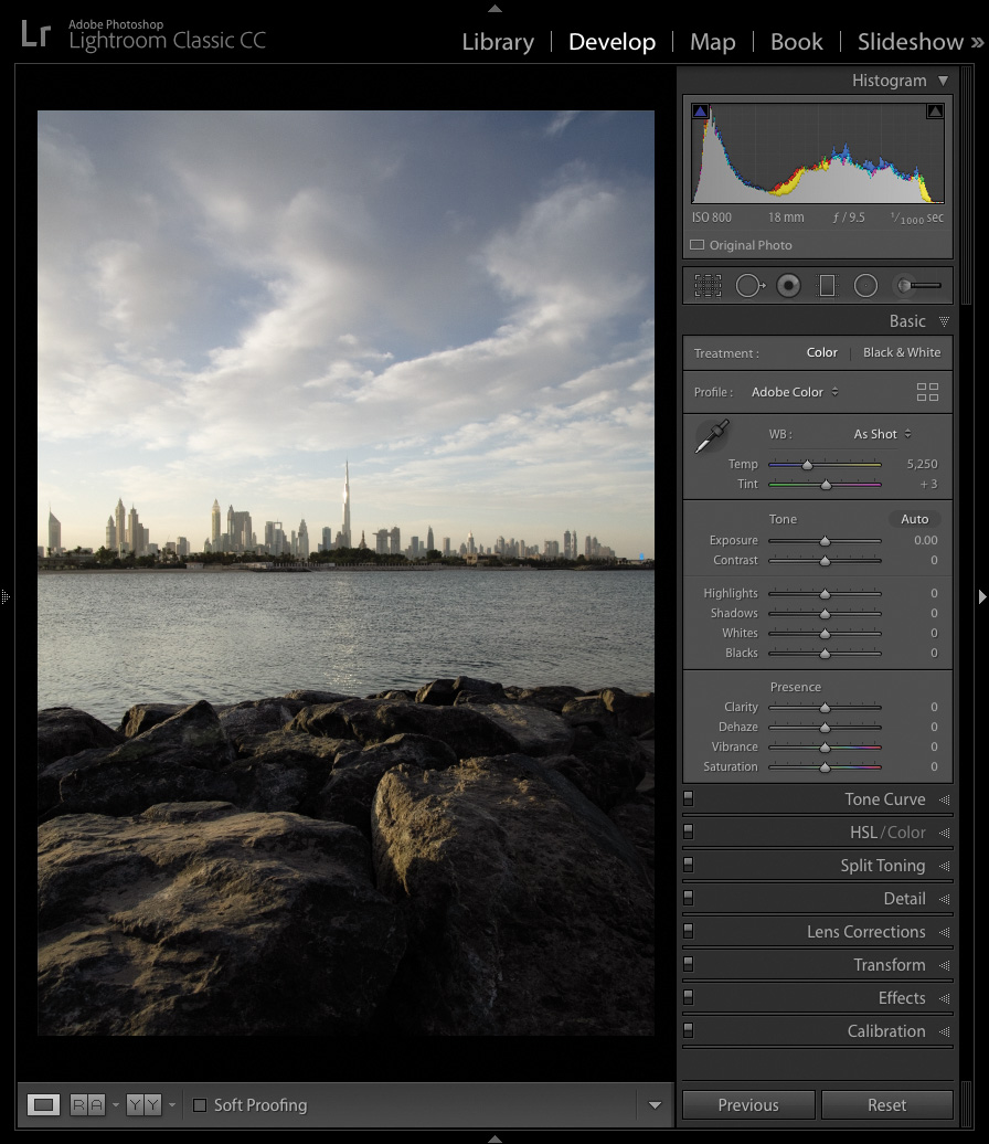
©2017 RAFAEL CONCEPCION, ABOUTRC.COM
The intuitive controls in Lightroom’s Develop module let you easily adjust composition, tone, and color to bring out the best in your photos.
Preparing for this lesson
To get the most out of this lesson, be sure you do the following:
Follow the instructions in the “Getting Started” section at the beginning of this book for setting up an LPCIB folder on your computer, downloading the lesson files to that LPCIB folder, and creating an LPCIB catalog in Lightroom.
Download the Lesson 03 folder from your Account page at peachpit.com to username/Documents/LPCIB/Lessons.
Launch Lightroom, and open the LPCIB catalog you created in “Getting Started” by choosing File > Open Catalog and navigating to the LPCIB Catalog. Alternatively, you can choose File > Open Recent > LPCIB Catalog.
Add the Lesson 3 files to the LPCIB catalog using the steps in the Lesson 1 section “Importing photos from a hard drive.”
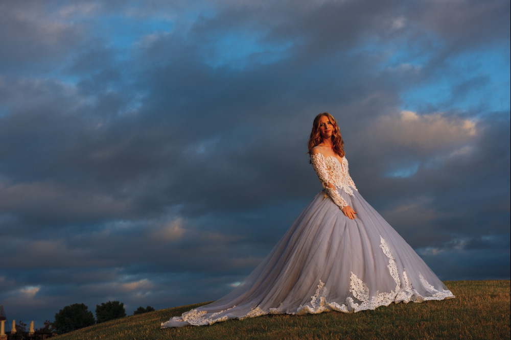
In the Library module’s Folders panel, select Lesson 03.
Create a collection called Develop Module Practice and place the images from the Lesson 03 folder in that collection.
Choose File Name from the Sort menu beneath the center preview area.
Now that your files are in order, you’re ready to learn how to use the Develop module workspace to perform global adjustments.
Using the Develop module
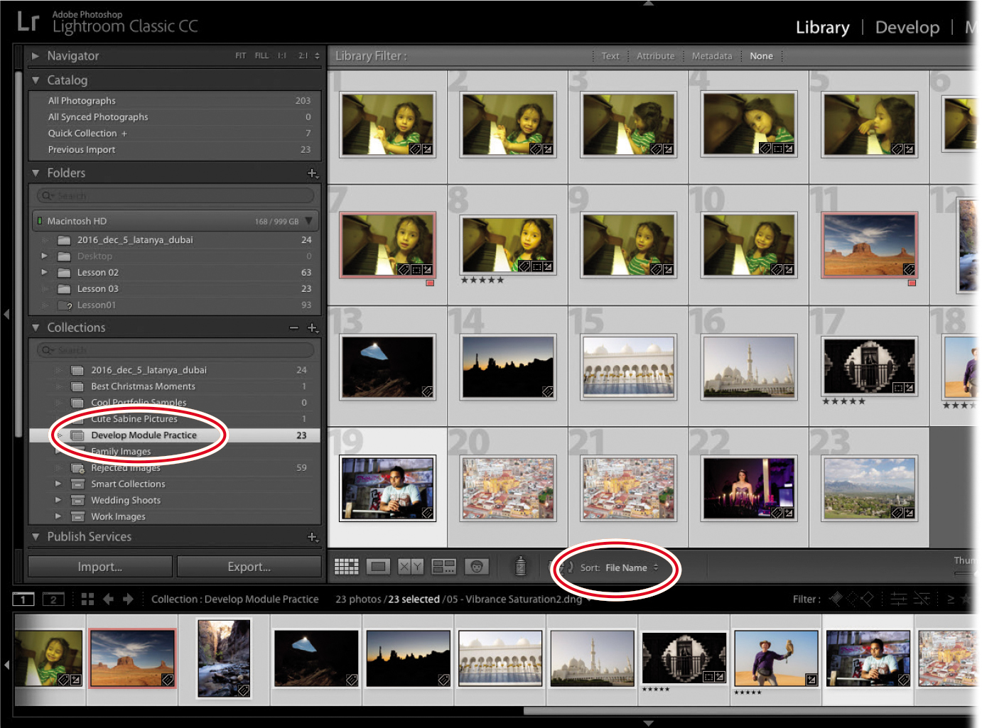
The Develop module looks and behaves a lot like the Library module. To get to it, click Develop at the top of the workspace or press D on your keyboard. Lightroom presents you with a column of panels on the left and right. A toolbar and the Filmstrip panel appear at the bottom; click any photo in the Filmstrip to see it in the preview area in the middle. You can expand, collapse, and hide panels (see the section “Meeting the panels” in Lesson 1) in the Develop module just as you can in the Library module, and zooming in to and repositioning a photo onscreen works the same way as described in the Lesson 1 section “Customizing your view.”
![]() Tip
Tip
Putting your panels in Solo mode is especially helpful in the Develop module, because it allows you to have only one panel open at a time and keeps you from doing so much scrolling. To activate it, right-click any panel’s header and choose Solo Mode from the menu. The catch? You will have to do that for each module.
You’ll learn more about using each panel as you progress through this lesson, although the ones on the left are for previewing, applying presets, saving versions, and undoing changes you’ve made to a photo. The ones on the right let you apply global and local adjustments, so that’s where you’ll spend the majority of your time. The toolbar below the preview area lets you see before and after views, and a Reference view, and has a menu for adding viewing choices and sorting actions, like a zoom slider or flagging icons. The Filmstrip at the bottom lets you select the image(s) you want to work on.
![]() Tip
Tip
You can show and hide the toolbar below the preview area in any module by pressing T on your keyboard.
Although you can select more than one image in the Filmstrip, Lightroom displays the most selected one in the preview area (see the Lesson 1 sidebar “The art of selecting thumbnail previews”). To see a before and after version of the image while you’re working on it in the Develop module, press the Backslash key () to temporarily view the original version of an image.
![]() Tip
Tip
The Develop module includes a new Reference view, which allows you to develop an image while comparing it to a second “reference” image in the preview area.
![]() Tip
Tip
To access other photos without switching to the Library module, click the triangle to the right of the file name, directly above the Filmstrip panel, and pick another source of images from the menu.
Developing your pictures
When shooting in raw, you will have an incredible amount of control in recovering details and correcting tone and color to enhance the appearance of your images. Unlike Photoshop, Lightroom is a nondestructive editor (see the “Getting Started” section “How Lightroom and Photoshop differ”), so there’s no hard-and-fast rule about the order in which you make adjustments—you can perform them in any order you want, though generally speaking, you’ll make global adjustments before making local ones.
![]() Tip
Tip
You can turn each panel’s adjustments off and on using the small gray switch that appears at the panel’s upper left. This is handy for assessing changes made in a single panel. You can also reset any slider to its default value by double-clicking the text label to the slider’s left. The Basic panel doesn’t have a switch, although you can press Backslash () on your keyboard to see the original, unadjusted photo.
Although you could start with a top-down panel approach—beginning with the Basic panel and working your way down through the other panels—you won’t need to use every panel on every photo. The use of any sliders in the Develop module is largely dependent on the type of problem you are trying to tackle in your picture.
What are camera profiles?
When shooting in JPEG mode, the camera applies color, contrast, and sharpening to the files it produces. When you switch to shooting in raw, your camera captures all of the raw data in the file, but builds a small JPEG preview as well. This JPEG preview—with all of the color, contrast, and sharpening—is what you see in the LCD on the back of the camera.
When you import a raw file, Lightroom initially shows you that JPEG preview as a thumbnail. Behind the scenes, it starts to render the raw data into pixels you can view and work with onscreen (a process known as demosaicing). To do this, Lightroom looks at the image’s metadata—white balance and everything buried in your camera’s color menu—and interprets it as best it can.
Because Lightroom can’t interpret some proprietary camera settings, the preview almost never looks like the JPEG that you saw on the back of your camera. This is why your thumbnails shift in color shortly after (or during) the import process.
This shift frustrated many photographers before Lightroom’s developers added camera profiles (presets that attempt to mimic the settings included in a camera’s JPEGs). While not 100 percent accurate, they let you get closer to what you saw on the back of your camera. They used to be located in the Camera Calibration panel.
As more photographers started using them, some created profiles for artistic effects. Adobe realized that users wanted to add profiles first—for both color fidelity and artistic expression—and moved them to the top of the Basic panel.
The new profiles in Lightroom
The April 2018 release of Lightroom Classic CC greatly expanded how photographers use camera profiles in their workflow by creating three categories to explore:
Adobe Raw Profiles: These profiles are not camera-dependent and aim to give users of any camera a more unified look and feel for their images.
Camera Matching Profiles: These profiles mimic the profiles built in to your camera, and vary by camera manufacturer.
Creative Profiles: These profiles are built for artistic expression and leverage Lightroom’s ability to include 3D LUTs for even more coloring effects.
![]() Note
Note
Color lookup tables (LUTs) are tables that remap or transform color in an image. Originally used in the video space to attempt to make footage from different video sources look similar, LUTs gained popularity as Photoshop users began using them to colorize their images as an effect. These effects sometimes are known as cinematic color grading.
Now that we know what these tools can do, let’s spend some time exploring how to use them to make our work really stand out: Select the first image in the Develop Module Practice collection, and press the D key to make sure you are in the Develop module. To make it easier for you to see the changes we are making, close the left-side panels and the Filmstrip by clicking the gray triangles in the middle of each side.
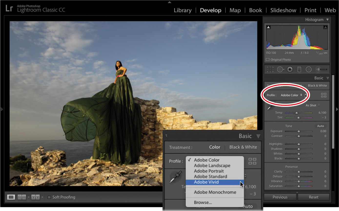
At the top of the Basic panel (directly under Treatment) is the Profile area. On the left is the Profile pop-up menu, where you choose a profile that mimics your camera settings from the list of Adobe Raw profiles (these appear only when working on a raw file). On the right is the Profile Browser icon (it looks like four squares), where you can access a variety of profiles, including the Adobe Raw Profiles.
Josh Haftel, principal product manager for Adobe, wrote a blog post explaining the new color profiles:
“Adobe Monochrome has been carefully tuned to be a great starting point for any black and white photograph, resulting in better tonal separation and contrast than photos that started off in Adobe Standard and were converted into black and white.
Adobe Portrait is optimized for all skin tones, providing more control and better reproduction of skin tones. With less contrast and saturation applied to skin tones throughout the photo, you get more control and precision for critical portraiture.
Adobe Landscape, as the name implies, was designed for landscape photos, with more vibrant skies and foliage tones.
Adobe Neutral provides a starting point with a very low amount of contrast, useful for photos where you want the most control or that have very difficult tonal ranges.
Adobe Vivid provides a punchy, saturated starting point.”

While I believe that Adobe has done a great job with the Adobe Raw profiles, many photographers will want to go directly to the Camera Matching profiles. To do this, click the Profile Browser icon.
The new Profile Browser gives you access to all the profiles Adobe created. We already discussed the Adobe Raw profiles at the top of the Profile Browser. The Camera Matching profiles include any profiles that are specific to your camera make, so the number of profiles available will vary by camera type.
At the bottom of the Profile Browser are the creative profiles, separated by category: Artistic, B&W, Modern, and Vintage. If you expand any of them, you’ll see a series of thumbnails showing what each profile will look like on your photo (as seen below).

I encourage you to experiment with all of the profiles. While the Camera Matching profiles might offer you a one-click solution to get closer to what you saw on the back of your camera, the creative profiles might spark a new interpretation of your image. My other favorite part? The creative profiles have an Amount slider, allowing you to dial in the effect to your liking. Once you choose a profile, click the Close button at the upper right of the browser to return to the Basic panel.
Setting your picture’s white balance
White balance refers to the color of light in a photo. Different kinds of light—fluorescent or tungsten lighting, overcast skies, and so on—create a different color cast in your photo. White balance adjustment is done by adjusting the temperature and tint to bring the color back to what you intended. You can do this with the WB menu. If you shoot in a raw format, you have more choices in the menu—the ones that you typically find in your camera (these are not available with a JPEG). Simply choose the one that most closely matches the lighting you shot in. You can also make your own adjustments to the Temp and Tint sliders.
![]() Note
Note
On raw images, you can use the WB menu to access white balance presets, although it’s usually quicker to set it manually using the White Balance Selector. Your camera’s white balance is baked into JPEGs, so this menu has far fewer options for them.
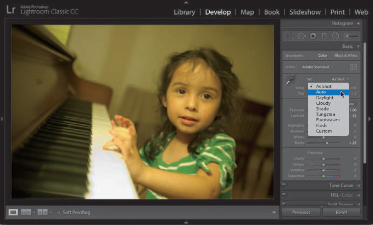
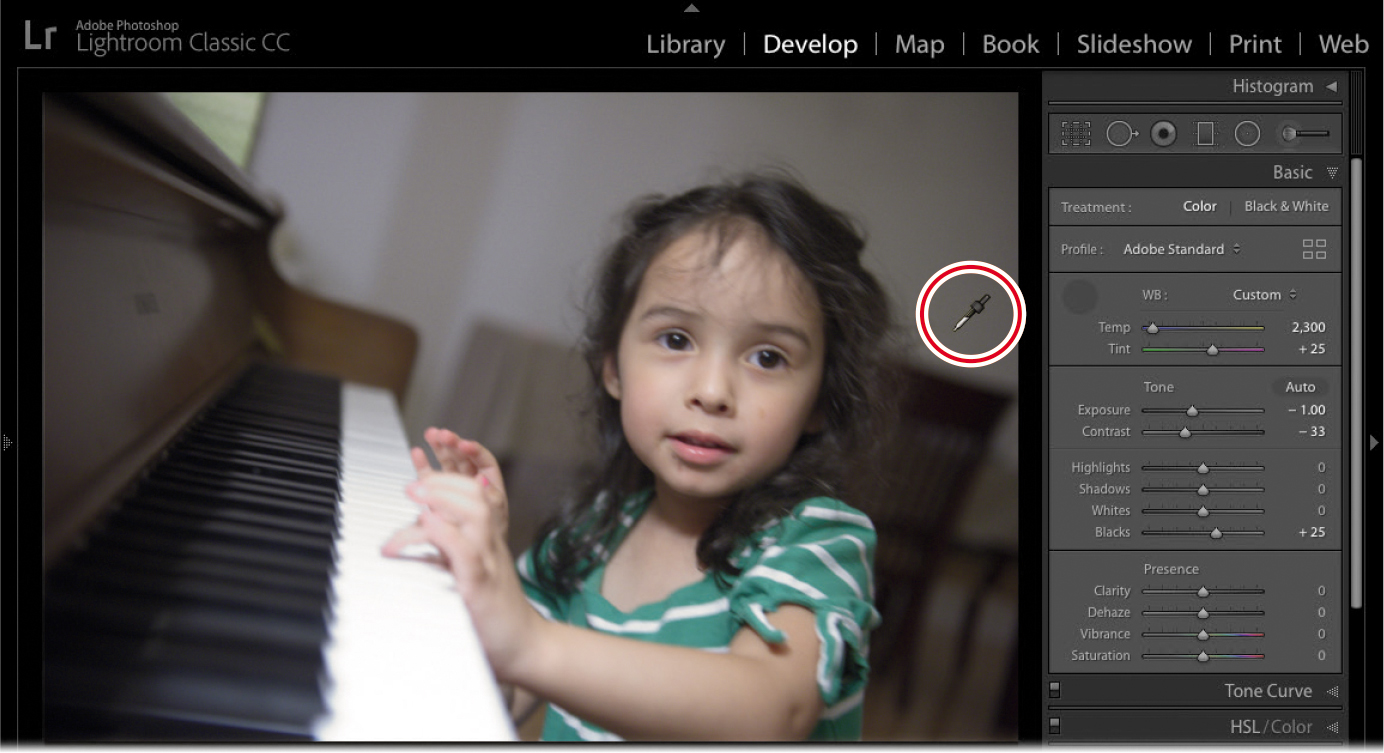
If you don’t like the results, in the Basic panel, click the White Balance Selector (it looks like a turkey baster) or press W on your keyboard. Move your cursor over your image, and click an area that should be neutral in color, such as a light or medium gray.
In the example on the next page, I clicked the back wall, to the right of my daughter’s head (shown circled). Lightroom automatically adjusts the temperature and tint to give you a better result. If it doesn’t look right, click in another area that should be neutral. If it’s still not right, you can fine-tune the color of the light using the Temp and Tint sliders, if necessary.
Setting exposure and contrast
Exposure is determined by how much light your camera’s sensor captures and is measured in f-stops (which indicate how much light your camera’s lens lets in). In fact, the slider values simulate stops on a camera: a setting of +1.00 is like exposing one stop over the metered exposure in-camera. In Lightroom, the Exposure slider affects midtone brightness (in portraits, that’s skin tones). Drag it to the right to increase brightness, or drag it to the left to decrease brightness (you can see this in the slider itself—white is to the right and black is to the left).
![]() Tip
Tip
To have Lightroom perform an auto adjustment for a single slider, no matter where it appears in the adjustment panels, Shift-double-click it. This is especially helpful in setting contrast—if, say, you opt to set exposure and contrast manually rather than using the Auto button—because contrast can be tough to get right (because you can easily mess up your highlights and shadows).
If you move your cursor over the middle of the histogram at the top of the right-side panels, the area affected by the Exposure slider is highlighted in light gray and the word “Exposure” appears below the lower-left corner of the histogram.
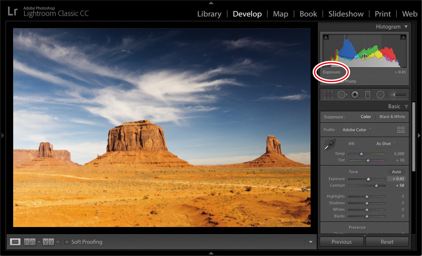
Contrast adjusts the difference in brightness between the darkest and lightest tones in your picture. When you drag this slider to the right (increasing contrast), you “stretch out” the histogram’s data, creating darker blacks and brighter whites. If you drag this slider to the left (decreasing contrast), you scrunch the histogram’s data inward, shortening the distance between the darkest (pure black) and lightest (pure white) endpoints, making the photo’s tones look flat or muddy.
Lightroom’s Auto button often does a good job adjusting your image, and you may need to fine-tune only the exposure. However, if the auto adjustment is too far off, undo it by pressing Ctrl+Z/Command+Z, and then manually adjust the exposure and contrast.
Alternatively, Alt/Option-click the word Tone to reset the tone sliders to 0.
Adjusting shadows and highlights
The Highlights and Shadows sliders let you recover details in areas that may be clipped. Clipping occurs when there are areas in the picture that are too dark or too light. If an area is too dark (sometimes you’ll hear it referred to as blocked), there is not enough variation in the shadows to provide detail. The area is too black, muddy, and no good. If there is an area that is clipped in the highlights (sometimes referred to as blown out), it is so bright, there is no detail in it. Printing this part of a picture would show nothing—no ink would hit the page.
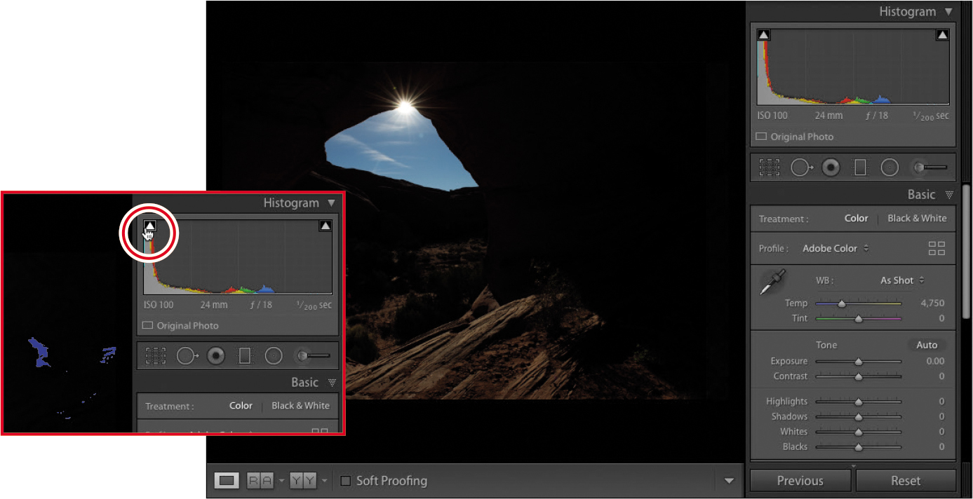
The general goal is to make sure that both your shadows and highlights have the most amount of detail possible without affecting the rest of the image. This picture of a cave in Monument Valley, Utah, was exposed for the blue sky. Because of the camera’s limited dynamic range (and the lack of light in the cave), the interior of the cave is really dark, clipping the shadows. You can see this by moving your cursor over the shadow clipping warning at the upper left of the histogram, which turns the clipped shadows in your image blue (as seen in the inset).
![]() Tip
Tip
You can click either clipping warning to leave the warning on while you work. When you are finished using the shadow and highlight clipping warnings, make sure you go back and turn them off.
Saving Develop settings as defaults and presets
If you repeatedly set the same panels to the same settings, consider saving them as default values or including them in a preset. Both maneuvers can save you a lot of time.
For example, any settings you make in the panels on the right side of the Develop module can be saved as defaults so that they’re automatically applied when you open an image in the Develop module. Although you (probably) wouldn’t want to save tone and color changes as defaults, camera calibration profiles and the Lens Corrections panel’s Enable Profile Corrections and Remove Chromatic Aberration options are great candidates for saving as defaults. This is especially true if you tend to take the same kind of pictures with the same camera (say, you always shoot portraits with your Canon 5D Mark III).
To save settings as defaults:
Ensure all other panels on the right are at their default settings.
Adjust the settings you want to capture as defaults.
Press and hold Alt/Option to change the Reset button at the lower right to Set Default.
Click Set Default, and in the resulting dialog, click Update To Current Settings.
From this point on, those settings will be applied to any photo you take with that camera the second you open it in the Develop module.
Another option is to save certain settings as a preset that you apply whenever you want or on import. For example, if you find a camera calibration profile that you like for landscapes but prefer a different one for portraits, you could set up two presets: one for landscape shots and another for portraits. And you could apply either of those presets on import.
To save a preset:
Adjust the settings in the panels on the right however you like.
Click the plus sign (+) in the Presets panel header and choose Create Preset.
In the resulting dialog box, enter a meaningful name for the preset.
Click Check None at lower left.
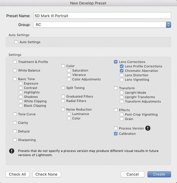
Turn on the settings you want included in the preset—here, that’s Lens Profile Corrections, Chromatic Aberration, and Calibration.
Click Create.
To install presets you’ve downloaded from elsewhere:
Uncompress them, and then choose Edit > Preferences (Windows) or Lightroom > Preferences (macOS).
In the dialog box that appears, click the Presets tab.
Click the Show Lightroom Develop Presets button.
In the Explorer or Finder window that appears, drag your presets into it.
Restart Lightroom.
To apply the preset:
Select an image (or several).
Open the Presets panel.
Click the triangle to the left of User Presets to expand it.
Click the preset you want to apply, and Lightroom makes it so.
To apply a preset on import, choose it from the Import Preset menu at the bottom of the Import window.
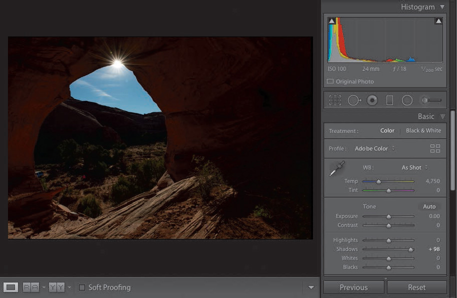
Adjusting the picture’s exposure overexposes the sky and eliminates the blue I am looking for. Dragging the Shadows slider, though, brings back all the detail in the cave without sacrificing the blue in the sky.
![]() Tip
Tip
You can turn clipping warnings on and off by pressing J on your keyboard.
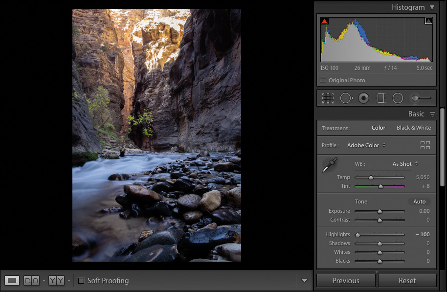
This picture (of the Narrows at Zion National Park) is a little overexposed at the top. Move your cursor over the highlight clipping warning (at the upper right of the histogram), and red appears where there is no information.

Highlights slider to the rescue! Dragging the Highlights slider to the left darkens only that portion of the image, yet leaves all of the shadow detail intact. The result is more yellow at the top of the mountain and less blown-out highlights, without having to make any additional changes.
These four sliders encompass the largest number of adjustments you’ll make to your pictures. I think it will come as a big shock just how much information you can get out of raw files, so make sure you’re shooting in raw!
Adjusting whites and blacks
Now that you’ve adjusted exposure, contrast, highlights, and shadows, we’ll move on to the Whites and Blacks sliders.
Adjusting whites and blacks can be controversial because many photographers set their whites and blacks first. Those first four sliders work so well for me, I find I use the Whites and Blacks sliders less and less. More often than not, I only use them to do some slight tweaking to the file.
In the picture here, there’s a pretty good range of light, but I could use a little bit more information in both the blacks and whites, if you’re looking at the histogram. By dragging those sliders, we can solve that problem pretty quickly.
The whites and blacks are the brightest and the darkest parts of the picture, but it can be difficult to see exactly where they are. Here are two tips to help you with this: First, hold down the Alt/Option key and click the Whites slider. As soon as you click, the image turns completely black. As you drag the Whites slider to the right, you’ll see some color changes.
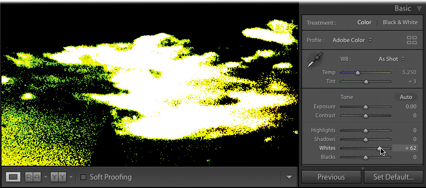
What you’re looking for is the first area that turns white. White tells you that portion of the picture is clipping, so that is the brightest you can make the whites without losing information. If other colors appear before you see white, Lightroom is letting you know that they are predominately bright in the image. Looking at the original image, it feels like it has a film of color over it. This is known as a color cast. The yellows that appear when we do this clipping trick suggest there is a bit of bright yellow in the picture, but I am okay with that. You may see other colors as you drag, but what you’re looking for is white.
Once you’re done with the whites, Alt-click/Option-click the Blacks slider and drag it to the left. This time, the image turns white, and what you’re looking for is the first spot of black. This tells you how far you can drag the Blacks slider.

Now you have your limits and you can use the Shadows and Highlights sliders to bring back as much information in the file as you can.
The second method for setting your white and black points is to let Lightroom automatically make these adjustments for you. Hold down the Shift key and double-click the Whites or Blacks slider, and Lightroom makes the change. Sometimes, it’s good; most of the time, I’d rather make these changes myself. It’s easy enough to do.
Clarity, vibrance, and saturation
Once you’ve dialed in your picture’s tonality, you can move on to making some of the final Basic panel adjustments to the shot. Clarity, vibrance, and saturation round out the basic editing of a picture.
Setting the picture’s general exposure adds contrast in the shadows and highlights, and affects the whites and blacks. The one part that doesn’t get a lot of attention is the midtones and, sometimes, adding a little punch in the midtones is very helpful.
The Clarity slider controls midtone contrast. It’s great for adding a bit of a gritty element to your pictures—things like metals, textures, brick walls, and hair all can do with a little bit of a clarity boost.
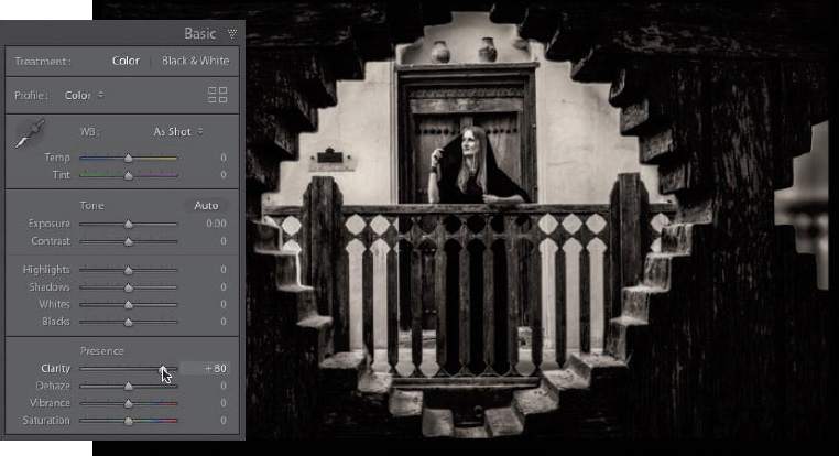
Keep in mind, though, when you’re using the Clarity slider, that out-of-focus areas in a picture generally don’t look good with clarity applied to them. It also doesn’t do well with softer elements, such as clouds, water, and fluffy kitties.
The Saturation and Vibrance sliders both deal with the application of color to a picture, but they work a little differently. Dragging the Saturation slider to the right intensifies all of the colors in your image evenly, including skin tones. The problem is it really doesn’t take into account whether a color is overused already. It’s an easy way for you to overcook a picture in Lightroom. You’ll need a more subtle hand at this, and that’s where the Vibrance slider comes in.
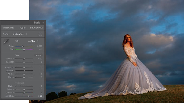
As you drag the Vibrance slider to the right, any under-represented colors are intensified more. Any colors that are over-represented are not adjusted as much. If there are any skin tones in the picture, Vibrance tries not to affect them as much.
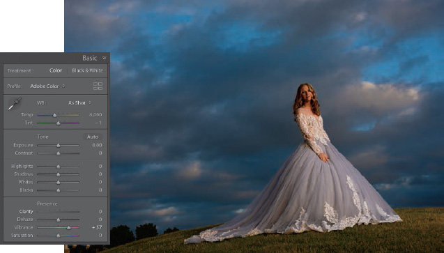
Add a more generous Vibrance boost to your picture to see how it looks before adding any Saturation adjustments. If there is an individual color you want to boost, adjust it individually in the Saturation section of the HSL/Color panel or paint in a color change with the Adjustment Brush, which we’ll cover later.
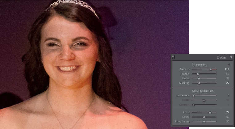
Adding detail to your images
When you shoot in JPEG mode, the camera adds color, contrast, and sharpening to the final image. Photographers are quick to make the tonal adjustments we just discussed, but a shocking number of them forget the most vital component: detail. Lightroom adds a small amount of detail to raw files, but it is never really enough for input sharpening.
In the Detail panel, there is a Sharpening area with four sliders: Amount, Radius, Detail, and Masking. Above the Sharpening sliders, there is a 100% preview of the picture (click the little triangle to its right to show/hide it). This small preview isn’t a really good way for you to see how much sharpness is being applied. Instead, click the larger image in the center preview area once to zoom in to 100%. Drag around the picture to find an area where you can see the sharpening you’re applying better and evaluate its effect.
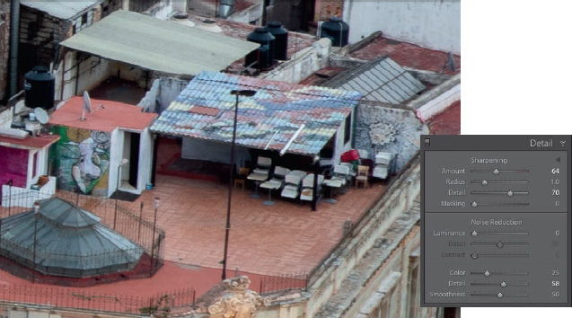
Let’s look at the sliders. The Amount slider is pretty straightforward: it dictates how much sharpening you want to apply to the picture.
The Radius slider lets you change how far from the center of the pixel you want to apply that sharpening. It’s really hard to see this by just dragging the Radius slider, so try this: hold down the Alt/Option key and drag the slider. Drag it to the left, and your image turns gray; drag it to the right, and you start seeing more edge information. The visible edge information is the area that is sharpened. Anything that’s gray won’t be sharpened. This gives you a better way to create the sharpness that you need.
Once you have the Radius set, move on to the Detail slider. The Detail slider brings out more texture or detail in a picture as you drag it to the right. However, if you move it too far, or all the way to the right, it will start introducing a little bit of noise. You’ll want to be careful with that.
Use the Radius and the Detail sliders to define the areas that you want to see sharpened, first. Then, go back and adjust your sharpening amount.
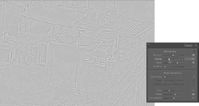
If you want to limit how that sharpening is applied, use the Masking slider. It creates a black-and-white mask, where the black areas won’t be sharpened and the white areas will be sharpened, confining your sharpening to just the edges.
Again, hold down the Alt/Option key and drag the Masking slider to the right, and you can dictate where you want that sharpening to occur. Once you release the Alt/Option key, you’ll see a much sharper picture without the noise you might get from sharpening everything evenly.

To see a before/after of your sharpening, click the power switch at the far left of the Detail panel’s header. Click it again to turn the sharpening back on, and now you can see whether you’ve added enough sharpening.
Input, creative & output sharpening
When you import a raw photo, Lightroom automatically applies a little sharpening to your photo so you can see the details it contains. This sharpening is attempting to mimic the sharpening that your camera would normally apply to an image if it were shot as a JPEG, and is commonly referred to as input sharpening. In my opinion, this level of sharpening is never enough as input sharpening, which means that you have to take it into your own hands at the start of the import process.
As you start working with your image, you may decide that you would like to sharpen more in some areas and not as much in others. For example, I would sharpen the bark on a tree more than I would sharpen the sky that is behind the tree. This is commonly known as creative sharpening—sharpening you perform to highlight a specific thing in a picture.
When you’re completely finished adjusting the photo, you can add more sharpening according to how you’ll output it, which is cleverly referred to as output sharpening. For example, a photo that’s destined to become a canvas gallery wrap needs more sharpening than one you’ll print on glossy or metallic stock.
How much to sharpen these images, when to sharpen them, and what process to use in doing so in Photoshop could be the subject of an entirely new book.
I believe Jeff Shewe is one of the masters in this space and The Digital Print (by Peachpit Press) is a book that will take you through this entire process, from start to finish.
Once you’re done with sharpening, go ahead and tackle noise. Noise in a picture appears for one of two reasons: you used a camera with a really high ISO setting (you shot in low light) or you added a lot of sharpening to your photo. In this example, we’re using a picture taken at 12,800 ISO, so it’s pretty high.
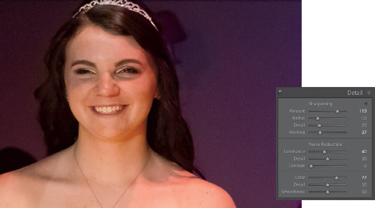
The Noise Reduction section has a two different types of noise you can affect, the first of which is luminance. Drag the Luminance slider to the right, and the noise starts disappearing. You’ll use this slider for 90% of the noise you want to remove.
If you feel you have lost too much detail after dragging the Luminance slider, grab the Detail slider below it and drag it to the right. If you want add contrast back after these adjustments, drag the that slider to the right a bit. Increasing the Detail and the Contrast reduces some of the effect of the luminance noise reduction (they tend to counterbalance each other). Click the Detail panel’s switch to turn your adjustments off and back on to see your results.
The Color, Detail, and Smoothness sliders deal with the fact that some camera sensors display noise not just in black, white, or gray dots, but in red, green, or blue dots, as well. To mitigate that, drag the Color slider to the right until those dots are desaturated, then add a bit of detail and smoothness back in.

Noise reduction brings back some smoothness to a file with a high ISO, but it’s also something you have to do if you excessively sharpen a picture. The more you sharpen a picture, the more noise gets introduced, especially if you use the Detail slider. So every time you go into the Detail panel’s sharpening section and create a lot of sharpening, add a little bit of noise reduction too. You’ll be surprised at the quality of the results you’ll get.
Cropping your image
The best thing you can do to your pictures is to make sure that you only leave in what needs to be left in. To do that, it is absolutely essential you crop them.
Press the R key on the keyboard and the Crop & Straighten tools appear. A crop overlay appears on your image, letting you change the crop. Here are a couple things to keep in mind when cropping a picture:
Hide the entire interface to better see your picture. Press Shift+Tab to hide all the panels, then press the L key twice to go into Lights Out mode. To finish your crop, press Enter/Return, and then press L again to turn the lights back on and Shift+Tab again to bring the panels back.
By default, dragging inward from a corner lets you crop the picture proportionally, but there are times when you don’t want a proportional crop. There are a set of predefined crop ratios in the Aspect menu. Even better, if you choose Custom from the menu, a dialog box appears that lets you enter your own values. Once you choose an aspect, the lock icon appears closed, letting you know you cannot change the proportions as you drag. To crop without a set aspect, click the lock icon to unlock it.
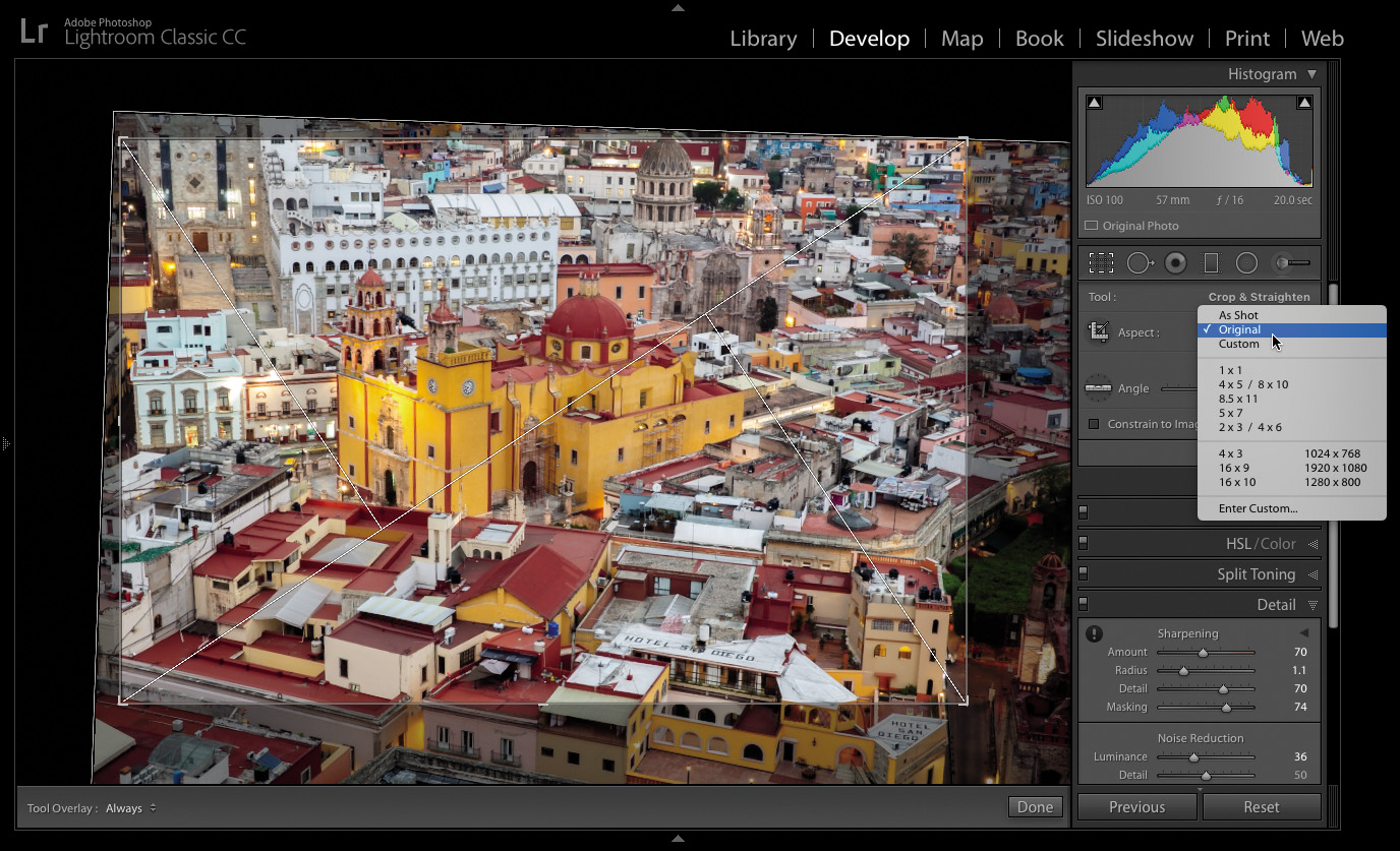
Seeing a crop overlay (Rule of Thirds, Golden Spiral, and so on) over the picture can be really helpful. Press the O key to cycle through them.
One last bit of advice on cropping: if an element in the picture doesn’t add to the picture, it takes away from it. Crop those away. Cropping is essential.
Lens corrections and transformations
Every lens you use creates problems that need some form of adjustment. One lens may distort pictures a little, while another may darken pictures’ edges (which is where the vignette effect comes from). Some older or more cost-concious lenses cause colored pixels to appear along the edges of objects (called chromatic abberation). Lightroom provides an easy way for you to correct these problems.
![]() Note
Note
While Lightroom contains a large collection of lens profiles, sometimes your specific lens isn’t listed. Newer lenses usually take an update or two before they appear in the Lens Corrections panel.
In the Lens Corrections panel’s Profile tab, select Enable Profile Corrections, and Lightroom reads the image’s embedded EXIF information to determine what make and model of the lens you used. It then chooses one of the built-in profiles and automatically adjusts the picture, often yielding a better-looking file. If it can’t find your lens, choose the closest one from the Make and Model menus.

There are times, however, when the problem with your image has little to do with your lens and more to do with your position when you made the picture. In the picture above, the camera was angled upward on the side of the Grand Mosque in Abu Dhabi, creating exaggerated vertical lines and a tilt to the picture that require additional transformation. This is where the Transform panel can help.
The buttons in the Upright area of the Transform panel tilt and skew your image in an attempt to fix it. There are four options to choose from:
Auto: Balances level, vertical, and horizontal perspective corrections, and keeps the aspect ratio as much as possible.
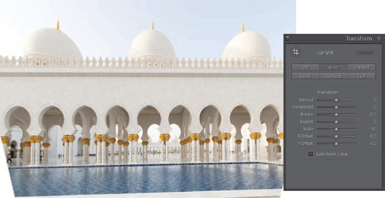
Level: Perspective corrections are weighted toward horizontal details.
Vertical: Perspective corrections are weighted toward vertical details and level corrections.
Full: Combination of full Level, Vertical, and Auto perspective corrections.
It’s often best to try each option to find the best one for your situation.
If none of the options fully solves your problem, try the Guided option to really move things along. Guided transformation allows you to draw up to four lines on the picture, tracing areas that should be straight. As you draw the lines, the image adjusts itself to what it believes is a straight picture.
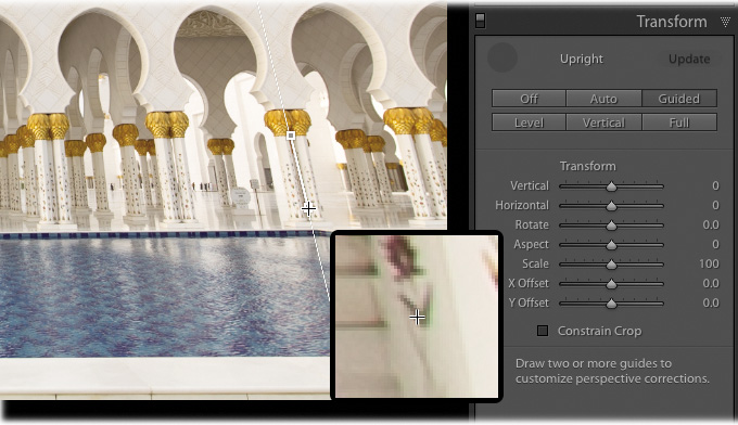
Once the transformation is complete, use the Transform sliders to make any final tweaks. This image ended up with a lot of white background in the bottom corners that needs to be cropped, or click the Constrain Crop option to have Lightroom automatically remove the white areas. The final image will be smaller than the original one, but it will certainly be straighter.

Using virtual copies for variations
Lightroom does a great job of keeping your library organized by keeping the number of duplicate images down to zero. One image can be referenced in multiple collections, and making a change in the file in one collection automatically cascades that change to the file in all other collections.
What if you want a copy of the file to try out a different look without changing the original? This is where another powerful feature comes in handy: the virtual copy.
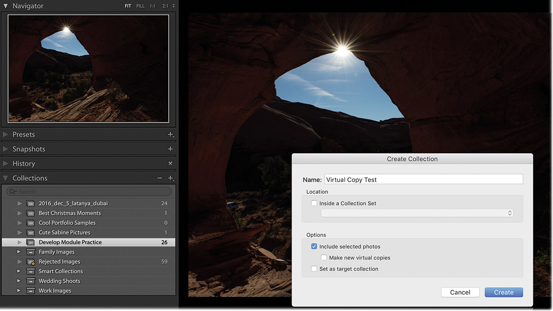
Create a new collection called Virtual Copy Test and place the Monument Valley picture we edited earlier in it, so we can keep the changes we make to this picture separate.
Right-click the image thumbnail, either in the Library module’s Grid view or in the Filmstrip in the Develop module, and choose Create Virtual Copy from the menu. A duplicate thumbnail will appear to the right of the original. It will look exactly the same as the original, but with the lower-left corner of the thumbnail curling up.
This new file is a virtual copy. You can make changes to it in the Develop module and it will be treated as a separate image. The plus side to this? While it looks like a separate image—a full copy not tied to the original image—it actually refers to the same physical copy of the image. That’s the virtual part.

You can create multiple virtual copies of a photo to try out different edits without taking up much additional space on your hard drive. You can make better judgements about which edits you prefer by having these virtual copies side by side.
Using snapshots for variations
To save different edits to a photo without making separate copies of the image for comparison, snapshots are a great option.
Edit the image to a point you want to save, and then click the plus sign (+) on the right side of the Snapshots panel header. A dialog box will appear with the date and time that you created the snapshot in the Name text box. You can either keep that date and time or rename the snapshot and click Create.
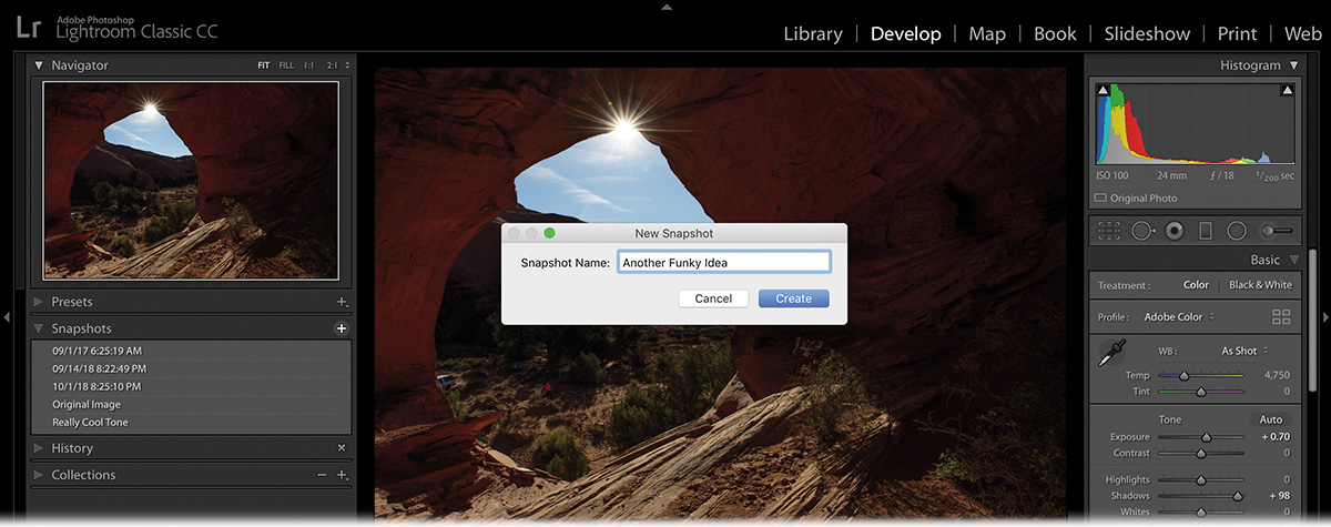
Continue editing your picture and when you are ready to save another change, click the plus sign (+) again to save a new snapshot. This is a great way to save variations and keep tabs on your progress, although I prefer the side-by-side nature of working with virtual copies.
Syncing changes to multiple photos
Lightroom has a number of features that make quick work of sharing adjustments across multiple photos, including Sync, Copy/Paste, Previous, and Auto Sync. If you’re adjusting photos that were taken under the same lighting conditions, these features can save you loads of editing time.
To apply the same changes to two or more photos, use the following steps to sync changes manually. Let’s practice on the pictures of Sabine at the piano.
Go back to your Develop Module Practice collection and select all of the images of Sabine at the piano. Click the plus sign (+) at the right side of the Collections panel’s header, and create a collection called Sync Test.
 Tip
TipTo save some time, leave the Include Selected Photos option selected.

Select the first picture of Sabine that we edited for white balance, and add contrast, clarity, and vibrance adjustments in the Basic panel.
Shift-click the last thumbnail in the Filmstrip to automatically select all of the images in between those two images.
TipYou can also Ctrl-click/Command-click to select nonconsecutive thumbnails in the Filmstrip.
Make sure the photo you corrected in step 2 is the most-selected thumbnail—the one with the lightest thumbnail frame in the Filmstrip (circled here).

Click the Sync button at the bottom of the right-side panels. If the button reads Auto Sync, click the panel switch to the left of the button to change it to Sync.
In the resulting dialog box, click Check None, and then pick the changes you want to sync. For this lesson, select the White Balance, Clarity, Vibrance, and Process Version options.
Click Synchronize to automatically apply those changes to the selected photos.

If the result, including the crop, needs fine-tuning on any affected photos, select the photo in the Filmstrip (remember to click in the gray area outside the thumbnail to deselect all others and select only this one) and then adjust the settings.
![]() Tip
Tip
You can sync local adjustments, too. As you’ll learn in the next lesson, each local adjustment you make sports a pin that you can drag to move the adjustment to another area (say, if your subject moved a little bit between the photos you’re syncing).
Your other options for applying changes to multiple photos include:
Copy/Paste: Select the photo you adjusted, and then click Copy at the bottom of the left-side panels. In the resulting dialog box, select the changes you want to copy, and then click Copy. Select other photos in the Filmstrip, and then click the Paste button, also at lower left.
Previous: This option lets you apply the most recent changes you’ve made to one other photo. Immediately after adjusting an image, click to select another photo in the Filmstrip, and then click the Previous button (where the Sync button is if you select multiple photos). Lightroom applies all the changes you made to the previous photo to the one that’s currently selected—you don’t get a dialog box that lets you pick which edits to apply.
Auto Sync: If you select multiple photos in the Filmstrip and then click the gray switch on the Sync button, it changes to Auto Sync. Click it, and Lightroom applies all the changes you make to the most selected photo, from this point forward—until you remember to turn off Auto Sync—to all the other selected photos. This is a perilous option because it’s incredibly easy to forget you have other photos selected or that you have Auto Sync turned on. For that reason, it’s best to avoid this feature.
You can sync changes in the Library module too. To do that, select the photos in the Filmstrip or Grid view, and then click the Sync Settings button at the bottom of the right-side panels.
Now that you have a good grasp of how to make global adjustments, you’re ready to dive into the realm of adjusting specific areas of a photo, which is a lot of fun.
The significance of process version
Process version (PV) refers to Lightroom’s underlying image processing technology. The instructions in this book, particularly those that concern the Basic panel, are for the current Lightroom process version, Process Version 5, which was introduced in 2018. You can find the process version of the image by going to the Camera Calibration panel in the Develop module.
If you used Lightroom to adjust photos prior to 2018, a different process version was used. In fact, if you used a version of Lightroom that dated back to 2012 and looked at the Develop module, some of the Basic panel sliders would look and behave differently than Lightroom CC. Some sliders have different names, their starting points are different, and the Clarity slider, in particular, uses a completely different algorithm in earlier process versions.
If you like the way a photo looks with its older processing, you can leave it alone. If you want to take advantage of the improvements in Process Version 5, you can change the photo’s process version, although doing so may significantly change the way it looks.
When importing raw files, why do the thumbnails shift in color shortly after (or during) the import process?
What is the difference between Lightroom’s Camera Matching profiles and creative profiles?
Is there a way to save multiple versions of a photo?
How do you find the white point in your photo?
Is there one right way to white balance a photo?
How do you reset a panel’s sliders?
How can you avoid sharpening your entire photo evenly?
What are the four ways to apply changes to multiple images?
Because Lightroom initially shows you the JPEG preview of the raw files made by the camera. If Lightroom can’t interpret all of the proprietary camera settings, the rendered raw files may look slightly different than the JPEG preview.
The Camera Matching profiles mimic the profiles built in to your camera by the manufacturer. Creative profiles were created for artistic expression.
Yes. You can use snapshots or virtual copies. Snapshots let you save different versions of the photo that are accessible in the original file via the Snapshots panel. Virtual copies, on the other hand, create a separate shortcut (alias) of the file, which you can adjust any way you want.
Alt-click/Option-click the Whites slider and drag to the right. As soon as you begin to see white appear, you have found your white point. Also, you can double-click the Whites slider to have Lightroom set it automatically.
No. White balancing is subjective. Lightroom’s White Balance controls can neutralize a color cast in a photo, but there are times when a color cast is desirable as a way to communicate the mood and message that you, as the photographer, choose to convey.
By double-clicking the slider itself.
By using the Masking slider in the Detail panel’s Sharpening section.
Sync, Copy/Paste, Previous, and Auto Sync.