
6 Working with Assets and CC Libraries
Lesson overview
In this lesson, you’ll learn how to do the following:
Understand the Assets panel.
Add colors to the Assets panel to reuse and edit.
Save and edit character styles.
Work with components.
Work with Creative Cloud Libraries.
This lesson will take about 60 minutes to complete. To get the lesson files used in this chapter, download them from the web page for this book at www.adobepress.com/XDCIB2020. For more information, see “Accessing the lesson files and Web Edition” in the Getting Started section at the beginning of this book.

Starting the lesson
In this lesson, you’ll work smarter by saving content in the Assets panel and working with Creative Cloud Libraries. To start, you’ll open a finished lesson file to get an idea of what you will create in this lesson.
Start Adobe XD, if it’s not already open.
On macOS, choose File > Open From Your Computer. On Windows, click the menu icon (
 ) in the upper-left corner of the application window and choose Open From Your Computer. Open the file named L6_end.xd, which is in the Lessons > Lesson06 folder that you copied onto your hard disk.
 Note
NoteIf you have not already downloaded the project files for this lesson to your computer from your Account page, make sure to do so now. See the “Getting Started” section at the beginning of the book.
NoteFor either macOS or Windows, if the Home screen is showing with no files open, click Your Computer in the Home screen. Open the file named L6_end.xd, which is in the Lessons > Lesson06 folder that you copied onto your hard disk.
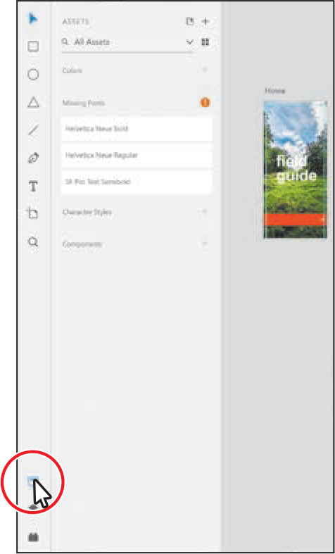
If the Assets panel opens on the left and you see a Missing Fonts message, close the panel by clicking Assets panel icon (
 ) in the lower left. Note
The screen shots for this lesson were taken on Windows. On macOS, you’ll see the menus above the application window.
Press Command+0 (macOS) or Ctrl+0 (Windows) to see all of the content.
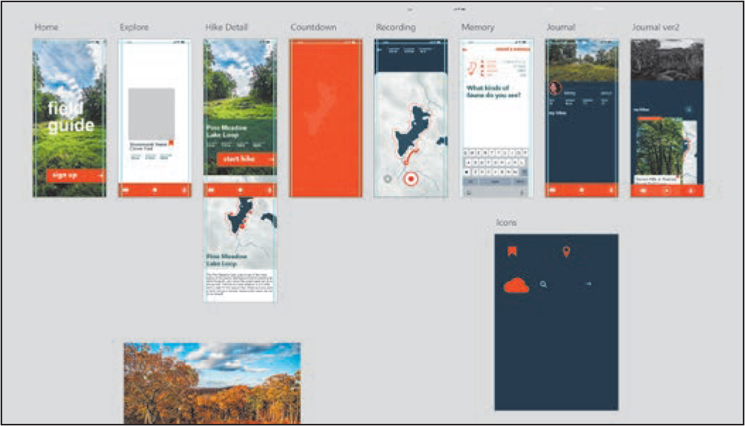
This file shows you what you will create by the end of the lesson.
Leave the file open for reference, or choose File > Close (macOS) or click the X in the upper-right corner of the open window (Windows) to close the file.
Managing assets with the Assets panel
You can use the Assets panel to save and manage project assets, including colors, text styling (called character styles), and components. Saving content in the Assets panel can save you a lot of time. For instance, when a saved color that’s being used in a document is edited, each occurrence of that color will automatically update. Each project file can have its own set of assets that can also be shared between projects. Assets are organized according to type by default.
Choose File > Open From Your Computer (macOS) or click the menu icon (
) in the upper-left corner of the application window and choose Open From Your Computer (Windows). Open the Travel_Design.xd document in the Lessons folder (or wherever you saved it). NoteIf you are starting from scratch using the jumpstart method described in the section “Getting Started,” open L6_start.xd from the Lessons > Lesson06 folder.
Press Command+0 (macOS) or Ctrl+0 (Windows) to see all of the content.
 Tip
TipYou can toggle the Assets panel open and closed by pressing Command+Shift+Y (macOS) or Ctrl+Shift+Y (Windows).
Click the Assets panel button (
), in the lower-left corner of the application window, to reveal the Assets panel.By default, the Assets panel is empty, but you can add your own colors, type styling (called character styles), and components from selected content or from the entire document by selecting all artboards. (You may see the Missing Fonts section if your system does not have fonts used in the document installed.) As you go through this section, you’ll learn about each of these types of assets and see how you can use them to save time and effort later.
Saving colors
To begin working with the Assets panel, you’ll save custom colors you’ve created. Saving colors in the Assets panel is similar to saving colors as swatches in a document in other Adobe applications, like Adobe Illustrator, and they live within the current document only. Once you save a color in the Assets panel and apply it to design content, if you edit the color later, any content that the color is applied to is updated. Saving colors in the Assets panel can be useful for a few reasons, including maintaining color accuracy and consistency and also for saving you time.
With the Assets panel showing, press Command+Y (macOS) or Ctrl+Y (Windows) to show the Layers panel.
Double-click the artboard icon (
 ) to the left of the artboard name Icons in the Layers panel to fit the artboard in the document window.
With the Select tool (
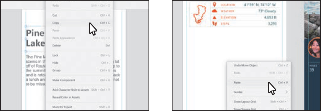
 ) selected, right-click the cloud icon on the Icons artboard and choose Add Color To Assets from the menu.
This is one method for saving color associated with content in the Assets panel.
Click the Assets panel button (
), in the lower-left corner of the application window, to reveal the Assets panel, if it isn’t showing already, and you’ll see the orange-red color saved in the Colors section. Tip
TipYou can double-click the name of a color when the Assets panel is in List view (the default view) and change it. You’ll learn about changing views at the end of this section.
Aside from saving an individual color, you can also select a series of objects and save all of the colors from those selected objects at once.
Press Command+0 (macOS) or Ctrl+0 (Windows) to see all of the design content.
Press Command+A (macOS) or Ctrl+A (Windows) to select all of the content in the file.
Click the plus (+) in the Colors section of the Assets panel to save any colors applied to the selected content.

As you can see, this method captures any color from the selected content in your design, including solid color fills, gradients, and fills or gradients with an alpha transparency applied. Gradients saved are always ordered or sorted last in the list.
Press Command+Shift+A (macOS) or Ctrl+Shift+A (Windows) to deselect.
Click the Grid View button (
 ) at the top of the Assets panel, to view the colors in a grid.
 Note
NoteThe colors or ordering you see may not be exactly the same, and that’s okay.
You can view the content in the Assets panel in List view or Grid view.
Press Command+S (macOS) or Ctrl+S (Windows) to save the file.
Editing saved colors
Next, you’ll see how to edit a color you saved in the Assets panel and see the effect on the design content in your Travel_Design project.
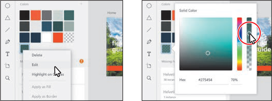
Move the pointer over the green swatch with the tooltip #275454 (90%). When you find that green swatch, click to select it; then right-click it and choose Highlight On Canvas to see where it’s being used (the rectangle on the Hike Detail artboard). If the option is dimmed, make sure the green swatch is the only one selected.

The “(90%)” next to the color name means that it has 90% opacity.
Right-click the green color again in the Assets panel and choose Edit. Change Alpha to 70%. Press the Esc key to hide the color picker.
 Note
NoteTo delete a swatch or multiple swatches in the Assets panel, select the swatches you want to delete, right-click one of them, and choose Delete. Deleting a color swatch in the Assets panel will not remove the color from the content in the document.
Zoom in to the Journal artboard with the picture of Meng.
To select the image of Meng in the group, Command-click (macOS) or Ctrl-click (Windows) the image.

To apply a color in the Assets panel to selected content, you can simply click the color swatch. The color is applied as a fill by default. To apply a color to the border of selected content, you can right-click a color in the Assets panel and choose Apply As Border. That’s what you’ll do next.
Right-click the orange swatch with the tooltip #FF491E in the Assets panel and choose Apply As Border to apply the color to the border of the selected image.

Change the border size in the Property Inspector to 3 to more easily see it.

Click in a blank area of the pasteboard, away from the image, to deselect.
Saving text formatting as a character style
In the Assets panel, you can also save text formatting as a character style. Character styles allow you to format text consistently and are helpful when text attributes need to be updated globally. Once a style is created, you only need to edit the saved style, and then all text formatted with that style in the document is updated. In this section, you’ll save text formatting you applied in a previous lesson as a character style to see how they work.
Press Command+0 (macOS) or Ctrl+0 (Windows) to see everything.
Zoom in to the bottom half of the Hike Detail artboard.
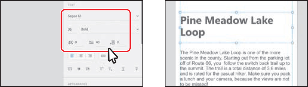
Select the Text tool (
 ) and move the pointer above the paragraph of text, aligning it with the aqua guide. Drag to make a text area. Type Pine Meadow Lake Loop.
Press the Esc key to select the text object.
Change the font size to 36 in the Property Inspector. Ensure that the font is Helvetica Neue (macOS) or Segoe UI (Windows) (or similar) and that the font weight is Bold, and change the Line Spacing (the distance between lines of text—similar to leading) to 40.
Select the Select tool (
) and drag a corner of the text box to show all of the text, if necessary, and so that it wraps like you see in the figure. Then drag it into the position you see in the figure. Make sure to keep the left edge aligned with the guide.
Right-click the text object and choose Copy. Navigate to the Memory artboard and right-click anywhere in the Memory artboard. Choose Paste to paste a copy of the text.
 Note
NoteIf you are zoomed in far enough to a different part of the artboard, the text will be pasted in the center of the document window.
With the text object on the Memory artboard selected, click the orange-red color swatch with the tooltip that shows #FF491E in the Colors section of the Assets panel to change the color.

Double-click the text to select it. Type What kinds of fauna do you see?
The same text formatting (including the color) needs to be applied to the original “Pine Meadow Lake Loop” text on the Hike Detail artboard. To do so, you can save the formatting from the text on the Memory artboard as a character style and apply it to the text on the Hike Detail artboard.

With the Select tool (
) selected, press the Esc key to select the text object, and drag a corner so the text appears on two lines if the text isn’t fitting. TipYou can also save formatting from text as a character style by selecting the text (not the text object).
With the text object selected, click the plus (+) in the Character Styles section of the Assets panel.
 Note
NoteCharacter styles don’t save alignment (left align, center, or right align).
TipYou can double-click the name of a character style when the Assets panel is in List view (the default view) and change it.
The text formatting is captured and saved as a style in the panel. Notice that the style name shows as the font name. I chose Segoe UI (Windows) for the font, so the style I see is named Segoe UI. If you chose a different font in the previous steps, your style name will be different—that’s okay.
Navigate to the bottom half of the Hike Detail artboard and click to select the “Pine Meadow Lake Loop” text. Click the character style named Helvetica Neue (macOS) or Segoe UI (Windows), or the character style name you see, to apply the formatting.
 Tip
TipCharacter styles are ordered alphabetically. If you have a lot of styles named Helvetica Neue, for instance, they are sorted by font size—largest at the top.
If you plan ahead, you can create a series of character styles before you begin your design or create them from content later, maybe when you need to reuse text formatting. The character styles, colors, and components (you’ll learn about components shortly) can also be used as part of an overall design system or as a starting point for a similar project later.
Editing character styles
With a character style created, next you’ll edit that style and see how all of the text with the character style applied changes.
Press Command+Shift+A (macOS) or Ctrl+Shift+A (Windows) to deselect all.
Press Command+0 (macOS) or Ctrl+0 (Windows) to see all of the content.
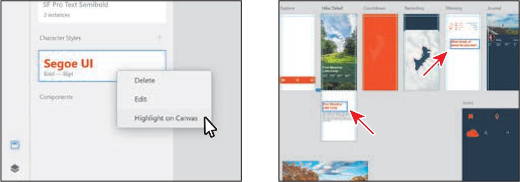
Right-click the character style in the Assets panel and choose Highlight On Canvas to see where it’s being used.
To edit a color or character style, you don’t need to highlight the content on the canvas. It’s just a useful way to see what will be affected when you edit the color or character style.
Right-click the style you saved in the Character Styles section of the Assets panel and choose Edit from the menu that appears.
NoteTo delete a character style or multiple character styles, select the styles in the Assets panel you want to delete, right-click one of them, and choose Delete. Deleting a character style in the Assets panel will not remove the formatting from the content in the document.
Make sure Hex is chosen in the color picker and change the color to 466D6D in the menu that appears. Press Return or Enter to accept the value. Click away from the menu to close it.
 Tip
TipWhen typing a Hex color, you don’t need to add the “#” at the beginning or type letters in caps.
As you edit the character-style formatting, you should see the text in the document changing. Unfortunately, when it comes to applying color to a character style, you can’t select a saved color swatch from the Assets panel while editing the character style. You could, however, select the Eyedropper tool in the editing menu and sample (click) a color swatch to copy and apply that color to other text.
Save the file by pressing Command+S (macOS) or Ctrl+S (Windows).
Creating components
As you’ve seen, saving colors and character styles is a great time-saver and a way to maintain design consistency, among other benefits. Being able to save content, like a button you drew or content for a footer you will need to reuse, can also be helpful. Objects you save in the Assets panel can be saved as components.
A component is an object that can be reused multiple times across artboards in a document, like a button. When you create a component, it is known as a master component. If you place multiple copies of a component in your design, called instances, you can change any properties of the master component and the instances are changed as well because the instances are linked to the master component. Changes you make to an individual instance are specific to that element, but changes you make to the master component affects all of the instances where that specific property hasn’t been customized. Next, you’ll save button artwork as a component.
Zoom in to the Home artboard.

Select the Text tool (
) and click the orange-red rectangle to add some text. Type sign up. Make sure it’s lowercase.Press the Esc key to select the text object.
With the text object selected, click the white color swatch with the tooltip #FFFFFF in the Colors section of the Assets panel to change the color.

Change the font size to 40 in the Property Inspector. Ensure that the font is Helvetica Neue (macOS) or Segoe UI (Windows) (or similar) and that the font weight is Bold.
TipBecause the text box may be taller than the text, it can be tricky to align the text box with the orange-red rectangle.
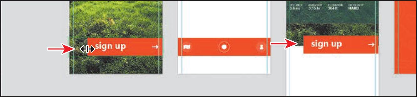
Select the Select tool (
) and drag the text into the position you see in the figure. Make sure to keep it visually vertically aligned with the orange-red rectangle shape. Tip
TipYou can also save content as a component by right-clicking the selected content and choosing Make Component from the menu.
Shift-click the orange-red button group to select both the text object and the button.
Click the plus (+) in the Components section of the Assets panel to save the selected content as a master component.

If a message appears, you can close it. Notice that after content is saved as a component, the button content appears in the Components section of the Assets panel. The button on the Home artboard is now a master component. You can tell it’s a master component because there is a green filled diamond in the upper-left corner. The border around the component is now also a subtle green—but that shows on master components as well as on instances.

You will also now see COMPONENT (MASTER) in the Property Inspector on the right (shown in the figure). In a later lesson on prototyping, you will learn more about using that area of the Property Inspector.
Adding a component instance to the design
You save content as components for several reasons. One is to be able to reuse content easily; another is to easily update content. Next, you’ll reuse the button component on another artboard as an instance.
Click the List View button (
 ) toward the top of the Assets panel. If you scroll down in the Assets panel, you can see the Components section. In List view, you can see the name of the component. Tip
When the Assets panel is displayed in list view, you can drag colors, character styles, and components to reorder them within each section.
Double-click the name of the new component, most likely “Component 1,” and type button. Press Return or Enter to accept the name.

If you don’t see the Hike Detail artboard in the document window, you can press Command and – (macOS) or Ctrl and – (Windows) to zoom out until you see it.
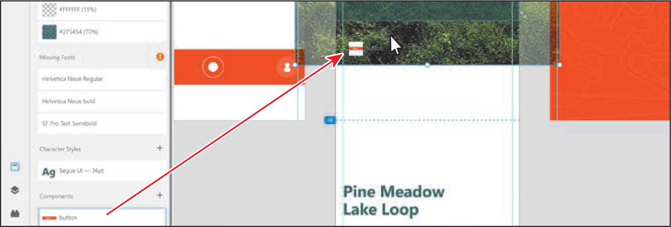
Next, you’ll drag a copy of the button component (called an instance) onto the Hike Detail artboard. First, you’ll arrange some of the content to make room for it.
Drag across the image and Pine Meadow Lake Loop text to select it. Drag all of it up a bit, matching the figure.

Drag the button component from the Components section of the Assets panel onto the Hike Detail artboard.
 Tip
TipYou can also copy and paste a component instance within an artboard or from one artboard to another.
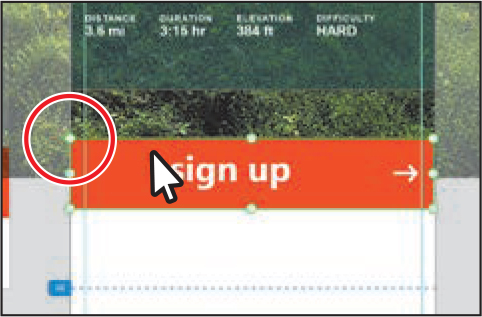
The instance now appears on the Hike Detail artboard. You can tell it’s an instance and not the master component because the diamond in the upper-left corner is hollow (circled in the figure).
Editing a master component
Suppose that the button component you created needs to be updated, maybe by changing the color or adding a border. In this next section, you’ll edit the appearance of the master component so that every instance will also be updated.
With the component instance selected, right-click it and choose Edit Master Component.
Editing the master component, rather than the instance, will update all instances.
 Note
NoteIf you delete a master component from the canvas, XD generates a master component next to the objects you’re currently editing.
To edit the content in the master component, double-click the master component (the orange button) on the Home artboard. Click to select the orange-red rectangle if it’s not already selected.
NoteMake sure the rectangle is selected; if you were to double-click the “sign up” text in the previous step, the text would be selected.
Zoom out so you can see the button instance on the Hike Detail artboard as well.
On the Home artboard, drag the left edge of the rectangle to the right to make it narrower.
The instance on the Hike Detail artboard should change as well. You can make changes to the style, size, shadow, or position of objects in the master component and see these changes reflected in all linked instances.
Click in a blank area away from the artboards to deselect.
Press Command+S (macOS) or Ctrl+S (Windows) to save the file.
Editing an instance
There may be times when you need to make an appearance change to a specific component instance. For instance, with the button component you created, maybe you need one of the buttons to be another color. If you change a property of the instance, not the master component, only that instance changes. Every property you change is considered an override. Overridden properties are always preserved, even if you edit the same property from the master component.
Next, you’ll edit the button instance without affecting the master component.
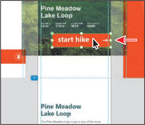
Press the T key to select the Text tool (
 ). Select the text “sign up” on the Hike Detail artboard and type start hike.
You can edit the text within a component instance, and the other instances or the master component won’t update. This can be useful in a project like this one, where we have a series of buttons with the same appearance but different text.
Select the Select tool (
) and click in a blank area of the pasteboard to deselect; then click the “start hike” component instance to select it.If you look in the upper-left corner of the bounds of the component, you will see that the diamond icon has a dot in the middle. That dot indicates that the instance has an override.
Right-click the button component instance with the “start hike” text and, in the menu that appears, you’ll see the command Reset To Master State. Don’t choose it!
 Note
NoteIf you do choose Reset To Master State, you can press Command+Z (macOS) or Ctrl+Z (Windows) to undo the command.
The Reset To Master State command is useful if you want the selected button instance to look like the master component again. In other words, it will remove all of the changes you just made to that instance.
Drag the “start hike” button so its right edge snaps to the right edge of the artboard and is positioned as you see in the figure.
Click in a blank area away from the artboards to deselect.
Press Command+S (macOS) or Ctrl+S (Windows) to save the file.
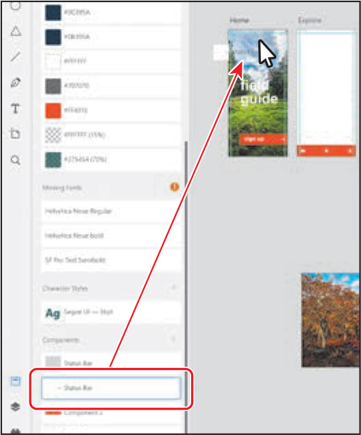
Making the footer a component
Now you’ll turn the footer group into a component and add it to all of the artboards.
With the Select tool (
) selected, click the footer group on the Explore artboard (see the figure). Press Command+K (macOS) or Ctrl+K (Windows) to save it as a component. Drag the footer component to the bottom of the artboard.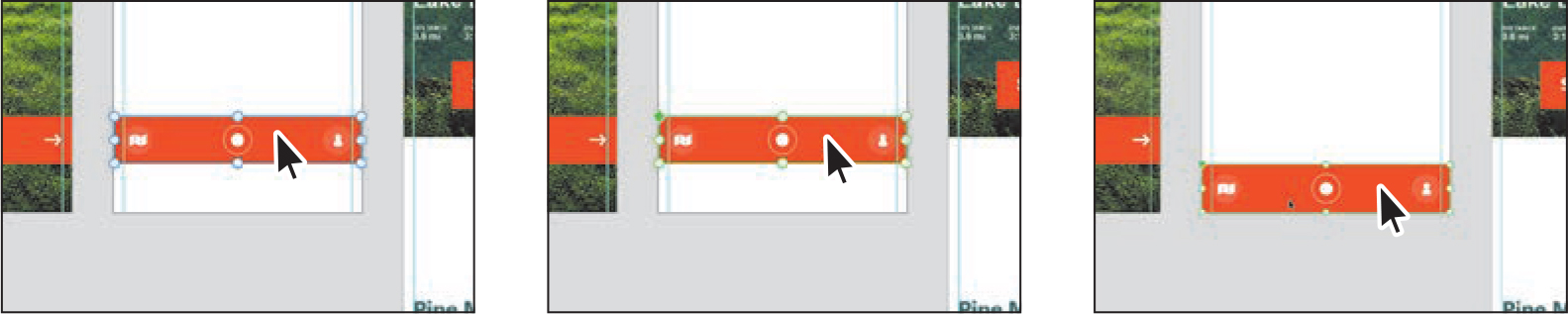
It is faster to save content as a component this way rather than clicking the plus (+) in the Components section of the Assets panel. After converting the content to a component, you should now see the green-filled diamond in the upper-left corner, indicating it’s the master component.
To copy the new component, press Command+C (macOS) or Ctrl+C (Windows).
Deselect everything by clicking in a blank area of the gray pasteboard.
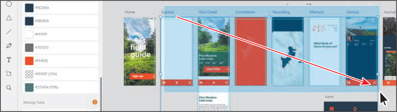
Press Command+0 (macOS) or Ctrl+0 (Windows) to see everything. Now you’ll paste the component as instances on several artboards.
To show the Layers panel, press Command+Y (macOS) or Ctrl+Y (Windows). In the Layers panel, click the Hike Detail artboard name to select it, and while pressing the Command key (macOS) or Control key (Windows), click the Journal name in the Layers panel list to select that artboard as well.

To paste the footer on both selected artboards in the same relative position, press Command+V (macOS) or Ctrl+V (Windows).
Click in an empty area to deselect.
Swapping components
In Adobe XD, you can also replace or swap components in your document. Maybe you need to swap out a button on one of your artboards with a different button, for instance. You simply drag a component from the Assets panel on top of the component you’d like to swap it with. Next, you’ll make two components from the status bar content in the document that was pasted back in Lesson 3.
With the Layers panel showing, double-click Pasteboard in the Layers panel to show the content on the pasteboard in the panel.
You will create two components from the two Status Bar groups.
Click the top Status Bar group name in the list and press Command+K (macOS) or Ctrl+K (Windows) to save it as a component.
You can see that the folder icon (
 ) in the Layers panel has changed to a diamond icon (
 ), which indicates it’s a component.
Click the other Status Bar group name in the Layers panel and make that a component as well by pressing Command+K (macOS) or Ctrl+K (Windows).
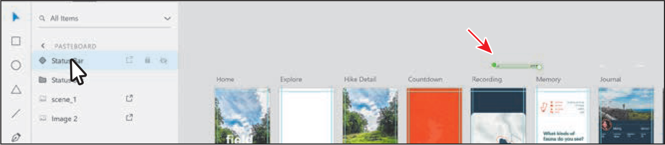
One of the status bars is white in color and the other is black. Now you’ll add the black status bar component to most of the artboards.
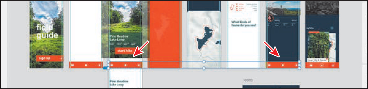
Open the Assets panel by pressing Command+Shift+Y (macOS) or Ctrl+Shift+Y (Windows). Scroll in the Assets panel to see the Components section, if necessary. Drag the black status bar component instance onto the top of the Home artboard.
Zoom in by pressing Command+3 (macOS) or Ctrl+3 (Windows). Drag the component into the horizontal center of the artboard—a magenta alignment guide should appear when it’s aligned—and so the bottom of the status bar is aligned with the horizontal guide along the top. You may want to zoom out a little to see the guides.

Copy the status bar component by pressing Command+C (macOS) or Ctrl+C (Windows).
Press Command+0 (macOS) or Ctrl+0 (Windows) to see everything.
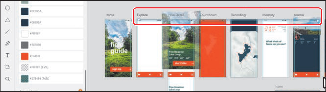
Drag across the Explore, Hike Detail, Countdown, Recording, Memory, and Journal artboards to select the artboards (not the content on them).
Press Command+V (macOS) or Ctrl+V (Windows) to paste the component instance in the same relative position on all of the selected artboards.
Click away from the content to deselect it all.
Now you’ll replace a few of the dark status bars with the white status bars so they are more readable.
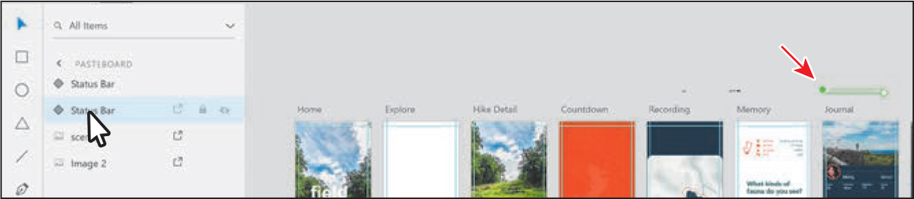
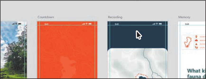
Zoom in closer to the Countdown and Recording artboards.
From the Assets panel, drag the white status bar on top of the black status bar on the Countdown artboard.

When the black status bar instance is highlighted, release the mouse button to replace that instance of the black status bar with an instance of the white status bar.
Drag the white status bar from the Assets panel onto the black status bar at the top of the Recording artboard to replace it as well.
Press Command+S (macOS) or Ctrl+S (Windows) to save the file.
Ungrouping components
Sometimes you will need to edit content that is a component instance and you don’t want the instance content to be linked at all to the original master component. In that case, you can ungroup a component instance from the master component. That command breaks the link between the instance and the component, so changes made to the component no longer affect the instance.
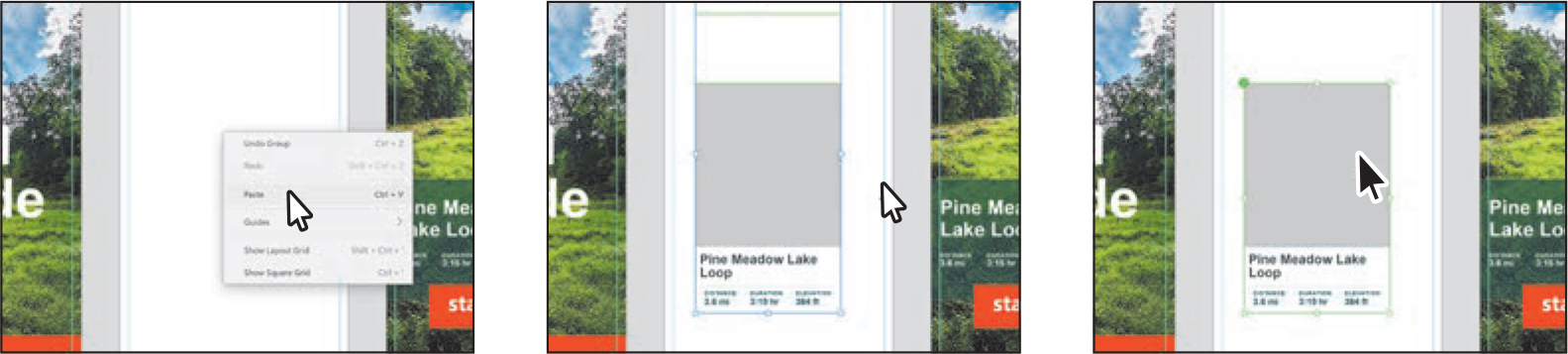
Pan or scroll over to the Home artboard so you can see it, and zoom in a bit to the “sign up” button.
To select part of the white arrow in the button, Command-click (macOS) or Ctrl-click (Windows) the white arrow. Press the Esc key to select the whole arrow group.

To copy the arrow, press Command+C (macOS) or Ctrl+C (Windows).
Move to the top of the Hike Detail artboard. Click in the Hike Detail artboard and press Command+V (macOS) or Ctrl+V (Windows) to paste the arrow on the artboard in the same relative position as it was on the Home artboard.
 Note
NoteClicking in the artboard is important. The arrow group you copied is deselected. If you don’t click in the artboard, the arrow you paste will be a part of the original arrow group.
Drag the arrow toward the top of the Hike Detail artboard, aligning it with the guide on the left side of the artboard, as you see in the figure. You will most likely need to zoom in.
To flip the pasted arrow, click the Flip Horizontally button (
 ) in the Property Inspector on the right.
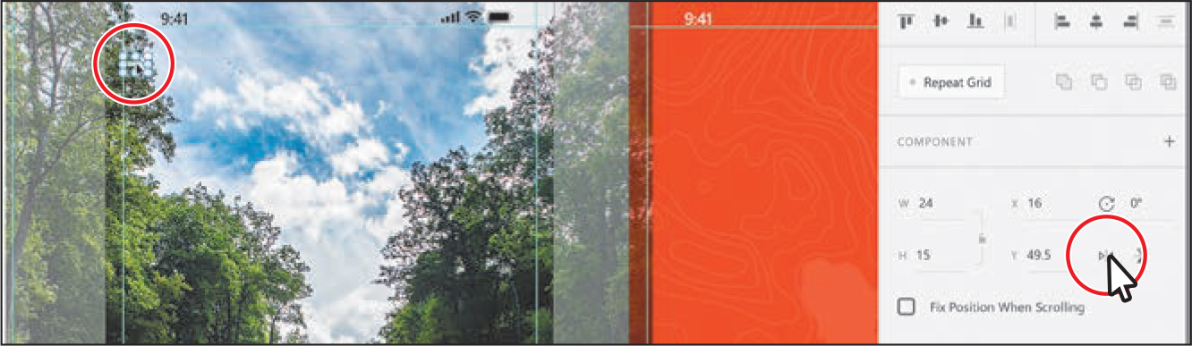
To save the arrow as a component, press Command+K (macOS) or Ctrl+K (Windows).
Copy the component instance by pressing Command+C (macOS) or Ctrl+C (Windows). Press Command and – (macOS) or Ctrl and – (Windows) to zoom out a bit so you can see the Hike Detail, Recording, and Memory artboards. You may want to press the spacebar and drag to see them.
Click in the Recording artboard and press Command+V (macOS) or Ctrl+V (Windows) to paste the arrow component instance in the same relative position on the artboard. Click in the Memory artboard and press Command+V (macOS) or Ctrl+V (Windows) to paste the arrow on that artboard as well.
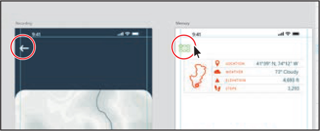
The arrow on the Memory artboard needs to be the orange-red color you saved previously so you can see it and other potential changes later. You’ll break the link to the master component so you can change anything and it won’t be affected by the master.
With the component instance selected on the Memory artboard, right-click the instance and choose Ungroup Component.
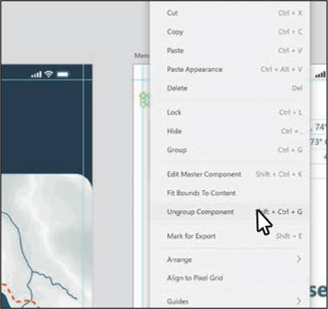
The content is no longer a component instance and is ungrouped.
Click the Assets panel button (
) in the lower-left corner to see the Assets panel, if it’s not already open. In the Colors section of the Assets panel, click the orange-red color to apply it. The arrow on the Memory artboard now has an orange-red border.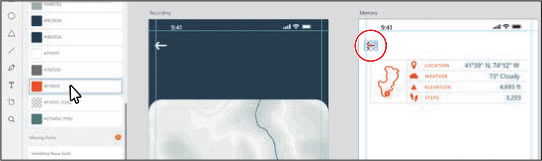
To group the arrow content together (if it isn’t already), press Command+G (macOS) or Ctrl+G (Windows).
Using components in other documents
In Adobe XD, you can copy a component from one source document to other documents. If you change the original component in the source document, components you pasted into other documents are updated because they are linked. Linked components allow you to create and maintain a style guide, design system, or UI kit or simply use that content in other Adobe XD documents.
Tip
You can share a source document with linked components. You can invite designers to edit or consume components from the source documents and receive update notifications when those documents are updated.
When you modify a linked component in the source document, XD shows a notification in other documents telling you that those components have been updated. You can then preview the changes in the original component and choose to accept or reject them.
So far in this lesson, you’ve been working with local components. Local components are components that reside within a document. In the next few sections, you’ll explore linked components, or saved components copied from a source document to a destination document.
Note
If you move the linked component source and the target documents to a new location, you need to ensure that the source and target documents are within the same parent folder structure. Otherwise, the links will be broken.
Choose File > Open From Your Computer (macOS) or click the menu icon (
) in the upper-left corner of the application window and choose Open From Your Computer (Windows). Click Your Computer in the dialog box that appears. Open the Icons.xd document in the Lessons > Lesson06 folder.With the Select tool (
) selected, click to select the text group in the top half of the artboard. Shift-click the group in the bottom half of the artboard to select both.
If you look in the Assets panel, you’ll see that both groups were saved as components.
With both instances selected, right-click either of them and choose Copy.
Choose File > Close (macOS) or click the X in the upper-right corner (Windows) to close the Icons.xd document.
Back in the Travel_Design.xd document, press Command+0 (macOS) or Ctrl+0 (Windows) to see all of the design content; then zoom in to the Explore artboard (the artboard to the right of Home).
Right-click in the Explore artboard and choose Paste.
Click in a blank area to deselect; then click one of the component instances you pasted.
With one of the component instances selected, you’ll see a green link icon in the upper-left corner. This indicates that the component instance is linked to another document (the source document). The green color also indicates that the component is up to date, meaning that it already reflects the latest saved changes to the component in the source document.
 Note
NoteIf you have multiple XD documents open, to see the Travel_Design.xd document, choose Window > Travel_Design (macOS) or press Command+~ (macOS) or Alt+Tab (Windows) to switch to the Travel_Design.xd document.
In the Assets panel, scroll down to see the Components section, if you don’t already see it. Make sure the List View option (
 ) is selected toward the top of the panel so you can see the component names.
You should now see components named “hike specs” and “carousel” listed in the Assets panel, along with a gray link icon to the right of each name.
In the Assets panel, move the pointer over the link icon (
 ) to the right of the “carousel” component name.
In the tooltip that appears, you’ll see “Up-to-date” and the name of the document that the component came from, which is Icons.xd. The link icon for a component in the Assets panel indicates a saved component copied from the source document to the destination document. You’ll learn more about working with linked components in the next section.
To save the file, press Command+S (macOS) or Ctrl+S (Windows).

Updating linked components
When you paste components from another document, a link between the original and the copy is created. You can choose to maintain that link and only edit the original, break the link between the source document and current document (making the component a local component), or maintain the link and apply style overrides to the component.
In the next few sections, you’ll explore how to work with linked components.
In the Travel_Design document, press Command+0 (macOS) or Ctrl+0 (Windows) to see all content. Zoom in to the Icons artboard.
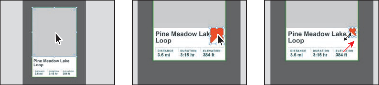
Click the orange-red banner icon on the Icons artboard and press Command+C (macOS) or Ctrl+C (Windows) to copy it.
You’ll add the banner to the carousel component in the Icons.xd document to update it.

In the Assets panel, right-click the carousel component and choose Edit Master In Source Document.
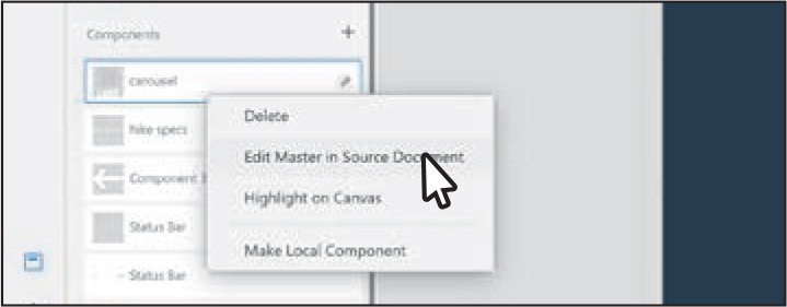
In the menu that showed, there was also a command for deleting the component. If you delete a component from the Assets panel, any instances in the document are still there; they are just no longer linked to a component.
In the Icons.xd document that opens, double-click the gray box at the top of the carousel component on the artboard to edit the content within. Zoom in to it.
Right-click the content and choose Paste to paste the orange-red banner icon. Drag it into the position you see in the second part of the following figure. Make it smaller by Shift-dragging a corner.
To save the file, press Command+S (macOS) or Ctrl+S (Windows). To close the Icons.xd file, choose File > Close (macOS) or click the X in the upper-right corner (Windows).
Back in the Travel_Design document, if you look at the carousel component in the Assets panel, you should now see a blue circle and link icon notification (
 ) indicating that it has been modified in the source document and can now be updated in the Travel_Design document. You may also see a message window appear that you can close, and the Assets panel icon in the lower-left corner of the application windows is now highlighted. All of this indicates that the component has been edited in the source document.
To see everything, press Command+0 (macOS) or Ctrl+0 (Windows).
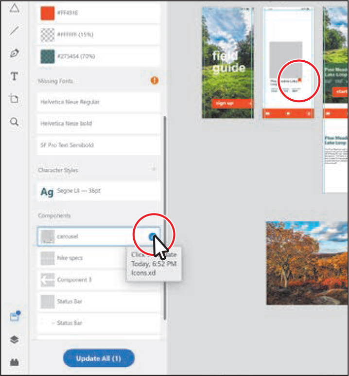
Move the pointer over the blue link notification in the Assets panel to see a preview of the update. Move the pointer away from the notification and the update preview will stop.
You may want to zoom in to the Explore artboard to more easily see the change.
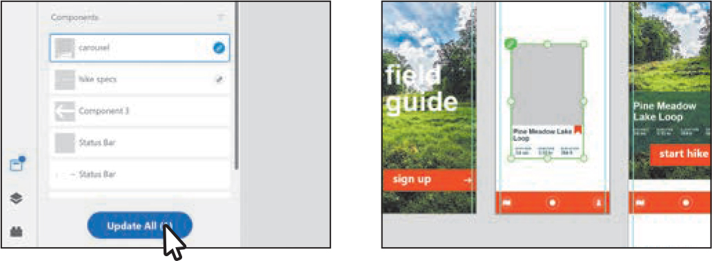
Click the Update All (1) button at the bottom of the Assets panel to accept the component update and make the change to the carousel component.
 Tip
TipTo accept the component update, you can also click the blue update icon or right-click a component or multiple selected components in the Assets panel list and select Update from the context menu.
The link icon to the right of the name in the Assets panel is now gray, indicating that the component has been updated. For the next step, you may want to zoom in.
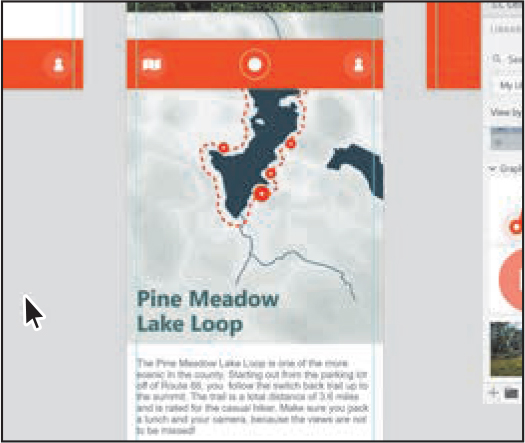
Double-click directly on the text “Pine Meadow Lake Loop” on the Explore artboard. Change it to Shunemunk Sweet Clover Trail.

The carousel component in the source document (Icons.xd) still has the “Pine Meadow Lake Loop” text, and the destination component is still linked to the source component. Any appearance changes you make to the source carousel component will still affect the carousel component in the destination document, if you choose to update.
Breaking the link to a component
There may be times when you no longer want a component in the destination document to update when that source component is changed and the document saved. For instance, the lines in the hike specs component in the source document (Icons.xd) are white. All of the component instances in the Travel_Design.xd document need to be green. The only way to edit the line color in the Travel_Design document component is to convert the destination (linked) component to a local component.
Drag the hike specs component instance you pasted onto the Explore artboard to the Recording artboard.
Since the text in the hike specs component instance is white on a white artboard, it may be challenging to select. You can drag across the area above the carousel component instance to select it.
On the Recording artboard, drag the white arrow component and the hike specs component into the position you see in the figure. You may need to zoom in to the artboard to align them.

In the Assets panel, right-click the hike specs component. Choose Make Local Component from the context menu that appears.
The link icon disappears to the right of the hike specs name in the Assets panel and also on the component instance(s) in the document. The component in the Travel_Design document is now a local component and will not update if changes are made to the source component in the Icons.xd document.

Working with Creative Cloud Libraries
Creative Cloud Libraries are an easy way to create and share stored content such as images, colors, character styles, XD components, and Adobe Stock assets between Adobe applications like XD, Photoshop, Illustrator, InDesign, and certain Adobe mobile apps.
Creative Cloud Libraries connect to your creative profile, putting the creative assets you care about at your fingertips. When you create content in XD, Illustrator, or Photoshop and then save it to a Creative Cloud Library, that asset is available to use in all of your XD project files. Those assets are automatically synced and can be shared with anyone with a Creative Cloud account. As your creative team works across Adobe desktop and mobile apps, your shared library assets are always updated and ready to use anywhere. In this section, you’ll explore Creative Cloud Libraries and use them in your project.
Note
To use Creative Cloud Libraries, you will need to be signed in with your Adobe ID and have an Internet connection.
Adding assets in XD to a Creative Cloud Library
The first thing you’ll learn about is how to work with the Creative Cloud Libraries panel in Adobe XD and add assets from an XD document you open into a Creative Cloud Library, then use them in your Travel_Design document.
Choose File > Open From Your Computer (macOS) or click the menu icon (
) in the upper-left corner of the application window and choose Open From Your Computer (Windows). Open the CC_assets.xd document in the Lessons > Lesson06 folder.Choose File > Open CC Libraries (macOS), or click the menu icon (
) in the upper-left corner of the application window and choose Open CC Libraries (Windows), to open the CC Libraries panel. Tip
TipYou can also open the CC Libraries panel by clicking the Open CC Libraries button (
 ) at the top of the Assets panel. Tip
In the CC Libraries panel, click More Options (...) and choose Create New Library to create a new library.
When you start working with Creative Cloud Libraries, you have one library to work with, called My Library. You can easily create other libraries in XD, maybe for keeping assets for specific jobs or clients, but in this section you’ll focus on using the default library. Toward the top of the panel you’ll see a menu for choosing a library, and you may see that the library named My Library is chosen. You can choose a different library you’ve created from that menu. For this exercise, make sure My Library is chosen or choose another library you have created.
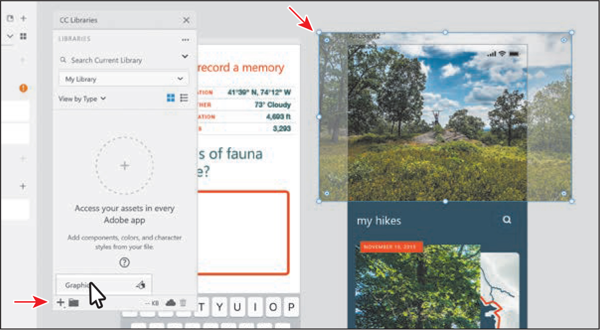
Drag the Creative Cloud Libraries panel so you can see the artwork on the artboards. With the Select tool selected, click the image at the top of Artboard 2.
To add it to the library, click the plus (+) at the bottom of the CC Libraries panel and choose Graphic to add the image to the library.
Click the keyboard at the bottom of Artboard 1 to select it.
You can tell it’s a master component because of the green-filled diamond in the upper-left corner and the green border.
Click the plus (+) at the bottom of the CC Libraries panel and choose Component to add the component to the library.
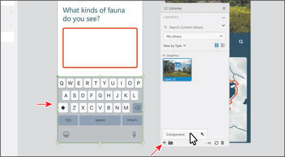
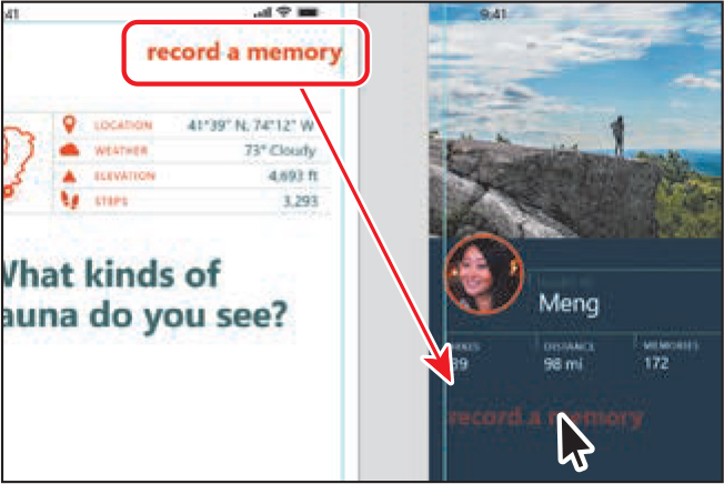
Click the text “record a memory” at the top of Artboard 1. You’ll save the formatting from the text so you can use it in your document.
Click the plus (+) at the bottom of the CC Libraries panel and choose Character Style to add the formatting to the library.

Choose File > Close (macOS) or click the X in the upper-right corner (Windows) without saving the file.
Adding Illustrator assets to the library
Now you’ll open Illustrator and add vector artwork to the same library that you can then use in XD. You could add content from other applications as well, like InDesign or Photoshop, but in this section, we’ll focus on one.
Open Adobe Illustrator.
In Adobe Illustrator, choose File > Open. In the Open dialog box, navigate to the Lessons > Lesson06 folder, and select the AI_Libraries.ai file on your hard disk. Click Open.
The file contains a few elements for the login screen of your app design in XD.
NoteIf you see a color profile warning, you can ignore it for now and click Continue or OK.
Choose Window > Workspace > Essentials, if it’s not already chosen, and then choose Window > Workspace > Reset Essentials.
Choose View > Fit All In Window to see the two artboards in the document.
Choose Window > Libraries to open the Libraries panel, if it isn’t open already. Choose My Library, or the library name you chose in the previous section, from the library menu.
Click View By Group and choose View By Type to see the assets organized by type.
Next, you’ll drag some of the artwork from Illustrator into the library.

Select the Selection tool (
 ) in the toolbar on the left. Drag the large map into the Libraries panel. When a plus sign (+) appears in the panel, release to add the artwork to the library.
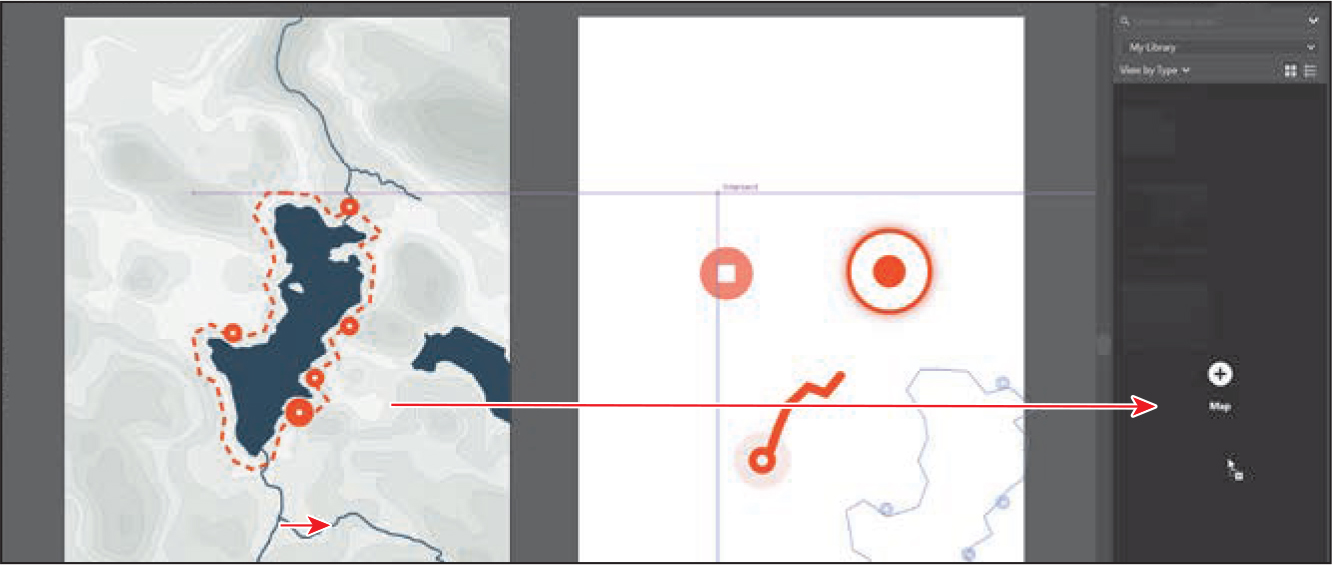 Note
NoteIf a warning dialog box appears, you can simply close it.
Drag each of the icons from the artboard, one at a time, into the Libraries panel to save them.
Choose File > Close, without saving, and leave Illustrator open.
Return to Adobe XD.
Using CC Library character styles in XD
You can now use the CC Library assets in your Adobe XD projects. In this section, you’ll apply the character-style text formatting from the CC Libraries panel.
Back in XD, in the Travel_Design document, zoom in to the Memory and Journal artboards.
Select the Text tool (
) and click in the top part of the Memory artboard. Type record a memory; then press the Esc key to select the text object. The text you see may have different formatting, and that’s okay. Note
NoteIf a font from a character style is not present on the local computer, a warning icon is displayed to the right of the character style in the CC Libraries panel.
NoteIn the next few sections, on Windows, you may need to press Alt+Tab to show the Creative Cloud Libraries panel again.
In the Creative Cloud Libraries panel (you may need to open it again), click the style with the orange, Helvetica Neue (macOS) or Segoe UI (Windows) (or other font), Bold (or other), 24pt font to apply the styling to the text.

When you apply a character style from a CC Library, it’s not added to the Assets panel as a style in the current document. Also, you cannot edit the style found in the Creative Cloud Libraries panel in Adobe XD.
Select the Select tool (
) and drag the content into position as you see in the figure.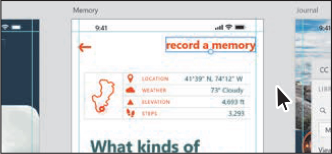
Option-drag (macOS) or Alt-drag (Windows) the text object to the Journal artboard to the right, below the Meng group of text. Release the mouse button and then the key to make a copy.
Press T to select the Text tool. Click in the copied “record a memory” text to select it. Type my hikes. Press Esc to select the text object again.
Press the V key to select the Select tool (
). Click the white color (#FFFFFF) in the Assets panel.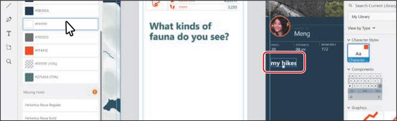
Using graphics from a CC Library
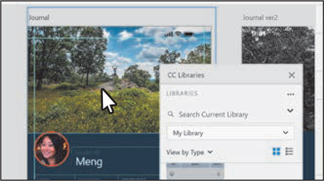
Raster images and vector graphics stored in a CC Library are called graphics and can be dragged into an open XD document. Graphics you drag into XD from a library are linked to the original source in the library. If you update the image in Photoshop or the vector graphic in Illustrator, for instance, it will be updated in your XD document. Next, you’ll drag the image from the CC Libraries panel into the document, replacing the current image on the Journal artboard.
With the Select tool (
) selected, click the image at the top of the Journal artboard to select it. Note
NoteIn Adobe XD, you cannot drag a graphic from the CC Libraries panel onto a locked image to replace it.
Drag the image from the Graphics section of the Creative Cloud Libraries panel on top of the image at the top of the Journal artboard. When it has a blue highlight, release. The new image is placed behind the original.
Press Backspace or Delete to remove the original image that is still selected at the top of the Journal artboard.
If you add an image to the library from Photoshop or other applications, it will replace the image you drag it on top of in XD. Since the image you saved from the XD file was a graphic, it won’t replace the image.
The image is not linked to the graphic in the library. If it were an image from Photoshop that you saved in the library, then it would be linked. That means that if you edit the image in another application, such as Photoshop, the image on the Journal artboard would update.
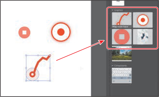
Drag the keyboard component from the CC Libraries panel onto the bottom of the Memory artboard. It will be positioned and resized in a later lesson.

Drag the Record button icon, the Stop button icon, and the Map route trace artwork from the Creative Cloud Libraries panel onto the Recording artboard and arrange them as you see in the figure.
 Note
NoteIt may take a little time for the graphics to appear on the artboard.
TipYou can select multiple objects in the CC Libraries panel with the Shift key or Command key (macOS)/Ctrl key (Windows). You can then drag all of the selected objects into XD at one time.
The graphics on the Recording artboard should now have green borders and show a link icon in the upper-left corner. They are each linked to the graphic in the library.
Drag the map graphic, the one you saved from Illustrator, from the Graphics section of the CC Libraries panel into an empty area of the Hike Detail artboard.
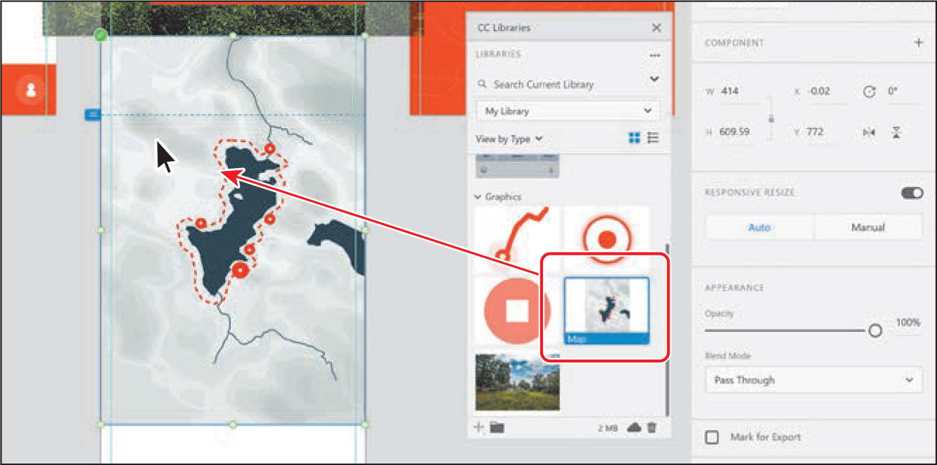
Right-click the map and choose Send To Back (macOS) or Arrange > Send To Back (Windows). Position it, and the other content, as you see in the figure.
Editing library items
You can edit vector artwork and raster images in a Creative Cloud Library from within XD. You can also edit raster and vector graphics stored in Creative Cloud Libraries. Right-click a graphic in the Creative Cloud Libraries panel or on the canvas and click Edit. Raster graphics open in Photoshop and vector graphics open in Illustrator. After you make changes to a graphic, save it. The graphic is updated in the Creative Cloud Library, and the thumbnail in the Creative Cloud Libraries panel in XD is automatically refreshed. The graphic on the canvas is also refreshed with your changes.
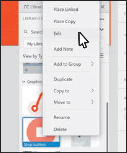
Click the stop button thumbnail in the Graphics section of the CC Libraries panel to select it, then right-click the same thumbnail and choose Edit.
When the asset opens in Illustrator, click the artwork to change the fill color.
Choose Window > Properties to open the Properties panel.
In the Properties panel on the right, click the Fill color, and in the menu that appears, click the Swatches button (
 ) and click a gray color to change the fill of the shape.
Press Command+S (macOS) or Ctrl+S (Windows) to save the file.
Close Illustrator by choosing Illustrator CC > Quit Illustrator (macOS) or File > Exit (Windows).
Switch back to Adobe XD, and after the graphic has synced, you’ll see it has updated on the Recording artboard.

Press Command+S (macOS) or Ctrl+S (Windows) to save the file.
NoteIf you started with the L6_start.xd jumpstart file, then keep that file open.
If you plan on jumping to the next lesson, you can leave the Travel_Design.xd file open. Otherwise, choose File > Close (macOS) or click the X in the upper-right corner (Windows) for each open document.
Review questions
1. What types of assets can be saved in the Assets panel?
2. How do you edit a character style in the Assets panel?
3. How do you create a component?
4. What property changes made to a master component will reflect in all instances of that same component?
5. What is a Creative Cloud Library?
6. What types of assets can a Creative Cloud Library contain?
Review answers
1. You can use the Assets panel to save and manage colors, character styles, and components.
2. To edit a character style in the Assets panel, right-click the character style and choose Edit. Make edits to the style in the panel that appears, and the text formatting will automatically update wherever the style has been used.
3. To create a component, you will select content in a document and then perform one of the following actions: click the plus (+) in the Components section of the Assets panel, right-click the content and choose Make Component, or press Command+K (macOS) or Ctrl+K (Windows).
4. You can change any properties of a master component to customize all of its instances. Changes you make to an instance only affect that element, but changes you make to the master component applies to all instances where that property hasn’t been customized.
5. A Creative Cloud Library is an easy way to create and share stored content such as images, colors, text styles, and more between Adobe applications like XD, Photoshop, Illustrator, InDesign, and certain Adobe mobile apps.
6. A Creative Cloud Library can contain assets such as colors, text styles, graphics, text frames, components, and more.