
7 Using Effects, Repeat Grids, and Responsive Layout
Lesson overview
In this lesson, you’ll learn how to do the following:
Understand effects.
Work with background and object blur.
Work with gradients and transparency.
Create and edit repeat grids.
Add padding to objects.
Understand responsive layout.
This lesson will take about 60 minutes to complete. To get the lesson files used in this chapter, download them from the web page for this book at www.adobepress.com/XDCIB2020. For more information, see “Accessing the lesson files and Web Edition” in the Getting Started section at the beginning of this book.
Starting the lesson
In this lesson, you’ll explore adding effects like drop shadows to your designs, you’ll apply gradients, and you’ll work with repeat grids and responsive layout. To start, you’ll open a final lesson file to get an idea of what you will create in this lesson.
Start Adobe XD, if it’s not already open.
On macOS, choose File > Open From Your Computer. On Windows, click the menu icon (
 ) in the upper-left corner of the application window and choose Open From Your Computer. Open the file named L7_end.xd, which is in the Lessons > Lesson07 folder that you copied onto your hard disk.
 Note
NoteIf you have not already downloaded the project files for this lesson to your computer from your Account page, make sure to do so now. See the “Getting Started” section at the beginning of the book.
NoteFor either macOS or Windows, if the Home screen is showing with no files open, click Your Computer in the Home screen. Open the file named L7_end.xd, which is in the Lessons > Lesson07 folder that you copied onto your hard disk.
If the Assets panel opens on the left and you see a Missing Fonts message, close the panel by clicking Assets panel icon (
 ) in the lower left. Note
The screen shots for this lesson were taken on macOS. On Windows, the menus can be accessed by clicking the hamburger menu.
Press Command+0 (macOS) or Ctrl+0 (Windows) to see all of the content.

This file shows you what you will create by the end of the lesson.
Leave the file open for reference, or choose File > Close (macOS) or click the X in the upper-right corner of the open window (Windows) to close the file.
Applying and editing gradients
A gradient fill is a graduated blend of two or more colors, and it always includes a starting color and an ending color. In Adobe XD, you can create a linear gradient (the beginning color blends into the ending color along a straight line) or a radial gradient (the beginning color defines the center point’s fill color, which radiates outward to the ending color).
 Tip
Tip
You can import objects with gradients from other applications, such as Adobe Illustrator. You can then edit the colors in the gradients within Adobe XD.
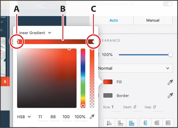
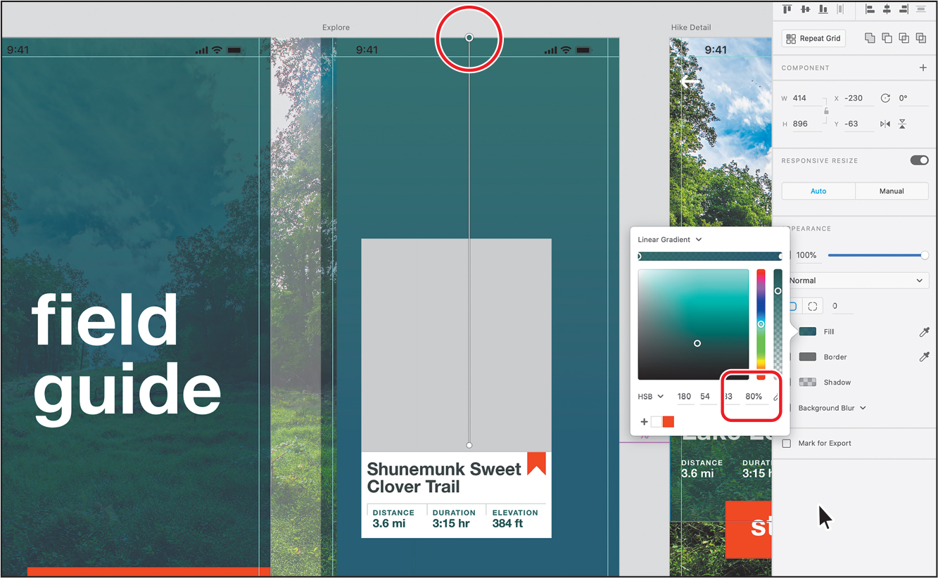
When you click the Fill color in the Property Inspector, in the color picker that appears, you can choose the type of gradient you want from the menu at the top. The gradient editor appears (labeled B in the figure). The leftmost gradient stop (labeled A) marks the starting color; the rightmost gradient stop marks the ending color (labeled C). A color stop is the point at which a gradient changes from one color to the next. You can add more color stops by clicking the gradient editor and changing the color within the color picker.
Applying gradients
In this section, you’ll explore the options for creating gradients and apply a gradient to several shapes in the design, starting with the Home artboard.
Choose File > Open From Your Computer (macOS) or click the menu icon (
) in the upper-left corner of the application window and choose Open From Your Computer (Windows). Open the Travel_Design.xd document from the Lessons folder (or where you saved it). NoteIf you are starting from scratch using the jumpstart method described in the section “Getting Started,” open L7_start.xd from the Lessons > Lesson07 folder.
Zoom in to the Home artboard using any zoom method. Make sure you can see the entire artboard.
Select the Rectangle tool (
 ) in the toolbar. Starting in the upper-left corner of the Home artboard, drag to the lower-right corner of the artboard to create a rectangle that covers the artboard.
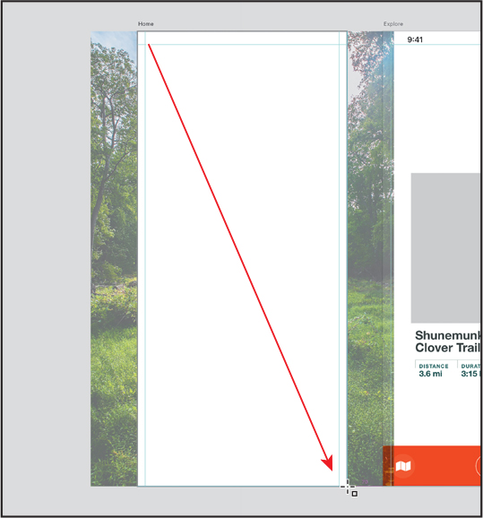
With the rectangle selected, click the Fill color box in the Property Inspector to show the color picker. Click Solid Color at the top of the color picker and choose Linear Gradient from the menu that appears.

By default, a white-to-gray gradient is now applied to the fill of the shape. Notice the bar that appears on the shape (an arrow is pointing to it in the following figure). This is called the on-canvas gradient editor, and it helps you change the direction and duration of the gradient.
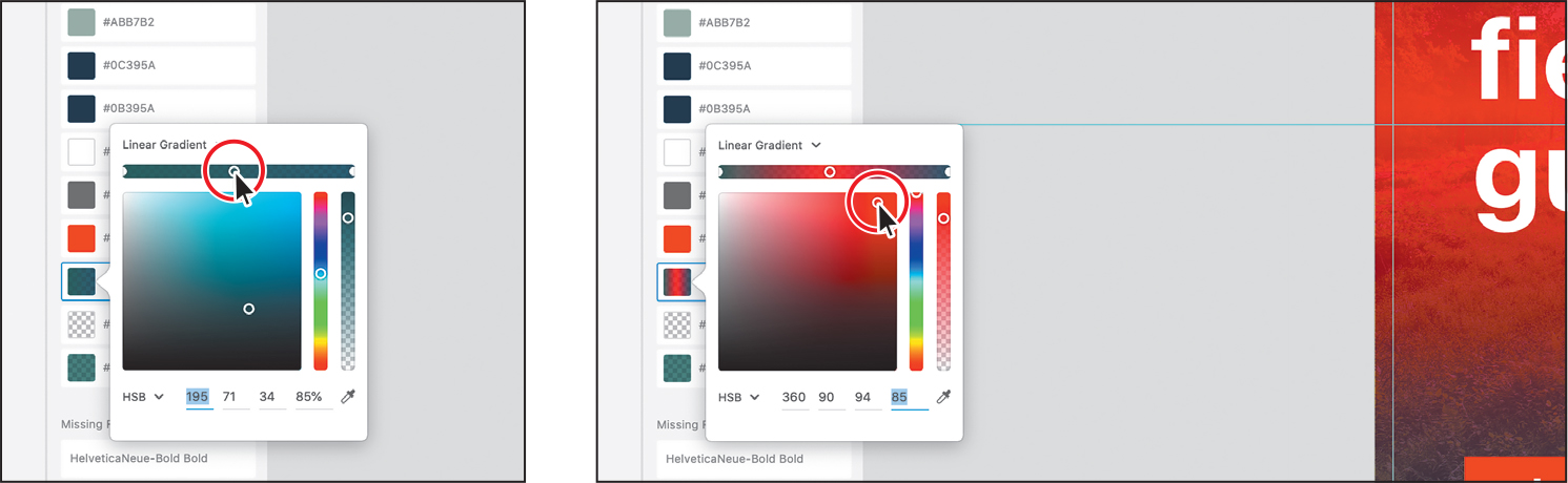
Click to select the leftmost color stop on the gradient editor in the color picker (circled in the following figure). Drag in the color spectrum to select any red. You’ll change this color later, so it doesn’t have to be an exact match to what you see in the figure.
 Note
NoteYou can tell when a color stop is selected because it has a thicker border and a hollow center.
Click to select the rightmost color stop on the gradient slider (circled in the following figure). Make sure HSB is chosen from the color mode menu and change the HSB color values to a blue: H=205, S=88, B=35, A=80. Press Return or Enter after the last value is entered.

Deselect the Border option in the Property Inspector to remove it.
To open the Layers panel if it isn’t open, press Command+Y (macOS) or Ctrl+Y (Windows). In the Layers panel, drag the selected rectangle down so it’s on top of the image but beneath everything else.
Next, you’ll save the gradient color so that you can easily edit it across more than one object.
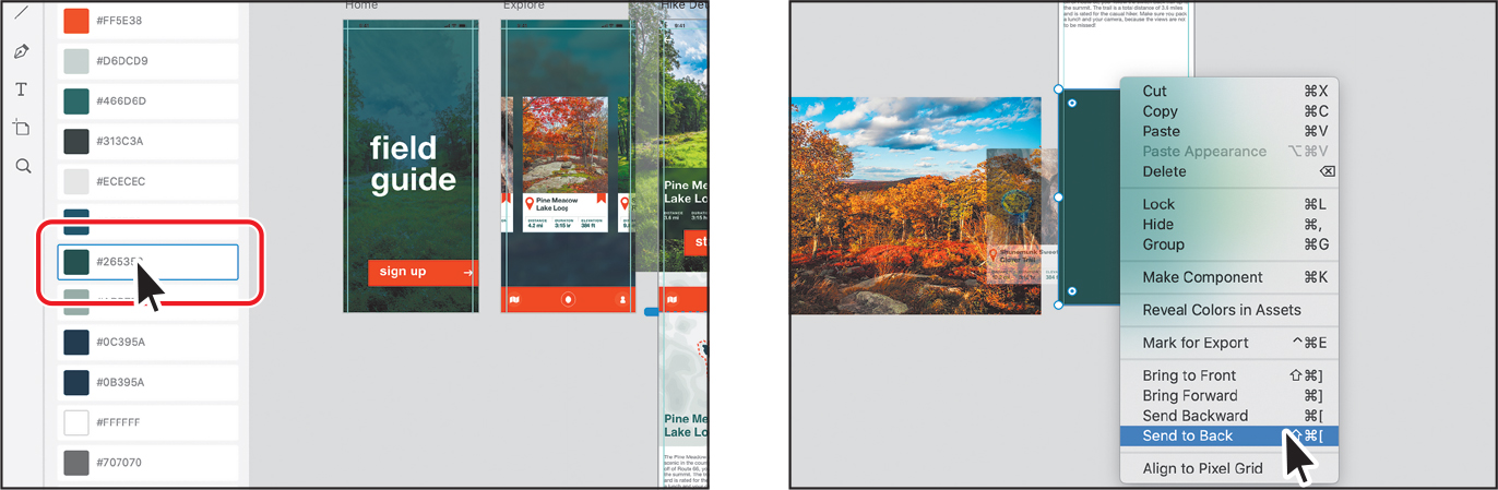
Right-click the rectangle on the artboard and choose Add Color To Assets.

The gradient color is now saved in the Assets panel and can be used elsewhere.
To show the Assets panel, press Command+Shift+Y (macOS) or Ctrl+Shift+Y (Windows). You may need to scroll in the Assets panel. The gradient color should be highlighted in the panel. Your color values may be different and that’s okay.
 Tip
TipTo see the gradient color in the Assets panel, if the panel is already open, you can right-click an object and choose Reveal Color In Assets.
With the rectangle still selected on the Home artboard, copy it by pressing Command+C (macOS) or Ctrl+C (Windows), right-click in the Explore artboard to the right, and choose Paste.
Right-click the rectangle copy on the Explore artboard and choose Send To Back (macOS) or Arrange > Send To Back (Windows) so it’s behind all of the other content. Leave the rectangle selected.
Press Command+S (macOS) or Ctrl+S (Windows) to save the file.
Editing gradient colors
Gradients can have more than the default two colors and can be adjusted directly on the artwork to give you more control over their appearance. In this section, you’ll edit the linear gradient you just created and saved in the Assets panel.
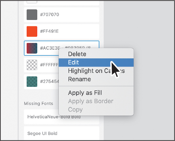
In the Assets panel, right-click the gradient you saved in the previous section and choose Edit.
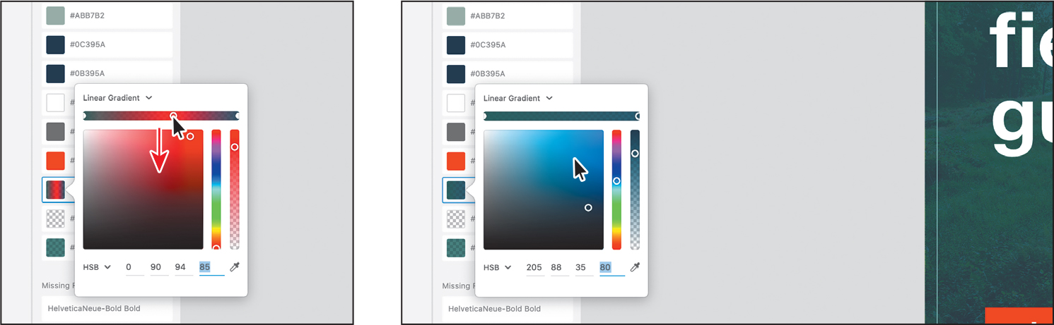
Click to select the leftmost (red) color stop on the gradient slider (circled in the figure). Make sure that HSB is chosen from the color mode menu and change the HSB color values to this green: H=180, S=54, B=33, A=90. Press Return or Enter after the last value is entered.

Move the pointer over the middle of the Gradient slider and click to add another color stop. Change the new color to a red.
Drag the new red color stop on the Gradient slider to the left and then to the right and watch what happens to the gradient in the shape.
To remove the new red color, drag it away from the slider and release. There should be only two colors in the gradient again.
Dragging a color stop along the slider changes the duration of the gradient (the distance it takes for one color to transition to another).
TipWhen editing on-canvas, to remove a color stop you can also click to select it and press Delete or Backspace.
Click away from the color picker to hide it.
Adjusting the direction and length of a gradient
Not only can you adjust the colors in the color picker, but you can also adjust them on the art using the on-canvas gradient editor, which is what you’ll do next. Note that edits to the gradient made on the art affect only the selected object.
With the gradient-filled rectangle on the Explore artboard still selected, select the Select tool (
 ), and then Shift-click the rectangle on the Home artboard to select it as well.
Adjusting the direction and length of a gradient can only be done to selected objects. You want the gradients on these artboards to look the same, which is why you selected both.
Click the Fill color in the Property Inspector.
You should now see the on-canvas gradient editor on the rectangle on the Explore artboard. When you select multiple shapes, the on-canvas gradient editor appears on the first selected shape.
Drag the bottom color stop of the on-canvas gradient editor up to make the gradient shorter within the shape.
 Note
NoteThe on-canvas gradient editor will not appear unless the color picker is showing in the Property Inspector.
TipYou can move the end of the on-canvas gradient editor segment by using the arrow keys. You can move an inner color stop along the segment by using the arrow keys as well.
You can change the direction and length of the gradient by dragging the color stops, so try exploring a bit. If you do explore, your gradient may not look like you see in the figures going forward, and that’s okay.
Click the top color stop (circled in the following figure) and change the alpha in the color picker (to the right) to 80.
 Tip
TipWhen editing on-canvas, you can also press Tab to select and change color stops along the on-canvas gradient editor.
TipIf you move the pointer over the Gradient slider on the art, a plus (+) will appear next to the pointer, indicating that if you click, you will add a color stop.
Press the Esc key to hide the color picker; then press Command+S (macOS) or Ctrl+S (Windows) to save.
Understanding effects
In Adobe XD there are several types of effects we can apply to content, including drop shadows, transparency, and blur effects. Drop shadows can be used to show depth, transparency can be used for design effect and overlays, and blur effects can be used to show focus for overlays, for instance.
In this section, you’ll add a few of these effects to your design.
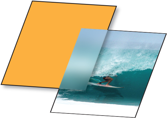
Working with background blur
Background blur uses an object as an overlay (the orange rectangle in the figure) to blur content that is behind it (the image of the surfer). Most of the time, the overlay object that is used to blur content is a shape, and the color fill and border of the shape have no effect on the result.
Note
You currently cannot apply a blur to a group.
Next, you’ll apply a background blur to existing content.
Zoom in to the Hike Detail artboard using any method you’ve learned.
With the Select tool (
) selected, Command-click (macOS) or Ctrl-click (Windows) the green rectangle behind the Pine Meadow Lake Loop text to select it.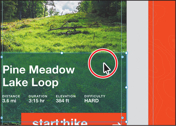
Since the rectangle is part of a group, Command/Ctrl-clicking will select just that object within the group.
Make sure the Border option is deselected to remove the border if there is one.

Select the Background Blur option in the Property Inspector, and change the following options:
Blur Amount (
 ): 7 (Determines how much blur is applied.)
Brightness (
 ): –30 (How dark or light the overall effect is. 0 is neutral, negative is darker, and positive is lighter.)
Effect Opacity (
 ): 50 (How opaque the effect is. Lower the value to make it more transparent.)

Notice that the color of the overlay shape is reduced and any content that it overlays (the image) is blurred. Feel free to adjust the background blur settings to get a better feel for how it works.
Press Command+S (macOS) or Ctrl+S (Windows) to save the file.
Working with object blur
Object blur is a method for blurring content such as a shape or an image. You can use object blur to indicate things like a state for a button or a hero image on a web page with overlay text, or maybe to move the focus to content above the blurred object, like a small pop-up form. Unlike with background blur, you select the content to be blurred. Next, you’ll blur artwork on the Recording artboard.
Press Command+0 (macOS) or Ctrl+0 (Windows) to fit all design content in the document window.
Right-click the image scene_1, which is on the gray pasteboard, and choose Copy to copy it.
Right-click in the Explore artboard and choose Paste to paste a copy.

To make the image larger from its center and maintain the proportions, Option+Shift-drag (macOS) or Alt+Shift-drag (Windows) a bounding point away from the center. Make sure the image covers the artboard.
 Note
NoteYou don’t need to press the Shift key if the Lock Aspect option (
 ) is selected to the right of the Width and Height fields in the Property Inspector.
Right-click the image and choose Send To Back (macOS) or Arrange > Send To Back (Windows) so the image is behind all other content on the artboard.
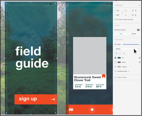
Click the Background Blur option in the Property Inspector on the right and choose Object Blur from the menu to turn it on. Change Blur Amount (
) to 8.
Adjusting the blur and opacity of objects is a great way to layer effects, make text readable on an image, and much more.
Drag the selected image so it is positioned something like you see in the figure.

Click away in a blank area to deselect all.

Press Command+S (macOS) or Ctrl+S (Windows) to save the file.
Applying a drop shadow
Drop shadows are another effect that can add a nice design touch to content, give a sense of depth, indicate the state of a button, and much more. In this section, you’ll see how to add a drop shadow to an image. First, you’ll add more content to the Journal artboard.
Press Command+0 (macOS) or Ctrl+0 (Windows) to fit all design content in the document window. Zoom in to the Journal ver2 artboard on the far right.
With the Select tool (
) selected, drag across the content on the Journal ver2 artboard you see in the first part of the following figure—making sure not to select the orange footer. Shift-click the “my hikes” text and the blue background shape to deselect them.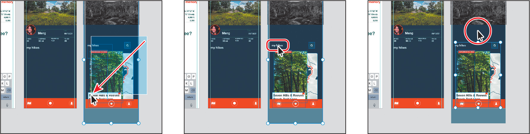
Press Command+C (macOS) or Ctrl+C (Windows) to copy the content. Right-click in the Journal artboard and choose Paste.
Press Command+3 (macOS) or Ctrl+3 (Windows) to zoom in to the selected content.
Drag the content so it’s horizontally centered on the artboard and the search eyeglass icon is aligned with the “my hikes” text.
Right-click the content and choose Send To Back (macOS) or Arrange > Send To Back (Windows) so that it’s behind the footer component.
For the next step, you’ll most likely need to zoom out or pan in the window.
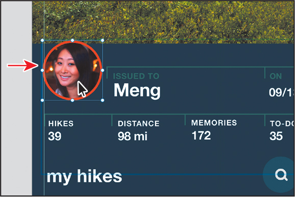
Click in the gray pasteboard area to deselect, and then Command-click (macOS) or Ctrl-click (Windows) the image of Meng in the group toward the top of the same Journal artboard.
Select the Shadow option in the Property Inspector and change the following options:
X (Distance along the X axis [horizontal]): 0
Y (Distance along the Y axis [vertical]): 0
B (Blur of the shadow): 10
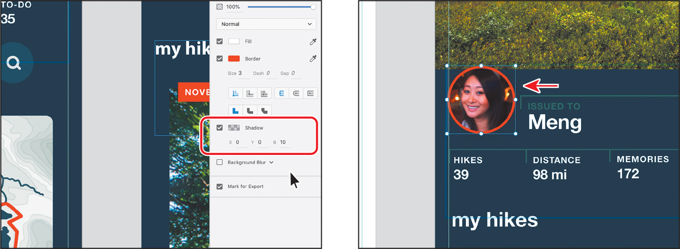
Click the Shadow color box (to the left of the word Shadow in the Property Inspector), and with black selected, change the alpha to 70. Press Return or Enter to accept the new value if you typed it in.

Press Command+S (macOS) or Ctrl+S (Windows) to save the file.
Applying blend modes
Blend modes are a way to blend the color of one object into content beneath it and are found in a lot of other Adobe applications, like Illustrator, Photoshop, and InDesign. You can use them to do things like apply a color cast to an image or to make text more readable over an image. In this short section, you’ll blend one object into another using a blend mode.
Press Command+0 (macOS) or Ctrl+0 (Windows) to fit all design content in the document window. Zoom in to the Home artboard.

Click to select the gradient-filled rectangle behind the text on the Home artboard.
In the Property Inspector, click the Blend Mode menu, which shows Normal as the default blend mode. Try choosing any of the blend modes to see the effect on the selected image.

The blend modes blend the color of the selected object into the content beneath it in different ways. They are grouped according to their overall effect, though. For instance, the Darken, Multiple, and Color Burn blend modes will usually make the resulting blend darker overall. The Lighten, Screen, and Color Dodge blend modes will make the resulting blend lighter.
Choose a blend mode you like from the Blend Mode menu.
I chose Darken so it looks something like it did before the blend mode was applied, but the grass and trees show more contrast.
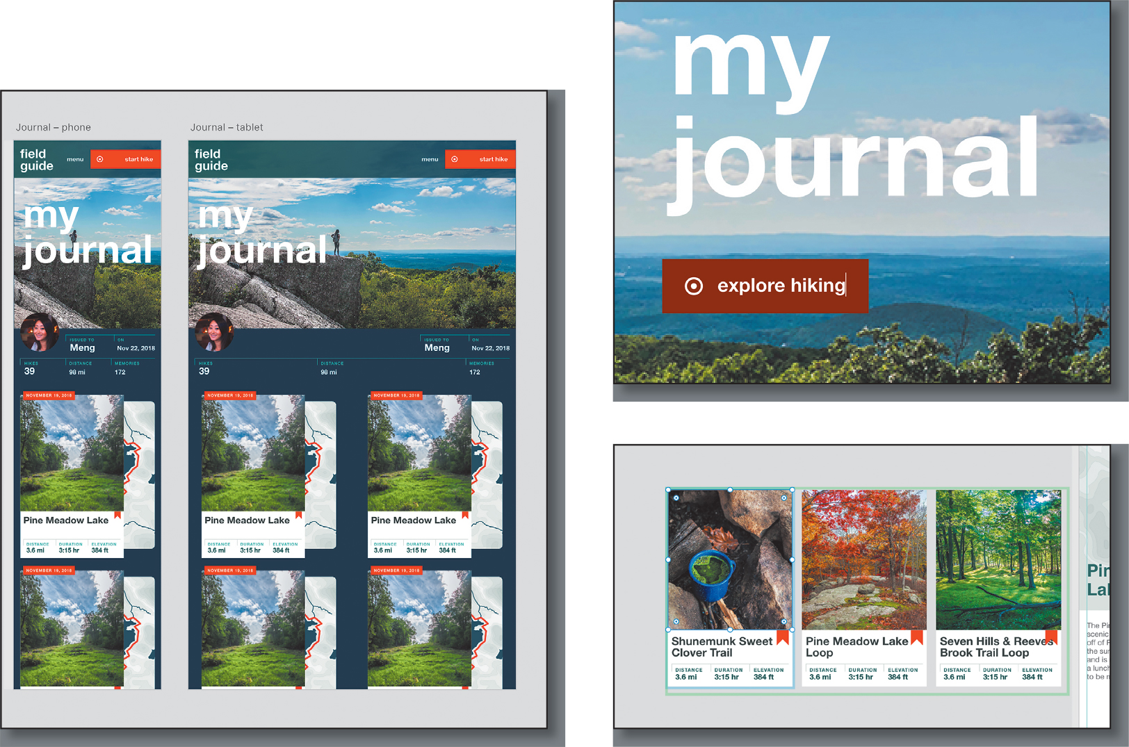
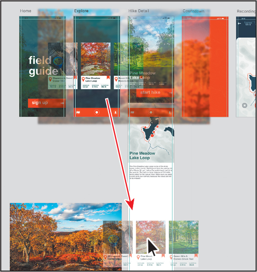
Using repeat grids
When designing for mobile apps or websites, you may create repeating elements or lists, such as a series of employee profiles or a list of entrées available at a restaurant. The repeating elements share a common design and general elements, but the images and text may be different. It can be cumbersome to create a grid of elements, especially when you need to easily adjust the spacing between them or rearrange common elements.

An example of a repeat grid
In Adobe XD, you can select an object or group of objects and apply a repeat grid to easily repeat the content. With a repeat grid applied to content, you can simply pull a handle at the bottom or right side of the content, and the content repeats in the direction you pull. When you modify any style of an element, the change is replicated in all elements of the grid. For example, if you round the corners of an image in one of the elements, the corners of all images in the grid are affected.
If you have a text element in the grid, only the style of the text element is replicated and not the content. So you can style text elements quickly while keeping the content different in the grid elements. You can replace placeholder text in a repeat grid by dragging a text file onto the grid. The repeat grid in Adobe XD has to be my favorite feature.
Adding content for a repeat grid
Next, you’ll add some content and set up your document so that you can create a repeat grid.
Press Command+0 (macOS) or Ctrl+0 (Windows) to zoom out.
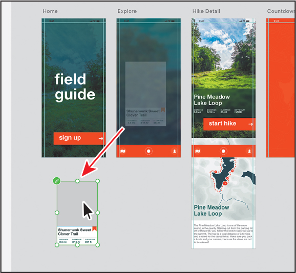
With the Explore artboard showing, drag the component instance that contains the text “Shunemunk Sweet Clover Trail” below the Home artboard.
 Note
NoteIf you started with the L7_start.xd jumpstart file, then the green icon in the upper-left corner (
 ) will look different since the component was embedded in the file.
This content is a description for a local hike.
Click in the gray pasteboard to deselect, and then zoom in to the hike description content you just dragged below the Home artboard.
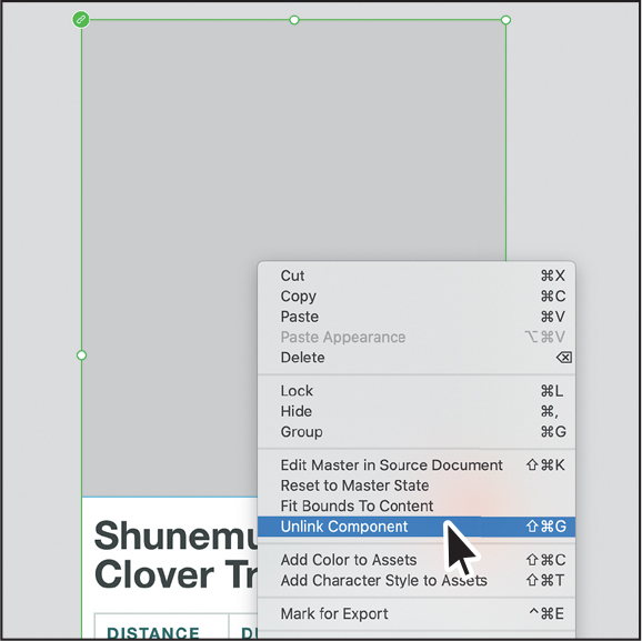
Right-click the selected content and choose Unlink Component. Leave the hike description content selected.
 Note
NoteIf you don’t see Unlink Component and see Ungroup Component instead, choose Ungroup Component. Choosing either will cause the component to no longer be a component.
You can make a repeat grid from a component, but when the hike description content is repeated, the gray rectangle in each will need to be a different image. As a component, it will be the same image. Unlinking the component instance from the original means it’s no longer a component instance and it’s now just a group of content.
Press Command+S (macOS) or Ctrl+S (Windows) to save the file.
Creating a repeat grid
Now that you have some content ready, you’ll create a repeat grid from it. The Hike Detail artboard will show a series of hikes. Instead of copying and pasting, you will take the group of content from the previous section and apply a repeat grid to it.
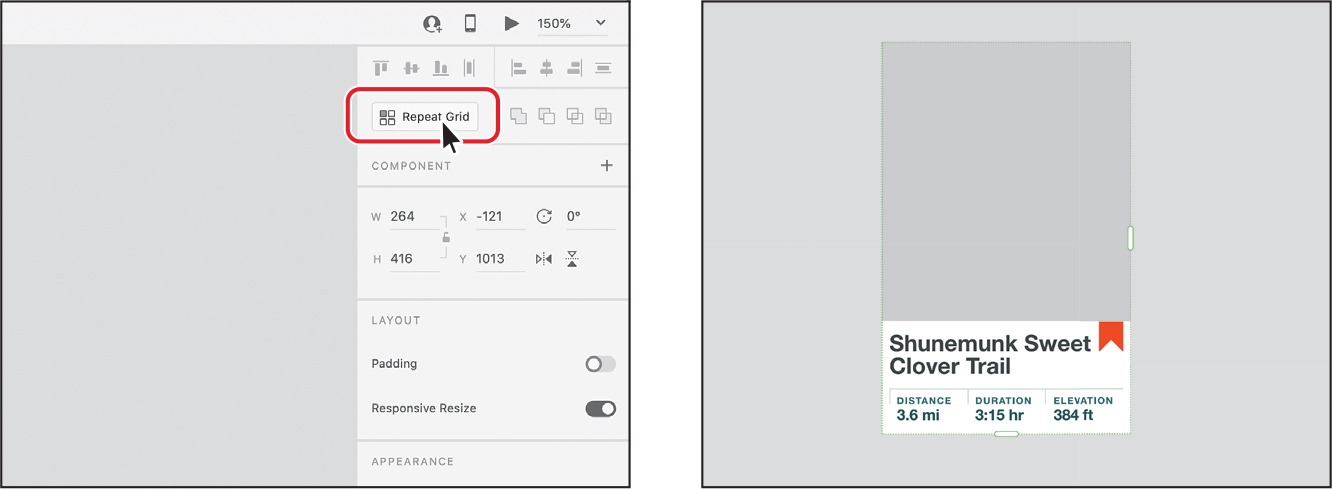
With the hike description group selected, click the Repeat Grid button in the Property Inspector to convert the selected content into a repeat grid.
 Tip
TipYou can also press Command+R (macOS) or Ctrl+R (Windows) to make a repeat grid.
NoteAny locked content that is selected when you create a repeat grid will not be included in it.
TipYou can nest repeat grids within each other. In other words, you can make a repeat grid from a repeat grid and other selected content, for instance.
A couple of things to notice when you convert content to a repeat grid:
First, there is now a subtle dotted green border around the content, indicating it’s a repeat grid.
Second, there are now two handles: one on the bottom and one on the right side. You drag the handles to create copies of the original content vertically (the bottom handle) or horizontally (the handle on the right side). The original content and the copies become cells in the repeat grid. You can then edit the cell and adjust the gap between rows, columns, or both.
For the next step, you may want to zoom out a bit or scroll down to see below the artboard.
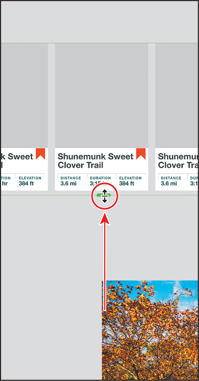
Drag the bottom green handle down until you see two copies of the content.
The content is repeated vertically, and the entire repeat grid acts like a group of the repeating elements. Later in this lesson, you’ll learn how to adjust the gap between the repeated elements. To make it so you can scroll the content vertically in your prototype, you’ll make the artboard taller.
 Tip
TipPressing the Option (macOS) or Alt (Windows) key while dragging a grid handle resizes the repeat grid on the opposite side as well, from the center. Pressing the Shift key while dragging a grid handle resizes both handles proportionally, from the center.
Drag the handle on the right side of the repeat grid to the right until you see a total of six hike descriptions.

This adds columns containing more duplicates of the hike description.
Drag the bottom green handle back up until you see only one row of hike descriptions.
The content is repeated horizontally, and the entire repeat grid acts like a group of the repeating elements. When it’s finished, you’ll add this repeat grid content to the Hike Detail artboard. To create room for it, next you’ll resize the Hike Detail artboard and arrange some of the content.
If there’s an image below the Hike Detail artboard, move it out of the way so you can make the Hike Detail artboard taller.
Press Command+0 (macOS) or Ctrl+0 (Windows) to zoom out.
Click the Hike Detail artboard name (above the artboard) to select it. Drag the bottom-middle handle down until you see an approximate height of 2300 in the Property Inspector to the right.

Editing content in a repeat grid
One of the benefits of a repeat grid, aside from being an easy way to duplicate content, is the ability to change the content in the grid. If there are repeating images in the grid, you can replace as many images as you like. You can also edit text independently, but styling remains applied to all copies of the object in the grid. Next, you’ll change some of the content in the repeat grid you created.
Zoom in to the repeat grid content below the Home artboard.
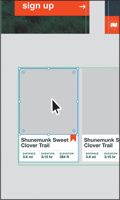
Click any content in the repeat grid to select the entire repeat grid. Double-click the first large gray rectangle on the left to select it.
When you double-click an object within a repeat grid, you enter into the repeat grid’s edit mode. The dashed green border around the repeat grid turns into a thicker solid-green border to indicate that you are in edit mode and can edit content within.
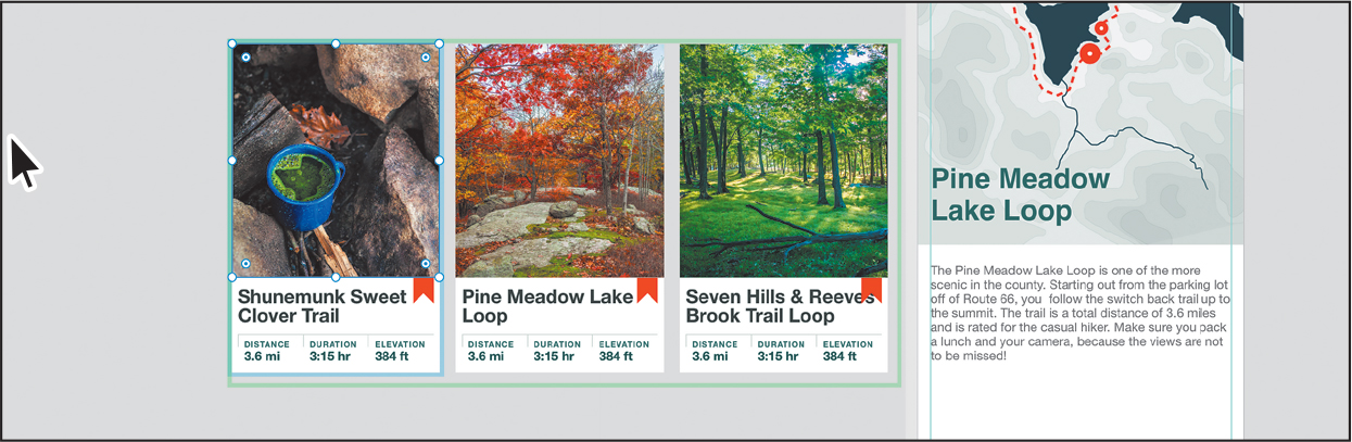
Double-click the middle Shunemunk Sweet Clover Trail text to select it, and type Pine Meadow Lake Loop to replace the text.
NoteYou may need to double-click more than once to select the text.
Notice that the other text objects did not change. You can edit the content of each of the copies in a repeat grid separately.
Double-click the Shunemunk Sweet Clover Trail text in the hike description on the right to select it, and type Seven Hills & Reeves Brook Trail Loop to replace the text.

Click in a blank area away from the repeat grid to deselect it. You may need to click a few times.
Click the image below the repeat grid and press Command+C (macOS) or Ctrl+C (Windows) to copy it.
Command-click (macOS) or Ctrl-click (Windows) any of the large gray rectangles in the repeat grid to select it. Right-click the same gray rectangle and choose Paste Appearance.

The image is pasted into all of the gray rectangles as a fill. In a repeat grid, if you change the appearance of any of the content, the rest of the copies in the repeat grid reflect that change.
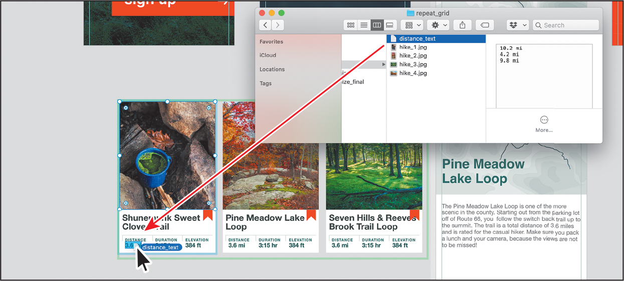
Go to the Finder (macOS) or File Explorer (Windows), open the Lessons > Lesson07 > repeat_grid folder, and leave the folder open in a Finder window (macOS) or File Explorer (Windows). With XD and the folder showing, click the image named hike_1.jpg and Shift-click the image named hike_4.jpg. Drag any of the selected images on top of any of the repeating images in the repeat grid. When it shows a blue highlight, release the mouse button to replace the images.
TipImages are placed in the cells in alphanumeric order. You’ll notice I added a “_1,” “_2,” and so on, to the names of the images. That helped me control the ordering of the images as they were placed in the repeat grid.

You can easily change the content of a repeat grid, either by changing an individual object or by dragging in images or a plain text file. Order in a repeat grid is defined in left-to-right reading order (left to right, then top to bottom). In this case, the repeat grid shows only the first three images since only three of the gray rectangles are showing. If you were to select the entire repeat grid and drag the right handle to show a few more of the hike descriptions, you’d see the fourth image, and when it came to the fifth description, the first image would appear again.
You can also drag a text file into a repeat grid to replace text in a repeating pattern. See the sidebar on the next page for specifics on how to set up a text file for import.
With both XD and the repeat_grid folder still showing, click the text file named distance_text.txt. Drag it on top of any of the “3.6 mi” text blocks in the repeat grid. When it shows a blue highlight, release the mouse button to replace the text.
 Note
NoteThe data is imported and not linked, so any changes you make to the source file won’t affect the data you’ve already placed in your XD file.
The first occurrence of the 3.6 mi text (on the left in the repeat grid) is replaced with the first paragraph in the text file, and so on.

Press Command+S (macOS) or Ctrl+S (Windows) to save the file.
Editing content appearance in a repeat grid
With content in the repeat grid, next you’ll adjust the distance between the rows, as well as some of the formatting within.
Click away from the repeat grid to deselect it. Click any content within the repeat grid to select the entire repeat grid.
TipYou can drag to change the distance between rows or columns in the repeat grid. You can even drag so that rows or columns overlap. This will show as a negative value in the row or column indicator.
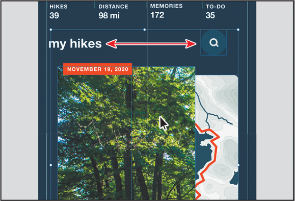
Move the pointer between the first two hike descriptions. When the magenta column indicators show, drag right and then left to see the distance between the columns change. A small distance value will appear above each pink column indicator. Drag until you see a value of approximately 30.
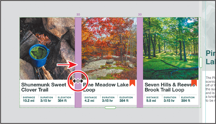
If the right side of the rightmost hike description content is being covered, drag the handle on the right side of the repeat grid to the right.
If you drag far enough, a repeat of the column will be revealed to the right. If you don’t drag far enough, the content in the third description may be cut off.
Press Command+S (macOS) or Ctrl+S (Windows) to save the file.
Adding content to a repeat grid
After you create a repeat grid, you can always add content to or remove content from it later using a variety of methods. Next, you’ll add content to the repeat grid.
Zoom out or pan over so you can see the Icons artboard, if necessary.
With the Select tool (
) selected, right-click the orange-red map pin icon and choose Cut.
Click back on the repeat grid below the Home artboard, and to zoom in, press Command+3 (macOS) or Ctrl+3 (Windows).
With the repeat grid selected, double-click one of the images in the repeat grid. This enters repeat grid edit context mode.
Press Command+V (macOS) or Ctrl+V (Windows) to paste the icon into the center of each object.

Now you’ll adjust some of the content to position the map pin icon.
Click the text Shunemunk Sweet Clover Trail to select the type object.
Change the font size to 20 in the Property Inspector to make it smaller.
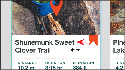
Drag the right edge of the type object to the left to make it narrower.
Drag the type object to the right to make room for the icon. See the first part of the following figure.
Drag the map pin icon to the left of the Shunemunk Sweet Clover Trail text.
TipTo move the icon in 1-pixel increments, you can press an arrow key.
Shift-drag a corner of the map pin to make it smaller so it fits. Drag it just to the left of the Shunemunk Sweet Clover Trail text.

You can draw any element or add text to a repeat grid, even after you’ve created it. Since a repeat grid automatically repeats every element, this allows us the flexibility to play with design in a new way.
Press Command+S (macOS) or Ctrl+S (Windows) to save the file.
Ungrouping a repeat grid
If you need to edit the different content in a repeat grid separately, you can always ungroup a repeat grid. This breaks apart the repeat grid so that each content group is independent from the others.

With the repeat grid selected, click the Ungroup Grid button in the Property Inspector. You can also choose Object > Ungroup Grid (macOS) or press Command+Shift+G (macOS) or Ctrl+Shift+G (Windows).
Finishing the repeat grid
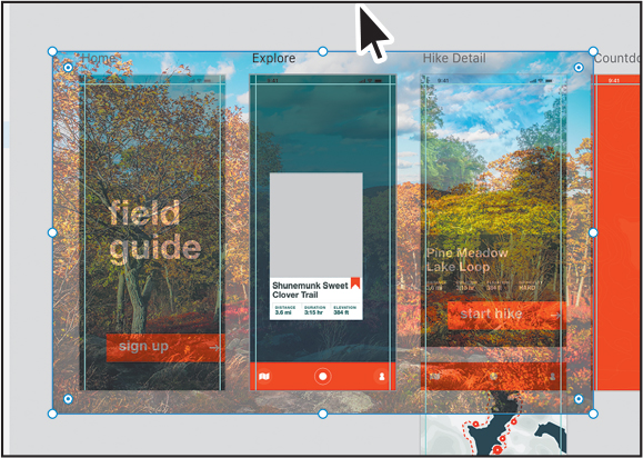
In this last section on repeat grids, you’ll drag copies of the repeat grid into place on the Hike Detail and Explore artboards. You’ll also add a few finishing touches to those same artboards.
Press Command+0 (macOS) or Ctrl+0 (Windows) to see all of the artboards.
Click in the gray pasteboard area to deselect. Drag the repeat grid into the middle of the Explore artboard.
 Note
NoteYou may need to click in the gray pasteboard more than once to deselect.
You may find that the content of the repeat grid isn’t exactly centered on the artboard even though the repeat grid is. That’s because there may be space off the right edge of the rightmost object. You can either drag the right handle of the repeat grid to the edge of the content or press the arrow keys right or left to align it visually. Now you’ll drag a copy of it to the Hike Detail artboard.
Option-drag (macOS) or Alt-drag (Windows) the repeat grid to the bottom of the Hike Detail artboard. Release the mouse button and then the key.
Now you’ll add a rectangle behind the repeat grid on the Hike Detail artboard.
Select the Rectangle tool and drag to create a rectangle that covers the bottom part of the Hike Detail artboard.
Open the Assets panel by clicking the Assets panel button (
) in the lower-left corner of the application window, if you don’t already see it. Click the green color with the name #265353 to apply it to the fill of the rectangle.
Right-click in the green rectangle on the Hike Detail artboard and choose Send To Back (macOS) or Arrange > Send To Back (Windows).
Now you’ll add some of the final content to the Explore artboard so users can navigate when you add interactivity.
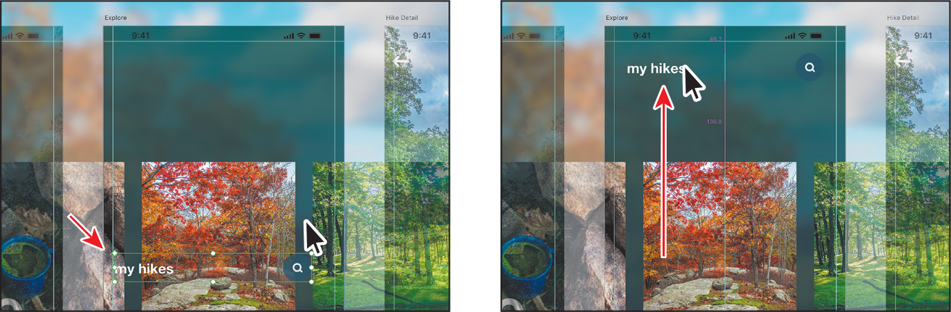
Zoom in to the Journal artboard, making sure you can see the whole artboard.
On the Journal artboard, select the Select tool (
) and drag across the “my hikes” text and the search icon to the right of it. To make it a component, press Command+K (macOS) or Ctrl+K (Windows). As a component, it’ll be easier to make edits across the copies. Note
NoteIf you select any other content when you drag across, Shift-click the content you don’t want selected.
Copy the component by pressing Command+C (macOS) or Ctrl+C (Windows).
Click in the Explore artboard and press Command+V (macOS) or Ctrl+V (Windows) to paste it in the same relative position.
Drag the component instance up toward the top of the artboard, making sure it is aligned horizontally in the center. An alignment guide will appear when it is.
Press Command+S (macOS) or Ctrl+S (Windows) to save the file.
Responsive content and layouts
When designing a website in Adobe XD, it’s important to consider how content acts across the wide variety of screen sizes available across mobile and tablet devices, as well as for desktops. Designers have long created multiple artboards at different sizes for each page in a web design, for instance. That meant copying and resizing an artboard, and then resizing all of the content on the new artboard manually. To solve this problem, Adobe XD has several layout features.
The first feature, content-aware layout, allows you to set padding values on groups or components and automatically scale the background when content changes are made. This can be useful if you have versions of buttons, drop-downs, tool tips, or even dialogs that need to be resized.
The other feature is called responsive resize. With responsive resize, XD automatically predicts which constraints you are likely to apply and then automatically applies those constraints as objects are resized. Unlike responsive resize that acts when you resize an entire group, padding acts when you change the content within a group.
Responsive padding with content-aware layout
In this first section, you’ll explore setting fixed padding values on content to make resizing easier.
Choose File > Open From Your Computer (macOS) or click the menu icon (
) in the upper-left corner of the application window and choose Open From Your Computer (Windows). Open the Responsive_content.xd document in the Lessons > Lesson 07 folder. TipTo see the final version of Responsive_content.xd, you can open Responsive_content_final.xd in the Lessons > Lesson 07 folder.
Press Command+0 (macOS) or Ctrl+0 (Windows) to see all of the artboards.
Zoom into the Journal – padding artboard at the top.
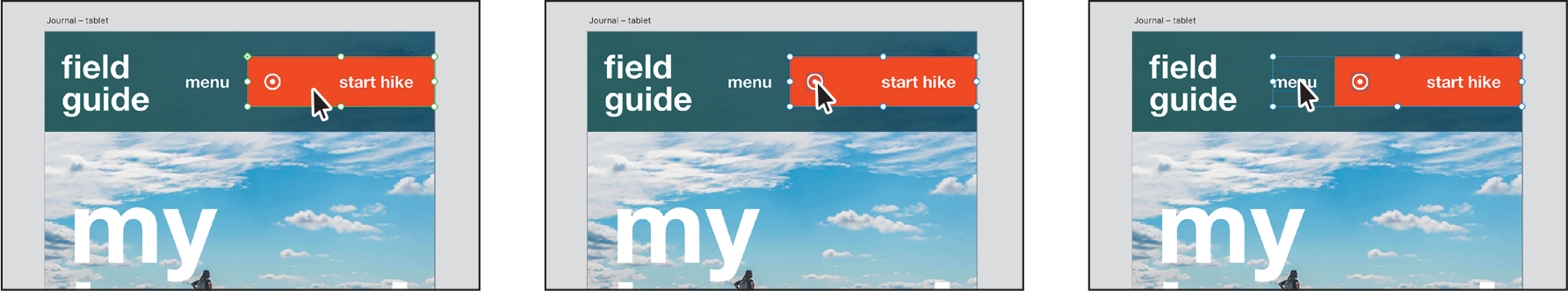
With the Select tool selected, drag across the red “start hike” button to select the content.

To group the selected content, press Command+G (macOS) or Ctrl+G (Windows).
In order to make it so that the button body (the orange-red rectangle) will resize if you edit the text, for instance, you need to group the content. If you have multiple instances of a single button component and need to make text changes to them, this could save you time.
With the button group selected, in the Property Inspector, turn on the Padding option in the Layout section.

By default, the amount of space between the background and the edge of the content within, on each side, is the amount of default padding. You have two options when editing padding, having the same padding for all edges (
 ) or different padding for each edge (
 ). By default, different padding is typically chosen.
With the Different Padding For Each Edge (
) selected, click in the first field value (the padding value for the top). Note
NoteThe Different Padding For Each Edge icon will look different, depending on which value you have selected (top, right, bottom, or left).
You will see the top padding value in the button appear as a magenta color the value to the left of the button. You may want to zoom in further to the button.
Select the second value from the left—which is the right padding value—and change it to 20.
Select the fourth value from the left—which is the left padding value—and change it to 20 to match the padding on the right.
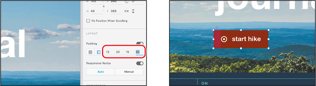
When you increase the padding values, XD creates an invisible padding that acts as a safe-space around logos or in a larger tap area for buttons when prototyping.
Press the letter T to select the Text tool and double-click the “start hike” text to select it. Change it to explore hiking.

You can see that the red button body (the rectangle) resizes, keeping the same padding value between the right edge of the text and the rectangle. This is the idea behind padding. If content changes within a group or component, the background resizes, keeping the padding on all sides consistent.
Padding examples 
To see other examples of working with padding in Adobe XD and to see the latest features, check out the video “Working with padding,” which is a part of the Web Edition of this book. For more information, see the “Web Edition” section of “Getting Started” at the beginning of the book.
Getting started with responsive resize
In this section, you’ll explore responsive resize to begin creating a tablet design from a phone design. You’ll explore how to turn on responsive resize and see how it affects different artboards.
Press Command+0 (macOS) or Ctrl+0 (Windows) to see all of the artboards.
Below the padding artboard, there are two sizes for a single page in a website—a mobile design and a desktop design. You’ll make a copy of the mobile-sized artboard, turn on responsive resize, and then resize the artboard to be a tablet-sized version of the design.
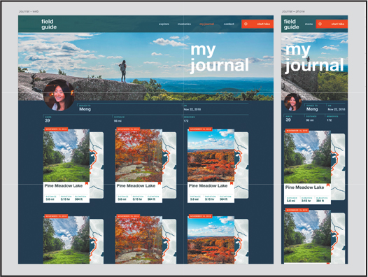
With the Select tool (
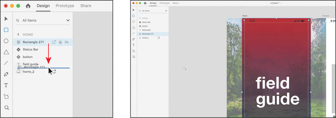
) selected, click the Journal – phone artboard name to select the artboard.To duplicate the artboard, press Command+D (macOS) or Ctrl+D (Windows). The new artboard, named “Journal – phone – 1,” is selected.

Double-click the new artboard name and change it to Journal – tablet.
Press Command+3 (macOS) or Ctrl+3 (Windows) to zoom in to the artboard.
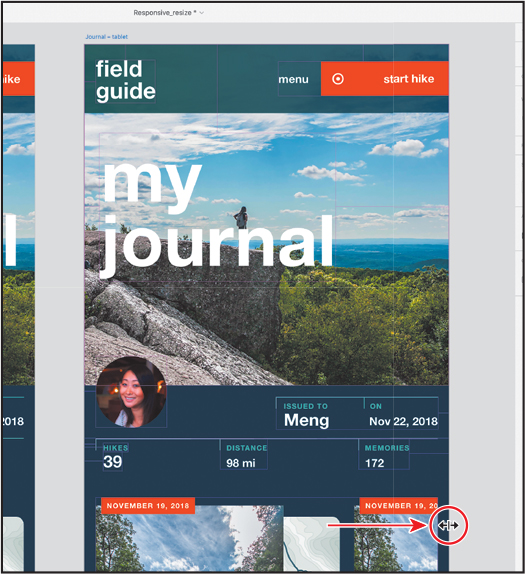
Drag the right-middle point of the selected Journal – tablet artboard to the right to make it wider. When you see a width of approximately 850 in the Property Inspector, stop dragging.
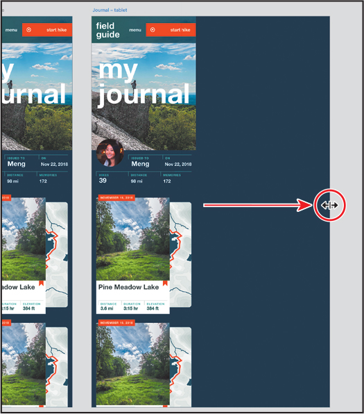
The content on the artboard doesn’t resize or move by default. By default, the responsive resize option is turned off for artboards, but you can turn it on for selected artboards. Turning it on for an artboard will allow the content on that artboard to resize.
Press Command+Z (macOS) or Ctrl+Z (Windows) to undo the artboard resizing.
NoteYou could just drag the right-middle point of the artboard to the left to make it narrower, but using the undo command puts it back to the same size every time more easily.
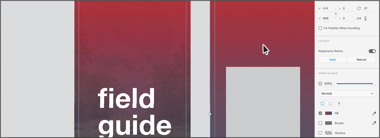
With the artboard still selected, in the Property Inspector click the Responsive Resize toggle to turn it on.

The content on the artboard is now set to resize as the artboard is resized.
Drag the right-middle point of the Journal – tablet artboard to the right until you see a width of approximately 800 in the Property Inspector.

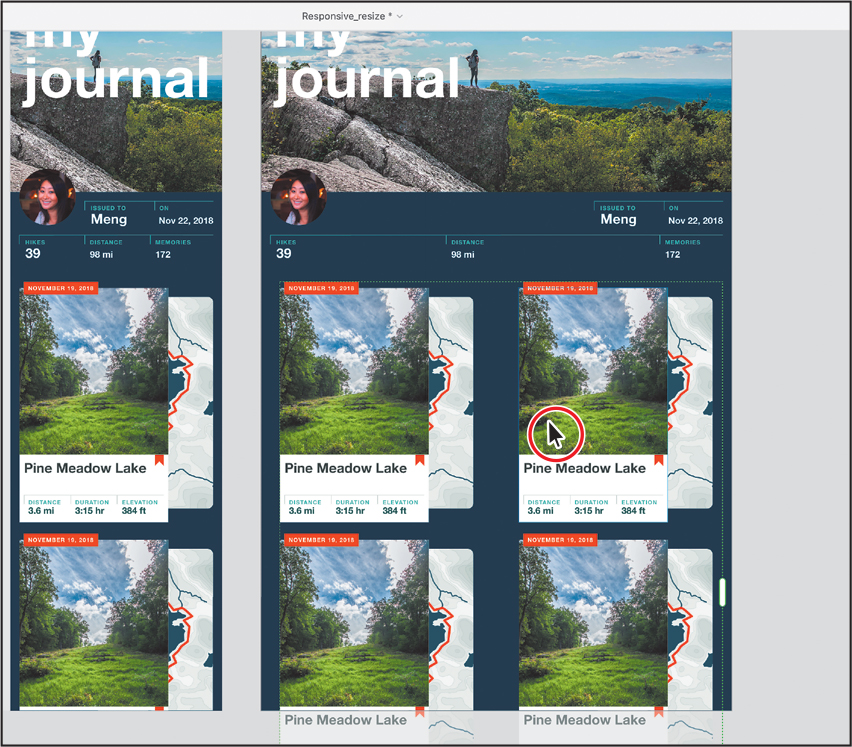
You can see that the header image resizes, the button content is separated, the repeat grid adds columns, and more. Notice that the HIKES, DISTANCE, and MEMORIES text, along with the numbers below it, is not staying together.
With responsive resize turned on for the artboard, Adobe XD analyzes the objects on the artboard, their grouping structure, their proximity to the edges of the parent group (such as the artboard), and the layout information when resizing. When resizing either objects on the artboard or the artboard itself, pink crosshairs appear on the content that is being resized. These crosshairs indicate what constraint rules are applied to a group. Constraint rules are used to determine how objects behave when you resize them. You’ll explore constraint rules in the next section.
Press Command+Z (macOS) or Ctrl+Z (Windows) to undo the artboard resizing.
Grouping content
When you resize an artboard with the responsive resize option enabled, Adobe XD does its best to recreate the placement of your elements on a larger or smaller artboard. Before resizing content, you can group similar objects to establish relationships between them. When resized, grouped objects stay together by default and allow you to establish a hierarchy in your projects.
Next, you’ll group content to keep it together when it’s resized and also set manual constraint rules. This will make more sense when you see it in action.
Zoom in to the top half of the Journal – tablet artboard.
With the Select tool (
) selected, drag across the text “MEMORIES, 172” and the short vertical line just to the left of the text and number to select it all.To group them together, press Command+G (macOS) or Ctrl+G (Windows).
Drag across the text “DISTANCE, 98 mi” and the short vertical line just to the left of the text and number to select it all.
To group them together, press Command+G (macOS) or Ctrl+G (Windows).

Click the Journal – tablet artboard name to select it. Drag the right-middle point of the artboard to the right. You can see that grouped content now stays together.

Press Command+Z (macOS) or Ctrl+Z (Windows) to undo the artboard resizing.
Next, you’ll group the content for the orange start hike button so it stays together when the artboard is resized.
Click the orange start hike button at the top of the artboard. The green border and hollow diamond in the upper-left corner indicate that it’s a component instance.
With the component instance selected, Shift-click the white double-circle on the button and the menu text. To group them together, press Command+G (macOS) or Ctrl+G (Windows).
Click the Journal – tablet artboard name to select it. Drag the right-middle point of the artboard to the right. You can see that all of the content in the orange button group now stays together.
Press Command+Z (macOS) or Ctrl+Z (Windows) to undo the artboard resizing.
Setting manual constraints
If you’re not happy with the content resizing when you resize an artboard, you can also edit constraint rules manually, which enables you to determine how objects behave when you resize the component, artboard, or group. Manual constraints you apply will always override automatic constraints placed by XD.
Click the orange “start hike” button group at the top of the artboard.
In the Layout section of the Property Inspector, there are two buttons below Responsive Resize: Auto and Manual. By default, the content in an artboard with responsive resize turned on is set to Automatic. For selected content, you can set the constraints manually by clicking the Manual button and setting which edges of the artboard you want it to stick to and whether you want to keep its height or width fixed.
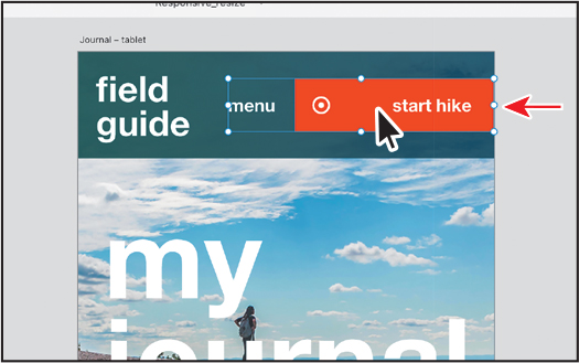
Click the Manual button to set constraints for the button group manually.
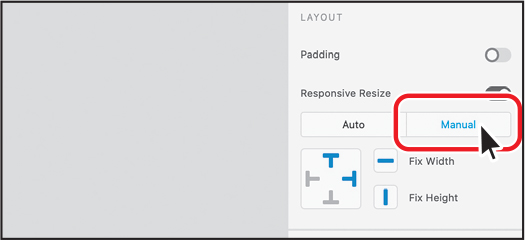
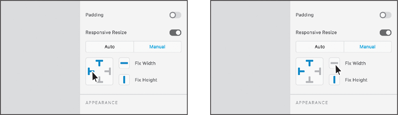
With Manual selected, you can now see position and size options. The position options are used to fix the position relative to the parent. In this case, the parent of the button group is the artboard. The Fix Width and Fix Height options can be used to ensure that the content does not resize horizontally, vertically, or both.
By default, the position of the button is set to be fixed to the top and right edges of the artboard. In this case, the button needs to stay in the same relative position it is currently in. To do that, you can set the position to Fix Left and Fix Top.
Click Fix Left (
 ).
).With Fix Left selected, Fix Right is disabled. The button group will now stay the same distance from the left edge of the artboard no matter how wide the artboard becomes.
TipIf content within a group has the Fix Width content turned off, you can choose Fix Left and Fix Right for that group.
Deselect Fix Width (
 ).
). Tip
TipUndoing by pressing Command+Z (macOS) or Ctrl+Z (Windows) can be used to undo constraint options you set.
The width of the button group will now resize horizontally. That doesn’t mean each object will get wider. It means that the content within the button will spread out to match a changing button width.
Click the Journal – tablet artboard name to select it. Drag the right-middle point of the artboard to the right a little. As you drag, you should see a faint pink line from the left edge of the orange button group to the left edge of the artboard. This is the constraint rule applied to the group—fixed left.

You can see that the left edge of the button stays the same relative distance from the left edge of the artboard. It is now fixed to the left side of the artboard. The white double-circle moves and also the orange button stretches because you turned Fix Width off for the button group.
Press Command+Z (macOS) or Ctrl+Z (Windows) to undo the artboard resizing.
Click the orange “start hike” button group at the top of the artboard again.
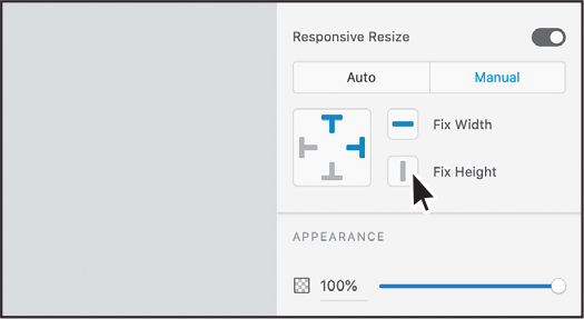
With the Manual option still selected in the Property Inspector, make sure the following are set:
Fix Top (
 ): selected
Fix Right (
 ): selected, so the selected button stays fixed to the right edge of the artboard (in this case)
Fix Left (
 ): deselected
Fix Width (
): selected, so the button content doesn’t resize anymoreFix Height (
 ): deselected
Setting the Fix Width option on the group overrides an individual object in the group which has the Fix Width option turned off. In other words, if the group can’t resize (it has a fixed width), the content within can’t either.
Click the Journal – tablet artboard name to select it. Drag the right-middle point of the artboard to the right. You can see that the orange button shape no longer resizes.

Finishing the design
When it comes to resizing artboards, responsive resize will only get you most of the way there, but it may not always get it right. To finish the design, you’ll set the artboard to a specific width and resize or move some of the content.
With the artboard still selected, change the Width value in the Property Inspector to 834. Press Return or Enter.

The content should resize like it did at the end of the previous section.
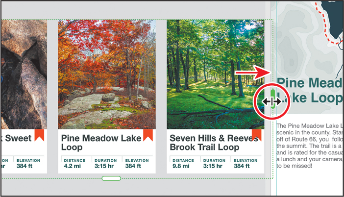
Click the repeat grid object. For the next step you may need to zoom out or scroll down. Move the pointer between the columns, and when the magenta column indicators show, drag to the right until you see a distance value above the pink column indicator of approximately 80.

Drag the handle on the right to the left so that only two columns show.

Drag the grid so it’s visually centered horizontally on the artboard. If you need to, you can also press the right or left arrow keys on your keyboard to nudge it in either direction.
 Note
NoteIf you don’t see an alignment guide, you can also just drag it so it’s visually aligned on the artboard.
Click in a blank area of the pasteboard to deselect.
To see everything, press Command+0 (macOS) or Ctrl+0 (Windows).

Press Command+S (macOS) or Ctrl+S (Windows) to save the file.
Choose File > Close (macOS) or click the X in the upper-right corner of the open window (Windows) to close the Responsive_content file.
If you plan on jumping to the next lesson, you can leave the Travel_Design.xd file open. Otherwise, choose File > Close (macOS) or click the X in the upper-right corner (Windows) for each open document.
NoteIf you started with the L7_start.xd jumpstart file, then keep that file open.
Review answers
1. Background blur uses an object as an overlay to blur content that is behind it. Most of the time, the overlay object that is used to blur content is a shape, and the color fill and border of the shape have no effect on the result. Object blur is a method for blurring selected content such as a shape or an image.
2. You apply a gradient to the fill of content by clicking the Fill color in the Property Inspector and choosing Linear Gradient or Radial Gradient from the menu at the top of the color picker.
3. In Adobe XD, you can select an object or group of objects and apply a repeat grid to easily repeat the content. With a repeat grid applied to content, you can simply pull a handle at the bottom or right side of the content and the content repeats in the direction you pull. When you modify any style of an element, the change is replicated in all the elements of the grid. For example, if you round the corners of an image in one of the elements, the corners of all images in the grid are affected.
4. To replace images in a repeat grid, go to the Finder (macOS) or Windows Explorer (Windows) and open a folder. With XD and the folder showing, drag the image(s) on top of any image in the repeat grid. When a blue highlight appears, release the mouse button to replace the image(s).
5. Enter into edit content mode by double-clicking content within a repeat grid or by Command-clicking (macOS) or Ctrl-clicking (Windows) content within a repeat grid. Then you can either create content within the repeat grid or paste content into it.