Painter X has an unsurpassed ability to create digital images with a three-dimensional (3D) look and feel. You can use almost any image with Painter X to create a textural effect in a painting. You can create paper libraries, patterns libraries, and an almost-infinite number of brushes, and you can access filter effects that can give an image a 3D look and feel. With Painter X, you are limited only by your creativity and imagination.
Painter X allows you to create images that mimic paintings done with traditional media. You can even mix media in nontraditional ways that would be impossible with traditional media; for example, you can create an image that combines watercolor and oil paint.
Chapter Contents
Creating a 3D Look with 2D Tools
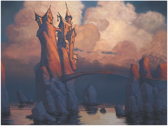
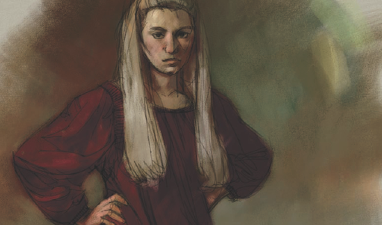
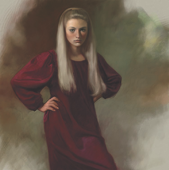
The Result First
Painting the Portrait
Finishing Touches
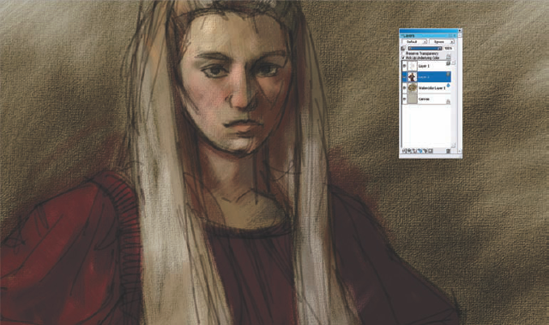
This chapter is a mix of general painting methods combined with Painter-specific features and techniques. In this chapter, I will show you how to use Painter X to paint a portrait that has the look of a traditional oil painting. You can imitate the 3D effect of oil paint by using many of the tools found in the program. While this chapter will not be an exhaustive look at using these features, it is a good start. We will build on these techniques in subsequent chapters. The actual sequence of steps used for this digital portrait is close to the method I would use to create a traditional oil painting.
I will start by giving an overview of how the entire portrait was painted. To accomplish this, I will show several methods of imitating a 3D surface when working in Painter X. As I demonstrate these methods, you will see the steps used to paint a portrait. Portrait painting is one of the artist's greatest challenges, and having a solid method to follow will help you minimize errors in your own work.
Remember that the subject matter is only a vehicle to show you techniques; you can apply these methods to any subject matter you want. There are, after all, many other types of subject matter that would benefit from the use of texture.
In this and all subsequent chapters, it is assumed that you have a basic understanding of the workings of Painter X. You should know the following things to successfully follow along with the demonstration or take what is presented and experiment on your own:
Where individual palettes and menu items are located. If certain palettes are not visible at the launch of Painter X, you should know how to access them.
How to adjust brush settings, including opacity, brush size, and, if needed, bringing up the Brush Creator.
How to scale the size of the brush and sample colors from within the painting using hot keys. Knowing this speeds up the process and natural flow when you're painting an image.
In Painter X, you can arrange the working space to suit your own way of painting. Because your setup may be different from the default, this chapter will not discuss where to locate specific features and menu items.
In this and subsequent chapters, you will be encouraged to save often and in a sequential fashion. This should become a habit, because it can help you avoid a lot of grief and frustration. In Painter X, simply hold down the Ctrl+Alt+S keys (
The painting we will create is a traditional portrait, where the likeness of the model is the primary consideration. Unlike a traditionally painted oil portrait, where it's necessary to wait for paint to dry to build up a rich surface, the digital painter does not have to worry about wet paint. One of the benefits of working digitally is the speed at which it's possible to create a painting without waiting on materials. The artist can paint, repaint, and overpaint any area at any time as much as necessary to make corrections or change direction entirely.
This tutorial shows you how to use various features found in Painter X to create a painting that imitates the rich and textured surface expected if painting the portrait using oil paint. While it is not an exhaustive demonstration of every technique available in the program, it is extensive in the number of methods shown. We will use different techniques to paint the background, fabric, hair, and flesh.
When we begin painting on the computer, we must first consider the final use of the painting and set up the canvas space accordingly. If the image will be used for print, we need to keep in mind the dpi (dots per inch) resolution of the image. While dpi is not important to the computer, it is critical to the printer, and we should set it accordingly to 300. If the plan is to display the image onscreen only, we can leave the dpi at the default setting of somewhere between 72 and 96.
Often, it is best to start with an image that is smaller than the intended final output. Starting small speeds up much of the early work, where details are not important. However, this digital painting technique relies on some early steps involving the use of texture so, in this case, it is better to begin working with the image at its final size. My initial size settings for this tutorial are about 3,000 pixels in each dimension.
Note
All the textures, patterns, and brushes that were used to create the painting are available for download at www.sybex.com/go/painter.
Let's set up the canvas, apply a texture, and get painting:
Create a new image. You can do this in several ways, including using the keyboard shortcut Ctrl+N (

Change the default resolution if you want, and put 3000 in the Height and Width fields, with Pixels as the unit of measurement.
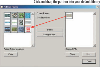
If you have not already done so, use the Pattern Selector menu to either open the Chapter 1 pattern library (
Chapter1.ptl) or, using the Pattern Mover, openChapter1.ptl, click your left mouse button on the gessoed canvas pattern, and drag it over into your default library (Figure 1.1).Make sure that the gessoed canvas pattern is active if you have copied it into your default library. If you have just opened
chapter1.ptl, you don't need to make changes.Using the Paper Selector, open the
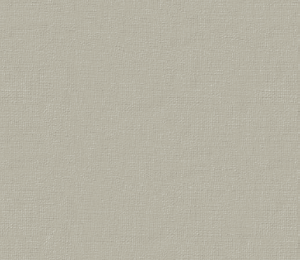
Chapter1paper library. There is only one paper texture in this library, so you may want to append your current default paper library instead of replacing it.In the toolbox, select the Paint Bucket tool (K), make sure that Clone Source is selected in the Tool Property Bar, and fill the image with the gessoed canvas pattern (Figure 1.2). You should have an image that, at 100 percent zoom, has a nice, slightly creamy fill that looks very much like a traditional artist canvas primed with a toned gesso.
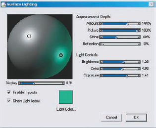
One last thing, and you will be ready to start painting. In the top menu bar, select Canvas Menu > Surface Lighting. The Surface Lighting controls open (Figure 1.3).
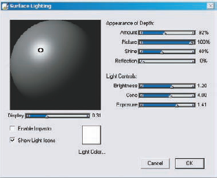
Surface Lighting determines the general depth effect of the Impasto Effect in Painter X. The default lighting of this feature is not bad, and for most work it is adequate. Making some slight adjustments to the default settings can add some subtle yet quite beautiful effects to the painting.
Choosing the right direction and color of the light source can add beautiful depth and texture to a stroke. The direction and elevation of the light source can be adjusted by clicking and dragging the small black circle in the middle of the highlight on the sphere.
Take care when changing the position of the light on the virtual globe in the Surface Lighting controls. Placing the light too high on the sphere's surface can wash out the Impasto Effect completely and lighten the entire painting. In contrast, placing the light too low can darken the image and overly exaggerate the Impasto Effect. These settings are global and affect all Impasto brushes on every layer. Figure 1.4 shows the effect of the default setting in the Surface Lighting controls.
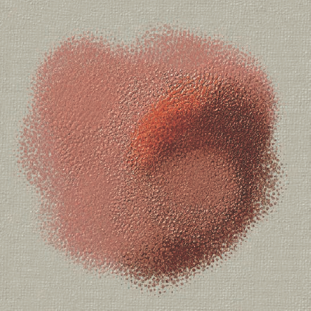
Figure 1.4. The effect that the default settings of the Surface Lighting controls have on an Impasto brushstroke
For this painting, we will make some changes to the default settings.
First, add a second light source. To add a second, third, fourth, or more light source to the image, just click with the cursor anywhere on the sphere. If you make a mistake and add more lights than you want, just click on the small black circle for the light you want to remove and press the Backspace key. You can tell which light is selected because the small circle will appear bold. Experiment with the position of the light until you are satisfied. A position that is low and to the opposite side of the primary light generally works best.
Now it's time to change the color of the light. To do this, click on the Light Color square. The system color picker appears, and you can choose any color for the second light source in the painting.
Generally, I find it best to select a darker and more saturated color. Too light a color, and the whole image will look washed out. Because this painting is a traditional portrait and I am fond of complementary color schemes, I select a bluish green color for the secondary light, as you can see in Figure 1.5.
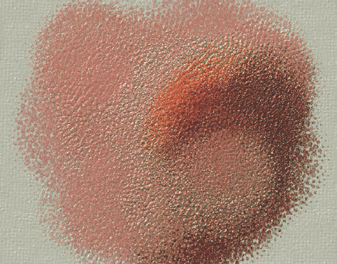
The effect should be subtle. Looking closely at the enlargement of the earlier brushstroke shows subtle greenish areas in the texture, as in Figure 1.6. Of course, there in no right or wrong when adding more light. Experiment with the controls and become familiar with their use.
Now that the preliminary work of setting up the canvas is finished, it is time to begin actually painting the image. Now would also be a good time to save your work.
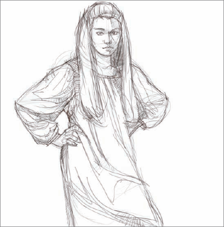
Most of the time when I start a painting, I do the preliminary sketch in pencil on paper, scan the drawing, and then open the scanned image in Painter X. Occasionally, I draw a sketch for a painting directly in the computer program. I always make sure that the sketch for a painting is on a new layer whether I use a scanned sketch or I draw directly in Painter. Working with layers in this way provides great flexibility in arranging the composition and making corrections to the drawing.
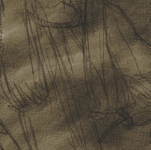
In this painting, I quickly drew the sketch in Painter X using one of the brush variants from the Pencils category on a white base. Only the bare essentials of the figure are indicated, because there is the temptation, when using a detailed drawing as the base for a painting, to work in a coloring-book mentality and just fill in the lines. Figure 1.7 shows the sketch that the painting will be based on. Save the sketch.
First we'll copy the sketch into the image where we'll do the actual painting.
Select the whole sketch image, copy it to the Clipboard, and paste it into the prepared canvas.
Change the Composite Method of the Sketch layer to Multiply, and move the sketch around until its placement in the new image is satisfactory.
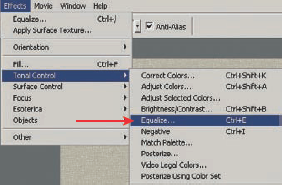
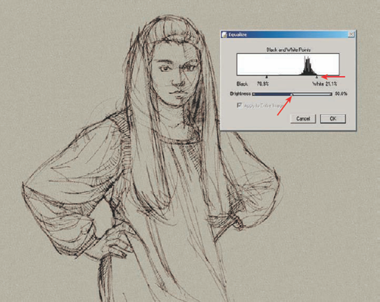
When you are happy with the composition, you can equalize the Sketch layer to get rid of the gray areas of the sketch if they are distracting. Typically, you would use the Equalize effect to place the black-and-white points and then evenly distribute the gray values between the two. Here, Equalize is used to eliminate some of the gray values by moving the white point indicator down into the gray areas. You can find the Equalize adjustments in the Effects menu, under Tonal Control. Figure 1.8 shows where to find Equalize.
Move the Brightness slider and White Point indicator slightly to the left. The image updates as you move the sliders so that you can preview the effect (Figure 1.9).
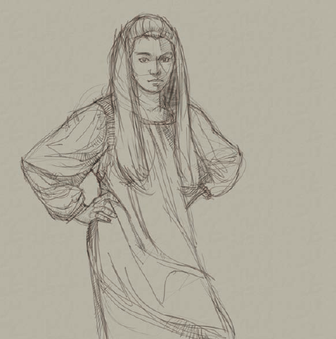
The image will look something like Figure 1.10.
Save the image using the Iterative Save command (Ctrl+Alt+S on the PC or
Note
All the brushes used in this painting are available for download as a zip file called Book Brushes.zip. at www.sybex.com/go/painter. You should have all of them installed and ready to use for the remainder of this tutorial. If you need help installing the brushes, please refer to the Painter help file.
When you paint with traditional media (except watercolor), it is often wise to paint on a mid-value ground. All colors look dark when you paint against a white ground, and that can make it hard for you to correctly judge the relationship between the light and dark values in your paintings. Using a toned ground may be even more important when you are working with digital media, because the white of the screen is so intensely bright.
Traditional media use pigment. Pigmented paint is much darker than paint made of light—which is basically what is happening on a computer. The whites are bright on a computer screen, and the value differences can be greater.
If you paint on a white canvas, eventually you will cover the surface entirely with paint, and you can then correctly judge the difference between the values of the colors. Often, though, you must adjust the colors and values that you paint in the early stages. You can avoid unnecessary repainting by toning the painting surface before you place the first stroke.
You can use various methods to change the value and color of a blank canvas before painting on the computer. Filling the area with a color using the Paint Bucket tool is often enough. For this particular project, though, we want the look and feel of a traditional oil painting, and a simple fill will not suffice. Also, the canvas already has some color and a pattern that we don't want to cover. The solution is to use one of Painter X's Watercolor brushes to paint a darker tone across the canvas. The effect will be the same as a coating of thinned oil paint brushed over a canvas.
Select the Canvas Toner brush variant.
Choose a dark brownish color, and paint a series of sweeping strokes across the canvas.
Because we are using a Watercolor brush, it will create its own new layer. Figure 1.11 shows the painting with a darker color painted over the figure and into the background, leaving a wet look.
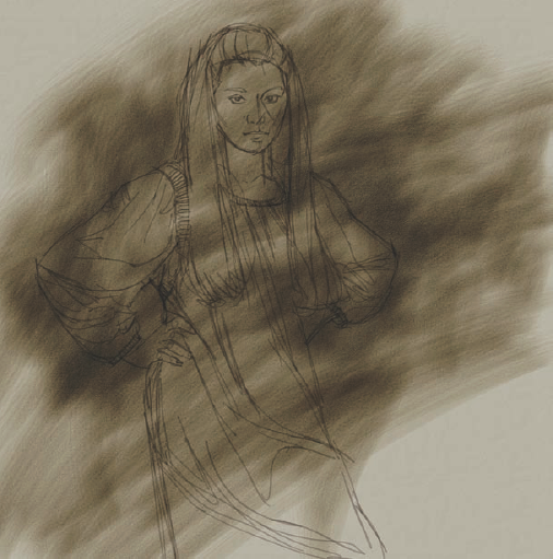
There is no need to worry about covering the underlying sketch since the Watercolor layer defaults to a Gel Composite Method, similar to Multiply, and lighter colors become progressively more transparent. The strokes will run and diffuse into the canvas paper texture. In Figure 1.12, the close-up of the painting shows how the color puddles and runs into the canvas texture.
Note that even though you paint with the Watercolor brush on its own layer above the Canvas layer, the brush and the paper texture interact as if you were painting on the canvas.
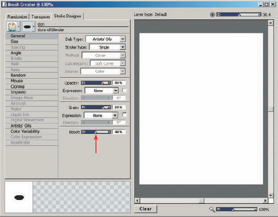
The Watercolor brushes in Painter are processor intensive. If you have a slower computer, you may see some lag to the brushstroke as you paint. This is not a technical problem, but it can be rather annoying. If you experience some lag, try increasing the Boost setting using the slider in the Brush Creator. You can access the Brush Creator using the Ctrl+B (
In traditional opaque painting, it is good practice to paint from darker to lighter colors in large and fairly rough shapes. That's a process I continue to use when I paint with the computer.
At this stage in the painting, the image often looks way too rough and sloppy, but it is not meant to be finished work. The early stage of adding color to a painting is called block-in. Blocking in color involves the simple process of roughly putting colors in the correct values and in the correct spot in the painting. There is no finesse or attempt to blend these colors. Blocking in the large shapes only establishes the basic building blocks to be refined later.
Before blocking in the colors, we need to rearrange some of the layers.
Click in the Layers palette on the Watercolor layer, and drag it down until it is the first layer above the canvas.
Click the Add Layer button at the bottom of the Layers palette, use the Layers menu, or use the keys Ctrl+Shift+N (
Change to the Brush tool if it is not already active (B key), and pick the Captured Bristle brush variant in the Acrylics brush category. This default brush is a great one to use to block colors in quickly in the initial stages of a painting. It has a brushy feel to the strokes, is opaque, and has a bristly appearance.
Keyboard Shortcuts
When you paint, there are two keyboard shortcuts you should learn and use at every opportunity. Their use will speed up your painting process.
Ctrl+Alt (Option+
The Alt key (Option on the Mac) activates the Dropper tool. Selecting colors to paint with is quick and easy: you can select colors that are created as strokes overlap, giving you some beautiful and subtle effects.
Choose a dark color and block in the dark areas of the painting on the new layer. Go ahead and use the same dark color to paint not only the fabric, but also some of the darker areas in the hair. Figure 1.14 shows this initial block-in of the dark color, as well as the arrangement of the various layers.
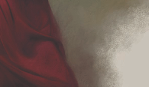
Using the same brush, continue to paint in the colors of the fabric, gradually moving to lighter colors. In the case of a deep red fabric, as in this painting, take care not to go too light with the red. Red is one of the only colors that will eventually become a different color as it is lightened. You do not want a pink costume.
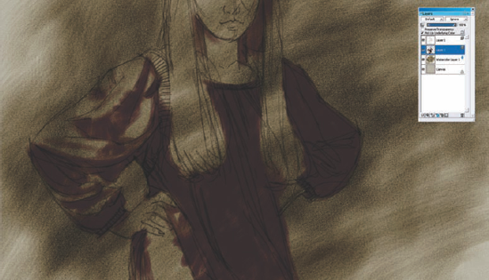
Figure 1.14. Painting in with a darker color on a new layer using the Captured Bristle Acrylic brush
Notice that some of the red also is painted over the edges of the sketch extending into the background. This apparent mess is intentional. A bit of foreground color painted into the background helps unify the color scheme. The reverse is also true. A bit of the background color brought into some of the foreground figure helps harmonize the color scheme even more. Figure 1.15 shows that most of the dress is now blocked in with red.
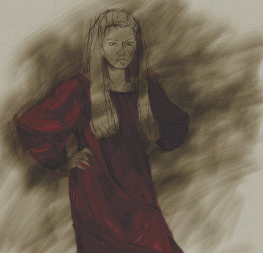
Continuing with the same brush, paint the face with a flesh color and the hair with a blonde color.
In this painting, I've tried to keep the model's hair really light to give it a nice contrast against her darker dress. Paint strokes of color across the forms in the face to give some volume to the features. A lot of color from the background is finding its way into the colors of the hair. This is intentional to help unify the color harmonies, as mentioned previously (Figure 1.16).
All of this color work is beneath the Sketch layer, as you can see in Figure 1.16. Because of the overlying sketch and the rough handling of the color, the painting is in a pretty ugly stage right now. Don't get discouraged if you think your painting is ugly. Virtually all paintings go through an ugly phase early on and will improve if the artist does not give up on it.
Without changing the brush but only varying the size and extensive use of the Dropper tool, block in the background colors.
The need to go back to the Colors palette for new colors will gradually diminish. Most colors needed to complete the painting will already be in the painting when you are finished with the block-in.
To give the painting the appearance of an oil painting, we need to add more texture to the 3D illusion.
Create a new layer above the Sketch layer. Some of the original sketch will be covered while you paint on this layer.
Pick the Variable Chalk variant from the Chalk category. This is a brush that ships with Painter X; you don't need to change any of its default settings other than size as you paint. The brush is good for painting textured surfaces. Because the paper texture that is active is gessoed canvas, the brushstrokes painted with this brush look as if they are painted on a canvas surface.
Use the Dropper tool to sample color from different areas in the canvas and paint large and bold strokes of color with the Variable Chalk brush. Work the strokes up close to the figure, and don't worry if there is the occasional overlap into the figure, as you can see on the right elbow of the model in the painting (Figure 1.17).
The nature of this particular brush is very different from the Acrylic brush that we used earlier. As we continue to build up color with the Variable Chalk brush, a softness and subtle blending begins to show, while interacting nicely with the paper texture.
Work all over the background of the painting to create a rich and textured surface.
Now we need to make a major change in the painting. To mimic the look and feel of an oil painting, we need to do the remainder of the work on one layer.
Before moving on, make sure you do an iterative save so you can recover to this spot if anything goes wrong in the next step.
We need to paint on one layer to temper the nature of the Impasto brushes that we will use. These brushes create their impasto effect on any layer where they are applied. Building on multiple layers tends to make the impasto effect on each succeeding layer shinier. While shine might be a good thing in some cases, it is not desirable for this painting. Figure 1.18 shows how the shine in the impasto effect builds from the Canvas layer on the left to the purple color on the right, which is painted on a fourth layer.
Drop all the layers onto the canvas, and save the image once again.
The painting in general is rough, and the dark sketch lines are dominant. To slightly soften the roughness of the painting and start to subordinate the sketch lines, we need to do a bit of blending. The blending should be subtle so it doesn't obliterate the colors and values that are already established in the painting.
Select the Dons Grainy Water brush, and set the Opacity slider to 15 percent. Using a light touch, blend and soften the edges in the painting. In some areas of the painting, blend along the edge to keep it crisp; in other areas, blend across the edge to soften the transition between colors and values.
Follow these general guidelines on how to handle blending and edges: keep the edges sharper and with less blending in the areas of the painting where you want the center of interest to be. Also make sharper the edges of small forms and forms that are strongly lit. The edges in areas of less interest can be softer. The edges in shadows and on large forms can also be blended more.
The blending will have an immediate result in making the painting look even worse than earlier versions. Don't worry; this is a normal precursor to finishing the painting. Figure 1.19 shows the painting after blending. The dark sketch lines are now significantly reduced in strength and opacity. Some of the edges where the figure meets the background are very soft, with color from the figure spilling into the background and vice versa. The edges of the hair are blended into the fabric and background, giving a soft base to later finish the hair on.
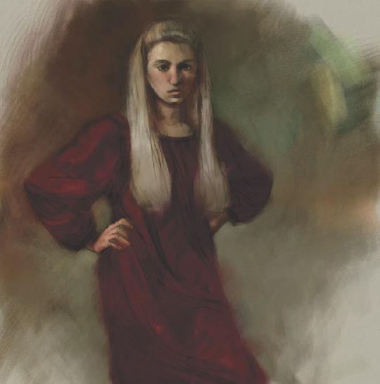
Figure 1.19. Using Dons Grainy Water brush to blend and soften the painting. Notice that the dark sketch lines are not nearly as strong now.
This is the end of the block-in stage of the painting. The basic colors and values are now established and, in many ways, you've completed the most important stage of a painting. For all practical purposes, the look of the painting is now established. From this point on, the work is meant to refine what is painted.
The block-in is a relatively easy phase of the painting process that quickly sets the tone for the painting. Most of the work is just beginning. The finish takes those early building blocks and refines them.
Most of the painting is going to be done with Impasto brushes. You can find all the brushes used in the painting in the Chapter 1 brush library.
There are a few things you should be aware of as you paint using Impasto brushes:
You can turn the Impasto effect on and off to view the painting without the 3D effect. Sometimes this is valuable when you're working on small details in the painting. To temporarily turn off the Impasto Effect, just click on the Toggle Impasto Effect button. It is the small blue star in the upper-right corner of the document window. Then click the star again to turn the Impasto Effect back on. The appearance of the shape will either look flat if the Impasto Effect is off or look 3D if the Impasto Effect is on (Figure 1.20).
When you move the painting around in the document window, you may feel a bit of lag as the image redraws. When zooming in and out, you may also experience some redraw problems with areas of the image that did not zoom in or out correctly (Figure 1.21). If you find this a nuisance, click the Toggle Impasto Effect button temporarily off. The redraw issues are caused by the computer processor trying to keep up drawing the effect as you move the image around in real time; sometimes it just can't keep up.
You might want to turn off the impasto effect while you paint. Areas of fine detail are often easier to paint if Impasto is temporarily turned off.
At times, too much impasto is visible, and it distracts from the painting. Should this be the case, you can use the brush called Depth Equalizer to remove some of the impasto depth. This is a default Painter X brush and found in the Impasto category. Use it carefully, or you can remove too much too quickly. Included in the Chapter1 brushes is my own variant of the brush that I think is a bit easier to use.
There is no correct way to approach the painting process from this point on; you may have a method that works better for your particular style. My usual process is to work from the dark to the light. I also move around the image working on different areas as I finish the painting. If you're following along, let's continue.
Select the Dons Oil 3 brush. This is a fine-bristled brush that was made to work on smaller areas with only a bit of the Impasto effect visible. It is the perfect brush to paint the face of the portrait. Leave the brush at the default settings to begin.
Paint and refine the features in the face. Place the brushstrokes across the forms in the face to give a sense of roundness. The direction of the brushstrokes is clearly visible in Figure 1.22. You need to pick some colors from the Colors palette, and others you can sample using the Dropper tool from different areas in the painting. Some dark reds from the dress are placed in the deep shadow areas of the face and hair. Bright oranges are placed under the chin. Background greens and golds are used in the shadow areas of the face and hair. The most obvious green is on the shadow side of the chin and cheek.
Using a lighter pressure with this brush gives you a smaller stroke, enabling you to paint smaller areas and details. Loosely paint the features in the face without changing the brush size.
Paint the detail in her hair. The strokes used to paint her hair follow the flow of her hair.
Switch to Dons Opaque Oil 2 brush. This brush is similar to the brush you just used, with a few modifications. The most important difference is that the number of bristles is larger, giving a smoother and thicker stroke. Brushes that have many bristles are quite processor intensive, so you should take care when using them at large sizes. Too large of a brush, and a significant lag will accompany the stroke.
Paint the hair, and begin to paint the background using the brush. All colors are sampled from the image at this point. This brush is covering the canvas texture created in the block-in stage. That's okay since traditional oil paint often does cover the texture of the canvas it is painted on. The goal is to begin to produce strokes that have the thick, wet feel of real oil paint. There is also some subtle impasto starting to show in the hair (Figure 1.22).
Switch brushes again and pick Dons Oils. This is a large brush made for painting large and rough strokes into the background of an image. The Impasto setting of this brush makes the strokes look 3D and gives a nice thick-paint feel to the areas where it is used.
Now the fun begins. Using colors selected from the background, paint some bold strokes back into the background. Use short and choppy strokes to start. This brush will cover most of the canvas texture from earlier steps, but do not paint into the corners of the image where the light areas of the canvas are still visible. Some of the canvas texture needs to be visible in the corners for later in the process. Notice that the harder the pressure is on the stylus, the more pronounced the impasto. Enjoy experimenting with the brush. There is no right or wrong way to paint in the background. The result is to create the look and feel of paint built up on the canvas (Figure 1.23).
Pick the brush Dons Oils 2. This brush is similar to Dons Oils except that it is better for longer and more decorative strokes.
Paint into the background areas that border the fabric of the dress. Using longer strokes and varying the direction, begin to build up areas that look very much like thick paint. Varying amounts of pressure affect the depth and size of the stroke.
Move on to the dress and, using the Dropper to pick the color, start with the darker areas of the fabric and paint some nice thick strokes. I generally paint across the form of the dress just as in the face to add dimension to the folds (Figure 1.24).
A few of the original sketch strokes are still visible in the hands and hair, but most have been covered by this time. The rest will be covered shortly.
Using the same brush, add long strokes of color to the hair. Take care to make sure that the strokes of the brush conform to the direction that the hair flows. The impasto of the stroke helps the illusion of painted hair (Figure 1.25).
Much of the work in the next few images is just a matter of moving around the image, switching brushes, and continuing to refine the painting. If there is any step that is unusual, I will describe the technique. Otherwise, the only changes to the brushes will be increasing their size up or down. Follow along so you can see how the work is done, but for the time being, there are no shortcuts or special techniques other than just painting.
Moving back to paint on the face, switch brushes to Dons Opaque Oil 2. This brush has more small bristles and is just the thing for more delicate work. Continue to build the colors of the face carefully, trying to get a bit more finish. The strokes of the brush are still being built up across the forms as they start to blend together visually. There is no blending going on other than that which happens as the brushstrokes overlap.
It is never good to complete one area of a painting and then move on to the next. It is better to move constantly around trying to bring the whole image to completion at the same time. If you paint one area at a time, there is a good chance that the painting as a whole will not work well visually. The color might be spotty, or the values may be off. There are any number of small problems that arise when focusing on small areas. In the end, you will find yourself moving around and trying to make fixes and adjustments. Too narrow a focus is particularly hard in digital painting, where you are able to zoom into one particular area for work without seeing the rest of the painting.
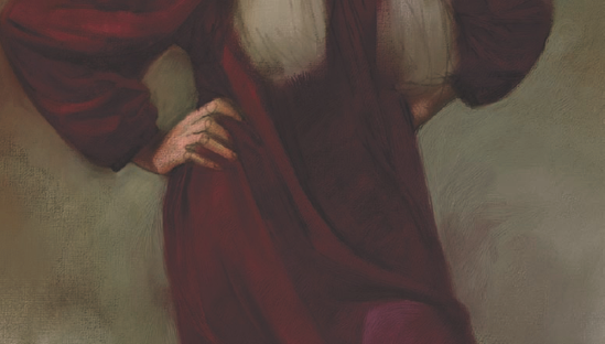
Use the same brush that you used to paint the face—Dons Opaque 2—to paint the hands. Because the hands are not the center of interest, more impasto is built up as they are painted. Impasto can become distracting, so it's best to keep it to a minimum in the face and use it with more abandon everywhere else.
Also, paint some of the background around the hands. Paint the tips of the fingernails using a light background color. Then add some bright and slightly magenta color to the fabric by the hands. This is the lightest red color that will be used in the dress; going much lighter could push the color toward pink (Figure 1.26).

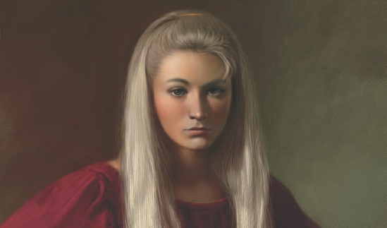
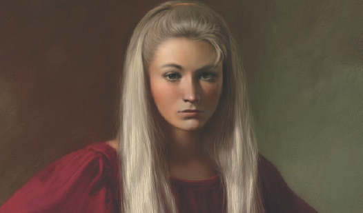
Overall, the painting is coming along nicely. Continue to do more work on the face, dress, and background. Add a hairclip on the top of her head. Figure 1.27 shows the entire painting at this point.
The painting is finished enough that we can add some of the smaller details. Adding detail is always a bit tricky. Too much, and the painting will look overworked. Too few, and a painting can look unfinished.
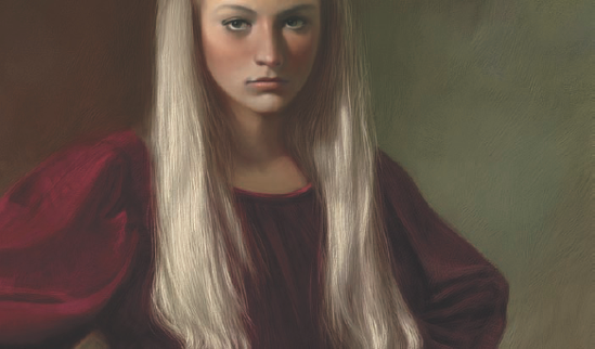
Move back to the hair and pick the Dons Oil 3 brush. Because this brush will paint with smaller bristles when using less pressure on the stylus, not much resizing is necessary. Paint in some smaller strands of hair in both the shadow and light side of the hair. Use the Dropper to select the right colors. Be careful not to overdo the number of small strands of hair that are painted. Too many, and the effect will be artificial. Figure 1.28 shows the smaller strands of hair painted into the larger hair masses.
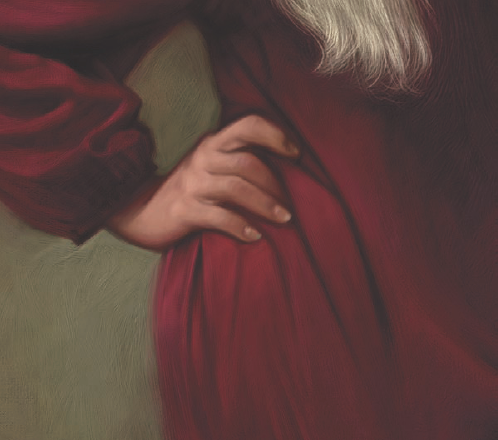
Finish the hand. There is not nearly as much detail put into the hand as the face. Paint colors from the dress into the fingers and into the shadow areas. The addition of the red color warms the hand and harmonizes with the dress. Hands are quite red naturally, so the addition of the red lends reality to the painting (Figure 1.29).
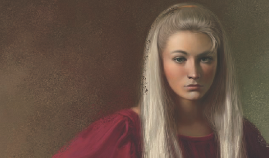
The figure is nearly finished. Add a few small details, such as small strands of hair falling over the forehead (Figure 1.30).
At some point, an image can stand on its own and be called finished. This painting has reached a point where I could probably call it finished. There are just a few more things I want to do to help polish the piece. These things include
Working in the background corners just a bit more to make the area look like canvas.
Giving the overall painting just a few touches here and there to refine the look of an oil painting. Mostly this will be adding back in some of the canvas texture.
Setting the painting aside for a few days and then looking at it with a fresh eye. There are small areas needing additional work in every painting that often are overlooked simply because of an artist's fatigue when looking at their own work. Not looking at an image for several days can give you a fresh outlook. While not exactly a part of the painting finish, this is critical to producing the best painting possible.
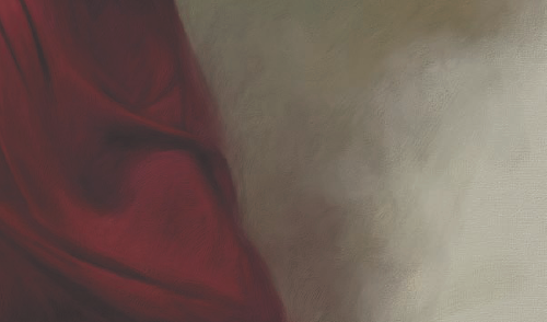
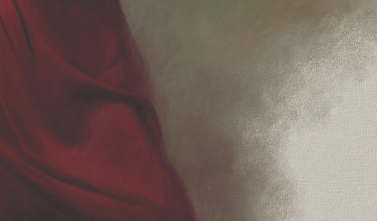
First we need to fine-tune the two lower corners of the painting to make sure that the canvas looks as if it has been painted over with oil paint. Figure 1.31 shows the bottom-right corner of the painting.
This area does not look too bad. The canvas texture shows well in the corner, and the painted textures show up well as you get closer to the figure. If possible, though, I would like to have the paint look more like it was dry brushed over the canvas texture. Here is how to go about creating the dry brush look:
Select the Dons Oil Scumble brush. This brush will dramatically interact with the paper texture. Using the Dropper tool, select the light canvas color in the bottom-right corner of the painting, and paint some rough strokes into the textured areas.
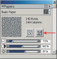
Invert the paper texture in the Papers palette. To do this, just click on the Invert Paper button. Figure 1.32 shows the location of this button in the Papers palette.
Select a color from within the painted and textured area, and paint back into the canvas corner. The result should look something like Figure 1.33.
Clone the image by using the Clone command located in the File menu. The cloned image appears and becomes the active image, with the original behind it. It is interesting to note that when an image is cloned, the Impasto effect is flattened down into the painting. The small star button no longer has an effect when you click on it.
Close the original image. Save the clone image with a new sequential name, and clone the new image once again. You should now have the original clone and a clone of the clone.
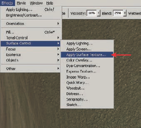
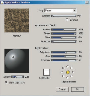
With the clone image active, select Surface Control > Apply Surface Texture from the Effects menu (Figure 1.34).
The Apply Surface Texture box has many options. Move the Amount slider down to about 32% and the Shine slider to 0%, and then click OK (Figure 1.35).
The canvas texture is applied to the entire surface of the cloned image (Figure 1.36).
Save and rename the cloned image. Do not close it. In the File menu, go to Clone Source, and make sure the textured image is selected with a check by its name. Minimize the painting so it is out of the way.
Choose the Soft Cloner brush from the Cloning Brushes category, and clone the rough, textured image back into the corner of the painting (Figure 1.37). There is now a much more convincing transition from the rough canvas texture of the canvas into the painted textures.
Carefully, and with a light touch, clone a bit of the canvas textured painting back into the original. This mimics convincingly the effect of canvas showing through the paint here and there in a traditional oil painting.
In a traditional painting, the dark passages are usually thinner paint than the lighter areas, so it is particularly appropriate to clone back in some of the canvas textures in the darker areas (Figure 1.38).
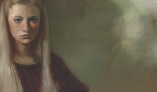
The painting is now looking quite convincing and really could be considered finished. However, a bit more texture in the background would contrast nicely with the smoother areas of the face. We can add this texture easily using one additional brush.
Select the Oil Splatter 2 brush from the brush picker. This brush is a captured dab brush that has been customized so it will resemble splattered paint.
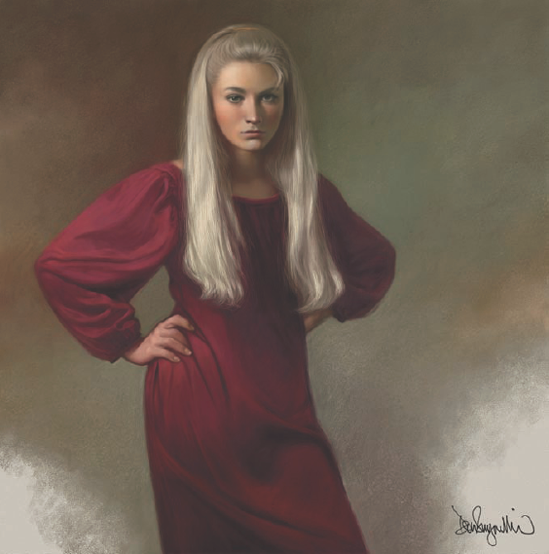
Create a new layer and, selecting colors from within the background, paint some splatter textures. Paint as many or as few as you like. Do not worry about the edges of the figure. Because the strokes are being painted on a new layer, any splatter that covers the edges of the figure can be erased (Figure 1.39).
Once you have erased the edges, drop the textured layer onto the canvas.
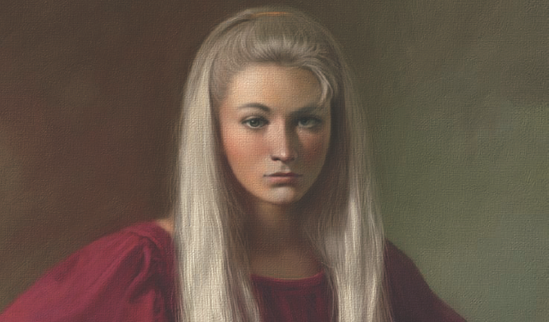
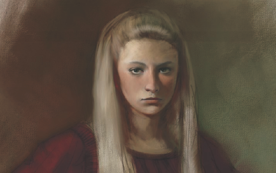
A few minor changes are made to the edges of the figure. Then I add my signature on a new layer, and the painting is done. Figure 1.40 shows the complete and finished painting.
While the subject matter of this tutorial was a portrait, the real reason for doing this tutorial was to show some of the many ways that texture can be added and used in a digital painting. A few approaches we used in this painting included
Filling an image with a texture made from a photograph
Painting with Impasto brushes
Applying a surface texture to an image
There are as many ways to apply a texture as there are reasons for wanting to use texture in a painting. In this case, we wanted to make something created on the computer look as if it were created with traditional media.
The techniques demonstrated here will not replace a good painting, and you should not rely on them to rescue a work of art. When used in conjunction with good art skills, textures can give your painting that little extra something.
In subsequent chapters, we will use more texture techniques, but I hope that this first chapter will fire your imagination to try new and original approaches as you paint.