Chapter 8. Data Manipulation and Visualization in R
American statistician Ronald Thisted once quipped: “Raw data, like raw potatoes, usually require cleaning before use.” Data manipulation takes time, and you’ve felt the pain if you’ve ever done the following:
-
Select, drop, or create calculated columns
-
Sort or filter rows
-
Group by and summarize categories
-
Join multiple datasets by a common field
Chances are, you’ve done all of these in Excel…a lot, and you’ve probably dug into celebrated features like VLOOKUP() and PivotTables to accomplish them. In this chapter, you’ll learn the R equivalents of these techniques, particularly with the help of dplyr.
Data manipulation often goes hand in hand with visualization: as mentioned, humans are remarkably adept at visually processing information, so it’s a great way to size up a dataset. You’ll learn how to visualize data using the gorgeous ggplot2 package, which like dplyr is part of the tidyverse. This will put you on solid footing to explore and test relationships in data using R, which will be covered in Chapter 9. Let’s get started by calling in the relevant packages. We’ll also be using the star dataset from the book’s companion repository in this chapter, so we can import it now:
library(tidyverse)library(readxl)star<-read_excel('datasets/star/star.xlsx')head(star)#> # A tibble: 6 x 8#> tmathssk treadssk classk totexpk sex freelunk race schidkn#> <dbl> <dbl> <chr> <dbl> <chr> <chr> <chr> <dbl>#> 1 473 447 small.class 7 girl no white 63#> 2 536 450 small.class 21 girl no black 20#> 3 463 439 regular.with.aide 0 boy yes black 19#> 4 559 448 regular 16 boy no white 69#> 5 489 447 small.class 5 boy yes white 79#> 6 454 431 regular 8 boy yes white 5
Data Manipulation with dplyr
dplyr is a popular package built to manipulate tabular data structures. Its many functions, or verbs, work similarly and can be easily used together. Table 8-1 lists some common dplyr functions and their uses; this chapter covers each of these.
| Function | What it does |
|---|---|
|
Selects given columns |
|
Creates new columns based on existing columns |
|
Renames given columns |
|
Reorders rows given criteria |
|
Selects rows given criteria |
|
Groups rows by given columns |
|
Aggregates values for each group |
|
Joins matching records from Table B to Table A; result is |
For the sake of brevity, I won’t cover all of the functions of dplyr or even all the ways to use the functions that we do cover. To learn more about the package, check out R for Data Science by Hadley Wickham and Garrett Grolemund (O’Reilly). You can also access a helpful cheat sheet summarizing how the many functions of dplyr work together by navigating in RStudio to Help → Cheatsheets → Data Transformation with dplyr.
Column-Wise Operations
Selecting and dropping columns in Excel often requires hiding or deleting them. This can be difficult to audit or reproduce, because hidden columns are easily overlooked, and deleted columns aren’t easily recovered. The select() function can be used to choose given columns from a data frame in R. For select(), as with each of these functions, the first argument will be which data frame to work with. Additional arguments are then provided to manipulate the data in that data frame. For example, we can select tmathssk, treadssk, and schidkin from star like this:
select(star,tmathssk,treadssk,schidkn)#> # A tibble: 5,748 x 3#> tmathssk treadssk schidkn#> <dbl> <dbl> <dbl>#> 1 473 447 63#> 2 536 450 20#> 3 463 439 19#> 4 559 448 69#> 5 489 447 79#> 6 454 431 5#> 7 423 395 16#> 8 500 451 56#> 9 439 478 11#> 10 528 455 66#> # ... with 5,738 more rows
We can also use the - operator with select() to drop given columns:
select(star,-tmathssk,-treadssk,-schidkn)#> # A tibble: 5,748 x 5#> classk totexpk sex freelunk race#> <chr> <dbl> <chr> <chr> <chr>#> 1 small.class 7 girl no white#> 2 small.class 21 girl no black#> 3 regular.with.aide 0 boy yes black#> 4 regular 16 boy no white#> 5 small.class 5 boy yes white#> 6 regular 8 boy yes white#> 7 regular.with.aide 17 girl yes black#> 8 regular 3 girl no white#> 9 small.class 11 girl no black#> 10 small.class 10 girl no white
A more elegant alternative here is to pass all unwanted columns into a vector, then drop it:
select(star,-c(tmathssk,treadssk,schidkn))#> # A tibble: 5,748 x 5#> classk totexpk sex freelunk race#> <chr> <dbl> <chr> <chr> <chr>#> 1 small.class 7 girl no white#> 2 small.class 21 girl no black#> 3 regular.with.aide 0 boy yes black#> 4 regular 16 boy no white#> 5 small.class 5 boy yes white#> 6 regular 8 boy yes white#> 7 regular.with.aide 17 girl yes black#> 8 regular 3 girl no white#> 9 small.class 11 girl no black#> 10 small.class 10 girl no white
Keep in mind that in the previous examples, we’ve just been calling functions: we didn’t actually assign the output to an object.
One more bit of shorthand for select() is to use the : operator to select everything between two columns, inclusive. This time, I will assign the results of selecting everything from tmathssk to totexpk back to star:
star<-select(star,tmathssk:totexpk)head(star)#> # A tibble: 6 x 4#> tmathssk treadssk classk totexpk#> <dbl> <dbl> <chr> <dbl>#> 1 473 447 small.class 7#> 2 536 450 small.class 21#> 3 463 439 regular.with.aide 0#> 4 559 448 regular 16#> 5 489 447 small.class 5#> 6 454 431 regular 8
You’ve likely created calculated columns in Excel; mutate() will do the same in R. Let’s create a column new_column of combined reading and math scores. With mutate(), we’ll provide the name of the new column first, then an equal sign, and finally the calculation to use. We can refer to other columns as part of the formula:
star<-mutate(star,new_column=tmathssk+treadssk)head(star)#> # A tibble: 6 x 5#> tmathssk treadssk classk totexpk new_column#> <dbl> <dbl> <chr> <dbl> <dbl>#> 1 473 447 small.class 7 920#> 2 536 450 small.class 21 986#> 3 463 439 regular.with.aide 0 902#> 4 559 448 regular 16 1007#> 5 489 447 small.class 5 936#> 6 454 431 regular 8 885
mutate() makes it easy to derive relatively more complex calculated columns such as logarithmic transformations or lagged variables; check out the help documentation for more.
new_column isn’t a particularly helpful name for total score. Fortunately, the rename() function does what it sounds like it would. We’ll specify what to name the new column in place of the old:
star<-rename(star,ttl_score=new_column)head(star)#> # A tibble: 6 x 5#> tmathssk treadssk classk totexpk ttl_score#> <dbl> <dbl> <chr> <dbl> <dbl>#> 1 473 447 small.class 7 920#> 2 536 450 small.class 21 986#> 3 463 439 regular.with.aide 0 902#> 4 559 448 regular 16 1007#> 5 489 447 small.class 5 936#> 6 454 431 regular 8 885
Row-Wise Operations
Thus far we’ve been operating on columns. Now let’s focus on rows; specifically sorting and filtering. In Excel, we can sort by multiple columns with the Custom Sort menu. Say for example we wanted to sort this data frame by classk, then treadssk, both ascending. Our menu in Excel to do this would look like Figure 8-1.

Figure 8-1. The Custom Sort menu in Excel
We can replicate this in dplyr by using the arrange() function, including each column in the order in which we want the data frame sorted:
arrange(star,classk,treadssk)#> # A tibble: 5,748 x 5#> tmathssk treadssk classk totexpk ttl_score#> <dbl> <dbl> <chr> <dbl> <dbl>#> 1 320 315 regular 3 635#> 2 365 346 regular 0 711#> 3 384 358 regular 20 742#> 4 384 358 regular 3 742#> 5 320 360 regular 6 680#> 6 423 376 regular 13 799#> 7 418 378 regular 13 796#> 8 392 378 regular 13 770#> 9 392 378 regular 3 770#> 10 399 380 regular 6 779#> # ... with 5,738 more rows
We can pass the desc() function to a column if we’d like that column to be sorted descendingly.
# Sort by classk descending, treadssk ascendingarrange(star,desc(classk),treadssk)#> # A tibble: 5,748 x 5#> tmathssk treadssk classk totexpk ttl_score#> <dbl> <dbl> <chr> <dbl> <dbl>#> 1 412 370 small.class 15 782#> 2 434 376 small.class 11 810#> 3 423 378 small.class 6 801#> 4 405 378 small.class 8 783#> 5 384 380 small.class 19 764#> 6 405 380 small.class 15 785#> 7 439 382 small.class 8 821#> 8 384 384 small.class 10 768#> 9 405 384 small.class 8 789#> 10 423 384 small.class 21 807
Excel tables include helpful drop-down menus to filter any column by given conditions. To filter a data frame in R, we’ll use the aptly named filter() function. Let’s filter star to keep only the records where classk is equal to small.class. Remember that because we are checking for equality rather than assigning an object, we’ll have to use == and not = here:
filter(star,classk=='small.class')#> # A tibble: 1,733 x 5#> tmathssk treadssk classk totexpk ttl_score#> <dbl> <dbl> <chr> <dbl> <dbl>#> 1 473 447 small.class 7 920#> 2 536 450 small.class 21 986#> 3 489 447 small.class 5 936#> 4 439 478 small.class 11 917#> 5 528 455 small.class 10 983#> 6 559 474 small.class 0 1033#> 7 494 424 small.class 6 918#> 8 478 422 small.class 8 900#> 9 602 456 small.class 14 1058#> 10 439 418 small.class 8 857#> # ... with 1,723 more rows
We can see from the tibble output that our filter() operation only affected the number of rows, not the columns. Now we’ll find the records where treadssk is at least 500:
filter(star,treadssk>=500)#> # A tibble: 233 x 5#> tmathssk treadssk classk totexpk ttl_score#> <dbl> <dbl> <chr> <dbl> <dbl>#> 1 559 522 regular 8 1081#> 2 536 507 regular.with.aide 3 1043#> 3 547 565 regular.with.aide 9 1112#> 4 513 503 small.class 7 1016#> 5 559 605 regular.with.aide 5 1164#> 6 559 554 regular 14 1113#> 7 559 503 regular 10 1062#> 8 602 518 regular 12 1120#> 9 536 580 small.class 12 1116#> 10 626 510 small.class 14 1136#> # ... with 223 more rows
It’s possible to filter by multiple conditions using the & operator for “and” along with the | operator for “or.” Let’s combine our two criteria from before with &:
# Get records where classk is small.class and# treadssk is at least 500filter(star,classk=='small.class'&treadssk>=500)#> # A tibble: 84 x 5#> tmathssk treadssk classk totexpk ttl_score#> <dbl> <dbl> <chr> <dbl> <dbl>#> 1 513 503 small.class 7 1016#> 2 536 580 small.class 12 1116#> 3 626 510 small.class 14 1136#> 4 602 518 small.class 3 1120#> 5 626 565 small.class 14 1191#> 6 602 503 small.class 14 1105#> 7 626 538 small.class 13 1164#> 8 500 580 small.class 8 1080#> 9 489 565 small.class 19 1054#> 10 576 545 small.class 19 1121#> # ... with 74 more rows
Aggregating and Joining Data
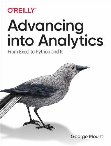
I like to call PivotTables “the WD-40 of Excel” because they allow us to get our data “spinning” in different directions for easy analysis. For example, let’s recreate the PivotTable in Figure 8-2 showing the average math score by class size from the star dataset:
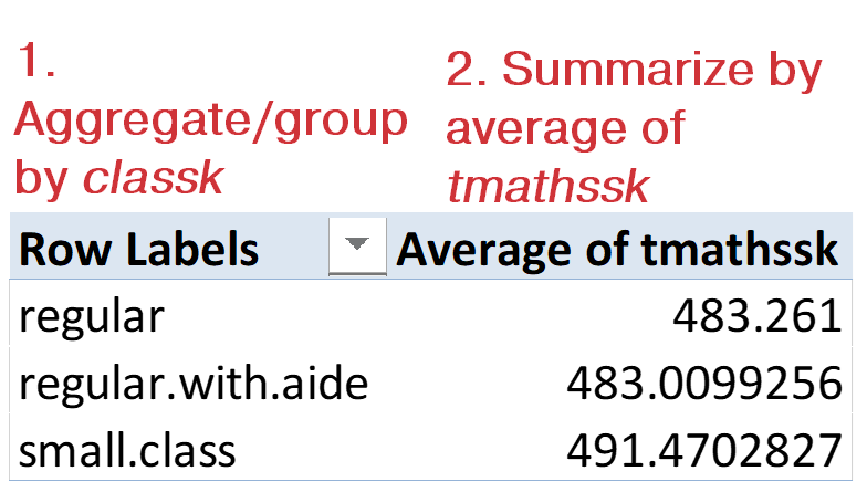
Figure 8-2. How Excel PivotTables work
As Figure 8-2 calls out, there are two elements to this PivotTable. First, I aggregated our data by the variable classk. Then, I summarized it by taking an average of tmathssk. In R, these are discrete steps, using different dplyr functions. First, we’ll aggregate the data using group_by(). Our output includes a line, # Groups: classk [3], indicating that star_grouped is split into three groups with the classk variable:
star_grouped<-group_by(star,classk)head(star_grouped)#> # A tibble: 6 x 5#> # Groups: classk [3]#> tmathssk treadssk classk totexpk ttl_score#> <dbl> <dbl> <chr> <dbl> <dbl>#> 1 473 447 small.class 7 920#> 2 536 450 small.class 21 986#> 3 463 439 regular.with.aide 0 902#> 4 559 448 regular 16 1007#> 5 489 447 small.class 5 936#> 6 454 431 regular 8 885
We’ve grouped our data by one variable; now let’s summarize it by another with the summarize() function (summarise() also works). Here we’ll specify what to name the resulting column, and how to calculate it. Table 8-2 lists some common aggregation functions.
| Function | Aggregation type |
|---|---|
|
Sum |
|
Count values |
|
Average |
|
Highest value |
|
Lowest value |
|
Standard deviation |
We can get the average math score by class size by running summarize() on our grouped data frame:
summarize(star_grouped,avg_math=mean(tmathssk))#> `summarise()` ungrouping output (override with `.groups` argument)#> # A tibble: 3 x 2#> classk avg_math#> <chr> <dbl>#> 1 regular 483.#> 2 regular.with.aide 483.#> 3 small.class 491.
The `summarise()` ungrouping output error is a warning that you’ve ungrouped the grouped tibble by aggregating it. Minus some formatting differences, we have the same results as Figure 8-2.
If PivotTables are the WD-40 of Excel, then VLOOKUP() is the duct tape, allowing us to easily combine data from multiple sources. In our original star dataset, schidkin is a school district indicator. We dropped this column earlier in this chapter, so let’s read it in again. But what if in addition to the indicator number we actually wanted to know the names of these districts? Fortunately, districts.csv in the book repository has this information, so let’s read both in and come up with a strategy for combining them:
star<-read_excel('datasets/star/star.xlsx')head(star)#> # A tibble: 6 x 8#> tmathssk treadssk classk totexpk sex freelunk race schidkn#> <dbl> <dbl> <chr> <dbl> <chr> <chr> <chr> <dbl>#> 1 473 447 small.class 7 girl no white 63#> 2 536 450 small.class 21 girl no black 20#> 3 463 439 regular.with.aide 0 boy yes black 19#> 4 559 448 regular 16 boy no white 69#> 5 489 447 small.class 5 boy yes white 79#> 6 454 431 regular 8 boy yes white 5districts<-read_csv('datasets/star/districts.csv')#> -- Column specification -----------------------------------------------------#> cols(#> schidkn = col_double(),#> school_name = col_character(),#> county = col_character()#> )head(districts)#> # A tibble: 6 x 3#> schidkn school_name county#> <dbl> <chr> <chr>#> 1 1 Rosalia New Liberty#> 2 2 Montgomeryville Topton#> 3 3 Davy Wahpeton#> 4 4 Steelton Palestine#> 5 6 Tolchester Sattley#> 6 7 Cahokia Sattley
It appears that what’s needed is like a VLOOKUP(): we want to “read in” the school_name (and possibly the county) variables from districts into star, given the shared schidkn variable. To do this in R, we’ll use the methodology of joins, which comes from relational databases, a topic that was touched on in Chapter 5. Closest to a VLOOKUP() is the left outer join, which can be done in dplyr with the left_join() function. We’ll provide the “base” table first (star) and then the “lookup” table (districts). The function will look for and return a match in districts for every record in star, or return NA if no match is found. I will keep only some columns from star for less overwhelming console output:
# Left outer join star on districtsleft_join(select(star,schidkn,tmathssk,treadssk),districts)#> Joining, by = "schidkn"#> # A tibble: 5,748 x 5#> schidkn tmathssk treadssk school_name county#> <dbl> <dbl> <dbl> <chr> <chr>#> 1 63 473 447 Ridgeville New Liberty#> 2 20 536 450 South Heights Selmont#> 3 19 463 439 Bunnlevel Sattley#> 4 69 559 448 Hokah Gallipolis#> 5 79 489 447 Lake Mathews Sugar Mountain#> 6 5 454 431 NA NA#> 7 16 423 395 Calimesa Selmont#> 8 56 500 451 Lincoln Heights Topton#> 9 11 439 478 Moose Lake Imbery#> 10 66 528 455 Siglerville Summit Hill#> # ... with 5,738 more rows
left_join() is pretty smart: it knew to join on schidkn, and it “looked up” not just school_name but also county. To learn more about joining data, check out the help documentation.
In R, missing observations are represented as the special value NA. For example, it appears that no match was found for the name of district 5. In a VLOOKUP(), this would result in an #N/A error. An NA does not mean that an observation is equal
to zero, only that its value is missing. You may see other special values such as
NaN or NULL while programming R; to learn more about them, launch the help
documentation.
dplyr and the Power of the Pipe (%>%)
As you’re beginning to see, dplyr functions are powerful and rather intuitive to anyone who’s worked with data, including in Excel. And as anyone who’s worked with data knows, it’s rare to prepare the data as needed in just one step. Take, for example, a typical data analysis task that you might want to do with star:
Find the average reading score by class type, sorted high to low.
Knowing what we do about working with data, we can break this into three distinct steps:
-
Group our data by class type.
-
Find the average reading score for each group.
-
Sort these results from high to low.
We could carry this out in dplyr doing something like the following:
star_grouped<-group_by(star,classk)star_avg_reading<-summarize(star_grouped,avg_reading=mean(treadssk))#> `summarise()` ungrouping output (override with `.groups` argument)#>star_avg_reading_sorted<-arrange(star_avg_reading,desc(avg_reading))star_avg_reading_sorted#>#> # A tibble: 3 x 2#> classk avg_reading#> <chr> <dbl>#> 1 small.class 441.#> 2 regular.with.aide 435.#> 3 regular 435.
This gets us to an answer, but it took quite a few steps, and it can be hard to follow along with the various functions and object names. The alternative is to link these functions together with the %>%, or pipe, operator. This allows us to pass the output of one function directly into the input of another, so we’re able to avoid continuously renaming our inputs and outputs. The default keyboard shortcut for this operator is Ctrl+Shift+M for Windows, Cmd-Shift-M for Mac.
Let’s re-create the previous steps, this time with the pipe operator. We’ll place each function on its own line, combining them with %>%.
While it’s not necessary to place each step on its own line, it’s often preferred for legibility. When using the pipe operator, it’s also not necessary to highlight the entire code block to run it; simply place your cursor anywhere in the following selection and execute:
star%>%group_by(classk)%>%summarise(avg_reading=mean(treadssk))%>%arrange(desc(avg_reading))#> `summarise()` ungrouping output (override with `.groups` argument)#> # A tibble: 3 x 2#> classk avg_reading#> <chr> <dbl>#> 1 small.class 441.#> 2 regular.with.aide 435.#> 3 regular 435.
It can be pretty disorienting at first to no longer be explicitly including the data source as an argument in each function. But compare the last code block to the one before and you can see how much more efficient this approach can be. What’s more, the pipe operator can be used with non-dplyr functions. For example, let’s just assign the first few rows of the resulting operation by including head() at the end of the pipe:
# Average math and reading score# for each school districtstar%>%group_by(schidkn)%>%summarise(avg_read=mean(treadssk),avg_math=mean(tmathssk))%>%arrange(schidkn)%>%head()#> `summarise()` ungrouping output (override with `.groups` argument)#> # A tibble: 6 x 3#> schidkn avg_read avg_math#> <dbl> <dbl> <dbl>#> 1 1 444. 492.#> 2 2 407. 451.#> 3 3 441 491.#> 4 4 422. 468.#> 5 5 428. 460.#> 6 6 428. 470.
Reshaping Data with tidyr
Although it’s true that group_by() along with summarize() serve as a PivotTable equivalent in R, these functions can’t do everything that an Excel PivotTable can do. What if, instead of just aggregating the data, you wanted to reshape it, or change how rows and columns are set up? For example, our star data frame has two separate columns for math and reading scores, tmathssk and treadssk, respectively. I would like to combine these into one column called score, with another called test_type indicating whether each observation is for math or reading. I’d also like to keep the school indicator, schidkn, as part of the analysis.
Figure 8-3 shows what this might look like in Excel; note that I relabeled the Values fields from tmathssk and treadssk to math and reading, respectively. If you would like to inspect this PivotTable further, it is available in the book repository as ch-8.xlsx. Here I am again making use of an index column; otherwise, the PivotTable would attempt to “roll up” all values by schidkn.
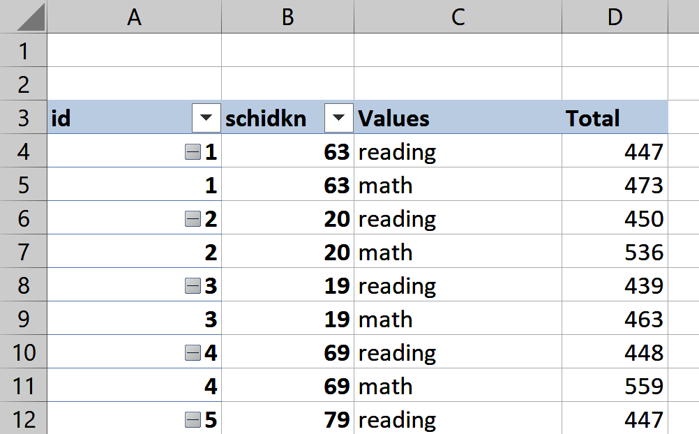
Figure 8-3. Reshaping star in Excel
We can use tidyr, a core tidyverse package, to reshape star. Adding an index column will also be helpful when reshaping in R, as it was in Excel. We can make one with the row_number() function:
star_pivot<-star%>%select(c(schidkn,treadssk,tmathssk))%>%mutate(id=row_number())
To reshape the data frame, we’ll use pivot_longer() and pivot_wider(), both from tidyr. Consider in your mind’s eye and in Figure 8-3 what would happen to our dataset if we consolidated scores from tmathssk and treadssk into one column. Would the dataset get longer or wider? We’re adding rows here, so our dataset will get longer. To use pivot_longer(), we’ll specify with the cols argument what columns to lengthen by, and use values_to to name the resulting column. We’ll also use names_to to name the column indicating whether each score is math or reading:
star_long<-star_pivot%>%pivot_longer(cols=c(tmathssk,treadssk),values_to='score',names_to='test_type')head(star_long)#> # A tibble: 6 x 4#> schidkn id test_type score#> <dbl> <int> <chr> <dbl>#> 1 63 1 tmathssk 473#> 2 63 1 treadssk 447#> 3 20 2 tmathssk 536#> 4 20 2 treadssk 450#> 5 19 3 tmathssk 463#> 6 19 3 treadssk 439
Great work. But is there a way to rename tmathssk and treadssk to math and reading, respectively? There is, with recode(), yet another helpful dplyr function that can be used with mutate(). recode() works a little differently than other functions in the package because we include the name of the “old” values before the equals sign, then the new. The distinct() function from dplyr will confirm that all rows have been named either math or reading:
# Rename tmathssk and treadssk as math and readingstar_long<-star_long%>%mutate(test_type=recode(test_type,'tmathssk'='math','treadssk'='reading'))distinct(star_long,test_type)#> # A tibble: 2 x 1#> test_type#> <chr>#> 1 math#> 2 reading
Now that our data frame is lengthened, we can widen it back with pivot_wider(). This time, I’ll specify which column has values in its rows that should be columns with values_from, and what the resulting columns should be named with names_from:
star_wide<-star_long%>%pivot_wider(values_from='score',names_from='test_type')head(star_wide)#> # A tibble: 6 x 4#> schidkn id math reading#> <dbl> <int> <dbl> <dbl>#> 1 63 1 473 447#> 2 20 2 536 450#> 3 19 3 463 439#> 4 69 4 559 448#> 5 79 5 489 447#> 6 5 6 454 431
Reshaping data is a relatively trickier operation in R, so when in doubt, ask yourself: am I making this data wider or longer? How would I do it in a PivotTable? If you can logically walk through what needs to happen to achieve the desired end state, coding it will be that much easier.
Data Visualization with ggplot2
There’s so much more that dplyr can do to help us manipulate data, but for now let’s turn our attention to data visualization. Specifically, we’ll focus on another tidyverse package, ggplot2. Named and modeled after the “grammar of graphics” devised by computer scientist Leland Wilkinson, ggplot2 provides an ordered approach for constructing plots. This structure is patterned after how elements of speech come together to make a sentence, hence the “grammar” of graphics.
I’ll cover some of the basic elements and plot types of ggplot2 here. For more about the package, check out ggplot2: Elegant Graphics for Data Analysis by the package’s original author, Hadley Wickham (Springer). You can also access a helpful cheat sheet for working with the package by navigating in RStudio to Help → Cheatsheets → Data Visualization with ggplot2. Some essential elements of ggplot2 are found in Table 8-3. Other elements are available; for more information, check out the resources mentioned earlier.
| Element | Description |
|---|---|
|
The source data |
|
The aesthetic mappings from data to visual properties (x- and y-axes, color, size, and so forth) |
|
The type of geometric object observed in the plot (lines, bars, dots, and so forth) |
Let’s get started by visualizing the number of observations for each level of classk as a barplot. We’ll start with the ggplot() function and specify the three elements from Table 8-3:
ggplot(data=star,aes(x=classk))+geom_bar()

The data source is specified with the
dataargument.
The aesthetic mappings from the data to the visualization are specified with the
aes()function. Here we are calling for classk to be mapped to the x-axis of the eventual plot.
We plot a geometric object based on our specified data and aesthetic mappings with the
geom_bar()function. The results are shown in Figure 8-4.

Figure 8-4. A barplot in ggplot2
Similar to the pipe operator, it’s not necessary to place each layer of the plot on its own line, but it’s often preferred for legibility. It’s also possible to execute the entire plot by placing the cursor anywhere inside the code block and running.
Because of its modular approach, it’s easy to iterate on visualizations with ggplot2. For example, we can switch our plot to a histogram of treadssk by changing our x mapping and plotting the results with geom_histogram(). This results in the histogram shown in Figure 8-5:
ggplot(data=star,aes(x=treadssk))+geom_histogram()#> `stat_bin()` using `bins = 30`. Pick better value with `binwidth`.
Figure 8-5. A histogram in ggplot2
There are also many ways to customize ggplot2 plots. You may have noticed, for example, that the output message for the previous plot indicated that 30 bins were used in the histogram. Let’s change that number to 25 and use a pink fill with a couple of additional arguments in geom_histogram(). This results in the histogram shown in Figure 8-6:
ggplot(data=star,aes(x=treadssk))+geom_histogram(bins=25,fill='pink')
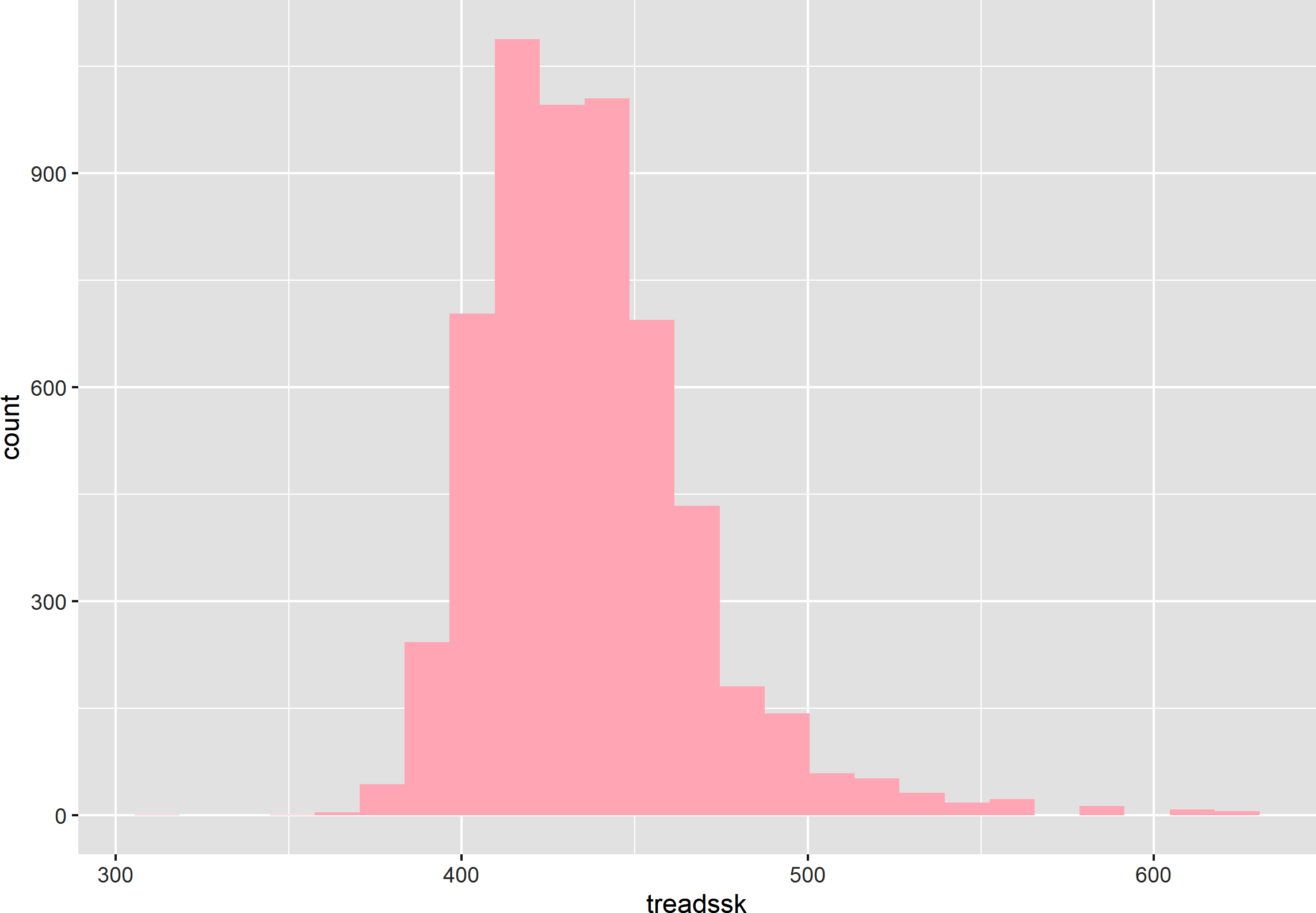
Figure 8-6. A customized histogram in ggplot2
Use geom_boxplot() to create a boxplot, as shown in Figure 8-7:
ggplot(data=star,aes(x=treadssk))+geom_boxplot()
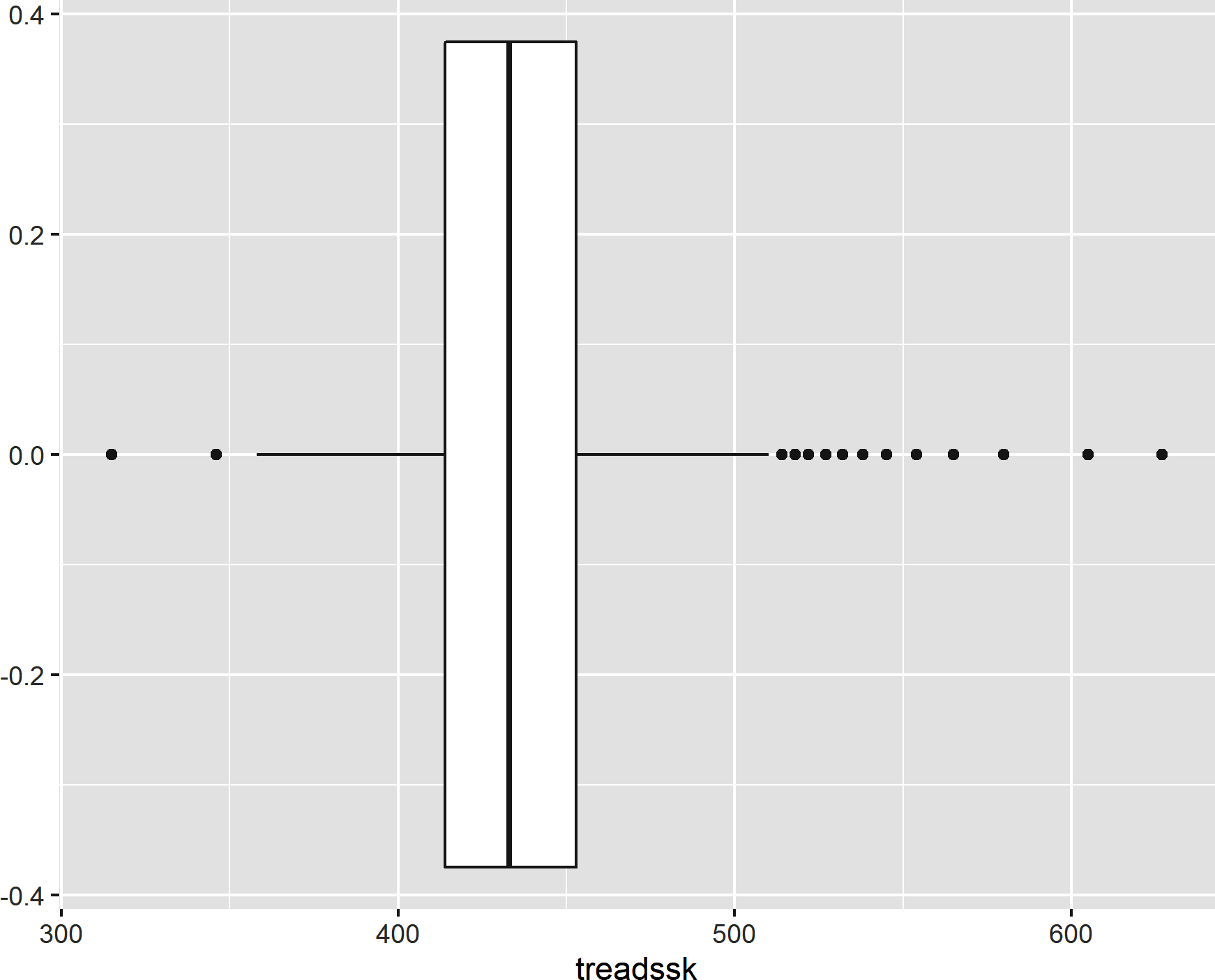
Figure 8-7. A boxplot
In any of the cases thus far, we could have “flipped” the plot by including the variable of interest in the y mapping instead of the x. Let’s try it with our boxplot. Figure 8-8 shows the result of the following:
ggplot(data=star,aes(y=treadssk))+geom_boxplot()
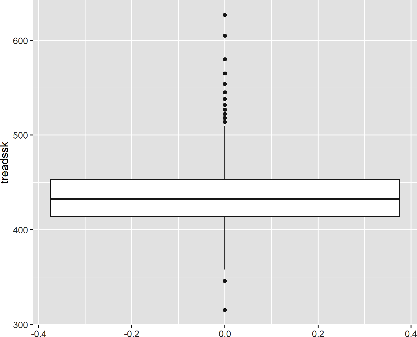
Figure 8-8. A “flipped” boxplot
Now let’s make a boxplot for each level of class size by mapping classk to the x-axis and treadssk to the y, resulting in the boxplot shown in Figure 8-9:
ggplot(data=star,aes(x=classk,y=treadssk))+geom_boxplot()
Similarly, we can use geom_point() to plot the relationship of tmathssk and treadssk on the x- and y-axes, respectively, as a scatterplot. This results in Figure 8-10:
ggplot(data=star,aes(x=tmathssk,y=treadssk))+geom_point()
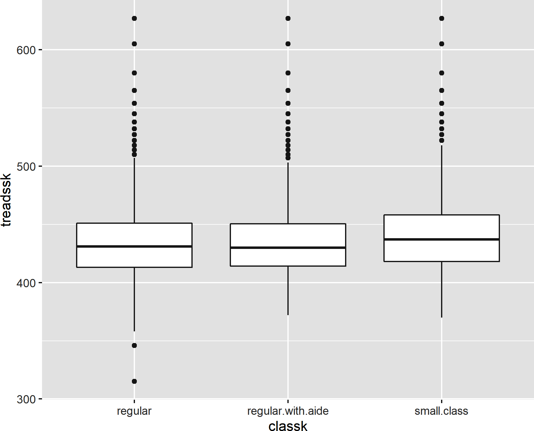
Figure 8-9. A boxplot by group
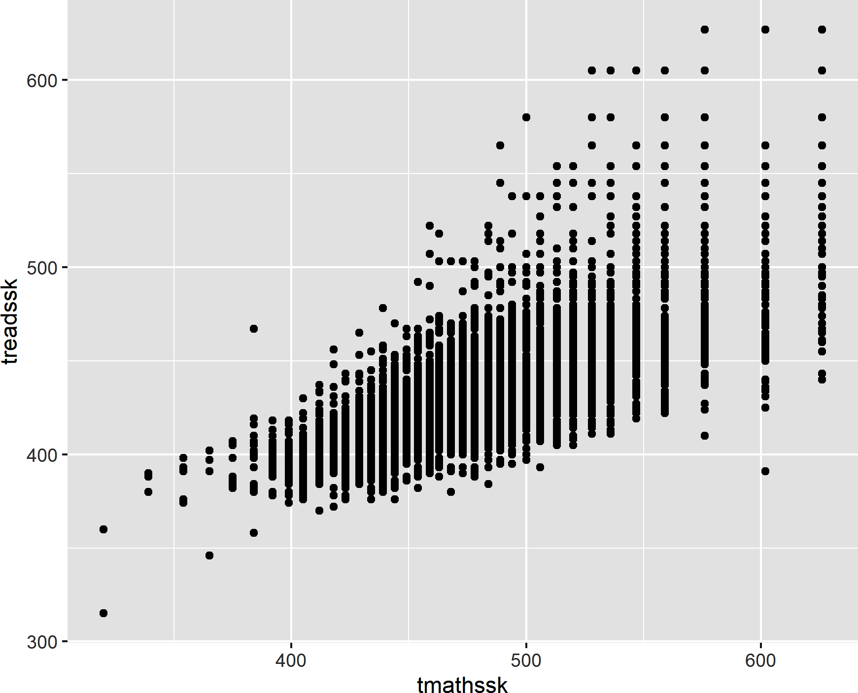
Figure 8-10. A scatterplot
We can use some additional ggplot2 functions to layer labels onto the x- and y-axes, along with a plot title. Figure 8-11 shows the result:
ggplot(data=star,aes(x=tmathssk,y=treadssk))+geom_point()+xlab('Math score')+ylab('Reading score')+ggtitle('Math score versus reading score')
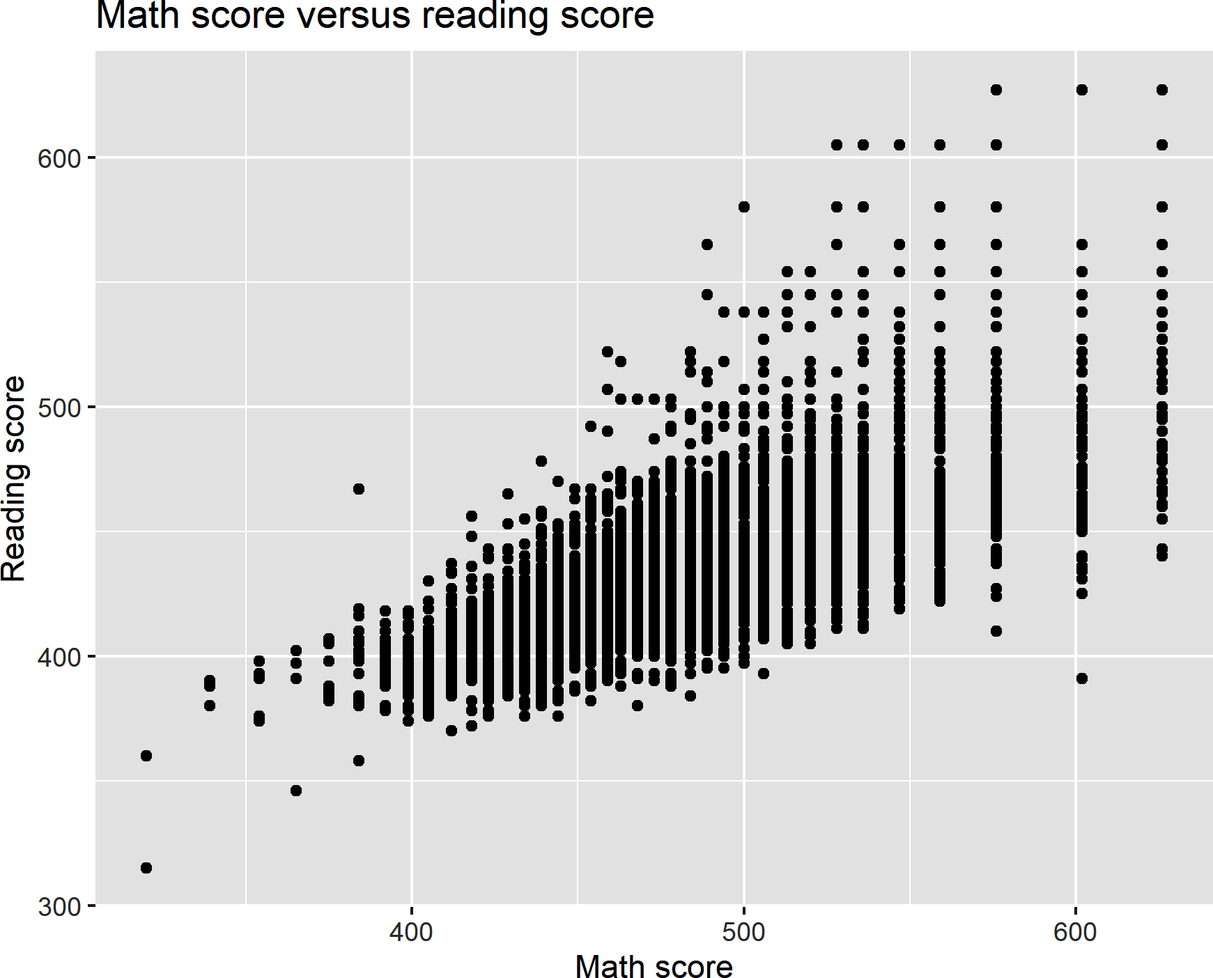
Figure 8-11. A scatterplot with custom axis labels and title
Conclusion
There’s so much more that dplyr and ggplot2 can do, but this is enough to get you started with the true task at hand: to explore and test relationships in data. That will be the focus of Chapter 9.
Exercises
The book repository has two files in the census subfolder of datasets, census.csv and census-divisions.csv. Read these into R and do the following:
-
Sort the data by region ascending, division ascending, and population descending. (You will need to combine datasets to do this.) Write the results to an Excel worksheet.
-
Drop the postal code field from your merged dataset.
-
Create a new column density that is a calculation of population divided by land area.
-
Visualize the relationship between land area and population for all observations in 2015.
-
Find the total population for each region in 2015.
-
Create a table containing state names and populations, with the population for each year 2010–2015 kept in an individual column.