Chapter 13. Capstone: Python for Data Analytics
At the end of Chapter 8 you extended what you learned about R to explore and test relationships in the mpg dataset. We’ll do the same in this chapter, using Python. We’ve conducted the same work in Excel and R, so I’ll focus less on the whys of our analysis in favor of the hows of doing it in Python.
To get started, let’s call in all the necessary modules. Some of these are new: from scipy, we’ll import the stats submodule. To do this, we’ll use the from keyword to tell Python what module to look for, then the usual import keyword to choose a sub-module. As the name suggests, we’ll use the stats submodule of scipy to conduct our statistical analysis. We’ll also be using a new package called sklearn, or scikit-learn, to validate our model on a train/test split. This package has become a dominant resource for machine learning and also comes installed with Anaconda.
In[1]:importpandasaspdimportseabornassnsimportmatplotlib.pyplotaspltfromscipyimportstatsfromsklearnimportlinear_modelfromsklearnimportmodel_selectionfromsklearnimportmetrics
With the usecols argument of read_csv() we can specify which columns to read into the DataFrame:
In[2]:mpg=pd.read_csv('datasets/mpg/mpg.csv',usecols=['mpg','weight','horsepower','origin','cylinders'])mpg.head()Out[2]:mpgcylindershorsepowerweightorigin018.081303504USA115.081653693USA218.081503436USA316.081503433USA417.081403449USA
Exploratory Data Analysis
Let’s start with the descriptive statistics:
In[3]:mpg.describe()Out[3]:mpgcylindershorsepowerweightcount392.000000392.000000392.000000392.000000mean23.4459185.471939104.4693882977.584184std7.8050071.70578338.491160849.402560min9.0000003.00000046.0000001613.00000025%17.0000004.00000075.0000002225.25000050%22.7500004.00000093.5000002803.50000075%29.0000008.000000126.0000003614.750000max46.6000008.000000230.0000005140.000000
Because origin is a categorical variable, by default it doesn’t show up as part of describe(). Let’s explore this variable instead with a frequency table. This can be done in pandas with the crosstab() function. First, we’ll specify what data to place on the index: origin. We’ll get a count for each level by setting the columns argument to count:
In[4]:pd.crosstab(index=mpg['origin'],columns='count')Out[4]:col_0countoriginAsia79Europe68USA245
To make a two-way frequency table, we can instead set columns to another categorical variable, such as cylinders:
In[5]:pd.crosstab(index=mpg['origin'],columns=mpg['cylinders'])Out[5]:cylinders34568originAsia469060Europe061340USA069073103
Next, let’s retrieve descriptive statistics for mpg by each level of origin. I’ll do this by chaining together two methods, then subsetting the results:
In[6]:mpg.groupby('origin').describe()['mpg']Out[6]:countmeanstdmin25%50%75%maxoriginAsia79.030.4506336.09004818.025.7031.634.05046.6Europe68.027.6029416.58018216.223.7526.030.12544.3USA245.020.0334696.4403849.015.0018.524.00039.0
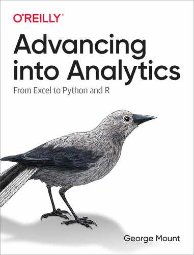
We can also visualize the overall distribution of mpg, as in Figure 13-1:
In[7]:sns.displot(data=mpg,x='mpg')
Figure 13-1. Histogram of mpg
Now let’s make a boxplot as in Figure 13-2 comparing the distribution of mpg across each level of origin:
In[8]:sns.boxplot(x='origin',y='mpg',data=mpg,color='pink')

Figure 13-2. Boxplot of mpg by origin
Alternatively, we can set the col argument of displot() to origin to create faceted histograms, such as in Figure 13-3:
In[9]:sns.displot(data=mpg,x="mpg",col="origin")

Figure 13-3. Faceted histogram of mpg by origin
Hypothesis Testing
Let’s again test for a difference in mileage between American and European cars. For ease of analysis, we’ll split the observations in each group into their own DataFrames.
In[10]:usa_cars=mpg[mpg['origin']=='USA']europe_cars=mpg[mpg['origin']=='Europe']
Independent Samples T-test
We can now use the ttest_ind() function from scipy.stats to conduct the t-test. This function expects two numpy arrays as arguments; pandas Series also work:
In[11]:stats.ttest_ind(usa_cars['mpg'],europe_cars['mpg'])Out[11]:Ttest_indResult(statistic=-8.534455914399228,pvalue=6.306531719750568e-16)
Unfortunately, the output here is rather scarce: while it does include the p-value, it doesn’t include the confidence interval. To run a t-test with more output, check out the researchpy module.
Let’s move on to analyzing our continuous variables. We’ll start with a correlation matrix. We can use the corr() method from pandas, including only the relevant
variables:
In[12]:mpg[['mpg','horsepower','weight']].corr()Out[12]:mpghorsepowerweightmpg1.000000-0.778427-0.832244horsepower-0.7784271.0000000.864538weight-0.8322440.8645381.000000
Next, let’s visualize the relationship between weight and mpg with a scatterplot as shown in Figure 13-4:
In[13]:sns.scatterplot(x='weight',y='mpg',data=mpg)plt.title('Relationship between weight and mileage')

Figure 13-4. Scatterplot of mpg by weight
Alternatively, we could produce scatterplots across all pairs of our dataset with the pairplot() function from seaborn. Histograms of each variable are included along the diagonal, as seen in Figure 13-5:
In[14]:sns.pairplot(mpg[['mpg','horsepower','weight']])

Figure 13-5. Pairplot of mpg, horsepower, and weight
Linear Regression
Now it’s time for a linear regression. To do this, we’ll use linregress() from scipy, which also looks for two numpy arrays or pandas Series. We’ll specify which variable is our independent and dependent variable with the x and y arguments, respectively:
In[15]:# Linear regression of weight on mpgstats.linregress(x=mpg['weight'],y=mpg['mpg'])Out[15]:LinregressResult(slope=-0.007647342535779578,intercept=46.21652454901758,rvalue=-0.8322442148315754,pvalue=6.015296051435726e-102,stderr=0.0002579632782734318)
Again, you’ll see that some of the output you may be used to is missing here. Be careful: the rvalue included is the correlation coefficient, not R-square. For a richer linear regression output, check out the statsmodels module.
Last but not least, let’s overlay our regression line to a scatterplot. seaborn has a separate function to do just that: regplot(). As usual, we’ll specify our independent and dependent variables, and where to get the data. This results in Figure 13-6:
In[16]:# Fit regression line to scatterplotsns.regplot(x="weight",y="mpg",data=mpg)plt.xlabel('Weight (lbs)')plt.ylabel('Mileage (mpg)')plt.title('Relationship between weight and mileage')
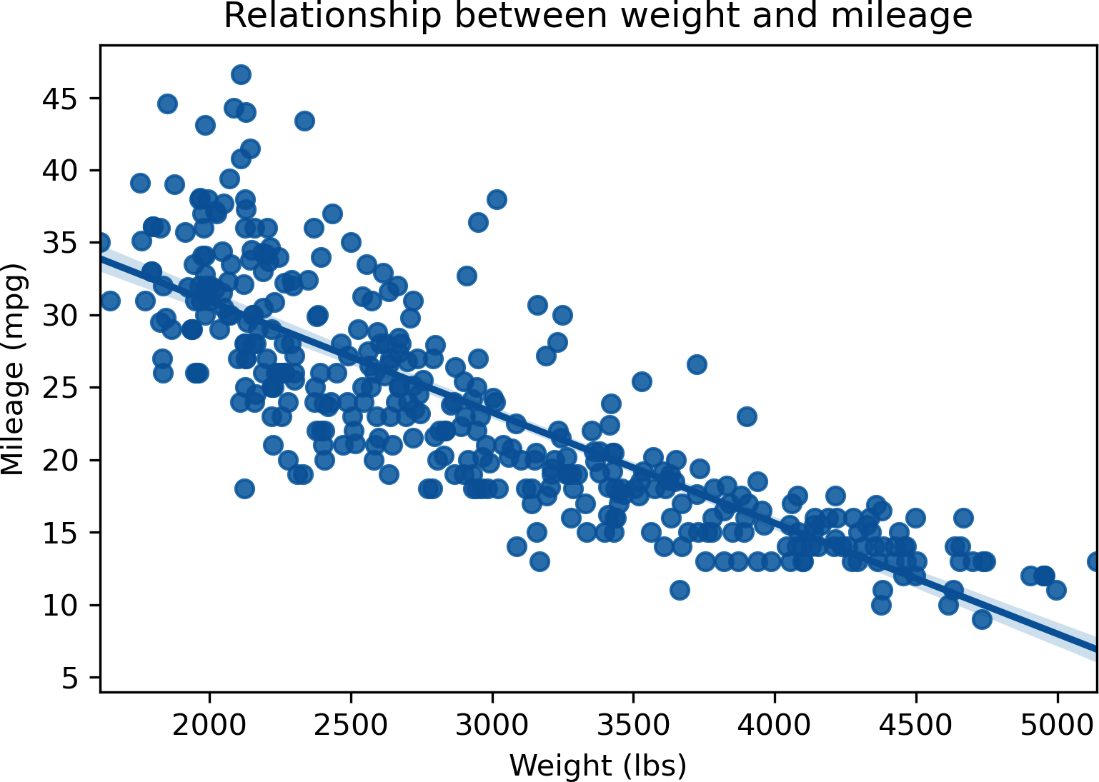
Figure 13-6. Scatterplot with fit regression line of mpg by weight
Train/Test Split and Validation
At the end of Chapter 9 you learned how to apply a train/test split when building a linear regression model in R.
We will use the train_test_split() function to split our dataset into four DataFrames: not just by training and testing but also independent and dependent variables. We’ll pass in a DataFrame containing our independent variable first, then one containing the dependent variable. Using the random_state argument, we’ll seed the random number generator so the results remain consistent for this example:
In[17]:X_train,X_test,y_train,y_test=model_selection.train_test_split(mpg[['weight']],mpg[['mpg']],random_state=1234)
By default, the data is split 75/25 between training and testing subsets:
In[18]:y_train.shapeOut[18]:(294,1)In[19]:y_test.shapeOut[19]:(98,1)
Now, let’s fit the model to the training data. First we’ll specify the linear model with LinearRegression(), then we’ll train the model with regr.fit(). To get the predicted values for the test dataset, we can use predict(). This results in a numpy array, not a pandas DataFrame, so the head() method won’t work to print the first few rows. We can, however, slice it:
In[20]:# Create linear regression objectregr=linear_model.LinearRegression()# Train the model using the training setsregr.fit(X_train,y_train)# Make predictions using the testing sety_pred=regr.predict(X_test)# Print first five observationsy_pred[:5]Out[20]:array([[14.86634263],[23.48793632],[26.2781699],[27.69989655],[29.05319785]])
The coef_ attribute returns the coefficient of our test model:
In[21]:regr.coef_Out[21]:array([[-0.00760282]])
To get more information about the model, such as the coefficient p-values or R-squared, try fitting it with the statsmodels package.
For now, we’ll evaluate the performance of the model on our test data, this time using the metrics submodule of sklearn. We’ll pass in our actual and predicted values to the r2_score() and mean_squared_error() functions, which will return the R-squared and RMSE, respectively.
In[22]:metrics.r2_score(y_test,y_pred)Out[22]:0.6811923996681357In[23]:metrics.mean_squared_error(y_test,y_pred)Out[23]:21.63348076436662
Exercises
Take another look at the ais dataset, this time using Python. Read the Excel workbook in from the book repository and complete the following. You should be pretty comfortable with this analysis by now.
-
Visualize the distribution of red blood cell count (rcc) by sex (sex).
-
Is there a significant difference in red blood cell count between the two groups of sex?
-
Produce a correlation matrix of the relevant variables in this dataset.
-
Visualize the relationship of height (ht) and weight (wt).
-
Regress ht on wt. Find the equation of the fit regression line. Is there a significant relationship?
-
Split your regression model into training and testing subsets. What is the R-squared and RMSE on your test model?