
chapter five
visualizing your data
No matter which data visualization object you are using, there are still a few rules that apply to all of them. In Looking Good in Print, Roger Parker has many examples of how newbies and professionals create ineffective ads, wedding invitations, and newsletters because of a failure to understand how people consume visual information.
Parker provides several makeovers to show what a difference a clean design, a color change, or removing words can make. While he is often re-doing something that was uninspired, he is also careful to note that design is not about a right or wrong technique. It is about effective communication. A cardboard sign that reads Yard Sale in a faint, small font is just not as effective as one with large letters and an arrow pointing where to go. A careful person could see the smaller sign and arrive at the sale, but the clearly written sign could draw more attention to itself and capture more customers. Thus, the well-designed sign is more effective.
This is good advice to keep in mind as you read this chapter and select your own visualizations. Think about the most effective way to communicate your message instead of the prettiest, coolest, or even easiest. In this chapter, you learn about the basic data objects, review usage guidelines, and some tips for overcoming common situations.
Elements of an effective data visualization
When crafting a report or a data visualization, keep in mind your message, your audience, and your technique.
Your message: know your point
It seems obvious to start with a statement like “Know your point” or “Make sure you understand your message.” Why would someone assemble a data visualization otherwise? The problem introduces itself when you mix a fancy data visualization application with your everyday business analyst. The result is a data visualization that says, “Hey, look what I can do!” It is easy to find cool ways to display the data without considering if it leaves the audience with an ineffective message.
This is where data storytelling enters the picture. The data visualization must either answer a question, clarify a point, or reveal relationships within the data. After seeing the data visualization, the reader should have a takeaway. The takeaway can be as simple as an insight or as complex as a determining what additional paths to explore.
Definitely, analysts should be encouraged to find new ways to display data, but the method should enhance their message and not focus on the software. Think of what your data visualization is trying to communicate to your audience before you create it.
How do I know my data visualization works?
Write your question on the top of the graph and then explain to yourself how the data visualization supports your point. You might be surprised if the data visualization cannot answer the question that you are posing.
Your audience: know who is listening
If someone is inexperienced with a bar chart, then data in a box plot will really take some explaining. The audience might miss your point if they are confused about the data visualization technique. However, if your audience is willing to learn, it might be worth your time to educate them. In general, save your sophisticated data visualization for an advanced crowd.
You also need to consider how well the audience understands the underlying data. If you are showing contact center data, those audience members who are more familiar with the department or topic require less education than someone who walks in off the street. Audience members “in the know” expect issues about inadequate staffing or increased call volumes. Because they understand more about how the data is collected, they’re more likely to understand advanced data visualization.
Your technique: follow the KISS principle
Probably you have heard the Keep It Simple Stupid (KISS) principle stated hundreds of times—probably because it is true. Keep your message and chart simple. Audiences can be quickly overwhelmed when there is too much data, visual clutter, or information in the data visualization. They can easily miss your point, which is to direct their attention to what is important.
Keep your message simple and straightforward by removing any unnecessary visual clutter. Your job is to direct the viewer’s attention to what is important about the message. The following guidelines can be applied to the majority of your data visualizations and will be discussed further in this chapter:
• Set your X-axis as 0.
• Limit the number of categories shown at once.
• Avoid over-labeling the elements—it creates chart junk.
• If you use an Other category, it should be a small percentage of the data.
Data visualization experts, such as Few and Tufte, remind us that users should not be distracted by the presentation method. Instead, users should be focused on the numbers and the message. Your goal is to simplify the data visualization so that the users can see what you see.
Keep it simple stupid is not an insult
If you were an average mechanic working in combat conditions, you would value an engine whose design team followed the KISS principle. This principle is most often attributed to Kelly Johnson of Lockheed Skunk Works. He led a team who designed spy planes. “Stupid” does not refer to the user, but to the design. It should be so obvious what was wrong with the engine that even someone with an average understanding could repair the engine.
Line charts
Line charts enable you to see trends over time. They have a much more direct purpose than any other chart type. Variations of line charts include area plots, time series charts, and even Pareto charts.
This topic uses the consumer complaint database from the Consumer Financial Protection Bureau (http://www.consumerfinance.gov). This database tracks complaints that are received by financial institutions.
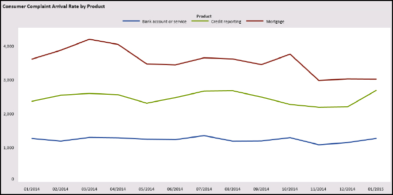
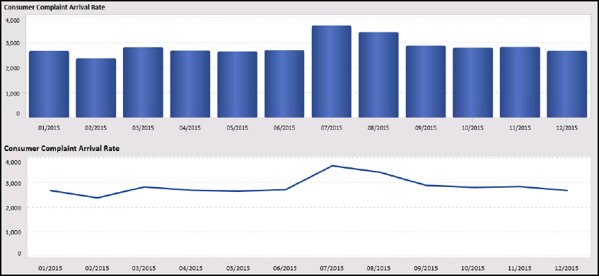
Interpreting the results
In the following figure, you can see the arrival rate for consumer complaints. There is a line for each product. This data visualization provides the following takeaways and follow-up questions:
• During 2013, consumer complaints decreased by half but then started rising again in early 2014. Wonder what caused the decrease and then the increase?
• At the start of 2014, complaints about credit reporting doubled and remained high. Is it possible that not all bureaus were reporting complaints prior to 2014?
• Complaints about bank accounts remained consistent. Wonder if everyone is accurately reporting this data?
The line chart makes following the trends easy. For a two-year period, you could understand how complaints arrived and have some ideas about where to explore next.
Figure 5.1 Line charts display trends
Line charts: guidelines
When producing these charts, keep the following tips in mind:
• X-axis is an ordered time series value, such as year, month, hour, or even minute. Y-axis is a measure such as a count, average, or percentage.
• Use a line to connect each data point. It is easier to understand the trend when the points are connected. The eye glides down the line to understand the trend.
• Indicate missing values with a 0 or a note on the object. If you did not have data for the summer of 2013, then you would want to ensure the viewer understood that the data was missing. Otherwise, your chart might take a huge leap forward, and the viewer would draw the wrong conclusion.
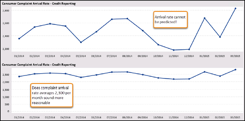
Use 0 as y-axis value
If you need to infuse your chart with some drama, then play with the y-axis value. Consider the following graphs and how much more dramatic the trend seems when we changed the y-axis value. The reported product issues are arriving at a dramatic pace, indicating a product with many issues. When we place the y-axis back at 0, it is easier to understand that there is a flow to the arrival that might even be seasonal.
Figure 5.2 Adding drama to a line chart
To control the axis values:
1. Select the data object and select the Properties pane.
2. In the Left Y Axis area, type 0 in the Set fixed minimum field.
3. You can change the maximum value for the axis by typing a new value in the Set fixed maximum field.
Dealing with nonzero axis
In Show Me the Numbers, Stephen Few suggests that a better way to handle this situation is to show the overall chart and then a second chart with a more focused trend line. You can imagine a case where a drop of 400 records might get people excited—especially when those people are trying to staff a call center or plan production runs.
Remember the KISS principle
The cognitive psychologist George Miller, in “The Magical Number Seven Plus or Minus Two,” asserts that most people can keep only about five to seven items in their working memory at once. When a chart becomes too busy or has too many lines, it is more difficult for the viewer to absorb the information. Time to apply the KISS principle!
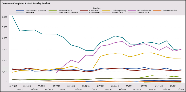
In the following chart, only 11 lines are showing, but you will spend a lot more time studying it as compared to the chart in Figure 5.1. One takeaway is that some products receive few or almost no complaints. If your message is “there’s only a few products with issues,” then use this chart to emphasize that point. If your point is to show the growth difference in the main areas, use the chart in Figure 5.1.
Figure 5.3 Keep your categories simple
A remedy for this situation is to add a filter that enables the viewer to control how much information is displayed at once. Viewers might only be interested in certain products or want to compare certain products.
Be careful with stacking area plots
SAS Visual Analytics provides three options for a line chart appearance, shown on the Properties tab:
• Overlay filled: Shows each line with the filled area behind it.
• Overlay unfilled: Shows a line. This is the default overlay.
• Overlay stacked: Shows all the groups and places one on top of the others. Thus, the data is stacked. This enables the viewer to see how each category contributed over time
If your line chart contains a grouped data item, you can use the overlay filled and overlay stacked choices.
Figure 5.4 Overlay stacked line chart
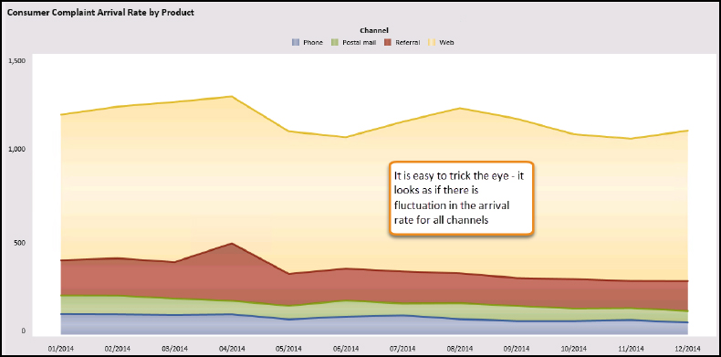
When you are working with stacked area plots, you can easily confuse users if they don’t understand your message. The problem lies in how you want to emphasize the parts to the whole. In this example, the data visualization shows an area plot grouped by complaint channel to help the viewer understand which channels drove the overall trend. The question was “Which channel contributed the most to the arrival rate in 2014?”
What if the title was a more generic one—such as “Arrival Rate by Channel?” causing the reader to focus on the arrival rate fluctuations. Although it appears that Phone and Postal mail had a lot of variation, it is not true.
In the following figure, the grouped data item was moved to the Lattice Row role. When you divide the channel into a lattice chart, a different story emerges. In this story, the web channels contribute the most to the trending with the web channel driving everything by the year-end, as shown in the following figure.
Figure 5.5 Use the lattice feature to understand individual categories
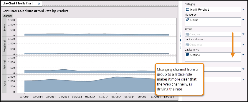
The point with this illustration is not that the stacked area plot is bad but instead the question is, “Was it effective?” This example is to help you understand how a data visualization was misinterpreted despite our best intentions.
Line charts: tips and tricks
Here’s some tips and tricks to help you work with common situations in line charts.
Tip 1: Dealing with a long timeline
When you have a long timeline that you want to show, your data visualization might appear too crunched. You can add a sliding window under the data object to enable the user to expand and focus on the periods of interest. From the Properties pane, click the Show overview axis check box to add the feature.
Figure 5.6 Sliding window to see more data
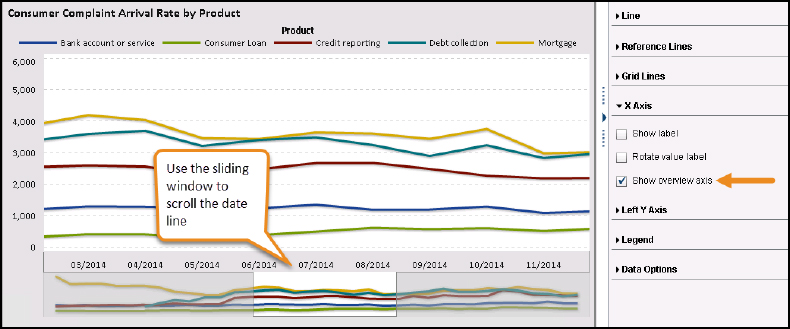
The user can expand the window to see all dates on the chart or focus the timeline on a central period.
Tip 2: Avoiding chart junk
If you read any of the data visualization pioneer Edward Tufte’s books, you quickly learn that he is a minimalist. He repeats often that “the data should do the talking,” “show only the data,” and so on. He provides multiple examples of what he calls chart junk. Tufte uses a data-to-ink ratio to draw out his examples, but it’s much simpler to apply his technique than a fancy formula.
Don’t add unneeded items, callouts, and decorations to your chart. When you add the data labels to the lines, it quickly changes the flavor of the chart. Notice how hard it is to see the trend when you are focused on reading the values. You make the viewer think the value has more importance than it does.
Figure 5.7 Manage your data
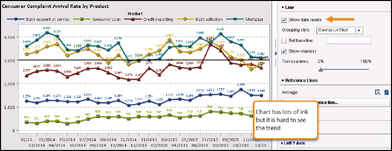
Remember that this is a trend chart. It’s not about individual values; it’s about how the values changed over time. Use a bar chart or a table if the individual number is important. You might notice that axis labels were added—but do they really assist the reader? It seems clear that the x-axis is a month value item, and the y-axis is a count. The title explains that the chart provides trending for arrival rate. You decide whether it adds detail or ineffective clutter.
Is it information or decoration?
While Tufte discusses minimalization, Alberto Cairo, author of The Functional Art, reminds designers that the task is message clarity, not simplification. Too often designers sacrifice content for style and lose their audience. Each visualization is different and this is where your knowledge and discernment enters the design process.
Tip 3: Transparency can be your enemy
SAS Visual Analytics enables you to overlay the lines. So instead of showing the parts to the whole (all complaints broken out by product), you can see how each line contributed over time—as you see in the following figure. The Grouping Style is Overlay Filled, which shows each item with a fill pattern beneath it. You can change the Transparency to 50% to get a nicer look.
Figure 5.8 Colors do not match the Legend
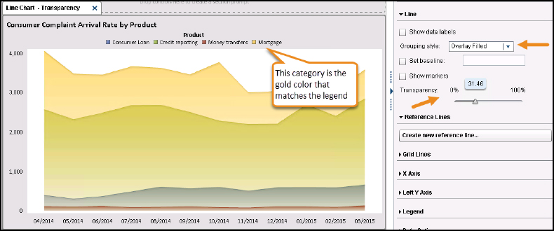
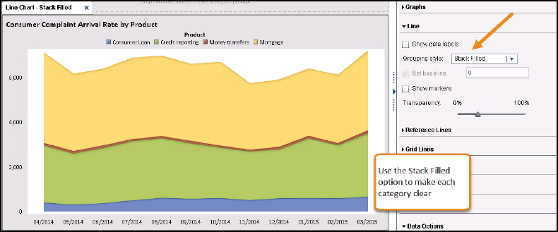
The problem is that the Mortgage is covering the other categories and making everything appear as brown and orange. One remedy for this situation is to stack the numbers so that we can see how each contributed to the total value over time. The grouping style was changed to Stack Filled.
Figure 5.9 Stack the grouped items to clarify your point
Tip 4: Keeping the date intervals
It is more difficult for the user to understand a timeline when there are missing dates. You might also want to extend the timeline to show the future. You have a few options when you want to include intervals that do not exist in your data.
Changing the data
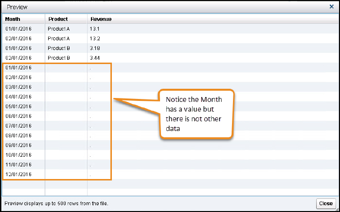
You can change your data. In the following figure, we want to extend the data to the end of year. Since it is the beginning of the year, we don’t have data for the other months yet.
Figure 5.10 Add dates without values
To correct the issue, we can update the date values in the data. In the following example, a helper data set contains only the variable Month and a date for the entire year. This data set was appended to my main data set. SAS Visual Analytics can use the new variable even if the other variables are empty. Notice that the other rows do not have any values, so SAS Visual Analytics has nothing to display. Keep in mind, if you use these rows in calculations, that you might need to work around the missing values or create filters to exclude them.
Figure 5.11 Modifying your data source
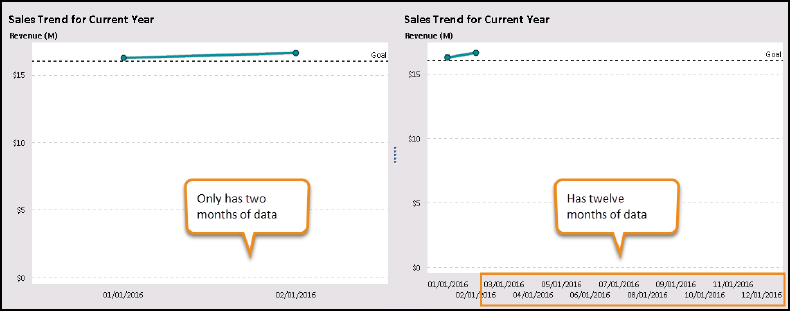
Using a time series chart
There is a time series data object especially for dates and trend charts. The time series object doesn’t mind if you only have data for two months. You can use the Properties menu to change the fixed minimum and maximum dates. Of course, any report using this method might have to be updated each year, but that seems like a small inconvenience.
Figure 5.12 Time series plot
Bar charts
Bar charts provide more detailed information than line charts. This chart type makes it easier to compare exact quantitative categories. There are two types of bar charts: vertical and horizontal. Vertical charts compare categories while horizontal charts work especially well for ranking.
Interpreting the results
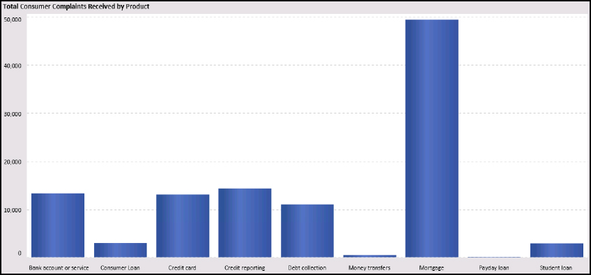
In the following figure, you see the count of all consumer complaints received in 2013. The x-axis is categorical data, so no order is necessary. The y-axis is the value that indicates the length of the bar.
Here’s what we learn:
• Consumers had as much concern about mortgages as all other categories combined.
• Money transfers and payday loans generated few complaints compared to the other categories.
• Bank account, credit cards, credit reporting, and debt collection had similar complaint counts.
The bar chart makes it easy to compare categories. In this case, you learn that mortgage complaints account for most of the work.
Figure 5.13 Example bar chart
Bar charts: guidelines
When producing these charts, keep the following tips in mind:
• Allow white space between the bars and keep the bars at the same distance.
• Keep bars the same color when the data is a single category. Unless your whole package is using a theme for a particular category, multiple colors usually only distract the viewer.
• Avoid using patterns or anything unusual for the bars. It is distracting.
• Viewers might have a hard time understanding vertical charts when there are more than 10 categories. Add a filter to allow the viewer to determine what is comfortable.
Choosing a line chart or a bar chart
When showing timeline data, you can use a line chart or a bar chart. This is an occasion where you have to determine which is more effective in communicating your point. In the following figure, the same data is plotted both ways. The line chart allows the eye to see the trend while the bar chart highlights specific values better. As discussed at the beginning of the chapter, you have to decide what your message is and what you are trying to show.
Figure 5.14 Bar chart versus a line chart
Choosing a grouped chart or a stacked chart
Bar charts really shine when comparing values across groups. There are two ways to compare values with a bar chart: stacked and grouped (or clustered). Determine whether your message is about the whole or the parts. Use a stacked chart to show the part-to-the-whole and the grouped charts to show the contribution by category.
A stacked chart reveals the part-to-the-whole similar to a pie chart. Use this chart when you want the viewer to consider each category as a whole more than the values within the category. In the following figure, you get a sense of how many more complaints are about mortgages than about the other categories.
Figure 5.15 Part to the whole
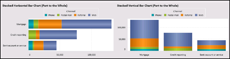
Grouped charts are easier to compare across categories. Notice that the white space is between Product instead of Channel. Your eyes take the visual clue that those items are related within the grouping. This chart does give you a sense of overall counts and it does show the web channel as the most popular contact method. What you also see is that almost no one uses postal mail to complain about his or her bank account, but it is a popular method for the other categories. You most likely didn’t notice that, overall, Mortgage had the highest total complaints.
Figure 5.16 Contribution by category
Bar charts: tips and tricks
Here’s some tricks for resolving common situations that occur when using bar charts.
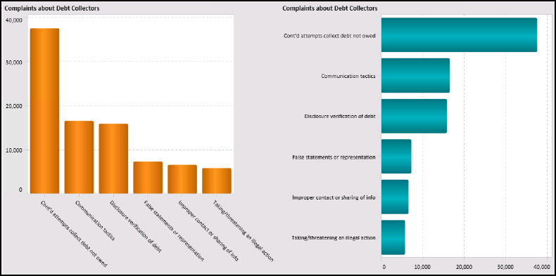
Tip 1: Rescue your long labels and your viewer
Horizontal bar charts assist with making comparisons but are also useful if your labels are long. Notice the difference in the labels in this example. The slanted labels are difficult to read mainly because they are too long.
Figure 5.17 Use a horizontal bar chart
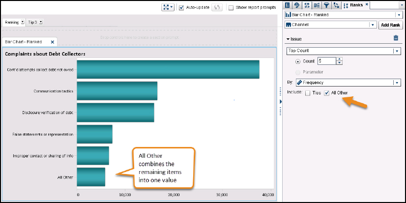
• Use the Ranks menu to limit the category to the top 5 or 10 by count or percentage. You can also show the bottom 5 or 10. The Ranks menu enables you to select a category and a measure. If you have an item that is tied (for example, two of the items rank as number 3), check the Ties check box to display both.
• Use the All Other check box to create another item where the remaining items are combined into one. In the following figure, you can see that last bar is called All Other. You want to ensure that this item is a smaller amount than the other bars. Otherwise, the ranking might appear as if you are ignoring a large part of the data.
Figure 5.18 Using the ranks pane
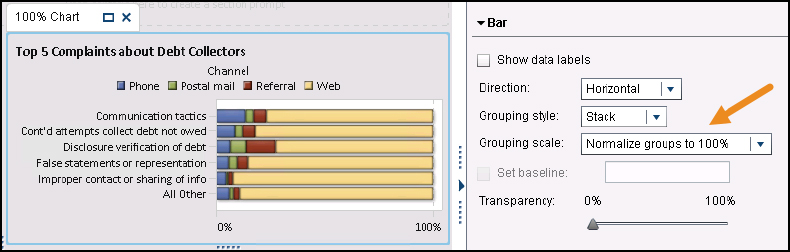
Tip 2: Show the complete percentage
In some instances, you might want to convert a count to a percentage to show the comparison as a whole. If you have a grouped bar chart, you can convert it quickly using the Properties tab. Change the grouping scale to Normalize groups to 100%. SAS Visual Analytics converts the numbers to percentages and shows the breakout.
Figure 5.19 Change the grouping scale to show 100%
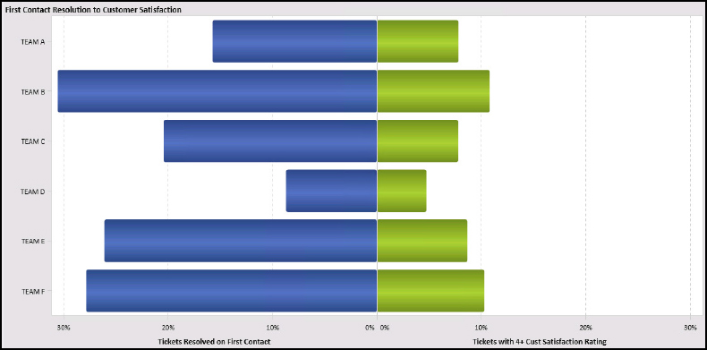
Tip 3: Using a butterfly chart
Butterfly charts are similar to grouped charts but enable the user to focus on two measures. The measures are placed back to back so that they have wings like a butterfly. The following example is from a customer service organization. The butterfly chart compares tickets resolved on first contact to the customer satisfaction rating for the event. Team B resolves more tickets on first contact and has the highest customer satisfaction rating. Likewise, the team with the lower first contact resolution also has the lower satisfaction.
This data object requires that both measures be the same type. In our example, both measures are percentages. If you want to compare measures of different types, you can modify this data object using the Custom Chart Builder feature. The Custom Chart Builder enables you to combine multiple data objects. Refer to the user documentation for more details about the Custom Chart Builder feature.
Figure 5.20 Using a butterfly chart
Pie and donut charts
Pie and donut charts show the parts-to-the-whole relationship of data. Many data visualization experts do not advocate using pie charts because as Stephen Few says “they communicate information poorly.” If you want to use one of these charts, make sure that you understand the guidelines for doing it correctly. Generally, these charts offer visual relief in a sea of text or boxes. In recent years, donut charts have become popular in infographics.
Starting in release 8.1, SAS Visual Analytics contains donut charts as an option. Although donut charts are not shown in this topic, the same visualization rules apply.
Interpreting the results
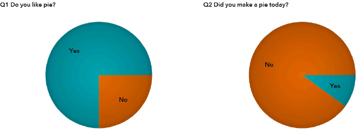
A pie chart shows how each slice contributes to the entire pie. Each slice is a category, and a reader should quickly look at the chart and have an answer. Consider the following pie charts from a user survey. These pie charts work because they have few categories and you can quickly read the answers for results. A pie chart is not about precision in value. Does it matter if someone likes pie 72% or 75%? The takeaway remains that people really like pie but might not make them every day.
Figure 5.21 Easy-to-understand pie charts
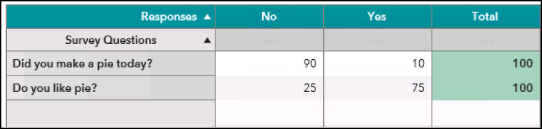
When the same information is presented in a table, the information is more precise and takes up less space. Truthfully, the pie charts revealed the Yes and No answers to the question quicker, but they do use a lot of space. You could argue that a bar chart is equally effective and uses the same space.
Figure 5.22 Table compared to a pie chart
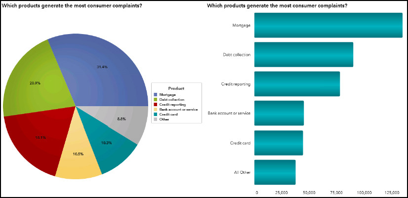
Often, data visualization newbies try to do too much with a pie chart, and it just goes wrong. They do not understand how or when to use a pie chart. Consider the following example. You spend more time correlating labels to slices and comparing the channel details so that you get overwhelmed. It is difficult to know what the author was trying to communicate.
Figure 5.23 Example of why pie charts are ineffective
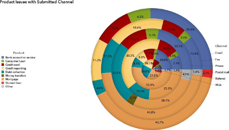
The preceding figure is why many data visualization experts hate pie charts. They argue that pie charts use too much space. Often foregoing a pie chart for a short statement is preferable.
Pie and donut charts: guidelines
Here are the guidelines for how to use a pie chart to display your data.
• Parts to a whole equal 100% – always. If your pie chart does not equal 100%, tell the reader in a footnote.
• Limit to 4 or 5 categories, but it’s better when one category is significant percentage-wise.
• Legends are superfluous when a pie chart is done correctly.
Removing the legend
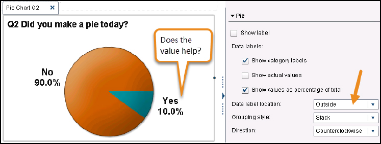
You can avoid using a legend if you allow the tool to place the labels. From the Properties menu, turn on the Show category labels check box. This places the category labels on the pie chart, making it easier to read. Use the Data label location to control where the label is placed. You might want the labels on the outside of the chart to keep it consistent. You can choose to have the percentage show by clicking the Show values as percentage of total check box. However, a pie chart works best when one category is dominant. This makes the values unnecessary.
Figure 5.24 Good pie charts don't need a legend
To remove the legend, click the Show Legend check box in the Properties panel.
Is the comparison effective?
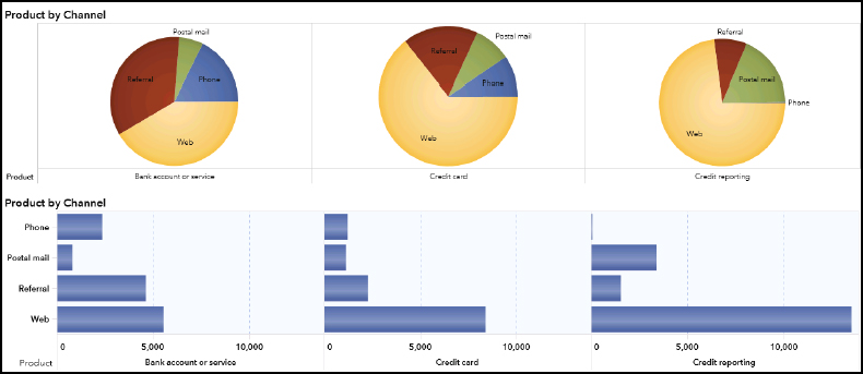
In the following figure, the data visualization compares complaint arrival by channel. You have 5 seconds to tell me the second most popular channel to receive a complaint. It’s hard to do. This is not a bad way to display data, but is it effective? In some cases, it is difficult to tell if Referral and Web generated the same amount. Our eyes are not adept at reading angles and determining which is larger.
It’s much easier to understand the complaints by channel when we look at the horizontal bar chart. This is another example where a bar chart makes it easier to understand the data. Using the bars, your eye has an easier time determining the amounts.
Figure 5.25 Too many comparisons
Pie and donut charts: tips and tricks
Use the following tips to overcome common issues.
Tip 1: Limit the categories to focus the reader’s attention
When you have too many categorical values in a pie chart, you make the reader’s job ten times more difficult. The reader might ask themselves “Is this a ranking?” or “Do these other categories really matter? Why am I being shown this?” Notice how going back and forth between the colors and legend is frustrating. In the following figure, the same data is shown as a pie chart and as a horizontal bar chart. Notice how much easier it is in the horizontal bar chart to determine the products that receive the most complaints.
Figure 5.26 When a bar chart works better
Tip 2: Keep categories a consistent color
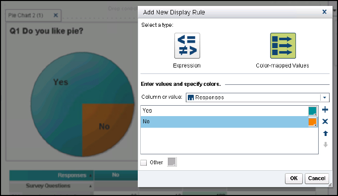
If you are presenting survey data, then you have multiple pie charts in a row. In this case, you want the Yes/No category to have a consistent color. You can use a display rule to map the values to a set color.
Click the data object and select Add Display Rule. When prompted, select Color-mapped values.
Then, create a line for each category and assign the color to it. In the following figure, you can see that Yes has been changed to teal and No changed to orange. You can set as many values as you want.
Figure 5.27 Setting color-mapped values
Tip 3: Pie chart as a dashboard gauge
If you are working on a dashboard, sometimes you want to display a single value, similar to the way infographics look. You could use a single cell in a list table, but here’s a more clever method. Use an invisible pie chart.
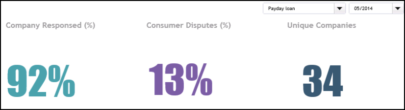
This method retains the value and title but hides the pie itself. Let’s build the last one called Unique Customers. For this example, we need a distinct count of the companies that received complaints for the time period and product. This value must be calculated on-the-fly. We can use the Distinct Count feature to count the companies in the data set. When the viewer selects a value from the drop-down list, the value is immediately re-calculated.
Here’s the steps for creating a distinct count aggregated measure and creating the infographic look.
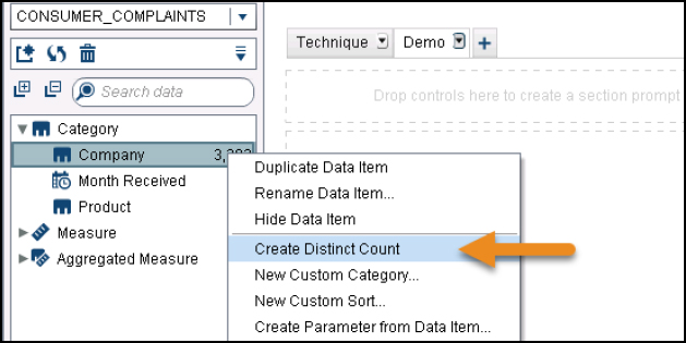
1. To create the distinct count value, right-click the Company data item. This data item is a character value that contains the name of each company. The new value appears in the Aggregated Measure area called Company (Distinct Count).
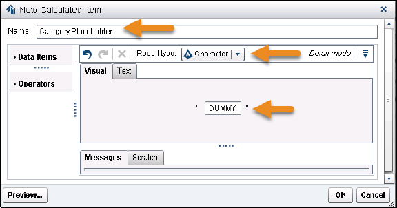
2. Create a new calculated item that is character-based. A pie chart requires the following roles: category and measure. For this example, we need a dummy value that does not cause any filtering to occur.
a. Select New Calculated Item from the Data drop-down list.
b. Type Category Placeholder in the Name field.
c. Change Result type to Character.
d. Type DUMMY in the field. This value never appears anywhere, and later it reminds you why you created it.
e. Save the calculated item.
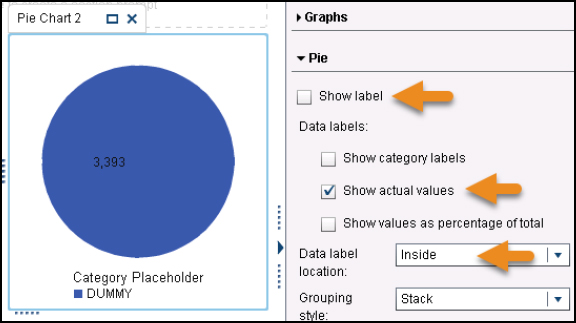
3. Create a new pie chart data item. On the Roles tab, add Category Placeholder and Company (Distinct Count) data items.
4. On the Properties tab, do the following:
a. Uncheck the Show label check box.
b. Click the Show actual values check box.
c. Change the Data label location to Inside.
5. On the Styles tab, do the following:
a. In the Data Styling area, change the Data Skin to Gloss. This action causes the HTML5 viewer to display the pie chart as white.
b. In the Text Styling area, change the Value font size to 60. Adjust the font color and font family if desired.
c. In the Data Colors area, change the first fill box to White or your background color.
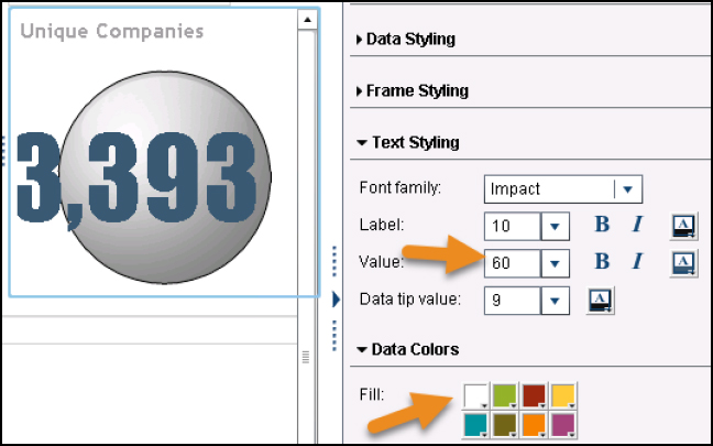
6. Save your report and look it in the Report Viewer application. With the drop-down filters in place, your new value will change as the selections change.
Treemaps
Treemaps enable viewers to see the results from a large number of categories. A treemap is a more efficient use of space than a bar chart. These data objects are especially good for hierarchical data to reveal overall patterns in the data.
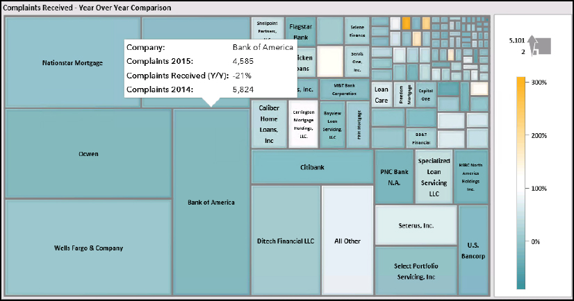
Interpreting the results
This object shows the complaints about mortgages for several companies. The box size indicates the number of complaints for 2015. The larger the box, the more complaints the company received. This enables the viewer to understand how many companies are in the category and then the complaint count. The color of the square indicates the percentage change in complaints. If the color is darker, the company received more complaints for 2015 than for 2014. You can filter the results. We might want to remove companies that had few complaints in one year and then no complaints the next year.
Figure 5.28 Treemap example
Here’s what we learn from this data visualization:
• The larger financial institutions receive more complaints. This is not surprising since they probably hold more mortgages. Notice that it is difficult to judge the exact number of complaints. You just know that it is a similar count.
• You might find that you can group boxes by size and thus understand how the financial institutions are similar. In the lower right of the treemap, there is a second group of institutions that received a similar number of complaints. In the top right, another group received a similar amount.
• We can see that many of the companies shown in teal decreased the complaints or maybe just received a similar number as the year before. By positioning your pointer over Bank of America, we see a 21% decrease in complaints.
The treemap provides an overview of many categories at once in a very small area. By using color, you can add an extra dimension to the analysis.
Treemaps: guidelines
When using a treemap, here are some guidelines.
Add two measures – one for size and one for difference
You can use two or three measures for this chart. The first measure is a sum, count, or average value. The second measure can be a rating, percentage difference, or another value that indicates a change. In Figure 5.27, the size of the box is the sum of complaints, and the color is the year-over-year percentage difference.
You can create the second measure with an aggregated measure or with a derived measure. With a derived measure, you can calculate time-based values to show a percentage change or difference. See the “Tables and Crosstabs” topic in this chapter for a detailed discussion about derived measures.
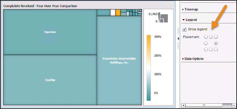
Add the legend
Like the bubble plot, the legend enables the user to understand what the box size indicates and how the color is judged. You can add the legend by clicking the Legend check box on the Properties menu. Use the Style pane to control the appearance of the legend, such as background color and font size.
Figure 5.29 Find the right location for your legend
Treemaps: tips and tricks
Use the following tips and tricks when creating treemaps.
Tip 1: Gradient values are easier to interpret
If you do not supply a third measure, all of the boxes are the same color. When you add the third measure, SAS Visual Analytics changes the gradient range from red to green. You can change the color by clicking on the color boxes on the Style menu. If your data is not performance related, you might want the values to be a gradient of a single color.
Figure 5.30 Gradients are easier to understand
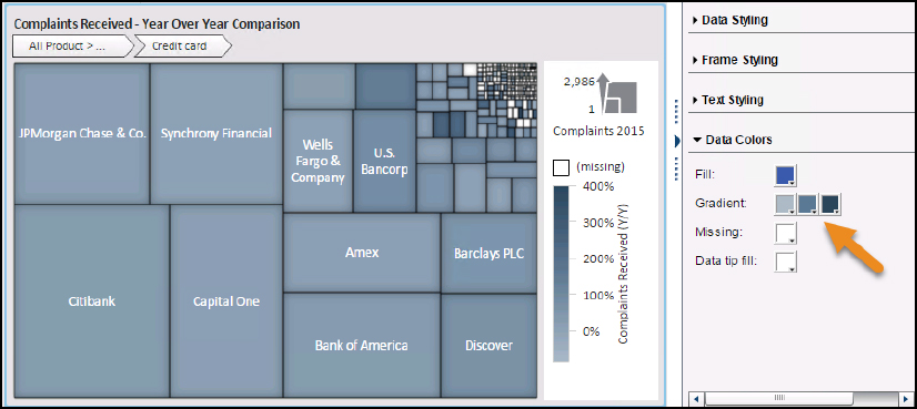
Notice in Figure 5.30 when values are missing, the color is set to white. You can also control that color. If values are missing, it might make more sense to use yellow or gray to highlight the situation.
You can also use the Display Rules to control the colors. This enables you to provide exact color choices. In the preceding example, you might want to highlight companies who decreased their overall complaint count. Refer to the “Tip 1: Using display rules” topic for instructions on creating display rules.
Tip 2: Hierarchies make it easier to navigate the tree
Use a hierarchy to enable the user to drill-down through the boxes. For the preceding treemap, it was showing the company only. We can add a hierarchy that goes from the product to the company at the top and specific issues at the end. In the following figure, you can see that the user has drilled down from Products to a specific vendor. The last level of the hierarchy shows the issues.
Figure 5.31 Users can drill-down with a hierarchy
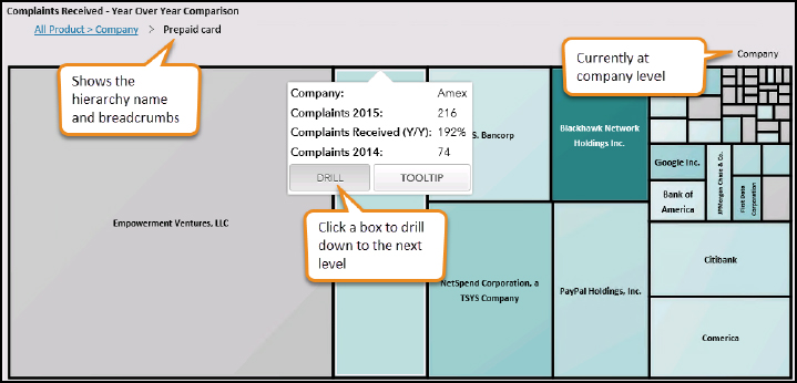
To build a hierarchy:
1. Click the arrow icon and click the New Hierarchy choice.
2. Drag the items that you want to the hierarchy. The order in which they are placed is how the hierarchy appears.
3. In this example, the data items are ordered by Product ▶ Sub-product ▶ Company.
4. Provide a name for the hierarchy. Click OK.
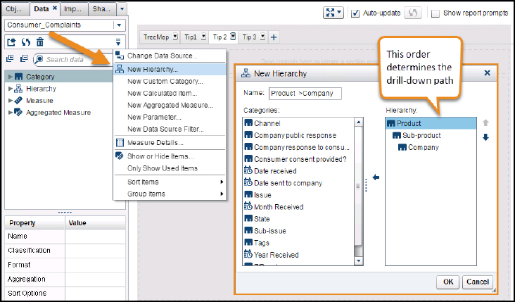
The hierarchy data item is added to the Hierarchy area on the Data menu. It is then added to the treemap.
Waterfall charts
Waterfall charts show how a cumulative value increments or decrements. These charts have many names, including progressive bar chart, bridge chart, and flying bricks chart. This chart is another example of understanding the part-to-the-whole values discussed in the “Using Categorical Charts” topic. These charts are commonly used in financial metrics to show a profit-and-loss statement.
This data visualization is considered a good alternative to a pie chart. It is easier for the user to deconstruct what happened to a value, such as revenue.
Interpreting the results
Waterfall charts help the user analyze how a value changed and what contributed to the change. In the following figure, you can see the how the costs change the revenue and the resulting profits. The decreasing value is shown as red, and the increasing value is shown as green. The decreasing values go down, and increasing values rise up. The final amount called Profit After is shown as the blue bar.
Figure 5.32 Example waterfall chart shows revenue change
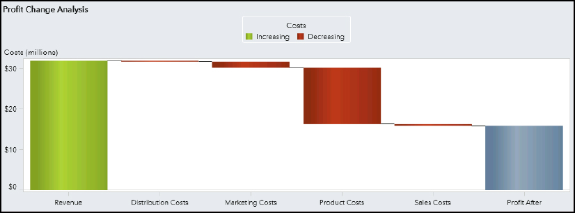
What we learn from this data visualization:
• The largest cost goes toward producing the products. Reducing costs in this area might have a larger overall impact.
• The other costs are minuscule compared to product cost.
Waterfall charts: guidelines for use
Waterfall charts are used to show how a single value changed, such as Revenue. You want to keep this data visualization simple using the similar guidelines used for a pie chart. The exception is that you can have more than five categories since the bars are used.
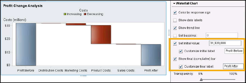
Add the initial and final values
If your data source only has the values by category, you might want to add the starting and ending value. Select the Set initial value and Show Final (cumulative) check boxes to add these bars to the chart. You can also change the labels.
Figure 5.33 Adding the initial and final values
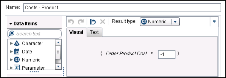
Adding the response sign
You can allow negative values to show as red and positive values to show as green. In the Properties window, select the Color by response sign check box. If your data source does not have negative values, then the data object might not be displayed properly.
You can create a negative value using a calculated item. In the following figure, Order Product Cost was multiplied by -1 to create a negative value. Refer to the “Creating Your First Dashboard” chapter for more details about creating a calculated item.
Figure 5.34 Creating a calculated item
Waterfall charts: tips and tricks
The following tips and tricks can be used with other data objects, but might come in handy when working with these data objects in particular.
Tip 1: Consider a summary data source
If your data is tall and wide, then it might not work with the waterfall chart. Our example data table VA_SAMPLE_SMALLINSIGHTS uses a wide format. This means that the data items are each in their own column and listed as a separate data item.
Figure 5.35 Wide data
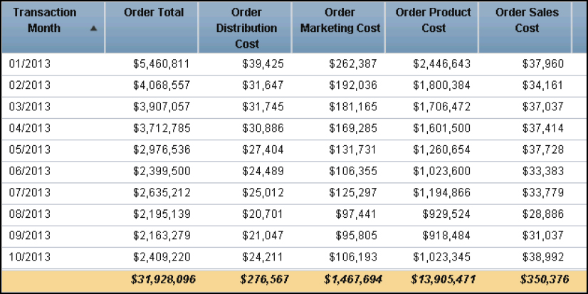
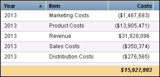
The waterfall chart shows how each value contributes to a single category for 2013. The values need to be summarized and transposed as shown in the following figure:
Figure 5.36 Tall data
Since this is a simple conversion, you might find it easier to prepare this chart if you use a summary table that you create outside of SAS Visual Analytics. You can use multiple data sources on the same section. In the following figure, you can see the text file that was created in Notepad and later imported into SAS Visual Analytics to keep this example simple.
Figure 5.37 Creating summary data
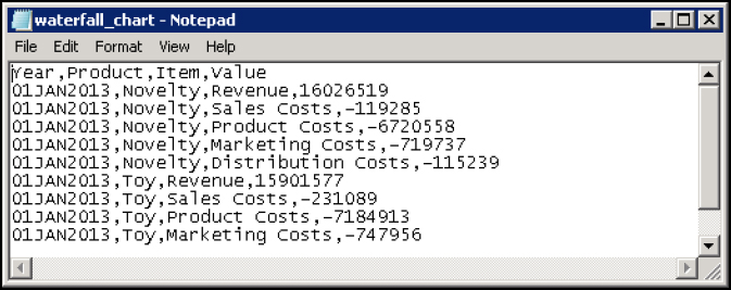
This data contains additional columns, so it can be used with the existing data source that has Year and Product Line as data items. This is a simple way to transpose the data. You could also create this data set in SAS Studio or the Data Builder. Refer to the “Data Builder Name” chapter for more details.
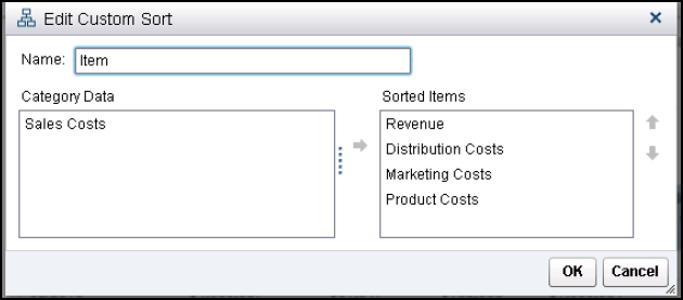
Tip 2: Use a custom sort for the category
With the waterfall chart, you might want the categories to display in a specific order. You can use the custom sort option to change the order. For the data object in Figure 5.37, the categories required a custom sort.
To add a custom sort to a category, right-click the category name and select New Custom Sort. Then drag the items from the Category Data column to the Sorted Items column. Place the data items in the desired sort order. Your data object updates automatically.
Figure 5.38 Use a custom sort
Tip 3: Use section filtering for different data sources
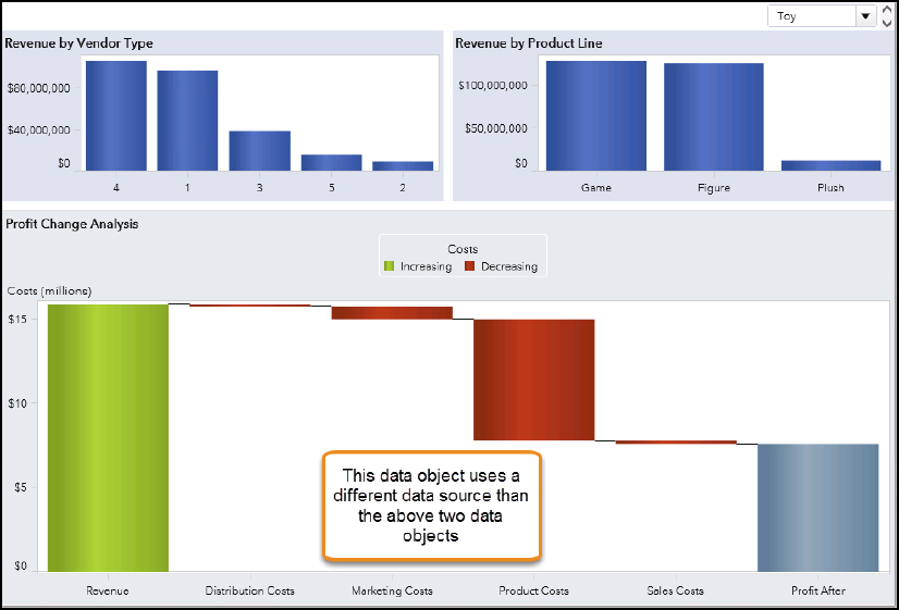
Since the data source needs to work with the other section elements, those were added to the file. For example, this waterfall chart is in the same section as a bar chart. Both of the data elements are controlled by drop-down lists in the section filter. You want the control to work on all of the data objects.
Figure 5.39 Section filtering for different data sources
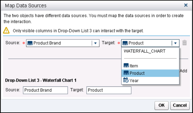
If the data sources have the same values, you can map the data sources. The data items do not need to have the same name. After adding your data objects and control, right-click the control and select Edit Data Source Mapping. In the Source field, select the data items for the Source and the Target that should be mapped. You can have multiple interactions.
Figure 5.40 Mapping data sources to the controls
Gauges
Gauges contain a single measurement and communicate a simple message: “Am I doing okay?” If you think about a gas gauge in a vehicle, it tells you how much gas is in the tank. The range is typically 0% to 100% full. You are expected to know how much gas you want in the tank. When translated to a performance dashboard, it uses the same message: where are you now?
Interpreting results
The following dashboard gauges measure the organization objectives. The objective or key performance indicator (KPI) is written above the gauge. For each gauge, there is a range of values and a color associated with the value. Take time to review the measures on each of the ranges.
Figure 5.41 Using dashboard gauges
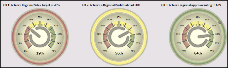
Here’s what we can learn from each gauge:
• For KPI 1, the team is failing to meet their target. The value is 19%, which is the lower range and indicated as red. This indicates that the team needs to take action.
• For KPI 2, the team is close to the 60% but not on track.
• For KPI 3, the team is achieving the established goal.
Gauges: Guidelines
Designers talk about gauges with the same disdain usually reserved for pie charts. Gauges have been misused a lot because users do not understand what data to use with them.
Choose the correct gauge
SAS Visual Analytics has five gauges available. The following figure contains examples of the available gauges.
Figure 5.42 Available gauges
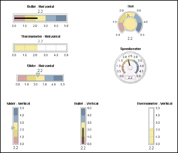
The bullet, thermometer, and slider can be horizontal or vertical, so it appears that there are three additional ones. You can also change the style for each of the gauges to get a different look.
Each gauge is measuring customer satisfaction where the rating can be 1 to 5. The target is 4.5. You can see the target as a notch. The colors use a method called trafficlighting where red indicates poor performance and blue indicates acceptable performance. You can compare how each gauge indicates performance. For example, the thermometer shows only one color. The slider measurement is highlighted.
Is there a best gauge?
In his Information Dashboard Design book, Few suggests that the bullet chart is the easiest gauge to read and understand. The user can see where within the range the current performance falls. This gauge also shows each range. Few recommends using blue instead of green for the successful measure. He indicates that color-blind users will have difficulty seeing the difference between green and red and will not be able interpret the chart correctly.
Use data that makes sense
A gauge makes the most sense when using a measurement that has a goal. Many users make the mistake of using a data item that does not fit a gauge. The data item might not be performance-related, so the gauge confuses the user.
In the following figure, the vendor location by average distance in miles is shown for the facility. You want your vendors close to your facility, but do organizations really set a performance goal for the task? This seems more like data that would be shared as part of a presentation when persuading management to open a new facility. Wouldn’t it make more sense to show this data as a bar chart or even on a map?
Figure 5.43 Gauges that do not make sense
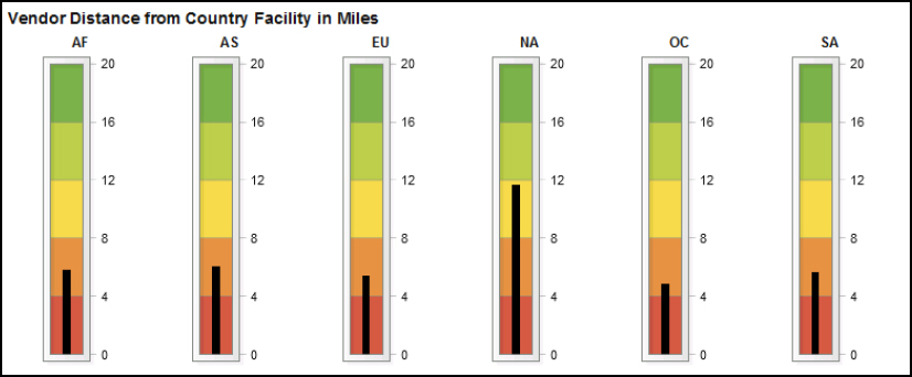
In some cases, you can turn a summed or averaged value into a percentage. This makes it easier to understand. In Figure 5.43, the gauges measured three different data items: sales target, profitability, and approval rating. However, notice that these data items were all converted to a percentage. Each of these data items also had an associated target.
Gauges: tips and tricks
Use the following tips and tricks when working with gauges.
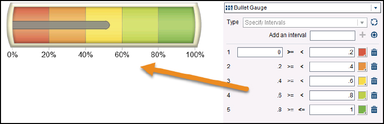
Tip 1: Use display rules
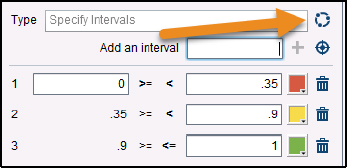
Besides setting the color, the display rules determine the ranges. When creating a display rule, you are adding the intervals and assigning colors to each interval. In the following figure, you can see that there are five intervals that are each 20%.
Figure 5.44 Setting gauge by 20% intervals
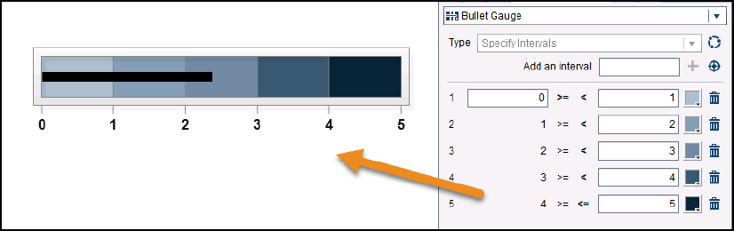
The intervals can be integers and can use a different range of colors. Click the color block to select a new color. The following figure shows intervals as whole numbers with a blue range. This gauge is used to show Customer Satisfaction ratings.
Figure 5.45 Setting gauge by single intervals
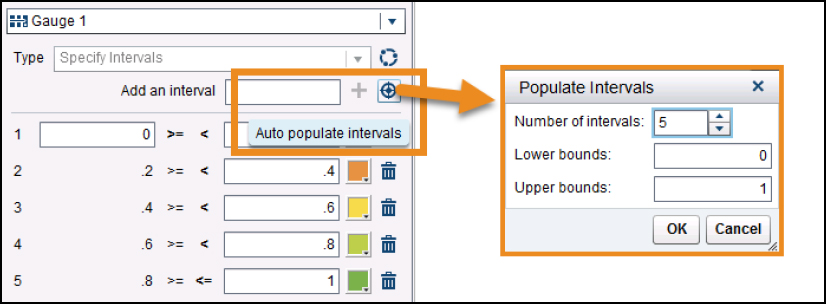
If you need help getting started, click the Auto populate interval icon. In the Populate Intervals window, select the number of intervals. Then enter the minimum or starting number in the Lower Bounds and the maximum number in the Upper Bounds. SAS Visual Analytics suggests the interval ranges that you can then edit.
Figure 5.46 Auto populate intervals
Tip 2: Add a shared rule
If your dashboard has several gauges that all use the same display rules, then create a shared rule. A shared rule enables you to create the display rule once and use it multiple times. You can have as many shared rules as you need.
In this example, each of these gauges uses a 0 to 100% scale where over 90% is the desired goal. To create the shared rule:
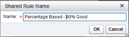
1. Create your display rule and click the Shared Rule icon.
2. When prompted, type the name of the shared rule. Make sure that you are descriptive enough so you will remember later what the display rule measures. The shared rule is applied to the current gauge automatically.
3. To apply the shared rule to a gauge, select Use a Shared Display Rule choice from the Type field. Then select the desired rule.
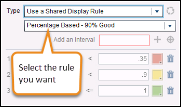
If you later decide that you don’t want to use the shared rule, select Specify Intervals from the Type field. The gauge then allows you to use the value you want.
Tables and cross tabs
Tables are used when you want to show specific values or detailed information. SAS Visual Analytics has two data objects for listing data: List Table and Crosstab.
Interpreting the results
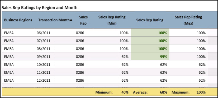
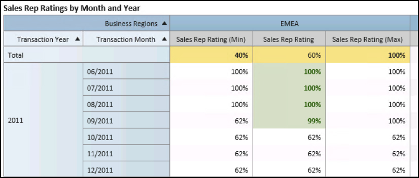
Tables show detailed information. In the following figure, you can see the approval ratings for sales rep 003R that we created in the “Building Your First Dashboard” chapter. The table has several columns, some with category values and others with measurements. Tables can use display rules, and you can add a total for the last row or last column.
Figure 5.47 Sales rep ratings in a table
In a crosstab, the categories are on the right side or top, and the measures are in the cells. The following table contains information similar to the table above, but it’s organized differently. Notice that the crosstab can organize the data item into a date hierarchy using month and year. Hierarchies can only be used with crosstabs. The total line is across the top and contains the data across both years in the hierarchy.
Figure 5.48 Using a hierarchy with a crosstab
Tables and crosstabs: guidelines for use
When using tables or crosstabs, readability should be a chief concern. Use the following guidelines when creating tables:
• Use color to ensure that the viewer understands the features of the table. For instance, use a contrasting color for the heading and the total line.
• Lines assist the viewer in following a value across the table.
Tables and crosstabs: tips and tricks
Use the following tips when creating list tables and crosstabs.
Tip 1: Add a sparkline or gauge
In his Information Dashboard Design book, Stephen Few presents a simple design based on a table. His example uses a sparkline popularized by Tufte. The following dashboard contains sparklines and gauges—all within a list table.
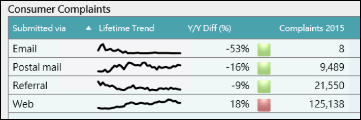
The Lifetime Trend column contains a sparkline. A sparkline is just a simple line that shows values over a time period: That is, it’s a mini-line chart. In this example, you can see how the Web trend increased while the Email trend became non-existent.
A sparkline requires a date item and a measure. It creates a new column in your table. This list table is based on yearly values, so showing the trend as a monthly or quarterly value makes sense. A daily value would make the sparkline difficult to interpret because it is such a small space, and too many values would appear cluttered. Likewise, a yearly value would not show enough variation.
The bullet gauge in the Y/Y Diff (%) column is one of the gauges available to List Tables. You can also select some of the other horizontal gauges. These gauges use the same methods as the other gauges in the tool. Refer to the “Gauges” topic for assistance in creating and using gauges.
Here’s how to create this example dashboard:
1. Add a category to a List Table. The example uses the Submitted via data item. Add the Y/Y Diff (%) and Complaints 2015 data items.
2. Add a sparkline to the table.
a. Right-click the list table and select Add Sparkline from the pop-up menu. A sparkline window appears.
b. Add a column name, a date data item, and the desired measure. Click OK.
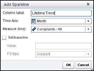
Note: If you need to edit the sparkline, right-click the list table and select Edit Sparkline from the menu.
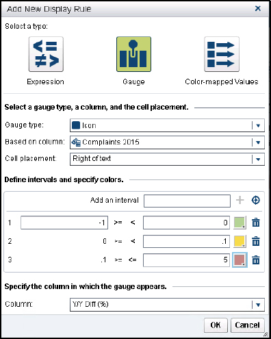
3. Add a gauge or display rule to the list table.
a. Right-click the column that contains the measure you want to use with the gauge and select Add Display Rule from the pop-up menu. The New Display Rule window appears.
b. Select Gauge to add a new gauge.
c. Select Icon as the gauge type.
d. If your measure does not appear in the Based on column, you can select it from the drop-down list.
e. Decide if you want the icon to appear to the left or right of the column value.
f. Set the display rules to determine the colors. This gauge uses reverse logic. For this data, companies want fewer complaints each year, so a negative trend is preferred. Green is used first and red last.
g. Click OK to continue.
4. Add more display rules or gauges until your dashboard meets your design intention.
Tip 2: Use a small table for single values
When you want to show a single value, you can use a table. With some creative maneuvering, you can make the font extremely large and then make the table as small as possible. In the following figure, the table was created with a single value. The heading was removed, and options on the Style menu were disabled. The font size was changed to 40 points, and a thick font was chosen.
Figure 5.49 Adding a single value
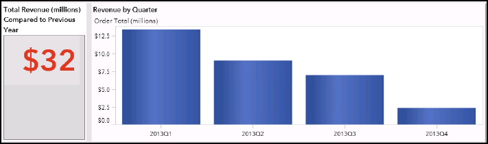
Refer to the “Pie and Donut Chart” topic for an alternate method using an invisible pie chart that works just as well.
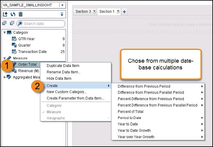
Tip 3: Check your aggregations and derived measures
When you create a calculated item, you should test it prior to use. The derived data items can be especially tricky since it’s not always obvious what is being calculated. Derived data items are created from a measure.
![]() Right-click a measure.
Right-click a measure.
![]() Select Create and then the derived measure you want.
Select Create and then the derived measure you want.
There are multiple date-based aggregated measures you can instantly create.
Figure 5.50 Adding a derived data items
After the measure is created, it is added to the Aggregated Measure list. In the following figure, the four derived items are displayed.
Figure 5.51 Derived measures in a table
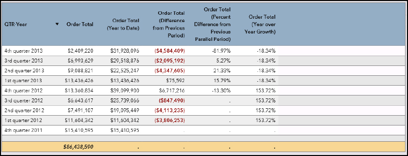
Here’s what each column in the preceding figure contains:
• QTR-Year is the date. Derived measures use a date as the basis.
• Order Total is the data item used to create the other column. This value helps you see how the result was calculated.
• Order Total (Year to Date) shows the cumulative amount for each year. It resets in first quarter.
• Order Total (Difference from Previous Period) is the difference in the previous period and this quarter.
• Order Total (Percent Difference from Previous Parallel Period) is the percentage difference in the same quarter of the previous year.
• Order Total (Year over Year Growth) is the percentage difference in the same quarter of the previous year.
Notice that the total row does not contain any values for the derived measures.
You may have noticed that the last two columns contain the same values. You can edit the derived measure to get a different result. For instance, if you wanted to display the year over year change for the entire year, you would edit the aggregated mesaure to change the Outer Interval to _By Year_ instead of _Inferred_. Refer to the product user documentation for a detailed discussion of derived measures.
Bubble plots
You cannot research bubble plots in the work of any data visualization expert without reading a reference to Hans Rosling’s TED Talk, Let My Dataset Change Your Mindset (May 2010). It might have been the first time that a bubble plot gained a mainstream appeal, as noted by Stephen Few in his Show Me the Numbers book. Rosling provided an intense amount of information in one data visualization. Here’s some pointers on using bubble plots to give your data set a sexy new appeal.
The examples in this topic were based on the sample BIRT database provided by the Eclispse Foundation (http://www.eclipse.org/birt/documentation/sample-database.php).
Interpreting the results
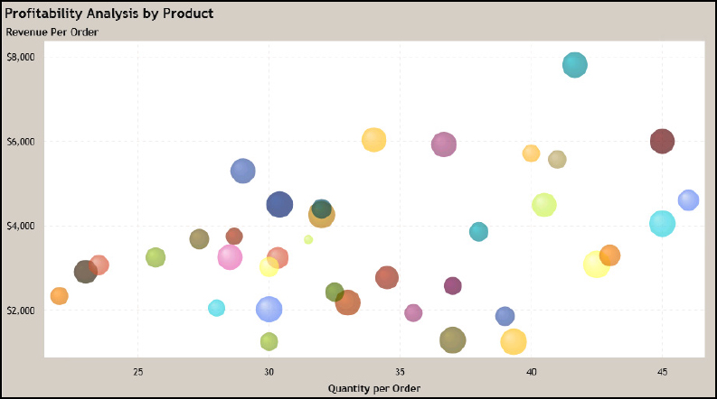
Bubble plots enable you to understand the relationship between three values. Two numeric values are plotted by their X and Y coordinates, and the third coordinate is a bubble. In this example, the bubble size is the gross margin. Revenue per Order and Quantity per Order are plotted on the x-axis and y-axis. Each bubble represents a specific product. You can interpret this chart by comparing the bubble size and placement. We are trying to understand our profitability.
Figure 5.52 Bubble plot
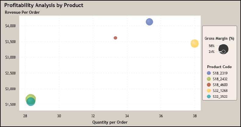
Gross margin means that we had more profit on a product—so the larger the bubble, the more money we earned. What else can we learn?
• The red product has a lower profit margin than the other products despite having double the revenue. What if the product was on sale to lure other customer purchases or if our discount is too much?
• In the bottom corner, the lime green and teal products had identical orders in terms of quantity and revenue. But the lime green one is larger, so it was more profitable. If these are similar products, why is the margin so different? Maybe we switched suppliers and had to pay a higher cost?
• The blue, yellow and teal products had similar margins but at different prices and quantities. How do we sell more of those products?
Bubble plots: guidelines
Many people criticize bubble charts for being difficult to interpret. Don’t let that stop you from using it—just be sure to add the supporting information to help the user understand. Most business users can learn to interpret the chart easily when it’s properly labeled. This chart is also not suited to precise values because it’s meant to provide an overall look and help the audience identify areas of concern. During this analysis process, we were comparing bubble size and not actual profit margins.
Data preparation is key
When preparing data for this demonstration, we used a sample data set from the BIRT project about a company selling Classic Cars. We joined several tables to get a data set that contains the line items from each customer order.
Here’s how the data items were created:
• Gross margin is a calculated measure. Gross margin is Line Item Revenue minus the Line Item COGS over the Line Item COGS. The gross margin was turned into a percentage.
• Quantity per Order was averaged from the raw data value.
• Revenue per Order was averaged from the raw data value.
A legend is a requirement
The legend on the side helps the user understand the bubble size and the color meaning—so it’s essential. Otherwise, the user may not understand that the bubble size indicates the gross margin value and the colors are the product codes.
You can turn on the Legend on the Properties tab. In the preceding figure, the legend is to the right of the data object. You can place the legend where it makes the most sense in your layout.
Bubble plots: tips and tricks
Here’s some tricks to handle common situations.
Tip 1: Use the transparency setting so users see all the data
You can also change the transparency setting so that users can see the overlap when there are more bubbles. The transparency setting is on the Properties pane. For this example, the transparency changed to 70%. This allows the background bubbles to shine through.
Figure 5.53 Use transparency for multiple bubbles
Tip 2: Animating the data
You can add a fifth dimension of time. This data set is based on 2012. It has a value called MONTH.
If you animate the data, this helps the user understand over time what happened to the product.
We can see that we started selling more of the green product, which didn’t change the margin that much. What if the product was discounted toward the end of the year or the customer was given a discount for a larger order?
Figure 5.54 Use animation wisely
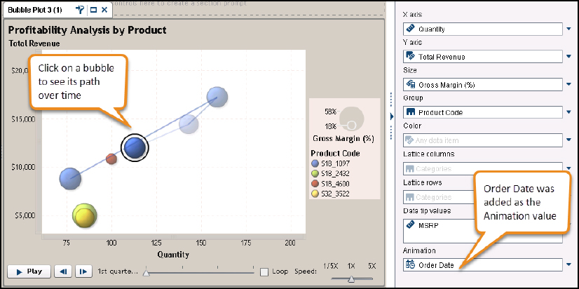
To add animation, use the Role tab. You must have a date value because this is showing how something changed over time. Add the date data item to the Animation role. The animation is based on the date value. If your date value is formatted as month, then the animation creates a month-to-month time line. Likewise, if you use a date that is formatted as quarter, then the timeline divides by quarter.
Choose your data value carefully. A timeline that takes too long to display may lose the viewer’s interest. Your timeline should emphasize your message quickly or show how the patterns changes over time.
References
Cairo, Alberto. 2013. The Functional Art: An Introduction to Information Graphics and Visualization. Berkeley, CA: New Riders.
Cairo, Alberto. 2016. The Truthful Art: Data, Charts, and Maps for Communication. San Francisco, CA: New Riders.
Few, Stephen. 2012. Show Me the Numbers: Designing Tables and Graphs to Enlighten. 2nd ed. Burlingame, CA: Analytics Press.
Few, Stephen. 2013. Information Dashboard Design: Displaying Data for At-A-Glance Monitoring. 2nd ed. Burlingame, CA: Analytics Press.
Kong, Nicholas, Jeffrey Heer, and Maneesh Agrawala. 2010. “Perceptual Guidelines for Creating Rectangular Treemaps.” IEEE Transactions on Visualization and Computer Graphics 16(6): 990-8. Available at http://vis.stanford.edu/files/2010-Treemaps-InfoVis.pdf.
Parker, Roger C. 2006. Looking Good in Print, Sixth Edition. Scottsdale, AZ: Paraglyph Press.
Tufte, Edward R. 2001. The Visual Display of Quantitative Information. Cheshire, CT: Graphics Press.