
chapter thirteen
visualizing and exploring your data
In the previous chapter, we walked you through the modern interface of the SAS Visual Data Builder. That same look has also been applied to the SAS Visual Analytics section for the version on SAS Viya. This new appearance gives you more space to work with and easier navigation of features, resulting in more control over your reporting and data analysis capabilities.
The architecture of the application has also been updated. Some parts that were previously split between sections are now combined into a unified application. Since this is an update, there are added features to the application as well. In this chapter, we explore this new version of SAS Visual Analytics and explain what has been added.
Introducing the new layout
The new layout of SAS Visual Analytics has a structure similar to the one from previous versions, but a new look and feel to it. Two of the major changes are the panels and top toolbar.
In Figure 13.1, a blank report is shown in SAS Visual Analytics 8.1.
Figure 13.1 SAS Visual Analytics layout
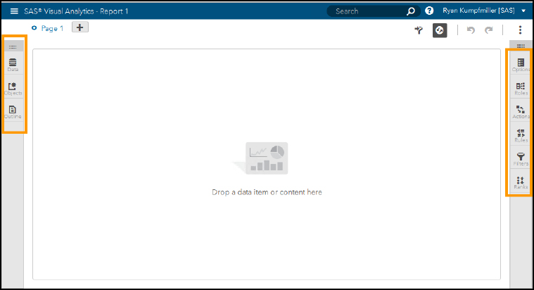
In the top left corner of the report, you can see that we have Page 1. This shows the tabs of the report, which are called pages. You can click the plus sign to create multiple pages for a report if you would like. If you have used any of the previous versions of SAS Visual Analytics, you should be able to recognize the panels that we have here as well as some added icons.
You can access your data and objects from the left panel. If you click the Data tab, it opens a panel with your data set and all of its data items. The Objects tab shows you all of the objects within the application that you can use for reporting. Within both of these tabs, the drag-and-drop functionality lets you easily drag data or objects to the canvas. The Outline tab outlines the structure of your report so that you can see the pages that you have created and the objects in each one of them.
The right panel lets you control your objects. The Options button gives you the choices to customize the object, changing titles, backgrounds, layout, and other data options. The Roles tab is where you can see and add data items to your object. With the Actions button, you can set up interactions between objects or links to other pages. The Filters, Rules, and Ranks tabs let you customize your object to your requirements.
An important aspect of this new layout is how the panels are minimized. If you click one of the tabs, it opens, and you can use it as needed. But once you are done, you can close the tabs and have an open white space to work in while you are building a report.
Top toolbar
The toolbar at the top that sits across from the pages of the report contains some new features that make reporting even more convenient. The first icon that looks similar to the filter in the right panel controls the display for the report and page prompts. When this icon is clicked, two bars appear at the top of your page, as shown in the following figure.
Figure 13.2 Report and page prompts
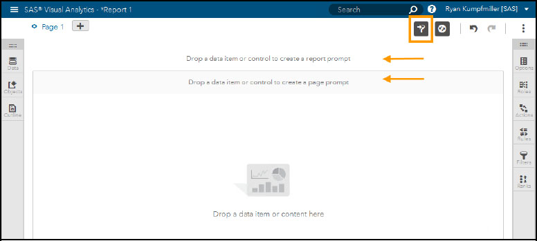
You can drag data items or control objects into these sections, which filter out data according to which one they are in. The Report prompt section filters data for all pages, and the Page prompt filters data for all objects on that page.
The next icon is the auto update. This is turned on by default so that when you make changes to the data within objects, the objects update automatically with the new results. If you’re working with large data sets that can take a few moments to process, you can turn this feature off to build reports quicker.
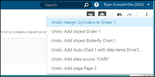
You should recognize the next two icons on the toolbar: Undo and Redo. You might find this new part of the interface to be the most convenient of them all. Not only does the Undo button keep track of your last action, but it also keeps a history of them, as shown in Figure 13.3 below. Left-click Undo to revert your last action; right-click to see the history of your actions. Now mistakes can more easily be corrected compared to previous versions.
Figure 13.3 Undo button
Starting a new report
When you click SAS Visual Analytics from SAS Home, you are immediately brought to a window with options to go to your data sources, create a new report, or open a saved report. This is the welcome mat of the application and lets you choose where you want to start in the application.
Figure 13.4 SAS Visual Analytics welcome mat
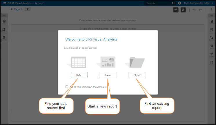
There is a check box at the bottom where you can default to a certain selection so that you do not get this welcome screen each time you log in. The options to open a report, create a new one, or load data are all available in the application as well.
Importing data
If you selected data from the welcome screen, you are brought to the Open Data Source window. You can also reach this window by selecting Add and then Add data source on the Data tab.
Figure 13.5 Open Data Source window
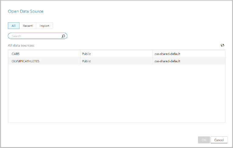
In this window, under the All tab is where you can find all of your data tables that are loaded into the CAS Server. The Recent tab shows all the data sources that you might frequently use, and the Import tab is where you can pull in data from other servers or your local machine. When under Import, there is an option From Clipboard in the local options. This option lets you paste data from places such as a web page.
Exploring data
From Figure 13.5, we are going to select the OLYMPICATHELETES data set and open in the application. After you click OK, the report canvas appears with the Data tab open.
Figure 13.6 Data panel
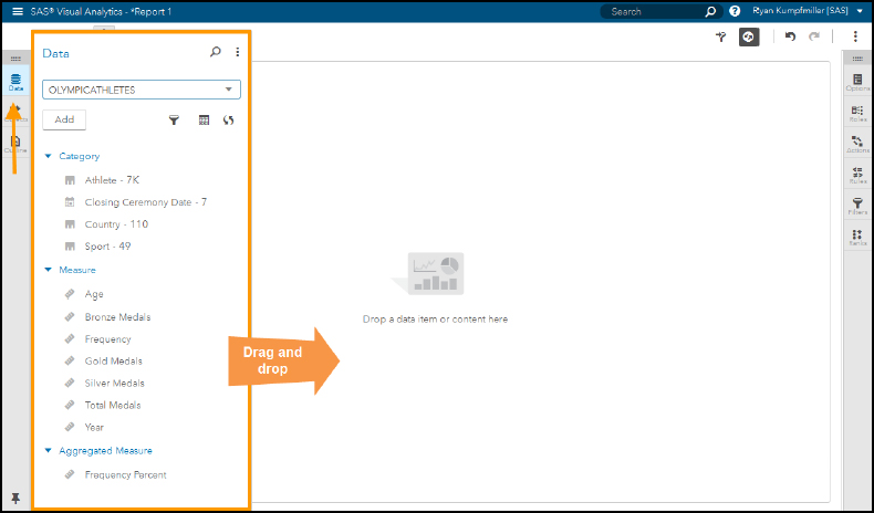
This panel is very similar to the one from previous versions. You can find your data source in the top drop-down bar. If you have imported multiple data sets, this drop-down bar is where you can switch between them. Down in the panel is where you can find your Category (character and datetime type), Measure (numeric), and Aggregate Measure data items. Right below the table name is the Add button. This is where you can access the options for creating hierarchies, new calculated items, custom categories, and parameters. The icons across from the Add button let you filter the whole data source, get to measure details (covered later in this chapter), and refresh the data.
Adding objects
Under the Data tab, is the Objects tab, which opens to a panel with an inventory of all of the available objects.
Figure 13.7 Objects panel
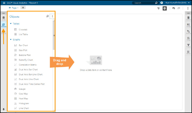
If you are familiar with previous versions, you notice that this is similar to the older objects tab with a few additions. As the instructions on the canvas mention, you can simply drag content to the canvas. For this example, we are just going to start with a list table.
Figure 13.8 Adding an object
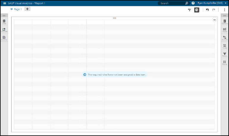
The canvas is updated with the list table, but we still do not have any data added. So a message sits in the middle of the object letting us know that data has not yet been assigned to the required roles. In order to add those roles to your object, you can drag data items from the data panel to the object or you can go to the Roles tab like we have in the figure above. When you click the Add button, a window appears like the one in the figure below.
Figure 13.9 Adding roles to an object
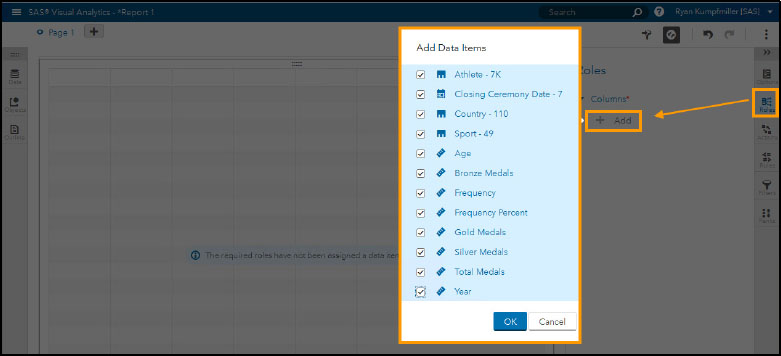
If the specific role that you are populating can take multiple data items, then a check box list appears. If the role only takes one type of measure or category, then you are given a choice of the ones that fit that required role. For the ones with possible multiple selections, you can select the first one and hold down the Shift key to select all or as many as you like. With our Olympic Athletes data set, we want to pull everything over first so that we can a look at all the data we have available. Here’s what the page looks like after we click OK.
Figure 13.10 List table with data
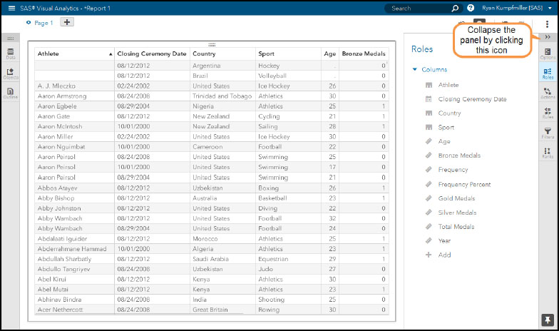
The Roles panel shows us that all of the columns have been added to the list table and are in order according to how they appear in the table. All of the data items cannot fit on the screen. But there is an invisible scroll bar at the bottom that you can use to see the rest of the items. It appears as your pointer moves to the bottom of the table.
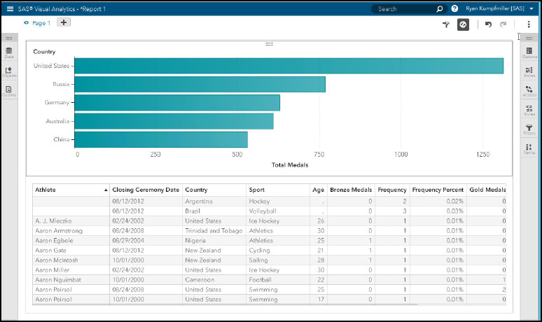
If you want to add another object, you can go back to the objects panel and drag another object to the canvas. While you’re still dragging, there are blue highlights on each side of the canvas indicating where the object is going to appear when you have finally dropped it. When you do drop, the canvas divides the space between your old object and the new one that was added. In Figure 13.11, we dragged a bar chart and added Country as our category and Total Medals as our Measure.
Figure 13.11 Adding multiple objects to the canvas
All-in-one application
In Chapter 2, we walked you through the designer part of SAS Visual Analytics and how to start building out reports. Then in Chapter 7, we showed you how to create visualizations in the explorer section of the application. The explorer section had quite a few features that you could not use in the designer. In this section we are going to show you where you can find them in SAS Visual Analytics 8.1.
Auto-chart and changing objects
One of the big differences between the report designer and explorer in previous versions was that in the explorer you could drag data items to the visualization area and then the application would automatically determine a chart to use. From there, you could change that chart if you would like through a drop-down menu. This feature has been merged into SAS Visual Analytics 8.1.
Figure 13.12 Dragging data items to a blank canvas
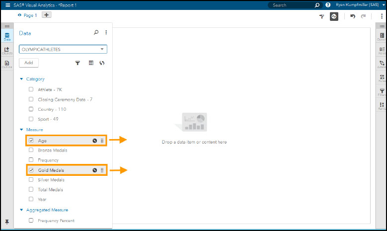
You can see in Figure 13.12 that we have selected Age and Gold Medals as measures from our Data panel. We can then drag those two items to the canvas to the right. By just dragging any data item to the canvas space, your data is automatically charted into a graph depending on what type of data it is.
Figure 13.13 Using the auto chart
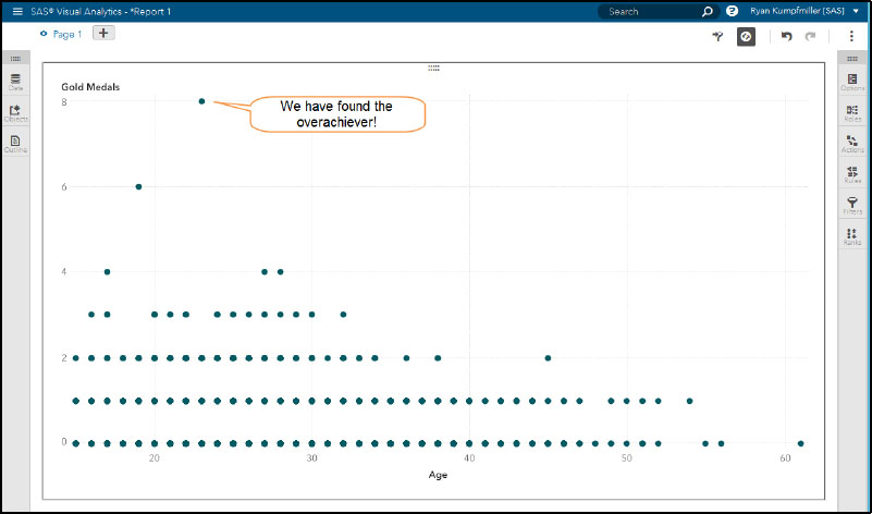
After dragging those fields over, a scatter plot appears with our data. The automatic chart feature determined that this was the best visual to display the fields that we gave it. With the scatter plot, we get a visual that plots the data of the two measures against each other. We seem to have an outlier at the top with someone winning 8 gold medals at the age of 23—wonder who that could be?
If you would like to add more fields, you can go back to the Data panel and continue to drag more into the object. Since we are still in the auto-chart feature, your object might change depending on the data item that you add. You can also select an option at the top of the report that shows which other types of charts are available for the data items that are in the report.
Figure 13.14 Changing the auto chart object
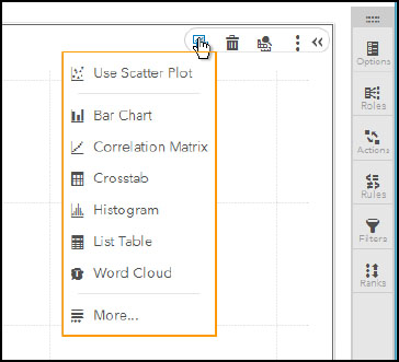
This is a cool feature that lets you change objects when you know you have the right set of data items to analyze. So with the data items that we currently have in the Scatter Plot, the Change Auto Chart to icon at the top lets us know that we can also look at it in a Bar Chart, Correlation Matrix, Crosstab, Histogram, List Table, and Word Cloud. Switching among all of these quickly gives you many different views of your data. Doing this might uncover a better object to visualize your data than you initially conceived.
Getting more measure details
When trying to learn more about a data item, you might put it into a table or bar chart so that you can better understand the values that it contains. In SAS Visual Analytics 8.1, the Measure Details feature from the Explorer in SAS Visual Analytics 7.3 has been brought in to give you all the information that you need to know about each of your measures. At the top of the Data tab, where the name of your data set is, click the Table icon to open a window that contains information about each measure in your data set.
Figure 13.15 Measure details for a table
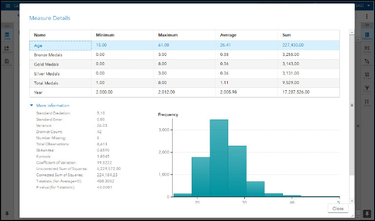
The top table shows your minimum, maximum, average, and sum for each measure. In Figure 13.15, we have Age selected for the More information section at the bottom. But you can select any of the measures from the top table and the bottom then updates. The bottom statistics show many advanced metrics for an individual measure ranging from distinct counts all the way to a value for skewness. The advanced metrics update by clicking on any of the measures in the table at the top.
Objects and Data Analysis Features
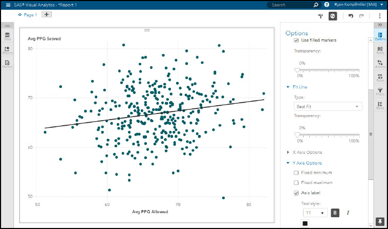
In previous versions, since the Explorer section was meant for more data analysis, it was packed with a few additional objects and features that you could not get to in the designer. Now that there is only one application, all of those have moved over. You can find heat maps, correlation matrices, word clouds, and many more objects in the objects panel in SAS Visual Analytics 8.1. Also, the data analysis features have migrated. Forecasting is available in the Time Series Plot, and fit lines are available in the Heat Map and Scatter Plot.
Rearranged features in SAS Visual Analytics 8.1
You might notice some other changes to the objects when comparing SAS Visual Analytics 7.3 and 8.1. For example, the Scenario Analysis in forecasting is now called What-If Analysis. Also, text analytics is now its own object (called Text Topics) instead of being a mode of the Word Cloud.
Figure 13.16 Forecasting feature in a line chart
Launch into analytics with visual statistics objects
While you’re analyzing a set of measures, you might want to look deeper into your data. Getting into the more advanced objects can be done through the launch option, which is similar to how you change the chart type. You can find the explore option in the small object toolbar in the top right corner, where you can change the chart.
Figure 13.17 Launch option
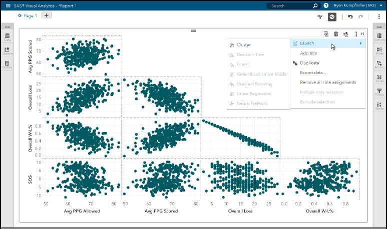
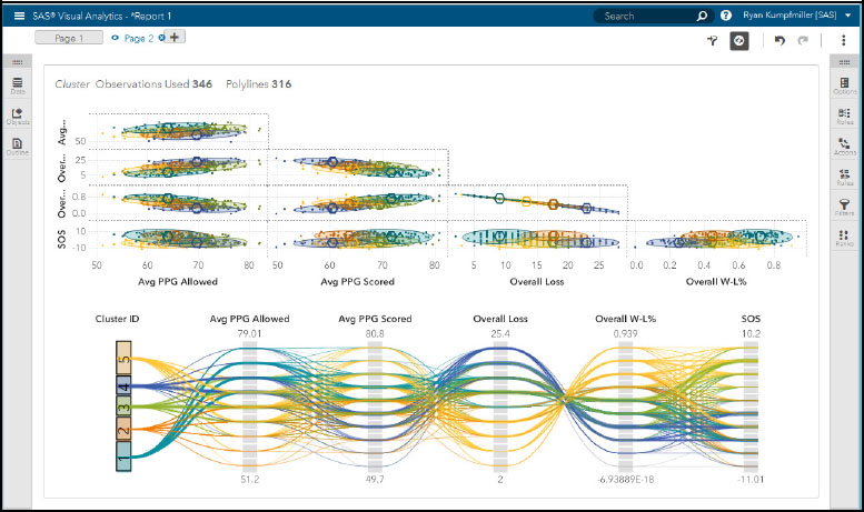
With the measures that you have in the current object, any of the advanced objects that require a similar set of measures are now available. You can see in Figure 13.17 about that the Cluster object is available for us to use. When we click this, we are taken to a whole new object that segments our data into clusters providing another perspective of our data.
Figure 13.18 Cluster analysis
Additional features
To go along with the new interface and everything that we have covered so far, there are also plenty of other new features added into SAS Visual Analytics 8.1. These include hiding a page, a new look to the pie chart, padding, and web fonts.
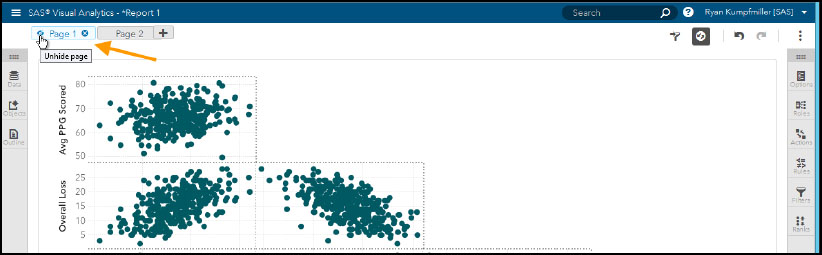
Hiding pages
This new feature lets you hide a page so that you can only view it when editing the report. If you share it or go to the viewer mode, that page does not show up. This can be very useful when in the process of developing pages in a report. Now you can just hide the pages that are a work in progress instead of having two versions of the report. You can set a page to be hidden by just clicking the eyeball icon that shows up right next to the page title when it’s open.
Figure 13.19 Hiding a page
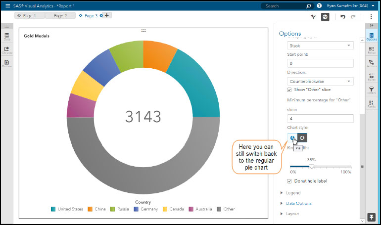
Adding the donut chart
A popular visualization object, this SAS Visual Analytics 8.1 version has revamped the Pie Chart to look more like a donut by just having an outer ring that divides the values that you are looking at. Additional options have been added so that you can choose where the chart starts, and you can also change the ring width. If you prefer the original pie chart, there is an icon in the options tab to revert.
Figure 13.20 New pie chart with donut style
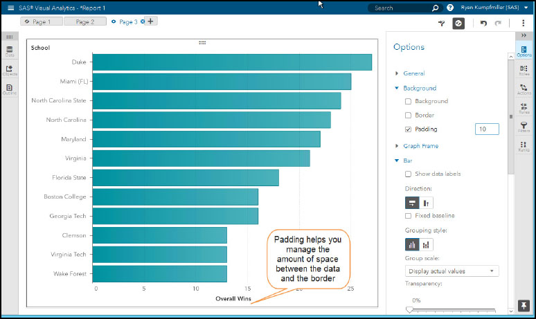
Add padding to objects
Sometimes it can be hard to get your labels to fit correctly on your charts. With the new padding option on the Options tab, you can give yourself more or less space between the border of the objects and where the text and chart of the object starts.
Figure 13.21 Padding feature on the options tab
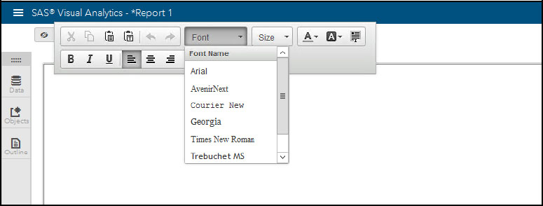
Keeping fonts consistent
The number of fonts available to use in this version has actually been reduced to just a few common fonts that are universally accepted on all platforms. In this way, when you export and share reports you know that your viewer has the same look and feel that you have.
Figure 13.22 Fonts available in SAS Visual Analytics
References
SAS Institute Inc. 2017. SAS Visual Analytics 8.1: User’s Guide. Cary, NC: SAS Institute Inc.
SAS Viya Communities. https://communities.sas.com/t5/SAS-Viya/ct-p/sas-viya
SAS Visual Analytics. https://communities.sas.com/t5/SAS-Visual-Analytics/bd-p/sas_va