
Hour 6. Working with Basic UI Controls
What You’ll Learn in This Hour
 Using
Using TextViews, EditTexts, and Buttons
Creating controls with adapters
Indicating progress with ProgressBars
Showing an image with an ImageView
In this hour, you look at three common controls in detail. Using a Button, EditText, and TextView with different properties, in this hour you learn how to create a variety of user interfaces. The functionality and tone of the apps can change even when using the same views. This hour introduces the concept of data adapters and shows how adapters work with Spinners and AutoCompleteTextViews. The use of ImageViews, ProgressBars, and SeekBars is also covered.
Setting Up the Demo App
When you create a user interface using the visual editor in Eclipse, you select items from the palette. The palette organizes these items into categories that include Form Widgets and Text Fields. The Form Widget category includes TextViews, Buttons, Spinners, ProgressBars, and Seekbars. The Text Fields category includes EditText views and AutoCompleteTextViews. You’ll examine these items individually and see how you can use them to create user interfaces with different functionality and styles. To do that, you’ll create a demo app with five activities. The main activity handles simple navigation. Each of the other activities demonstrates how to use certain view controls.
For the demo app, you’ll use a LinearLayout with a vertical orientation. Navigation will occur when the user clicks a button to go to another activity. Each button has the layout_width set to match_parent.
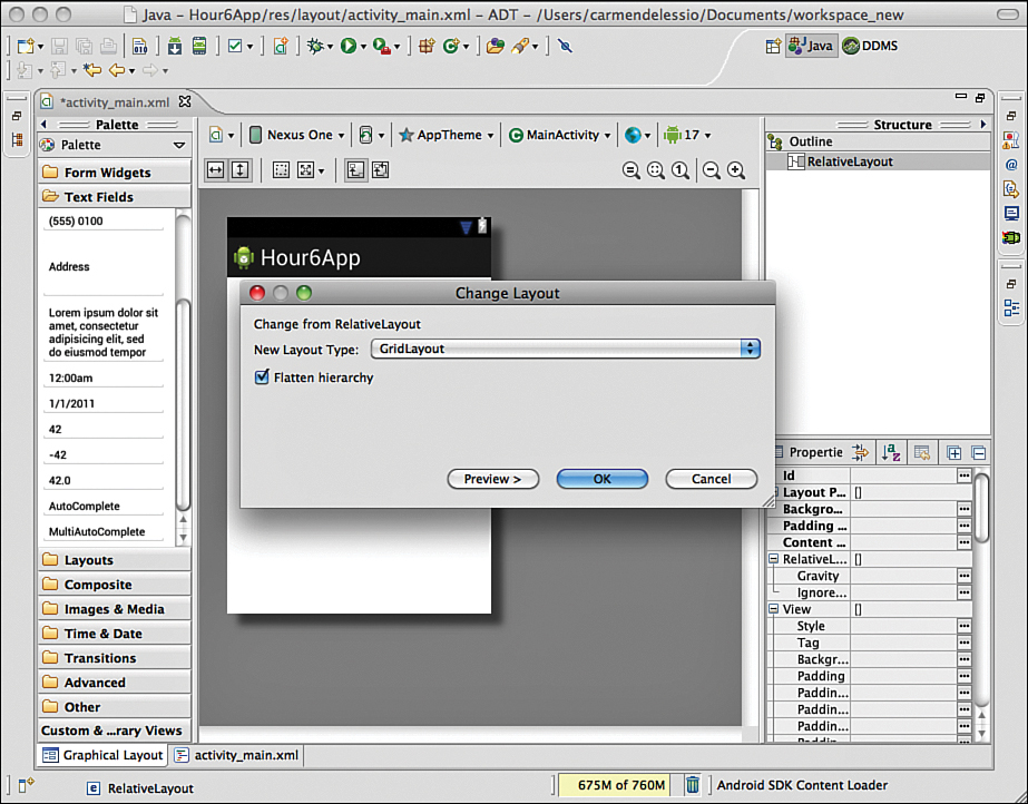
To get started, create an Android app called Hour6App. The XML layout file main_activity.xml will be created. Using Eclipse, remove the TextView that is automatically created. To change the layout from a RelativeLayout to a LinearLayout, right-click on the RelativeLayout and choose Change Layout.
Choose LinearLayout with vertical orientation (see Figure 6.1). After you change the layout, you can add buttons that will be used to launch other activities.
The Hour6App project that accompanies this book contains all the source code that accompanies this hour.
Right-clicking a control in the visual editor brings up a contextual menu of common tasks. You can perform tasks such as changing text, id, or layout_width in this way. Using the demo app is an easy way to change the text and layout_width of the buttons on the main_activity.xml layout.
Figure 6.2 shows the resulting layout for the demo app shown in the emulator.
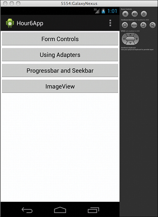
As you develop activities for various views, you’ll “wire” them to the main page. On the onClickListener() for each button, the app launches the appropriate activity.
Using Input Controls
In many apps, there is a need to collect basic information from the user. The most basic data entry field to use on a layout is an EditText. You used an EditText in the sample app in Hour 1, “Getting Started: Creating a Simple App.” As you design layouts, you can use TextViews as labels for clarity and perhaps to add instructions. You use Buttons to initiate an action.
Using TextView and EditText Views
A TextView displays text that the user cannot change. An EditText view is intended for user input. Like with other controls, you can change the size, color, and background properties of both a TextView and an EditText view.
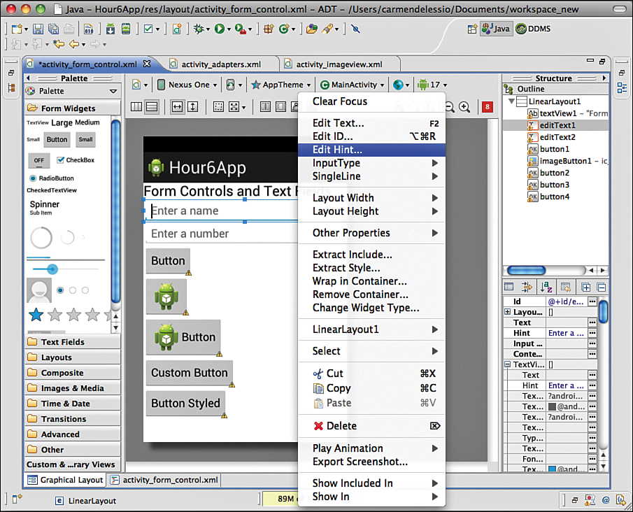
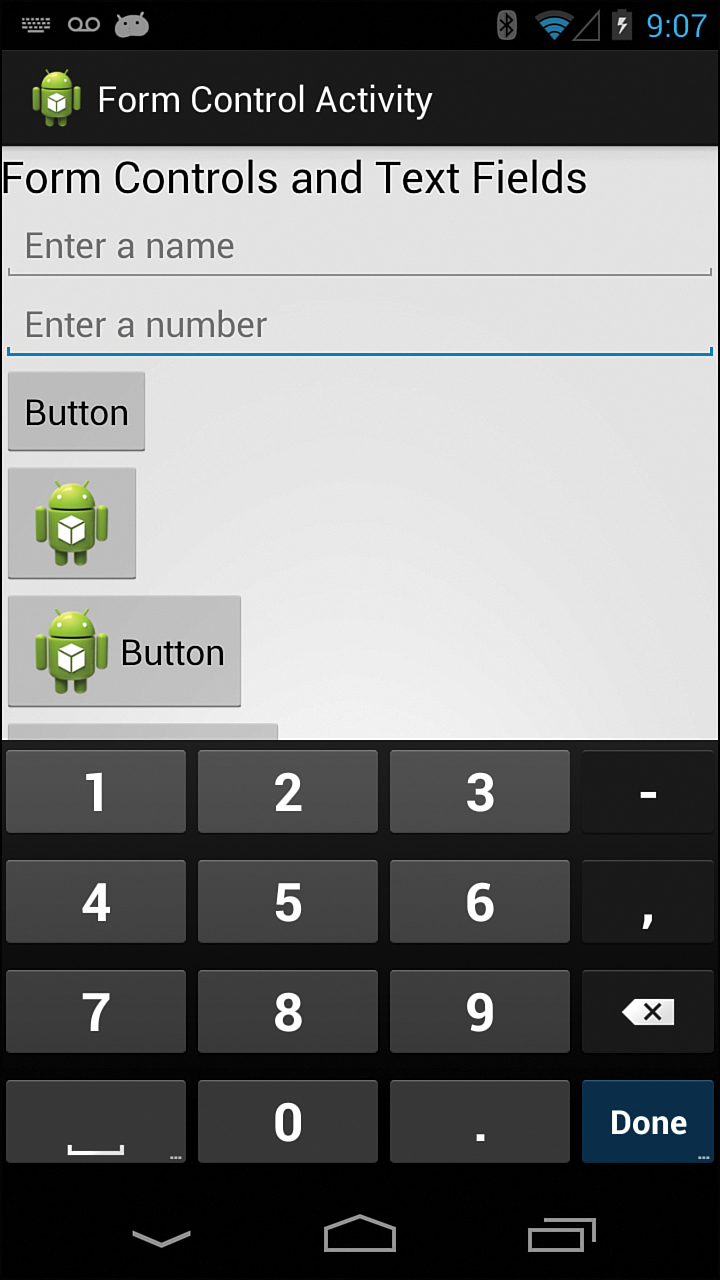
This section considers two other properties of an EditText field: the hint property and the inputType. A hint displays in the contents of an unedited EditText. In Figure 6.3, the hint for editText1 says “Enter a Name,” and the hint for editText2 says “Enter a Number.” Figure 6.3 shows these in the Eclipse visual editor with the Edit Hint menu item selected.
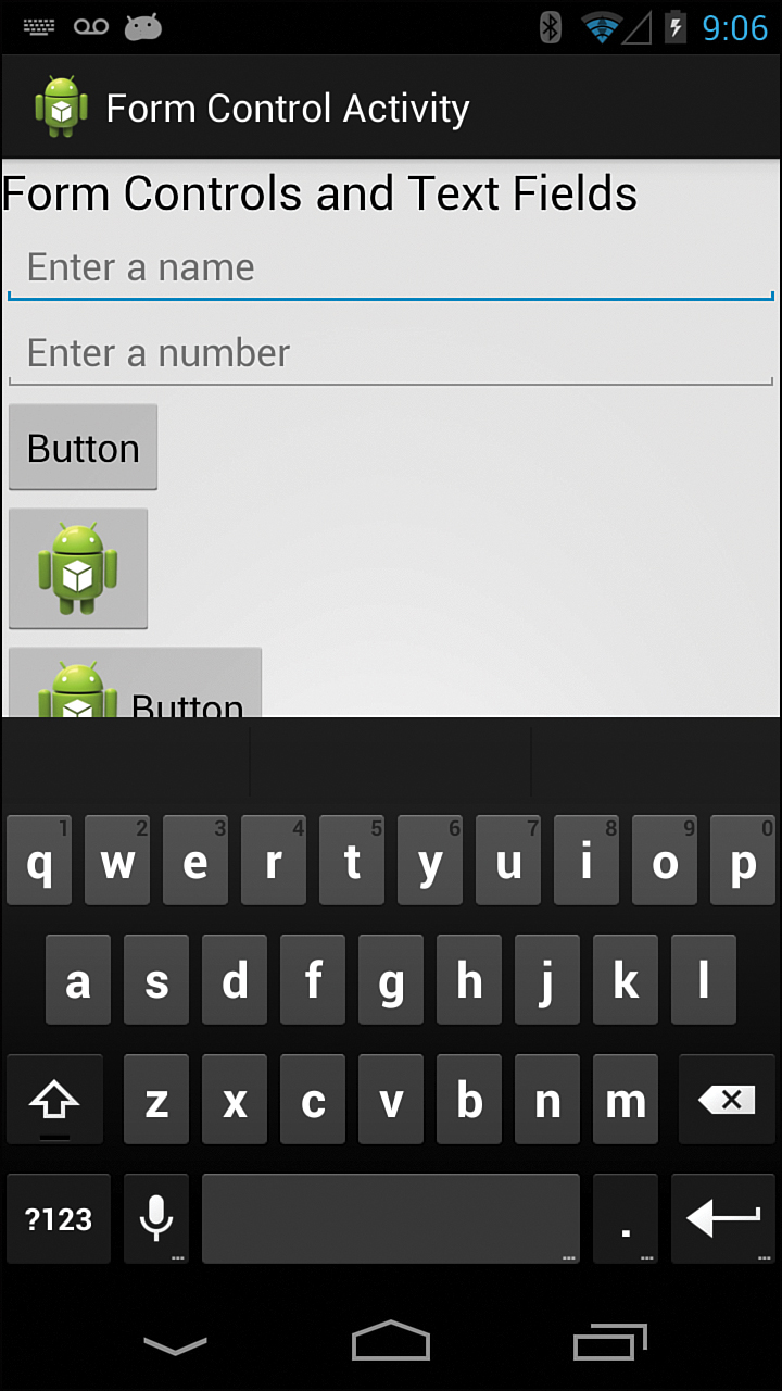
The inputType property has a long list of choices. The purpose of the inputType property is to show the appropriate keyboard layout for use with the EditText view. If the intended input is a number, then the keyboard will show numbers. If the input type should be an email address, then the keyboard shows text and an @ symbol. An EditText view has a method called getText() to access the current value in the view.
The demo app uses a default inputType and a number inputType. Figures 6.4 and 6.5 show the resulting keyboard for these EditText views.
To implement the FormControlActivity, create a FormControlActivity class and an XML layout file that contains a TextView and two EditText views. The FormControlActivity just uses setContentView() to show the layout file. To display the FormControlActivity, MainActivity.java requires the creation of a showFormButton and a corresponding onClickListener() with code that starts an activity. This is the same method used in Hour 2, “Understanding an Android Activity,” to launch an activity:
Button showFormButton = (Button)findViewById(R.id.buttonFormControl);
showFormButton.setOnClickListener(new OnClickListener() {
public void onClick(View v) {
Intent intent = new Intent(MainActivity.this, FormControlActivity.class);
startActivityForResult(intent, 0);
}
});
Using Different Kinds of Buttons
You used an unmodified button in Hour 1, “Getting Started: Creating a Simple App.” You can create buttons with a variety of styles and attributes.
Two controls are buttons: one is a Button(android.widget.Button) and the other is an ImageButton(android.widget.ImageButton). A Button contains a text label and an ImageButton contains an image. In the Eclipse visual editor, you access a Button via the Form Widgets section of the palette and an ImageButton in the Images and Media section.
You can also add a drawable image to a standard Button by providing a value for at least one of these properties: drawable_left, drawable_right, drawable_top, or drawable_bottom.
Listing 6.1 shows the XML layout for a Button, an ImageButton, and a Button with a value for drawable_left. For the drawables, use the ic_launcher.png file, which is the default image that is used for an app icon and provided when you create your activity.
Note: More About Button and ImageButtons
The Button class is extended from a TextView and an ImageButton is extended from an ImageView. A Button is a TextView that can have drawables placed around it. An ImageButton is an ImageView that acts like a button. An ImageButton displays a single image.
LISTING 6.1 Three Buttons Defined in an XML Layout
1: <Button
2: android:id="@+id/button1"
3: android:layout_width="wrap_content"
4: android:layout_height="wrap_content"
5: android:text="Button" />
6: <ImageButton
7: android:id="@+id/imageButton1"
8: android:layout_width="wrap_content"
9: android:layout_height="wrap_content"
10: android:src="@drawable/ic_launcher" />
11: <Button
12: android:id="@+id/button2"
13: android:layout_width="wrap_content"
14: android:layout_height="wrap_content"
15: android:drawableLeft="@drawable/ic_launcher"
16: android:text="Button" />
As with other views, you can programmatically change the contents and properties of a button. Swapping the image in an ImageButton or changing the drawable and text in a standard button might make sense.
Now add an onClickListener() for button2 that is defined in lines 11–16 of Listing 6.1. Clicking the button causes the image to be replaced and the text to be updated. To find out the current contents of the button, you must get the text being displayed.
Listing 6.2 shows the code to implement this. You use getText() and setText() to check the value and change contents. To change the image, use the method setCompoundDrawablesWithIntrinsicBounds(). The parameters to this method are the drawables to use in the button in this order: left, top, right, and bottom. Figure 6.6 shows the two buttons that you are switching between.
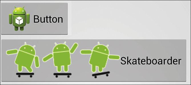
The skateboarding robot image needs to be imported into the drawables resource folder.
LISTING 6.2 Swapping Drawables in a Button
1: mIcon = getResources().getDrawable( R.drawable.ic_launcher );
2: mSkateboardIcon = getResources().getDrawable( R.drawable.robot_skateboarding );
3: swapButton = (Button)findViewById(R.id.button2);
4: swapButton.setOnClickListener(new OnClickListener() {
5: public void onClick(View v) {
6: if (swapButton.getText().equals("Button")){
7: swapButton.setText("Skateboarder");
8: swapButton.setCompoundDrawablesWithIntrinsicBounds(mSkateboardIcon,
9: null, null, null);
10: }else{
11: swapButton.setText("Button");;
12: swapButton.setCompoundDrawablesWithIntrinsicBounds(mIcon, null, null,
null);
13: }
14: }
15: });
Several techniques are available for changing the look and feel of buttons. For example, you can change the style of the button or create a custom background for the button. You can also use an existing Android system style. This line sets the button to an existing Android system style:
style="@android:style/Widget.Button.Inset"
Creating a button with a custom background requires some additional work. You need a drawable image for each state of the button. A button can be displayed on a page, it can be the control on the page that has focus, and it can be pressed by the user. These three button states display differently. To handle each of these scenarios, you create an XML file in the drawable directory that references these three button states. That XML file is, in fact, a drawable.
Listing 6.3 shows the contents of the button_custom.xml. In this case, each drawable used in the XML file is a solid color image. This file is placed in a drawable resource folder. To use effects such as beveled edges, nine-patch images are recommended. You set the background property of the Button you want to customize to the button_custom.xml file by referring to the file as a drawable; for example:
android:background="@drawable/button_custom"
LISTING 6.3 Defining a Drawable for a Custom Button
1: <?xml version="1.0" encoding="utf-8"?>
2: <selector xmlns:android="http://schemas.android.com/apk/res/android">
3: <item android:drawable="@drawable/button_pressed"
4: android:state_pressed="true" />
5: <item android:drawable="@drawable/button_focused"
6: android:state_focused="true" />
7: <item android:drawable="@drawable/button_default" />
8: </selector>
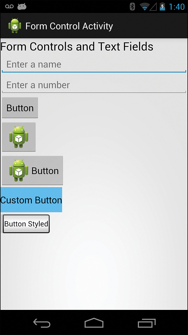
Figure 6.7 shows all the views used in the FormControlActivity.
Using Controls with Adapters
Many controls have a single text property. For example, a button might display “OK,” or you can use a line of text as a label in a text view. Other controls require and must display more than one piece of data. For these, you use adapters to tie complex data to a control.
Adapters
An Adapter(android.widget.Adapter) binds data to a view. For example, a Spinner is a control that provides the user with a list of choices to select. The list of choices is the data required for the view to run. To make the handshake between the view and the data, you use an adapter. In this section, you’ll use predefined adapters such as the ArrayAdapter(android.widget.ArrayAdapter) class. For more complex apps, creating custom adapters is common. You’ll do that in later chapters that cover cursors and cursor adapters.
You will use an ArrayAdapter to show the same data in a Spinner control and in an AutoCompleteTextView.
In the examples, you use a String array that is programmatically defined. You can also define a String array as a resource. That method is appropriate for an unchanging list.
GO TO HOUR 15, “LOADERS, CURSORLOADERS, AND CUSTOMADAPTERS,” for more information on creating custom adapters.
Using a Spinner Control
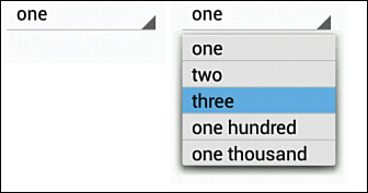
A spinner is essentially the Android platform’s version of a drop-down list. Figure 6.8 shows an unselected spinner on the left and the same spinner on the right when focused with the “three” option selected in the dropdown.
Setting Up the Spinner
To show the spinner, you define it and then bind it to an adapter. The data for the adapter should be available when the spinner is set up. The data for this example is an array of string constants called values:
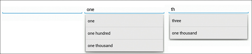
String[] values = {"one", "two", "three", "one hundred", "one thousand" };
To use this data, you create the spinner, use the data in an adapter, and tie the spinner to the adapter:
mSpinner = (Spinner)findViewById(R.id.spinner1);
ArrayAdapter<String> spinnerAdapter = new ArrayAdapter<String>
(this,android.R.layout.simple_spinner_item,values);
mSpinner.setAdapter(spinnerAdapter);
You create an ArrayAdapter called spinnerAdapter by tying the values array to a predefined system resource called android.R.layout.simple_spinner_item. You set the spinnerAdapter to be the adapter for the spinner. The adapter binds the data to the spinner and indicates how each item should be displayed.
Getting Data from a Spinner
You can do several things with the spinner. You can detect when an item is selected in the spinner by setting up an OnItemSelectedListener(). You can read the selected data from the spinner by using getSelectedItem() or getSelectedItemPosition().
In this example, the items in the list are strings, so you would read the string value as follows:
String selected = (String) mSpinner.getSelectedItem();
Using an AutoCompleteTextView
An AutoCompleteTextView is an input field that provides a list of suggestions based on user input. The user may select one of the suggestions or make a new entry. Figure 6.9 shows several states of an AutoCompleteTextView based on the text entered. The list of possible values is the same that was used for the Spinner. The left image has no data entered. When “one” is entered, the words that begin with “one” appear. Note that when “th” is entered, both “three” and “one thousand” appear. Any word that begins with “th” makes the list.
Setting up an AutoCompleteTextView is similar to setting up a spinner. You define an adapter and bind it to the view:
ArrayAdapter<String> textAdapter = new ArrayAdapter<String>
(this,android.R.layout.simple_spinner_dropdown_item,values);
mAutoCompleteTextView = (AutoCompleteTextView)findViewById(R.
id.autoCompleteTextView1);
mAutoCompleteTextView.setAdapter(textAdapter);
To retrieve data from an AutoCompleteTextView, you use the method getText().
ProgressBars and SeekBars
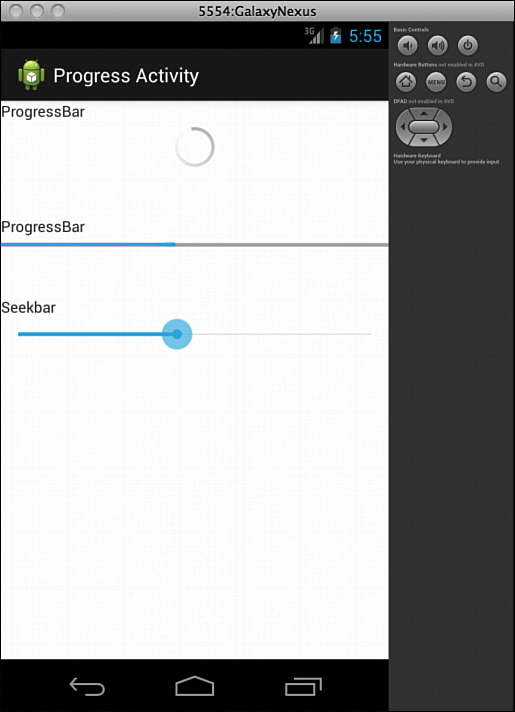
A ProgressBar (android.widget.Progressbar) and SeekBar (android.widget.SeekBar) help tell the status of an event that is occurring. For example, you might want to show a ProgressBar in your user interface as an image file is downloading. A ProgressBar that is circular and indicates that something is occurring is known as an indeterminate progress bar. A horizontal ProgressBar can indicate how much of something is complete. A SeekBar is similar to a horizontal ProgressBar, but the user can set the SeekBar to a specific location. A SeekBar can be used to set the location within a VideoView, for example.
Before getting into ProgressBars and SeekBars, this section goes into the details of using an AsyncTask(android.os.AsyncTask). AsyncTasks are used for background processing. Moving intense tasks to background processes is important. This section shows how a background task can communicate with a ProgressBar in the UI thread. Updates from the AsyncTask will be reflected using a horizontal ProgressBar and a SeekBar.
Figure 6.10 shows a ProgressBar, a horizontal ProgressBar, and a SeekBar.
AsyncTask
You use the AsyncTask class to manage background operations that will eventually post back to the UI thread.
To use an AsyncTask, you must create a subclass of the AsyncTask class and implement the appropriate callback methods:
onPreExecute()—Runs on the UI thread before background processing begins.
doInBackground()—Runs in the background and is where all the real work is done.
publishProgress()—This method, called from the doInBackground() method, periodically informs the UI thread about the background process progress. This method sends information to the UI process. Use this opportunity to send updated progress for a progress bar that the user can see.
onProgressUpdate()—Runs on the UI thread whenever the doInBackground() method calls publishProgress(). This method receives information from the background process. Use this opportunity to update a ProgressBar control that the user can see.
When launched with the execute() method, the AsyncTask class handles processing in a background thread without blocking the UI thread.
onPostExecute()—Runs on the UI thread after the background processing is completed.
Three generic types are used with an AsyncTask. These represent the parameters passed to the task, the progress values used, and the final return value of the task. You define the class with these generic types as follows:
android.os.AsyncTask<Params, Progress, Result>
Using all the types is not required. Void indicates that the generic type is not used. The following defines MyTask with no parameters, progress types, or return values:
class MyTask extends AsyncTask<Void, Void, Void> { ... }
Listing 6.4 shows the complete code for an AsyncTask named ShowProgressTask.
In the onPreExecute() method, the visibility of an indeterminate ProgressBar is set to visible. In other words, on line 4, the app shows an indeterminate ProgressBar. The same ProgressBar is set to invisible in the onPostExecute() method on line 26. Tying the ProgressBar to these methods makes it visible while the background task is running.
In ShowProgressTask, the doInBackround() method increments an integer value and makes a call to publishProgess() with that value as a parameter. The sleep() method on line 10 is used to simulate the delay of some complex task. It is for demo purposes only. The onProgressUpdate() method accepts that value and updates a horizontal ProgressBar and SeekBar appropriately. You execute the ShowProgressTask as follows:
ShowProgressTask showTask = new ShowProgressTask();
showTask.execute();
LISTING 6.4 An AsyncTask That Updates the UserInterface
1: private class ShowProgressTask extends AsyncTask<Void, Integer, Integer> {
2: @Override
3: protected void onPreExecute (){
4: mProgressBar.setVisibility(View.VISIBLE);
5: }
6: @Override
7: protected Integer doInBackground(Void... params) {
8: for (int i=0; i<=100; i++){
9: try {
10: Thread.sleep(100); // FOR DEMO ONLY!!!
11: publishProgress(i);
12: } catch (InterruptedException e) {
13: return -1;
14: }
15: }
16: return 100;
17: }
18: @Override
19: protected void onProgressUpdate(Integer...progess) {
20: Int progress = progess[0];
21: mHorizontalProgressBar.setProgress(progress);
22: mSeekBar.setProgress(progress);
23: }
24: @Override
25: protected void onPostExecute (Integer result){
26: mProgressBar.setVisibility(View.INVISIBLE);
27: }
28: }
ProgressBar
Listing 6.4 shows the work of the AsyncTask to update two different ProgressBars. In the onCreate() method for the ProgressActivity, you define the ProgressBars:
mProgressBar = (ProgressBar)findViewById(R.id.progressBar1);
mProgressBar.setVisibility(View.INVISIBLE);
mHorizontalProgressBar = (ProgressBar)findViewById(R.id.progressBar2);
In the layouts for the ProgressBar, the style setting gives progressBar2 the horizontal style:
<ProgressBar
android:id="@+id/progressBar1"
android:layout_width="wrap_content"
android:layout_height="wrap_content"
android:layout_gravity="center" />
<ProgressBar
android:id="@+id/progressBar2"
style="?android:attr/progressBarStyleHorizontal"
android:layout_width="fill_parent"
android:layout_height="wrap_content"
android:layout_gravity="center" />
SeekBar
The SeekBar is similar to the horizontal progress bar in this example. You can also set up a listener to listen and react to changes in a SeekBar.
In this case, the SeekBar is defined in the code and the max value is set to 100:
mSeekBar = (SeekBar)findViewById(R.id.seekBar1);
mSeekBar.setMax(100);
ImageViews
To complete this hour, we introduce a simple ImageView(android.widget.ImageView). You use an ImageView to display an image. You can change different characteristics of the image including how the image scales and how opaque it is. Common attributes such as size and gravity apply to ImageViews. Hour 21, “Media Basics: Images, Audio, and Video,” takes a look at ImageViews much more closely as you consider displaying media.
GO TO HOUR 21, “MEDIA BASICS: IMAGES, AUDIO, AND VIDEO,” for more information on using ImageViews.
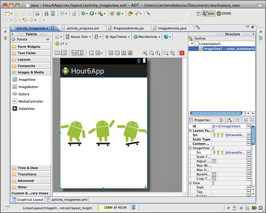
To show an image, you use an ImageView and the layout_width and layout_height to match_parent. The image will fill the available space:
<ImageView
android:id="@+id/imageView1"
android:layout_width="match_parent"
android:layout_height="match_parent"
android:src="@drawable/robot_skateboarding" />
Figure 6.11 shows the ImageView using the Eclipse visual editor.
Summary
This hour examined several types of Android views. These views have common characteristics, such as width, height, and visibility. Using Buttons, you saw that you can customize the same view type to look different for a particular app. Adapters bind data to views. By using a Spinner and AutoCompleteTextView, you saw how views and adapters work together. An AsyncTask was introduced and used to show how to work with controls that show progress status for an app. A simple ImageView was also shown. This hour introduced views and showed basic methods on how to display them and retrieve data from them.
Q&A
Q. What are some differences between a Spinner and an AutoCompleteTextView?
A. Both of these things use an Adapter, display information to the user, and then collect information from the user. The main difference is that a Spinner shows a pre-set list to the user. The user must select an item from the list. With an AutoCompleteTextView, the list of words is only used as suggestions. The user can enter something completely new. With a Spinner, the data is accessed via methods that refer to the selected item. In an AutoCompleteTextView, the data is accessed using getText().
Q. Does this hour cover every type of view that can be used in an Android app?
A. No, not at all. This hour introduced common controls and showed some ways to use them. Using different views is one way to understand them better.
Workshop
Quiz
1. What does a hint do in an EditView?
2. What must you do to implement a custom button?
3. What is the difference between an indeterminate ProgressBar and a determinate ProgressBar?
4. What does publishProgess mean when discussing an AsyncTask?
Answers
1. The hint is displayed in the EditText view as a prompt for the user. It is overwritten by user input.
2. To implement a custom button, an XML file is used as a drawable resource. The XML file defines which actual drawables to use based on button states.
3. An indeterminate ProgressBar is shown as a spinning circle and does not show the actual status of the current task. A determinate ProgressBar, like a horizontal progressBar, reflects the status of the background process. If the background task is 50 percent complete, the determinate ProgressBar will be at the halfway mark.
4. Using publishProgress() makes a call to onProgressUpdate, so you can use publishProgress as a mechanism to show the intermediate status of a task that is running in the background.
Exercise
Implement a sample app with an EditView, Button, and AutoCompleteTextView. Use the EditView and Button to populate a String array that is used by the AutoCompleteView. You will need to update the array and set the adapter with each update.