
Hour 7. ActionBar and Menu Navigation
So far, as you have worked with activities, the navigation in your apps has been based on moving from one activity to another. That navigation occurred via a button on the page. For persistent navigation and app functionality, you can add an ActionBar(android.app.ActionBar) to your apps. In this hour, you implement an action bar and learn several ways to use it. The action bar was introduced in Android 3.0. It is not part of the support package, but other options exist for navigation in earlier versions of the Android platform.
Understanding the Options Menu
Until version 3.0, all Android phones and devices included a hardware-based menu button. That assured that the option to click on Menu was persistent in apps. A Back and Home button were also present. A software infrastructure for handling the Menu button is supported in Android.
That same infrastructure is used to support the action bar in Android 3.0 and higher. The same application code can support two completely different interfaces. The advantage is that it provides a way to support older and newer devices with one code base.
This hour shows how to create an options menu that supports both older and newer Android versions and considers the variations on how items can be displayed in the action bar using just these methods.
To target both older and newer devices, you will use the support library that was covered in Hour 4, “Not Just Smartphones: Supporting Tablets, TVs, and More.”
Displaying the Options Menu
You might have noticed that when you create a new Android project with an activity named MainActivity, a resource file named activity_main.xml is created in the menu folder. In the source for MainActivity.java, the following code is generated:
@Override
public boolean onCreateOptionsMenu(Menu menu) {
// Inflate the menu; this adds items to the action bar if it is present.
getMenuInflater().inflate(R.menu.activity_main, menu);
return true;
}
The onCreateOptionsMenu() method inflates the menu items defined in the menu resource file activity_main.xml. In devices that support the action bar, these items appear in the action bar. For devices that do not support the action bar, these items appear as menu items.
Create an Hour7App project now. The onCreateOptionsMenu() method will be generated and include in the code for the MainActivity. The contents of the menu resource fill will be as follows:
'<menuxmlns:android="http://schemas.android.com/apk/res/android"'>
'<item
android:id="@+id/menu_settings"
android:orderInCategory="100"
android:showAsAction="never"
android:title="@string/menu_settings"'/>
'</menu'>
A single item is defined with the attributes id, orderInCategory, showAsAction, and title. The title is a string that is defined as a resource with the value “Settings.” OrderInCategory defines the order. In this case, showAsAction is set to “never.”
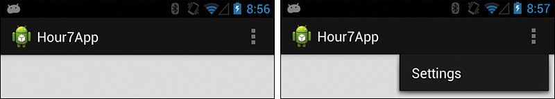
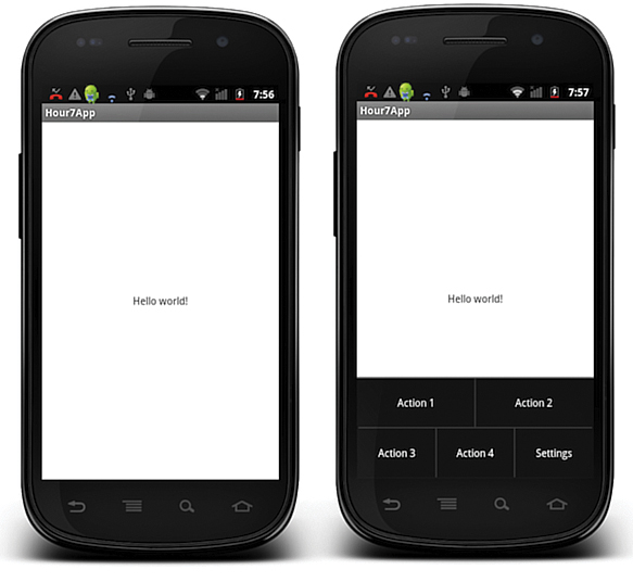
When you run the app, you see an action bar as shown in Figure 7.1, which shows two states of the action bar. On the right image in Figure 7.1, the Settings menu item is selected.
The projects that accompany this book contain all the source code that accompanies this hour. The projects for Hour7 are Hour7App, Hour7ActionBarApp, and Hour7ActionBarTabApp.
The three vertical dots shown in both images in Figure 7.1 are known as the overflow menu. When menu items do not fit in the action bar, they are shown in the overflow menu. In this case, the Settings menu option value for showAsAction is never. Because it is not shown as an action, it appears in the overflow menu.
Understanding the showAsAction Attribute
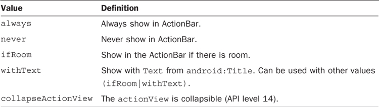
You can specify how menu items are displayed in an action bar. Table 7.1 shows the possible values. If a menu item is displayed in the action bar, it is called an action item and can be clicked directly in the action bar. Menu items that are not action items appear like the Settings option in Figure 7.1.
Let’s add two more menu items to the action bar as action items. The showAsAction will be set to ifRoom. In general, using always should be avoided, because items could theoretically overlap in a user interface.
For the new items, use Action 1 and Action 2 for titles. The purpose of this example is to illustrate the concept of action items. A more common use of an action is to implement a share action. The XML for the first action item is as follows:
<item
android:id="@+id/menu_test"
android:orderInCategory="10"
android:showAsAction="ifRoom"
android:title="Action 1"/>
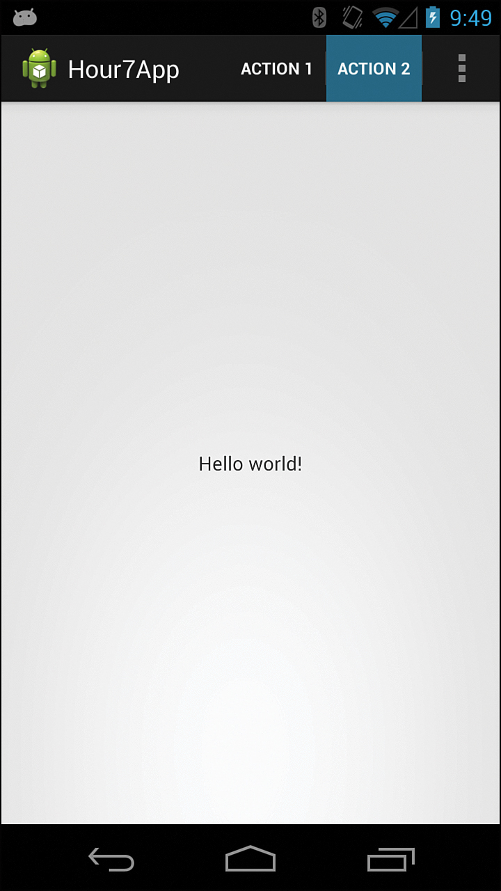
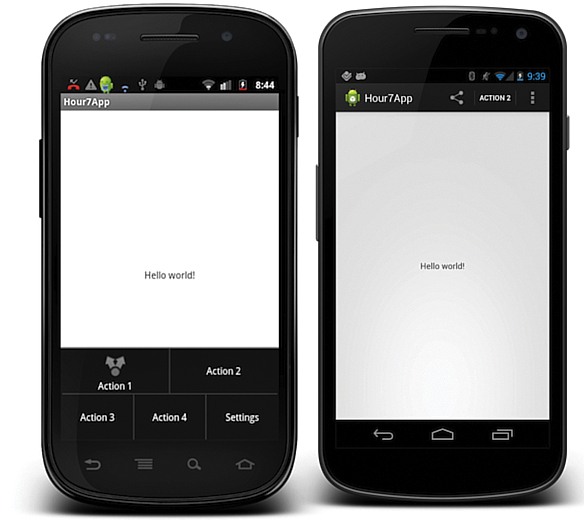
Figure 7.2 shows the action bar in the resulting app. The action items are available with Action 2 selected.
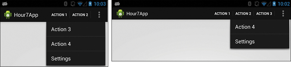
If you add more menu items with showAsAction set to ifRoom, the additional items appear as choices in the overflow menu, but you can see different results in portrait and landscape mode, as shown in Figure 7.3. There is more room in landscape mode, so more action items appear. The same is true when viewing this app on a tablet; if there is room, more action items appear.
Menu Items for Platforms with No ActionBar
The Hour7App with menu items defined as they are will run perfectly on earlier versions of Android that do not support action bars. Pressing the hardware menu button on these phones will result in a menu being displayed. Figure 7.4 shows the Hour7App with no menu shown and with the menu open. The frame of the phone is shown to illustrate the menu button.
Adding Icons to Menu Items
You can add an icon to any menu item. Icons are supported in both the action bar and older menu styles. Figure 7.5 shows the Hour7App with an icon provided for Action 1. The menu is shown on the left and the action bar is shown on the right. Note that the icons for Action 1 are different. This was accomplished by using alternate image resources based on the Android version.
You can add the icon to the menu item XML with the single line:
android:icon="@+drawable/menu_share"
A drawable named menu_share must exist in the drawable resource folder.
In this case, two drawables were created. Both images are named menu_share.png. To support older versions of Android, you place one image in the /res/drawable-mdpi folder. To support versions of Android that include an ActionBar, you place the other menu_share.png image in the /res/drawable-mdpi-v11 folder. This latter image is used when the Android API version is 11 or greater; in other words, when there is an ActionBar.
Many suitable menu icons are defined as Android system resources. The Google guidelines for menus suggest that these not be used directly in your apps. You should use a local copy of the system resource to ensure that your app remains consistent. The possibility exists for these icons to change across platform versions. The android.R.drawable resources should not be used directly for menus.
Note: Finding System Drawable Resources
When you installed Eclipse and the Android Developer environment, at least one Android platform was installed. That platform includes all the menu icons used in Android. To find these images, go to the Preferences menu in Eclipse and choose Android. This tells you where the SDK is installed. In that folder, navigate to the /data/res/ folder and check the drawables. The directory will be something like adt-bundle-mac/sdk/platforms/android-4.2/data/res/drawable-mdpi. If you use a system menu icon, you should import all densities into your app (ldpi, mdpi, and so on).
You can also check out this helpful website: http://androiddrawables.com/.
You can find additional options for menu items at http://developer.android.com/guide/topics/resources/menu-resource.html.
Responding to the Options Menu
So far, you have only displayed the action bar or menu. Responding to a click on a menu item is straightforward. You created the menu with the onCreateMenuOptions() method. To respond to when a menu item is clicked, you use the onOptionsItemsSelected() method, as shown in Listing 7.1.
A Toast object is defined on line 2. A Toast provides a simple way to display a brief message on the screen. The onOptionsItemSelected() method is passed a MenuItem as a parameter. You use the item.getItemId() method in line 3 for a switch statement that determines which item to respond to. Note that you use the resource id for matching. When an item is clicked, a brief message displays using Toast.
LISTING 7.1 Using onOptionsItemSelected()
@Override
1: public boolean onOptionsItemSelected(MenuItem item) {
2: Toast toast = Toast.makeText(getApplicationContext(),"Option 1", Toast.
LENGTH_SHORT);
3: switch (item.getItemId()) {
4: case R.id.menu_item_1:
5: toast.setText("Option 1");
6: toast.show();
7: return true;
8: case R.id.menu_item_2:
9: toast.setText("Option 2");
10: toast.show();
11: return true;
12: case R.id.menu_item_3:
13: toast.setText("Option 3");
14: toast.show();
15: return true;
16: default:
17: return super.onOptionsItemSelected(item);
18: }
19: }
Using the Action Bar
A number of additional features can appear on the action bar. These include tabs for navigation or drop-down navigation in the app. In these cases, you access the action bar directly in the code. So far, you have used techniques that apply to both old-style Android menus and the action bar. This section focuses on action bar–only features.
Drop-Down Navigation
In Hour 6, “Working with Basic UI Controls,” you used a simple spinner control. The spinner acts as a drop-down list and provides options for the user to select. Action bars include an option for using similar drop-down style navigation.
To enable drop-down navigation, you must provide an adapter that includes the list of navigation options, and you must implement the ActionBar class’s OnNavigationListener interface.
You are familiar with creating an adapter from the work on spinners in Hour 6, in which you used an array of string constants called values as the data:
String[] values = {"one", "two", "three", "one hundred", "one thousand" };
To use this data, you created an ArrayAdapter called spinnerAdapter, as follows:
ArrayAdapter<String> spinnerAdapter = new ArrayAdapter<String>
(this,android.R.layout.simple_spinner_item,values);
In that case, you used an existing Android layout named android.R.layout.simple_spinner_item to tell the adapter how to show the contents of each item in the list.
In the case of the action bar, define your own layout to use for the adapter. The Android system layouts use black text in the spinner layouts. Using those with a default action bar shows black on black text. Fortunately, creating a custom layout is not difficult.
The following is a layout named navigation_item.xml that lives in the /res/layout folder:
<TextView xmlns:android="http://schemas.android.com/apk/res/android"
android:id="@android:id/text1"
style="?android:attr/dropDownItemStyle"
android:layout_width="fill_parent"
android:layout_height="?android:attr/listPreferredItemHeight"
android:ellipsize="marquee"
android:singleLine="true"
android:textAppearance="?android:attr/textAppearanceLargeInverse"
android:textColor="#eeeeee" />
The navigation_item.xml is used to define the spinnerAdapter:
mSpinnerAdapter = new ArrayAdapter<String>(this,R.layout.navigation_item, values);
That gives you the adapter. You must still implement the ActionBar.OnNavigationListener interface. The ActionBar.OnNavigationListener provides the position of the selected item in the drop-down list. From there, you can take whatever action you want. As in the previous example, you can show a simple Toast message. The goal at this point is to highlight the framework for navigation.
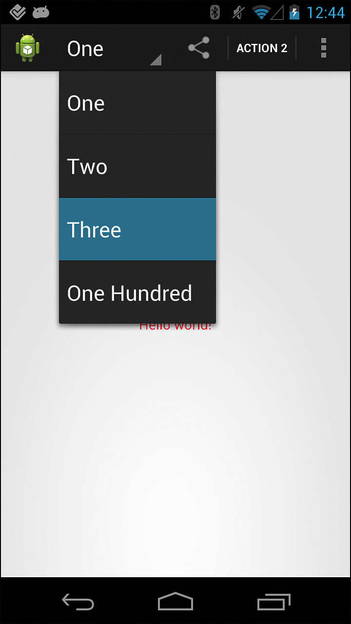
As shown in Listing 7.2, the NavigationListener class implements ActionBar.OnNavigationListener. It is created as a private inner class within the MainActivity class. On line 4, you use the values array and the position to get the text value of the selected drop-down item. It is then displayed in a Toast message. Figure 7.6 shows the drop-down navigation menu. Note that the drop-down menu is used in conjunction with action items.
LISTING 7.2 Implementing ActionBar.OnNavigationListener
1: private class NavigationListener implements ActionBar.OnNavigationListener{
2: @Override
3: public boolean onNavigationItemSelected(int position, long itemId) {
4: String selected = values[position];
5: Toast toast = Toast.makeText(getApplicationContext(), selected , Toast.
LENGTH_SHORT);
6: toast.show();
7: return false;
8: }
9: }
Tab Navigation
Tabs provide another navigation option for an action bar. Tabs take the user quickly from one mode to another in an app.
You implement tabbed navigation in a similar way to enabling the drop-down navigation. When the user chooses a tab, the appropriate Toast message appears.
Using tabs for navigation means that the action bar is set to a different navigation mode. You use the NAVIGATION_MODE_TABS. Tabs must be defined to display. Listen for a tab click; you define a class that implements ActionBar.TabListener.
A user can select, unselect, or reselect a tab. The ActionBar.TabListener covers all of those cases. For this example, you add code to the onTabSelected() method.
Listing 7.3 shows the action bar being created as before. The navigation mode is set in line 5, and lines 6 and 7 define two tab objects using the actionBar.newTab() method. This sets up two tabs to display. Note that icons are also supported in tabs.
LISTING 7.3 Displaying Tabs in the ActionBar
1: protected void onCreate(Bundle savedInstanceState) {
2: super.onCreate(savedInstanceState);
3: setContentView(R.layout.activity_main);
4: ActionBar actionBar = getActionBar();
5: actionBar.setNavigationMode(ActionBar.NAVIGATION_MODE_TABS);
6: mTab1= actionBar.newTab().setText("Tab 1").setTabListener(new
ExampleTabListener());
7: mTab2= actionBar.newTab().setText("Tab 2").setTabListener(new
ExampleTabListener());
8: actionBar.addTab(mTab1);
9: actionBar.addTab(mTab2);
10: }
Listing 7.4 shows the methods onTabReselected(), onTabSelected(), and onTabUnselected() implemented. The onTabSelected() method contains the code to show a Toast message when the tab is clicked.
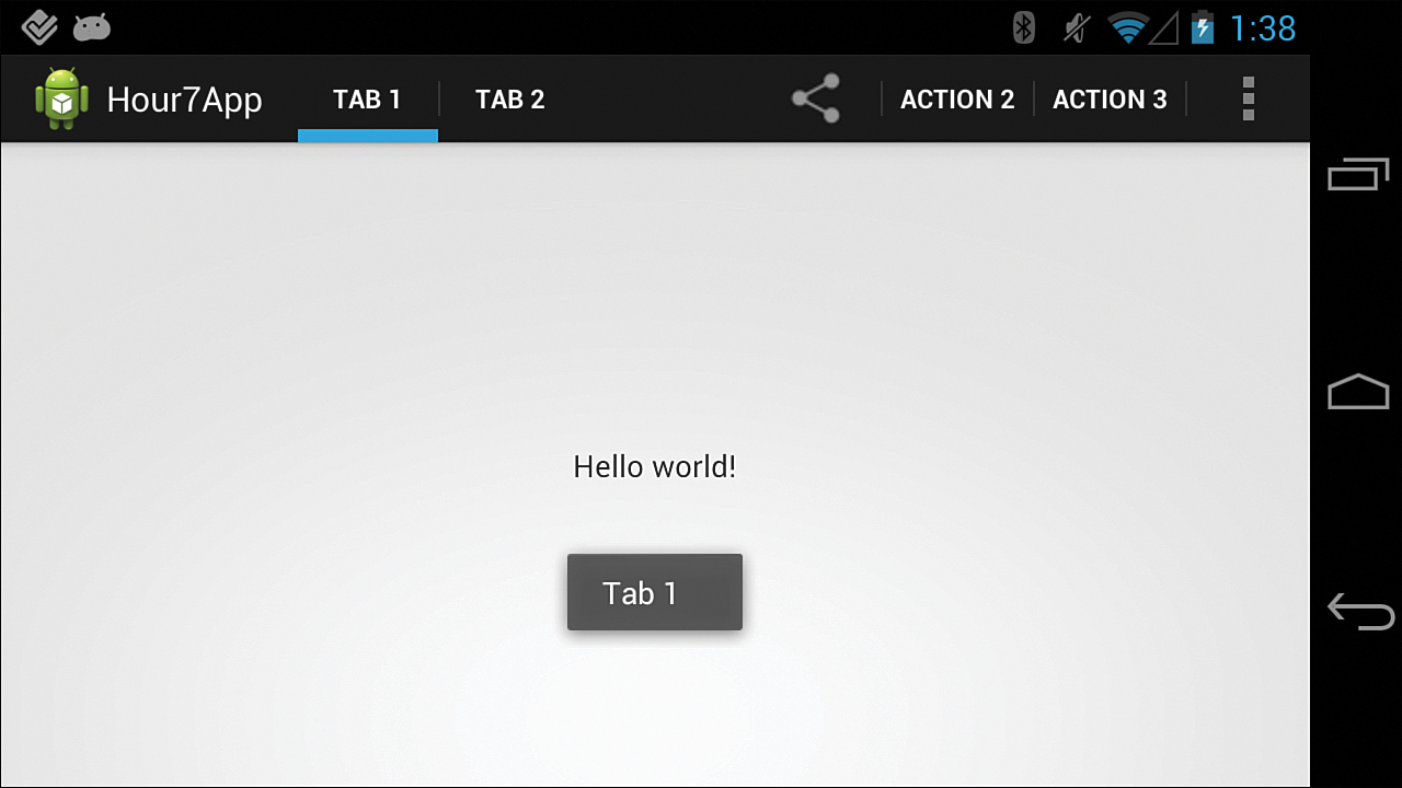
Figure 7.7 shows the result.
LISTING 7.4 Implementing ActionBar.TabListener()
1: private class ExampleTabListener implements ActionBar.TabListener {
2: public ExampleTabListener() {
3: }
4: @Override
5: public void onTabReselected(Tab tab, FragmentTransaction ft) {
6: }
7: @Override
8: public void onTabSelected(Tab tab, FragmentTransaction ft) {
9: Toast toast = Toast.makeText(getApplicationContext(), "tab" , Toast.LENGTH_
SHORT);
10: if (tab.equals(mTab1)){
11: toast.setText("Tab 1");
12: toast.show();
13: }else{
14: toast.setText("Tab 2");
15: toast.show();
16: }
17: }
18: @Override
19: public void onTabUnselected(Tab tab, FragmentTransaction ft) {
20: }
21:}
Two parameters are passed to the TabListener: One is the tab that was clicked on, and the other is a FragmentTransaction. Hour 8, “Activities and Fragments,” covers fragments in detail. FragmentTransactions manage how fragments are used within an app. Android does not pre-define how a FragmentTransaction may be used with the TabListener. The parameter is provided for developers to take advantage of if needed.
Strategies for Using the ActionBar and Menus
This hour has not exhausted the possible options for using the action bar, but it has shown how to use menu items, drop-down navigation, and tab navigation within the action bar.
Of these, using menu items provides one opportunity to support older and newer versions of Android using the same code.
There are alternatives to consider for using advanced features of the ActionBar for newer Android versions while still supporting the old. Giving older versions of Android a look and feel that is similar to that of the action bar’s is possible.
Let’s consider four options:
 Use menu options only: Use
 onCreateMenuOptions() to create an app that will have an action bar on new versions and support a dedicated menu button on older versions. This method does not provide all action bar features, but could be a good solution for many apps.
Create an initial branching activity: You learned in Hour 4 that you can check Android versions in your code. You can make an activity that checks for the Android version when the app starts. If the version is Honeycomb or higher, the app could show an activity that includes advanced action bar features. If it’s not, the old-style menu would appear via a different activity. You can do a check like the following:
if (android.os.Build.VERSION.SDK_INT>=
android.os.Build.VERSION_CODES.HONEYCOMB) {}
Create a layout for versions lower than Honeycomb that mimics the functionality of an ActionBar: Android provides a sample app called action bar compatibility that provides an example of this layout. To get it, follow the instructions at http://developer.android.com/tools/samples/index.html.
Use a third-party product called ActionBarSherlock: This product implements the ActionBar API in older versions of Android and works with the support library. Hour 23, “Pro Tips, Finishing Touches, and Next Steps,” includes an example app that uses ActionBarSherlock.
Summary
In this hour, you considered several ways to implement navigation on an ActionBar. You used menu items, drop-down navigation, and tab navigation. Drop-down navigation and tab navigation are supported in Android 3.0 and newer versions. You can create an app with menu items in which the same code will work on both older and newer versions of Android. Three basic strategies were considered to create apps for all versions of Android.
Q&A
Q. Are there design guidelines for using the ActionBar? There seem to be a lot of options.
A. Yes, the Android documentation on design guidelines is constantly improving. For information on the ActionBar specifically, check http://developer.android.com/design/patterns/actionbar.html.
Q. What problem does the ActionBar solve?
A. The ActionBar provides a prominent and consistent place for important actions within your app. It solves the problem of a user who is lost in navigation.
Workshop
Quiz
1. What does getMenuInflater().inflate() do?
2. What do ActionBar.OnNavigationListener and ActionBar.TabListener have in common?
Answers
1. When you create an app, you can include an XML file that defines a menu. The getMenuInflater().inflate() method inflates that XML file into an object that can be used in the app.
2. ActionBar.OnNavigationListener and ActionBar.TabListener are both interfaces of the ActionBar class that must be implemented to listen for and respond to specific ActionBar events. ActionBar.OnNavigationListener is used in drop-down navigation, and ActionBar.TabListener is used in tab navigation.
Exercises
1. Modify the code in this hour to display tabs that are meaningful to an app that you are thinking of creating.
2. Show the tabs you created in Exercise 1 as options for drop-down navigation.
3. Modify the code from this chapter to include more than five MenuItems. Add icons to two of those menu items and ensure that they always display in the app.