
Chapter 4: Getting Started with Layouts and Material Design
We have already seen the Android Studio user interface (UI) designer, as well as Java, in action. In this hands-on chapter, we will build three more layouts—still quite simple, yet a step up from what we have done so far.
Before we get to the hands-on part, we will have a quick introduction to the concept of Material Design.
We will see another type of layout called LinearLayout, and step through using it to create a usable UI. We will take things a step further using ConstraintLayout, both with understanding constraints and with designing more complex and precise UI designs. Finally, we will meet TableLayout, for laying out data in an easily readable table.
We will also write some Java code to switch between different layouts within our app/project. This is the first major app that links together multiple topics into one neat parcel. The app is called Exploring Layouts.
In this chapter, we will look at the following topics:
- Finding out about Material Design
- Exploring Android UI design
- Introducing layouts
- Building a LinearLayout and learning when it is best to use this type of layout
- Building another, slightly more advanced ConstraintLayout and finding out a bit more about using constraints
- Building a TableLayout and filling it with data to display
- Linking everything together in one app called Exploring Layouts
First on the list is Material Design.
Technical requirements
You can find the code present in this chapter on GitHub at https://github.com/PacktPublishing/Android-Programming-for-Beginners-Third-Edition/tree/main/chapter%2004.
Finding out about Material Design
You might have heard of Material Design, but what exactly is it? The objective of Material Design is quite simple—to create beautiful UIs. It is also, however, about making these UIs consistent across Android devices. Material Design is not a new idea; it is taken straight from the design principles used in pen-and-paper design, such as having visually pleasing embellishments through shadows and depth.
Material Design uses the concept of layers of materials, which you can think of in the same way you would think of layers in a photo-editing app. Consistency is achieved with a set of principles, rules, and guidelines. It must be stressed that Material Design is entirely optional, but it also must be stressed that Material Design works—and if you are not following it, there is a good chance your design will be less appreciated by the user. The user has after all become used to a certain type of UI, and that UI was most likely created using Material Design principles.
Material Design is a sensible standard to strive for, but while we are learning the details of it, we mustn't let that hold us back from learning how to get started with Android.
This book will focus on getting things done, while occasionally pointing out when Material Design has influenced the design, how it has influenced the design, and further resources for those who want to look at Material Design in more depth.
Exploring Android UI design
We will see with Android UI design that so much of what we learn is context-sensitive. The way that a given widget's x attribute will influence its appearance might depend on a widget's y attribute or even on an attribute on another widget. It isn't easy to learn this verbatim. It is best to expect to gradually get better and faster results with practice.
For example, if you play with the designer by dragging and dropping widgets onto the design, the Extensible Markup Language (XML) code that is generated will vary quite considerably, depending upon which layout type you are using. We will see this as we go ahead throughout this chapter.
This is because different layout types use different means to decide the position of their children—for example, the LinearLayout we will explore next works very differently from the ConstraintLayout that was added by default to our project in Chapter 1, Beginning Android and Java.
This information might initially seem to be a problem, or even a bad idea, and it certainly is a little awkward at first. What we will grow to learn, however, is that this clear abundance of layout options and their individual quirks is a good thing because they give us almost unlimited design potential. There are very few layouts you can imagine that are not possible to achieve.
This almost unlimited potential comes with a bit of complexity, however. The best way to start to get to grips with this is to build some working examples of several types. In this chapter, we will see three types of layouts, outlined as follows:
- LinearLayout
- ConstraintLayout
- TableLayout
We will see how to make things easier using the distinctive features of the visual designer, and we will also pay some attention to the XML that is autogenerated, to make our understanding more rounded.
Introducing layouts
We have already seen ConstraintLayout in Chapter 1, Beginning Android and Java, but there are more layouts than this. Layouts are the building blocks that group together the other UI elements. Layouts can also contain other layouts.
Let's look at some commonly used layouts in Android, because knowing the different layouts and their pros and cons will make us more aware of what can be achieved and will therefore expand our horizons in terms of what is possible.
We have already seen that once we have designed a layout, we can put it into action with the setContentView method in our Java code.
Let's build three designs with different layout types, and then put setContentView to work and switch between them.
Creating and exploring a layout project
One of the toughest things in Android is not just finding out how to do something but finding out how to do something in a particular context. That is why throughout this book, as well as showing you how to do some neat stuff, we will link lots of topics together into apps that span multiple topics and, often, chapters. The Exploring Layouts project is the first app of this type. We will learn how to build multiple types of layout while linking them all together in one handy app.
Let's get started, as follows:
- Create a new project in Android Studio. If you already have a project open, select File | New Project. When prompted, choose Open in same window as we do not need to refer to our previous project.
Important note
If you are on the start screen of Android Studio, you can create a new project simply by clicking the Create new project option.
- Make sure to select the Empty Activity project template, as we will build most of the UI from scratch. Click the Next button.
- Enter Exploring Layouts for the application name and then click the Finish button.
Look at the MainActivity.java file. Here is the code, excluding the import… statements:
public class MainActivity extends AppCompatActivity {
@Override
protected void onCreate(Bundle savedInstanceState) {
super.onCreate(savedInstanceState);
setContentView(R.layout.activity_main);
}
}
Locate the call to the setContentView method and delete the entire line. The line is shown highlighted in the previous code snippet.
This is just what we want because now, we can build our very own layouts, explore the underlying XML, and write our own Java code to display these layouts. If you run the app now, you will just get a blank screen with a title; not even a Hello World! message.
The first type of layout we will explore is the LinearLayout type.
Building a layout with LinearLayout
LinearLayout is probably the simplest layout that Android offers. As the name hints at, all the UI items within it are laid out linearly. You have just two choices: vertical and horizontal. By adding the following line of code (or editing via the Attribute window) you can configure a LinearLayout to lay things out vertically:
android:orientation="vertical"
You can then (as you could probably have guessed) change "vertical" to "horizontal" to lay things out horizontally.
Before we can do anything with LinearLayout, we need to add one to a layout file; and as we are building three layouts in this project, we also need a new layout file.
Adding a LinearLayout layout type to a project
In the project window, expand the res folder. Now, right-click the layout folder and select New. Notice there is an option for Layout resource file, as shown in the following screenshot:

Figure 4.1 – Adding LinearLayout to project
Select Layout resource file and you will see the New Resource File dialog window. In the Root element: field, enter LinearLayout, as illustrated in the following screenshot:

Figure 4.2 – Creating new resource file
In the File name: field, enter main_menu. The name is arbitrary, but this layout is going to be our main menu that is used to select the other layouts, so the name seems appropriate.
Click the OK button, and Android Studio will generate a new LinearLayout in an XML file called main_menu and place it in the layout folder, ready for us to build our new main menu UI. The new file is automatically opened in the editor, ready for us to get designing.
Preparing your workspace
Click the Design tab to switch to design view if you are not already in this view. Adjust the windows by dragging and resizing their borders (as you can in most windowed apps) to make the palette, design, and attributes as clear as possible but no bigger than necessary. The following screenshot shows the approximate window proportions I chose to make designing our UI and exploring the XML as clear as possible. The detail in the screenshot is not important:
Figure 4.3 – Preparing workspace
Important note
I have made the project, palette, and attribute windows as narrow as possible yet without obscuring any content. I have also closed the Build/logcat window at the bottom of the screen, the result being that I have a nice clear canvas on which to build the UI.
Examining the generated XML
Click on the Code tab, and we will have a look at the current state of the XML code that forms our design at this stage. Here is the code so that we can talk about it (I have reformatted it slightly to make it appear more clearly on the page):
<?xml version="1.0" encoding="utf-8"?>
<LinearLayout
xmlns:android="http://schemas.android.com/apk/res/android"
android:orientation="vertical"
android:layout_width="match_parent"
android:layout_height="match_parent">
</LinearLayout>
We have the usual starting and closing tags and, as we could have predicted, they are called <LinearLayout and </LinearLayout>. There is no child element yet, but there are three attributes. We know they are attributes and not children of the LinearLayout because they appear before the first closing >. The three attributes that define this LinearLayout have been highlighted in the previous code for clarity.
The first attribute is android:orientation, or—more succinctly—we will just refer to the attributes without the android: part. The orientation attribute has a value of vertical. This means that when we start to add items to this layout, it will arrange them vertically from top to bottom. We could change the vertical value to horizontal, and it would lay things out from left to right.
The next two attributes are layout_width and layout_height. These determine the size of the LinearLayout. The value given to both attributes is match_parent. The parent of a layout is the entire available space. By matching the parent horizontally and vertically, the layout will fill the entire space available.
Adding a TextView to the UI
Switch back to the Design tab, and we will add some elements to the UI.
First, find the TextView widget in the palette. This can be found in both the Common and Text categories. Left-click and drag the TextView onto the UI, and notice that it sits neatly at the top of the LinearLayout.
Look at the XML on the Code tab and confirm that it is a child of the LinearLayout and that it is indented by one tab to make this clear. Here is the code for the TextView widget, without the surrounding code for the LinearLayout:
<TextView
android:id="@+id/textView"
android:layout_width="match_parent"
android:layout_height="wrap_content"
android:text="TextView" />
Notice it has four attributes: an id attribute, in case we need to refer to it from another UI element or from our Java code; a layout_width attribute set to match_parent, which means the TextView stretches across the whole width of the LinearLayout; and a layout_height attribute set to wrap_content, which means the TextView is precisely tall enough to contain the text within it. Finally, for now, it has a text element, which determines the actual text it will display, and this is currently set to just "TextView".
Switch back to the Design tab, and we will make some changes.
We want this text to be the heading text of this screen, which is the menu screen. In the Attributes window, click the search icon and type text into the search box, as shown in the following screenshot. Find the text attribute and change its value to Menu:
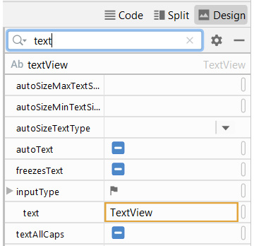
Figure 4.4 – Adding TextView to UI
Tip
You can find any attribute by searching or just by scrolling through the options. When you have found the attribute you want to edit, left-click it to select it and then press the Enter key on the keyboard to make it editable.
Next, find the textSize attribute using your preferred search technique, and set textSize to 50sp. When you have entered this new value, the text size will increase.
Important note
The sp value stands for scalable pixels. This means that when the user changes the font-size settings on their Android device, the font will dynamically rescale itself.
Now, search for the gravity attribute and expand the options by clicking the little arrow indicated in the following screenshot:

Figure 4.5 – Expanding gravity attribute
Add center_horizontal to the gravity by setting that value to true, as illustrated in the following screenshot:

Figure 4.6 – Adding center_horizontal to gravity by setting the value to true
The gravity attribute refers to the gravity within the TextView itself, and our change has the effect of moving the actual text inside the TextView to the center.
Important note
The gravity attribute is different from the layout_gravity attribute. The layout_gravity attribute sets the gravity within the layout—in this case, the parent LinearLayout. We will use layout_gravity later in this project.
At this point, we have changed the text of the TextView widget, increased its size, and centered it horizontally. The UI designer should now look like this:

Figure 4.7 – Adjusting textView on the UI
A quick glance at the Code tab to see the XML would reveal the following code:
<TextView
android:id="@+id/textView"
android:layout_width="match_parent"
android:layout_height="wrap_content"
android:gravity="center_horizontal"
android:text="Menu"
android:textSize="50sp" />
You can see the new attributes as follows: gravity, which is set to center_horizontal; text, which has been changed to Menu; and textSize, which is set to 50sp.
If you run the app, you might not see what you expected. This is because we haven't called the setContentView method in our Java code to load the UI. You will still see the blank UI. We will fix this once we have made a bit more progress with our design.
Adding a multiline TextView to the UI
Switch back to the Design tab and find Multiline Text from the Text category of the palette, and drag it onto the design just below the TextView widget we added a moment ago.
Using your preferred search technique, set the text attribute to the following: Select a layout type to view an example. The onClick attribute of each button will call a method which executes setContentView to load the new layout.
Now, your layout will look like this:

Figure 4.8 – Multiline textView added to UI
Your XML will be updated with another child in the LinearLayout (after the TextView) that looks like this (I have slightly reformatted it for presenting it on the page):
<EditText
android:id="@+id/editTextTextMultiLine"
android:layout_width="match_parent"
android:layout_height="wrap_content"
android:ems="10"
android:gravity="start|top"
android:inputType="textMultiLine"
android:text="Select a layout type to view an example.
The onClick attribute of each button will call a
method which executes setContentView to load the
new layout" />
You can see the details of the UI item. A look at the XML reveals we have an inputType attribute, indicating that this text is editable. There is also another attribute that we haven't seen before, and that is ems. The ems attribute controls how many characters can be entered per line, and the value of 10 was chosen automatically by Android Studio. However, another attribute, layout_width="match_parent", overrides this value because it causes the element to expand to fit its parent— that is, the whole width of the screen.
When you run the app in the next section, you will see the text is indeed editable, although for the purposes of this demo app it serves no practical purpose.
Wiring up the UI with the Java code (Part 1)
To achieve an interactive app, we will do the following three things:
- We will call the setContentView method from the onCreate method to show the progress of our UI when we run the app.
- We will write two more methods of our own, and each one will call the setContentView method on a different layout (that we have yet to design).
- Then, later in this chapter when we design two more UI layouts, we will be able to load them at the click of a button.
As we will be building a ConstraintLayout and a TableLayout, we will call our new methods loadConstraintLayout and loadTableLayout, respectively.
Let's do that now, and then we can see how we can add some buttons that call these methods.
Switch to the MainActivity.java file, then inside the onCreate method add the following highlighted code:
@Override
protected void onCreate(Bundle savedInstanceState) {
super.onCreate(savedInstanceState);
setContentView(R.layout.main_menu);
}
The code uses the setContentView method to load the UI we are currently working on. You can now run the app to see the following result:
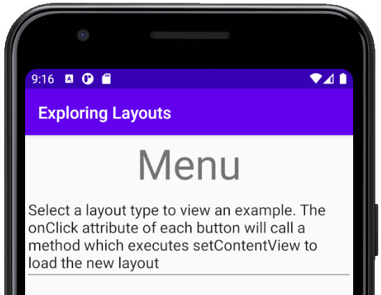
Figure 4.9 –Exploring Layouts menu
Add these two new methods inside the MainActivity class after the onCreate method, as follows:
public void loadConstraintLayout(View v){
setContentView(R.layout.activity_main);
}
public void loadTableLayout(View v){
setContentView(R.layout.my_table_layout);
}
There is one error with the first method and two errors with the second. The first error we can fix by adding an import statement so that Android Studio is aware of the View class. Left-click the word View to select the error. Hold down the Alt key and then tap the Enter key. You will see the following messages pop up:
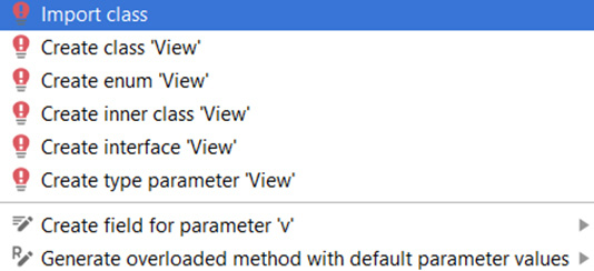
Figure 4.10 – Selecting Import class to eliminate the error
Choose Import class. The error is gone. If you scroll to the top of the code, you will see that a new line of code has been added by that shortcut we just performed. Here is the new code:
import android.view.View;
Android Studio knows about the View class and no longer has an error.
The second method still has an error, however. The problem is that the code calls the setContentView method to load a new UI (R.layout.my_table_layout). As this UI layout does not exist yet, it produces an error. You can comment out this call to remove the error until we create the file and design the UI layout later in this chapter. Add the comment forward slashes ( // ), as highlighted next:
public void loadConstraintLayout(View v){
setContentView(R.layout.activity_main);
}
public void loadTableLayout(View v){
// setContentView(R.layout.my_table_layout);
}
The reason why the loadConstraintLayout method does not have an error is because that method loads the activity_main.xml layout, which was created by Android Studio when we generated the project.
Now, we want to add some buttons we can click to call our new methods and load the new layouts we will be building. But adding a couple of buttons with some text on is too easy—we have done that before. What we want to do is line up some text with a button to the right of it. The problem is our LinearLayout has the orientation attribute set to vertical and, as we have seen, all the new parts we add to the layout will be lined up vertically.
Adding layouts within layouts
The solution to laying out some elements with a different orientation from others is to nest layouts within layouts. Here is how to do it.
From the Layouts category of the palette, drag a LinearLayout (Horizontal) onto our design, placing it just below the Multiline Text. Notice in the following screenshot that there is a blue border occupying all the space below the Multiline Text:

Figure 4.11 – Dragging a LinearLayout (Horizontal) from the Layouts category onto our design and placing it just below the Multiline Text
This indicates that our new LinearLayout (Horizontal) is filling the space. Keep this blue border area in mind, as this is where we will put the next item on our UI.
Now, go back to the Text category of the palette and drag a TextView widget onto the new LinearLayout we just added. Notice in the following screenshot how the TextView widget sits snuggly in the top left-hand corner of the new LinearLayout:

Figure 4.12 – Dragging a TextView widget from the Text category of the palette onto the new LinearLayout
This at first seems no different from what happened with the previous vertical LinearLayout, which was part of our UI from the start. But watch what happens when we add our next piece of the UI.
Important note
The term used to refer to adding layouts within layouts is nesting. The Android term applied to any item that appears on the UI (buttons, text, and so on) is view, and anything that contains views is a view group. As the terms view and view group do not always make their meanings clear in certain contexts, I will usually refer to parts of the UI either specifically (such as TextView, Button, LinearLayout) or more broadly (UI element, item, or widget).
From the Button category, drag a Button widget onto the right-hand side of the previous TextView widget. Notice that the button sits to the right of the text, as shown here:

Figure 4.13 – Dragging a Button widget from the Button category onto the right-hand side of the previous TextView widget
Next, select the LinearLayout (the horizontal one) by clicking on an empty part of it. Find the layout_height attribute and set it to wrap_content. Notice that the LinearLayout is now taking up only as much space as it needs, and there is space below where we can add more widgets. This is shown in the following screenshot:
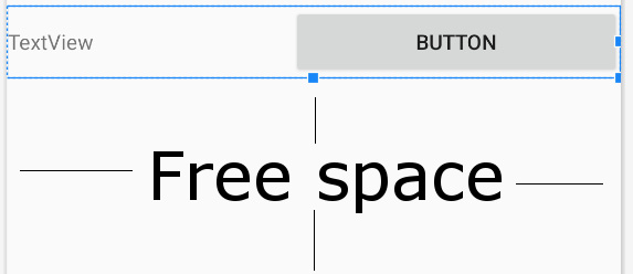
Figure 4.14 – Selecting the LinearLayout (the horizontal one) by clicking on an empty part
Let's configure the text attribute of the TextView widget and the Button widget before we add the next part of the UI. Change the text attribute of the Button widget to LOAD. Change the text attribute of our new TextView widget to Load ConstraintLayout.
This screenshot shows what the layout should look like currently:

Figure 4.15 – Configuring the text attribute of the TextView widget and the Button widget
Tip
Did that work? Yes? Excellent. You are now familiar with editing attributes of Android views. No? Left-click the item you want to edit (in this case, the TextView widget), search using the search icon, or scroll to find the attribute you want to edit in the Attributes window (in this case, the text attribute), select the attribute, and press Enter to edit it. I can now give more succinct instructions on how to build future UI projects, and this makes your journey to becoming an Android Ninja much quicker.
Now, we can repeat ourselves and add another TextView widget and Button widget within another LinearLayout (Horizontal), just below the one we have just finished. To do so, follow these steps in order:
- Add another LinearLayout (Horizontal) just below the previous one.
- Add a TextView to the new LinearLayout.
- Change the text attribute of the TextView to Load TableLayout.
- Add a Button widget on the right-hand side of the TextView widget.
- Change the text attribute of the Button widget to LOAD.
- Resize the LinearLayout by changing the layout_height attribute to wrap_content.
- Just for fun and for the sake of exploring the palette a bit more, find the Widgets category of the palette and drag a RatingBar widget onto the design, just below the final LinearLayout.
Now, your UI should look like this:

Figure 4.16 – Another TextView widget and Button widget added within another LinearLayout (Horizontal)
Let's add some visual finishing touches to the layout.
Making the layout look pretty
In this section, we will explore some more attributes that control the finer details of our UI. You have probably noticed the UI looks a bit squashed in some places and wonky and unsymmetrical in others. As we progress through the book, we will continually add to our repertoire to improve our layouts, but these short steps will introduce and take care of some of the basics.
Before you get started with the next steps, consider the following tip.
Tip
When you are configuring the attributes of widgets, you can select multiple widgets at a time—for example, in Step 3 in the instructions that follow, you could left-click to select the first TextView widget and then Shift and left-click to select the second TextView widget. You could then alter attributes for both simultaneously. This tip will also work for Step 4 with the Button widgets. It will even work when the widgets are different types, provided you are only editing attributes that all the selected widgets have. So, in Step 5 that follows, you can simultaneously select and edit the padding attribute on both TextView and both Button widgets.
Follow these instructions:
- Select the Multiline Text widget, and find then expand the padding attribute. Set the padding option to 15sp. This has made a neat area of space around the outside of the text.
- To make a nice space below the Multiline Text widget, find and expand the Layout_Margin attribute and set bottom to 50sp.
- On both button-aligned TextView widgets, set the textSize attribute to 20sp; layout_gravity to center_vertical; the layout_width attribute to match_parent; and layout_weight to .7.
- On both buttons, set the weight to .3. Notice how both buttons now take up exactly .3 of the width and the text takes up .7 of the LinearLayout, making the whole appearance more pleasing.
- On both TextView widgets and both Button widgets, select padding then padding, and set the value to 10dp.
- On the RatingBar widget, find the Layout_Margin attribute, then set left and right to 15sp.
- Still with the RatingBar widget and the Layout_Margin attribute, change top to 75sp.
You can now run the app and see our first full layout in all its glory, as illustrated here:
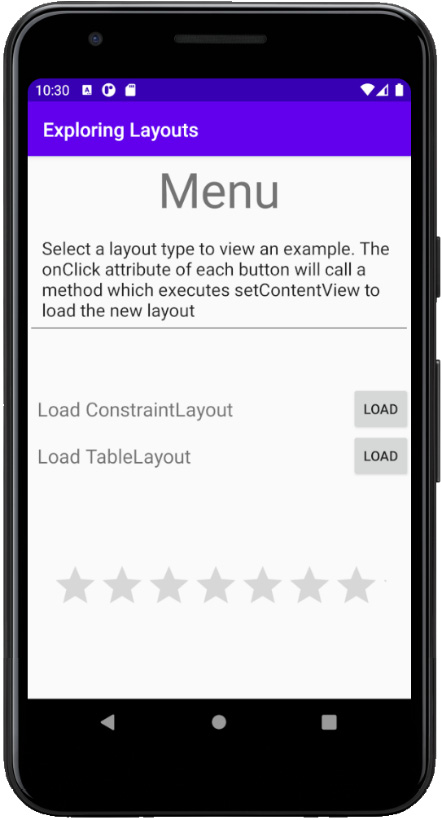
Figure 4.17 – The improved layout
Notice that you can play with the RatingBar widget, although the rating won't persist when the app is turned off.
Unfortunately, the buttons in our app don't do anything yet. Let's fix that now.
Wiring up the UI with Java code (Part 2)
To enable the user to interact with our buttons, follow the next two steps to make the buttons in the layout call our methods:
- Select the button next to the Load ConstraintLayout text. Find the onClick attribute and set it to loadConstraintLayout.
- Select the button next to the Load TableLayout text. Find the onClick attribute and set it to loadTableLayout.
Now, the buttons will call the methods, but the code inside the loadTableLayout method is commented out to avoid errors. Feel free to run the app and check that you can switch to the ConstraintLayout by clicking the loadConstraintLayout button. But all the ConstraintLayout currently has is a Hello World! message.
We can now move on to building this ConstraintLayout.
Building a precise UI with ConstraintLayout
Open the ConstraintLayout that was autogenerated when we created the project. It is probably open already in a tab at the top of the editor. If not, it will be in the res/layout folder. The filename is activity_main.xml.
Inspect the XML in the Code tab and note that it is empty, apart from a TextView that says Hello World. Switch back to the Design tab, left-click the TextView to select it, and tap the Delete key to get rid of it.
Now, we can build ourselves a simple yet intricate UI. The ConstraintLayout is most useful when you want to position parts of your UI very precisely and/or relative to the other parts and not just in a linear fashion.
Adding a CalendarView
To get started, look in the Widgets category of the palette and find the CalendarView. Drag and drop the CalendarView near the top and horizontally central. As you drag the CalendarView around, notice that it jumps/snaps to some locations.
Also, notice the subtle visual cues that show when the view is aligned. I have highlighted the horizontally central visual cue in the following screenshot:

Figure 4.18 – The horizontally central visual cue
Let go when it is horizontally central, as it is in the preceding screenshot. Now, we will resize it.
Resizing a view in a ConstraintLayout
Left-click and hold one of the corner squares that are revealed when you let go of the CalendarView, and drag inward to decrease the size of the CalendarView, as illustrated in the following screenshot:

Figure 4.19 – Resizing a view in the ConstaintLayout
Reduce the size by about half and leave the CalendarView near the top and horizontally central. You might need to reposition the widget a little after you have resized it. The result should look like this:

Figure 4.20 – Repositioning the widget
You do not need to place the CalendarView in exactly the same place, as the purpose of the exercise is to get familiar with the visual cues that inform you where you have placed it, not to create a replica of my layout.
Using the Component Tree window
Now, look at the Component Tree window, the window to the left of the visual designer and below the palette. A component tree is a way of visualizing the layout of the XML but without all the details.
If you don't see this, look for a tab at the bottom of the Palette tab that says Component Tree vertically. Click on this to open up the Component Tree tab.
In the next screenshot, we can see that the CalendarView is indented to the right of the ConstraintLayout and is therefore a child. In the next UI we build, we will see that we sometimes need to take advantage of the Component Tree to build the UI.
For now, I just want you to see there is a warning sign by our CalendarView. I have highlighted it here:
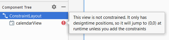
Figure 4.21 – Warning sign by our CalendarView
The error says This view is not constrained. It only has designtime positions, so it will jump to (0,0) at runtime unless you add the constraints. Remember when we first added buttons to the screen in Chapter 2, First Contact: Java, XML, and the UI Designer, they simply moved off to the top-left corner?
Tip
Run the app now and click on the Load ConstraintLayout button if you want to be reminded of this problem.
Now, we could fix this by clicking the Infer constraints button that we used in Chapter 2, First Contact: Java, XML, and the UI Designer. Here it is again as a reminder:
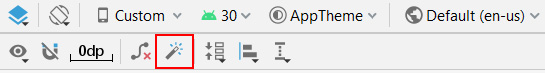
Figure 4.22 – Fixing error by clicking the Infer constraints button
But learning to add constraints manually is worthwhile because it offers us more options and flexibility. Also, as your layouts get more complex, there is always an item or two that doesn't behave as you want it to, and fixing it manually is nearly always necessary.
Adding constraints manually
Make sure the CalendarView is selected, and notice the four small circles on the top, bottom, left, and right, as illustrated in the following screenshot:

Figure 4.23 – The four constraint handles
These are the constraint handles. We can click and drag them to anchor them with other parts of the UI or the sides of the screen. By anchoring the CalendarView with the four edges of the screen, we can lock it into position when the app is run.
One at a time, click and drag the top handle to the top of the design, the right handle to the right of the design, the bottom handle to the bottom, and the left handle to the left. Notice how the CalendarView is jumping around as we're applying these constraints? That's because the designer is applying the constraints as soon as we put them in, so we can see exactly how it will look at runtime.
Notice that the CalendarView is now constrained in the center. Left-click and drag the CalendarView back to the upper part of the screen, somewhere like the position shown in the following screenshot. Use the visual cues (also shown in the next screenshot) to make sure the CalendarView is horizontally central:
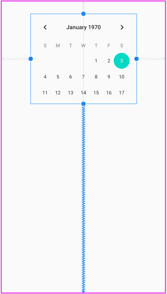
Figure 4.24 – Making the CalendarView horizontally central
At this stage, you could run the app and the CalendarView would be positioned as just pictured in the preceding screenshot.
Let's add a couple more items to the UI and see how to constrain them.
Adding and constraining more UI elements
Drag an ImageView from the Widgets category of the palette and position it below and to the left of the CalendarView. When you place the ImageView, a pop-up window will prompt you to choose an image. You can choose any image you like, but for the purposes of seeing another Android Studio feature in action, choose the image from the top of the list, Avatar, in the Sample data section. Click OK to add the image to the layout. We will see in the forthcoming Making the text clickable section the effect of adding an image from the Sample data section has on our project.
Constrain the left-hand side of the ImageView and the bottom of the ImageView to the left and bottom of the UI respectively. Here is the position you should be in now:

Figure 4.25 – Constraining the left-hand-side and the bottom of the ImageView respectively to the left and bottom of the UI
The ImageView is constrained in the bottom-left corner. Now, grab the top constraint handle on the ImageView and drag it to the bottom constraint handle of the CalendarView. This is now the current situation:

Figure 4.26 – Edited UI
The ImageView is only constrained horizontally on one side and so is pinned/constrained to the left. It is constrained vertically and equally between the CalendarView and the bottom of the UI.
Next, add a TextView to the right of the ImageView. Constrain the right of the TextView to the right of the UI and constrain the left of the TextView to the right of the ImageView. Then, constrain the top of the TextView to the top of the ImageView and constrain the bottom of the TextView to the bottom of the UI. Now, you will be left with something resembling this:
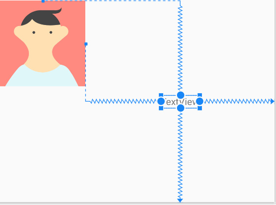
Figure 4.27 – Adding a TextView to the UI
Important note
All the warnings in the Component Tree window about unconstrained items are gone. There are warnings about hardcoded strings because we are adding text directly to the layout instead of the strings.xml file, and a warning about missing the contentDescription attribute. The contentDescription attribute should be used to add a textual description so that visually impaired users can get a spoken description of images in the app. For the sake of making fast progress with the ConstraintLayout, we will ignore these two warnings. We will look at adding String resources more correctly in Chapter 18, Localization, and you can read about accessibility features in Android Studio on the Android Developers website, at https://developer.android.com/studio/intro/accessibility.
You can move the three UI elements around and line them up neatly, just how you want them. Notice that when you move the ImageView, the TextView moves with it because the TextView is constrained to the ImageView. But also notice that you can move the TextView independently and, wherever you drop it, this represents its new constrained position relative to the ImageView. Whatever an item is constrained to, its position will always be relative to that item. And as we have seen, the horizontal and vertical constraints are distinct from each other. I positioned mine like this:

Figure 4.28 – Positioning the TextView
Tip
ConstraintLayout could be considered the default layout type, and while it is more complex than the other layouts it is the most powerful, as well as the one that runs the best on our user's device. It is worth spending time looking at some more tutorials about ConstraintLayout. Especially look on YouTube, as video is a great way to learn about tweaking ConstraintLayout. We will return to ConstraintLayout throughout the book, and you do not need to know any more than we have covered already to be able to move on.
Making the text clickable
We are nearly done with our ConstraintLayout. We just want to wire up a link back to the main menu screen. This is a good opportunity to demonstrate that TextView (and most other UI items) are also clickable. In fact, clickable text is probably more common in modern Android apps than conventional-looking buttons.
Change the text attribute of the TextView widget to Back to the menu. Now, find the onClick attribute and enter loadMenuLayout.
Now, add the following method to the MainActivity.java file just after the loadTableLayout method, as highlighted next:
public void loadTableLayout(View v){
//setContentView(R.layout.my_table_layout);
}
public void loadMenuLayout(View v){
setContentView(R.layout.main_menu);
}
Now, whenever the user clicks the Back to the menu text, the loadMenuLayout method will be called and the setContentView method will load the layout in main_menu.xml.
You can run the app and click back and forth between the main menu (LinearLayout) and the CalendarView widget (ConstraintLayout), but have you noticed that the image in the following screenshot seems to be missing?

Figure 4.29 – Image missing from the UI
The TextView widget is neatly positioned as if the ImageView widget were there, but as we can see from the preceding screenshot, the avatar icon that is visible in Android Studio is absent. The reason for this is because we chose the image from the sample data category. Android Studio allows us to use sample data so that we can get on with the job of laying out our apps before the images are available. This is useful because it is quite common that images will need to be produced/sourced throughout the development life cycle of an app.
To solve this missing image problem, we can simply find the srcCompat attribute in the Attributes window, left-click it, and choose any image that is not from the Sample data category. I chose sym_def_app_icon, which is the cool Android icon shown next:

Figure 4.30 – Adding an icon from the srcCompat attribute
Let's build the final layout for this chapter.
Laying out data with TableLayout
Now, we will build a layout that resembles a spreadsheet. It will have neatly aligned cells with titles and data. In a real-world app, you would most likely use real live data from the user. As we are just practicing with different layouts, we will not go to this extent.
Follow these steps:
- In the project window, expand the res folder. Now, right-click the layout folder and select New. Notice that there is an option for Layout resource file.
- Select Layout resource file, and you will see the New Resource File dialog window.
- In the File name: field, enter my_table_layout. This is the same name we used in the call to setContentView within the loadTableLayout method.
- Notice in the Root element: field that it has selected by default …ConstraintLayout as the option. Delete …ConstraintLayout and type TableLayout.
- Click the OK button, and Android Studio will generate a new TableLayout in an XML file called my_table_layout and place it in the layout folder, ready for us to build our new table-based UI. Android Studio will also open the UI designer (if it isn't already open) with the palette on the left and the Attributes window on the right.
- You can now uncomment the loadTableLayout method in the MainActivity.java file, as follows:
void loadTableLayout(View v){
setContentView(R.layout.my_table_layout);
}
You can now switch to the screen with the new TableLayout widget when you run the app, although at the moment it is blank and there is no way of switching back to the main menu screen; therefore, you will have to quit the app.
Adding a TableRow element to TableLayout
Drag a TableRow element from the Layouts category on to the UI design. Notice that the appearance of this new TableRow element is virtually imperceptible, so much so that it is not worth putting a screenshot of it in the book. There is just a thin blue line at the top of the UI. This is because the TableRow element has collapsed itself around its contents, which are currently empty.
It is possible to drag and drop our chosen UI elements onto this thin blue line, but it is also a little awkward, even counterintuitive. Furthermore, once we have multiple TableRow elements next to each other, it gets even harder. The solution lies in the Component Tree window, which we introduced briefly when building the ConstraintLayout.
Using the Component Tree for when the visual designer won't do
Look at the Component Tree and notice you can see the TableRow as a child of the TableLayout. We can drag our new UI widgets directly onto the TableRow in the Component Tree. Drag three TextView widgets onto the TableRow in the Component Tree, and that should leave you with the following layout. I have Photoshopped the next screenshot to show you the Component Tree and the regular UI designer at the same time:
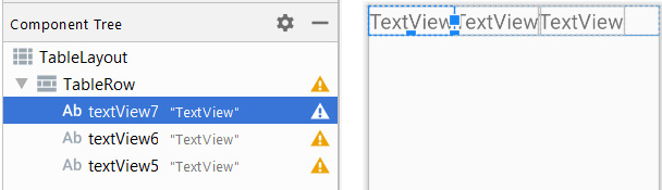
Figure 4.31 – Dragging three TextView widgets onto the TableRow element in the Component Tree
Now, add another two TableRow widgets (from the Layouts category). You can add them via the Component Tree window or the main UI designer.
Tip
You need to drop the widgets on the far left of the window, otherwise the new TableRow will become a child of the previous TableRow. This would leave the whole table in a bit of a muddle. If you accidentally add a TableRow as a child of the previous TableRow, you can either select it then tap the Delete key, use the Ctrl + z keyboard combination to undo it, or drag the mispositioned TableRow to the left (in the Component Tree) to make it a direct child of the Table (instead of TableRow).
Now, add three TextView widgets to each of the new TableRow elements. This will be most easily achieved by adding them via the Component Tree window. Check your layout to make sure it is like this:

Figure 4.32 – Adding three TextView widgets to each of the new TableRow elements
Let's make the table look more like a genuine table of data you might get in an app by changing some attributes.
On the TableLayout, set the layout_width and layout_height attributes to wrap_content. This gets rid of extra cells
Change all the outer (along the top and down the left-hand side) TextView widgets to black by editing the textColor attribute. You can achieve this by selecting the first TextView, searching for its color attribute, and then starting to type black into the color attribute values field. You will then be able to select @android:color/black from a drop-down list. Do this for each of the outer TextView widgets.
Tip
Remember you can select multiple widgets at the same time by holding the Shift key and left-clicking each required widget in turn.
Find the padding category for all the TextView widgets, and change the padding attribute to 10sp.
This next screenshot shows what the table looks like in Android Studio at this stage:

Figure 4.33 – The table in Android Studio
Let's add some finishing touches to the table.
Organizing the table columns
It might seem at this point that we are done, but we need to organize the data better. Our table, as with many tables, will have a blank cell in the top left to divide the column and row titles. To achieve this, we need to number all the cells. For this, we need to edit the layout_column attribute.
Tip
Cell numbers are numbered from 0 from the left.
Start by deleting the top-left TextView. Notice the TextView from the right has moved into the top-left position.
Next, in the new top-left TextView, edit the layout_column attribute to be 1 (this assigns it to the second cell because the first cell is 0, and we want to leave the first one empty), and for the next cell along, edit the layout_column attribute to be 2.
The result should look like this:
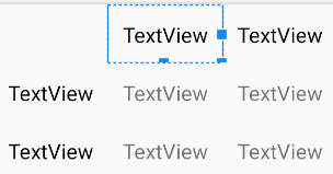
Figure 4.34 – Table column organized
For the next two rows of cells, edit their layout_column attributes from 0 to 2 from left to right.
If you want clarification on the precise code for this row after editing, here is a snippet, and remember to look in the download bundle in the Chapter 4 folder to see the whole file in context.
Important note
In the code snippet that follows, I have also added some values to the text attributes throughout.
<TableRow
android:layout_width="wrap_content"
android:layout_height="wrap_content">
<TextView
android:id="@+id/textView2"
android:layout_width="wrap_content"
android:layout_height="wrap_content"
android:layout_column="1"
android:padding="10sp"
android:text="India"
android:textColor="@android:color/black" />
<TextView
android:id="@+id/textView1"
android:layout_width="wrap_content"
android:layout_height="wrap_content"
android:layout_column="2"
android:padding="10sp"
android:text="England"
android:textColor="@android:color/black" />
</TableRow>
Try to complete this exercise, however, using the Attributes window if possible.
Linking back to the main menu
Finally, for this layout, we will add a button that links back to the menu, as follows:
- Add another TableRow via the Component Tree.
- Drag a button onto the new TableRow.
- Edit its layout_column attribute to 1 so that it is in the middle of the row.
- Edit its text attribute to Menu and edit its onClick attribute to match our already existing loadMenuLayout method.
You can now run the app and switch back and forth between the different layouts.
If you want to, you can add some meaningful titles and data to the table by editing all the text attributes of the TextView, as I have done in the following screenshot, which shows the TableLayout running in the emulator:

Figure 4.35 – Adding some significant titles and data to the table by editing all the text attributes of the TextView
Note
The author admits that the preceding data might be considered overly optimistic.
As a final thought, think about an app that presents tables of data. Chances are that data will be added to the table dynamically, not by the developer at design time as we have just done, but more likely by the user or from a database on the web. In Chapter 16, Adapters and Recyclers, we will see how to dynamically add data to different types of layout using adapters; and in Chapter 27, Android Databases, we will also see how to create and use databases in our apps.
Summary
We have covered many topics in just a few dozen pages. We have not only built three different types of layout—including LinearLayout with nested layouts, ConstraintLayout with manually configured constraints, and TableLayout (albeit with fake data) —but we have also wired all the layouts together with clickable buttons and text that trigger our Java code to switch between all these different layouts.
In the next chapter, we will stick with the topic of layouts. We will review many attributes we have seen, and we will build our most aesthetically pleasing layout so far by incorporating multiple CardView layouts, complete with depth and shadow into a smooth-scrolling ScrollView layout.