Lesson Files > Lesson 12 > Color.fcp | ||
Media | Color Correction Examples | |
Time | This lesson takes approximately 60 minutes to complete. | |
Goals | Identify color using a color wheel | |
Manipulate color with hue, saturation, and luminance controls | ||
Incorporate color effects during grading | ||
Use video scopes to identify and manipulate color | ||
Use the Color Corrector 3-way filter | ||
Use color balancing to enhance the final scene | ||
Describe the color terms hue, saturation, color wheel, color space, primary, secondary, and complementary |
Lesson 11 was entirely focused on luminance and contrast. Once you’ve graded the contrast, the next step in the color correction process is to work on the color balance of the image.
Choosing the color balance is a creative, as well as corrective, endeavor. You may find yourself wanting to manipulate color to enhance an image, to alter the mood of a scene, or perhaps to create highly stylized color schemes for a title sequence or motion graphics segment.
Whatever your goals, you need to understand how to judge colors and which controls to use to create the desired effect. This lesson focuses on how you evaluate and manipulate color in Final Cut Pro. You will learn how to read and understand the color balance of an image and then use color correction to alter the color balance in that clip with total control.
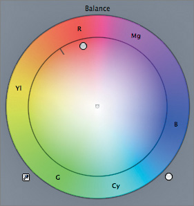
Color balance refers to the relative amounts of red, green, and blue in an image. As the name implies, by controlling the balance of each color in relation to the others, you can change the hue and saturation of all the colors found within an image.
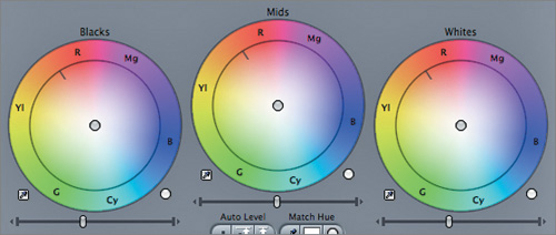
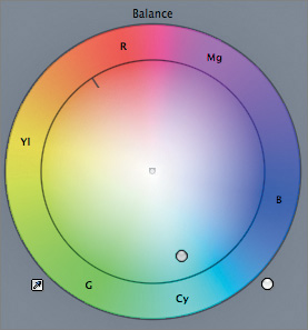
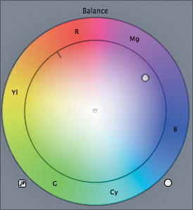
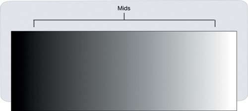
Final Cut Pro goes further by providing you with separate controls over the balance of the colors found in each of the three zones of luminance in an image, which allows you to make separate changes to the colors found in the blacks (such as shadows), those found in the mids (most of the image), and those in the whites (the bright areas and highlights). Each Color Balance control consists of a color wheel, at the center of which is a handle that allows you to make the necessary adjustments.
The contrast controls (the sliders beneath each wheel) help you ensure that the video is broadcast legal, but the Color Balance controls help you ensure that the colors in the image look right. For example, by manipulating the color balance within an image, you can make video shot with too much orange tint look more natural by neutralizing the tint.
Ideally, color correction is an extension of the original cinematography. As a colorist, you are a collaborator in one step of the artistic process, and your ideas and contributions help shape the final look and emotional impact of the program. You will probably work with the director of photography (though not always) to establish a starting point for the color correction process, and the two of you may continue to finesse the images into their final form. It’s also likely that the director or producer will have a say about the look of the program, and this input will weave its way into the creative process.
At other times, color correction may take the form of damage control, as you attempt to rescue footage that was shot under less than ideal conditions, or footage that was shot using an aesthetic that is no longer compatible with the project goals. Furthermore, the client may be relying on color correction to implement ideas that are too difficult or costly to execute on location.
Whatever the issues you need to address, color correction (also called grading), is generally broken down into two stages: primary correction and secondary correction. This lesson focuses on primary color correction, which involves adjusting the contrast and color balance of the overall image to achieve the desired look and feel. Secondary correction, when you isolate specific areas or colors in an image and modify them independently, is covered in Apple Pro Training Series: Encyclopedia of Color Correction.
In this lesson, you’ll evaluate an image to determine color casts (hues affecting the overall image), one of the most common color issues you’ll have to address. For example, this image may seem, at first glance, to be fine, but a closer examination will reveal a subtle blue cast from the shadows through the highlights.
Once you learn to identify a color cast in a clip, you’ll work towards correcting it to create a clean, neutral look, where whites are pure and blacks are solid.
Whatever the overall look, the first, and sometimes only, step you need to take is to apply a single primary color correction.
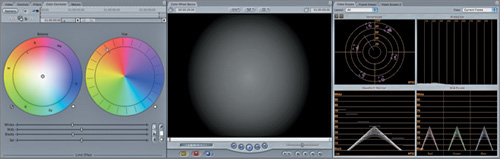
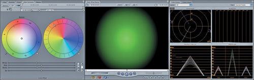
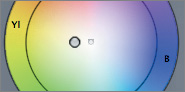
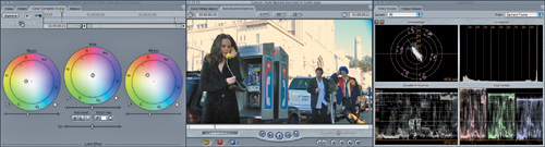
Before you start pushing and pulling the color balance in your shots, take a few minutes to get a better understanding of the color wheel that’s at the heart of the Color Balance controls. In doing so, you’ll also learn how to better understand the Vectorscope, which displays a graph of the colors in your image against a backdrop of targets that are directly analogous to the color wheel.
In its various forms, the color wheel is an effective way to provide independent yet unified control over hue (color) and saturation (intensity of color). Once you understand how the color wheel represents the fundamental components of color, you can reliably predict and control the results of color adjustments.
The color wheel displays all of the possible hues around the outside of a circle. If you follow the edge of the color wheel, you can find the three primary colors: red, green, and blue.
The pure primaries are equally distant from one another, and they divide the color wheel into thirds.
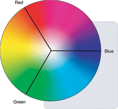
Video systems, regardless of the format, create color in an additive fashion, by mixing the three primaries together. The primary colors found on the color wheel correspond to the red, green, and blue components of a video signal; the red, green, and blue phosphors of a CRT display; and the red, green, and blue components of the pixels on a flat-screen monitor. (Incidentally, film also records color in three layers, or substrates, each of which is sensitive to red, green, and blue.)
By mixing these primary colors, any color of the rainbow can be displayed, and you can see this happening in the color wheel. As the primary colors blend together around the outer edge of the wheel, you can see other hues emerge.
An equal mixture of any two primaries creates the secondary colors on the color wheel. The three secondary colors are cyan, magenta, and yellow. For example, yellow (a secondary color) is a combination of green and red (both primaries).
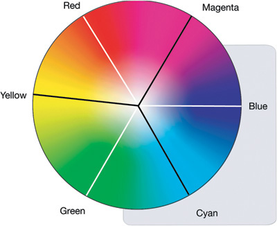
Notice that each secondary color falls directly opposite a primary color. Any two colors that are opposite one another—such as yellow and blue—on the color wheel are considered to be complementary.
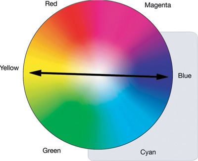
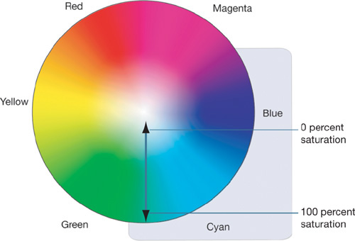
Combining any color with its complementary color on the wheel neutralizes it, effectively desaturating it. You can see this phenomenon represented in the color wheel—the outer edge of the wheel represents each hue at 100 percent saturation, and the center of the wheel has 0 percent saturation, which is represented by white.
Note
Even though 0 percent saturation is represented in the color wheel by white, it’s important to remember that 0 percent saturation simply means an absence of color. Removing all saturation from an image does nothing to alter the luminance of the image, which may then consist of any shade of gray.
To effectively control colors with the Final Cut Pro color correction filters, you must understand the relationship between complementary colors, and the effect of blending them together.
This simple exercise will help you understand the color wheel’s effect on an image and how those effects are displayed in the video scopes:
Open Lesson Files > Lesson 12 > Color.fcp.
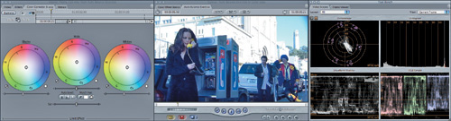
If it isn’t already, set up your workspace to include the video scopes in the Tool Bench window.
Choose Window > Arrange > Color Correction to open the Video Scopes tab.
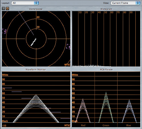
In the Layout pop-up menu, choose All to ensure all four scopes are visible.
Open the Exercise 01 - Color Wheel Basics bin.
Open the Color Wheel Basics sequence.
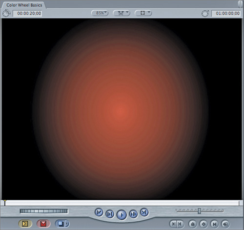
Double-click the first Custom Gradient clip in the sequence to open it into the Viewer. Then, at the top of the Viewer, click the Color Corrector tab.
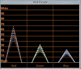
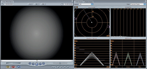
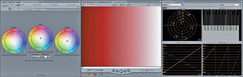
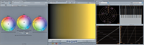
The first clip in the sequence is a custom gradient generator that’s been set to a low, neutral gray. A Color Corrector filter has been applied to the clip, but all the parameters are still at their default, so it is not affecting the image.
The first thing you should notice in the Vectorscope is the lack of any graph whatsoever, which means that the image is completely desaturated. The second thing you should notice in the Parade scope is that each color channel is equally strong. This latter graph shows the additive nature of the red, green, blue primary color system—adding equal amounts of each color results in a neutral gray.
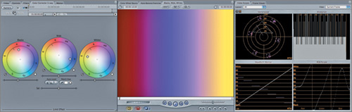
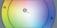
Click anywhere in the Color Balance control and drag toward the R (red) target.
As you move the balance control handle, the image in the Canvas begins to turn red.
Control-click in the Vectorscope and choose Magnify from the shortcut menu.
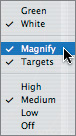
Because most adjustments you’ll be making to an image happen close to the center of the Vectorscope, the Magnify setting lets you see the results in more detail.
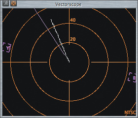
As you adjusted the Color Balance control, the graph in the Vectorscope stretched out in the same direction as the adjustment you made. The red channel, represented by the red graph in the Parade scope, also increased in intensity relative to the green and blue channels.
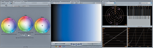
Click the Color Balance control and drag around the edge of the wheel towards the Cy (cyan) target. Watch the video scopes while you make the adjustment.
You can see the graph in the Vectorscope change to mirror the new direction of the balance control indicator. At the same time, you can see the three color channels in the Parade scope individually shift as you push and pull colors in each channel.
No matter what you do with the Color Balance control, and no matter how much the individual channel levels change in the Parade scope, the overall luminance of the image stays the same, as represented by the Waveform Monitor. This is an important concept. As its name implies, the Color Balance control lets you change the balance of colors in the red, green, and blue channels of an image, but the end result always has the same overall luminance.
More importantly, the Color Balance controls let you simultaneously rebalance the levels of all three color channels. This is an extremely powerful, and extremely fast, way to work.
Take a minute to make additional changes to the Color Balance controls, observing the changes in the picture and in the video scopes.
In this exercise, you’ll use the Color Balance control to modify the saturation of a color and to neutralize any single color by adding it to its complementary color.
Press the Down Arrow key to navigate to the second clip in the Color Wheel Basics sequence. Double-click the second Custom Gradient clip to open it into the Viewer.
This clip also has a Color Corrector filter applied.
This clip is a circular gradient, just like the first clip. However, this clip already has a clear green cast, which you can see in both the Vectorscope and Parade scope.
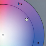
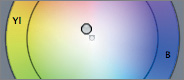
Click in the Color Balance control, and drag towards a point somewhere between the Mg (magenta) and B (blue) targets, so that the spike in the green channel of the Parade scope diminishes, while the blue and red spikes remain roughly the same height relative to one another.
Stop dragging when the green has diminished but not quite faded completely, and look at the video scopes.
It’s a little tricky to maintain the balance between the red and blue graphs in the Parade scope, while pulling down the green channel, but keep at it until you have roughly the result shown in the preceding figure.
By moving color balance in the opposite direction from the original green color, you’ve begun to desaturate the image, as you can see by the shortening of the graph in the Vectorscope. Because the balance between the red and blue spikes in the Parade scope is roughly equal, you can be sure that you’re moving in the direction of purely neutralizing the image, rather than tinting it another color.
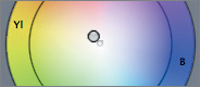
Immediately after you start to drag the balance control indicator to the right, hold down Shift and resume dragging, ever so slightly, until the three graphs in the Parade scope are the same height, and the graph in the Vectorscope is as close to the center as possible.
By Shift-dragging, you lock the angle of your adjustment. Because every hue is represented by an angle around the perimeter of the wheel, locking the angle lets you move the balance control indicator in and out from the center of the wheel to the edge, without changing its angle. This allows you to make saturation adjustments without also changing the hue of the image.
When you’ve made the adjustment, the gradient should appear nearly completely gray.
If the image is not gray, the channels as displayed in the Parade scope weren’t balanced equally enough when you made the last change. Keep working at it until you’ve completely neutralized the color.
Feel free to continue experimenting with this last image until you get the hang of the technique. The most important thing to learn is that by moving a Color Balance control you can adjust each individual color channel of your image.
Even more important, the direction in which you rebalance colors with the Color Balance control is mirrored by the direction in which the graph moves in the Vectorscope. This direct relationship is a key element in your ability to predict necessary changes in color balancing.
Have you ever taken a picture with a digital camera, or shot some video on vacation, only to get home and find that your footage is inexplicably orange, or blue, or green? What you’re seeing is an incorrect white balance, often referred to as a color cast.
Every light source has a different color temperature. Each of the three types of light sources you’ll typically encounter—incandescent (tungsten), fluorescent, and sunlight—produce light with spikes in different parts of the visible spectrum. Most of the time, you don’t consciously notice these color temperatures, because the human eye is extremely adaptive and influenced by visual context. Generally, your perception of what is white and what is black is relative to the surrounding colors.
Film and video cameras are not usually so forgiving. Color casts are a result of the recording device not being correctly adjusted to interpret the color temperature of the dominant light source. With film, the film stock wasn’t intended for the light source in use. With video, the white balance control was incorrectly set, or the automatic setting wasn’t quite so automatic.
The results are sometimes obvious (The whites look orange!) and sometimes subtle (What’s wrong with his face?); but, in any event, the colors in the image are not what was expected. No matter what your creative goals are for the color of an image, you generally want to begin with an image where the whites look white, the blacks look black, and faces look the way they’re supposed to, instead of orange, or green, or blue.
For this reason, you must learn to spot a color cast, determine which color channel is creating a problem, and neutralize the cast using the Color Balance controls.
Colorists need to perceive nuances in color and color casts in an image, and know how to alter the colors to create a natural appearance. Although every colorist has subjective viewpoints on the use of color, finding a natural balance is often the first step to creating the final look of the video.
In the Browser, open the Exercise 02 - Auto Balance bin and double-click the Auto Balance Exercise sequence.
Note
This lesson assumes that you are working on a calibrated external NTSC monitor. A computer monitor does not provide a true representation of the actual NTSC broadcast image. If your system is PAL, or you don’t have an external monitor, you may complete this exercise using your computer’s monitor, but be aware that it is not accurate for finishing purposes, and the resulting images will not look the same when output to broadcast video. If you have an SDI out from your video card and a DVI-D display, with the right adapter/converter, you can get a pretty reliable monitoring solution, although not 100 percent accurate.
In the Video Scopes tab, make sure that the Layout pop-up menu is set to All.
Before you do anything else, take a close look at the image in the Canvas.
Your first impression is extremely important. The longer you look at any image, the more your eyes adapt to the relative differences between the colors in the frame, and the less sensitive you’ll be to a color cast in the picture.
You need to get into the habit of asking the following three questions:
If the answer to these is a collective no, as it should be in this image, you need to quantify the problem. In this case, you may have noticed that the image has a slightly blue, cool quality to it. To confirm your suspicions, it’s time to look at the video scopes to determine exactly what the problem is.
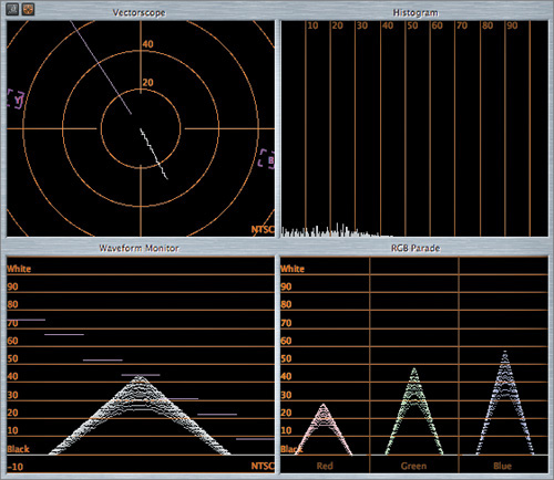
Look at the video scopes.
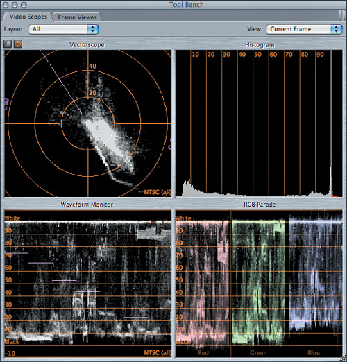
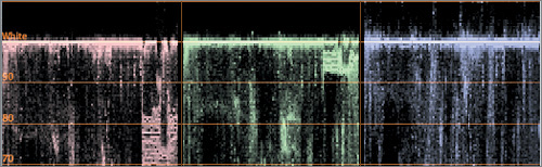
You’ll notice that the image is well exposed, with a wide contrast ratio that stretches from 0 percent (black) all the way to 100 percent (white). Furthermore, there is an enormous amount of detail throughout the mids. From the clustering at the top of the Waveform Monitor, however, you can surmise that there’s a bit of overexposure, and the huge spike to the right of the Histogram at the 100 percent line confirms that there’s an excess of white in the image.
As far as color casts go, however, the scopes reveal two telltale signs that the image is too blue. Before going on to the next step, see if you can guess what they are.
From the Layout pop-up menu, choose Parade.
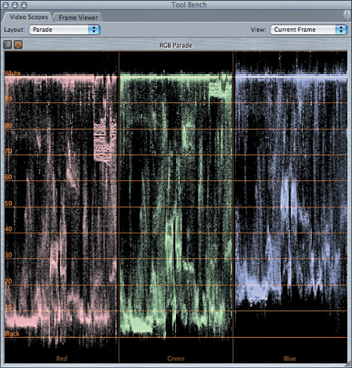
In many cases when there are abundant blacks and whites in the image, the three graphs that represent the red, green, and blue channels in the Parade scope look somewhat similar, in terms of their overall shape. Clearly, the mids will vary considerably, but because blacks represent an absence of all three colors, and whites represent the presence of all three colors, the tops and bottoms of each of the three graphs should fall roughly in the same places.
Carefully examine the top of the blue waveform.
This confirms the problem. While the Waveform Monitor shows you the average luminance of all three color channels together, the Parade scope shows you that the blues in this image are considerably stronger than the reds and greens. The bottom of the Parade scope shows that the blue channel is lighter in the blacks, which explains why the blacks seem somewhat washed out, even though parts of the Waveform Monitor extend all the way to the bottom.
From the Layout pop-up menu, choose Vectorscope. Control-click the Vectorscope and deselect Magnify in the shortcut menu.
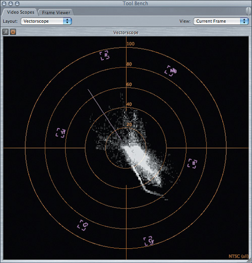
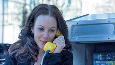
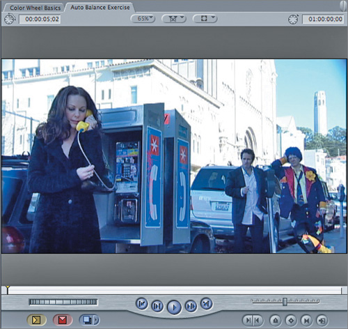
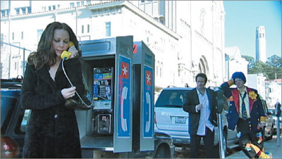
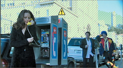
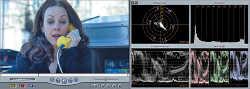
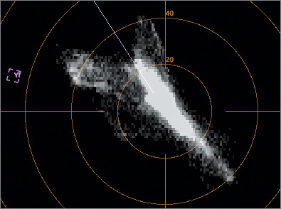
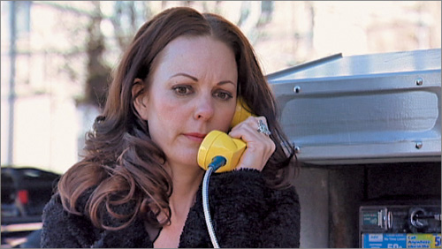
If you didn’t have enough proof already, here’s the smoking gun. In an image featuring three people, there are no traces clustered around the Flesh Tone line (the diagonal line in the upper-left quadrant) in the Vectorscope.
Furthermore, even though there is a lot of color in the Canvas (the reds and yellows in the clown’s outfit and on the phone signage) the entire graph within the Vectorscope seems oddly uncentered, and in fact is offset in the direction of blue and cyan.
Although you can oftentimes identify a color cast by sight, the Parade scope and the Vectorscope are your best tools for correctly identifying the type, and severity, of a color cast in any image. Even though you may develop your eye to accurately spot the hue of a color cast, the scopes are still useful for revealing just how much correction you need to make, based on the numbers.
Now that you’ve identified an improper color cast, you’ll want to eliminate it before taking any other steps. To expedite the process, the Color Corrector 3-way filter provides three Select Auto-balance Color buttons that can automatically rebalance an image to make the blacks and whites neutral and rich.
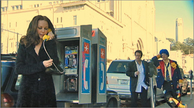
Open the Phone_Call.mov clip into the Viewer and click the Color Corrector 3-Way tab.
In the Video Scopes tab, choose All from the Layout pop-up menu.
You’re now set to start correcting this clip. You’ll notice a small eyedropper button at the bottom left of each Color Balance control in the Viewer. These are the Select Auto-balance Color buttons—one corresponds to each zone of luminance.
The most important of these buttons corresponds to the blacks and whites. Whenever you use the automatic balancing controls in Final Cut Pro, you want to start where the color cast is most noticeable. In this case, it’s in the blacks.
Click the Blacks Select Auto-balance Color button so that it is highlighted.
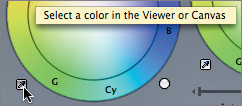
When you click the button, a tooltip appears with an instruction. What the instruction doesn’t tell you is that you need to select an area that’s supposed to be pure black.
This is an important decision, and it’s not as easy as it may seem. You want to select an area that you think corresponds as closely to solid black as possible. In particular, because there’s a color cast, you want to select an area that is supposed to be black, even if it doesn’t appear to be so at first. In this image, there are several candidates: the woman’s black dress, the shadow in the phone kiosk, or the color of the man’s trousers. Each of these black areas is slightly different, however, and will yield different results.
Click in the shadows of the phone kiosk.
Immediately, three things happen. The most noticeable event is that the image immediately looks more natural.
If you look in the Color Corrector tab, you’ll see that the balance control indicator in the Blacks Color Balance control has moved to the left, toward yellow. As you learned earlier, yellow is the complementary of blue, so this small adjustment neutralizes the cast in the blacks.
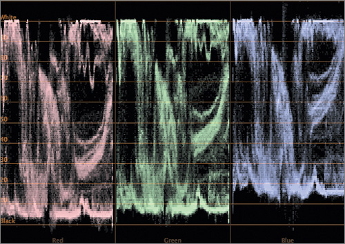
Look at the Parade scope.
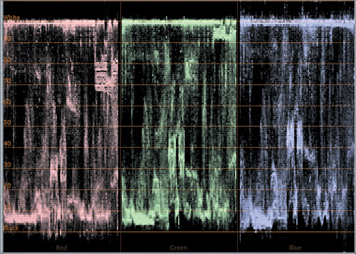
You should notice two things. First, the bottom of the blue graph now approximately matches the level of the red and green graphs. Second, the whites are still out of whack. Work remains to be done.
Click the Whites Select Auto-balance Color button to the left of the Whites Color Balance control.
Now, you want to click a region in the image that’s supposed to be white. That seems easy enough, because there’s plenty of white in the image.
In the Canvas, click the side of the white building.

Nothing happened! How can this be? The Parade scope clearly shows a blue cast in the whites. This situation illustrates an important rule you need to remember when you use the Whites Select Auto-balance Color button.
Press Control-Z to turn on luminance range checking in the Canvas (or choose View > Range Check > Excess Luma).
You now can clearly see that the area you tried to select is overexposed. When digital video is overexposed, the result is that all values over the maximum digital limit are clipped, and the resulting parts of the image are pure white. These areas will not have the color cast you’re trying to correct because they’re artificially white. Extreme whites that are likely to be overexposed—such as lens flares, glints, or hot highlights—are not good candidates for the Whites Auto-balance eyedropper.
You need to pick a new area of the picture. The shirt of the man standing next to the clown seems like a good choice. It’s not overexposed, and it clearly looks like it has the blue cast you’re trying to eliminate.
Press Control-Z to turn off luminance range checking in the Canvas.
Click the Whites Reset button to the right of the Whites Color Balance control.
Click the Whites Select Auto-balance Color button, and then click the man’s shirt.

Immediately, you should see another unexpected problem.
Instead of correcting all of the whites in the image, it turns them unexpectedly sepia. If you look at the Parade scope, the balance has been horribly skewed. Apparently the shirt is supposed to have a slightly higher blue level. You need to find something else that is supposed to be white.
Click the Whites Reset button next to the Whites Color Balance control.
Next, try the phone logo on the side of the phone kiosk.
Click the Whites Select Auto-balance Color button, and then click the whitest group of pixels within the phone.
The result is a compromise. The building has become warmer, but this may be due to the quality of light at that time of day, or the fact that the paint on the building is a warmer shade of white. (In either case, a quick chat with the director of photography should clear that up.)
The important thing is that the faces, which seemed anemic before, are now looking a little healthier, which is confirmed by the graph in the Vectorscope. Unfortunately, in this example, there is no absolute benchmark for the accuracy of this correction, and it becomes a matter of preference and experience.
As you can see, the effectiveness of the Auto-balance eyedroppers is highly dependent on selecting the right pixels in the image. This process may involve some detective work on your part.
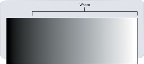
When correcting color casts, you typically need to adjust only two Color Balance controls to balance the image. Why? Because the Whites Color Balance control primarily affects the top 75 percent of the image. (The influence of this control falls off at this point, fading out around 10 percent luminance.) Everything from dark-gray shades of color up to white is affected.
You probably noticed, however, that there are three eyedroppers, and so far you’ve ignored the one for mids.
In general, you should begin to color balance a scene by working in the whites or the mids to make the scene natural and realistic. Then, depending on the scene, additional adjustments may or may not be necessary.
If there is nothing white in the frame, your next best bet is to sample something that is as close to 50 percent gray as possible using the Mids Auto-balance eyedropper. The mids typically make up a large percentage of an image, and the Mids Color Balance control has influence over the colors falling between 10 percent and 90 percent luminance, with the maximum area of influence being the center 75 percent.
If the entire image is lit with light of the same color temperature, you may get away with balancing just the mids. The advantage of doing the primary color balancing with the mids is that you can avoid overly tinting the bright whites or deep blacks, if these regions are relatively free from color casts. This is, of course, highly dependent on the distribution of color throughout the three luminance zones of the image. Every image is different and requires a unique approach.
As you’ve seen, the Final Cut Pro color correction filters let you separately manipulate the colors in the blacks, midtones, and whites zones of an image.
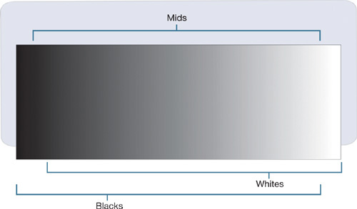
Any control that targets the blacks will affect only colors found in the shadows of the image, from full black up into the mid-gray tones.
Any control that targets the whites will affect only colors found in the highlights, from the mid-gray tones up to white.
Any control that targets the mids affects all the colors found in the midrange of the image, which constitutes the largest percentage of the viewing area.
These three zones have a great deal of overlap. For example, the controls that affect the mids extend their influence into the blacks and whites, but the effect tapers off before reaching the extreme blacks and whites, in order to preserve the ultimate black and white points you want to define.
Before moving to a practical example of color balancing, you’ll do one last grayscale exercise. (It’s the last one, we promise!) This time you’ll explore the amount of overlap exerted by each color control.
In the Browser, open the Exercise 03 - Blacks, Mids, Whites bin.
Double-click the Blacks, Mids, Whites sequence.
Double-click the Gradient clip in the sequence to open it into the Viewer, and then click the Color Corrector 3-way tab at the top of the Viewer. (A Color Corrector 3-way filter has already been applied.)

The clip you’ll be working on first is another linear gradient generator, this time with the black on the left and the white on the right. It’s an ideal way to see the effect each color control has on an image, stretching from absolute black to absolute white.
Click in the Blacks Color Balance control, and drag the balance control indicator in any direction to tint the blacks within the image. It’s not necessary to drag all the way to the edge, just drag until the blacks are well tinted.
As you can see, the Blacks Color Balance control actually influences color well into mids. It’s important to see, however, that this influence tapers off gently towards the end, so that by 80 percent luminance the control is barely having an effect, and this control has absolutely no effect on the upper 10 percent of whites.
Click the Blacks Reset button.
Drag the Mids balance control indicator in any direction.
Predictably, you can see that the mids area of influence is strongest in the center region of luminance, tapering off at the blacks and whites, leaving them unaffected.
Click the Mids Reset button.
Drag the Whites balance control indicator in any direction.
The effect of the whites adjustment is pretty much the inverse of the blacks, such that the lower 10 percent of the luminance range remains unaffected.
Take a minute to play around with all of the Color Balance controls at once, and observe how the colors mix together.
You can see that the blacks and whites both have a profound effect on the mids, yet a strong mids adjustment still manages to create a unique tint at the center of the gradient. Furthermore, you should also observe that the extreme blacks and whites remain unaffected by changes to either of the opposing controls.
You should now have a complete understanding of how the three Color Balance controls allow you to influence the color balance in each of the three zones of luminance. It’s time for you to put this knowledge to a real-world test.
Now you’re going to use everything you’ve learned to color correct a shot manually, without using any automatic controls. In the process, you’ll see that, with practice (and the help of the video scopes), it is often easier and faster to manually address color casts and other issues within an image.
Open the Color Balancing Zones sequence.
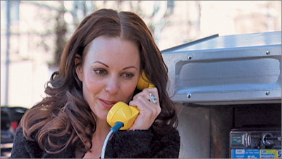
Double-click the Phone_Call_CU.mov clip in the sequence to open it into the Viewer, then at the top of the Viewer click the Color Corrector 3-way tab. (A Color Corrector 3-way filter has already been applied.)
Ordinarily, you would first adjust the contrast with the Blacks, Whites, and Mids sliders. In this case, you’re lucky, the shot has exactly the contrast the client wants, so you can skip this step.
The Parade scope reveals that the blacks have abnormally high blue levels, so this is the first thing you’ll need to address.
Look at the Vectorscope.

The scope reveals an offset into the blues. This provides you with a valuable clue about how to resolve the color cast issue.
Look at the Blacks Color Balance control, and find the direction of the complementary color to the biggest spike in the Vectorscope.
This tells you the direction in which you want to drag the Blacks balance control indicator to neutralize the color cast.
Drag the balance control indicator in the direction of the complementary color, in this case, somewhere between yellow and red.
Keep dragging, with one eye on your image, another eye on the Vectorscope (to keep track of the overall shift in hue), and a third eye on the bottoms of the three graphs in the Parade scope to make sure they become relatively balanced.
Don’t worry if you don’t drag the control very far. In real-world images, you’ll typically find that very small changes in the Color Balance controls have a very big impact.
Tip
At first, you may not notice any movement while dragging a balance control indicator. By default, the balance control indicators in the color correction filters move in very small increments, which is appropriate for most corrections. If necessary, you can Command-drag to make adjustments in larger increments.
When you’re happy with the quality of the blacks, it’s time to work on the whites.
Because the color cast in the whites is also in the blues, also move the balance control indicator towards a point between yellow and red.
This time, as you drag, keep your eye on the woman’s skin color. Because of the large degree of overlap between the whites and mids, this is an opportunity to warm up some of the highlights on her face.
As you make this adjustment, you’ll run into the same problem you saw earlier, when the building you thought was white began to turn sepia. It can be helpful to spot something else in the picture that is being affected by the whites color cast. This image has few whites, but there are some highlights on the ring on her finger that can serve as a rough guide.

Again, don’t be surprised if you find yourself making a small adjustment to avoid severely tinting the background. In color correction, a little goes a long way. In any event, keep your change minimal, because there’s one more step you can take.
In the Video Scopes tab, choose Vectorscope from the Layout pop-up menu.
For the last step in this procedure, you’re going to boost the red channel in the mids to make the woman pop out a little more from the background. As you do this, keep a close eye on the Vectorscope, so you can keep track of how closely her adjusted skin tones come to the Flesh Tone line.
Drag the Mids balance control indicator in the direction of the complementary color, in this case, somewhere between yellow and red.
This will be your most subtle adjustment of all. You want to drag the balance control indicator out far enough to add more color to her face and some luster to her hair, but you don’t want to move it out so far that the image turns brown.
Note
If at any point you feel that you’re doing more harm than good, don’t get frustrated. It’s easy for your eyes to get tired after looking at the same color shifts for a long time. Just click the Mids Reset button and start over.
As you drag the balance control indicator, keep your eye on the Vectorscope. You’ll see her flesh tones near the Flesh Tone line, but they don’t have to lie directly on the line. Indeed, if they did, she might look a little sallow. In this case, having the traces of the Vectorscope fall just above the Flesh Tone line seem to produce the most pleasing results, but this is a matter of interpretation.
With this last adjustment, you’re finished!
To see the before and after for this exercise (which is quite dramatic), select and deselect the Enable Filter checkbox beside the “eye” icon at the top of the Color Corrector tab.

In this lesson, you’ve learned how to perform the most common color correction task there is—identifying color casts in images and adjusting them. You’ve learned some of the most common ways of spotting problems in your images by using the video scopes, and you’ve learned precise methods of adjusting the different regions of an image, based on the luminance zone that a particular set of colors happens to fall into.
The Color.fcp project file contains a sequence called Color Balancing Zones—Completed that contains a finished version of this lesson. You can compare your own work to the color corrections in that version.