
Market basket analysis (MBA) is a technique used in data mining by retail companies to increase sales by better understanding customer buying patterns. It involves analyzing large datasets, such as customer purchase history, to uncover item groupings and products that are likely to be frequently purchased together.

The framework of M B A explains the market basket transaction data. An example of a frequent itemset is at the bottom.
MBA explained
This chapter explores the implementation of market basket analysis with the help of an open source e-commerce dataset. You start with the dataset in exploratory data analysis (EDA) and focus on critical insights. You then learn about the implementation of various techniques in MBA, plot a graphical representation of the associations, and draw insights.
Implementation
Data Collection
Let’s look at an open source dataset from a Kaggle e-commerce website. Download the dataset from www.kaggle.com/carrie1/ecommerce-data?select=data.csv.
Importing the Data as a DataFrame (pandas)

An output sample explains the data of invoice number, stock code, description, quantity, invoice date, unit price, customer I D, and country name.
The output
Cleaning the Data

An output sample of quantity, unit price, and customer I D, count, mean, minimum and maximum values.
The output
The Quantity column has some negative values, which are part of the incorrect data, so let’s drop these entries.

An output sample of quantity, unit price, and customer I D, count, mean, minimum and maximum values.
The output
Insights from the Dataset
Customer Insights
Who are my loyal customers?
Which customers have ordered most frequently?
Which customers contribute the most to my revenue?
Loyal Customers

An output sample of data from the top 5 loyal customers with the highest number of orders. The data includes customer ID, country, and invoice number.
The output
Number of Orders per Customer
Let’s plot the orders by different customers.

A graph of the number of orders by different customers. The line begins at 0, peaks around 4500, then decreases, and rises up to 7000.
The output

A screenshot of the input and output of the top 5 profitable customers with the highest money spent. The data frame of the output exhibits the customer ID, country, and amount.
The output
Money Spent per Customer

A graph of the output of money spent by different customers. 250000 is the highest amount spent by a customer. The graph has a fluctuating trend.
The output
Patterns Based on DateTime
In which month is the highest number of orders placed?
On which day of the week is the highest number of orders placed?
At what time of the day is the store the busiest?
Preprocessing the Data
How Many Orders Are Placed per Month?

A bar chart exhibits the output data of a number of orders calculated in different months. November 2011 has the highest number of orders, while December 11 has the least.
The output
How Many Orders Are Placed per Day?
Provide X tick labels.

A graph exhibits the output data of the number of orders calculated on different days. Thursday has the highest number of orders at over 4000.
The output
How Many Orders Are Placed per Hour?

A bar chart of the number of orders calculated versus hours. The highest number of orders is at the twelfth hour.
The output
Free Items and Sales
Since the minimum unit price = 0, there are either incorrect entries or free items.

A box plot of unit price. The distribution is observed from 0 to 4200 and at 8200-unit prices.
The output
Items with UnitPrice = 0 are not outliers. These are the “free” items.

A screenshot of the filtered output data includes invoice number, stock code, year _ month, month, day, hour, description, quantity, invoice date, unit price, customer I D, and amount.
The output
There is at least one free item every month except June 2011.
Provide X tick labels.

A bar chart of frequency calculated in different months. November 2011 has the highest range of frequency, while February has the least.
The output
The greatest number of free items were given out in November 2011. The greatest number of orders were also placed in November 2011.

A bar chart of the number of orders calculated in different months. November 2011 has the highest number of orders, while December has the least.
The output
Compared to the May month, the sales for the month of August have declined, indicating a slight effect from the “number of free items”.

A bar chart of revenue generated for different months. The highest amount is generated in November 2011.
The output
Item Insights
Which item was purchased by the greatest number of customers?
Which is the most sold item based on the sum of sales?
Which is the most sold item based on the count of orders?
What are the “first choice” items for the greatest number of invoices?
Most Sold Items Based on Quantity

A horizontal bar chart of the top 10 items based on the number of sales. Papercraft and a little birdie have the highest quantity.
The output
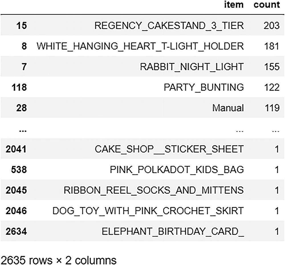
Items Bought by the Highest Number of Customers
This means 856 customers ordered WHITE HANGING HEART T-LIGHT HOLDER.

A screenshot of stock codes and descriptions.
The output
Create a bar plot of description (or the item) on the y axis and the sum of unique customers on the x axis.

A horizontal bar chart of the top 10 items bought by the highest number of customers. Regency Cake stands 3 T I E R is the most bought item of all.
The output
Most Frequently Ordered Items

A word cloud of the words of habitually ordered items.
The output
Top Ten First Choices
A screenshot of the top 10 first choices. The data of items and counts are represented.
The output

A horizontal bar chart of the top 10 first choices.
The output
Frequently Bought Together (MBA)
Which items are frequently bought together?
If a user buys an item X, which item is he/she likely to buy next?
Let’s use group by function to create a market basket DataFrame, which specifies if an item is present in a particular invoice number for all items and all invoices.
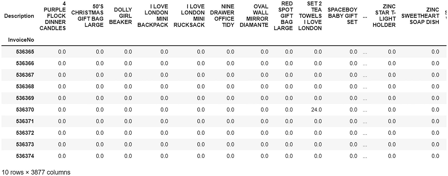
An output of the total quantity assembled by description and invoice.
The output
This output gets the quantity ordered (e.g., 48,24,126), but we just want to know if an item was purchased or not.

An output of the total quantity assembled by description and invoice.
The output
Apriori Algorithm Concepts
Refer to Chapter 1 for more information.
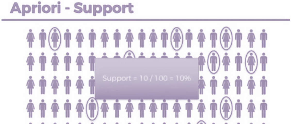
An illustration of the apriori-support. Support is equal to 10 over 100, which is equal to 10 percent.
Support

A set of 2 formulas for calculating movie recommendations and market basket optimization.
Formula
Suppose you are looking to build a relationship between milk and bread. If 7 out of 40 milk buyers also buy bread, then confidence = 7/40 = 17.5%

An illustration explains the percentage obtained in confidence. Confidence is equal to 7 over 40, which is equal to 17.5 percent.
Confidence

A set of 2 formulas for calculating movie recommendation and market basket optimization.
Formula
The basic formula is lift = confidence/support.
So here, lift = 17.5/10 = 1.75.

An illustration of the value of lift. Lift is equal to 17.5 % over 10 %, which is equal to 1.75. Two formulas of movie recommendation and market basket optimization to calculate lift.
Lift
Association Rules
Association rule mining finds interesting associations and relationships among large sets of data items. This rule shows how frequently an item set occurs in a transaction. A market basket analysis is performed based on the rules created from the dataset.

An illustration of five transactions and the frequent itemset and the association rule on the right.
The output
Figure 2-30 shows that out of the five transactions in which a mobile phone was purchased, three included a mobile screen guard. Thus, it should be recommended.
Implementation Using mlxtend
If A => then B
Use the apriori algorithm and create association rules for the sample item.

A sample output. It includes data on antecedents, consequents, antecedent support, consequent support, support, confidence, lift, leverage, and conviction.
The output
Creating a Function
Validation

A validation output. It includes the year, day, hour, description, quantity, country, and amount.
The output
There are some common items between the recommendations from the bought_together_frequently function and the invoice.
Thus, the recommender is performing well.
Visualization of Association Rules

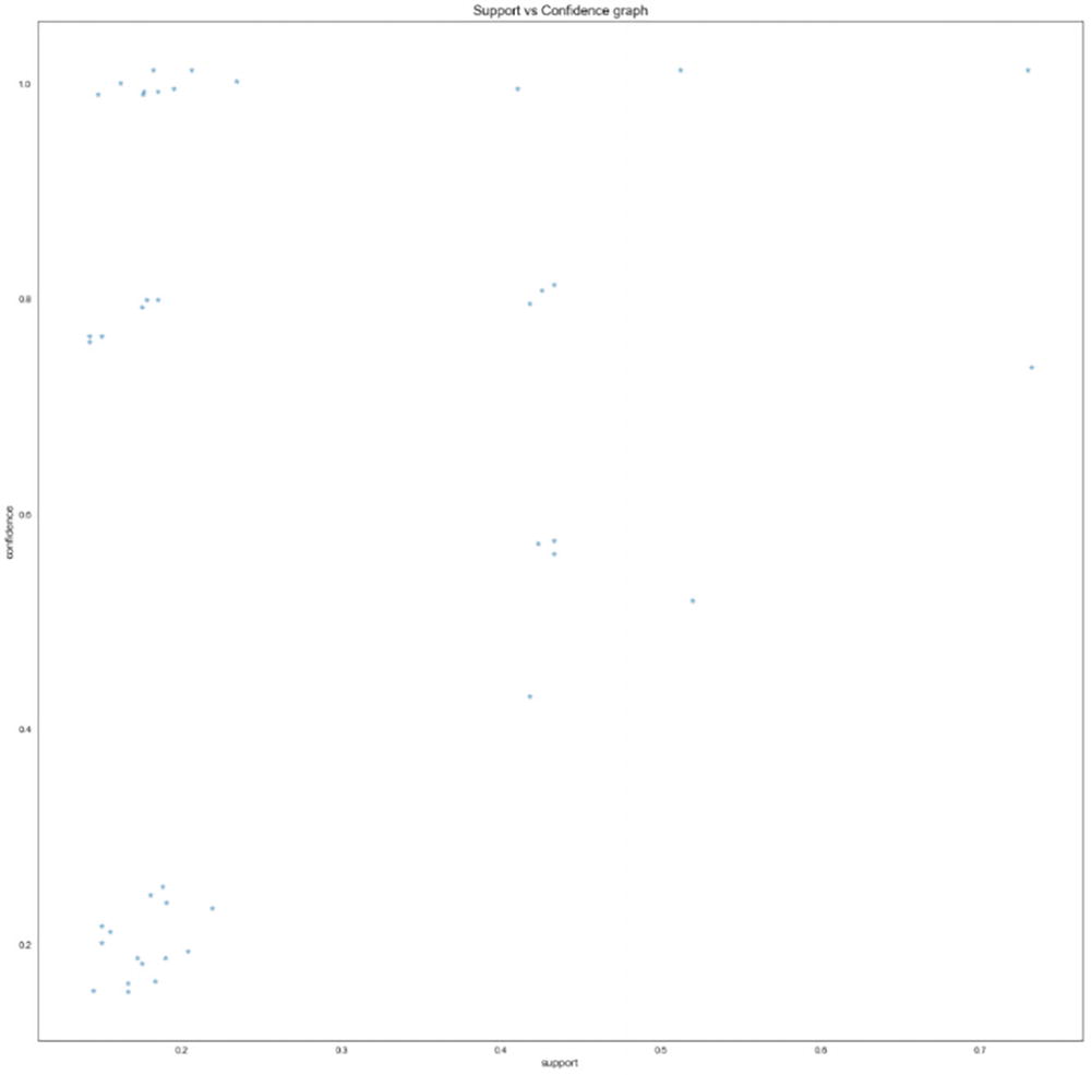
A scatterplot of support versus confidence. The plots are observed under 0.2, 0.5, 0.6 and 0.7.
The output

A graphical representation of the interconnection between wooden star Christmas Scandinavian, paper chain kit 50's Christmas, R1, R2, R3, R4, and R0.
The output
A scatterplot of support versus confidence. The graph has the highest value of above 0.8.
The output

A graphical representation of the links of R1, R0, R2 R3, wooden star Christmas Scandinavian, paper chain kit 50's Christmas and wooden heart Christmas Scandinavian.
The output

A scatterplot of support versus confidence. The graph has the highest value above 0.8.
The output

A graphical representation of the links of R 0, 1, 2, 3, 4, 5, jam-making set printed, jam-making set with jars, recipe box pantry yellow design, and a pack of 72 retro spot cake cases.
The output
Summary
In this chapter, you learned how to build a recommendation system based on market basket analysis. You also learned how to fetch items that are frequently purchased together and offer suggestions to users. Most e-commerce sites use this method to showcase items bought together. This chapter implemented this method in Python using an e-commerce example.