© The Author(s), under exclusive license to APress Media, LLC, part of Springer Nature 2023
A. Kulkarni et al.Applied Recommender Systems with Pythonhttps://doi.org/10.1007/978-1-4842-8954-9_7

7. Clustering-Based Recommender Systems

Akshay Kulkarni1  , Adarsha Shivananda2, Anoosh Kulkarni3 and V Adithya Krishnan4
(1)
Bangalore, Karnataka, India
(2)
Hosanagara tq, Shimoga dt, Karnataka, India
(3)
Bangalore, India
(4)
Navi Mumbai, India
 

Recommender systems based on unsupervised machine learning algorithms are very popular because they overcome many challenges that collaborative, hybrid, and classification-based systems face. A clustering technique is used to recommend the products/items based on the patterns and behaviors captured within each segment/cluster. This technique is good when data is limited, and there is no labeled data to work with.

Unsupervised learning is a machine learning category where labeled data is not leveraged, but still, inferences are discovered using the data at hand. Let’s find the patterns without the dependent variables to solve business problems. Figure 7-1 shows the clustering outcome.

A graph of unsupervised learning exhibits the clustering outcome. A set of three clusters are represented along the x (x subscript 1) and y (x subscript 2) axis.

Figure 7-1

Clustering

Grouping similar things into segments is called clustering; in our terms, “things” are not data points but a collection of observations. They are
  • Similar to each other in the same group

  • Dissimilar to the observations in other groups

There are mainly two important algorithms that are highly being used in the industry. Before getting into the projects, let’s briefly examine how algorithms work.

Approach

The following basic steps build a model based on similar users’ recommendations.
  1. 1.

    Data collection

     
  2. 2.

    Data preprocessing

     
  3. 3.

    Exploratory data analysis

     
  4. 4.

    Model building

     
  5. 5.

    Recommendations

     
Figure 7-2 shows the step to building the clustering-based model.

A set of 2 frameworks expose the steps involved to build a model based on similar user recommendations (top) and based on similar items recommendation (bottom).

Figure 7-2

Steps

Implementation

Let’s install and import the required libraries.
#Importing the libraries
import pandas as pd
import numpy as np
from matplotlib import pyplot as plt
from scipy.cluster.hierarchy import dendrogram
from sklearn.cluster import AgglomerativeClustering
from sklearn.cluster import KMeans
import seaborn as sns
import os
from sklearn import preprocessing

Data Collection and Downloading Required Word Embeddings

Let’s consider an e-commerce dataset. Download the dataset from the GitHub link of this book.

Importing the Data as a DataFrame (pandas)

Import the records, customers, and product data.
# read Record dataset
df_order = pd.read_excel("Rec_sys_data.xlsx")
#read Customer Dataset
df_customer = pd.read_excel("Rec_sys_data.xlsx", sheet_name = 'customer')
# read product dataset
df_product = pd.read_excel("Rec_sys_data.xlsx", sheet_name = 'product')
Print the top five rows of the DataFrame.
#Viewing Top 5 Rows
print(df_order.head())
print(df_customer.head())
print(df_product.head())
Figure 7-3 shows the output of the first five rows of records data.

A data frame exposes the output of the first 5 rows (0 to 4) of the records data. The data includes invoice number, stock code, quantity, delivery date, and ship mode are represented.

Figure 7-3

The output

Figure 7-4 shows the output of the first five rows of customer data.

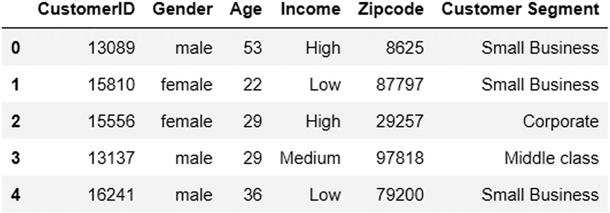
A data frame exposes the output of the first 5 rows (0 to 4) of customer data. The data includes customer I D, gender, age, income, zip code, and customer segment are represented.

Figure 7-4

The output

Figure 7-5 shows the output of the first five rows of product data.

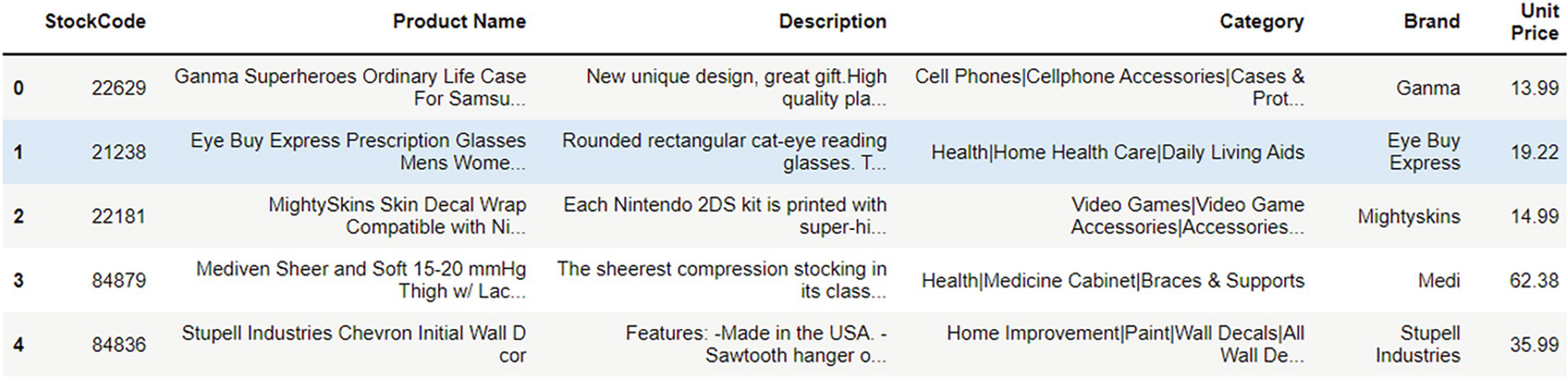
A data frame exposes the output of the first 5 rows (0 to 4) of product data. The data includes stock code, product name, description, category, brand, and unit price are represented.

Figure 7-5

The output

Preprocessing the Data

Before building any model, the initial step is to clean and preprocess the data.

Let’s analyze, clean, and merge the three datasets so that the merged DataFrame can be used to build ML models.

First, focus all customer data analysis to recommend products based on similar users.

Next, write a function and check for missing values in the customer data.
# function to check missing values
def missing_zero_values_table(df):
        zero_val = (df == 0.00).astype(int).sum(axis=0)
        mis_val = df.isnull().sum()
        mis_val_percent = 100 * df.isnull().sum() / len(df)
        mz_table = pd.concat([zero_val, mis_val, mis_val_percent], axis=1)
        mz_table = mz_table.rename(
        columns = {0 : 'Zero Values', 1 : 'Missing Values', 2 : '% of Total Values'})
        mz_table['Total Zero Missing Values'] = mz_table['Zero Values'] + mz_table['Missing Values']
        mz_table['% Total Zero Missing Values'] = 100 * mz_table['Total Zero Missing Values'] / len(df)
        mz_table['Data Type'] = df.dtypes
        mz_table = mz_table[
            mz_table.iloc[:,1] != 0].sort_values(
        '% of Total Values', ascending=False).round(1)
        print ("Your selected dataframe has " + str(df.shape[1]) + " columns and " + str(df.shape[0]) + " Rows. "
            "There are " + str(mz_table.shape[0]) +
              " columns that have missing values.")
#         mz_table.to_excel('D:/sampledata/missing_and_zero_values.xlsx', freeze_panes=(1,0), index = False)
        return mz_table
# let us call the function now
missing_zero_values_table(df_customer)
Figure 7-6 shows the missing values output.

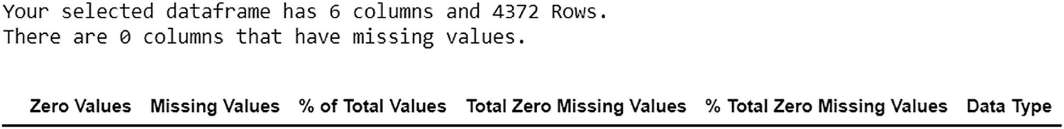
A representation exposes the output of missing values. The selected data frame has 6 columns and 4372 rows. There are 0 columns that have missing values.

Figure 7-6

The output

Exploratory Data Analysis

Let’s explore the data for visualization using the Matplotlib package defined in sklearn.

First, let’s look at age distribution.
# Count of age Category
plt.figure(figsize=(10,6))
plt.title("Ages Frequency")
sns.axes_style("dark")
sns.violinplot(y=df_customer["Age"])
plt.show()
Figure 7-7 shows the age distribution output.

A violin plot of ages frequency represents the output of distribution of the customer's age (from 20 to 60). The y-axis is indicated by age.

Figure 7-7

The output

Next, let’s look at gender distribution.
# Count of gender Category
genders = df_customer.Gender.value_counts()
sns.set_style("darkgrid")
plt.figure(figsize=(10,4))
sns.barplot(x=genders.index, y=genders.values)
plt.show()
Figure 7-8 shows the gender count output.

A bar chart exposes the output of gender (male and female) count. The counts for male and female genders are observed with a similar range.

Figure 7-8

The output

The key insight from this chart is that data is not biased based on gender.

Let’s create buckets of age columns and plot them against the number of customers.
# age buckets against number of customers
age18_25 = df_customer.Age[(df_customer.Age <= 25) & (df_customer.Age >= 18)]
age26_35 = df_customer.Age[(df_customer.Age <= 35) & (df_customer.Age >= 26)]
age36_45 = df_customer.Age[(df_customer.Age <= 45) & (df_customer.Age >= 36)]
age46_55 = df_customer.Age[(df_customer.Age <= 55) & (df_customer.Age >= 46)]
age55above = df_customer.Age[df_customer.Age >= 56]
x = ["18-25","26-35","36-45","46-55","55+"]
y = [len(age18_25.values),len(age26_35.values),len(age36_45.values),len(age46_55.values),len(age55above.values)]
plt.figure(figsize=(15,6))
sns.barplot(x=x, y=y, palette="rocket")
plt.title("Number of Customer and Ages")
plt.xlabel("Age")
plt.ylabel("Number of Customer")
plt.show()
Figure 7-9 shows the age column buckets plotted against the number of customers.

A bar chart shows the output of the number of customers (y-axis) and ages (x-axis). The age group 26 to 35 is observed with the highest number of customers.

Figure 7-9

The output

This analysis shows that there are fewer customers ages 18 to 25.

Label Encoding

Let’s encode all categorical variables.
# label_encoder object knows how to understand word labels.
gender_encoder = preprocessing.LabelEncoder()
segment_encoder = preprocessing.LabelEncoder()
income_encoder =  preprocessing.LabelEncoder()
# Encode labels in column
df_customer['age'] = df_customer.Age
df_customer['gender']= gender_encoder.fit_transform(df_customer['Gender'])
df_customer['customer_segment']= segment_encoder.fit_transform(df_customer['Customer Segment'])
df_customer['income_segment']= income_encoder.fit_transform(df_customer['Income'])
print("gender_encoder",df_customer['gender'].unique())
print("segment_encoder",df_customer['customer_segment'].unique())
print("income_encoder",df_customer['income_segment'].unique())
The following is the output.
gender_encoder [1 0]
segment_encoder [2 0 1]
income_encoder [0 1 2]
Let’s look at the DataFrame after encoding the values.
df_customer.iloc[:,6:]
Figure 7-10 shows the output of the DataFrame after encoding the values.

A data frame exposes the output after encoding the values. The data of age, gender, customer _ segment, and income _ segment are represented.

Figure 7-10

The output

Model Building

This phase builds clusters using k-means clustering. To define an optimal number of clusters, you can also consider the elbow method or the dendrogram method.

K-Means Clustering

k-means clustering is an efficient and widely used technique that groups the data based on the distance between the points. Its objective is to minimize total variance within the cluster, as shown in Figure 7-11.

A graph represents the clustering of K means. There are 3 groups of clusters. It is observed that the clusters are plotted along - 1 and + 1.

Figure 7-11

k-means clustering

The following steps generate clusters.
  1. 1.

    Use the elbow method to identify the optimum number of clusters. This acts as k.

     
  2. 2.

    Select random k points as cluster centers from the overall observations or points.

     
  3. 3.
    Calculate the distance between these centers and other points in the data and assign it to the closest center cluster that a particular point belongs to using any of the following distance metrics.
    • Euclidean distance

    • Manhattan distance

    • Cosine distance

    • Hamming distance

     
  4. 4.

    Recalculate the cluster center or centroid for each cluster.


Repeat steps 2, 3, and 4 until the same points are assigned to each cluster, and the cluster centroid is stabilized.

The Elbow Method

The elbow method checks the consistency of clusters. It finds the ideal number of clusters in data. Explained variance considers the percentage of variance explained and derives an ideal number of clusters. Suppose the deviation percentage explained is compared with the number of clusters. In that case, the first cluster adds a lot of information, but at some point, explained variance decreases, giving an angle on the graph. At the moment, the number of clusters is selected.

The elbow method runs k-means clustering on the dataset for a range of values for k (e.g., from 1–10), and then for each value of k, it computes an average score for all clusters.

Hierarchical Clustering

Hierarchical clustering is another type of clustering technique that also uses distance to create the groups. The following steps generate clusters.
  1. 1.

    Hierarchical clustering starts by creating each observation or point as a single cluster.

     
  2. 2.

    It identifies the two observations or points that are closest together based on the distance metrics discussed earlier.

     
  3. 3.

    Combine these two most similar points and form one cluster.

     
  4. 4.

    This continues until all the clusters are merged and form a final single cluster.

     
  5. 5.

    Finally, using a dendrogram, decide the ideal number of clusters.

     
The tree is cut to decide the number of clusters. The tree cutting happens where there is a maximum jump from one level to another, as shown in Figure 7-12.

A hierarchical dendrogram exposes the clustering. The tree-like structure represents the relationship between all the data points in the system.

Figure 7-12

Hierarchical clustering

Usually, the distance between two clusters has been computed based on Euclidean distance. Many other distance metrics can be leveraged to do the same.

Let’s build a k-means model for this use case. Before building the model, let’s execute the elbow method and the dendrogram method to find the optimal clusters.

The following is an elbow method implementation.
# Elbow method
wcss = []
for k in range(1,15):
    kmeans = KMeans(n_clusters=k, init="k-means++")
    kmeans.fit(df_customer.iloc[:,6:])
    wcss.append(kmeans.inertia_)
plt.figure(figsize=(12,6))
plt.grid()
plt.plot(range(1,15),wcss, linewidth=2, color="red", marker ="8")
plt.xlabel("K Value")
plt.xticks(np.arange(1,15,1))
plt.ylabel("WCSS")
plt.show()print("income_encoder",df_customer['income_segment'].unique())
Figure 7-13 shows the elbow method output.

A graph of the K value (on the x-axis) versus W C S S (on the y-axis) exhibits the elbow method output. The trend in the graph decreases from 1 to 14 K value.

Figure 7-13

The output

The following is a dendrogram method implementation.
#function to plot dendrogram
def plot_dendrogram(model, **kwargs):
    # Create linkage matrix and then plot the dendrogram
    # create the counts of samples under each node
    counts = np.zeros(model.children_.shape[0])
    n_samples = len(model.labels_)
    for i, merge in enumerate(model.children_):
        current_count = 0
        for child_idx in merge:
            if child_idx < n_samples:
                current_count += 1  # leaf node
            else:
                current_count += counts[child_idx - n_samples]
        counts[i] = current_count
    linkage_matrix = np.column_stack(
        [model.children_, model.distances_, counts]
    ).astype(float)
    # Plot the corresponding dendrogram
    dendrogram(linkage_matrix, **kwargs)
# setting distance_threshold=0 ensures we compute the full tree.
model = AgglomerativeClustering(distance_threshold=0, n_clusters=None)
model = model.fit(df_customer.iloc[:,6:])
plt.title("Hierarchical Clustering Dendrogram")
# plot the top three levels of the dendrogram
plot_dendrogram(model, truncate_mode="level", p=3)
plt.xlabel("Number of points in node (or index of point if no parenthesis).")
plt.show()
Figure 7-14 shows the dendrogram output.

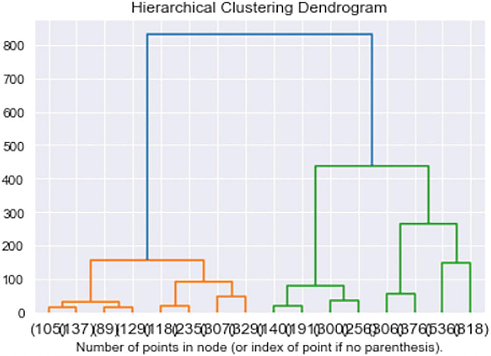
A hierarchical clustering dendrogram exposes the number of points in the node (or index of point if no parenthesis). It exhibits the relationship between all the data points in the system.

Figure 7-14

The output

The optimal or least number of clusters for both methods is two. But let’s consider 15 clusters for this use case.

Note

You can consider any number of clusters for implementation, but it should be greater than the optimal, or the least, number of clusters from k-means clustering or dendrogram.

Let’s build a k-means algorithm considering 15 clusters.
# K-means
# Perform kmeans
km = KMeans(n_clusters=15)
clusters = km.fit_predict(df_customer.iloc[:,6:])
# saving prediction back to raw dataset
df_customer['cluster'] = clusters
df_customer
Figure 7-15 shows the output of df_cluster after creating the clusters.

A data frame exposes the output of the df _ cluster after the creation of the clusters. The data includes customer I D, gender, age, income, zip code, and customer segment are represented.

Figure 7-15

The output

Select the required columns from the dataset.
df_customer = df_customer[['CustomerID', 'Gender', 'Age', 'Income', 'Zipcode', 'Customer Segment', 'cluster']]
df_customer
Figure 7-16 shows the output of df_cluster after selecting particular columns.

A data frame exposes the output of the df _ cluster after the selection of particular columns. The data includes customer I D, age, gender, income, and zip code are represented.

Figure 7-16

The output

Let’s perform some analysis on the cluster level.

Write a function to plot charts of clusters against the column given.
def plotting_percentages(df, col, target):
    x, y = col, target
    # Temporary dataframe with percentage values
    temp_df = df.groupby(x)[y].value_counts(normalize=True)
    temp_df = temp_df.mul(100).rename('percent').reset_index()
    # Sort the column values for plotting
    order_list = list(df[col].unique())
    order_list.sort()
    # Plot the figure
    sns.set(font_scale=1.5)
    g = sns.catplot(x=x, y='percent', hue=y,kind='bar', data=temp_df,
                    height=8, aspect=2, order=order_list, legend_out=False)
    g.ax.set_ylim(0,100)
    # Loop through each bar in the graph and add the percentage value
    for p in g.ax.patches:
        txt = str(p.get_height().round(1)) + '%'
        txt_x = p.get_x()
        txt_y = p.get_height()
        g.ax.text(txt_x,txt_y,txt)
    # Set labels and title
    plt.title(f'{col.title()} By Percent {target.title()}',
              fontdict={'fontsize': 30})
    plt.xlabel(f'{col.title()}', fontdict={'fontsize': 20})
    plt.ylabel(f'{target.title()} Percentage', fontdict={'fontsize': 20})
    plt.xticks(rotation=75)
    return g
Plot the customer segment.
plotting_percentages(df_customer, 'cluster', 'Customer Segment')
Figure 7-17 shows the plot for the customer segment against clusters.

A triple bar chart shows the output of customer segments (small business, corporate, and middle class) versus clusters. x and y axis is indicated by cluster and customer segment percentage.

Figure 7-17

The output

Let’s plot income.
plotting_percentages(df_customer, 'cluster', 'Income')
Figure 7-18 shows the plot for income against clusters.

A triple bar chart exposes the data of cluster by percent income (high, medium, and low incomes). x and y axis indicate the clusters and income percentage respectively.

Figure 7-18

The output

Let’s plot for gender.
plotting_percentages(df_customer, 'cluster', 'Gender')
Figure 7-19 shows the plot for gender against clusters.

A double bar chart exposes the gender percentage (for male and female) versus cluster. Cluster 9 for males is observed with the highest percentage and 14 for females has the highest percentage.

Figure 7-19

The output

Let’s plot a chart that gives the average age per cluster.
df_customer.groupby('cluster').Age.mean().plot(kind='bar')
Figure 7-20 shows the plot for average age per cluster.

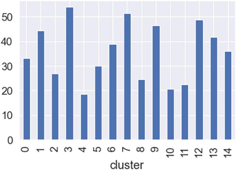
A bar chart exposes the output of the average in accordance with the cluster. The x-axis is indicated by the cluster. Cluster 3 has the highest average (above 50).

Figure 7-20

The output

Until now, all the data preprocessing, EDA, and model building have been performed on customer data.

Next, join customer data with the order data to get the product ID for each record.
order_cluster_mapping = pd.merge( df_order,df_customer, on='CustomerID', how='inner')[['StockCode','CustomerID','cluster']]
order_cluster_mapping
Figure 7-21 shows the output after merging customer data with order data.

A data frame exposes the output after unifying customer data with order data. The data includes stock code, customer I D, and cluster are represented.

Figure 7-21

The output

Now, let’s create score_df using groupby on 'cluster' and 'StockCode', and count it.
score_df = order_cluster_mapping.groupby(['cluster','StockCode']).count().reset_index()
score_df = score_df.rename(columns={'CustomerID':'Score'})
score_df
Figure 7-22 shows the output after creating score_df.

A data frame (37032 rows and 3 columns) exhibits the output after the formulation of score _ df. The data includes cluster, stock code, and score are represented.

Figure 7-22

The output

The score_df data is ready to recommend new products to a customer. Other customers in the same cluster have bought the recommended products. This is based on similar users.

Let’s focus on product data to recommend products based on similarity.

The preprocessing function for customer analysis is used to check the missing values.
missing_zero_values_table(df_product)
Figure 7-23 shows the missing value output.

A data frame exposes the output of missing values. The data includes zero values, missing values, percentages of total values, total zero missing values, and data type represented.

Figure 7-23

The output

So, there are discrepancies present in the product data. Let’s clean it and check again.
df_product = df_product.dropna()
missing_zero_values_table(df_product)
Figure 7-24 shows the output after removing missing values.

A representation of a data frame exhibits the output after the removal of missing values. The selected data frame has 6 columns and 3706 rows. There are 0 columns that have missing values.

Figure 7-24

The output

Let’s work on the Description column since we’re dealing with similar items.

The Description column contains text, so preprocessing and converting text to features are required.
# Pre-processing step: remove words like we'll, you'll, they'll etc.
df_product['Description'] = df_product['Description'].replace({"'ll": " "}, regex=True)
df_product['Description'] = df_product['Description'].replace({"-": " "}, regex=True)
df_product['Description'] = df_product['Description'].replace({"[^A-Za-z0-9 ]+": ""}, regex=True)
# Converting text to features
# Create word vectors from combined frames
# Make sure to make necessary imports
from sklearn.cluster import KMeans
from sklearn import metrics
from sklearn.feature_extraction.text import TfidfVectorizer
#converting text to features
vectorizer = TfidfVectorizer(stop_words='english')
X = vectorizer.fit_transform(df_product['Description'])
The text preprocessing and text-to-features conversion are done. Now let’s build a k-means model using 15 clusters.
# #clustering your products based on text
km_des = KMeans(n_clusters=15,init='k-means++')
clusters = km_des.fit_predict(X)
df_product['cluster'] = clusters
df_product
Figure 7-25 shows the output after creating clusters for product data.

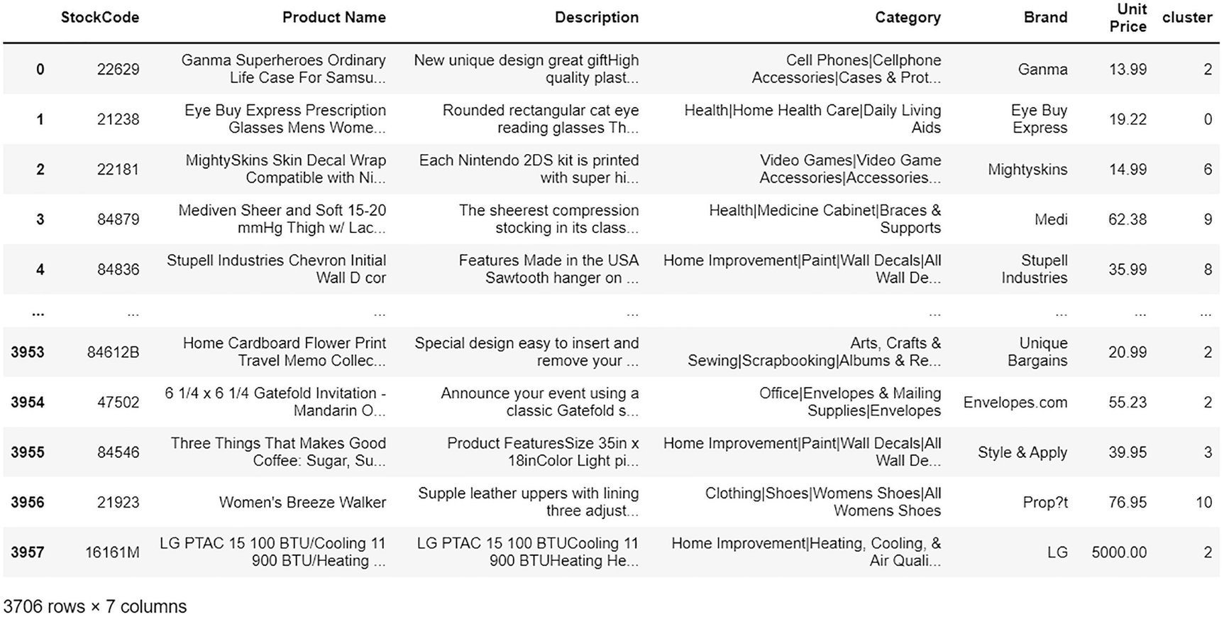
A data frame exposes the output after the formulation of clusters for product data. The data includes stock code, product name, description, category, brand, unit price, and cluster are represented.

Figure 7-25

The output

Now the df_product data is ready to recommend the products based on similar items.

Let’s write a function that recommends products based on item and user similarity.
# functions to recommend products based on item and user similarity.
from sklearn.feature_extraction.text import TfidfVectorizer, ENGLISH_STOP_WORDS
from sklearn.metrics.pairwise import cosine_similarity
from sklearn.feature_extraction.text import TfidfTransformer
from nltk.corpus import stopwords
import pandas as pd
# function to find cosine similarity after converting discerption column to features using TF-IDF
def cosine_similarity_T(df,query):
    vec = TfidfVectorizer(analyzer='word', stop_words=ENGLISH_STOP_WORDS)
    vec_train = vec.fit_transform(df.Description)
    vec_query = vec.transform([query])
    within_cosine_similarity = []
    for i in range(len(vec_train.todense())):
        within_cosine_similarity.append(cosine_similarity(vec_train[i,:].toarray(), vec_query.toarray())[0][0])
    df['Similarity'] = within_cosine_similarity
    return df
def recommend_product(customer_id):
# filter for the particular customer
    cluster_score_df = score_df[score_df.cluster==order_cluster_mapping[order_cluster_mapping.CustomerID == customer_id]['cluster'].iloc[0]]
# filter top 5 stock codes for recommendation
    top_5_non_bought = cluster_score_df[~cluster_score_df.StockCode.isin(order_cluster_mapping[order_cluster_mapping.CustomerID == customer_id]['StockCode'])].nlargest(5, 'Score')
    print(' --- top 5 StockCode - Non bought -------- ')
    print(top_5_non_bought)
    print(' -------Recommendations Non bought ------ ')
#printing product names from product table.   print(df_product[df_product.StockCode.isin(top_5_non_bought.StockCode)]['Product Name'])
    cust_orders = df_order[df_order.CustomerID == customer_id][['CustomerID','StockCode']]
    top_orders = cust_orders.groupby(['StockCode']).count().reset_index()
    top_orders = top_orders.rename(columns = {'CustomerID':'Counts'})
    top_orders['CustomerID'] = customer_id
    top_5_bought = top_orders.nlargest(5,'Counts')
    print(' --- top 5 StockCode - bought -------- ')
    print(top_5_bought)
    print(' -------Stock code Product (Bought) - Description cluster Mapping------ ')
    top_clusters = df_product[df_product.StockCode.isin(top_5_bought.StockCode.tolist())][['StockCode','cluster']]
    print(top_clusters)
    df = df_product[df_product['cluster']==df_product[df_product.StockCode==top_clusters.StockCode.iloc[0]]['cluster'].iloc[0]]
    query = df_product[df_product.StockCode==top_clusters.StockCode.iloc[0]]['Description'].iloc[0]
    print(" query ")
    print(query)
    recomendation = cosine_similarity_T(df,query)
    print(recomendation.nlargest(3,'Similarity'))
recommend_product(13137)
Figure 7-26 highlights the final recommendations to customer 13137.

A representation of the output exposes the top 5 stock codes - non-bought, top 5 stock codes - bought, recommendations for non-bought (highlighted), and stock code product - description cluster mapping.

Figure 7-26

The output

The first set highlights similar user recommendations. The second set highlights similar item recommendations.

Summary

In this chapter, you learned how to build a recommendation engine using unsupervised ML algorithms, which is clustering. Customer and order data were used to recommend the products/items based on similar users. The product data was used to recommend the products/items using similar items.

..................Content has been hidden....................

You can't read the all page of ebook, please click here login for view all page.
Reset
3.145.44.174