Early in this book, emphasis is placed on providing high-quality subsurface prospects with accompanying maps and the direct positive impact that the use of these prospect maps has on a company’s financial bottom line. This is even more critical when significant investment has been made on geophysical workstations and the digital two-dimensional (2D) and three-dimensional (3D) seismic data that are acquired and processed. We cite six areas of performance improvement discussed in this textbook that also apply to workstation-based studies.
Developing the most reasonable interpretations for the area being studied. Faster data access on the workstation allows multiple ideas to be tested.
Generating more accurate and reliable exploration and exploitation prospects. Three-dimensional seismic data have created opportunities to visualize and analyze prospects from multiple points of view to better understand risks. However, remember the cliché “garbage in, garbage out” still holds true.
Correctly integrating geological, geophysical, and engineering data to establish the best development plan for a field discovery. Workstations in use today allow unprecedented integration of all types of data at a high rate of delivery.
Optimizing hydrocarbon recoveries through accurate volumetric estimates. Workstations can often eliminate the need for hand-drawing maps, digitizing contours manually, and calculating volumes by hand.
Planning a more successful development drilling, recompletion, and workover depletion plan. Successful companies have recognized the importance of the geoscience and engineering staffs working together on a daily basis. Workstations enable fast decision-making by sharing data among different disciplines (the beginning of a Shared Earth Model).
Accurately evaluating and developing any required secondary recovery program. Here it is imperative that geoscientists and engineers communicate closely. Sometimes a second seismic survey is acquired over a producing field, allowing the team to detect any unproduced areas or monitor a water flood program.
The Philosophical Doctrine, as described in detail in Chapter 1, is valid when work is done with or without a workstation. It should be reviewed and understood before reading this chapter because it provides the context and background principles to the techniques and workflows described in the following sections. Even though most of the ten points in the philosophical doctrine are self-explanatory, point 4 requires a bit of clarification relative to the workstation. Point 4 states that “all subsurface data must be used to develop a reasonable and accurate subsurface interpretation.” In the 3D seismic world, it is usually impractical to interpret by hand every line, crossline, time slice, and arbitrary line in the 3D data set. Methods are discussed in this section on how to accomplish point 4 without costing your company valuable time waiting for an interpretation. Workstations allow us to make interpretations faster than conventional paper methods, but that doesn’t mean we should cut corners on quality. It means we are able to do more quickly the quality geoscience or engineering that we need to do.
An area for improvement in interpretation that is often overlooked by companies is the involvement of an interpreter in the design, acquisition, processing, and loading of the seismic data. Many seismic surveys are purchased “off the shelf,” and very little is known about the design, acquisition, or processing. This is unfortunate, but it happens frequently. If you interpret seismic data and have the great fortune to be involved before the data are acquired, you have the opportunity to assist and provide advice in the design of the program and to determine, in advance, where the targets are and how to best image them. This process can save you and your company countless hours of work later and a lot of money in the end. The same applies to processing the data. If you are involved early in the processing flow, you can quality-check results as various steps are taken along the way. It is also a good idea to preserve certain intermediate data sets along the way in case something needs to be redone. You may want to compare two or more versions of the final product. Finally, you need to specify what the final products are in advance to be certain critical intermediate versions are preserved if they are needed. Many options are available as final products. A few possibilities are a migrated volume, a depth-migrated volume, a velocity volume, amplitude-versus-offset (AVO) or amplitude-versus-angle-of-incidence (AVA) volumes, and coherency (or other attribute) volumes.
Once the seismic volume is delivered from processing, the next step is to load it into the workstation. This is one area where the interpreter usually has some control of how the data set looks, but many do not take advantage of the opportunity to do so. Some companies have a standard seismic data-loading procedure, which includes whether it is loaded in 8-bit, 16-bit, or 32-bit format and what, if any, amplitude scaling is applied. A few companies give the interpreter complete control over how the data look and allow the interpreter to select parameters based on how the data are to be used. Whatever the case may be, it is the interpreter’s job to understand as much as possible about the data he or she is responsible for interpreting.
One of the first things to consider before starting on a workstation interpretation project is the layout of the office or workroom where the work is to be accomplished. The workstation should be located in a low traffic/low noise area. Lighting should be arranged in a way that does not cause screen glare but allows other team members to work nearby with ease. Large worktables should be close, allowing layout of maps, logs, or sections while the seismic data are being worked or viewed. Frequent breaks from sitting at the workstation are required to reduce fatigue. Chairs should be comfortable and adjustable. Monitors should be raised only enough so that the head is tilted forward slightly in a relaxed position. A well-organized work area is an important first step to an effective interpretation environment.
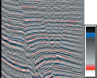
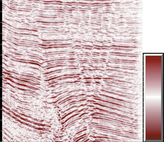
Digital seismic data have proven to be a powerful tool for subsurface interpretation, visualization and mapping. This is especially true for 3D seismic data where virtually any orientation can be viewed at any scale. Add color to the display and you have enormous flexibility. Color can be used very effectively to enhance or suppress features. Several examples are shown to illustrate this point. Figure 9-1 uses highly contrasting colors (black and white) on the extreme ends and gradational colors in the outer midrange. This helps show discontinuities when high amplitude reflections are smeared. Zero crossings are de-emphasized. Figure 9-2 is a more common display with contrasting colors at the extremes grading to contrasting soft colors near the zero crossing. This typically aids in correlation across discontinuities by emphasizing peaks and troughs. Figure 9-3 de-emphasizes polarity but highlights discontinuity in high-amplitude events. The color bar in Fig. 9-4 is useful in certain situations by highlighting only the high amplitude peaks and troughs and suppressing internal character or noise. Figure 9-5 is an example of how low-amplitude events can be darkened to bring out subtle features in the low amplitude data. The possible combinations are endless, so experiment and find some that work best for you. It is advisable to change color schemes from time to time to get a different perspective on your data. This is especially helpful in complex areas where subtle features can be enhanced or missed when using certain color ranges.


In addition to color, horizontal and vertical scale settings can enhance or suppress subtle features. Scale settings are often limited by hardware constraints such as the size and resolution of the video monitors in use. How much of a seismic profile is displayed is a balance of how much line you need to see to “get the big picture” versus how much detail is necessary to make an accurate interpretation. Sometimes it is necessary to have several seismic views open at one time but scaled differently, or to have flexible zoom and scrolling capabilities to allow rapid adjustments to the display. Most interpretation systems allow user flexibility when selecting between wiggle trace, variable density, or some combination of the two. The eye is very sensitive to color changes, so color-variable density is better than just black and white (Fig. 9-6). Wiggle traces are useful to show subtle changes in wave shape, which may be helpful in prospect generation or reservoir characterization (Fig. 9-7). Some displays allow both types of traces either as an overlay or as a composite, variable-color wiggle trace display (Fig. 9-8).


Interpretation software is generally very similar in capability, and this book is not intended to compare various interpretation systems. It is important to note that interpreter “overhead” should be considered when selecting interpretation software. What is meant by overhead is how many keystrokes or button presses it takes to accomplish the everyday mundane tasks such as selecting seismic profiles, redrawing maps, toggling between displays, interpreting faults and horizons, and viewing the results in map view. For example, cascading menus, which are very common, take longer than using icons or “hot keys.” The icon location on screen should be flexible to minimize the distance the cursor travels to reach it. Anything that takes the interpreter’s attention away from analyzing, interpreting, and mapping of the seismic data is a drag on work efficiency and should be avoided. Small incremental time savers will build up large savings over a project of long duration.
Philosophical Doctrine Point 8 states, “The mapping of multiple horizons is essential to develop reasonably correct, 3D interpretations of complexly faulted areas.” Framework horizon mapping is the practical application of this philosophy. A framework horizon is a seismic or geologic correlation event that is laterally extensive but may not necessarily be a target horizon. Target horizons should be “framed” above and below by framework horizons in order to ensure the interpretation is valid in 3D. At first, it may seem excessive to interpret and map horizons that are not prospective; however, much more time has been wasted redoing interpretations that are not valid, or worse, explaining a dry hole.
Framework horizons are effective quality-control tools. They can be used to create isochrons or isopachs with target horizons or other framework horizons. If certain fault blocks appear to be abnormally thick between framework horizons, this may indicate a miscorrelation across a fault. If a computed isochron or isopach generates a negative value, this indicates a mapping bust on one or both horizons. Fault patterns from multiple horizons can be overlain on each other to test the vertical compatibility of the fault interpretation and horizon mapping. If fault trends are not compatible, this must be explained or corrected before proceeding with detailed target mapping. If not done early, there can be much more later work that is necessary to clean up an invalid interpretation. Once framework horizons are interpreted, mapped, and checked for vertical compatibility, it becomes much faster and easier to work additional target horizons internal to the existing framework.
The important role that teamwork plays in the success of exploration or development projects is difficult to quantify. Synergy, which develops as a result of positive teamwork, becomes the fuel that drives a team’s success. Synergy is simply explained by the statement of fact that the total quantity and quality of work performed by two or three people working together toward a common goal is greater than if the two or three people had worked independently. Take, for example, the typical field development team consisting of a geologist, geophysicist, reservoir engineer, and drilling engineer. What is the value of a geophysicist getting a second opinion from a geologist or reservoir engineer on subtle faulting in a potential reservoir? Or, a reservoir engineer working with a geologist or geophysicist to address production anomalies? Drilling risks can be assessed by drilling engineers by using 3D visualization to plan wells prior to drilling, thus saving precious drilling dollars with better designed wells. During the course of field development, technical experts working the data sometimes encounter roadblocks in their interpretation. Something just doesn’t make sense in the data. A true synergistic team can pull together resources and look for a multidisciplinary solution instead of someone “taking their best guess.”
The real power of a synergistic team does not lie just in more effectively accomplishing the same set of tasks as a linear team. The real power of synergistic teamwork is unleashed when one team member observes something that explains another team member’s data, opening the way to new concepts. Synergistic teams find answers to questions that linear teams never even recognize (Tearpock and Brenneke 2001).
Geologists, geophysicists, and engineers all work with a single earth. The model that each discipline develops must therefore be compatible with the model of every other discipline if the resultant model is to be correct. A shared earth model is a single model of a portion of the earth that seamlessly incorporates the observations, interpretations, and data of each specialist involved in its development. The workstation, a common database, and synergistic teams have made a shared earth model a reality (Tearpock and Brenneke 2001). The value of a team making planned and informed decisions is difficult to quantify, but we believe it to be significant.
One way to enhance the possibility of success is to develop a plan and appoint a team leader to monitor progress toward goals. Successful exploration or development projects are usually thought out well in advance of the first interpretation, analysis, or correlation. Successful teams are successful because they plan to be successful, not by chance. Success is not based on luck, chance, or serendipity, but rather on solid scientific work. Any large undertaking, such as sending a manned rocket into space, designing a new model of automobile, or developing a large oil and gas field, stands a much higher chance of success if the team members involved develop a plan to set attainable goals, plan the course of action, define the timing, and then execute this plan every day during the project. With a good plan, the team stays on course to meet their objectives. When roadblocks are encountered, they communicate and work together toward a solution. The plan is not cast in stone but is adjusted periodically to reflect progress or changes in scope of the work.
Project plans are a simple but effective tool to track progress and identify critical interdependent tasks that need to be completed prior to others. This is especially helpful when team members are relying on each other for completed maps, production data, or log correlations, for example. A good plan acts like a road map to success for interdisciplinary work teams. Project plans generally consist of a list of interdependent and independent tasks to be performed by each team member. Tasks that are related or dependent on each other are connected in a way to show the relative timing. Critical tasks are those that, if delayed, will delay the entire project. Plans can be relatively simple, with a lot of flexibility, or very complex, depending on the scope of the work. Whatever the case may be, you have heard it said: “Teams don’t plan to fail, they fail to plan” (Tearpock 1997).
Workflows are developed to accomplish the ten objectives listed in our Philosophical Doctrine. How does a workflow differ from a plan? A workflow is the detailed step-by-step actions taken to accomplish a task or series of tasks. It is how you do your work on a daily basis. This could consist of how to interpret faults throughout a data set, how maps will be constructed, or which process should be used for depth conversion. A workflow provides a level of consistency when similar tasks are done on the same project. Workflows can also be used on different projects, either “as is” or modified in some way. Seismic interpretation workflows are usually so specific that they are tailored to one type of interpretation software and frequently are not easily translated to other systems. For this reason, this chapter does not discuss software, but rather lays out the philosophical basis for developing or improving your workflow on whatever software is in use. We provide examples of how to apply the philosophy but not the actual specific menus or button presses.
So how do you develop a workflow for your software and your project? The first step is to choose a task that can be broken down into its smallest components. For example, you must integrate fault surfaces with horizon surfaces to draw accurate fault gaps and structure maps. A corresponding task on a project plan may likely read something like this: “Integrate preliminary structure maps with fault surfaces.” Ask yourself what is needed to accomplish this. You need a contoured fault surface, a contoured horizon surface, a fault gap polygon, and a way to display them all on a map view or 3D visualization display. Immediately, it becomes obvious that in order to reach the goal of having an accurate structure map, a lot has to happen before you reach this step. In fact, this broad workflow can and should be broken down even further so that it can be done in a reasonable amount of time. Included in this process are a fault interpretation workflow, a horizon interpretation workflow, a fault gap construction workflow, a preliminary mapping workflow, and finally, an integration workflow. As you can see, workflows should be developed with the philosophical doctrine as a backdrop within the context of your project data and time constraints. A note of caution is necessary for those interpreters inclined to ignore a sound interpretation and mapping philosophy and cut corners to save time. The risk of producing incorrect interpretations and maps will increase accordingly. Computer mapping is a great tool, but it cannot always make up for an incorrect interpretation.
Workflows can be made even more effective if the output of interpretation and mapping is well organized. A lot of overhead is created when interpreters have to search through long lists of faults, horizons, maps, or other displays to find what they need. Sometimes file names are limited in character length, making the task all the more difficult. Whether your workstation is PC-based or Unix-based, it is helpful to find a way to organize data so that the most important and frequently used names are at the top of the list. In the Unix world, the hierarchy descends from numbers at the top to capital letters and, finally, lowercase letters. Use this to your advantage. Then develop a system of useful abbreviations to use when character lengths are limited. Most importantly, be consistent so that you as well as others can find things quickly.
Finally, here are a couple of “headache reducing” hints that most people already know but may not apply on a routine basis. First, make digital backups of your data, interpretations, and databases on a daily basis. Protect thy work; it has great value. Second, clean up after yourself. Clean out unused or unwanted files. Overwrite or recycle old versions with the latest version. If you save everything, eventually you (or anyone else) won’t know the good from the bad. It may not be clear whether a specific map or interpreted horizon is some failed hypothesis or the most accurate.
One way to keep everything organized is to document your work in a notebook or in digital form using an electronic journal of some sort. This will benefit you and those who follow. Even if an area has a history, such as a previous interpretation, most people still want to do their own interpretation. This is understandable. However, there is usually a time saving benefit from understanding what previous interpreters have done. This is more effective if the previous person has taken good notes and is willing to share knowledge with incoming team members. Avoiding mistakes made by predecessors is a great time saving tool, and building on the good they have accomplished increases efficiency during the project.
Documenting your work (Philosophical Doctrine point 10) seems like the “interpreter overhead” we mentioned previously to avoid. However, this is not the case. Taking a few seconds now and then to jot down a key file name or the steps taken to generate a particular display will help jog your memory in the days to come. Keep track of parameters when the software won’t do it for you. It helps with consistency and avoiding a “reinvention of the wheel” every time a process is tried. Clearly, the work you perform for your company has value. Interpretation procedures and methods are assets just like seismic data, well data, and unproduced reserves. They should be preserved and protected like any other asset.
The principles discussed in the following sections apply to any workstation software and are relevant to extensional or compressional tectonic environments. The importance and art of making fault surface maps is discussed in detail in Chapter 7. This section is intended to provide techniques of fault interpretation and mapping for the workstation. A three-dimensionally correct fault interpretation provides the solid foundation upon which all subsequent horizon interpretation and mapping are built. It is not enough to just pick fault segments on a series of parallel vertical and/or horizontal seismic profiles. The resulting fault surface must make sense geologically and geometrically, and it must be valid in 3D. Therefore, faults must not only be interpreted but also contoured as a fault surface map and checked for validity.
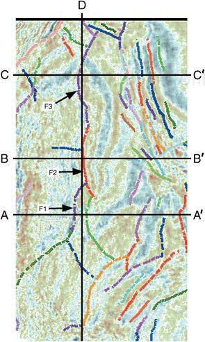
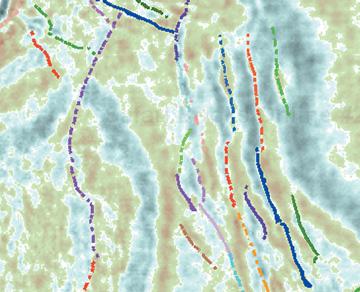
Fault surfaces tend to be smooth, nearly planar, or arcuate surfaces. They typically do not change radically in strike or dip unless the fault surface has been deformed. Vertical separation varies in a systematic manner along a fault surface and can increase or decrease with depth. Vertical separation and fault length are related. Obviously, large faults extend to greater lateral distances than small faults, which are more local in character. The distinction between a long fault and a series of small en echelon faults should be made, as in the following example. On widely spaced parallel lines, we commonly interpret a fault segment on one profile that appears to belong to the same fault as segments picked on other profiles. However, as we interpret the intervening areas in detail, the faults are found to be either a series of disconnected en echelon faults or a series of faults that extend laterally and actually coalesce to form a fault system. So what may be interpreted to be a single fault may in fact be several separate faults or faults connected together end-to-end. Figures 9-9 through 9-13 demonstrate how this would look on 3D seismic data. Figures 9-9 through 9-11 are parallel dip lines from a 3D data set. Each fault is color-coded to identify it in subsequent figures. There are similarities in the faulting on each dip line, but the true relationship between the faults begins to emerge when viewed on a strike line (Fig. 9-12). Note how each fault has a unique concave shape and how several faults are connected end-to-end, forming a single fault system. Figure 9-13 shows the same relationship in horizontal slice view. Notice in the upper right portion of Fig. 9-13 the small en echelon faults that do not connect to form a single fault system.

(Published by permission of Subsurface Consultants & Associates, LLC.)
Figure 9-9. Dip line A-A′. Parallel to lines in Figs. 9-10 and 9-11.


Finally, it should be stated that without interpreting faults as surfaces, horizon mapping and prospect generation become more challenging and risky. Fault surface maps and their integration with the structural horizons provide the best means for the location and orientation of the upthrown and downthrown traces of a mapped horizon and the delineation of a prospect or reservoir.
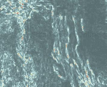
There is a tendency among some geoscientists to just dive right into a new data set and start working the data before determining exactly what needs to be done and at what level of detail. We recommend that at least some time be set aside at the beginning of an interpretation project to scroll through the data in vertical and horizontal orientations in order to get a sense of which direction the structures are trending and where future interpretation problem areas may exist. Seismic attributes such as coherence are also a valuable reconnaissance tool. Figures 9-14 and 9-15 demonstrate how difficult it can be to interpret faults on amplitude time slices through a typical 3D data volume. Figures 9-16 and 9-17 show the same time slices, but they are now displayed using a coherence attribute that enhances discontinuities. Fault trends and relationships are more easily determined using this type of attribute display.

(Published by permission of Subsurface Consultants & Associates, LLC.)
Figure 9-16. Same time slice as Fig. 9-13, but displaying a coherence attribute.

Creative color bars (palettes) used on variable density displays can enhance discontinuities in the data and allow better fault identification. Some ideas for color schemes were shown previously, but geoscientists are not limited to those few. The goal is to identify faults as quickly as possible, so use your imagination when it comes to use of color and various display scales. From this reconnaissance, develop a plan to approach the fault interpretation. Take into account well locations, any missing or repeated section-correlated in the well logs, and how much detail is necessary to correctly map the faults in your 3D data set.
It is best to begin 3D fault interpretation at or near a well with evidence of a fault, based on log correlation. The following process will help you tie your well control.
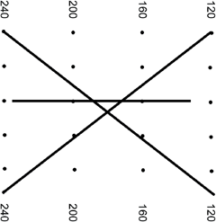
Display two or three seismic sections that pass through a well location but without the well information displayed on the seismic data. Pick orientations that are based on your best guess for the dip direction of the fault. These should form an X or asterisk (*) pattern on the map (Fig. 9-18).
Look for event terminations that indicate the presence of a fault, and interpret a fault segment that would represent a most likely location for the fault. If no fault is obvious, pick several possible segments or pick another line orientation.
Now redisplay the seismic section with the well data and your picked segment. How close do the fault segment and well-correlation fault data agree? The seismic fault segment should tie the subsurface data. If it does not, consider the following five possible reasons for the mis-tie:
the time–depth relationship between the well and seismic is incorrect;
the seismic interpretation is incorrect or needs adjustment;
the fault pick in the well is incorrect or needs adjustment;
there is an unresolved lateral or vertical velocity gradient between velocity control points; or
the well location is inaccurate (incorrect surface location, or erroneous directional survey).
Any one of these explanations is equally likely. Begin by reevaluating the seismic interpretation and attempt to adjust the interpreted fault segment. If the time–depth relationship appears reasonable, and the fault interpretation cannot be reasonably altered to fit the well control, review the well log correlations. Attempt to adjust the fault cut in the well to match the seismic interpretation. If the correlation is reasonably certain, look for evidence of a velocity gradient. A velocity gradient should affect all the correlation markers between two or more wells. If all else fails, assume for a deviated well that the directional survey is in error, or in the case of a vertical hole that it is not really vertical, or that the surface location of the well may be mis-spotted. Well location problems are more common than you may suspect. Because fault surfaces typically dip at much higher angles than bedding surfaces, errors in well location generate much larger discrepancies in fault ties than they do in horizon ties. The key point is that all discrepancies between the seismic data and the subsurface control must be resolved. Also, make sure the vertical separation interpreted on the 3D seismic sections agrees with the vertical separation as determined from log correlation. After tying the well control, continue working this fault with one of the following strategies.
There are many ways to approach fault interpretation and mapping in the workstation environment. Some are more efficient than others. As software evolves, techniques also evolve to take advantage of new functionality. Even with more powerful hardware and software, however, the underlying objective in fault interpretation does not change. That objective is to create an accurate 3D representation of all fault surfaces, which results in more accurate prospect and reservoir mapping.
A sound fault interpretation strategy is based on the following principles.
Interpret one fault at a time whenever possible.
Define the preliminary fault surfaces quickly with a minimum of seismic control.
Integrate the well control.
Validate the fault surfaces in 3D.
Complete the fault interpretation before beginning the final horizon interpretation.
Four basic strategies are used to make a fault interpretation.
Single fault method using vertical sections.
Single fault method using vertical sections and time slices.
Multiple fault method.
Three-dimensional visualization method.
Each strategy has its advantages, but the first two are probably used 80 percent of the time. The multiple fault method is normally used after the single fault method in cases where the remaining faults are difficult to sort out. Three-dimensional visualization is best used in complex areas where fault conditions and trends change rapidly. Visualization software should always be used as a quality-check tool for the faults and to refine a preliminary fault interpretation. As visualization capabilities expand, more and more geoscientists are using this tool on a daily basis.
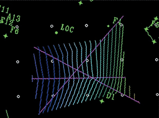
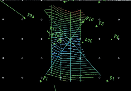
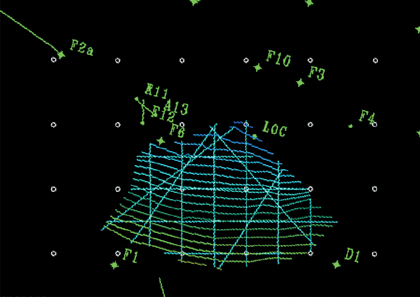
Figures 9-19 through 9-26 demonstrate the interpretation workflow for the single fault methods (strategies 1 and 2). Interpret a fault segment on the first vertical line (Fig. 9-19). Choose two arbitrary lines that tie the first line (Fig. 9-20) and interpret the fault based on the tie with the previous line. Two fault segments are interpreted on the two tied seismic profiles shown in Fig. 9-21. Figure 9-22 shows the resulting fault surface based on the three interpreted lines. Notice the fault surface passes very close to Well No. D1 in the south-central part of the map. Is there a correlated fault in Well No. D1? Yes, Figure 9-23 shows the well tie and fault interpretation on a fourth line. This is all it takes to make a preliminary fault interpretation using strategy 1. Adding a time slice (Fig. 9-24) to the flow (strategy 2) is highly recommended to achieve a better representation of the fault surface. The surface should be checked in strike view and additional interpretation added as needed (Fig. 9-25). The fault surface generated from the five interpreted lines and Well No. D1 is reasonable for a first pass (Fig. 9-26).


Using a series of intersecting seismic displays and interpreting one fault at a time, such as in strategies 1 and 2, is generally the most efficient and effective methodology. It is important to note that these are preliminary fault surfaces that need to be refined as necessary during horizon interpretation. The result should be a good representation of the geometry of the fault, how far it extends, and in what direction. It should be noted that as faults are interpreted on seismic data, the map view of the resulting contoured fault surface should be updated. This allows quality control “on the fly” to catch any big errors such as abnormal changes in fault dip, strike, or miscorrelation before getting too deep into the interpretation. Do not pick more segments than are needed to define the fault surface. The key points are to determine where the major faults occur and how they connect in the subsurface, if indeed they connect.
In complex areas, where there are several closely parallel faults or multiple fault intersections in a small area, it may be necessary to interpret several faults at one time in order to sort them out using strategy 3, the multiple fault method. Start by interpreting several unnamed fault segments in vertical seismic views. These can be parallel or intersecting views (Figs. 9-27 and 9-28 are parallel profiles). Then view the interpreted faults in a time slice (amplitude or coherence attribute) view (Fig. 9-29). Look for trends where some of the segments that intersect the slice view line up along seismic event terminations and appear to form a reasonable fault trace (Fig. 9-30). Next, assign each fault a name and view the resulting contoured fault surfaces in map view (Fig. 9-31). Add control from tie-lines to support the interpretation (Fig. 9-32). Choose one surface to complete first (Fig. 9-33). If the fault surface appears valid, then proceed to the next fault.


In areas where it is important to sort out the finest details of a fault interpretation and the data quality is sufficient, geoscientists should use some kind of cube or 3D visualization display. This allows the data to be viewed in rapid succession in any orientation. Putting the data in motion, so to speak, allows you to see subtle changes occurring over a small area. This process can be time-consuming and at times unproductive, but it is well worth the effort when a prospect is drilled and completed successfully. Many cube visualization tools are available. One example is shown in Fig. 9-34.

Much of the time spent interpreting faults is wasted if the resulting surfaces do not make sense geologically or geometrically. They should form reasonable surfaces in 3D. They should not violate the well data or the seismic data. Fault surfaces are one of the two main elements in accurate structural interpretation and mapping (the other being the horizon surface itself). Make sure the time you invest in fault interpretation is used both efficiently and effectively. Being efficient means not overinterpreting the data or not dwelling too long in areas that are unimportant at the time. Being effective means not rushing through the work but carefully interpreting each fault to the extent necessary to accurately define the surface. Figures 9-35 and 9-36 show an example of an unreasonable fault interpretation with zigzag contours and inconsistent changes in dip. Note the general overkill in interpreting fault segments when the resulting fault surface is unusable. Note also the mis-tied and miscorrelated segments that add to the confusion. Figure 9-37 is the same fault interpreted as 15 tied fault segments, and Fig. 9-38 is the appropriately contoured fault surface based on the 15 segments.

(Published by permission of Subsurface Consultants & Associates, LLC.)
Figure 9-35. An example of a possible result when too many fault segments are interpreted before the resulting surface is checked. This part of the fault surface is not geologically reasonable. The entire interpreted fault surface is shown in Fig. 9-36.


(Published by permission of Subsurface Consultants & Associates, LLC.)
Figure 9-37. Fifteen tied fault segments used in the interpretation of the fault in Figs. 9-35 and 9-36.

(Published by permission of Subsurface Consultants & Associates, LLC.)
Figure 9-38. Fault surface based on fault segments in Fig. 9-37, exhibiting a listric shape with depth.
The use of the strike view is another valuable quality-checking tool to detect mis-ties or abrupt changes in strike. Mis-tied or sloppy interpretation will slow the mapping and ultimately the prospect generation progress. Therefore, it is better to check the interpretation early in the process. Figure 9-39 shows sloppy interpretation in a strike view of the down-dip portion of a fault surface. This usually occurs when interpretation is done on parallel lines only and the segments are not loop-tied. Figure 9-40 shows the up-dip portion of the same fault. In addition to sloppy interpretation, this figure shows a change in strike. The resulting fault surface (Fig. 9-41) raises the same questions. Why the changes in strike? Is it one fault or two? First, determine how abrupt the changes in strike are. A gradual change may indicate a deformed fault surface. An abrupt change, such as in this case, usually means that the fault is interpreted incorrectly or that there are two separate faults passing near or intersecting one another. This conclusion is also based on the knowledge of the area being worked. A deformed fault surface is not likely to occur in this area (but even so, it should be considered as a possibility). The reason this is important is that it could have implications regarding the fault zone as a seal for trapping hydrocarbons. Proceed using the strike lines to reinterpret the fault as two unique faults. Then rework the dip lines with the two-fault scenario. When the fault is reinterpreted as two faults and cleaned up (Figs. 9-42 and 9-43), the resulting fault surfaces look much more reasonable for mapping (Fig. 9-44). Take the time to do the fault interpretation correctly the first time, and the time you save will multiply for each horizon interpreted.


(Published by permission of Subsurface Consultants & Associates, LLC.)
Figure 9-41. Map view of the fault surface as represented in Figs. 9-39 and 9-40. The change in strike direction can indicate the presence of two faults or a deformed fault surface.


The choice of framework horizons is important to the success of an interpretation project, so they must be carefully selected. We recommend a minimum of three framework horizons: one shallow, one intermediate, and one deep. The intermediate horizon should be near the primary objective(s). The shallow horizon should be at or above the shallowest objective, and the deep horizon should be at or below the deepest objective. If the structure is relatively simple and does not change appreciatively through the objective zone, two framework horizons may be adequate. If, however, there are stratigraphic and/or structural complexities, or the target horizons cover a large depth interval, four or more horizons may be required to define the framework.
Framework horizons, if possible, should correspond to higher amplitude seismic events that extend laterally over the entire study area. Objective reservoirs are often not good framework horizons because they may change in reflection character over the area of interest. Clastic reservoirs, such as sandstone, often exhibit porosity variations and/or fluid variations, making these reservoirs difficult to correlate over large areas on seismic data (unless you are working around a mega-giant accumulation). Reservoirs with variable acoustic characteristics often yield structure maps that are not always representative of the true structure. You should be able to follow the framework horizons around with confidence and relative ease over the study area. Also, the seismic horizon should correspond to a reliable subsurface marker found in a majority of nearby wells, which is usually a regional shale marker or a sand/shale sequence.
Unconformities must often be mapped as one of the framework horizons because the structure and rock properties are likely to be different above and below the unconformity. Angular unconformities, onlaps, and downlaps sometimes generate complex reflections that are easily identified but difficult to interpret as a horizon. Such an interface may need to be interpreted entirely by hand, which could be a time-consuming process. The techniques described in the following section are intended to make the process of horizon interpretation more effective and efficient.
The process of tying well data to a framework horizon on seismic data is a continuation of the process begun during the framework fault interpretation described in the previous section. You will recall that a first-pass tie between an interpreted seismic fault and missing or repeated section in a well log may result in a good tie. However, some wells do not cross faults, or the interpretation is not clear. Therefore, the next course of action is to try generating a synthetic seismogram.
Synthetic seismograms are generated by convolving a wavelet with a series of reflection coefficients in time (or depth), which have been computed from well log data (measured in depth). The velocity function used to convert depth to time can be obtained from integration of the sonic log and/or from a checkshot (or VSP) survey, from time–velocity pairs used in data processing, or simply from time–depth pairs determined by the geoscientist through observation. The primary purpose is to match the character of synthetic seismic traces derived from well logs with the corresponding traces from the 3D seismic volume. Most of the time, sonic and density logs are used to compute the acoustic impedance and reflection series. In cases where either, or both, the sonic or density logs are unavailable, pseudosonic or pseudodensity logs can be generated from resistivity (or other) logs. The quality of the tie between a synthetic seismogram and seismic data varies from very good to no tie at all. However, the details of techniques for improving the tie are beyond the scope of this book. One additional benefit of generating a synthetic seismogram is that it indicates the reflection character of critical seismic reflections such as those that occur at shale markers used as framework horizons and at tops and bases of reservoir sands. Figure 9-45 shows an example of a synthetic seismogram.
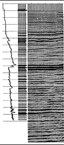
Figure 9-45. Tie of seismic data to synthetic seismogram. Events correlate well from synthetic seismogram to seismic profile. (From Badley 1985, provided by Merlin Profilers, Ltd.)
Horizon interpretation is a rather straightforward process, but there are things that can be done to make a more accurate interpretation in a reasonable amount of time. One important time saver has already been mentioned: complete the preliminary fault interpretation prior to starting the framework horizon interpretation. This is very important because it significantly reduces the possibility that work will have to be redone if something doesn’t fit. Also, we must remember that most hanging wall structures are formed by large faults. As discussed in Chapters 10 and 11, a geometric relationship commonly exists between fault shape and fold shape. Therefore, the more the geoscientist understands the faults, the more likely the interpretation of the horizons will be more accurate, geologically valid, easier to generate, and result in viable prospects.
Based on the fault interpretation strategies described previously, it is likely that framework horizons will be interpreted, at least at first, on a different set of lines than the faults. Ultimately, it may be desirable to have fault segments and horizons on the same lines and crosslines, but the procedure to get to that point will be discussed later. In other words, preferred line orientations for faults may not be preferred for horizons. With the speed of workstations and data servers ever increasing, it is not necessary to compromise an accurate interpretation by selecting only one set of lines.
Our basic philosophy can be summed up this way. Don’t interpret horizons in a way that will take a lot of time to revise, and don’t be reluctant to revise things that do not fit or make sense geologically. Once a lot of time has been invested in an interpretation, some geoscientists are reluctant to back up and resolve problems that show up in mapping. Having a 3D survey on a workstation does not change the basic need to tie lines to crosslines and resolve mis-ties, such as would be done with a big eraser on paper copies of 2D data.
It is best to begin at a well (or wells) and work outward from there. When working areas between wells, either of two approaches will work. The first is to use a combination of lines and crosslines to tie data between the wells. The second is to use an arbitrary line directly in line with the wells in question. In either case, there will be a cross-posted interpretation to use as a guide while interpreting other lines and crosslines. When using arbitrary lines to initially “seed” an area with interpretation, it is best to keep that horizon separate from the line/crossline horizon that will be used for mapping. The reason for this is that on most 3D workstations it is difficult to edit horizons on arbitrary lines once the focus has moved to other lines. Keeping them separate allows for fast editing and clean up later. They can always be merged later if necessary for mapping. Figures 9-46 and 9-47 show examples of seismic lines that intersect wells in a 3D data set. Note that correlation marker A in the wells corresponds to the blue seismic event (interpreted in green) that will be the upper framework horizon. Figure 9-48 shows a nearly complete well-tie interpretation done on lines and crosslines only. The same wells can be tied on arbitrary lines, as shown in Fig. 9-49. There are advantages to either method, and both can be done quickly. These ties should then be used to work outward from the well control to complete the interpretation. Complete the ties to the other framework horizons that are seen in the same wells. In the case of highly directional wells, be sure to locate the seismic tie at the horizon penetration point in the wellbore.


How dense should the interpretation be when handpicking seismic horizons for structure mapping? The answer is similar to the fault interpretation philosophy: only as dense as needed to accurately define the surface. In our Philosophical Doctrine, point 4 states, “All subsurface data must be used to develop a reasonable and accurate subsurface interpretation.” The way this applies to 3D seismic data is probably not obvious. It is not necessary to interpret every line, crossline, time slice, and arbitrary line. All orientations should be used as needed to ensure the interpretation is valid in 3D. Well data must be tied to the seismic data. Engineering data, if available, should be considered as well. The handpicked interpretation performed on selected sections should be preserved and not altered by automated processes such as autotracking or interpolation. The latter should be written out to a separate horizon so results can be compared to your handpicked interpretation. If editing becomes necessary, it is much easier to work on a relatively loose grid of data than to fix every line or crossline after infilling.
So, what is the optimum density of handpicked interpretation? That has already been answered to some extent, but for example, if a 20-line by 20-crossline mesh of interpretation yields an accurately contoured structure map on a simple unfaulted structure, then it is not necessary to do a 10 × 10 or 5 × 5. The level of detail at which to begin is dependent on your data and the geology, so do not just dive in and begin with too high a density. You will save countless hours of interpretation and editing if you approach from a wide spacing and move toward increasing levels of detail as complex areas are encountered.
We now consider an example of how an increased level of detail affects an interpretation. Figure 9-50 is a map on a faulted horizon showing a 10-line by 10-crossline interpretation density. This map area is in the northeastern part of Fig. 9-13, in which the fault interpretation is based on a 5 × 5-interpretation grid. Based on the 10 × 10 density in Fig. 11-50, the fault pattern and the horizon dip between the faults could be considered reasonable. Figure 9-51 shows a 5 × 5 interpretation spacing. With the higher interpretation density, the faults and the horizon shape are more accurately defined, and the difference in the fault interpretation is significant. The three faults in the central area of Fig. 9-50 are reinterpreted on the 5 × 5 grid (Fig. 9-51) to be three pairs of en echelon faults. The clues that the 10 × 10 interpretation is incorrect are the bends in the fault polygons. A fault surface map of each fault would also show a bend in the contours, which should alert you to the possible error. This is critical if fault-trap prospects are generated along the faults in Fig. 9-50. The 5 × 5 interpretation takes more work than the 10 × 10, but it is definitely worth the effort.


(Published by permission of Subsurface Consultants & Associates, LLC.)
Figure 9-51. 5 × 5 interpretation. A better interpretation of the faults in Fig. 9-50 can be made, and so the en echelon character of the faults is recognized.
If prospects are located within narrow fault blocks and additional definition is needed, you may need to work the even-numbered or odd-numbered lines and crosslines (a 2 × 2 spacing) within the fault blocks, as in Fig. 9-52. There is no specific formula regarding how densely to interpret 3D seismic data. It is up to you to decide, based on data, time constraints, and the use for which the final maps are intended. Ultimately, the maps and the 3D seismic interpretation should agree completely. It should be noted that the process described here involves some preliminary structure contour mapping. Be aware that mis-ties in the interpretation or improper gridding and contouring parameters will also affect the accuracy of the contoured map. The good news is that if mis-ties are spotted early, they can be fixed with minimal effort. Gridding and contouring will be discussed later in this chapter.

(Published by permission of Subsurface Consultants & Associates, LLC.)
Figure 9-52. Dense handpicked interpretation within the prospect fault blocks. This horizon is used as input for Figs. 9-53, 9-54, and 9-55. Faults were used as barriers for each infill computation.


Given what we have said about the density of interpretation, if a framework horizon is a strong, laterally continuous seismic event, it may require only one or two interpreted lines in an area or a fault block to allow computer autopicking, or autotracking, to infill the rest. If this is the case, then go for it! If for some reason the autopick wanders off the event, it is better to spend your time adding handpicked interpretation to the input and rerunning the infill rather than trying to clean up after autopicking. However, autopicked horizons are notorious for being noisy and generally do not contour smoothly.
There are many ways to infill a horizon accurately. The acceptability of the result depends on data quality, structural complexity, desired objectives, and which software parameters are being used. Four methods are discussed here. They are autopicking, interpolation, gridding, and handpicking. Before looking at the methods, these questions should be asked: “Why infill a horizon at all? Can an accurate structure map be constructed without an infilled horizon?” Yes, if that is the only objective, then that can be done without additional interpretation. There are many reasons, however, why an infilled horizon may be necessary. It can be used as a reference for seismic attribute extraction such as amplitude. It can be used for detailed structure mapping where there are subtle complexities. It can be used as a reference for stratigraphic waveform classification. Finally, it is more effective when performing layer computations such as isochores, isopachs, isochrons, or flattening on seismic. The objective for using infilled horizons will determine which method is best suited to the task.
Handpicking each line is an option that should be used only when working (1) complexly deformed or difficult areas such as very small fault blocks, (2) near fault intersections, (3) around faults of limited extent that could affect viability of a prospect, or (4) within intersecting fault patterns. These types of problems usually drive autopickers crazy, not to mention the difficulties they create in map gridding and contouring. Detailed handpicking to fill in small areas is one of those tedious tasks that should be used as a last resort but is necessary from time to time. Figure 9-52 is an example of detailed handpicking within narrow fault blocks.
Interpolation, particularly linear interpolation, is faster than handpicking every line. Simply stated, with linear interpolation the computer considers two interpreted lines and mathematically interpolates horizon values between them. This is usually done in a line or crossline direction. The prerequisite for this to work is that interpretation must be done on parallel or subparallel lines close enough to represent the characteristics of the seismic event. Interpolation can be used to cross gaps in data or interpretation where no changes are expected to occur. It can be used as a “quick and dirty” infill strategy when little time is available for more sophisticated techniques. One drawback of using linear interpolation is the jagged-edge effect where features such as faults cut diagonally across the 3D area (Fig. 9-53).
The next technique is based on gridding a horizon. Gridding is a process usually performed when mapping (contouring) a horizon. A grid is computed from raw input data, which may be irregularly distributed throughout the data set. Regularly spaced grid points are derived from samples of surrounding raw data points and represent the horizon surface topography. Grid parameters can be selected to show every detail of an interpreted horizon or to act as a smoothing filter to remove irregularities in the interpretation. Whatever your needs are for accuracy versus a visually pleasing map, find a set of parameters that works for you. Using a gridded horizon will usually yield the best looking map, but remember to always quality-check it against the seismic to make sure it agrees with the data (Fig. 9-54).
Autopicking can be a very effective way to infill a horizon. Quality control is the key. Good results depend on data quality, number of seed points, parameters selected, and software used. Seed points are the hand-interpreted areas that autopicking software uses as a starting point for infilling. Success is defined by how well the autopicked horizon tracks the seismic event. In high continuity data areas, only a few hand-interpreted lines are necessary to seed a good autopicked horizon. In complex or noisy data areas, more hand interpretation will be a necessary preliminary for a horizon to be effectively infilled. In certain complex structural areas or in areas with much incoherent data, autopicking cannot be used. To be effective as a timesaving tool, autopicking should work quickly and accurately with minimal editing. Early autopicking software and hardware were slow enough that interpreters had to start a job before lunch and return an hour later to check results. Thankfully, the time involved has been significantly reduced. The most frequent problem with autopicking is finding a balance between parameters that allows large areas to be covered without the horizon wandering up or down a leg in the data. If tracking parameters are too restrictive to limit leg jumping, only the most continuous events will be tracked, and some areas will not fill in. Sometimes the compromise solution is to autopick only in areas of the data set where results are good. Then, follow up with interpolation and/or handpicking to complete the infill process. Autopicked horizons of high quality can be used for any purpose from structure mapping to seismic attribute extraction to surface attributes or any layer-related function, such as flattening or depth conversion (Fig. 9-55).
Accurate interpretation of framework and prospect horizons is the most important element (after accurate fault interpretation) when making accurate structure maps. Efficient interpretation techniques allow large data sets with many framework and prospective horizons to be evaluated in a reasonable amount of time. By working in increasing levels of detail, interpreters can have preliminary maps ready at an early stage for quick evaluation and then continue to work areas of higher interest in more detail. In the next section, we discuss techniques to generate preliminary structure maps that are based on the current horizon and fault interpretation. These “work in progress” maps can be generated at any time to evaluate the status and quality of a current interpretation.
It is important in most projects to make preliminary structure maps as early as possible in the interpretation process. They can be made either in time or in depth. Prior to making the first structure maps, geoscientists should have preliminary fault surfaces interpreted and mapped, and at least part of one framework horizon interpreted. Preliminary structure maps are useful to quality-check an interpretation, such as for interpretation mis-ties, dip direction, fault location, and prospect potential. They are also useful to test the 3D validity of the initial horizon and fault interpretation. Other uses for preliminary structure maps are to check how accurately the wells are tied to the seismic interpretation, how good the time–depth conversion is, and how much more detail is needed to accurately define a horizon or fault surface.
Drawing accurate fault gaps and overlaps on maps is one area in which good software goes a long way. The many ways to accomplish this task depend on which software is used. Some tools allow the interpreter to manually draw the fault gaps, whereas others compute gaps based on the integration of the fault and horizon surfaces. Some tools work in 2D while others work in 3D. Fault gaps and overlaps are defined by the map representations of the upthrown and downthrown horizon cutoffs at faults. Normal faults typically create a gap, and reverse faults create an overlap in the horizon. The locations of horizon cutoffs and the width of fault gaps and overlaps in prospective fault traps are extremely important with regard to well design and prospect economics because they affect limits and volumes of the interpreted reservoirs.
Drawing accurate fault gaps begins by having a fault and a horizon interpreted in the same vertical view. Also, you need a way to mark the upthrown and downthrown terminations of the horizon against the fault. That information should then be displayed in map view. This process works quickly when gaps are computed and posted automatically. The fault gap takes shape when this is done on a series of parallel and intersecting lines. Some software tools will actually draw preliminary fault polygons as an interpretation is completed. Fault polygons (known also by other names, such as fault traces or fault boundaries) are the result of connecting all the individual cutoffs for a single fault and horizon. Figure 9-56 shows a typical vertical seismic section with several faults cutting a sequence of horizons with one highlighted interpreted horizon. A gap is computed for each horizon termination. Figure 9-57 shows the map view representation of the computed gaps and computer-generated polygons for each fault. The result is not bad for computer-drawn polygons, but the computer does not always capture the details or a more geologically reasonable depiction, which can be drawn by hand editing, as shown in Fig. 9-58. Fault gap polygons are useful for a variety of reasons. Obviously, they represent an important component of any structure map depicting the location of each fault trace and the width of the gaps. In the workstation environment, they are also useful to control horizon infilling (discussed previously) and computer contouring.


Generating a structure contour map midway through the interpretation process is a good way to check and validate the progress of your interpretation. However, there is a big difference between these preliminary maps and a final regional, prospect, or reservoir map. The difference lies in the level of detail and amount of seismic integration with well control and production data. In wildcat exploration, there is still a need for detail and integration, but less data are generally available than in field development drilling. Preliminary structure maps should provide a glimpse into where prospects might be located and where problem areas exist that need additional work.
Interpretation software in use today generally provides some feedback to the geoscientist on how the work is progressing in map view. Several examples have already been shown (Fig. 9-58, for example). However, these status maps are not always indicative of the appearance of the interpretation when contoured. Having the ability to quickly contour your interpretation while work is in progress is an effective tool for controlling quality and discovering areas that require more handpicking to allow accurate contouring later in the process. Areas between faults and at the termination of a fault are notorious zones of difficulty for computer contouring. Close attention should be paid around faults to ensure that the vertical separation interpreted on seismic data is accurately depicted by the mapped horizon contours across the fault. Vertical separation data (see Chapter 7) from nearby wells should also be incorporated into the mapping. If discrepancies are found in the mapped fault displacement, the seismic interpretation should be corrected before proceeding with refining the structure maps.
Preliminary maps used for quality control are more effective if gridding and contouring parameters are carefully considered. For example, Figs. 9-59 and 9-60 are structure contour maps of the same input data shown in Fig. 9-58. Both maps are useful. The map in Fig. 9-59 can be used in an early prospect review when you begin to propose wells. The team members should be able to determine the approximate size of each prospect and how many wells are required to be drilled. If the prospect looks economically viable, then refine the map as more interpretation is completed. Figure 9-59 is a good presentation map because the input data is sampled less densely and gridded at a wider interval, providing a smoother effect. However, it is not as effective in overall quality control as the map in Fig. 9-60. Table 9-1 compares the values of the sampling, gridding, and contouring parameters that produce the differences between the two maps. Figure 9-60 is a more detailed map and shows more work is needed to define the structure between faults. Furthermore, when compared to the input data, it leads you directly to which lines and crosslines to check and correct. This detailed map is accomplished by interpreting more closely spaced lines, sampling the input data more densely, and using a smaller grid interval.

(Published by permission of Subsurface Consultants & Associates, LLC.)
Figure 9-59. Preliminary structure “show” map. Sampled and gridded less dense for a smoother look. See Table 9-1 for details.

(Published by permission of Subsurface Consultants & Associates, LLC.)
Figure 9-60. Preliminary structure “quality control” map. Sampled and gridded more densely to show problem areas. See Table 9-1 for details.
Table 9-1. Comparison of mapping parameters for Figs. 9-59 and 9-60.
Mapping Parameters | ||
|---|---|---|
Interpretation Density (traces) | 10 × 10 | 5 × 5 |
Sampling Density (traces) | 5 × 5 | 1 × 1 |
Search Radius (ft) | 2000 | 5000 |
Grid Interval (ft) | 200 × 200 | 150 × 150 |
Contour Interval (ms) | 10 | 10 |
After the preliminary structure maps have been corrected, checked and deemed geologically reasonable, more refinements of the maps are possible through the integration of the fault surfaces and the horizons, as described in the following section.
Integration of fault surface and contoured horizon maps is a relatively simple task on the workstation. The basic principles and techniques are the same as described in Chapter 8 under the section Manual Integration of Fault and Structure Maps. The difference is that all workstation interpretation is in digital form and can be manipulated graphically to accomplish the task without having to make paper copies. It is helpful to review why it is important to integrate these surfaces.
Integration techniques provide an important contribution to the overall quality of a structure map:
Accurate delineation of the fault location for any mapped horizon;
Precise construction of the upthrown and downthrown traces of the fault;
Proper projection of structure contours across the fault; and
Correct determination of the width of the fault gap or overlap.
The challenge to the geoscientist is to use available software tools to display several types of map data in the same view. Some software makes this easier than others, and some tools allow the process to be done in 3D. Geoscientists should be able to display a contoured fault surface map on-screen with a contoured horizon surface map at the same contour interval. Also needed are the fault polygons that define the fault gaps for that horizon.
Contours of equal value should be annotated or highlighted using color to view the intersection of the two surfaces. The point of intersection should correspond to a point on the fault polygon.
The technique works best if one fault surface is integrated at a time to minimize clutter and confusion. If only a slight adjustment is necessary, the fault polygon (trace) should be edited to match the intersection of the horizon and fault surfaces. If a large discrepancy is discovered, more interpretation work may be needed to determine the cause. Common causes for mislocated fault polygons include sloppy or incorrect interpretation of the fault and/or horizon, incorrect correlation of the fault gaps, and inconsistent depth conversion of the fault surface and the horizon surface. The integration technique works on normal or reverse faults with large or small displacement. Large faults may require that the upthrown and downthrown cutoff traces be edited individually due to the large range of depth involved and practical limits of contour intervals. The following is a step-by-step description of the process.
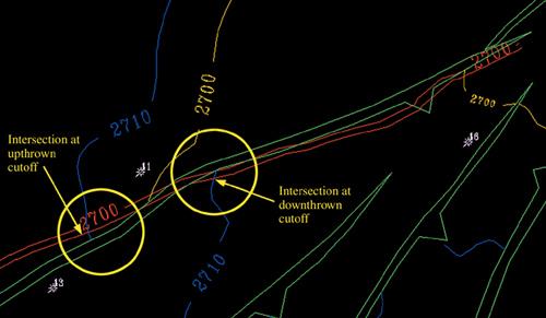
Display a fault contour (2700 ms), a horizon contour of the same value, and fault polygons in the same map view (Fig. 9-61). The fault contours, the horizon contours, and the fault polygon line should all intersect at the same point. If only a slight correction is needed, edit (move) the polygon lines until they do intersect.

(Published by permission of Subsurface Consultants & Associates, LLC.)
Figure 9-61. Step 1. Horizon and fault integration, showing a fault contour of 2700 ms (red), a horizon contour of the same value (yellow), and fault polygons (green) in the same map view. The red, yellow, and green lines should intersect at the same point.
Display a second contour (2710 ms) for the fault and horizon. Notice in Fig. 9-62 that both the upthrown and downthrown cutoffs represented by the polygons need adjustment.
(Published by permission of Subsurface Consultants & Associates, LLC.)
Figure 9-62. Step 2. Horizon and fault integration. A second contour is displayed (in this case 2710 ms) for the fault (red) and horizon (blue). Both the upthrown and downthrown cutoffs represented by the polygon (green) need adjustment.
Continue with as many contours and adjustments as possible on the same fault, then repeat the procedure for other faults critical to the prospect or reservoir (Fig. 9-63). Figure 9-64 shows the horizon and fault contours with the adjusted fault polygon.
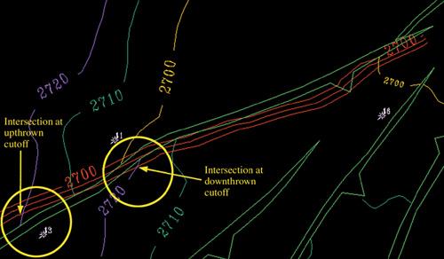
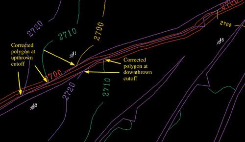
Figure 9-65 compares the original polygon with the adjusted polygon. Note that in this example the adjustments are very small (less than 150 feet). There are two points to be made here. The first is whether or not to bother to adjust a fault polygon 150 feet. Assuming the fault and structural interpretation to be accurate, the answer depends on how critical the fault trace positions are to well planning and prospect economics. We have seen a number of cases where a directional well is planned to penetrate multiple objectives within 50 feet of a fault surface to obtain the best structural position in a reservoir. Tens of millions of barrels of additional oil have been recovered by accurately mapping faults and fault traces as shown here. Wells can then be designed based on the fault interpretation to accurately hit the targets.

We have also seen wells miss a hanging wall objective and penetrate the footwall instead, missing the target because the fault interpretation and maps(s) were off by as little as 100 feet or less. So accuracy is important.
The bottom line is this: The process of integrating a horizon and a fault can be done quickly and should be done on all faults critical to a prospect. The second point is that in areas of steep dip, such as around a salt dome, this process becomes more critical because adjustments can be much greater than in low dip areas. Seismic data can be of poor quality and, in that case, proper integration becomes critical.
Finally, the ability to post certain well data is also very useful if the software allows. This includes correlation depths (including restored tops) and fault picks with vertical separation annotated. Most software permits display of only some of this information, but a “workaround” is usually available. The more information you can display, without making the map unreadable, the better.
We have discussed ways to increase efficiency by planning and organizing your work so that important data are not lost and priorities can be clearly defined. We have also shown how to use workflows to provide fast but accurate and consistent methodology to interpret and map data on a workstation. Workstation technology provides unprecedented integration of geophysical, geological, and reservoir engineering data, leading to more efficient and effective prospect generation, well design, field development, and reservoir volumetric determinations. The philosophy and techniques described in this chapter are meant to inspire geoscientists to make correct interpretations in a timely manner that lead to accurate prospect maps and, ultimately, economically successful wells.