TECHNIQUES
Pencil Techniques
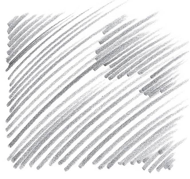
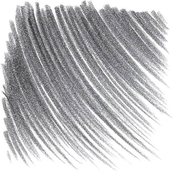
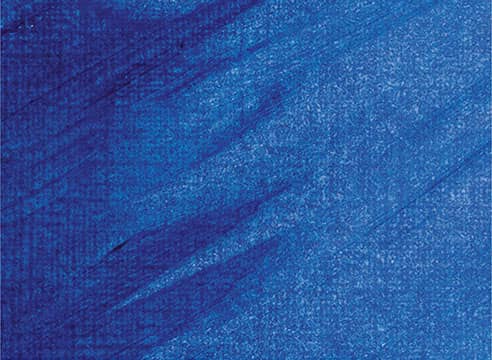
HATCHING This basic method of shading involves filling an area with a series of parallel strokes. The closer the strokes, the darker the tone will be.
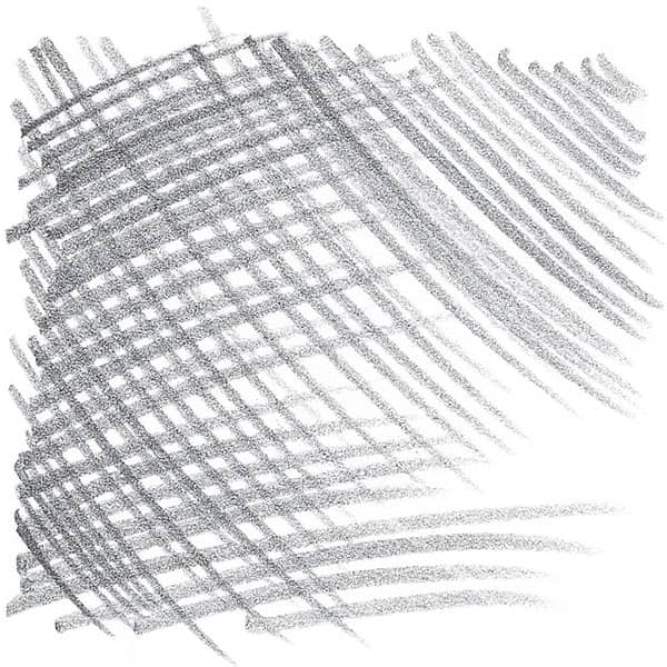
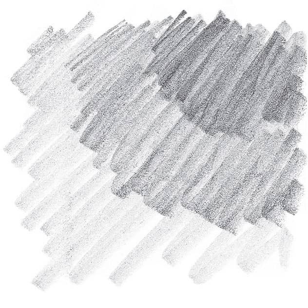
CROSSHATCHING For darker shading, place layers of parallel strokes on top of one another at varying angles. Again, make darker values by placing the strokes closer together.
SHADING DARKLY By applying heavy pressure to the pencil, you can create dark, linear areas of shading.
GRADATING To create gradated values (from dark to light), apply heavy pressure with the side of your pencil, gradually lightening the pressure as you stroke.
BLENDING To smooth out the transitions between strokes, gently rub the lines with a blending tool or tissue.

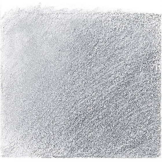
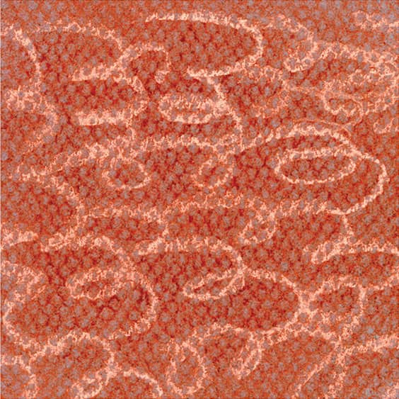
SHADING WITH TEXTURE For a mottled texture, use the side of the pencil tip to apply small, uneven strokes.
CREATING FORM
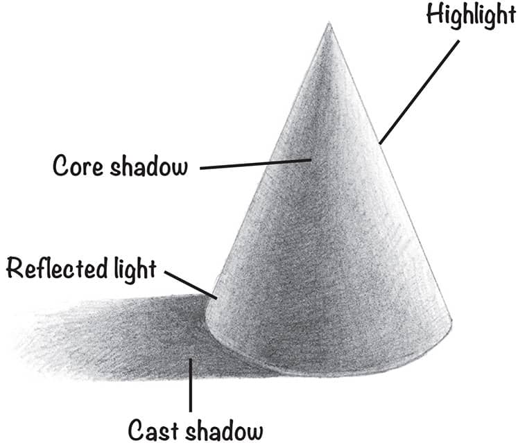
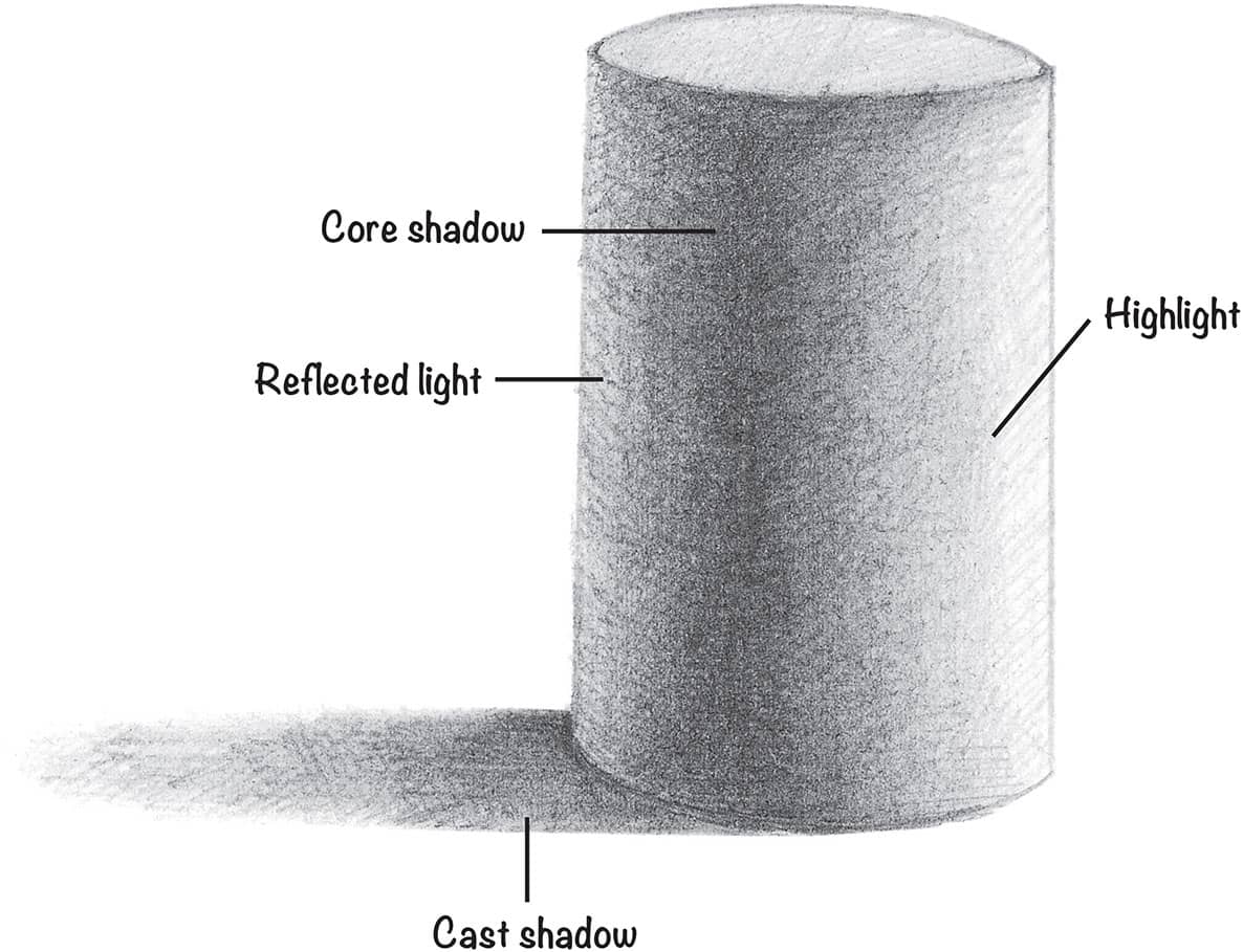
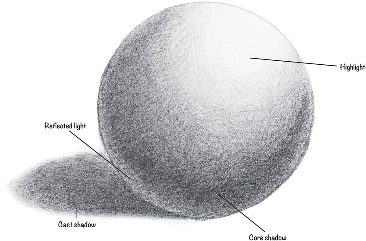
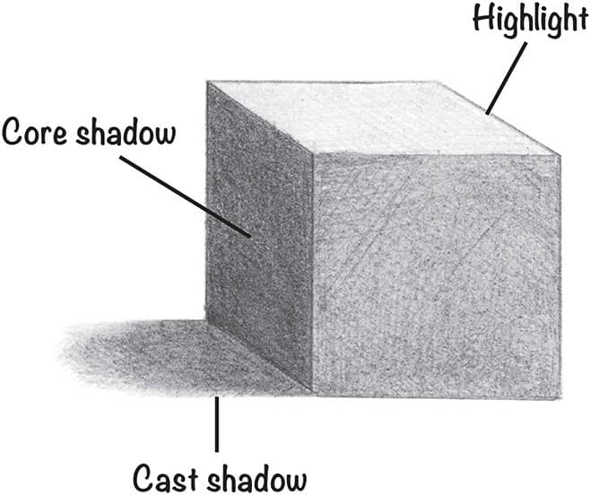
The first step when creating an object is to establish a line drawing to delineate the flat area that the object takes up. This is known as the “shape” of the object.
ADDING VALUE TO CREATE FORM
A shape can be further defined by showing how light hits the object to create highlights and shadows. First note from which direction the source of light is coming. (In these examples, the light source is beaming from the upper right.)
Acrylic Techniques
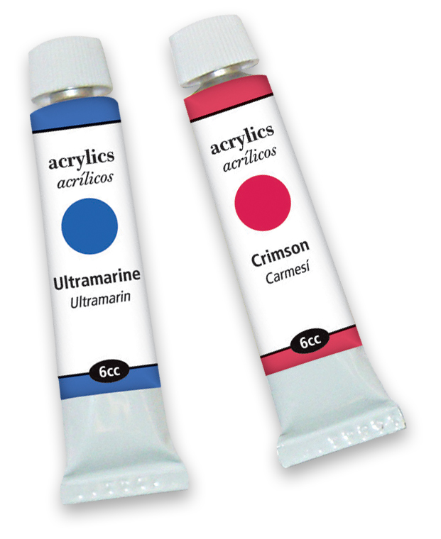
There are myriad techniques and tools that can be used to create a variety of textures and effects. By employing some of these different techniques, you can spice up your art and keep the painting process fresh, exciting, and fun!
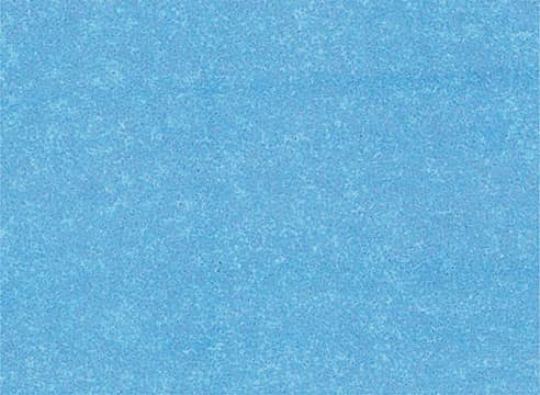
FLAT WASH This thin mixture of acrylic paint has been diluted with water (use solvents to dilute oil paint). Lightly sweep overlapping, horizontal strokes across the support.
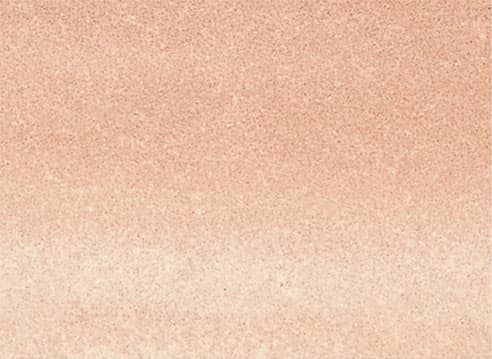
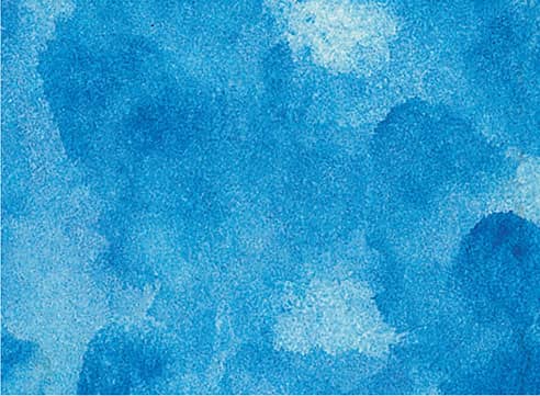
GRADED WASH Add more water or solvent and less pigment as you work your way down. Graded washes are great for creating interesting backgrounds.
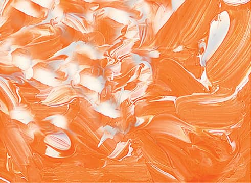
DRYBRUSH Use a worn flat or fan brush loaded with thick paint, wipe it on a paper towel to remove moisture, then apply it to the surface using quick, light, irregular strokes.
STIPPLE Take a stiff brush and hold it very straight, with the bristle-side down. Then dab on the color quickly, in short, circular motions. Stipple to create the illusion of reflections.
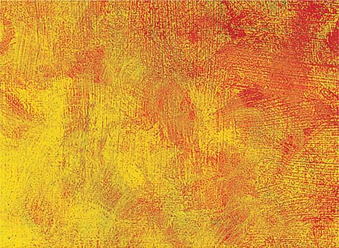
SCUMBLE With a dry brush, lightly scrub semi-opaque color over dry paint, allowing the underlying colors to show through. This is excellent for conveying depth.
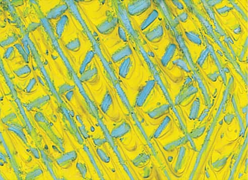
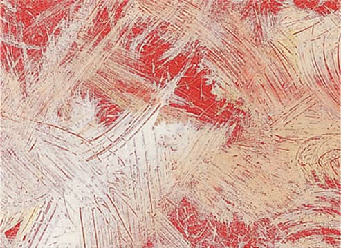
SCRAPE Using the side of a palette knife or painting knife, create grooves and indentations of various shapes and sizes in wet paint. This works well for creating rough textures.
LIFTING OUT Use a moistened brush or a tissue to press down on a support and lift colors out of a wet wash. If the wash is dry, wet the desired area and lift out with a paper towel.
IMPASTO Use a paintbrush or a painting knife to apply thick, varied strokes, creating ridges of paint. This technique can be used to punctuate highlights in a painting.
THICK ON THIN Stroking a thick application of paint over a thin wash, letting the undercolor peek through, produces textured color variances perfect for rough or worn surfaces.
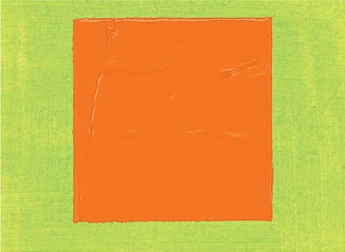
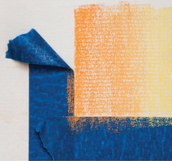
MASK WITH TAPE Masking tape can be placed onto and removed from dried acrylic paint without causing damage. Don’t paint too thickly on the edges—you won’t get a clean lift.
DRY ON WET Create a heavily diluted wash of paint; then, before the paint has dried, dip a dry brush in a second color and stroke quickly over it to produce a grainy look.
Oil Techniques
Most oil painters apply paint to their supports with brushes. The variety of effects you can achieve—depending on your brush selections and your techniques—is virtually limitless. Just keep experimenting to find out what works best for you. A few of the approaches to oil painting and brushwork techniques are outlined below.
PAINTING THICKLY Load your brush or knife with thick, opaque paint and apply it liberally to create texture.
THIN PAINT Dilute your color with thinner, and use soft, even strokes to make transparent layers.
DRYBRUSH Load a brush, wipe off excess paint, and lightly drag it over the surface to make irregular effects.
BLENDING Use a clean, dry hake or fan brush to lightly stroke over wet colors to make soft, gradual blends.
GLAZING Apply a thin layer of transparent color over existing dry color. Let dry before applying another layer.
PULLING AND DRAGGING Using pressure, pull or drag dry color over a surface to texture or accent an area.
SCUMBLING Lightly brush semi-opaque color over dry paint, allowing the underlying colors to show through.
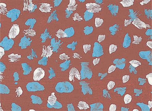
SPONGING Apply paint with a natural sponge to create mottled textures for subjects such as rocks or foliage.
WIPING AWAY Wipe away paint with a paper towel or blot with newspaper to create subtle highlights.
SPATTER Randomly apply specks of color on your canvas by flicking thin paint off the tip of your brush.
SCRAPING Use the tip of a knife to remove wet paint from your support and reveal the underlying color.
STIPPLING Using the tip of a brush or knife, apply thick paint in irregular masses of small dots to build color.
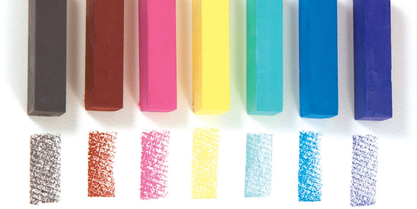
Colored Pencil Techniques
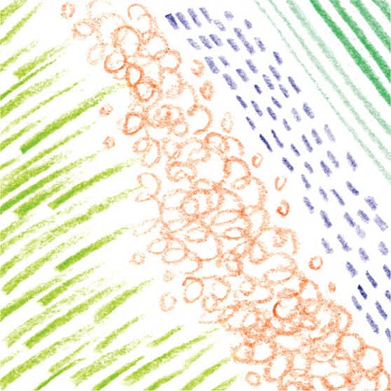
VARYING STROKES Experiment with the tip of your pencil as you create a variety of marks, from tapering strokes to circular scribbles.
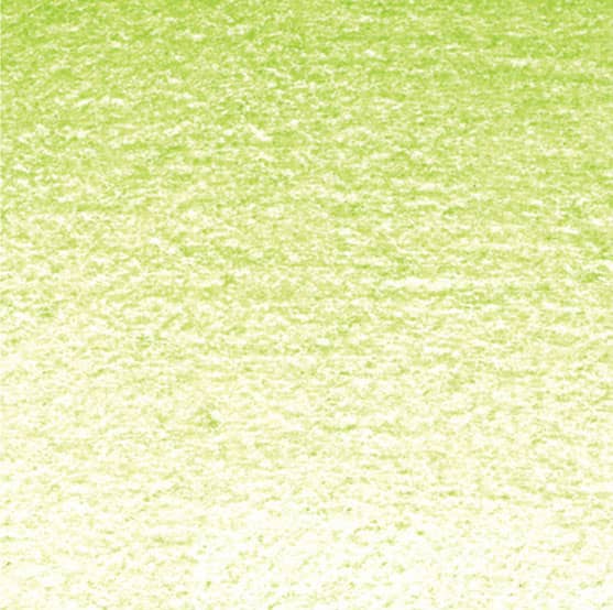
GRADATING To create a gradation with one color, stroke side to side with heavy pressure and lighten the pressure as you move away, exposing more of the white paper beneath the color.
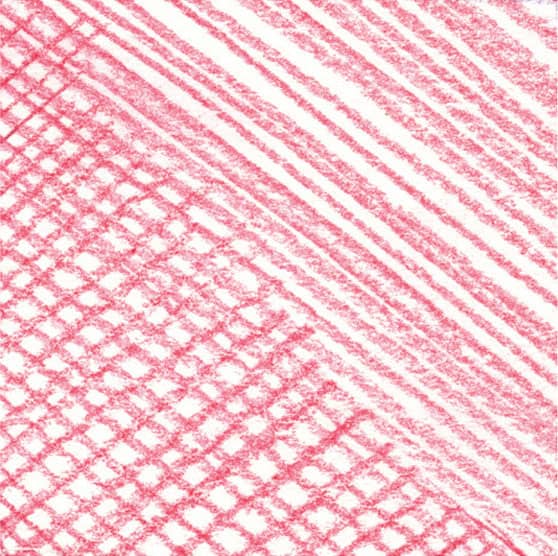
HATCHING & CROSSHATCHING Add shading and texture to your work with hatching (parallel lines) and crosshatching (layers of parallel lines applied at varying angles).
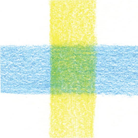
LAYERING You can optically mix colored pencils by layering them lightly on paper. In this example, observe how layering yellow over blue creates green.
STIPPLING Apply small dots of color to create texture or shading. The closer together the dots, the darker the stippling will “read” to the eye.
BURNISHING For a smooth, shiny effect, burnish by stroking over a layer with a colorless blender, a white colored pencil (to lighten), or another color (to shift the hue) using heavy pressure.
BLENDING To blend one color into the next, lighten the pressure of your pencil and overlap the strokes where the colors meet.
SCUMBLING Create this effect by scribbling your pencil over the surface of the paper in a random manner, creating an organic mass of color.
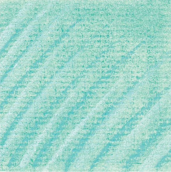
Pastel Techniques
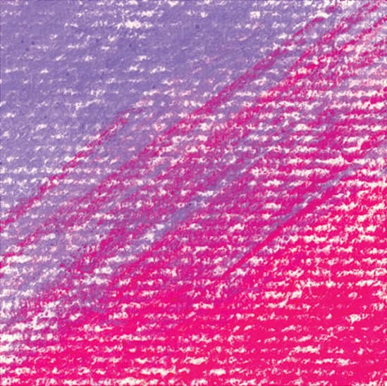
UNBLENDED STROKES To transition from one color to another, allow your pastel strokes to overlap where they meet. Leaving them unblended creates a raw, energetic feel and maintains the rhythm of your strokes.

BLENDING To create soft blends between colors, begin by overlapping strokes where two colors meet. Then pass over the area several times, using a tissue, chamois, or stump to create soft blends.
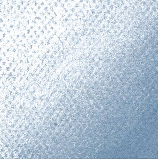
GRADATING A gradation is a smooth transition of one tone into another. To create a gradation using one pastel, begin stroking with heavy pressure and lessen your pressure as you move away from the initial strokes.
STROKING OVER BLENDS You can create rich colors and interesting contrasts of texture by stroking over areas of blended pastel.
SCUMBLING This technique involves scribbling to create a mottled texture with curved lines. Scumble over blended pastel for extra depth.
MASKING Use artist tape to create clean edges in your drawings or to mask out areas that should remain free of pastel.
Color Theory
Acquaint yourself with the ideas and terms of color theory, which involve everything from color relationships to perceived color temperature and color psychology. In the following pages, we will touch on the basics as they relate to painting.
COLOR WHEEL
The color wheel, pictured to the right, is the most useful tool for understanding color relationships. Where the colors lie relative to one another can help you group harmonious colors and pair contrasting colors to communicate mood or emphasize your message. The wheel can also help you mix colors efficiently. Below are the most important terms related to the wheel.
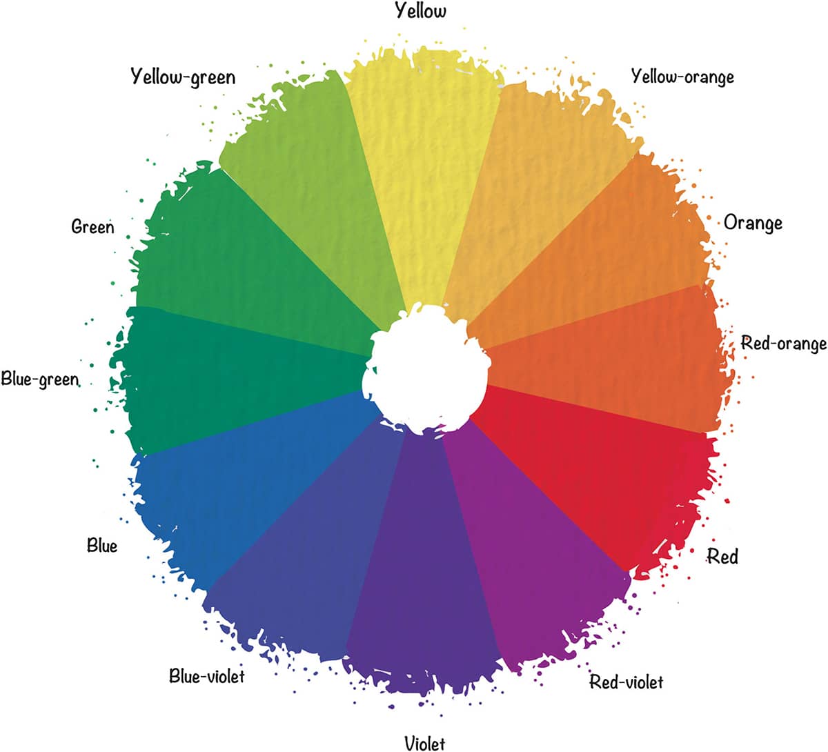
Primary colors are red, blue, and yellow. With these you can mix almost any other color; however, none of the primaries can be mixed from other colors. Secondary colors include green, orange, and violet. These colors can be mixed using two of the primaries. (Blue and yellow make green, red and yellow make orange, and blue and red make violet.) A tertiary color is a primary mixed with a near secondary, such as red with violet to create red-violet.
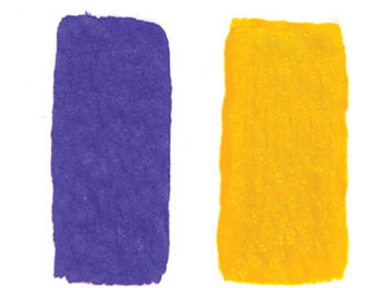
COMPLEMENTARY COLORS are those situated opposite each other on the wheel, such as purple and yellow. Complements provide maximum color contrast.
ANALOGOUS COLORS are groups of colors adjacent to one another on the color wheel, such as blue-green, green, and yellow-green. When used together, they create a sense of harmony.
NEUTRAL COLORS are browns and grays, both of which contain all three primary colors in varying proportions. Neutral colors are often dulled with white or black. Artists also use the word “neutralize” to describe the act of dulling a color by adding its complement.
Transferring a Drawing
There are many options available to transfer a subject image onto drawing paper or canvas, including using transfer paper, the grid method, or the projector method.
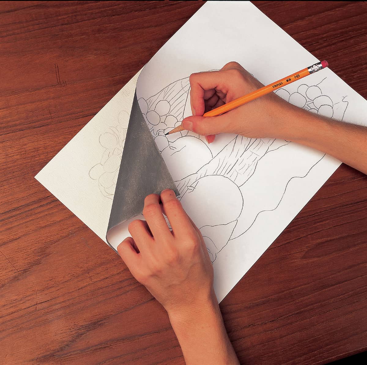
TRANSFER PAPER On a sheet of thin drawing or tracing paper, sketch out your composition until you are satisfied. Take a piece of transfer paper (sold in art stores) and tape it over the white paper surface you have chosen for your final drawing. There is a coating of graphite on the bottom of the transfer paper. Tape your drawing or tracing paper over the transfer paper. Using a ballpoint pen or stylus, impress the outlines of your drawing with medium pressure. Raise both papers, and you will see the graphite image on your final white paper. Erase the transferred graphite lines if needed as you develop the drawing. Of course, you can always freehand your composition directly onto the final paper. Sketch lightly and erase well.
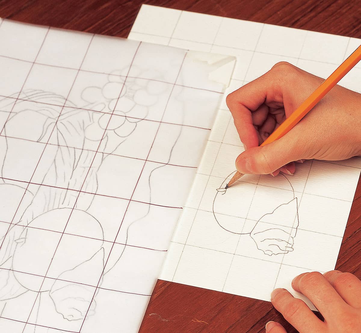
GRID METHOD This method enables you to sketch out your drawing in small segments using one-inch squares. Photocopy your photo reference and draw a grid of one-inch squares over the photocopy with a pen and ruler. Then very lightly draw the same grid of one-inch squares with a graphite pencil onto your final drawing paper. Starting from left to right, draw what you see in each square. Connect your composition from box to box until it is done. Erase your grid lines.
PROJECTOR METHOD Secure your projector to a countertop and tape your photo inside its top. The photo reflects off a lighted mirror, through a lens, and onto your final paper. Trace the basic outlines of the photo onto your drawing paper. Once the sketch is on paper, you can then focus on creating a perfectly proportioned piece as you refine lines, add detail, and build up tone.
Canine Features in Pencil
Before creating a full canine portrait, get to know the general shapes that make up each feature. As you practice rendering the features of a variety of dogs, notice the subtle changes in shape, value, and proportion that distinguish each breed.
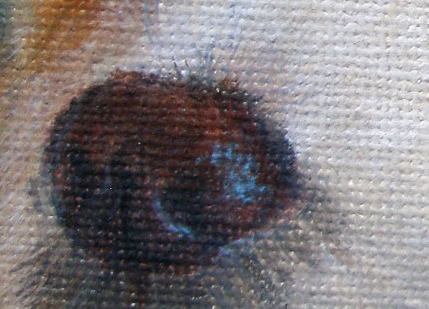
EYES
The eyes are possibly the most important feature when it comes to capturing the personality and character of an animal.
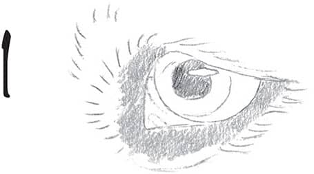
1 Using an HB pencil, begin by outlining the main areas of the eye—the pupil, the iris, the eyelids, and the highlight. Also sketch the hair around the eyes. Almost all dog breeds have a very dark area of bare skin surrounding the eyeball, so shade this area with solid tone.
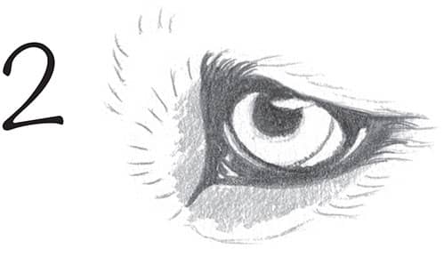
2 Next, using a 2B pencil, block in the darkest values of the eye, including the pupil (avoiding the highlight) and the area surrounding the eyeball. As you shade, leave small highlights in the corners of the eye to convey the impression of a moist, glistening surface.
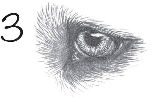
3 Begin creating the pattern of the iris using an HB pencil, drawing lines that radiate outward from the pupil toward the outer edge of the iris. Use the HB pencil to add more hair around the eye, following the direction of growth.
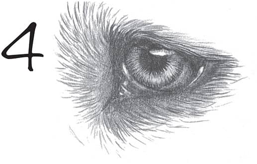
4 Finish the eye with an H pencil, adding more tone to the iris and then lifting out some graphite to indicate reflected light. Soften the highlight with a tortillon; then continue developing the hair, stroking over the top of the lid and over the outer corner.
WHISKERS
There are a number of ways to suggest whiskers—but keep in mind that many whiskers are light in color and often appear nearly translucent.
INDENTING METHOD For light whiskers against dark hair, use a blunt tool to indent the whiskers; then shade over them. Continue the whiskers into lighter sections using a sharp HB pencil.

ERASING METHOD For thicker whiskers, remove the graphite with the point of an eraser. This method is best suited for large or close-up drawings.
NEGATIVE DRAWING METHOD To create thin or thick whiskers without disturbing the paper’s surface, outline the parallel shapes of each whisker; then avoid stroking over them.
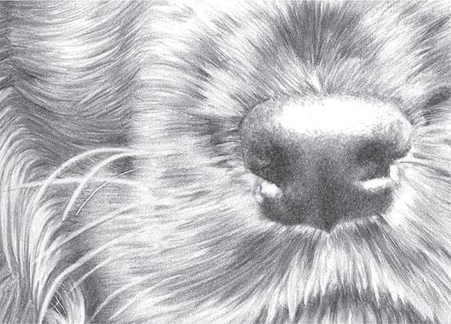
NOSES
There is variation in nose size, shape, and color from one breed to the next. Observe your subject from a variety of angles to truly understand the shape of this feature.
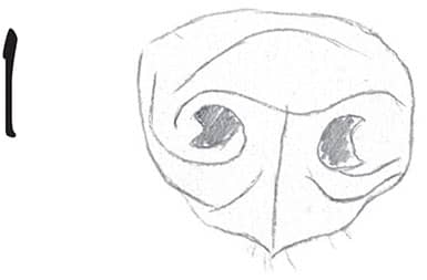
1 Use an HB pencil to sketch the shape of the nose, including the nostrils. Be sure to study your subject and draw the shape you see. Add rough guidelines to show where the main areas of light and shadow will be.
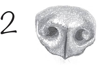
2 Next add tone with a 2B pencil, using tiny circular strokes to emulate the texture of the dog’s nose. Darken the nostrils and the vertical crease through the middle of the nose. Then begin shading the rest with lighter layers of circles. Leave the highlight areas free of graphite.
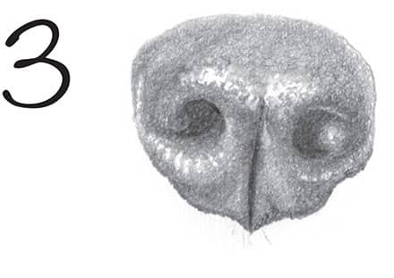
3 Go over the entire nose with small circles to soften the texture slightly, but keeping a bumpy effect. Leave the top of the nose and the area under the nostril light to suggest reflected light. To create the appearance of a wet nose, avoid blending the darks into the lights, instead allowing harsh separations.
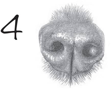
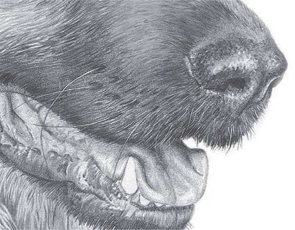
4 To connect the nose to the rest of the dog’s face, begin adding the surrounding hair. Dog fur grows away from the nose, with the darkest areas directly underneath and above. The hair just below the nose is generally coarse, so keep these lines dark and short.
EARS
Canine ears can be long or short, dropped or upright, and long haired or short haired.

1 Begin by sketching the ear shape with an HB pencil, outlining the folds and mapping out some of the darker tones.
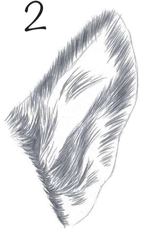
2 Using a 2B pencil, begin adding hair to the ear, starting with the darkest hair around the base and along the uppermost edge. Let the hair dictate the form of the ear, using very little shading. The hair grows upward and outward across the ear, with a hairless area along the inside flap of the ear.
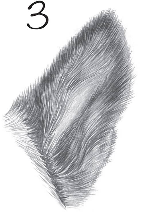
3 Go over the dark hairs with an HB pencil; this fills in the gaps with a slightly different tone, providing depth and thickness to the hair. Fill in most of the remaining gaps with strokes of a 2B pencil, applying very little pressure for the lighter areas. Finish by lightly shading the hairless area using a 2H pencil.
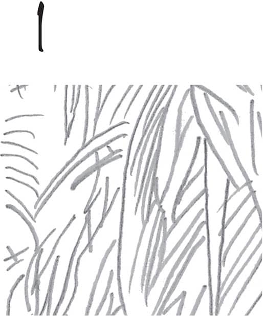
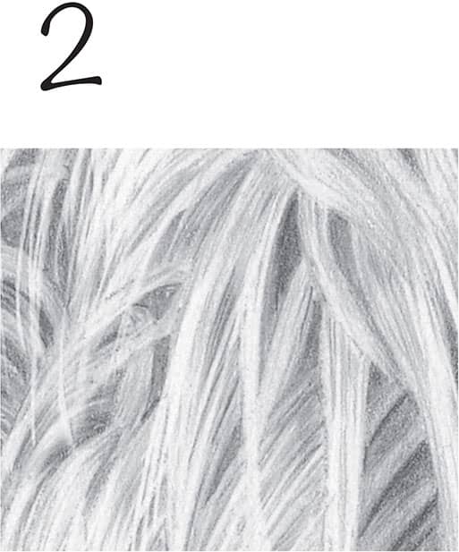
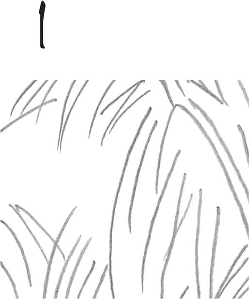
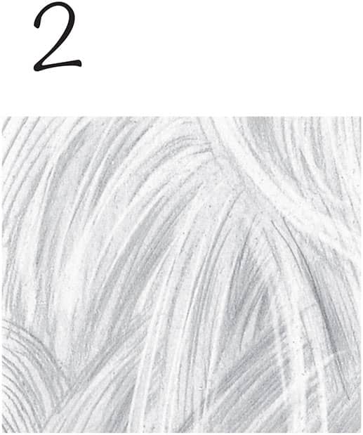
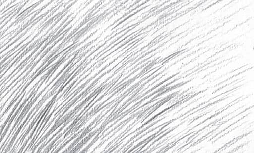
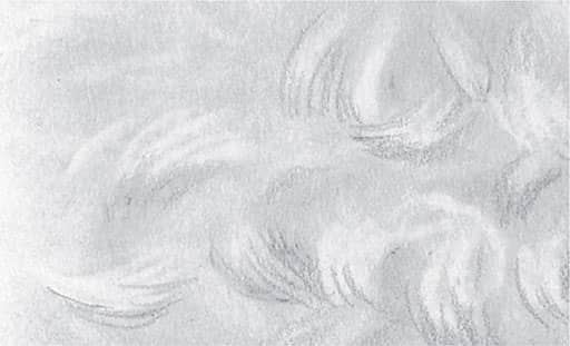
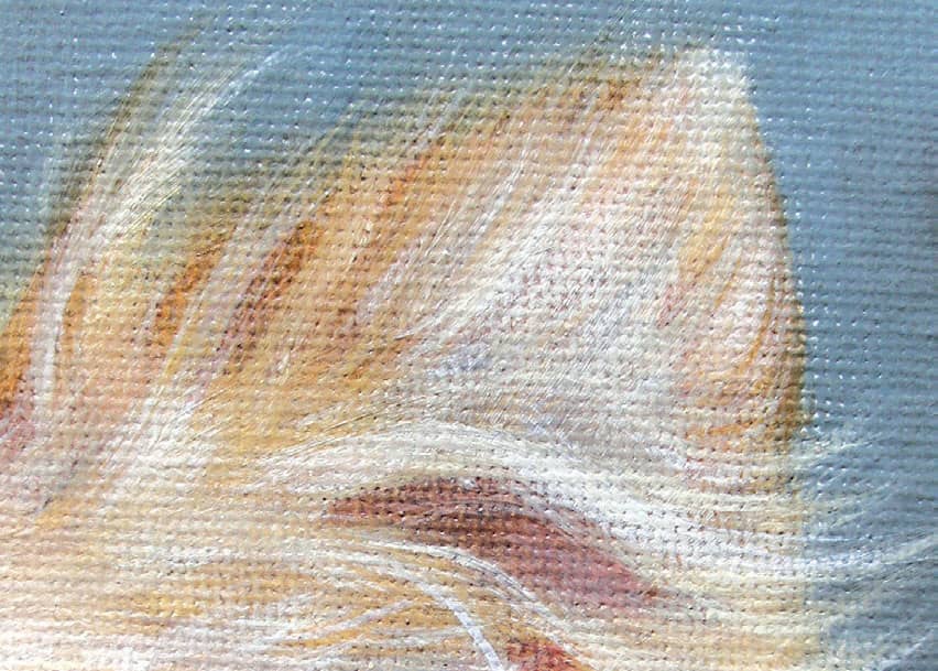
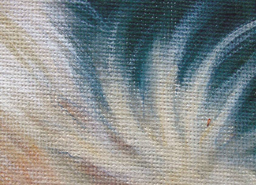
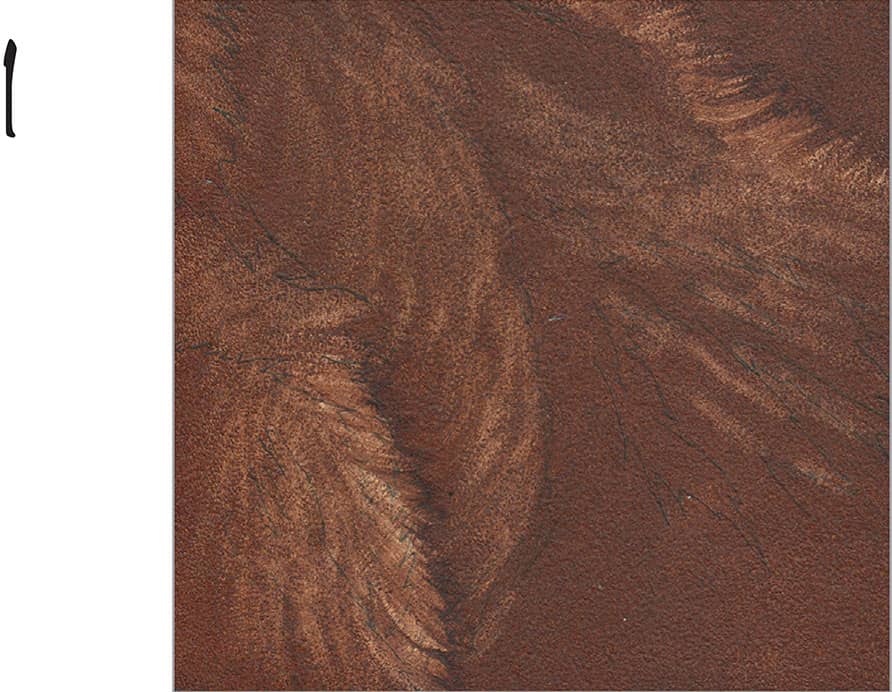
Rendering Hair
Dog hair can be long, short, straight and curly. The roughness or smoothness of the hair affects a dog’s overall appearance, as well. There are many variations within each basic type of hair, but you should be able to adapt any of the techniques demonstrated in this section.
LONG & CURLY
Detail Method
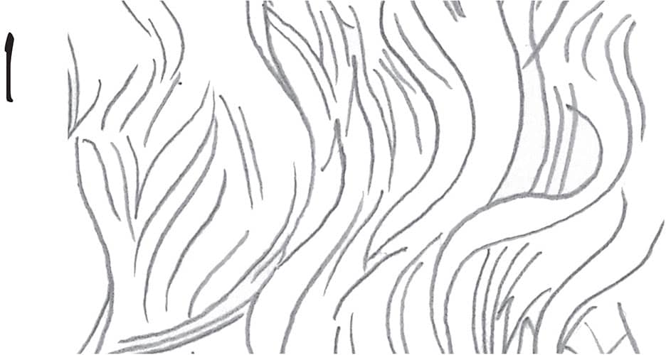
1 Long, curly hair tends to flow in waves. Begin drawing wavy lines using an HB pencil, roughly following a consistent pattern of curvature while ensuring that the pattern isn’t too rigid and exact. Overlap some hairs for realism.
2 Darken the areas in between the main clumps of hair using a soft pencil. Then suggest the strands within the clumps of hair nearest the viewer, using long strokes to communicate the length. Leave some areas nearly free of graphite to bring them forward visually.
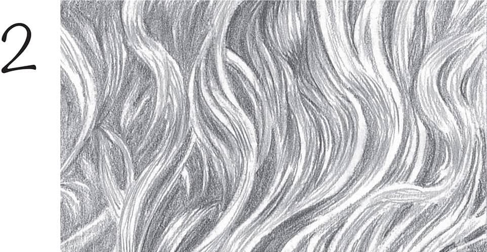
Sketch Method
1 To draw the same hair type with a looser style, sketch long, wavy lines, following a general S-shaped pattern.
2 Rough in texture using lines. Rather than creating definite highlights and shadows, simply draw the lines closer together in shadowed areas and farther apart in lighter areas. When drawing any type of hair, always stroke in the direction of growth.
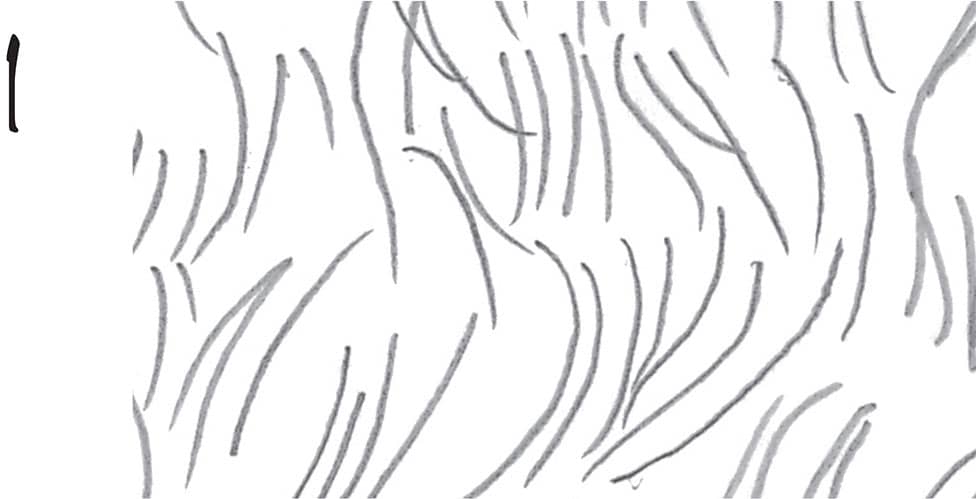
LONG & STRAIGHT
Detail Method
1 Long, straight hair doesn’t necessarily lay in perfectly parallel lines. In fact, the longer the hair, the more haphazard it’s likely to be. With this in mind, draw long sections of hair, stroking in different directions and overlapping strokes.
2 Carefully shade the dark areas among the hairs; then apply long, light strokes on top of the sections of hair. Use a kneaded eraser to lift out some individual hairs, giving depth to the coat.
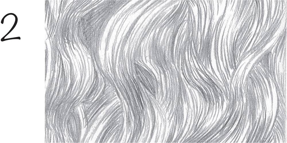
Sketch Method
1 Draw light, rough guidelines for the sections of hair. Then use long, wispy strokes to gradually build up the strands along the guidelines. Place lines closer together for dark areas and farther apart for light areas.
2 As with the detailed method, add highlights and depth by lifting out additional hairs using a kneaded eraser molded into a point.
SHORT & STRAIGHT Short, straight hair is the simplest to draw, as it generally is made up of only short lines. For a detailed rendering, draw many straight lines, all running in the same direction. To give the impression of individual short hairs, draw pairs of lines, tapering the ends together to form a point for each hair.
SHORT & CURLY A few breeds, such as Poodles and Bichon Frises, have coats with short, soft, tight curls. To draw this type of hair, fill the area with even shading using an HB pencil; then blend with a tissue. For highlights, use an eraser to lift out graphite using a random, circular motion. In this view, the light is coming from above, so the shadows are on the underside of each highlighted curl.
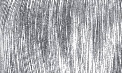
SMOOTH Draw long, sweeping, parallel lines, leaving lighter areas for highlights. As with any type of hair, avoid drawing the lines too uniformly in direction or value, which produces an unnatural look.
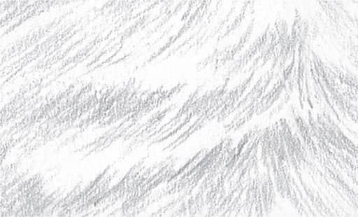
FLUFFY Draw “rough” rows of hair that give the impression of hair fluffing outward, as shown above. Draw lines close together, following rows across the paper, and make some strokes longer than others to break up any distracting patterns.
Canine Features in Oil & Acrylic
Below are some techniques for rendering various canine features in oil and acrylic using common canine color combinations.
EARS Use a #8 filbert brush to paint a thin layer of a burnt sienna and burnt umber for the darkest ear color. For the center of the ear, use a thin mixture of cadmium red and a bit of alizarin crimson. When dry, tone down the pink by applying a thin layer of burnt umber. Allow the paint to dry and then create a beige mix of burnt umber and white. Using a #3 round brush, stroke in the direction of fur growth. Clean your brush and mix raw sienna with white to create a cream color; use this to flick on fur texture. Add more white highlights where needed. To get a soft, fluffy look, be sure to use paint that isn’t too thick.
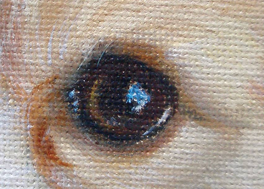
EYES Dog eyes are usually very dark and reflect the colors of their surroundings. For this eye, use a small round brush and a mix of burnt umber and ultramarine blue to draw the shapes of the eye and pupil. While the paint is still wet, use a mix of burnt sienna and burnt umber to paint the dark brown iris. To soften the eye’s outer edge, mix burnt sienna with just a bit of burnt umber and shade around the eye. Once dry, use thinned cadmium yellow to apply a soft brushstroke to the left of the pupil, showing a bit of reflected light. Add highlights to the eye with white and a bit of ultramarine blue.
NOSES Most often you’ll find it useful to paint from dark to light, but sometimes it is better to do the opposite. For this nose, paint the lighter undercolor using burnt sienna. Once dry, mix burnt umber and ultramarine blue to create the dark of the nose. Paint a thin layer on top. You may press your thumb on the nose to remove some of the paint and allow the lighter undercolor to show. This is a great technique for noses painted using oil and acrylic. While the paint is still wet, use a small round brush to darken the nostril and add a line up the center of the nose. Once dry, use a mix of white and ultramarine blue to paint the highlights, lifting off a bit with a clean thumb again.
TAILS If you are working with acrylics, use a slow-drying medium to keep your paint wet and workable. Build up the background in three layers using a mix of burnt umber and burnt sienna. Let each layer dry before applying the next, making the last layer slightly thicker than the first two. While the background is still wet, begin painting the tail. For the dark cream undercolor, use a mix of yellow ochre and a bit of burnt sienna. Use a #8 filbert brush to apply sweeping brushstrokes, flicking the brush up into the wet background beginning at the center of the tail. Then lighten the cream mix by adding some white, and use the same brush and technique to flick in highlights.
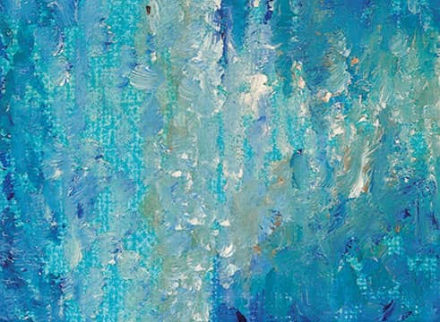
SMOOTH FUR
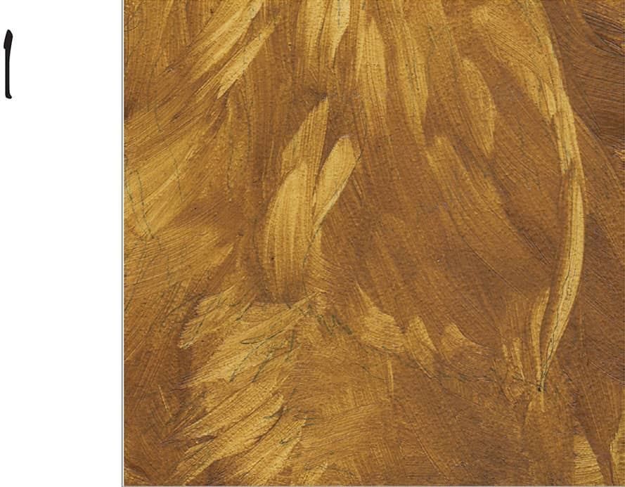
1 Begin by laying in a medium value of thinned burnt sienna and sap green using a ½-inch flat brush. This golden brown mix will show through the fur as you paint subsequent layers picking out color wherever you desire using a pointed brush.
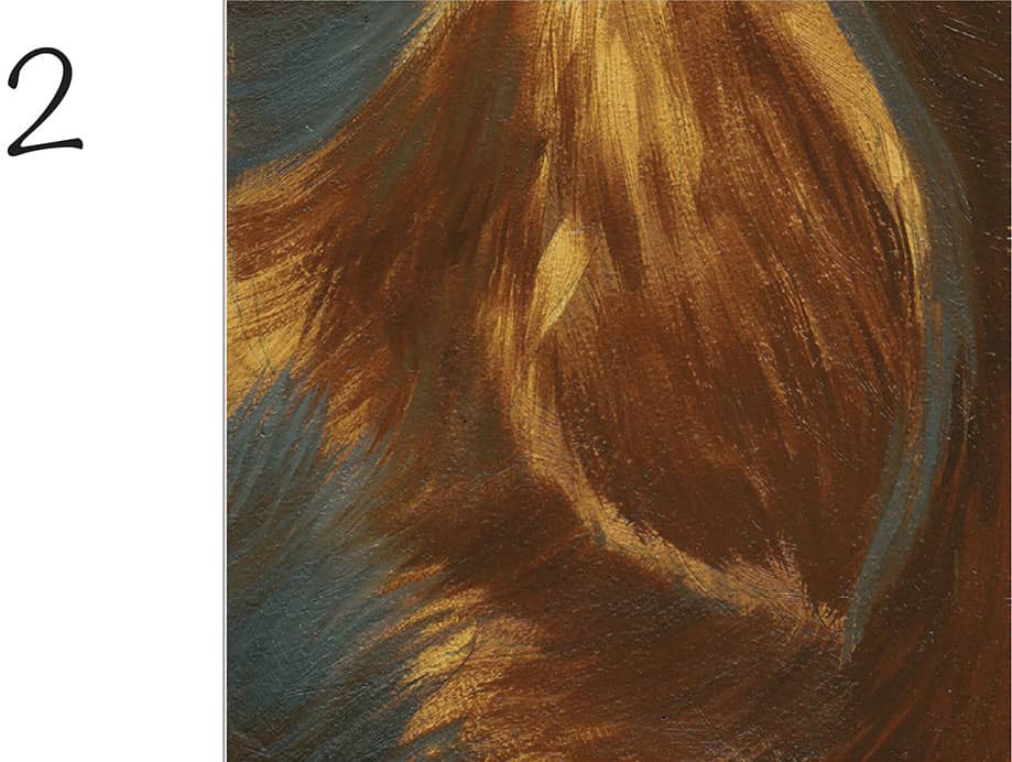
2 Continue to darken the shadows with equal parts of raw sienna and black using a soft ½-inch flat brush. Always work your strokes in the direction of the hair growth. Add some white to create a warm gray and work from the edges of your piece toward the fur, lessening your pressure at the end of each stroke to create soft, blurred ends. Add more white to this mixture and use a long, fine-pointed brush to paint loose, soft-edged hairs that fade into the background.
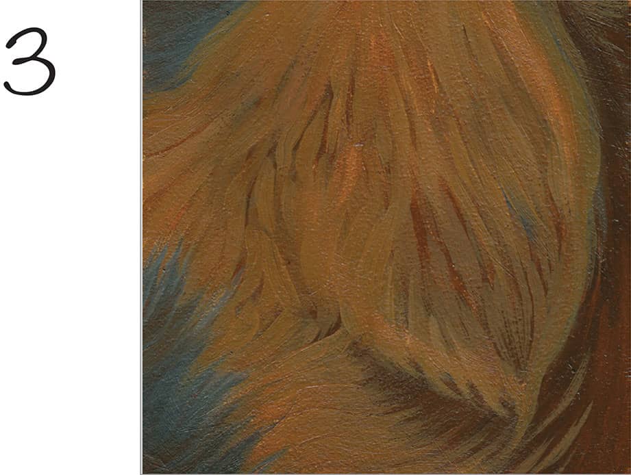
3 To build the middle tones, mix cadmium yellow medium, yellow ochre, and a bit of black. Using a fine-pointed brush, twist and turn your wrist as you move in the direction of the hair growth, creating brushmarks that range from one to two inches long. Vary the pressure you put on the brush to create lines that are both thick and thin. For the lighter areas, add a small amount of white. You may go over your brushmarks with a soft, dry brush to minimize the texture and create the illusion of softer fur.
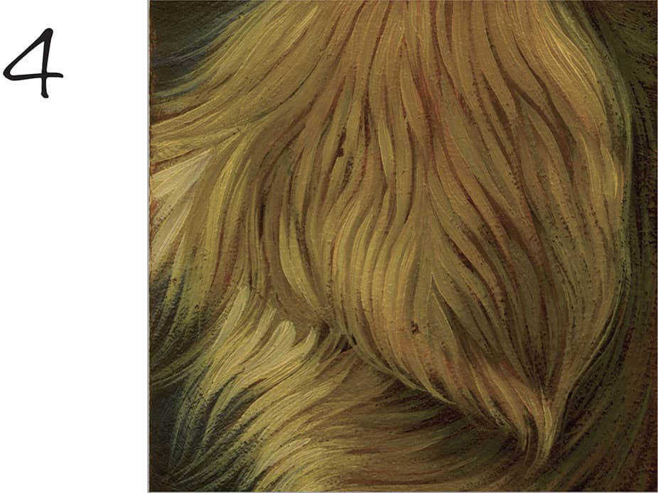
4 For the final layer, mix three parts raw sienna with one part white and one part cadmium yellow medium. Load a pointed brush and wipe off the excess paint onto a dry cloth so your brushmarks are softer and silkier. Start with the bottom layers of fur and work upward so each brushstroke lays over the previous. Use various amounts of pressure to create thicker and thinner lines. It is a good idea to thin the paint for better flow. Add a very small amount of black to this mixture to create a greenish tone for the shadow areas, staying careful to leave these areas softer so they recede. Add more white to your original mixture for the lighter areas.
CURLY FUR
1 Create a thin mix of four parts burnt sienna to one part black; then use a ½-inch flat brush to lay in a flat area of color, working from dark to light. Use the pounce technique to smooth out the brushmarks. To remove some color from the lightest areas of fur, use a cotton swab dipped in mineral spirits (if using oil) or water (if using acrylic) to gently wipe away the paint.
2 To create the soft edges in curly or fuzzy hair, start by painting a thin layer of medium (if using oil) or water (if using acrylic) directly over the dried underpainting. When you paint over this wet surface, your brushmarks will be less dramatic and blurred. For the shadows, create a mix of equal parts of black and burnt sienna. Then use a pointed brush to dab the color into the spaces between the curls and under the ear, using squiggly marks. You can blend this more by lightly sweeping a soft, dry fan brush over your marks to knock down the texture. Allow the paint to dry.
3 To create softer brushstrokes, begin by wetting your entire painting again. Next mix equal parts of yellow ochre, burnt sienna, and black for the middle values of this curly fur. Using a ¼-inch flat brush, begin to build the lighter values with random, squiggly lines that vary in thickness, moving from top to bottom. To soften the brushmarks, use a fine-pointed brush with a darker version of burnt sienna mixed with black to repaint some of your shadows, blending them with the wet paint in the curls.
4 For the last layers, mix equal parts of raw sienna and white. Using the corner of a ¼-inch flat brush, gently and loosely build up the lighter areas of the hair. Build your values from dark to light slowly to create a softer effect. Switch to a smaller pointed brush if you desire more control, but hold it very loosely, allowing the brush to do the work for you. You will achieve more natural variation in your marks. Add a small amount of cadmium red light to warm the fur or white to lighten it. Use burnt sienna to darken the mix for detail in the shadow areas.
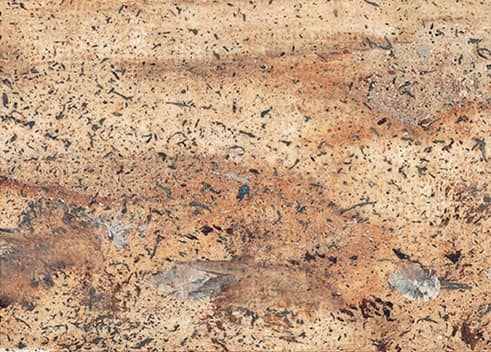
COARSE FUR
1 Paint the darkest shadow color using a mix of three parts burnt sienna to one part black. Thin the color until it is soft and smooth but not watery. Apply the wash with a ½-inch flat brush and use the pounce technique to eliminate brushmarks. Define the fur texture along the edges by lifting color in short strokes in the lightest areas using a dry, fine-pointed brush.
2 Short, choppy strokes with the edge of a ½-inch flat brush work well for capturing the texture of coarse hair. Always work in the direction of the hair growth and allow some of the underpainting to show through to start building depth and detail with minimal effort. Use a darker version of your mix of black and burnt sienna.
3 To create the illusion of coarse, scratchy fur, try painting with a pointed palette knife instead of a brush. Mix equal parts of yellow ochre, cadmium red light, and cadmium yellow medium for the middle values of the fur. Use the palette knife point and its edge to lay in the color. Scratch into the paint with the tip of the palette knife to spread the color in the direction of the hair growth and create the illusion of fine hairs.
4 There should be a lot of texture on your painting from the palette work in step three, so this is a good time to use the drybrush technique. Load a very small amount of paint on your ½-inch flat brush. Wipe off any excess on a rag. Then, with your brush on its side, stroke lightly across the texture marks so you only pick up the raised parts. Don’t push the paint into the grooves. After you’ve exposed as much texture as you can, use your palette knife to build up even more texture in the light areas. Blend these new areas into the previous ones by scratching into them with the pointed end of your palette knife, working the paint in the direction of the hair growth.