
TECHNIQUES
Pencil Techniques

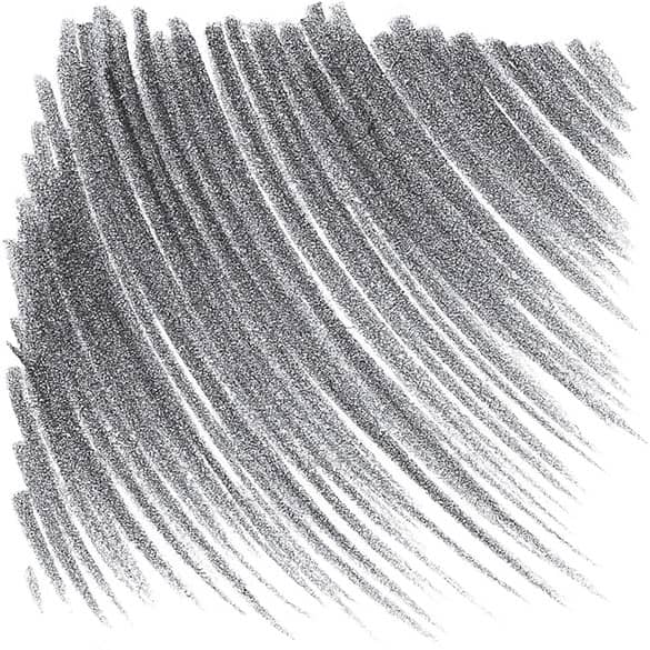
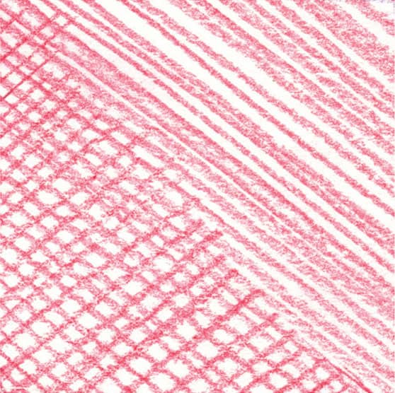
HATCHING This basic method of shading involves filling an area with a series of parallel strokes. The closer the strokes, the darker the tone will be.

CROSSHATCHING For darker shading, place layers of parallel strokes on top of one another at varying angles. Again, make darker values by placing the strokes closer together.
SHADING DARKLY By applying heavy pressure to the pencil, you can create dark, linear areas of shading.

GRADATING To create gradated values (from dark to light), apply heavy pressure with the side of your pencil, gradually lightening the pressure as you stroke.

BLENDING To smooth out the transitions between strokes, gently rub the lines with a blending tool or tissue.

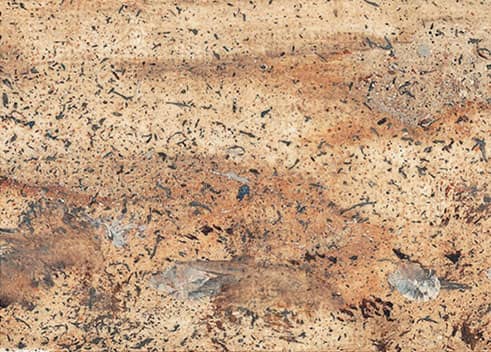
SHADING WITH TEXTURE For a mottled texture, use the side of the pencil tip to apply small, uneven strokes.
CREATING FORM
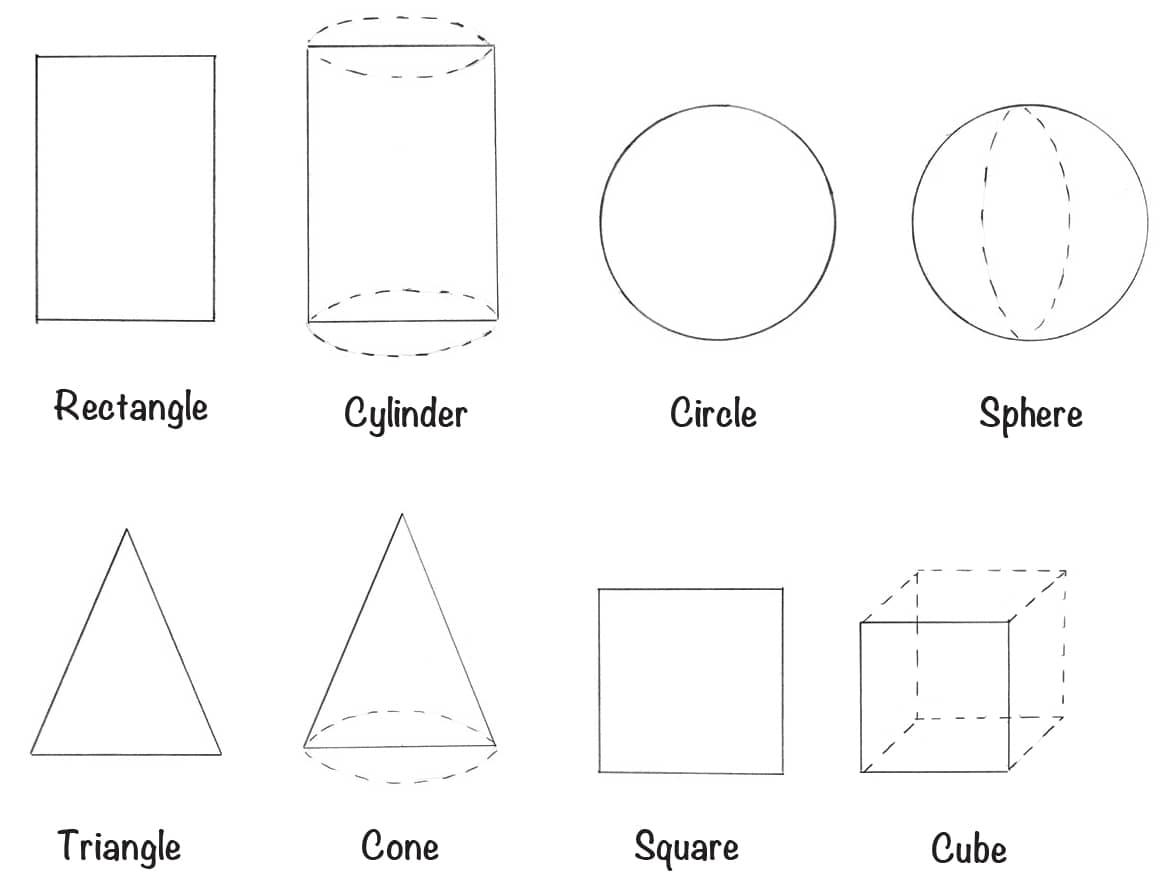
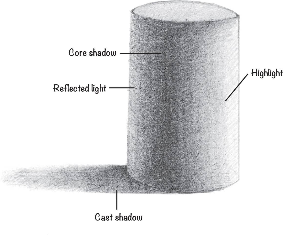
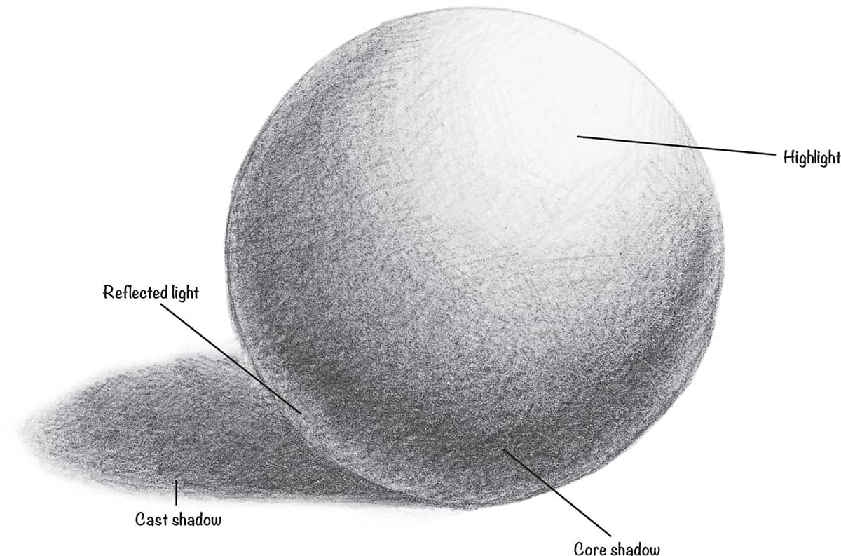
The first step when creating an object is to establish a line drawing to delineate the flat area that the object takes up. This is known as the “shape” of the object.
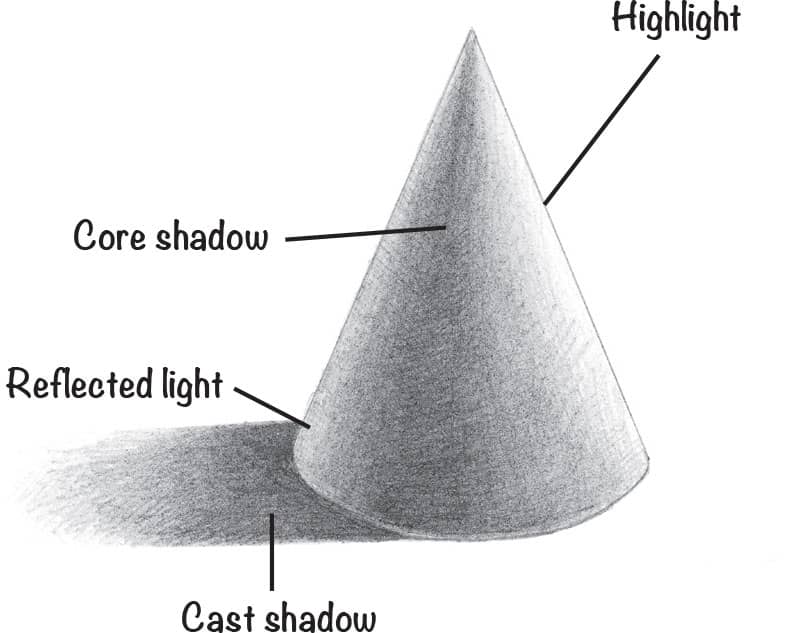
ADDING VALUE TO CREATE FORM
A shape can be further defined by showing how light hits the object to create highlights and shadows. First note from which direction the source of light is coming. (In these examples, the light source is beaming from the upper right.)

Acrylic Techniques

There are myriad techniques and tools that can be used to create a variety of textures and effects. By employing some of these different techniques, you can spice up your art and keep the painting process fresh, exciting, and fun!

FLAT WASH This thin mixture of acrylic paint has been diluted with water (use solvents to dilute oil paint). Lightly sweep overlapping, horizontal strokes across the support.

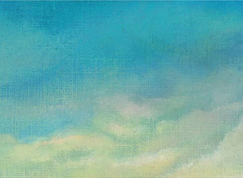
GRADED WASH Add more water or solvent and less pigment as you work your way down. Graded washes are great for creating interesting backgrounds.

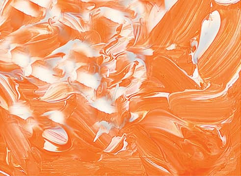
DRYBRUSH Use a worn flat or fan brush loaded with thick paint, wipe it on a paper towel to remove moisture, then apply it to the surface using quick, light, irregular strokes.
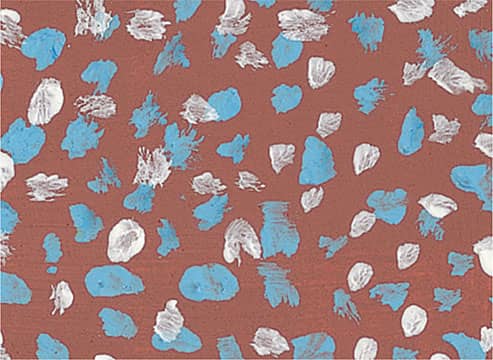
STIPPLE Take a stiff brush and hold it very straight, with the bristle-side down. Then dab on the color quickly, in short, circular motions. Stipple to create the illusion of reflections.

SCUMBLE With a dry brush, lightly scrub semi-opaque color over dry paint, allowing the underlying colors to show through. This is excellent for conveying depth.

SCRAPE Using the side of a palette knife or painting knife, create grooves and indentations of various shapes and sizes in wet paint. This works well for creating rough textures.
LIFTING OUT Use a moistened brush or a tissue to press down on a support and lift colors out of a wet wash. If the wash is dry, wet the desired area and lift out with a paper towel.
IMPASTO Use a paintbrush or a painting knife to apply thick, varied strokes, creating ridges of paint. This technique can be used to punctuate highlights in a painting.
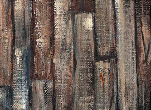
THICK ON THIN Stroking a thick application of paint over a thin wash, letting the undercolor peek through, produces textured color variances perfect for rough or worn surfaces.
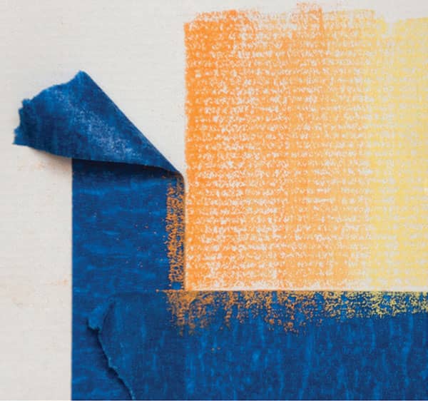
MASK WITH TAPE Masking tape can be placed onto and removed from dried acrylic paint without causing damage. Don’t paint too thickly on the edges—you won’t get a clean lift.

DRY ON WET Create a heavily diluted wash of paint; then, before the paint has dried, dip a dry brush in a second color and stroke quickly over it to produce a grainy look.
Oil Techniques
Most oil painters apply paint to their supports with brushes. The variety of effects you can achieve—depending on your brush selections and your techniques—is virtually limitless. Just keep experimenting to find out what works best for you. A few of the approaches to oil painting and brushwork techniques are outlined below.

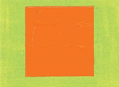
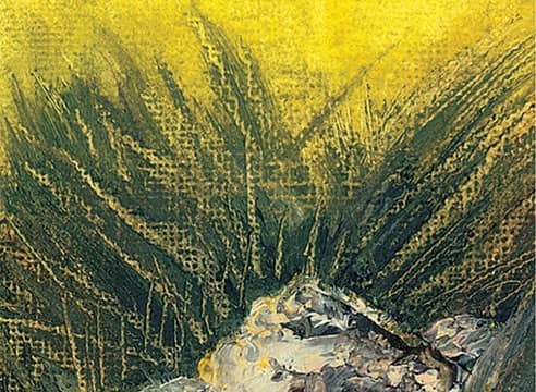
PAINTING THICKLY Load your brush or knife with thick, opaque paint and apply it liberally to create texture.

THIN PAINT Dilute your color with thinner, and use soft, even strokes to make transparent layers.
DRYBRUSH Load a brush, wipe off excess paint, and lightly drag it over the surface to make irregular effects.
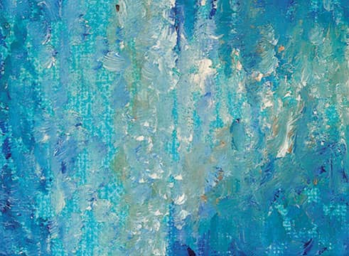
BLENDING Use a clean, dry hake or fan brush to lightly stroke over wet colors to make soft, gradual blends.
GLAZING Apply a thin layer of transparent color over existing dry color. Let dry before applying another layer.

PULLING AND DRAGGING Using pressure, pull or drag dry color over a surface to texture or accent an area.

SCUMBLING Lightly brush semi-opaque color over dry paint, allowing the underlying colors to show through.
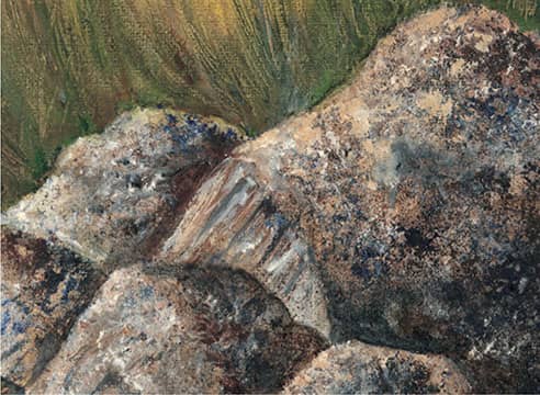
SPONGING Apply paint with a natural sponge to create mottled textures for subjects such as rocks or foliage.
WIPING AWAY Wipe away paint with a paper towel or blot with newspaper to create subtle highlights.
SPATTER Randomly apply specks of color on your canvas by flicking thin paint off the tip of your brush.
SCRAPING Use the tip of a knife to remove wet paint from your support and reveal the underlying color.
STIPPLING Using the tip of a brush or knife, apply thick paint in irregular masses of small dots to build color.
Colored Pencil Techniques

VARYING STROKES Experiment with the tip of your pencil as you create a variety of marks, from tapering strokes to circular scribbles.

GRADATING To create a gradation with one color, stroke side to side with heavy pressure and lighten the pressure as you move away, exposing more of the white paper beneath the color.
HATCHING & CROSSHATCHING Add shading and texture to your work with hatching (parallel lines) and crosshatching (layers of parallel lines applied at varying angles).
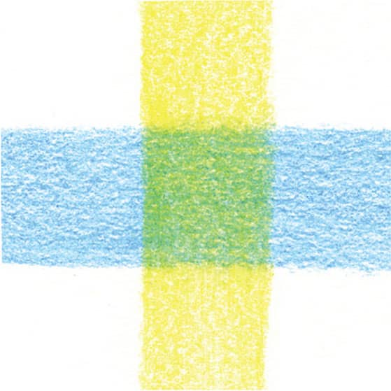
LAYERING You can optically mix colored pencils by layering them lightly on paper. In this example, observe how layering yellow over blue creates green.

STIPPLING Apply small dots of color to create texture or shading. The closer together the dots, the darker the stippling will “read” to the eye.

BURNISHING For a smooth, shiny effect, burnish by stroking over a layer with a colorless blender, a white colored pencil (to lighten), or another color (to shift the hue) using heavy pressure.
BLENDING To blend one color into the next, lighten the pressure of your pencil and overlap the strokes where the colors meet.

SCUMBLING Create this effect by scribbling your pencil over the surface of the paper in a random manner, creating an organic mass of color.
Pastel Techniques

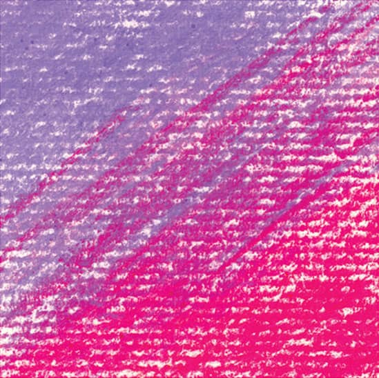
UNBLENDED STROKES To transition from one color to another, allow your pastel strokes to overlap where they meet. Leaving them unblended creates a raw, energetic feel and maintains the rhythm of your strokes.

BLENDING To create soft blends between colors, begin by overlapping strokes where two colors meet. Then pass over the area several times, using a tissue, chamois, or stump to create soft blends.

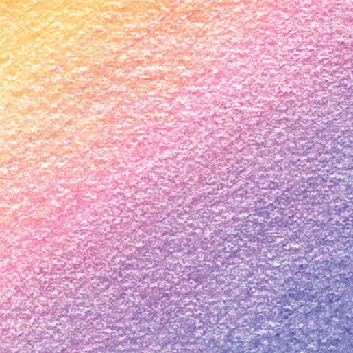
GRADATING A gradation is a smooth transition of one tone into another. To create a gradation using one pastel, begin stroking with heavy pressure and lessen your pressure as you move away from the initial strokes.

STROKING OVER BLENDS You can create rich colors and interesting contrasts of texture by stroking over areas of blended pastel.
SCUMBLING This technique involves scribbling to create a mottled texture with curved lines. Scumble over blended pastel for extra depth.
MASKING Use artist tape to create clean edges in your drawings or to mask out areas that should remain free of pastel.
Watercolor Techniques
Unlike other painting media, watercolor relies on the white of the paper to tint the layers of color above it. Because of this, artists lighten watercolor washes by adding water—not by adding white paint. To maintain the luminous quality of your watercolors, minimize the layers of paint you apply so the white of the paper isn’t dulled by too much pigment.
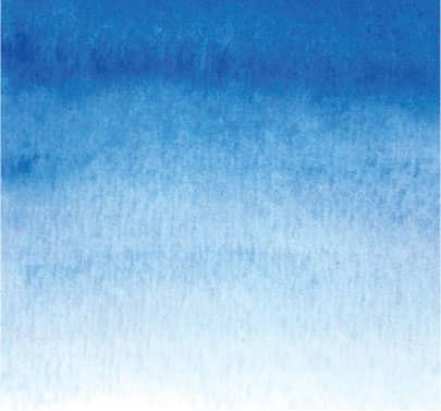
GRADATED WASH A gradated (or graduated) wash moves slowly from dark and to light. Apply a strong wash of color and stroke in horizontal bands as you move away, adding water to successive strokes.
BACKRUNS Backruns, or “blooms,” create interest within washes by leaving behind flower-shaped edges where a wet wash meets a damp wash. First stroke a wash onto your paper. Let the wash settle for a minute or so, and then stroke another wash within (or add a drop of pure water).

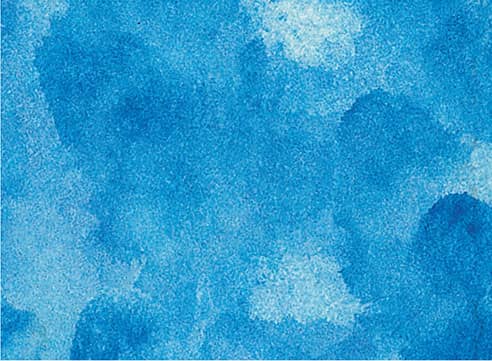
WET-INTO-WET Stroke water over your paper and allow it to soak in. Wet the surface again and wait for the paper to take on a matte sheen; then load your brush with rich color and stroke over your surface. The moisture will grab the pigments and pull them across the paper to create feathery soft blends.

TILTING To pull colors into each other, apply two washes side by side and tilt the paper while wet so one flows into the next. This creates interesting drips and irregular edges.
FLAT WASH A flat wash is a thin layer of paint applied evenly to your paper. First wet the paper, and then load your brush with a mix of watercolor and water. Stroke horizontally across the paper and move from top to bottom, overlapping the strokes as you progress.
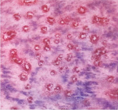
USING SALT For a mottled texture, sprinkle salt over a wet or damp wash. The salt will absorb the wash to reveal the white of the paper in interesting starlike shapes. The finer the salt crystals, the finer the resulting texture.
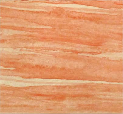
DRYBRUSHING Load your brush with a strong mix of paint; then dab the hairs on a paper towel to remove excess moisture. Drag the bristles lightly over the paper so that tooth catches the paint and creates a coarse texture. The technique works best when used sparingly and with opaque pigments over transparents.

USING A SPONGE In addition to creating flat washes, sponges can help you create irregular, mottled areas of color.

SPATTERING Load your brush with a wet wash and tap the brush over a finger to fling droplets of paint onto the paper. You can also load your brush and then run the tip of a finger over the bristles to create a spray.
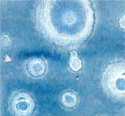
USING ALCOHOL To create interesting circular formations within a wash, use an eyedropper to drop alcohol into a damp wash. Change the sizes of your drops for variation.
MIXING WATERCOLORS
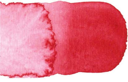
WET-ON-DRY This method involves applying different washes of color on dry watercolor paper and allowing the colors to intermingle, creating interesting edges and blends.

MIXING IN THE PALETTE VS. MIXING WET-ON-DRY To experience the difference between mixing in the palette and mixing on the paper, create two purple shadow samples. Mix ultramarine blue and alizarin crimson in your palette until you get a rich purple; then paint a swatch on dry watercolor paper (A). Next paint a swatch of ultramarine blue on dry watercolor paper. While this is still wet, add alizarin crimson to the lower part of the blue wash, and watch the colors connect and blend (B). Compare the two swatches. The second one (B) is more exciting. It uses the same paints but has the added energy of the colors mixing and moving on the paper. Use this mix to create dynamic shadows.
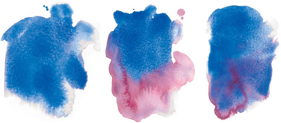
VARIEGATED WASH A variegated wash differs from the wet-on-dry technique in that wet washes of color are applied to wet paper instead of dry paper. The results are similar, but using wet paper creates a smoother blend of color. Using clear water, stroke over the area you want to paint and let it begin to dry. When it is just damp, add washes of color and watch them mix, tilting your paper slightly to encourage the process.
APPLYING A VARIEGATED WASH After applying clear water to your paper, stroke on a wash of ultramarine blue (left). Immediately add some alizarin crimson to the wash (center), and then tilt to blend the colors further (right). Compare this with your wet-on-dry purple shadow to see the subtle differences caused by the initial wash of water on the paper.
GLAZING is a traditional watercolor technique that involves two or more washes of color applied in layers to create a luminous, atmospheric effect. Glazing unifies the painting by providing an overall underpainting (or background wash) of consistent color.

CREATING A GLAZE To create a glazed wash, paint a layer of ultramarine blue on your paper (far left). Your paper can either be wet or dry. After this wash dries, apply a wash of alizarin crimson over it (near left). The subtly mottled purple that results is made up of individual glazes of transparent color.
Color Theory
Acquaint yourself with the ideas and terms of color theory, which involve everything from color relationships to perceived color temperature and color psychology. In the following pages, we will touch on the basics as they relate to painting.
COLOR WHEEL
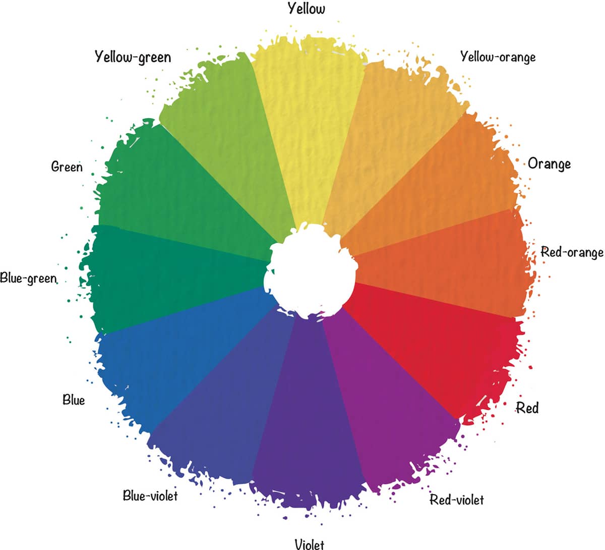
The color wheel, pictured to the right, is the most useful tool for understanding color relationships. Where the colors lie relative to one another can help you group harmonious colors and pair contrasting colors to communicate mood or emphasize your message. The wheel can also help you mix colors efficiently. Below are the most important terms related to the wheel.
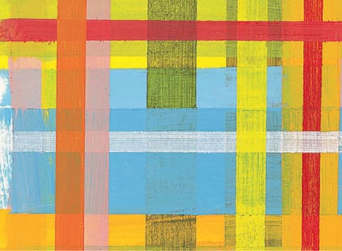
Primary colors are red, blue, and yellow. With these you can mix almost any other color; however, none of the primaries can be mixed from other colors. Secondary colors include green, orange, and violet. These colors can be mixed using two of the primaries. (Blue and yellow make green, red and yellow make orange, and blue and red make violet.) A tertiary color is a primary mixed with a near secondary, such as red with violet to create red-violet.

COMPLEMENTARY COLORS are those situated opposite each other on the wheel, such as purple and yellow. Complements provide maximum color contrast.

ANALOGOUS COLORS are groups of colors adjacent to one another on the color wheel, such as blue-green, green, and yellow-green. When used together, they create a sense of harmony.

NEUTRAL COLORS are browns and grays, both of which contain all three primary colors in varying proportions. Neutral colors are often dulled with white or black. Artists also use the word “neutralize” to describe the act of dulling a color by adding its complement.
Transferring a Drawing
There are many options available to transfer a subject image onto drawing paper or canvas, including using transfer paper, the grid method, or the projector method.
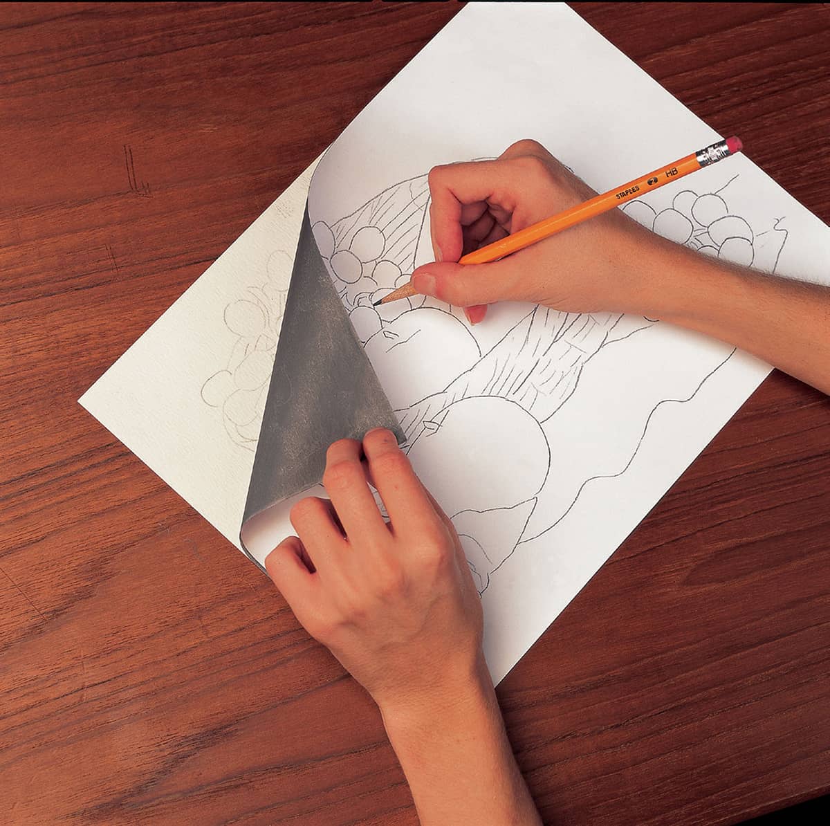
TRANSFER PAPER On a sheet of thin drawing or tracing paper, sketch out your composition until you are satisfied. Take a piece of transfer paper (sold in art stores) and tape it over the white paper surface you have chosen for your final drawing. There is a coating of graphite on the bottom of the transfer paper. Tape your drawing or tracing paper over the transfer paper. Using a ballpoint pen or stylus, impress the outlines of your drawing with medium pressure. Raise both papers, and you will see the graphite image on your final white paper. Erase the transferred graphite lines if needed as you develop the drawing. Of course, you can always freehand your composition directly onto the final paper. Sketch lightly and erase well.

GRID METHOD This method enables you to sketch out your drawing in small segments using one-inch squares. Photocopy your photo reference and draw a grid of one-inch squares over the photocopy with a pen and ruler. Then very lightly draw the same grid of one-inch squares with a graphite pencil onto your final drawing paper. Starting from left to right, draw what you see in each square. Connect your composition from box to box until it is done. Erase your grid lines.
PROJECTOR METHOD Secure your projector to a countertop and tape your photo inside its top. The photo reflects off a lighted mirror, through a lens, and onto your final paper. Trace the basic outlines of the photo onto your drawing paper. Once the sketch is on paper, you can then focus on creating a perfectly proportioned piece as you refine lines, add detail, and build up tone.