
Chapter 2: Creating Robust Data Pipelines and Data Transformation
In this chapter, we will cover how to load and enrich data using the power of Apache Spark in Azure Synapse Analytics. We will learn about and understand various concepts and recipes for writing Spark data frames to read data from Azure Data Lake Storage (ADLS) and writing to a SQL pool using PySpark.
This chapter comprises the following recipes:
- Reading and writing data from ADLS Gen2 using PySpark
- Visualizing data in a Synapse notebook
Reading and writing data from ADLS Gen2 using PySpark
Azure Synapse can take advantage of reading and writing data from the files that are placed in the ADLS2 using Apache Spark. You can read different file formats from Azure Storage with Synapse Spark using Python.
Apache Spark provides a framework that can perform in-memory parallel processing. On top of that, Spark pools help developers to debug and work more effectively as regards their production workloads.
Getting ready
We will be using the same public dataset that we used in Chapter 1, Choosing the Optimal Method for Loading Data to Synapse. To retrieve the dataset, you can go to the following URL: https://www.kaggle.com/microize/newyork-yellow-taxi-trip-data-2020-2019.
The prerequisites for this recipe are as follows:
- The public dataset must be uploaded to ADLS2.
- You must have an Apache Spark pool created within Synapse Studio. You can refer to the following document for more information on how to create a Spark pool in Synapse: https://docs.microsoft.com/en-us/azure/synapse-analytics/quickstart-create-apache-spark-pool-portal.
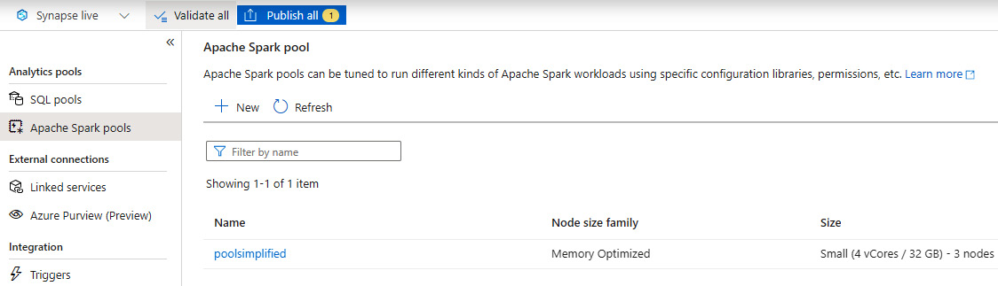
Figure 2.1 – Apache Spark pool
How to do it…
Let's begin this recipe and see how you can read the data from ADLS2 using the Spark notebook within Synapse Studio. We will leverage the notebook capability of Azure Synapse to get connected to ADLS2 and read the data from it using PySpark:
- Let's create a new notebook under the Develop tab with the name PySparkNotebook, as shown in Figure 2.2, and select PySpark (Python) for Language:

Figure 2.2 – Creating a new notebook
- You can now start writing your own Python code to get started. The following code is how you can read a CSV file from ADLS using Python:
from pyspark.sql import SparkSession
from pyspark.sql.types import *
adls_path ='abfss://%s@%s.dfs.core.windows.net/%s' % ("taxistagingdata", "synapseadlsac","")
mydataframe = spark.read.option('header','true')
.option('delimiter', ',')
.csv(adls_path + '/yellow_tripdata_2020-06.csv')
mydataframe.show()
Please refer to Figure 2.3 for a better understanding of the execution and the results:

Figure 2.3 – Reading data from a CSV file
- You can use different transformations or datatype conversions, aggregations, and so on, within the data frame, and explore the data within the notebook. In the following query, you can check how you are converting passenger_count to an Integer datatype and using sum along with a groupBy clause:
mydataframe1 = mydataframe.withColumn("passenger_count" ,mydataframe["passenger_count"].cast(IntegerType()))
mydataframe1.groupBy("VendorID","payment_type").sum("passenger_count").show()
You can refer to Figure 2.4 to see how it looks:

Figure 2.4 – Column datatype conversation
- Another aspect is the fact that you can write the external table data to the Spark pool from your data frame with the simple command shown here:
%%pyspark
df = spark.read.load('abfss://[email protected]/yellow_tripdata_2019-01.csv', format='csv'
, header=True
)
df.write.mode("overwrite").saveAsTable("default.yellow_tripdata")
The following screenshot shows the result:

Figure 2.5 – Writing data to a Spark table
- Finally, you can query and read the data from the Spark table that you have created and play around with the data, as shown in Figure 2.6:
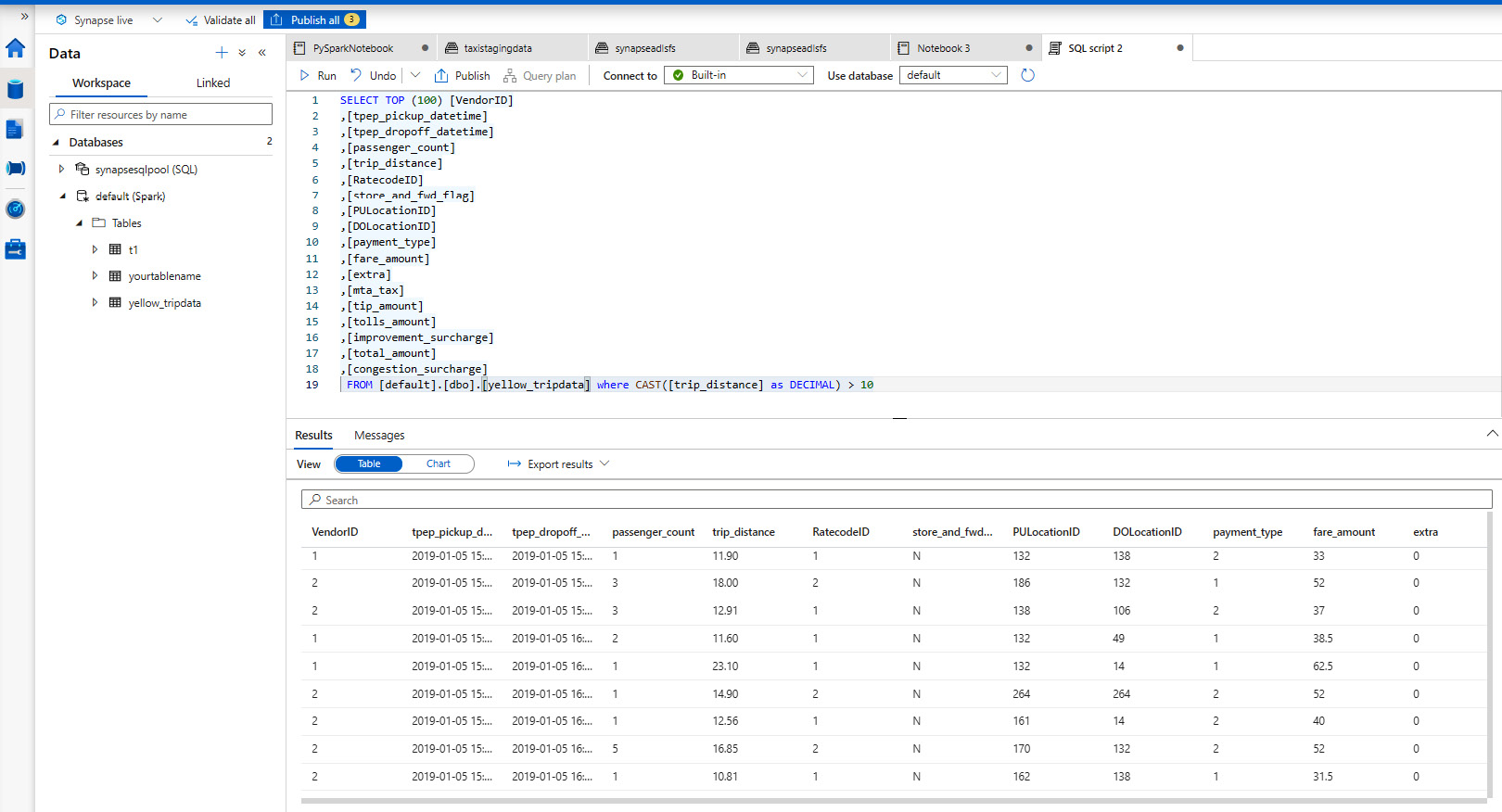
Figure 2.6 – Querying the Spark table
You can also create charts to analyze it on the fly, as shown in Figure 2.7:

Figure 2.7 – Charting data
How it works…
The Spark pool gives you the flexibility to define the compute as per your needs. You can define the node size as Small, Large, xLarge, xxLarge, or xxxLarge, with up to 80 vCores/505 GB. The autoscale features provide you with the ability to automatically scale up and down based on the level of load and activity.
You can monitor the compute allocation using the Spark pool monitor to understand the vCore allocation, active applications, and concluded applications by date and time. This allows the developer to plan resource allocation more optimally, as you can see in Figure 2.8:
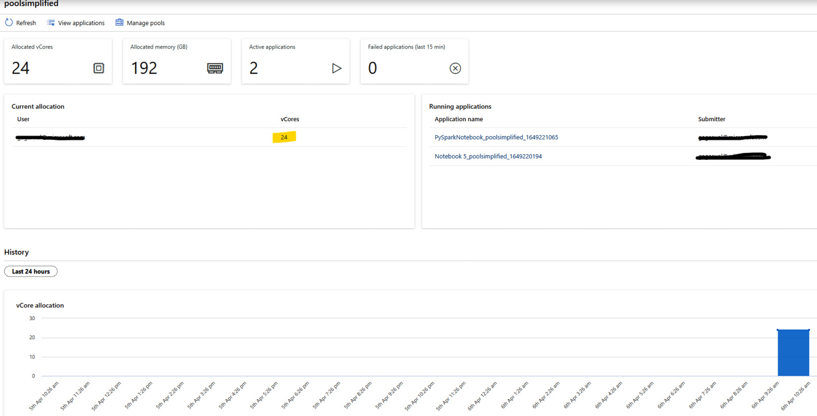
Figure 2.8 – Apache Spark pool monitor
Visualizing data in a Synapse notebook
Let's now look at an interesting aspect of data exploration that will involve plotting some interesting visuals within the Synapse notebook. We all know that it is always easier to understand pictures or graphs compared to a typical dataset in rows and columns, for example, when you are dealing with a very large dataset, which may contain a lot of key insights. To obtain data-driven insights, we try to work on data pointers that will lead us to those insights; to do that, we plot the data in the form of a visual.
This is exactly what we will be doing in this recipe, and you will learn how to do this within the notebook experience.
Getting ready
We will be leveraging the same data frame that we created in the Reading and writing data from ADLS Gen2 using PySpark recipe.
Basic knowledge of matplotlib is required, which will help you to create static and interactive Python visuals.
How to do it…
Let's get back to the same notebook, PySparkNotebook, that we published in the Reading and writing data from ADLS Gen2 using PySpark recipe:
- Import matplotlib.pyplot:
import matplotlib.pyplot as plt
This is the visualization plotting library in Python, as shown in Figure 2.6:

Figure 2.9 – matplotlib import
- Define and load the entire data frame to pandas using the toPandas() function, and define the chart type that we want to plot. In our case, it will be a histogram, which will give us the distribution for the total passenger count:
mydataframeplot = mydataframe1.toPandas()
ax = mydataframeplot['passenger_count'].plot(kind='hist', bins= 20, facecolor='orange')
ax.set_title('Total Passenger distribution')
ax.set_xlabel('No. of Passengers')
ax.set_ylabel('Counts')
chartplt.suptitle('Trend')
chartplt.show()
Figure 2.10 shows the output:
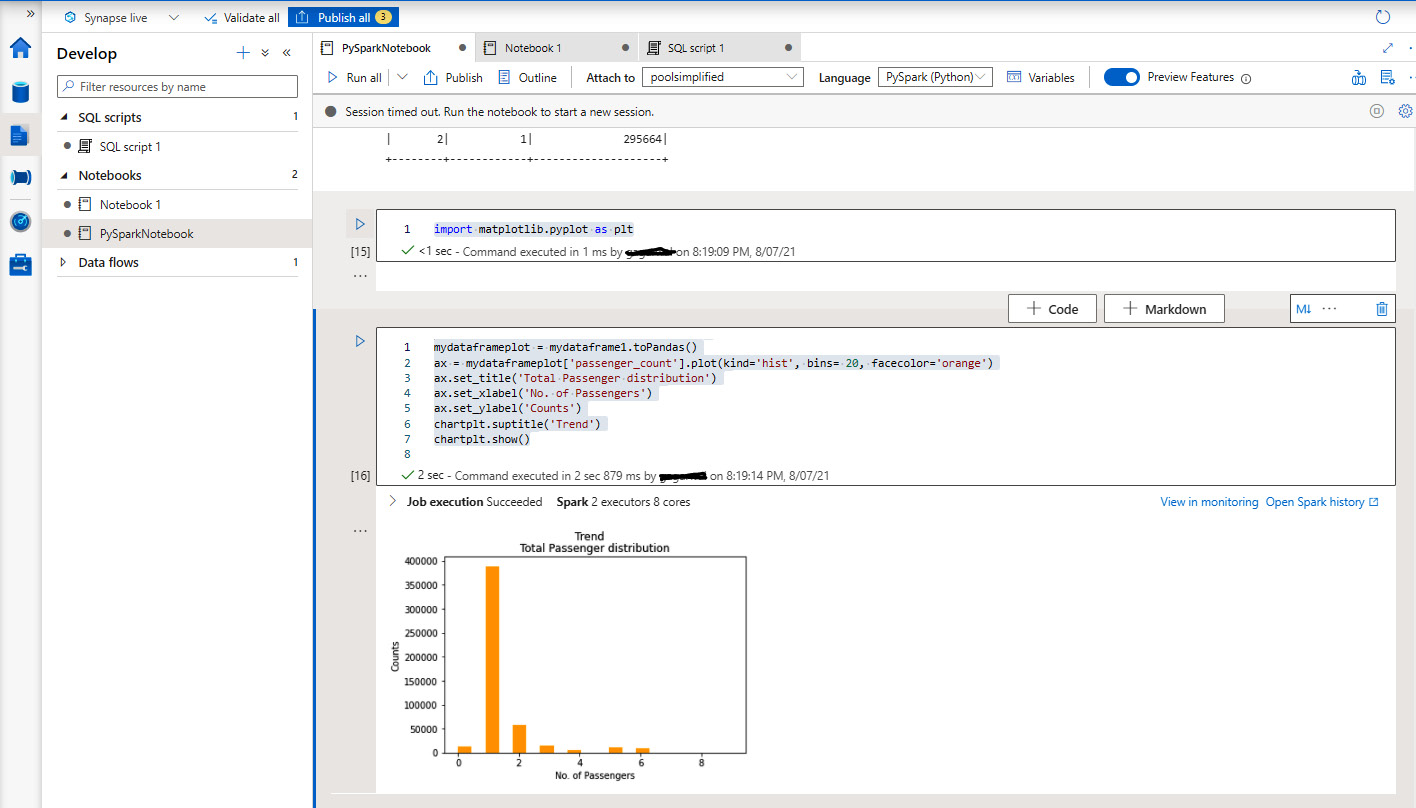
Figure 2.10 – Plotting a histogram
How it works…
This leverages the power of the Spark pool that you have created to perform data exploration. It makes the process of extracting useful insights from the data extremely fast. The notebook experience within Synapse makes it a one-stop-shop for the developer and the data analyst to collaborate and perform their respective activities.