
THIS CHAPTER COULD very well be titled “The Importance of the First Store, Part II.” If finding a Grade A location is the initial step in claiming a powerful brand position with the first store, then the proper design of the store completes that process through the physical manifestation of the brand. Finding a designer with the experience and artistic skills to translate a concept into a physical reality can be just as difficult as finding the perfect location, and the process requires the same level of determination and focus. This chapter takes you through the many design considerations, explains the trade-offs between a one-off store design and a design intended for multiple rollouts, and introduces the concept of “Kit of Parts,” an approach to produce high-quality equipment and fixtures in high volume and at low prices. To show how design issues play out in actual retail projects, this chapter first examines a design project for a start-up retail venture, and then examines a major redesign project for an existing major retail chain. Together, these examples paint a comprehensive picture of design issues and concerns during the entire life of a retail brand.
After Steve and James of Blue C Sushi found their first location, they set out to engage a design firm that could take their conceptual ideas and create the physical solution to their vision, an environmental design that communicates the concept and establishes the brand's position. I arranged for them to interview three companies that I thought would be able to translate their vision into reality. After a couple of meetings with each firm, they selected Foundation Design in Seattle. David Edelstein, who runs Foundation Design, was instrumental in developing the Tommy Bahama brand. Having traveled to Japan, the design principals knew modern Japanese architecture, technology, pop culture, and music—everything that makes modern Japan fresh and exciting. When James said that he wanted to open a Japanese kaiten sushi restaurant with a “twist,” they understood his desire to upgrade the cafeteria feel that is typical of kaiten houses in Japan as well as in the United States. When the passionate entrepreneurs talked about a blend of Japanese and Western culture, the designers recognized the Asian-Northwest visual sensibility they were seeking. It was a good fit because their point of view and personalities meshed with those of the Blue C Sushi founders.
We were close to executing the lease for the first store and needed to finish the concept design, so we met weekly and Foundation Design went through a number of design renditions fairly quickly. In one meeting, James and Steve seemed pleased with the latest work being presented. The conceptual thinking was excellent in many ways, but I grew more and more restive during the presentation. Finally, James picked up on my unease and asked me for a pointed critique of the proposed direction. From our earliest meetings, the two men had discussed their desire to open multiple stores if the concept was successful. “The work has some cool elements,” I said, “but I'm not seeing unique materials and cutting-edge combinations of materials that could give us a point of differentiation. I want to see design elements that we can own and can use to roll out a lot of stores.” My concern involved a number of things, from material choices to the booth design, to the major graphical elements intended for the walls. The proposed graphic was line art, navy blue and white, showing a series of hands holding chopsticks in different positions, a reproduction of the graphical instructions on the use of chopsticks that are often found on chopstick packaging. The idea was that customers would recognize these elements as instructions and feel welcomed (especially novices to sushi), or that customers would consider the graphic as pop art. I felt that the visual work needed to be richer and more interesting.
Overall, the designers had conceived a beautiful individual restaurant design. However, we were looking for a design that would be appli cable to a multiple-store rollout. The first practical consideration for any retailer is whether the design will be for a one-off store or for a rollout of multiple stores. If it is for a single store, the design can maximize the fittings and furnishings for the size and shape of the specific location, but no economies of scale will occur in design or construction. In effect, the retailer will pay a premium for all aspects of the project. For a multiple-store rollout, the imperative is to make the design visually appealing while keeping it modular enough to spread the expense across multiple stores. The cornerstone to a multiple rollout is the idea of the “Kit of Parts,” a comprehensive approach to store design and execution. The idea is to integrate all the elements of store design, from cabinets to fixtures to colors to visual imagery, so that they work in harmony to create an impression unique to the concept. Further, all of these parts are engineered to enable a relatively inexpensive rollout to many stores. Because individual components work in so many different combinations, they create an effective total presentation regardless of the size or shape of the space—whether the space is, say, 1,500 square feet or 3,000 square feet. In the Kit of Parts approach, the goal is to make each fixture small enough to fit any store but large enough to be manageable. A cabinet that is 12 feet wide will probably fit in only one out of five stores, whereas one that is 30 inches wide will probably fit in every store.
Each category of retail has different fixture concerns. Apparel sales require larger tables, wall racks, and freestanding racks. Hand goods require smaller tables and wall displays. Restaurants require a variety of cabinets, tables, and chairs. Jewelry stores require large banks of display cases plus sitting areas where sales staff can work with customers. At Banana Republic and other chains, you will notice a standard-size table for clothing. Tables can be broken down to make them smaller or clipped together to create larger displays. Such modular features are called “rollable” elements that can be built or bought in advance, in quantity. This approach enables a company to obtain discounts through the volume of work brought to suppliers and contractors. When the operation is large enough—opening 30 to 50 stores a year—the retailer should generate enough volume to obtain just-in-time delivery of components from critical suppliers.
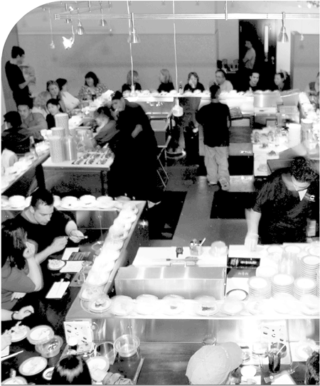
Regarding the restaurant, my concern with the work of Foundation Design was that I did not see a design theme that Blue C could own and carry to the second, third, or fortieth store or a way to achieve economies of scale with future stores. Fortunately, the designers understood the feedback. Two weeks later they returned with a design concept that was intrinsically different. It had the same aesthetic sensibility as the earlier work but included a material and color palette that could be repeated in a number of ways in different environments. The use of materials was unique enough that we could “own” the elements as part of Blue C Sushi's presentation. Further, in the final design, the physical arrangement provided good flow for both customers and store personnel, and put the main branding element of the restaurant—the sushi chef—front and center. The conveyor belt, which is the centerpiece of the store, was laid out to place the senior sushi chef, who prepares much of the sushi to be served, where he would be visible to everyone in the space. The chef was within eye contact of the front door and was in position to greet entering customers. It would be instantly clear to customers that this is a serious sushi restaurant. Two or three other chefs would also be out front. Surrounding the chefs would be the conveyor belt carrying the sushi. Most of the customers would face the belt, from which they could pull their selections. The food preparation and the people facing inward toward each other would provide the unique theatrical dining/entertainment experience. The down-lights would highlight the sushi on the conveyor and present it like jewels in a display case. The tables would be dark-stained, solid wood providing a nice color contrast to the lighter-colored plates. There would be shoulder-height tile on the walls (an earth color—I vetoed white as being too institutional). Higher tile is special because tile is normally used as wainscoting, set to a lower height of 30 inches above the floor. Higher placement of wall tiles (in this case taken up to four feet, six inches above the floor) creates a powerful visual impact. There would be a large panorama on the back wall depicting the Fremont neighborhood, created by a Japanese and American couple from Los Angeles who specialized in storytelling art. This mural concept could be commissioned to show the neighborhood around every future store, anchoring the restaurant and brand to the community. Large glass windows would open the restaurant to the street, creating an opportunity to excite pedestrians who would be walking by. In general, incorporating as much storefront glass as possible turns a store or restaurant into a stage set and enables the pedestrians passing by to be part of the audience. Large windows also act as a beacon, especially at night when the interior lights are on. This restaurant concept was to be inclusive and inviting. Allowing customers to see in supports the positioning of Blue C Sushi as a fast-casual dining experience. On the whole, the design was an original avant-garde environment. The feel was an exciting, unique, interactive, and informal dining experience. You would tell your most interesting friends about it and want to take them there to eat.
James and Steve were able to turn both of the space's physical limitations into an advantage. The first problem was that the space included a 700-square-foot mezzanine that the conveyor belt could not reach but for which they still paid rent. Until then the Blue C Sushi economic model did not call for a separate bar for alcohol. Bottled beer and wine were to be served from the kitchen refrigerator. They designed an upper bar area that would generate more revenue and provide a place for people to wait until booths were available downstairs. To best utilize the mezzanine, we designed an open mesh-steel railing for the upper space that made it feel more open and more visually accessible and inviting. The view down from the mezzanine to the eclectic crowd below provided another theatrical element. The second problem was that the 1,600-square-foot main floor did not provide enough space for a kitchen and storage room. We had to build the kitchen in the basement along with offices and restrooms. Overall, we were successful. The final design solution, as the customer sees it, reinforces the brand.
Creating a compelling design and rolling it out inexpensively can be as trying for an existing chain as for an inexperienced start-up. Certainly the process is more complex, although usually the existing retailer has more resources to apply as well. Starbucks faced the problem of an “aging” design in the early 1990s even though the company was relatively new. A little-known secret of Starbucks' success is that the company has had store designers in-house since 1991. The “Main & Main” strategy—locating stores on highly visible corners—required us to develop custom designs to fit spaces of unusual sizes and shapes. When I joined the company in 1992, it was apparent to me that we had to develop our in-house design capability to keep up with projected growth. Starting with a handful of designers, we had more than 150 a decade later. At its business core, however, Starbucks is a concept driven by real estate, so my initial effort as senior vice president was to properly organize and focus our real estate group toward the goal of national expansion. At this time, Starbucks was shifting from opening dozens of new stores a year to hundreds. The company's store designs needed to be reinvented to keep up with our innovative brand positioning, but without good real estate all the leading-edge design in the world does not mean anything. Our original store design concept would take us to 1,000 stores, I told the other senior managers, so give me the time to put the real estate strategy in place and establish our regional real estate offices to enable us to execute rapid and orderly expansion.
At the same time, I knew that our competitors were hot on our heels and our store designs would not be good enough for the next 1,000 stores. Although each Starbucks store was custom designed, we were beginning to hear complaints that our stores had an institutional feel, that they were perhaps even a bit sterile and cookie cutter. For a company that prided itself in creating a personal connection with customers, the criticism stung. In addition, our cost per store was rising as we attempted to be more creative, going as high as $350,000 a store. The design challenge was daunting: create a distinctive, personal look; make that look compatible with each locale; reduce costs; and be able to roll out the design all over the country—and soon, the world. To capture the essence of the “Third Place”—a place where people gather between work and home but without the pressures of either—we had to come up with cutting-edge designs that differentiated Starbucks' brand.
I researched many of the top retail architectural firms in the country. I actually hired one but ended the relationship after several months. Many architects with proven experience in residential, commercial, and institutional projects often claim that they can design and build dynamic store or restaurant environments. But they are not in touch with the retailer's mindset or the retail experience. We are back to that problem again of some designers thinking in two dimensions rather than three, of people seeing only in terms of floor plans rather than the overall customer experience, of not understanding how to create a design that reinforces a brand. In addition, many designers or architects develop a certain “house style.” Their designs become predictable. It is likely that your project will look similar to their previous work. This rote approach will not get you a fresh idea. Such architects may design useful space, yet fail to capture the soul of a brand, to create an atmosphere that will connect with the hearts and minds of the customers. They are likely to give you designs that are the retail trend de jour, theirs or others, as opposed to designs that are functional and timeless. Did you ever wonder why most clothing retail stores look and feel alike? The Gap feels like J. Crew, which feels like Abercrombie & Fitch, which feels like … The problem is not with the look of any one of the chains' stores; it is that the chains all look the same. Most architects keep up with retail trends but are not able to take the time to be innovative. Retail is moving so quickly that designers need to be current. In the mid-1990s, for example, bagels became the hot concept. It was expected for this category to mature in three to five years. Instead, it matured in about two years. At Starbucks, we were faced with an onslaught of competitors, both independent coffee shops and regional chains. The coffee may not have been as good, but the environments were comfortable. We had to move fast with designers who “got” what we were about.
To meet our challenges, I decided to take a risk and develop the new store prototypes in-house. We would find the best group of people possible and bring them in house, inculcate them in our coffee culture, our values, and our design philosophy, and then turn them loose to come up with our store of the future. We brought together architects, interior designers, graphic designers, lighting designers, poets, artists, writers, and engineers. Among those willing to sign on was a group of freelance designers, artists, and architects that included a designer named Bill Sleeth. This brash group showed us their portfolios with the attitude of, “Here's what we've done, hire us.” We did. That first interview with Bill established a relationship that continues to this day, as becomes clear in Chapter 5, “Seamlessly Connecting Design to Brand While Staying on Budget.”
Hidden in a loft space in the Starbucks building in Seattle, the new team functioned as a classic “skunk works,” set off on their own with little internal oversight to explore new designs. They reported to Wright Massey, the vice president of design, who reported to me. Wright was an artist as well as an architect. He had retail background as well as resort hotel experience from working for Disney. He knew that good retail design enhanced the retail customer experience. He knew how to use graphical imagery to create a visual language to tell the story of the brand.
Access to the group was limited—only a handful of people even knew the team existed. We invited our in-house design talent to participate as well. CEO Howard Schultz came by to explain his vision for what Starbucks should be. The goal was not to just come up with a new color scheme or style of furniture and fixtures but to dig deep into coffee culture and mythology to capture the essence of the spirit behind our business. The team explored the history of the company, of coffee use and cultivation, of the mythology of the sea (Starbucks was the first mate in Moby Dick), of the siren who lured unsuspecting sailors into the rocks. The team kicked around the notion of what the Third Place meant to them. A number of different visual approaches emerged.
Wright worried as to whether he was going to get shot over the transformation he was undertaking. In a lot of companies, unpleasantness flows downhill, but a good manager knows that often his duty is to shield his teams from pressure from above. The design team already felt the weight of responsibility for the company's future. My job was to make sure that they kept their heads in the game. Before a major presentation, I would visit informally with Wright and his team to understand their latest direction and to make sure that they were rolling up all of their individual ideas into a larger business message. One time a couple of the designers were talking to me excitedly about how they could use the maritime theme to create unique visuals. With others listening I asked innocently, “So you're creating an iconography thatStarbucks can own?” “Yes!” they replied. These were smart people. They understood the hint to provide the business justification for the new visuals, which was to help Starbucks maintain an exclusive identity. At the presentation the next day, they couched everything in the context of the brand.
From small victories comes large momentum. Many people do not realize that successful architecture includes the need to sell your client on your point of view. We needed in short order to gain Howard's confidence as well as that of Orin Smith, then chief financial officer and later president and CEO. With their belief in our ability to succeed, we would be granted more funds with which to continue our journey. I made a point of rolling out some of the new visual concepts first in the creation of new kiosks. We presented more than 20 new kiosk-style formats to management for their review and to show them that we were going in the right direction. Out of this first stage came the breve bar and the doppio (named for a double shot of espresso). The breve bar is designed for a store-in-store display in the lobby of an office building or in the front of a supermarket; the doppio can fit into an even smaller space such as you might find on a college campus or county fair and can be put up or taken down in a few hours. Although prefabricated, both kiosks incorporated the same high-quality materials and finish as used in regular stores. As soon as Howard and the other senior managers developed confidence in the look and feel of the kiosks as proof of our design direction, they authorized us to continue working on the overall new store designs. We had earned another month of work!
Design is a process. Many times when starting out, you establish design parameters and objectives having no idea where you will end up. Out of this process, the designers developed a set of brand “touchstones” built on the alchemy of coffee and the traditional concepts of earth, fire, water, and air. A touchstone is a word, phrase, or image that attempts to capture the essence of the design approach. All future work should refer back to a touchstone in an obvious or sometimes subtle way. Each of the elements related to stages of the coffee bean development, and each of the elements directed us toward a distinctive color palette. Earth, which corresponds to grow, has shades of green. Fire, which corresponds to roast, has deep reds and browns. Water, which corresponds to brew, has blue for water and brown for coffee. Aroma, which corresponds to air, has light shades of yellow, green, and white.
These new touchstones gave us an organic rather than a commercial look. No Gap-lookalike possibilities here. No use of trendy plastic materials. Hard edges and metallic sheens were eliminated as well. In their place were soft edges, natural materials, and soothing colors. Packaging and iconography were similarly modified to reflect the new motifs. Stores would have wallpaper or hand-painted murals. Round tables would be used exclusively in the seating areas in place of tables with right-angle corners. A single person at a square table looks (and possibly feels) lonely. A round table is less formal, has no “empty” seats, and the lack of right-angle edges makes the person seated at the table feel less isolated. The new designs celebrated the art of custom crafting espresso beverages by using a hand-blown light fixture to spotlight the drinks set on a raised curved wooden handoff platform where the barista presents the beverage to the customer.
From these basic ideas, we created a design playbook containing the four distinct templates, four color palettes, and four distinct formats and describing how they could be mixed and matched for different effects. The design playbook had a rubber cover, a tradition that Wright brought with him from Disney, and became known as the “rubber book.” This playbook allowed us to create as many as 12 different store designs, easily varying them from urban to suburban, from high-end neighborhood to funky college area, without having to develop a new creative approach each time from scratch. In Vancouver, B.C., for example, we ended up with two stores diagonally across from each other. One store was in a traditional brick building, the other in a newly erected modern building. Using the new designs, we created two distinctly different visual atmospheres: one that appealed to the general population that frequented the brick building and one that appealed to the hip crowd that frequented the new building to see and be seen.
With the signoff by Howard and others on the new designs, we did not have time to celebrate. Work became the celebration. New designs in hand, we value-engineered each component to lower its costs for mass production, making the overall store construction costs more predictable. Instead of having construction managers trying to save nickels and dimes on a store-by-store basis, we designed and engineered the components in our stores to generate huge savings across the entire chain. This effort came to be known as the “Kit of Parts” approach, the modular component design for flexibility in store layouts. Like quick-serve restaurants, we standardized as many store components as possible—but we did so without reducing the quality of the components themselves. We focused on the equipment, fixtures, and cabinetry that every store would need, such as countertops and drawers for coffee beans storage and display racks for pastries. Using computer-aided design software, we were able to lay out the main components of any new store in modular form, using filler panels for any leftover space. Having several different seating possibilities from small tables to long library tables, we were able to develop flexible seating arrangements to match almost any size and shape. Experience taught us that 80 percent or more of every store could be fitted with standard components. Our designers, then, could focus on customizing the remaining 20 percent or so to make it as unique and interesting as possible.
Initially, we were able to prestock standard items at volume discounts of 20 to 30 percent. Later we were able to go to just-in-time delivery for certain components, eliminating the storage costs for many of the modular parts.
All this time, Starbucks had been chugging ahead opening stores. We were now at about 1,250 stores and expanding rapidly. My biggest nightmare was that as we tried to work down our old inventory and begin to work in the new design inventory, the wheels would come off the train. If you are in the middle of opening 85 to 150 stores and all of a sudden the new cabinetry does not show up, store opening dates get pushed back and things will fall apart very fast. If we did not execute properly, either the new stores would fail to open on time or we would be left with hundreds of thousands of dollars of old inventory. But stopping the store-opening engine to make all the changes would also send the company's financials off the track. Three out of four possibilities would jeopardize all of our work, not to mention my job.
This was the one point where I did put pressure on my team. I called special meetings that focused strictly on the execution of our store rollout schedule. Wright was there, along with the director of design, the director of construction—everyone who was on the critical path to delivery. We developed comprehensive timetables and flowcharts on the design, manufacturing, and timing of delivery for hundreds of these items. Remember, we were not creating just a single new design but as many as 12, depending on colors and cabinetry. We identified and tracked every detail, from the dates when the manufacturers needed each shop drawing to whether the manufacturers were in fact producing the necessary units of each component needed to make our commitments. With every decision, I look at the downside. “If this goes wrong,” I would ask, “what is the backup?” We identified all the aspects of the designs that could be dovetailed with the new designs if something failed to arrive. We made sure that if we were low on parts in the California warehouse, then we had enough in the New Jersey warehouse to make up the difference, and vice versa. In some cases, there was no way to cover a shortfall. The old floor tile, for instance, did not match the new colors. The complete store tile shipment had to arrive, and on time. These areas received even more diligence.
On reflection, I did not institute any new marvelous management techniques. I did, however, force an extra layer of attention to detail by all the managers for every single item under their control. For every delivery we asked “what if?” What if the manufacturer let us down and failed to produce or deliver the item on time? We were not satisfied until every what-if had a response. We reviewed every article on the flowchart and every delivery milestone. We tracked every item through the system from design to shop drawings to manufacturing, and from shipping to the warehouses to shipping from the warehouses to the stores. The results were gratifying. Customers were giving us positive feedback on the first few new stores completed. Hundreds of people inside and outside the company worked hard to successfully shift to all the new materials and components, but to most people at Starbucks the transition was largely seamless.
This new design and construction approach also required longer-term changes in our organization and in the working relationships of people at headquarters and in the field. Among other things, we organized our design teams into regions so that they would develop an in-depth understanding of the design issues particular to their part of the country. We hired construction managers for each of the major markets to coordinate bids from contractors in the building of multiple stores simultaneously. The payoff for all the changes was a decrease in store construction time from nine to six weeks and a substantial savings in the cost of each store. Before the change, our store costs were inching upward because each and every designer was custom designing each store on a one-off basis. Hundreds of stores were being produced on a one-by-one basis. With the Kit of Parts approach, the key store elements were already designed and the costs estimated before the actual store was designed. The only changes that a designer could make under this system were color palette, wall graphics, and seating layout. Yet to our customers, each store looked and felt different, a result that successfully supported Starbucks' high-quality brand positioning. These benefits were in addition to the cutting-edge new designs that competitors could not successfully copy, because we copyrighted and trademarked our graphics and light fixtures.
We discovered the power of our new designs when we opened the first Starbucks in the fashionable Ginza District in Tokyo. This was our first location outside North America, and our primary objective (besides, of course, selling coffee) was to see whether the Starbucks brand would be meaningful overseas and whether our store design would be understood and accepted by other cultures. Despite heat and humidity that made the neighborhood feel more like Atlanta than Tokyo, the store opened to a full crowd and remained busy all day. Other international stores began to open, each with great success. The store color palettes, the icons, the murals, and high-quality materials—all the treatments came from the same design language we had developed for the North American market. Knowing that every store would have large waves of customers, we planned the stores to have additional cash registers or “points of sale.” Early market research also told us to offer baked goods more familiar to the market. We continued to vary each design to match the location any and everywhere in the world, but the final payoff for our revolution in design was that we did not have to create entirely new concepts to succeed outside of our native land.
Working with a design group to create a unique look for your concept is about more than having a leading-edge storefront or interior space. A unique visual “language” for your concept enables you to establish and differentiate your brand's identity and replicate its most important physical elements while adapting the look to the attributes of each demo graphic neighborhood and building. A sound strategy for a rollout design leads to a solution that is standard enough to work in any space but flexible enough to take advantage of the unique features of every location. Using a design playbook and adopting the Kit of Parts methodology enables you to quickly and efficiently roll out the concept in all its glory at minimal cost and with minimal changes. Such techniques enabled Starbucks to place stores in historic banks and railway stations in ways that respected the history of the building, the block, and the community while reflecting the soul of Starbucks—and to build out hundreds of stores a year worldwide without losing control of quality or expenses. All of these factors are important to retail success, but the most crucial reason to invest in a compelling design is that a unique design language is one that you and only you own. It serves to differentiate your brand. It establishes your company as a trendsetter and innovator. Someone once said, “Art is the process of speaking to the heart and soul,” and retail design is about connecting with the heart and soul of the consumer.
Lastly, a general “look” can sometimes be duplicated, but a well-executed design that is central to your concept and your values is unique. It cannot be easily translated by competitors into their own designs. When we made incremental changes to our designs, competitors would knock off our ideas—the materials, lighting, etc. Our major redesign, however, thwarted them. One company tried to copy the icons that we had developed, but they made no sense visually within their own store designs. The copied icons were out of place. The artwork simply did not look good. Competitors were unable to translate our images into a meaningful brand statement for themselves. The proper combination of look and feel—one integral to your brand—cannot be duplicated and remains a strategic advantage. Store design turns out to be more than a way to create visual appeal for customers. Done properly, design can create a visual look that is recognizable and accepted worldwide. Store design becomes a primary way to ensure that your brand remains unique, readily identifiable, and unassailable against competitive threats and copycat looks: one of the most powerful brand positions a retailer can have.