
A DISCUSSION OF MERCHANDISING usually begins with some of the basic principles: Have clear sight lines; that is, arrange the furnishings so that customers can see all of the main displays, all the way through the store. Make it easy for customers to move from one shopping area (“grazing area” in retail parlance) to another. Provide a visual attraction, focal point, or a necessity at the back of the store to draw customers farther in past more products. Provide a smooth, obvious route through the space and an efficient checkout process so the customer leaves with a positive impression. All of these rules are important, but they are presumptuous. They presuppose that the customer is already inside the store and prepped to buy.
The first step in the art of merchandising is to get the customer to notice you and take the first step … into the store! As Chapter 5, “Seamlessly Connecting Design to Brand While Staying on Budget,” showed, the retailer has to create a sense of place, a place where the customer wants to be. A sense of place begins with locationing, the aesthetics of the building and environs, and continues with the company logo and the supporting iconography—the visual images that the customer connects with your brand—displayed in a manner that is tastefully aligned with the brand positioning. If the iconography is sufficiently strong and the brand has developed familiar visual touchstones, the store name itself does not have to be screamed out. Abercrombie & Fitch uses giant, high-quality wood-framed posters of attractive models wearing A&F clothes as a signature element to depict the store's business. The posters, prominently placed at the store's entry, leave little doubt as to what A&F sells. Similarly, Starbucks developed such a strong visual language that the green Starbucks disk, a large, clean glass storefront, and custom glass globe lighting fixtures in the window were all we needed to communicate “great coffee here.” In a few cities where we had already achieved brand awareness with densely packed stores and where consumer acceptance for our products was high, we toyed with the idea of dispensing entirely with the large signage identifying the company on the storefront.
The suggestion is not that you treat your store like those hard-to-find nightspots in major cities that deliberately omit signs as a mark of being hip. Rather, the merchandising must be tied to your sense of place and to the customer experience, and the sense of place begins with a unified, consistently executed visual representation of your brand. The logo and iconography identify the brand; the overall visual presentation saturates the customer with the brand's characteristics and sensibility. The storefront must attract the customer's attention and romance the customer into the establishment—hence the treatment of the storefront as stage set and the people inside as actors in the drama. For most concepts, this means maximum fenestration—all the glass possible out front. Large window spaces create more opportunities for creative displays and brand presentation. Large windows enable people to see into your store, piquing their curiosity and interest to what is going on in there. Guess what—people draw more people!
About the only business that prospers with a closed-up storefront is a bar. The purpose of the “dark front” is to protect the privacy of everyone inside enjoying a drink. The retail outlets of a company called Illuminations have closed storefronts, evidently to create some sort of allure that will draw customers in. But most people do not even know that Illuminations is a candle company. Its storefront should illuminate. The windows should have warm displays that engage people with the most interesting candles, using the inherent visual appeal of the product to invite the customers inside to investigate the wares. Illuminations filed for bankruptcy in early 2004 with the characteristic explanation of overly rapid expansion. I am convinced that its repressed storefronts did not help in attracting customers.
One of the biggest names in fashion retailing, Tiffany's, also has a closed storefront. The company relies on its reputation and on tiny window vignettes to highlight the exclusivity of its unique jewelry products. The small displays, however, mean that the marketing potential of its varied and gorgeous product line goes largely unrealized. The reason for small windows is theft, the same reason that a number of consumer electronics companies have storefronts that are totally “blank.” Retailers are afraid of “smash-and-grab” thieves who bust a window and make off with whatever merchandise they can carry. But by minimizing their exposure to the street, they are minimizing their exposure to customers! Other ways exist to prevent theft. Roll-down steel gates are the most obvious, because most smash-and-grabs occur after hours. This is why department stores invented full-size window displays. The lifelike scenes depict the store's products in visually appealing lifestyle settings without exposing the store's most valuable merchandise to robbery. Barneys of New York, to name just one store, is famous for its unconventional window treatments. Window decoration is so integrated with the brand that customers come to the store just to see the changeovers, especially at holidays. However you manage it, you need to let people see the play that is unfolding inside your store.
From the moment the brand registers or connects with the customer, the store itself must strive to engage all five human senses. Drawing the customer into the store and engaging the customer's senses might be termed meta-merchandising: the things a retailer must do above and beyond the placement of product in the store. Meta-merchandising consists of all the elements that engage a customer's senses and establishes an atmosphere that encourages sales. It is the most overlooked aspect of retail sales. Touch, taste, smell, vision, and hearing all create powerful visceral reactions. Smell is the most powerful sense because it triggers memory and emotion, and smart retailers take advantage. Bakeries put their vents to the sidewalk to engage the sense of smell and market their products. A huge store, Costco, recognized the power of smell and put in bakeries to take advantage of the human connection between baking and comfort. Sam Goody's, the music store, experiments with burning incense. If the scent of leather goods does not permeate the air of a clothing store, you can be sure that a good clothier will have potpourri to engage the sense of smell. Illuminations greet customers with a whiff of aromatic candles. Artistic glazing on the door windows appeal to sight; the style and the door handle design can appeal to touch. Entering, the customer should be drawn to a visual focal point. In Oakley stores, large-screen televisions display sports scenes showing the company gear in action. Clothing stores use music that appeals to target customers. The louder the music, the younger the customer. Make sure, by the way, that the music is geared to the customer, not the staff. The music selection of some stores is far too young for the target audience and can be explained only in terms of entertaining the employees during slack times. (Note to mom-and-pops: Having a TV turned on in a retail store detracts from the customer's experience.)
Another way to appeal to the senses is through the “theater of retail experience,” engaging the customer in some activity that enriches or enlivens the buying experience. Employees handing out food samples or perfume samples are good theater. So are aestheticians who do makeovers at cosmetics counters. In Johnny Rocket restaurants, a 1950s hamburger and milk shake concept, when a particular song comes on the juke box, the employees break into a line dance for the crowd. The employees at restaurants who sing and bang drums to celebrate birthdays are also theater, although too often you wish they were mimes. Theater can involve customers as well. Children's slides and similar entertainments at fast-food restaurants are theater as well as a way to give parents a few moments to enjoy a meal in peace. Karaoke is a concept entirely based on theater. Some athletic stores allow customers to jog up and down the street in front of the store to test the fit of new running shoes. Practical theater. An afternoon at a Disney theme park with its colorful array of characters and its variety of entertainments illustrates the degree to which the concept of theater can transform an ordinary experience into something magical.
Theater must not only be well designed, but also well acted. I was eating in a fast-casual Italian restaurant not too long ago. The layout places the chefs out front, in the line of sight of most of the customers, so the cooking of meals is intended to be part of the customer experience. The chefs, however, seemed to think that they were behind a wall. Neither man had shaved. Their white frocks were dirty from the evening's exertions. One wore a chef's hat, the other a hair net. They both had worn-out sneakers. One wore fuzzy gray pants, the other a pair of low-rider pants favored by some young men, complete with chains. (Customers watched in suspense to see whether the pants would stay up, probably not the theater intended.) Imagine the impression for customers if instead of dressing like short-order cooks in a cheap diner, the two men both wore crisp black pants, black shoes, and white frocks and chef hats (changed hourly to remain spotlessly white). Imagine the enjoyment by the diners if the chefs made a display of preparing the dishes, if they had snappy little routines and crisp gestures, if they bantered with the servers coming to retrieve the dishes. The customers had no choice but to watch the chefs, but the chefs failed to act as if they were on display. I do not know what offended me more: their slovenly dress or their failure to put on a show. Your store is a stage set, your employees are the actors, and the customers are the audience. They are always watching!
Whether you are aware of it or not, everything you do or do not do in a store works to establish a mood and atmosphere. Lighting can establish a mood faster than almost any other feature of a store; but many retailers use two-by-two-foot or two-by-four-foot, generic drop-in fluorescent ceiling fixtures throughout. This kind of lighting is cheap and monotonous. The mood it creates is uniform dullness. Intensifying lighting in certain areas gives the store's interior space a sculptured look and highlights your nicest products. In addition, different incandescent and fluorescent bulbs produce light in different parts of the color spectrum, affecting presentation in subtle ways. Bulbs that glow on the bluish-green side of the color scale make people look pale and unhealthy and are particularly unsuited to dressing rooms. Bulbs on the warm (red) side of the spectrum should be used to highlight food, especially meat. Dressing rooms require good overall lighting with few shadows; bulbs on the red side of the spectrum make customers look healthier as they try on clothes. (Actors know that pink light makes them look younger.) The healthier the customers' skin looks, the better they feel about the product. By all means, explore energy-efficient lighting, but be willing to spend a bit more to obtain a more natural lighting spectrum where it matters.
All of the other materials you choose should convey a distinctive feeling: expansive or intimate, luxury or value. The most important factor in design and merchandising is how well the materials and layout fit with the brand values to create an overall customer experience. For Apple, the choice of wood surfaces and bright track lighting conveys a high-quality, if precious, feel to its stores. The company also presents each product individually, as Oakley does with its sunglass displays. A product that “demands its own space” creates a sense of exclusiveness, like two or three fine pieces of jewelry in a window. Costco, on the other hand, would never put in expensive fixtures, which would conflict with its “lowest-cost” message, and most product is stacked in boxes, one atop the other. The large, plain, open shelves reinforce the notion of “stack 'em high, let 'em fly.”Not only does this approach make it easy for customers to get what they want—to “grab it and go”—but it also makes the product look like it is a great bargain. Target has perfected the balance between promotional pricing and higher-quality brand positioning without spending a fortune on store furnishings. Using slightly more expensive materials and more varied colors for paint and floor finishes, the company has a more tasteful and coordinated interior design than other price-value stores. In addition, Target changes the traffic flow and aisle layout and orientation to more clearly delineate its offerings; it feels more like a traditional department store than a Wal-Mart. As a result, the Target customer is perfectly happy to buy a $3 hand towel or an expensive teapot from a well-known designer.
Paper and related products can be sold as an “office supply” concept or as a luxury fashion item. Mass retailers have large, open stores with high steel shelves full of paper by the box and ream, a very businesslike atmosphere. At the Kate's Paperie stores in Manhattan, however, individual stationery items are uniquely presented on inviting fixtures and shelves of a variety of natural woods and wood stains, elevating the product from functional provisions to personal fashion. The owner, Leonard Flax, knows how to present paper as a fashion item. This is a very important concept. In a world of commodities, try to find a way to present your wares as “fashion.”
Whether you are selling tacos, tires, or Tiffany lamps, the design and layout must communicate the brand intrinsically. Restaurants typically invest a lot of money into their interior design to create a mood that complements the dining experience. My favorite restaurant in New York City is named Il Mulino. The intimate eatery could easily add ten more seats to its dining room. Instead, the owners use a lot of the space near the entry for a colorful display of fresh fruit and antipasto piled high. It is a vivid signal that you are going to dine on incredible, fresh, high-quality food there. The fast-casual and much less expensive Pei Wei restaurant chain has also done an awesome job of paying attention to mood-setting details throughout their stores. Rooted in a richly lacquered, glossy red motif, the restaurants tap into the design of traditional Chinese restaurants. The restaurants have one major icon in their space: an antique wood food carrier about three feet tall that is prominently displayed between the ordering line and the dining room. For me, Pei Wei's best and smartest features are the wood shutters installed inside the typical anodized aluminum and glass window storefront. The shutters create a more intimate and upscale atmosphere than a customer would expect in the strip shopping centers where the restaurants are usually located. Few customers notice the shutters as being the defining point of differentiation, but all customers notice the feel of a quality dining experience.
Losing the mood means losing much of what makes a concept special. The rise and fall of bagel stores speaks volumes on this point. Bagel stores originally were a specialized bakery, vibrant community eateries serving freshly baked breads. The best bagel stores understand this history and place the bagel counter at the front of the store, where the sight and smell of bagels stimulate the customer's appetite. But as the concept became popular about a decade ago, several rapidly expanding chains ended up homogenizing what had made the bagel concept special. To differentiate themselves, they added more food products. To centralize food preparation and the point-of-sale (POS) registers, they moved both to the rear. In an evident effort to try to draw customers into the store, they put the bagel counters in the back. They also showed a lack of imagination in general food service design. Adding coffee beverages and power bars homogenized their positioning. They lost their ownership position of the bagel category. The result is that they morphed into just another generic eatery. What they gained in efficiencies they lost in excitement and intimacy. They distanced customers from the one product whose sight and smell had drawn them in to begin with. They lost the feel of the neighborhood bakery and did not replace it with anything nearly as unique and interesting. They started to fail long before the low-carb wave.
Mood is a quality that is difficult to achieve, but it is as important in general retail as in food service. Everything about the experience must be aligned with your brand values. In my neighborhood in Seattle, a lingerie boutique does a fantastic job of creating a sense of intimacy in line with its products and services. The store is small and cozy, with several unobtrusive mirrors, placed in private dressing areas. Victoria's Secret uses similar design techniques even though the stores are much larger. They use merchandise and other elements to break the store into small, intimate spaces within the larger environment. You get a completely different feeling upon entering a Crate & Barrel store. The light woods and large open windows create a monolithic, clean, stylized atmosphere that showcases the furniture and house wares in a simple, elegant manner. Abercrombie & Fitch creates a lively environment for its target audience of preteens and teenagers, as well as the parents who take them there. The stores feature a great mix of clothes on racks and tables that invite shoppers to browse, touch, and pick up. Notice the difference between their hanger stock and the T-shirts piled up on floating tables. A message is being sent. Nicer, more expensive shirts and blouses are on hangers. The clothes require a little more care, and someone buying one of these will take a little more time. Inexpensive T-shirts are folded on the feature tables. The clothes are low care, and a customer can “grab and go.” On a table like this, products become convenience items, even impulse items. People are always looking for a nice, low-priced T-shirt to kick around in.
Each of these stores has a different manner of visually displaying its wares according to its brand values. The visual merchandising of Abercrombie & Fitch mimics the untidy, laissez faire attitude of its 20-something target market, with well-crafted but decidedly informal arrangements. The displays emphasize the lifestyle and the clothing itself. The visual merchandising of Victoria's Secret, in contrast, focuses on her, the well-educated woman who looks beautifully and sensually fit—or who wants to look that way. Product is secondary to the lush, expensive photographic displays that emphasize a well-sculpted woman in her 20s or 30s.
Financial resources also come into play. The small retailer does not have the money to design and produce the elaborate photography of Victoria's Secret. The local lingerie retailer must rely upon visual artwork supplied by the manufacturer. Unable to target the specific demographic, the small retailer must find ways to appeal to all potential customers regardless of age. The displays are more generic, emphasizing the availability of the merchandise across all potential customer groups.
To succeed in this situation—a local retailer competing against the brand and marketing capabilities of a national chain—you have to be a great merchandiser. Sometimes a retailer is a great merchant and sometimes the retailer is a great operator. Seldom is a retailer both. The merchant figures out what is going to sell in a retail setting—what to lead and follow with in sales, what to stock and how to present it, and how moving a mannequin two feet to the left can increase sales 37 percent. Everything the merchant does revolves around creating the right space to enhance the shopping environment. An operator is the one who figures out how the sales machine functions. The operator is real estate, facilities management, the planning, space management, and education and training—all the nuts and bolts. Merchandising deals with everything that goes on in front of the curtain. Operations cover everything that goes on behind the curtain. Merchandising at the local level requires an analytic eye, a designer sensibility that understands color and composition, a willingness to exceed customer expectation, and impeccable attention to detail. The small retailer in particular must know how to promote the buying pattern, for example by being certain to display a mannequin with three or four layers of color-coordinated clothing, accessories, and shoes. By showing all the possibilities, the retailer maximizes the sales potential. In the case of lingerie, which generally cannot be showcased with other clothes—other clothes usually hide the lingerie—the retailer must focus on the intimacy of the sales experience, on the quality of the fitting process, and the personal attention.
In addition, the centrally located chairs in Abercrombie & Fitch make it easy for customers (or parents) to hang out comfortably and watch “the show.” People like to sit and relax, regardless of the nature of the retail establishment. For the life of me, I cannot understand why most clothing retailers fail to provide more seating where male companions can wait while their wives or daughters shop. Fashionable shops have some seating, but often it is for design instead of comfort. A few retailers are getting it right. On a recent trip to Napa Valley, my wife and I visited a shoe store called Foot Candy. Not only does it have a great brand name, but the owners have a seating area in the back of the store, in the middle of the men's shoe department, that has seating with a television and an Internet computer. (The owners figured out that men would either be accompanying their female companions or they would finish their shoe shopping long before the women did.) Seeing me entertained back there surfing the Internet, my wife decided not to disturb me. She left the store to continue her shopping down the street!
Design has also gotten ahead of functionality in terms of wall graphics. Clothing stores have slowly but surely taken mirrors out of the general part of the store, limiting them to the dressing rooms. Why? To use the space for more merchandise displays or to install trendy graphics. Often, a person just wants to hold up a blouse or dress or shirt to a mirror to get a general sense of style, color, and fit. The customer should not have to traipse all the way back to a dressing room and check in with security. Besides, people like to look at themselves. It is part of the fun of shopping. A single great wall graphic, properly executed, has more effect than dozens of smaller graphics placed without any relation to the brand. Graphics should provide a focal point, not just fill up wall space. Leave the mirrors on the walls for customers.
Another aspect of the shopping experience is the bathroom. The design and maintenance of a bathroom is a direct indicator of the operational standards of a company. The cleanliness and gentility of the restroom show, up close and personal, your attention to detail and consideration for the customer. Yet it is the first place that people try to cut costs. Many retail restrooms look barely more finished than a garage, and far too many are less than scrupulously clean. Rigorous hourly maintenance by store personnel is, of course, imperative. The store manager should make spot inspections and have the restroom cleaned more often as needed. Cleanliness in and of itself is an operational issue, but retailers need to go beyond spotless. You should think of every operational issue as an opportunity to improve the customer experience and further delineate the company's brand position. In many establishments, the customers' restroom has morphed into a storage room. Among some obvious pointers:
Never leave cleansers, plungers, or store supplies in view of the customer.
Make the bathroom more than four bare walls and a glaring light. Put in flooring that is a cut above the typical vinyl or institutional tile. Paint the room in the same colors as the rest of your establishment, install a nice light fixture (in a “warm” tone, remember).
Add at least one design element that is unique to your store and brand—the wainscoting, wall tile, a graphic.
The bathroom should reinforce the brand by being as inviting as the rest of your store, not a place to be tolerated while nature calls.
Spit and polish extends to the store as a whole. Some small retailers have excellent products but terrible presentation. No one is minding the store from the customer's perspective. One juice bar, for example, has created a cultlike clientele in the local university community and takes pride in its “authentic” down-home environment. What I saw, however, was carelessness. It is one thing to have cracks in the old wood floor. It is another thing to have visible crumbs and dirt in the cracks. It is one thing to have old window sashes that do not hang straight. It is another to have dead insects on the windowsill. In my view, the owners were coasting. No matter how good their product is, it will never connect with me. Even retailers who do not care about the potential for expansion should have more pride in their presentation and their work. For someone who owns a single store, the store is that person's home. It should be well cared for.
Every aspect of presentation must come together to create a special experience. At Potbelly Sandwich Works, it is the smell of toasted bread and the diverse antique furnishings and materials, the interesting knobs on the counter drawers. It is the queuing line that is easy to understand, the easy-to-read, hand-painted menu board. It is the simplicity of the sandwich choices. It is the absence of plastic. During lunchtime, musicians play to the crowd from a mezzanine. The live music, a “surprise gift” to guests featuring tunes from different eras, is theater that distinguishes Potbelly from competitors. If you went to a cheesy fast-food restaurant, you would not feel cool about seeing your high school girlfriend there. Unless you were there escorting a child under ten, you would both feel a bit embarrassed. But you would be okay running into her at a Potbelly because it is a cool place to be. This is a subtle little thing, but it is important to people.
Finally we reach the part that most people consider “merchandising.” Of the basic concepts, the two most important are establishing view corridors and providing a visual attraction in the back to draw customers well into the store. To create a view corridor, tables, display cases, and racks should form clear visual and physical paths into the store. Usually the rows are straight, but slight curves work nicely, too. The store should not feel crowded or in disarray. The difference between a junk store and an antique store is the care with which the product is laid out. A jumble of products marks the junk store, whereas a well-merchandised antique store uses line-of-sight techniques to draw customers toward its “hidden” treasures. Most department stores lay out merchandise crisply, but during busy seasons they can sometimes fall short. Last Christmas season, one retailer jammed so many racks of clothes into the children's department that not only was there no view corridor but the aisles were also too narrow for shopping carts. For most retail operations, clutter is death.
Related to clear corridors is the idea of “wayfinding.” The layout of the store, the lines of sight, the signage, and the location of the POS systems should enable customers to easily navigate a store and also should pull them through along a desired path. Retailers can almost always improve wayfinding. If you have ever been unable to tell whether you are supposed to line up on the left or right at a deli or fast-food counter, or if you have ever entered a clothing or furniture store and suddenly became unsure as to which way to go, you have experienced examples of wayward wayfinding. A majority of people have a tendency to turn right upon entering a store. One retail store had a column and an escalator that constricted customers' ability to turn right comfortably. Customers were confused without knowing why, and a surprising number of them turned away. A redesign of the entrance was required. Always reinforce consumer behavior!
Wayfinding should ensure that customers easily find the products they want, but along a trajectory that you want them to follow. Omaha Steaks' new design, for instance, has displays that draw the customer to the areas that feature complete meals. The display conveys the store message that Omaha Steaks provides complete, nutritional meals to consumers, an upgrade to the brand positioning. Omaha Steaks is already well known for its individual meat, poultry, and seafood products, which are well displayed farther inside. If the customer wants a frozen cut of ribeye, the customer can get to it pronto. But in passing the whole-meal counter, the customer may pause and decide on the handiness of a prepared meal tonight. The customer has an opportunity for added convenience, and Omaha Steaks has a chance to improve its bottom line.
Small retailers often miss the concept of conveying the store's message. They do not know whether to highlight the slow-selling big-ticket items or the low-margin but high-volume T-shirts and socks that serve as their bread and butter. So they try to push both. They try to display and sell so many products that they water down their message. Every concept has to stand for something. You have about a minute to show the customer visually that you are the expert in that something. Major merchandising displays, therefore, play a dual role. From a brand standpoint, the role is to establish your expertise. From a financial standpoint, the role is to highlight those goods with the highest margins, which are usually the “brand-imprinting” products that establish this expertise. Think of merchandising this way: If your store simply vanished overnight, what would you be remembered for? The answer should be immediate and definitive.
“They had the best cinnamon rolls in town.”
“They knew everything about cross-country skis.”
“They had the finest silk dresses you could imagine.”
“They could fix any appliance ever made.”
If a customer cannot come into your store and quickly determine what you stand for, then your merchandising strategy has failed. So the retailer's predicament is not really a predicament. The “branding” products should achieve the most prominence. Other products should support these displays. A combination of layout, flow, and add-on selling (which requires trained personnel) will ensure that you will sell the mix of products you need without diluting the message impact of merchandising.
For example, the “branding” products should be presented on mannequins in conjunction with related products or on the most visible tables and racks. Windows displays should be complete, showing three or four related products, but not jammed with every possible accessory. Tables close to the window displays should have related merchandise. “Lifestyle” displays should show a major product surrounded by related accessories. Whatever the final arrangement of the store, you should create maximum brand impact and maximize sales of high-margin products by placing products together to create an integrated visual presentation—color-coordinated shirt, pants, sweater all together—and place the less-glamorous but high-volume products nearby, grouped with similar-style merchandise. Even though customers seldom need to replenish their supplies of skis, snowboards, bikes, ATVs, televisions, or other long-lasting products, a single visual presentation—with the “big-ticket” item at the top of the psychological pyramid—makes it far more likely that the customer will consider you the expert in that area and return for your big-ticket item when the time comes.
On the most functional level, merchandising is where the customer sees what, when. Merchandising is how all the products tie together versus the customer “hunting and pecking” through the store to find the goods. In general, the newest goods should be generally toward the front of the store, displayed in the windows and on tables, racks, and other fixtures that can be seen from outside or upon immediate entry. The front displays should be freshened weekly to attract repeat customers. This is important so that the customer is pleasantly surprised to see and learn about new products. Fresh displays also tell customers that you are innovative and that they should look forward to stopping here on their next visit. The center of the store is the primary selling space, where the sales staff interacts with customers. If the center area is divided into more than one space, a salesperson should be available for each one. The back of the store should be reserved for the oldest and least-profitable merchandise. The slowest-moving merchandise should also be toward the back, unless it consists of higher-margin goods that you want to sell. (With some experience, you will learn which products sell poorly because of poor placement and which products sell poorly because of low demand.) Many variations on these basic themes relate to the size and shape of the store and the number of different departments or groupings of products that a retail concept has. Grocers and drugstores place milk and juice and promotional items in the back of the store hoping you will pick up a few more items as you walk through.
Products should also be arranged vertically according to value. “Elbow to eye” is the strike zone for retailers, and the most profitable items should be at eye level for maximum exposure. Less-profitable items should be placed lower, and nothing except storage should be below the knee. Anything below the knee diminishes the product. (This is similar to not having customers go down steps; nobody wants to go or look down.) Place something high, above six feet, only if the goal is to create a visual appeal from a distance. In general, anything above seven feet is a waste, although occasionally goods can be displayed up high in a way that creates a graphic effect. Good examples are sweatshirts, T-shirts, or hats displayed on a wall. In most stores, customers need to be able to see their way through the store ahead of time. That is why Costco has merchandise on low tables at the entry and in the middle. High racks line the perimeter of the store.
Some retailers are in the habit of putting their sales merchandise up front so that passers-by will see the goods (or see the people going through the goods) and stop in. However, this approach has the perverse effect of concentrating attention on your oldest and most heavily discounted wares. Advertising the sale at the front of the store with signs and banners makes sense, but crowds jamming the sales racks can impede entry into the store, and sales areas also tend to be messy. A rare “sidewalk sale” is fine, but in general neither a congested entry nor a pile of pawed-through goods is likely to be the best way to promote your brand. Putting sales racks in back is another way to draw customers through the store. Conversely, you could put a sales rack in each shopping area according to product type in order to pull customers through different departments. Notice how high-end retailers put their sale merchandise off to the side so as not to diminish their other products.
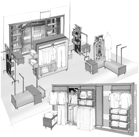
Figure 6-1. A merchandising display must have visual appeal that draws customers as well as prominently display the high-margin items that the retailer wants to sell. The closer an item is to eye level, the more likely a customer is to consider purchasing the product.
Location of the POS systems and cashiers requires some thought. Fast-food and fast-casual restaurants usually have the cashiers toward the back because they need to form manageable queues of customers and have food production at hand for delivery. Starbucks uses an L-shaped queue to minimize the distance of the cashiers and baristas from the customer. The POS for clothing stores is often in the middle, where the salespeople are most active and where customers do not have too far to go from changing rooms. The POS is also sometimes located in the front to discourage shoplifting. Grocery stores, discount stores, and the like have the POS at the front for the ease of customers with shopping carts or heavy bags, as well as for security. Unless a concept requires a particular position for the POS, I prefer to set it to the side so that the customer has the full impact of the visual heart of the store upon entering.
Merchandising culminates in the way your store bids farewell to the customer. Whether you sell doughnuts, gifts, coffee, clothing, cars, or candles, you need to develop an overall strategy, a psychology, to highlight the product at the end of the sales transaction. At Starbucks we specifically designed a beverage handoff counter at eye level, highlighted by a stylish overhead glass globe light, upon which to present the coffee drink to the customer. Directly lit from above, the drink is presented as a custom-crafted piece of sculpture. Other competitors have provided a shelf on which to place the coffee but do not really understand what we were doing from a brand standpoint. Tiffany's wraps its products in signature boxes and bags, all light blue. The Europeans and Japanese put tremendous care into wrapping a product. It is a sensual delight to watch a salesperson wrap a product in fine paper and ribbon as if he or she is preparing a special gift for the customer. It takes just an extra minute or two to make the product feel special to the customer and to make the customer feel special for buying it here. It is such a simple thing, but it is your way of saying thank you and goodbye. A finely wrapped product means you care about how your product is presented when someone takes your brand away with them! Customers want to have something to take away with them. Pay as much attention to this part of the transaction as to everything else. When customers unwrap the package, they once again think about their store experience and your brand. You have successfully reconnected with them!
It is not enough for merchandising strategies to increase sales. They must also maximize the sales of products with the highest margins. One way to increase margins, of course, is to lower your costs. Because of its volume, Wal-Mart can drive down the cost of its goods. Most of these savings pass through to the consumer, and the customer benefit drives more volume. But volume retailers have already driven their costs so low it is unlikely that they will see any more breakthroughs there, and most retailers are not volume retailers anyway. The solution is for retail stores to use merchandising management to sell products with higher margins. Stores, therefore, need to be designed to the economics of the concept. At Starbucks, our core product was pretty much the highest-margin product. We maximized the throughput at the barista area to produce as many coffee drinks as possible and focused on being as efficient as possible in the counter area. Other merchandise is limited to 15 or 20 lineal feet, all supporting the sales of our core offerings. These products had generally good margins with lower volumes of sales.
Often, however, it is not the core product that provides the greatest profit. In every retail concept, the “80/20 rule” applies: 80 percent of the sales come from 20 percent of the product. Yet too often retailers fail to determine what those 20 percent are. Too often people just stock what they stock and sell whatever of that stock they can. Analyzing sales and trends at the level of stock keeping units (SKUs, the basic pricing unit in retail) implies high-quality financial systems. Such systems are well within the reach of small retailers today. Retailers also have to have a senior manager or managers focused on such analysis. For small stores, that is probably the owner. But the results can be spectacular. Costco spends a lot of time figuring out the 4,000 or so SKUs the company stocks. Some stores that are a quarter of Costco's size carry 35,000 to 40,000 SKUs. Costco buyers are excellent at figuring out what to stock. They turn over their merchandise something like a dozen times a year. Most stores would be happy with half a dozen, and small retailers with two or three. Normally, a retailer pays for stock 45 to 60 days after the stock arrives. If stock sells rapidly, the retailer has the use of the money for some period of time before paying the bill. If stock sells slowly, the retailer has to pay for the merchandise before receiving any revenue. Fast turnover enables a retailer to “live on the float,” a process that can dramatically improve cash flow. Consider the advantage to Costco with turnover every 30 days or so and payment due every 45 days. So determine the best-selling SKUs and stock primarily those. Everything else is stage setting. You want a sufficient number of supporting products and accessories to flesh out the concept, but not so many as to drive up the costs of inventory and logistics and drive down the overall return.
You can be certain that Costco's analysis is not just of those products that sell the most, but of those products that make the most profit. The retailer's profit rule should be “x transactions including these high-margin items,” and merchandising should follow suit. A food concept might offer a 10 percent discount if a customer buys two pounds of lobster or might offer a pound of hamburger free if the customer buys a minimum of $15 worth of steak. Prescriptions used to be high-margin items, but competition, Medicare, health maintenance organizations, and other factors have driven down the margins for pharmacists. If a drugstore makes 18 percent on prescriptions and 50 percent on ice coolers, then the retailer needs to promote ice coolers, using the merchandising policies outlined here. Look around your chain drugstore during the summer months. You will see coolers displayed everywhere. Now you know why.
In this context, merchandising is not a matter of physically attractive product placement, but a strategy to sell higher-margin goods. “Value meals” offer a good deal for customers but also increase the margins of fast-food restaurants because customers buy more items than they would otherwise. Super-sizing, now falling out of favor because of dietary concerns, is the same idea. Fast-feeders love to sell an extra nickel's worth of French fries and charge another 19 cents. Every “bundle” works on the principle that the combined sale, whether it is for a computer system or a set of furniture, increases margins despite a lower price because it increases the number of items per transaction. Formal bundles—two or more items at a combined price—are common in some concepts and rare in others. Clothiers seldom have a bundled price for coordinated separates, but they display shirts, sweaters, and trousers together to create a presumption that a customer should buy them all.
Recently, my company found margin problems in an analysis of the product mix of one retailer. Of about 200 SKUs, 89 percent of them had less than 1 percent of sales each. Only 6 SKUs—less than half of 1 percent—had more than 2 percent in sales. Worse, the top-selling items had gross margins that were 7.5 percent lower than other products. We recommended that the client develop a line of bundled products to increase the number of items sold per transaction. We also recommended that the company develop a new line of products to capture the latest trend in that category. This proposal was not a matter of jumping on the latest fad but a natural extension of its business, which already featured a core product that was substantially on trend. By proper marketing of the new products and proper merchandising of them in stores—this would also require training of the sales staff to promote these products—the company will be able to increase sales of high-margin items and reduce the number of unprofitable SKUs.
While implementing your merchandising strategy, evaluate the way in which similar retailers display their wares and learn what you can from what they do. Also observe closely to understand their weaknesses and to learn where they either fail to be smart about merchandising or have fallen into a static “cookie cutter” approach. Let your creative talents loose; however, keep in mind that the ultimate goal is not to please your aesthetic sensibility (or that of your designer) but to please the customer and make it easier for the customer to buy.
Nike's concept store in downtown Seattle, one of half a dozen the company uses as a flagship presentation and to develop its merchandising strategy, is a good example of learning. In this case, it was the company learning from itself. Finding the right merchandising presentation is not easy, even for a billion-dollar company. Initially Nike arranged the product by sport—running shoes with running clothes, soccer shoes with soccer clothes, and so on. The arrangement made sense according to most merchandising theory, putting all lifestyle elements together. The approach, however, proved problematic in practice. Each of the shoe areas was small and crowded. Nike used a “shoe elevator” to bring up stock in the proper sizes when the customer was ready to try on shoes. Runners—in this context, employees going to get the shoes, although many of them were runners in the track sense—came from all directions to get the shoes from the elevator. The small crowded aisles and constant hurry created a jumbled feel. The pounding street music added to the sense of noise and congestion.
After a while, Nike moved all the shoes together into a large open circle in the middle of the store. Shoes are still grouped by sport, but the central placement and the wide aisles invite customers to come inside and take a look. New, lifelike mannequins in a variety of body styles stand behind the shoe area, modeling the clothes related to each category of shoes and creating a softer feel for the entire display area. Instead of head-banging music, the music has a lighter sound—not quite soft rock, but no longer edgy urban. The beat makes you want to tap your toes—or take off down the street in your new pair of Nikes. When I first saw the changes, I commented to an employee that the store was much quieter now that they had removed that clattering shoe elevator. Puzzled, the employee said that they were still using the elevator—in fact, here came a load of shoes at that moment. The changes in presentation and music had totally altered the sensory experience of the store. So apply the basic principles, but change them as needed to meet your customers' needs.
Too many retailers simply put out their goods and see what sells. This approach is no more than warehousing with price tags. It leaves to customers the responsibility of finding what they need rather than the retailer leading them to it. Merchandising, which is both an art and a science, requires you to think big (another example of making no little plans). The art involves the creation of a seamless connection of the physical experience to the brand positioning. The art involves establishing a sense of place, inviting customers in and making them feel at home, and treating them so well that they feel glad they stopped by whether they buy a lot, a little, or nothing at all. A customer treated well is a customer who returns and who tells friends about the experience. The science represents the operational side of the business. Too often, it seems, operations is treated as being one discrete part of retailing, whereas marketing and brand building are treated as another. Excellent retailers, however, recognize that even the most mundane aspect of operations touches upon the customer experience in some way. Therefore, the POS system is not merely a means of expediting transactions, but a way to create a pleasurable customer experience; the presentation of the store bathrooms, along with every other part of the store design and presentation, is a way to reinforce the brand positioning. The science also involves organizing the products not only to maximize sales through proper placement and promotion of products, through queuing and the flow of customers through the premises, but also to maximize the sales of the products with the highest margins.
Merchandising, then, begins with the presentation of the brand from the outside. The storefront must be visually interesting enough to register with the customer. The iconography outside must present the brand positively. The window displays must be attractive enough to draw the customer into the store. Upon entering, the customer must be engaged by all five senses. The format of the displays must match the concept, and everything about the experience must be compatible with the brand values and must come together to create a unique experience. Before the traditional steps of merchandising begin, meta-merchandising connects with the customer in subtle and sometimes subliminal ways. By solidly establishing the store message—what the store stands for—meta-merchandising sets up the traditional elements of merchandising. These traditional elements then draw customers through the store, steering them toward higher-margin merchandise while encouraging cross-selling to increase the overall margin.
Retailers who put a lot of thought into merchandising learn to integrate both the fine art and the practical science. They convey a single store message—the brand position and the products that most support it—and see the greatest success.