
GREAT LOCATION IN HAND, the retailer now understands what store design seeks to achieve and how design profoundly impacts the brand positioning. The retailer also understands the need from the earliest stages of the retail concept to think in terms of a Kit of Parts strategy to roll out multiple stores with as little cost as possible, even if that rollout may not happen for some time. Now the retailer needs to grasp the best way to proceed in actually working with a designer, finding a contractor to oversee construction of the design, and dealing with the operational challenges of actually opening the first store. All of these issues require the greatest attention if the first store is to have the necessary brand impact.
Design is not something that happens in the abstract. To obtain maximal results in the shortest amount of time and at the least expense, design requires intense interaction between the retailer and the design firm. Chapter 4, “Maximizing the Retail Experience Through Design,” discussed the importance of finding designers whose personality fits with the client and whose sensibility is compatible with the category of the concept. A high degree of trust must exist between the client and designer. The design process is not necessarily linear. It moves forward in circuitous ways. Before any work begins, a good designer will seek to understand the business mission and vision, all of the details of the concept to that point, and the company's financial goals. At the same time, the designer must determine the technical needs and the space requirements for the concept. The designer should know whether the concept is a one-off design or a design that will be used for a series of stores. With this information, the designer will develop a budget for the project.
After the project is approved, the designer's first deliverable should include the brand touchstones as well as preliminary sketches based on those touchstones. The way in which Vizwerks, a design group in Portland, Oregon, has worked with customers illustrates this aspect of the design process. Vizwerks was started by Bill Sleeth and his business partner, Shauna Stinson, several years after working with me at Starbucks. It was Bill and his team who worked on the design concept for Il Fornaio Café and Bakery, mentioned in Chapter 1, “It's About Your Values.” Recall that Bill and his team established that the design should be a “Tuscan ideal” around the values and brand touchstones of “authentic,” “welcoming,” and “fresh.” At the same time, Vizwerks also did a visual survey of the look and feel of competitive brands to determine the opportunities for a visual point of distinction—a look that would not only be compelling for Il Fornaio but also one that would be difficult for a competitor to copy. Keeping in mind the business plan and the product mix, Bill's team began to develop the visual framework upon which to present the brand touchstones. The goal was to create a “guard rail” around the design concept so that it would not veer off in the wrong direction. All of this thinking became the basis for the initial drawings, which showed a fairly broad visual presentation of the physical environment. The Tuscan design values showed in the proposed use of the “noble materials”—marble, terracotta, and blown glass, among other beautiful but unadorned materials selected for their durability and utility. The furniture would be modern, with clean lines; the chairs would be formal but comfortable; the eating area would have the tables close enough together to create a communal feel but not so close that customers would feel jammed together. These values served as the “design vocabulary” for the store.
Because initial drawings are sketchy, retailers sometimes do not pay enough attention early on. Psychologically, they are waiting to see a more fully fledged design before they engage. But the first meeting or two, in which the designer presents the brand touchstones, the visual concept, and the preliminary drawings, are critical. The retailer and the designer need to fully agree on the designer's assessment of the brand and the way the designer wants to translate this assessment into what will become a physical reality. Although many things will change during the design process, major changes made early are always the least expensive. Therefore, dedicate concentrated time to the early stages of design.
When the client and designer agree, the design evolves from a broad idea to a specific solution, from drawings that show the general arrangement of different areas of the store to drawings that show the exact size, shape, and placement of each element. The designer solves the operational flow—where different product offerings should be displayed, how the customer traffic should move through the store, where customers should pay, and so on. Selections of material, palette, color, and graphics become more defined. A late drawing for Il Fornaio, for instance, shows that in keeping with the Tuscan ideal the store sign and menu signs would appear to be hand lettered and all metalwork would appear to be the work of a craftsman (as opposed to the work of an artist).
Beginning retailers are usually their own target market. This is not surprising because retailers normally engage in something about which they have a special interest and knowledge. Often, just meeting with a would-be retailer helps me understand the likely audience. In any case, the retailer should have early on a good understanding of who the potential customers are. Knowing who you want to speak to translates directly into design work. A concept slanted to women aged 25 to 50 in the suburban market is going to look substantially different from one targeting young males in the inner city who ride skateboards. Having good demographic information enables the designer to begin developing a visual library from which the design can grow. The library should show what the targeted customers wear, what they play with and carry on them (cell phones, Gameboys, both?), what music they listen to, what their rooms look like, and so on.
In addition, before ever engaging a design firm, retailers should flip through magazines and looking for photographs and illustrations that appeal to them. They should file anything that feels right and appropriate about their concept. Often, clients do not have the vocabulary to describe what they want their store to look like, but if they save enough visual material they can provide clues to the designer, who can find and use the common elements in the design.
Along the way, the client must remain involved. The most successful retailers are the ones who sweat the details. This means everyone with a major say in running the store. Probably the biggest design failures are the ones in which the operations side of the business is not sufficiently involved. One company provided Internet access for customers as part of a new design, and then failed to exploit it because the Information Technology staff did not want to open the corporate systems to security problems and electronic viruses. At Starbucks we changed the way the coffee beans were presented in the stores by installing beautiful metal hoppers with large pull handles, much as you might see in an old-fashioned general store. The idea was for customers to think about the freshness of the roasted beans. Customers would stand near the barista (the counter person) while the employee used the mechanism to dispense the beans—an added bit of high-touch. The metal hopper was making a subliminal connection to an in-store coffee bean roaster. We would never place a functioning roaster in a store (fire hazard and dust issues); however, we could mentally connect our customer to the equipment through design. Design is more than surface treatment and fixtures and paint. It must seamlessly connect the brand to the customer experience. Design must be integrated into the brand goals and into the operational and financial plans. Employees must understand and use design elements appropriately. One company I know spent millions of dollars to install a design that encouraged more interaction between the sales staff and customers but never trained the staff to exploit the new way of working with customers. At Starbucks, because operations never embraced the idea, the coffee bean hoppers were never used prominently. They became just a store decoration. The company would have been better off without them, and in fact they were phased out. In the case of Il Fornaio, experienced restaurateurs and operational experts regularly reviewed the developing plans for the new café and bakery. Sometimes they tweaked the plan so much that the designers had to work hard to stay on budget, but too much involvement by the people running the store is better than not enough.
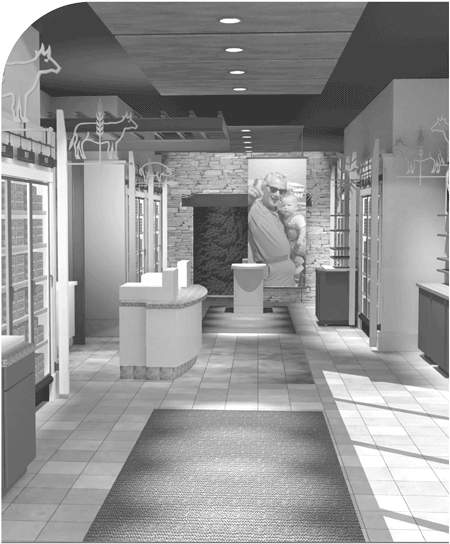
Figure 5-1. Early renderings of a retail concept should capture the brand touchstones—important attributes of the physical design such as materials, texture, and color—as well as a layout that will achieve the marketing objectives. For Omaha Steaks, the aesthetic goal was to create a new, warmer, more upscale environment, while the marketing goal was to improve the awareness of the company's complete meal offerings. (Rendering by Don Lange.)
Usually, at the end of the process, the designer creates a full-color physical model that is as real as it is possible to make it. The scale is typically one-quarter or one-half inch to the foot, so that most stores can be represented in a model that can fit on a small table. Often, this is the last bit of work before the design is approved and construction begins. However, as we always do when we ideate a new concept and design, we encouraged Il Fornaio to take an extra step. This is why Bill and I met with Mike Hislop, Il Fornaio's president and CEO, and half a dozen of his senior staff in a drafty warehouse one cold winter day in Portland, Oregon. Mike Hislop understood the importance of building a full-sized working model to work through with his operational team.
Before us in the warehouse was by all appearances the new Il Fornaio Café and Bakery, but it was constructed out of particle board. Up front was the station where the pizza maker works dough. This was the emblem of their concept—fresh bread, made daily—and the first thing the customer saw upon entering the store. Close by were the stations for bread, bagels, and pastries, which will offer the customer enticing aromas as well as an enticing view. Farther along was the station for coffee and espresso to complement the pastries. Around the far corner were two large stations for salad preparation. At the far end of the shop was a sandwich and soup bar. If it were not for the fact that we were all bundled up in coats and seeing our own breath in the cold air, we would have been hard pressed to tell this full-sized mockup from the first café and bakery, which would not open for many more months. In addition, we mounted cardboard graphics to test sight lines.
Boeing might be able to design an airliner using nothing but three-dimensional computer-aided design tools in place of a hugely expensive full-scale prototype, but a life-sized mockup is still beneficial for the first store of a potential multiple-store operation. Retail outlets have complex customer traffic flows to orchestrate. The floor layout and the signage need to create customer lines naturally, to “cue the queue.” Food-service preparation presents classic problems in time and motion. The space has to enable a smooth progression from ordering to payment to pickup for customers on one side of the counter and provide for a ballet of movement for employees on the other side.
Despite the long hours of work by Vizwerks and Mike's restaurant people and the quality of the brand presentation, the need for changes became apparent as we went through the restaurant station by station. Two counters needed to be narrowed to reduce the chance of spills while servers handed food or drink to customers. Another counter had to be moved to open up a bottleneck for employees. A sink needed to be shifted to provide better access for all the servers in the salad area. The area for to-go orders needed to be made more prominent to remind customers every time they enter the store that the café has a to-go business. These and a few other issues emerged as we mimicked the work of servers and traced the path of customers through the store.
Taking the extra step to build a mockup reduces design mistakes and enables retailers to repair miscalculations before the problems are locked in. Contractors can review the mockup to point out money-saving changes. Sometimes moving a piece of equipment a few feet or cabinets to a different location can save thousands of dollars in engineering costs. Electricians and plumbers can identify similar ways to reduce costs. Because of fewer unknowns, contractors' bids will include lower contingency allowances and fewer cost overruns. Most important, the store can be built faster so that it begins generating revenue sooner.
On the aesthetics side, the mockup enables you to see how the store fits together on both the large and small scale. Although Mike was pleased with the overall look of the café and bakery, he was less happy with the soup-and-sandwich area anchoring the far wall. To hide the workspace behind it, the wooden cabinet was tall, broad, and unadorned. Seen in person, this area was an intimidating fortress of sandwich making that would deter customers from approaching. Mike requested that the designers make the area more approachable by trying different heights for the counters and by adding vertical design elements to relieve the unrelenting horizontal band. On a small scale, the team identified changes to the type sizes of various graphics and to the placement of signs; among them, raising the height of a menu board so that a server's head would not block the sign board on which the “soup of the day” would be highlighted.
Few companies take the step of building a full-scale model. Most owners shy away from the additional cost or believe that their know-how will enable them to avoid significant problems in going directly from a scale model to construction. Computer-aided perspective drawings are great for “seeing” the space and getting a good feel for what the retail experience will be like. No matter how skilled the designer or experienced the retailer, however, some problems can be identified only with a physical walkthrough. A full-scale mockup can cost as little as $10,000. Because the materials are generally inexpensive, much of the cost is in the labor. The prevention of just one substantive design mistake will more than recoup the expense. It is better to fix a problem now than to try to move a sink or resize a counter in the harried days before a store opening, or to experience the chaos and expense of changes after the store has opened. Beyond these benefits is the ability to experience the atmosphere of the store as it actually will be. Giving the direct experience of the full-size vignette mockups of our new design elements to Howard and other senior managers at Starbucks gave us all a comfort level in proceeding that we otherwise could not have obtained.
Because of the many variables involved, it is difficult to provide specific budget guidance for design work. A simple one-off concept could be designed for as little as $25,000 to $100,000. A complex new concept design for a national chain could run $250,000 or more depending on the elements requested. Suffice it to say that the design work for many smaller projects can be done for under $150,000, whereas many large projects are produced for well over twice that much. Beyond these numbers, bids from several firms will ensure that the design estimates are realistic and competitive. Unless the designer can explain the differences, be wary of any bid substantially lower or higher than the others. As you narrow down your shortlist, check references with prior clients.
A good working rule of thumb in gauging what a store concept should cost to build out is that the projected established annual revenue should be 2.0 to 2.5 times the estimated construction costs. A store expected to generate $1 million in revenue should be budgeted to cost no more than $400,000 to design and build. Inventory would be extra. Of course, each concept has different costs and margins, and each concept requires a detailed pro forma, discussed in Chapter 10, “Kicking the Economic Model Into Gear.” A retailer should think in terms of spending perhaps 15 percent of the construction cost on customizable elements. In addition, the retailer should set aside a minimum of 5 percent, preferably 10 percent, of the total cost for unforeseen contingencies. With a ballpark figure established, the designer will first develop the conceptual construction budget based on the design, material choices, finishes, and so on. After contract documents are drawn, actual construction budgets can be let out for bid. Sometimes the client develops the construction budget or a part of it (for example, the budget for certain equipment). Whoever is responsible, close coordination of all parties is required. A certain amount of push and pull between client and designer occurs before everyone agrees on an acceptable budget.
After the general budget is agreed upon, the client needs to ensure that the client, the designer, and (later) the construction contractor always remain in sync. An apocryphal story in the building trades concerns the client who keeps coming up with changes. “Can we do this?” the client asks, and the contractor says, “Sure.” Later, the client asks again, “Can we do this?” and the contractor says, “Sure.” Every day the client comes up with more changes, and every day the contractor says sure, they can make them. When the project is done, the contractor hands the client a huge bill for all the change orders. “But I thought you said we could do all these things,” the client says. “Sure,” the contractor replies. “We can do anything. All it takes is money.” Do not agree to a construction change without receiving in writing a firm bid outlining the costs. In fact, before you execute a construction contract, ask the contractor to compile a list of what components may be missing on the contract documents that in his opinion are necessary to complete the store build-out.
Similar kinds of misperceptions can arise during the design phase. Sometimes the client may ask for an unreasonable number of visual approaches or an unreasonable number of changes to a design. Other times, the designer may come up with some wildly creative ideas and simply assume that the client knows that the new approach will be more expensive to design and/or to build. “I thought you knew” is not a phrase you ever want to hear, and especially not in the design and construction process. Although the designer and the contractor should be responsible for advising the client of any budget changes, it is the client who ultimately pays and the client who should regularly remind his team of fiscal realities. At the end of our morning-long review of Il Fornaio's café prototype, we all gathered briefly to summarize the changes that were to be made. The last thing that Mike said to the design team was, “I have only one word for you: cost.”
Choice of material and choice of construction have the greatest impact on customer appeal. They also represent the greatest variable in expense. High-quality stone or marble, rounded cabinet fronts, special joint details, special hand-wiped stains—all of these things cost a premium. Put money into materials that the customer will touch and interact with. Select special materials and details for areas that are in the customer's “touch zone,” from waist to chest high, and in the customer's line of sight.
When designing your space, consider exciting one's five senses: sight, touch, smell, taste, and hearing. If you are successful in combining responses to the various senses into a design, your customers will have a unique experience that differentiates your brand. At Starbucks, we used the finest materials in countertops and front elevations of cabinets; the pendant light fixtures at the customer handoff area were hand-made. However, as the number of stores Starbucks built accelerated each year, it was important that we established a discipline for controlling costs. I told my designers, “Don't put pencil to paper to redesign anything that will add to our current costs unless you work hand in glove with manufacturing and purchasing to reduce the cost of some other build-out item by an equal amount.” For example, the back bar, which customers do not interact with, was inexpensive, dark-colored plastic laminate. I scratch my head when I see expensive tile placed behind the bar where it is out of the customers' view. Never pay extra for materials in such places. Whenever possible, balance every expensive exotic material in view with affordable materials out of view.
Ceiling design and installation work has probably caused designers more grief than almost any other part of the store. It is important to define the overhead plane. Installing drop ceilings with required earthquake bracing above it is very expensive, yet the result is a typical bland lay-in acoustical tile ceiling. At Starbucks, we altered the design to leave the ceiling area exposed. We spray-painted the upper area dark colors, including the ductwork, to let the ceiling “die” away. We used other design elements to direct the customer's attention elsewhere and to keep the customer's eye fixed on a plane eight feet and below. The upper area simply vanished to the customer's view. The savings from this change paid for the continued use of high-quality materials and hardwood cabinetry where we wanted them—where the customer came in contact with them. Another area of a store that can save money is the flooring. We used exposed colored concrete floors with a few areas of carpeting wherever possible to save money. Because the store arrangements were so compelling, the concrete “disappeared” below the customer's view. We started doing this in 1996, well before it became popular in the industry.
It is possible to go overboard with low-cost materials. To save money, some architects have used MDF, a plain and inexpensive paneled building board, as a flooring material. By the time they have stained the MDF tiles a custom color, installed them, and sealed them (MDF is not durable), the floor—although beautiful—costs more than marble. It is important to carefully consider initial construction costs; however, always project and value-engineer usability and the life of the materials. If the material wears out faster and needs to be replaced more often, costs over time will be higher. Where durability and maintenance are an issue, be willing to spend what it takes in the initial investment.
Having approved the design and moved into the construction phase, a retailer is likely to be engulfed as the project races to conclusion. If you have ever built or renovated a house, you will have some idea, although a store build-out is an order of magnitude more exacting and complex. In particular you will not believe how busy you will be, especially during the last 30 days before opening.
As in the selection process for design firms, the retailer should interview several contractors. Because building a store or restaurant requires different experience than building an office building or residences, experience in retail construction is a prerequisite. Blue C Sushi, for example, evaluated several contractors, each of which had different strengths and varied levels of experience. Eventually, Blue C Sushi requested three firms to bid on the construction of the project based on the final designs. We reviewed the bids and asked hard questions about how each contractor would approach the work. For example, the Blue C Sushi design called for the installation of laminated sheets of bamboo lining the staircase. How would the contractor handle the edges, or would the contractor recommend another material on the wall leading up to the mezzanine? Would the contractor request multiple subcontractor bids for the electrical, mechanical, and framing work? The issue is whether the contractor would be a true partner, study the plans carefully to determine what costs might not be evident from the architect's drawings, help proactively solve other problems before they occurred during construction, and offer other recommendations to help ensure that the store would open on time and under budget.
James and Steve ultimately chose the contractor who had provided the greatest level of detail in its estimate and who also had some experience building restaurants. They checked the contractor's references personally with three prior clients and visited his completed projects. Because finished carpentry and installation work represent the greatest potential variance in build-out cost, Blue C Sushi worked with the design firm and the contractor to ensure that multiple bids were obtained for just about every special item. Blue C Sushi promoted the use of the “coolest” material in each category but also requested to see two or three less-expensive alternatives. Probably the best example of teamwork was in the creation of a stainless steel curve located at floor level at the base of the conveyor belt stub wall. Foundation Design laid out the design, the contractor modified it for code compliance, and an engineering company did the final fabrication drawings and the actual work.
When building a store, plan for Murphy's law (“whatever can go wrong, will”) times three. In Blue C Sushi's case, Murphy's law came into play the week that the kitchen equipment was supposed to be installed. The kitchen designer, who had laid out and ordered the equipment, went AWOL—never to be seen again—while Steve and James coped with a rash of errors in the equipment orders they discovered in her absence.
As work progressed and opening day approached, every little detail mattered. We discussed whether the corners of tables should be square or rounded. We argued over the booth seat height. We debated the texture and durability of materials. Many times when James and Steve were close to completing a phase of the construction, they discovered something new that was not quite right. A problem with the location of a floor sink held up equipment installation in the kitchen for a couple of days. When they went through the restaurant trying to determine the sight lines from all the seats, we discovered that when the door to the pantry was open, customers could see the servers preparing miso soup or pouring soft drinks in the back room. In food service, food preparation can be planned to be part of the presentation, or it should take place out of sight. The only solution was to train the staff to always close the door as they passed through. Hiring and training of staff came during the busiest of those last few crazy weeks. The Blue C Sushi founders spent hours with state and federal employment-related paperwork while trying to get the construction punch list completed before opening.
Of course, from the beginning we were working on naming the sushi concept. Naming a one-off restaurant is one matter. Selecting a distinctive name that works for a planned rollout of multiple units is another. Blue C Sushi considered more than 250 names, trying to find a word or phrase that would capture the essence of quality and fun. Steve and James pondered some of the great brands and tried to understand what made the names memorable. Usually, it was not the name itself but the value created behind it. They ruled out Japanese names as being too typical of a sushi restaurant, although one of the finalists was “Moto Sushi”—it sounded vaguely Japanese while also connoting the motorized conveyer system. “Blue C” had been a strong candidate since it made a late appearance on their naming board. It moved to the fore when the logos were developed for the final candidate names. The Blue C Sushi logo, a big fading blue letter C that resembled a wave, fit the natural spirit and feel of what they wanted. The C is a strong Western symbol, while the stylized calligraphic brush stroke gave a nod to Japan. “Blue C” was a homophone for “Blue Sea,” source of their fresh fish, and the big blue character C could also stand for conveyor (the core concept) and for creativity and community, two elements the restaurant sought and that have since become the restaurant's watchwords. Some people found the name difficult to say; others enjoyed the tongue-twister (say “Blue C Sushi” three times fast). Eventually, they decided that the name captured the spirit of fun they wanted to convey. What will the brand mean in 10 years? Too early to tell. As with the major brands they studied, it is up to the entrepreneurs to create a great restaurant experience in each and every unit that will imbue the brand with significance.
At last, on August 21, 2003, Blue C Sushi opened in the Fremont neighborhood of Seattle. This was preview night, the equivalent of the dress rehearsal for a major play. A preview should be controlled to give the restaurateurs a chance to fine-tune staff training and to hear feedback from the initial diners. Being new to the game, James and Steve booked a “full conveyor belt” of family and friends for the entire evening. A few people brought uninvited friends; other people just showed up; many people stayed longer than the planned 45 minutes between seatings. The restaurant got behind early and never caught up that evening. For the owners and staff, the first night was, in Steve's words, “like drinking from a fire hose.”
In fact, the restaurant has been running “all out” ever since. “Like George Jetson on the treadmill,” Steve says—an interesting image from a guy who serves food on a conveyor. The good news is that Blue C Sushi was profitable within a few months. The bad news is that they did not have time to ramp up and work out the operational kinks. All the learning has occurred on the fly. For example, they had not thought through the mechanics of takeout food requests. At first, they planned to accept telephone orders. Then they realized that there was no reason. Customers could come in and pick up whatever they wanted directly from the belt. However, the floor plan did not take into account the fact that takeout customers would be blocking the main walkway while waiting for their orders to be rung up. Blue C Sushi added a line of counter tables along the front window. Now diners could simply step across the aisle to the belt to select their sushi and return to the standup counters. It is not a major inconvenience, and the setup provides faster service whenever the booths are full. The bar area could drive more revenue, so they added a happy hour to increase sales on slower days of the week.
Other changes were not as dramatic but were equally important to achieving profitability. In Japan, the food plates are uncovered as they move along the conveyor belt. In the United States, the plates need to be covered. The original clear plastic lids were about 15 times more expensive than disposable lids. The sturdier lids lasted about a month but required a tremendous amount of labor to wash. Disposable lids lasted only a day, but did not require the additional labor to wash. The question of which to use vexed them for more than six months before they changed to disposable (but recyclable) lids to reduce labor and to provide greater visibility for the product beneath the lid.
Blue C Sushi's founders understood the importance of getting their first store right. They did not start with a poorly defined concept and hope to eventually stumble upon the right formula. Rarely does such serendipity occur. A few mistakes are inevitable, but imagine how much more difficult and expensive the opening would have been if the founders had lacked the discipline to systematically find the right the location, create the proper store design and brand connection, or find the right contractor. Doing everything right also means you are more likely to start with a bang. Solid preparation will keep you from being overwhelmed after opening. Getting the most important early decisions right greatly increases the odds of success. Getting the early decisions right also creates value in the brand from the start and makes successive stores far easier to open and less speculative financially. The first Blue C Sushi restaurant has proven the aesthetic appeal and economic viability of the concept, incorporating a unique design palette and look that can be reproduced. Working out operational kinks is an ongoing task. Achieving operational perfection is a lofty goal. The entrepreneurs know that to successfully operate a multi-unit concept they must complete the operations manuals to ensure rollout success.
When learning to walk, toddlers put all their energy into getting the first step right. Soon they are tearing around the house. After the first step, it is a matter of repetition and variation. The same thing is true in retail. If you put all your effort into getting the first store to be as good as it can be, you too will soon be off and running.
Many times, Starbucks spent far more than the average projected store construction costs necessary to build out a store in a retail space, so it may sound contradictory to assert that most people spend too much money on their retail build-out. “Too much” is difficult to quantify. “How much is appropriate” is a question that must be asked in terms of how the spending establishes the brand. Design and build-out costs must always have an eye toward the goal of brand building as well as operational efficiency. A retailer who does not understand the concepts described in this and the previous chapter is likely to spend “too much” because the retailer will not know what to look for or how to both enable and control the design and construction process. A retailer who fails to make the substantial time investment working with a designer early will spend “too much” because of a failure of the design to meet brand goals or because the design creates operational problems. A retailer will spend “too much” by failing to bid out the construction and failing to monitor the work in progress. A retailer will also spend “too much” when the designer rather than the retailer drives the process and the result is a design for design's sake rather than a design that increases sales; or a design that is so expensive to implement that it devastates the return on investment. New retailers tend to over-invest without considering the value of the investment or accurately projecting the return on investment.
It is crucial to know what kind of return on investment the improvements will bring, either in sales or brand building. For example, Starbucks' strategy was to open a highly visible flagship store within the first year of entering a market. Preferably the flagship store, located on a major intersection in a downtown commercial core area, would be the first store to open in the market. This was to introduce the brand with a bang, to build awareness, and start the marketing “buzz.” Usually, we opened stores in urban neighborhoods and surrounding suburbs only after the flagship urban stores opened. Customers would visit the flagship store during their work week and see it as they drove to and from work every work day. Having had a quality experience in a downtown store, customers would visit their neighborhood stores over the weekend. The suburban stores, although a consistent high-quality design, did not usually require the kind of investment in the store build-out as the flagship store. As sales volumes grew enough to justify additional stores, we opened additional stores in the downtown central business districts. These store designs generally matched the company's average store construction cost.
A first store, or a flagship store, merits the additional investment of design and build-out dollars because it establishes the brand for an entire market through a design that projects your brand properly and powerfully. Whenever Starbucks restored a building to its original grandeur or added additional design features to properly integrate our store into its surroundings, the company had a strategic reason related to brand building. We not only created a place where customers wanted to come (and spend their money), we also kept a careful eye on the connection of a store's locationing elements to the brand's overall presentation to the customer and the brand's strategic positioning. Think in terms of “cost containment” for design and construction elements that customers do not see or that otherwise do not impact brand. Think in terms of “spend what it takes” to achieve the brand positioning you seek. Superior brand positioning will justify the cost through increased sales and an increased return on investment.