
CHAPTER 3
Dracula and the Four Horsemen of the Media Apocalypse
As the last chapter said, you want to look for the elephant in the room—the big thing the herd overlooks. But we’re not quite there yet. Before knowing what to look for, you must know what not to look at! The media fails miserably at this. They most often look in the wrong place—leading most investors to look at the wrong things, too.
You can’t spot the elephant if you don’t look in the room. Yet very few folks do! Most stare out the window, looking at far-off specks that may never come. They gaze at sociological issues, peripheral chaos and academic debates—unimportant for markets. Or they peek just around the corner, always scared of what’s lurking.
None of this matters. Not the far future! Not sociology! Not what just happened! Not things everyone says could happen tomorrow! Markets aren’t far-sighted or myopic. They look about 3 to 30 months ahead and look hardest 12 to 18 months ahead. If we knew for a fact, with perfect 20/20 vision, the world would end on December 31, 2020, stocks wouldn’t start pricing it until about 2018 at the earliest. That’s the market’s version of 20/20 vision. Further out than about 30 months is to the market a blur not to be believed. It simply disbelieves.
Think of this chapter and the next as a primer on how to read your newspaper, peruse the Internet or watch CNBC, starting with how to know real news from short-term noise. How to slay vampires and battle the four horsemen of the media apocalypse. Or to put it less fancifully:
- How to tell what’s short-term noise and what’s something stocks might actually care about
- How to battle media hype with simple logic
- How to tell when headlines are crying “wolf!”
The Media’s Flawed Financial Eyesight
Ok, maybe that section header is a bit harsh. Journalists aren’t blind—they can see near and far! But they are writing for a customer market that isn’t capital markets based. They aren’t writing for the 1%, that’s for sure. They aren’t even writing for the 3%. Their eyes naturally drift to what seems important to their pressing reader but isn’t important to markets. The too-near and too-far.
Most headlines look at the wrong timeframes. That’s where the noise is loudest, and noise sells. Especially bad news! If it bleeds, it leads. Most of the time, it leads investors astray.
Open any financial paper or website, and you’ll see: The stories will nearly all fall into two categories. The super-short-term and the ultra-long-term.
On page one, you always get the obligatory story about what stocks did that day (or yesterday, if it’s your morning paper). Five hundred words pinning volatility on some event or economic report. Even though 99.9% of it is garbage, hey, it’s breaking news. Extra! Extra! Stocks fall on retail sales and Janet Yellen’s haircut! It’s all useless. Usually, you can’t tie the market’s daily moves to any one thing, and it’s always backward-looking. And no one knows, at all, who was buying or selling that day, much less why. Media simply summarizes what yakkers were yakking about. Besides, what happened to stocks yesterday has no bearing on what they will do over the next year.
You’ll also get stories dissecting data releases. Gross domestic product (GDP)! Consumer spending! Retail sales! Unemployment! Inflation! Factory orders! Factory output! Trade deficit! Jobless claims! Home prices! Bored yet? You should be. It’s all yesterday’s news, which should be a snooze, but you’re still guaranteed to get a few hundred words on why any and all of these (and more!) rose or fell in any month or quarter, and too much speculating on what it means. This includes quotes from analysts and economists telling you why it’s all important, anything to be quoted in print. Sometimes you even get a preview story a day or two before, guessing at what the results will be—and then analyzing the implications of that guess. Mindless myopia.
Same goes for big earnings releases. Preview stories predicting big bellwethers’ results, then the actual news. Then stories moaning about or cheering over the results and guidance, and all the sell-side firms’ analysts updating their buy/sell recommendations. All it takes is one look at a chart of the stock’s intraday price movement to see that none of that news is actionable—it’s priced within microseconds. But that doesn’t stop the town crier.
The Fed is featured regularly, too. Any time a Fed member gives a speech, you get a bunch of media blather guessing at what the comments mean for future rate moves. They whip out their decoder rings and look for hidden messages in vague comments and off-the-cuff remarks, then try to tell you what it all means for rates, and what rates mean for stocks. It’s all entirely unknowable. You can’t game the Fed! Really, you can’t. But pundits never stop trying.
Then there is the event-related chatter. If there is strife or war in any part of the world, and there usually is, stories speculate about the impact on stocks. This goes double if the conflict is in the Middle East—then you get oil, too! Heck, any time oil prices move big, headlines hit it hard, telling you it means something for markets. If oil prices move and stocks don’t, they tell you the stock market is broken, not pricing in some big risk. It’s all a bunch of malarkey. Markets are markets! All liquid markets are forward-looking and relatively efficient. Don’t waste time seeking hidden meaning in the gap between stocks’ wiggles, bonds’ waggles and commodities’ wobbles.
That’s just some of the short-term drivel you’ll see on any one day—there is loads more. From the ridiculous to the sublime! But there is also the other end of the spectrum: the super-long-term forecasting.
A lot comes from government agencies like the Congressional Budget Office (CBO) or supranationals like the World Bank, International Money Fund (IMF) and Organisation for Economic Co-operation and Development (OECD). You get 30-year potential growth forecasts. Estimates of the long-term consequences of climate change. Or debt. Or income inequality. Shrinking populations in the developed world. Baby Boom bust. Obamacare driving health care spending through the roof and dooming us to decades of despair. Innovation stopping. China taking over the world. You name it.
You get the forecasts and the warnings. Then you get the talking heads arguing over the forecasts. It’s all static. All of it! Whether life is amazing or dismal in 50 years has nothing to do with the next 30 months and nothing to do with what the markets do now. And markets don’t believe one darned thing about 10, 20 or 50 years from now.
Yet headlines hover over all of these stories and more, which makes normal folks obsess and falsely presume significance. “It must be important if I keep reading about it.” If you read a few dozen times that something is critically important for markets or the economy, it’s near-impossible not to believe. The repetition is too powerful. This is why you don’t need to take a survey or hold elaborate focus groups to figure out what is on most investors’ minds. The media performs that service for you almost for free. Again, go to any financial publication’s website now. (You can put the book down for a second. It’s ok. I’ll wait.) My bet is nearly everything they claim will influence the broad market is either myopic or super-long-term. Go to any investor conference, and the Q&A concentrates on whatever has been big in the media or documented in the last month—and hence already priced—or the super-long-term (we’re too indebted, society is going to hell, Social Security is bankrupt).
Markets have already dealt with all those short-term issues and couldn’t be bothered with the long-term ones. Any number of things could happen between now and then to make those long-term forecasts look downright silly, no matter how wise they might seem now. (More on this in Chapter 4.)
Dracula Around the Corner
One such short-term media obsession is what I call “Dracula around the corner”: some big, evil, scary thing with superpowers that promises a future of death and destruction, just lurking there ready to bite. A ticking time bomb about to blow.
Now, don’t get me wrong. If Dracula were in your house, that’d be bad. Bloodsucking and all like that. But if he’s really there, sooner or later he must show himself. Otherwise, he’s just a ghost story. Ghost stories can scare you—and sometimes markets briefly!—but they can’t bite you.
Terrorism is one example. Most assume first-world terrorist strikes are automatic negatives, pointing to 9/11. The S&P 500 lost –11.6% the first five trading days after the attacks and finished the year down –13%—“proof” terrorism knocks stocks hard.1
Or is it? Always be skeptical of anecdotal “proof.” Ask: What else was going on then? In 2001, the answer would be “a raging bear market.” That –13% full-year return had far less to do with 9/11 than with the bear market beginning 18 months prior, on March 24, 2000, as the tech bubble burst. Stocks were already down –17.3% year-to-date through September 10, before the planes hit. After the immediate –11.6% drop, the S&P 500 rallied, regaining pre-attack levels 19 trading days after markets re-opened, and rose through year end (a brief bear-market rally before deep fundamental negatives resumed their hold over stocks in 2002).2
Stocks have weathered several terrorist attacks since the 1980s. Most saw some volatility in the surrounding days, though to a smaller extent. Each time, the reaction was quick—no terrorist attack ended a bull market. See for yourself in Figures 3.1 through 3.8.
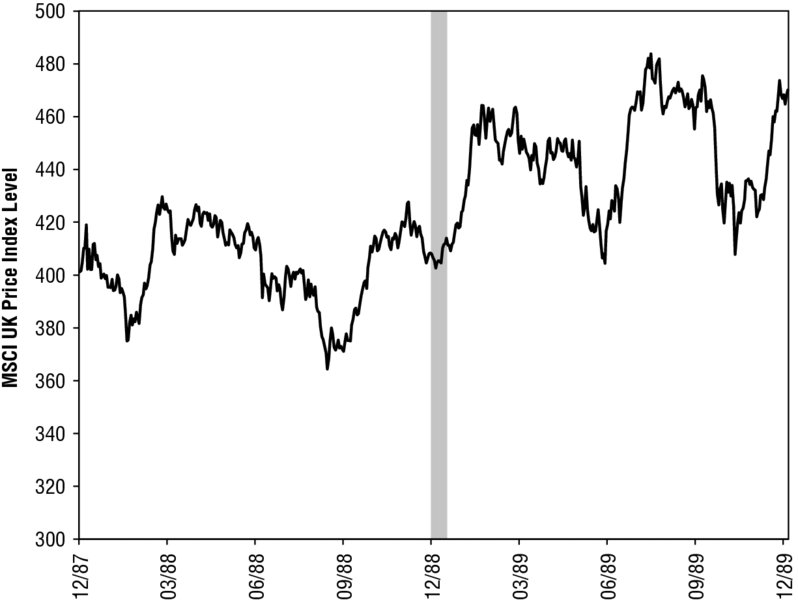
Figure 3.1 Pan Am Flight 103
Source: FactSet, as of 9/11/2014. MSCI UK Price Index, 12/21/1987–12/21/1989. Shaded period includes the day before the attack and the following 10 trading sessions.
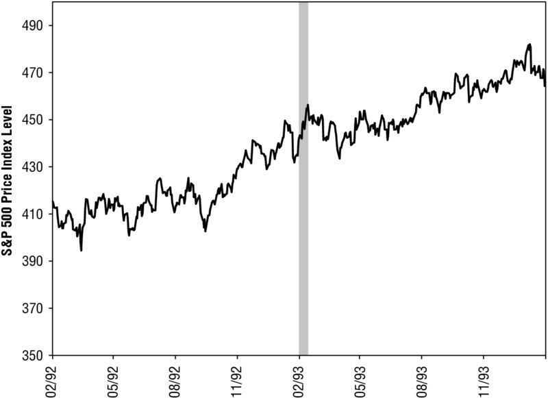
Figure 3.2 First World Trade Center Bombing
Source: FactSet, as of 9/11/2014. S&P 500 Price Index, 2/26/1992–2/25/1994. Shaded period includes the day before the attack and the following 10 trading sessions.
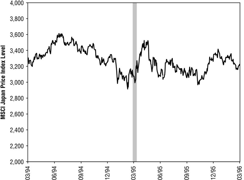
Figure 3.3 Tokyo Sarin Gas Attacks
Source: FactSet, as of 9/11/2014. MSCI Japan Price Index, 3/21/1994–3/20/1996. Shaded period includes the day before the attack and the following 10 trading sessions.
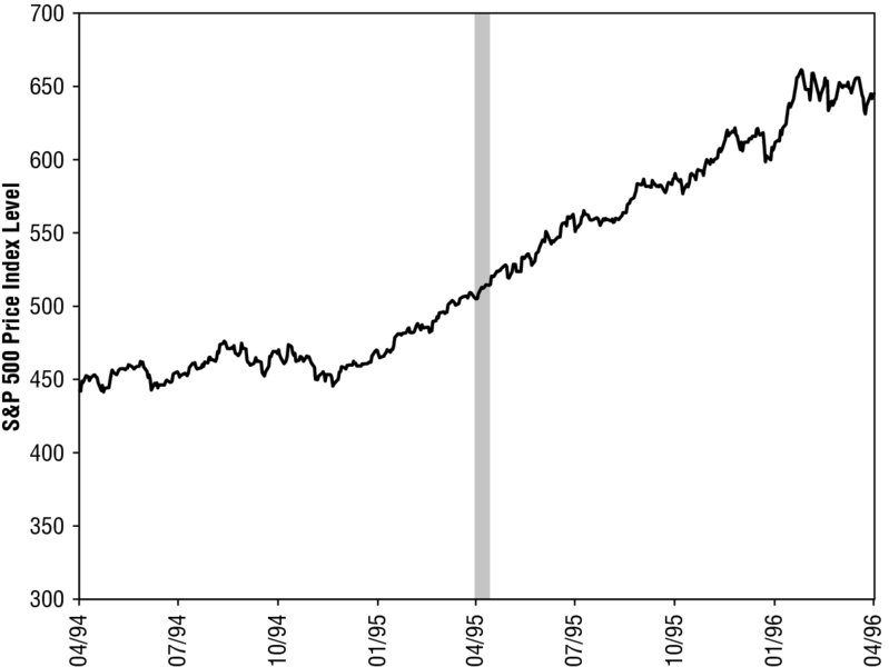
Figure 3.4 Oklahoma City Bombing
Source: FactSet, as of 9/11/2014. S&P 500 Price Index, 4/19/1994–4/19/1996. Shaded period includes the day before the attack and the following 10 trading sessions.
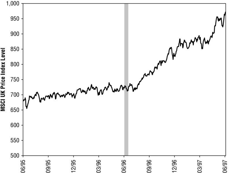
Figure 3.5 IRA Attacks on Manchester
Source: FactSet, as of 9/11/2014. MSCI UK Price Index, 6/15/1995–6/13/1997. Shaded period includes the day before the attack and the following 10 trading sessions.
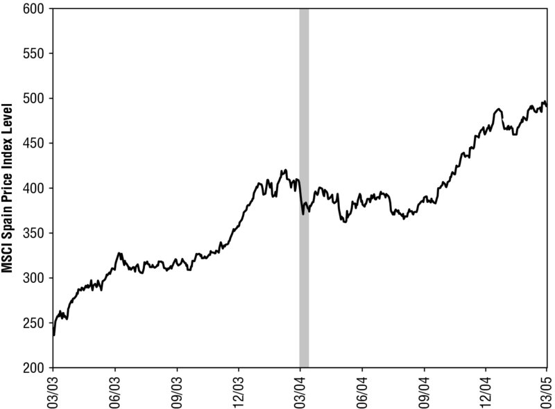
Figure 3.6 Madrid Train Bombings
Source: FactSet, as of 9/11/2014. MSCI Spain Price Index, 3/11/2003–3/11/2005. Shaded period includes the day before the attack and the following 10 trading sessions.
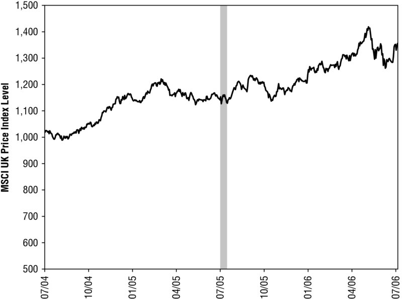
Figure 3.7 London 7/7 Transport Bombings
Source: FactSet, as of 9/11/2014. MSCI UK Price Index, 7/7/2004–7/7/2006. Shaded period includes the day before the attack and the following 10 trading sessions.
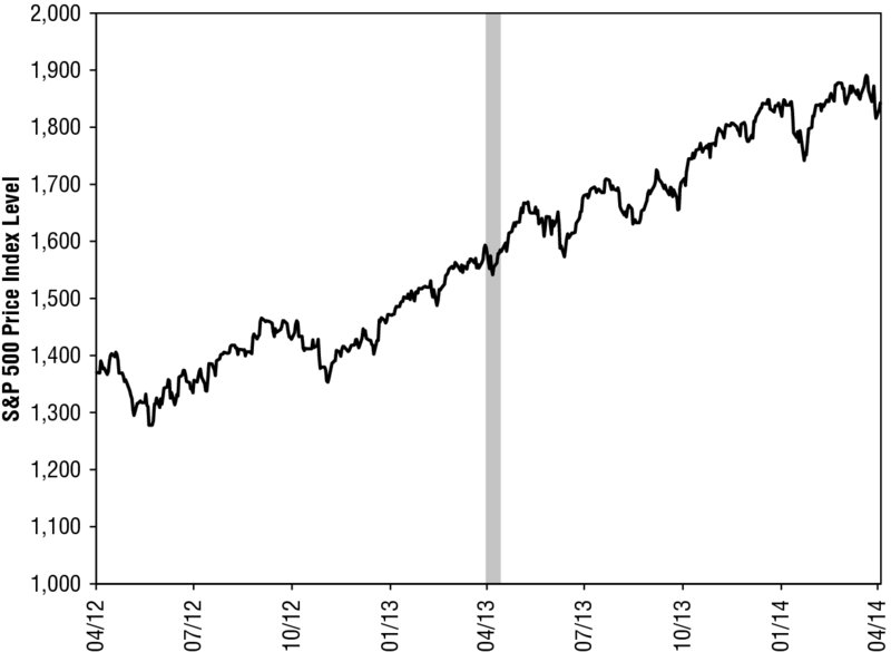
Figure 3.8 Boston Marathon Bombing
Source: FactSet, as of 9/11/2014. S&P 500 Price Index, 4/13/2012–4/15/2014. Shaded period includes the day before the attack and the following 10 trading sessions.
Fundamentals support this as well as history. Terrorism whacks sentiment, but usually only briefly. That hits stocks in the short term, but forward-looking markets soon resume weighing future economic growth, earnings and political factors, which aren’t much disrupted by the attacks. The 9/11 attacks occurred six months into a recession, but recovery began in November. The attacks impacted politics via the Patriot Act and Afghanistan War, but they had nothing to do with Sarbanes-Oxley—the chief political negative as markets dove through October 2002.
Investors don’t quickly forget attacks. On a human level, they’re always with us. But as time passes, folks realize the economic impact is small. They see growth continuing, companies profiting and their country’s spirit too strong to be broken by evil. These realizations give stocks relief from the jolt they received in the attack’s immediate aftermath.
Terrorism is just one Dracula. War is another, as we’ll see in these pages. But perhaps the biggest, oldest vampire tale of all is pandemic pandemonium. Every few years, some big flu scare comes along, and headlines warn that millions of people could die, taking the economy and stocks to the grave with them. In 2009, it was swine flu: Innocent Mexican piggies were going to infect humanity with the virus to end all viruses, killing huge chunks of the global population. In 2005 and 2006 it was avian bird flu (which is, of course, redundant and double-stated in the scare for emphasis). Chinese chickens destroying the world. In 2003 it was SARS, severe acute respiratory syndrome, again from China. As I write, folks fret an Ebola outbreak in Africa will infect America and markets. Dracula is back!
Don’t fall for any of this. For one, none of these ever resulted in more than a few hundred or thousand deaths—tragic, but too small for cold-hearted markets to care about at all. Two, during the one modern pandemic that did pack a punch—1918’s Spanish flu, which infected about a third of the world’s population and killed roughly 100 million—stocks rose nicely, amazing and hard for most to believe as that is! But markets really are hard-hearted and cruel and don’t care about human suffering—only wealth. There is zero evidence disease and pestilence are market risks. Zero! The fear can cause volatility in the short term—bird flu fright caused a correction in 2005—but in that magic 12- to 18-month range, it’s a false factor.
These are ghost stories. When you’re a kid, and you hear a ghost story around the campfire, you get scared. You think it’s real. You can’t sleep. But then you realize it isn’t real! It’s a myth! It’s ok to relax! It can’t get you! Vampires and monsters aren’t real! Same thing can be said about markets. When the media tells you Dracula’s there and he’s real and about to kill you, that’s scary, and that fear impacts markets. Stocks can behave pretty darned irrationally over short periods. But it doesn’t last. Investors realize whatever they feared wasn’t real, markets bounce back, and life goes on.
As long we have markets and media, we’ll have Dracula. He’ll never go away. But now you know better—no need to run for cover! Or arm yourself with a stake and holy water! Dracula isn’t ever real. You can wait it out and game it, knowing that false fear will flip and markets will be a-ok.
Looking for Growth in All the Wrong Places
What’s another misguided media obsession? Economic data. It’s an easy story to write—growth good, drop bad, add 600 words and call it a day. Every darned time a report comes out, headlines react, assuming it means something and has magical predictive powers.
Normal economic expansions have normal but meaningless volatility within them. The masses often debate whether a certain statistic is good or bad, whether a dip is a blip or a trend, but it isn’t about which side is right and which is wrong. The debate is entirely noise. Static. Meaningless noise. You can just tune it all out.
One of contrarians’ biggest strengths—and advantages—is their ability to filter out the noise and keep things simple. Simplicity is power. One, it’s usually right. Two, it keeps you sane. Getting hung up on any and every economic data release will drive you crazy—and get you nowhere. Fast. Even—and especially—GDP.
GDP is supposedly the mother of all economic data—the big report folks spend months trying to guess at, the one that adds up all the small data releases throughout the quarter and finally brings them meaning. But GDP is a look back at that which has already been priced—a rough tally of everything that happened over a three-month window that closed a month (or more) ago. It isn’t a terrible tally, but it also isn’t the economy! It isn’t stocks. You don’t buy a share in GDP. You buy a share in publicly traded companies’ growth and earnings (or lack thereof).
GDP captures some of this through business investment and to an extent government and consumer spending, which can result in revenues. But it misses tons. It counts imports as a negative, even though imports reflect demand and help keep businesses’ costs low. If imports tanked, you can bet Wal-Mart would be in bad, bad shape. But GDP might look great! GDP also counts government spending as an economic positive, which even the strictest Keynesian would agree isn’t exactly correct. It could also represent places where government agencies are crowding out private businesses. There, too, it counts bad as good.
Maybe you think none of that matters—a rough snapshot is better than no snapshot so we may as well use it. Fair enough. But even then, GDP is useless to you as an investor. It’s past-tense. Markets don’t care about the past. GDP simply aggregates things stocks have already anticipated, lived through and priced in. In July 2011, for example, headlines were atwitter over revisions to the depth of the 2007–2009 recession, which was very meaningful in 2007–2009, but less than worthless for investors two years after growth returned. Stocks look forward, not backward. Last quarter’s output doesn’t tell you where the economy will go.
Most media does the same with every other data release, big or small. The reports are all the same—random numbers that vary hugely from month to month. They come out every darned month or quarter, telling you what happened in a narrow past space over some short period that has already been priced by markets. Industrial production, retail sales, consumer spending, manufacturing output, exports, imports—all snapshots of past activity. None are leading indicators; none carry magical, hidden insight. Recessions don’t start because auto sales are down.
Yet because we’re bombarded with stories claiming these things are significant, many investors can’t stop overthinking them. The noise never stops. Everyone searches for meaning in these silly stats, and the media provides plenty of fuel. Like kids with cereal box treasure maps and decoder rings, they look for hidden meaning in every release, not realizing it’s all just backward-looking noise. “U.S. industrial production rose in March, moving beyond a lackluster winter and showing potential to gain strength in the coming months.”3 “Retail sales barely rose in April, tempering hopes of a sharp acceleration in economic growth in the second quarter.”4 “The [consumer spending] report added to data ranging from employment to industrial production in suggesting there was momentum in the economy at the tail end of a very difficult first quarter, which provides a springboard for faster growth in the April–June period.”5 “Exports hit one of their highest levels ever in March, but the trade deficit didn’t shrink as much as expected, leading economists to predict that first-quarter GDP will be revised down.”6 All pre-priced.
That last one should be on someone’s top-10 list of the most bizarre interpretations of an economic release. The quote comes from The Wall Street Journal, but they weren’t the only ones saying it; most mainstream outlets warned the wider-than-expected trade deficit in March 2014 would cause Q1 GDP to get revised from low growth to a small drop (it eventually did, but that isn’t the point). They fussed over a statistic—the trade deficit—that says zilch about an economy’s health, and they were worried it would make already-old GDP numbers look uglier. Who cares? It doesn’t matter! All that mattered was both exports and imports went up in the month, which means demand was great at home and abroad. Good, not bad, but none of it forward-looking. You can read it, say “That’s nice, pre-priced,” and move on.
The Magic Indicator
You don’t need to parse dozens of narrow stats to see which way the world is going. Overthinking is an unnecessary headache. I hate overthinking. You should too. Pointless. There is a simple, quick way to see if economies are heading up or down over a meaningful timeframe—the next several months out.
What is it? The Leading Economic Index, better known as LEI. It’s simple and usually magical.
The LEI is old, born in the post–Great Depression United States, when economic stats and national accounts became all the rage. Everyone knew, intuitively, that the country had been through hell, but it was all qualitative. Arthur Burns and Wesley C. Mitchell, economists at the National Bureau of Economic Research (NBER), had a hunch that if they could aggregate the many stats in NBER’s treasure trove of historical time series, they could measure how much the country had shrunk—and find patterns through history to help predict the next downturn. What they found, of course, was the business cycle.
In their analysis, which was later picked up by another NBER economist, Geoffrey H. Moore, they identified which variables moved ahead of the pack, which moved coincidentally and which lagged. Moore packaged these into leading, coincident and lagging business cycle indicators, and they debuted in 1950, exactly midway through the last century. Thus, LEI—a composite of a handful of the most forward-looking economic variables—was born. Coincidentally, just when I was. A long time ago by human standards. NBER administered LEI at first, but the US Census Bureau took over in 1961. The Commerce Department’s Bureau of Economic Analysis picked it up in 1972, and The Conference Board adopted it in 1995. The Conference Board still administers it today, along with LEIs for 11 other major countries and the eurozone.
Today’s LEI doesn’t much resemble the original. The components changed over time as data and understanding improved and the United States evolved. The original series reflects 1940s understanding and a 1940s United States. It included liabilities of business failures, the Dow Jones Industrial Average, durable goods orders, residential and commercial/industrial building contracts, the average manufacturing workweek, new incorporations, and wholesale commodity prices. Exactly what you’d expect in a postwar, manufacturing-heavy economy.
Over the next 30 years, the broader, more structurally correct, capitalization-weighted Standard & Poor’s (S&P) 500 replaced the narrow, industry-heavy, price-weighted Dow. Construction permits replaced building contracts. Industrial metals prices replaced broader commodity prices. Then prices fell out entirely, along with business incorporations and failures—these weren’t predictive. Supplier delivery times went in, then got replaced by factory orders—more forward-looking. M2 money supply and the 10-year US Treasury yield appeared for a while, as Milton Friedman’s influence spread, and in 1996 The Conference Board added the interest rate spread (10-year minus federal-funds rate)—the most meaningful, forward-looking thing you can look at. More than 100 years of economic theory and evidence show that a wide interest rate spread is growthy and marvelous for stocks. We’ve known this since God created little green apples. Economists had argued for its inclusion in LEI since the early 1980s. It just took a while to get there (as tends to happen when bureaucratic government agencies administer anything).
The last major change occurred in 2011, when The Conference Board added its Leading Credit Index—a snapshot of credit availability. The current series has 10 variables (Table 3.1), and The Conference Board has computed it back all the way to 1959. As you’ll see in Figure 3.9, it’s a wonderfully accurate read of the economy’s future direction. Not its short-term wibbles and wobbles—the broader, longer-term trend. LEI trends usually precede reality by several months. No recession in the last 55 years has occurred during a rising LEI trend—they all started after LEI had fallen for some time.
Table 3.1 LEI Components
| Components of the Leading Economic Index | |
| 1. | Average weekly manufacturing work hours |
| 2. | Average weekly initial jobless claims |
| 3. | Manufacturers’ new orders for consumer goods and materials |
| 4. | Manufacturers’ new orders for nondefense capital goods ex-aircraft |
| 5. | ISM New Orders Index (manufacturing) |
| 6. | Building permits for new private housing units |
| 7. | S&P 500 Index (monthly average closing price) |
| 8. | Leading Credit Index (The Conference Board’s proprietary gauge of credit conditions) |
| 9. | Interest rate spread (10-year US Treasury minus fed-funds rate) |
| 10. | Average consumer expectations for business conditions (from University of Michigan and Conference Board surveys) |
Source: The Conference Board.
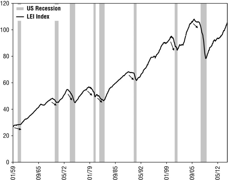
Figure 3.9 LEI and Recessions
Source: The Conference Board and National Bureau of Economic Research (NBER), as of 12/9/2014. The Conference Board Leading Economic Index, January 1959–October 2014. Shaded areas indicate recessions as dated by NBER.
To see which direction the world is headed, just look at the big-country LEIs. America, Britain, China, Japan, eurozone. Simple! No overthinking required!
Just look at recent trends, don’t get caught up in any one month, and you’ll be fine. Often, usually, just seeing America’s is enough.
LEI works. Yet few look at it—not flashy enough, perhaps not complicated enough. But good enough. The best in simplest form. Perhaps it’s that journalists would rather cover the splashier, individual data points that make up the whole. By the time the aggregation is done, the others have already had their myopic moment in the sun. Few news outlets even cover it. LEI’s guardian, The Conference Board, issues a press release on every update, and occasionally it gets reposted on some of the news aggregators. But it rarely hits the A-block on The Wall Street Journal or Bloomberg. Talking heads don’t dissect it on CNBC. Few even realize there are LEIs for all major countries. LEI’s power lies partly in their ignorance—it isn’t widely discussed so its conclusions frequently aren’t fully discounted. If folks broadly expect the economy to dip, dive or stagnate based on their reading of past data, and LEI still points up, that’s something you can work with.
Most of LEI’s power comes from its components. No one stat perfectly captures the entire economy. But by gathering 10 variables, LEI casts a pretty wide net—not perfect, but better than otherwise. It gives a broad snapshot of future manufacturing conditions, consumer spending, construction and credit, and it includes the two most powerful leading indicators—stock prices and the yield curve spread.
Because LEI includes stock prices, it isn’t a direct market forecasting tool. Stocks don’t predict stocks. The LEI doesn’t predict stocks because its components, too, are pre-priced. But it takes worries about the economy’s direction off the table. As Forrest Gump told you, “one less thing.”
LEI can be noisy. That’s just normal—some of its components are pretty volatile. Manufacturing orders, building permits, manufacturing hours and the employment variables drop often and irregularly during an expansion, usually without strong discernible trends. Consumer expectations are less variable, but they aren’t terribly forward-looking. Consumer confidence surveys reflect people’s feelings about the present and recent past, making them a coincident indicator at best. Stocks are the ultimate leading indicator, though sentiment-driven pullbacks can make that component noisy, too.
But the Leading Credit Index and interest rate spread are consistent and forward-looking. Their trends are long, and turning points typically occur before a recession begins. This shouldn’t surprise anyone. There is a world of evidence showing that a negative rate spread—or inverted yield curve—is a strong indication of future recession, and deteriorating credit conditions often presage a fall in investment. When the other components wobble, it’s a fair bet you can look past them and make your judgment based on the Leading Credit Index and yield spread.
Looking at LEI is a great way to see whether most investors’ economic expectations are right or wrong—whether heeding media’s warnings of recession will lead you astray. Back in early 2010, everyone feared a double-dipping US economy. Several indicators had slowed or dropped, and many were sure a recession relapse was nigh—the economy hadn’t achieved “escape velocity,” so gravity must naturally take hold.
Economies aren’t spaceships. If the pundits predict something based on liftoff, escape velocity, momentum or gravity, you can discount it. Laws of physics don’t apply to markets—only the laws of supply and demand. So when headlines fret about economies losing steam, just look at LEI—LEI is all about supply and demand!
The whole time double-dip fears reigned supreme, LEI headed up. Look back to Figure 3.9. LEI believers were rewarded. LEI ignorers who fled stocks because they overthought a few teetering backward-looking data points missed world stocks’ 11.8% gain in 2010.
LEI works internationally, too. Each country’s LEI components are different—no two economies are exactly alike, so no two countries’ leading indicators are twins. China has a command economy where the government dictates credit growth, so China’s LEI doesn’t include the yield curve spread; it wouldn’t make sense. Credit conditions are harder to pin down in India, so India’s LEI uses M3 money supply growth instead of a Leading Credit Index. But the many decades of lessons and analysis that underpin the US LEI inform the foreign LEIs, too.
Look at the eurozone. After the region exited an 18-month recession in June 2013, growth was anemic and everyone feared a “weak recovery”—just an iteration of those old US double-dip fears. There, too, many monthly indicators reeled. The herd dreaded a relapse. No one noticed LEI had almost perfectly predicted the past year’s economic directions. It started rising months before the recession ended—normal. Then it dipped a bit, a few months before GDP slightly slowed in the recovery’s second quarter. After that, it went on a tear, suggesting growth was accelerating. LEI was right! No one noticed.
Same thing in France. In late 2013, everyone said France was the “sick man” of Europe. Europe always has a “sick man”—one of the continent’s quirks. No one would ever say Michigan is the “sick man” of America. But Europe is just funny like that—they’ve had “sick men” since the Ottoman Empire. (Which included Greece—another recent “sick man”!)
The French “sick man” claims came from a few lousy Purchasing Managers Index (PMI) readings in Q4 2013. Media loves PMIs. They come out early and claim to give you a near-instantaneous read on whether a country or sector grew in a given month. Any reading above 50 is considered growth, anything below 50 a contraction.
PMIs are somewhat useful at best, but they aren’t amazingly accurate. They’re surveys—never the most reliable. Read Darrell Huff’s classic, How to Lie With Statistics (WW Norton, 1954; pap. 1993), to fathom the unreliability of surveys. (More in Chapter 8.) PMIs also measure, specifically, the number of firms reporting an increase in overall activity, demand, employment and other categories during that month. But they don’t give you the magnitude of that growth. In real life, if only a minority of firms grow, but they grow at a fast rate, they can tip the whole country into growth.
So look past headline PMI results and focus on the key components, like new orders, export orders and order backlogs. If these are over 50, that means demand is probably growing—and today’s orders and backlogs become tomorrow’s production. And then look at LEI! Even while France was supposedly the sick man, its LEI was rising. Not what you get if France is really sick. There, too, LEI was right. France grew. Not so sick!
In all these examples, LEI would have given anyone a very simple, quick way to see whether warnings would be right. It’s easy to find—just go to The Conference Board’s website. The splash page shows every single one. You can go look it up now at www.conference-board.org/data/bci.cfm. Do it, and you’ll be one of the few who use the power of the magic indicator. There are other producers of “LEIs,” but only The Conference Board’s are reliable. They are the gold standard.
War—What Is It Good For?
Absolutely nothin’ . . . except stocks! Ok, that’s beyond a tad oversimplified. Bullets aren’t bullish. But there is no—zero—evidence showing a regional conflict ends bull markets. Even if the United States is involved. You often get some volatility in the run-up to a conflict as fear hits the market—normal—but it fades fast. Sometimes the conflict defuses. Other times bullets fly but investors quickly realize it doesn’t have much scope—terrible as war is for those directly involved, market life just goes on as normal for the rest of the world. Business doesn’t stop, trade doesn’t stop. This realization is a relief for stocks.
Many investors can’t get past this—and here, too, the media bears much of the responsibility. With every geopolitical skirmish and potential armed conflict, no matter how far-flung or small, headlines warn of the toll it will take on stocks and the economy. If it’s in the Middle East, you get the oil-stocks double threat.
It’s easy to see these stories and freak out. War is hell, after all. But freaking out of stocks is rarely profitable. You must stay cool and think rationally! To do this, use two tools: history and scale. History shows no regional conflict has ever caused a bear market. Usually, conflict is simply too fleeting and centered in too small a section of the global economy to take a big bite out of commerce and profits. Ukraine and Iraq were 2014’s hot spots—0.2% and 0.3% of world GDP, respectively.8 In 2013 it was Syria—0.1%.9 In 2012 it was Egypt—0.4%.10 Tiny fractions of global output and trade. Unless the conflict turns to World War III, it probably isn’t a market risk.
Rarely will the media look at history, which makes history a powerful tool. I mentioned earlier that when the media makes sweeping claims, you should demand supporting evidence—and then go look for it yourself. Usually, market history is a great way to do this! Even if you don’t have a fancy stock market database, you can find old S&P 500 returns pretty easily. Yahoo! Finance has daily S&P 500 Price Index returns back to 1950—publicly available and free for your use. Whenever the media says such and such is horrible for markets, think of times when such and such happened before, and look up what markets did then. History never repeats perfectly! But as Mark Twain said, it sure as heck rhymes, and it is a marvelous way to determine the probability of a certain event impacting markets. Often what’s convention and the media says happens simply never does.
So let’s be contrarian and look at history! Pick a skirmish—any skirmish—and you’ll see it didn’t whack stocks. Even in the Middle East! Folks always fear Middle East conflict—they think it’s the world’s powder keg. Or where all the oil is. Or a hair’s breadth away from a nuclear strike. Or, or, or . . . But conflict has raged on and off there since pretty much always. It has been near-constant since the dawn of modern markets. Never has the conflagration gone global or been anywhere near major enough to put global commerce at risk. Markets are just used to it—it’s part of the background, with us in bull and bear markets alike. Not once has a Middle Eastern conflict caused a cyclical turning point.
Don’t believe me? Look at Figure 3.10, which shows the S&P 500 during four big Middle Eastern conflicts. None derailed a bull market. Some saw stocks wobble as the initial uncertainty drove fear, but markets resumed rising well before the conflicts ended.
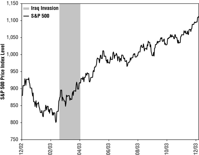
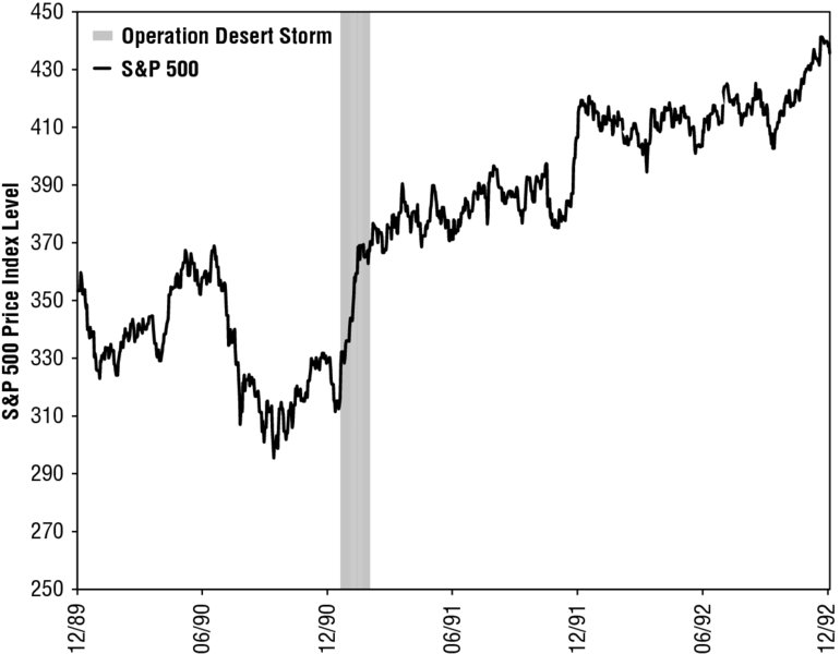
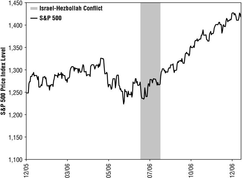
Figure 3.10 Middle Eastern Conflicts and Stocks
Source: FactSet, as of 7/15/2014. S&P 500 Price Index, 12/30/1966–12/29/2006.
Anti-herd contrarians might think, “Sell the fear, buy the bullets,” but short-term timing is a fool’s errand. There’s no guarantee fear triggers a drop. It didn’t when folks feared America would bomb Syria in 2013 or when Russia invaded Ukraine in March 2014. Re-entry is also difficult to time. Sometimes markets rise when shots are first fired, sometimes weeks later. Even if you do time it well, transaction costs and taxes might offset your savings. More often than not, you’re best off waiting it out.
Those are just four examples. Here are more! The S&P 500 suffered a quick correction at the dawn of the Korean War, losing 14% between June 12, 1950—about two weeks before the war’s official start—and July 17, 1950.11 But stocks were back in the black by September 22. Over the entire conflict, from June 25, 1950, through July 27, 1953, the S&P rose 25.8%.12
The S&P 500 fell in the run-up to the Cuban Missile Crisis in 1962 but bottomed on October 23, the day after President Kennedy’s television address informing the nation of the naval blockade. Stocks rose on October 24, the day Soviet ships neared the blockade as Soviet Premier Khrushchev called the move an “act of aggression.” By the time the Soviet ships turned around on November 5, the S&P had gained 9.1% since the low.13 The nascent bull carried on another three-plus years.
Stocks were choppy in the run-up to the US’s involvement in the Bosnian War in 1994, but the S&P 500 bottomed shortly after the NATO airstrikes on Croatia began—and gained 36% by the war’s end on December 20, 1995.14 Another example? The years 1973–1974, which contained a bear market. Folks are convinced the Yom Kippur War, which began in October 1973, was the trigger. But the bear began January 11, 1973. Not in October. Not even close. The Organization of Petroleum Exporting Countries (OPEC) embargo was from October 16, 1973, to March 16, 1974. So even if you lump in this protectionist measure as a reaction to US support of Israel, it’s hard to see how those dates match up with a bear market that ran from January 11, 1973, to October 3, 1974.
Only once in history—once!—can conflict be identified as the proximate cause of a bear market. In 1938, Hitler’s invasion of the Sudetenland made his territorial ambitions abundantly clear, forcing the world to start pricing in the likelihood of massive, destructive global conflict—World War II. This truncated a young bull market (more on this in Chapter 5). Even then, stocks didn’t sink right away. They lulled along sideways until May 1940, when markets got a shocker: France fell. The S&P 500 Price Index lost nearly 25% in the first three weeks of May as Germany made a farce of the Maginot Line, forcing stocks to price in a much deeper, longer, more destructive European conflict.15 Among others, historian Niall Ferguson claims in his book The Ascent of Money (Penguin Press, 2008) that World War I had a similarly crushing impact on stocks. Which is possible or even probable, but the data from this time period are very shaky and unreliable (more on this, too, in Chapter 5). Either way, it would merely emphasize the point: World wars matter; regional ones don’t.
It takes a huge war, with major powers facing off against each other across a global theater, for capital markets to suffer heavy enough losses to cause a bear market. When you know that, determining whether a conflict can sink stocks is easy. Just ask yourself: How likely is it that this becomes World War III? It will always be possible—anything is possible always! But possible isn’t probable. Only if you have a mountain of evidence suggesting a skirmish will become a global eruption should you act.
Conflict will always be with us. As I type this section, news has just broken that a civilian aircraft carrying 298 passengers and crew members—including US citizens—from Amsterdam to Kuala Lumpur was shot down over a conflict zone in Eastern Ukraine. A terrible, tragic loss of life! An international incident! Headlines are already saying it will sink stocks. But I remember history. I remember when Korean Air flight 007 was shot down by Soviets in 1983, and everyone was sure the Cold War would turn hot. It didn’t, and the nascent bull market continued.
Don’t Be a Cow, Be a Contrarian
Everything we’ve covered in this chapter has something in common besides myopia: They’re all cud. Issues investors chew and rechew, sometimes for years.
Think about what cud is: a mass of semidegraded food a cow regurgitates and then chews over and over for comfort. It has little nutritional value. It can’t do much of anything for them. They mostly just cud it for fun—like gum for cows, only they don’t blow bubbles.
News cud is the same. It doesn’t drive stock returns. Stewing over it doesn’t help investors make better decisions. Folks chew and rechew it because the media hypes it—bad news sells!—but it has no nutritional value for investors. Markets are too efficient! Again, if something is widely known, it’s either wrong or powerless to move stocks. The longer a fear circulates—the more cud-like it becomes—the more you can know for sure it is already priced in.
Investors chewed a lot of cud during the bull market that began in March 2009. China is a prime example. From 2010 on, folks feared China’s slowing growth would snowball into a hard landing, taking down the world economy and stocks globally. Every slowing PMI, every drop in trade, every slowdown in retail sales or industrial production caused crash fears. Each year, when full-year GDP grew fine, pundits said “Yeah, but next year the bottom will fall out.” If they were wrong about one hyped hard-landing trigger, they just moved on to another—fearing the same outcome, just with a different cause. For a while they feared a property bubble would spell doom. That was wrong, so they moved to collapsing manufacturing. That was wrong, so they moved to the banking system. That was wrong, so they moved back to property markets.
China slowed all the while—they were right about that!—but the hard landing still isn’t here. China hasn’t tanked the world economy, and global stocks fared fine. Markets don’t mind a slower-growing China! But the cud-chewing continues.
The eurozone debt crisis was terrible for many but was also big-time cud. Headlines started chewing in late 2009, when Greece started wobbling. For all of 2010 and 2011, folks feared Greece, then Ireland, then Portugal, then Italy and Spain would default, splinter the euro and send the world into chaos. When Greece actually did default in February 2012, fears were so baked in, markets didn’t blink. When Greece defaulted a second time late that year, almost no one noticed! Meanwhile, euro collapse fears morphed to fears the bloc’s recession would go deeper and global. When that didn’t happen and the eurozone started recovering mid-2013, slow-growth fears took over. In 2014, fear flipped to a “lost decade” of deflation and shrinking nominal GDP.
The specific fears morphed for five years, but the underlying issue didn’t. Whether folks feared a collapsing currency, deepening recession, sluggish growth or deflation doompocalypse, they really feared Continental Europe would be a black hole in the world economy. They’ve chewed on this for five-plus years, and stocks overall rose the whole time. Have the cud chewers been right about some things? Sure! They were right about Greece! They were right about recession! Right about just enough to drive confirmation bias. But their deeper fears were already priced in, so these small negatives didn’t knock stocks.
You should see all this cud for what it is: priced-in pointlessness. Even if you think the crowd is right about whatever bad thing will happen, efficient markets have probably already discounted that outcome. This is why an 18-month recession in Continental Europe couldn’t sink stocks globally. And as we’ll see in Chapter 6, it’s why stocks barely blinked at the Affordable Care Act.
But we aren’t ready to talk politics yet. We’re still just getting to know each other! And we haven’t even covered cud-like far-future fears that hoodwink investors! Time to turn to Chapter 4, the second part of our financial media user’s manual.