
Controls provide the means for users to interact with apps, and they play a crucial role in app design. This chapter focuses on controls that can edit and display a single value. These include the text input, rich text, radio, toggle, slider, rating, and date controls.
An important topic that we’ll cover is how to use forms and to map data values to controls. It’s common for data sources to store codified or abbreviated data values. These could include country code abbreviations or letters such as “Y” and “N” to denote true and false. It can be a challenge to configure controls such as radio or toggle controls so that they display meaningful options to the user, yet store and retrieve codified values from the data source. We’ll find out exactly how to carry out this mapping task.
Another important topic that we’ll cover is how to work with dates and times. Power Apps performs time zone conversions to allow users in different regions to work with times in their local time zone. The difficulty is that if we misconfigure our apps, we can store incorrect time values in our data source.
The simple, single-value controls that Power Apps provides, how these controls appear, the features they offer, and how we configure these controls
How to incorporate a variety of edit controls into a screen and how to connect those controls to forms
How to modify the format in which we store dates and times in a data source to help avoid localization issues
Chapter Overview
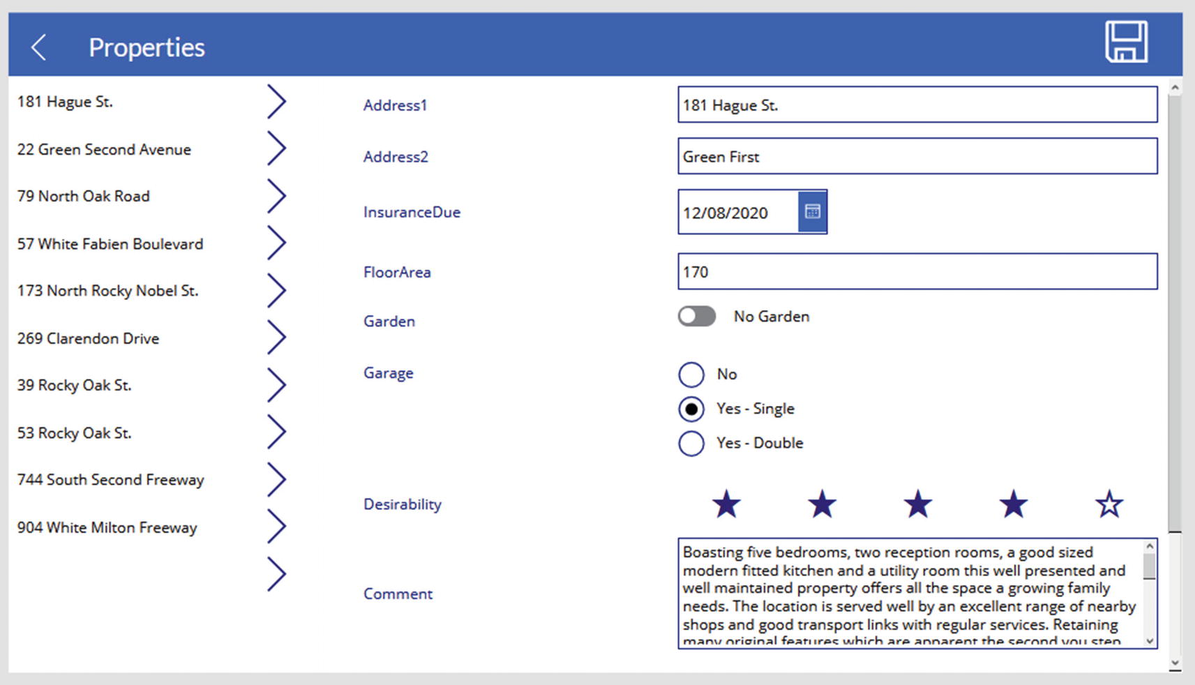
The screen that we'll build in this chapter
Building Data Structures to Support Controls
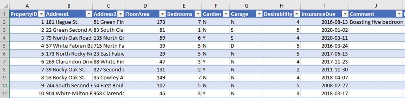
Property details spreadsheet

The basic setup of our screen
Displaying Data
To display data, Power Apps provides two controls – the label and HTML text controls. Let’s take a closer look at these controls.
The Label Control
The most basic control is the label control . We can use this to show values from a data source, or we can use it to display static text. To show static text, we set the Text property to the text that we want to show. We enclose this text in double quotes, and we can display line breaks by typing <shift><enter>.

The properties of a label control
The fonts that we can use are limited. For example, the Wingdings font isn’t available, which would enable us to enter symbols that could include checkmark, crosses, or emoticons.
Although most properties are self-explanatory, there are some that warrant further explanation. First are the properties that control how a label behaves with a large amount of text. There are two properties that are relevant – the auto height and overflow properties.
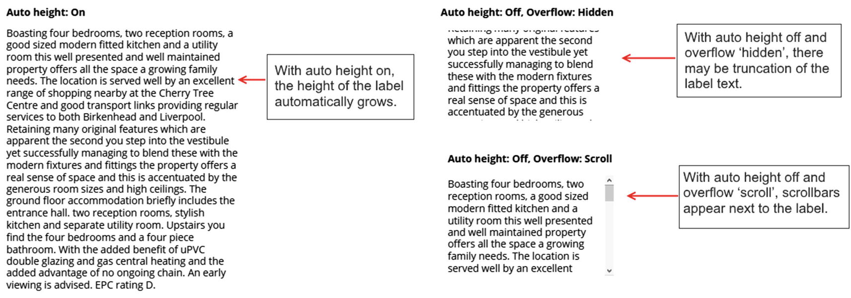
The auto height and overflow properties of a label control

The line height setting of a label control
The HTML Text Control
The HTML text control is a versatile control that enables us to display richly formatted HTML content. HTML provides far greater control over the formatting of text. Unlike the label control, we can set the colors and styles of individual words in a sentence with HTML.
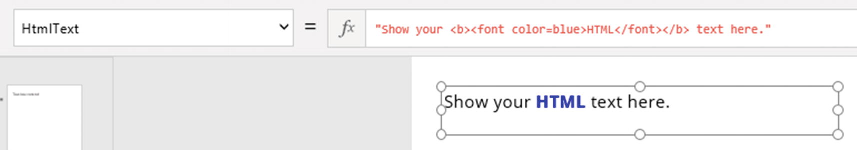
The HTML text control provides example markup
The HTML text control is particularly useful when we want to display characters that are unavailable with plain text. This could include the superscript characters in chemical symbols, mathematical symbols, or even musical characters. Example symbols with their corresponding HTML tags include CO2 (CO<sup>2</sup>),∞ (∞), and B♭ (B ♭).
Displaying Phone Numbers and Email Addresses
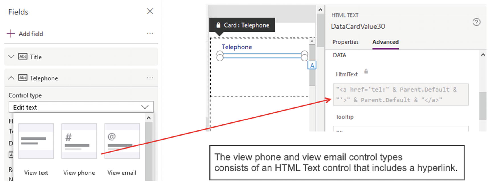
The view phone and view email control types
Technically, these controls are HTML text controls with markup that defines a hyperlink.
Using Simple Data Entry Controls
We’ll now move on and look at how to use simple data controls – controls that bind to a single value. The controls that we’ll examine in this section include the text input, radio, slider, toggle, and rating controls.
Text Input Control
The text input control is a simple control that enables users to enter text. We can customize this control in many useful ways.
To restrict the data that users can enter, this control provides a Mode property that accepts one of three values: MultiLine, SingleLine, or Password. The MultiLine and SingleLine properties control the entry of multiline text. In password mode, the control masks each character that the user enters with asterisk characters.
To limit the amount of text that a user can enter, we can set the “max length” property. The control also provides a Format property that we can set to one of two values: Text or Number. If we set the Format property to Number, the control will only accept numeric input from the user.
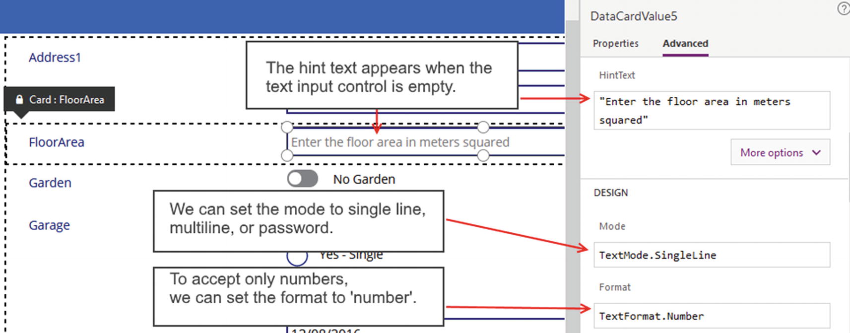
Setting the hint text on the text input control
The text input control also includes a property called Clear. When this is set to true, a cross icon appears in the far right of the control, and the user can click this to clear the contents of the control. On Windows, the official browsers that support this feature are IE and Edge.
Another useful property is the EnableSpellCheck property . This property enables the spell-check functionality that is built into web browsers. This includes up-to-date versions of Edge and Chrome, but not Internet Explorer.
Use the hint text property to provide help for smartphone or tablet users. Tooltips do not appear on devices without a mouse.
Rich Text Control

The rich text control
The output from this control is in HTML format, and we can retrieve this through the HtmlText property .
A useful thing to understand is that technically, this control is an implementation of the open source text editor control CKEditor. Therefore, if we have any in-depth questions about how this control operates , we can carry out a web search on CKEditor to help answer any queries.
Radio Control
The radio control enables a user to make a single selection from a list of choices. Although this control is simple to use, new app builders can struggle to understand how to connect the control to a codified set of data values.
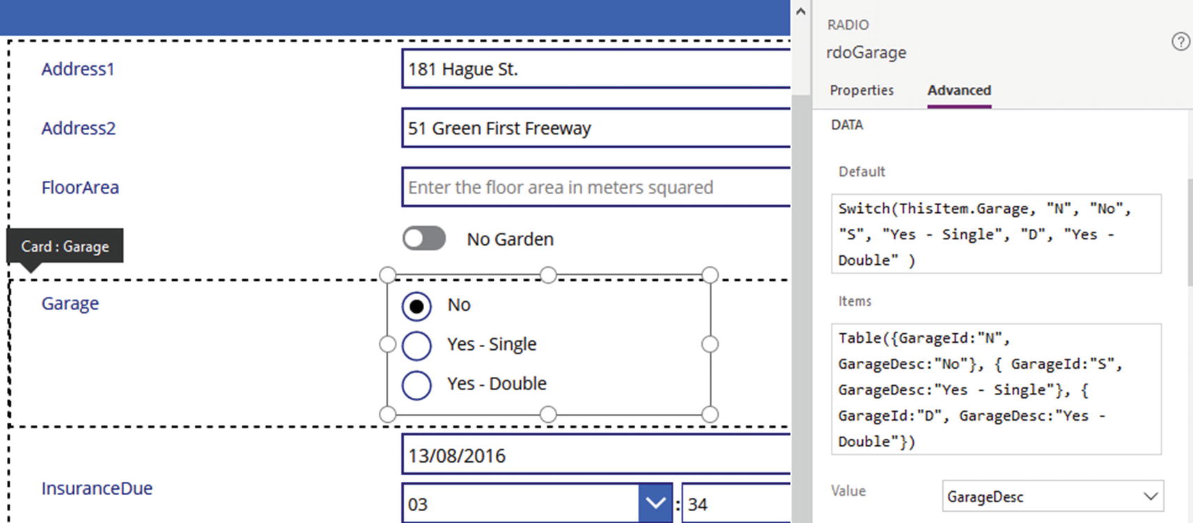
To give an example, let’s assume our spreadsheet contains a field called Garage that indicates whether a property contains a garage. There are three acceptable values for this field – N, S, or D. The value N indicates there is no garage, whereas the values S and D denote the presence of a single and a double garage, respectively.
Let’s look at how to modify our form to support this data structure. To build this feature, the first step is to add a card to the form based on the Garage field. By default, the card contains a text input control. To modify the card, we must unlock the card and delete the text input control.
When we delete a text input control from a card, the designer will display two warnings. The first relates to the Update property of the card which is now invalid, and the second refers to a formula that calculates the coordinates of an error warning label. We need to change this formula so that it refers to our new control (which we’ll now add), rather than the old text input control name.
This formula defines a table that includes the columns GarageId and GarageDesc. The GarageId field denotes the codified value, and the GarageDesc field contains the friendly description. To configure the radio control to show the friendly description, set the Value property to GarageDesc.
Configuring a radio control
A useful tip to be aware of is that we can change the orientation of the radio items . By default, the radio items always stack on top of each other. To amend the layout so that the items flow from left to right , we set the layout property to horizontal.
Storing Radio Control Options in Separate Tables or Collections
For simplicity and clarity, the preceding radio control example duplicates the definition of the ID and description values in both the Items and the Default properties of the radio control. A more maintainable solution is to store these details in a separate table or to predefine these values once in a collection.
This formula calls the LookUp function to retrieve from the collection the description that matches the selected ID value .
Toggle and Checkbox Controls
There are two controls that can accept yes/no or true/false values from the user. These are the toggle control and the checkbox control. Both of these controls function similarly, so for brevity, we’ll examine the use of the toggle control only. The toggle control is identical to the checkbox, except that the user changes the state of the control by sliding a button, rather than clicking a checkbox with a mouse.
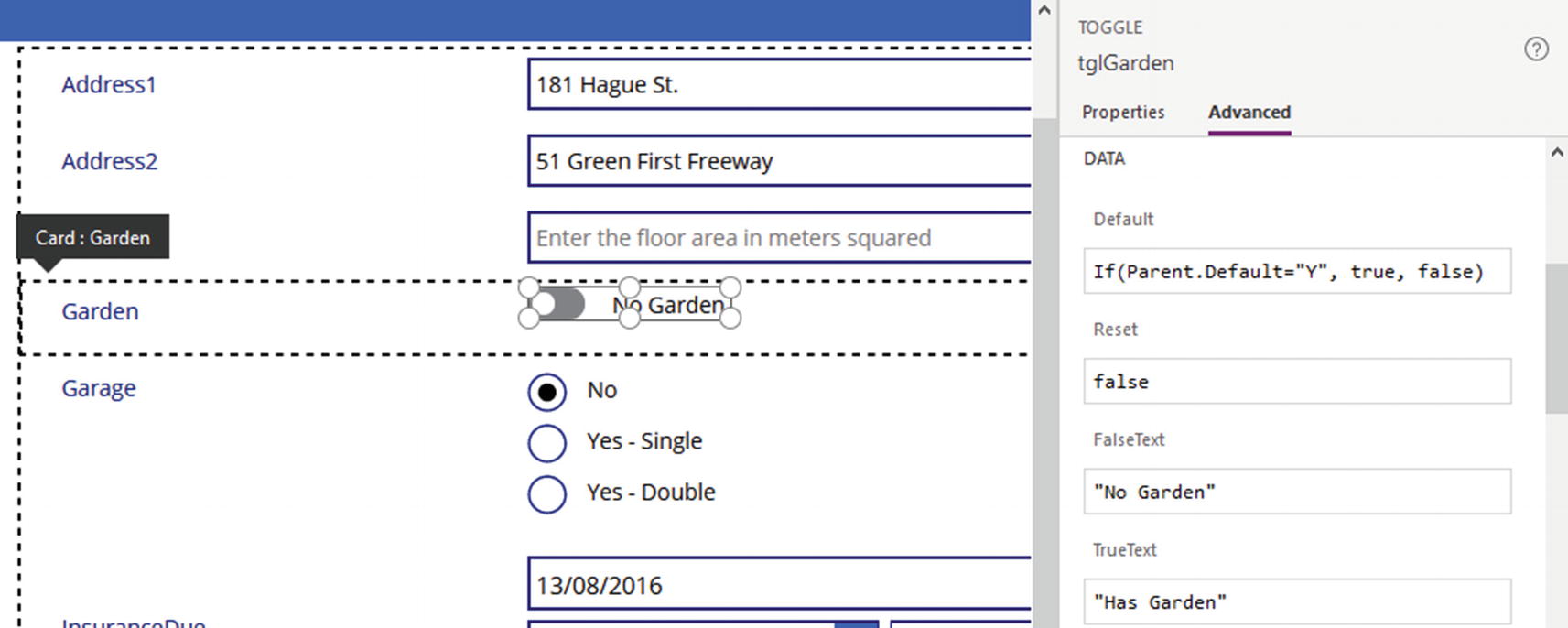
To demonstrate this control, we’ll add a toggle control to our screen to allow users to indicate whether a property contains a garden. The Garden field in our spreadsheet will contain the value Y or N (to indicate yes or no). The toggle control returns Boolean true or false values; therefore, it’s necessary to add a formula that converts the toggle output to the text value Y or N.
Just like the previous example, the first step is to unlock the garden card, delete the textbox, and resolve any errors that appear. Next, insert a toggle control and name it tglGarden. The toggle control includes two properties called TrueText and FalseText. These define the text that appears when the slider is on or off, and the default values of these properties are “on” and “off.” We can customize our control by setting these properties to “Has garden” and “No garden.”
A helpful point to mention is that the equals operator is case sensitive. Therefore, Parent.Default="Y" is not the same as Parent.Default="y".
Configuring the toggle control
Slider Control
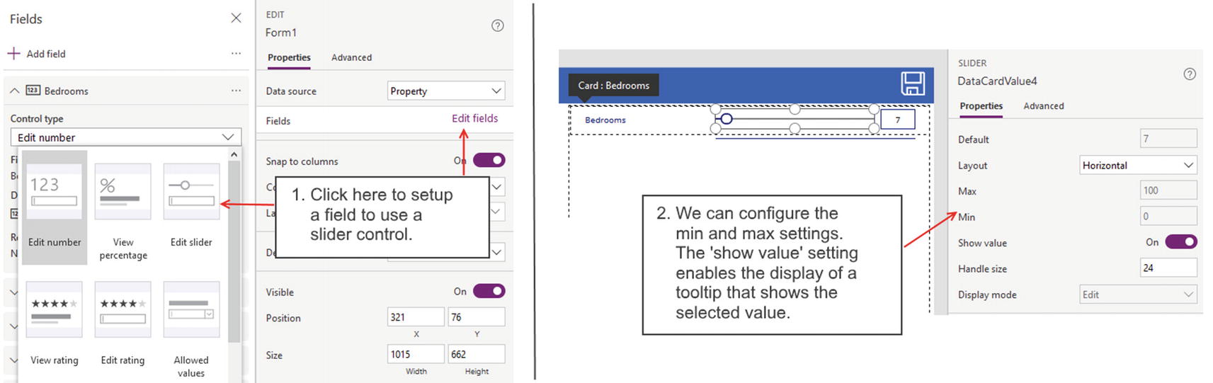
Setting up a slider control
Note that the “Edit slider” option appears only against numeric fields. Therefore, this option would not be available in cases where we store numeric values in a text field. To use a slider control in this scenario, we can modify a card using the same technique that we applied in the radio and toggle control examples. In the Default property of the slider control, we would call the Value function to convert the underlying text value to a number. In the Update property of the form, we would convert the value of the slider control to a text value by calling the Text function.
Some useful properties that we can set on the slider control are the minimum and maximum values. The minimum value can be negative, and the maximum value can be as large as the maximum number that JavaScript permits. Other cosmetic settings include the size of the slider bar and slider button .
Rating Control
The rating control works with numeric fields. It displays a series of stars, and users can assign a rating by clicking a star. To configure a field to use the rating control, we set the control type of a field to “Edit rating.”

Configuring the rating control
Note that at present, there is no option to select a different image other than a star.
Working with Dates
In this section, we’ll look at how to work with date values and how to use the date picker control. We’ll look at the challenges that we face when dealing with time zone conversions, and we’ll look at ways in which we can overcome these problems.
Date Picker Control

Date picker control
This calendar view provides forward and backward icons to navigate through the months. Something that might not be obvious is that users can quickly change the year and month values by clicking these labels. Users who are unaware of this feature can easily become frustrated when they set a date that is significantly earlier or greater than the current date with the backward and forward navigation icons.
An important property to be aware of is the “start year” property. This defaults to 1970, and users cannot select a year earlier than this. It’s necessary to reduce this value if we want to accept earlier dates.
If we create a form based on an Excel data source, it’s important to populate the spreadsheet with sample data. If the spreadsheet contains only table headings, the designer cannot identify the date fields, and any cards that we add for those fields will contain a text input, rather than a date picker control.
Showing Dates Only
For auto-generated apps, Power Apps generates cards that include both date and time entry controls for any date and time fields in a data source. A common question from app builders is how to modify a card to accept date entries only. What are the ways in which we can accomplish this?
If we only want to store date values without a time component, the best approach is to always set the data type of the field in the data source to a data type that is designed for date values only. With a SharePoint list, for example, we would select the “date and time” data type and select the “date only” format. For SQL Server, would we choose the date data type (rather than the datetime, datetimeoffset, or other data types). When we choose a data type that is designed for date values only, the card control that Power Apps generates will include only the date entry controls .
In cases where we cannot change the field data type, we can adapt the cards by removing the hour and minute drop-down controls. To demonstrate this technique, we’ll modify a date field on the edit form to accept date entries only. The name of the field that we’ll modify is the “insurance due” field.
Once we open the edit form in the designer, the first step is to unlock the card. Within the card, there are three controls that relate to the time component: an hour drop-down, a minute drop-down, and a label control that displays a colon between these two drop-downs. Select these three controls and delete them from the card.

The Update property is no longer valid when we delete the hour and minute controls
The most important setting to change is the Update property. One of the exclamation point icons will take us to the update formula, and we can remove the references to the time controls. At this point, we can run our app and use the date picker to save just the date value.
Here’s a useful tip. The designer does not provide an option to insert the time picker controls through the Insert menu. If we want to add hour and minute drop-down controls to other parts of an app, we can copy and paste these controls from an auto-generated card.
If we have a frequent need to add date and time controls to our apps, we can build a custom, reusable date and time picker component for this purpose. We cover this topic in Chapter 22.
Understanding Time Zones
One reason why working with dates and times can be so complicated is because of time zone differences. There are cases where app builders have not appreciated the nuances of time zones. They only discover the problem after they deploy an app. At this point, it becomes an enormous headache to try and repair the data that users have already entered. With the help of this section, we can avoid the common difficulties that are associated with time zones.
To store an absolute date and time that is not tied to a specific time and place. For example, we might want to record the opening dates and times for an international chain of stores. A typical value might be 9 AM on weekdays.
To uniquely and unambiguously identify a single point in time. For example, let’s imagine a system that records the dates and times of online meetings. If a user in the United States creates an appointment, a user in Europe must be able to determine the meeting time in a way that aligns with the user’s time zone.
Power Apps works on the premise that we always want to store points in time, rather than absolute dates and times. By default, the controls and connectors work on this basis. For everything to function correctly, the data source must also be “point in time” aware.
SharePoint is a data source that supports points in time. When we add a datetime column to SharePoint, SharePoint stores the date values in UTC (Coordinated Universal Time) format. UTC shares the same time as GMT (Greenwich Mean Time), the time zone for England, and all time zones in the world are expressed as positive or negative offsets against UTC.
There are data sources that are not “point in time” aware. Excel is one example. Another example is a SQL Server column that uses the datetime data type. These are examples of setups that we would use to store absolute dates and times.
Where we have a mismatch, that is, a scenario where Power Apps expects to work with points in time and a data source that expects to work with absolute dates and times, this is where things start to go wrong.
Excel Walk-Through
To illustrate the typical problem that app builders face with data sources that are not “point in time” aware, we’ll walk through the process of configuring our Excel app to store a date.
We’ll take the form that we created earlier with the “insurance due” field. Let’s now assume that we’re in London and that the current month is June. At this location, the current time zone is BST (British Summer Time), which equates to UTC+ 1 hour.
Let’s now run our app; open a record; set the “insurance due” field to August 13, 2020; and save our record. At this stage, everything will appear to work correctly. We can reopen our record and view the insurance end date value as expected.
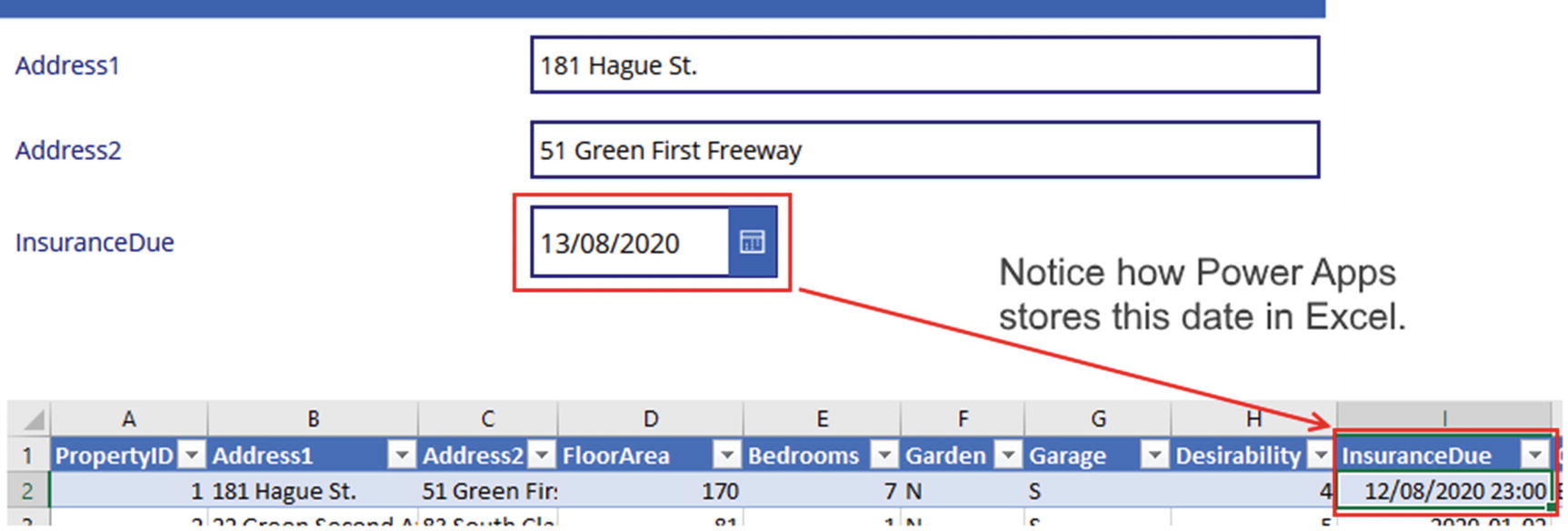
Power Apps saves UTC times to the underlying data source
This behavior causes a problem for other users who want to work directly with the data in Excel. The date values here will be one hour out of sync and will not be an accurate reflection of what the user intended.
We also notice that although Power Apps stores the time in UTC, the value in Excel doesn’t include the offset. Let’s now imagine that five months have passed and we’re now in November. The clocks have now gone back by one hour, and the time zone in England is now GMT. What do you think will happen when we now reopen this same record in Power Apps? The answer is that Power Apps will convert “August 12, 2020, 23:00” to our local time, and because there is now no time difference between GMT and UTC, it will not re-add one hour. Effectively, our record is now one day off.
Storing Absolute Times
The fundamental cause of this problem is that Power Apps is set up to store “point in time” values, whereas Excel is a data source that stores absolute values. Is there a way to configure Power Apps so that it works with absolute values? The answer is yes, although with Excel, it isn’t a perfect solution.
The date picker control provides a property called TimeZone. This property defines the time zone of the selected date in the control, and we can set this to one of two values: local or UTC. The default value is local, and this is the reason why in our example, Power Apps subtracts one hour when it saves the date to Excel.

Excel data appears correctly when we set the TimeZone to UTC

The date that Power Apps retrieves is incorrect when we set the TimeZone to UTC
By default, Power Apps assumes that dates and times that it retrieves from a data source are in UTC. By using this formula to specify that we want to show the UTC value, there is effectively no conversion that Power Apps needs to carry out, and it therefore shows the exact value from the Excel spreadsheet.
By using this technique, we can now accurately save absolute dates and times in Excel. The slight disadvantage of this technique is that we now need to change all the places where the date appears and this can involve a lot of work. Also, if we’ve built screens to search data based on date criteria, we would need to make sure to convert the input date to UTC.
Saving Dates in Year-Month-Day Format
With SharePoint, there is less scope for problems to occur. Because SharePoint datetime columns support UTC and Power Apps expects to work against data sources that support UTC, both systems work in harmony.
Occasionally, SharePoint users may report time values that don’t match those in Power Apps. Usually, the cause of this will be incorrect regional settings on the client device or browser. Alternatively, the administrator may never have set up the regional settings for the SharePoint site.
The main challenge with SharePoint are circumstances where we want to store absolute dates and times, rather than a point in time. A reliable and simple solution is not to use a date column, but instead to store the data as a number in the format yyyymmddhhmm. When we want to display a date in an app, we would format the date as required. An added benefit of this approach is that you may recall the problem where Power Apps doesn’t support searches against date fields with the greater than or less than operators (i.e., filtering a SharePoint list by a date column with greater/less than operators results in a non-delegable query). This solution helps to solve that problem. Furthermore, users can still sort date values in ascending or descending order with this date format.
Here’s how to amend an app to store the “insurance due” values in yyyymmddhhmm format. The first step is to add a numeric field to our data source. Let’s call it InsuranceDueyyyymmddhhmm.
In the screen designer, open the form and add this field. Next, unlock the card, delete the textbox, and resolve any errors that show up. Now insert a date picker control and name it dteInsurance.
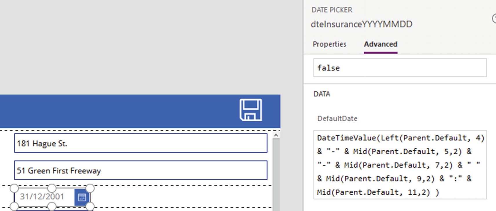
Converting a field to yyyymmddhhmm
At this stage, we can run our app. The app will function as before, but the date values will be stored in yyyymmddhhmm format in the underlying data source.
Summary
This chapter covered the important topic of simple, single-value screen controls. The two controls that display text are the label and HTML text controls. The more powerful of these two controls is the HTML text control because this provides the ability to format text with different styles. Useful applications of this control include the ability to show subscript and superscript characters, mathematical symbols, and more.
The text input control receives text from the user. We can encourage users to enter valid data by specifying a maximum length, and we can also configure the control to accept numeric input only.
Other simple controls include the radio, slider, toggle, and rating controls. On the edit form of an auto-generated app, we can delete the default text input control on a card and replace it with an alternate control. To maintain the ability of the form to save and retrieve data, there are two settings we need to modify. First, it’s necessary to set the Default property of the new control to show the existing data value when the form loads. In general, we would specify the Parent.Default property to retrieve the data value from the containing card, and we can also apply formulas to carry out any data transformations. For example, with a checkbox or toggle control, we can apply a formula to transform an underlying data value of “T” or “F” to the Boolean value true or false, respectively. The second step is to configure the save behavior by modifying the Update property of the containing card. We can apply formulas in the Update property to carry out any reverse transformations. For example, we could convert the Boolean value of a checkbox or toggle control to the value “T” or “F” for storage in the underlying data source.
In auto-generated apps that are based on tables with datetime fields, the card on the edit form will include date picker and time entry controls. A common requirement is to accept date entries without the time component, for example, to store birthdays. In these circumstances, the best approach is to always set the data type of the field in the data source to a data type that is designed for date values only.
Where this isn’t possible, we can adapt the card by deleting the time controls and by modifying the Update property to remove any references to the time controls.
To store dates and times, we must identify whether we want to store an absolute date and time that is time zone independent or a “point in time” that should align with the time zone of the end user.
Power Apps works on the premise that we always want to store points in time, rather than absolute dates and times. For this to function correctly, the data source must also be “point in time” aware by supporting UTC. If the data source does not support UTC, we can easily end up with mismatches between the date values that we see in Power Apps and the date values that we see in the data source.
A great way to store absolute dates and times is to store in a number field, the numeric representation of the date and time in the format yyyymmddmmss. The benefit of this approach is that the date values will still be sortable. Also, this format provides better query support because we can overcome the query delegation limitations of filtering dates with the greater and less than operators.