
This chapter focuses on how to work with controls that can bind to a single record or multiple rows. The controls that we’ll cover include the drop-down, combo box, list box, form, and gallery controls.
The drop-down and combo box controls enable us to limit the data items that a user can select. We’ll look at how to set up these controls, including how to customize display values and how to filter the items in the control based upon a value in a dependent control.
Next, we’ll look at the ways in which we can customize the layout and appearance of the gallery control. Using this control, we’ll find out how to build a feature that enables a user to amend multiple records in one go.
How to configure the combo box control to accept multiple selections and, importantly, how to set up data sources to support this configuration.
How to access the items in a gallery control with a formula. We’ll look at how to simplify formulas and how we can more easily identify errors by using hidden gallery controls.
How to build data entry screens that incorporate both forms and the Patch function. By combining both methods, we can build data entry screens with more bespoke layouts while retaining the productivity that the form designer provides.
Chapter Overview
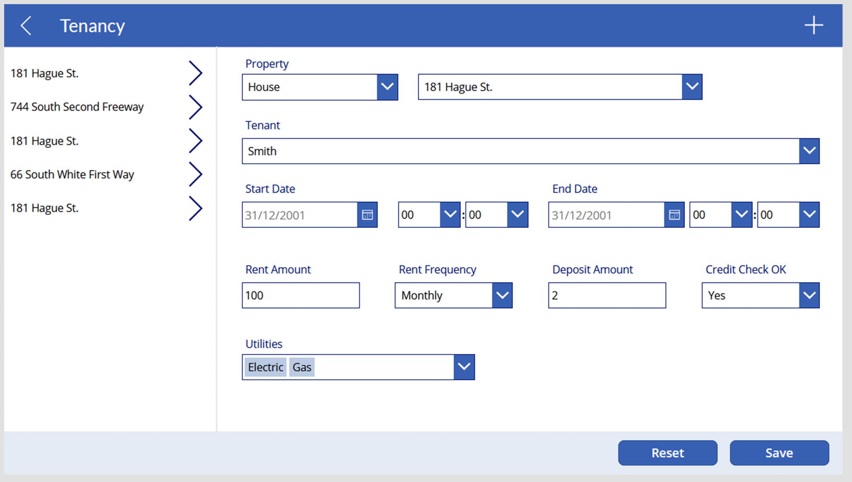
The screen that we’ll build in this chapter

The data structure of the tenancy table
Our tenancy table includes fields such as the start and end dates and payment details. It also contains lookup values that relate to the property and the tenant tables.
From the tenancy table, the PropertyID field stores a numeric value that corresponds to a value that’s held in a property lookup table. Likewise, the TenantID field stores a numeric value that corresponds to a lookup value that’s held in a tenant table.
These sets of tables represent the typical data structure that we would find in a relational database, and they provide an ideal way for us to look at how to work with drop-down lookup values.
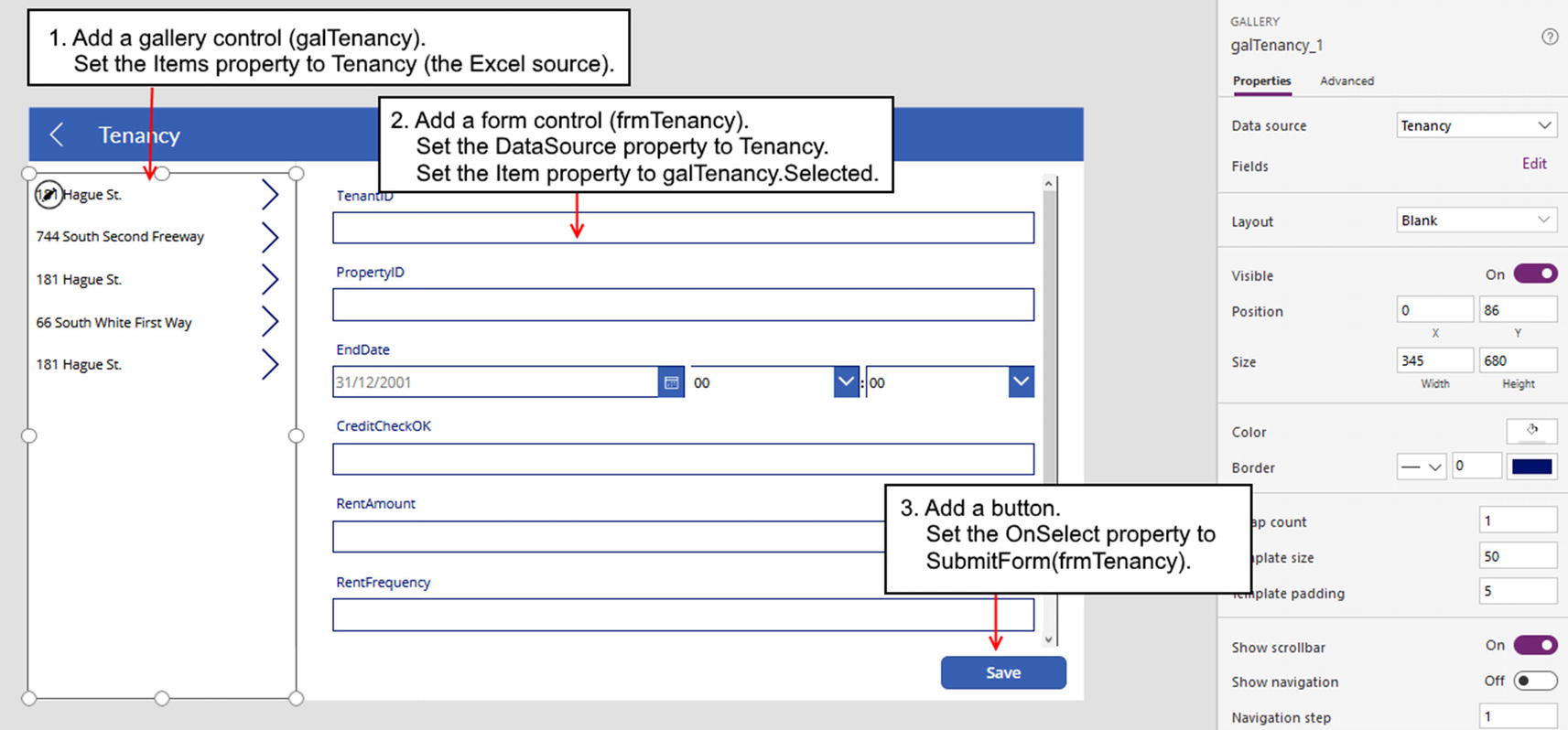
The basic setup of our screen
Data Entry Controls
There are two controls that display a list of selectable items – the drop-down and combo box controls. Both look very similar, so what features do these controls offer, and what are the differences between the two? We’ll now find out.
Of these two controls, the most basic is the drop-down control. This control enables users to select a single item. The biggest limitation with this control is that it displays a maximum of 500 items only.
The combo box control provides many more capabilities, compared to the drop-down control. Unlike other implementations of combo box controls that we can find in other systems, it also offers a search feature. Users can type into the control, and the combo box will display all matching items that contain the search text. This feature helps us to overcome the 500-item limit that the drop-down control imposes. Another powerful feature is that the combo box control supports multiple selected items. With the drop-down control, users can select a single item only.
Compared to the drop-down control, the combo box control provides many more features including search, multi-select capabilities, additional layout settings, and support for more than 500 items.
Drop-Down Control
To demonstrate the drop-down control , here’s how to apply the control to a text field called “credit check” in our tenancy table. In this example, we’ll limit users to entering the value “yes” or “no” in this field.
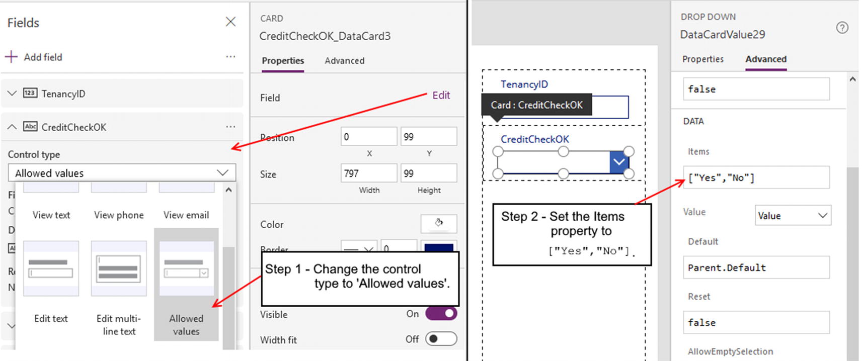
Changing the control type to “Allowed values”

Setting lookup values with SharePoint and Dataverse
We can now run our app and use the drop-down control to set the “credit check” value of the record. An interesting question we might ask is this: If we open an existing record with a value that doesn’t exist in the drop-down, what would happen? The answer is that the drop-down would show a blank value. In this scenario, Power Apps will not display any error messages to the user, and it will not crash or stop working entirely .
Setting Lookup Values
The simple example we’ve seen is not particularly future-proof because it relies on hardcoded values. To enable users to maintain the choice items that appear in a drop-down or combo box control, we can build a data structure that stores the choice items in a separate table or SharePoint list.
With SharePoint, it’s very simple to develop this type of structure. In our example, we have a tenancy list that stores tenancy details. To store the property that relates to a specific tenancy record, we can define a lookup column in the tenancy list and configure this column to refer to a SharePoint list of property records.
With Dataverse, we can also easily define lookups by creating relationships between tables. With SharePoint and Dataverse data sources, the designer understands the relationships between lists or tables. This enables us to more easily build screens that use the drop-down or combo box controls.
We’ll now look at how to configure a form to store lookup values, based on SharePoint and Excel data sources.
Setting Lookup Values with SharePoint and Dataverse
Starting with SharePoint, we’ll base this example on a tenancy list that includes a lookup column that relates to the property list. However, what we cover here will work equally well for any list with a lookup column.
If we add a form that’s based on the tenancy list and add the property lookup field, the card for this field will include a combo box control that displays items from the SharePoint property list. The great news is that it all works and there are no additional tasks we need to carry out.
The Choices function accepts a field name and returns a table that contains all acceptable choice values for the input field.
Setting Lookup Values with Other Data Sources
With other data sources such as Excel or SQL Server, Power Apps cannot identify the relationships between tables; and therefore, there is more work involved to configure a combo box or drop-down control.

The data structure of the tenancy, property, and property type tables
As a starting point, let’s suppose we create a new app that includes these Excel tables. We then add a form, set the data source of the form to the tenancy table, and add the property field.
To modify the property card so that it uses a drop-down control, we change the control type to “Allowed values” and unlock the card.
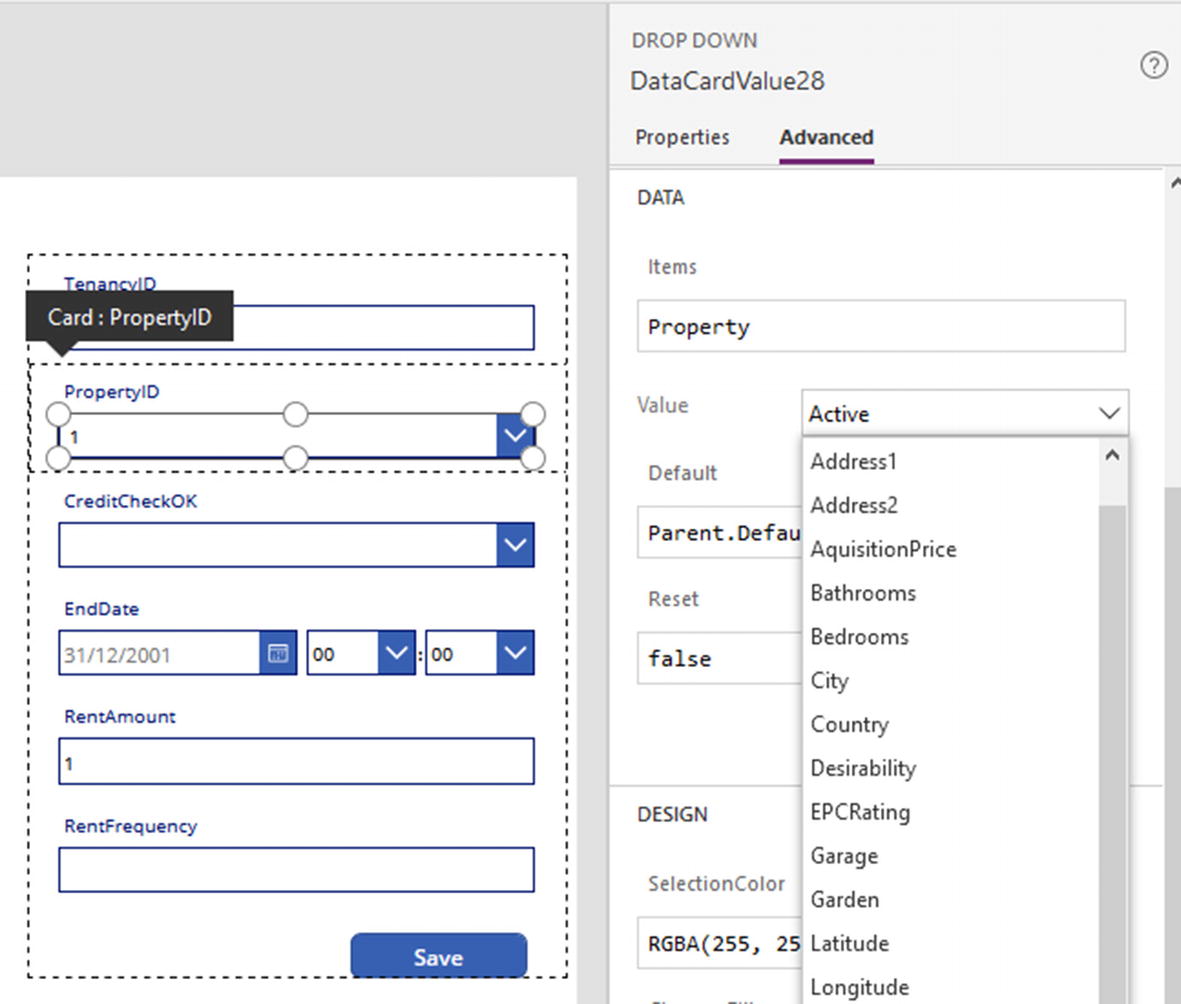
Setting up drop-downs
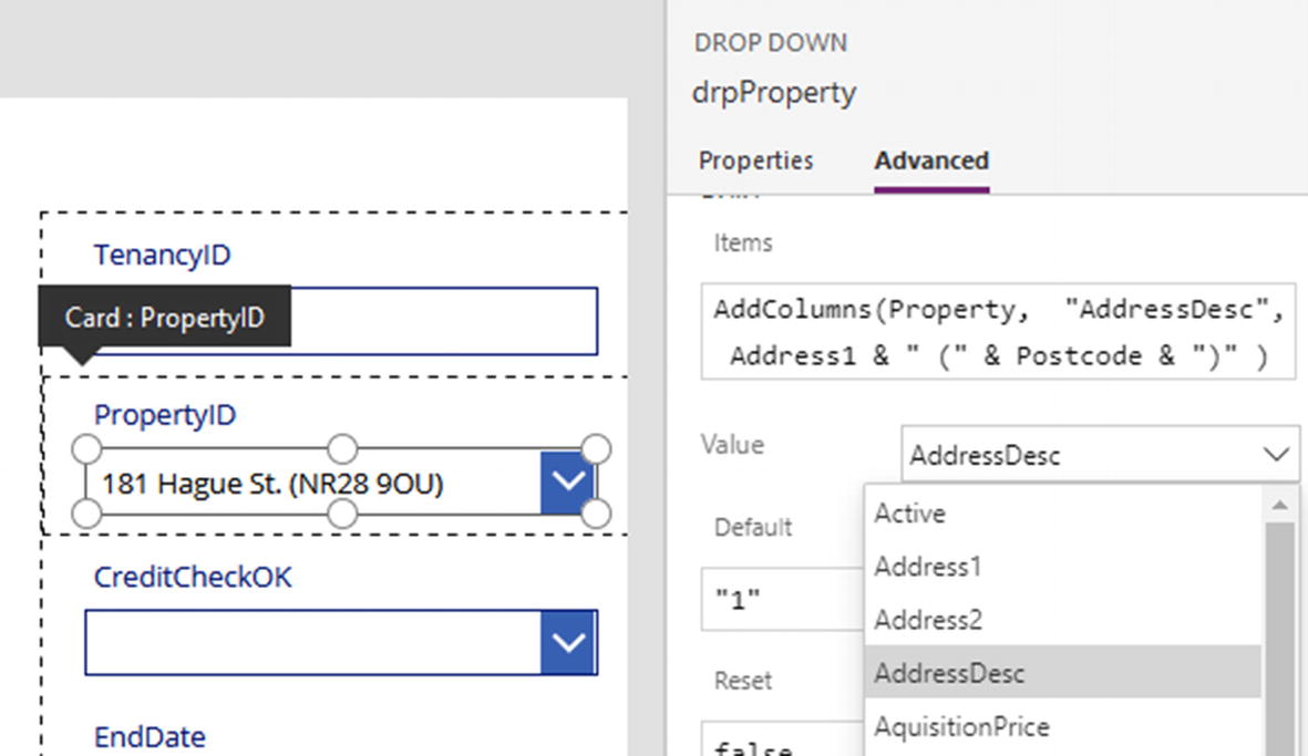
The default name of the drop-down will be something like DataCardValue28. To make this control easier to identify, we’ll rename it to drpProperty.
We can now run our app and set the property value of a tenancy record using a drop-down control.
Customizing the Drop-Down Display Value
The AddColumns function adds columns to a data source, collection, or table. This function accepts three arguments – a data source, the name of the column to add, and the value for each row.
Here, we add a column called AddressDesc that combines the first line of the address and the postcode in parentheses. To display this value in the drop-down, we set the Value property of the drop-down to AddressDesc.
The LookUp function returns the first record from a data source that matches the formula that we provide. The data source we provide here is the formatted version of the Property table that includes the address and the postcode in parentheses. The lookup formula retrieves the record from this data source where the PropertyID value matches the PropertyID value of the tenancy record.
Edit the Items, Value, and Default properties to customize the drop-down text
Nesting Drop-Down Controls
To assist data entry, we can nest together sets of combo box or drop-down controls. There are many practical scenarios where this is useful. To give an example, an address entry screen could provide a drop-down box that displays a list of states. When a user selects a state, a corresponding drop-down box will display a list of cities that match the selected state.
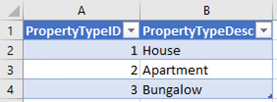
The property type table
Power Apps provides a simple no code method to implement nested drop-downs. This simple technique is less customizable, and there is another, more complex method that we can adopt. We’ll now cover both these techniques
Setting Drop-Down Control Dependencies
Starting with the simple technique, the first step is to add an additional “property type” drop-down to the card that we adapted to include a property selection drop-down. We would set the Items property of the new “property type” drop-down to our property type table.
Defining a drop-down dependency
Although this technique is simple and involves no code, the limitation is that we must use the items drop-down to select a data source and we must use the Value property to define the text that displays in each row of the drop-down. This prevents us from customizing the text that displays in the drop-down.
Changing the Combo Box Layout
If we want to specify drop-down dependencies using a no code technique but also require more flexibility over the text that appears, another option is to use a combo box rather than a drop-down.
A useful feature of the combo box control is that it provides three row item templates. The default template displays a single data item per row. There is also a double item template that displays two data items per row and a person template that enables us to show a photo.
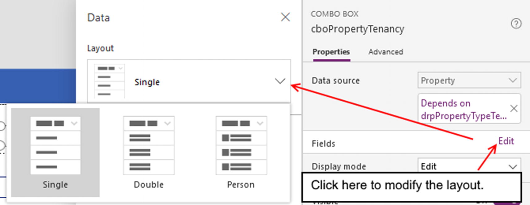
Selecting a combo box layout
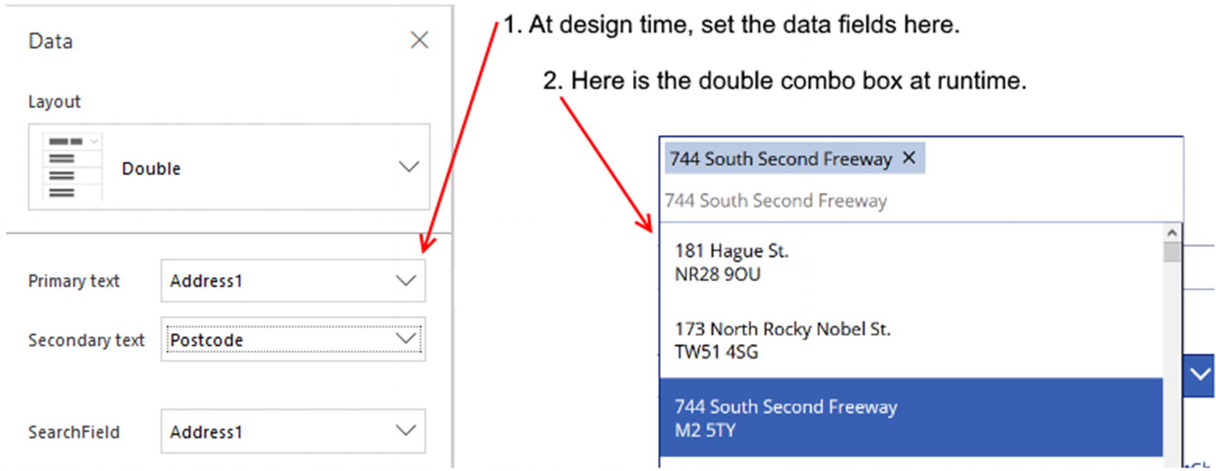
Using the double layout to display two data values per row
Defining Drop-Down Dependencies with Formulas
Although the combo box control provides more flexibility, it might not completely satisfy our needs. We may want to display more than two data fields per row, customize the display text, or not like the appearance of each item taking up two lines in the combo box. In these cases, we can implement drop-down dependencies by writing our own formulas.
To demonstrate this technique, we’ll extend our earlier example where we customized each row of our drop-down control to display the first line of the address followed by the postcode in parentheses.
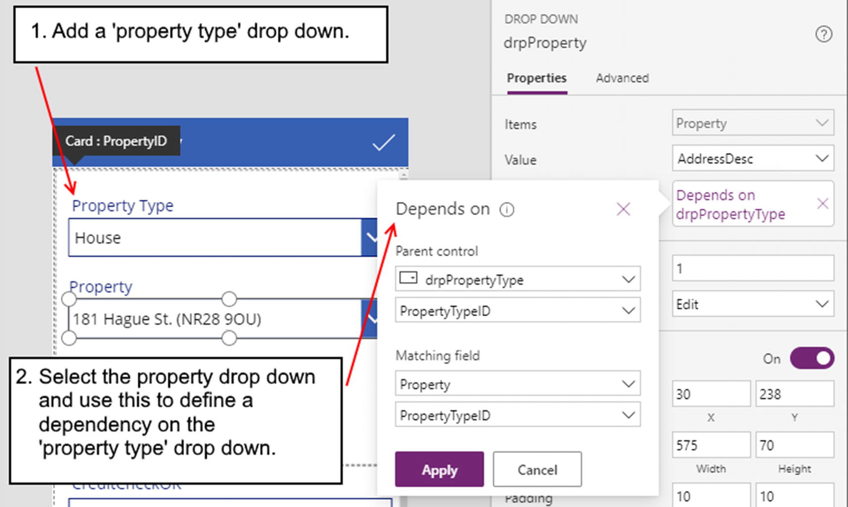
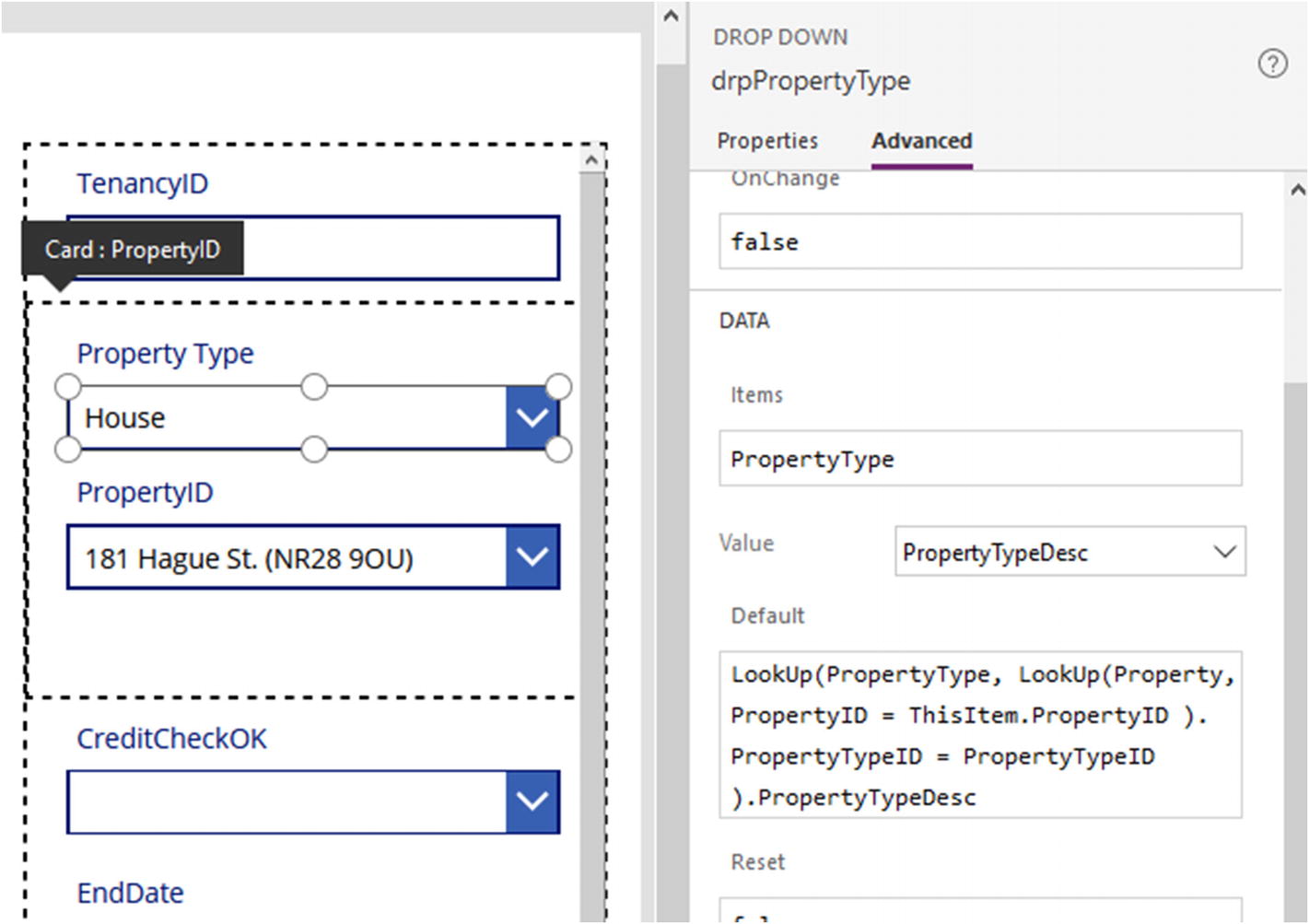
Taking the form that displays a tenancy record, the first step is to add a “property type” drop-down to the card in the form that corresponds to the property ID field. Next, set the Items property of this drop-down to the property type table and name the control drpPropertyType.
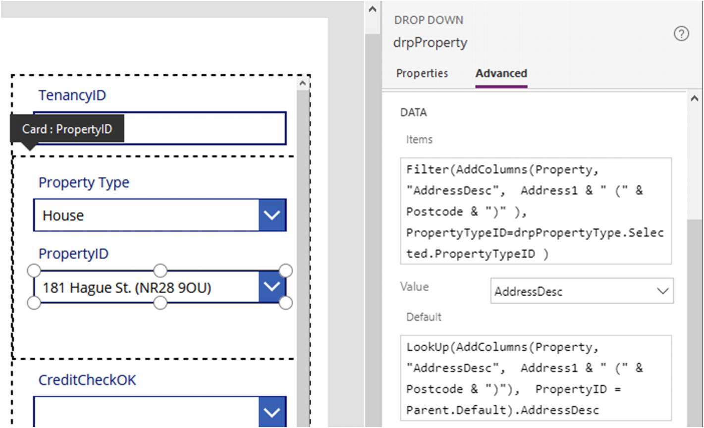
Creating a dependency between the property and property type drop-downs
This formula contains a set of nested lookups. The innermost lookup retrieves the property record that relates to the tenancy record in the form. The outermost lookup retrieves the property type record that is related to the property record.
Showing the property type that corresponds to the selected property
When we now run our app, the items that appear in the property drop-down will display the first line of the address and postcode in parentheses, and the property type drop-down will also show the property type that correctly matches the property.
Selecting Multiple Items with a Combo Box
A powerful feature that the combo box control offers is the ability for users to select multiple items. The easiest way to set up a multi-selection combo box is to use a SharePoint data source. With a bit more work, we can also utilize multi-selection combo boxes with other data sources. In this section, we’ll walk through the steps to configure a multi-selection combo box in both these scenarios.
Combo Box Multi-selection with SharePoint
With SharePoint, we can define a choice column that permits multiple selections. With this type of column, we can easily construct a data entry form without needing to write any code.
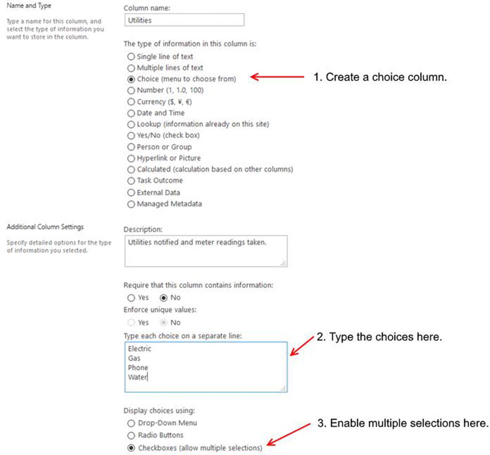
Creating a multi-select combo in SharePoint
We can now add a form, set the data source to the tenancy list, and include the utilities field. The designer will create a card with a combo box control with the multi-selection feature enabled. The good news is that this now all works without us needing to perform any additional tasks.

A multi-select combo box at runtime
Combo Box Multi-selection with Other Data Sources
With data sources other than SharePoint, we can set up a multi-selection combo box, but it involves more work and custom formulas.
To demonstrate, we’ll recreate our SharePoint example with Excel. The first step is to add a column called utilities to the tenancy table in our spreadsheet. We will store comma-separated choice items in this column.
We can now add a form, set the data source to the tenancy table, and include the utilities field. By default, the utilities card will contain a textbox. We need to unlock this card, delete the textbox control, and replace it with a combo box control. We’ll call this control cboUtilities.
The SelectedItems property of the combo box control returns a table of selected items. We call the Concat function to combine these rows into a single string, with each row prefixed with a comma. The Mid function removes the proceeding comma.

Setting up a multi-select combo box
Data Display Controls
In this section of the chapter, we’ll look at some of the controls that we can use to display tables of data. These will include the list box, table, and gallery controls.
List Box Control
The list box control enables users to select one or more items from a list. For practical purposes, this control works almost identically to the drop-down control. In addition to the multi-select capability, the only difference is that the data items are always on display.
The Items property defines the data source, and the Value property defines the data field that is shown for each item in the control.
Just like the drop-down control, we can customize the item text by setting the Items property to a formula that utilizes the AddColumns function . We can also specify a dependency to filter the items in the control based on the value of another control.

The list box control
The list box control can support multiple selections, and the SelectMultiple property controls this feature.
We can use the SelectedItems property to retrieve a table of selected items. If we were to use this control to display a data value for an existing record, we could use the Default property to specify the selected item. However, a major limitation is that we can preselect a maximum of one item only, and this prevents us from using this control to display multiple items.
Therefore, the list box control works best for data entry purposes. A typical scenario is where we want to build a screen that accepts search criteria values.
Displaying Tables of Data
The data table control is a great control that enables us to quickly and easily display data in a tabular format. The table control is read-only and doesn’t provide cell-level editing like Excel.
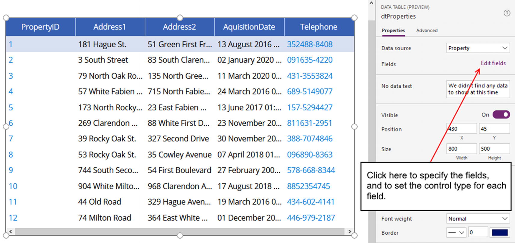
Using the table control
Through the fields section, we can define the control type. Where this comes in useful is for telephone or web address fields. With these data types, we can use the properties of the column to enable a hyperlink. This configures the cell value to display a hyperlink that opens the telephone dialer or the web address in a browser.

Setting column attributes
The data table control behaves similarly to the gallery control because it keeps track of the selected row. Therefore, we can use it for record selection purposes, or we can utilize the design pattern where we place an edit form next to the data table control and set the data source of the edit form to the selected item in the data table .
Working with Gallery Controls
The gallery control is a powerful control that is versatile and highly customizable. By now, we’re familiar with the functionality that this control offers; so in this section, we’ll cover some of the features that we haven’t covered. This includes layout features and an example of how we can use the gallery control to help select multiple records.
Choosing a Gallery Type

The three gallery types
A vertical gallery arranges items from top to bottom, whereas a horizontal gallery arranges items from left to right. A horizontal gallery works well with the landscape orientation of a tablet device.
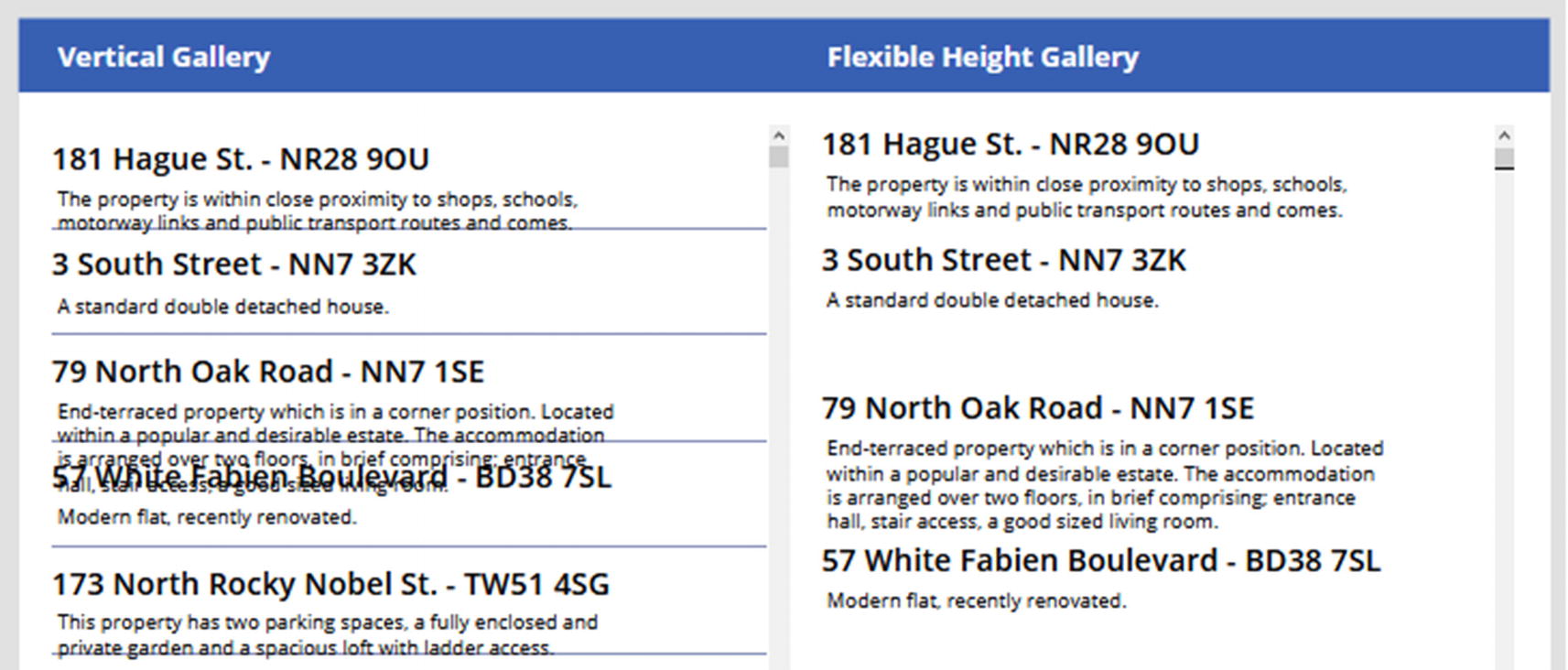
Vertical vs. flexible height gallery
A vertical gallery imposes a fixed row height. If the amount of data in a row exceeds the specified height, the content in the row will overlap the next row. We can avoid this problem with a flexible height gallery . With this type of gallery, the row height will grow automatically, so long as the content that we add to the item template are labels or HTML text controls with the AutoHeight property set to true.
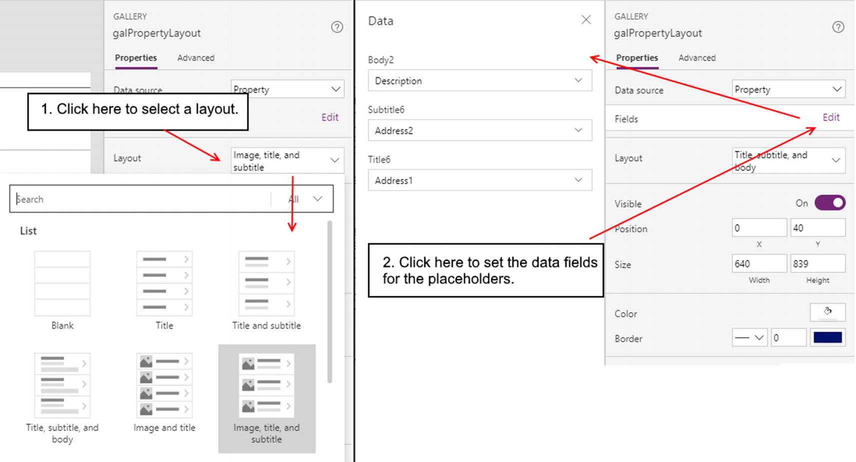
Applying Layouts

All the layouts that we can apply to a gallery
The vertical gallery type provides the largest choice of layouts. The horizontal and flexible height gallery types provide a choice of only three layouts each. Once we apply a layout, we can use the designer to select which fields to display in each placeholder.
Gallery control layouts
Setting Properties

Gallery control properties
The gallery control can display forward and backward navigation buttons. The “Show navigation” setting controls the visibility of these buttons. The Navigation step setting controls how many records to move through when the user clicks the navigation button. In this example, the gallery fits four records. By setting the navigation step to 4, the user can quickly view the next or previous four records by clicking the navigation button.
It’s possible to hide the scrollbar and navigation items. A scenario where we would do this is if we were building a menu structure and we didn’t want navigation items to appear.
There are three transition options that we can set – none, push, and pop. The Transition setting defines the visual behavior of an item when a user hovers the mouse over the item. With the pop setting, the controls in the item template pop out toward the user and become more prominent when the user hovers the mouse over the data item. With the push setting, the controls in the item template sink into the gallery when the user hovers the mouse over the data item.
Another useful setting is wrap count. On a vertical gallery, this defines the number of records to display in each row. On a horizontal gallery, this defines the number of rows that are visible. We can use the wrap count setting to fit more records into a space or to help build a tile layout of records.
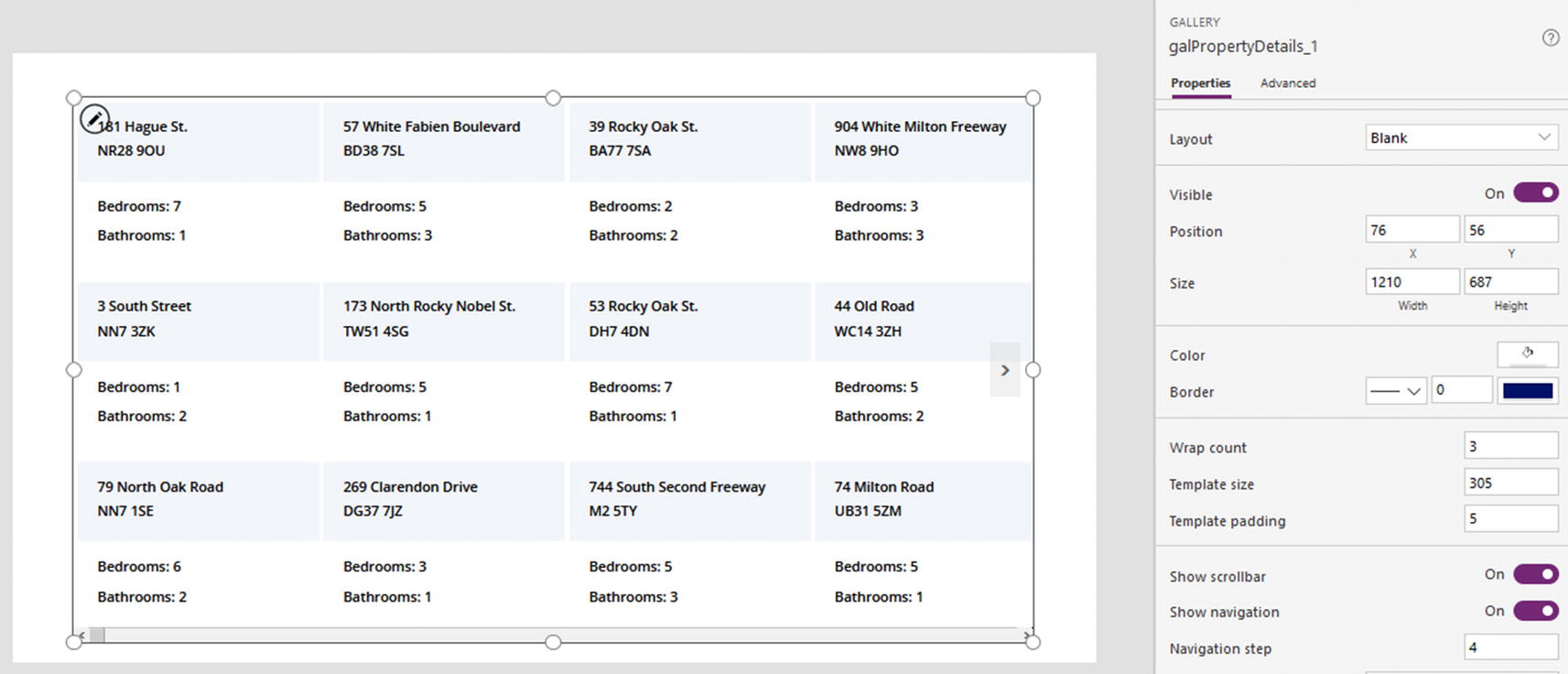
Wrap count property
Incorporating Data Entry Controls
The beauty of the gallery control is that we can add all sorts of controls to an item template. These include data entry controls and nested galleries. For example, we could add a checkbox control to the item template of a gallery, and this would provide a means for users to select multiple records. We could use this as an input to update or to delete multiple records.

Creating a multi-edit screen

The gallery control contains a text input control and label
The gallery control contains a property called AllItems. Through this property, we can access all items within the gallery. This includes not just the data values in the gallery but also any controls that we add to the item template.

The hidden gallery control contains two labels
This formula loops through the items in the hidden gallery and calls the UpdateIf function to update the description that corresponds to the property ID of the record. We covered the UpdateIf function in Chapter 7.
This example highlights the benefit of using a hidden gallery. It makes our call to the ForAll function easier to read because we’ve extracted the function that filters the source gallery for any modified records. Also, by referencing the updated values through labels, we avoid any tricky disambiguation syntax due to the data source of our updated records and the target data source sharing the same column name.
If the formula fails to update our data source, another advantage of this technique is that we can debug the problem by setting the visibility of the hidden gallery to true and inspecting the records that we want to update in more detail.
A hidden gallery provides a simple way to access modified records. We can add labels to this hidden gallery to help avoid disambiguation syntax.
Working with Forms
In the final part of this chapter, we’ll examine the form control in more depth. In Chapter 3, we covered the basic use of the form control, including the relationship between the form and card controls. In this section, we’ll examine some of the topics that we haven’t yet covered, including how to lay out a form, how to improve the presentation of a data input screen by using multiple forms, how to set default values and reset controls, and how to validate values.
Laying Out a Form
We can use the Layout setting to define where the field labels appear in relation to the data entry controls. There are two settings we can apply – vertical and horizontal.
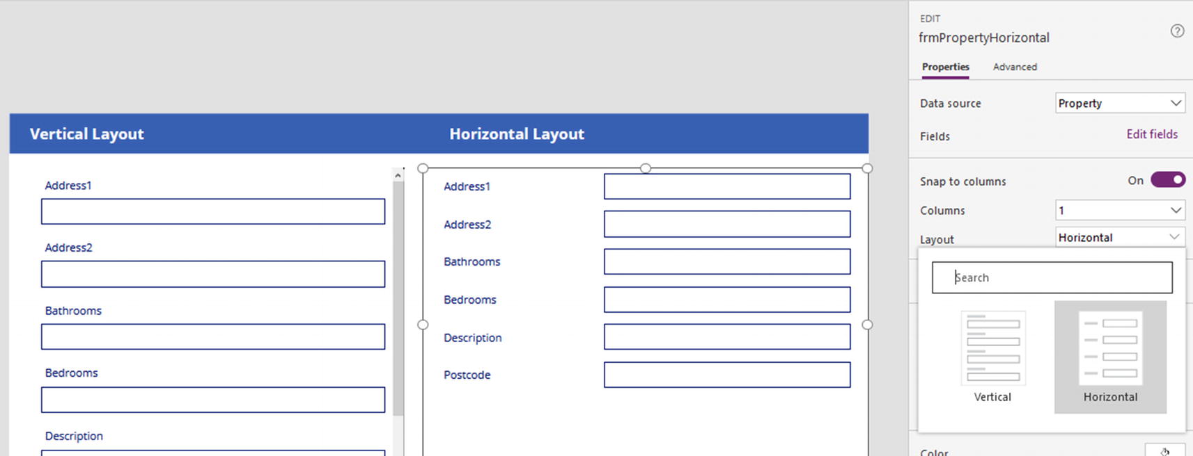
Selecting either the vertical or horizontal layout
Defining Form Columns
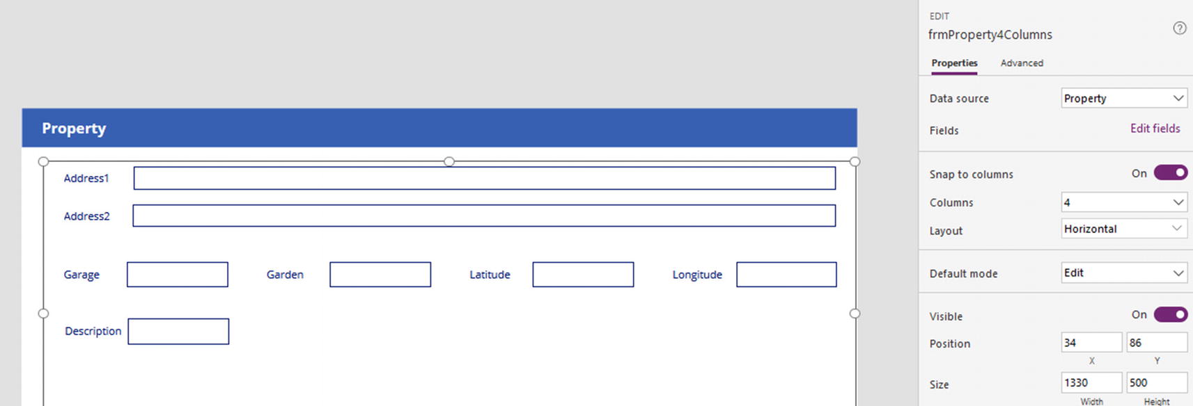
Laying out a form with multiple columns
With a Columns setting of 4, Power Apps applies an invisible grid beneath the form that consists of four columns. We can position cards so that they fit into a column, or we can stretch a card so that it spans multiple columns.
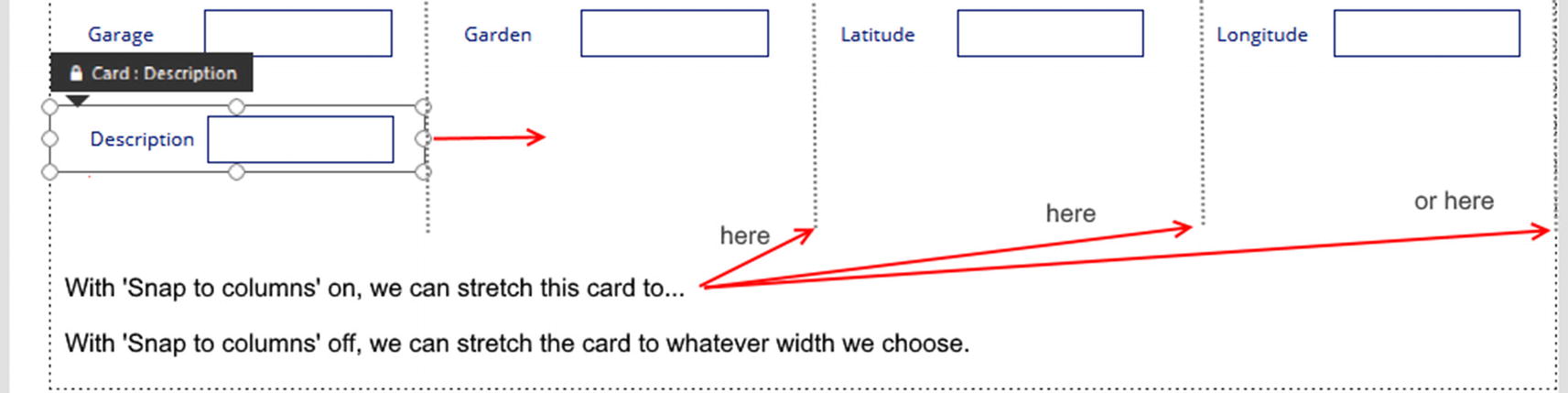
How Snap to columns works
Here are some additional tips. It isn’t possible to rearrange the order of the cards on the form by dragging and dropping the cards in the designer. The way to rearrange the order of the cards is to click the Edit fields link and to rearrange the cards from that section of the designer.
If we want to leave an empty column, we can add a blank custom card, and we can position that into the column that we want to leave blank.
Combining Forms and Patch
Sometimes, a form layout can be too rigid. For additional flexibility, a technique we can use is to combine multiple forms and the Patch function . The benefit of this technique is that in the case of an edit screen, we can use the graphical designer to build the UI that loads an existing record, and we can do this productively in a no code way. By separating fields into separate forms, we can design our data entry screens more granularly. We can split data entry sections into tabs, or we can separate forms across multiple screens.

A screen with three forms
The form control exposes a property called Updates . This returns the values of the data fields that have been changed by the user.
Setting Form Default Values
To help users more easily create new records, we can set default field values for a record. With a form, we can write a formula that detects the form mode. This can be one of two modes – new or edit. If the form is in new mode, we can show a default value. If the form is in edit mode, we can show the existing field value instead. To demonstrate, here’s how to modify an edit form based on our tenancy table. When a user creates a new record, we’ll default the start date to today’s date.
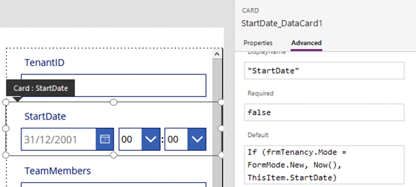
Setting default screen values
If (frmTenancy.Mode = FormMode.New, Now(), ThisItem.StartDate)
When we now run this form, the start date field will display today’s date when we create a new record. When we edit an existing record, it will show the existing start date value.
Resetting Form Controls
Power Apps provides a framework to reset control values back to their default states. This feature serves a very useful purpose because we can use it to enable users to undo their changes. We’ll demonstrate this feature by adding a discard button to an edit form. If a user starts to edit a record and decides not to continue, the discard button will restore the control values back to their initial state.
Every control includes a property called Reset, and all controls will respond to a change in this property. When the Reset property for a control changes to true, it triggers the control to restore its value back to its initial state. The pattern to build a discard feature is to set the Reset property of all controls to a context variable. To trigger the reset operation, we would set the value of the variable to true. Next, we would immediately set the value back to false. By setting the value to false, the user can repeat the discard operation at a later point in time.

Adding a reset button
We would now set the Reset property on all the data entry controls to the variable ResetForm. We can now run our screen. If we change the values on a form and click the reset button, the controls will revert to their initial values.
Validating Form Values
A great benefit of using forms with data sources such as SharePoint, SQL Server, and Dataverse is that the designer creates the controls to enforce any basic data constraints that we define at the data source. This includes mandatory field, data length, and range validation (i.e., whether an input value falls between a defined minimum and maximum range).
If we need to apply more complex validation rules, we need to build this into our application manually. To demonstrate a typical validation rule, here’s how to ensure that users enter end date values that are greater than the start date.
To build this feature, the first step is to unlock the start date card. To make our formula more readable, we’ll rename the start date picker and time controls to dteStart, drpHourStart, and drpMinuteStart.
Next, unlock the end date card and rename the end date picker and time controls to dteEnd, drpHourEnd, and drpMinuteEnd.

Adding a validation message that compares two fields
This formula calls the If function to test if the end date value exceeds the start date. If a user enters valid data, the label shows an empty string. Otherwise, it shows a message that indicates the error to the user.
A great way to validate data is to call the IsMatch function, as demonstrated in Chapter 5. We can call this function to check that users enter data in the correct format. For example, we can call this function to validate the format of email addresses or telephone numbers.
Retrieving Validation Rules
If we build a data entry screen without forms, we can call the Validate function to check if the input data adheres to the basic validation rules that we define at the data source. This technique works against data sources that support data rules, including SharePoint, Dataverse, and SQL Server.

Using the Validate function to validate a single field
Because the intention here is to validate a new record, we call the Defaults function to return a base record that we can pass to the Validate function . If we were validating an existing record, we would provide the existing record to the Validate function instead.
A good way to force users to enter numeric data is to use a text input control and to set the Format property to TextFormat.Number. This technique can help us avoid writing specific code to validate numeric input data.
Summary
This chapter covered the more complex control types including drop-down and combo controls, galleries, and form controls.
We began by looking at the drop-down and combo box controls. Both of these controls are important because they provide a means for us to allow users to set lookup values or to restrict the values that a user can enter. The difference between these two controls is that the combo box provides more features. With the combo box control, users can search items by typing into the control. Another feature of the combo box control is that it permits users to select multiple items.
For SharePoint lists with lookup columns or Dataverse tables with relationships, the form designer can generate data entry cards that include the drop-down control. This provides a simple, no code way for us to apply the drop-down control.
With other data sources, the typical way to utilize a drop-down control is to set the data source to a lookup table that contains both a description and a corresponding code or numeric value. We would display the description in the drop-down and store the code value in the data source that references the lookup value. On the form that contains the drop-down, we would add a formula to the Update property of the card to save the selected code value of the drop-down. In the Default property of the drop-down control, we would look up the description that corresponds to the lookup ID.
We use the Value property to define the field that the drop-down control displays. The value that we enter must match one of the fields in the data source of the control. A common requirement is to customize the text in each row of the drop-down control. We can accomplish this by setting the data source of the drop-down or combo box to the result of the AddColumns function . In the call to the AddColumns function, we would construct a formula to produce the customized display text.
With both the drop-down and combo box controls, we can filter the items that these controls display by specifying a dependent control.
With a SharePoint list, we can define choice columns that permit multiple selections. If we build a form against this type of column, the data card will include a combo box control that supports the entry and retrieval of multiple selections.
Other controls that can display multiple records include the list box control and table control. The list box control works similarly to the drop-down control. But instead of the user needing to click the control to show the list of items, the data items are always visible with the list box control. For data entry purposes, the user can select one or more items from a list box. However, a limitation with this control is that when we load data into the control, we can only preselect a maximum of one item.
The table control provides a very simple and quick way for us to display data in rows and columns. The main limitation is that it is not possible for users to edit data using the control.
The gallery control is one of the most powerful and widely used controls. There are three gallery types that are available. These include the vertical, horizontal, and flexible height galleries. The vertical and flexible height galleries display data items from top to bottom, whereas the horizontal gallery displays items left to right. Each data item in the vertical gallery has a fixed height. In situations where the data that we want to show in each row can vary, the text from the previous row can overlap onto the next row. The flexible height gallery overcomes this problem by providing row heights that can vary depending on the amount of data in each row.
There are various settings that we can use to customize the appearance of a gallery. To help us quickly build the item template of the gallery, we can apply a built-in layout. When we apply a layout, the designer produces an item template that includes placeholder controls. These controls can include an image placeholder and placeholders for a title and description. Through the designer, we can choose the data field that we want to display in each placeholder using a drop-down control.
The gallery control exposes a property called AllItems. We can use this to retrieve all the data items and controls in a gallery. By utilizing the AllItems property of the gallery, we learned how to build a gallery that enables users to amend multiple records in one go. In this example, we also examined how to use hidden galleries to store working sets of data. This technique can help simplify formulas, and by temporarily showing the hidden galleries at design time, we can more easily diagnose problems.
In the final part of this chapter, we looked at how to customize the form control. We can specify where field labels appear in relation to the data entry controls by using the Layout setting. We can use this to display field labels above or to the left of the data entry controls.
The form control provides a Columns setting. We use this to apply a column structure that helps us to lay out the cards on a form. By using the designer, we can stretch a card so that it spans multiple columns. We can use this feature to produce a form that contains a wide text input control in one row and multiple shorter text input controls on another row.
The form control exposes a property called Updates. This property returns all the field values on a form that the user has modified. To produce a screen with sets of controls that are placed in disjointed locations, we learned how to add multiple forms to a screen that bind to the same record. We can save the data from the multiple forms by calling the Patch function and referring to the Updates property of each form.
We looked at how to add custom validation to a form, and in the final section of this chapter, we looked at how to restore control values back to their initial state. Each control includes a property called Reset. When this value is true, the control will reset itself back to its initial state. A typical way to build a reset or undo feature on a screen is to set the Reset property on all target controls to a Boolean variable. We would then add a button that sets the variable to true and then back to false. This would trigger all the specified controls to revert to their initial values.