
Power Apps provides a range of charting capabilities for both canvas and model-driven apps. With canvas apps, we can visualize data with bar, line, and pie chart types. With model-driven apps, there are even more options.
In this chapter, we’ll find out how to prepare a data source and how to improve the presentation of our canvas and model-driven apps by incorporating charts. With model-driven apps, we can build dashboards that enable users to drill into data through charts. We’ll find out how to build this feature.
How to aggregate data. We’ll look at techniques we can use to transform our data into a format that we can use with the chart controls.
How to use charts in canvas apps. We’ll learn how to add charts to a screen and how to configure settings such as legends, colors, and labels. We’ll also find out how to display multiple series of data.
How to build and use charts in model-driven apps. We’ll find out how to incorporate charts in dashboards and to make advanced customizations by modifying the chart definitions outside of the editor.
Introduction
Canvas chart controls
Model-driven app chart controls
Power BI charts
For canvas apps, Power Apps offers bar, line, and pie chart controls. The properties of the chart control enable us to set the label, color, and legend settings. The controls can render multiple series. This means, for example, that we can build a line chart that displays two distinct groups of data.
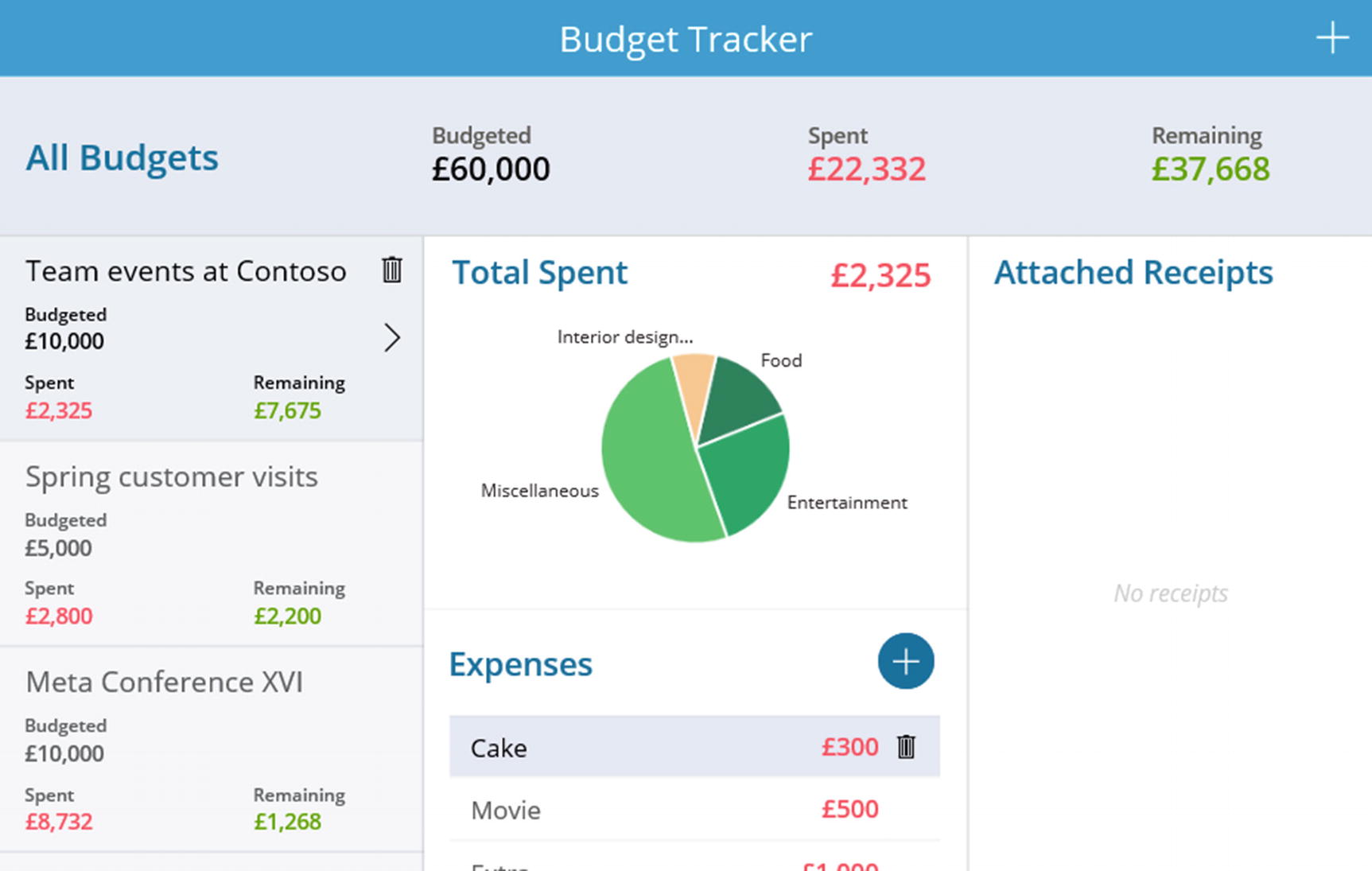
The sample “Budget Tracker” canvas app
Model-driven apps provide far better charting capabilities. There are eight chart types, including area, funnel, tag, and donut chart types. We can also configure the bar, column, and area charts to render stacked and 100% stacked variations of these charts. There is also ability to combine charts. For example, we can build a single chart that displays a column and a line chart.
As we saw earlier in this book, we can attach charts to interactive dashboards. This offers a way for users to use charts to drill down into lists of data. At runtime, users can select a source view and use the date filtering capabilities of a dashboard to render a chart that pertains to a specific set of data.
A useful feature is that a user can build a personal dashboard and build a chart that is visible only to the user. Due to the nature of model-driven apps, we can define charts at the table level and reuse those charts in multiple apps. This feature provides an efficiency benefit that is unavailable through canvas apps.
Behind the scenes, Power Apps defines model-driven app charts through XML. This opens a wide range of customization options because it enables us to manually modify the XML and to edit charts in ways that are not possible through the standard graphical chart designer.
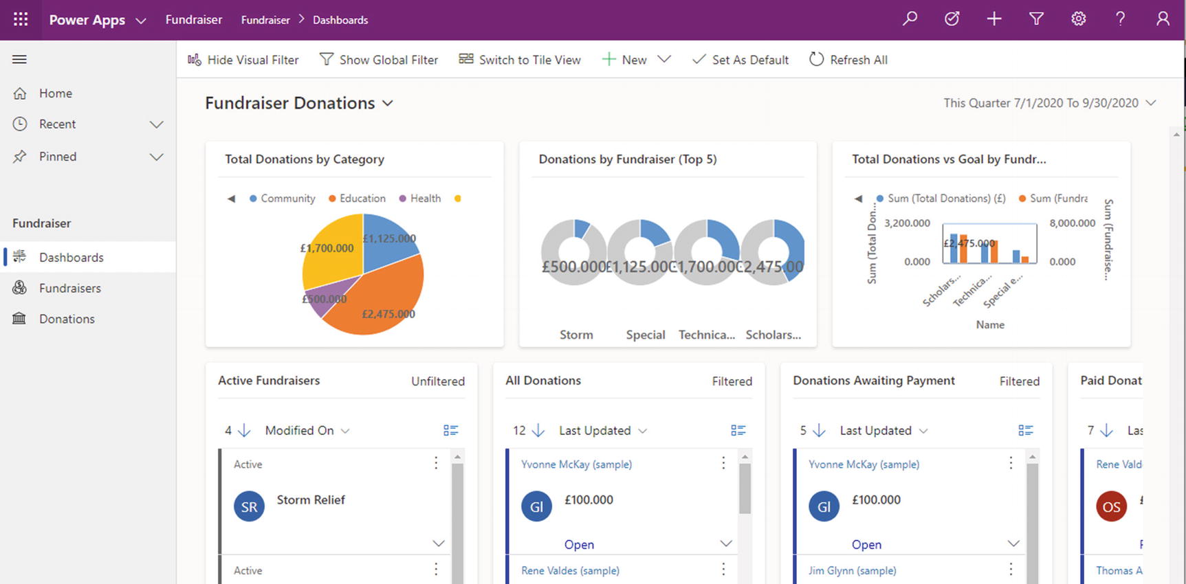
The sample “Fundraiser Donations” model-driven app
The final option is not to use charting features in Power Apps, but to build charts using Power BI instead. Power BI is a separate product in the Power Platform and is designed specifically for charting and reporting. Although it provides richer charting capabilities, the key benefit of Power BI is performance. It can process large quantities of data quickly and copes well with data sources with millions of rows. We can embed Power BI charts in a canvas app through a Power BI tile control.
Given that Power BI is so much more advanced, are there any reasons not to always use Power BI? One reason is that Power BI is licensed separately and can therefore incur additional costs. Another reason is that due the richer feature set, the learning curve can be far steeper.
The Power Apps chart controls are ideal for simple charting requirements and provide an attractive and visual way to improve the presentation of an app. For anything more serious, I would recommend the use of Power BI. The first edition of this book devoted a fair amount of content on how to aggregate data and how to group data by month on the x axis. The formulas to carry out this type of task are complex and can fail to return accurate results when the number of rows exceeds the delegable row limit of 2,000.
Therefore, this chapter focuses on building simple charts, which is what works best with the inbuilt charting capabilities of Power Apps.
Canvas Apps
In this section, we’ll look at how to utilize the chart controls. We’ll start by exploring data transformation options that enable us to transform data into a format that can work with the chart controls. Next, we’ll look at how to build some simple charts.
Transforming Data
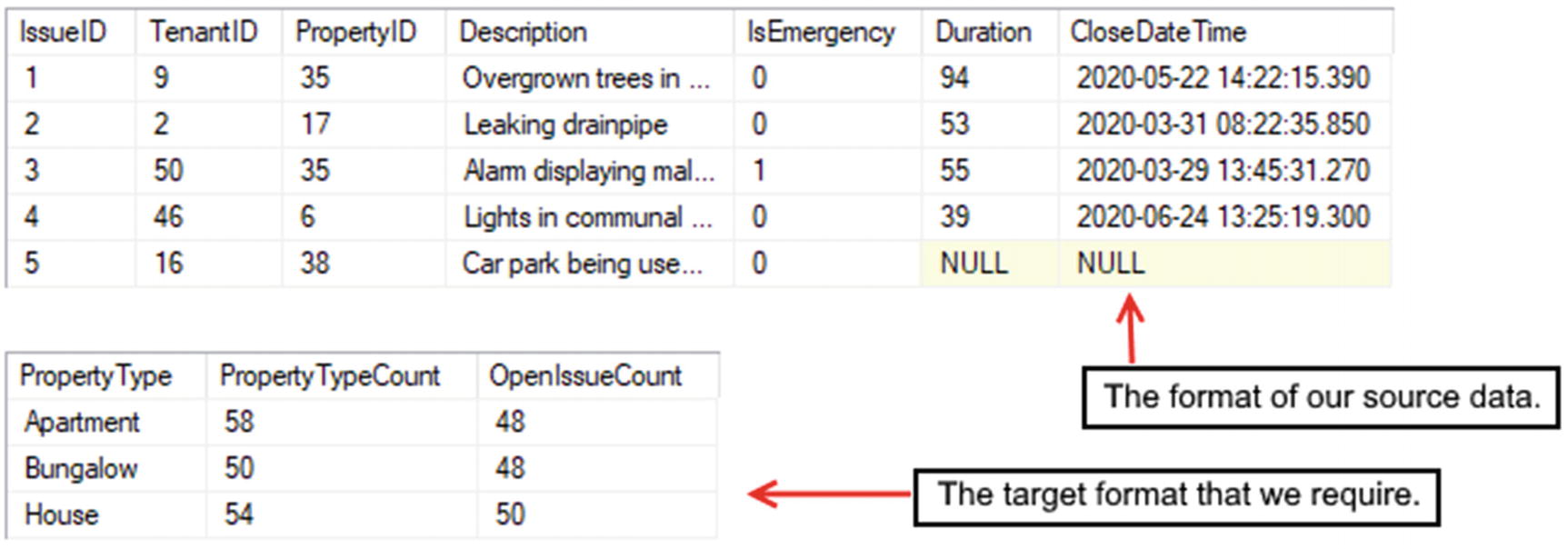
Transforming data
This example highlights the challenge we face when we attempt to build charts that are based on real-life, relational sets of data. Here, each issue record is associated with a property record, and each property record is associated with a property type record. To produce our target output, we need to build a query that spans three tables. How do we do this?
With SharePoint and Excel, this can be a challenging task. It is practically impossible to write a formula that aggregates data without hitting query delegation limits. This prevents us from retrieving accurate results when the source data exceeds 2000 rows. With these data sources, the easiest way to prepare a data source is to pre-aggregate the data into a separate list or spreadsheet, using Microsoft Power Automate. An alternative solution is to avoid the use of the native charting capabilities and to use Power BI instead.
SQL Server is the best data source for retrieving and aggregating data. This is because we can build a SQL Server view that joins multiple tables and produces our aggregate result. We can then use this view as the data source for our chart. SQL Server performs very quickly, especially if the source database is optimized and indexed correctly.
Dataverse doesn’t provide the same low-level access to data that we can accomplish with SQL Server. However, it does provide features that can help facilitate the construction of charts. These include calculated and rollup fields. It also offers great query delegation support, including support for aggregate operators such as the Sum, Min, Max, and Average functions.

Using calculated columns to help build our chart
Even with Dataverse, it can be tricky to transform data in the ways that we require. For example, calculated and rollup columns can span only one relationship. This is the reason why it’s necessary to create two calculated columns (one on the property table and one on the issue table), rather than one. In a formula, the GroupBy function cannot group data by a lookup column; and therefore, it isn’t possible to use this function to aggregate data across a relationship. In many cases, it can be much simpler or necessary to pre-aggregate data into a reporting entity for the purpose of building a chart. We can use Microsoft Automate or dataflows to carry out this task.
Building a Column Chart
To build a column chart, we use the insert menu to add a column chart control to a screen. All three chart controls (column, pie, and line) are composite controls that consist of three items: a chart, title, and legend.
Note that with this formula, crc51_propertytype refers to the name of the calculated field that contains the property type description. It’s necessary to pass the logical field name to the GroupBy function , hence this name.
If we choose to set the data source of a chart to a collection, it’s important to build the collection before we open the screen that houses the chart control. If we build the collection using a formula on the screen’s OnVisible property , the chart control will not render the collection data due to timing issues.
X label angle – By default, the labels on the x axis are slanted by 60 degrees to better accommodate charts with multiple items on the x axis. We can use this property to change the angle or to format the label text so that it appears horizontally.
Grid style – This property controls the display of gridlines on the chart canvas. The available options include All, None, X only, and Y only.
Markers – A column chart can display the numeric value above the bar. The markers property controls the visibility of this marker.
Marker suffix – We can use this setting to append a label that follows the marker value.
Items gap – This setting defines the space between columns in the chart.
Series axis min/Series axis max – We can use this setting to define the maximum and minimum values for the y axis.
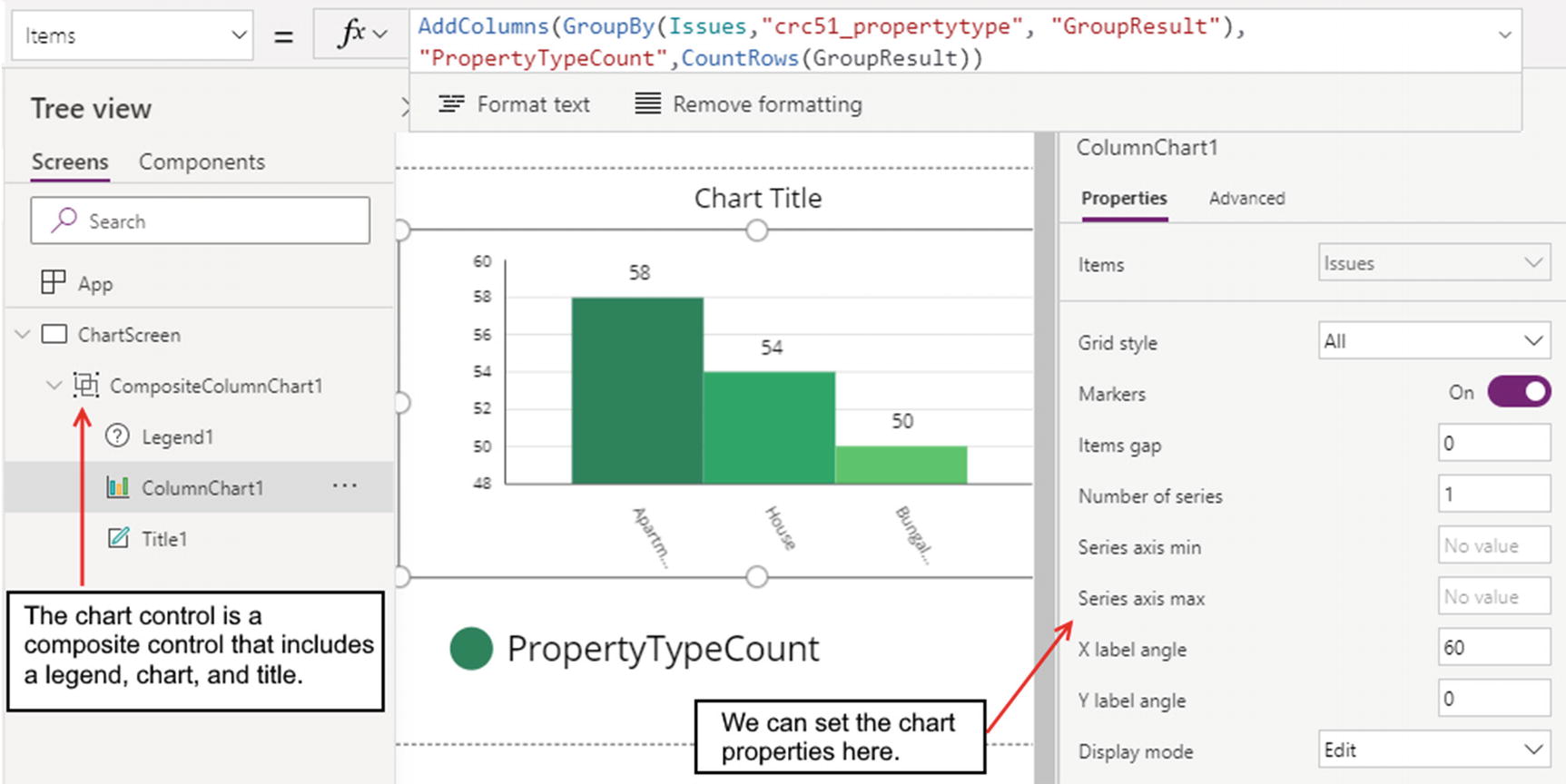
Configuring a column chart
If we set the data source of a chart to a collection, the chart will not display the correct data if we populate the collection using a formula on the screen’s OnVisible property.
Setting Legends
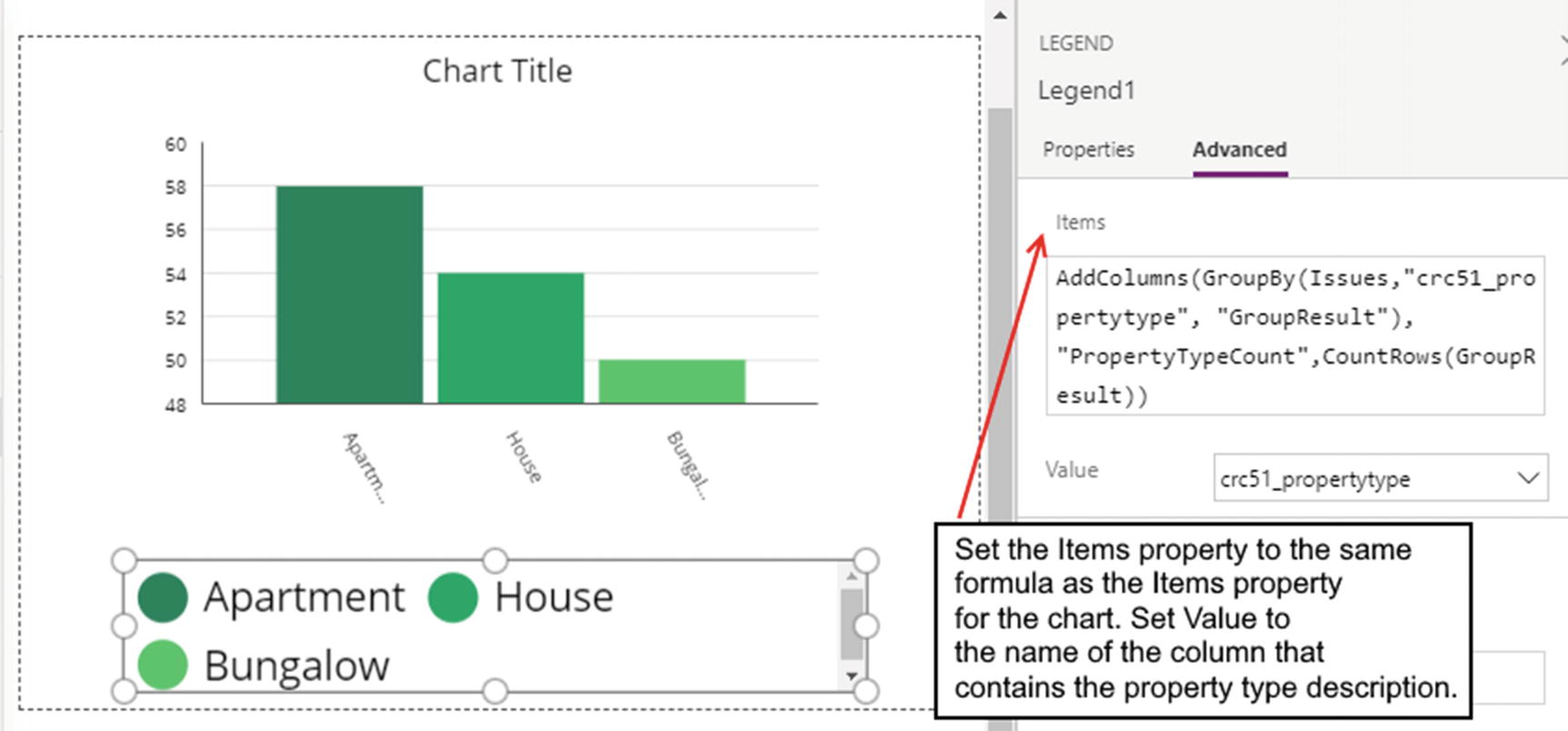
Setting the legend text
Applying Colors and Styles
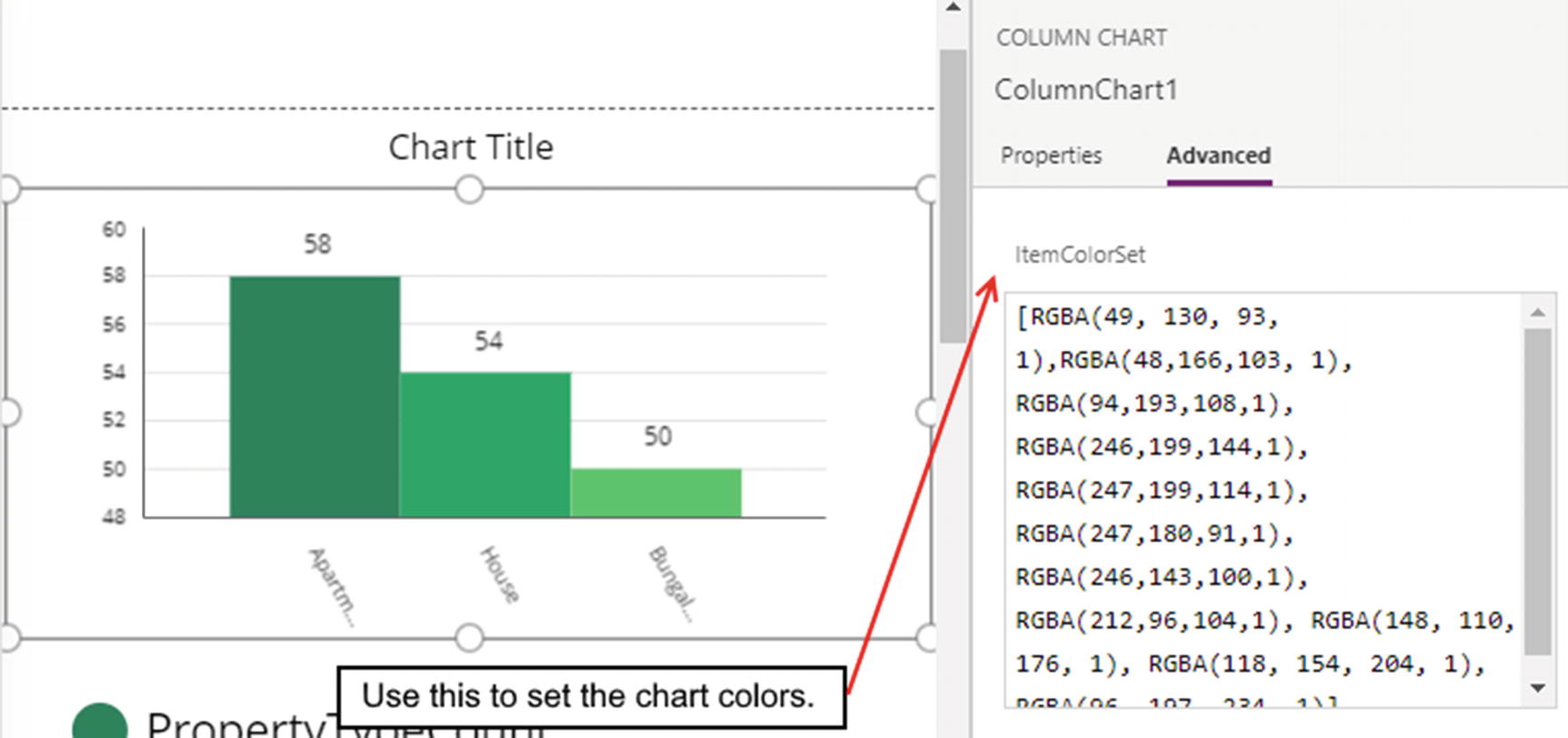
Setting the chart colors
Building a Pie Chart
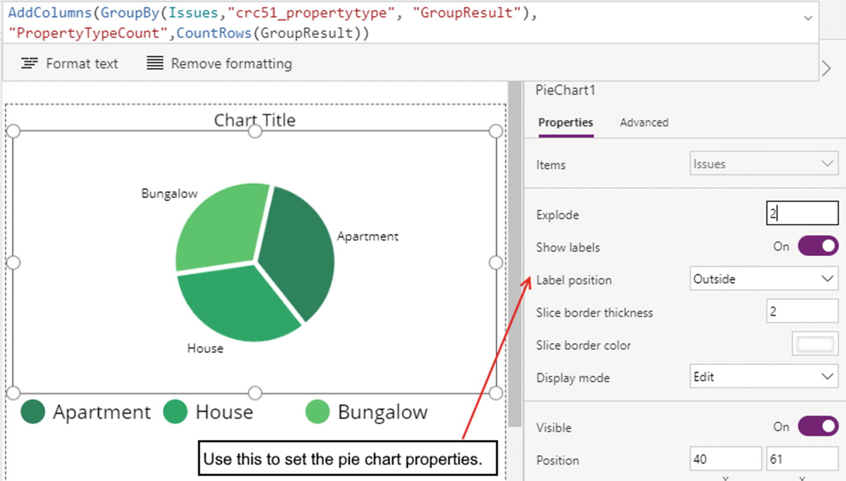
Setting up a pie chart
Explode – This defines the space between the segments in a chart.
Label position – We can choose to display the segment label outside or inside the segment.
Slice border thickness/color – We can use these settings to control the border that surrounds each segment.
Building a Line Chart
In this section, we’ll look at how to build a line chart and how to configure the chart to show multiple series.
Showing Multiple Series
The two chart types that can display multiple series are the column and line charts. Both these chart types support up to a maximum of nine series. To demonstrate this feature, we’ll build a line chart that displays two series: a count of the total number of issues by property type and a count of the total number of open issues by property type.

The data source for the multi-series chart

Configuring a multi-series chart
The Labels property defines the field that appears on the x axis. We set this to Result. This is the name of the field that the Distinct function returns, and the value of this field contains the distinct property type values. We then set the Series1 property to PropertyTypeCount and the Series2 property to OpenIssueCount.
Model-Driven Apps
We’ll now explore the charting capabilities of model-driven apps. We’ll walk through the steps to build a simple column chart. Once we understand how to define the series and category of a chart, changing the chart type is simply a case of simply selecting a different chart type. Therefore, this section focuses on the column chart and two features that are unique to charts in model-driven apps – the stacked chart variation and the ability to combine multiple charts.
The graphical designer provides a simple, limited set of design features. To fully customize a chart, we can manually modify the XML definition of the chart. We’ll find out how to use this technique later in this section.
Using the Designer
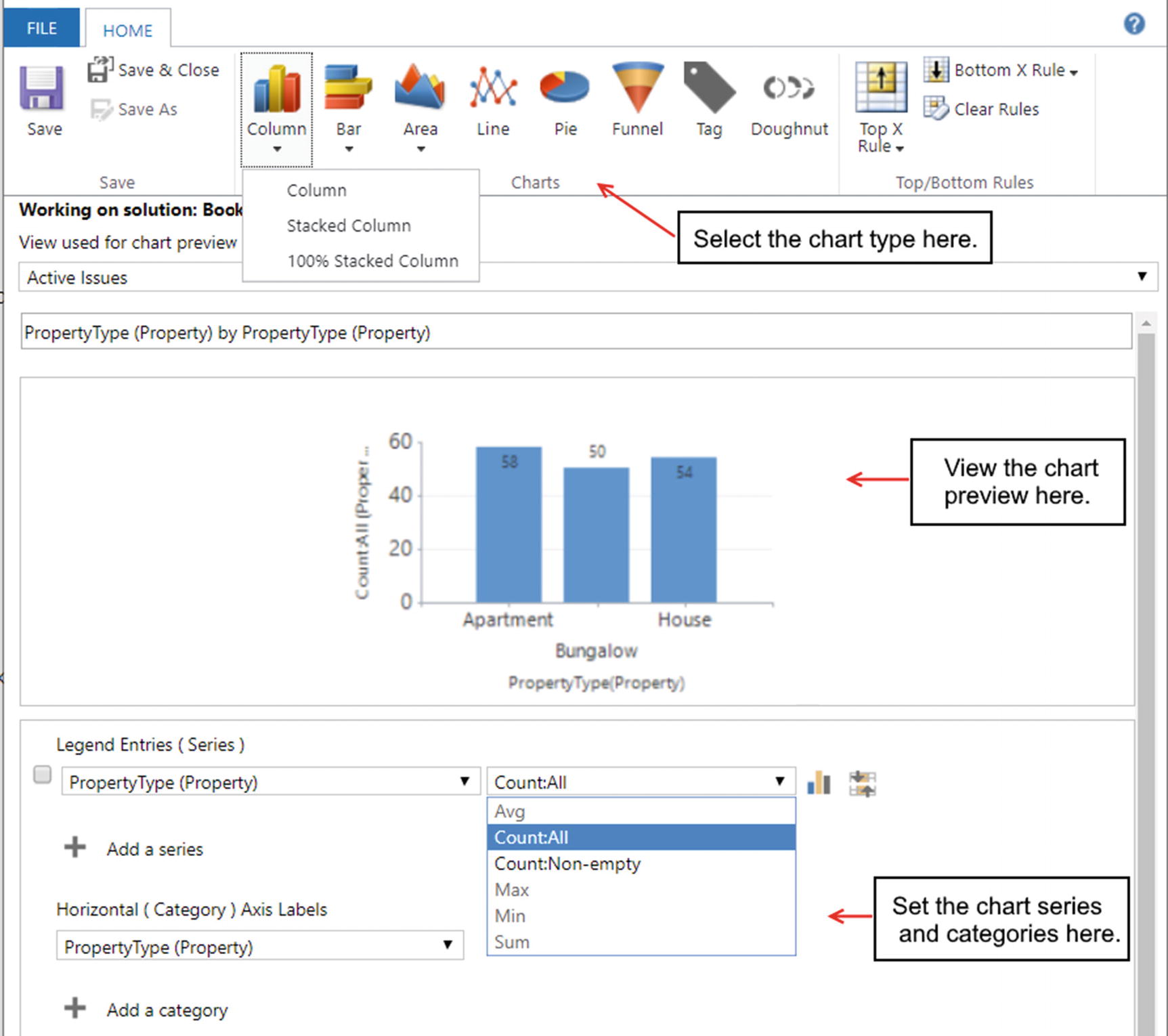
The model-driven app chart designer
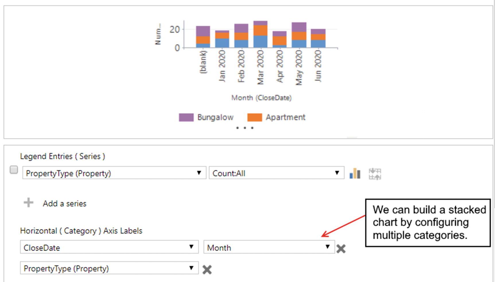
Building a stacked chart
The icons in the ribbon bar menu enable us to select one of the eight chart types. These include the column, bar, area, line, pie, funnel, tag, and doughnut chart types.
The process to create each chart type is almost identical. We configure the series and category values in the same way. The primary difference is to choose a different chart type from the ribbon bar menu. Because of the very close similarities, we will focus only on the bar chart type.
A key feature of the bar, column, and area chart types is that we can choose stacked and 100% stacked variations of the chart. We use a drop-down button beneath the chart type button to make this selection.
Next to the chart type buttons are buttons to define the top/bottom rules. These enable us to build a chart to retrieve the top X or bottom X records from the data source.
The main part of the chart designer enables us to name our chart and to choose a view to preview the chart in the designer.
The series and category settings define the data in our chart. Our example illustrates a chart that displays a count of issues by property type. The “Legend Entries (Series)” drop-down enables us to select a field from the issue table, and an adjacent drop-down enables us to select an aggregate function. In this, example we select PropertyType and “Count:All.”
Beneath the Series drop-down, we can use the category drop-down to define the field that appears on the horizontal axis. In this example, we choose property type. As we build our chart, we can see a preview of the output in the middle part of the designer.
Building a Staked Chart
We can use the designer to define additional series and categories for each chart. To demonstrate this feature, here’s how to modify our chart so that it groups the issue count by month.
To make this change, we select a date field from the category drop-down (Figure 19-12). This is a drop-down that enables us to select a time period. The options that appear include day, week, month, quarter, year, fiscal period, and fiscal year. If we select “close date” and month, this will produce a chart that displays months along the x axis and the count of issues along the y axis.
We can improve our chart by further breaking down the figures for each month by property type. To do this, we add an additional category, and we select “property type” from the drop-down. We then change the chart type to a stacked column.
Combining Charts
To demonstrate how to combine charts, here’s how to build a chart that shows the maximum duration of an issue and the count of issues, grouped by date.
We define our first series by selecting the duration field and choosing the Max aggregate operator. We can add another series, and we can select the property type field, and we can choose the “Count:All” aggregate operator. We can use the icons next to the aggregate drop-down to select the chart type. In this example, we choose the line chart type to show the maximum duration and column chart type to display the count of issues.

Combining chart types
Displaying Charts
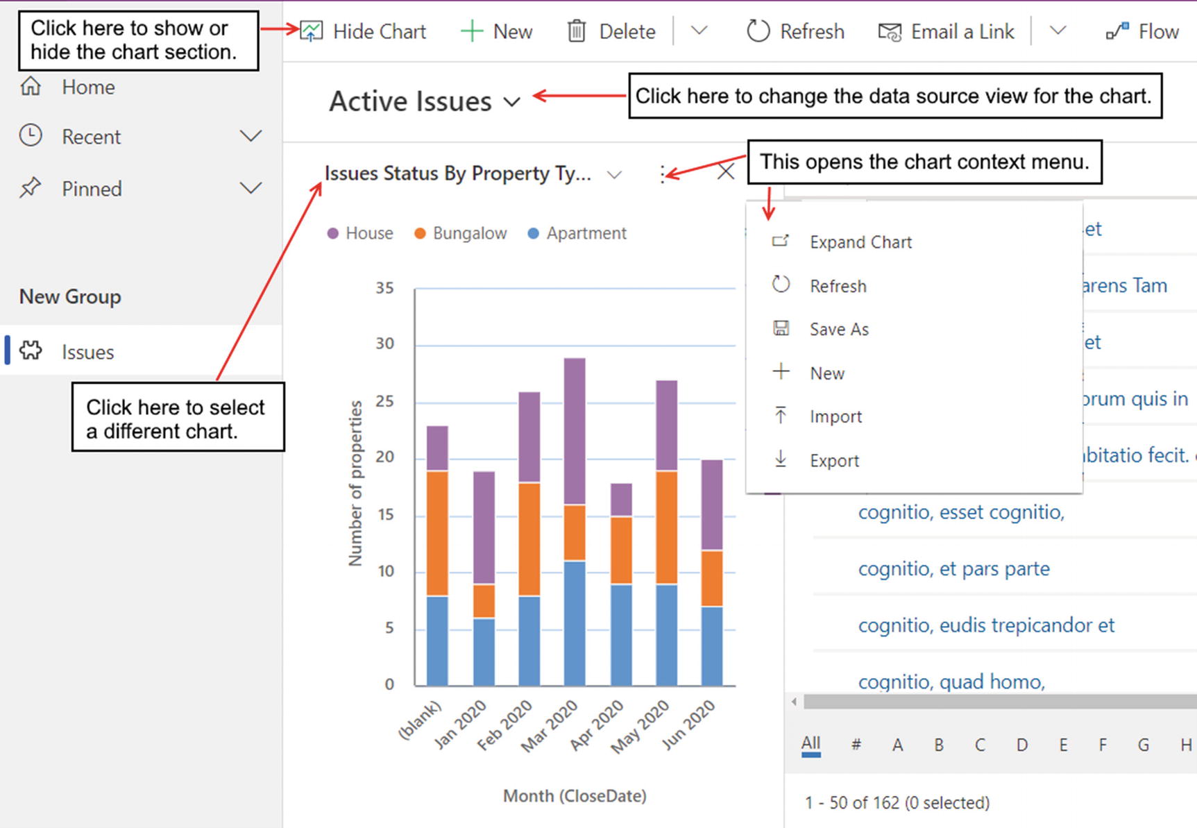
Viewing the chart in a model-driven app
The user can click the “Show chart” button in the header section to display the chart panel. From this area, the user can use a drop-down to display the charts that are associated with the table.
For each chart, the context menu provides the option to expand the chart, to refresh the chart, or to export and import the XML chart definitions.
Displaying Dashboards
A great way to utilize charts in a model-driven app is to create an interactive dashboard. Chapter 13 introduced this topic, and in this section, we’ll revise the steps that we use to add a chart to a dashboard.
The two dashboard types are the classic dashboard and the interactive dashboard. The main feature of an interactive dashboard is that the user can click a chart area to filter a list (or stream) of data that appears beneath the chart area.
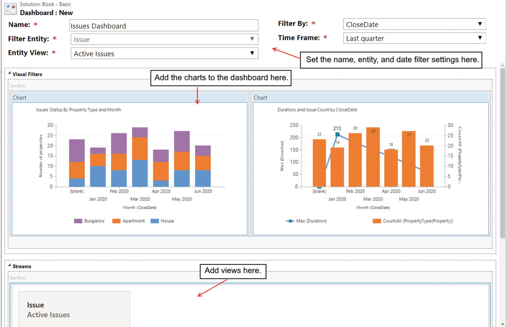
Creating a dashboard
In the top part of this designer, we can provide a name for the dashboard and select the source entity (a Dataverse table) and view for the dashboard. A useful pair of settings are the “Filter By” and “Time Frame” drop-downs. This configures the dashboard so that the user can filter the data in the charts and dashboard by a time frame. The “Filter By” drop-down enables us to select a date field from the entity, and the Time Frame drop-down provides values that include today, yesterday, this week, last week, this month, last month, last quarter, and month to date.
In this example, we’ll add our two charts to the dashboard, and we’ll add the active issues view to the stream section beneath the charts.
After we create the dashboard, we need to add a link to the dashboard in the site map of the app. To deploy the app, it’s necessary to publish the site map. It’s also necessary to publish the dashboard. Without doing this, the dashboard will not appear in the list of available dashboards that the user can select.
There is currently no option to publish a dashboard from the dashboard designer, and therefore, we need to publish the dashboard from elsewhere. One way to do this is from the Default Solution (or to create a solution for our app, which we’ll cover in Chapter 26).
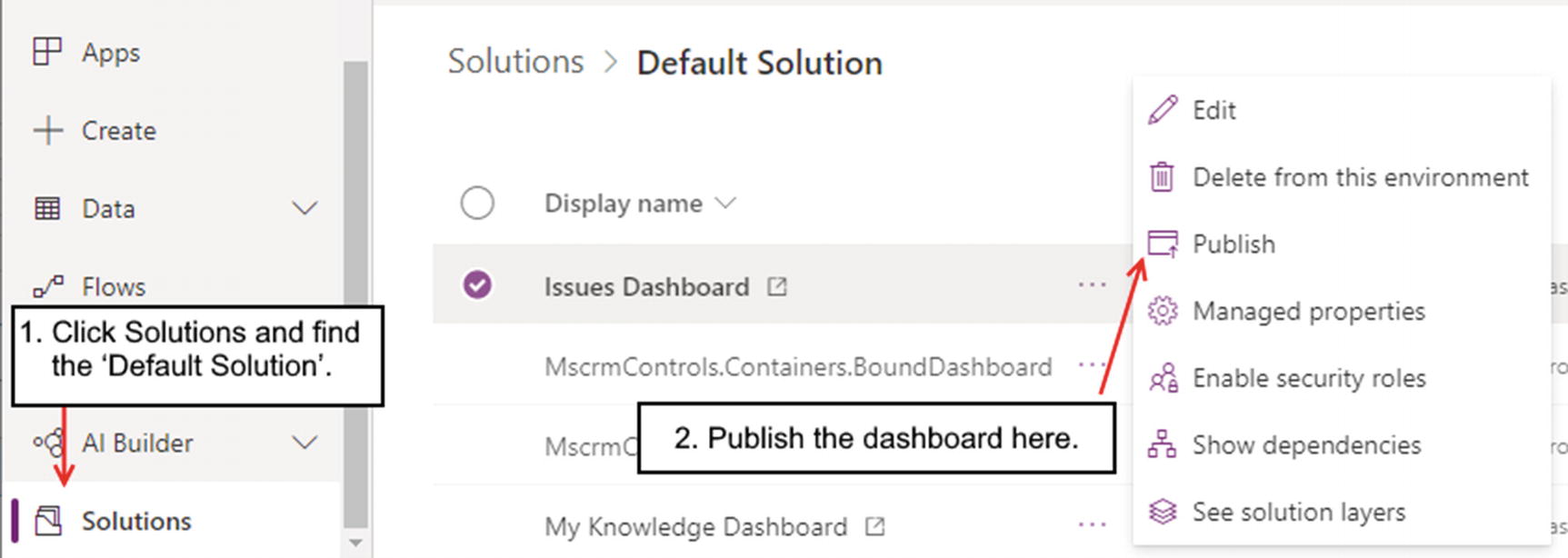
Publishing an interactive dashboard

Viewing the dashboard at runtime
The user can use the date period drop-down to filter the records in the dashboard by date. The user can also click segments in either chart to filter the issue records in the lower part of the dashboard.
Customizing XML
The chart designer provides a simple editor. There are many chart settings that are inaccessible through the editor. These include settings that relate to the color scheme, labels, tooltip, legend text, font styles, gridline, and axis. From a data perspective, the chart editor also provides limited data retrieval and filter capabilities. Fortunately, we can access all of these hidden settings by editing the XML definition of the charts.
To demonstrate, we’ll modify the combined line and column chart that we created earlier. By default, the series and legend labels appear in this format: “Max (Duration),” “Count:All (PropertyType(Property)).” We’ll replace these labels with text that is more user friendly.
The chart that we created earlier also appears odd because we group the issue records by “close date” and there are records without a “close date.” We’ll modify our chart to filter out records without a “close date.”
To carry out this task, we can retrieve the chart XML and modify it manually with a text editor. This method can be very arduous, and fortunately, there are third-party tools that can greatly simplify this task. The tool that we’ll use here is the “AdvancedChartEditor,” which we can obtain through the XrmToolBox.

Using the AdvancedChartEditor
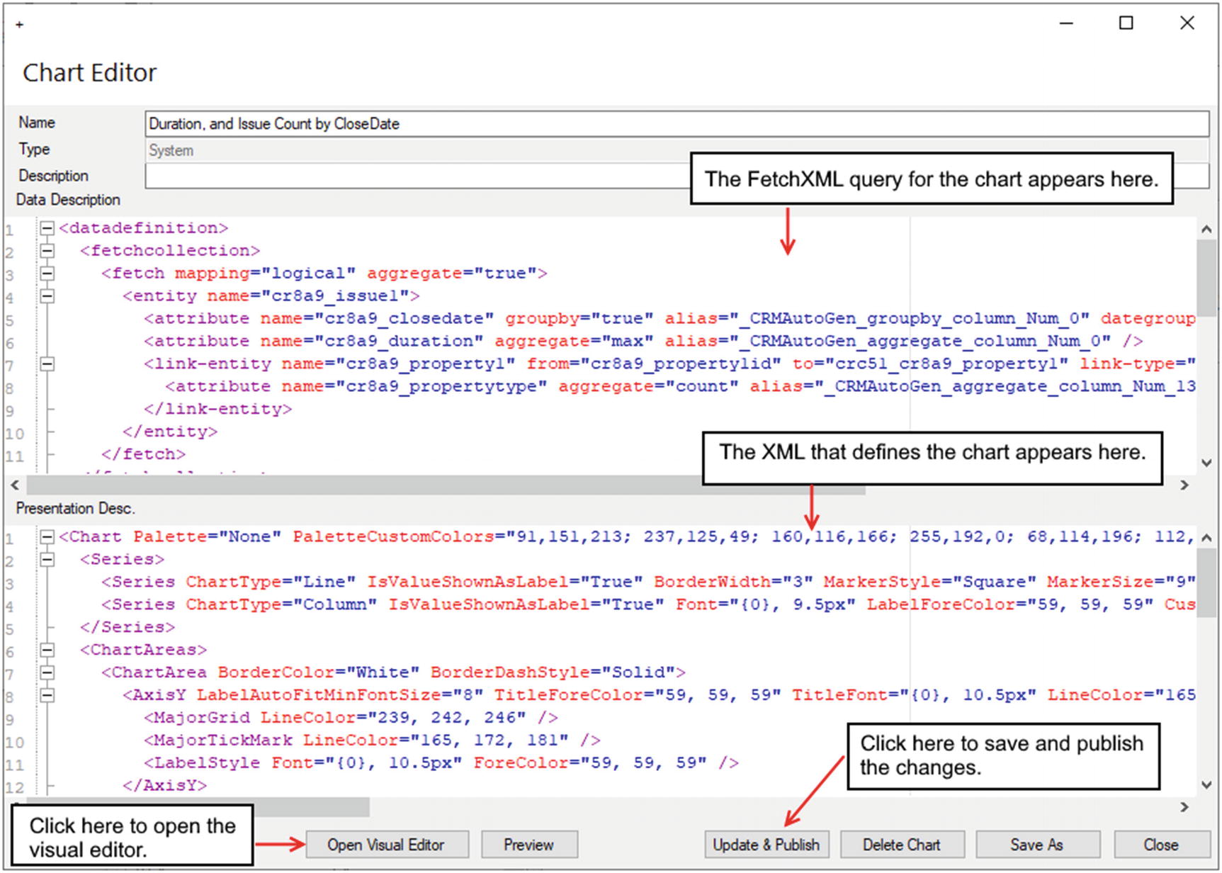
Editing the XML for a chart
There are two main parts to this chart editor. The data description textbox specifies the data source for the chart in FetchXML format. This is the same FetchXML language that we encountered when we built custom queries for a portal app (Chapter 14).
The “Presentation Desc” textbox shows the XML that defines the chart content. We can click the “Open Visual Editor” button to edit the chart definition in a form. The Preview button opens a visual preview of the chart, and it provides a useful way to verify the changes that we make. When we complete our changes, we can click the “Update & Publish” button to deploy our changes. For future enhancements and customizations, we can use this same process to amend the chart XML and to republish our changes.
Customizing the Chart

Using the visual chart editor
To modify the label text that appears against each axis, we can select the relevant axis, and we can use the title setting to define the label. In the axis area, we can also define the minimum and maximum values of the axis, and we can also modify the font and color settings.
To modify the labels that appear in the legend, we use the legend text setting that appears beneath the Series node.
As we use the chart editor, we discover that there are many visual settings that we can customize. For example, we can give chart areas a 3D effect, we can change the appearance of the columns in a column chart so that they appear as cylinders, and we can even select 20+ additional chart types which include bubble, Kagi, polar, radar, Renko, pyramid, and more.
It’s important to note, however, that these chart types and many of the additional presentation settings do not work in model-driven apps. It is possible that future releases will support these features. The reason why these settings exist is because the older web client from Dynamics 365 supports these features.
Customizing the Data Source
To customize the data source for a chart, we can modify the FetchXML query for the chart. The ability to specify a query with FetchXML provides great benefits. We can define filter, group, and sort data in ways that are not possible using the chart editor. We can also join other tables and produce aggregate results including the sum and count of a grouped set of records. We can define “outer joins” between tables to return records that do not exist (e.g., customers who have not made an order).
In this chapter, we’ve seen how to use computed and rollup columns to retrieve the necessary data for a chart. The disadvantage of this technique is that we can easily clutter our tables with columns that serve little purpose elsewhere. By defining the data source of a chart with FetchXML, we can keep our tables tidier.
Building a FetchXML query can be complicated. To simplify this task, we can use third-party tools. The one that we’ll use here is “FetchXML Builder” for XrmToolBox, by Jonas Rapp.
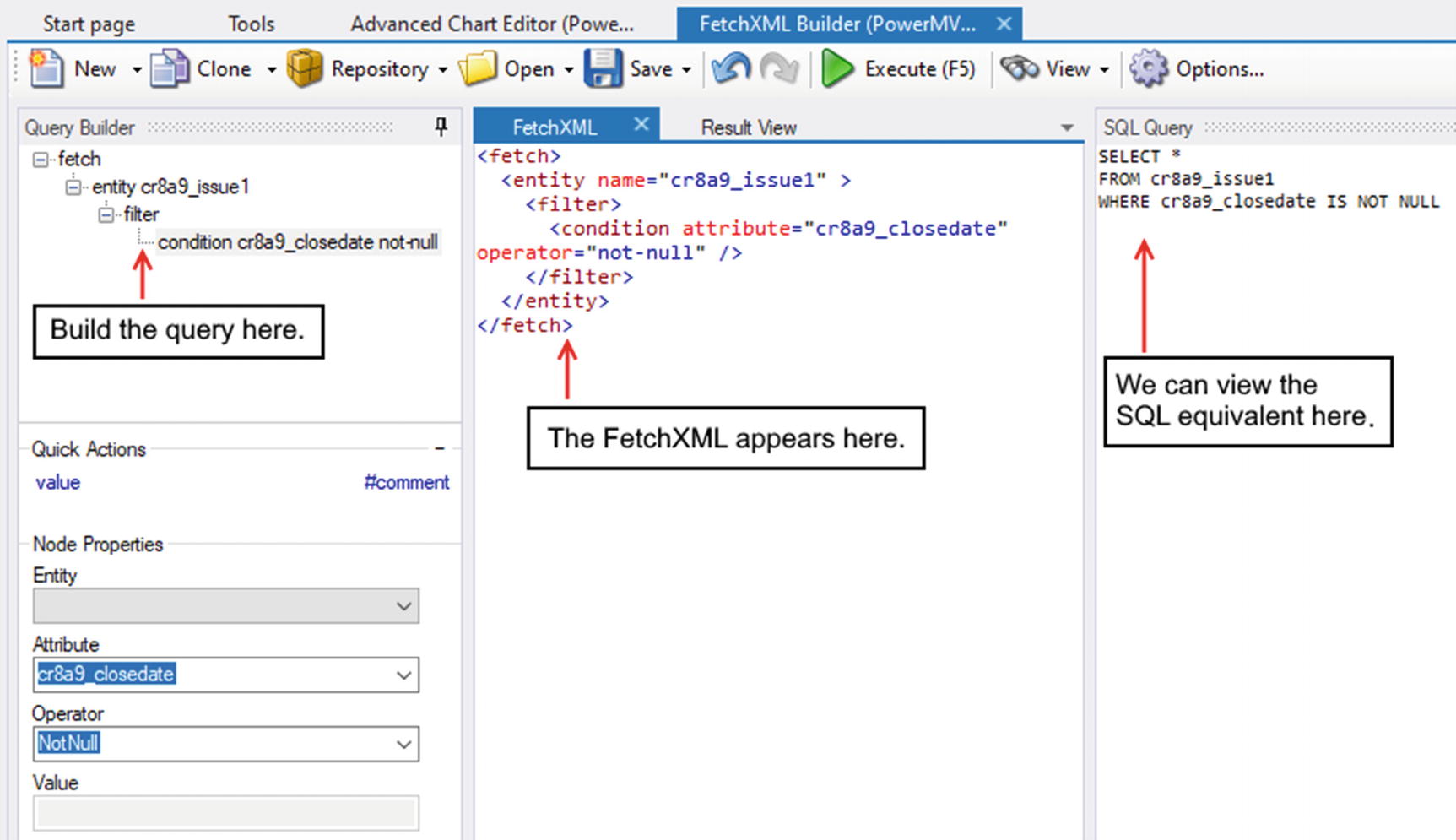
Using FetchXML Builder
Useful features include the ability to view the FetchXML syntax that we build. We can also click the “Execute (F5)” button to run the query and to view a tabular representation of the results. This can help verify that our query is correct. There is also the option to display the SQL equivalent of the query. This can assist app builders who are more conversant with SQL.
In our example, we want to filter the source of our chart to exclude records without a close date. We can customize our query in the editor and use the result to amend the data description of our chart through the “AdvancedChartEditor.”
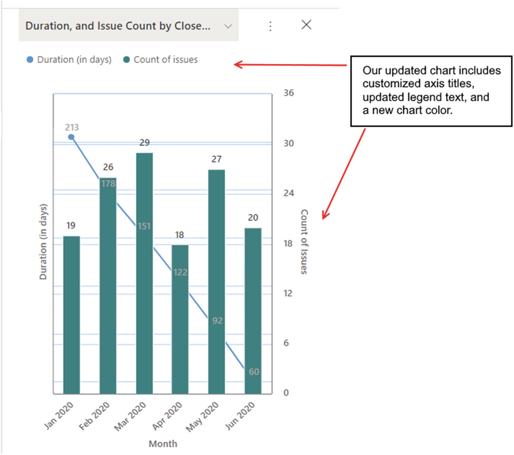
Our modified chart
Summary
This chapter covered the topic of charting. With canvas apps, we can use the chart controls to build bar, line, and pie charts. We can configure many of the visual elements on a chart, including the label, color, and legend settings. The bar and line charts also support multiple series, which enable us to display multiple groups of data on a single chart.
Model-driven apps provide better charting capabilities. There are eight chart types, in addition to staked and 100% stacked variations of the bar, column, and area chart types. A great feature with model-driven apps is that we can combine multiple charts into a single chart, for example, a chart that contains both a column and a line chart. Another powerful feature is that we can incorporate charts into dashboards and enable users to drill into data by clicking segments of a chart.
Another option is to use Power BI instead of the charting features that are built into Power Apps. Power BI performs quickly and can cope with data sources with millions of rows. From Power Apps, we can use a Power BI tile control to display content from Power BI.
To build a chart in a canvas app, the first step is to prepare a data source and to transform the data into a format that works with the chart controls. Typically, we would perform some aggregate operation to calculate the counts or sums of groups of records. With SharePoint and Excel, this can be very challenging due to the 2,000-row limit for non-delegable queries. To ensure accuracy and good performance, it can be easier to pre-aggregate data into separate lists or tables using dataflows or Power Automate.
It is easier to build charts with SQL Server and Dataverse data sources because with SQL Server, we can aggregate and transform data with SQL views and with Dataverse, we can use rollup and calculated columns.
Once we prepare a suitable data source, we can easily build a chart by adding a chart control to a screen. A chart control is a composite control that consists of three items – a title, a chart, and a legend. We use the Items property of the chart to set the data source. We can then use the label and series settings to control the data that appears on the chart.
With model-driven apps, we define our charts at the table level. This provides the benefit of being able to use the same chart in multiple apps.
The chart designer offers a simple graphical way to build a chart and to define the series and categories of the chart. Through the designer, we can define the chart type, set up charts to return the top X number of rows, and combine multiple chart types by defining multiple series and assigning a different chart type to each series.
There are many chart settings that are inaccessible through the simple chart editor, including settings that relate to the color scheme, labels, tooltips, legend text, font styles, gridline, and axis. We can access these hidden settings by editing the XML definition of the chart.
To edit the chart XML, we learned how to use a third-party tool that we can access through the XrmToolBox called “AdvancedChartEditor.” This provides a form-based interface that enables us to connect to an entity (table), extract the chart XML, make changes, and republish our changes.
A FetchXML query defines the data source of a chart. We can modify the data source of a chart by manually building a FetchXML query. This enables us to implement joins and filters that are impossible to carry out through the standard editor. To help us more easily build FetchXML queries, we looked at how to use a tool called “FetchXML Builder.” This enables us to build a query using a form-based designer. We can execute the query in the designer to verify the output, and we can also view the SQL equivalent of the query that we build.