Adapt an Existing Site
Up to this point, the chapters in this book have discussed how you would build a new site from the beginning in view of the site being responsive. However, building from scratch may not always be an option, and having already dismissed building a separate site for mobile use, it is likely you will want to adapt your existing site and code base to be responsive. To achieve this, there are three options available:
- Adapt the current styles
- Refactor the code to be mobile first
- Do a full reskin
Of these three options, the approach you choose is dependent on your site’s individual circumstances, as each of the options has its own set of advantages and disadvantages. This chapter will look at each of these different approaches by going through an example of each so you can clearly see the steps involved in adapting an existing site to be responsive, after which you should be able to choose which approach is most appropriate for your project.
For this chapter I have put together an unresponsive site for a fictional company I will call Unresponsive design inc., which I will use to demonstrate the different approaches for converting an existing site to be responsive. It is included in the code bundle at the web site for this book (www.apress.com). You might want to follow along on your computer with the instruction I provide for this.
Adapt Existing Styles and Scripts
The first of the three approaches for adapting a site is to keep the existing HTML and to adapt the existing styles and JavaScript so they respond to the device viewport by adding media queries.
This approach is a desktop-first approach, and as such you would be gracefully degrading your experience for the smaller devices. There are many ways to degrade the content of a site, the first of which is to simply hide the less important content and rearrange the remaining content so it fits nicely on the smaller device’s screen, both of which can be achieved using CSS alone. This approach has the benefit that it can be done relatively quickly, however, it is possible that content you deem to be less important may be important to one or more of your users. The second approach would be to adapt the content using CSS to work better on the site, and where appropriate to use JavaScript to change the way the user interacts with the content. With both approaches, the overall aim should be to provide a better experience than if the user had directly used the desktop site on the smaller device.
By taking the approach of adapting your current styles, you are keep your existing styles intact and instead using media queries to target styles that override the existing styles at the points that the site begins to break.
One of the resulting benefits of this approach is that the existing code base is likely to have already been well browser tested. This in turn will reduce the likelihood of experiencing browser-specific bugs you haven’t already fixed. In browsers that do not support media queries, the site will look identical to how it did prior to adaptation. In the case of browsers that support media queries, you can focus on testing the site on the new breakpoints you have added, rather than bugs that might have been introduced during a reskin.
One of the key disadvantages of this approach is that the original desktop site that you are adapting might already have a bloated code base with inefficiencies caused by legacy or redundant code. By adapting a site that is already bloated, you are likely to make the problem worse and could face issues with performance due to loading more code on devices with a slower connection. In this situation, you would want to look at reducing these inefficiencies before embarking on making the site responsive. One of the ways you can achieve this is to look at removing any unused CSS selectors that may be left over from older iterations of the site. There are a number of tools you could use to achieve this, one of which is a Firefox plug-in called Dust-Me Selectors (https://addons.mozilla.org/en-US/firefox/addon/dust-me-selectors/), which will scan your web site and find any unused CSS.
Another issue with taking this approach is that in many cases the browser will still download the larger images on smaller devices. Tim Kadlec ran tests to see under what circumstances the browser would download images (http://timkadlec.com/2012/04/media-query-asset-downloading-results/). In nearly all the browsers he tested, he found that for images included in the page as .img elements, the browser would download the images even if the CSS specified it should not be shown. In addition, he also found that if a background image is set to an element in the CSS and a media query is specified that the element should not be shown, the image is still downloaded. There is, however, a way to prevent background images from loading. In further tests, Tim found that if you use display: none on the parent of the element you want to hide, the background image will not be downloaded. So if you want to hide a background image, this is the approach you will need to take.
As with simply updating a site, when adapting the existing styles, it is important to ensure you maintain the existing coding style. The reason for this is that the styles must remain consistent, including the use of the same naming convention for class names and the use of the same units for font sizes.
Having looked at the benefits and disadvantages of adapting the existing CSS and JavaScript for a web site, let’s look at an example of how you might do this when building a responsive site. The first step is to take a look at the existing site and determine exactly what needs to change. I have included a screenshot of the base template for my fictional company example so you can start to see the possible ways to refine it (see Figure 6-1).
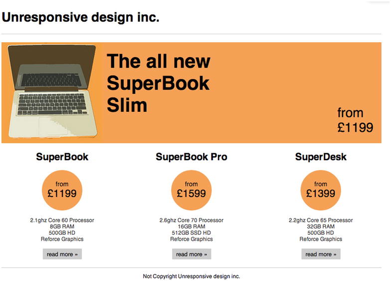
Figure 6-1. The fixed width site that will be make responsive
Defining the Breakpoints
Having looked at the original site that I want to adapt to be responsive, I need to decide on a set of breakpoints that will allow it to work across a wide variety of devices. For this site, I will add two breakpoints: the first being for small devices like tablets and the second being for extra small devices such as mobile phones.
For the first breakpoint, I want to try to scale down the existing site so it fits comfortably on small devices. I will want to add a breakpoint so that when the existing site no longer fits within the viewport, it can switch to the smaller version of the site. To achieve this, the breakpoint needs to break before a horizontal scrollbar is forced to appear due to the site being too wide. For this I need to allow for the site’s width plus the width of the vertical scrollbar. Unfortunately, the width of the scrollbar can vary based on a number of factors including operating system and browser, so I will calculate the breakpoint at the site width plus 20px. This means, for this particular site, the site will have a breakpoint at 1000px. When I refer to this breakpoint later in this example, I will refer to it as the small breakpoint. The code for this breakpoint is:
@media screen and (max-width: 1000px){
}
The next breakpoint will need to target mobile devices. With the wide array of devices available, with varying dimensions and screen resolutions, it is difficult to say where a tablet size ends and where the mobile size begins. Therefore, you need to make a judgment call when it comes to determining what to classify as a mobile device using media queries. A good place to start is to look at the portrait width of some of the tablets you are looking to support. The easiest place to find this information is at www.viewportsizes.com, which allows you to find information about different viewport widths. Using this site, you can look at the viewport widths of some of the most common tablets to determine what you want to define as your mobile breakpoint. A couple you might look at are the Apple’s iPad, with a portrait viewport width of 768px, and the Microsoft Surface, which also has a portrait viewport width of 768px. Therefore, if 768px is common for tablets, you can set the breakpoint for mobile devices to 767px, as this is 1px less than tablet. When I refer to this breakpoint later in this example, I will refer to it as the extra small breakpoint. The code for this breakpoint is:
@media screen and (max-width: 767px){
}
Typography
The existing typography is a good size for the majority of devices, however, on extra small devices it is a bit too big, so you will need to add some styles to your headings. To do so, you need to look at the base font size that has been used so you can calculate the font size values correctly. The code for this would be:
@media screen and (max-width: 767px){

    h1{
        font-size: 22px;
        font-size: 1.571em;
    }

    h2{
        font-size: 18px;
        font-size: 1.286em;
    }
}
Wrapper
Having adjusted the font sizes, you now need to adjust the width of the wrapper so that is does not extend farther than the bounds of the devices viewport. To do this, you need to decide how your site should work across the different breakpoints you have defined. The first breakpoint is the small breakpoint, which is defined as having a max-width of 1000px. As mentioned earlier, this is the breakpoint aimed at devices in between the existing desktop site and a mobile site. For this breakpoint, you would set the width of the wrapper for the site to 710px, as the site needs to work on viewports ranging from 768px to 1000px, and this includes scrollbars. You also need to take into account the 20px left and right paddings. The code for this breakpoint would be:
@media screen and (max-width: 1000px){
    .wrapper{
        width: 710px;
    }
}
When you get down to the extra small viewport, it makes sense to make the site a fluid width. There are several reasons for this, the first being that on these smaller devices, you want to try to take advantage of every pixel of the browser’s viewport width to show the content, and you cannot afford to have excess spacing around the edges. The second reason is that in between 320px and 767px there is a large variation in the widths of the screens used to view a site. Therefore, you want to try to offer an optimized experience for all of these widths. To enable you to make your wrapper fluid on these extra small viewport devices, you will set the width to 100%. Upon setting this, you will notice that the wrapper is still wider than the viewport. The reason for this is that you have padding applied to the wrapper. It makes sense to keep this padding for the mobile site, so instead of removing it, you could use the box-sizing property to allow you to include the padding in the 100% width. In Chapter 4, I discussed applying box sizing to the universal (*) CSS selector; unfortunately, because this is an existing code base, it isn’t practical to apply globally because you would likely break some of the existing styles. This is why when you are adapting existing CSS you should apply box sizing on a case-by-case basis. The final styles for the wrapper for the extra small viewport would be:
@media screen and (max-width: 767px){
    .wrapper{
        width: 100%;
         -moz-box-sizing: border-box;
         -webkit-box-sizing: border-box;
         box-sizing: border-box;
    }
}
Jumbotron
If you have been testing in your browser along with me as I have progressed, you will notice that the Jumbotron currently is expanding outside the site’s wrapper. If you look at the existing CSS for the Jumbotron to see why this is happening, you will see that the Jumbotron has its width set to 940px. Clearly the media queries need to be adjusted to how the Jumbotron looks across different devices.
For the small breakpoint, you would simply need to resize the Jumbotron so it fits properly within the wrapper. Because the wrapper is 710px wide, you would need to adjust the Jumbotron to match at 710px wide using this code:
@media screen and (max-width: 1000px){
    .jumbotron{
        width: 710px;
    }
}
When it comes to the extra small breakpoint, however, you would need to make more radical changes because the Jumbotron’s content will no longer sit nicely in the existing layout. You would need to adjust the layout so the content of the Jumbotron stacks when viewed on an extra small device. To enable this, the first step is to set the Jumbotron so that it fills the wrapper, leaving the wrappers padding either side:
@media screen and (max-width: 767px){
    .jumbotron{
        width: 100%;
        height: auto;
        text-align: center;
        padding: 20px 0;
    }
}
If you were to take a look at the original site for the Jumbotron, you would see the elements inside are all positioned absolutely, meaning that after changing the width and changing the height to auto, the site looks really broken. This can be fixed by resetting the positioning and the width of the elements:
@media screen and (max-width: 767px){
    .jumbotron img,
    .jumbotron p,
    .jumbotron h2,
    .jumbotron .roundal,
    .jumbotron .roundal span{
        position: static;
        left: auto;
        right: auto;
        bottom: auto;
        top: auto;
        width: auto;
    }
}
The final step to make the Jumbotron look right on these extra small devices is to adjust the heading text so that the font size is more appropriate for mobile devices. In addition, so the heading text does not approach the edges of the Jumbotron, you would add padding to the heading text:
@media screen and (max-width: 767px){
    .jumbotron h2{
        font-size: 22px;
        font-size: 1.375em;
        padding: 10px 20px;
    }
}
If you now look at the Jumbotron on the extra small device, you would see the information a lot clearer (see Figure 6-2).
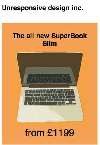
Figure 6-2. Our slimmed down site for the Jumbotron
Products
The next step is to adjust the products so they look great across the various breakpoints. First, you would start with deciding how they should look on small devices. To determine this, you need to consider whether the existing content will fit comfortably within the existing structure or whether you will need to adapt the layout. Adapting the layout could be as simple as changing from a three-column layout to a two-column layout, or it could mean changing the layout to be single columns with a fluid width. In the case of this example, however, on the small breakpoint the existing layout and content can fit comfortably within the existing three-column structure by simply changing the width of the three product elements to 223px:
@media screen and (max-width: 1000px){
    .product{
        width: 223px;
    }
}
Having adapted the small devices to continue to use three columns, albeit with a smaller width, the next step is to look at how to adjust the product elements to work on extra small devices. At this point, the viewport is getting too small to continue to show the products in three columns, and when using the extra small breakpoint, you are using a fluid width, so it makes sense to change the product elements so they are no longer in columns but instead are stacked upon one another. To achieve this, you would adjust the width of the product elements to 100%. In addition, you would want to ensure that there is a clear divider between the products, which will be achieved with padding and a border in between:
@media screen and (max-width: 767px){
    .product{
        width: 100%;
        padding: 20px 0px;
        border-top: 1px solid #ccc;
    }
}
Having added padding and borders, the first product now has an extra border at the top and extra padding, so you can use the :first-child selector to target the first product and remove the excess padding and border:
@media screen and (max-width: 767px){
    .product:first-child{
        border-top: 0px;
        padding-top: 0px;
    }
}
Similarly, there is additional unwanted padding showing beneath the last product, so this can be removed by using the :last-child selector to target the last product and remove the excess padding:
@media screen and (max-width: 767px){
    .product:last-child{
        padding-bottom: 0px;
    }
}
If you now look at how the products stack, you will notice they work quite well, as shown in Figure 6-3.
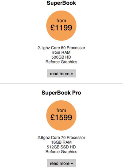
Figure 6-3. Slimmed down product panels
Conclusion
Having adapted the site to be responsive, you now have a site that works across a wide variety of different devices. Adapting the site in this way has both benefits and disadvantages, and I will now discuss them so when it comes to your own sites you can decide if simply adapting your existing site is suitable for your needs.
The main problem you might have noticed when you were adapting the Jumbotron is that when degrading the site to work on smaller devices, you sometimes need to override a large amount of the styles to provide a good experience to mobile. Although in this example it was relatively simple, a larger site you are adapting to be responsive may require you to do more significant overriding of styles. Whether you are working mobile first or, as in this case, desktop first, you will always be overriding some of the styles of a previous breakpoint. Usually a mobile-first site is building on top of what is already there with each breakpoint, but with a desktop-first site such as this one, sometimes having to reset values back to their browser defaults can make the code base more bloated.
The benefit from simply adapting the site in this example is that the styles of the desktop site did not need to change, which means the focus can be the new breakpoints that are being added. Not only does this save development time, it also can help make testing a lot simpler as we know that in most cases the bugs we find would have been introduced within our media queries.
Refactoring
The second approach that could be taken for adapting an existing site is refactoring the existing code base to be mobile first. The benefit here is that you are not having to start the styles from scratch. You can also make tweaks to the site design and look at removing redundant code as part of the refactoring process.
Defining the Breakpoints
As the first step of the refactoring of the site, you need to wrap the existing styles that are currently being used to style the site in a media query targeted toward the larger devices, such as desktop browsers that the site already supports. To choose a suitable media query for this, look at the site’s existing styles to determine its width. If you look at the code for the example site we are making responsive, you will see that the main wrapper is 940px wide plus 20px of padding to both the left and the right, totaling 980px in width. Taking into account scrollbars, you will therefore set the media query to check for a minimum width of 1024px:
@media screen and (min-width: 1024px){
}
With this media query being used to wrap the existing styles, there are no styles being applied to any viewport with a width less than 1024px. From this point I will refer to this breakpoint as the medium breakpoint.
You will also want to be able to adapt the site to work on larger viewport sizes than the site currently supports, in this case you would need to add an additional breakpoint that targets these larger viewports:
@media screen and (min-width: 1200px){
}
In addition to the larger media queries that have already been defined, you might want to add an additional media query for small devices (like tablets). This media query will enable you to take advantage of the larger viewports offered by tablet devices, and for this you will take the smaller width of the iPad as the breaking point for these small devices:
@media screen and (min-width: 768px){
}
Refactoring the Existing Styles
Having defined the breakpoints, you can now refactor the existing styles. You have moved all the existing styles into a breakpoint, so this means that on devices smaller than 1024px, no styles will be shown, as shown in Figure 6-4.
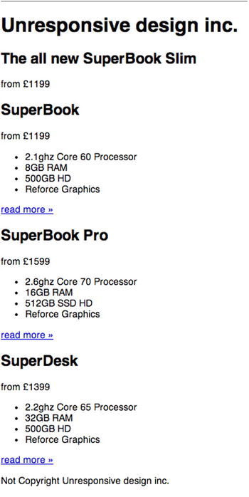
Figure 6-4. No styles are shown on smaller devices
At this point you can start to migrate styles that are currently targeted at larger states so they are available globally. The kind of styles you can easily pull out to be globally available are those that apply fonts and generic spacing that would be used regardless of the breakpoint.
In the case of the example site, the site is using the default browser font, so the fonts don’t need to be touched. The site doesn’t apply any generic spacing to element types, but there is a clearfix helper class that is used to clear the floats. It makes sense for this to be available outside the media query as it is needed on smaller devices as well.
Having moved any of the generic styles, the next step is to look at the different sections of the site and see where you can take existing styles and apply them to the smaller viewports, refactoring them in the process.
Let’s start this process of refactoring with the site’s main wrapper. The padding and margins that are applied can easily be pull outside the media query. The other styles are specific to the larger viewport sizes, so let’s leave them where they are:
.wrapper{
    padding: 0 20px 20px;
    margin: 0 auto;
}
Header
The next step is to look at the header styles to see which styles can be used for smaller devices. In this example, the existing styles applied to the header are simply spacing and a border bottom. It makes sense to move these out of the media query so they are accessible to the other viewport sizes. The styles that will be moved are shown here:
.global-header{
    margin: 0 0 20px;
    border-bottom: 1px solid #ccc;
}
If you look at the header in your browser, you will see that it now has some basic styling applied. However, because nothing has been done with the font sizes at this stage, the heading text appears quite large (as shown in Figure 6-5).

Figure 6-5. The site header, with no font sizes applied
To rectify this let’s add styles to the h1 element to style the font size and align the text to center:
h1{
    font-size: 1.4em;
    text-align: center;
}
Now when you look at this in the browser, the font size is more appropriate for the smaller viewport, as shown in Figure 6-6.

Figure 6-6. The site header, with the font size and alignment applied
Jumbotron
The next element of this site that needs to be looked at is the Jumbotron. The original CSS for the Jumbotron is 35 lines long, and much of it applies to only the larger viewport widths, so it is important to look carefully at what is suitable. To this end I have included the original Jumbotron CSS below and have highlighted the lines that you might want to use as a starting point for the Jumbotron on smaller devices:
.jumbotron{
        position: relative;
        background: #f4a156;
        width: 940px;
        height: 250px;
        margin-bottom: 20px;
}

.jumbotron img{
        position: absolute;
        left: 0px;
        top: 0px;
}

.jumbotron h2{
        position: absolute;
        left: 260px;
        top: 20px;
        font-size: 3em;
        width: 300px;
        margin: 0px;
}

.jumbotron .roundal{
        position: absolute;
        right: 0px;
        bottom: 0px;
}

.jumbotron .roundal span{
        position: absolute;
        right: 20px;
        bottom: 20px;
        font-size: 2em;
}
Taking the highlighted lines in the CSS from above, you are then left with the resulting CSS:
.jumbotron{
    background: #f4a156;
    margin-bottom: 20px;
}

.jumbotron h2{
    margin: 0px;
}
If you now look at the Jumbotron in your browser, you will see that you have the start of the styles, as shown in Figure 6-7.
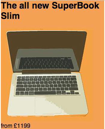
Figure 6-7. The Jumbotron with this base CSS in place
You will notice that the orange background for the Jumbotron does not stretch across the full viewport as you might expect. This is because of the wrapper you are using to apply consistent spacing to either side of the site. To enable you to keep this consistent spacing but extend the background to be full width, you can use a negative margin. To then add the consistent spacing within the Jumbotron, you can simply apply padding. In addition, you will want to align the text to be centered. This is shown in the following CSS:
.jumbotron{
    background: #f4a156;
    margin:  0 -20px 20px;
    padding:  20px;
    text-align: center;
}
The font sizes are also particularly large. This is because the font size for the second-level headings hasn’t been set for smaller viewports, so they should now be set to an appropriate size. Since the first-level headings are set to 1.4em, the second-level headings should be set to 1.3em. You also don’t want additional spacing above the second-level heading in the Jumbotron, so specifically for this Jumbotron that the margin top is set to 0px.
h2{
    font-size: 1.3em;
}

.jumbotron h2{
    margin-top: 0px;
}
With this in place, the Jumbotron now looks complete, as shown in Figure 6-8.
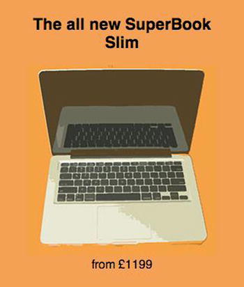
Figure 6-8. The complete Jumbotron
Product Panels
The next step is to build the styles for the product panels. The majority of the styles used for these panels on the larger viewports can also be used to style these panels on the smaller viewports. As before, I have highlighted the lines of the following CSS that can be used to simply move it outside the media query:
.product{
    float: left;
    width: 300px;
    padding-left: 20px;
    text-align: center;
}

.product:first-child{
    padding-left: 0px;
}

.product .roundal{
    width: 100px;
    height: 75px;
    margin: 0 auto;
    background: #f4a156;
    border-radius: 50px;
    padding-top: 25px;
}

.product .roundal span{
    display: block;
    font-size: 1.6rem;
}

.product ul{
    padding: 0px;
}

.product li{
    list-style: none;
    font-size: 0.8rem;
    color: #333;
}

.product a{
    font-size: 0.9rem;
    color: #000;
    text-decoration: none;
    display: inline-block;
    background: #ccc;
    padding: 5px 10px;
    border-radius: 2px;
}

.product a:hover, .product a:focus, .product a:active{
    background: #999;
    color: #eee;
}

.product *:first-child{
    margin-top: 0px;
}

.product *:last-child{
    margin-bottom: 0px;
}
After moving the highlighted CSS to outside the media query, you now need to add some extra padding and borders to finish off the product panels. So that there is spacing on either side of the border, add 20px padding to the top and bottom of each product panel. The border is then applied to the bottom of the product panel:
.product{
    text-align: center;
    padding: 20px 0px;
    border-bottom: 1px solid #ccc;
}
With that in place, ensure that you don’t have too much spacing above the first panel. Remove the padding only for the first product panel, and this will be targeted using the :first-child selector:
.product:first-child{
    padding-top: 0px;
}
With this in place, take a look at how the product panels look in your browser, as shown in Figure 6-9.
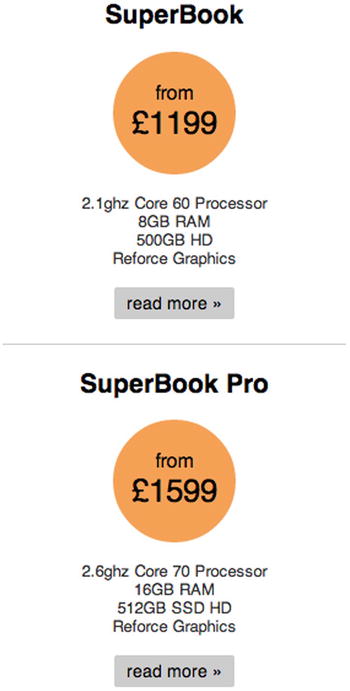
Figure 6-9. The product panels on a smaller device
The final part of CSS that you need to look at is the footer. Let’s start by looking at the CSS that is currently applied to the footer in the larger media query. I have highlighted the lines in the CSS that make sense in order to bring it outside the media query so it can be applied to the extra small viewports and up:
.global-footer{
    margin: 20px 0;
    border-top: 1px solid #ccc;
}

.global-footer p{
    text-align: center;
    font-size: 0.8rem;
}
There is no need to write any further CSS for the footer, and the finished footer is shown in Figure 6-10.
Figure 6-10. The finished footer on extra small devices
Targeting the Different Breakpoints
At this point the site is working great on extra small devices, but we haven’t yet thought about how it looks on small or large devices. It is also likely we have broken the original (medium) layout due to the new styles that have been added. Let’s start by increasing the browser’s width to the size of one of the small devices and see how the site looks, as shown in Figure 6-11.
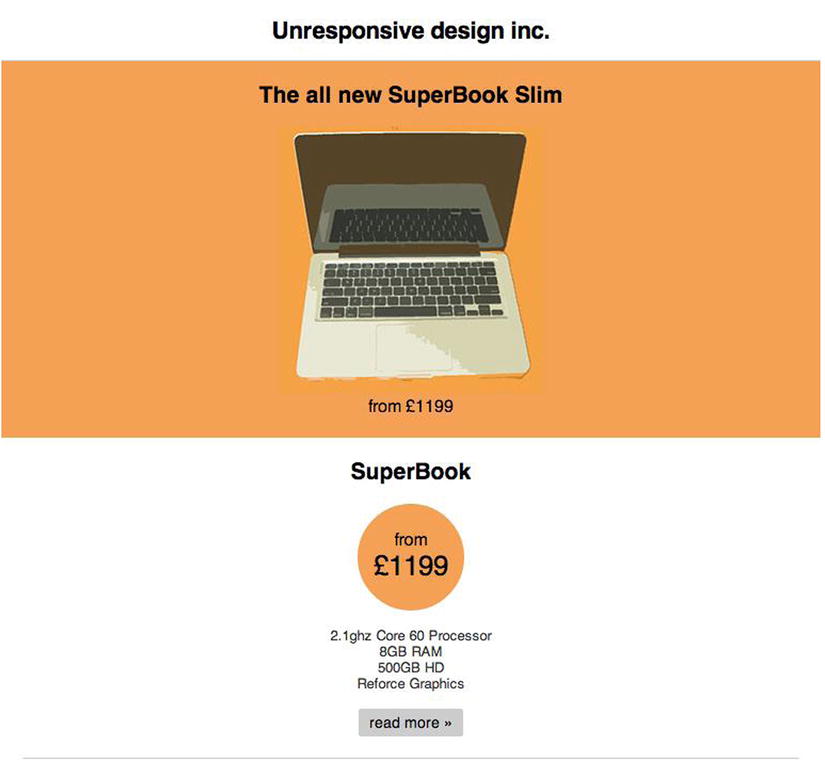
Figure 6-11. The site shown on a small device
Now, after seeing what the site looks like on a small device, you will notice that there is a lot of space around the stacked product panels that could be better utilized by showing the products in a row next to one another. This is the same way the original nonresponsive site behaved, however, rather than set a fixed width to the product panels, you would apply a fluid width. Because you want three columns here, you would set the width to 33.33%. To get the panels to sit next to one another, apply a float and remove the padding from the top of the elements. The final code looks like this:
.product{
        width: 33.33%;
        padding-top: 0px;
        float: left;
}
If you then check this in your browser, the panels should now be side by side, as shown in Figure 6-12.
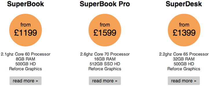
Figure 6-12. The product panels on a small device
If you continue to increase the viewport size until you reach the medium viewport width, you will notice that the header and Jumbotron of the site are both broken. This is because of the styles you applied to the earlier breakpoints. I have shown how the header and Jumbotron are broken in Figure 6-13.
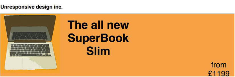
Figure 6-13. The medium breakpoint with the broken Jumbotron
As part of the refactoring, you can choose to make changes to the design of the site, in this example, you will be doing this to both the header and the Jumbotron. The first step is to look at the header; currently the CSS has styles applied to the h1 making it float to the left, the CSS is:
.global-header h1{
    float: left;
}
If you don’t want it to float left, you can remove this style. However, you want to increase the font size, but it makes sense that you apply the font size in the same way you did for the mobile site, which is on the h1 directly. The new styles to change the font size would look like this:
h1{
    font-size: 2rem;
}
With this in place, the next step is to look at the Jumbotron. To get started, let’s look at the CSS that is currently being applied to the Jumbotron. The first part is the CSS that contains the main element for the Jumbotron, the class on this element is jumbotron. The existing CSS is:
.jumbotron{
    position: relative;
    width: 940px;
    height: 250px;
}
As you will notice, the Jumbotron has a value set defining it as 940px wide. Because we want the Jumbotron to always be as wide as the wrapper, you can simply remove the width, so the CSS now looks like:
.jumbotron{
    position: relative;
    height: 250px;
}
The next step is to position the image. Although you could refactor the HTML to use a basic grid and build the Jumbotron using that, to keep it simple, let’s simply use absolute positioning to position the content of the Jumbotron. The existing styles currently position the image so it is positioned absolutely in the top left corner:
.jumbotron img{
    position: absolute;
    left: 0px;
    top: 0px;
}
But we want to place the image to the left of the center of the Jumbotron. To achieve this, you would set the left property of the selector to have a value of 50%. You can then use a negative margin equal to the width of the image to pull it to the left. You also want to bump the top down to give it an extra bit of space, so let’s set the top to 20px:
.jumbotron img{
    position: absolute;
    left: 50%;
    top: 20px;
    margin-left: -250px;
}
The next step is to style the title of the Jumbotron. The way it is currently styled absolutely positions it so it sits next to the original placement of the image. Because we changed the position of the image, you also need to adjust the position of the heading so it still sits next to the image. To achieve this, position the heading so it is to the right of the center of the Jumbotron. The current CSS is:
.jumbotron h2{
    position: absolute;
    left: 260px;
    top: 20px;
    font-size: 3rem;
    width: 300px;
    margin: 0px;
}
To achieve the desired effect, simply change the left so it is at 50%:
.jumbotron h2{
    position: absolute;
    left: 50%;
    top: 20px;
    font-size: 3rem;
    width: 300px;
    margin: 0px;
}
The next step is to position the pricing in the Jumbotron. You will want it to appear below the heading text, so let’s use the same technique to off-center the text. We are already using absolute positioning, so you simply need to change the position. The existing CSS is:
.jumbotron .roundal{
    position: absolute;
    right: 0px;
    bottom: 0px;
}
First, change the positioning to the left set to 50% and then the bottom set to 50px. This will position the text directly below the header. After updating the position, increase the font size so it is more prominent, in this case let’s increase the font size to 2rem:
.jumbotron .roundal{
    position: absolute;
    left: 50%;
    bottom: 50px;
    width: 300px;
    font-size: 2rem;
}
Finally, you can simply remove the following styles, which originally positioned the span that was within the roundel but is no longer needed:
.jumbotron .roundal span{
    position: absolute;
    right: 20px;
    bottom: 20px;
    font-size: 2rem;
}
With both the header styles and Jumbotron styles tweaked, let’s look at them in a browser, as shown in Figure 6-14.
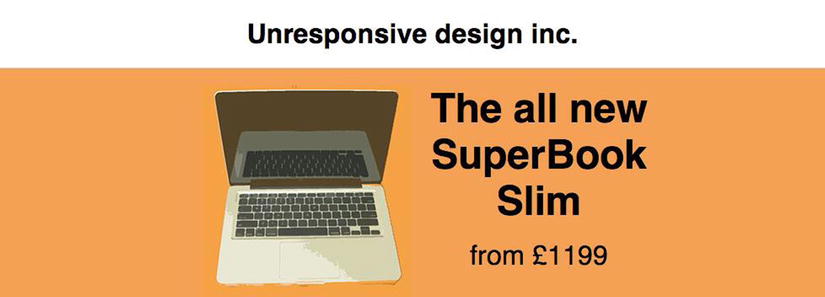
Figure 6-14. The completed header and footer
Aside from the header and Jumbotron, there are also issues with the footer of the site, as it has an extra border showing, as shown in Figure 6-15.
Figure 6-15. The double border issue on the medium breakpoint
This is because a border was added to the bottom of the products, but the larger viewport already had a border added to the top of the footer. To fix this issue, simply remove the following styles from the style sheet:
.global-footer{
    margin: 20px 0;
    border-top: 1px solid #ccc;
}
Now if you look at it in the browser again, you’ll see the line has been removed, as shown in Figure 6-16.
Figure 6-16. The fixed footer for the medium breakpoint
This completes the medium breakpoint, but as part of making the site responsive, you want to also take advantage of the space available on larger displays. Earlier I discussed the media query that would be used to achieve this, but now let’s look at the CSS required to adapt the site.
Because everything built so far is fluid within a fixed-width wrapper, adjusting the site for a larger viewport can be achieved by simply changing the width of this wrapper. In some circumstances you might want to take advantage of the extra space by doing more than this, but for this example let’s simply adjust the wrapper. As the large breakpoint breaks at 1200px, you will want to set the width of the wrapper to 1170px wide to give space for the scrollbar. To achieve this, simply place the following CSS inside the large media query:
.wrapper{
        width: 1170px;
}
Loading the finished page with a viewport equal to or greater than 1200px will show the new wider site, as shown in Figure 6-17.
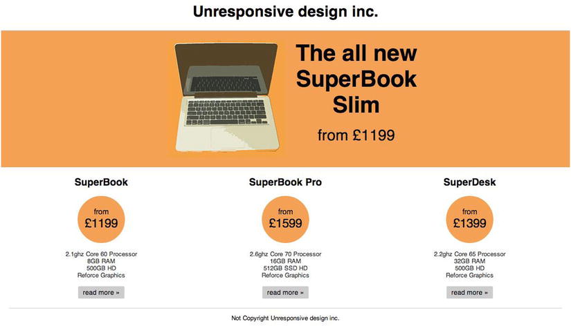
Figure 6-17. The completed refactored site shown on a large viewport
Full Reskin
The third approach that could be taken for adapting an existing site is to keep the majority of the current HTML, but ditch the existing CSS and start afresh.
There are benefits and disadvantages of choosing to take the full reskin approach, with the key benefit being that by starting the CSS afresh and refactoring the HTML as necessary, you overcome any inefficiencies that may have creeped into the CSS over the life of the site. In addition, because you would be replacing the existing CSS, you can take a mobile-first, progressive-enhancement approach, building the site for the smaller, mobile devices first and then enhancing the site based on the devices feature set and viewport size.
Being a full reskin, the first step is to clear out the original styles and see what is left. By deleting the core styles, you are left with simply the content. If you look at this in a browser, you will see that you get a very clear outline of the document, as shown in Figure 6-18.
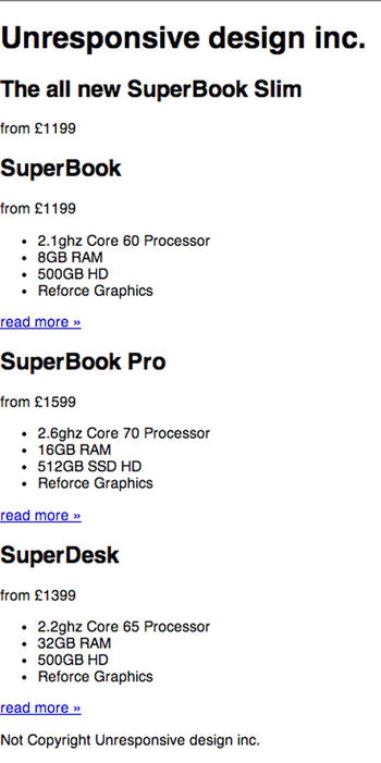
Figure 6-18. The initial site with the original styles removed
Part of the reason that this remains very easy to follow is that the heading tags were used correctly, so while the site has only browser default styling, the content still has a strong, clear heading hierarchy. When looking at your own site, you might notice that some of your headings do not seem to follow a proper hierarchy. This is a good opportunity to look at refactoring your headings so they are used to provide users with a proper hierarchy to the page. As a demonstration of how an improper hierarchy might look, I put together an example as shown in Figure 6-19.
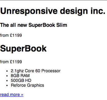
Figure 6-19. An example of a page with an improper hierarchy
There are multiple reasons it is important that pages follow a clear hierarchy, the most important being that is makes the page much more accessible to users, especially those using screen readers that may be relying on the hierarchy of the page to navigate through the content. Another reason that heading hierarchy is important is that it enables us to easily apply styles that match up to the correct heading elements.
General Styles
Before starting the core of the coding, let’s first change the default box model for the elements. This is achieved using the box-sizing CSS3 property, which was covered in Chapter 4, and applying it to all elements using the CSS universal selector (*):
* {
        -webkit-box-sizing: border-box; /* Safari/Chrome, other WebKit */
        -moz-box-sizing: border-box;    /* Firefox, other Gecko */
        box-sizing: border-box;         /* Opera/IE 8+ */
}
By setting the value to border-box, you are moving both the borders and paddings inside the elements, allowing you to use percentage values for the widths, while still using px values for the paddings. Earlier when we were adapting the CSS, we were unable to apply this technique easily to the CSS due to the potential of breaking existing styles. When reskining a site, you don’t have this problem because you are able to build all the styles based on the box model you have chosen to implement.
Defining the Breakpoints
It is important to plan at what points you want to use media queries to define breakpoints. Because you are building this site mobile first, you are progressively enhancing the site at each breakpoint based on the width of the device viewport. Therefore, each of the breakpoints should try to build on top of the previous breakpoint. Building mobile first means that the base CSS that is not wrapped in any media queries is the CSS aimed at is for extra small devices. With this in mind, you will need to define three breakpoints, each using a sensible value for minimum width.
The first breakpoint to define is a minimum width of 768px. This will allow you to target devices with a viewport width starting at 768px. The reason behind this choice is that this is normally the starting point for tablets in a portrait orientation, and as tablets get bigger screens and wider viewports, you can then enhance the site to take advantage of this. When referring to this breakpoint later, I will call it the small breakpoint:
@media screen and (min-width: 768px){
}
The second breakpoint to define is a minimum width of 1000px, the purpose being to target the very popular 1024×800 screen resolution used by a large number of users. Although the previous breakpoint could assume the majority of users would be using some kind of tablet, this breakpoint is shared between landscape tablets and desktops, so it can’t be used to make these kinds of assumptions. When referring to this breakpoint later, I will call it the medium breakpoint:
@media screen and (min-width: 1000px){
}
The final breakpoint to define is a minimum width of 1200px. With the growth of larger displays, as discussed earlier in the book, it makes sense to take advantage of the additional space available. When referring to this breakpoint later, I will call it the large breakpoint:
@media screen and (min-width: 1200px){
}
Typography
Once you are happy with the breakpoints, let’s start by applying sensible default sizes to the typography. The first step is to set the base font size for the page. For this, a sensible default size is 14px, and this is set on the HTML tag as a percentage:
html{
    font-size: 87.5%;
}
Setting a default font size will have an effect on all the text on the site, however, you may want to set your own custom font sizes for the headings:
h1{
    font-size: 22px;
    font-size: 1.571rem;
}

h2{
    font-size: 18px;
    font-size: 1.286rem;
}
You may have noticed that for both the h1 and h2 selectors I have defined the font-size property twice, the first with a pixel value followed by a second declaration with a value in rem. The reason for this is that you want to use rem (also known as a relative em) as they are relative to the default font size. However, this is not supported by all browsers, so as a fallback I have defined the font size in pixels. The drawback to this approach is that in older browsers that do not support rem, text-size–based zooming will not work, however, full-page zooming will still work, meaning the site would still be usable to those using these older browsers.
Having defined the mobile CSS, let’s increase the font size for larger devices. You will do this by adding increased font sizes to the small media query, and because you are using min-width, it will then apply to all the breakpoints greater than it:
@media screen and (min-width: 767px){
    h1{
        font-size: 28px;
        font-size: 2rem;
    }

    h2{
        font-size: 24px;
        font-size: 1.714rem;
    }
}
Wrapper
As you might already know, the HTML includes a div element with the class wrapper, which encapsulates the HTML of the site. In the site’s original CSS that is being replaced, this was used to define the width of the site and center it on the page. For a mobile device, however, you would not want to set a width because you want the wrapper to be fluid. You do, however, want to apply consistent spacing to the sides of the site, so you can use a wrapper for this. This will be achieved by adding a margin to the left and right of the wrapper to space out the page:
.wrapper{
    margin: 0 20px;
}
Having added a margin to the wrapper, the content of the site will have 20px margins down the left- and right-hand sides. Although the fluid width works really well with extra small devices, you want to set a fixed width on small devices, and you also want to center the fixed width design within the viewport, which you can achieve by using margins:
@media screen and (min-width: 767px){
    .wrapper{
        width: 740px;
        margin: 0px auto;
    }
}
Having set the width for small devices, when you get to the medium breakpoint, you will find that the width you set for the small breakpoint leaves a large amount of space available. It, therefore, makes sense to make the site wider on these medium-size displays:
@media screen and (min-width: 1000px){
    .wrapper{
        width: 980px;
    }
}
Finally, you want to be able to take advantage of the extra space offered by larger displays, and as such let’s increase the width of the wrapper again. In this case, I have chosen to use a breakpoint of minimum width 1200px. This is to ensure the browser does not show horizontal scrollbars. Let’s set the width of the site to 1170px to allow for the browser’s scrollbars:
@media screen and (min-width: 1200px){
    .wrapper{
        width: 1170px;
    }
}
Header
Having looked at both the typography of the site and the wrapper, let’s move on to styling the header of the site. On extra small devices, we want to have a border on the bottom of the header spanning the width of the viewport. However, with a set margin of 20px for the wrapper, the header does not naturally span 100% of the viewport. To fix this, let’s use negative margins to pull the width of the header to the full width of the viewport. You can then add this spacing onto the inside of the header using padding and then add the border to the bottom of the header:
.global-header{
    border-bottom: 1px solid #ccc;
    margin: 0 -20px;
    padding: 0 20px;
}
For larger viewports, you will want to remove this additional spacing:
@media screen and (min-width: 767px){
    .global-header{
        margin: 0px;
        padding: 0px;
    }

    .global-header h1{
        text-align: left;
    }
}
Jumbotron
Directly under the header is the Jumbotron, which is used to highlight the latest product that our fictional company Unresponsive design inc. wants to promote. This panel should stand out, so let’s add a background color of orange, along with pulling out the Jumbotron so it fits the full width of the viewport:
.jumbotron{
    background: #f4a156;
    margin: 0 -20px;
    padding: 20px;
    text-align: center;
}
Next let’s add some styling to the heading element shown within the Jumbotron so it does not have any margins at the top:
.jumbotron h2{
    margin-top: 0px;
}
Finally, let’s style the price of this product that is highlighted in the Jumbotron. For this, let’s simply increase the font size to make it stand out more:
.jumbotron .roundal{
    font-size: 18px;
    font-size: 1.286rem;
}
If you load the site in a browser now, you will be able to see the styled Jumbotron, as shown in Figure 6-20.
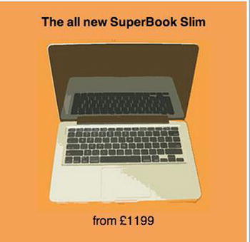
Figure 6-20. The newly styled Jumbotron
So now let’s adapt this to work on larger devices. To achieve the desired effect, let’s use absolute positioning. To enable this, you need to set the height and the element to position: relative:
.jumbotron{
    margin: 0px;
    height: 290px;
    position: relative;
}
The next step is to position the image. You want all the content in the Jumbotron to be central, so let’s set it left to 50%, then use margin-left to add an offset. In this case, the image is 250px wide, so you’ll want it to be off the center by 20 pixels—in this case the offset will be -270px:
.jumbotron img{
    position: absolute;
    left: 50%;
    margin-left: -270px;
}
Similarly, the heading needs to be central, and then off-centered using margin-left. Although the image is off-centered to the left, the text will off-center to the right. Let’s also increase the font size:
.jumbotron h2{
    position: absolute;
    left: 50%;
    margin-left: 20px;
    width: 250px;
    font-size: 42px;
    font-size: 3rem;
    text-align: left;
}
Finally, let’s position the price. This should be lined up with the title but nearer the bottom of the Jumbotron:
.jumbotron .roundal{
    position: absolute;
    left: 50%;
    margin-left: 20px;
    bottom: 40px;
    font-size: 28px;
    font-size: 2rem;
}
Now if you take a look at how the Jumbotron appears on larger devices, it would look like Figure 6-21.
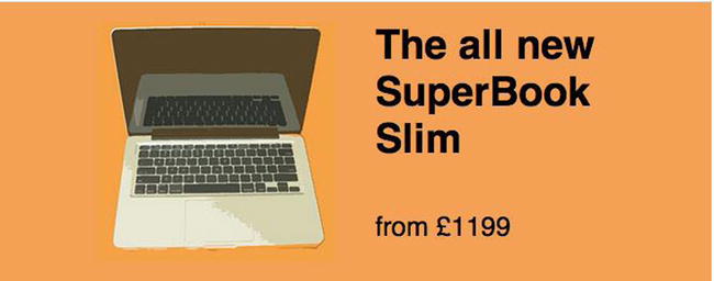
Figure 6-21. The Jumbotron as seen on larger devices
Products
The products are a core part of this site, so it is important to show them in a way that tells the user about them in a clear and concise way. There is already HTML that lists the price for the name and the specification of the product, however, you would need to style this so it works well on extra small devices. It makes sense that on these devices the products would be stacked so the user can scroll up and down to see the different products. As each product is a div, which is a block-level element, each would naturally be full width and stacked. But it is also important to apply styles to space out the products. Finally, you would align the text to center to be consistent with how the header and Jumbotron are styled:
.product{
    text-align: center;
    margin: 20px 0;
    border-bottom: 1px solid #ccc;
    padding-bottom: 20px;
}
Having spaced out the products, the next step is to style the pricing of the products. For this you would use a roundal. To enable this, let’s style the roundal to be 100px wide, and the height will be made up of 70px of height and 30px top padding. The circle effect will be achieved by giving it a background color of orange and a border radius of 50px. Finally, this will be aligned center using margins. To show the price in a higher font size, style the span to be display block (to force a new line) with a font size of 1.6rem:
.product .roundal{
    width: 100px;
    height: 100px;
    margin: 0 auto;
    background: #f4a156;
    border-radius: 50px;
    padding-top: 30px;
}
.product .roundal span{
    display: block;
    font-size: 1.6rem;
}
Next you would want to add styling specifications of the product. For starters, let’s remove the default padding applied to the list by the browser and then remove the bullet points because they are not needed when listing the specifications:
.product ul{
    padding: 0px;
}

.product li{
    list-style: none;
}
The next step is to style the read-more link. It makes sense for this to be a button, so let’s style this up:
.product a{
    color: #000;
    text-decoration: none;
    display: inline-block;
    background: #ccc;
    padding: 0px 10px;
    border-radius: 2px;
    line-height: 40px;
}
Having declared the button, you also want to add hover, focus, and active states to the button. Although your first thought might be that small touch-screen devices do not have the ability to hover as they generally have touch screens, you need to ensure you cover all bases within the CSS, because you cannot know whether users are using a touch device:
.product a:hover, .product a:focus, .product a:active{
    background: #999;
    color: #eee;
}
Finally, you will notice that there is extra spacing occurring around the product. This is caused by the margins on the first and last elements in the product elements. You can quickly remove these using the first-child and last-child selectors. The reason to do this rather than style the elements directly is that the order of the elements could change or new elements could be added, and this CSS would still apply regardless of the element:
.product > *:first-child{
    margin-top: 0px;
}
.product > *:last-child{
    margin-bottom: 0px;
}
Having built the products so they stack, you can see that they work really well regardless of the width of the browser (see Figure 6-22):
Figure 6-22. Product stack works well regardless of browser
Although the fluid width products work great across all viewport sizes, on the larger viewports you will notice there is a lot of space. The fluidness of the products and the elements within mean that when it comes to specifying a width on a product element, it, along with the contents within, will continue to work at the width specified. What this means is that on larger viewports you can take advantage of the extra space by placing the products into columns. To achieve this, simply set the width of the product element to 33.333% so the products take up a third of available width:
@media screen and (min-width: 767px){
    .product{
        float: left;
        width: 33.333%;
    }
}
You can then see that the columns appear side by side in the browser (see Figure 6-23).
Figure 6-23. Products line up side by side in browser
Had you used percentages for the widths of the product elements, they would simply continue to scale up as the width of the site does.
Footer
The final thing to style for the reskin is the footer. This is really simple because the products already provide a separator between the products and the footer, so all you need to do is center align the text and add a tiny bit of spacing below:
.global-footer{
    text-align: center;
    padding-bottom: 10px;
}
These styles do not need any media queries to scale up as they will be fluid within the wrapper.
Conclusion
Having reskined the site with new CSS, you have learned how building mobile first and building upon the mobile version with each breakpoint can allow you to build a site that can be streamlined.
You have also learned that by building elements to be fluid on extra small devices, you can apply fixed width to them at different breakpoints, and then you only need to apply minimal extra styling.
It is important to remember that as you are rebuilding CSS you do not necessarily need to have an identical site as the end result. For your own site, before you embark on a reskin, it would be good to discuss with your designers and UX team whether they want to make any tweaks to the site as the reskin would be the best time to do this.
Summary
This chapter explained how to adapt an existing site to be responsive. You learned three different techniques for adapting a site to be responsive.
The first way of adapting a site to be responsive is to adapt the existing CSS. The key benefit of adapting the existing CSS is that it is a lot quicker than performing a full reskin. By adapting the existing CSS, you already have a base to start from. On the opposite side of this, this can be a disadvantage as it can lead to the code becoming a lot more bloated because you may have to override the values you have set with what would have been browser default behavior. A very simple example would be absolute positioning, where it is very unlikely that on smaller devices you wouldn’t have to in some way change the way the element is positioned, often even removing the absolute positioning that has been applied.
The second way to adapt a site to be responsive was to refactor the existing code base so it was both responsive and built from a mobile-first perspective. The key benefit here is that you can get the performance and usability benefits of building a site mobile first without doing a full reskin. The key disadvantage is that on a large site you may be faced with a large code base to refactor, and it can be very difficult to isolate legacy code that is no longer needed because there might be a page embedded deep within the site that uses it.
The final way to adapt a site to be responsive was to do a full reskin the site. The key benefit of doing a full site reskin is that it enables you to build from a mobile-first perspective, building the site using progressive enhancement, which can help the code base to be much leaner. Using this mobile-first way of building a site allows you to add any additional styles as you progressively enhance the site.
Previous chapters have highlighted the benefit to building a site using a mobile-first methodology, so the preferred method to adapt an existing site is to do a full reskin, scraping the original CSS and starting using mobile-first methodologies. If, however, time is a concern, you might find that you will need to simply adapt the existing styles and, while not ideal, you will achieve a usable responsive site. Should you then find you have a bit of time left, you could look at optimizing your site to alleviate some of the disadvantages of a desktop-first build.
Although this chapter focused on the CSS side of adapting a site to be responsive, you are not limited to this. If necessary you can refactor parts of your HTML to enable you to better adapt your site. In addition, where the functionality of the site would benefit, you could write responsive JavaScript to change the way in which different elements of your site function.
The next chapter will look at how to improve the tools we use and the workflow we follow when building a responsive site.